Chapter 12 CALIBRATING SPATIAL REGRESSION MODELS IN R
The SAR model may be calibrated using the spautolm function from spdep. This uses the notation also used in the lm function – and related functions – to specify models. In the next section, the SAR and CAR models will be expanded to consider further predictor variables, rather than just neighbouring values of \(z_i\). However, for now the basic model may be specified by using the notation for a linear model with just a constant term for the mean of the predicted variable - this is \(\mu\) in equation or . This is simply Var.Name ~ 1 with Var.Name replaced with the actual variable name of interest (for example penn.state.utm$smk in the smoking rate examples used in previous sections A further parameter family, specifies whether a SAR or a CAR model is fitted. The function returns a regression model object - among other things this allows the values of coefficients, fitted values and so on to be extracted. An example of use is as follows:
Call:
spautolm(formula = smk ~ 1, data = penn.state.utm, listw = penn.state.lw)

Coefficients:
(Intercept)      lambda
 23.7689073   0.6179367

Log likelihood: -142.8993
From this it can be seen that \(\lambda =\) 0.618, and \(\mu\) = 23.769, to 3 places of decimal. While the estimate for \(\mu\) is easily interpretable, deciding where the reported level of \(\lambda\) is of importance is harder. One possibility is to find the standard error of \(\lambda\) - this is reported as the lambda.se component of the spatial autoregression object:
[1] 0.1130417An approximate 5% confidence interval can be found in the standard way - by finding a band given by the estimate of \(\lambda\) plus or minus two times the standard error:
[1] 0.3918532 0.8440201as before, this suggests that a null hypothesis of \(\lambda=0\) is highly unlikely.
12.1 Models with predictors: A Bivariate Example
Both the CAR and SAR models can be modified to include predictor variables in as well as incorporate autocorrelation effects. This is achieved by replacing a constant \(\mu\) by an observation specific \(\mu_i\) for each \(z_i\), where \(\mu_i\) is some function of a predictor variable (say \(P_i\)). If the relationship between \(\mu_i\) and \(P_i\) is linear, we can write, for the SAR case:
\[ z_i = a_0 + a_1 P_i + \sum_{j=1}^{j=n} b_{ij} \left(z_j - a_0 - a_1 P_i \right) + \epsilon_i \label{sareqbiv} \]
where \(a_0\) and \(a_1\) are effectively intercept and slope terms in a regression model. The key difference between this kind of model and a standard ordinary least squares (OLS) model is that for the OLS case the \(z_i\) values are assumed to be independent, whereas here nearby \(z_j\) values influence \(z_i\) as well as the predictor variable.
Calibrating models such as that in equation in R is straighforward, and involves including predictor variables in the model argument for spautolm. In the following example, a new data item, the per-county lung cancer rate for Penn State in 2002 is computed, and used as the \(z_i\) variable. This time the role of the smoking uptake variable is changed to that of the predictor variable, \(P_i\).
This is acheived via a two-stage process:
- Compute the per-county lung cancer rates
- Compute the regression model
For stage 1, the plyr package is used to manipulate the data. Recall that pennLC is a list, and one of the elements (called data) is a data frame giving the counts of population, and lung cancer incidence, for each county in Penn State subdivided by race (white' orother’), gender (male' orfemale’), and age (Under 40',40 to 59’,60 to 69', andOver 70’). The format of the data frame uses a county column and three substrata columns - together specifying a combination of county, age, gender and ethnicity. Two further columns then specify the count of cases for that county/substrata combination, and also the overall population for the same county substrata combination:
  county cases population race gender      age
1  adams     0       1492    o      f Under.40
2  adams     0        365    o      f    40.59
3  adams     1         68    o      f    60.69
4  adams     0         73    o      f      70+
5  adams     0      23351    w      f Under.40
6  adams     5      12136    w      f    40.59
For example, it may be seen that Adams County has 0 incidents of lung cancer for non-white females under 40 out of a total population of 1492 female non-white people under 40 in Adams County. Using the (ply-R) package (???), it is possible to create a data frame showing the total number of cases over all combinations of age, ethnic and gender for each county:
In the code above, the function applied to a subset data frame for each county is created via numcolwise(sum). This transforms the basic sum function, which applies to vectors, to a new function which sums all numeric columns in a data frame, yielding a one-row data frame with sums of numeric columns. Here these columns are the number of incidents of lung cancer, and the population. After applying this function to each subset of the data, the list of county-wise totals for lung cancer incidents, and populations are re-combined to give a data frame with county name, county total lung cancer cases, and county total population - in the data frame totcases:
     county cases population
1     adams    55      91292
2 allegheny  1275    1281666
3 armstrong    49      72392
4    beaver   172     181412
5   bedford    37      49984
6     berks   308     373638
Having created a data frame of county-based lung cancer incident and population counts, the cancer rates per 10,000 population are computed. These are added as a new column to the totcases data frame:
Thus, totcases now has three columns, and is ready to provide input to the regression model - below this variable is inspected (using head) and a boxplot drawn in figure :
     county cases population     rate
1     adams    55      91292 6.024624
2 allegheny  1275    1281666 9.947990
3 armstrong    49      72392 6.768704
4    beaver   172     181412 9.481181
5   bedford    37      49984 7.402369
6     berks   308     373638 8.243273
# Check the distribution of rates
boxplot(totcases$rate,horizontal=TRUE,
xlab='Cancer Rate (Cases per 10,000 Popn.)')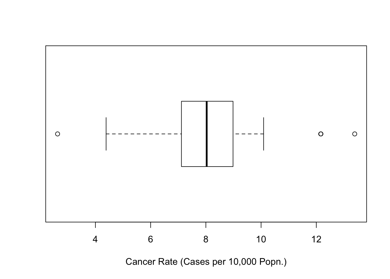
Figure 12.1: Boxplot of Cancer Rates (Penn State 2002)
It is now possible to calibrate the spatial regression model. As stated earlier, the \(z_i\) variable here is related to the cancer rate, and the predictor is smoking uptake. Note that in this case an additional weighting variable is added - based on the population variable, and also that \(z_i\) is actually the square root of the cancer rate. This allows for the fact that the random variable here is actually the count of cancer cases - and that this is possibly a Poisson distributed variable - since the square root transform can stabilise variance of Poisson count data (???). Since the square root rate is essentially
\[ \sqrt{\frac{\textrm{No. of Cases}}{\textrm{Population}}} \]
and population is assumed a fixed quantity - then the numerator above will have an approximately fixed variance - and be reasonably approximated by a normal distribution. Dividing this by the square root of population then makes the variance inversely proportional to the population. Hence, weighting by population is also appropriate here. Taking these facts into account, the SAR model may be calibrated and assessed:
sar.mod <- spautolm(rate~sqrt(penn.state.utm$smk),listw=penn.state.lw,
                    weight=population,data=totcases)
summary(sar.mod)
Call:
spautolm(formula = rate ~ sqrt(penn.state.utm$smk), data = totcases,
    listw = penn.state.lw, weights = population)

Residuals:
     Min       1Q   Median       3Q      Max
-5.45183 -1.10235 -0.31549  0.59901  5.00115

Coefficients:
                         Estimate Std. Error z value
(Intercept)              -0.35263    2.26795 -0.1555
sqrt(penn.state.utm$smk)  1.80976    0.46064  3.9288
                          Pr(>|z|)
(Intercept)                 0.8764
sqrt(penn.state.utm$smk) 8.537e-05

Lambda: 0.38063 LR test value: 6.3123 p-value: 0.01199
Numerical Hessian standard error of lambda: 0.13984

Log likelihood: -123.3056
ML residual variance (sigma squared): 209030, (sigma: 457.19)
Number of observations: 67
Number of parameters estimated: 4
AIC: 254.61
The ‘coefficients’ section in the output may be interpreted in a similar way to a standard regression model. From this it can be seen that the rate of smoking does influence the rate of occurrence of lung cancer - or at least that there is evidence to reject a null hypothesis that it does not effect cancer rates, with \(p\)=8.54 \(\times\) 10\({}^{-5}\). The `lambda’ section provides a \(p\)-value for the null hypothesis that \(\lambda=0\) - that is, that there is a degree of spatial autocorrelation in the cancer rates. Here, \(p\)=0.012, so that at the 5% level there is evidence to reject the null hypothesis, although the strength of evidence just falls short of the 1% level.
Thus, the analysis here suggests that smoking is linked to lung cancer, but that lung cancer rates are spatially autocorrelated. This is possibly because other factors that influence lung cancer (possibly age, or risk associated with occupation) are geographically clustered. Since these factors are not included in the model, information about their spatial arrangement might be inferred via nearby occurrence of lung cancer.
12.2 Further Issues
The above analysis gave a reasonable insight into the occurrence of lung cancer in Pennsylvania as a spatial process. However, a number of approximations were made. A more exact model could have been achieved if a direct Poisson model had been used, rather than using an approximation via square roots. Indeed, if an independent \(z_i\) model were required, where the \(z_i\)’s were case counts, then a straighforward Poisson regression via glm could have achieved this. However, a Poisson model with an autocorrelated error term is less straightforward. One approach might be to use a Bayesian Markov Chain Monte Carlo (MCMC) approach for this kind of model - see (???) for an example. In R, this type of approach can be achieved using the RJags package or the RStan package .
12.3 Troubleshooting Spatial Regression
In this section, a set of the issues with spatial models based on \(\mathbf{W}\)-matrices will be explored. These issues are identified in (???). The issues identify certain strange characteristics in some spatial models - and possibly interactive exploration via R is an important way of identifying whether these issues affect a particular study. For this exercise you will look at the Columbus crime data supplied with the spdep package§§§. Typing in the following will load the shapefile of neighbourhoods in Columbus, Ohio, and create a map (figure ). Note that the mapping command might issue a warning as columbus does not have a defined map projection. This is not a problem if the shapefile is only considered in isolation – if it is to be combined with outher sources of geographical information this could be more problematic.
columbus <- readShapePoly(system.file("etc/shapes/columbus.shp",
 package="spdep")[1])

# Create a plot of columbus and add labels for each of the zones
tm_shape(columbus) + tm_polygons(col='wheat')  +
  tm_text(text='POLYID',size=0.7)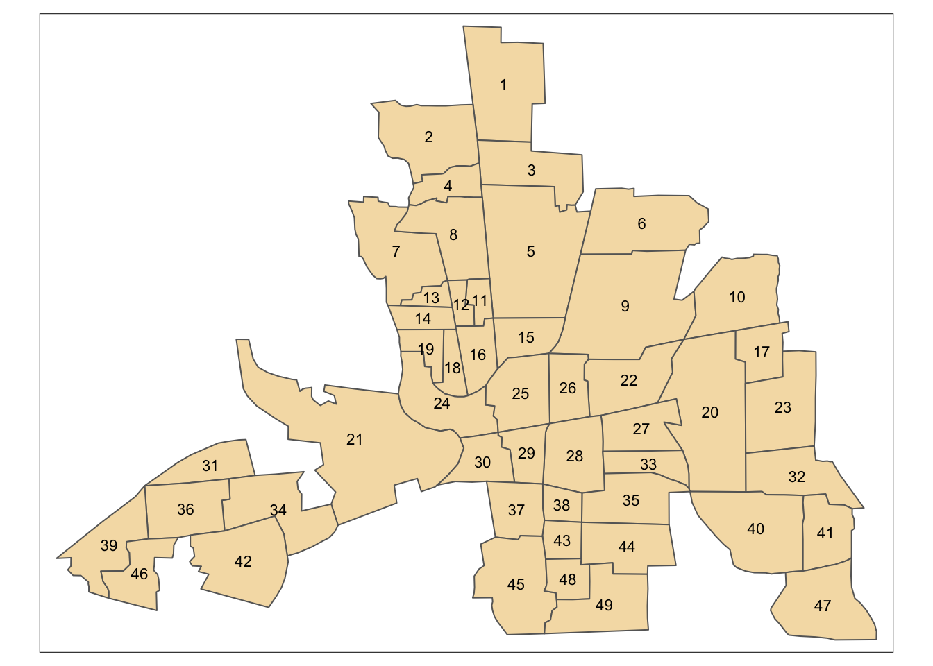
Figure 12.2: Shapefile of neighbourhoods in Columbus, Ohio, with labels
This data has been used in a number of studies. For each neighbourhood, a number of attributes are provided, including ‘Average House Price’, ‘Burglary Rate’ and ‘Average Income’. However, here these will not be considered, as focus will be on the correlation structure implied by the \(\mathbf{W}\)-matrix. Here, a Queen’s case matrix is extracted from this data. Adjacency plays an important role in a SAR model. Recall there are also several options in terms of specifying the definition of polygon adjacency - in particular the rook’s case and queen’s case. Both of these can be computed from columbus, which is a SpatialPolygonsDataFrame object.
# Extract a 'queen's case' adjacency object and print it out
col.queen.nb <- poly2nb(columbus,queen=TRUE)
col.queen.nb
Neighbour list object:
Number of regions: 49
Number of nonzero links: 236
Percentage nonzero weights: 9.829238
Average number of links: 4.816327 # Extract a 'rooks's case' adjacency object and print it out
col.rook.nb <- poly2nb(columbus,queen=FALSE)
col.rook.nbNeighbour list object:
Number of regions: 49
Number of nonzero links: 200
Percentage nonzero weights: 8.329863
Average number of links: 4.081633 The two variables col.queen.nb and col.rook.nb respectively contain the adjacency information for the queen’s and rook’s case adjacency. It can be seen that the Queen’s case has 36 more adjacencies than the Rook’s case.
(???) and others demonstrate that for the SAR model with a constant \(\sigma^2\) term
\[ \textrm{Var}(\mathbf{z}) = (\mathbf{I} - \lambda \mathbf{W})^{-1 }\left[ (\mathbf{I} - \lambda \mathbf{W})^{-1} \right]^T \sigma^2 \]
provided \((\mathbf{I} - \lambda \mathbf{W})\) is invertible. Thus, as stated before, the spatial autoregressive model is essentially a regression model with non-independent error terms, unless \(\lambda=0\) in which case it is equivalent to a model with independent observations. The variance-covariance matrix is therefore a function of the variables \(\mathbf{W}\), \(\sigma^2\) and \(\lambda\). Without loss of generality, we can assume that \(Y\) is scaled so that \(\sigma^2 = 1\). Then, for any given definition of adjacency for the study area, it is possible to investigate the correlation structure for various values of \(\lambda\). In R, the following defines a function to compute a variance-covariance matrix from \(\lambda\) and \(\mathbf{W}\). Here, the adjacency object is used (rather than supplying a \(\mathbf{W}\) matrix), but this contains the same information.
covmat <- function(lambda,adj) {
  solve(tcrossprod(diag(length(adj)) - lambda* listw2mat(nb2listw(adj))))
}
The tcrossprod function takes a matrix \(\mathbf{X}\) and returns \(\mathbf{X X^{T}}\). The function solve finds the inverse of a matrix.
This can also be used as the basis for finding the correlation matrix (rather than the variance-covariance matrix).
We can now examinine the relationship between, say, the correlation between zones 41 and 47, and \(\lambda\) - the plot created is shown in figure .
# Create a range of valid lambda values
lambda.range <- seq(-1.3,0.99,l=101)
# Create an array to store the corresponding correlations
cor.41.47 <- lambda.range*0
# ... store them
for (i in 1:101) cor.41.47[i] <- cormat(lambda.range[i],col.rook.nb)[41,47]
# ... plot the relationship
plot(lambda.range,cor.41.47,type='l')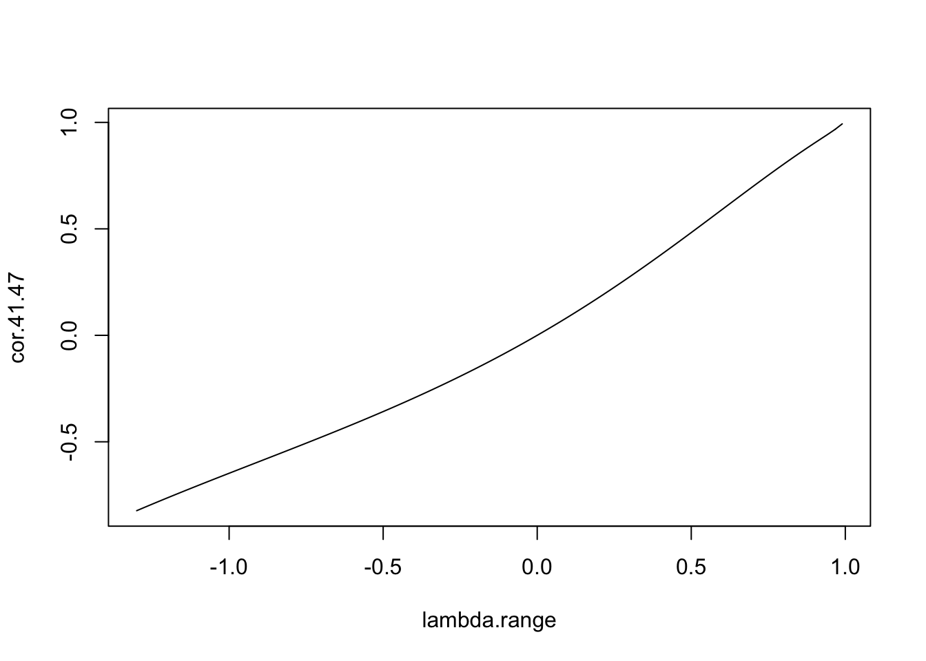
Figure 12.3: Relationship between \(\lambda\) and the correlation between zones 41 and 47
This seems reasonable - larger values of \(\lambda\) lead to higher correlation between the zones, \(\lambda=0\) implies no correlation, and the sign of \(\lambda\) implies the sign of the correlation. However, now consider the same curve, but between zones 40 and 41.
# First, add the line from the previous figure for reference
plot(lambda.range,cor.41.47,type='l',xlab=expression(lambda),ylab='Correlation',lty=2)
# Now compute the correlation between zones 40 and 41.
cor.40.41 <- lambda.range*0
for (i in 1:101) cor.40.41[i] <- cormat(lambda.range[i],col.rook.nb)[40,41]
# ... and add these to the plot
lines(lambda.range,cor.40.41)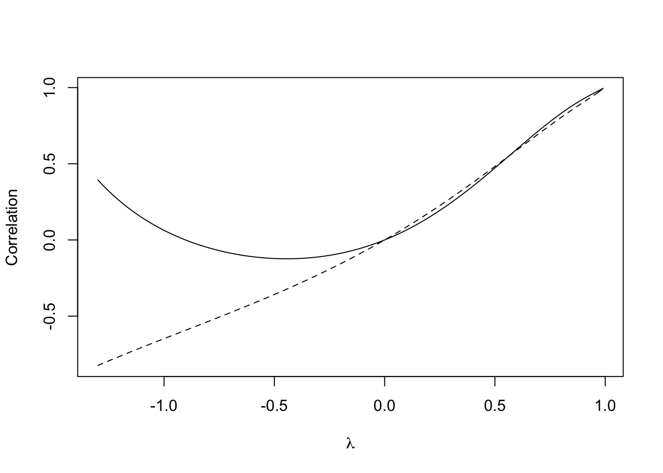
Figure 12.4: Relationship between \(\lambda\) and the correlation between zones 41 and 47
Here, something strange is happening. When \(\lambda\) drops below around -0.5 the correlation between the zones 40 and 41 begins to increase, and at a point at around -0.7 it becomes positive again. This is somewhat counter-intuitive, particularly as \(\lambda\) is often referred to as an indicator of spatial association. For example, (???) states that \(w_{ij}\) ‘represents the degree of possible interaction of location \(j\) on location \(i\)’. Although initially for positive \(\lambda\) the correlation between zones 40 and 41 is less than that for zones 41 and 47, when \(\lambda\) exceeds around 0.5 the situation is reversed (although this is a less pronounced effect than the sign change noted earlier). A useful diagnostic plot is a parametric curve of the two correlations, with parameter \(\lambda\) (see Figure ):
# First,  plot the empty canvas (type='n')
plot(c(-1,1),c(-1,1),type='n',xlim=c(-1,1),ylim=c(-1,1),xlab='Corr1',ylab='Corr2')
# Then the quadrants
rect(-1.2,-1.2,1.2,1.2,col='pink',border=NA)
rect(-1.2,-1.2,0,0,col='lightyellow',border=NA)
rect(0,0,1.2,1.2,col='lightyellow',border=NA)
# Then the x=y reference line
abline(a=0,b=1,lty=3)
# Then the curve
lines(cor.40.41,cor.41.47)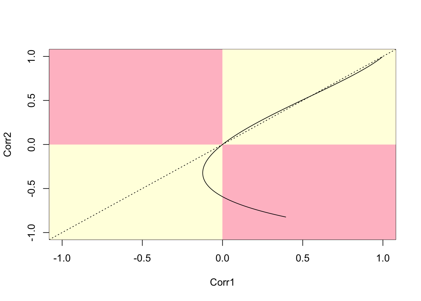
Figure 12.5: Parametric plot of correlations between two polygon pairs (40,41) and (41,47)
We term this a battenburg plot. Tracing along this line from top right shows the relationship between the two correlations as \(\lambda\) decreases from its maximum value. The dotted line is the \(x=y\) reference point - whenever the curve crosses this, the values of the two correlations change order. Perhaps the key feature is that the curve ‘doubles back’ on itself - so that for some ranges of \(\lambda\) one of the correlations increases while the other decreases. The quadrants are also important - if a curve enters one of the pink quadrants this suggests that one of the correlations is positive, while the other is negative. Again, this is perhaps counter-intuitive, given the interpretation of \(\lambda\) as a measure of spatial association. Note in his case after the `doubling back’ of the curve it does enter the pink quadrant.
A selection of 100 random pairs of correlations (chosen so that each pair has one zone in common) can be drawn (see below). This seems to suggest that ‘doubling back’ and curves going inside the pink quadrants are not uncommon problems. In addition, for positive \(\lambda\) values, there is a fair deal of variation in the values of correlation for given \(\lambda\) values. In addition, the variability is not consistent, so that the order of values of correlation changes frequently.
# First,  plot the empty canvas (type='n)
plot(c(-1,1),c(-1,1),type='n',xlim=c(-1,1),ylim=c(-1,1),
     xlab='Corr1',ylab='Corr2')
# Then the quadrants
rect(-1.2,-1.2,1.2,1.2,col='pink',border=NA)
rect(-1.2,-1.2,0,0,col='lightyellow',border=NA)
rect(0,0,1.2,1.2,col='lightyellow',border=NA)
# Then the x=y reference line
abline(a=0,b=1,lty=3)
# Then the curves
# First, set a seed for reproducibility
set.seed(310712)
for (i in 1:100) {
  r1 <- sample(1:length(col.rook.nb),1)
  r2 <- sample(col.rook.nb[[r1]],2)
  cor.ij1 <- lambda.range*0
  cor.ij2 <- lambda.range*0
  for (k in 1:101)
    cor.ij1[k] <- cormat(lambda.range[k],col.rook.nb)[r1,r2[1]]
  for (k in 1:101)
    cor.ij2[k] <- cormat(lambda.range[k],col.rook.nb)[r1,r2[2]]
  lines(cor.ij1,cor.ij2)
}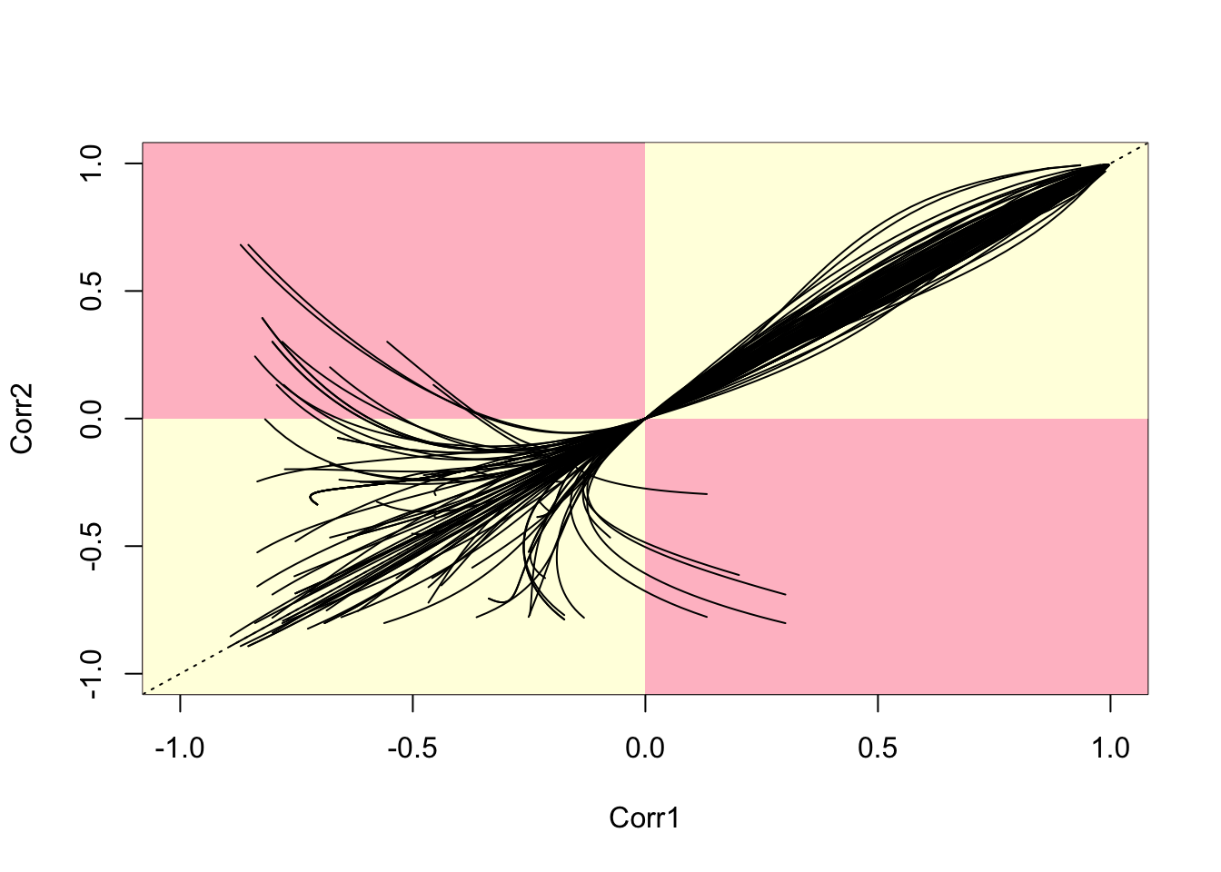
Figure 12.6: Parametric Plots of 100 Sampled Correlations
This shows a pattern very similar to those seen in (???). Essentially, for negative \(\lambda\) values, some correlations become positive while others remain negative. The ordering can also change as \(\lambda\) changes, as noted earlier, so that some adjacent zones are more correlated than others for certain \(\lambda\) values, but this situation can alter. Finally, some adjacent zone pairs experience a sign change for negative values of \(\lambda\) , while others do not. The aim of this section has been in part to highlight the issues identified by Wall, but also to suggest some visual techniques in R that could be used to explore these – and identify situations in which the counter-intuitive behaviour seen here may be occurring. As a general rule, the authors have found this not to happen a great deal when working with zones based on a regular grid, but that the problems seen here occur quite often for irregular lattices. This provides empirical back-up to the more theoretical arguments of (???) for CAR models.
Answer to self-test question
The following code will apply the modified approach asked for in the question:
# Set up a set of five 'fake' smoking update rates as well as the real one
# Create new columns in penn.state.utm for randomised data
# Here the seed 4676 is used.  Use a different one to get an unknown outcome.

set.seed(4676)
penn.state.utm$smk_rand1 <- sample(penn.state.utm$smk,replace=TRUE)
penn.state.utm$smk_rand2 <- sample(penn.state.utm$smk,replace=TRUE)
penn.state.utm$smk_rand3 <- sample(penn.state.utm$smk,replace=TRUE)
penn.state.utm$smk_rand4 <- sample(penn.state.utm$smk,replace=TRUE)
penn.state.utm$smk_rand5 <- sample(penn.state.utm$smk,replace=TRUE)

# Scramble the variables used in terms of plotting order
vars <- sample(c('smk','smk_rand1','smk_rand2','smk_rand3','smk_rand4','smk_rand5'))

# Which one will be the real data?
# Don't look at this variable before you see the maps!
real.data.i <- which(vars == 'smk')

# Draw the scrambled map grid
tm_shape(penn.state.utm) +
  tm_polygons(col=vars,legend.show=FALSE, breaks=c(18,20,22,24,26,28)) +
  tm_layout(title=1:6,title.position=c("right","top"))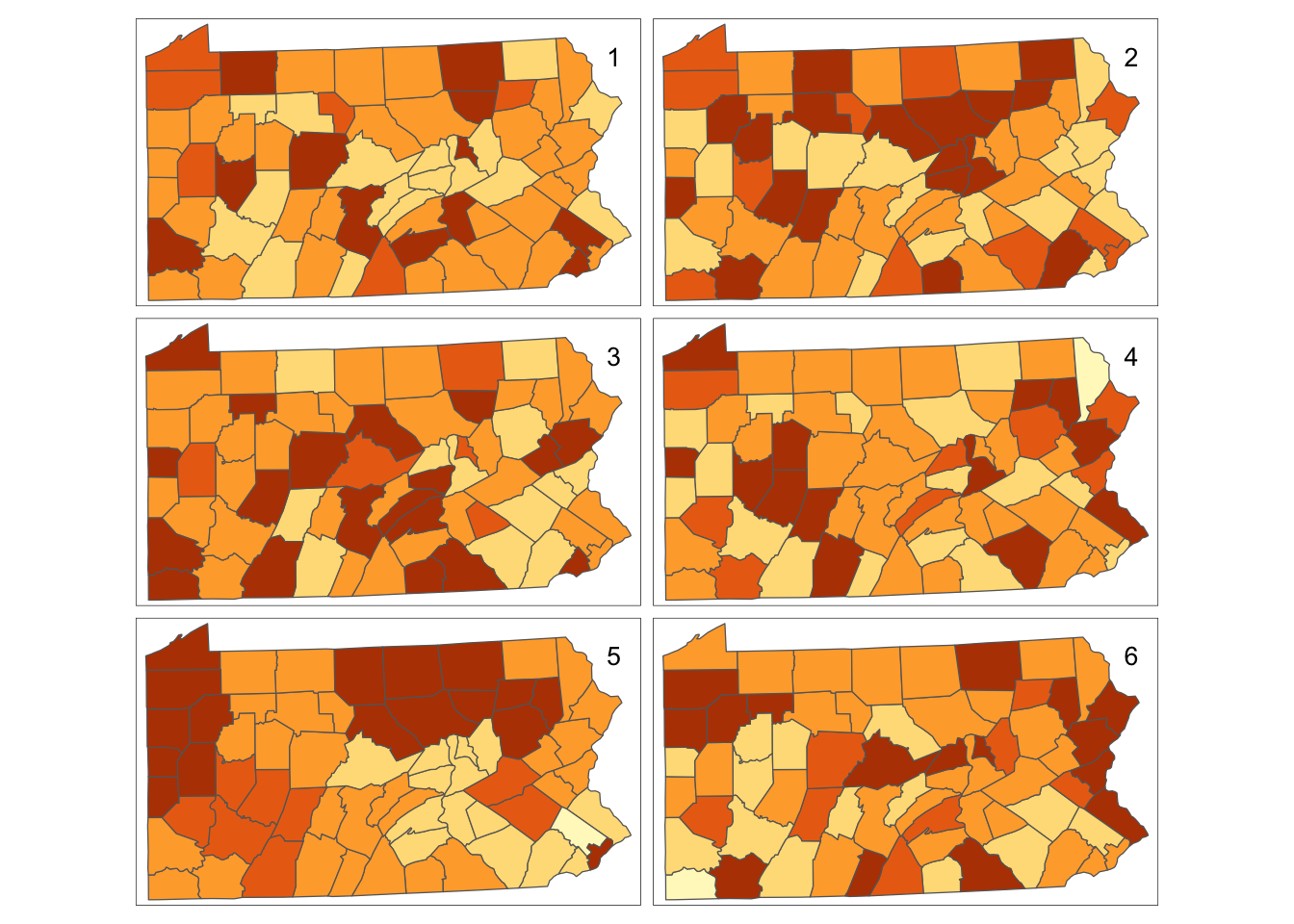
Figure 12.7: Bootstrap Randomisation of smoking uptake rates
The only difference between this and the previous code block is the inclusion of the optional parameter replace=TRUE in the sample function - which tells the function to return \(n\) random samples from the list of smoking take-up rates with replacement. Also the breaks are now explicitly specified - these would always be the same for a permutation since the default break-choosing algorithm depends on the range of the values - but for a sample with replacement these may change as the largest and smallest values in the data set may not be chosen. This is essentially the technique to simulate the drawing of random samples used by (???) to carry out the Bootstrap approach to non-parametric estimations of standard error. Thus, here it is referred to as `bootstrap randomisation’.