Chapter 3 Basics of Handling Spatial Data in R
3.1 Overview
3.1.1 Spatial Data
3.1.2 Installing and loading packages
3.2 Introduction to sp and sf: the sf revolution
3.2.1 sp data format
3.2.1.1 Spatial data in GISTools
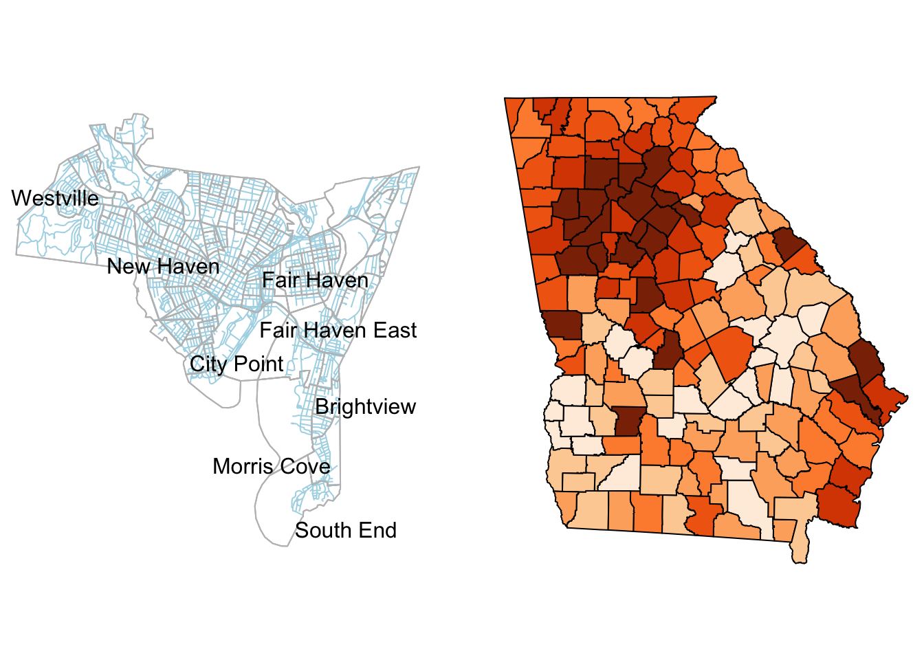
Figure 3.1: The New Haven census blocks areas with roads in blue and the counties in the state of Georgia shaded by median income
[1] "blocks" "breach" "burgres.f" "burgres.n"
[5] "famdisp" "places" "roads" "tracts" [1] "SpatialPoints"
attr(,"package")
[1] "sp"[1] "SpatialPolygonsDataFrame"
attr(,"package")
[1] "sp"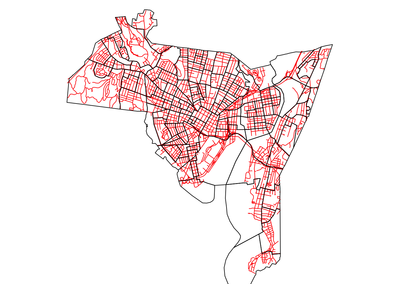
Figure 3.2: The New Haven census blocks and road data
3.2.2 sf data format
3.2.2.1 sf spatial data
# load the georgia data
data(georgia)
# conversion to sf
georgia_sf = st_as_sf(georgia)
class(georgia_sf)[1] "sf" "data.frame"# all attributes
plot(georgia_sf)
# selected attribute
plot(georgia_sf[, 6])
# selected attributes
plot(georgia_sf[,c(4,5)])## sp SpatialPolygonDataFrame object
head(data.frame(georgia))
## sf polygon object
head(data.frame(georgia_sf))[1] "SpatialPolygonsDataFrame"
attr(,"package")
[1] "sp"3.3 Reading and Writing Spatial Data
3.3.1 Reading to and writing from sp format
3.4 Mapping: an introduction to tmap
3.4.1 Introduction
3.4.2 A quick tmap
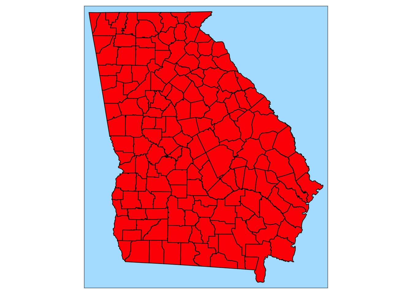
Figure 3.3: The map of Georgia generated by qtm()
qtm(georgia_sf, fill="MedInc", text="Name", text.size=0.5,
format="World_wide", style="classic",
text.root=5, fill.title="Median Income")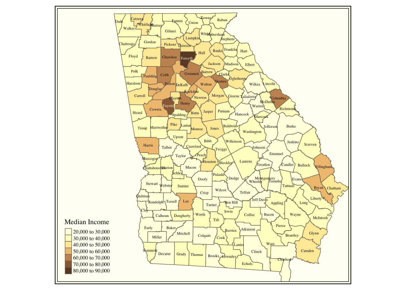
Figure 3.4: Counties in the state of Georgia shaded by median income
3.4.3 Full tmap
tm_shape(georgia_sf) +
tm_fill("tomato") +
tm_borders(lty = "dashed", col = "gold") +
tm_style("natural", bg.color = "grey90")tm_shape(georgia_sf) +
tm_fill("tomato") +
tm_borders(lty = "dashed", col = "gold") +
tm_style("natural", bg.color = "grey90") +
# now add the outline
tm_shape(g) +
tm_borders(lwd = 2)tm_shape(georgia_sf) +
tm_fill("tomato") +
tm_borders(lty = "dashed", col = "gold") +
tm_style("natural", bg.color = "grey90") +
# now add the outline
tm_shape(g) +
tm_borders(lwd = 2) +
tm_layout(title = "The State of Georgia",
title.size = 1, title.position = c(0.55, "top"))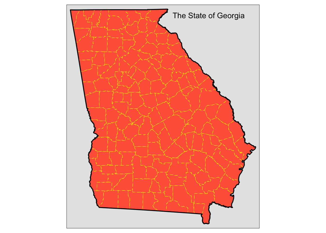
Figure 3.5: Counties in the state of Georgia
# 1st plot of georgia
t1 <- tm_shape(georgia_sf) +
tm_fill("coral") +
tm_borders() +
tm_layout(bg.color = "grey85")
# 2nd plot of georgia2
t2 <- tm_shape(georgia2) +
tm_fill("orange") +
tm_borders() +
# the asp paramter controls aspect
# this is makes the 2nd plot align
tm_layout(asp = 0.86,bg.color = "grey95")library(grid)
# open a new plot page
grid.newpage()
# set up the layout
pushViewport(viewport(layout=grid.layout(1,2)))
# plot using the print command
print(t1, vp=viewport(layout.pos.col = 1, height = 5))
print(t2, vp=viewport(layout.pos.col = 2, height = 5))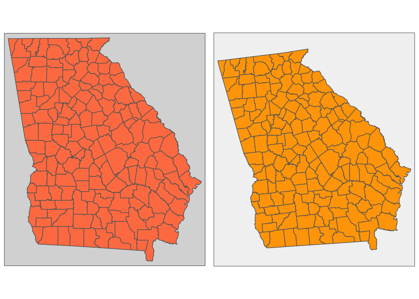
Figure 3.6: Examples of the use of tmap to generate multiple maps in the same plot window
tm_shape(georgia_sf) +
tm_fill("white") +
tm_borders() +
tm_text("Name", size = 0.3) +
tm_layout(frame = FALSE)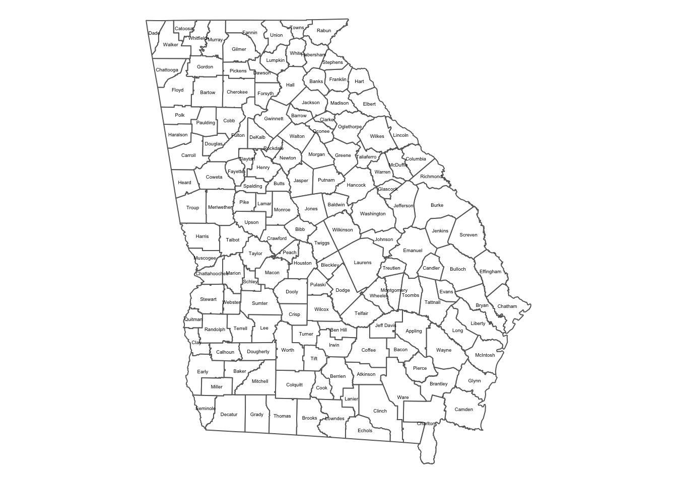
Figure 3.7: Adding text to map objects with tmap
# the county indices below were extracted from the data.frame
index <- c(81, 82, 83, 150, 62, 53, 21, 16, 124, 121, 17)
georgia_sf.sub <- georgia_sf[index,]tm_shape(georgia_sf.sub) +
tm_fill("gold1") +
tm_borders("grey") +
tm_text("Name", size = 1) +
# add the outline
tm_shape(g) +
tm_borders(lwd = 2) +
# specify some layout parameters
tm_layout(frame = FALSE, title = "A subset of Georgia",
title.size = 1.5, title.position = c(0., "bottom"))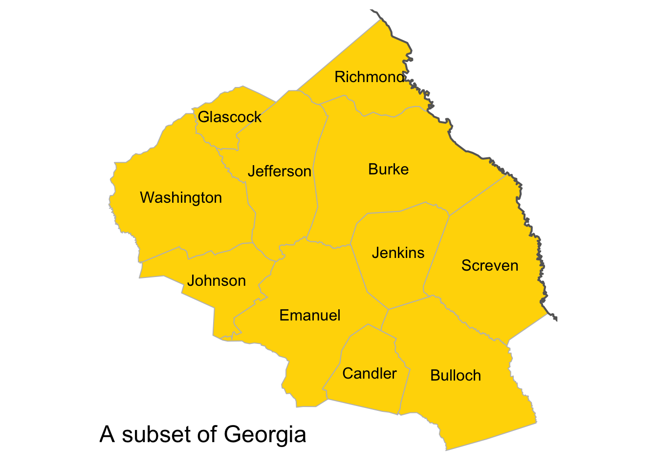
Figure 3.8: A subset of the counties in the state of Georgia
# the 1st layer
tm_shape(georgia_sf) +
tm_fill("white") +
tm_borders("grey", lwd = 0.5) +
# the 2nd layer
tm_shape(g) +
tm_borders(lwd = 2) +
# the 3rd layer
tm_shape(georgia_sf.sub) +
tm_fill("lightblue") +
tm_borders() +
# specify some layout parameters
tm_layout(frame = T, title = "Georgia with a subset of counties",
title.size = 1, title.position = c(0.02, "bottom"))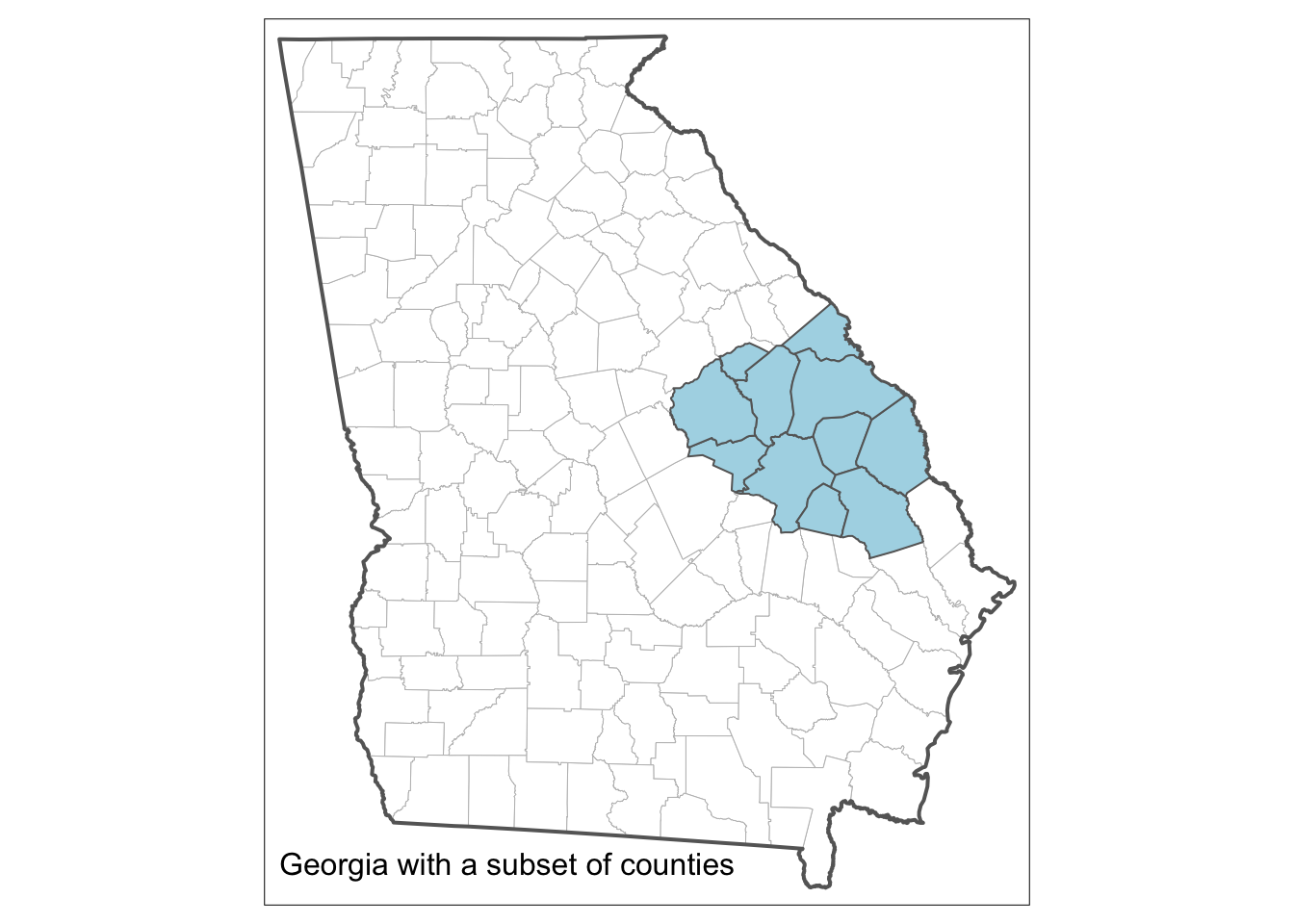
Figure 3.9: The result of the code for plotting a spatial object and a spatial subset
3.4.4 Adding context
library(OpenStreetMap)
# define upper left, lower right corners
georgia.sub <- georgia[index,]
ul <- as.vector(cbind(bbox(georgia.sub)[2,2],
bbox(georgia.sub)[1,1]))
lr <- as.vector(cbind(bbox(georgia.sub)[2,1],
bbox(georgia.sub)[1,2]))
# download the map tile
MyMap <- openmap(ul,lr)
# now plot the layer and the backdrop
par(mar = c(0,0,0,0))
plot(MyMap, removeMargin=FALSE)
plot(spTransform(georgia.sub, osm()), add = TRUE, lwd = 2)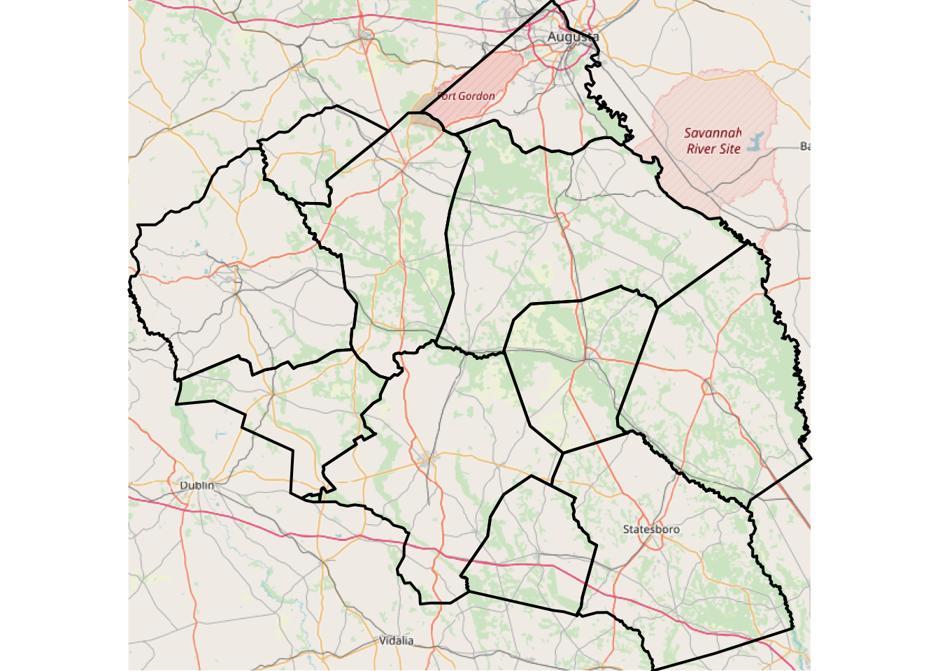
Figure 3.10: A subset of Georgia with an OpenStreetMap backdrop
# load the package
library(RgoogleMaps)
# convert the subset
shp <- SpatialPolygons2PolySet(georgia.sub)
# determine the extent of the subset
bb <- qbbox(lat = shp[,"Y"], lon = shp[,"X"])
# download map data and store it
MyMap <- GetMap.bbox(bb$lonR, bb$latR, destfile = "DC.jpg")
# now plot the layer and the backdrop
par(mar = c(0,0,0,0))
PlotPolysOnStaticMap(MyMap, shp, lwd=2,
col = rgb(0.25,0.25,0.25,0.025), add = F)tmap mode set to interactive viewing3.4.5 Saving your map
# load package and data
library(GISTools)
data(newhaven)
proj4string(roads) <- proj4string(blocks)
# plot spatial data
tm_shape(blocks) +
tm_borders() +
tm_shape(roads) +
tm_lines(col = "red") +
# embellish the map
tm_scale_bar(width = 0.22) +
tm_compass(position = c(0.8, 0.07)) +
tm_layout(frame = F, title = "New Haven, CT",
title.size = 1.5,
title.position = c(0.55, "top"),
legend.outside = T) pts_sf <- st_centroid(georgia_sf)
setwd('~/Desktop/')
# open the file
png(filename = "Figure1.png", w = 5, h = 7, units = "in", res = 150)
# make the map
tm_shape(georgia_sf) +
tm_fill("olivedrab4") +
tm_borders("grey", lwd = 1) +
# the points layer
tm_shape(pts_sf) +
tm_bubbles("PctBlack", title.size = "% Black", col = "gold")+
tm_format_NLD()
# close the png file
dev.off()3.5 Mapping spatial data attributes
3.5.1 Introduction
3.5.2 Attributes and data frames
# clear workspace
rm(list = ls())
# load & list the data
data(newhaven)
ls()
# convert to sf
blocks_sf <- st_as_sf(blocks)
breach_sf <- st_as_sf(breach)
tracts_sf <- st_as_sf(tracts)
# have a look at the attributes and object class
summary(blocks_sf)
class(blocks_sf)
summary(breach_sf)
class(breach_sf)
summary(tracts_sf)
class(tracts_sf)3.5.3 Mapping polygons and attributes
tm_shape(blocks_sf) +
  tm_polygons("P_OWNEROCC", title = "Owner Occ") +
  tm_layout(legend.title.size = 1,
          legend.text.size = 1,
legend.position = c(0.1, 0.1))[1] "#EFF3FF" "#BDD7E7" "#6BAED6" "#3182BD" "#08519C"tm_shape(blocks_sf) +
tm_polygons("P_OWNEROCC", title = "Owner Occ", palette = "Reds") +
tm_layout(legend.title.size = 1)tm_shape(blocks_sf) +
tm_fill("P_OWNEROCC", title = "Owner Occ", palette = "Blues") +
tm_layout(legend.title.size = 1)# with equal intervals: the tmap default
p1 <- tm_shape(blocks_sf) +
tm_polygons("P_OWNEROCC", title = "Owner Occ", palette = "Blues") +
tm_layout(legend.title.size = 0.7)
# with style = kmeans
p2 <- tm_shape(blocks_sf) +
tm_polygons("P_OWNEROCC", title = "Owner Occ", palette = "Oranges",
style = "kmeans") +
tm_layout(legend.title.size = 0.7)
# with quantiles
p3 <- tm_shape(blocks_sf) +
tm_polygons("P_OWNEROCC", title = "Owner Occ", palette = "Greens",
breaks = c(0, round(quantileCuts(blocks$P_OWNEROCC, 6), 1))) +
tm_layout(legend.title.size = 0.7)
# Multiple plots using the grid package
library(grid)
grid.newpage()
# set up the layout
pushViewport(viewport(layout=grid.layout(1,3)))
# plot using the print command
print(p1, vp=viewport(layout.pos.col = 1, height = 5))
print(p2, vp=viewport(layout.pos.col = 2, height = 5))
print(p3, vp=viewport(layout.pos.col = 3, height = 5))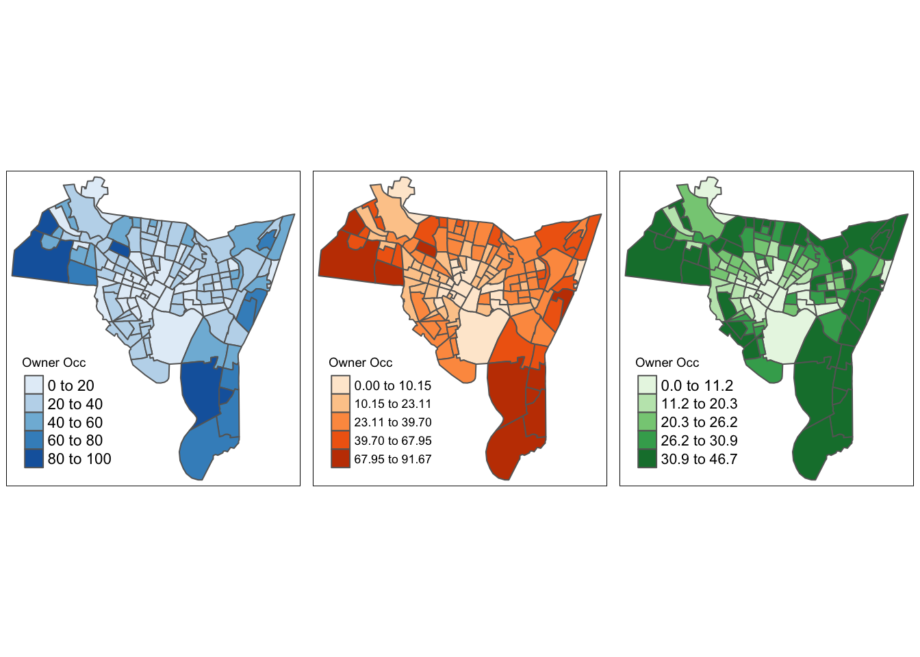
Figure 3.11: Different chroropleth maps of owner occupied properties in New Haven using different shades and class intervals.
tm_shape(blocks_sf) +
  tm_polygons("P_OWNEROCC", title = "Owner Occ", palette = "-GnBu",
      breaks = c(0, round(quantileCuts(blocks$P_OWNEROCC, 6), 1)),
      legend.hist = T) +
  tm_scale_bar(width = 0.22) +
  tm_compass(position = c(0.8, 0.07)) +
  tm_layout(frame = F, title = "New Haven",
      title.size = 2, title.position = c(0.55, "top"),
      legend.hist.size = 0.5)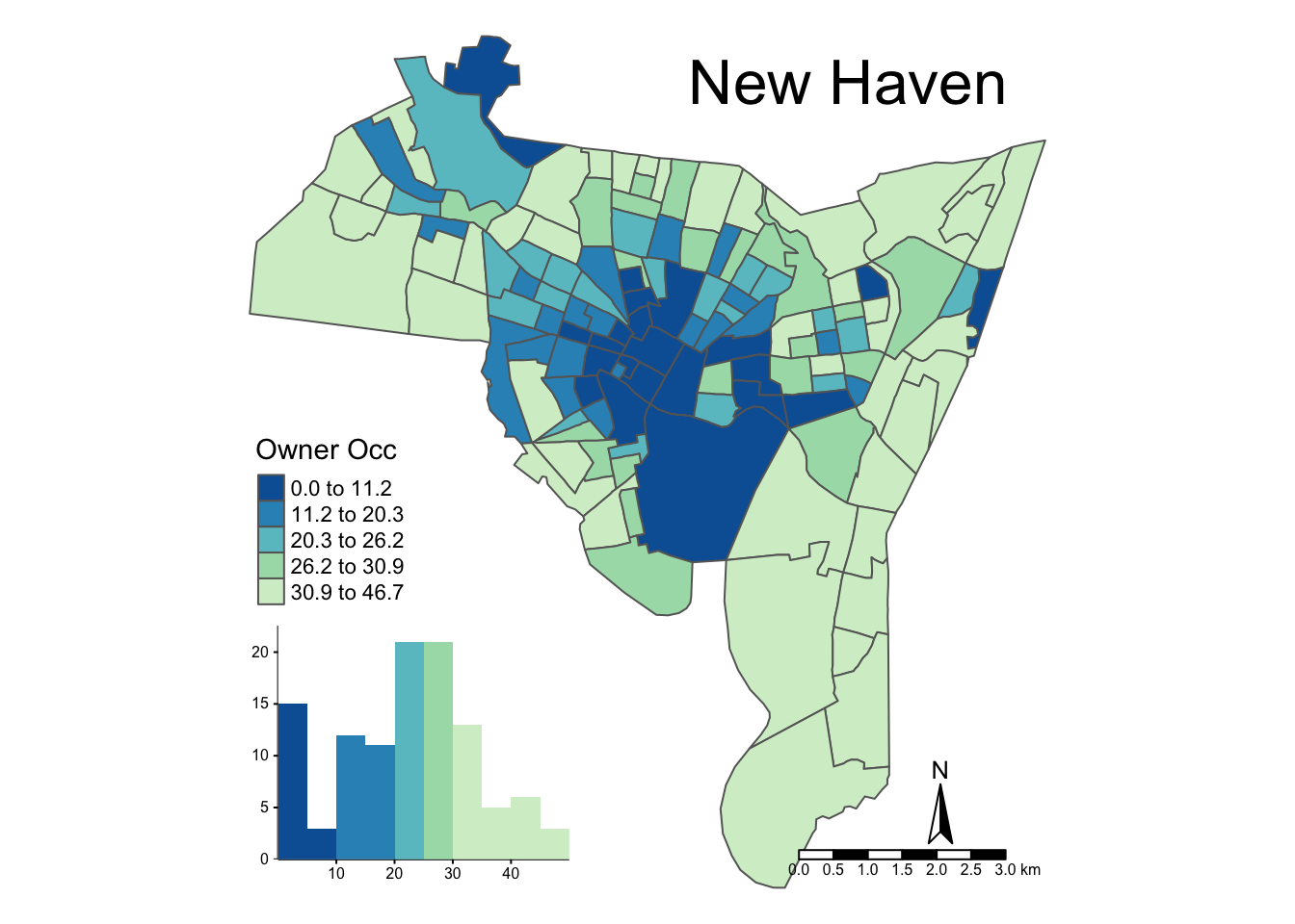
Figure 3.12: An illustration of the various options for mapping with tmap.
# add a projection to tracts data and convert tracts data to sf
proj4string(tracts) <- proj4string(blocks)
tracts_sf <- st_as_sf(tracts)
tracts_sf <- st_transform(tracts_sf, "+proj=longlat +ellps=WGS84")
# plot
tm_shape(blocks_sf) +
    tm_fill(col="POP1990", convert2density=TRUE,
        style="kmeans", title=expression("Population (per " * km^2 * ")"),
        legend.hist=F, id="name") +
    tm_borders("grey25", alpha=.5) +
  # add tracts context
    tm_shape(tracts_sf) +
      tm_borders("grey40", lwd=2) +
    tm_format_NLD(bg.color="white", frame = FALSE,
    legend.hist.bg.color="grey90")
# add an area in km^2 to blocks
blocks_sf$area = st_area(blocks_sf) / (1000*1000)
# calculate population density manually
summary(blocks_sf$POP1990/blocks_sf$area)tm_shape(blocks_sf) +
tm_fill(c("P_RENTROCC", "P_BLACK")) +
tm_borders() +
tm_layout(legend.format = list(digits = 0),
legend.position = c("left", "bottom"),
legend.text.size = 0.5,
legend.title.size = 0.8)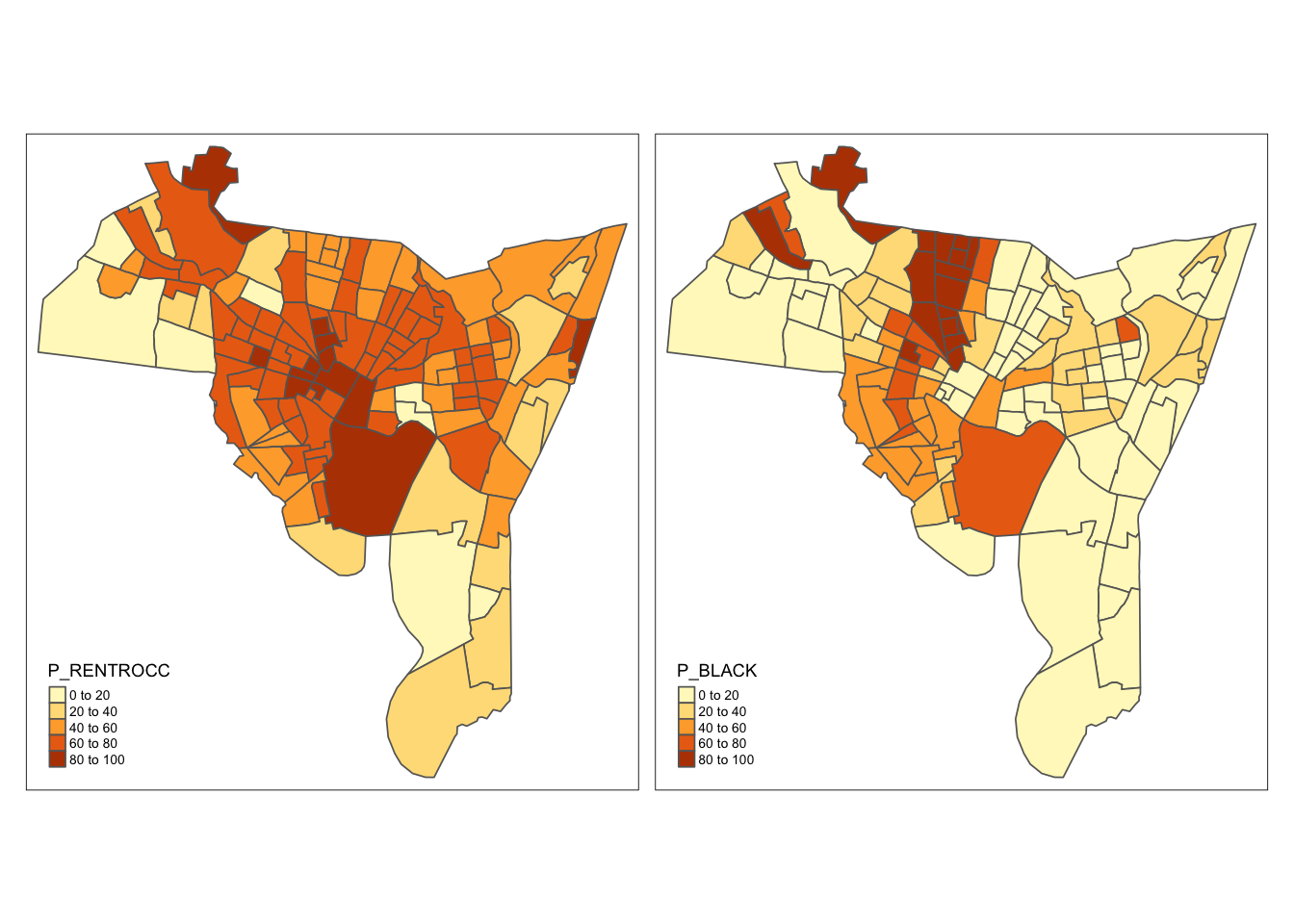
3.5.4 Mapping points and attributes
tm_shape(blocks_sf) +
  tm_polygons("white") +
  tm_shape(breach_sf) +
tm_dots(size = 0.5, shape = 19, col = "red", alpha = 1)# define the coordinates
coords.tmp <- cbind(quakes$long, quakes$lat)
# create the SpatialPointsDataFrame
quakes.sp <- SpatialPointsDataFrame(coords.tmp,
data = data.frame(quakes),
proj4string = CRS("+proj=longlat "))
# convert to sf
quakes_sf <- st_as_sf(quakes.sp)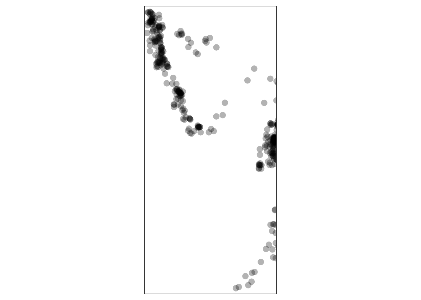
Figure 3.13: A plot of the Fiji earthquake data.
library(grid)
# by size
p1 <- tm_shape(quakes_sf) +
  tm_bubbles("depth", scale = 1, shape = 19, alpha = 0.3,
      title.size="Quake Depths")
# by colour
p2 <- tm_shape(quakes_sf) +
  tm_dots("depth", shape = 19, alpha = 0.5, size = 0.6,
          palette = "PuBuGn",
      title="Quake Depths")
# Multiple plots using the grid package
grid.newpage()
# set up the layout
pushViewport(viewport(layout=grid.layout(1,2)))
# plot using he print command
print(p1, vp=viewport(layout.pos.col = 1, height = 5))
Legend labels were too wide. Therefore, legend.text.size has been set to 0.5. Increase legend.width (argument of tm_layout) to make the legend wider and therefore the labels larger.The legend is too narrow to place all symbol sizes.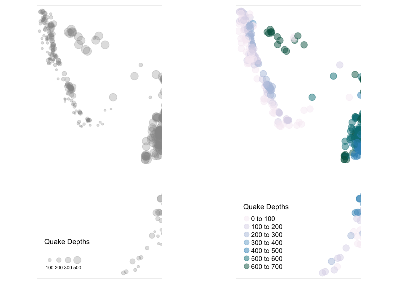
Figure 3.14: Plotting points with plot size (left) and plot colour (right) related to the atrribute value.
# create the index
index <- quakes_sf$mag > 5.5
summary(index)
# select the subset assign to tmp
tmp <- quakes_sf[index,]
# plot the subset
tm_shape(tmp) +
  tm_dots(col = brewer.pal(5, "Reds")[4], shape = 19,
          alpha = 0.5, size = 1) +
  tm_layout(title="Quakes > 5.5",
title.position = c("centre", "top"))library(RgoogleMaps)
# define Lat and Lon
Lat <- as.vector(quakes$lat)
Long <- as.vector(quakes$long)
# get the map tiles
# you will need to be online
MyMap <- MapBackground(lat=Lat, lon=Long)
# define a size vector
tmp <- 1+(quakes$mag - min(quakes$mag))/max(quakes$mag)
PlotOnStaticMap(MyMap,Lat,Long,cex=tmp,pch=1,col='#FB6A4A30')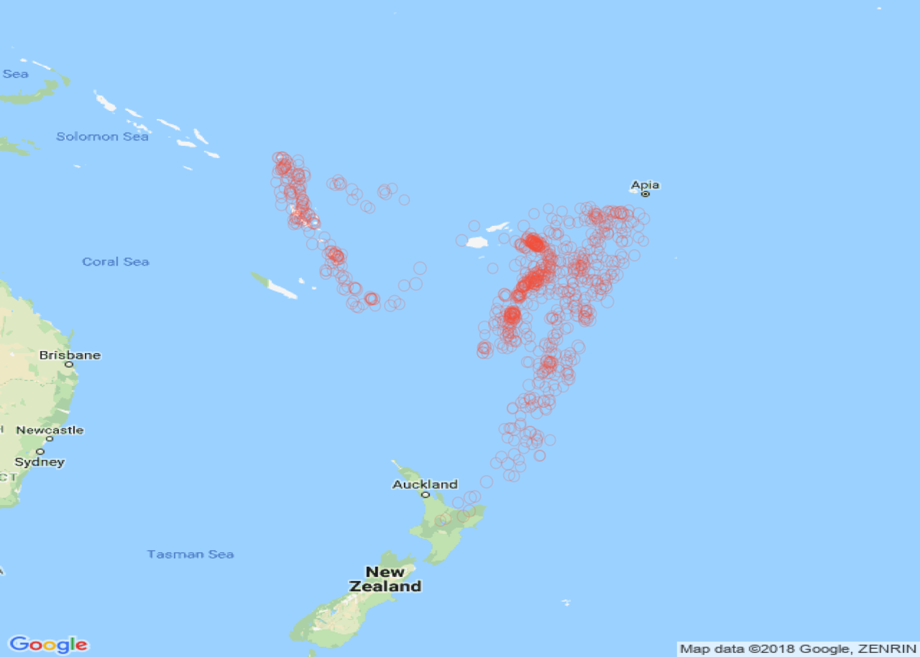
Figure 3.15: Plotting points with a Google map context
MyMap <- MapBackground(lat=Lat, lon=Long, zoom = 10,
    maptype = "satellite")
PlotOnStaticMap(MyMap,Lat,Long,cex=tmp,pch=1,
    col='#FB6A4A50')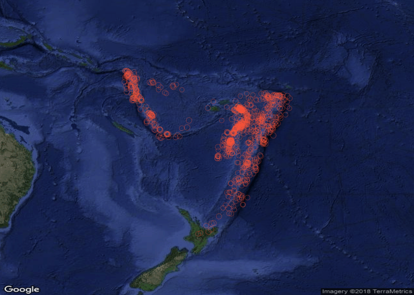
Figure 3.16: Plotting points with Google satellite image context
3.5.5 Mapping lines and attributes
data(newhaven)
proj4string(roads) <- proj4string(blocks)
# 1. create a clip area
xmin <- bbox(roads)[1,1]
ymin <- bbox(roads)[2,1]
xmax <- xmin + diff(bbox(roads)[1,]) / 2
ymax <- ymin + diff(bbox(roads)[2,]) / 2
xx = as.vector(c(xmin, xmin, xmax, xmax, xmin))
yy = as.vector(c(ymin, ymax, ymax, ymin, ymin))
# 2. create a spatial polygon from this
crds <- cbind(xx,yy)
Pl <- Polygon(crds)
ID <- "clip"
Pls <- Polygons(list(Pl), ID=ID)
SPls <- SpatialPolygons(list(Pls))
df <- data.frame(value=1, row.names=ID)
clip.bb <- SpatialPolygonsDataFrame(SPls, df)
proj4string(clip.bb) <- proj4string(blocks)
# 3. convert to sf
# convert the data to sf
clip_sf <- st_as_sf(clip.bb)
roads_sf <- st_as_sf(roads)
# 4. clip out the roads and the data frame
roads_tmp <- st_intersection(st_cast(clip_sf), roads_sf)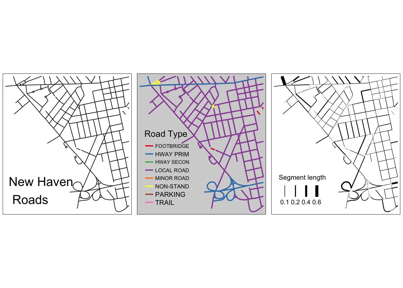
Figure 3.17: A subset of the New Haven roads data, plotted in different ways: simple, shaded using an attribute, line width based on an attribute
3.5.6 Mapping raster attributes
# you may have to install the raster package
# install.packages("raster", dep = T)
library(raster)
library(sp)
data(meuse.grid)
class(meuse.grid)
summary(meuse.grid)
plot(meuse.grid$x, meuse.grid$y, asp = 1)meuse.sp = SpatialPixelsDataFrame(points =
meuse.grid[c("x", "y")], data = meuse.grid,
proj4string = CRS("+init=epsg:28992"))
meuse.r <- as(meuse.sp, "RasterStack")plot(meuse.r)
plot(meuse.sp[,5])
spplot(meuse.sp[, 3:4])
image(meuse.sp[, "dist"], col = rainbow(7))
spplot(meuse.sp, c("part.a", "part.b", "soil", "ffreq"),
col.regions=topo.colors(20))# set the tmap mode to plot
tmap_mode('plot')
# map dist and ffreq attributes
tm_shape(meuse.r) +
tm_raster(col = c("dist", "ffreq"), title = c("Distance", "Flood Freq"),
palette = "Reds", style = c("kmeans", "cat"))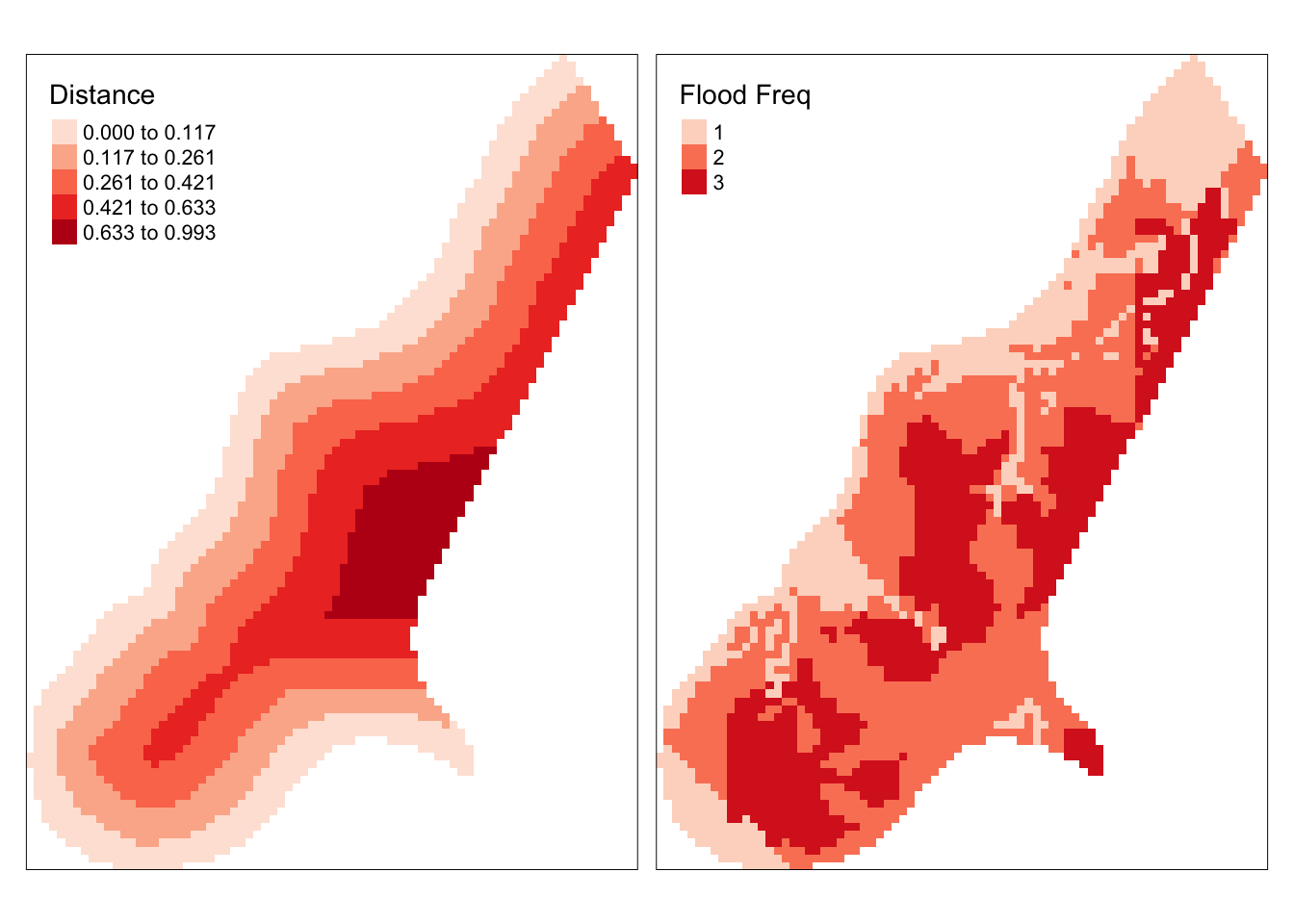
Figure 3.18: Maps of the Meuse raster data.
# set the tmap mode to view
tmap_mode('view')
# map the dist attribute
tm_shape(meuse.r) +
  tm_raster(col = "dist", title = "Distance", style = "kmeans") +
  tm_layout(legend.format = list(digits = 1))
You could also experiment with some of the refinements as with tm_polygons examples above. For example:
3.6 Simple descriptive statistical analyses
3.6.1 Histograms and Boxplots
# the tidyverse package loads the ggplot2 package
library(tidyverse)
# standard approach with hist
hist(blocks$P_VACANT, breaks = 40, col = "cyan",
   border = "salmon",
   main = "The distribution of vacant property percentages",
   xlab = "percentage vacant", xlim = c(0,40))
# ggplot approach
ggplot(blocks@data, aes(P_VACANT)) +
  geom_histogram(col = "salmon", fill = "cyan", bins = 40) +
  xlab("percentage vacant") +
labs(title = "The distribution of vacant property percentages")library(reshape2)
# a logical test
index <- blocks$P_VACANT > 10
# assigned to 2 high, 1 low
blocks$vac <- index + 1
blocks$vac <- factor(blocks$vac, labels = c("Low", "High"))library(ggplot2)
ggplot(melt(blocks@data[, c("P_OWNEROCC", "P_WHITE", "P_BLACK", "vac")]),
aes(variable, value)) +
geom_boxplot() +
facet_wrap(~vac)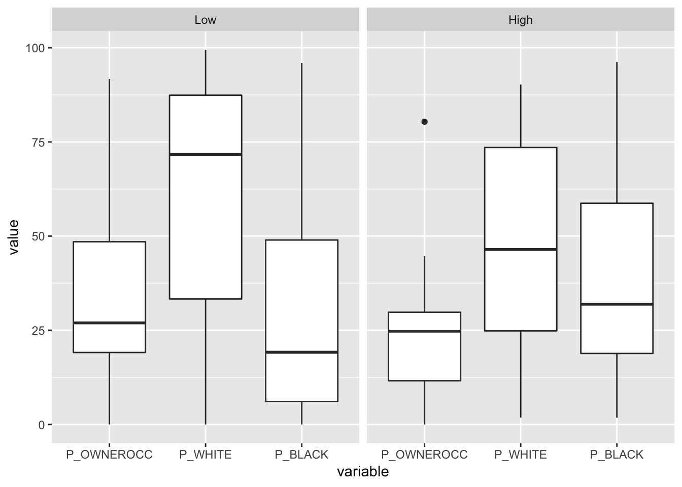
Figure 3.19: Box and Whisker examples
3.6.2 Scatterplots and Regressions
# assign some variables
p.vac <- blocks$P_VACANT/100
p.w <- blocks$P_WHITE/100
p.b <- blocks$P_BLACK/100
# bind these together
df <- data.frame(p.vac, p.w, p.b)
# fit regressions
mod.1 <- lm(p.vac ~ p.w, data = df)
mod.2 <- lm(p.vac ~ p.b, data = df)
Call:
lm(formula = p.vac ~ p.w, data = df)

Residuals:
     Min       1Q   Median       3Q      Max
-0.11747 -0.03729 -0.01199  0.01714  0.28271

Coefficients:
            Estimate Std. Error t value Pr(>|t|)
(Intercept)  0.11747    0.01092  10.755   <2e-16 ***
p.w         -0.03548    0.01723  -2.059   0.0415 *
---
Signif. codes:
0 '***' 0.001 '**' 0.01 '*' 0.05 '.' 0.1 ' ' 1

Residual standard error: 0.06195 on 127 degrees of freedom
Multiple R-squared:  0.03231,   Adjusted R-squared:  0.02469
F-statistic: 4.24 on 1 and 127 DF, p-value: 0.04152p1 <- ggplot(df,aes(p.vac, p.w))+
#stat_summary(fun.data=mean_cl_normal) +
geom_smooth(method='lm') +
geom_point() +
xlab("Proportion of Vacant Properties") +
ylab("Proporion White") +
labs(title = "Regression of Vacant Properties aginst Proportion White")
p2 <- ggplot(df,aes(p.vac, p.b))+
#stat_summary(fun.data=mean_cl_normal) +
geom_smooth(method='lm') +
geom_point() +
xlab("Proportion of Vacant Properties") +
ylab("Proporion Black") +
labs(title = "Regression of Vacant Properties aginst Proportion Black")
grid.newpage()
# set up the layout
pushViewport(viewport(layout=grid.layout(2,1)))
# plot using he print command
print(p1, vp=viewport(layout.pos.row = 1, height = 5))
print(p2, vp=viewport(layout.pos.row = 2, height = 5))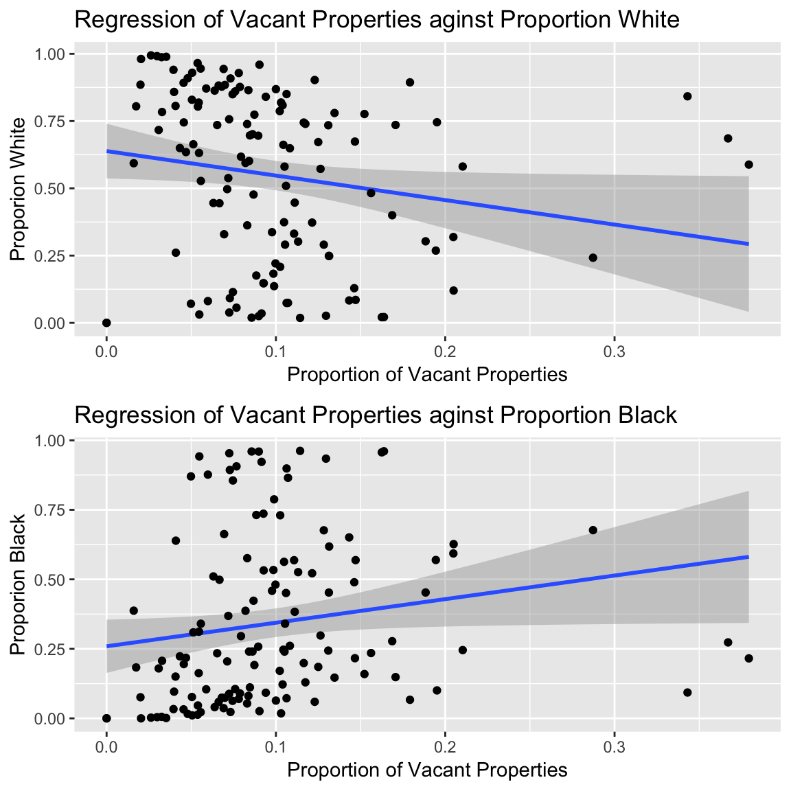
Figure 3.20: Plotting regression coefficient slopes
3.6.3 Mosaic Plots
# create the dataset
pops <- data.frame(blocks[,14:18]) * data.frame(blocks)[,11]
pops <- as.matrix(pops/100)
colnames(pops) <- c("White", "Black", "Ameri", "Asian", "Other")
# a true / false for vacant properties
vac.10 <- (blocks$P_VACANT > 10)
# create a cross tabulation
mat.tab <- xtabs(pops ~vac.10)
# melt the data
df <- melt(mat.tab)
# load the packages
library(ggmosaic)
# call ggplot and stat_mosaic
ggplot(data = df) +
stat_mosaic(aes(weight = value, x = product(Var2),
fill=factor(vac.10)), na.rm=TRUE) +
theme(axis.text.x=element_text(angle=-90, hjust= .1)) +
labs(y='Proportion of Vacant Properties', x = 'Ethnic group',
title="Mosaic Plot of Vacant Properties with ethnicty") +
guides(fill=guide_legend(title = "> 10 percent", reverse = TRUE))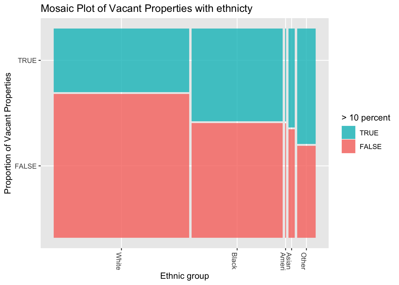
Figure 3.21: An example of a ggmosaic mosaic plot
# standard mosiac plot
ttext = sprintf("Mosaic Plot of Vacant Properties
  with ethnicty")
mosaicplot(t(mat.tab),xlab='',
           ylab='Vacant Properties > 10 percent',
           main=ttext,shade=TRUE,las=3,cex=0.8)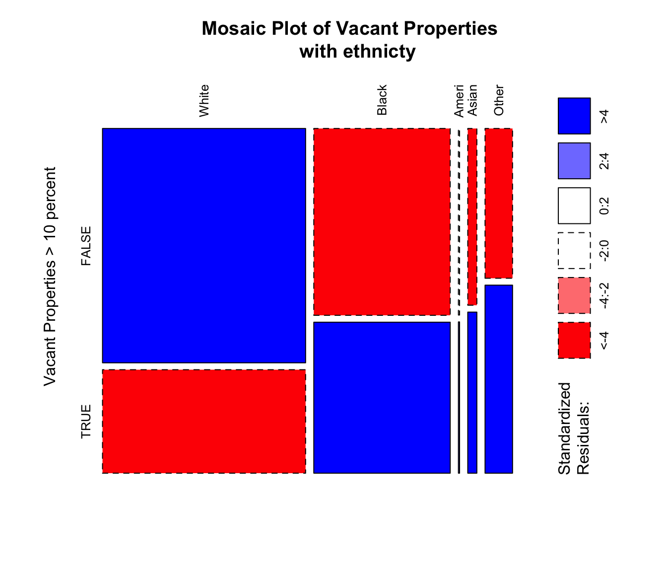
Figure 3.22: An example of a standard graphics mosaic plot with residuals
3.7 Self-Test Questions
Self-Test Question 1 - Plots and maps: working with map data
# Hints
display.brewer.all()   # to show the Brewer palettes
breaks            # to specify class breaks OR
style             # in the tm_fill / tm_polygons help
# Tools
library(ggplot2) # for the mapping tools
data(georgia)       # the Georgia data in the GISTools package
st_as_sf(georgia) # to convert the data to sf format
tm_layout         # takes many parameters eg legend.position
Self-Test Question 2 - Mis-Representation of continuous variables: using different cutters for choropleth mapping
# Hints
p1 <- tm_shape(...) # assign the plots to a variable
pushViewport                # from the grid package, used earlier...
viewport            # ...to plot multiple tmaps
?quantileCuts       # quantiles, ranges std.dev...
?rangeCuts          # ... from GISTools package
?sdCuts
breaks              # to specify breaks in tm_polygon
tmap_mode('plot')   # to specify a map view
# Tools
library(tmap)           # for the mapping tools
library(grid)           # for plotting the maps together
data(newhaven)      # to load the New Haven data
Self-Test Question 3 - Selecting data: creating variables and subsetting data using logical statements
# Hints
library(GISTools)   # for the mapping tools
data(georgia)       # use georgia2 as it has a geographic projection
help("!")       # to examine logic operators
as.numeric      # use to coerce new attributes you create to numeric format
                # eg georgia.sf$NewVariable <- as.numeric(1:159)
# Tools
st_area         # a function in the st package
Self-Test Question 4 - Rransformations data using spTransfrom and st_transform
# Using spTransform in sp
new.spatial.data <- spTransform(old.spatial.data, new.Projection)
# Using st_transform in sf
new.spatial.data.sf <- st_transform(old.spatial.data.sf, new.Projection)3.8 Answers to self-test questions
Q1. Plots and maps: working with map data.
# load the data and the packages
library(GISTools)
library(sf)
library(tmap)
data(georgia)
# set the tmap plot type
tmap_mode('plot')
# convert to sf format
georgia_sf = st_as_sf(georgia)
# create the variable
georgia_sf$MedInc = georgia_sf$MedInc / 1000
# open the tif file and give it a name
# start the tmap commands
tm_shape(georgia_sf) +
  tm_polygons("MedInc", title = "Median Income", palette = "GnBu",
    style = "equal", n = 10) +
  tm_layout(legend.title.size = 1,
    legend.format = list(digits = 0),
    legend.position = c(0.2, "top")) +
  tm_legend(legend.outside=TRUE)
# close the tiff file
dev.off()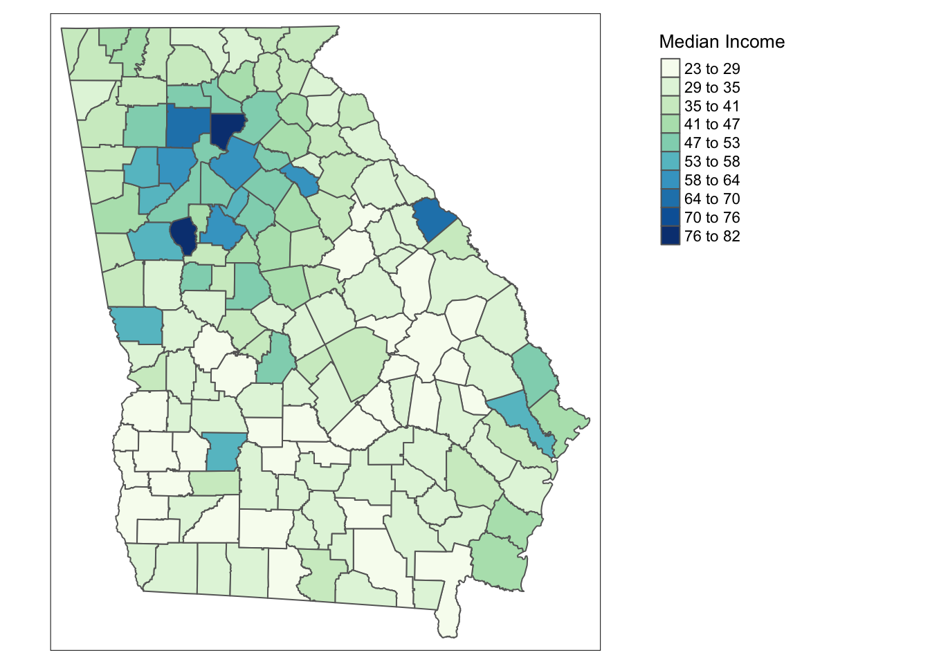
Figure 3.23: The map produced by the code for Q1
Q2. Mis-Representation of continuous variables - using different cutters for choropleth mapping.
# load packages and data
library(tmap)
library(GISTools)
library(sf)
library(grid)
data(newhaven)
# convert data to sf format
  blocks_sf = st_as_sf(blocks)
# 1. Initial Investigation
# You could start by having a look at the data
attach(data.frame(blocks_sf))
hist(HSE_UNITS, breaks = 20)
# You should notice that it has a normal distribution
# but with some large outliers
# Then examine different cut schemes
quantileCuts(HSE_UNITS, 6)
rangeCuts(HSE_UNITS, 6)
sdCuts(HSE_UNITS, 6)
# detach the data frame
detach(data.frame(blocks_sf))
# 2. Do the task
# a) mapping classes defined by quantiles
# define some breaks
br <- c(0, round(quantileCuts(blocks_sf$HSE_UNITS, 6),0))
# you could examine br
p1 <- tm_shape(blocks_sf) +
  tm_polygons("HSE_UNITS", title = "Quantiles",
      palette = "Reds",
      breaks = br)
# b) mapping classes defined by absolute ranges
# define some breaks
br <- c(0, round(rangeCuts(blocks$HSE_UNITS, 6),0))
# you could examine br
p2 <- tm_shape(blocks_sf) +
  tm_polygons("HSE_UNITS", title = "Ranges",
      palette = "Reds",
      breaks = br)
# c) mapping classes defined by standard deviations
br <- c(0, round(sdCuts(blocks$HSE_UNITS, 6),0))
# you could examine br
p3 <- tm_shape(blocks_sf) +
  tm_polygons("HSE_UNITS", title = "Std Dev",
      palette = "Reds",
      breaks = br)
# open a new plot page
grid.newpage()
# set up the layout
pushViewport(viewport(layout=grid.layout(1,3)))
# plot using he print command
print(p1, vp=viewport(layout.pos.col = 1, height = 5))
print(p2, vp=viewport(layout.pos.col = 2, height = 5))
print(p3, vp=viewport(layout.pos.col = 3, height = 5))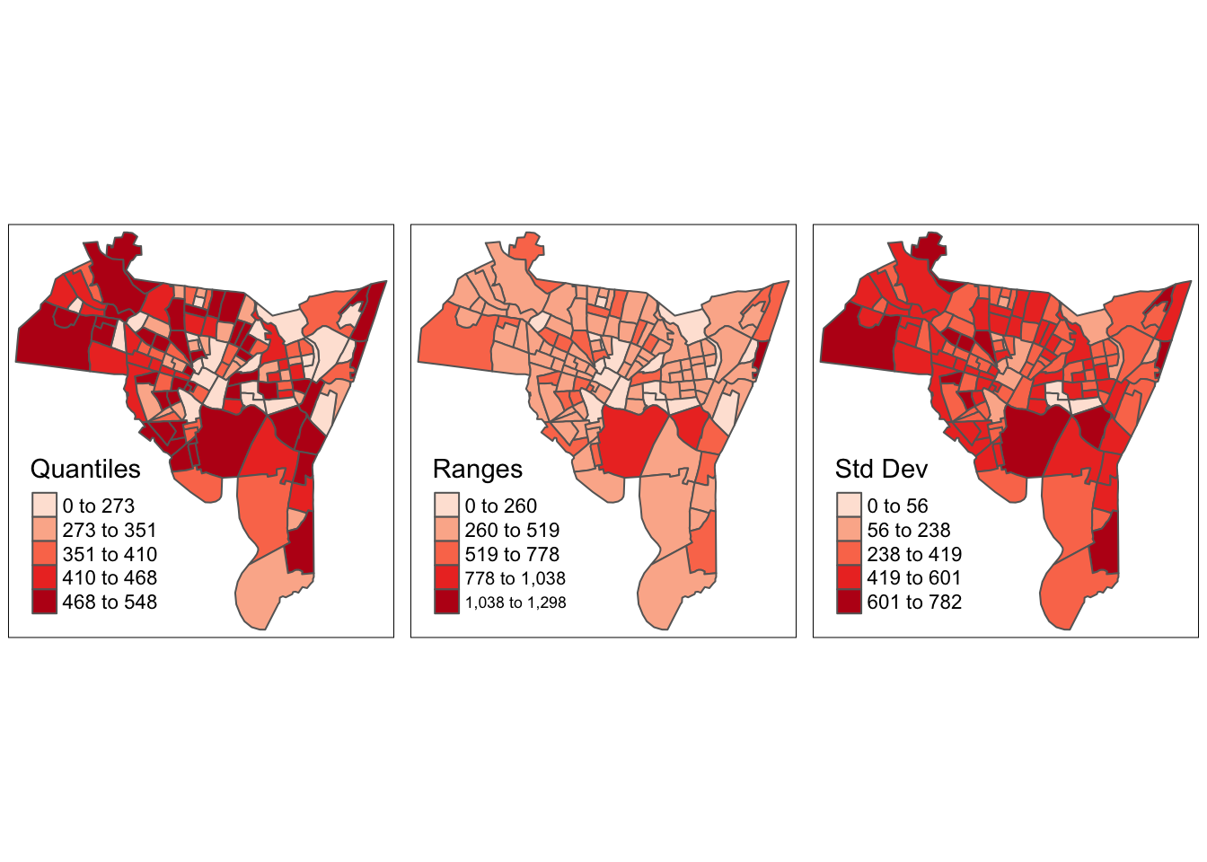
Figure 3.24: The map produced by the code for Q2
Q3 Selecting data - creating variables and subsetting data using logical statements.
library(GISTools)
library(sf)
data(georgia)
# convert data to sf format
georgia_sf = st_as_sf(georgia2)
# calculate rural population
georgia_sf$rur.pop <- as.numeric(georgia_sf$PctRural
  * georgia_sf$TotPop90 / 100)
# calculate county areas in Km^2
georgia_sf$areas <- as.numeric(st_area(georgia_sf)
  / (1000* 1000))
# calculate rural density
georgia_sf$rur.pop.den <- as.numeric(georgia_sf$rur.pop
  / georgia_sf$areas)
# select counties with density > 20
georgia_sf$rur.pop.den <- (georgia_sf$rur.pop.den > 20)
# map them
tm_shape(georgia_sf) +
  tm_polygons("rur.pop.den",
    palette = c("chartreuse4", "darkgoldenrod3"),
        title = expression("Pop >20 (per " * km^2 * ")"),
    auto.palette.mapping = F)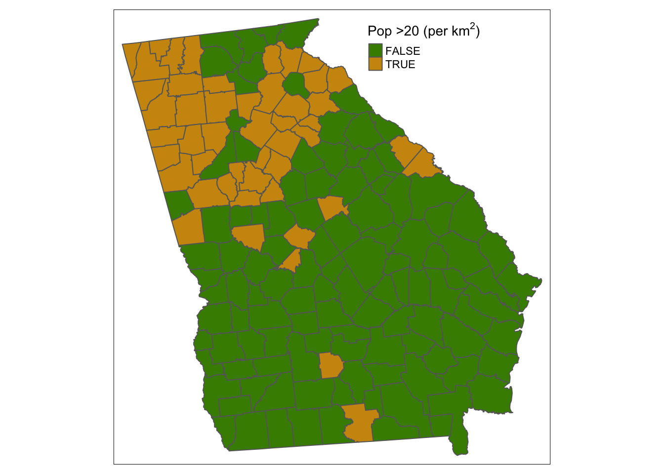
Figure 3.25: The map produced by the code for Q3
Q4 Transforming data. Your map should look something like figure or figure depending on which way you did it!
library(GISTools)  # for the mapping tools
library(sf)  # for the mapping tools
library(rgdal)    # this has the spatial reference tools
library(tmap)
library(OpenStreetMap)
data(newhaven)
# Define a new projection
newProj <- CRS("+proj=longlat +ellps=WGS84")
# Transform blocks and breach
# 1. using spTransform
breach2 <- spTransform(breach, newProj)
blocks2 <- spTransform(blocks, newProj)
# 2. using st_transform
breach_sf <- st_as_sf(breach)
blocks_sf <- st_as_sf(blocks)
breach_sf <- st_transform(breach_sf, "+proj=longlat +ellps=WGS84")
blocks_sf <- st_transform(blocks_sf, "+proj=longlat +ellps=WGS84")
# set the mode
tmap_mode('view')
# plot the blocks
tm_shape(blocks_sf) +
tm_borders() +
# and then plot the breaches
tm_shape(breach_sf) +
tm_dots(shape = 1, size = 0.1, border.col = NULL, col = "red", alpha = 0.5)ul <- as.vector(cbind(bbox(blocks2)[2,2],
bbox(blocks2)[1,1]))
lr <- as.vector(cbind(bbox(blocks2)[2,1],
bbox(blocks2)[1,2]))
# download the map tile
MyMap <- openmap(ul,lr)
# now plot the layer and the backdrop
par(mar = c(0,0,0,0))
plot(MyMap, removeMargin=FALSE)
# notice how the data need to be transformed
# to the internal osm projection
plot(spTransform(blocks2, osm()), add = TRUE, lwd = 1)
plot(spTransform(breach2, osm()), add = T, pch = 19, col = "#DE2D2650")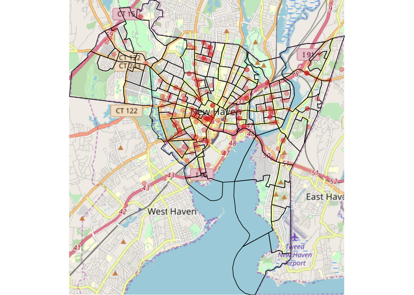
Figure 3.26: The OSM map produced by the code for Q4