Chapter 9 A VISUAL EXPLORATION OF AUTOCORRELATION
An important descriptive statistic for spatially referenced attribute data – and, in particular, measurement scale data – is spatial autocorrelation. In Figure it was seen that counties in Pennsylvania tended to have similar smoking uptake rates to their neighbours. This is a way in which spatial attribute data are sometimes different from other data, and it suggests that models used for other data are not always appropriate. In particular, many statistical tests and models are based on the assumption that each observation in a set of measurements is distributed independently of the others – so that in a set of observations \(\{z_1, \cdots, z_n\}\), each \(z_i\) is modelled as being drawn from, say, a Gaussian distribution, with probability density
\[ \phi(z_i | \mu,\sigma) = \frac{1}{\sqrt{2 \pi \sigma^2}} \exp\left[ - \frac{(z_i - \mu)^2}{2\sigma^2} \right] \]
where \(\mu\) and \(\sigma\) are respectively the population mean and standard deviation of the distribution of the data. However, the distribution itself is not a key issue here. More important is the assumption that for each \(z_i\) the distribution is independent of the other observations \(\{z_1, \cdots , z_{i-1}, z_{i+1}, \cdots , z_n \}\), so that the joint distribution is
\[ \Phi(\bm{z}) = \prod_{i=1}^n \phi(z_i|\mu,\sigma) \]
where \(\bm{z}\) denotes the vector \((z_1, \cdots , z_n)^T\). The reason why this common assumption is important here is that it is frequently untrue for spatial data. Figure suggests that it is unlikely that, say, two observations \(z_i\) and \(z_j\) are independent, if \(i\) and \(j\) index adjacent counties in Pennsylvania. It seems that a more realistic model would allow for some degree of correlation between nearby observations. Correlation of this kind is referred to as spatial autocorrelation. There are a number of ways in which spatial autocorrelation can be modelled, but in this section visual exploration will be considered.
We begin by scrutinising the claim that the image in Figure really does demonstrate correlation. This can be done via significance testing in later setions, but here some useful visual approaches will be outlined. The first of these is to compare the pattern seen in the map to a set of random patterns, where the observed smoking rates are assigned randomly to counties. Here, six maps are drawn, one based on the actual data and the rest created using random permutations. These are drawn in a 2 \(\times\) 3 rectangular grid arrangement. For the random part of this, the sample function is used. Given a single argument, which is a vector, this function returns a random permutation of that argument. Thus,
sample(penn.state.utm$smk) will permute the smoking uptakes amongst the counties. This produces five alternative allocations of rates in addition to the actual one. The sample(c('smk','smk_rand1',…'smk_rand5')) expression in the following code block scrambles the six variable names, and these in turn are given to the tm_polygons function in that scrambled order. Not only are five of the six maps are based on random permutations, but also the position in the figure of the actual data map is chosen at random. The idea of this second randomisation is that not even the coder will know which of the six maps represents the true data. If on inspection there is one clearly different pattern – and it appears obvious which of the maps this is, then there is strong visual evidence of
autocorrelation.
# Set up a set of five 'fake' smoking update rates as well as the real one
# Create new columns in penn.state.utm for randomised data
# Here the seed 4676 is used.  Use a different one to get an unknown outcome.

set.seed(4676)
penn.state.utm$smk_rand1 <- sample(penn.state.utm$smk)
penn.state.utm$smk_rand2 <- sample(penn.state.utm$smk)
penn.state.utm$smk_rand3 <- sample(penn.state.utm$smk)
penn.state.utm$smk_rand4 <- sample(penn.state.utm$smk)
penn.state.utm$smk_rand5 <- sample(penn.state.utm$smk)

# Scramble the variables used in terms of plotting order
vars <- sample(c('smk','smk_rand1','smk_rand2','smk_rand3','smk_rand4','smk_rand5'))

# Which one will be the real data?
# Don't look at this variable before you see the maps!
real.data.i <- which(vars == 'smk')

# Draw the scrambled map grid
tm_shape(penn.state.utm) + tm_polygons(col=vars,legend.show=FALSE) +
  tm_layout(title=1:6,title.position=c("right","top"))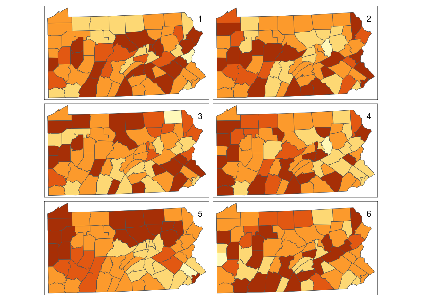
Figure 9.1: Randomisation of smoking uptake rates
Having drawn these maps (see Figure ), an informal self-test is to reveal which map is the real data:
[1] 5One point worth making is that the ‘random’ maps do show some groups of similar neighbours – commonly this is the case: the human eye tends to settle on regularities in maps, giving a tendency to identify clusters, even when the data are generated by a process without spatial clustering. This is why procedures such as the previous one are necessary, to make visual cluster identification more robust. This approach is a variant on that due to (???).
9.1 Neighbours and Lagged Mean Plots
An alternative visual approach is to compare the value in each county with the average values of its neighbours. This can be achieved via the lag.listw function in the spdep library. This library provides a number of tools for handling data with spatial referencing, particularly data that are attributes of SpatialPolygons such as the Pennsylvania data here. A lagged mean plot can be generated if we have a list of which counties each county has as neighbours. Neighbours can be defined in several ways, but a common definition is that a pair of counties (or other polygons in different examples) who share some part of their boundaries are neighbours. If this is the queen’s case definition, then even a pair of counties meeting at a single corner point are considered neighbours. The more restrictive rook’s case requires that the common boundary must be a linear feature. This is illustrated in Figure .
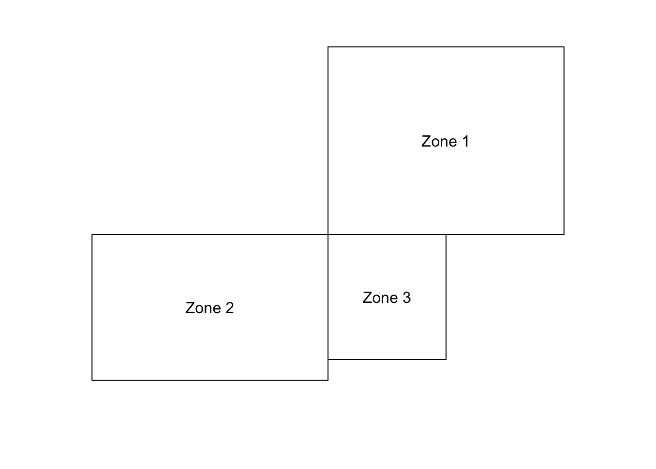
Figure 9.2: Rook’s vs Queen’s case neighbours: Zones 1 and 2 are neighbours only under Queen’s case. Zone pairs 1,3 and 2,3 are neighbours under both cases.
Neighbour lists of either case can be extracted using the poly2nb function in spdep. These are stored in an nb object – basically a list of neighbouring polygons for each polygon.
Neighbour list object:
Number of regions: 67
Number of nonzero links: 346
Percentage nonzero weights: 7.70773
Average number of links: 5.164179
As seen in the block above, printing out an nb object lists various characteristics - such as the average number of neighbours each polygon has - in this case 5.164. Note that in the default situation, Queen’s case neighbours are computed. To compute the Rook’s case, the optional argument queen=FALSE is added to poly2nb.
It is also possible to plot an nb object – this represents neighbours as a network. Firstly it is turned into a SpatiaLinesDataFrame by nb2lines – a function in spdep. The lines join the centroids of the polygons regarded as neighbours, and may be plotted as a map. The centroid locations are provided by the coordinates function. One further thing to note is that as a default, nb2lines sets the projection of the result to NA. This is overwritten using the current.projection option in set_projection - so the result is EPSG 3724 - the correct UTM projection here.
# Create a SpatialLinesDataFrame showing the Queen's case contiguities
penn.state.net <- nb2lines(penn.state.nb,coords=coordinates(penn.state.utm))
# Default projection is NA,  can change this as below
penn.state.net <- set_projection(penn.state.net,current.projection = 3724)
# Draw the projections
tm_shape(penn.state.utm) + tm_borders(col='lightgrey') +
  tm_shape(penn.state.net) + tm_lines(col='red')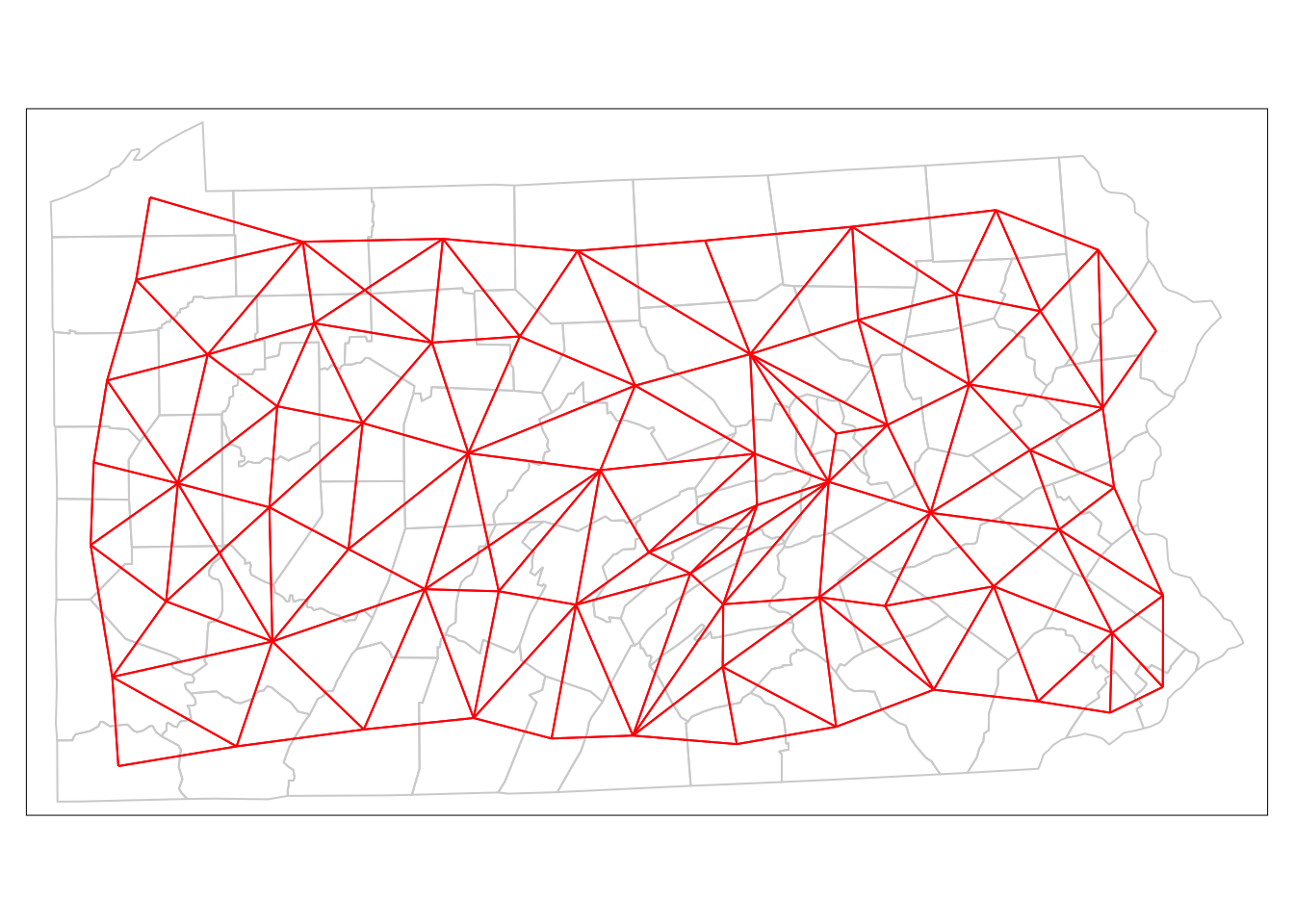
Figure 9.3: Depiction of Neighbouring Counties of Penn State as a network (Queen’s case.)
Finally, the plots are also useful to compare the rook’s case to the queen’s case neighbourhoods (see Figure 7.5):
# Calculate the Rook's case neighbours
penn.state.nb2 <- poly2nb(penn.state.utm,queen=FALSE)
# Convert this to a SpatialLinesDataFrame
penn.state.net2 <- nb2lines(penn.state.nb2,coords=coordinates(penn.state.utm))
# Update prohjection
penn.state.net2 <- set_projection(penn.state.net2,current.projection = 3724)
# Plot the counties in background,  then the two networks to compare:
tm_shape(penn.state.utm) + tm_borders(col='lightgrey') +
  tm_shape(penn.state.net) + tm_lines(col='blue',lwd = 2) +
  tm_shape(penn.state.net2) + tm_lines(col='yellow')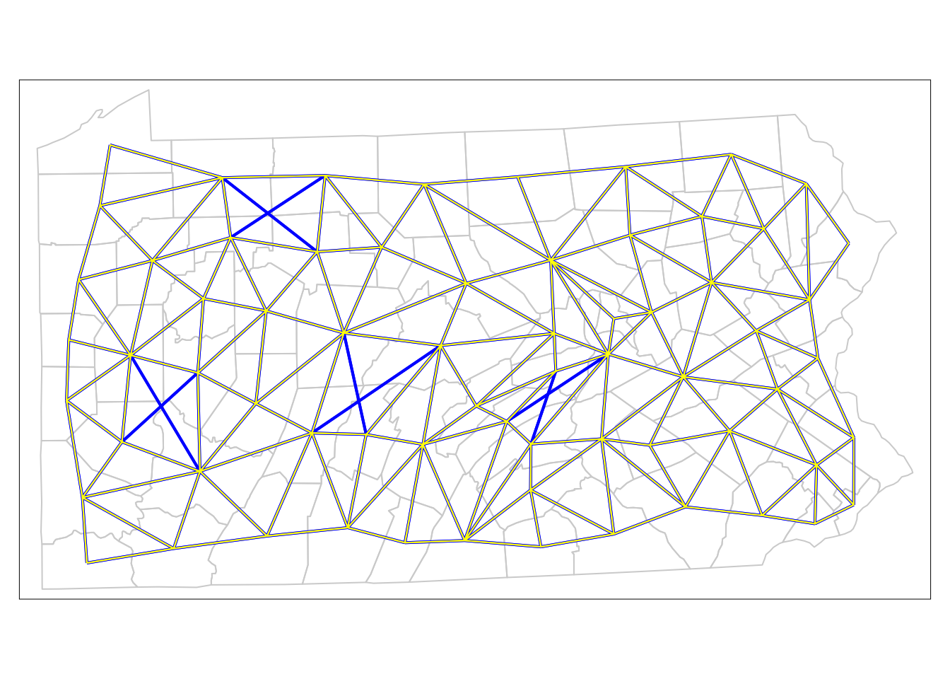
Figure 9.4: Comparison of Neighbouring Counties of Penn State (Rook’s vs. Queen’s case).
Here the queen’s case only neighbours are apparent (these are the blue links on the network) – there are eight of these. For now, we will work with rook’s case neighbours. The next stage is to consider the lagged mean plot – as discussed above, this is a plot of the value of \(z_i\) for each polygon \(i\) against the mean of the \(z\)-values for the neighbours of polygon \(i\). If \(\delta_i\) is the set of indices of the neighbours of polygon \(i\), and \(|\delta_i|\) is the number of elements in this set, then this mean (denoted as \(\tilde{z_i}\) is defined by
\[ \tilde{z_i} = \sum_{j \in \delta_i} \frac{1}{|\delta_i|} z_i \label{laggedmean} \]
Thus, the lagged mean is a weighted combination of values of the neighbours. In this case, the weights are the same within each neighbour list, but in some cases they may differ (for example, if weighting were inversely related to distance between polygon centres). In spdep another kind of object – the listw object – is used to store a list of neighbours, together with their weights. A listw object can be created from an nb object using the nb2listw function in spdep:
# Convert the neighbour list to a listw object - use Rook's case...
penn.state.lw <- nb2listw(penn.state.nb2)
penn.state.lw
Characteristics of weights list object:
Neighbour list object:
Number of regions: 67
Number of nonzero links: 330
Percentage nonzero weights: 7.351303
Average number of links: 4.925373
Weights style: W
Weights constants summary:
n nn S0 S1 S2
W 67 4489 67 28.73789 274.6157As a default, this function creates weights as given in equation () – this is the Weights style: W in the printout above. Other possible approaches to weights are possible – use ?nb2listw if you wish to investigate this further. Having obtained a listw object, the function lag.listw computes a spatially lagged mean (i.e. a vector of \(z_i\) values) – here, these are calculated, and then mapped (see Figure ):
penn.state.utm$smk.lagged.means <- lag.listw(penn.state.lw,penn.state.utm$smk)
tm_shape(penn.state.utm) + tm_polygons(col='smk.lagged.means',title='% of Popn.')  +
tm_layout(legend.bg.color = "white") 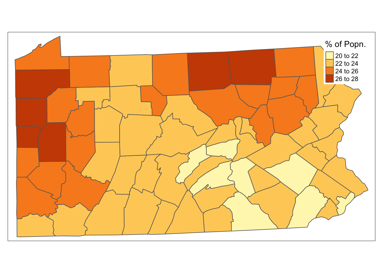
Figure 9.5: Lagged means of smoking uptake rates
Finally, a lagged mean plot is produced – as described this is a scatter plot of \(z_i\) against \(\tilde{z_}\) . Here the line \(x = y\) is added to the plot as a point of reference. The idea is that when nearby polygons tend to have similar \(z_i\) values, there should be a linear trend in the plots. However, if each \(z_i\) is independent, then \(\tilde{z_i}\) will be uncorrelated to \(z_i\) and the plots will show no pattern. Below, code is given to produce the plot shown in Figure :
with(data.frame(penn.state.utm), {
  plot(smk,smk.lagged.means,asp=1,xlim=range(smk),ylim=range(smk))
  abline(a=0,b=1)
  abline(v=mean(smk),lty=2)
  abline(h=mean(smk.lagged.means),lty=2)
})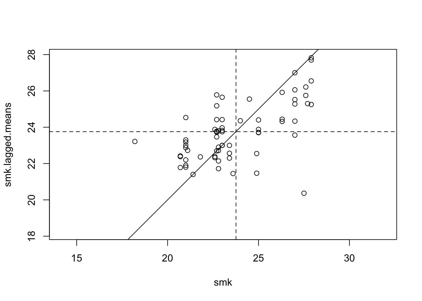
Figure 9.6: Lagged Mean plot for smoking uptake
The abline(a=0,b=1) command adds the line \(x = y\) to the plot. The two following abline commands add dotted horizontal and vertical lines through the mean values of the variables. The fact that more points lie in the bottom left and upper right quadrants created by the two lines suggests that there is some degree of positive association between \(z_i\) and \(\tilde{z_i}\) – this means generally that when \(z_i\) is above average, so is \(\tilde{z_i}\) , and when one is below average, so is the other.
Note that this procedure is also termed a Moran plot or Moran scatterplot – see Anselin (???) and (???) . In fact there is a function that combines the above steps, and adds some functionality, called moran.plot. However, working through the steps is helpful in demonstrating the ways in which spdep handles neighbour-based data. Below, the moran.plot approach is demonstrated. The output may be seen in Figure .
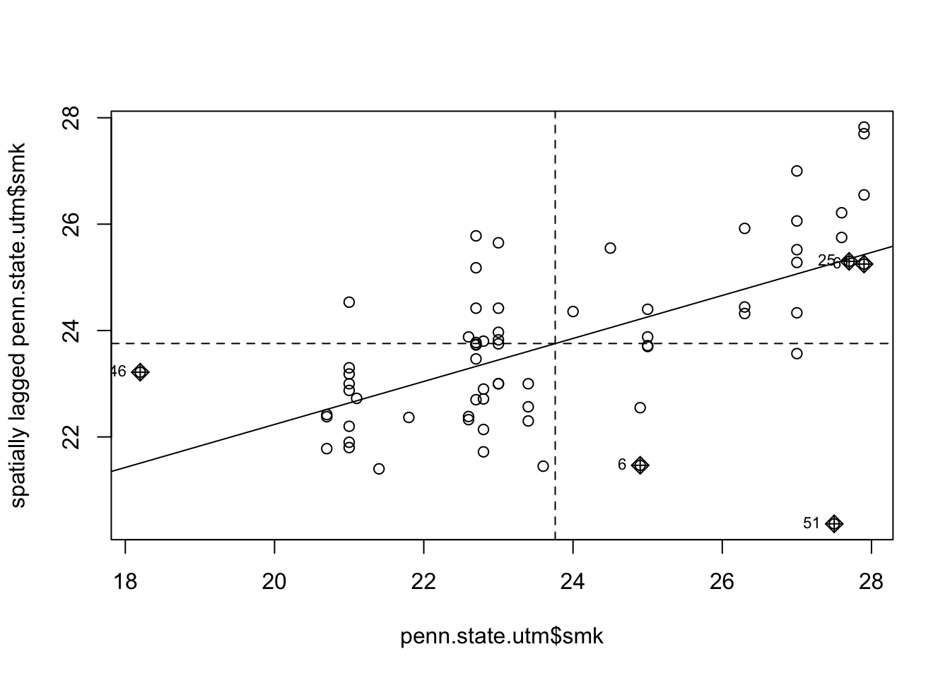
Figure 9.7: Lagged Mean plot for smoking uptake - alternative method.
In addition to the code earlier, this approach also identifies points with a high influence in providing a best-fit line to the plot – see, for example, (???) or (???).
Self Test Question 1. One further modification of this approach is based on the observation that although the permutation approach does simulate no spatial influence on correlation, observations are in fact correlated – since the randomised data are a permutation of the actual data, the fact that \(z_i\) gets assigned one particular value implies that no other variables can take this value. An alternative simulation would assign values to counties based on sampling with replacement. In this case we are no longer conditioning on the exact set of observed uptake rates, but on an empirical estimate of the cumulative distribution function of the data, assuming that observations are independent. Modify the above code to carry out this alternative approach. Hint: use the help facility to find the optional arguments to the sample function.