Chapter 12 Two-Way Within Subjects ANOVA
Packages used: datarium, tidyverse, psych, ggplot2, qqplotr, viridis, afex
The data:
We will be using the “selfesteem2” dataset from the datarium package. This dataset contains the self-esteem score from 12 individuals at three different time points. There were also two different treatments: placebo (control) and special diet. In this study, each participant participated in each trial, and they were counterbalanced and time-separated. As read in, the data will be in “wide” format, meaning there is one column for ID, one column for treatment, and one column per time point (t1 through t3).
#Call datarium package
library(datarium)

#Assign data set to an object
se2 <- selfesteem2

#See what it looks like
head(se2)
## # A tibble: 6 × 5
## id treatment t1 t2 t3
## <fct> <fct> <dbl> <dbl> <dbl>
## 1 1 ctr 83 77 69
## 2 2 ctr 97 95 88
## 3 3 ctr 93 92 89
## 4 4 ctr 92 92 89
## 5 5 ctr 77 73 68
## 6 6 ctr 72 65 63As in the one-way within subjects ANOVA, in order to test our assumptions and perform the ANOVA, we will need to convert to long format. Or, we will need to gather all the time points into one column. There will still be a treatment column, and multiple rows per ID. We first define a new dataframe, se2_long, and assign our se2 dataframe to it. Then %>% sends the se2 dataframe to the next line. gather() is from the tidyverse package and “gathers” a value across columns. We specify the “key” column name with key = "time", and what value we want created with value = "score". We then specify what columns we want “gathered” : t1, t2, t3.
We then need to convert the time column from a character column (something that R interprets as words) to a factor column (something that R interprets as different levels of one variable). The as.factor() function will allow us to do that, and takes as an argument the column you want to change (se2_long$time). Since we want the time column to be changed, we need to reassign the change back to the time column.
After doing all that, we check our work before moving on.
#Call tidyverse
library(tidyverse)

#Gather columns t1, t2 and t3 into long format
se2_long <- se2 %>%
  gather(key = "time", value = "score", t1, t2, t3)

#Convert time column to a factor
se2_long$time <- as.factor(se2_long$time)

#Check work
head(se2_long)
## # A tibble: 6 × 4
## id treatment time score
## <fct> <fct> <fct> <dbl>
## 1 1 ctr t1 83
## 2 2 ctr t1 97
## 3 3 ctr t1 93
## 4 4 ctr t1 92
## 5 5 ctr t1 77
## 6 6 ctr t1 7212.1 Descriptive Statistics
We will get descriptive statistics for each time point as well as each treatment group (so, 3 time points x 2 treatments = 6 tables!), using the describeBy() function from the psych package. We start by telling the function what we want summarized (se2_long$score). Then, since we have two variables we want combinations of, we include them both, separated by a colon: (se2_long$treatment : se2_long$time).
#Load psych package
library(psych)

#Get descriptive statistics by group
describeBy(se2_long$score,
           group = se2_long$treatment : se2_long$time)
##
## Descriptive statistics by group
## group: ctr:t1
## vars n mean sd median trimmed mad min max range skew kurtosis se
## X1 1 12 88 8.08 92 88.7 2.97 72 97 25 -0.75 -1.08 2.33
## ------------------------------------------------------------------------------------------------------------
## group: ctr:t2
## vars n mean sd median trimmed mad min max range skew kurtosis se
## X1 1 12 83.83 10.23 88 84.6 5.93 65 95 30 -0.62 -1.31 2.95
## ------------------------------------------------------------------------------------------------------------
## group: ctr:t3
## vars n mean sd median trimmed mad min max range skew kurtosis se
## X1 1 12 78.67 10.54 81 79.1 11.86 62 91 29 -0.39 -1.56 3.04
## ------------------------------------------------------------------------------------------------------------
## group: Diet:t1
## vars n mean sd median trimmed mad min max range skew kurtosis se
## X1 1 12 87.58 7.62 90 87.7 4.45 74 100 26 -0.41 -0.99 2.2
## ------------------------------------------------------------------------------------------------------------
## group: Diet:t2
## vars n mean sd median trimmed mad min max range skew kurtosis se
## X1 1 12 87.83 7.42 90 88 5.19 75 99 24 -0.47 -1.11 2.14
## ------------------------------------------------------------------------------------------------------------
## group: Diet:t3
## vars n mean sd median trimmed mad min max range skew kurtosis se
## X1 1 12 87.67 8.14 89.5 88.3 6.67 72 97 25 -0.69 -1.06 2.35In the output, we can see there are the expected six sets of descriptive statistics - one for each time point and treatment combination (ie, time 1-control, time 1-treatment, etc.). We get the mean score for each combination, along with all the other statistics we are accustomed to. We can also use these outputs to confirm that there are the same number of responses for each time point - if there were not, this would indicate we were missing data.
A boxplot can be helpful to identify if there are outliers in any of the combinations. We will make a boxplot using ggplot2 and using viridis for our color scale. In the code below, we first define our data (data = se2_long) and x (x = time) and y (y = score) values. Our x value is our grouping variable (time) that we want on the x-axis, and our y value is the one we are comparing (scores). The next line calls the boxplot function (geom_boxplot()). We added the argument aes(color = treatment) to allow different colors per treatment group. geom_jitter() prints each data point as a dot on the box plot, and the argument aes(color = treatment) again color-codes the dots by treatment. The next line, scale_color_viridis(discrete = TRUE) assigns the viridis color scale to the colors in the plot, which is a colorblind friendly scale. discrete = TRUE is used because we are not using all continuous variables (recall we changed time to a factor). The last line is a theme line, and addresses plot background color and such.
#Call ggplot
library(ggplot2)

#Also call viridis
library(viridis)

#Generate a boxplot
ggplot(data = se2_long, aes(x = time, y = score)) +
  geom_boxplot(aes(color = treatment)) +
  geom_jitter(aes(color = treatment), width = .25) +
  scale_color_viridis(discrete = TRUE) +
  theme_bw()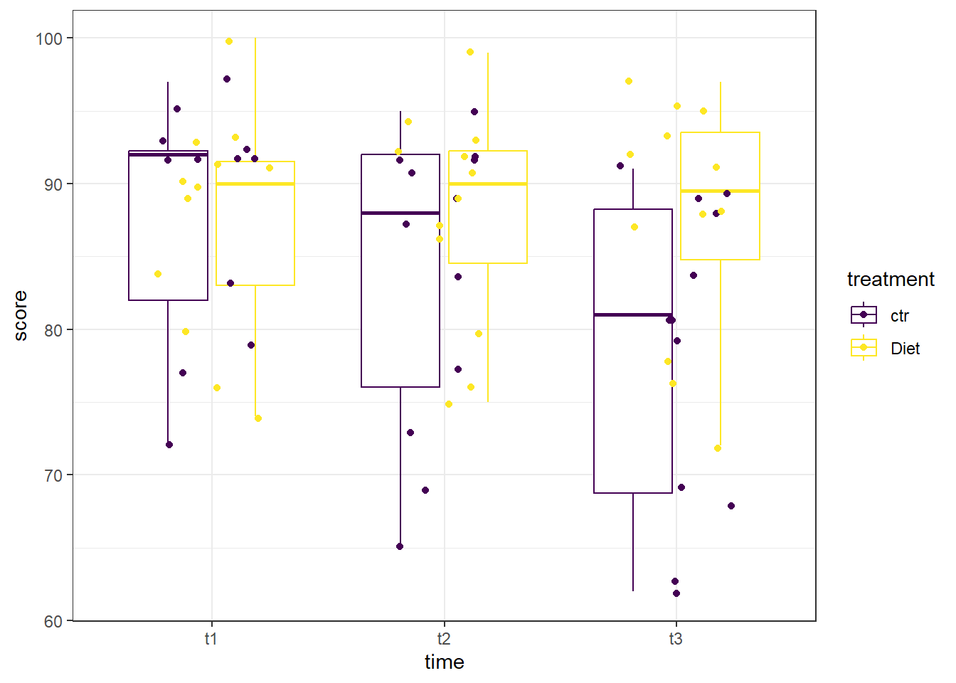
Looking at the boxplot, there don’t appear to be any extreme outliers. When we are examining this graph, remember to compare like-colors within each time point, otherwise you may mistakenly think some points are outliers when they are in fact not.
12.2 Assumptions
Now, we test the assumptions. Similar to the one-way within subjects anova, we will test on each time point as the grouping variable, but we are adding in treatment as a second grouping variable. The normality checks will all look familiar, and we will be adding the check of sphericity assumption. In order to get R to split by group, we will make use of the ‘pipe’(%>%) from the tidyverse package.
Shapiro-Wilk
We will begin by running a Shapiro-Wilk test to test each time point for normality. The shapiro.test() will allow us to get the test, though we will need to assign it to an object and ask for the information in a table. Specifically, we will be asking for the W statistic, or Shaprio-Wilk statistic, and the p-value from the test.
In the code below, we first call the tidyverse package to allow us to split by time point before moving on to running the Shapiro-Wilk test. Then, we specify our data (se2_long) and send it on to the next line (%>%). We next specify which variable R should group by with the group_by() function - this time, it is the ‘time’ variable. The line group_by(time, treatment) takes our dataframe and groups it by time point as well as treatment, giving us the same 6 combinations as before. Then, we send that on (%>%) to the Shapiro-Wilk test.
Running the Shapiro-Wilk test, we start with the summarise() function, and define what our columns will be. The first column is the Shapiro-Wilk statistic, named “S-W Statistic”, and we specify that the value in this column should be the statistic from the function: "S-W Statistic" = shapiro.test(score)$statistic. We see that we are still calling the shapiro.test() function on the ‘score’ column (shapiro.test(score)), but then we are including $statistic because that’s the value we want in this column. In the second column we specify that the values should be the p-value from the shapiro.test() function: "p-value" = shapiro.test(score)$p.value.
#Run the Shapiro-Wilk test
se2_long %>%   #Call our dataframe and send it on
  group_by(time, treatment) %>%    #Group by our grouping variable
  summarise("S-W Statistic" = shapiro.test(score)$statistic,   #Give us the statistics we want, in a table
            "p-value" = shapiro.test(score)$p.value)
## # A tibble: 6 × 4
## # Groups: time [3]
## time treatment `S-W Statistic` `p-value`
## <fct> <fct> <dbl> <dbl>
## 1 t1 ctr 0.828 0.0200
## 2 t1 Diet 0.919 0.279
## 3 t2 ctr 0.868 0.0618
## 4 t2 Diet 0.923 0.316
## 5 t3 ctr 0.887 0.107
## 6 t3 Diet 0.886 0.104Looking at the output, we see that all the combinations except time 1-control have non-significant p-values, indicating that they do not have a distribution that is significantly different than a normal distribution. The time 1 - control combination has a p-value less than 0.05, indicating that that distribution is significantly different than a normal distribution.
Histogram
We can also check the normality assumption for each combination visually, by generating histograms for each combination.
Since there are six different combinations, we will use a stacked histogram, by adding the function facet_grid(time ~ treatment) to our ggplot object. This will generate one histogram per combination, in more of a grid layout than what we’ve seen before. If you’d like the grid to be inverted, with time point across the top and treatment along the side, you would use treatment ~ time. At the end, theme_minimal() is addressing how the graphs look - getting rid of the grey background, for example.
#Generate side-by-side histograms
ggplot(data = se2_long, aes(x = score)) +
  geom_histogram() +
  facet_grid(time ~ treatment) +
  theme_minimal()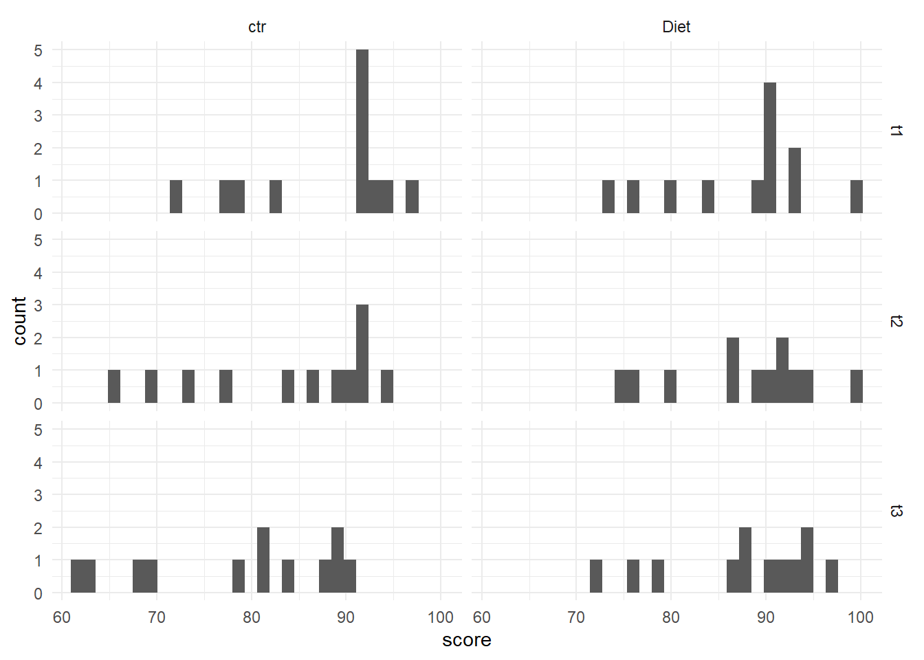
With only 12 data points in each histogram, it is a bit challenging to speak to the distribution, but overall they do look to be normally distributed. There is a pretty even spread across the scores, indicating likely normal distribution.
QQ Plot
Another visual inspection we can do involves a Q-Q plot. We will use the package qqplotr to make these, as an addition to ggplot2.
Breaking down the code we will use to generate the plot:
1. ggplot(data = se2_long, mapping = aes(sample = score, color = time, fill = time)) + is our call to ggplot. We are defining what data to use (data = se2_long), and then giving some arguments to the aes() function. sample = score says to use the variable ‘score’, color = time is asking for each time point to be a different color, and fill = time corresponds to the filled in portion. To ensure colorblind friendliness, we will specify colors below.
2. stat_qq_band(alpha=0.5, conf=0.95, qtype=1, bandType = "ts") + is our first function using the qqploter package, and contains arguments about the confidence bands. This is defining the alpha level (alpha = 0.5) and the confidence interval (conf = 0.95) to use for the confidence bands. bandType = "pointwise" is saying to construct the confidence bands based on Normal confidence intervals.
3. stat_qq_line(identity = TRUE) + is another call to the qqplottr package and contains arguments about the line going through the qq plot. The argument identity = TRUE says to use the identity line as the reference to construct the confidence bands around.
4. stat_qq_point(col = "black") + is the last call to the qqplottr package and contains arguments about the data points. col = "black" means we’d like them to be black.
5. facet_grid(time ~ treatment, scales = "free", labeller = "label_both") + uses facet_grid rather than facet_wrap, as we have been, to better label our plots. This is sorting by time and treatment combination (time ~ treatment), and creating a qq plot for each of our combinations. The scales = "free" refers to the scales of the axes; by setting them to “free” we are allowing them to freely vary between each of the graphs. If you want the scale to be fixed, you would use scale = "fixed". Lastly, labeller = "label_both" refers to how the labels along the top and side will be labelled. Using “label_both” means that we see both the classification(ie, Time), as well as which factor within that (ie, t1) it is referring to. If we left this off, it would default to just the factor value (ie, t1).
6. labs(x = "Theoretical Quantiles", y = "Sample Quantiles") + is a labeling function. Here, we are labeling the x and y axis (x = and y = respectively).
7. scale_fill_viridis(discrete = TRUE) is specifying a color fill that is colorblind friendly as well as grey-scale friendly. Since these are discrete groups, we add discrete = TRUE.
8. scale_color_viridis(discrete = TRUE) is again using a colorblind friendly scale for the outlines, to match the fill.
9. Lastly, theme_bw() is giving an overall preset theme to the graphs - this touches on things such as background, axis lines, grid lines, etc.
#Call qqplotr
library(qqplotr)

#Call viridis
library(viridis)

#Perform QQ plots by group
ggplot(data = se2_long, mapping = aes(sample = score, color = time, fill = time)) +
  stat_qq_band(alpha = 0.5, conf = 0.95, bandType = "pointwise") +
  stat_qq_line(identity = TRUE) +
  stat_qq_point(col = "black") +
  facet_grid(time ~ treatment, scales = "free", labeller = "label_both") +
  labs(x = "Theoretical Quantiles", y = "Sample Quantiles") +
  scale_fill_viridis(discrete = TRUE) +
  scale_color_viridis(discrete = TRUE) +
  theme_bw()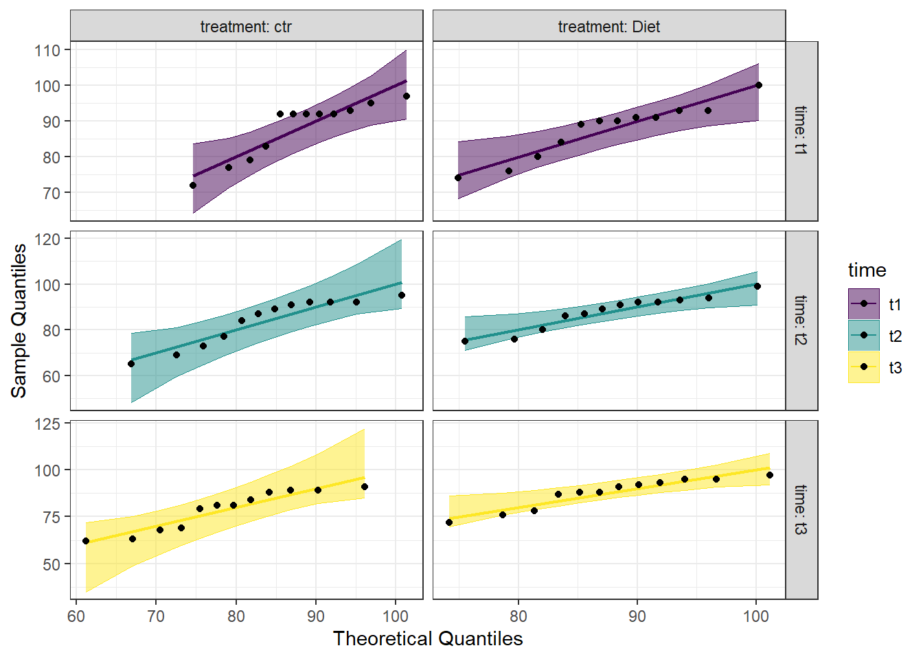
Looking at the Q-Q plot, we can see that most data points fall along the line, or within the 95% interval. There are two points in the time 1-control combination that would be considered outliers, and one in both time 2-diet and time 3-diet that are just outside the 95% interval. Overall, however, the data seem to fall within a normal distribution.
Detrended QQ Plot
We can also make a detrended Q-Q plot using the same code but adding detrend = TRUE to all of the stat_qq_ functions.
#Perform detrended QQ plots by group
ggplot(data = se2_long, mapping = aes(sample = score, color = time, fill = time)) +
  stat_qq_band(alpha = 0.5, conf = 0.95, bandType = "pointwise", detrend = TRUE) +
  stat_qq_line(identity = TRUE, detrend = TRUE) +
  stat_qq_point(col = "black", detrend = TRUE) +
  facet_grid(time ~ treatment, scales = "free", labeller = "label_both") +
  labs(x = "Theoretical Quantiles", y = "Sample Quantiles") +
  scale_fill_viridis(discrete = TRUE) +
  scale_color_viridis(discrete = TRUE) +
  theme_bw()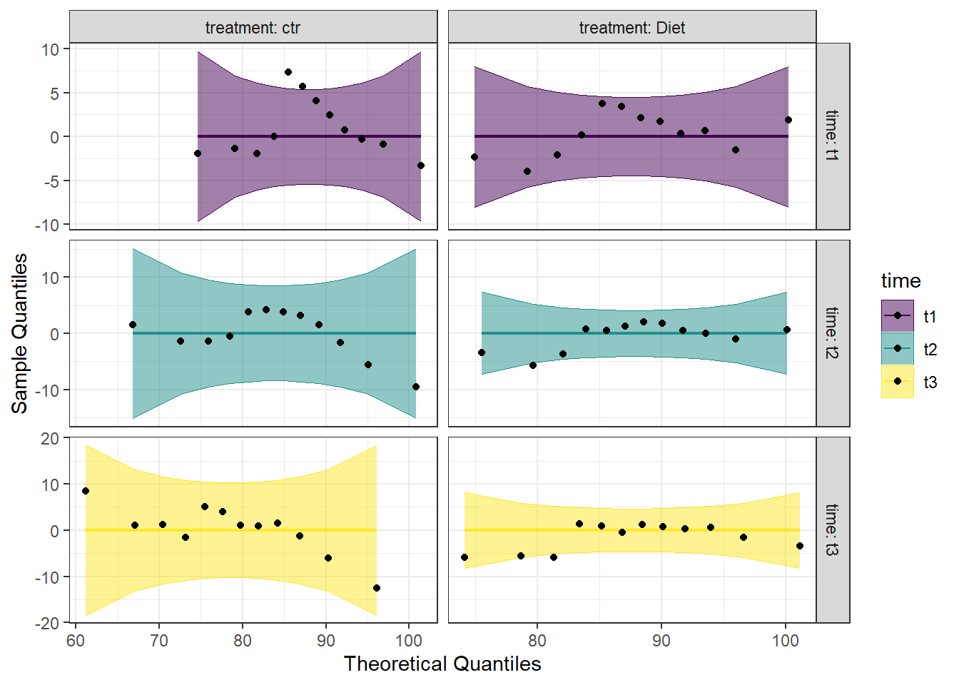
Looking at both the regular and detrended Q-Q plots, we can see that the data is reasonably normally distributed. Combining this with the results from the Shapiro-Wilk tests, we will consider the assumption of normality to be upheld.
12.3 Run the Two-Way Within Subjects ANOVA
We are now ready to run the one-way within subjects ANOVA. We will be using the aov_car() function from the afex package to run this test, as well as to test for the assumption of sphericity. By default, the Greenhouse-Geisser and Huynh-Feldt corrections are provided, regardless of the results of the Mauchly test of sphericity. The aov_car() function creates a model object that can be used later with emmeans() to do follow-ups.
Looking at the code below, you can see that we will be saving the model as an object (model_se2); this can be used to get the model information as well as for contrasts later. We give the function aov_car() the formula first (score ~ time*treatment). We have time*treatment to reflect that there are two variables we are looking at: time and treatment. By including the interaction between the two, R automatically knows to include each of the individual terms. Then, since this is a within subjects ANOVA, we need to give some additional information to the formula: + Error(id/(time*treatment)). Here, we are specifying the unit of observation (people; id) as well as what the repeating factor is (time*treatment). Lastly, we provide our data, which must be in long format (data = se2_long). Since we are saving the model as an object, we don’t get immediate output by running the model line of code. We need to ask for summary(model_se2) to get the output from the model.
#Call the afex package
library(afex)

#Perform the ANOVA
model_se2 <- aov_car(score ~ (time*treatment) + Error(id/(time*treatment)),
                    data = se2_long)


#Get the output
summary(model_se2)
##
## Univariate Type III Repeated-Measures ANOVA Assuming Sphericity
##
## Sum Sq num Df Error SS den Df F value Pr(>F)
## (Intercept) 527536 1 4641.2 11 1250.313 1.112e-12 ***
## time 259 2 104.0 22 27.369 1.075e-06 ***
## treatment 317 1 224.2 11 15.541 0.002303 **
## time:treatment 266 2 96.3 22 30.424 4.630e-07 ***
## ---
## Signif. codes: 0 '***' 0.001 '**' 0.01 '*' 0.05 '.' 0.1 ' ' 1
##
##
## Mauchly Tests for Sphericity
##
## Test statistic p-value
## time 0.46908 0.02271
## time:treatment 0.61607 0.08875
##
##
## Greenhouse-Geisser and Huynh-Feldt Corrections
## for Departure from Sphericity
##
## GG eps Pr(>F[GG])
## time 0.65320 5.034e-05 ***
## time:treatment 0.72258 1.255e-05 ***
## ---
## Signif. codes: 0 '***' 0.001 '**' 0.01 '*' 0.05 '.' 0.1 ' ' 1
##
## HF eps Pr(>F[HF])
## time 0.7054565 2.810626e-05
## time:treatment 0.8028383 4.815620e-06What we get first in the output is the ANOVA table assuming the sphericity assumption has been met. Starting at the interaction (time:treatment), we can see that it is significant. Right below that is a table for Mauchly Tests for Sphericity. As a reminder, only factors with more than two levels will have a test for sphericity (ie, time will, treatment will not). Checking this, we see that the test of sphericity for time:treatment is not significant, indicating that this assumption has been met, and no corrections are needed. However, the test of sphericity for time is significant, indicating that this assumption has been violated here. We can either choose to use Greenhouse-Geisser or Huynh-Feldt corrections for all conditions, or assume that sphericity has been met since it was met for the interaction and not use corrections. To be safe, we will use the Greenhouse-Geisser correction for all conditions.
By adding an additional argument to the aov_car() function, we can get the partial eta squared. This is probably best done after running the first model, as we did above, to determine if corrections are needed. We use the argument anova_table = to get additional information. Within this, we see that we are listing out (list()) two things. The first is correction =, which takes either “none”, GG”, or “HF”. As might be assumed, this is the sphericity correction that should be applied. The second argument is es =, which is “eta-squared”. We use es = "pes" for “partial eta squared”. We are re-assigning this to our model object from before, but to get this new information, we just need to call the model object itself, rather than the summary.
#Re-run the ANOVA, with any needed corrections.
#Perform the ANOVA
model_se2 <- aov_car(score ~ time*treatment + Error(id/(time*treatment)),
data = se2_long,
anova_table = list(correction = "GG", es = "pes"))
#Get the model object for the partial eta squared
model_se2## Anova Table (Type 3 tests)
##
## Response: score
## Effect df MSE F pes p.value
## 1 time 1.31, 14.37 7.24 27.37 *** .713 <.001
## 2 treatment 1, 11 20.38 15.54 ** .586 .002
## 3 time:treatment 1.45, 15.90 6.06 30.42 *** .734 <.001
## ---
## Signif. codes: 0 '***' 0.001 '**' 0.01 '*' 0.05 '+' 0.1 ' ' 1
##
## Sphericity correction method: GGLooking at the output, we see there is a column for pes, which is the partial eta squared. Here, it is 0.734 for the interaction, indicating a large effect.
We can put the above information into a nice table, using the gt() function from the gt package. We start with the gt() function, followed by the nice() function from the afex package. The nice() function packages the ANOVA information up “nicely” for putting into a table. We then specify the model we want the table made from (model_se2), what, if any, eta-squared to use (es = "pes"), and if any sphericity corrections are needed (correction = "none").
##
## Attaching package: 'gt'## The following object is masked from 'package:Hmisc':
##
## html| Effect | df | MSE | F | pes | p.value |
|---|---|---|---|---|---|
| time | 1.31, 14.37 | 7.24 | 27.37 *** | .713 | <.001 |
| treatment | 1, 11 | 20.38 | 15.54 ** | .586 | .002 |
| time:treatment | 1.45, 15.90 | 6.06 | 30.42 *** | .734 | <.001 |
12.3.1 Estimated Means
We can also examine the estimated marginal means, using the emmeans() function from the emmeans package. This is the same function we use for the pairwise comparisons below, we are just asking for a specific part of it first.
Even though we are only looking at the estimated means for now, we still run the emmeans() function, saving it as an object. The first argument is the ANOVA model object (model_se2). We then specify on what variable we would like the means. Notice there are three different models we are making: one for means by time, one for means by treatment, and one for means for the interaction (each combination of time and treatment). We then call the models to visualize the means.
#Call emmeans
library(emmeans)
#Calculate estimated marginal means
se2_em_time <- emmeans(model_se2, specs = ~time)
se2_em_treatment <- emmeans(model_se2, specs = ~treatment)
se2_em_time_treatment <- emmeans(model_se2, specs = ~time*treatment)
#Look at the estimated means
se2_em_time## time emmean SE df lower.CL upper.CL
## t1 87.8 2.24 11 82.9 92.7
## t2 85.8 2.49 11 80.3 91.3
## t3 83.2 2.60 11 77.5 88.9
##
## Results are averaged over the levels of: treatment
## Confidence level used: 0.95## treatment emmean SE df lower.CL upper.CL
## ctr 83.5 2.73 11 77.5 89.5
## Diet 87.7 2.20 11 82.9 92.5
##
## Results are averaged over the levels of: time
## Confidence level used: 0.95## time treatment emmean SE df lower.CL upper.CL
## t1 ctr 88.0 2.33 11 82.9 93.1
## t2 ctr 83.8 2.95 11 77.3 90.3
## t3 ctr 78.7 3.04 11 72.0 85.4
## t1 Diet 87.6 2.20 11 82.7 92.4
## t2 Diet 87.8 2.14 11 83.1 92.5
## t3 Diet 87.7 2.35 11 82.5 92.8
##
## Confidence level used: 0.95The output from the above code shows three tables with the estimated mean self esteem score for each time point, treatment, or combination (emmean column), as well as the standard error, degrees of freedom, and upper and lower confidence intervals.
12.3.2 Interaction Plot
We can also plot the interaction, to visually see how the estimated mean self esteem scores vary both at each time point, and to compare the treatment condition to the control condition. We will use ggplot() to plot. Breaking down the code below by line:
1. ggplot() is the main function, and gets fed what the data is (data = as.data.frame(model_se2_time_treatment)). You may notice the extra wrapper around our data this time, the as.data.frame(). This is because the estimated means table from the emmeans() function is not a dataframe, and ggplot only takes dataframes. This wrapper changes the object into a dataframe. The other argument on this line is defining our x and y values (aes(x = time, y = emmean)).
2. geom_line(aes(color = treatment, group = treatment)) is what allows our individual data points to be connected by a line. The aes(color = treatment, group = treatment) argument is telling the line graph how our data is grouped and what to connect. Since there are two different treatments, it is helpful to have each one a different color.
3. geom_point() is a scatterplot function, and creates the individual data points you will see on the graph. This needs no additional arguments.
4. scale_color_viridis(begin = 0.2, end = 0.8, discrete = TRUE) calls the viridis color scale for accessibility. The begin = 0.2, end = 0.8 arguments are simply to avoid a yellow line when not absolutely necessary. This is a personal preference of mine, and can easily be left off. discrete = TRUE is needed, as we are not supplying a continuous set of data, but rather individual values from our emmeans object.
5. theme_bw() addresses the overall theme of the plot - removing the grey background, for example.
#Plot estimated marginal means
ggplot(data = as.data.frame(se2_em_time_treatment), aes(x = time, y = emmean)) +
geom_line(aes(color = treatment, group = treatment)) +
geom_point(aes(color = treatment)) +
scale_color_viridis(begin = 0.2, end = 0.8, discrete = TRUE) +
theme_bw()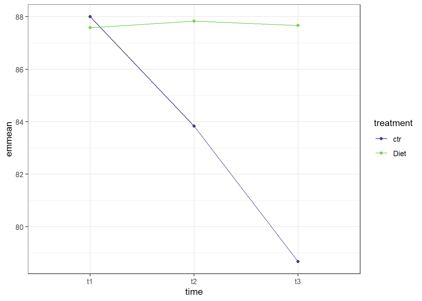
The graph makes pretty clear that the effect of time is different for the control group than it is for the treatment (diet) group. The diet group does not appear to have much change in self esteem scores through the three time points while there is a clear decrease in self esteem scores for the control group moving from time point 1 to time point 3.
12.4 Post-hoc testing
The diagram below is a guide to what tests to pursue depending on what tests are significant. We always start with the interaction effect, and ask if it is significant or not. That will then guide our choices. The sections below are laid out with the same headings as the chart - pick the one(s) that suits your analysis, and proceed. The sections are laid out in such a way that the tests for an interaction effect are first (ie, simple main effects, and simple comparisons) followed by tests for a non-significant interaction. NOTE: I am using the same data for all the tests; this is for illustration purposes only! You would not run every test in “real life” - choose only the tests that are appropriate for your analysis.
12.4.1 Simple Main effects
Simple main effects in a two-way ANOVA are similar to performing a one-way within subjects ANOVA on only one of the other factors. To do this, we will be making use of the rstatix package, which allows us to bring in the pipe from tidyverse (%>%), making grouping easier.
Simple Main Effect of Treatment
We can determine the simple main effect of treatment on the self esteem score by seeing how it differs at each time point. Since treatment only has 2 levels, we could do a paired-samples t-test. For future analyses that may have more than two levels, however, we are doing it in this manner.
Breaking down the calculation line by line:
1. sme_treat_se2 <- se2_long %>% to start, we are defining what data to use (se2_long), and assigning the whole thing to an object (sme_treat_se2). The %>% then sends it on to the next line.
2. group_by(time) %>% this is grouping by the different time points. So, gathering all the time 1 scores together, etc.
3. anova_test(score ~ treatment + Error(id/treatment)) %>% is the actual ANOVA test. As before, we supply it with the formula we want it to use: score ~ treatment, and since this is a within subjects design, also provide + Error(id/treatment).
4. get_anova_table() %>% requests an ANOVA table from the anova_test() function above.
5. adjust_pvalue(method = "bonferroni") performs the adjustment to the p-values. The method chosen here is bonferroni; Tukey and Scheffe are not options with this function.
#Call Rstatix package
library(rstatix)
#Calculate simple main effect of treatment
sme_treat_se2 <- se2_long %>%
group_by(time) %>%
anova_test(score ~ treatment + Error(id/treatment)) %>%
get_anova_table() %>%
adjust_pvalue(method = "bonferroni")
#Call the output table
sme_treat_se2## # A tibble: 3 × 9
## time Effect DFn DFd F p `p<.05` ges p.adj
## <fct> <chr> <dbl> <dbl> <dbl> <dbl> <chr> <dbl> <dbl>
## 1 t1 treatment 1 11 0.376 0.552 "" 0.000767 1
## 2 t2 treatment 1 11 9.03 0.012 "*" 0.052 0.036
## 3 t3 treatment 1 11 30.9 0.00017 "*" 0.199 0.00051Looking at the table above, we can see that the effect of treatment on self esteem score at time 1 is not significant (p = 0.55), but the effect of treatment on self esteem score at time 2 and time 3 is significant. Since treatment only has two levels (control and diet), there is no need to perform a simple comparison. Had treatment consisted of more than two levels (say, for example, control, diet, and exercise), then we would need to move on to simple comparisons to determine where the difference was.
Simple Main Effect of Time
We can also calculate the simple main effect of time, looking at the effect of time on the self esteem score by seeing how it differs at each treatment.
#Call Rstatix package (we just did above; for illustrative purposes here)
library(rstatix)
#Calculate simple main effect of treatment
sme_time_se2 <- se2_long %>%
group_by(treatment) %>%
anova_test(score ~ time + Error(id/time)) %>%
get_anova_table() %>%
adjust_pvalue(method = "bonferroni")
#Call the output table
sme_time_se2## # A tibble: 2 × 9
## treatment Effect DFn DFd F p `p<.05` ges p.adj
## <fct> <chr> <dbl> <dbl> <dbl> <dbl> <chr> <dbl> <dbl>
## 1 ctr time 2 22 39.7 0.00000005 "*" 0.145 0.0000001
## 2 Diet time 2 22 0.078 0.925 "" 0.000197 1Here, we can see that there is a significant effect of time on self esteem score in the control group (p < .001), but there is not a significant effect of time on self esteem score in the diet group (p = .925). Since there is more than one level of time, we will proceed to simple comparisons to determine where the difference is in the control group.
12.4.2 Simple comparisons
Simple comparisons are performed just like pairwise comparisons were performed in a one-way within subjects ANOVA. The code is slightly different than the one-way test, since we are using the rstatix package.
The code below is similar to the code above: we first call our data set, and assign it to an object. Then, we group by treatment, before performing the pairwise t-test (pairwise_t_test()). The arguments for this function include the formula to use (score ~ time), the fact that it’s paired (paired = TRUE), and what adjustment method to use (p.adjust.method = "bonferroni").
#Simple comparisons for time
sc_se2 <- se2_long %>%
group_by(treatment) %>%
pairwise_t_test(
score ~ time,
paired = TRUE,
p.adjust.method = "bonferroni"
)
#Call the summary
sc_se2## # A tibble: 6 × 11
## treatment .y. group1 group2 n1 n2 statistic df p p.adj p.adj.signif
## * <fct> <chr> <chr> <chr> <int> <int> <dbl> <dbl> <dbl> <dbl> <chr>
## 1 ctr score t1 t2 12 12 4.53 11 0.000858 0.003 **
## 2 ctr score t1 t3 12 12 6.91 11 0.0000255 0.0000765 ****
## 3 ctr score t2 t3 12 12 6.49 11 0.0000449 0.000135 ***
## 4 Diet score t1 t2 12 12 -0.522 11 0.612 1 ns
## 5 Diet score t1 t3 12 12 -0.102 11 0.921 1 ns
## 6 Diet score t2 t3 12 12 0.283 11 0.782 1 nsIn the table above, we got a breakdown of time by both treatment options. Since the simple main effect of treatment was not significant, we will ignore the bottom three rows. Looking at the control condition, we can see that there is a significant difference on job satisfaction score at all three time combinations (t1-t2, t2-t3, and t1-t3).
12.4.3 Main Effects
If the interaction is not significant, we then look to the main effects. This is found in the main ANOVA table we ran above. As a reminder, it is reproduced below:
##
## Univariate Type III Repeated-Measures ANOVA Assuming Sphericity
##
##                Sum Sq num Df Error SS den Df  F value    Pr(>F)
## (Intercept)    527536      1   4641.2     11 1250.313 1.112e-12 ***
## time              259      2    104.0     22   27.369 1.075e-06 ***
## treatment         317      1    224.2     11   15.541  0.002303 **
## time:treatment    266      2     96.3     22   30.424 4.630e-07 ***
## ---
## Signif. codes:  0 '***' 0.001 '**' 0.01 '*' 0.05 '.' 0.1 ' ' 1
##
##
## Mauchly Tests for Sphericity
##
##                Test statistic p-value
## time                  0.46908 0.02271
## time:treatment        0.61607 0.08875
##
##
## Greenhouse-Geisser and Huynh-Feldt Corrections
##  for Departure from Sphericity
##
##                 GG eps Pr(>F[GG])
## time           0.65320  5.034e-05 ***
## time:treatment 0.72258  1.255e-05 ***
## ---
## Signif. codes:  0 '***' 0.001 '**' 0.01 '*' 0.05 '.' 0.1 ' ' 1
##
##                   HF eps   Pr(>F[HF])
## time           0.7054565 2.810626e-05
## time:treatment 0.8028383 4.815620e-06As we have indicated, since the interaction is significant, we would perform other tests. However, had the interaction NOT been significant, we would then look at the main effect of time and the main effect for treatment. Specifically, these rows:
We can see that both time and treatment have significant main effects, meaning we would then proceed to marginal comparisons.
12.4.4 Marginal Comparisons
To do marginal comparisons (used when the interaction is not significant, but the main effect(s) are), we will be using the pairwise_t_test(), which is in base R (ie, comes standard with R - no packages to declare). We define an object first, followed by our data (se2_long). Then we run the pairwise test (pairwie_t_test()) on the desired main effect. We set that with the formula: score ~ treatment will provide marginal comparisons for a significant main effect of treatment while score ~ time will provide marginal comparisons for a significant main effect of time. We then indicate that this is a paired test (paired = TRUE), and our desired p-value adjustment method (p.adjust.method = "bonferroni").
Treatment
#Do pairwise comparisons for treatment
mc_treat <- se2_long %>%
  pairwise_t_test(
    score ~ treatment,
    paired = TRUE,
    p.adjust.method = "bonferroni")

#Call the table
mc_treat
## # A tibble: 1 × 10
## .y. group1 group2 n1 n2 statistic df p p.adj p.adj.signif
## * <chr> <chr> <chr> <int> <int> <dbl> <dbl> <dbl> <dbl> <chr>
## 1 score ctr Diet 36 36 -4.35 35 0.000113 0.000113 ***Time
#Do pairwise comparisons for time
mc_time <- se2_long %>%
  pairwise_t_test(
    score ~ time,
    paired = TRUE,
    p.adjust.method = "bonferroni")

#Call the table
mc_time
## # A tibble: 3 × 10
## .y. group1 group2 n1 n2 statistic df p p.adj p.adj.signif
## * <chr> <chr> <chr> <int> <int> <dbl> <dbl> <dbl> <dbl> <chr>
## 1 score t1 t2 24 24 2.86 23 0.009 0.027 *
## 2 score t1 t3 24 24 3.70 23 0.001 0.004 **
## 3 score t2 t3 24 24 3.75 23 0.001 0.003 **Both the marginal comparisons for treatment and for time are significant. Specific to the treatment main effect, the self esteem scores for the control group were 4.34 units lower than the self esteem scores for the control group. If we look at time, we could say that self esteem scores at time 1 were 2.86 units higher than self esteem scores at time 2.