Chapter 7 Repeated Measures t-test
Like the One Sample T-Test and Independent Samples T-Test, we will go through:
- Getting descriptive statistics
- Check assumptions
- Perform the t-test
Packages used: datarium, psych, ggplot2, qqplotr, tidyverse, effectsize
Since a repeated measures t-test is used when you have repeated data on the same set of individuals, we will be using the ‘mice2’ dataset from the datarium package. This dataset contains the weights of 10 mice before and after a treatment.
The variables are:
- id: mouse ID
- before: weight (in g) before treatment
- after: weight (in g) after treatment
#Call datarium package
library(datarium)

#Assign data set to an object
mice <- mice2

#See what it looks like
head(mice)
## id before after
## 1 1 187.2 429.5
## 2 2 194.2 404.4
## 3 3 231.7 405.6
## 4 4 200.5 397.2
## 5 5 201.7 377.9
## 6 6 235.0 445.8With a repeated measures t-test, we are testing the difference between the two time points, or the difference between “before” and “after”. We will first need to calculate a difference column. We can do this by declaring a new column for our dataset called diff: mice$diff. This doesn’t exist yet, but once we run the line of code, it will. I chose to do “after - before”, but the test will work just as well if you did “before - after”.
##   id before after  diff
## 1  1  187.2 429.5 242.3
## 2  2  194.2 404.4 210.2
## 3  3  231.7 405.6 173.9
## 4  4  200.5 397.2 196.7
## 5  5  201.7 377.9 176.2
## 6  6  235.0 445.8 210.8
After we create the difference column, it is always a good idea to check your work, making sure things are named what you thought they should be and that the calculations look correct.
7.1 Descriptives
For a repeated measures t-test, we will be looking at the descriptive statistics, and later assumptions, for the difference column we just calculated. You can certainly also look at the descriptive statistics for each group still, it just has less of an impact on this test.
To get the descriptive statistics for the difference column, we will use the describe() function again from the psych package. This gives a similar output to the describeBy() function we used for the independent samples t-test, but since we do not need the statistics by group (ie, the ‘By’ portion of describeBy()), we will just use describe(). We could use describeBy(), and R will throw the warning of Warning: no grouping variable requested. This will not affect the statistics provided; it is just R’s way of reminding you that you did not include grouping information.
##    vars  n   mean    sd median trimmed   mad   min   max range skew kurtosis   se
## X1    1 10 199.48 24.69  198.2  198.49 25.65 164.6 242.3  77.7 0.24    -1.27 7.81
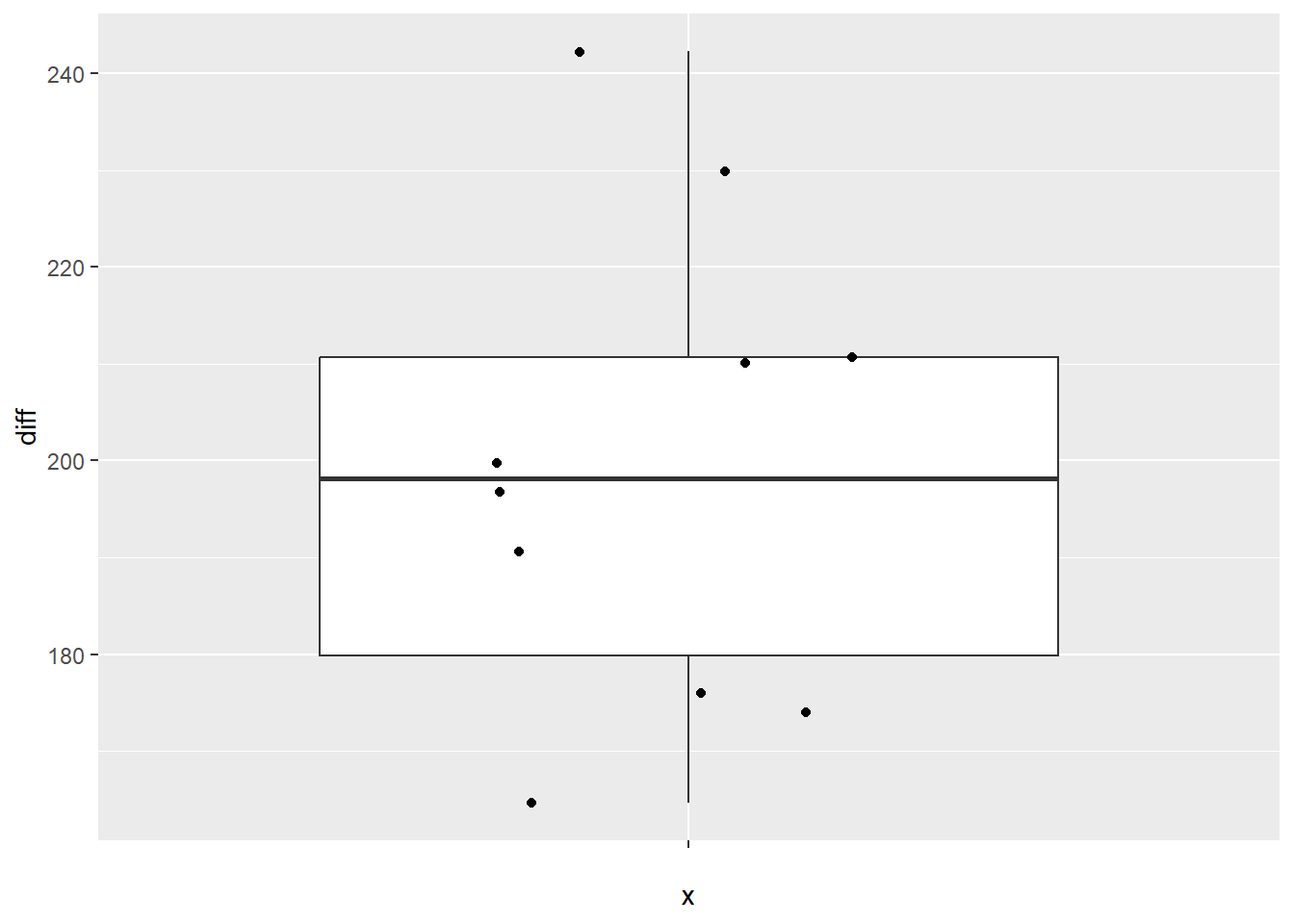
From this, we can see that the mean difference is 199.48, with a standard deviation of 24.69. It also tells us that there are 10 records (n = 10), as well as the minimum difference (164.6) and maximum difference (242.3). As with the independent samples t-test, we can make a box plot to identify any potential outliers.
Again, using ggplot2, we first defining our data (data = mice). You may notice that while we have x =, it is seemingly empty: x = "". This is because we are not asking for box plots per group, and instead just want the one box plot for the difference. However, ggplot still needs us to put something for our x, so we just leave it empty. Our y value is a bit more straight forward: y = diff. The rest of the box plot is the same as in the independent samples t-test: geom_boxplot() calls the box plot function, and geom_jitter() prints each of the data points on the box plot.
#Call ggplot
library(ggplot2)

#Generate a boxplot
ggplot(data = mice, aes(x = "", y = diff)) +
  geom_boxplot() +
  geom_jitter(width = .2)
7.2 Check Assumptions
For a repeated measures t-test, the assumptions are surrounding the difference column, or the difference in the population. As with the descriptives, we will be looking to our created difference column to check our assumptions rather than comparing the two time points.
7.2.1 Normality
As before, we will start off by running a Shapiro-Wilk test to test for normality of the difference. We will be using the shapiro.test() function on the difference column.
##
##  Shapiro-Wilk normality test
##
## data:  mice$diff
## W = 0.96751, p-value = 0.8669
We see that the result is non-significant (p = 0.8669), indicating that the distribution of the difference is not significantly different than a normal distribution, and satisfying the normality assumption.
Histogram
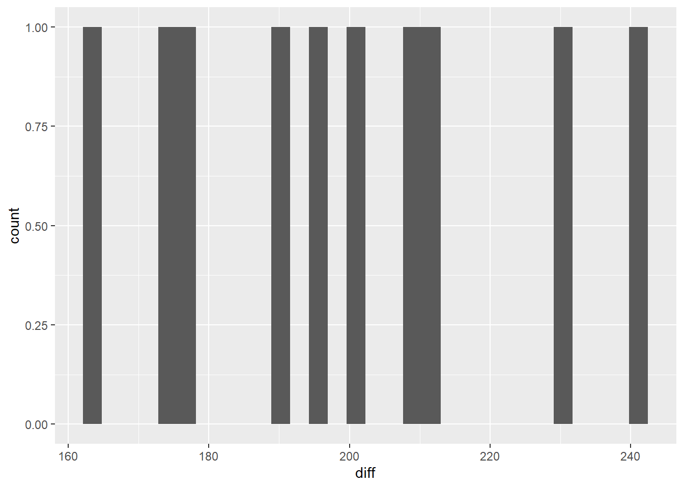
We can also check the normality assumption visually via a histogram.

With only 10 data points, it’s a bit challenging to see if the data are in fact normally distributed. What we can say visually is that the data don’t seem to be stacked up at either end of the range, and there seem to be more in the middle of the range than the tails.
QQ Plot
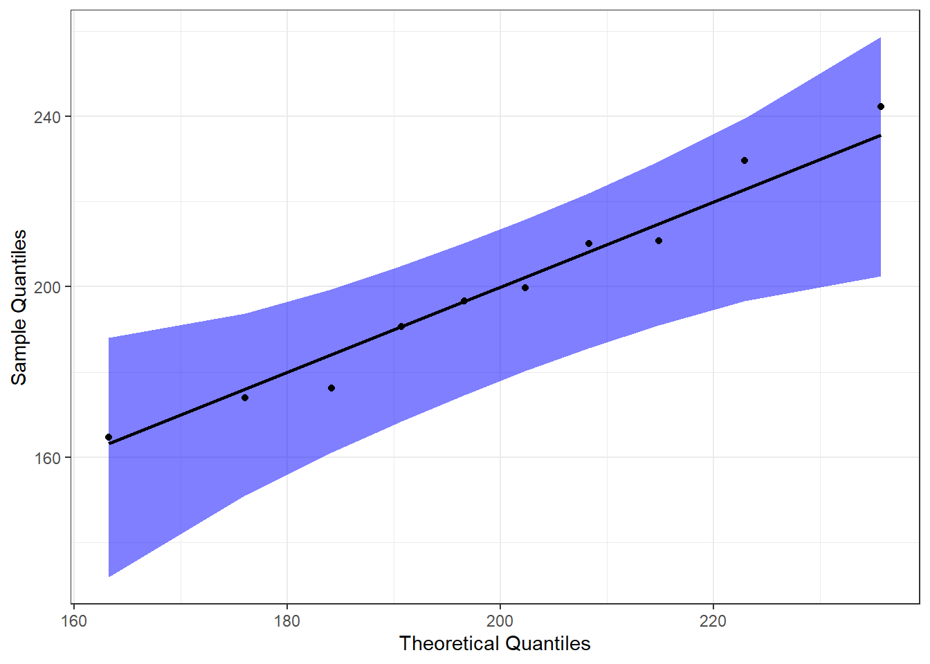
Another way we can visually examine the data for normality is to do a Q-Q plot. For a full explanation of the code below, please see Chapter 6.
#Call qqplotr
library(qqplotr)

#Perform QQ plots by group
ggplot(data = mice, mapping = aes(sample = diff)) +
  stat_qq_band(alpha = 0.5, conf = 0.95, bandType = "pointwise", fill = "blue") +
  stat_qq_line(identity = TRUE) +
  stat_qq_point(col = "black") +
  labs(x = "Theoretical Quantiles", y = "Sample Quantiles") +
  theme_bw()
From this, we can see that the data are pretty neatly lined up on the theoretical normal line (black line), and all of them are within the 95% confidence bands. This further supports our assumption of normality.
Detrended QQ Plot
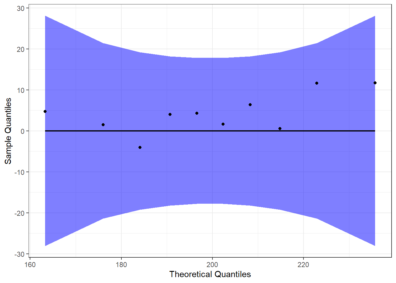
We can also make a detrended Q-Q plot, to visualize deviations from a normal distribution.
#Perform detrended QQ plots by group
ggplot(data = mice, mapping = aes(sample = diff)) +
  stat_qq_band(alpha = 0.5, conf = 0.95, bandType = "pointwise", fill = "blue", detrend = TRUE) +
  stat_qq_line(identity = TRUE, detrend = TRUE) +
  stat_qq_point(col = "black", detrend = TRUE) +
  labs(x = "Theoretical Quantiles", y = "Sample Quantiles") +
  theme_bw()
Both the regular and detrended Q-Q plots support the assumption that our data (the difference, in this case) are normally distributed.
7.3 Perform the T-test
Since we have met our assumptions, we will run the repeated measures t-test, as shown below. We again use the t.test() function, with some arguments specific to a repeated measures t-test. Rather than specifying a dataset, we are passing it an “x” and “y” value - these correspond to the two time points. Since I calculated the difference column as “after - before”, I am specifying x = mice$after and y = mice$before. We are declaring both the dataset and the specific column to use because we did not have a data = statement. We also pass the argument paired = TRUE to the t.test() function, telling it that we have a paired t-test, or a repeated measures t-test.
##
##  Paired t-test
##
## data:  mice$after and mice$before
## t = 25.546, df = 9, p-value = 1.039e-09
## alternative hypothesis: true mean difference is not equal to 0
## 95 percent confidence interval:
##  181.8158 217.1442
## sample estimates:
## mean difference
##          199.48
After we run it, we see the t-statistic (t = 25.546), df (df = 9), and p-value (p-value = 1.039e-09). With p < 0.001, we would reject the null hypothesis and conclude that the weight of mice after treatment is significantly different than the weight of mice before treatment. Our output also provides us with a 95% confidence interval (95 percent confidence interval: 181.8158, 217.1442), which does not include 0.
As an illustration, had we decided to do “before - after”, we would have gotten the exact same t-statistic, df, and p-value. Only the means and values of the 95% confidence interval would have differed, and those only by the sign.
##
##  Paired t-test
##
## data:  mice$before and mice$after
## t = -25.546, df = 9, p-value = 1.039e-09
## alternative hypothesis: true mean difference is not equal to 0
## 95 percent confidence interval:
##  -217.1442 -181.8158
## sample estimates:
## mean difference
##         -199.48
This just confirms that the order in which you calculate your difference column will not affect your final statistics, nor the descriptive statistics in absolute value.
7.4 Calculating Cohen’s d
Like before, we can calculate an effect size via Cohen’s d both by hand and by using the cohens_d() function.
To calculate by hand, we would use the following: \[d = \frac{|mean\_difference|}{standard\_deviation}\] For our data, that would look like \[d = \frac{|199.48|}{24.69} = 8.0779\]
Before we calculate using the cohens_d() function, we need to transform our data from wide format to long format. Put another way, rather than having one row per ID, and a column for each time point, we need multiple rows for each ID, and one row for “time”. Since we have already calculated a difference column above, and don’t need it here, we specify we only want columns 1-3 with mice[1:3]. Then %>% sends those three columns to the next line. gather() is from the tidyverse package and “gathers” a value across columns. We specify the “key” column name with key = "group", and what value we want created with value = "weight". We then specify what columns we want “gathered” : before, after. We create this in a new dataframe named mice_long.
#Call tidyverse to use pipe
library(tidyverse)

#Change to long format
mice_long <- mice[1:3] %>%
    gather(key = "group", value = "weight", before, after)

#Check work
head(mice_long)
## id group weight
## 1 1 before 187.2
## 2 2 before 194.2
## 3 3 before 231.7
## 4 4 before 200.5
## 5 5 before 201.7
## 6 6 before 235.0After we check our work, we can proceed to calculating Cohen’s d:
#Call the package
library(effectsize)

#Get Cohen's d
cohens_d(data = mice_long, weight ~ group, paired = TRUE)
## Cohen's d | 95% CI
## -------------------------
## 8.08 | [4.37, 11.79]The values calculated using cohens_d() and by hand match, and they indicate a large effect size.