Chapter 6 Independent Samples T-Test
Like the One Sample T-Test, we will go through:
- Getting descriptive statistics
- Check assumptions
- Perform the t-test
Packages used:psych, ggplot2, tidyverse, qqplotr, car, effectsize.
We will also be using a data set more appropriate to an Independent samples t-test, the sleep data set. This data is looking at the effect of two different soporific (sleep) drugs and if they increase or decrease the amount of sleep students get compared to control.
We have three variables:
- extra: increase in hours of sleep
- group: which drug was given
- ID: patient ID
##   extra group ID
## 1   0.7     1  1
## 2  -1.6     1  2
## 3  -0.2     1  3
## 4  -1.2     1  4
## 5  -0.1     1  5
## 6   3.4     1  6
6.1 Descriptives
Since we have two groups we are comparing, and we’d like a bit more information than provided by summary(), we will use the describeBy() function in the psych package. This function takes the form \[describeBy(x, group = groupingvar)\] and gives basic summary statistics by group.
#Call the package
library(psych)

#Get the descriptives by group
describeBy(df$extra, group = df$group)
##
## Descriptive statistics by group
## group: 1
## vars n mean sd median trimmed mad min max range skew kurtosis se
## X1 1 10 0.75 1.79 0.35 0.68 1.56 -1.6 3.7 5.3 0.42 -1.3 0.57
## ------------------------------------------------------------------------------------------------------------
## group: 2
## vars n mean sd median trimmed mad min max range skew kurtosis se
## X1 1 10 2.33 2 1.75 2.24 2.45 -0.1 5.5 5.6 0.28 -1.66 0.63In our output, we see that we get two different sets of descriptive statistics, one for group = 1 (group: 1), and another for group = 2 (group: 2). In each output, it tells us how many individuals (n), the mean and standard deviation (mean and sd, respectively), and the skew and kurtosis (skew and kurtosis) of each group, among other things.
A boxplot can be helpful to identify if there are outliers in our groups. We will make a boxplot, again using ggplot2. In the code below, we are first defining our data (data = df) and x (x = group) and y (y = extra) values. Our x value is our grouping variable, and our y value is the one we are comparing; in our case, how many extra hours of sleep. The next line calls the boxplot function (geom_boxplot()), and the last one prints each data point as a dot on the box plot (geom_jitter()). The last argument can be left blank, but it may be easier to compare sparse data points when they’re not as spread out horizontally, so the width = .2 argument squishes them together a bit. The opposite is true with larger datasets - you may want them more spread out! In which case, you can leave that argument blank.
#Call ggplot
library(ggplot2)

#Generate a boxplot
ggplot(data = df, aes(x = group, y = extra)) +
  geom_boxplot() +
  geom_jitter(width = .2)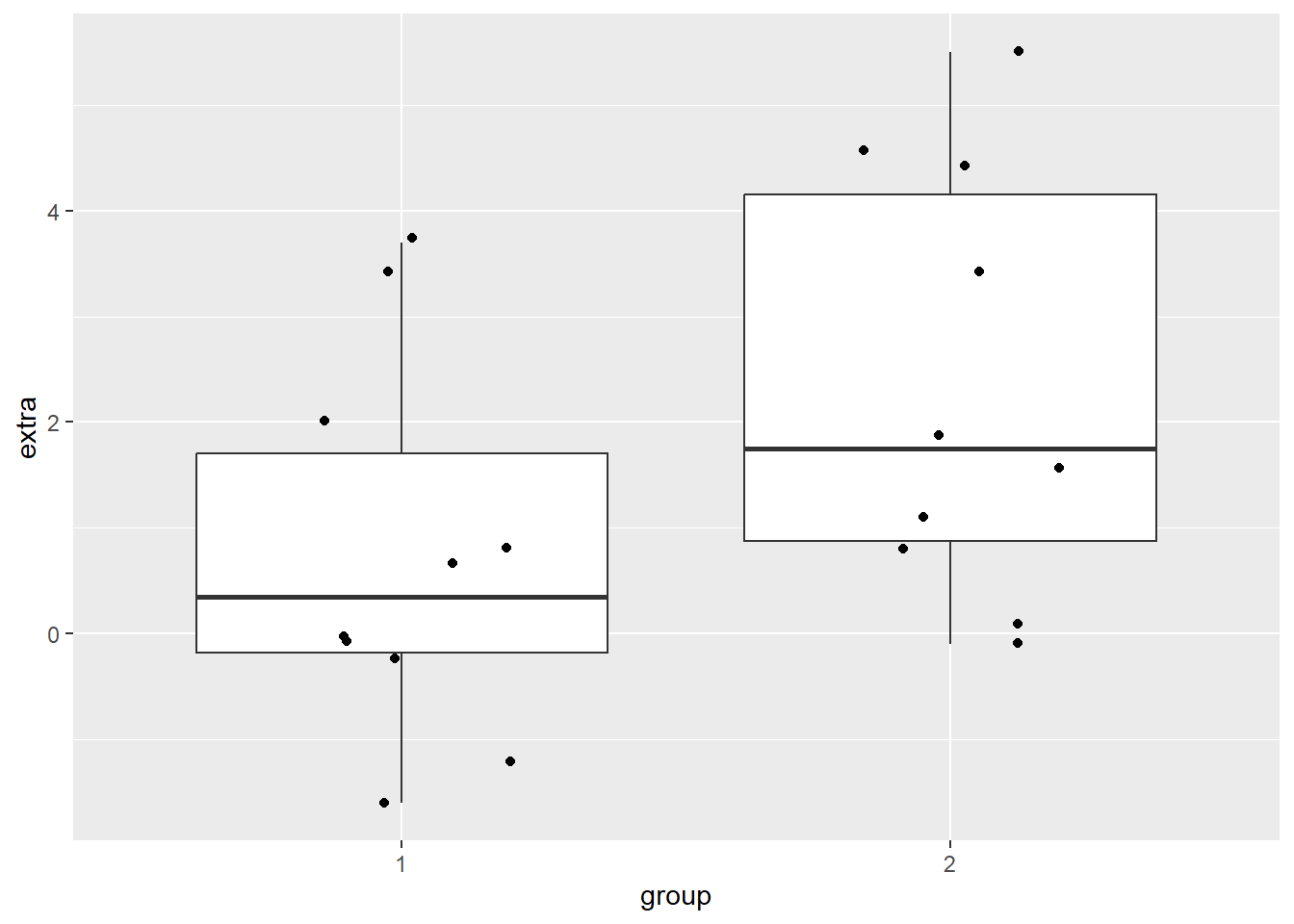
6.2 Check Assumptions
Since we have two groups, we have to test assumptions for each group, rather than on the data as a whole. This involves a few extra lines of code to ask R to split by group, and we will make use of the ‘pipe’(%>%) from the tidyverse package. This symbol is basically saying “take this bit, and send it on to the next”. It can be very useful, and make code easier to read and write.
6.2.1 Normality
We start off by running a Shapiro-Wilk test to test for normality. Recall from the one-sample t-test that we used the shapiro.test() function to get this information. The output contained the W statistic, or Shaprio-Wilk statistic, and the p-value. Had we assigned that to an object, we could see what information it contained, and what it called that information. After running the code below, if we look in our Environment Window and click on the object “SW”, we see what is in Figure 6.1.
##
##  Shapiro-Wilk normality test
##
## data:  trees$Height
## W = 0.96545, p-value = 0.4034After running the code above, if we look in our Environment Window and click on the object “SW”, we can see that it is in fact made of four things: statistic, p.value, method, and data.name. For our Independent Samples t-test, where we want this information by group, we will be calling on those individual items within the shapiro.test() output.

Figure 6.1: Behind the scenes of One Sample t-test shapiro.test() Function
In the code below, we are first calling the tidyverse package (library(tidyverse)) before moving on to running the Shapiro-Wilk test. Then, we specify our data (df) and send it on to the next line (%>%). We specify which variable R should group by with the group_by() function - for us, it is the ‘group’ variable. [NOTE: this is a bit confusing, and your grouping variable should probably be named something else, like “treatment” or “drug”.] So, the line group_by(group) is taking our dataframe and now grouping it according to group membership. Then, we send that on (%>%) to the Shapiro-Wilk test. It looks different than before, because we are asking it to report out by group rather than just the whole dataset.
We start with the summarise() function, and define what our columns will be (our rows have already been taken care of by group_by()). The Shapiro-Wilk statistic is named “S-W Statistic”, and we say that we’d like that value to be the statistic from the function: "S-W Statistic" = shapiro.test(extra)$statistic. We see that we are still calling the shapiro.test() function on the ‘extra’ column (shapiro.test(extra)), but then we are including $statistic because that’s the value we want in this column. In the second column we’d like the p-value from the shapiro.test() function: "p-value" = shapiro.test(extra)$p.value.
#Call tidyverse package
library(tidyverse)

#Run the Shapiro-Wilk test
df %>%   #Call our dataframe and send it on
  group_by(group) %>%    #Group by our grouping variable
  summarise("S-W Statistic" = shapiro.test(extra)$statistic,   #Give us the statistics we want, in a table
            "p-value" = shapiro.test(extra)$p.value)
## # A tibble: 2 × 3
## group `S-W Statistic` `p-value`
## <fct> <dbl> <dbl>
## 1 1 0.926 0.408
## 2 2 0.919 0.351We can see that both group 1 and group 2 have non-significant p-values, indicating that they do not have a distribution that is significantly different than a normal distribution.
Histogram
We could also check the normality assumption visually, by generating a histogram of each group. There are two different ways to accomplish this; the first has two plots stacked, the other has both distributions on the same graph. With these data, the separate visualizations is more clear to me, but I have included both options below.
The stacked histogram is generated much the same as a unstacked one, with the exception of the function facet_grid(group ~ .). This is what is generating one histogram per group. The second histogram, with each group a different color, does not use the function facet_grid(). The facet_grid() function allows separate plots per group. If you’d like them side-by-side, use ~ group. If you’d rather them be one on top of the other, use group ~ .. To generate different colors for each group, notice the extra argument in the aes() function: fill = group. This is saying that different membership under our group column should be a different color. Transparency is set with the alpha = 0.4 argument inside the geom_histogram() function.
#Generate two separate histograms
ggplot(data = df, aes(x = extra)) +
  geom_histogram() +
  facet_grid(~ group)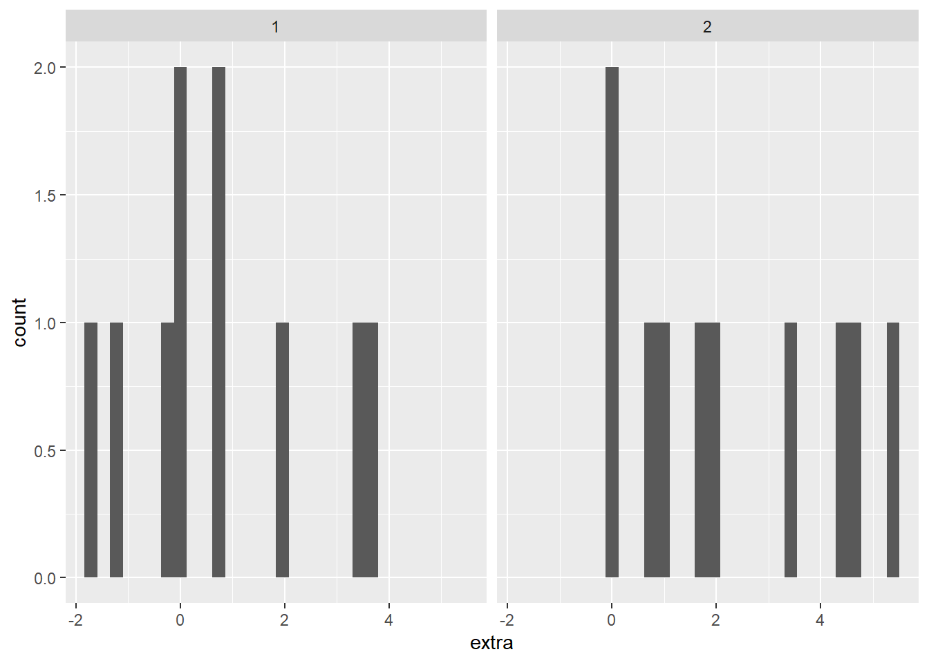
#Both in the same plot - I don't think this is as clear, especially with these data
ggplot(data = df, aes(x = extra, fill = group)) +
  geom_histogram(position = "identity", alpha = 0.4)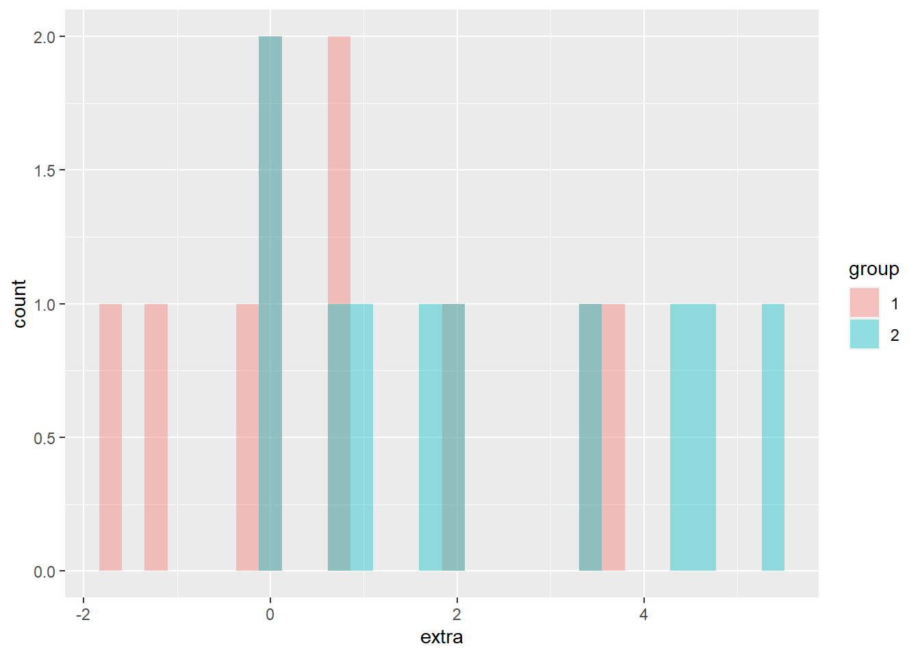
Both plots make clear that both groups have a small sample size, but seem to have a relatively normal distribution.
QQ Plot
Another visual inspection we can do involves a Q-Q plot. We will need to install and call the package qqplotr to make these, though it can be thought of as an addition to ggplot2.
Breaking down the code we will use to generate the plot:
1. ggplot(data = df, mapping = aes(sample = extra, color = group, fill = group)) + is our call to ggplot. We are defining what data to use (data = df), and then giving some arguments to the aes() function. sample = extra says to use the variable ‘extra’, color = group is asking for each drug group to be a different color, and fill = group corresponds to the filled in portion. Lastly, the + at the end indicates that there’s more to come. Don’t forget to add the + at the end of each of the lines!
2. stat_qq_band(alpha=0.5, conf=0.95, qtype=1, bandType = "ts") + is our first function using the qqploter package, and contains arguments about the confidence bands (the colored-in bit below). This is defining the alpha level (alpha = 0.5) and the confidence interval (conf = 0.95) to use for the confidence bands. bandType = "pointwise" is saying to construct the confidence bands based on Normal confidence intervals.
3. stat_qq_line(identity = TRUE) + is another call to the qqplottr package and contains arguments about the line going through the qq plot. The argument identity = TRUE says to use the identity line as the reference to construct the confidence bands around.
4. stat_qq_point(col = "black") + is the last call to the qqplottr package and contains arguments about the data points. col = "black" means we’d like them to be black.
5. facet_wrap(~ group, scales = "free") + is a similar argument to the stacked bar plot above. This is sorting by group (~group), and creating a qq plot for each of our drug groups. The scales = "free" refers to the scales of the axes; by setting them to “free” we are allowing them to freely vary between each of the graphs. If you want the scale to be fixed, you would use scale = "fixed".
6. labs(x = "Theoretical Quantiles", y = "Sample Quantiles") + is a labeling function. Here, we are labeling the x and y axis (x = and y = respectively).
7. Lastly, theme_bw() is giving an overall preset theme to the graphs - this touches on things such as background, axis lines, grid lines, etc.
#Call qqplotr
library(qqplotr)

#Perform QQ plots by group
ggplot(data = df, mapping = aes(sample = extra, color = group, fill = group)) +
  stat_qq_band(alpha = 0.5, conf = 0.95, bandType = "pointwise") +
  stat_qq_line(identity = TRUE) +
  stat_qq_point(col = "black") +
  facet_wrap(~ group, scales = "free") +
  labs(x = "Theoretical Quantiles", y = "Sample Quantiles") +
  theme_bw()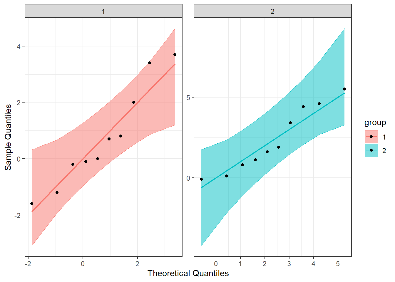
Detrended QQ Plot
We can also make a detrended Q-Q plot using the same code but adding detrend = TRUE to all of the stat_qq_ functions.
#Perform detrended QQ plots by group
ggplot(data = df, mapping = aes(sample = extra, color = group, fill = group)) +
  stat_qq_band(alpha = 0.5, conf = 0.95, bandType = "pointwise", detrend = TRUE) +
  stat_qq_line(identity = TRUE, detrend = TRUE) +
  stat_qq_point(col = "black", detrend = TRUE) +
  facet_wrap(~ group, scales = "free") +
  labs(x = "Theoretical Quantiles", y = "Sample Quantiles") +
  theme_bw()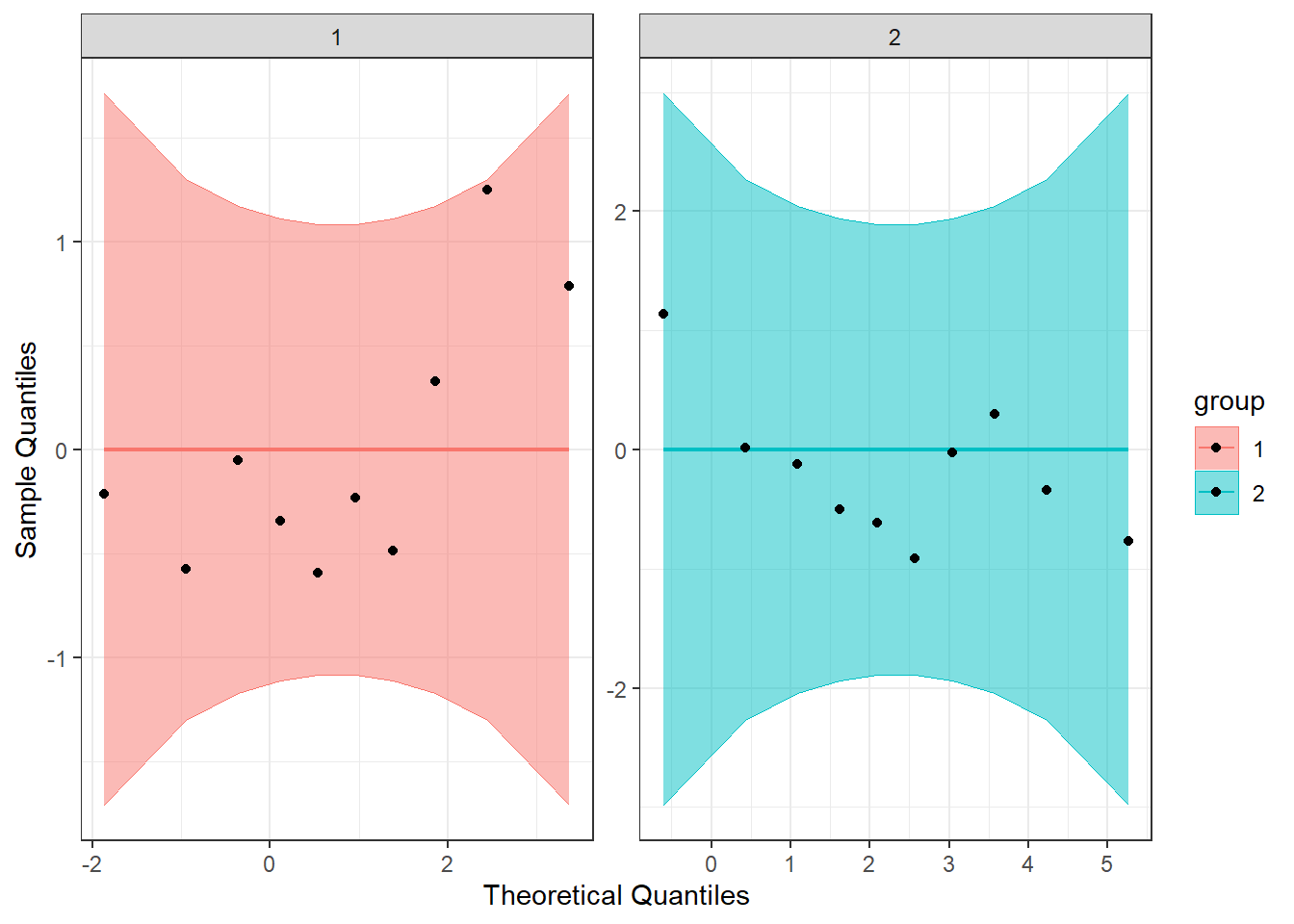
Looking at both the regular and detrended Q-Q plots, we can see that our data seem to be normally distributed.
6.2.2 Homogeneity of Variance
We will test the homogeneity of variance of the two groups with the Levene’s Test and the Brown-Forsyth Test. Both use the same function from the package car, leveneTest(), but with the argument center = we can differentiate between the two.
#Call the car package
library(car)

#Perform Levene's Test
LT <- leveneTest(extra ~ group, data=df, center="mean")

#Perform Brown-Forsythe test
BFT <- leveneTest(extra ~ group, data=df, center="median")

#Print both of them
print(LT)
## Levene's Test for Homogeneity of Variance (center = "mean")
## Df F value Pr(>F)
## group 1 0.6197 0.4414
## 18## Levene's Test for Homogeneity of Variance (center = "median")
## Df F value Pr(>F)
## group 1 0.2482 0.6244
## 18We see that neither value is significant, indicating that we fail to reject the null that the variances are the same. The assumption of homogeneity of variances is met.
6.3 Perform the T-Test
Since we have met our assumptions, we can run the independent samples t-test, as shown below. We use the t.test() function again, with some extra arguments. This time, we first pass it the formula we want it to use (extra ~ group): comparing extra by group. Then we specify what data to use (data = df), and that we have equal variances (var.equal = TRUE). If we did not have equal variances we could pass var.equal = FALSE to the function.
##
##  Two Sample t-test
##
## data:  extra by group
## t = -1.8608, df = 18, p-value = 0.07919
## alternative hypothesis: true difference in means between group 1 and group 2 is not equal to 0
## 95 percent confidence interval:
##  -3.363874  0.203874
## sample estimates:
## mean in group 1 mean in group 2
##            0.75            2.33
From our output, we see the t-statistic (t = -1.8608), df (df = 18), and p-value (p-value = 0.07919). Since p > 0.5, we would conclude that the two groups do not differ on the amount of extra sleep they received. Our output also provides us with a 95% confidence interval (95 percent confidence interval: -3.363874, 0.203874), which we can see includes 0. Lastly, the output provides us with sample means (mean in group 1 mean in group 2).
6.4 Calculating Cohen’s d
As with the one sample t-test, we can calculate an effect size. This can be done by grabbing the values from the descriptive statistics and doing it by hand, or by using the cohens_d() function.
If we were going to do it by hand, we would use the following equation: \[d = \frac{\mid\overline{X_{1}} - \overline{X_{2}}\mid}{\sqrt{s^{2}_{p}}}\] where \[s^{2}_{p} = \frac{SS_{1} + SS_{2}}{df_{1} + df_{2}} = \frac{(n_{1} - 1)s^{2}_{1} + (n_{2} - 1)s^{2}_{2}}{n_{1} + n_{2} - 2}\]
In the code below, calculations for Cohen’s d are set up. Notice how by defining the variables first (eg. n1, s1, x1), it makes the later calculations much easier. And, if you wanted to calculate Cohen’s d for another sample, you would just have to change the appropriate values, rather than retype the whole equation.
#Calculate cohen's d
#Set our variables first
n1 <- 10 #N
s1 <- 1.79 #SD
x1 <- 0.75 #Mean

n2 <- 10
s2 <- 2
x2 <- 2.33

#Calclate pooled variance
sp <- ((n1 - 1)*(s1^2) + (n2 - 1)*(s2^2))/(n1 + n2 -2)

#Calculate cohen's d
d_is <- abs(x1 - x2)/sqrt(sp)

#Print the value
d_is
## [1] 0.8324961We can also use the cohens_d() function to calculate it for us, as in the one sample t-test. Similar to the t-test, we provide the formula we want it to use (df$extra ~ df$group) and tell it we have equal variances (var.equal = TRUE).
#Call the package
library(effectsize)

#Get Cohen's d
cohens_d(df$extra ~ df$group, var.equal = TRUE)
## Cohen's d | 95% CI
## -------------------------
## -0.83 | [-1.74, 0.10]
##
## - Estimated using pooled SD.We see that they match, as they should, and the effect size is 0.83.