Chapter 11 Two-Way Between Subjects ANOVA
Packages used: datarium, psych, tidyverse, ggplot2, qqplotr, viridis, car, emmeans, afex, rstatix
The data:
We will be using the “jobsatisfaction” data set from the datarium package, which gives job satisfaction score as well as variables for gender and education level. Gender is reported on a male/female binary, and education has three levels: school, college, and university
#Call datarium package
library(datarium)

#Assign data set to an object
job <- jobsatisfaction

#See what it looks like
head(job)
## # A tibble: 6 × 4
## id gender education_level score
## <fct> <fct> <fct> <dbl>
## 1 1 male school 5.51
## 2 2 male school 5.65
## 3 3 male school 5.07
## 4 4 male school 5.51
## 5 5 male school 5.94
## 6 6 male school 5.811.1 Descriptive Statistics
We can first take a look at the descriptive statistics for our data, broken down by each different combination of gender and education. To do this, we will use the describeBy() function from the psych package.
#Call the package
library(psych)

#Get the descriptives by group
describeBy(job$score, group = job$gender:job$education_level)
##
## Descriptive statistics by group
## group: male:school
## vars n mean sd median trimmed mad min max range skew kurtosis se
## X1 1 9 5.43 0.36 5.51 5.43 0.43 4.78 5.94 1.16 -0.29 -1.2 0.12
## ------------------------------------------------------------------------------------------------------------
## group: male:college
## vars n mean sd median trimmed mad min max range skew kurtosis se
## X1 1 9 6.22 0.34 6.3 6.22 0.31 5.58 6.74 1.16 -0.35 -0.89 0.11
## ------------------------------------------------------------------------------------------------------------
## group: male:university
## vars n mean sd median trimmed mad min max range skew kurtosis se
## X1 1 10 9.29 0.44 9.2 9.28 0.43 8.7 10 1.3 0.45 -1.25 0.14
## ------------------------------------------------------------------------------------------------------------
## group: female:school
## vars n mean sd median trimmed mad min max range skew kurtosis se
## X1 1 10 5.74 0.47 5.72 5.76 0.43 4.93 6.38 1.45 -0.12 -1.3 0.15
## ------------------------------------------------------------------------------------------------------------
## group: female:college
## vars n mean sd median trimmed mad min max range skew kurtosis se
## X1 1 10 6.46 0.47 6.45 6.48 0.43 5.65 7.1 1.45 -0.13 -1.3 0.15
## ------------------------------------------------------------------------------------------------------------
## group: female:university
## vars n mean sd median trimmed mad min max range skew kurtosis se
## X1 1 10 8.41 0.94 8.48 8.5 0.86 6.52 9.57 3.05 -0.58 -0.81 0.3From this, we can see the means of each group, along with min/max values and skew and kurtosis and other values. This also gives us a group size. We can see that all combinations except the male-college combination has N = 10; male-college has N = 9. This is not a wildly different group size, and no cause for concern.
A boxplot can be used to visually identify if there are outliers in any of the combinations. We will make a boxplot using ggplot2 and using viridis for our color scale. In the code below, we first define our data (data = job) and x (x = gender) and y (y = score) values. Our x value is our grouping variable (time) that we want on the x-axis, and our y value is the one we are comparing (scores). The next line calls the boxplot function (geom_boxplot()). We added the argument aes(color = education_level) to allow different colors per treatment group. geom_jitter() prints each data point as a dot on the box plot, and the argument aes(color = education_level) again color-codes the dots by treatment. The next line, scale_color_viridis(discrete = TRUE) assigns the viridis color scale to the colors in the plot, which is a colorblind friendly scale. discrete = TRUE is used because we are not using all continuous variables. The last line is a theme line, and addresses details such as plot background color.
#Call ggplot
library(ggplot2)

#Also call viridis
library(viridis)

#Generate a boxplot
ggplot(data = job, aes(x = gender, y = score)) +
  geom_boxplot(aes(color = education_level)) +
  geom_jitter(aes(color = education_level), width = .25) +
  scale_color_viridis(discrete = TRUE) +
  theme_bw()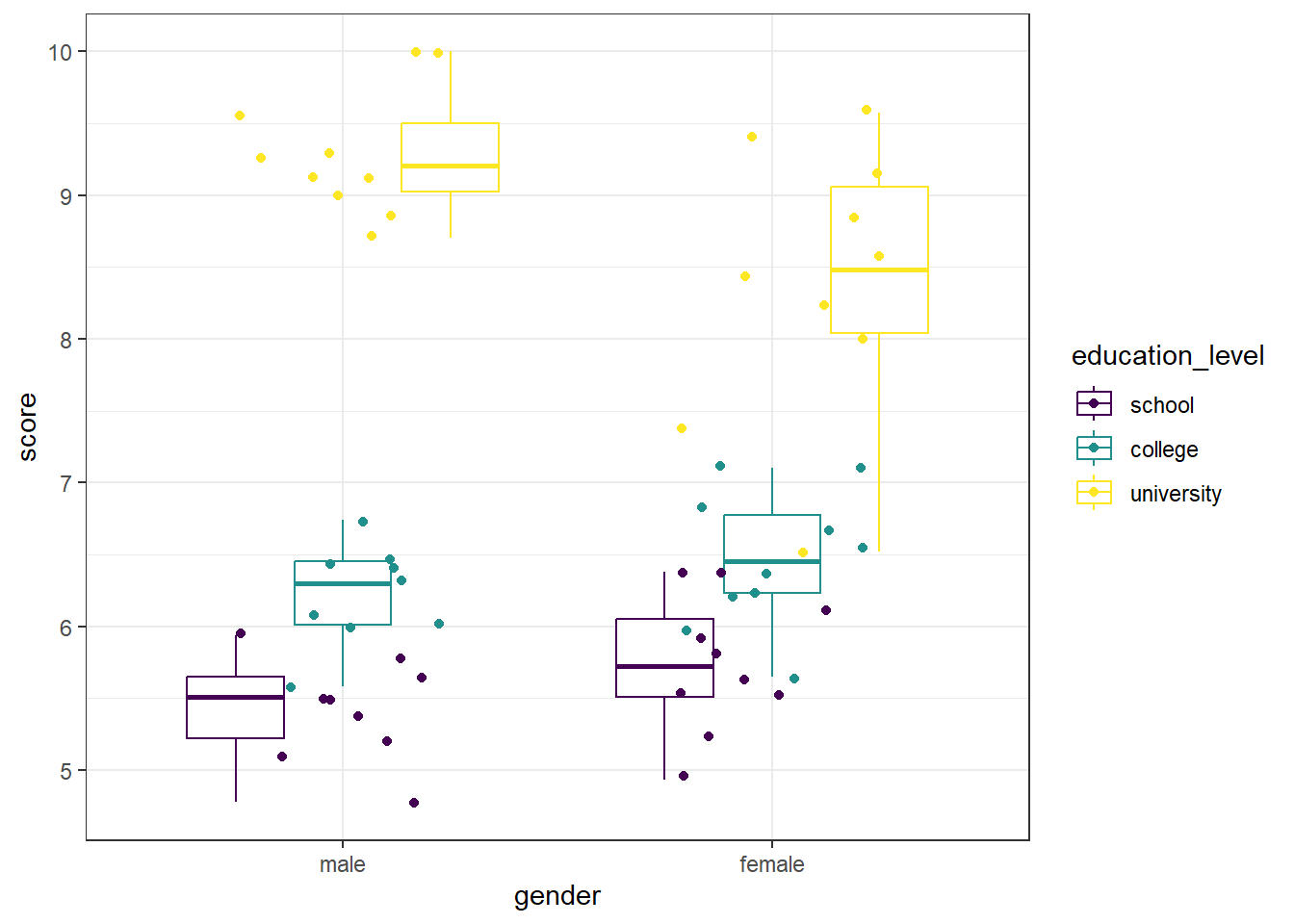
We can see that there are no extreme outliers, as long as we are careful to color-match. This can get visually challenging, and we can take one of two approachs. The first is to re-assign our x-axis to reflect the IV with more levels (so, education level rather than gender). This makes it easier to match up the data points, if you have IVs with few factor levels. As a personal preference, I added begin = 0.2, end = 0.8 to the scale_color_viridis() function to avoid dark purple and yellow being the only two colors to be used. This can easily be left off.
#Generate a boxplot - education level on x axis
ggplot(data = job, aes(x = education_level, y = score)) +
  geom_boxplot(aes(color = gender)) +
  geom_jitter(aes(color = gender), width = .25) +
  scale_color_viridis(begin = 0.2, end = 0.8, discrete = TRUE) +
  theme_bw()
Since our gender variable only has two levels, this is easier to differentiate which dots go with which plots, as well as to identify any potential outliers. However, data you may use in future analyses may have two IVs, both with multiple levels.
Another option is to create the boxplot without the data points being shown, and instead use a function to determine if there are any extreme outliers, as we do below. The ggplot object is the same as above, except we removed the geom_point() line, which removed the individual data points. Next, we have a call to the rstatix package, which contains the identify_outliers() function. To get there, we first provide our data (job), and send that (%>%) to the grouping function (group_by()) where we group by both gender and education level. Then, we use the identify_outliers() function on the score to determine if there are any.
#Generate a boxplot - no dots this time
ggplot(data = job, aes(x = gender, y = score)) +
  geom_boxplot(aes(color = education_level)) +
  scale_color_viridis(discrete = TRUE) +
  theme_bw()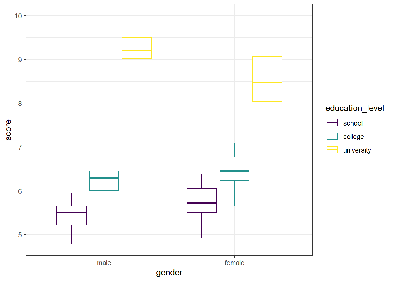
#Also test for extreme outliers
#Call rstatix package
library(rstatix)

#Test for outliers in each combination
job %>%
  group_by(gender, education_level) %>%
  identify_outliers(score)
## [1] gender education_level id score is.outlier is.extreme
## <0 rows> (or 0-length row.names)The graph is visually a bit cleaner - no data points to compare to box plots. And the output for the identify_outliers() function is empty (<0 rows>). This means there are no extreme outliers in our data. If we compare that to what we could see in the first box plot, we can see they are in agreement.
11.2 Assumptions
We will be testing for meeting the assumption of normality and homogeneity of variance.
Shapiro-Wilk
We will begin by running a Shapiro-Wilk test to test each combination of gender and education level for normality. The shapiro.test() will allow us to get the test, though we will need to assign it to an object and ask for the information in a table. Specifically, we will be asking for the W statistic, or Shaprio-Wilk statistic, and the p-value from the test.
In the code below, we first call the tidyverse package to allow us to split by group before moving on to running the Shapiro-Wilk test. Then, we specify our data (job) and send it on to the next line (%>%). The line group_by(gender, education_level) takes our dataframe and groups it by gender and then educational level. Then, we send that on (%>%) to the Shapiro-Wilk test.
Running the Shapiro-Wilk test, we start with the summarise() function, and define what our columns will be. The first column is the Shapiro-Wilk statistic, named “S-W Statistic”, and we specify that the value in this column should be the statistic from the function: "S-W Statistic" = shapiro.test(score)$statistic. We see that we are calling the shapiro.test() function on the ‘score’ column (shapiro.test(score)), but then we are including $statistic because that’s the value from the Shapiro test we want in this column. In the second column we specify that the values should be the p-value from the shapiro.test() function: "p-value" = shapiro.test(score)$p.value.
#Call tidyverse
library(tidyverse)

#Run the Shapiro-Wilk test
job %>%
  group_by(gender, education_level) %>%
  summarise("S-W Statistic" = shapiro.test(score)$statistic,
            "p-value" = shapiro.test(score)$p.value)
## # A tibble: 6 × 4
## # Groups: gender [2]
## gender education_level `S-W Statistic` `p-value`
## <fct> <fct> <dbl> <dbl>
## 1 male school 0.980 0.966
## 2 male college 0.958 0.779
## 3 male university 0.916 0.323
## 4 female school 0.963 0.819
## 5 female college 0.963 0.819
## 6 female university 0.950 0.674For each combination, p > 0.05, indicating that no distribution is significantly different than a normal distribution.
Histogram
We can also check the normality assumption visually, by generating histograms of each gender-education level combination. Given that we have six possible combinations, we will be creating separate histograms for each.
We will use a stacked histogram, by adding the function facet_grid(education_level ~ gender) to our ggplot object. This will generate one histogram per combination, in a grid layout rather than a truly “stacked” layout. This phrasing (education_level ~ gender) is saying put the different education levels on the “y axis” of the grid, and different gender options along the “x axis” of the grid. If you’d like the grid to be inverted, with education level across the top and gender along the side, you would use gender ~ education_level. At the end, theme_minimal() is addressing how the graphs look - getting rid of the grey background, for example.
#Generate side-by-side histograms
ggplot(data = job, aes(x = score)) +
  geom_histogram() +
  facet_grid(education_level ~ gender) +
  theme_minimal()
These histograms show that, visually, all the different combinations seem to be normally distributed.
QQ Plot
Another visual inspection for normality we can do is a Q-Q plot. We will use the package qqplotr to make these, as an addition to ggplot2.
Breaking down the code we will use to generate the plot:
1. ggplot(data = job, mapping = aes(sample = score, color = education_level, fill = education_level)) + is our call to ggplot. We are defining what data to use (data = job), and then giving some arguments to the aes() function. sample = score says to use the variable ‘score’, color = education_level is asking for each of the educational levels to be a different color, and fill = education_level corresponds to the filled in portion, again different colors for each educational level. To ensure colorblind friendliness, we will specify a particular color scale below.
2. stat_qq_band(alpha=0.5, conf=0.95, qtype=1, bandType = "ts") + is our first function using the qqploter package, and contains arguments about the confidence bands. This is defining the alpha level (alpha = 0.5) and the confidence interval (conf = 0.95) to use for the confidence bands. bandType = "pointwise" is saying to construct the confidence bands based on Normal confidence intervals.
3. stat_qq_line(identity = TRUE) + is another call to the qqplottr package and contains arguments about the line going through the qq plot. The argument identity = TRUE says to use the identity line as the reference to construct the confidence bands around.
4. stat_qq_point(col = "black") + is the last call to the qqplottr package and contains arguments about the data points. col = "black" means we’d like them to be black.
5. facet_grid(education_level ~ gender, scales = "free") + uses facet_grid rather than facet_wrap, as we have been, to better label our plots. This is sorting by education level and gender combination (education_level ~ gender), and creating a qq plot for each of the different combinations. The scales = "free" refers to the scales of the axes; by setting them to “free” we are allowing them to freely vary between each of the graphs. If you want the scale to be fixed, you would use scale = "fixed".
6. labs(x = "Theoretical Quantiles", y = "Sample Quantiles") + is a labeling function. Here, we are labeling the x and y axis (x = and y = respectively).
7. scale_fill_viridis(discrete = TRUE) is specifying a color fill that is colorblind friendly as well as grey-scale friendly. Since these are discrete groups, we add discrete = TRUE.
8. scale_color_viridis(discrete = TRUE) is again using a colorblind friendly scale for the outlines, to match the fill.
9. Lastly, theme_bw() is giving an overall preset theme to the graphs - this touches on things such as background, axis lines, grid lines, etc.
#Call qqplotr
library(qqplotr)

#Call viridis
library(viridis)

#Perform QQ plots for each combination
ggplot(data = job, mapping = aes(sample = score, color = education_level, fill = education_level)) +
  stat_qq_band(alpha = 0.5, conf = 0.95, bandType = "pointwise") +
  stat_qq_line(identity = TRUE) +
  stat_qq_point(col = "black") +
  facet_grid(education_level ~ gender, scales = "free") +
  labs(x = "Theoretical Quantiles", y = "Sample Quantiles") +
  scale_fill_viridis(discrete = TRUE) +
  scale_color_viridis(discrete = TRUE) +
  theme_bw()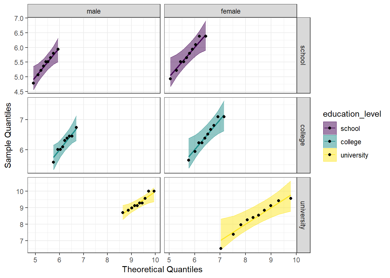
Looking at the Q-Q plot, we can see that all (except perhaps one in the male-university combination) the data points fall within the 95% range, as well as falling pretty neatly along the trend line.
Detrended QQ Plot
We can also make a detrended Q-Q plot using the same code but adding detrend = TRUE to all of the stat_qq_ functions.
#Perform detrended QQ plots for each combination
ggplot(data = job, mapping = aes(sample = score, color = education_level, fill = education_level)) +
  stat_qq_band(alpha = 0.5, conf = 0.95, bandType = "pointwise", detrend = TRUE) +
  stat_qq_line(identity = TRUE, detrend = TRUE) +
  stat_qq_point(col = "black", detrend = TRUE) +
  facet_grid(education_level ~ gender, scales = "free") +
  labs(x = "Theoretical Quantiles", y = "Sample Quantiles") +
  scale_fill_viridis(discrete = TRUE) +
  scale_color_viridis(discrete = TRUE) +
  theme_bw()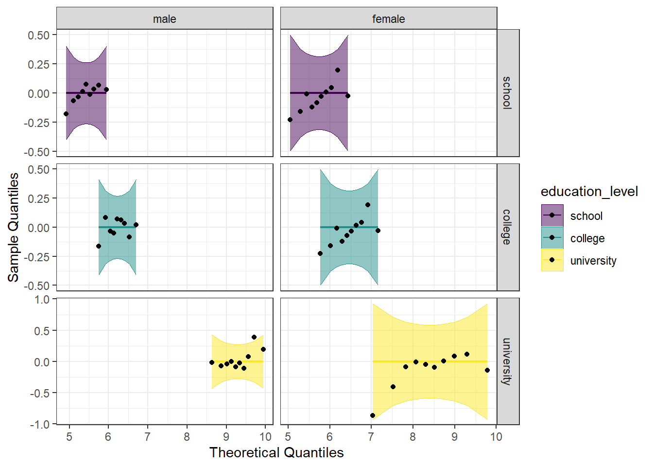
Looking at both the regular and detrended Q-Q plots, we can see that all of the educational level and gender combinations are normally distributed.
11.2.2 Homogeneity of Variance
We will test the homogeneity of variance with the Levene’s Test and the Brown-Forsyth Test. Both tests use the same function from the package car, leveneTest(), but with the argument center = we can differentiate between the two. We provide the function leveneTest() with the formula we want to use (score ~ gender*education_level), and indicate the data set (data = job).
#Call the car package
library(car)

#Perform Levene's Test
LT_job <- leveneTest(score ~ gender*education_level, data = job, center="mean")

#Perform Brown-Forsythe test
BFT_job <- leveneTest(score ~ gender*education_level, data = job, center="median")

#Print both of them
print(LT_job)
## Levene's Test for Homogeneity of Variance (center = "mean")
## Df F value Pr(>F)
## group 5 2.2748 0.0605 .
## 52
## ---
## Signif. codes: 0 '***' 0.001 '**' 0.01 '*' 0.05 '.' 0.1 ' ' 1## Levene's Test for Homogeneity of Variance (center = "median")
## Df F value Pr(>F)
## group 5 2.197 0.06856 .
## 52
## ---
## Signif. codes: 0 '***' 0.001 '**' 0.01 '*' 0.05 '.' 0.1 ' ' 1We see that neither value is significant, indicating that we do not reject the null that the variances are the same. The assumption of homogeneity of variances has been met.
11.3 Run the two-way between subjects ANOVA
Using the aov_car() function from the afex package, we first assign the formula to an object (model_job), so we can later get summary statistics and perform post hoc tests if needed. We put in that we want score modeled as a function of both gender and education level, as well as the interaction between the two (score ~ gender*education_level). We need to add in + Error(id), which specifies the error factor. Lastly, we specify that our data is the job dataframe (data = job). You may notice that we only specified the interaction in our formula designation. R will automatically add in the individual main effects to the model. In other words, the formula score ~ gender*education_level is interpreted identically to socre ~ gender + education_level + gender*education_level; it is just less typing for us. When we run the first line, we don’t see any output, because we have assigned it to an object. However, if we ask for the summary of that model (summary(model_job)), we get the output seen below.
#Call afex package
library(afex)

#Run the model
model_job <- aov_car(score ~ gender*education_level + Error(id), data = job)

#Get the model summary
summary(model_job)
## Anova Table (Type 3 tests)
##
## Response: score
## num Df den Df MSE F ges Pr(>F)
## gender 1 52 0.30252 0.5856 0.01114 0.447601
## education_level 2 52 0.30252 189.1724 0.87917 < 2.2e-16 ***
## gender:education_level 2 52 0.30252 7.3379 0.22011 0.001559 **
## ---
## Signif. codes: 0 '***' 0.001 '**' 0.01 '*' 0.05 '.' 0.1 ' ' 1Looking at the summary, we can see an ANOVA table, which includes ges (“generalized eta squared”). However, we don’t see SS listed in the table. If we want this, we can include an additional argument to aov_car(), return = "univariate" (see below). This will provide an ANOVA table with SS as well as listing the residuals, or error.
#Run the model
model_job2 <- aov_car(score ~ gender*education_level + Error(id),
data = job,
return = "univariate")## Contrasts set to contr.sum for the following variables: gender, education_level## Anova Table (Type III tests)
##
## Response: dv
## Sum Sq Df F value Pr(>F)
## (Intercept) 2774.84 1 9172.2752 < 2.2e-16 ***
## gender 0.18 1 0.5856 0.447601
## education_level 114.46 2 189.1724 < 2.2e-16 ***
## gender:education_level 4.44 2 7.3379 0.001559 **
## Residuals 15.73 52
## ---
## Signif. codes: 0 '***' 0.001 '**' 0.01 '*' 0.05 '.' 0.1 ' ' 1We look first at the interaction (gender:education_level), and see that it is significant, indicating that the effect of gender on job satisfaction score depends on the educational level. We can also say that the effect of education level on job satisfaction score depends on gender.
In the section below, you will find post hoc tests for situations when there is a significant interaction and when there is not. Look at the flow chart in 11.1 to determine which tests you will need to perform for your particular analysis.
Figure 11.1: Decision chart for two-way between subjects ANOVA
11.3.1 Estimated Means
We can also examine the estimated marginal means, using the emmeans() function from the emmeans package. This is the same function we will use for the pairwise comparisons below, we are just asking for a specific part of it first.
WARNING: If you do not have a balanced design (equal N in all cells), you would not want to use estimated marginal means.
The first argument to the emmeans() function is the ANOVA model object (model_job). We then specify on what variable we would like the means. Notice there are three different models we are making: one for means by education level, one for means by gender, and one for means for the interaction (each combination of education level and gender). We then call the models to visualize the means.
#Call emmeans
library(emmeans)
#Calculate estimated marginal means
job_em_edu <- emmeans(model_job, specs = ~education_level)## NOTE: Results may be misleading due to involvement in interactions## NOTE: Results may be misleading due to involvement in interactionsjob_em_edu_gend <- emmeans(model_job, specs = ~education_level*gender)
#Look at the estimated means
job_em_edu## education_level emmean SE df lower.CL upper.CL
## school 5.58 0.126 52 5.33 5.84
## college 6.34 0.126 52 6.09 6.60
## university 8.85 0.123 52 8.60 9.10
##
## Results are averaged over the levels of: gender
## Confidence level used: 0.95## gender emmean SE df lower.CL upper.CL
## male 6.98 0.104 52 6.77 7.19
## female 6.87 0.100 52 6.67 7.07
##
## Results are averaged over the levels of: education_level
## Confidence level used: 0.95## education_level gender emmean SE df lower.CL upper.CL
## school male 5.43 0.183 52 5.06 5.79
## college male 6.22 0.183 52 5.86 6.59
## university male 9.29 0.174 52 8.94 9.64
## school female 5.74 0.174 52 5.39 6.09
## college female 6.46 0.174 52 6.11 6.81
## university female 8.41 0.174 52 8.06 8.76
##
## Confidence level used: 0.95The output from the above code shows three tables with the estimated mean job satisfaction score for each educational level, gender, or combination (emmean column), as well as the standard error, degrees of freedom, and upper and lower confidence intervals.
11.3.2 Interaction Plot
We can also plot the interaction, to visually see how the estimated mean job satisfaction scores vary both at each educational level, and to compare the genders. We will use ggplot() to plot. Breaking down the code below by line:
1. ggplot() is the main function, and gets fed what the data is (data = as.data.frame(job_em_edu_gend)). You may notice the extra wrapper around our data this time, the as.data.frame(). This is because the estimated means table from the emmeans() function is not a dataframe, and ggplot only takes dataframes. This wrapper changes the object into a dataframe. The other argument on this line is defining our x and y values (aes(x = education_level, y = emmean)).
2. geom_line(aes(color = gender, group = gender)) is what allows our individual data points to be connected by a line. The aes(color = gender, group = gender) argument is telling the line graph how our data is grouped and what to connect. Since there are two different treatments, it is helpful to have each one a different color.
3. geom_point() is a scatterplot function, and creates the individual data points you will see on the graph. This needs no additional arguments.
4. scale_color_viridis(begin = 0.2, end = 0.8, discrete = TRUE) calls the viridis color scale for accessibility. The begin = 0.2, end = 0.8 arguments are simply to avoid a yellow line when not absolutely necessary. This is a personal preference of mine, and can easily be left off. discrete = TRUE is needed, as we are not supplying a continuous set of data, but rather individual values from our emmeans object.
5. theme_bw() addresses the overall theme of the plot - removing the grey background, for example.
#Plot estimated marginal means
ggplot(data = as.data.frame(job_em_edu_gend), aes(x = education_level, y = emmean)) +
geom_line(aes(color = gender, group = gender)) +
geom_point(aes(color = gender)) +
scale_color_viridis(begin = 0.2, end = 0.8, discrete = TRUE) +
theme_bw()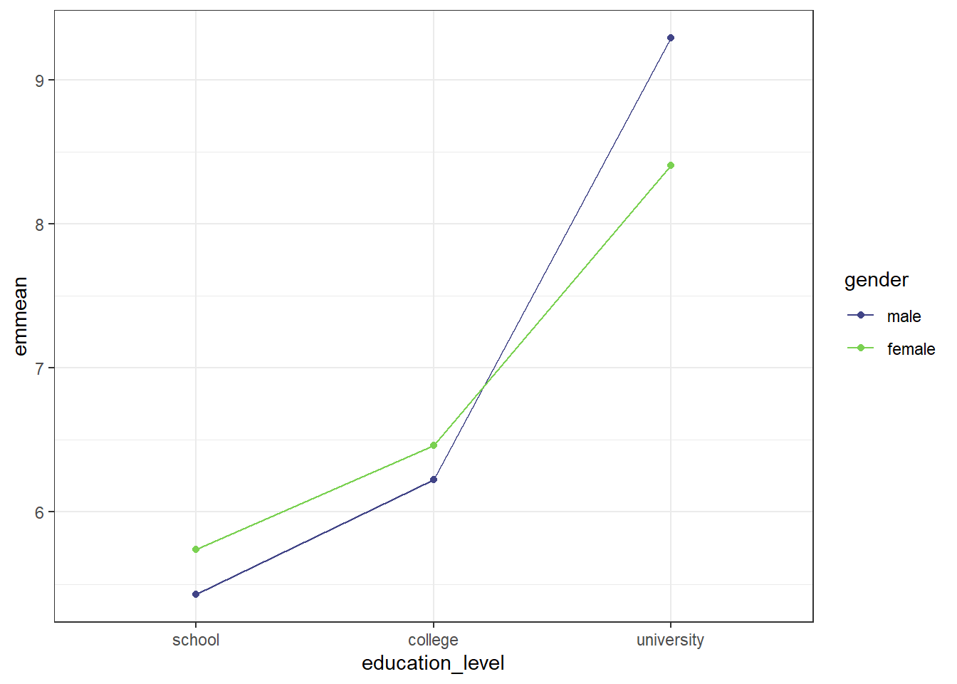
The graph shows that if education level was school or college, females reported higher job satisfaction scores than males, while males reported higher job satisfaction scores than females at the university education level. We can also see that the increase in job satisfaction between school and college was not as steep for both genders as the increase between college and university.
11.4 Post-hoc tests
11.4.1 Simple Main Effects
The simple main effect is similar to performing a one-way between subjects ANOVA on just one of the IVs. For ease in grouping, we will be using the rstatix package, which allows us to group our data using the pipe operator (%>%).
Simple Main Effect of Gender
We can determine the simple main effect of gender on job satisfaction scores by seeing how it differs at each educational level. Since gender only has 2 levels in these data, we could do a paired-samples t-test. For future analyses that may have more than two levels, however, we are doing it in this manner.
The first thing we need to do is re-run our model, in order to have an object that anova_test() can recognize below. The omnibus model will be used to gather pooled sum of squares error and degrees of freedom, so it is necessary to calculate. That is done with lm_model_job <- lm(score ~ gender*education_level, data = job), and is the same format we saw above.
NOTE: we are doing this because we have passed the homogeneity of variance assumption. If we did not have homogeneity of variance, we should not use the pooled error sum of squares, and should instead perform separate one-way ANOVAs to have separate error sums of squares. That is currently beyond the scope of this tutorial, however.
Breaking down the simple main effect calculation line by line:
1. sme_gend_job <- job %>% to start, we are defining which data set to use (job), and assigning the whole thing to an object (sme_gend_job). The %>% then sends it on to the next line.
2. group_by(education_level) %>% is grouping by the different educational level. So, gathering all the job satisfaction scores from school together, etc.
3. anova_test(score ~ gender, error = lm_model_job) %>% is the actual ANOVA test. As before, we supply it with the formula we want it to use: score ~ gender. We also provide which ANOVA model to use to pull the pooled sum of squares error and degrees of freedom - error = lm_model_job. This is why we needed to re-run our model using lm() rather than aov_car() like we had for the omnibus test. This function does not accept aov_car() model objects to calculate the error from.
4. get_anova_table() %>% requests an ANOVA table from the anova_test() function above.
5. adjust_pvalue(method = "bonferroni") performs the adjustment to the p-values. The method chosen here is bonferroni; Tukey and Scheffe are not options with this function.
#Call Rstatix package
library(rstatix)
#Restate our model
lm_model_job <- lm(score ~ gender*education_level, data = job)
#Calculate simple main effect of treatment
sme_gend_job <- job %>%
group_by(education_level) %>%
anova_test(score ~ gender, error = lm_model_job) %>%
get_anova_table() %>%
adjust_pvalue(method = "bonferroni")
#Call the output table
sme_gend_job## # A tibble: 3 × 9
## education_level Effect DFn DFd F p `p<.05` ges p.adj
## <fct> <chr> <dbl> <dbl> <dbl> <dbl> <chr> <dbl> <dbl>
## 1 school gender 1 52 1.55 0.219 "" 0.029 0.657
## 2 college gender 1 52 0.899 0.347 "" 0.017 1
## 3 university gender 1 52 13.0 0.000706 "*" 0.2 0.00212Here, we can see that there is no significant effect of gender on job satisfaction scores at the school or college education level, but there is a significant effect of gender on job satisfaction scores at the university education level.
Simple Main Effect of Education Level
If our research question was focused on education level, we could also calculate the simple main effect of education, looking at the effect of education level on the job satisfaction score by seeing how it differs for each gender.
Since education level has more than two levels, if there is a significant simple main effect, we will need to further follow up with pairwise comparisons to see where the difference is.
#Call Rstatix package (we just did above; for illustrative purposes here)
library(rstatix)
#Restate our model (same as above)
lm_model_job <- lm(score ~ gender*education_level, data = job)
#Calculate simple main effect of treatment
sme_edu_job <- job %>%
group_by(gender) %>%
anova_test(score ~ education_level, error = lm_model_job) %>%
get_anova_table() %>%
adjust_pvalue(method = "bonferroni")
#Call the output table
sme_edu_job## # A tibble: 2 × 9
## gender Effect DFn DFd F p `p<.05` ges p.adj
## <fct> <chr> <dbl> <dbl> <dbl> <dbl> <chr> <dbl> <dbl>
## 1 male education_level 2 52 132. 3.92e-21 * 0.836 7.84e-21
## 2 female education_level 2 52 62.8 1.35e-14 * 0.707 2.70e-14We can see from the table above that there is a significant effect of education level on job satisfaction scores for both males and females. Since education level has more than two levels, we will need to do pairwise comparisons to determine between which levels the difference occurs.
11.4.2 Simple Comparisons
Still using the rstatix package, we can calculate simple comparisons. We assign the output to an object (model_sc_job), and define our data (job). Then, we group by gender (group_by(gender)) before calling emmeans() with emmeans_test(). For this function, we define what we’re comparing (remembering that we have already grouped by levels of one of our IVs) with score ~ education_level. We define what the adjustment method should be with p.adjust.method = "bonferroni". Of the adjustment methods discussed in the one-way ANOVA, only Bonferroni is available within this function. Lastly, adding detailed = TRUE gives a more detailed table output, which will include and “estimate” column, which is the difference between the two combinations being compared.
#Do the pairwise comparison
model_sc_job <- job %>%
group_by(gender) %>%
emmeans_test(score ~ education_level,
p.adjust.method = "bonferroni",
detailed = TRUE)
model_sc_job## # A tibble: 6 × 15
## gender term .y. group1 group2 null.value estimate se df conf.low conf.high statistic p p.adj p.adj.signif
## * <fct> <chr> <chr> <chr> <chr> <dbl> <dbl> <dbl> <dbl> <dbl> <dbl> <dbl> <dbl> <dbl> <chr>
## 1 male education_level score school college 0 -0.797 0.259 52 -1.32 -0.276 -3.07 3.37e- 3 1.01e- 2 *
## 2 male education_level score school university 0 -3.87 0.253 52 -4.37 -3.36 -15.3 6.87e-21 2.06e-20 ****
## 3 male education_level score college university 0 -3.07 0.253 52 -3.58 -2.56 -12.1 8.42e-17 2.53e-16 ****
## 4 female education_level score school college 0 -0.722 0.246 52 -1.22 -0.228 -2.94 4.95e- 3 1.49e- 2 *
## 5 female education_level score school university 0 -2.67 0.246 52 -3.16 -2.17 -10.8 6.07e-15 1.82e-14 ****
## 6 female education_level score college university 0 -1.94 0.246 52 -2.44 -1.45 -7.90 1.84e-10 5.52e-10 ****We could also perform the pairwise comparisons in the emmeans package, which results is a less overwhelming table. We first need to define an em model object (em_sc_job) by running emmeans() on our initial ANOVA model object (model_job). We then specify what we want comparisons of ("education_level"), and how we want it grouped (by = "gender").
After defining the object, we then run a pairs() function on that object (pairs(em_sc_job, adjust = "bonferroni")) and specify our p-value adjustment method. Another benefit of using this method is the range of p-value adjustments available: Bonferroni, Tukey’s HSD, Scheffe, among others.
#Define em model
em_sc_job <- emmeans(model_job, "education_level", by = "gender")
#Get pairwise comparisons
pairs(em_sc_job, adjust = "bonferroni")## gender = male:
## contrast estimate SE df t.ratio p.value
## school - college -0.797 0.259 52 -3.073 0.0101
## school - university -3.865 0.253 52 -15.295 <.0001
## college - university -3.069 0.253 52 -12.143 <.0001
##
## gender = female:
## contrast estimate SE df t.ratio p.value
## school - college -0.722 0.246 52 -2.935 0.0149
## school - university -2.665 0.246 52 -10.834 <.0001
## college - university -1.943 0.246 52 -7.899 <.0001
##
## P value adjustment: bonferroni method for 3 testsFrom the tables, we can see that there are significant differences on job satisfaction score between all educational levels for both males and females.
11.4.3 Marginal Comparisons
For a non-significant interaction, we would then determine if any main effects were significant. We see this by looking back at our omnibus model:
## Anova Table (Type 3 tests)
##
## Response: score
##                        num Df den Df     MSE        F     ges    Pr(>F)
## gender                      1     52 0.30252   0.5856 0.01114  0.447601
## education_level             2     52 0.30252 189.1724 0.87917 < 2.2e-16 ***
## gender:education_level      2     52 0.30252   7.3379 0.22011  0.001559 **
## ---
## Signif. codes: 0 '***' 0.001 '**' 0.01 '*' 0.05 '.' 0.1 ' ' 1From this, we see that there was a significant main effect of education level, but no significant main effect of gender. (REMINDER: Since we had a significant interaction, we would typically not be doing this. This is to illustrate procedures when there is not a significant interaction) Since there is a significant main effect, we can follow up with marginal comparisons to determine where differences are.
To do marginal comparisons, we will be using the pairwise_t_test(), which comes with base R (no packages needed). We define an object first, followed by our data (job). Then we run the pairwise test (pairwise_t_test()) on the desired main effect. We set that with the formula: score ~ education_level will provide marginal comparisons for a significant main effect of education level while score ~ gender would provide marginal comparisons for a significant main effect of gender. We then indicate our desired p-value adjustment method (p.adjust.method = "bonferroni"). Even though only education level had a significant main effect, both education level and gender marginal comparisons are illustrated below. This method is handy, but does not provide us with the direction and size of the difference.
Using emmeans_test() from the rstatix package provides similar information to pairwise_t_test(), but, when the argument detailed = TRUE is provided, also provides the estimate, or how much job satisfaction scores are differing. This method is also provided below.
Gender
Using pairwise_t_test():
#Do marginal comparisons for gender
mc_gend <- job %>%
  pairwise_t_test(
    score ~ gender,
    p.adjust.method = "bonferroni")

#Call the table
mc_gend
## # A tibble: 1 × 9
## .y. group1 group2 n1 n2 p p.signif p.adj p.adj.signif
## * <chr> <chr> <chr> <int> <int> <dbl> <chr> <dbl> <chr>
## 1 score male female 28 30 0.636 ns 0.636 nsUsing emmeans_test() from rstatix:
#Redefine model for overall df
lm_gend <- lm(score ~ gender*education_level, data = job)

#Get marginal comparisons
job %>%
  emmeans_test(score ~ gender,
               p.adjust.method = "bonferroni",
               model = lm_gend,
               detailed = TRUE)
## NOTE: Results may be misleading due to involvement in interactions## # A tibble: 1 × 14
## term .y. group1 group2 null.value estimate se df conf.low conf.high statistic p p.adj p.adj.signif
## * <chr> <chr> <chr> <chr> <dbl> <dbl> <dbl> <dbl> <dbl> <dbl> <dbl> <dbl> <dbl> <chr>
## 1 gender score male female 0 0.111 0.145 52 -0.180 0.401 0.765 0.448 0.448 nsEducation Level
#Do marginal comparisons for education level
mc_edu <- job %>%
  pairwise_t_test(
    score ~ education_level,
    p.adjust.method = "bonferroni")

#Call the table
mc_edu
## # A tibble: 3 × 9
## .y. group1 group2 n1 n2 p p.signif p.adj p.adj.signif
## * <chr> <chr> <chr> <int> <int> <dbl> <chr> <dbl> <chr>
## 1 score school college 19 19 3.27e- 4 *** 9.82e- 4 ***
## 2 score school university 19 20 3.43e-23 **** 1.03e-22 ****
## 3 score college university 19 20 3.8 e-18 **** 1.14e-17 ****Using emmeans_test() from rstatix:
#Redefine model for overall df
lm_edu <- lm(score ~ gender*education_level, data = job)

#Get marginal comparisons
job %>%
  emmeans_test(score ~ education_level,
               p.adjust.method = "bonferroni",
               model = lm_edu,
               detailed = TRUE)
## NOTE: Results may be misleading due to involvement in interactions## # A tibble: 3 × 14
## term .y. group1 group2 null.value estimate se df conf.low conf.high statistic p p.adj p.adj.signif
## * <chr> <chr> <chr> <chr> <dbl> <dbl> <dbl> <dbl> <dbl> <dbl> <dbl> <dbl> <dbl> <chr>
## 1 education_level score school college 0 -0.759 0.179 52 -1.12 -0.401 -4.25 8.91e- 5 2.67e- 4 ***
## 2 education_level score school university 0 -3.27 0.176 52 -3.62 -2.91 -18.5 1.51e-24 4.53e-24 ****
## 3 education_level score college university 0 -2.51 0.176 52 -2.86 -2.15 -14.2 1.52e-19 4.56e-19 ****As expected, there is no significant difference between male and female (there was no significant main effect). However, looking at the marginal comparisons for the main effect of education level, we can see that there are significant differences between all levels. Looking at the output from emmeans, we can say that the job satisfaction scores averaged across gender were 0.76 units lower for an educational level of school as compared to an educational level of college.