Chapter 8 Correlation and Regression
Packages used: tidyverse, ggplot2, correlation, Hmisc
8.1 Correlation
To illustrate correlations, we will be using the mtcars data set that is built into R. For simplicity sake, we will only be looking at three of the variables; we will therefore need to subset the data. First, we will load the full mtcars data set into a dataframe, and look at what the variables are. We can see that there are 11 variables, some of which are not continuous. We will keep mpg (miles per gallon), hp (horse power), and wt (weight). To do this, we make a new dataframe (data1) and assign our first data frame to that (<- data). Then, using the %>% operator, we send our first dataframe to the second line. There, we are choosing to only keep the three variables we want; we are selecting them: select(c(mpg, hp, wt)). Since we are selecting more than one, we are using c(); you can think of this as meaning “combine”. After we select our columns, we check once more to make sure all our work went as we thought.
##                    mpg cyl disp  hp drat    wt  qsec vs am gear carb
## Mazda RX4         21.0   6  160 110 3.90 2.620 16.46  0  1    4    4
## Mazda RX4 Wag     21.0   6  160 110 3.90 2.875 17.02  0  1    4    4
## Datsun 710        22.8   4  108  93 3.85 2.320 18.61  1  1    4    1
## Hornet 4 Drive    21.4   6  258 110 3.08 3.215 19.44  1  0    3    1
## Hornet Sportabout 18.7   8  360 175 3.15 3.440 17.02  0  0    3    2
## Valiant           18.1   6  225 105 2.76 3.460 20.22  1  0    3    1
#Load tidyverse package
library(tidyverse)
#Only keep 3 variables: mpg, hp, and wt
data1 <- data %>%
select(c(mpg, hp, wt))
#Check once more that our data is how we'd like it
head(data1)## mpg hp wt
## Mazda RX4 21.0 110 2.620
## Mazda RX4 Wag 21.0 110 2.875
## Datsun 710 22.8 93 2.320
## Hornet 4 Drive 21.4 110 3.215
## Hornet Sportabout 18.7 175 3.440
## Valiant 18.1 105 3.4608.1.1 Examine the Data - Correlation
We can visually examine the relationship between the variables by creating scatterplots. Since there are three variables, there are three different pairs to examine: mpg-hp, hp-wt, and mpg-wt. We can use ggplot to make scatterplots for each pair, with the geom_point() option. In the first set of commands, we are telling ggplot what data to use, and aes(x = mpg, y = hp) defines which variable goes on which axis.
#Load ggplot package
library(ggplot2)

#mpg-hp scatterplot
ggplot(data1, aes(x = mpg, y = hp)) +
  geom_point()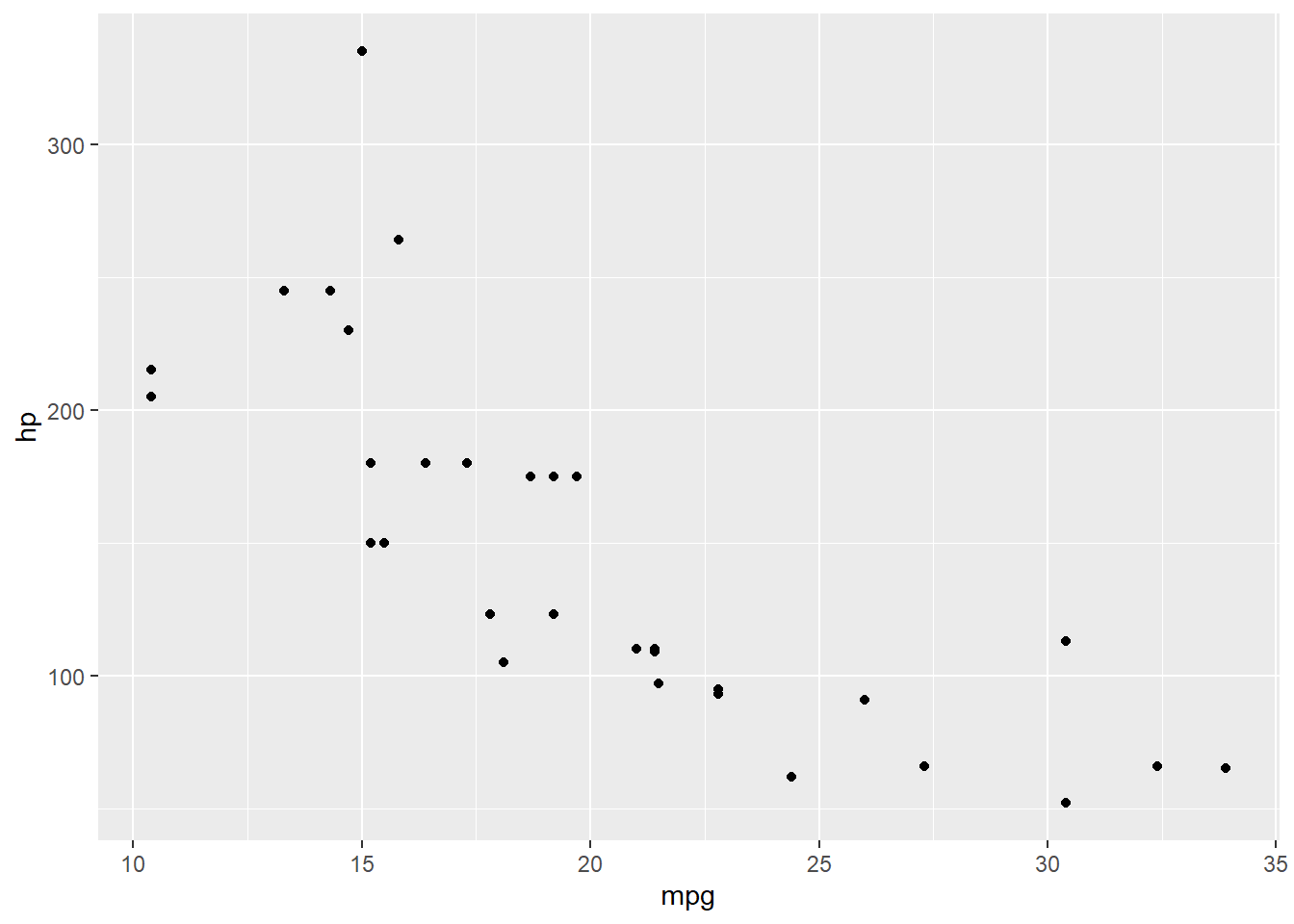
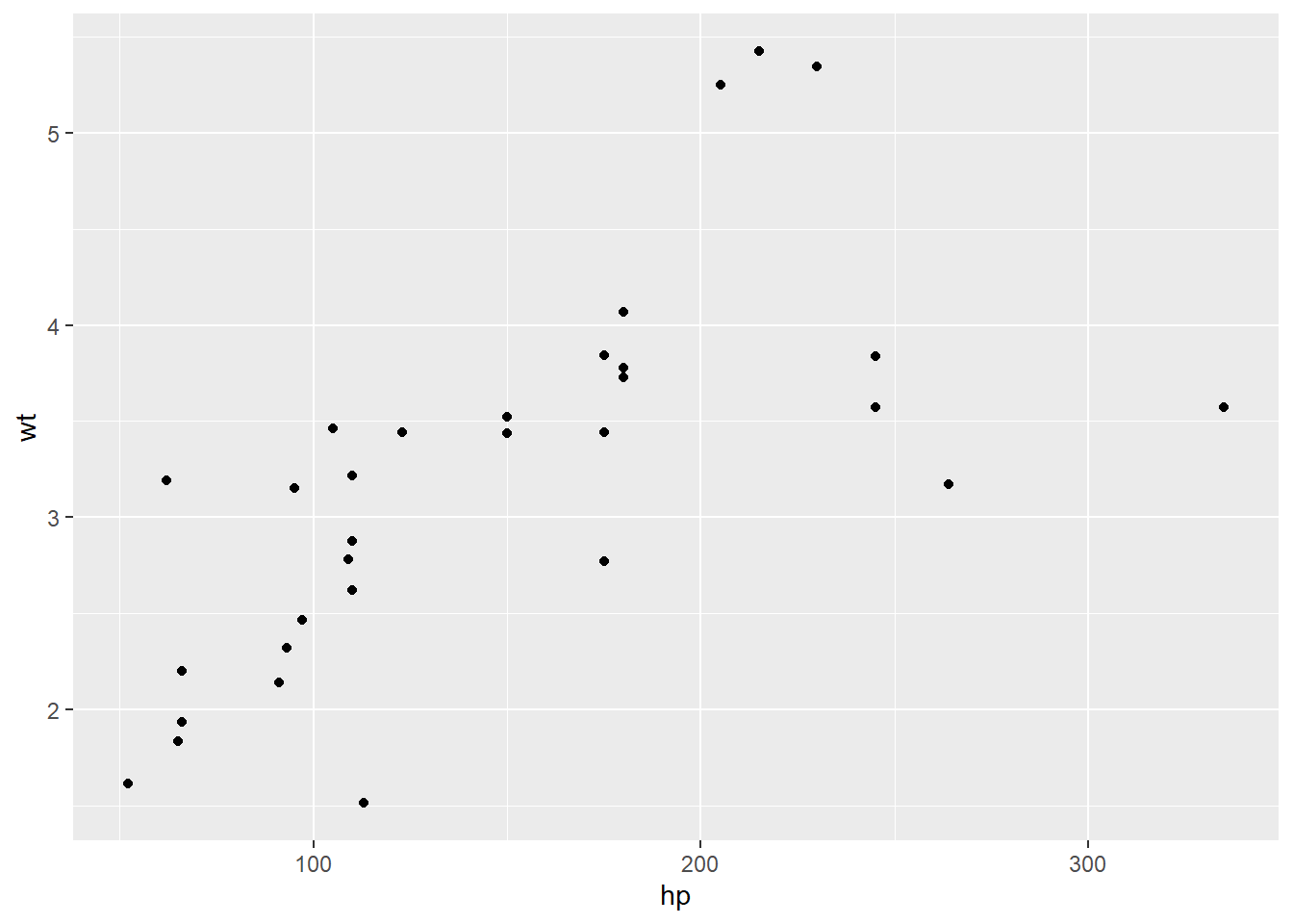
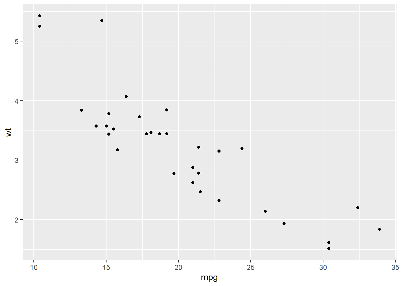
As you can imagine, this could get cumbersome rapidly. Another way of looking at the relationship is to create multiple scatterplots in one figure. This creates a comparison of each variable to the others. It can be less clear to read, especially as they get large, but it can be a nice first step, before creating individual plots of interesting relationships.
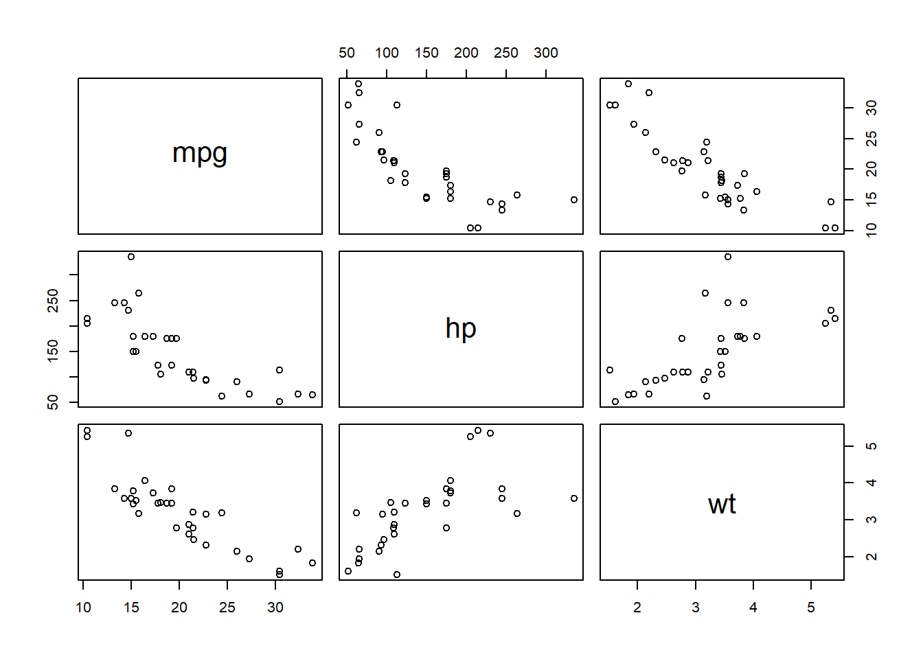
The plot above can be read by looking at the variable names along the center diagonal (they are put there rather than along the edges). Intersections of columns and rows of two different variables contain scatter plots with those variables. Compare this image to the individual scatter plots above - you will see they look the same.
8.1.2 Run a Correlation
To run the correlation, we can take one of two approaches, depending on our data: 1. Run a correlation between a single pair 2. Create a correlation matrix for our entire dataframe
Correlation between a single pair of variables
This test is testing if the correlation between two variables is significantly different than zero. We can use cor.test() for this, specifying which two variables we want tested.
##
##  Pearson's product-moment correlation
##
## data:  data1$mpg and data1$hp
## t = -6.7424, df = 30, p-value = 1.788e-07
## alternative hypothesis: true correlation is not equal to 0
## 95 percent confidence interval:
##  -0.8852686 -0.5860994
## sample estimates:
##        cor
## -0.7761684
From the output, we can see that mpg and hp have a correlation significantly different than 0 (p < 0.001), with a correlation of -0.776. This is useful if you only have two variables you are trying to compare. However, if you have more than one variable, you will likely want to create a correlation matrix.
Correlation matrix
If we just wanted the correlations of each pair of variables, we can use
One way to create a correlation matrix is to use the rcorr() function in the Hmisc package; this will create a matrix of correlations between the variables in your dataframe. Since this function requires matrix input, we use as.matrix() around our dataframe to change the type for the function.
#Load the Hmisc package
library(Hmisc)

#Run the test; saving out results
c <- rcorr(as.matrix(data1))

#View results
c
## mpg hp wt
## mpg 1.00 -0.78 -0.87
## hp -0.78 1.00 0.66
## wt -0.87 0.66 1.00
##
## n= 32
##
##
## P
## mpg hp wt
## mpg 0 0
## hp 0 0
## wt 0 0We can see from the output of rcorr() that we get two different matrices: one with the correlations between each set of variables, and another with each of the p-values. P-values of 0, as in our table, indicate p < 0.001.
This can be challenging to reference, having to go back and forth between two tables to determine if the correlation is significant or not. One way around this is to use the correlation() function in the correlation package. The only information we need to provide is the name of our data set. If we were running a different type of correlation (ie, not Pearson), we could specify that by including method = "spearman" after our data.
## # Correlation Matrix (pearson-method)
##
## Parameter1 | Parameter2 |     r |         95% CI | t(30) |         p
## --------------------------------------------------------------------
## mpg        |         hp | -0.78 | [-0.89, -0.59] | -6.74 | < .001***
## mpg        |         wt | -0.87 | [-0.93, -0.74] | -9.56 | < .001***
## hp         |         wt |  0.66 | [ 0.40,  0.82] |  4.80 | < .001***
##
## p-value adjustment method: Holm (1979)
## Observations: 32
After running the code, we get a table output with each possible combination of variables as a row. The r column has the correlations, followed by a 95% confidence interval for the correlations (95% CI), a t-test of the correlation (t(30)), and the p-value (p). Following what we saw earlier, all three correlations are significant (p < 0.001). Under the table, it also tells us that we had 32 observations (N = 32). We can say that there is a significant negative linear relationship between mpg and hp as well as between mpg and wt. Additionally, we can say that there is a significant positive relationship between hp and wt.
8.2 Regression
To model a linear regression, we are going to go back to the cherry tree data set we used earlier. As a reminder, the variables are: - Girth (diameter, in inches) - Height (in feet) - Volume (in cubic feet)
##   Girth Height Volume
## 1   8.3     70   10.3
## 2   8.6     65   10.3
## 3   8.8     63   10.2
## 4  10.5     72   16.4
## 5  10.7     81   18.8
## 6  10.8     83   19.7
We can ask the question “How does the girth change as the trees grow taller?”, which can be answered by a linear regression model. Our DV, or “Y”, is girth, while our IV, or “X”, is height. In R, to represent this relationship, we will write Y ~ X. We would say that as “Y is a function of X”. The equation for this would be \[Girth = a + b*Height\], with “a” being the intercept and “b” being the slope.
8.2.1 Examine the Data - Regression
We can begin to get an idea as to the relationship by plotting on a scatterplot. This time, which variable goes where is very important: the DV needs to be assigned to y and the IV to x.
#ggplot2 is already loaded from above, so we don't need to do it again
ggplot(data = df_t, aes(x = Height, y = Girth)) +
  geom_point()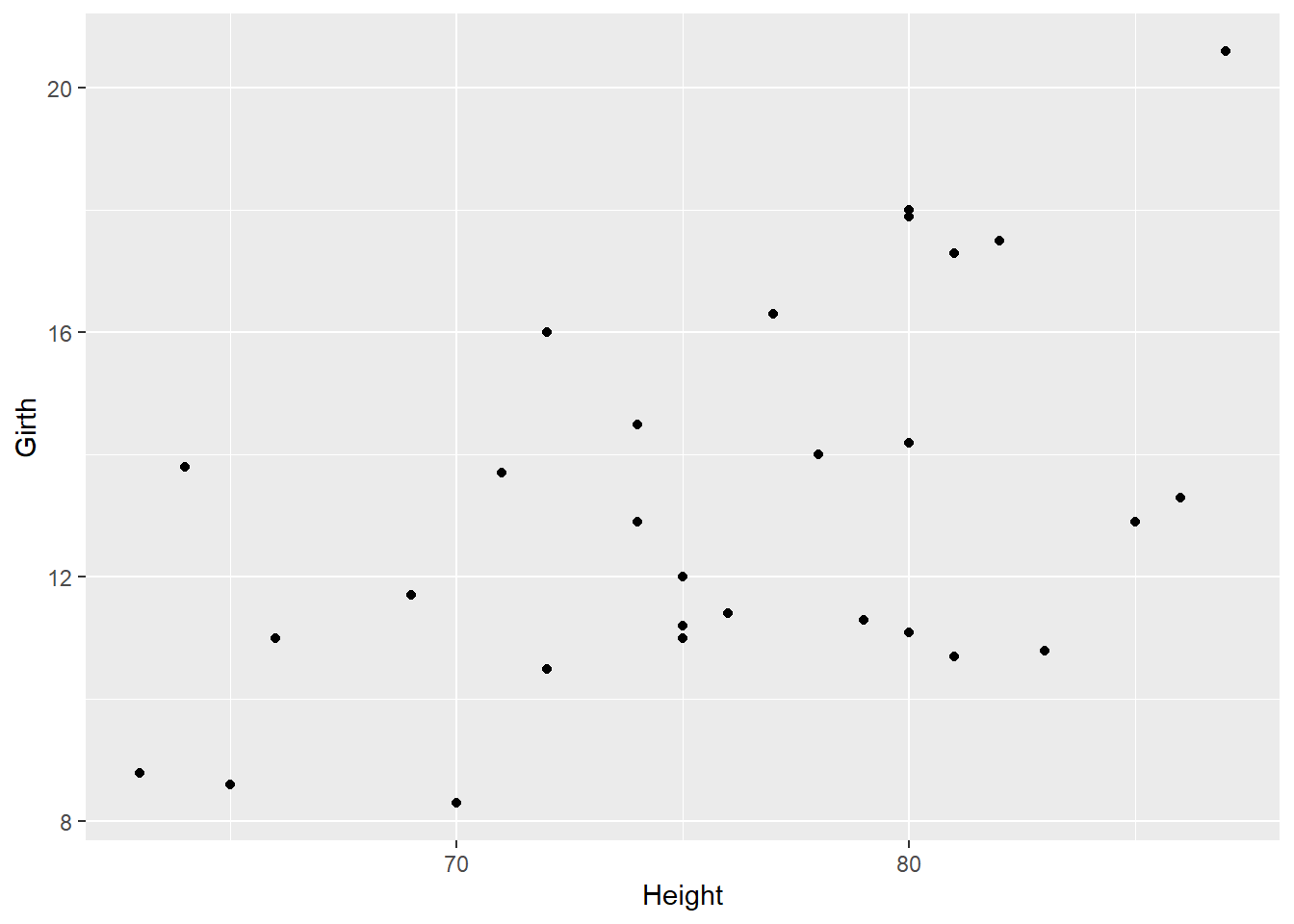
Looking at the scatterplot, we can see there seems to be a slight positive relationship between girth and height of cherry trees.
8.2.2 Run the Regression
We can now run the regression, which will give us values for our slope and intercept. To do this, we will use the lm() function, or ‘linear model’. We will be saving the output as an object in order to get the summary from it. Below, we can see that we first put in the formula Girth ~ Height, followed by specifying our data (data = df_t).
#Make the linear regression model
model <- lm(Girth ~ Height, data = df_t)

#Look at model output
model
##
## Call:
## lm(formula = Girth ~ Height, data = df_t)
##
## Coefficients:
## (Intercept) Height
## -6.1884 0.2557##
## Call:
## lm(formula = Girth ~ Height, data = df_t)
##
## Residuals:
## Min 1Q Median 3Q Max
## -4.2386 -1.9205 -0.0714 2.7450 4.5384
##
## Coefficients:
## Estimate Std. Error t value Pr(>|t|)
## (Intercept) -6.18839 5.96020 -1.038 0.30772
## Height 0.25575 0.07816 3.272 0.00276 **
## ---
## Signif. codes: 0 '***' 0.001 '**' 0.01 '*' 0.05 '.' 0.1 ' ' 1
##
## Residual standard error: 2.728 on 29 degrees of freedom
## Multiple R-squared: 0.2697, Adjusted R-squared: 0.2445
## F-statistic: 10.71 on 1 and 29 DF, p-value: 0.002758When we run the first line of code, nothing happens, because the output is being saved in the object model. If we take a look at what is provided as basic output, it provides us with the coefficients. This allows us to input this into our equation from above, substituting “Intercept” for “a” and “Height” for “b”: \[Girth = -6.1884 + 0.2557*Height\]
However, we do not know if height is a significant predictor of girth. Running a summary of the model with summary(model) gives us more information about the statistics on the model. This gives us more information about the coefficients: their estimate, their standard error, and significance. The t-test on the coefficients is testing if they are significantly different than zero; we can see that the slope coefficient for Height is significantly different than zero (p = 0.002).
At the bottom of the summary, we get the \(R^{2}\) (Multiple R-squared) value, the F-statistic, and the associated p-value. We can see that our \(R^{2}\) is 0.2697, F(1, 29) = 10.71, and p = 0.002, indicating that this model better fits the data than a model with no variables.