Chapter 10 One-Way Within Subjects ANOVA
Packages used: datarium, tidyverse, psych, ggplot2, qqplotr, viridis, afex
The data:
We will be using the “selfesteem” dataset from the datarium package. This dataset contains the self-esteem score from 10 individuals at three different time points during a specific diet to determine whether their self-esteem improved. As read in, it will be in “wide” format, meaning there is one column for ID, and one column per time point (t1 through t3).
#Call datarium package
library(datarium)

#Assign data set to an object
se <- selfesteem

#See what it looks like
head(se)
## # A tibble: 6 × 4
## id t1 t2 t3
## <int> <dbl> <dbl> <dbl>
## 1 1 4.01 5.18 7.11
## 2 2 2.56 6.91 6.31
## 3 3 3.24 4.44 9.78
## 4 4 3.42 4.71 8.35
## 5 5 2.87 3.91 6.46
## 6 6 2.05 5.34 6.65In order to test our assumptions and perform the within subjects ANOVA, we will need to convert to long format. Or, we will need to gather all the time points into one column, and there will be multiple rows per ID. We first define a new dataframe, se_long, and assign our se dataframe to it. Then %>% sends the se dataframe to the next line. gather() is from the tidyverse package and “gathers” a value across columns. We specify the “key” column name with key = "time", and what value we want created with value = "score". We then specify what columns we want “gathered” : t1, t2, t3.
We then need to convert the time column from a character column (ie, R interprets it as words) to a factor column (ie, R interprets it as different levels of one variable). The as.factor() function will allow us to do that, and takes as an argument the column you want to change (se_long$time). Since we want the time column to be changed, we need to reassign the change back to the time column.
After doing all that, we check our work before moving on.
#Call tidyverse
library(tidyverse)

#Gather columns t1, t2 and t3 into long format
se_long <- se %>%
  gather(key = "time", value = "score", t1, t2, t3)

#Convert time column to a factor
se_long$time <- as.factor(se_long$time)

#Check work
head(se_long)
## # A tibble: 6 × 3
## id time score
## <int> <fct> <dbl>
## 1 1 t1 4.01
## 2 2 t1 2.56
## 3 3 t1 3.24
## 4 4 t1 3.42
## 5 5 t1 2.87
## 6 6 t1 2.0510.1 Descriptive Statistics
We will get descriptive statistics for each time point, using the describeBy() function from the psych package. We tell the function what we want summarized (se_long$score), and what the grouping variable is (se_long$time).
#Load psych package
library(psych)

#Get descriptive statistics by group
describeBy(se_long$score, se_long$time)
##
## Descriptive statistics by group
## group: t1
## vars n mean sd median trimmed mad min max range skew kurtosis se
## X1 1 10 3.14 0.55 3.21 3.17 0.45 2.05 4.01 1.96 -0.45 -0.67 0.17
## ------------------------------------------------------------------------------------------------------------
## group: t2
## vars n mean sd median trimmed mad min max range skew kurtosis se
## X1 1 10 4.93 0.86 4.6 4.81 0.6 3.91 6.91 3 1.01 0.05 0.27
## ------------------------------------------------------------------------------------------------------------
## group: t3
## vars n mean sd median trimmed mad min max range skew kurtosis se
## X1 1 10 7.64 1.14 7.46 7.53 1.4 6.31 9.78 3.47 0.4 -1.3 0.36In the output, we can see there are three sets of descriptive statistics - one for each time point (t1 - t3). We get the mean score for each time, along with all the other statistics. We can also use these outputs to confirm that there are the same number of responses for each time point - if there were not, this would indicate we were missing data.
A boxplot can be helpful to identify if there are outliers in any of the time points. We will make a boxplot using ggplot2. In the code below, we first define our data (data = se_long) and x (x = time) and y (y = score) values. Our x value is our grouping variable (time, in this case), and our y value is the one we are comparing (scores). The next line calls the boxplot function (geom_boxplot()), and the last line prints each data point as a dot on the box plot (geom_jitter()).
#Call ggplot
library(ggplot2)

#Generate a boxplot
ggplot(data = se_long, aes(x = time, y = score)) +
  geom_boxplot() +
  geom_jitter(width = .2)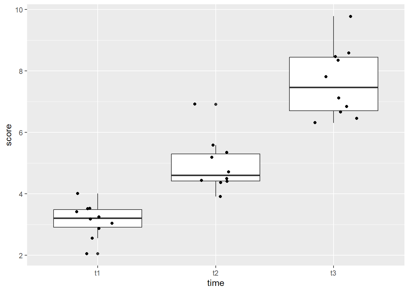
Looking at the boxplot, we can see that time point 1 and 3 both have one data point that is on the line of being an outlier, while time point 2 has two data points that would be considered extreme outliers.
10.2 Assumptions
As with the one-way between subjects ANOVA, we will be testing assumptions. However, these will be tested on each time point as the grouping variable. The normality checks will all look familiar, and we will be adding the check of sphericity assumption. In order to get R to split by group, we will make use of the ‘pipe’(%>%) from the tidyverse package.
Shapiro-Wilk
We will begin by running a Shapiro-Wilk test to test each time point for normality. The shapiro.test() will allow us to get the test, though we will need to assign it to an object and ask for the information in a table. Specifically, we will be asking for the W statistic, or Shaprio-Wilk statistic, and the p-value from the test.
In the code below, we first call the tidyverse package to allow us to split by time point before moving on to running the Shapiro-Wilk test. Then, we specify our data (se_long) and send it on to the next line (%>%). We next specify which variable R should group by with the group_by() function - this time, it is the ‘time’ variable. The line group_by(time) takes our dataframe and groups it by time point. Then, we send that on (%>%) to the Shapiro-Wilk test.
Running the Shapiro-Wilk test, we start with the summarise() function, and define what our columns will be. The first column is the Shapiro-Wilk statistic, named “S-W Statistic”, and we specify that the value in this column should be the statistic from the function: "S-W Statistic" = shapiro.test(score)$statistic. We see that we are still calling the shapiro.test() function on the ‘score’ column (shapiro.test(score)), but then we are including $statistic because that’s the value we want in this column. In the second column we specify that the values should be the p-value from the shapiro.test() function: "p-value" = shapiro.test(score)$p.value.
#Run the Shapiro-Wilk test
se_long %>%   #Call our dataframe and send it on
  group_by(time) %>%    #Group by our grouping variable
  summarise("S-W Statistic" = shapiro.test(score)$statistic,   #Give us the statistics we want, in a table
            "p-value" = shapiro.test(score)$p.value)
## # A tibble: 3 × 3
## time `S-W Statistic` `p-value`
## <fct> <dbl> <dbl>
## 1 t1 0.967 0.859
## 2 t2 0.876 0.117
## 3 t3 0.923 0.380Looking at the output, we see that all the time points have non-significant p-values, indicating that they do not have a distribution that is significantly different than a normal distribution.
Histogram
We can also check the normality assumption for each time point visually, by generating histograms for each time point.
Since there are three time points, we will use a stacked histogram, by adding the function facet_grid(~ time) to our ggplot object. This will generate one histogram per group. If you’d like them as a vertical stack rather than side-by-side, use time ~ .. At the end, theme_minimal() is addressing how the graphs look - getting rid of the grey background, for example.
#Generate side-by-side histograms
ggplot(data = se_long, aes(x = score)) +
  geom_histogram() +
  facet_grid(~ time) +
  theme_minimal()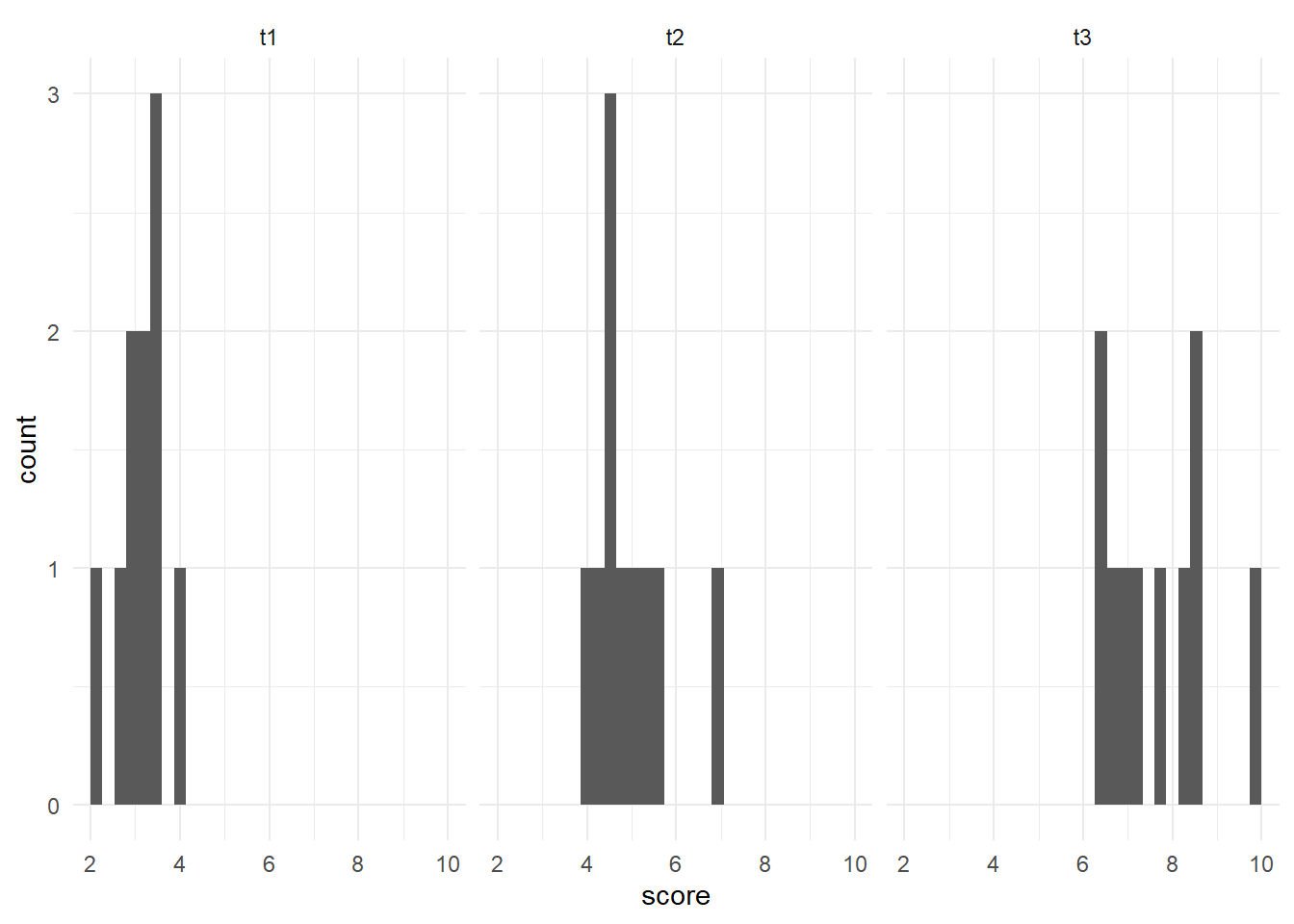
Overall, we could say these histograms appear to be normally distributed. It is more challenging with fewer data points, but they appear to be normally distributed.
QQ Plot
Another visual inspection we can do involves a Q-Q plot. We will use the package qqplotr to make these, as an addition to ggplot2.
Breaking down the code we will use to generate the plot:
1. ggplot(data = se_long, mapping = aes(sample = score, color = time, fill = time)) + is our call to ggplot. We are defining what data to use (data = se_long), and then giving some arguments to the aes() function. sample = score says to use the variable ‘score’, color = time is asking for each time point to be a different color, and fill = time corresponds to the filled in portion. To ensure colorblind friendliness, we will specify colors below.
2. stat_qq_band(alpha=0.5, conf=0.95, qtype=1, bandType = "ts") + is our first function using the qqploter package, and contains arguments about the confidence bands. This is defining the alpha level (alpha = 0.5) and the confidence interval (conf = 0.95) to use for the confidence bands. bandType = "pointwise" is saying to construct the confidence bands based on Normal confidence intervals.
3. stat_qq_line(identity = TRUE) + is another call to the qqplottr package and contains arguments about the line going through the qq plot. The argument identity = TRUE says to use the identity line as the reference to construct the confidence bands around.
4. stat_qq_point(col = "black") + is the last call to the qqplottr package and contains arguments about the data points. col = "black" means we’d like them to be black.
5. facet_wrap(~ time, scales = "free") + is a similar argument to the bar plot above. This is sorting by group (~ time), and creating a qq plot for each of our time points. The scales = "free" refers to the scales of the axes; by setting them to “free” we are allowing them to freely vary between each of the graphs. If you want the scale to be fixed, you would use scale = "fixed".
6. labs(x = "Theoretical Quantiles", y = "Sample Quantiles") + is a labeling function. Here, we are labeling the x and y axis (x = and y = respectively).
7. scale_fill_viridis(discrete = TRUE) is specifying a color fill that is colorblind friendly as well as grey-scale friendly. Since these are discrete groups, we add discrete = TRUE.
8. scale_color_viridis(discrete = TRUE) is again using a colorblind friendly scale for the outlines, to match the fill.
9. Lastly, theme_bw() is giving an overall preset theme to the graphs - this touches on things such as background, axis lines, grid lines, etc.
#Call qqplotr
library(qqplotr)
#Call viridis
library(viridis)
#Perform QQ plots by group
ggplot(data = se_long, mapping = aes(sample = score, color = time, fill = time)) +
stat_qq_band(alpha = 0.5, conf = 0.95, bandType = "pointwise") +
stat_qq_line(identity = TRUE) +
stat_qq_point(col = "black") +
facet_wrap(~ time, scales = "free") +
labs(x = "Theoretical Quantiles", y = "Sample Quantiles") +
scale_fill_viridis(discrete = TRUE) +
scale_color_viridis(discrete = TRUE) +
theme_bw()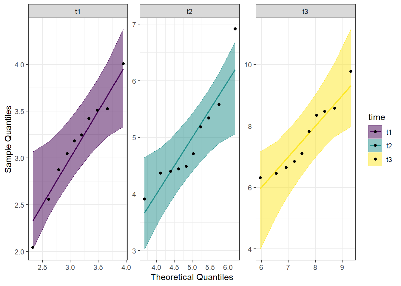 Looking at the Q-Q plot, we can see that most data points fall along the line, or within the 95% interval with the exception of one data point in time point 2.
Detrended QQ Plot
We can also make a detrended Q-Q plot using the same code but adding detrend = TRUE to all of the stat_qq_ functions.
#Perform detrended QQ plots by group
ggplot(data = se_long, mapping = aes(sample = score, color = time, fill = time)) +
  stat_qq_band(alpha = 0.5, conf = 0.95, bandType = "pointwise", detrend = TRUE) +
  stat_qq_line(identity = TRUE, detrend = TRUE) +
  stat_qq_point(col = "black", detrend = TRUE) +
  facet_wrap(~ time, scales = "free") +
  labs(x = "Theoretical Quantiles", y = "Sample Quantiles") +
  scale_fill_viridis(discrete = TRUE) +
  scale_color_viridis(discrete = TRUE) +
  theme_bw()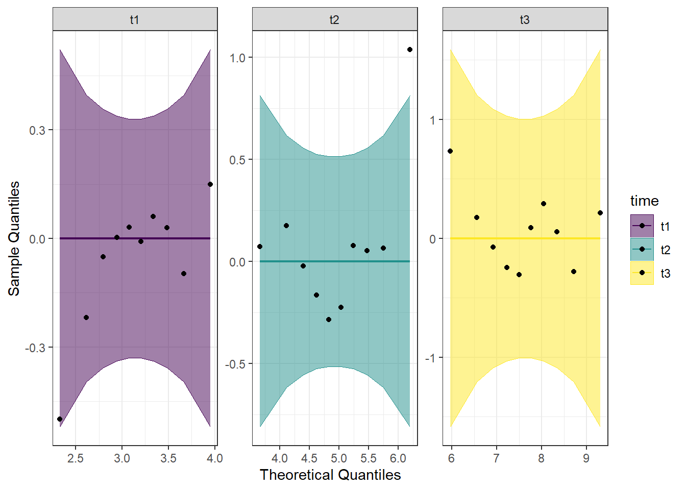
Looking at both the regular and detrended Q-Q plots, we can see that time point 2 has an outlier, but the rest of the data is reasonably normally distributed. Combining this with the results from the Shapiro-Wilk tests, we will consider the assumption of normality to be upheld.
10.3 Run the One-Way Within Subjects ANOVA
We are now ready to run the one-way within subjects ANOVA. We will be using the aov_car() function from the afex package to run this test, as well as to test for the assumption of sphericity. By default, the Greenhouse-Geisser and Huynh-Feldt corrections are provided, regardless of the results of the Mauchly test of sphericity. The aov_car() function creates a model object that can be used later with emmeans() to do follow-ups.
Looking at the code below, you can see that we will be saving the model as an object (model_se); this can be used to get the model information as well as for contrasts later. We give the function aov_car() the formula first (score ~ time). Then, since this is a within subjects ANOVA, we need to give some additional information to the formula: + Error(id/time). Here, we are specifying the unit of observation (people; id) as well as what the repeating factor is (time here; time). Lastly, we provide our data, which must be in long format (data = se_long). Since we are saving the model as an object, we don’t get immediate output by running the model line of code. We need to ask for summary(model_se) to get the output from the model.
## Loading required package: lme4## Loading required package: Matrix##
## Attaching package: 'Matrix'## The following objects are masked from 'package:tidyr':
##
## expand, pack, unpack## ************
## Welcome to afex. For support visit: http://afex.singmann.science/## - Functions for ANOVAs: aov_car(), aov_ez(), and aov_4()
## - Methods for calculating p-values with mixed(): 'S', 'KR', 'LRT', and 'PB'
## - 'afex_aov' and 'mixed' objects can be passed to emmeans() for follow-up tests
## - Get and set global package options with: afex_options()
## - Set sum-to-zero contrasts globally: set_sum_contrasts()
## - For example analyses see: browseVignettes("afex")
## ************##
## Attaching package: 'afex'## The following object is masked from 'package:lme4':
##
## lmer#Perform the ANOVA
model_se <- aov_car(score ~ time + Error(id/time),
data = se_long)
#Get the output
summary(model_se)##
## Univariate Type III Repeated-Measures ANOVA Assuming Sphericity
##
## Sum Sq num Df Error SS den Df F value Pr(>F)
## (Intercept) 822.72 1 4.5704 9 1620.085 1.795e-11 ***
## time 102.46 2 16.6237 18 55.469 2.014e-08 ***
## ---
## Signif. codes: 0 '***' 0.001 '**' 0.01 '*' 0.05 '.' 0.1 ' ' 1
##
##
## Mauchly Tests for Sphericity
##
## Test statistic p-value
## time 0.55085 0.092076
##
##
## Greenhouse-Geisser and Huynh-Feldt Corrections
## for Departure from Sphericity
##
## GG eps Pr(>F[GG])
## time 0.69006 2.161e-06 ***
## ---
## Signif. codes: 0 '***' 0.001 '**' 0.01 '*' 0.05 '.' 0.1 ' ' 1
##
## HF eps Pr(>F[HF])
## time 0.7743711 6.032582e-07What we get first in the output is the ANOVA table assuming the sphericity assumption has been met. Right below that is Mauchly Tests for Sphericity. Looking at the p-value here, we see that it is not significant, indicating that no adjustments are needed. We can interpret the ANOVA table at the top, with the provided degrees of freedom. Looking at the ANOVA table, we see that it is significant, indicating there is a significant main effect of time.
Had we needed them, the Greenhouse-Geisser and Huynh-Feldt Corrections are provided below Mauchly Tests for Sphericity.
By adding an additional argument to the aov_car() function, we can get the partial eta squared. This is probably best done after running the first model, as we did above, to determine if corrections are needed. We use the argument anova_table = to get additional information. Within this, we see that we are listing out (list()) two things. The first is correction =, which takes either “none”, GG”, or “HF”. As might be assumed, this is the sphericity correction that should be applied. The second argument is es =, which is “eta-squared”. We use es = "pes" for “partial eta squared”. We are re-assigning this to our model object from before, but to get this new information, we just need to call the model object itself, rather than the summary.
#Re-run the ANOVA, with any needed corrections.
#Perform the ANOVA
model_se <- aov_car(score ~ time + Error(id/time),
                    data = se_long,
                    anova_table = list(correction = "none", es = "pes"))

#Get the model object for the partial eta squared
model_se
## Anova Table (Type 3 tests)
##
## Response: score
## Effect df MSE F pes p.value
## 1 time 2, 18 0.92 55.47 *** .860 <.001
## ---
## Signif. codes: 0 '***' 0.001 '**' 0.01 '*' 0.05 '+' 0.1 ' ' 1Looking at the output, we see there is a column for pes, which is the partial eta squared. Here, it is 0.860, indicating a large effect.
We may want a more traditional ANOVA table, with SS and MS, which we can get by using the aov() function. However, using this does not provide us with any corrections for violations of the sphericity assumption, so those would need to be made by hand. As above
#Create a model using aov()
model_se2 <- aov(score ~ time + Error(id/time), data = se_long)

#Get the model summary
summary(model_se2)
##
## Error: id
## Df Sum Sq Mean Sq F value Pr(>F)
## Residuals 1 0.07667 0.07667
##
## Error: id:time
## Df Sum Sq Mean Sq
## time 2 87.5 43.75
##
## Error: Within
## Df Sum Sq Mean Sq F value Pr(>F)
## time 2 16.75 8.376 10.4 0.000557 ***
## Residuals 24 19.32 0.805
## ---
## Signif. codes: 0 '***' 0.001 '**' 0.01 '*' 0.05 '.' 0.1 ' ' 1The summary ANOVA table provided with the aov() function contains the degrees of freedom, Sum of Squares, Mean Square, F, and p-value in an ANOVA table, similar to the one provided in the between-subjects ANOVA. Keep in mind, however, if any adjustments need to be made for sphericity violations, you would need to run the other model.
We can also examine the estimated marginal means, using the emmeans() function from the emmeans package. This is the same function we use for the pairwise comparisons below, we are just asking for a specific part of it first.
10.3.1 Estimated Means
Even though we are only looking at the estimated means for now, we still run the emmeans() function, but don’t add in some of the other arguments we will use later. We first provide the model (model_se), and say that we’d like the means for each of the time points (specs = ~time).
#Call emmeans
library(emmeans)

#Calculate estimated marginal means
model_se_em <- emmeans(model_se, specs = ~time)

#Look at the estimated means
model_se_em
## time emmean SE df lower.CL upper.CL
## t1 3.14 0.174 9 2.75 3.53
## t2 4.93 0.273 9 4.32 5.55
## t3 7.64 0.361 9 6.82 8.45
##
## Confidence level used: 0.95The output from the above code shows the estimated mean self esteem score for each time point (emmean column), as well as the standard error, degrees of freedom, and upper and lower confidence intervals.
We can also plot this, to visually see how the estimated mean self esteem scores change at each time point. We will use ggplot() to plot. Breaking down the code below by line:
1. ggplot() is the main function, and gets fed what the data is (data = as.data.frame(model_se_em)). You may notice the extra wrapper around our data this time, the as.data.frame(). This is because the estimated means table from the emmeans() function is not a dataframe, and ggplot only takes dataframes. This wrapper changes the object into a dataframe. The other argument on this line is defining our x and y values (aes(x = time, y = emmean)).
2. geom_line(group = 1) is what allows our individual data points to be connected by a line. The group = 1 argument is telling the line graph how our data is grouped and what to connect. Since we want all the points connected, and only have the three points, we say there is only one group.
3. geom_point() is a scatterplot function, and creates the individual data points you will see on the graph. This needs no additional arguments.
#Plot estimated marginal means
ggplot(data = as.data.frame(model_se_em), aes(x = time, y = emmean)) +
geom_line(group = 1) +
geom_point()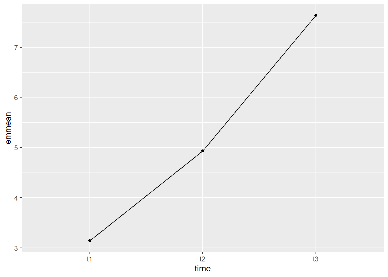
The graph shows that the increase between t2 and t3 looked to be steeper than the increase between t1 and t2. This will be tested formally with the pairwise comparisons.
10.3.2 Using emmeans() for Pairwise Comparisons
We have already run the emmeans() function on our ANOVA model above, in order to get the estimated means. I will copy it again below for clarity’s sake. The emmeans() function first takes an ANOVA model (model_se_em). Then, we specify that we want to do pairwise comparisons, and what our grouping variable is (pairwise ~ time). Lastly, we specify what method we want to use to adjust the p-values (adjust = "bonferroni"). Other adjustments that this function can take are Tukey’s HSD and Scheffe, among others.
#Run pairwise comparisons
model_se_em <- emmeans(model_se, pairwise ~ time, adjust = "bonferroni")
#Print results
model_se_em## $emmeans
##  time emmean    SE df lower.CL upper.CL
##  t1     3.14 0.174  9     2.75     3.53
##  t2     4.93 0.273  9     4.32     5.55
##  t3     7.64 0.361  9     6.82     8.45
##
## Confidence level used: 0.95
##
## $contrasts
## contrast estimate SE df t.ratio p.value
## t1 - t2 -1.79 0.361 9 -4.968 0.0023
## t1 - t3 -4.50 0.340 9 -13.228 <.0001
## t2 - t3 -2.70 0.555 9 -4.868 0.0027
##
## P value adjustment: bonferroni method for 3 testsLooking this time at the contrasts table, we see that there is a significant different in self esteem scores both between time 1 and time 2 as well as between time 2 and time 3. At each time point, participant’s self esteem scores had significantly increased as compared to the time point prior.
10.3.3 Custom contrasts
We can also perform custom comparisons, again using the emmeans package, and the contrast() function. Since we had previously specified to run pairwise comparisons in our emmeans model, we will re-specify our model to just have group statistics (emmeans(model_se, "time", data = se_long). We also save this as an object, for later use. We then specify the contrasts we want to run. As a reminder, within any individual contrast, the values must add up to zero. As an example, we will compare the average of t1 and t2 to t3
We first assign these planned contrasts to an object (con_se). Using the contrast() function, we first give it our model from emmeans() (se.emm). Then, we list our contrast. Even though we are testing one contrast, we will still put it within list(). Each one has a name (eg, se1), and then a vector of numbers that add up to zero. Since there are three time points, there needs to be three numbers.
After we define our contrast, we then test it with the test() function. This takes the object containing the contrasts as an argument, and we tell it we don’t want any adjustments made.
#Restate our emmeans model - get rid of pairwise comparisons
se.emm <- emmeans(model_se, "time", data = se_long)

#State the contrasts
con_se <- contrast(se.emm, list(se1 = c(0.5, 0.5, -1)))

#Test the contrasts
test(con_se, adjust = "none")
## contrast estimate SE df t.ratio p.value
## se1 -3.6 0.423 9 -8.501 <.0001Looking at the output, we can see that the planned contrast is significant. We would interpret this as the average of time 1 and time 2 is 3.6 units lower than the mean of time 3.