Chapter 8 Machine Learning: Foundations
Broadly speaking, machine learning is a sub-field of computer science which studies algorithms that learn from data. Sometimes the goal is to build a model that can predict unknown outcomes, while other times machine learning is used to explore the natural patterns or characteristics of a data set. The field is generally organized into three main approaches:
Supervised learning, where the goal is to build a model that can predict uncertain outcomes. Prediction is a process that uses historical data to forecast future events (e.g., using January’s sale data to determine which customers are likely to return in February). The growth in predictive machine learning models is in large part responsible for the increased uptake of data science in so many industry sectors. Today, predictive models affect most aspects of our everyday life, from Netflix’s recommendation algorithm to Google’s search engine, or even to food placement on grocery store shelves. Mastering these methods will allow one to develop forecasts that apply across various business problems and industries. Supervised machine learning is covered in this chapter and the next.
Unsupervised learning, where the goal is to observe any patterns or structures that might emerge from a data set. For example, an online marketing company may be interested in grouping consumers into different segments based on those consumers’ characteristics, such as their demographics, shopping behaviors, geographic location, etc. Unsupervised machine learning could be used to cluster customers into different groups based on their similarity across these features. Unsupervised machine learning is covered in Chapter 11.
Reinforcement learning, where a computer program operates in a dynamic environment and repeatedly receives feedback on its performance at some target task. For example, self-driving cars are trained using reinforcement learning. In the current edition, reinforcement learning is not covered in this book.
In this chapter, we will introduce a basic framework for supervised machine learning using a relatively simple machine learning model, called the k-nearest neighbors algorithm. In the next chapter, we will cover many of the other popular machine learning algorithms that are commonly used in industry.
8.1 Introduction to Supervised Machine Learning
Supervised learning is generally divided into two main types of prediction problems: classification and regression. Many machine learning algorithms can be used for either classification or regression, although some can only be used for one or the other. For each algorithm in this chapter and the next, we will show how it can be used for both types of problems (or state that it can only be used for one).
8.1.1 Classification
In classification problems the outcome of interest is discrete, meaning one is trying to predict the category an observation belongs to. The following are some examples of classification problems:
- A spam detection system that classifies incoming emails as spam or not spam.
- A bank using an algorithm to predict whether potential lenders will default or repay on their loan.
- A sorting machine on an assembly line that identifies apples, pears, and oranges and sorts them into different bins.
- An HR department that conducts an employee engagement survey and uses the data to predict who will stay and leave in the upcoming year.
Note that we were already introduced to classification in Section 6.2, where we covered logistic regression. Indeed, logistic regression, which models binary outcomes as a function of one or more independent variables, can be used for classification.
8.1.1.1 Motivating Example
For many businesses, customer churn is an important metric for measuring customer retention. Banks, social media platforms, telecommunication companies, etc. all need to monitor customer turnover to help understand why customers leave their platform, and whether there are intervention strategies that can help prevent customer churn.
Imagine that you work for a telecommunications provider and would like to reduce customer churn. To that end, you hope to develop a predictive model that will identify which customers are at a high risk of leaving for another provider. If you could identify these customers before they leave, you may be able to develop intervention strategies that would encourage them to stay.
Using historical customer data that your company collected in the past quarter, you compile a data set with the account characteristics of each customer and whether or not they “churned” by the end of the previous quarter. This data is stored in a data frame called churn, the first few rows of which are shown below. A data dictionary which describes each variable in the data set is also provided below.
| account_length | international_plan | voice_mail_plan | number_vmail_messages | total_day_minutes | total_day_calls | total_night_minutes | total_night_calls | total_intl_minutes | total_intl_calls | total_intl_charge | number_customer_service_calls | churn |
|---|---|---|---|---|---|---|---|---|---|---|---|---|
| 165 | no | no | 0 | 209.4 | 67 | 150.2 | 88 | 12.8 | 1 | 3.46 | 0 | no |
| 103 | no | no | 0 | 180.2 | 134 | 181.7 | 134 | 8.4 | 3 | 2.27 | 1 | no |
| 90 | no | yes | 27 | 156.7 | 51 | 123.2 | 111 | 12.6 | 6 | 3.40 | 2 | no |
| 36 | no | no | 0 | 177.9 | 129 | 306.3 | 102 | 10.8 | 6 | 2.92 | 2 | no |
| 95 | no | yes | 35 | 229.1 | 143 | 248.4 | 110 | 3.9 | 3 | 1.05 | 0 | no |
| 119 | no | no | 0 | 231.5 | 82 | 211.0 | 118 | 7.4 | 10 | 2.00 | 1 | no |
account_length: number of months the customer has been with the provider.internation_plan: whether the customer has an international plan.voice_mail_plan: whether the customer has a voice mail plan.number_vmail_messages: number of voice-mail messages.total_day_minutes: total minutes of calls during the day.total_day_calls: total number of calls during the day.total_night_minutes: total minutes of calls during the night.total_night_calls: total number of calls during the night.total_intl_minutes: total minutes of international calls.total_intl_calls: total number of international calls.total_intl_charge: total charge on international calls.number_customer_service_calls: number of calls to customer service.churn: whether or not the customer churned.
Throughout this chapter and the next, we will use this data set to demonstrate how different machine learning algorithms can be used to build classification models.
8.1.2 Regression
In regression problems the outcome of interest is continuous, so the goal is to make a prediction as close to the true value as possible. Note that the terminology here can be slightly confusing. When we talk about regression problems, we refer to prediction problems in which the outcome of interest is continuous. However, when we talk about regression models, we could be referring to linear regression or logistic regression (or one of the many other types of regression models). Therefore, some regression models (like logistic regression) are actually used for classification problems (and not regression problems). The following are some examples of regression problems:
- A paint company that wants to predict their total revenue in the upcoming quarter.
- An investor trying to predict the stock price of a company over the next six months.
- An online marketing company that wants to predict the number of shares a sponsored post will receive.
Note that we were already introduced to regression in Section 6.1, where we covered linear regression. Indeed, linear regression, which models continuous outcomes as a function of one or more independent variables, can be used for regression.
8.1.2.1 Motivating Example
[In Progress]
8.2 To Explain or To Predict?
[In Progress]
8.3 k-Nearest Neighbors (kNN)
Put simply, our goal is to use the information stored in the churn data set to predict whether new customers will churn in the upcoming quarter. A straightforward way to accomplish this would be to identify the observations in churn that our most similar to our new customer, and then observe whether or not those customers churned in the previous period. For example, if our new customer is from the Midwest, has twenty voice mail messages, does not have an international plan, etc., we could identify the observations in churn that have the same (or very similar) characteristics. If the majority of those customers churned in the previous quarter, we might predict that our new customer is likely to churn; if the majority did not, we might predict that our new customer is at a low risk of churning. This is in essence how the k-nearest neighbors algorithm makes predictions.
More formally, the k-nearest neighbors (kNN) algorithm starts by calculating the distance between a new observation and each of the observations in churn. The \(k\) observations that are closest to the new observation are considered its “neighbors”. If most of these neighbors churned in the previous quarter, the model predicts that the new customer will churn (and vice versa). The number of neighbors that the model considers is determined by \(k\), which is set by the user. \(k\) is known as a hyperparameter, or a model parameter whose value must be specified by the user. How to choose the right value for a hyperparameter is a topic we will explore throughout this chapter and the next.
To demonstrate knn, let’s start with a simplified data set that only has 100 observations and two independent features, total_intl_charge and account_length. Our feature space, or the geometric space that our data occupy, looks like the following:

Suppose we have three new customers and would like to predict whether or not they will churn in the upcoming quarter. These customers are plotted as green squares in the figure below. If we use a \(k\) of five, we can find the five customers in churn that are most similar to our new customers (based on their account_length and total_intl_charge):
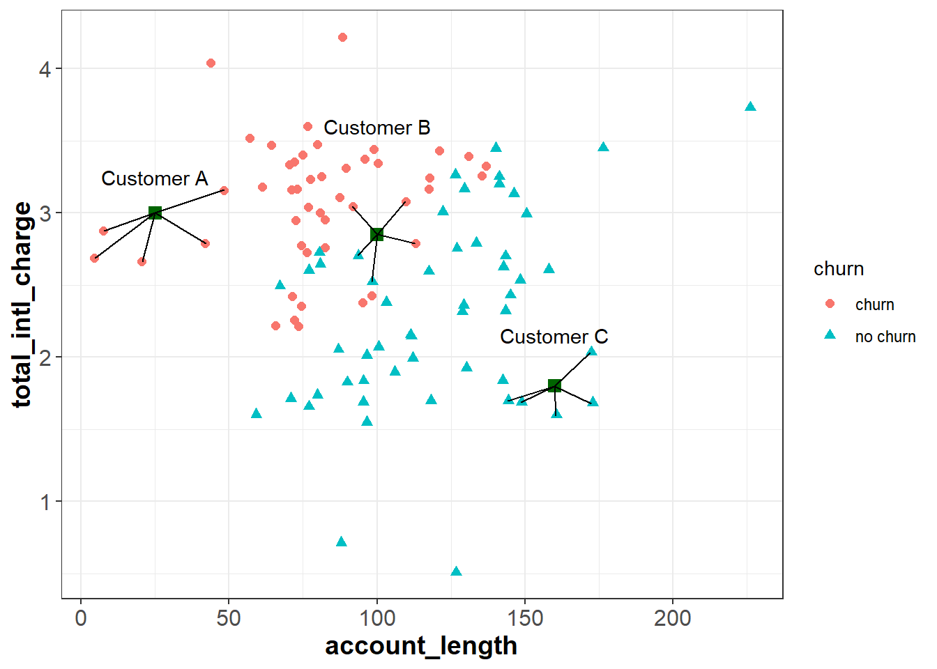
We see that that five nearest neighbors of Customer A all churned in the previous quarter, so the algorithm would predict that Customer A will churn. Similarly, all five nearest neighbors of customer C did not churn in the previous quarter, so the algorithm would predict that Custer C will not churn.
For Customer B, three of the nearest neighbors churned and two did not. Therefore, for this observation the model would predict a 60% chance of churning (3 churns / 5 neighbors = 0.60). Ultimately we need to make a binary decision about whether to intervene on this customer’s account or not. To do this, we need to convert the predicted probability of 60% into a binary prediction of “churn” or “no churn”. Because the predicted chance of churning is greater than 50%, the model is predicting that it is more likely than not that the customer will churn. Therefore, one may choose to treat this as a prediction of “churn”. In this case, we have used a cutoff of 50% to convert the model’s prediction into a binary outcome; if the predicted probability is less than 50% we interpret the prediction as “no churn”, and if it is greater than 50% we interpret it as “churn”.
Although 50% seems like a natural cutoff, consider the following scenario. Suppose that when our model predicts a customer will churn, we offer that customer a very large discount to convince them to stay with the service. Because this discount is so costly, we only want to offer it to customers when we are very confident that they will churn in the upcoming quarter. If this were the case, we may want to be more than 50% confident before we intervene. For example, we may choose to intervene only if the model is 80% or more confident that the customer will churn in the next quarter. In this scenario, we would apply a cutoff of 80% instead of 50%. This is an example of how managerial judgment is an important component of any data science project. Without understanding the costs of an intervention (and the relative benefit of retaining customers), it would be difficult to find the optimum cutoff to apply to the model’s predictions.
8.3.1 Calculating Distance
So far we have not discussed how the model calculates the distance between observations. It turns out that there are several different ways to calculate distance, and each method has its own advantages (see here for more information). Here we will only cover the most basic distance measure, called Euclidean distance. However, be aware that there are other methods that may be useful depending on the context of the problem.
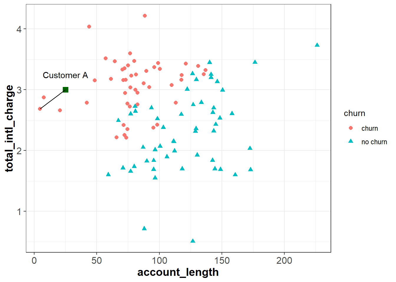
The Euclidean distance between two points is simply the distance between those points in Euclidean space. Let’s say we want to calculate the Euclidean distance between Customer A and one of their neighbors:
For two points (\(x_1\), \(y_1\)) and (\(x_2\), \(y_2\)), the Euclidean distance between them is calculated as: \[\sqrt{(x_2 - x_1)^2 + (y_2 - y_1)^2} \]
The coordinates for Customer A are (25, 3), and the coordinates for the other point are (4.56, 2.69). Applying the formula above, we can calculate the distance between them as:
\[\sqrt{(4.56 - 25)^2 + (2.69 - 3)^2} \approx 20.44 \]
The larger this value, the further away the two points are in Euclidean space. Therefore, the kNN algorithm finds the \(k\) observations with the smallest Euclidean distance from the new observation. Note that although we are currently working in two dimensions, this formula can be extended to higher dimensions when we are working with more than two independent features.
8.3.2 Normalizing Data
If you review the plot from the previous section, you will notice that the \(x\) and \(y\) axes are on very different scales. The account_length variable ranges from around zero to over 200, while total_intl_charge ranges from from about two to four. This is problematic for the calculation of Euclidean distance, because the distance between points is impacted by the magnitude of each variable.
For example, imagine two observations with the same total_intl_charge but a different account_length: (50, 2) and (100, 2). The Euclidean distance between these observations would be:
\[\sqrt{(100 - 50)^2 + (2 - 2)^2} = \sqrt{(50)^2} = 50\]
Now imagine two observations with the same account_length but a different total_intl_charge: (150, 2) and (150, 3). The Euclidean distance between these observations would be:
\[\sqrt{(150 - 150)^2 + (3 - 2)^2} = \sqrt{(1)^2} = 1\]
If we plot these points in our feature space, they seem to be roughly the same distance from each other. However, they have very different Euclidean distances. The reason for this is that account_length is measured on a greater scale than total_intl_charge, so it has a greater impact the distance metric.

When applying the kNN algorithm, we want to eliminate the impact of magnitude on the distance between points. One common method to accomplish this is to normalize the data so that each variable is measured on the same scale. A common method of normalization is min-max scaling, which converts each variable to the range [0, 1]. For a given variable \(x\), the formula for min-max scaling is:
\[x' = \frac{x - min(x)}{max() - min(x)}\]
If we apply this process to our data set, our feature space will look the same, but account_length and total_intl_charge will both be in the range [0, 1]:
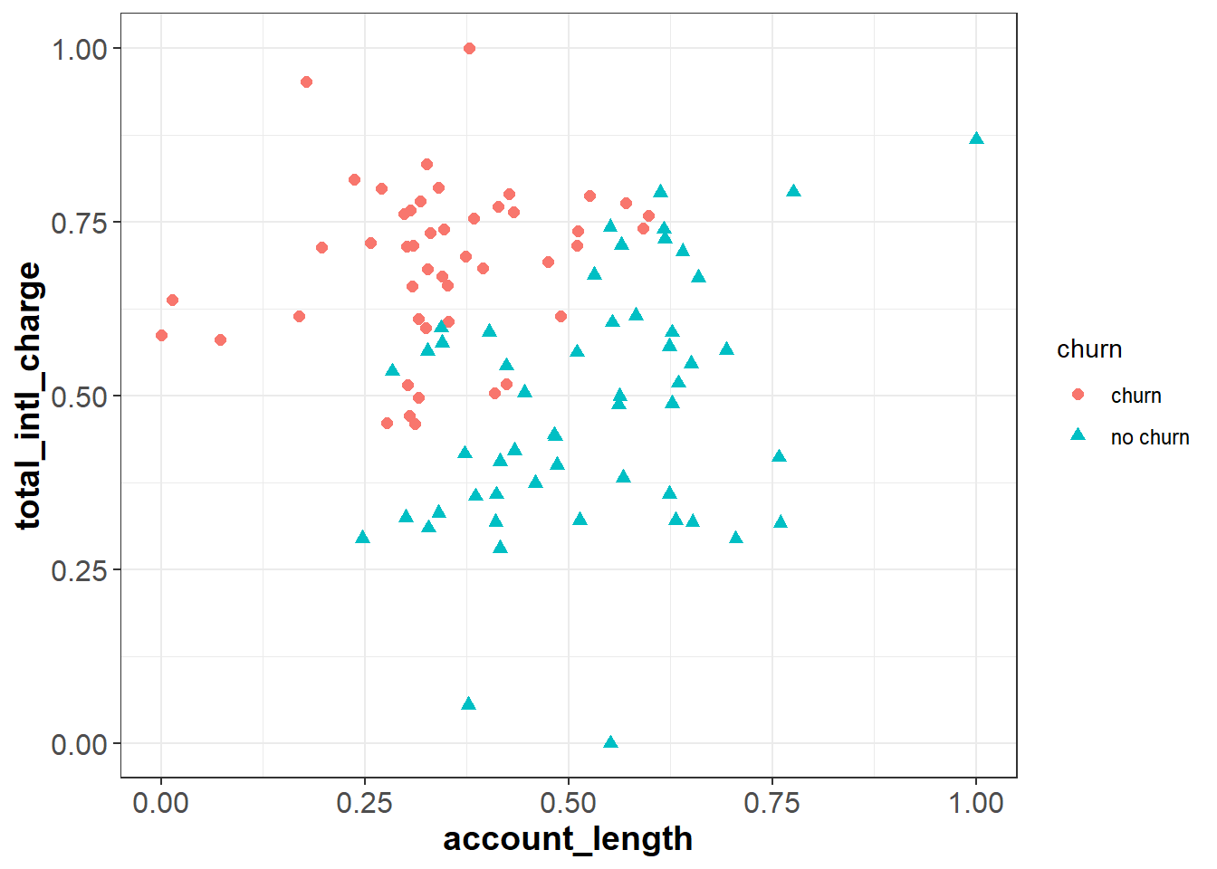
Now when we calculate Euclidean distance after applying min-max normalization, the scale that each variable is measured on will not impact the distance metric.
8.3.3 kNN for Regression
[In Progress]
8.3.4 Applying kNN in R
Now that we understand how the kNN algorithm works, let’s see how it can be applied to our churn data set in R.
Instead of working with just account_length and total_intl_charge, we will now work with all relevant features in our data set (see 8.1.1.1 for a description of the variables in churn). As we saw in the previous section, the first thing to do is normalize the continuous variables in the data set so that they are on the same scale. We can apply min-max scaling with the preProcess() function from the caret package, which uses the following syntax:
caret::preProcess(x, method = c(“center”, “scale”))
- Required arguments
x: A data frame with the variables to scale.
- Optional arguments
method: Used to specify the desired type of preprocessing. To apply min-max scaling, this can be set to “range”.
This function creates an object (which we call scaler below) that we can then pass in to predict() to scale our data set. As you can see, the continuous variables in churnScaled are all in the range [0,1]. Note also that preProcess() knows to ignore non-continuous variables (e.g., international_plan), which do not need to be normalized.
## Warning: package 'caret' was built under R version 4.0.5# Create min-max scaler
scaler <- preProcess(churn, method="range")
# Apply scaler to our data set
churnScaled <- predict(scaler, churn)| account_length | international_plan | voice_mail_plan | number_vmail_messages | total_day_minutes | total_day_calls | total_night_minutes | total_night_calls | total_intl_minutes | total_intl_calls | total_intl_charge | number_customer_service_calls | churn |
|---|---|---|---|---|---|---|---|---|---|---|---|---|
| 0.6776860 | no | no | 0.00 | 0.5957326 | 0.4060606 | 0.3802532 | 0.5176471 | 0.640 | 0.05 | 0.6407407 | 0.0000000 | no |
| 0.4214876 | no | no | 0.00 | 0.5126600 | 0.8121212 | 0.4600000 | 0.7882353 | 0.420 | 0.15 | 0.4203704 | 0.1111111 | no |
| 0.3677686 | no | yes | 0.54 | 0.4458037 | 0.3090909 | 0.3118987 | 0.6529412 | 0.630 | 0.30 | 0.6296296 | 0.2222222 | no |
| 0.1446281 | no | no | 0.00 | 0.5061166 | 0.7818182 | 0.7754430 | 0.6000000 | 0.540 | 0.30 | 0.5407407 | 0.2222222 | no |
| 0.3884298 | no | yes | 0.70 | 0.6517781 | 0.8666667 | 0.6288608 | 0.6470588 | 0.195 | 0.15 | 0.1944444 | 0.0000000 | no |
| 0.4876033 | no | no | 0.00 | 0.6586060 | 0.4969697 | 0.5341772 | 0.6941176 | 0.370 | 0.50 | 0.3703704 | 0.1111111 | no |
Next, we need to convert the categorical features in our data set to numeric dummy variables. If you recall from Section 6.1.3, the lm() and glm() functions automatically convert categorical variables to binary dummy variables when one is using linear or logistic regression. Unfortunately, the function we will use for kNN does not do this automatically, so we need to do it ourselves.
# Convert categorical variables to dummy variables
churnScaled$international_plan <- ifelse(churnScaled$international_plan=="yes", 1, 0)
churnScaled$voice_mail_plan <- ifelse(churnScaled$voice_mail_plan=="yes", 1, 0)| account_length | international_plan | voice_mail_plan | number_vmail_messages | total_day_minutes | total_day_calls | total_night_minutes | total_night_calls | total_intl_minutes | total_intl_calls | total_intl_charge | number_customer_service_calls | churn |
|---|---|---|---|---|---|---|---|---|---|---|---|---|
| 0.6776860 | 0 | 0 | 0.00 | 0.5957326 | 0.4060606 | 0.3802532 | 0.5176471 | 0.640 | 0.05 | 0.6407407 | 0.0000000 | no |
| 0.4214876 | 0 | 0 | 0.00 | 0.5126600 | 0.8121212 | 0.4600000 | 0.7882353 | 0.420 | 0.15 | 0.4203704 | 0.1111111 | no |
| 0.3677686 | 0 | 1 | 0.54 | 0.4458037 | 0.3090909 | 0.3118987 | 0.6529412 | 0.630 | 0.30 | 0.6296296 | 0.2222222 | no |
| 0.1446281 | 0 | 0 | 0.00 | 0.5061166 | 0.7818182 | 0.7754430 | 0.6000000 | 0.540 | 0.30 | 0.5407407 | 0.2222222 | no |
| 0.3884298 | 0 | 1 | 0.70 | 0.6517781 | 0.8666667 | 0.6288608 | 0.6470588 | 0.195 | 0.15 | 0.1944444 | 0.0000000 | no |
| 0.4876033 | 0 | 0 | 0.00 | 0.6586060 | 0.4969697 | 0.5341772 | 0.6941176 | 0.370 | 0.50 | 0.3703704 | 0.1111111 | no |
Now that we have prepared the data set we will use to build the model (churnedScaled), let’s prepare the data set with the observation we would like to make a prediction on. Suppose we have a file called “churn_new.csv” that contains the information of a new customer, and we would like to predict whether that customer will churn in the next quarter.
## Rows: 1 Columns: 12## -- Column specification --------------------------------------------------------
## Delimiter: ","
## chr (2): international_plan, voice_mail_plan
## dbl (10): account_length, number_vmail_messages, total_day_minutes, total_da...##
## i Use `spec()` to retrieve the full column specification for this data.
## i Specify the column types or set `show_col_types = FALSE` to quiet this message.| account_length | international_plan | voice_mail_plan | number_vmail_messages | total_day_minutes | total_day_calls | total_night_minutes | total_night_calls | total_intl_minutes | total_intl_calls | total_intl_charge | number_customer_service_calls |
|---|---|---|---|---|---|---|---|---|---|---|---|
| 12 | no | no | 0 | 250 | 118 | 280 | 90 | 11.8 | 3 | 3.19 | 1 |
As with our other data set, we need to (1) normalize the variables, and (2) convert the categorical variables into dummies. To normalize the data, we can apply the scaler object that we created above. To do this we can now just pass scaler and churnNew into predict(). This will apply the min-max formula to churnNew based on the minimum and maximum values used to create churnScaled.
| account_length | international_plan | voice_mail_plan | number_vmail_messages | total_day_minutes | total_day_calls | total_night_minutes | total_night_calls | total_intl_minutes | total_intl_calls | total_intl_charge | number_customer_service_calls |
|---|---|---|---|---|---|---|---|---|---|---|---|
| 0.0454545 | no | no | 0 | 0.7112376 | 0.7151515 | 0.7088608 | 0.5294118 | 0.59 | 0.15 | 0.5907407 | 0.1111111 |
Next, we need to convert our categorical variables into dummies:
churnNewScaled$international_plan <- ifelse(churnNewScaled$international_plan=="yes", 1, 0)
churnNewScaled$voice_mail_plan <- ifelse(churnNewScaled$voice_mail_plan=="yes", 1, 0)| account_length | international_plan | voice_mail_plan | number_vmail_messages | total_day_minutes | total_day_calls | total_night_minutes | total_night_calls | total_intl_minutes | total_intl_calls | total_intl_charge | number_customer_service_calls |
|---|---|---|---|---|---|---|---|---|---|---|---|
| 0.0454545 | 0 | 0 | 0 | 0.7112376 | 0.7151515 | 0.7088608 | 0.5294118 | 0.59 | 0.15 | 0.5907407 | 0.1111111 |
Now that our data has been processed, we can actually apply the kNN algorithm! We can do this in R with the knn() function from the class package, which uses the following syntax:
class::knn(train, test, cl, k = 1, prob = FALSE)
- Required arguments
train: A data frame with the observations used to build the model. This should only contain the independent (\(X\)) features, not the target feature (\(Y\)).test: A data frame with the observation(s) the model should be applied to.cl: A vector with the correct labels (\(Y\)) of the observations used to build the model.
- Optional arguments
k: The number of nearest neighbors considered.prob: Whether or not the probability of each prediction is returned. IfprobequalsFALSE, the function returns a binary prediction (e.g. “churn” or “no churn”).
Below we apply this function, with churnScaled used to build the model and churnNewScaled used to make predictions. Note that the train parameter only accepts the \(X\) features (and not the target feature \(Y\)), so we exclude the thirteen column in churnScaled when passing the data to train.
library(class)
knnModelK5 <- knn(train = churnScaled[,-13], test = churnNewScaled,
                  cl = churnScaled$churn, k = 5, prob=TRUE)

knnModelK5
## [1] no
## attr(,"prob")
## [1] 0.8
## Levels: no yesBased on this output, our model predicts that the new customer will not churn, with a probability of 80%.
8.4 The Bias-Variance Tradeoff
An open question from the previous section is how to choose the value of the hyperparameter \(k\). To explore this, let’s return to the simplified churn data set, which only has 100 observations and two independent features (total_intl_charge and account_length).
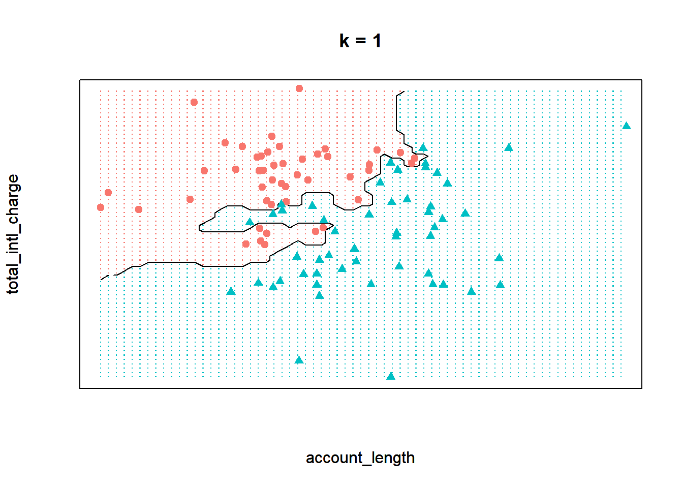
To visualize the kNN model when \(k\) equals five, we can plot the decision boundary of our model on this data, or the line that partitions the feature space into two classes. In the plot below, the area shaded in red represents points where a majority of the five nearest neighbors churned. Similarly, the area shaded in blue represents points where a majority of the five nearest neighbors did not churn. Therefore, this plot shows how our kNN model separates the data into two classes.
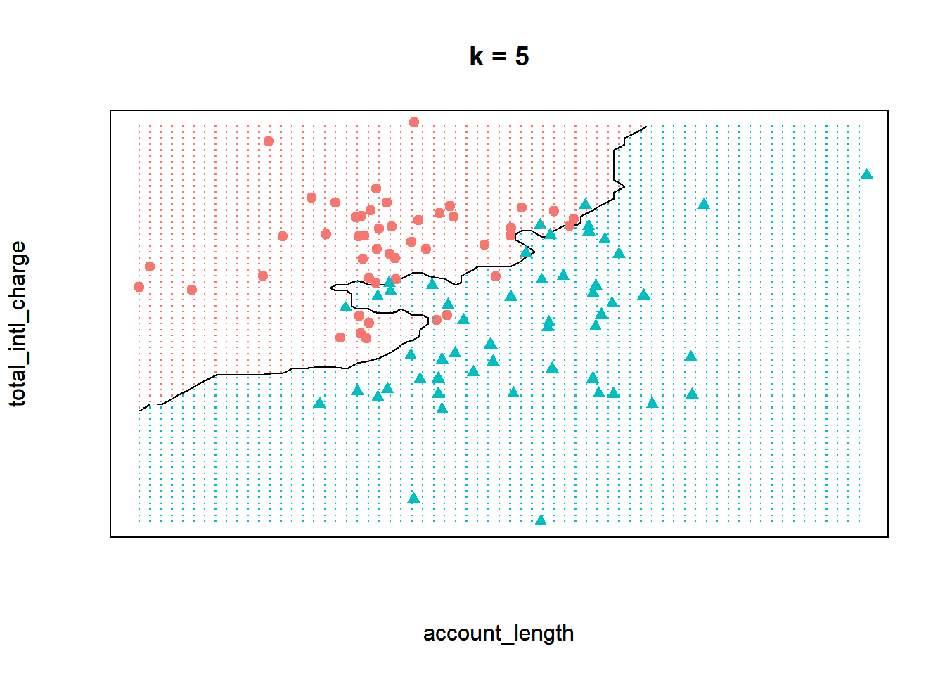
Now observe what happens if we run the model with a \(k\) of one instead. By decreasing the value of \(k\), we have increased the “sensitivity” of the model. In other words, the decision boundary now contorts itself so that every single point in the data set lies in the correct region; there is not a single misclassified observation. Compare that to the model when \(k\) equals five, where the decision boundary is less flexible and there are some observations in the wrong region.
Finally, let’s see the decision boundary when we set \(k\) to twenty. Now the model seems much more inflexible - the boundary is almost a straight line and does not closely adhere to any individual point.
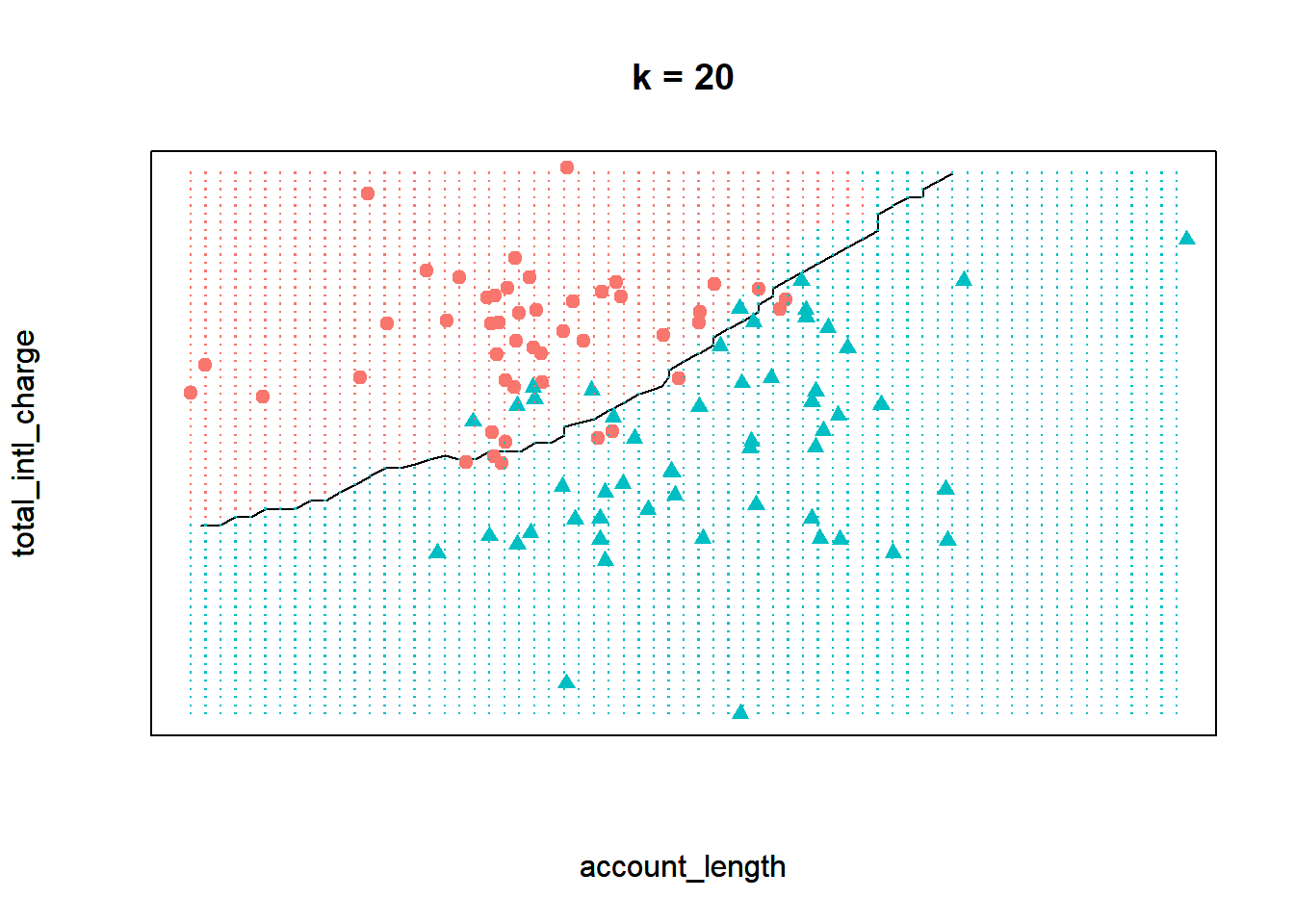
Which one of these scenarios is best? It may be tempting to assume that the best model is the one where \(k\) equals one. After all, this model provides the closest fit to the data. However, this is often not the case due to a principle known as the bias-variance tradeoff. The bias-variance tradeoff refers to the tension between how closely a model fits its training data, versus how well it generalizes to unseen data.
For the kNN algorithm, the closest fit is achieved when \(k\) equals one. The primary issue is that this fit is likely too close. When \(k\) is very low, the model may be so flexible that it starts to pick up on the random idiosyncrasies of the training data. Remember that we are building our model on a sample of data, and the information that sample provides is a combination of signal and noise. The signal of the sample reflects the true, underlying relationships between the variables of interest. This information is generalizable to other observations not in our sample, and is therefore useful for building our predictive model. The noise of the sample refers to the random variation that is unique to the particular observations in the training data. When a model starts to fit the noise of a sample, we say that it is overfitting the data.
Ultimately we want our model to be flexible enough that it can pick up the signal in the sample, but not so flexible that it starts to pick up on the noise. This is the essence of the bias-variance tradeoff. What, then, is the value of \(k\) that correctly balances this tradeoff? Unfortunately, there is no single correct answer. The right value for \(k\) depends on the properties of the data set one is working with. Therefore, data scientists typically divide their data up into train and validation sets to test different values of \(k\).
8.4.1 Train & Validation Sets
In order to traverse the bias-variance tradeoff, we need to tune the model hyperparameter \(k\). If \(k\) is too small we risk overfitting the data and picking up on the noise of the sample, while if \(k\) is too large we risk underfitting the data and missing the signal. Consequently, we need to find the value of \(k\) that maximizes the ability of the model to make accurate predictions on unseen data.
A typical approach to this problem is to split the data into a training set and a validation set. The training set is used to build models with different values of our hyperparameter \(k\). We start by defining a grid of different values for the hyperparameter that we want to test. In this case, our grid will be \(k = {1, 3, 5, 10, 20}\). We then use the training set to build five different models, each with a different value of \(k\).
Next, we apply all five of those models to the validation set, which is used to compare the accuracy of different models. Whichever value of \(k\) results in the most accurate predictions on the validation set is taken to be the optimal value.
Note that instead of using a validation set, we could just calculate the accuracy of each model on the training data. In other words, we could build a model on the training set, then calculate the accuracy of that model on the same data it was trained on. The reason one should never do this is that it will almost certainly result in overfitting. On the training set, the most accurate model is the one where \(k\) equals one, as this model very closely fits the training data. However, this model will not generalize well to unseen data. Therefore, we need the validation set to ensure that our model is not overfitting the training data, and that it will generalize well to new data.
We can split our processed data set (churnScaled) into training and validation sets using the sample.split() function from the caTools package. One advantage of using sample.split() is that it ensures that the training and validation sets have the same proportions of the target feature, in our case churn.
Note that we are randomly dividing the data, meaning that each observation should have a chance of being included in the training set and a chance of being included in the validation set. We want this sampling process to be random, but we also want to ensure that every time the code is run, the same observations are sorted into the training set and the same observations are sorted into the validation set. This will guarantee that every time the code is re-run, we have the exact same training and validation sets. If we did not do this, two different runs of the code would almost certainly have a different set of observations in the training set, so the results would be different each time.
We can ensure that a random process is stable (i.e., leads to the same result) by setting the random seed with set.seed(). The number you pass into this function “seeds” the randomization that R uses to split the data, so two people using the same random seed will have identical splits of the data. In the code below we use a random seed of 972941, a number which was itself randomly chosen.
After setting the random seed we then apply sample.split(), which uses the following syntax:
caTools::sample.split(Y, SplitRatio=2/3)
- Required arguments
Y: An atomic vector with the values of the target feature in the data set.
- Optional arguments
SplitRatio: The proportion of observations to use for the training set. The remaining observations are used for the validation set.
We save the output of sample.split() into sample, a vector with either TRUE or FALSE for each observation in our data set. An element of sample is set equal to TRUE if the observation is assigned to the training set and FALSE if the observation is assigned to the validation set. We can then create the two separate data sets train and validate using the subset() function. Note that we will place 80% of the data into the training set and 20% into the validation set.
# Set the random seed
set.seed(972943)

# Define the training and validation sets
library(caTools)
sample <- sample.split(churnScaled$churn, SplitRatio=0.8)

# Split the data into two data frames
train <- subset(churnScaled, sample==TRUE)
validate <- subset(churnScaled, sample==FALSE)
If we view the dimensions of train and validate, we can see that train contains 80% of the observations and validate contains 20%.
## [1] 2720 13## [1] 680 13Now we can use train to build five different models, each with a different value of \(k\). We can then calculate the accuracy of those models on validate to determine the optimal value of \(k\). In the code below, we fit all five of these models using the knn() function. Note that we set the test parameter equal to validate so that the models are applied to the validation set.
knnModelK1 <- knn(train = train[,-13], test = validate[,-13],
                  cl = train$churn, k = 1, prob=TRUE)

knnModelK3 <- knn(train = train[,-13], test = validate[,-13],
                  cl = train$churn, k = 3, prob=TRUE)

knnModelK5 <- knn(train = train[,-13], test = validate[,-13],
                  cl = train$churn, k = 5, prob=TRUE)

knnModelK10 <- knn(train = train[,-13], test = validate[,-13],
                  cl = train$churn, k = 10, prob=TRUE)

knnModelK20 <- knn(train = train[,-13], test = validate[,-13],
                  cl = train$churn, k = 20, prob=TRUE)
To determine the performance of each model on the validation set, we need to compare the model’s predictions against the known, true values. Here we will score the models using accuracy, or the proportion of observations where the model’s prediction was correct. In Section 8.5, we will learn about other metrics that can be used to assess model performance.
We can easily calculate the accuracy of our models on the validation set using the Accuracy() function from the MLmetrics package, which uses the following syntax:
MLmetrics::Accuracy(y_pred, y_true)
- Required arguments
y_pred: An atomic vector with the model predictions.y_true: An atomic vector with the true labels.
The model objects that we created (e.g., knnModelK1) store a vector of the model’s predictions on the validation set. For example, if we display the first few elements of knnModelK1, we see the model’s prediction for the first few observations in validate. In this case, all five are predicted not to churn.
## [1] no  no  no  yes no
## Levels: no yes
To use Accuracy(), we pass in our vector of model predictions as y_pred and the true values (stored in the column validate$churn) as y_true:
## [1] 0.8544118This means that the model where \(k\) was one correctly predicted 83.7% of the observations in the validation set. Now let’s apply this to the other models:
## [1] 0.8838235## [1] 0.8838235## [1] 0.8735294## [1] 0.8764706Based on these results, we can conclude that the best value for \(k\) is somewhere around three to ten. We will use a \(k\) of three because it achieved the highest accuracy on the validation set, although the difference in accuracy between three, five, and ten is so small that it is likely negligible.
Now that we have chosen a value for \(k\), we would fit a final model with \(k\) equals three using all of the available data (i.e., the combined training and validation sets, which is stored in churnScaled). This is the model we would deploy to predict which customers will churn in the upcoming quarter.
8.4.2 \(k\)-Fold Cross Validation
Although we can help prevent overfitting by dividing our data into train and validation sets, this method is not without its shortcomings. It requires that we sacrifice a significant portion of our data (usually around 20%) for model validation, so we can only build our models on 80% of the data. We always want to build our models with as much data as possible, and this becomes especially problematic when working with smaller data sets. [NOTE: this is not exactly right, come up with a concise but more accurate explanation of why cross validation is better than train/validate split]
An alternative method for training and validating different models is called \(k\)-fold cross validation. Note that this \(k\) is completely unrelated to the hyperparameter \(k\) from the kNN algorithm; to distinguish between them, moving forward we will use \(k_{fold}\) when discussing cross validation, and \(k_{knn}\) when discussing the kNN algorithm. Cross validation randomly divides our data set into \(k_{fold}\) partitions (called folds). It then builds a model on all but one of these folds, and uses the held-out fold to validate that model’s predictive ability. It then repeats this procedure \(k_{fold}\) times, each time holding out a different one of the \(k_{fold}\) folds.
For example, we would apply the following steps if we chose a \(k_{fold}\) of five:
- Randomly divide the data set into five equally-sized folds.
- Treat the fifth fold as the validation set and train the model on the first four folds.
- Evaluate the model’s performance error on the fifth fold.
- Repeat Steps 2 and 3 four more times, but each time treat a different fold as the validation set.
- Calculate the model error for five-fold cross-validation by averaging the five error estimates from Step 3.
This process is shown in the visualization below:
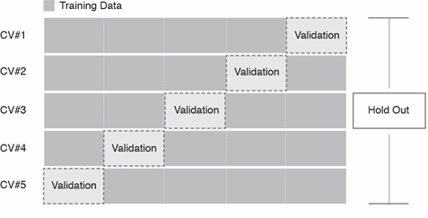
Imagine that we applied this process with the kNN algorithm and a \(k_{knn}\) of three. We would first divide our data into five folds, and train the kNN model on the first four folds using a \(k_{knn}\) of three. Then, we would calculate the accuracy of that model on the fifth fold. Next, we would train another kNN model (again using a \(k_{knn}\) of three) on folds one, two, three, and five, then calculate the accuracy of that model on the fourth fold. We would repeat this process five times, each time using a different one of the folds for validation. This would provide us with five separate estimates of the model’s accuracy, which we could average together for a final accuracy score.
Just as we tried several different values of \(k_{knn}\) in the previous section, we can perform cross validation with a grid of different values for our hyperparameter. Whichever value attains the best average accuracy score can be chosen as our final value of \(k_{knn}\).
The caret package in R provides a framework for building and validating models with cross validation. The first step is to set up the conditions of the cross validation process with the trainControl() function, which uses the following syntax:
caret::trainControl(method, number)
- Required arguments
method: The method used to divide the data; there are many different approaches, but we will set it to “cv” for cross validation.number: The number of folds (i.e., \(k_{fold}\)).
What is this object for? We always want to build and compare multiple models under the same conditions. If we were evaluating two kNN models, one with a \(k_{knn}\) of three and another with a \(k_{knn}\) of ten, we would want to ensure that the models were trained and evaluated on the same set of observations so that they are directly comparable. The cvConditions object defines these conditions so that we are always consistent when training different models.
We will next use the cvConditions object with the train() function from caret, which actually performs the cross validation. This function uses the following syntax:
caret::train(y ~ x1 + x2 + … + xp, data, method=“rf”, trControl=trainControl(), tuneGrid=NULL)
- Required arguments
y: The name of the dependent (\(Y\)) feature.x1,x2, …,xp: The name of the first, second, and \(p_{th}\) independent feature. Note that if you just replace the names of the features with the wildcard character., the model will be built using all of the features in the data set.data: The name of the data frame with they,x1,x2, andxpvariables.
- Optional arguments
method: The algorithm to apply. See here for the complete list of available models.trControl: A list defining the conditions of the training procedure.tuneGrid: A data frame with different values of the hyperparameter(s) to test.
In the code below, we apply this function to the churn data set. Within train(), we define the model with churn as the independent (\(Y\)) feature, and all the remaining features in the data set as dependent (\(X\)) features. Because we are using the kNN algorithm, we set method equal to "knn" (from the list here). We set trControl equal to the cvConditions object we created above to control how the cross validation is performed. Finally, we define a grid of different values for \(k_{knn}\) and pass that in to tuneGrid. Note that we set the random seed so that the process is replicable.
set.seed(972945)
knnCV <- train(churn ~ .,
                 data = churnScaled,
                 method = "knn",
                 trControl = cvConditions,
                 tuneGrid = expand.grid(k = c(1, 3, 5, 10, 20)))

knnCV
## k-Nearest Neighbors
##
## 3400 samples
## 12 predictor
## 2 classes: 'no', 'yes'
##
## No pre-processing
## Resampling: Cross-Validated (5 fold)
## Summary of sample sizes: 2720, 2720, 2719, 2720, 2721
## Resampling results across tuning parameters:
##
## k Accuracy Kappa
## 1 0.8552832 0.3708154
## 3 0.8844082 0.4207154
## 5 0.8841206 0.3858950
## 10 0.8820605 0.3480523
## 20 0.8764739 0.2582296
##
## Accuracy was used to select the optimal model using the largest value.
## The final value used for the model was k = 3.How do we interpret this? In the output we see a small table with the following results:
| k | Accuracy | Kappa |
|---|---|---|
| 1 | 0.8552832 | 0.3708154 |
| 3 | 0.8844082 | 0.4207154 |
| 5 | 0.8841206 | 0.3858950 |
| 10 | 0.8820605 | 0.3480523 |
| 20 | 0.8764739 | 0.2582296 |
For each value of \(k_{knn}\), the function performed five-fold cross validation, the results of which are shown in this table. For example, for a \(k_{knn}\) of one, train() built five different models on different folds of the data, and evaluated each one on the held-out fold. It then averaged those five accuracy estimates together for a final accuracy score of 80.88% (we will ignore kappa). As we can see from the table, train() determined that three is the optimal value of \(k_{knn}\).
8.4.3 Holdout Sets
Finally, in addition to the train and validation sets, we always reserve a portion of our data as a holdout set. The purpose of the holdout set is to provide a final estimate of our model’s predictive accuracy on unseen data.
After we use the train and validation sets (or cross validation) to build and compare different models, we decide on a final model. We know how this model performs on the validation set, but this still does not provide an unbiased estimate for how our model will perform on unseen data. The reason for this is that although the model may not be directly trained on the observations in the validation set, the validation set was still used to tune the model’s hyperparameters. This means that the validation set had some influence on how the model was built. Consequently, it cannot provide a completely unbiased estimate for how the model will perform on observations it has never seen before. For this, we need to evaluate our final model on the holdout set.
It is important to emphasize that the holdout set should never influence the model building process. If you use the holdout set to make decisions about your model (which algorithm to use, the values of any hyperparameter(s), etc.), the holdout set can no longer provide an unbiased estimate of your model’s performance. Therefore, you should only look at the holdout set after you have decided on a final model.
For the churn data, we have held out a portion of the observations for the holdout set. These observations are saved in a data frame called churnHoldout; the first few observations are shown below.
## Rows: 850 Columns: 13## -- Column specification --------------------------------------------------------
## Delimiter: ","
## chr (3): international_plan, voice_mail_plan, churn
## dbl (10): account_length, number_vmail_messages, total_day_minutes, total_da...##
## i Use `spec()` to retrieve the full column specification for this data.
## i Specify the column types or set `show_col_types = FALSE` to quiet this message.| account_length | international_plan | voice_mail_plan | number_vmail_messages | total_day_minutes | total_day_calls | total_night_minutes | total_night_calls | total_intl_minutes | total_intl_calls | total_intl_charge | number_customer_service_calls | churn |
|---|---|---|---|---|---|---|---|---|---|---|---|---|
| 147 | yes | no | 0 | 157.0 | 79 | 211.8 | 96 | 7.1 | 6 | 1.92 | 0 | no |
| 85 | no | yes | 27 | 196.4 | 139 | 89.3 | 75 | 13.8 | 4 | 3.73 | 1 | no |
| 57 | no | yes | 39 | 213.0 | 115 | 182.7 | 115 | 9.5 | 3 | 2.57 | 0 | no |
| 54 | no | no | 0 | 134.3 | 73 | 102.1 | 68 | 14.7 | 4 | 3.97 | 3 | no |
| 121 | no | yes | 30 | 198.4 | 129 | 181.2 | 77 | 5.8 | 3 | 1.57 | 3 | yes |
| 116 | no | yes | 34 | 268.6 | 83 | 166.3 | 106 | 11.6 | 3 | 3.13 | 2 | no |
To stay consistent, we need to (1) normalize the holdout data using the scaler we created in Section ??, and (2) convert the categorical variables into dummies.
# Apply min-max scaling to the holdout set
churnHoldoutScaled <- predict(scaler, churnHoldout)

# Convert categorical variables in the holdout set to dummy variables
churnHoldoutScaled$international_plan <- ifelse(churnHoldoutScaled$international_plan=="yes", 1, 0)
churnHoldoutScaled$voice_mail_plan <- ifelse(churnHoldoutScaled$voice_mail_plan=="yes", 1, 0)| account_length | international_plan | voice_mail_plan | number_vmail_messages | total_day_minutes | total_day_calls | total_night_minutes | total_night_calls | total_intl_minutes | total_intl_calls | total_intl_charge | number_customer_service_calls | churn |
|---|---|---|---|---|---|---|---|---|---|---|---|---|
| 0.6033058 | 1 | 0 | 0.00 | 0.4466572 | 0.4787879 | 0.5362025 | 0.5647059 | 0.355 | 0.30 | 0.3555556 | 0.0000000 | no |
| 0.3471074 | 0 | 1 | 0.54 | 0.5587482 | 0.8424242 | 0.2260759 | 0.4411765 | 0.690 | 0.20 | 0.6907407 | 0.1111111 | no |
| 0.2314050 | 0 | 1 | 0.78 | 0.6059744 | 0.6969697 | 0.4625316 | 0.6764706 | 0.475 | 0.15 | 0.4759259 | 0.0000000 | no |
| 0.2190083 | 0 | 0 | 0.00 | 0.3820768 | 0.4424242 | 0.2584810 | 0.4000000 | 0.735 | 0.20 | 0.7351852 | 0.3333333 | no |
| 0.4958678 | 0 | 1 | 0.60 | 0.5644381 | 0.7818182 | 0.4587342 | 0.4529412 | 0.290 | 0.15 | 0.2907407 | 0.3333333 | yes |
| 0.4752066 | 0 | 1 | 0.68 | 0.7641536 | 0.5030303 | 0.4210127 | 0.6235294 | 0.580 | 0.15 | 0.5796296 | 0.2222222 | no |
Now we can use our final model to make predictions on the holdout set. Note that the object we created with the train() function, knnCV, automatically identifies the optimal hyperparameters and trains a final model on all of the data. We can view the details of this final model with $finalModel, as follows:
## 3-nearest neighbor model
## Training set outcome distribution:
##
##   no  yes
## 2912  488
Because the optimal \(k_{knn}\) according to our cross validation was three, the final model is a 3-nearest neighbor model.
Now we can use our final model to make predictions on the holdout set. We can do this using the same predict() function for linear regression that we saw in Section 6.1.1.5. To do this we simply pass in our model object (knnCV) and the data we want to make predictions on (churnHoldoutScaled). The result is an atomic vector with the final model’s predictions on the holdout set. The predictions on the first few observations are shown in the output below.
## [1] no no no no no
## Levels: no yes
Finally, we can calculate the accuracy of our final model on the holdout set using the Accuracy() function from Section @ref(train-&-validation-sets):
## [1] 0.8988235This final accuracy measure provides an estimate for how well our model will perform on future observations.
8.5 Evaluation Metrics
So far we have been evaluating our models via their accuracy, or the proportion of times when their predictions agreed with the true outcome. This is a simple measure to calculate, and in some circumstances is sufficient to evaluate the performance of a prediction model. However, there are many other performance metrics with different strengths and weaknesses that may be more useful depending on the context of the problem. In this section, we will cover some of the popular alternatives. The different metrics we describe in this section are organized by classification and regression problems.
8.5.1 Classification
8.5.1.1 Confusion Matrices
From the accuracy score we calculated in Section 8.4.3, we know that our final model incorrectly predicted around 10% of the observations in the holdout set. But what kind of mistakes did it make? Did it label customers who did churn as non-churners? Or did it label customers who did not churn as churners? We can investigate this through a confusion matrix, or a table that breaks down the type of correct and incorrect predictions made by a model. We can create confusion matrices in R with the ConfusionMatrix() function from the MLmetrics package, which uses the following syntax:
MLmetrics::ConfusionMatrix(y_pred, y_true)
- Required arguments
y_pred: An atomic vector with the model predictions.y_true: An atomic vector with the true labels.
Applying this to our holdout set:
##       y_pred
## y_true  no yes
##    no  715  25
##    yes  61  49
What does this table tell us? The diagonal of the table (i.e., 715 and 49) represents the observations that the model predicted correctly (715 + 49 = 764). Conversely, the off-diagonals (25 and 61) represent the observations that the model predicted incorrectly (25 + 61 = 86). If we divide the number of correct predictions (764) by the total number of observations in the holdout set (850), we get our accuracy score of 89.9%.
Now let’s focus on each value in the confusion matrix:
- The top-left cell indicates that the model correctly identified 715 of the non-churners.
- The top-right cell indicates that the model incorrectly flagged 25 non-churners as churners.
- The bottom-left cell indicates that the model incorrectly flagged 61 churners as non-churners.
- The bottom-right cell indicates that the model correctly identified 49 of the churners.
Why might this be more informative than simple accuracy? Although accuracy tells us the total number of mistakes our model made, it does not tell us which type of mistakes the model made. In this context, there are two possible mistakes: flagging someone who is not going to churn as a churner (known as a false positive), and flagging someone who is going to churn as a non-churner (known as a false negative).
Depending on the business context, these two types of mistakes may not be associated with identical costs. Assume that if our model predicts a customer is about to churn, we plan to offer that customer a $100 rebate to convince them to stay with the service. In this case, it is likely much more costly to lose a customer than it is to provide the rebate to a customer that would not have churned. If we make a false positive error and incorrectly assume that someone is about to churn, we will unnecessarily lose $100, as the customer would have stayed regardless of whether we gave them the rebate. Conversely, if we make a false negative error and incorrectly assume that someone is not about to churn, we will not offer them a rebate and permanently lose them as a customer. Therefore, a false negative is likely more costly than a false positive in this context.
This is another example of the role managers play in the data science pipeline. A thorough understanding of the business context is required to evaluate the relative costs of these two types of errors. A highly accurate model may still be insufficient if it makes highly costly mistakes. It is therefore important that managers and data scientists collaborate to evaluate models in the context of the business problem.
Up until now, we have been implicitly applying a cutoff of 50% to our model’s predictions. Remember that the kNN algorithm predicts the probability that a given customer will churn (a value between 0% and 100%). When we applied the model to the holdout set using the predict() function (see Section 8.4.3), this function automatically converted the model’s predictions from a continuous probability to a discrete “churn” / “did not churn”. By default predict() uses a cutoff of 50%. This means that if our model predicts the probability of churning as greater than 50%, the final prediction is considered “churn”; if the probability is less than 50%, the final prediction is considered “not churn”.
This cutoff of 50% seems like a natural threshold, but there is no reason we must choose 50%. As we noted above, the cost of a false positive and false negative error may be different. If the cost of a false positive is very high, we may only want to predict “churn” if we are very, very confident that the customer is about to churn. Therefore, we may want to increase the threshold above 50%. For example, we may only want to predict “churn” if the model’s predicted probability is greater than 80%. Conversely, if the cost of a false negative is very high, we may want to decrease the threshold below 50%.
If we apply a different cutoff to our predictions, we will get a different confusion matrix for the same model. Let’s start with a cutoff of 80%. First, we need to re-run the predict() function so that we get the raw probabilities, instead of just “yes” / “no”. We can do this by adding the optional parameter type="prob" to the predict() function:
finalModelPredictionsProb <- predict(knnCV, churnHoldoutScaled, type="prob")
head(finalModelPredictionsProb)
## no yes
## 1 0.6666667 0.3333333
## 2 1.0000000 0.0000000
## 3 1.0000000 0.0000000
## 4 1.0000000 0.0000000
## 5 1.0000000 0.0000000
## 6 1.0000000 0.0000000This creates a data frame, where one column represents the model’s predicted probability that the observation is a “yes”, and the other represents the predicted probability that the observations is a “no”. Note that these two columns always sum to 1.
Now that we have the raw probabilities, we can apply our custom cutoff of 0.8. In the code below, we create a vector called finalModelPredictions0.8, where each element equals “yes” if the predicted probability of churning is greater than 80%, and “no” if the predicted probability is less than 80%.
finalModelPredictions0.8 <- ifelse(finalModelPredictionsProb$yes > 0.8, "yes", "no")
finalModelPredictions0.8[1:5]
## [1] "no" "no" "no" "no" "no"Now we can use ConfusionMatrix() to calculate the confusion matrix with our new cutoff of 80%:
##       y_pred
## y_true  no yes
##    no  739   1
##    yes  94  16
As expected, this confusion matrix looks different than the one where we used a cutoff of 50%. Now, the model makes only one false positive error, but it makes many more false negative errors (94).
Let’s repeat this process with a lower cutoff of 20%.
finalModelPredictions0.2 <- ifelse(finalModelPredictionsProb$yes > 0.2, "yes", "no")
ConfusionMatrix(finalModelPredictions0.2, churnHoldoutScaled$churn)
## y_pred
## y_true no yes
## no 623 117
## yes 25 85Now that we apply a lower cutoff, the model makes less false negative errors (25), but more false positive errors (117).
As emphasized previously, it is the manager’s job to determine which one of these cutoffs is appropriate. In general, if based on the business context a false negative error is more costly, one would want to apply a lower cutoff. If instead a false positive error is more costly, one would want to apply a higher cutoff.
8.5.1.2 ROC Curves
To evaluate our model on the holdout set, we could continue looking at confusion matrices associated with different cutoffs. However, there are an infinite number of possible cutoffs to pick from between 0 and 1. Therefore, we need an evaluation method that is independent of arbitrary cutoff choices. One such method is the ROC curve (Receiver Operating Characteristic Curve), which plots the model’s false positive and true positive rates across all possible cutoff values.
Recall our three confusion matrices, which show the model’s performance at different cutoffs (0.2, 0.5, and 0.8). For 0.2, the false positive rate (or the proportion of non-churners that are incorrectly flagged as churners) is 117 / (623 + 117) = 15.81%. The true positive rate (or the proportion of churners that are correctly flagged as churners) is 85 / (25 + 85) = 77.27%. For 0.5 the false positive and true positive rates are (3.38%, 44.55%) respectively, and for 0.8 these values are (0.14%, 14.55%).
We also know that if we used a cutoff of one, all of the predictions would be “not churn”, so the false positive and true positive rates would be (0%, 0%). Similarly, if we used a cutoff of zero, all of the predictions would be “churn”, so the false positive and true positive rates would be (100%, 100%).
Let’s plot these five points, with the false positive rate on the x-axis and the true positive rate on the y-axis:
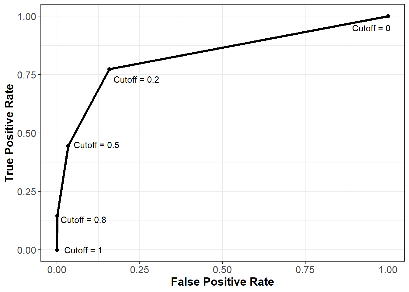
As we can see from this curve, we face a tradeoff when it comes to the cutoff value we choose. As we decrease the value of the cutoff, our true positive rate increases, which means we correctly flag more people who will end up churning. However, our false positive rate also increases, meaning we incorrectly flag more people who will not end up churning. As always, how one chooses to balance this tradeoff (i.e., how to pick the correct cutoff) depends on the business context of the problem.
To understand this curve even further, consider what it would look like if we just randomly guessed the probability of churning for each observation. Because we are guessing randomly, at any given cutoff the probability of a false positive would be the same as the probability of a true positive. Therefore, a very poor model that randomly guessed at the outcome would be plotted on the 45 degree line, where the false positive and true positive rates are the same. This is shown below in the red dotted line.
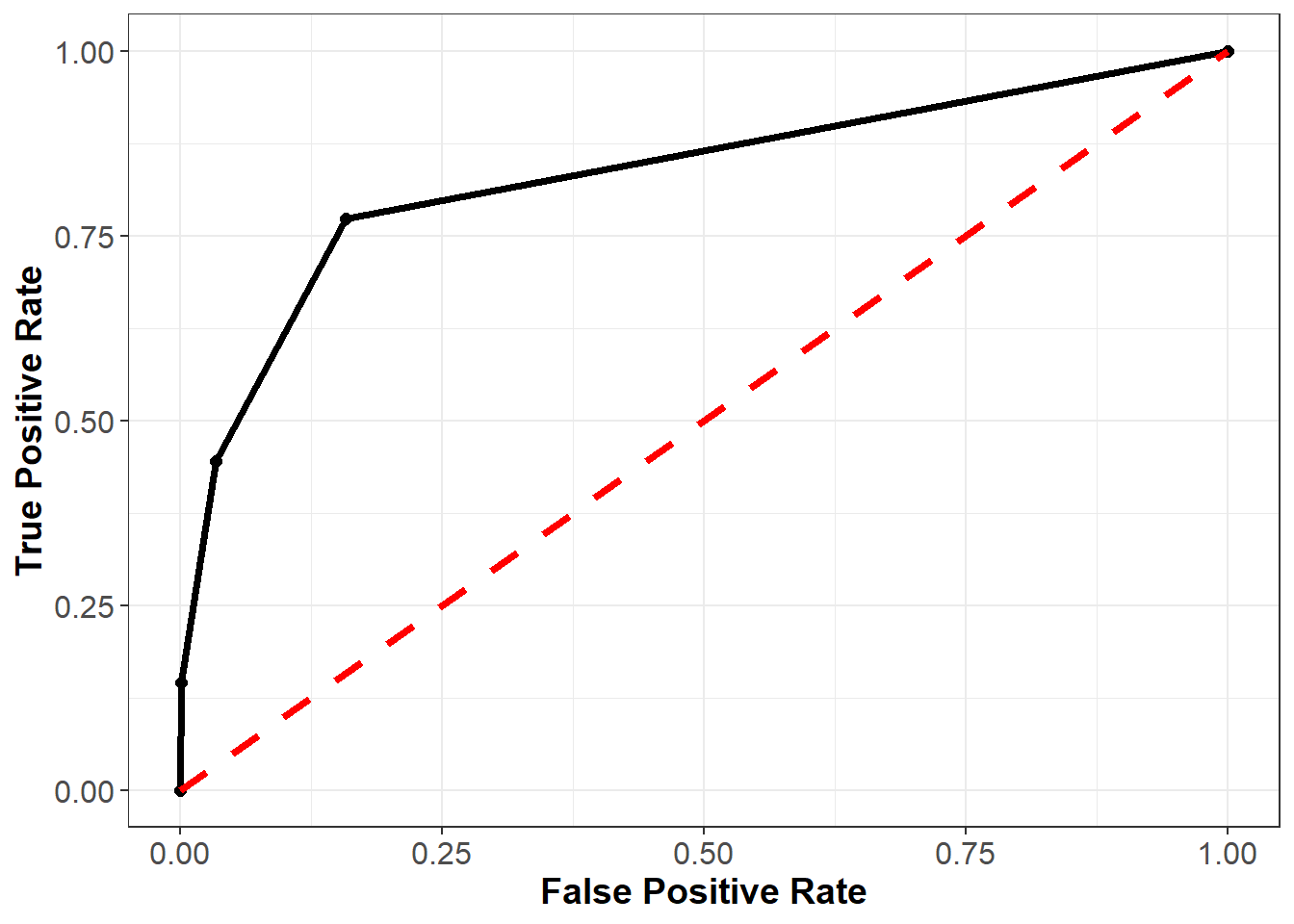
Finally, consider what the curve would look like with a perfect model. For observations that did churn, this model would predict the probability of churning to be 100%, and for observations that did not churn, this model would predict the probability of churning to be 0%. At a threshold of one the false positive and true positive rates would still be (0%, 0%), and at a threshold of zero these rates would still be (100%, 100%). However, for any other threshold, the false positive and true positive rates would be (0%, 100%). This curve is plotted below in the blue dashed line.

In general, the better our model, the closer the ROC curve will be to the blue line, and the further away it will be from the red line.
We can plot the ROC curve for our model in R using the prediction() and performance() functions from the ROCR package. These functions use the following syntax:
ROCR::prediction(predictions, labels)
- Required arguments
y_pred: An atomic vector with the model predictions.y_true: An atomic vector with the true labels.
ROCR::performance(predictionObj, measure1, measure2, …)
- Required arguments
predictionObj: An object created using theprediction()function.measure1: The desired model performance measure. See the “Details” section here for a full list. For our purposes, we will use “tpr” for the true positive rate and “fpr” for the false positive rate.
- Optional arguments
measure2, ...: Any additional model performance measures.
Below we apply these functions to create an object roc, which can be passed to the plot() function to plot the ROC curve:
## Warning: package 'ROCR' was built under R version 4.0.5rocPrediction <- prediction(finalModelPredictionsProb$yes, churnHoldoutScaled$churn)
roc <- performance(rocPrediction, "tpr", "fpr")
plot(roc)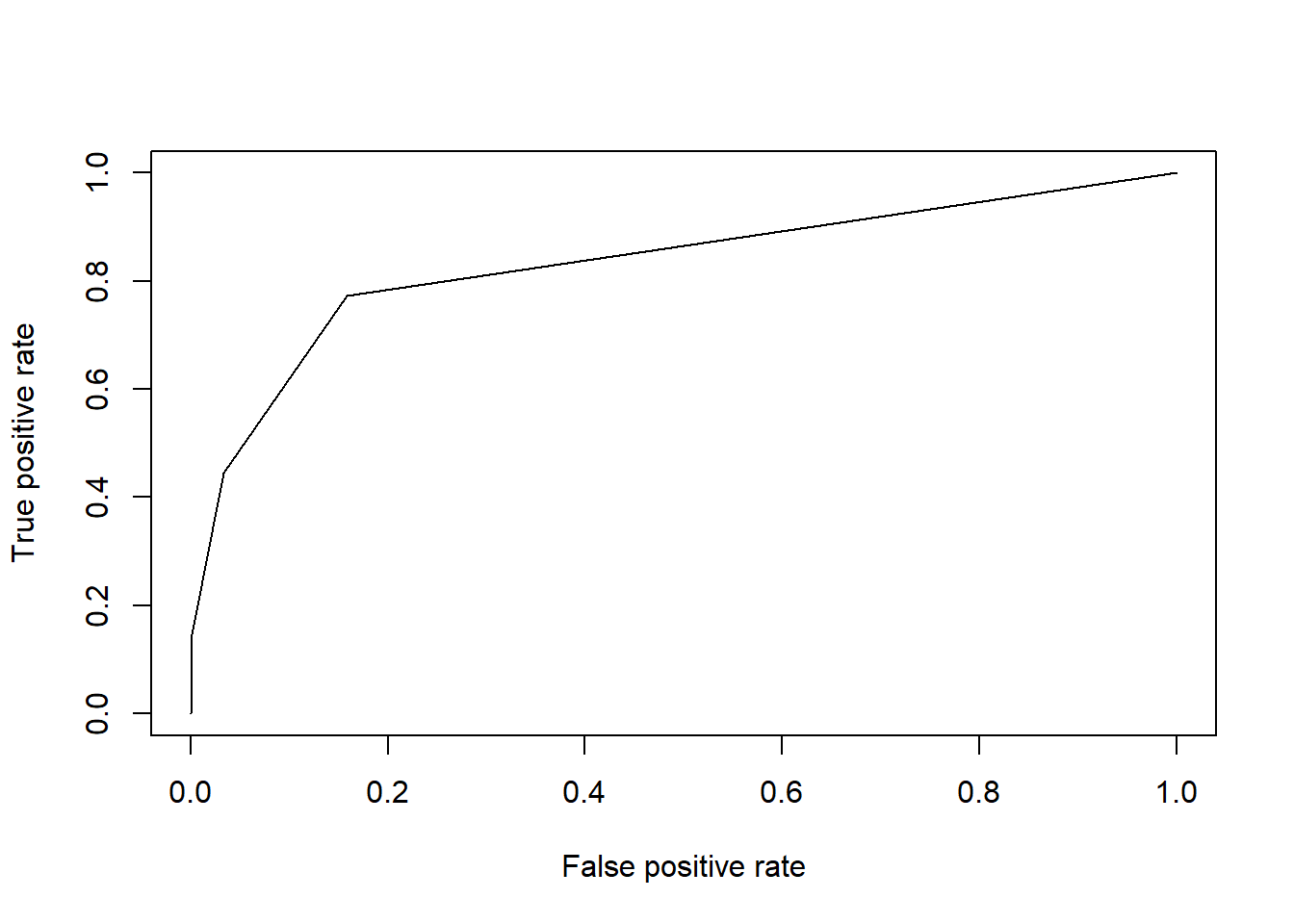
We can summarize this plot numerically through a measure known as area under the ROC curve (AUC), which (as the name implies) measures the area underneath our plotted ROC curve. If our curve fell on the red dotted line (representing the worst possible model), the area under the curve would be 0.5. Conversely, if our curve fell on the blue dotted line (representing the best possible model), the area under the curve would be 1. Therefore, the closer our AUC is to 1, the better our model, and the closer it is to 0.5, the worse our model. Note that because it is based on the ROC curve, this metric is independent of any particular cutoff value, unlike accuracy and confusion matrices.
We can calculate the AUC of our model in R using the AUC() function the MLmetrics package, which uses the following syntax:
MLmetrics::AUC(y_pred, y_true)
- Required arguments
y_pred: An atomic vector with the model’s predicted probabilities.y_true: An atomic vector with the true labels, represented numerically as 0 / 1. Note that this is different from some of the other functions fromMLmetrics, where the labels can be in their original form (i.e., “churn” / “not churn”).
Below we apply this function to our model. Note that churnHoldoutScaled$churn labels the observations as “no” or “yes”, but the AUC() function expects them to be labeled as 0 or 1 (respectively). Therefore, we first need to re-code the true values from “no” / “yes” to 0 / 1.
# Convert labels to binary (0 / 1)
trueLabelsBinary <- ifelse(churnHoldoutScaled$churn=="yes", 1, 0)

# Calculate AUC
AUC(finalModelPredictionsProb$yes, trueLabelsBinary)
## [1] 0.83162788.5.1.3 Log Loss
Another problem with simple accuracy is that it does not take into account the strength of each prediction. Imagine two competing models that both correctly predict a given customer will churn. Model 1 outputs a predicted probability of 0.51, while Model 2 outputs a predicted probability of 0.99. If we were scoring based on simple accuracy, these models would be considered equivalent - both correctly predicted that the customer would churn. The problem with this scoring method is that it does not reward Model 2 for having a predicted probability much closer to 1.
One solution to this issue is to score classification models via log loss, which is defined as:
\[LogLoss = -\frac{1}{n}\sum^{n}_{i=1}[y_ilog(\hat{p_i}) + (1 - y_i)log(1 - \hat{p_i})]\]
where
- \(n\) is the number of observations in the data set
- \(y_i\) is the observed realization of observation \(i\); it equals 1 if the observation churned and 0 if not
- \(\hat{p_i}\) is the predicted probability that observation \(i\) churned according to the model
To help understand log loss, think through the following scenarios:
- Great predictions
- \(y_i\) = 1 & \(\hat{p_i}\) = 0.99: the observation actually churned, and the model estimated the probability of a churn to be 99%. \[logloss_i = 1log(0.99) + (1-1)log(1-0.99) = log(0.99) \approx \mathbf{-0.004}\]
- \(y_i\) = 0 & \(\hat{p_i}\) = 0.01: the observation did not churn, and the model estimated the probability of a churn to be 1%. \[logloss_i = 1log(0.99) + (1-1)log(1-0.99) = log(0.99) \approx \mathbf{-0.004}\]
- Terrible predictions
- \(y_i\) = 0 & \(\hat{p_i}\) = 0.99: the observation did not churn, but the model estimated the probability of a churn to be 99%. \[logloss_i = 0log(0.99) + (1-0)log(1-0.99) = log(0.01) = \mathbf{-2}\]
- \(y_i\) = 1 & \(\hat{p_i}\) = 0.01: the observation actually churned, but the model estimated the probability of a churn to be only 1%.\[logloss_i = 1log(0.01) + (1-1)log(1-0.01) = log(0.01) = \mathbf{-2}\]
From these examples, it is clear that the absolute value of the log loss is small when the model is close to the truth and large when the model is far off. Now consider the following:
- Good (not great) predictions
- \(y_i\) = 1 & \(\hat{p_i}\) = 0.66: the observation actually churned, and the model estimated the probability of a churn to be 66%. \[logloss_i = 1log(0.66) + (1-1)log(1-0.66) = log(0.66) \approx \mathbf{-0.1805}\]
- \(y_i\) = 0 & \(\hat{p_i}\) = 0.33: the observation did not churn, and the model estimated the probability of a churn to be 33%. \[logloss_i = 0log(0.33) + (1-0)log(1-0.33) = log(0.66) \approx \mathbf{-0.1805}\]
- Bad (not terrible) predictions
- \(y_i\) = 0 & \(\hat{p_i}\) = 0.66: the observation did not churn, but the model estimated the probability of a churn to be 66%. \[logloss_i = 0log(0.66) + (1-0)log(1-0.66) = log(0.33) \approx \mathbf{-0.4815}\]
- \(y_i\) = 1 & \(\hat{p_i}\) = 0.33: the observation actually churned, but the model estimated the probability of a churn to be only 33%.\[logloss_i = 1log(0.33) + (1-1)log(1-0.33) = log(0.33) \approx \mathbf{-0.4815}\]
Notice that as our predictions go from terrible to bad to good to great, the log loss decreases in absolute value (i.e., it gets closer to zero). A perfect classifier would have a log loss of precisely zero. Less ideal classifiers have progressively larger values of log loss.
We can calculate log loss in R using the LogLoss() function from the MLmetrics package, which uses the following syntax:
MLmetrics::LogLoss(y_pred, y_true)
- Required arguments
y_pred: An atomic vector with the model’s predicted probabilities.y_true: An atomic vector with the true labels, represented numerically as 0 / 1. Note that this is different from some of the other functions fromMLmetrics, where the labels can be in their original form (i.e., “churn” / “not churn”).
Like AUC(), to use this function we first need to re-code the true values from “no” / “yes” to 0 / 1.
# Convert labels to binary (0 / 1)
trueLabelsBinary <- ifelse(churnHoldoutScaled$churn=="yes", 1, 0)

# Calculate log loss
LogLoss(finalModelPredictionsProb$yes, trueLabelsBinary)
## [1] 1.1936578.5.2 Regression
[In Progress]
8.5.2.1 MAE
[In Progress]
8.5.2.2 MAPE
[In Progress]