Chapter 4 Exploring Data
One of the fundamental pillars of data science is to understand data by visualizing it and computing basic descriptive summary statistics (e.g., average, standard deviation, maximum, and minimum). This collection of techniques is typically referred to as exploratory data analysis (EDA). Often, visualizing data is enough to answer basic descriptive questions (such as, which types of customers are buying different products?) devise more complex hypotheses about various relationships (such as, which types of customers are more likely to buy different products?) and identify irregularities (such as mistakes in the data collection or outlier data).
Descriptive statistics of key business metrics are aggregations of data that should form the information backbone of every enterprise. For example, sales, revenue, and customer churn are all examples of business metrics. Creating meaningful visualizations and analyzing descriptive statistics is the first important step in addressing business problems with data.
In this chapter, we will see how R can be used to explore and summarize data.
4.1 Summary Statistics for Quantitative Variables
As we explore a data set, it is often useful to calculate summary statistics that provide a preliminary overview of the variables we are working with. There are two main types of quantitative variables, continuous and discrete. A continuous variable is one that can take on any value within a certain numerical range. For example, in the employees data set Salary is continuous because it can take on any value above $0. A discrete variable can take on only a discrete set of values (e.g., 2,4,6,8).
The most basic summary statistics for quantitative variables are measures of central tendency, such as:
The mode - the most frequent value in the data.
The mean - the average value, defined as the sum of all observations divided by the total number of observations. In mathematical notation, we would write this as: \[\bar{x} = \frac{1}{n}\sum^{n}_{i=1}{x_i}\] Conventionally, we have a data set with \(n\) observations, and \(x_i\) represents the value of the \(i^{th}\) observation in that data set. In the formula above, the expression \(\sum^{n}_{i=1}{x_i}\) means “the sum of the \(n\) values of \(x\) in the data set.” To get the mean (\(\bar{x}\)), we divide that total by \(n\). As we saw in Section 2.3.1, we can calculate means in R with the
mean()function:## [1] 156486- The median & quartiles - when the data is sorted:
- The median is the middle value (i.e., the 50th percentile, also called the second quartile),
- The first quartile is the 25th percentile, and
- The third quartile is the 75th percentile.
We can calculate the median in R with the
median()function.median(vectorName, na.rm=FALSE)
- Required arguments
- The atomic vector whose values one would like to find the median of.
- Optional arguments
na.rm: IfTRUE, the function will remove any missing values (NAs) in the atomic vector and find the median of the non-missing values. IfFALSE, the function does not removeNAs and will return a value ofNAif there is anNAin the atomic vector.
## [1] 156289.5
We can calculate the first and third quartiles with
quantile().quantile(vectorName, probs=c(0, 0.25, 0.5, 0.75, 1), na.rm=FALSE)
- Required arguments
- The atomic vector of values where we would like to find the quantiles.
- Optional arguments
probs: An atomic vector with the percentiles (between 0 and 1) we would like to calculate.na.rm: IfTRUE, the function will remove any missing values (NAs) in the atomic vector and find the percentiles of the non-missing values. IfFALSE, the function does not removeNAs and will return a value ofNAif there is anNAin the atomic vector.
##       0%      25%      50%      75%     100%
##  29825.0 129693.8 156289.5 184742.2 266235.0
In addition to measures of central tendency, we often also want to measure the dispersion, or spread, of a data set. We can do that with the following measures:
The interquartile range (IQR) - the difference between the first quartile (i.e., the 25th percentile) and the third quartile (i.e., the 75th percentile).
- The standard deviation & variance - variance and standard deviation are both measures of the spread of a data set. The minimum value of both measures is zero (which indicates no variation in the data), and the higher the values the more spread out the data are. The variance is calculated in squared units, while the standard deviation is recorded in the base units.
- Formally, the variance of a data set is written as: \[s^2 = \frac{1}{n - 1}\sum^{n}_{i=1}{(x_i - \bar{x})^2}\] Although variance is an important concept in statistics, it does not provide a very intuitive understanding of the spread of a data set, because it is in squared units. Instead we more commonly look at the standard deviation, which is the square root of the variance.
- Formally, the standard deviation of a data set is written as: \[s = \sqrt{\frac{1}{n - 1}\sum^{n}_{i=1}{(x_i - \bar{x})^2}}\] This can be thought of as roughly the average distance observations in the data set fall from the mean.
We can calculate standard deviation and variance with the
sd()andvar()functions, respectively.sd(vectorName, na.rm=FALSE) & var(vectorName, na.rm=FALSE)
- Required arguments
- The atomic vector whose values one would like to find the standard deviation/variance of.
- Optional arguments
na.rm: IfTRUE, the function will remove any missing values (NAs) in the atomic vector and find the standard deviation/variance of the non-missing values. IfFALSE, the function does not removeNAs and will return a value ofNAif there is anNAin the atomic vector.
## [1] 39479.84## [1] 1558657479
4.1.1 Correlation
So far we have seen summary statistics for individual variables. However, we often want to summarize the relationship between two or more variables. For example, take the scatter plot below, which shows the relationship between Age and Salary in the employees data set:
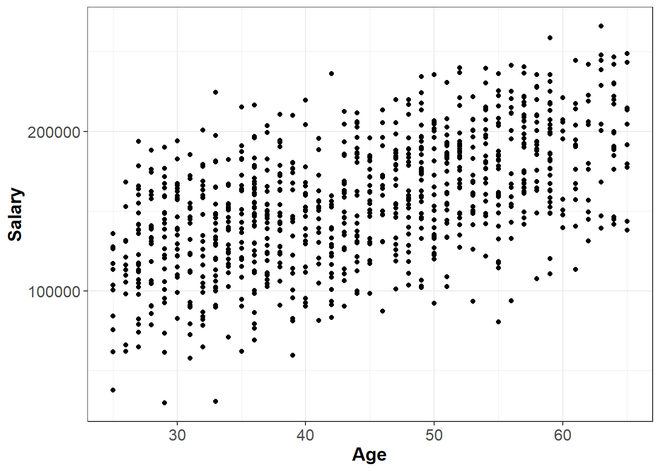
We might describe the plot above as having a “moderate, positive relationship” between Age and Salary. The strength of this relationship can be summarized by a statistical measure called the correlation coefficient, or simply the correlation.
The correlation, denoted \(r\), is a value between -1 and 1 and measures the direction and strength of a linear relationship between two variables. In short, how well would a line fit our observed data? If the correlation is positive, then on average as one variable rises the other variable rises as well. If the correlation is negative, then on average as one variable rises the other variable falls. Keep in mind that correlation is a measure of linear relationship. Thus, a correlation of zero means that there is no linear relationship between two variables, but there could be a non-linear relationship. For example, in the chart below, \(X\) and \(Y\) are clearly related, but not in a linear fashion. Indeed, the correlation between \(X\) and \(Y\) in the graph below is zero.
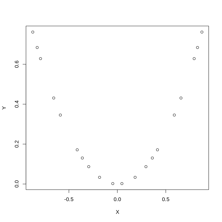
Figure 4.1: A Non-Linear Relationship.
A rough rule of thumb table for how to interpret the correlation in absolute value |\(r\)| is as follows:
| |\(r\)| | Interpretation |
|---|---|
| 0 - 0.2 | Very weak |
| 0.2 - 0.4 | Weak to moderate |
| 0.4 - 0.6 | Medium to substantial |
| 0.6-0.8 | Very strong |
| 0.8-1.0 | Extremely strong |
In R, we can compute correlation using the command cor():
cor(x, y, use = “everything”)
- Required arguments
x: A numeric vector that represents the \(X\) variable.y: A numeric vector that represents the \(Y\) variable.
- Optional arguments
use: Ifuseequals"everything", all observations are used to calculate the correlation. Ifuseequals"complete.obs", only the observations that complete (i.e., that are not missing values for either variable) are used.
For example, we can use cor() to calculate the correlation between Salary and Age in the employees data. Note that we set use="complete.obs" because Salary is missing for some of the observations in the data set.
## [1] 0.56351254.1.1.1 Correlation is Not Causation
Although the correlation coefficient measures the strength of a linear relationship between two variables, it provides no information about cause or effect. A high correlation may imply that two variables move in tandem, but it does not imply that one causes the other. For example, there is a high correlation between the number of fire fighters at a fire and the dollar amount of the resulting damage. However, this does not mean that fire fighters cause damage. In this case there is a third variable (called a confounding variable) - the size of the fire. The confounding variable is causally related to the other two variables; a larger fire causes more damage, and causes more fire fighters to show up. One must always consider whether an observed correlation can be explained by a confounding variable.
Correlation does not imply causation.
4.1.1.2 The Correlation Matrix
If we have several variables, we can create a correlation matrix, which lists the correlations between each pair of variables. As an example, the following R code will create a correlation matrix between the Age, Rating, and Salary variables in the employees data. Note that this is the same cor() command that we saw above; instead of passing in two numeric vectors x and y, we can pass in a data frame and cor() will calculate the correlation between all of the variables in the data frame.
##               Age     Rating    Salary
## Age    1.00000000 0.06199581 0.5635125
## Rating 0.06199581 1.00000000 0.3064684
## Salary 0.56351248 0.30646840 1.0000000
From the results, we learn, for example, that the correlation between Salary and Rating is 0.3235. The matrix is symmetric, meaning that the correlation of Salary and Rating is the same as the correlation of Rating and Salary. The diagonal of this matrix is all ones, indicating that the correlation of a variable with itself is one.
4.1.2 Summarizing Quantitative Variables with tidyverse
At the end of the previous chapter (Section 3.7), we created a data frame called innerJoinData with all of the columns from employees, plus a column that indicates which office each employee belongs to. In this section we will see how we can use the tools from the tidyverse to easily calculate summary statistics for all three offices (New York, Detroit, and Boston) at once.
First we need to introduce the summarise() function, which we can use to quickly summarize one or more columns in a data frame. This function uses the following syntax:
tidyverse::summarise(df, summaryStat1 = …, summaryStat2 = …, …)
- Required arguments
df: The tibble (data frame) with the data.summaryStat1 = ...: The summary statistic we would like to calculate.
- Optional arguments
summaryStat2 = ..., ...: Any additional summary statistics we would like to calculate.
For example, we can use summarise() to calculate all of the following at once from employees:
- The average of
Salary - The standard deviation of
Salary - The minimum
Age - The maximum
Age
summarise(innerJoinData,  meanSalary = mean(Salary, na.rm=TRUE),
                          sdSalary = sd(Salary, na.rm=TRUE),
                          minAge = min(Age),
                          maxAge = max(Age))
## # A tibble: 1 x 4
## meanSalary sdSalary minAge maxAge
## <dbl> <dbl> <dbl> <dbl>
## 1 158034. 39677. 25 65It is often useful to include the helper function n() within summarise(), which will calculate the number of observations in the data set. Note that this is similar to the nrow() function that we saw in Section 3.3, but n() only works within other tidyverse functions.
summarise(innerJoinData,  meanSalary = mean(Salary, na.rm=TRUE),
                          sdSalary = sd(Salary, na.rm=TRUE),
                          minAge = min(Age),
                          maxAge = max(Age),
                          nObs = n())
## # A tibble: 1 x 5
## meanSalary sdSalary minAge maxAge nObs
## <dbl> <dbl> <dbl> <dbl> <int>
## 1 158034. 39677. 25 65 908The summarise() function is useful for calculating summary statistics, but it becomes even more powerful when we combine it with group_by().
tidyverse::group_by()
Our goal is to calculate separate summary statistics for each of the three offices separately, not across the entire data set. To accomplish this, we can simply pass the data through group_by() first, then pass it through summarise(). Any variable(s) we specify in group_by() will be used to separate the data into distinct groups, and summarise() will be applied to each one of these groups separately. For example, using the pipe (%>%) we introduced in Section 3.6:
innerJoinData %>%
  group_by(office) %>%
  summarise(meanSalary = mean(Salary, na.rm=TRUE),
            sdSalary = sd(Salary, na.rm=TRUE),
            minAge = min(Age),
            maxAge = max(Age),
            nObs = n())
## # A tibble: 3 x 6
## office meanSalary sdSalary minAge maxAge nObs
## <chr> <dbl> <dbl> <dbl> <dbl> <int>
## 1 Boston 157958. 37389. 25 65 294
## 2 Detroit 137587. 38510. 25 65 166
## 3 New York 165628. 38978. 25 65 448We can also include more than one variable within group_by(). For example, imagine we wanted to calculate these summary statistics by gender within each office. All we would need to do is add Gender to the group_by():
innerJoinData %>%
  group_by(office, Gender) %>%
  summarise(meanSalary = mean(Salary, na.rm=TRUE),
            sdSalary = sd(Salary, na.rm=TRUE),
            minAge = min(Age),
            maxAge = max(Age),
            nObs = n())
## `summarise()` has grouped output by 'office'. You can override using the `.groups` argument.## # A tibble: 6 x 7
## # Groups: office [3]
## office Gender meanSalary sdSalary minAge maxAge nObs
## <chr> <chr> <dbl> <dbl> <dbl> <dbl> <int>
## 1 Boston Female 152778. 34105. 25 65 114
## 2 Boston Male 161317. 39107. 25 65 180
## 3 Detroit Female 133720. 35552. 25 65 69
## 4 Detroit Male 140251. 40401. 25 64 97
## 5 New York Female 160560. 39788. 25 65 220
## 6 New York Male 170647. 37585. 25 65 2284.2 Summary Statistics for Categorical Variables
Categorical variables take on values corresponding to a category. For example, Degree in employees can only take on the values High School, Associate's, Bachelor's, Master's, and Ph.D. Categorical variables cannot be summarized by the mean, median, or standard deviation. Instead, these variables are often summarized using tables and bar plots. For categorical variables, the table() and prop.table() commands show the number and percentage (proportion) of observations in each category, respectively. Note that to use prop.table(), we need to apply table}() first.
table(vectorName) & prop.table(table(vectorName))
##
##      Accounting       Corporate     Engineering Human Resources      Operations
##              63             103             236              97             287
##           Sales
## 214##
## Accounting Corporate Engineering Human Resources Operations
## 0.063 0.103 0.236 0.097 0.287
## Sales
## 0.214Two categorical variables can be summarized in a two-way table using the same table() and prop.table() commands shown above. For example:
##
##                   High School Associate's Bachelor's Master's Ph.D
##   Accounting                0           0         31       32    0
##   Corporate                 0           0         20       40   43
##   Engineering               0           0         36       43  157
##   Human Resources           0          35         30       32    0
##   Operations              146         110         16       15    0
##   Sales                    54          55         67       38    0
The prop.table() command has an optional second argument margin that calculates the proportion of observations by row (margin = 1) or column (margin = 2). Note that the term margin refers to the “margins” (i.e., the outer edges) of the table, where the sum of the rows and columns are often written. In the code chunk below we do not specify the margin parameter in prop.table(), so each cell represents the proportion over all observations in the data set. For example, 5.4% of all employees work in Sales and have a high school diploma.
##
##                   High School Associate's Bachelor's Master's  Ph.D
##   Accounting            0.000       0.000      0.031    0.032 0.000
##   Corporate             0.000       0.000      0.020    0.040 0.043
##   Engineering           0.000       0.000      0.036    0.043 0.157
##   Human Resources       0.000       0.035      0.030    0.032 0.000
##   Operations            0.146       0.110      0.016    0.015 0.000
##   Sales                 0.054       0.055      0.067    0.038 0.000
If we set margin equal to 1, each cell represents the proportion of observations by row. For example, of all employees in Accounting, 49.2% have a Bachelor’s.
##
##                   High School Associate's Bachelor's   Master's       Ph.D
##   Accounting       0.00000000  0.00000000 0.49206349 0.50793651 0.00000000
##   Corporate        0.00000000  0.00000000 0.19417476 0.38834951 0.41747573
##   Engineering      0.00000000  0.00000000 0.15254237 0.18220339 0.66525424
##   Human Resources  0.00000000  0.36082474 0.30927835 0.32989691 0.00000000
##   Operations       0.50871080  0.38327526 0.05574913 0.05226481 0.00000000
##   Sales            0.25233645  0.25700935 0.31308411 0.17757009 0.00000000
If we set margin equal to 2, each cell represents the proportion of observations by column. For example, of all employees with an Associate’s, 55.0% work in Operations.
##
##                   High School Associate's Bachelor's Master's  Ph.D
##   Accounting            0.000       0.000      0.155    0.160 0.000
##   Corporate             0.000       0.000      0.100    0.200 0.215
##   Engineering           0.000       0.000      0.180    0.215 0.785
##   Human Resources       0.000       0.175      0.150    0.160 0.000
##   Operations            0.730       0.550      0.080    0.075 0.000
##   Sales                 0.270       0.275      0.335    0.190 0.000
Binary categorical variables are often modeled using the binomial distribution, which is described in ??.
4.3 Visualization
Data visualization is an essential tool for discovering and communicating insights in a simple, actionable way. Data science is problem-driven, and one of the easiest ways to quickly gain an understanding of the problem at hand is to visualize the relevant data. Although data visualization may seem less rigorous or scientific than the other statistical methods described in this book, visualizations often uncover important insights that are not captured in quantitative summaries of the data. Therefore, data visualization is an important component of any data practitioner’s toolkit.
Additionally, data visualizations allow managers and business analysts to communicate important information across large organizations. The old phrase “a picture is worth a thousand words” applies well – in business contexts, visualizations are often one of the best ways to communicate essential information quickly and effectively. Creative uses of color, shapes, and even animation can succinctly tell a compelling story. Interactive dashboards allow stakeholders to track key business metrics in real time. As a manager, all of these tools can help you and your team stay informed about different outcomes.
4.3.1 Histograms
Often one of the best ways to get a quick understanding of your data is to visualize it in a few basic charts. The simplest of these is a histogram, which shows how a variable is distributed over a range of values. The range of values on the x-axis is divided into “buckets.” The height of each bucket in a histogram represents the number of observations that fall within that bucket’s range. We can create a histogram in R with the hist() function.
hist(vectorName)

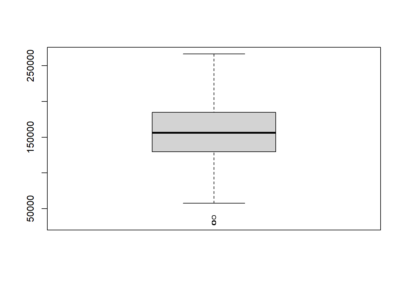
4.3.2 Boxplots
Another very useful chart is the boxplot, which is an alternative way to visualize the distribution and spread of a variable. The boxplot serves as a visual display of five main values:
- The median (i.e., the 50th percentile) of the data, represented by the middle line of the box.
- The 25th and 75th percentiles of the data, represented by the sides of the box (Q1 and Q3 respectively).
- The Interquartile Range (IQR) is the distance between the 25th and 75th percentiles, that is:
- IQR = Q3 - Q1
- The Interquartile Range (IQR) is the distance between the 25th and 75th percentiles, that is:
- The minimum and maximum values, which form the ends of the boxplot’s “whiskers”. Somewhat confusingly, these points are actually not the smallest and largest values in the data set. Instead, these two points are calculated as follows:
- “minimum” = Q1 - 1.5 * IQR
- “maximum” = Q3 + 1.5 * IQR
In R, any points that fall to the left of (i.e., less than) the minimum or to the right of (i.e., greater than) the maximum are plotted individually and treated as outliers.
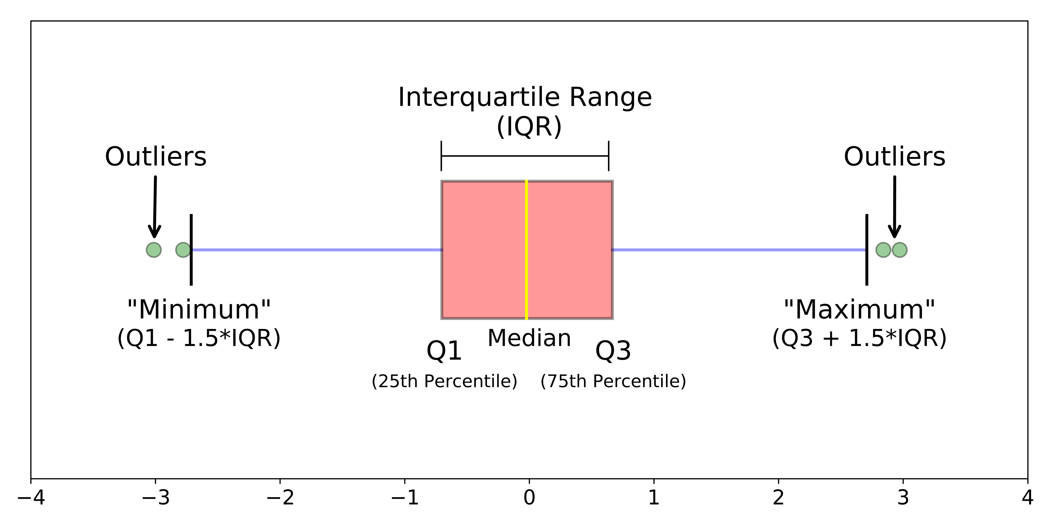
Figure 4.2: Boxplot.
We can create a boxplot in R with the boxplot() function.
boxplot(vectorName)
4.3.3 Side-by-Side Box Plots
Side-by-side boxplots can be used to visualize the distribution of a variable over each category of a categorical variable. The code chunk below creates a box plot of the Salary variable for each value of Degree in employees. Note that the boxplot() function uses the tilde (~) notation; the quantitative variable we’re analyzing goes before the tilde, and the categorical variable comes after.

4.3.4 Scatter Plots
Scatter plots can be used to get a quick feel for how two variables are related. The plot() function takes two variables as inputs; the first variable is plotted on the x-axis, and the second variable is plotted on the y-axis.
plot(x, y)

4.3.5 Bar Plots
For categorical variables, bar plots can be used to visualize how the data are distributed over the different categories. Specifically, a bar plot shows the number of observations corresponding to each category of a categorical variable, such as Division. To create the barplot, we first need to create a table of the categorical variable we are examining, then apply barplot}() to that table.
barplot(table(vectorName))

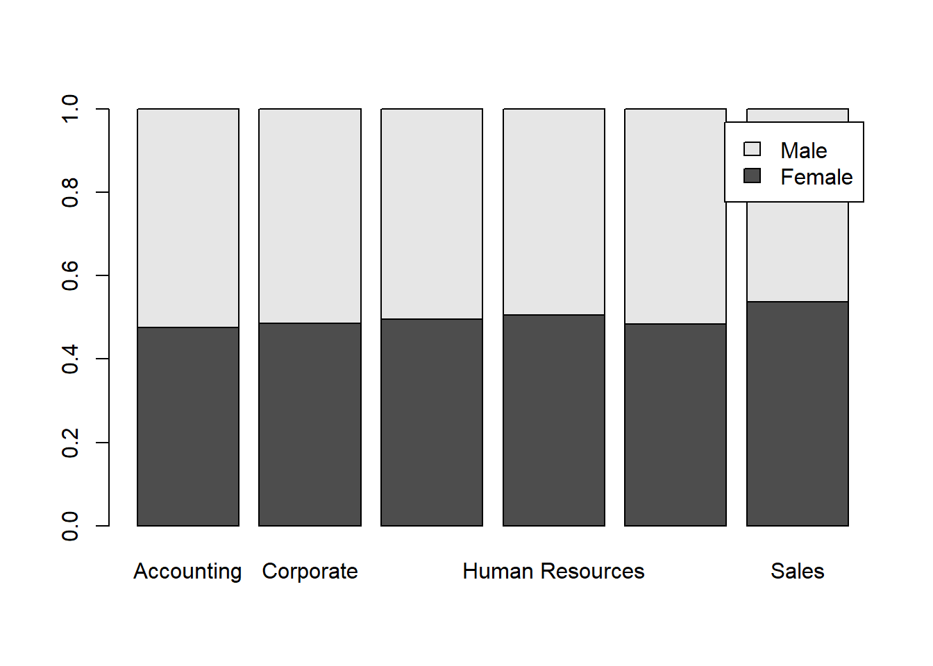
By combining the barplot() command and the table() and prop.table() commands from Section 4.2, we can create a stacked barplot for two categorical variables, such as Division and Gender. Recall that the margin argument of the prop.table() command, 2 in this case, indicates that we wish to calculate the proportion of observations by column rather than by row. The legend parameter adds a legend with the Male and Female labels for each color.
barplotTable <- prop.table(table(employees$Gender,employees$Division), 2)
barplot(barplotTable, legend=rownames(barplotTable))