Chapter 8 Lab 6 - Graduated Color Mapping
Welcome to Lab 6! In this lab we are going to focus on
Topics Covered
- Spatially joining crimes
- Creating color schemes
- Sequential vs. divergent patterns
8.1 Getting Started: Spatial Joins
Let’s start by reading in our libraries as well as our two shapefiles. One is a shapefile we have used before, nyc_shooting, which is the location of all shootings in NYC in 2017. The other is a polygon shapefile, nypd_precinct showing the boundaries of all 77 of the New York Police Department’s precincts.
library(sf)
library(tidyverse)

shooting <- st_read("C:/Users/gioc4/Desktop/nyc_shooting.shp")
precinct <- st_read("C:/Users/gioc4/Desktop/nypd_precinct.shp")
Let’s create a point map to visualize what we’re working with here.
# Plot all shootings by police precinct
ggplot() +
  geom_sf(data = precinct, fill = "lightblue") +
  geom_sf(data = shooting, size = 1, shape = 1)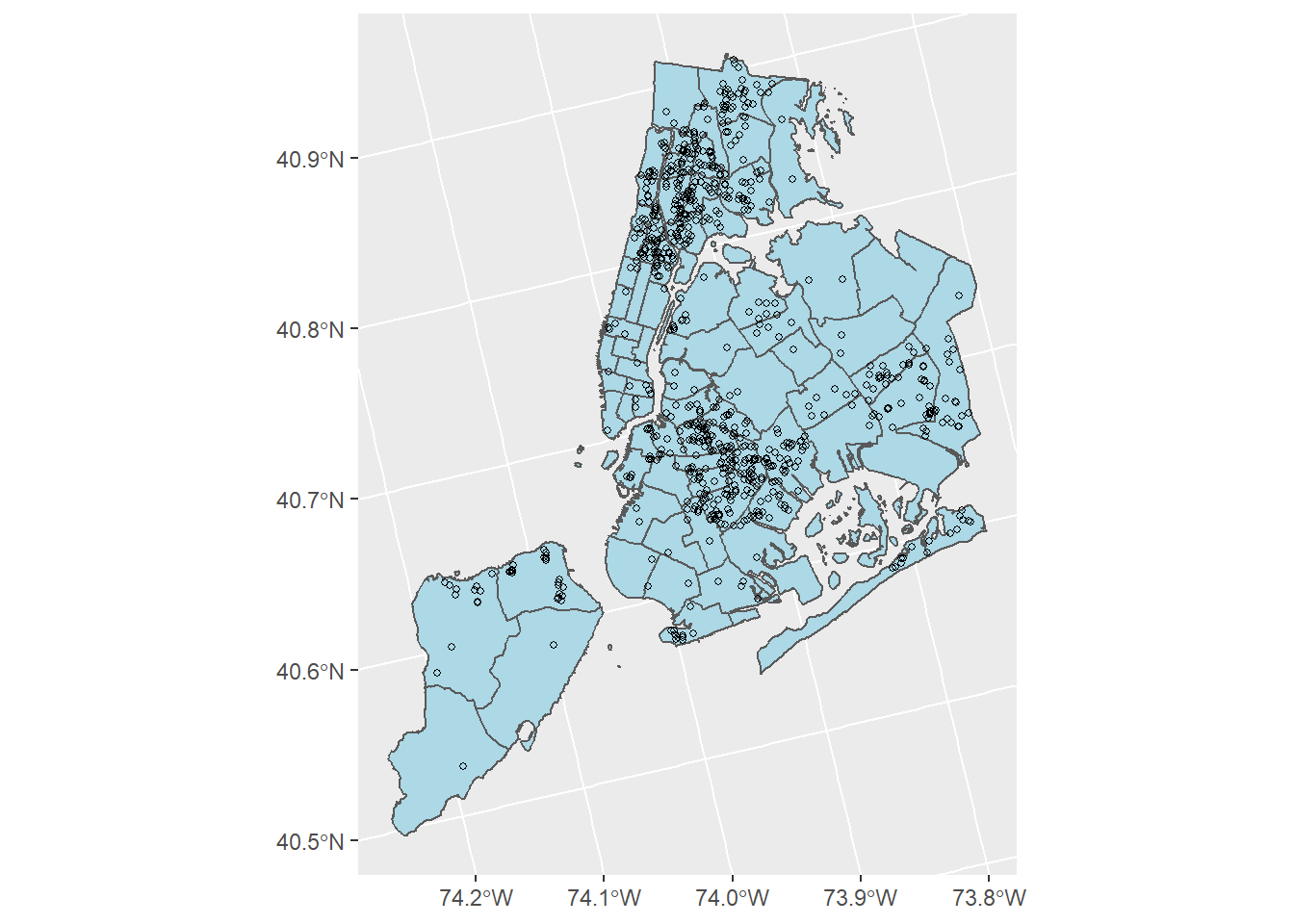
Here we can see that we have a lot of shootings (about 969 in total) spread across the city. From just a brief visual inspection we can see that these aren’t evenly distributed, however. In fact, they are densely concentrated in a few neighborhoods and precincts in the city. Let’s work with some methods to help identify these locations and visualize them with more clarity.
8.1.1 Joining shootings to precincts with st_join
Let’s start by figuring out how many shootings occurred in each of the 77 precincts. In this case we want to count up the number of shootings based on their location in each precinct. This is going to require a spatial join. In a previous lab we used a spatial join to link crimes to a spatial buffer. Here, we are going to spatially join crimes to the precinct they occurred in. The tool we are using st_join does the following:
The spatial join tool inserts the columns from one feature table to another based on location or proximity
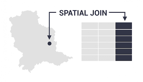
Figure 8.1: Applying a spatial join
In this case, we are going to find out which shootings occurred within the boundaries of each precinct. In R we will use the function st_join. Let’s try it out.
# Link shootings to precincts using st_join
precinct_shootings <- st_join(shooting, precinct)

# Check the new data
head(precinct_shootings)
## Simple feature collection with 6 features and 10 fields
## Geometry type: POINT
## Dimension: XY
## Bounding box: xmin: 1828394 ymin: 561221.1 xmax: 1833140 ymax: 587232.3
## Projected CRS: Albers
## id_key date year boro vic_race vic_sex vic_age precinct shape_area shape_leng geometry
## 1 173129246 2017-12-31 2017 BROOKLYN BLACK M 18-24 61 134635108 128324.49 POINT (1833140 561221.1)
## 2 173120488 2017-12-31 2017 BROOKLYN BLACK M 18-24 94 65627713 44412.65 POINT (1830159 574401.4)
## 3 173120488 2017-12-31 2017 BROOKLYN BLACK M 25-44 94 65627713 44412.65 POINT (1830159 574401.4)
## 4 173105454 2017-12-29 2017 BRONX BLACK M 25-44 41 62139101 47901.42 POINT (1833079 585311.2)
## 5 173084537 2017-12-29 2017 MANHATTAN BLACK M 18-24 33 25863124 21744.60 POINT (1828394 587232.3)
## 6 173084538 2017-12-29 2017 BROOKLYN WHITE HISPANIC M 18-24 94 65627713 44412.65 POINT (1831543 574097.2)There! Now our shooting data has additional columns based on the ‘precinct’ shapefile. Specifically, we have data on the precinct the shooting occurred in. We can look at the variable precinct to tell us which precinct each of the 969 shooting occurred in. For example, the first shooting on the list occurred on 2017-12-31 in precinct 61.
8.1.2 Counting shootings within precincts using count
Now we want to count up how many shootings happened in each precinct. To do this we’re just going to take our new dataframe precinct_shootings and count the number of times each precinct shows up in the precinct column. Then we’ll get a number that tells us how many shootings each precinct had. In R we have a handy function called count that will do this for us. Let’s take a look.
# First, let's count up how many shootings happened in each precinct
# The code `%>% data.frame() just converts it from a shapefile to a data table
precinct_count <- count(precinct_shootings, precinct, name = "shootings") %>% data.frame()

head(precinct_count)
## precinct shootings geometry
## 1 1 2 POINT (1825722 571361.3)
## 2 7 2 MULTIPOINT ((1827558 572939...
## 3 9 5 MULTIPOINT ((1827191 574378...
## 4 10 1 POINT (1825774 575366.3)
## 5 13 1 POINT (1827707 575959.9)
## 6 18 4 MULTIPOINT ((1825772 578358...There! Now we see we have a column for the precinct (named precinct) and a column for the number of shootings (named shootings). So in precinct 1, there were 2 shootings, in precinct 9 there were 5 shootings, and so on.
The last thing we need to do is link this data back to our polygon shapefile and plot it. To do this we’re going to use what is called a left_join. Essentially, we are going to link the number of shootings back based on the name in the precinct column.
# Employ a left_join
# linking the number of shootings back to the precinct polygon
# We put in by = 'precinct' to specify we want to link the files by that variable
precinct_plot <- left_join(precinct, precinct_count, by = 'precinct')

# This just fill in zero values for precincts who didn't have any shootings
precinct_plot <- replace_na(precinct_plot, replace = list(shootings = 0))
A brief aside: The code replace_na(precinct_plot, replace = list(shootings = 0)) just fills in zeroes for precincts that didn’t have any shootings. Since we don’t have any data for those precincts, we just need to specify a value. I’m doing this for you - so no worries!
8.2 Creating a Graduated Color Map
Graduated color maps are very useful tools for visualizing numeric data within defined spatial regions. A graduated color map is a type of map where a range of colors indicate some kind of numeric progression (i.e. from low to high). In this case, we are interested in visualizing shootings.
8.2.1 Colorbrewer
A great example and tool we will be using is the colorbrewer website. Here, we can visualize what our graduated color map will look like ahead of time. What we will want to do is select a pattern for our map, and then choose a matching color scheme. We have two options:
- A sequential color scheme that goes from low to high
- A diverging color scheme that goes from low to medium to high.
The biggest difference is that a diverging color scheme has a midpoint that divides the low and high values more cleanly. Let’s try both and see what we get.
On the colorbewer page click the ‘sequential’ button, then click the yellow-red palette on the bottom-right of the window. It should look something like this:
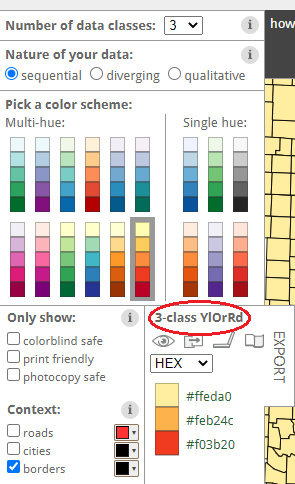
Figure 8.2: Colorbrewer palette selector
Now, in R, we are going to add the line of code to our ggplot which reads:
scale_fill_distiller()
We have to fill in what type we want. type = "seq" will create a sequential plot, while type = "div" will create a diverging plot. We then have to choose a palette from the website to add in. So if I want a yellow-orange-red sequential palette, I will copy ‘YrOrRd’ from the palette on the website (see above).
8.2.2 Sequential
Let’s start by doing a sequential plot. So we will use the function scale_fill_distiller that we discussed above. Here, I’m using the color scheme ‘YlOrRd’ for a yellow-orange-red palette.
# Create a sequential plot
ggplot() +
  geom_sf(data = precinct_plot, aes(fill = shootings)) +
  scale_fill_distiller(type = "seq", palette = "YlOrRd")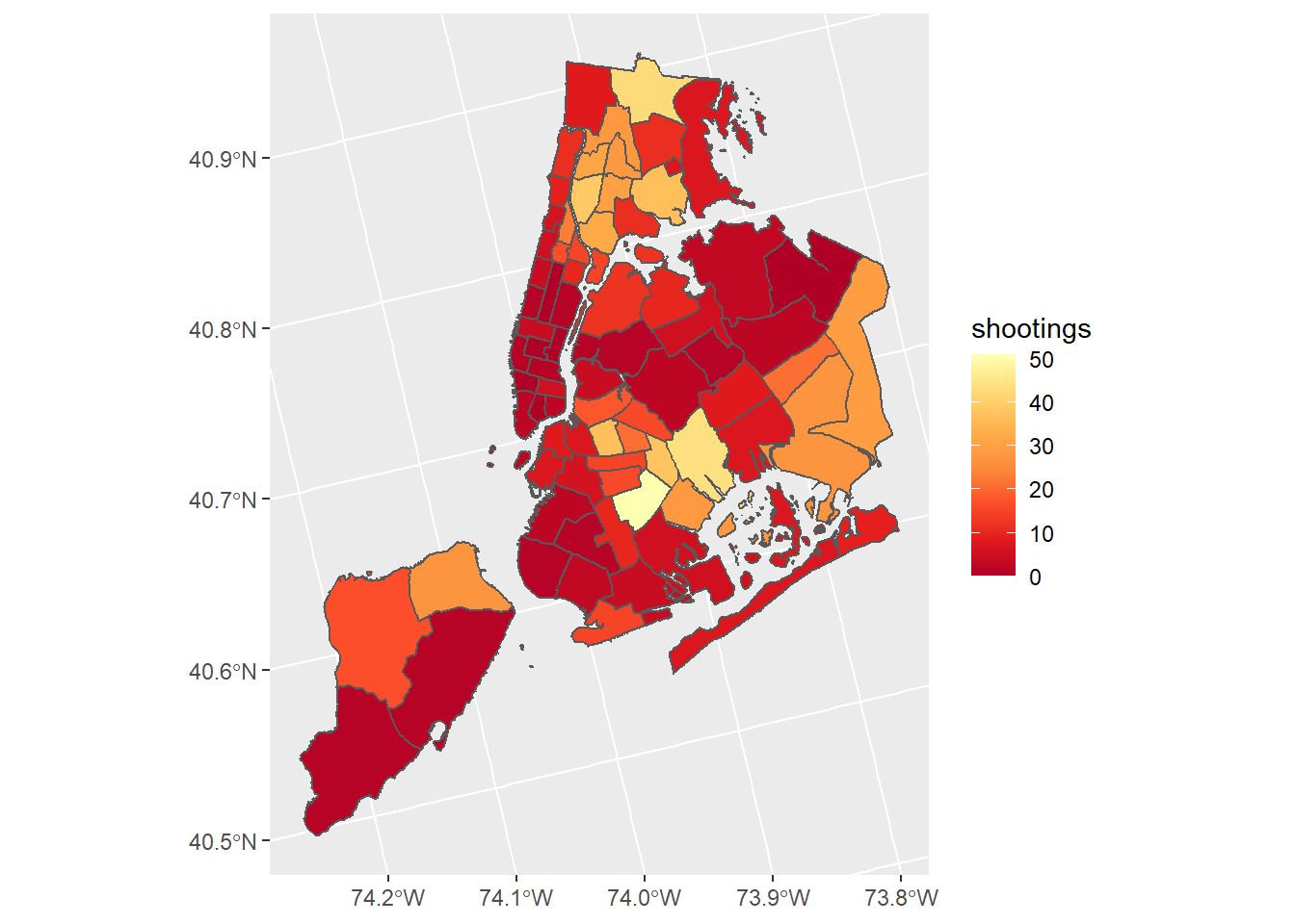
8.2.3 Diverging
We can also create a diverging plot in the same way as above, except we swap out the two arguments for type = "div", and palette = "RdYlGn". Be sure to click on the button for diverging schemes on the colorbrewer webpage.
# Create a diverging plot
ggplot() +
  geom_sf(data = precinct_plot, aes(fill = shootings)) +
  scale_fill_distiller(type = "div", palette = "RdYlGn")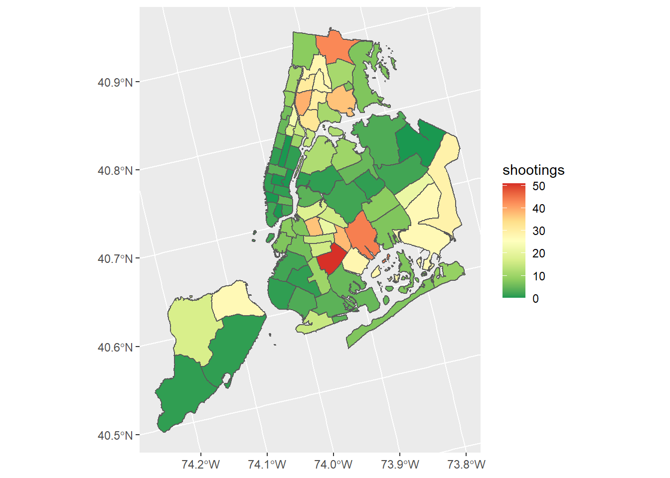
8.2.4 Final Plot
Let’s end by adding a title and removing the background so our plot looks cleaner. I’m going to use a diverging plot because I think it visualizes the patterns better.
# Create a diverging plot
ggplot() +
  geom_sf(data = precinct_plot, aes(fill = shootings)) +
  scale_fill_distiller(type = "div", palette = "RdYlGn") +
  labs(title = "2017 Shootings, by Police Precinct") +
  theme_void()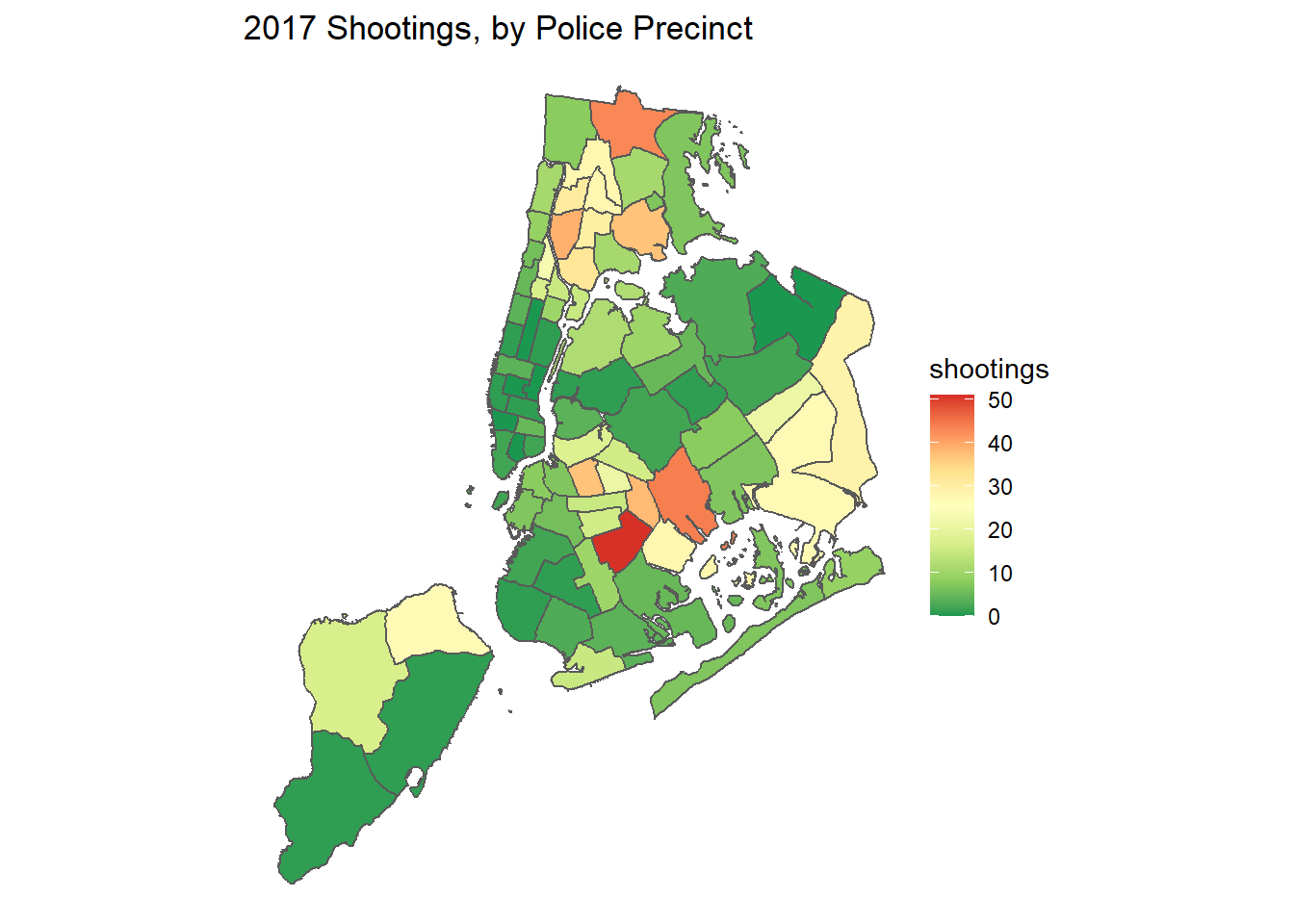
8.3 Lab 6 Assignment
This lab assignment is worth 10 points. Follow the instructions below.
Using the provided shapefiles nyc_shooting.shp, and nypd_precinct.shp perform the following analyses:
Create a point map using both shapefiles. In your point map, do the following:
- Change the color and shape of the points
- Change the fill color of the precincts
Follow the instructions from lab to spatially join shootings to precincts.
Create a graduated color map using either:
- A sequential color scheme
- A diverging color scheme
For step 3, be sure to add a descriptive title to your plot. In addition, you may not use the same palettes shown in the example (pick your own from the colorbrewer webpage!)
In a few sentences write why you chose either a sequential or diverging color scheme and how you think it best visualizes the crime points. Finally, write whether you think this analysis would suit either a tactical or strategic crime analysis and why.