Crime Mapping and Analysis
2022-01-03
Chapter 1 Introduction to the Course
Welcome to CJST 4557 - Crime Mapping and Analysis!
Before we get started, let’s address a few common questions about this course, as well as some more general questions about crime mapping in general. In general I have a few major goals for you in this course:
- Develop an understanding of how crime can be predicted, understood, and addressed
- Learn to use common crime analysis tools
- Design data-driven approaches to crime prevention
This is intended to be a general course covering common methods in crime analysis, some of the tools that go along with it, and a theory-based discussion of how to best implement strategies for crime prevention. This will be a mix of both lab-based computer work and in-class discussion supplemented with some lecture. There is significant overlap in the two different areas.
1.1 What’s This Document?
This is a digital ‘book’ that contains all the necessary information included in the lab assignments for this course. A crime mapping and analysis course requires some use of computers to analyze data, develop data visualizations, and produce outputs that can be used for future crime prevention strategies.
1.2 Why Crime Mapping and Analysis?
1.3 Why Data Visualization?
Data Visualization is a powerful tool for understanding complex patterns in the real world. Today, we have access to an unprecedented amount of data and one of the most common issues is how to accurately present it. For example, here’s a table reporting the number of motor vehicle thefts in Brooklyn, NYC in 2019.
| month | mvt |
|---|---|
| Jan | 334 |
| Feb | 295 |
| Mar | 301 |
| Apr | 348 |
| May | 388 |
| Jun | 470 |
| Jul | 589 |
| Aug | 633 |
| Sep | 573 |
| Oct | 526 |
| Nov | 459 |
| Dec | 499 |
This looks fine - but it’s hard to make out any patterns just at a glance. If we manually look at each month we can see that the highest month for motor vehicle thefts is in August, but other than that the table doesn’t add much. What happens if we translate this to a data visualization? Let’s see what it looks like as a line chart.
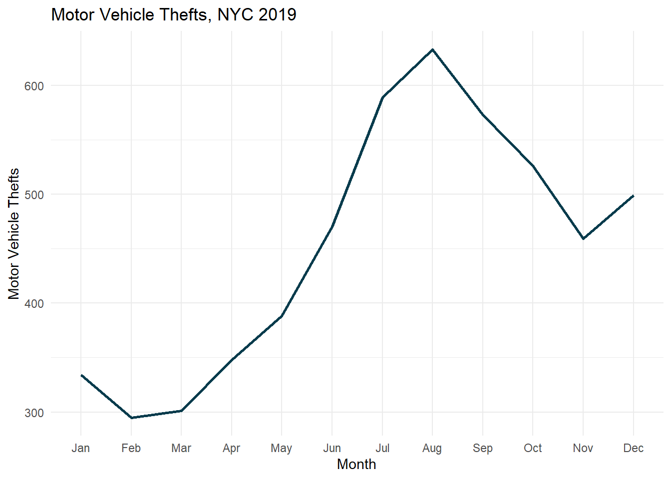
There! A much clearer visual of the same underlying data. Using a line chart we can see that motor vehicle thefts in NYC are actually quite seasonal. We observe a large increase during the warmer summer months, and a decrease during the darker and colder winter months. From a crime prevention perspective, this can be quite helpful. We will consider questions like these throughout the semester.
1.4 Structure of the Labs
Each lab covers a new topic. The first few labs (Lab 1 and Lab 2, in particular) will focus primarily on getting you comfortable with R and Rstudio. As you build your confidence, you will be introduced into progressively more challenging material. However, each lab will build upon the previous lab! So you will be gaining skills, then applying those skills to the next lab in your lineup!