Chapter 4 Lab 2 - Points, Lines, and Polygons
Welcome to Lab 2! In this lab we are going to focus on creating your
Topics Covered
- Introduction to RStudio
- Installing packages
- Loading data into
R - Working with variables
- Plotting spatial data
4.1 Loading your data
To begin, we’re first going to load three different sets of data into R. These are all spatial datasets, so we will
need to use the function st_read. Before we do anything else, we should load our libraries into R. We will need the
tidyverse package to do some of the plotting, and the sf package to handle our spatial data.
library(tidyverse)
library(sf)
Now that we have our libraries loaded in, we can start. Let’s look at the three datasets we will be using today:
nh_burglary.shpis the location of residential burglaries in New Havennh_roads.shpis the location of all streets and avenues in New Havennh_blocks.shpare the census block groups in New Haven
The third file, nh_blocks is one we have already plotted before in the previous lab. The other two files nh_burglary
and nh_roads are the location of residential burglaries, and the location of all roads in the city, respectively.
Let’s talk a bit about what we are going to do with these files. First, let’s load the files into R, following the
instructions from lab 1.
To reiterate from lab 1, the steps we are going to do are:
- Specify a variable name for the shapefile we want to save
- Use the assignment operator
<-to save the data to our new variable name - Use
st_read()to read in the data
The code below is an example on my computer. Remember, you will have to change your username based on your own, personal computer.
new_haven <- st_read("C:/Users/gioc4/Desktop/nh_blocks.shp")
new_haven_roads <- st_read("C:/Users/Desktop/nh_roads.shp")
burglary <- st_read("C:/Users/gioc4/Desktop/nh_burglary.shp")
Now we have all the data we need. Let’s move on to discussing the basic types of data we will use in our GIS.
4.2 Vector Data
Geographic data refer to ways of depicting information in a spatial format. When we talk about spatial data we are referring to data which takes into account its place on a map. Common sources of spatial data are things like roads, buildings, lakes, and mountains. We can also show the occurrence of various incidents - such as crimes, car accidents, or arrests.
The most common types of geographic data that you will be working with is vector data. The three types of vector data are:
- Points
- Lines
- Polygons
Look at the image below. These will be the most common types of data we will work with in this course.
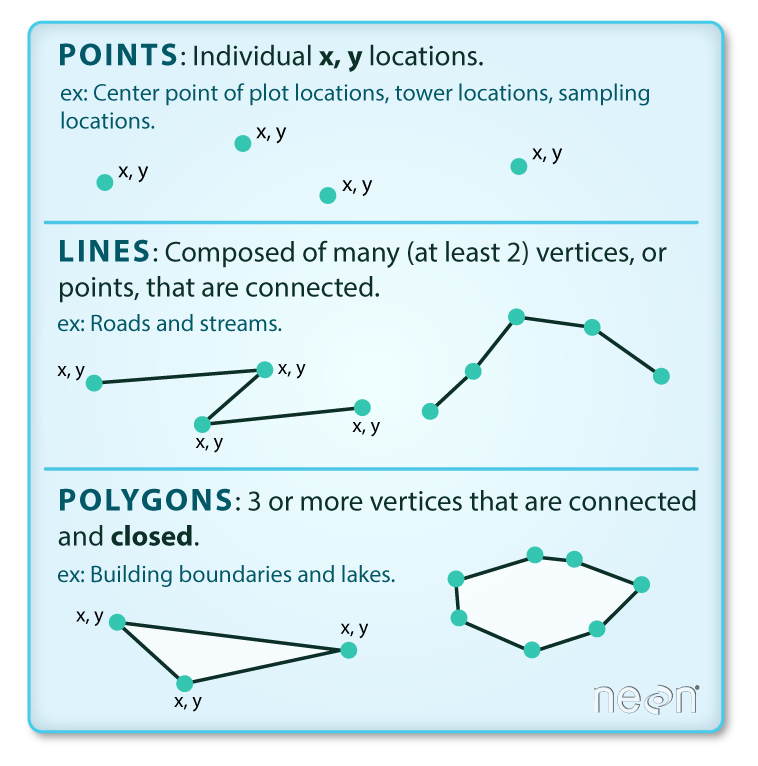
Figure 4.1: Three types of vector data
4.3 Plotting data using ggplot
There are a number of ways to plot data in R but arguably the most useful and power is using the ggplot function.
This is a plotting function that is part of the tidyverse package that we used earlier. It contains a ton of
methods for generating all kinds of plots. We will be using ggplot extensively throughout the semester to
visualize data and develop high-quality images and plots.
With ggplot you create an image based on layers. Essentially you will build your plot, piece-by-piece by specifying
each individual part separately. Let’s start by reading in some data, and then we’ll work through the whole process.
4.3.1 Plotting point data
Point data is visualized as a single symbol on a map - like placing a pin on a paper wall map. Let’s first try
plotting our burglary data. The first important function we will be using is the ggplot function.
When we use ggplot we need to specify everything as separate parts. Generally we will create a plot doing the
following:
- Steps:
- Specify the dataset that has the variables you want to plot
- Specify the type of visualization you want
- Add additional items, colors, or themes
Each time we add something to the plot we need to add a + sign, then the next object. So, now let’s try plotting the
city shapefile and shooting shapefile together. When we plot them we call them a geom_sf
ggplot() +
  geom_sf(data = burglary)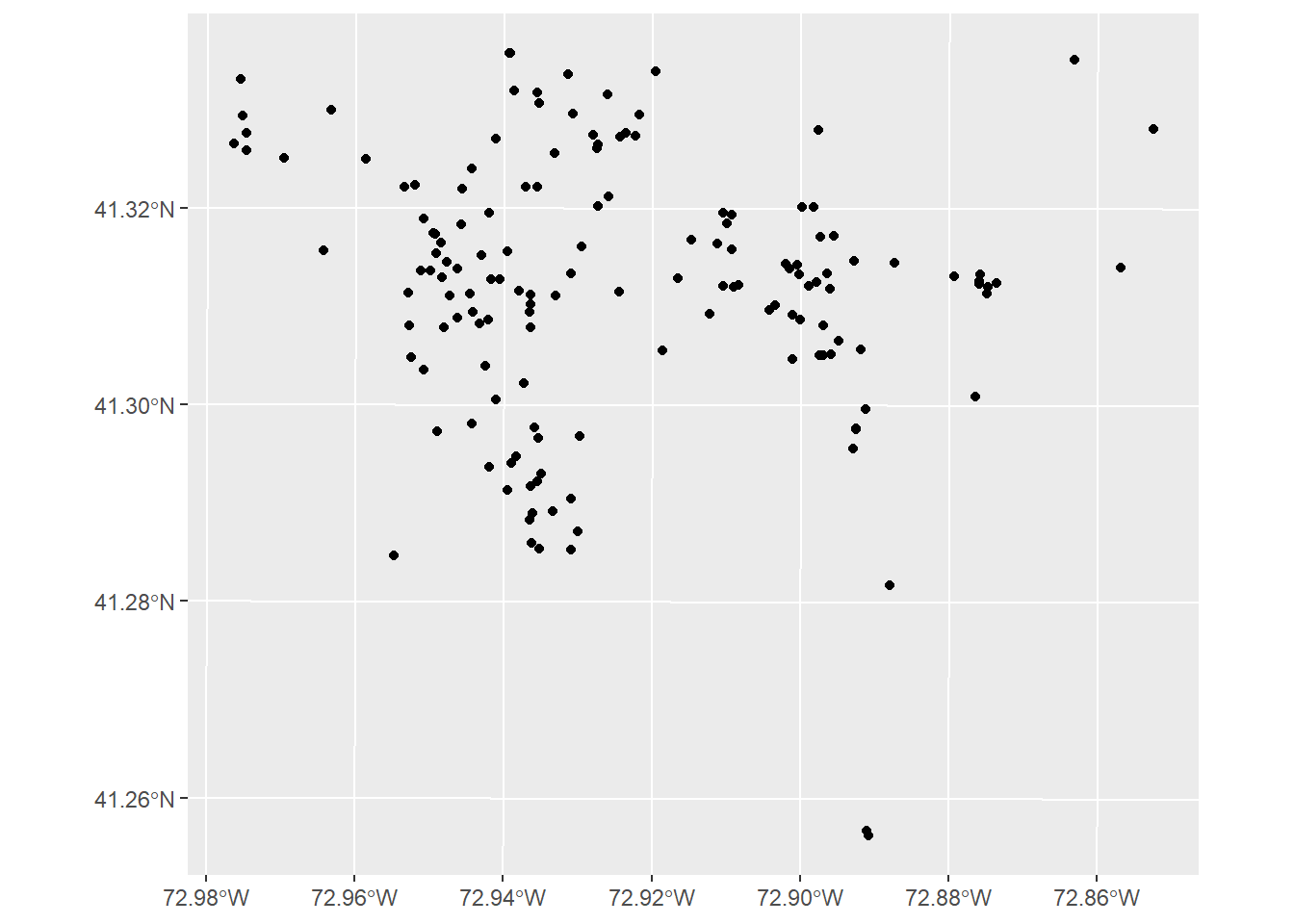
There! This plot shows the location of residential burglaries in New Haven using the default plotting method.
The default shows each crime incident as a small black circle icon on the map. This isn’t super great looking, however.
Let’s try changing some of the defaults. In particular, the ggplot() function has several different methods for
changing the shape, color, and other features. First, let’s change the shape. To change the shape all we have to
do is add shape = and then specify one of the values below:
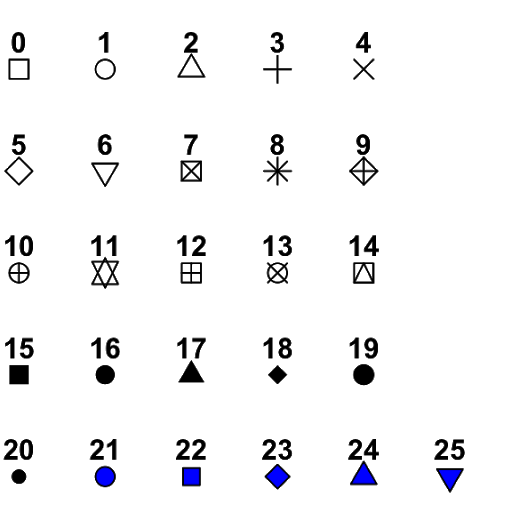
Figure 4.2: Point symbols in ggplot
Let’s choose shape = 17 to assign a filled-in triangle as our shape.
ggplot() +
  geom_sf(data = burglary, shape = 17)
We can also change the color of the points by using the argument color. For instance, if we want to change the color
to blue, all we have to do is add color = "blue". You can see all of the default colors available in R from this
website: the R Graph Gallery. So, I might choose something a bit
spicy like "firebrick". Note: You can also type colors() into the console window to see a complete list of all 657
colors available in R.
ggplot() +
  geom_sf(data = burglary, shape = 17, color = "firebrick")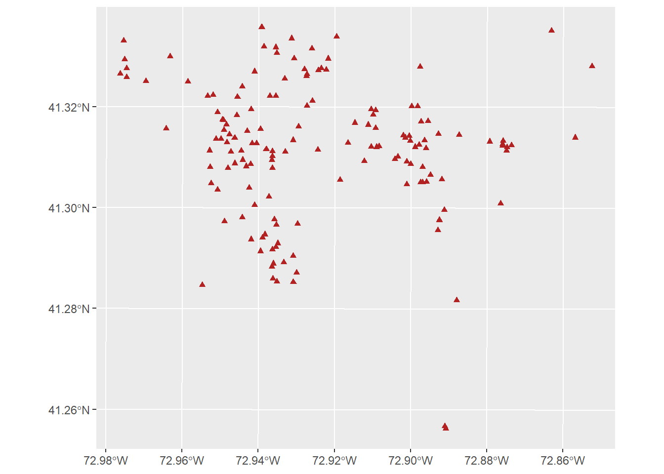
If we want to change the size of the points, we can add the argument size. Essentially, it tells R how much bigger
or smaller to make the shape, relative to the default (which is 1). Let’s try making the shapes larger by adding
size = 2. This implies we want the points to be twice as large as the default.
ggplot() +
  geom_sf(data = burglary, shape = 17, color = "firebrick", size = 2)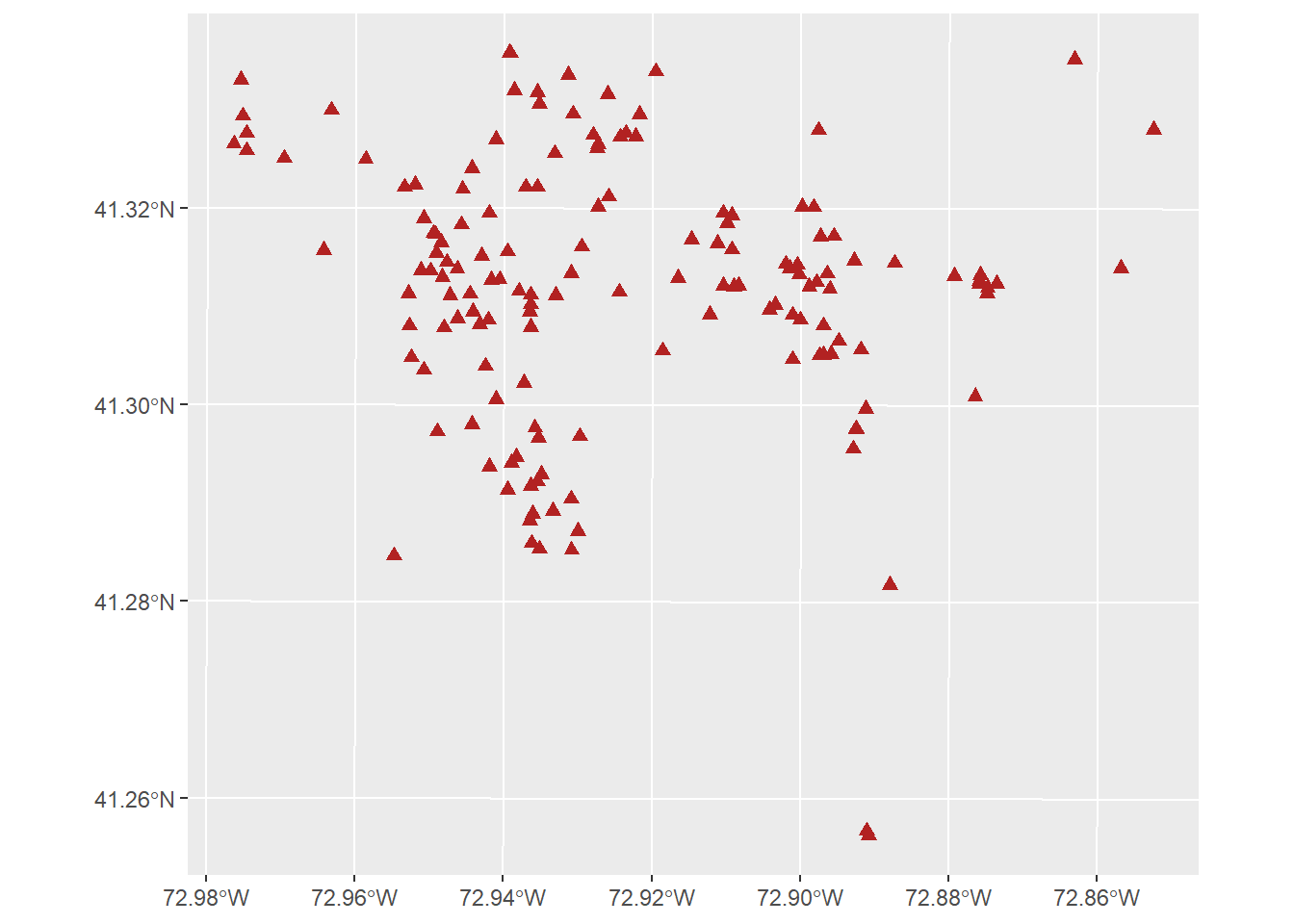
Finally, if we want to add a title, all we have to do is add the argument title in a new object called labs.
This just stands for “labels” Let’s give our plot a good title.
ggplot() +
  geom_sf(data = burglary, shape = 17, color = "firebrick", size = 2) +
  labs(title = "Residential Burglaries in New Haven")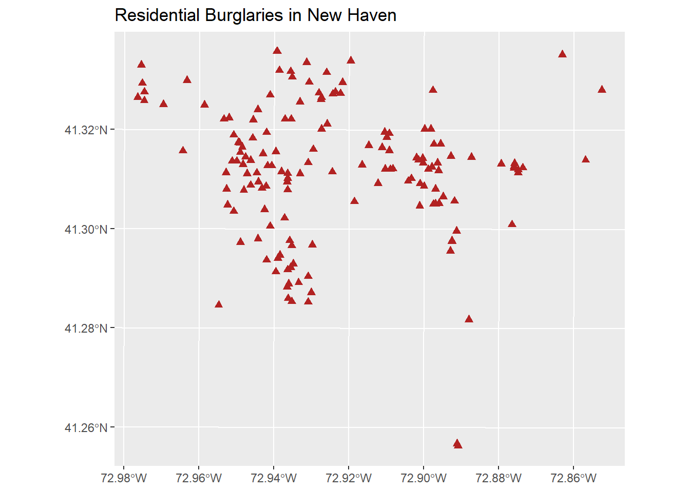
4.3.2 Plotting line data
- Line features are represented on a map as a series of connected line segments. While we often use them to
represent rivers, streams, or power lines, the most common use in criminology is the display of road structures in
cities. We can plot them exactly the same as points by using the
ggplotfunction and thegeom_sfargument. Let’s plot the roads in New Haven.
ggplot() +
  geom_sf(data = new_haven_roads)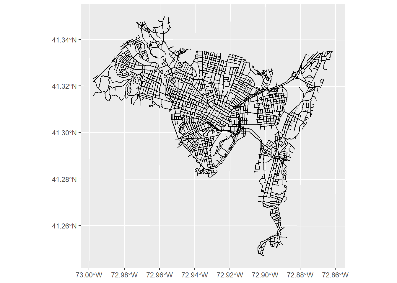
A little cramped, but it looks OK. We can use a lot of the same arguments we used before. For instance, let’s change the color of the roads to a light grey color using color = "lightgrey".
ggplot() +
  geom_sf(data = new_haven_roads, color = "lightgrey")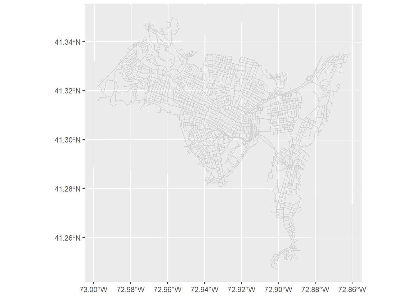
4.3.3 Plotting polygon data
Polygon features are represented on a map by a multi-sided figure with a closed set of lines. In a GIS we can make
a number of things into polygon shapes - such as state boundaries, census tracts, buildings, parks, or police districts.
In this case we are going to look at a set of census tracts in New Haven. Just like before, let’s start plotting by
using ggplot. This is actually the same code we used in the previous lab!
ggplot() +
  geom_sf(data = new_haven)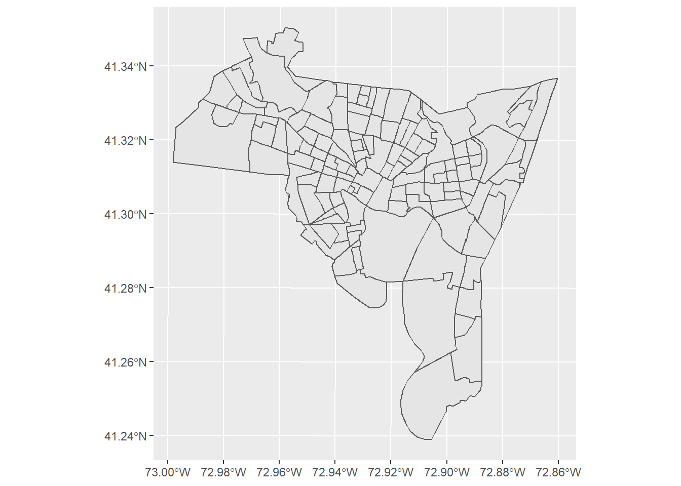
As before we can use a lot of the same arguments that we used for both points and lines. For instance let’s use fill
to change the fill color to a light blue and size to change the width of the polygon lines to 1.
ggplot() +
  geom_sf(data =new_haven, fill = "skyblue", size = 1)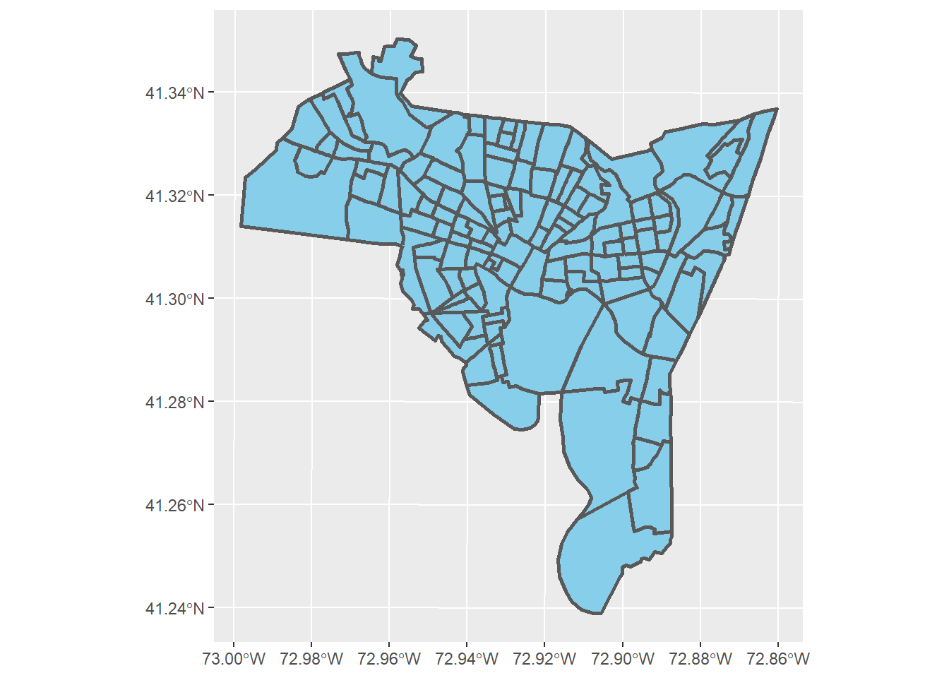
We should remember that color refers to the color of the polygon lines, while fill refers to the color inside the
polygon. When we use fill this changes the fill color of the polygon. If we want to change the color of
the borders we need to use the argument color. Let’s change the borders to a dark blue, and also add a title.
ggplot() +
  geom_sf(data = new_haven, fill = "skyblue", color = "darkblue", size = 1) +
  labs(title = "New Haven, CT")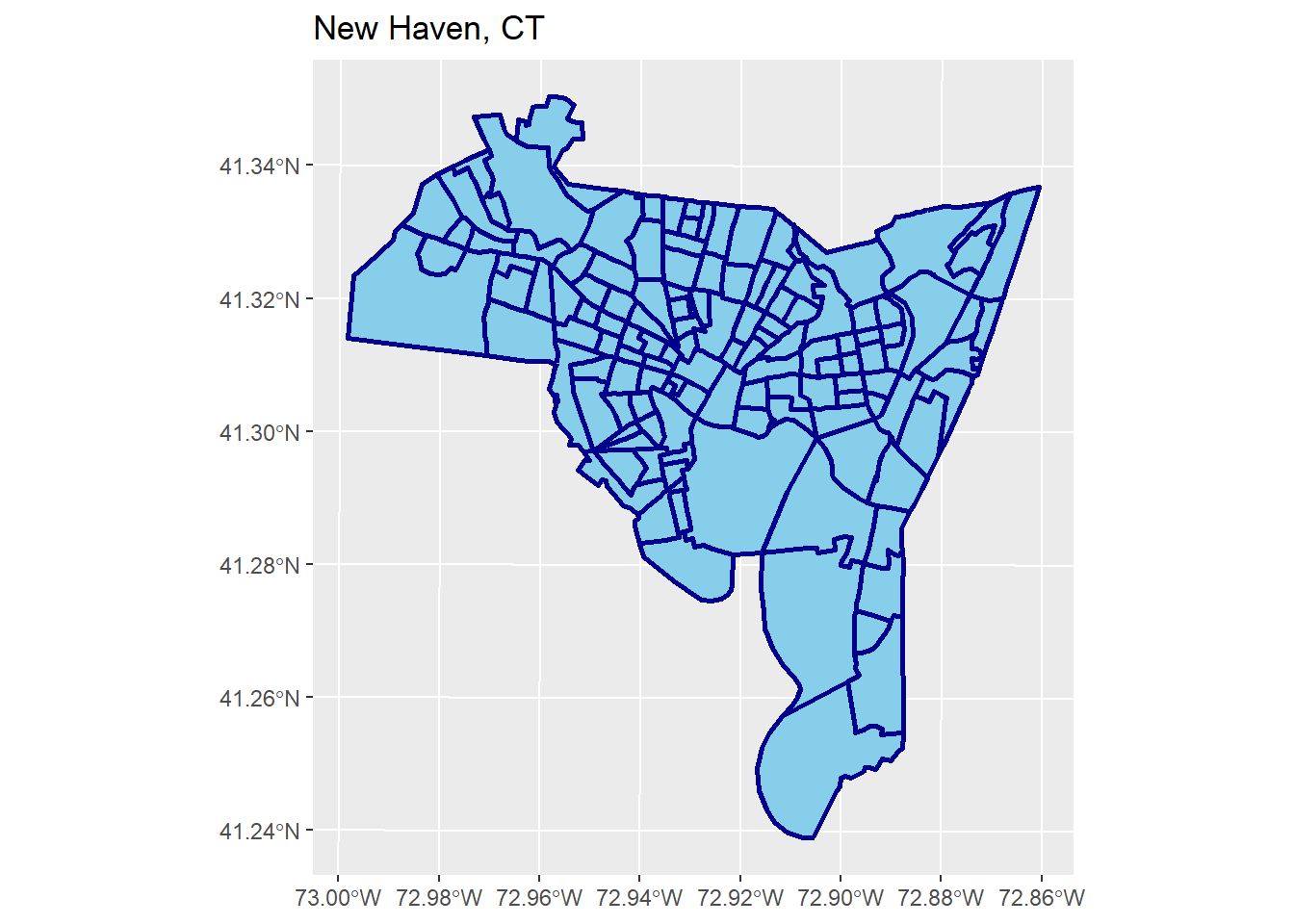
4.4 Layering Files
The examples above have different layers. A layer can be thought of as a single feature on a map. Just as if we were laying transparent pieces of paper down, we need to think about what goes on top of what.
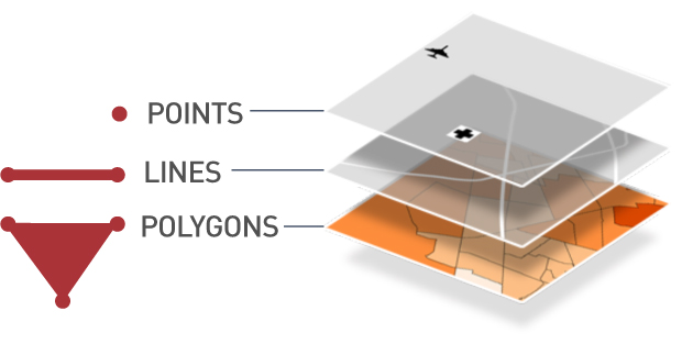
Figure 4.3: Point symbols in ggplot
When we are using ggplot() each time we use the plus sign we are telling R to add another layer. For instance if we wanted to plot burglaries on top of the New Haven map, we would add both shapefiles together - remembering that
we need to add layers in reverse order (that is, from the bottom up).
ggplot() +
  geom_sf(data = new_haven, fill = "skyblue", color = "darkblue", size = 1) +
  geom_sf(data = burglary, shape = 17, color = "firebrick", size = 2) +
  labs(title = "New Haven, CT")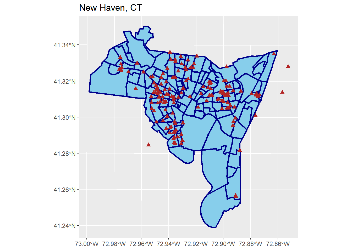
Not the prettiest map, but it works. What if we want to add roads? First, let’s think about the ordering of our layers. We want our base layer to be the census tracts, then plot the roads on top of that, then plot the crimes on top of that. What does that look like?
ggplot() +
  geom_sf(data = new_haven, fill = "skyblue", color = "darkblue", size = 1) +
  geom_sf(data = new_haven_roads, color = "lightgrey") +
  geom_sf(data = burglary, shape = 17, color = "firebrick", size = 2) +
  labs(title = "New Haven, CT")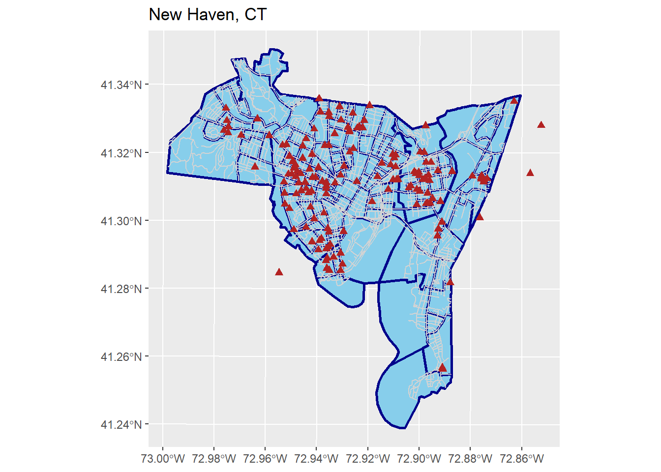
A bit ugly, but OK for now. We will work on making pretty maps later in the semester
4.5 Lab 2 Assignment
This lab assignment is worth 10 points. Follow the instructions below.
- Use the function
st_read()to load the other shapefilebreach.shpintoR- Plot the points, using symbols and colors of your choice, along with a title
- Create a 2-layered plot using the
nh_blocks.shpandbreach.shpshapefiles- Plot the “blocks” shapefile using colors of your choosing
- Plot the “breach” shapefile on top of this
- Export a picture of your map, then submit it in the assignment tab
- Provide one or two sentences describing where you think a crime hotspot might exist.