Chapter 16 Tidyverse data wrangling
An incredibly important skill of a data scientist is to be able to take data from an untidy format and get it into a tidy format. This process is often referred to as data wrangling. Generally, data wranglings skills are those that allow you to wrangle data from the format they’re currently in into the tidy format you actually want them in.
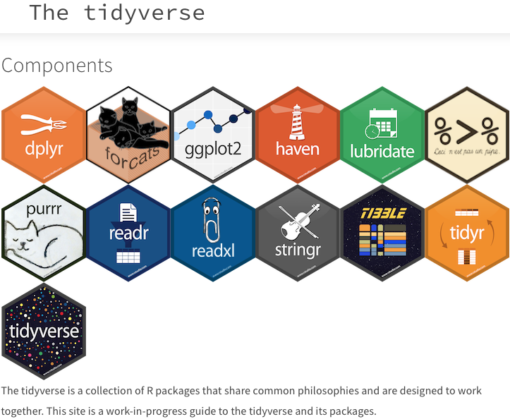
Tidyverse is a suite of packages that are incredibly useful for working with data. are designed to work together to make common data science operations more user friendly. The packages have functions for data wrangling, tidying, reading/writing, parsing, and visualizing, among others.
16.1 Tidyverse basics
The Tidyverse suite of packages introduces users to a set of data structures, functions and operators to make working with data more intuitive, but is slightly different from the way we do things in base R.
Two important new concepts in tidyverse that we will focus on are pipes and tibbles.
Before we get start
16.1.1 Pipes
To make R code more human readable, the Tidyverse tools use the pipe, %>%, which is part of the dplyr package that is installed automatically with Tidyverse. The pipe allows the output of a previous command to be used as input to another command instead of using nested functions.
NOTE: Shortcut to write the pipe is shift + command + M in MacOS; for Windows shift + ctrl + M
An example of using the pipe to run multiple commands:
## [1] 9.110434## [1] 9.11## [1] 9.11The pipe represents a much easier way of writing and deciphering R code.
Exercises
- Create a vector of random numbers using the code below:
- Use the pipe (
%>%) to perform two steps in a single line:
- Take the mean of
random_numbersusing themean()function. - Round the output to three digits using the
round()function.
16.1.2 Tibbles
A core component of tidyverse is the tibble. **Tibbles are data frames, but have several properties that make it superior. For example, printing the tibble to screen displays the data types in each of the columns and the dimensions. Another very handy feature of tibbles is that by default they will only print out the first 10 rows and as many columns as fit in your window. This is important when you are working with large datasets – as we are.
Tibbles can be created directly using the tibble() function or data frames can be converted into tibbles using as_tibble(name_of_df). It is also easy to convert tibbles into dataframes with the as.data.frame() function.
NOTE: The function
as_tibble()will ignore row names, so if a column representing the row names is needed, then the functionrownames_to_column(name_of_df)should be run prior to turning thedata.frameinto a tibble.rownames_to_column()takes the rownames and adds it as a column in the data frame.
16.2 Experimental data
We’re going to explore the Tidyverse suite of tools to wrangle our data to prepare it for visualization. You should have gprofiler_results_Mov10oe.tsv in your R project’s data folder earlier.
The dataset:
Represents the functional analysis results, including the biological processes, functions, pathways, or conditions that are over-represented in a given list of genes.
Our gene list was generated by differential gene expression analysis and the genes represent differences between control mice and mice over-expressing a gene involved in RNA splicing.
The functional analysis that we will focus on involves gene ontology (GO) terms, which:
- describe the roles of genes and gene products
- organized into three controlled vocabularies/ontologies (domains):
- biological processes (BP)
- cellular components (CC)
- molecular functions (MF)
16.3 Analysis goal and workflow
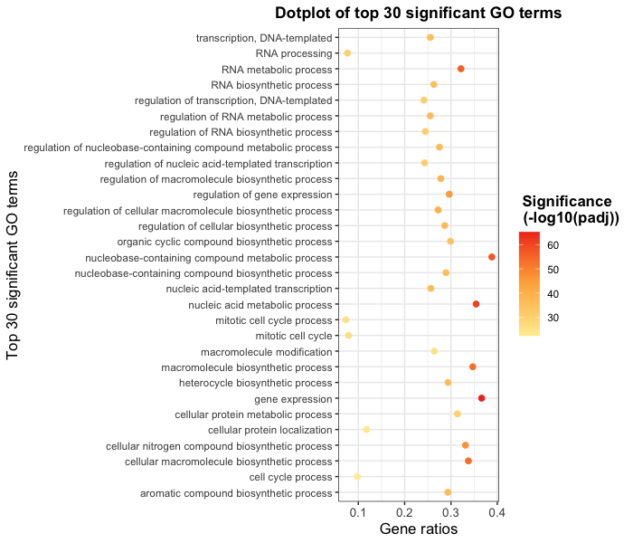
Goal: Visually compare the most significant biological processes (BP) based on the number of associated differentially expressed genes (gene ratios) and significance values by creating the following plot:

To wrangle our data in preparation for the plotting, we are going to use the Tidyverse suite of tools to wrangle and visualize our data through several steps:
Read in the functional analysis results
Extract only the GO biological processes (BP) of interest
Select only the columns needed for visualization
Order by significance (p-adjusted values)
Rename columns to be more intuitive
Create additional metrics for plotting (e.g. gene ratios)
Plot results
Tidyverse tools
We are going to investigate more deeply the packages loaded with tidyverse, specifically the reading (readr), wrangling (dplyr), and plotting (ggplot2) tools.
16.3.1 1. Read in the functional analysis results
While the base R packages have perfectly fine methods for reading in data, the readr and readxl Tidyverse packages offer additional methods for reading in data. Let’s read in our tab-delimited functional analysis results using read_delim():
# Read in the functional analysis results
functional_GO_results <- read_delim(file = "data/gprofiler_results_Mov10oe.tsv",
    delim = "\t")
## Rows: 3644 Columns: 14
## ── Column specification ──────────────────────────────────────────────────────────────────────
## Delimiter: "\t"
## chr (4): term.id, domain, term.name, intersection
## dbl (9): query.number, p.value, term.size, query.size, overlap.size, recall, precision, su...
## lgl (1): significant
##
## ℹ Use `spec()` to retrieve the full column specification for this data.
## ℹ Specify the column types or set `show_col_types = FALSE` to quiet this message.## # A tibble: 3,644 × 14
## query.number significant p.value term.size query.size overlap.size recall precision term.id
## <dbl> <lgl> <dbl> <dbl> <dbl> <dbl> <dbl> <dbl> <chr>
## 1 1 TRUE 0.00434 111 5850 52 0.009 0.468 GO:003…
## 2 1 TRUE 0.0033 110 5850 52 0.009 0.473 GO:003…
## 3 1 TRUE 0.0297 39 5850 21 0.004 0.538 GO:003…
## 4 1 TRUE 0.0193 70 5850 34 0.006 0.486 GO:003…
## 5 1 TRUE 0.0148 26 5850 16 0.003 0.615 GO:001…
## 6 1 TRUE 0.0187 22 5850 14 0.002 0.636 GO:008…
## 7 1 TRUE 0.0226 48 5850 25 0.004 0.521 GO:003…
## 8 1 TRUE 0.0491 17 5850 11 0.002 0.647 GO:003…
## 9 1 TRUE 0.00798 164 5850 71 0.012 0.433 GO:005…
## 10 1 TRUE 0.0439 19 5850 12 0.002 0.632 GO:004…
## # ℹ 3,634 more rows
## # ℹ 5 more variables: domain <chr>, subgraph.number <dbl>, term.name <chr>,
## # relative.depth <dbl>, intersection <chr>Click here to see how to do this in base R
# Read in the functional analysis results functional_GO_results <- read.delim(file = "data/gprofiler_results_Mov10oe.tsv", sep = "\t")# Take a look at the results functional_GO_results
Notice that the results were automatically read in as a tibble and the output gives the number of rows, columns and the data type for each of the columns.
16.3.2 2. Extract only the GO biological processes (BP) of interest
Now that we have our data, we will need to wrangle it into a format ready for plotting.
To extract the biological processes of interest, we only want those rows where the domain is equal to BP, which we can do using the filter() function from the dplyr package.
To filter rows of a data frame/tibble based on values in different columns, we give a logical expression as input to the filter() function to return those rows for which the expression is TRUE.
Now let’s return only those rows that have a domain of BP:
# Return only GO biological processes
bp_oe <- functional_GO_results %>%
    filter(domain == "BP")

head(bp_oe[, -7])
## # A tibble: 6 × 13
## query.number significant p.value term.size query.size overlap.size precision term.id domain
## <dbl> <lgl> <dbl> <dbl> <dbl> <dbl> <dbl> <chr> <chr>
## 1 1 TRUE 0.00434 111 5850 52 0.468 GO:0032… BP
## 2 1 TRUE 0.0033 110 5850 52 0.473 GO:0032… BP
## 3 1 TRUE 0.0297 39 5850 21 0.538 GO:0032… BP
## 4 1 TRUE 0.0193 70 5850 34 0.486 GO:0032… BP
## 5 1 TRUE 0.0148 26 5850 16 0.615 GO:0010… BP
## 6 1 TRUE 0.0187 22 5850 14 0.636 GO:0086… BP
## # ℹ 4 more variables: subgraph.number <dbl>, term.name <chr>, relative.depth <dbl>,
## # intersection <chr>Click here to see how to do this in base R
# Return only GO biological processes idx <- functional_GO_results$domain == "BP" bp_oe2 <- functional_GO_results[idx,]# View(bp_oe
Now we have returned only those rows with a domain of BP. How have the dimensions of our results changed?**
Exercise:
We would like to perform an additional round of filtering to only keep the most specific GO terms.
- For
bp_oe, use thefilter()function to only keep those rows where therelative.depthis greater than 4. - Save output to overwrite our
bp_oevariable.
16.3.3 3. Select only the columns needed for visualization
For visualization purposes, we are only interested in the columns related to the GO terms, the significance of the terms, and information about the number of genes associated with the terms.
To extract these columns from a data frame/tibble we can use the select() function. In contrast to base R, we do not need to put the column names in quotes for selection.
# Selecting columns to keep
bp_oe <- bp_oe %>%
    select(term.id, term.name, p.value, query.size, term.size, overlap.size, intersection)

head(bp_oe)
## # A tibble: 6 × 7
## term.id term.name p.value query.size term.size overlap.size intersection
## <chr> <chr> <dbl> <dbl> <dbl> <dbl> <chr>
## 1 GO:0032606 type I interferon product… 0.00434 5850 111 52 rnf216,polr…
## 2 GO:0032479 regulation of type I inte… 0.0033 5850 110 52 rnf216,polr…
## 3 GO:0032480 negative regulation of ty… 0.0297 5850 39 21 rnf216,otud…
## 4 GO:0032481 positive regulation of ty… 0.0193 5850 70 34 polr3b,polr…
## 5 GO:0010644 cell communication by ele… 0.0148 5850 26 16 pkp2,prkaca…
## 6 GO:0086064 cell communication by ele… 0.0187 5850 22 14 pkp2,prkaca…Click here to see how to do this in base R
# Selecting columns to keep
bp_oe <- bp_oe[, c("term.id", "term.name", "p.value", "query.size", "term.size", "overlap.size", "intersection")]
# View(bp_oe)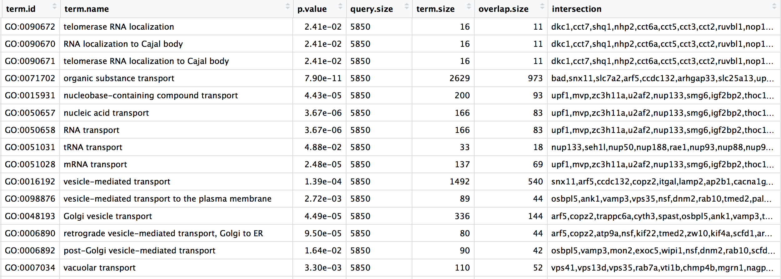
16.3.4 4. Order GO processes by significance (adjusted p-values)
Now that we have only the rows and columns of interest, let’s arrange these by significance, which is denoted by the adjusted p-value.
Let’s sort the rows by adjusted p-value with the arrange() function from the dplyr package.
16.3.5 5. Rename columns to be more intuitive
While not necessary for our visualization, renaming columns more intuitively can help with our understanding of the data using the rename() function from the dplyr package. The syntax is new_name = old_name.
Let’s rename the term.id and term.name columns.
# Provide better names for columns
bp_oe <- bp_oe %>%
    dplyr::rename(GO_id = term.id, GO_term = term.name)
Click here to see how to do this in base R
# Provide better names for columns
colnames(bp_oe)[colnames(bp_oe) == "term.id"] <- "GO_id"
colnames(bp_oe)[colnames(bp_oe) == "term.name"] <- "GO_term"
NOTE: In the case of two packages with identical function names, you can use
::with the package name before and the function name after (e.gstats::filter()) to ensure that the correct function is implemented. The::can also be used to bring in a function from a library without loading it first.In the example above, we wanted to use the
rename()function specifically from thedplyrpackage, and not any of the other packages (or base R) which may have therename()function.
Exercise
Rename the intersection column to genes to reflect the fact that these are the DE genes associated with the GO process.
16.3.6 6. Create additional metrics for plotting (e.g. gene ratios)
Finally, before we plot our data, we need to create a couple of additional metrics. The mutate() function enables you to create a new column from an existing column.
Let’s generate gene ratios to reflect the number of DE genes associated with each GO process relative to the total number of DE genes.
# Create gene ratio column based on other columns in dataset
bp_oe <- bp_oe %>%
    mutate(gene_ratio = overlap.size/query.size)
Click here to see how to do this in base R
# Create gene ratio column based on other columns in dataset
bp_oe <- cbind(bp_oe, gene_ratio = bp_oe$overlap.size / bp_oe$query.size)
Exercise
Create a column in bp_oe called term_percent to determine the percent of DE genes associated with the GO term relative to the total number of genes associated with the GO term (overlap.size / term.size)
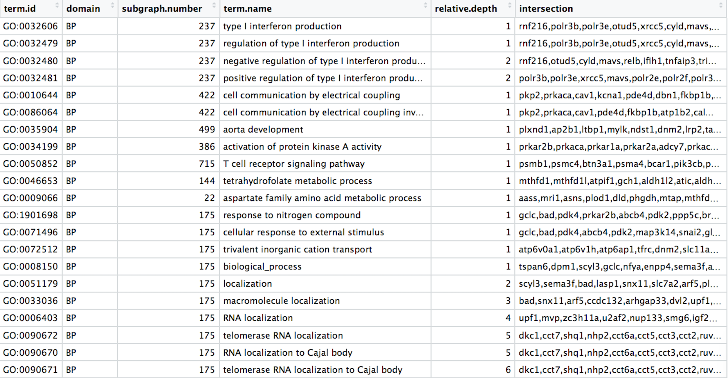
Our final data for plotting should look like the table below:

16.4 Next steps
Now that we have our results ready for plotting, we can use the ggplot2 package to plot our results.
Homework
Use ggplot2 to plot bp_oe to recapitulate the GO enrichment figure shown below using the top 30 categories:
