Chapter 12 Plotting with ggplot2
12.1 Data Visualization with ggplot2
This chapter will teach you how to visualise your data using ggplot2. R has several systems for making graphs, but ggplot2 is one of the most elegant and most versatile. ggplot2 implements the grammar of graphics, a coherent system for describing and building graphs. With ggplot2, you can do more faster by learning one system and applying it in many places.
For this lesson, you will need the new_metadata data frame. Load it into your environment as follows:
## load the new_metadata data frame into your environment from a .RData object
load("data/new_metadata.RData")
Next, let’s check if it was successfully loaded into the environment:
Great, we are now ready to move forward!
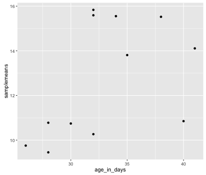
The ggplot2 syntax takes some getting used to, but once you get it, you will find it’s extremely powerful and flexible. We will start with drawing a simple x-y scatterplot of samplemeans versus age_in_days from the new_metadata data frame. Note that ggplot2 expects a “data frame”.
Let’s start by loading the ggplot2 library:
The ggplot() function is used to initialize the basic graph structure, then we add to it. The basic idea is that you specify different parts of the plot using additional functions one after the other and combine them using the + operator; the functions in the resulting code chunk are called layers.
Let’s start:
You get an blank plot, because you need to specify additional layers using the + operator.
The geom (geometric) object is the layer that specifies what kind of plot we want to draw. A plot must have at least one geom; there is no upper limit. Examples include:
- points (
geom_point,geom_jitterfor scatter plots, dot plots, etc) - lines (
geom_line, for time series, trend lines, etc) - boxplot (
geom_boxplot, for, well, boxplots!)
Let’s add a “geom” layer to our plot using the + operator, and since we want a scatter plot so we will use geom_point().
Why do we get an error?
We get an error because each type of geom usually has a required set of aesthetics to be set. “Aesthetics” are set with the aes() function can be set nested within geom_point() or within ggplot().
The minimal ggplot function requires the following arguments:
# Minimal ggplot template:
ggplot(<DATA>) +        # 1. specify data set to use
<GEOM_function>(        # 2. specify geom
aes(<MAPPING>)).        # 3. map x and y axes
12.1.1 Aesthetics
The aes() function has many different arguments, and all of those arguments take columns from the original data frame as input. It can be used to specify many plot elements including the following:
- position (i.e., on the x and y axes)
- color (“outside” color)
- fill (“inside” color)
- shape (of points)
- etc.
To start, we will specify x- and y-axis since geom_point requires the most basic information about a scatterplot, i.e. what you want to plot on the x and y axes. All of the other plot elements mentioned above are optional.
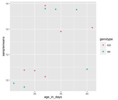
Now that we have the required aesthetics, let’s add some extras like color to the plot. We can color the points on the plot based on the genotype column within aes().
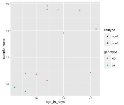
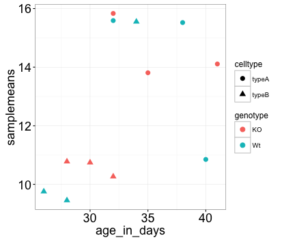
Let’s try to have both celltype and genotype represented on the plot. To do this we can assign the shape argument in aes() the celltype column, so that each celltype is plotted with a different shaped data point.
ggplot(new_metadata) +
  geom_point(aes(x = age_in_days, y= samplemeans,
  color = genotype, shape=celltype))
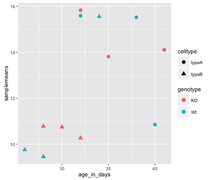
The data points are quite small. We can adjust the size of the data points within the geom_point() layer, but it should not be within aes() since we are not mapping it to a column in the input data frame, instead we are just specifying a number.
ggplot(new_metadata) +
  geom_point(aes(x = age_in_days, y= samplemeans,
  color = genotype, shape=celltype), size=2.25)
12.1.2 Layers
The labels on the x- and y-axis are also quite small and hard to read. To change their size, we need to add an additional theme layer. The ggplot2 theme system handles non-data plot elements such as:
- Axis label aesthetics
- Plot background
- Facet label backround
- Legend appearance
There are built-in themes we can use (i.e. theme_bw()) that mostly change the background/foreground colours, by adding it as additional layer. Or we can adjust specific elements of the current default theme by adding the theme() layer and passing in arguments for the things we wish to change.
Let’s add a layer theme_bw().
ggplot(new_metadata) +
  geom_point(aes(x = age_in_days, y= samplemeans,
  color = genotype, shape=celltype), size=3.0) +
  theme_bw()
Do the axis labels or the tick labels get any larger by changing themes?
No, they don’t. But, we can add arguments using theme() to change the size of axis labels ourselves. Since we will be adding this layer “on top”, or after theme_bw(), any features we change will override what is set by the theme_bw() layer.
Let’s increase the size of both the axes titles to be 1.5 times the default size. When modifying the size of text the rel() function is commonly used to specify a change relative to the default.
ggplot(new_metadata) +
  geom_point(aes(x = age_in_days, y= samplemeans,
  color =   genotype, shape=celltype), size=2.25) +
  theme_bw() +
  theme(axis.title = element_text(size=rel(1.5)))
NOTE: You can use the
example("geom_point")function here to explore a multitude of different aesthetics and layers that can be added to your plot.
NOTE: RStudio provide this very useful cheatsheet for plotting using
ggplot2. Different example plots are provided and the associated code (i.e whichgeomorthemeto use in the appropriate situation.) We also encourage you to peruse through this useful online reference for working with ggplot2.
Exercise
The current axis label text defaults to what we gave as input to
geom_point(i.e the column headers). We can change this by adding additional layers calledxlab()andylab()for the x- and y-axis, respectively. Add these layers to the current plot such that the x-axis is labeled “Age (days)” and the y-axis is labeled “Mean expression”.Use the
ggtitlelayer to add a plot title of your choice.Add the following new layer to the code chunk
theme(plot.title=element_text(hjust=0.5)).
- What does it change?
- How many theme() layers can be added to a ggplot code chunk, in your estimation? ***