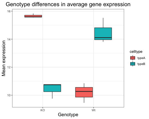
Chapter 13 Boxplot with ggplot2: exercise
13.1 Generating a Boxplot with ggplot2
A boxplot provides a graphical view of the distribution of data based on a five number summary:
The top and bottom of the box represent the (1) first and (2) third quartiles (25th and 75th percentiles, respectively), also known as Q1 and Q3.
The line inside the box represents the (3) median (50th percentile).
The whiskers extending above and below the box represent the (4) maximum, and (5) minimum of a data set.
The whiskers of the plot reach the minimum and maximum values that are not outliers.
In this case, outliers are determined using the interquartile range (IQR), which is defined as: Q3 - Q1. Any values that exceeds 1.5 x IQR below Q1 or above Q3 are considered outliers and are represented as points above or below the whiskers.
13.1.1 1. Boxplot!
Generate a boxplot using the data in the new_metadata dataframe. Create a ggplot2 code chunk with the following instructions:
- Use the
geom_boxplot()layer to plot the differences in sample means between the Wt and KO genotypes. - Use the
fillaesthetic to look at differences in sample means between the celltypes within each genotype. - Add a title to your plot.
- Add labels, ‘Genotype’ for the x-axis and ‘Mean expression’ for the y-axis.
- Make the following
theme()changes:- Use the
theme_bw()function to make the background white. - Change the size of your axes labels to 1.25x larger than the default.
- Change the size of your plot title to 1.5x larger than default.
- Center the plot title.
- Use the
After running the above code the boxplot should look something like that provided below.

13.1.2 2. Change genotype order
Let’s say you wanted to have the “Wt” boxplots displayed first on the left side, and “KO” on the right. How might you go about doing this?
To do this, your first question should be - How does ggplot2 determine what to place where on the X-axis? * The order of the genotype on the X axis is in alphabetical order. * To change it, you need to make sure that the genotype column is a factor * And, the factor levels for that column are in the order you want on the X-axis
- Factor the
new_metadata$genotypecolumn without creating any extra variables/objects and change the levels toc("Wt", "KO")### 3. Re-run the boxplot code chunk you created for the “Boxplot!” exercise above.
13.1.3 4. Changing default colors
You can color the boxplot differently by using some specific layers:
- Add a new layer
scale_color_manual(values=c("purple","orange")).- Do you observe a change?
- Replace
scale_color_manual(values=c("purple","orange"))withscale_fill_manual(values=c("purple","orange")).- Do you observe a change?
- In the scatterplot we drew in class, add a new layer
scale_color_manual(values=c("purple","orange")), do you observe a difference?- What do you think is the difference between
scale_color_manual()andscale_fill_manual()?
- What do you think is the difference between
- Back in your boxplot code, change the colors in the
scale_fill_manual()layer to be your 2 favorite colors.- Are there any colors that you tried that did not work?
We have a separate lesson about using color palettes from the package RColorBrewer, if you are interested.
You are not restricted to using colors by writing them out as character vectors. You have the choice of a lot of colors in R, and you can do so by using their hexadecimal code. For example, “#FF0000” would be red and “#00FF00” would be green similarly, “#FFFFFF” would be white and “#000000” would be black. click here for more information about color palettes in R.
OPTIONAL Exercise: