Chapter 1 Simple Linear Regression
1.1 Correlation
We’ll start off by loading some required package, entering in a very small data set by hand, and graphing that data set. Then we will compute some basic descriptive statistics.
require(tidyverse)
require(mosaic)
x<-c(0,1,2,3,4,4,5,6,6,9) #hours studying for exam
y<-c(20,70,65,84,72,80,75,95,64,90) #exam score
mean(x)
## [1] 4## [1] 2.666667## [1] 71.5## [1] 20.78595## [1] 0.6795457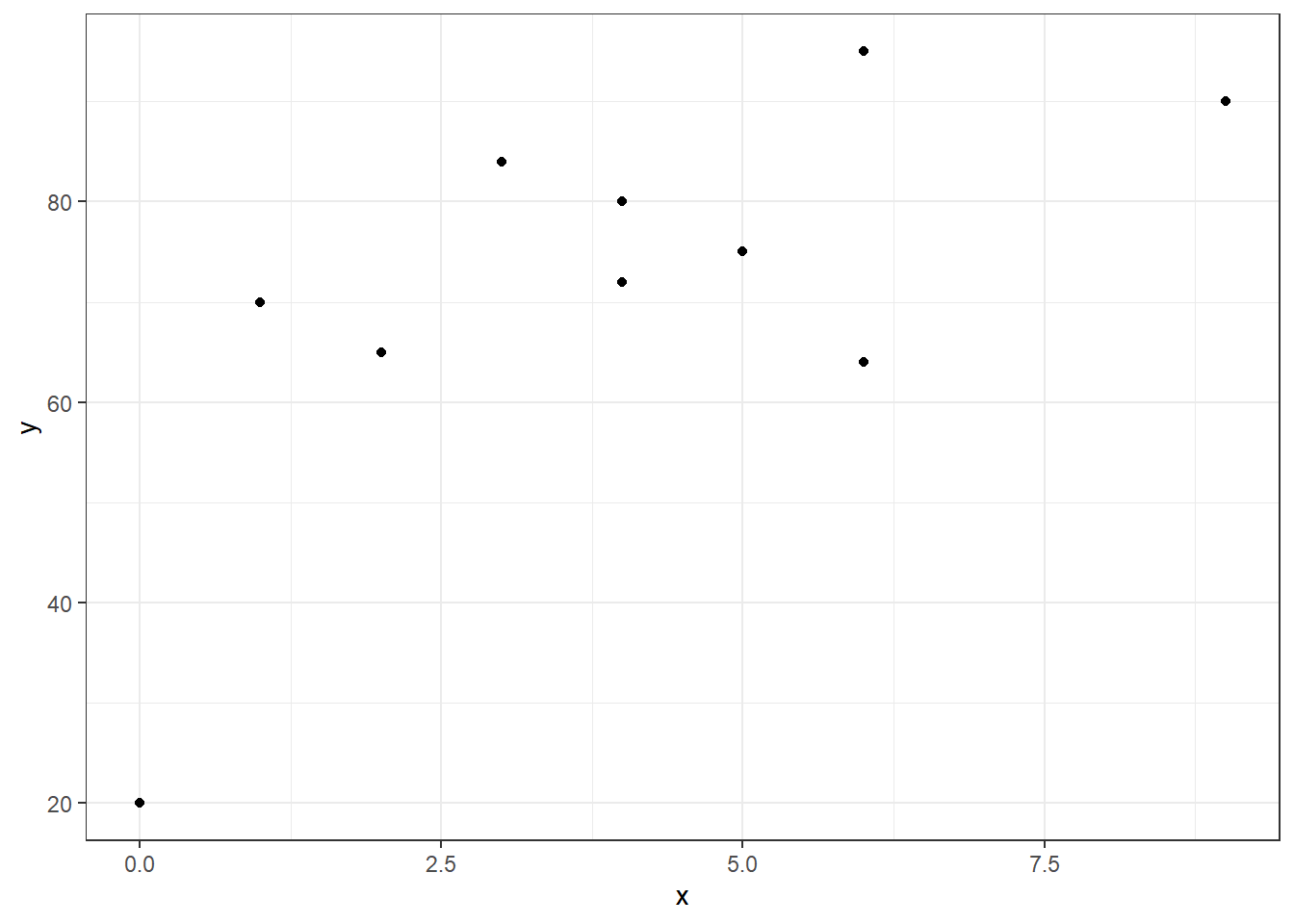
When I refer to the “summary statistics” of a bivariate data set, I’m referring to the means, the standard deviations, and the correlation between the two variables.
The correlation coefficient (also known as Pearson’s product-moment correlation) can be computed with a variety of algebraically equivalent formulas. Typically we will compute this with technology.
\[r=\frac{\sum(x_i-\bar{x})(y_i-\bar{y})}{\sqrt{\sum(x_i-\bar{x})^2}\sqrt{\sum(y_i-\bar{y})^2}}\]
\[r=\frac{SSXY}{\sqrt{SSX}\sqrt{SSY}}\]
\[r=\frac{Cov(X,Y)}{\sqrt{Var(X)}\sqrt{Var(Y)}}=\frac{s_{xy}}{s_x s_y}\]
A possibly edifying form of the calculation is to base this calculation on standardizing both of the variables.
\[r=\frac{1}{n-1}\sum(\frac{x_i-\bar{x}}{s_x})(\frac{y_i-\bar{y}}{s_y})\] \[r=\frac{1}{n-1}z_x z_y\]
Let’s show these calculations and how the formula based on standardized \(z\)-scores looks graphically.
ggplot(exam,aes(x,y)) + geom_point() +
  geom_hline(yintercept=mean(y),linetype="dashed",color="red") +
  geom_vline(xintercept=mean(x),linetype="dashed",color="red") +
  theme_bw()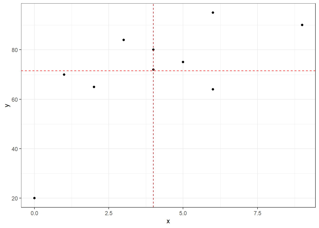
## [1] 0.6795457## # A tibble: 10 x 5
## x y z.x z.y z.xy
## <dbl> <dbl> <dbl> <dbl> <dbl>
## 1 0 20 -1.5 -2.48 3.72
## 2 1 70 -1.12 -0.0722 0.0812
## 3 2 65 -0.75 -0.313 0.235
## 4 3 84 -0.375 0.601 -0.226
## 5 4 72 0 0.0241 0
## 6 4 80 0 0.409 0
## 7 5 75 0.375 0.168 0.0631
## 8 6 95 0.75 1.13 0.848
## 9 6 64 0.75 -0.361 -0.271
## 10 9 90 1.88 0.890 1.67## [1] 0.6795457## [1] 0.6795457ggplot(z.scores,aes(z.x,z.y)) + geom_point() +
geom_hline(yintercept=0,linetype="dashed",color="red") +
geom_vline(xintercept=0,linetype="dashed",color="red") +
theme_bw() 
We see a moderate positive correlation between hours of study and exam score. This probably matches our intutition.
1.2 Linear Model
Now let’s try to find the “line of best fit”, or in other words a linear model to describe the relationship between hours of study and exam score.
\[DATA = MODEL + ERROR\] \[Y = f(X) + \epsilon\]
starting with a guess. I’m going to guess that the line \[y=60+4x\] could be a candidate for predicting exam scores. The \(y\)-intercept means that I believe students that do not study will have an average score of 60, while the positive slope indicates that I believe each hour of study will result in a 4 point increase in the exam score. Notice this model would predict you would get a score of \(Y=100\) with \(x=10\) hours of study.
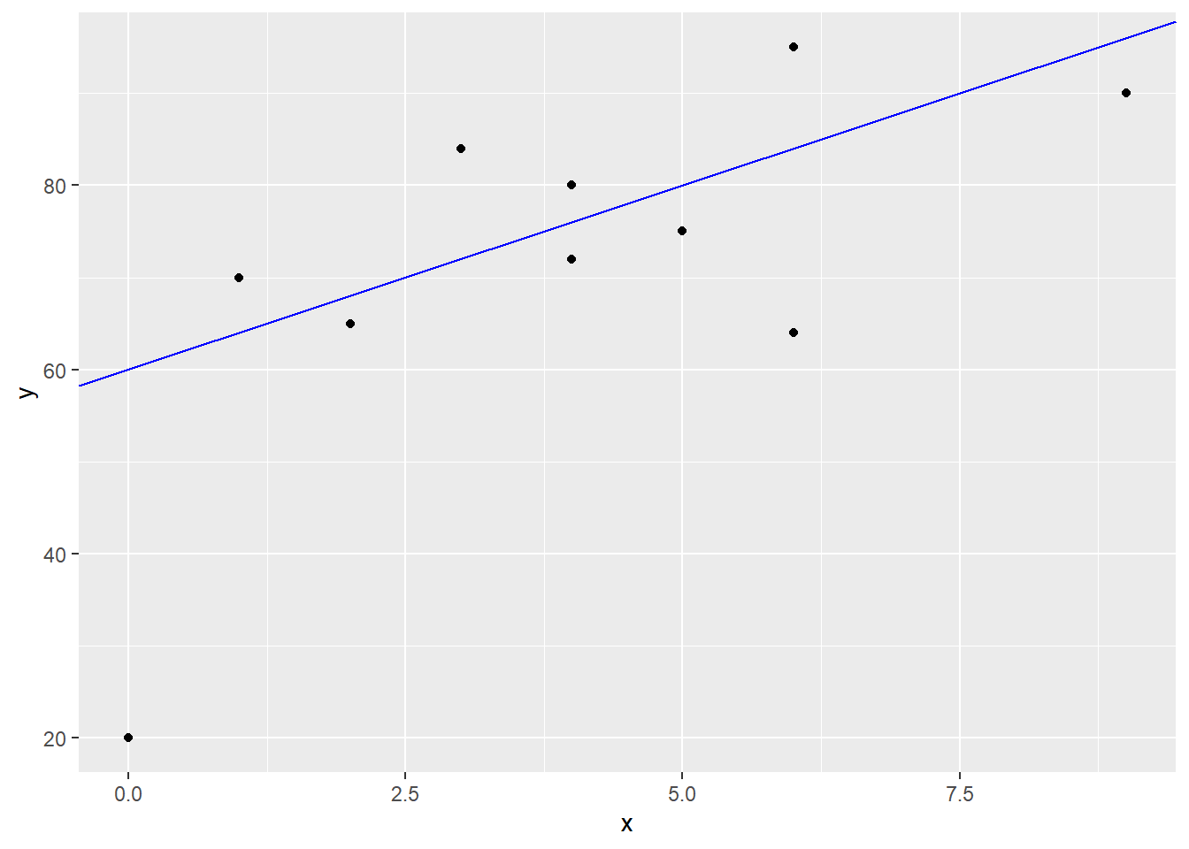
Obviously we do not have a perfect correlation and I cannot exactly predict your exam score with just the number of hours you spent studying. The error term includes both other possible factors I haven’t considered in the model, and random error.
A residual \(e_i=y_i-\hat{y}_i\) represents the difference between the actual value of \(Y\) that we observed in reality from the predicted value from a model, which we will denote with \(\hat{y}\). For instance, student #7 in our data set had \(x_7=5, y_7=75\) and \[\hat{y}=60+4(5)=80\]
Our model gives a residual of \[e_7=y_7 - \hat{y}_7 = 75-80 = -5\] This student did 5 points worse than our naive model would predict. I’ll show this graphically for all 10 students.
exam2 <- exam %>%
  mutate(y.hat=60+4*x) %>%
  mutate(e=y-y.hat)

ggplot(exam2) + geom_point(aes(x,y,color=(e>0))) +
  geom_abline(intercept=60,slope=4,color="blue") +
  geom_segment(aes(x,y,xend=x,yend=y.hat,color=(e>0)))
It seems doubtful that our naive model \[\hat{Y}=60+4x\] which was chosen for no real mathematical reason is truly the “line of best fit”. In statistics, the principle of least squares is generally used to find the equation of the linear model. The idea is to minimize the sum of squared residuals, i.e. minimize \[SSE = \sum(y_i - \hat{y})^2 = \sum e_i^2\]
Graphically, this is literally the combined area of all of the squares that represent the squared residuals. In other words, \(SSE\) is the size of all of these squares, and we want to choose the line that makes this cumulative area as small as possible.
exam2 <- exam %>%
  mutate(y.hat=60+4*x) %>%
  mutate(e=y-y.hat)

ggplot(exam2) + geom_point(aes(x,y,color=(e>0)),size=2) +
  geom_abline(intercept=60,slope=4,color="blue") +
  geom_segment(aes(x,y,xend=x,yend=y.hat,color=(e>0))) +
  geom_rect(aes(xmin=x,ymin=y,xmax=x-e,ymax=y-e,color=(e>0)),fill="white") +
  coord_fixed(ratio=1)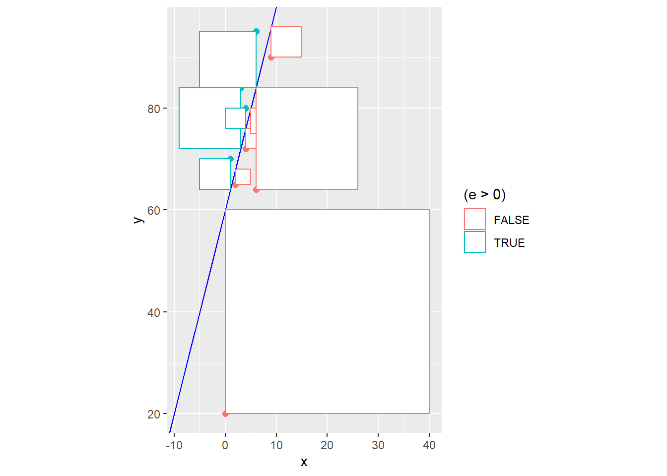
## [1] 2403Instead of using trial and error to reduce \(SSE\) and improve our model fit, equations for the least squares regression coefficients can be found through the use of calculus (which we won’t do in this class).
1.3 Assumption of the Linear Model
Let’s express our linear model as: \[Y = \beta_0 + \beta_1 X + \epsilon\] with the following mathematical assumptions:
Linearity: We assume a linear pattern. We’ll deal with handling this assumption later.
Zero Mean: The error distribution is centered at zero and the residuals have mean zero. This means that the line will have points randomly above and below it.
Uniform Spread: The error distribution has a common variance \(\sigma^2\). This means the variance of the response (in our example, exam score) does not change as the explanatory variable changes (in our case, as we study for fewer or more hours).
Independence: Errors are assumed to be independent of each other. This assumption is often not met if the explanatory variable is time (think of the temperature or the price of a stock).
Normality: When we wish to make inferences on our linear model, the errors are assumed to be random and to be normal. \[\epsilon \sim N(0,\sigma^2)\]
In a basic class like STA 135, I will give students the following formulas, which relate the estimates of the regression coefficients to basic summary statistics:
\[\hat{\beta}_1 = r \frac{s_y}{s_x}\]
\[\hat{\beta}_0 = \bar{y} - \hat{\beta}_1 \bar{x}\]
We can also find the slope based on the sums of squares.
\[\hat{\beta}_1 = \frac{SSXY}{SSX}\]
## [1] 5.296875## [1] 50.3125## [1] 64## [1] 339## [1] 5.296875Our new and improved least squares regression equation is \[\hat{Y}=50.3125+5.296875X\]
Taking student #7 again, \[\hat{y_7}=50.3125+5.296875*5=76.79688\]
Rounding off, the residual is \[e_7 = 75 - 76.8 = -1.8\]
exam2 <- exam %>%
  mutate(y.hat=50.3125+5.239687*x) %>%
  mutate(e=y-y.hat)

ggplot(exam2) + geom_point(aes(x,y,color=(e>0)),size=2) +
  geom_abline(intercept=50.3125,slope=5.239687,color="blue") +
  geom_segment(aes(x,y,xend=x,yend=y.hat,color=(e>0))) +
  geom_rect(aes(xmin=x,ymin=y,xmax=x-e,ymax=y-e,color=(e>0)),fill="white") +
  coord_fixed(ratio=1)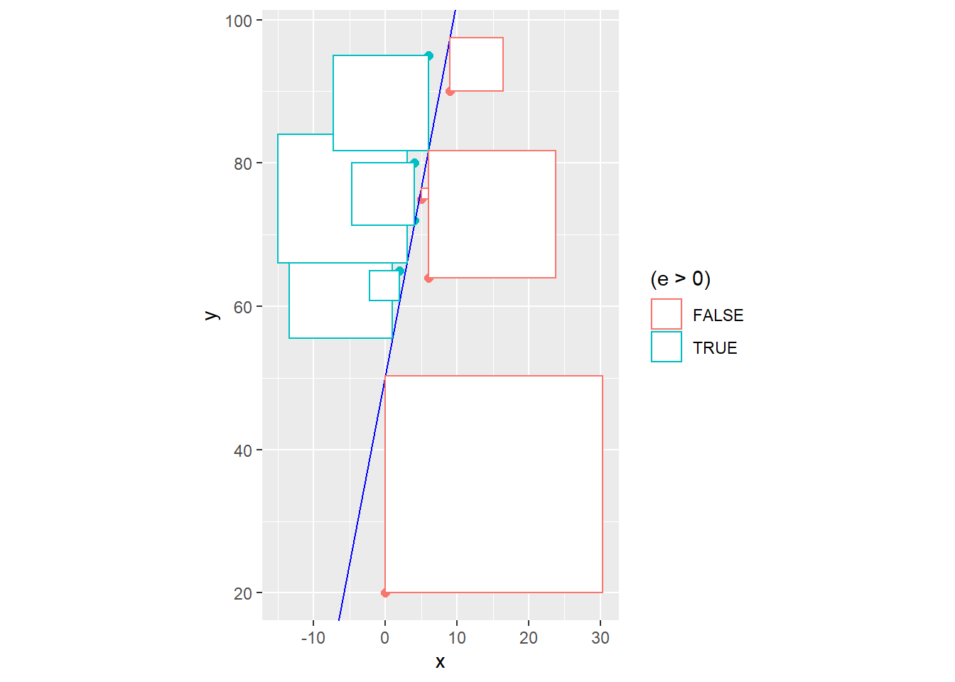
## [1] 2093.592The \(SSE\) decreased from the earlier model’s value of 2403 to 2093.592, and there is no equation of a straight line that would give a smaller \(SSE\) for this data set.
Obviously, it will be easier to compute the least squares equation, the fitted values \(\hat{y}_i\) and the residuals \(e_i\) with R.
##
## Call:
## lm(formula = y ~ x, data = exam)
##
## Coefficients:
## (Intercept)            x
## 50.313 5.297##
## Call:
## lm(formula = y ~ x, data = exam)
##
## Residuals:
## Min 1Q Median 3Q Max
## -30.312 -6.438 2.297 11.805 17.797
##
## Coefficients:
## Estimate Std. Error t value Pr(>|t|)
## (Intercept) 50.313 9.569 5.258 0.000766 ***
## x 5.297 2.022 2.620 0.030655 *
## ---
## Signif. codes: 0 '***' 0.001 '**' 0.01 '*' 0.05 '.' 0.1 ' ' 1
##
## Residual standard error: 16.17 on 8 degrees of freedom
## Multiple R-squared: 0.4618, Adjusted R-squared: 0.3945
## F-statistic: 6.864 on 1 and 8 DF, p-value: 0.03066## 1 2 3 4 5 6 7 8
## 50.31250 55.60938 60.90625 66.20312 71.50000 71.50000 76.79688 82.09375
## 9 10
## 82.09375 97.98438## 1 2 3 4 5 6 7
## -30.312500 14.390625 4.093750 17.796875 0.500000 8.500000 -1.796875
## 8 9 10
## 12.906250 -18.093750 -7.984375Where is the \(SSE\) at in this information? It’s there, but not in an obvious fashion.
The book covers the standard error of regression, which is an estimate of the square root of the common variance \(\sigma^2\) that we assume the error term has.
\[\hat{\sigma}_\epsilon = \sqrt{\frac{\sum(y_i-\hat{y})}{n-2}} = \sqrt{SSE}{n-2}\]
We have \(n-2\) degrees of freedom for estimating the standard error of regression in a simple linear regression model (losing 1 df for each parameter in the model; we will lose more df when we fit more complex models).
For our example, we know \(n=10\) and \(SSE=2093.592\), so
\[\hat{\sigma}_\epsilon = \sqrt{\frac{2093.592}{8}}=16.17711\] Oh, R calls this residual standard error. It is also called root mean square error or root MSE.
Another common notation for \(\hat{\sigma}_\epsilon\) is \(s_{y|x}\).
1.4 Tidying Our Linear Model
Let’s look at another new package to help “tidy” up our data. The broom package is also part of the tidyverse and can be used to more neatly package up the results of statisical analyses, such as fitting linear models, into “tibbles” for subsequent analyses and/or graphing. You may need to install broom.
## # A tibble: 2 x 5
##   term        estimate std.error statistic  p.value
##   <chr>          <dbl>     <dbl>     <dbl>    <dbl>
## 1 (Intercept)    50.3       9.57      5.26 0.000766
## 2 x 5.30 2.02 2.62 0.0307## # A tibble: 1 x 11
## r.squared adj.r.squared sigma statistic p.value df logLik AIC BIC
## <dbl> <dbl> <dbl> <dbl> <dbl> <int> <dbl> <dbl> <dbl>
## 1 0.462 0.395 16.2 6.86 0.0307 2 -40.9 87.8 88.7
## # ... with 2 more variables: deviance <dbl>, df.residual <int>## # A tibble: 10 x 9
## y x .fitted .se.fit .resid .hat .sigma .cooksd .std.resid
## <dbl> <dbl> <dbl> <dbl> <dbl> <dbl> <dbl> <dbl> <dbl>
## 1 20 0 50.3 9.57 -30.3 0.35 9.85 1.45 -2.32
## 2 70 1 55.6 7.93 14.4 0.241 16.1 0.165 1.02
## 3 65 2 60.9 6.52 4.09 0.162 17.2 0.00742 0.277
## 4 84 3 66.2 5.50 17.8 0.116 15.7 0.0895 1.17
## 5 72 4 71.5 5.11 0.500 0.1 17.3 0.0000590 0.0326
## 6 80 4 71.5 5.11 8.50 0.1 17.0 0.0170 0.554
## 7 75 5 76.8 5.50 -1.80 0.116 17.3 0.000912 -0.118
## 8 95 6 82.1 6.52 12.9 0.162 16.4 0.0738 0.872
## 9 64 6 82.1 6.52 -18.1 0.162 15.6 0.145 -1.22
## 10 90 9 98.0 11.3 -7.98 0.491 16.8 0.230 -0.692## [1] 1.776357e-15The most basic residual plot places the fitted values on the \(x\)-axis and the residuals on the \(y\)-axis. When the regression assumptions are met, the points in such a plot should be randomly scattered above and below a horizontal line through zero, with no patterns that might indicated violations of linearity, normality, and/or nonconstant variance.
The normal probability plot or qq-plot can be used to look for violations of normality in the residuals. If the residuals are normally distributed, their values will coincide with “theoretical quantiles” form the standard normal distribution and the points will lie on a straight line. This is very cumbersome to compute by hand, so we will use R.
ggplot(model1.stuff,aes(x=.fitted,y=.resid)) + geom_point() +
  geom_hline(yintercept=0,linetype="dashed",color="red") +
  ggtitle("Fitted vs Residuals")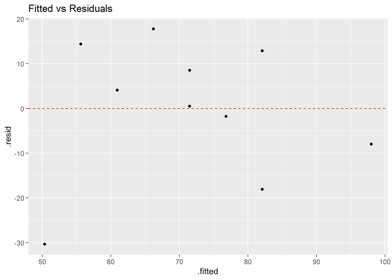
ggplot(model1.stuff,aes(sample=.resid)) +
  stat_qq() + stat_qq_line(color="red") +
  ggtitle("Normal Probability Plot")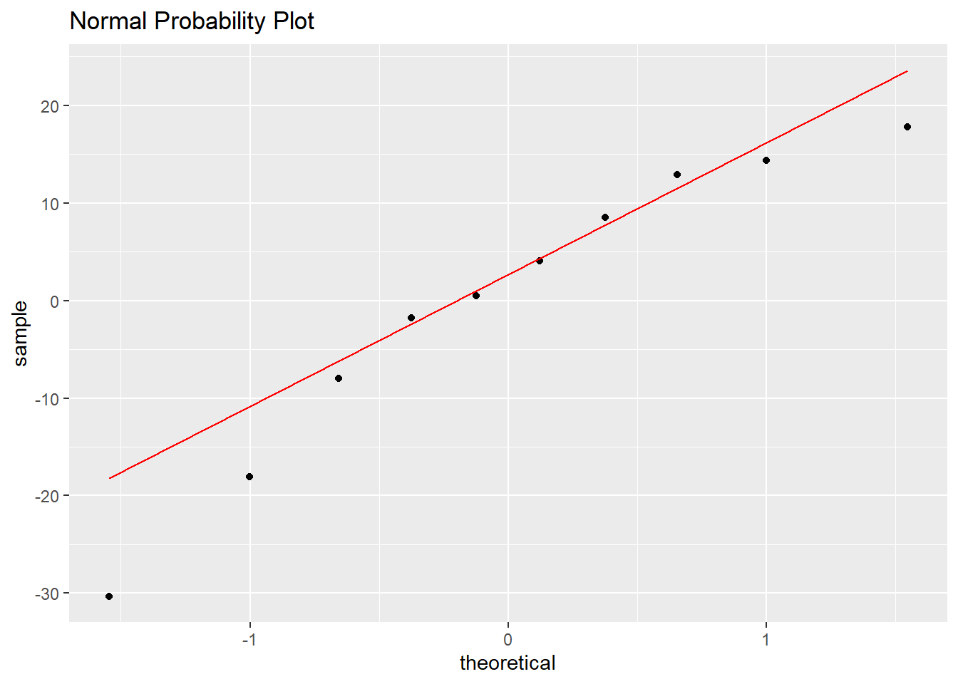
It is extremely difficult to make judgements based on a sample this small, so let’s look at a larger data set. Here, we will try to predict the weight of a backpack based on the body weight of a student from a sample of \(n=100\)
require(Stat2Data)
data(Backpack)
model.backpack <- lm(BackpackWeight~BodyWeight,data=Backpack)
tidy(model.backpack)
## # A tibble: 2 x 5
## term estimate std.error statistic p.value
## <chr> <dbl> <dbl> <dbl> <dbl>
## 1 (Intercept) 5.98 3.03 1.97 0.0514
## 2 BodyWeight 0.0371 0.0195 1.91 0.0592backpack.stuff <- augment(model.backpack)
ggplot(Backpack, aes(BodyWeight,BackpackWeight)) +
geom_point() +
stat_ellipse() +
ggtitle("Body Weight vs Backpack Weight")
ggplot(backpack.stuff,aes(x=.fitted,y=.resid)) + geom_point() +
  geom_hline(yintercept=0,linetype="dashed",color="red") +
  ggtitle("Fitted vs Residuals")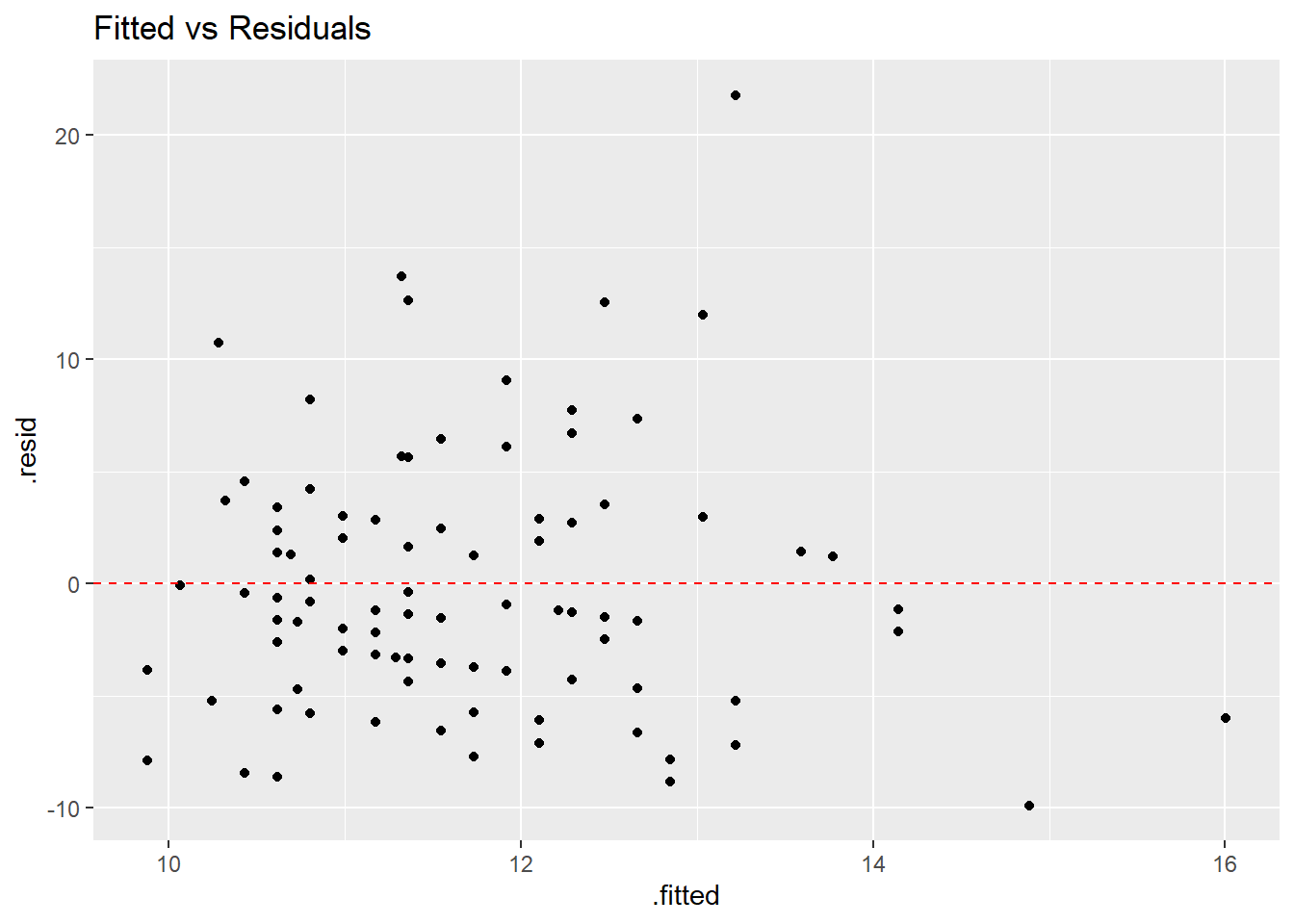
ggplot(backpack.stuff,aes(sample=.resid)) +
  stat_qq() + stat_qq_line(color="red") +
  ggtitle("Normal Probability Plot")
1.5 Log Transfromation
With this data set, I’ll show a bit about when a transformation is needed (we’ll use the log transformation) with species of oak trees from the “Atlatnic” region.
Acorn Size and Geographical Range in the North American Oaks (Quercus L.) Author(s): Marcelo A. Aizen and William A. Patterson Source: Journal of Biogeography, Vol. 17, No. 3 (May, 1990) pp.327-332 URL: http://www.jstor.org/stable/2845128
An EXCEL file I saved in .csv format, then posted on my webpage http://murraystate.edu/academic/faculty/cmecklin/Acorns.csv
I will generally recommend you save an .xls or .xlsx file in the .csv format before importing into R.
Acorn.Size is weight in grams, Range.Area is area in hundreds of squared kilometers, and Tree.Height is in meters.
acorns<-read_csv(file="http://campus.murraystate.edu/academic/faculty/cmecklin/STA265/Acorns.csv")
acorns
## # A tibble: 39 x 5
## Species Region Range.Area Acorn.Size Tree.Ht
## <chr> <chr> <dbl> <dbl> <dbl>
## 1 Quercus alba L. Atlantic 24196 1.4 27
## 2 Quercus bicolor Willd. Atlantic 7900 3.4 21
## 3 Quercus macrocarpa Michx. Atlantic 23038 9.1 25
## 4 Quercus prinoides Willd. Atlantic 17042 1.6 3
## 5 Quercus Prinus L. Atlantic 7646 10.5 24
## 6 Quercus stellata Wang. Atlantic 19938 2.5 17
## 7 Quercus virginiana Mill. Atlantic 7985 0.9 15
## 8 Quercus Michauxii Nutt. Atlantic 8897 6.8 30
## 9 Quercus lyrata Walt. Atlantic 8982 1.8 24
## 10 Quercus Laceyi Small. Atlantic 233 0.3 11
## # ... with 29 more rowsatlantic <- acorns %>%
filter(Region=="Atlantic")
ggplot(atlantic,aes(x=Acorn.Size,y=Range.Area)) +
geom_point()
## [1] 0.4259023# log transform both axes
ggplot(atlantic,aes(x=Acorn.Size,y=Range.Area)) +
geom_point() +
coord_trans(x="log10",y="log10")
## [1] 0.6241522# fit model with no transformation, residual plot
model.no <- lm(Range.Area~Acorn.Size,data=atlantic)
tidy(model.no)## # A tibble: 2 x 5
## term estimate std.error statistic p.value
## <chr> <dbl> <dbl> <dbl> <dbl>
## 1 (Intercept) 7399. 1950. 3.79 0.000796
## 2 Acorn.Size 1218. 508. 2.40 0.0238ggplot(augment(model.no),aes(x=.fitted,y=.resid)) +
geom_point() +
geom_hline(yintercept=0,color="red",linetype="dashed")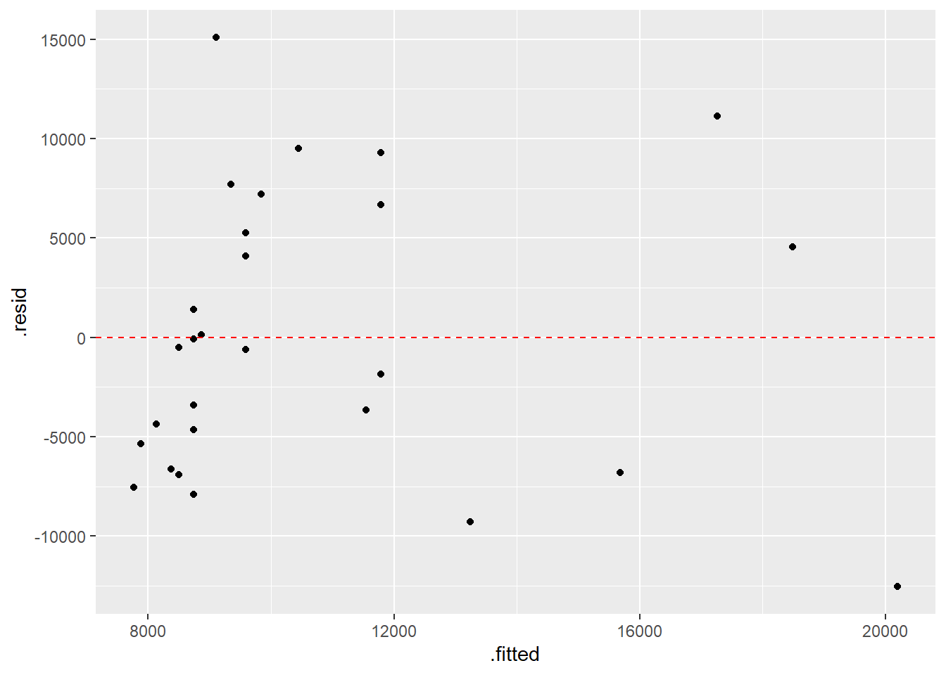
# nonconstant variance

# fit model with transofrmation, residual plot
model.log <- lm(log10(Range.Area)~log10(Acorn.Size),data=atlantic)
tidy(model.log)
## # A tibble: 2 x 5
## term estimate std.error statistic p.value
## <chr> <dbl> <dbl> <dbl> <dbl>
## 1 (Intercept) 3.66 0.0881 41.5 2.70e-25
## 2 log10(Acorn.Size) 0.764 0.188 4.07 3.86e- 4ggplot(augment(model.log),aes(x=.fitted,y=.resid)) +
geom_point() +
geom_hline(yintercept=0,color="red",linetype="dashed")
Now let’s try the California region. Will the same general trend of larger acorns being associated with a larger range hold on the West Coast?
You will notice a point that is “influential”–seems to be an “outlier” that is way off the general pattern.
There exist fancier version of residuals and other statistics to help quantify the amount of “leverage” a point has on the regression equation. The general idea is that no point should exert too much influence on the fit.
What’s the story with the Calfornia outlier? Why is the acorn large but the range over which that species of oak tree is found so small?
california <- acorns %>%
  filter(Region=="California")

# log transform both axes

ggplot(california,aes(x=Acorn.Size,y=Range.Area)) +
  geom_point() +
  coord_trans(x="log10",y="log10")
## [1] 0.02281815# fit model with transofrmation, residual plot
model.log <- lm(log10(Range.Area)~log10(Acorn.Size),data=california)
tidy(model.log)## # A tibble: 2 x 5
## term estimate std.error statistic p.value
## <chr> <dbl> <dbl> <dbl> <dbl>
## 1 (Intercept) 2.60 0.263 9.89 0.00000393
## 2 log10(Acorn.Size) 0.0272 0.397 0.0685 0.947ggplot(augment(model.log),aes(x=.fitted,y=.resid)) +
geom_point() +
geom_hline(yintercept=0,color="red",linetype="dashed")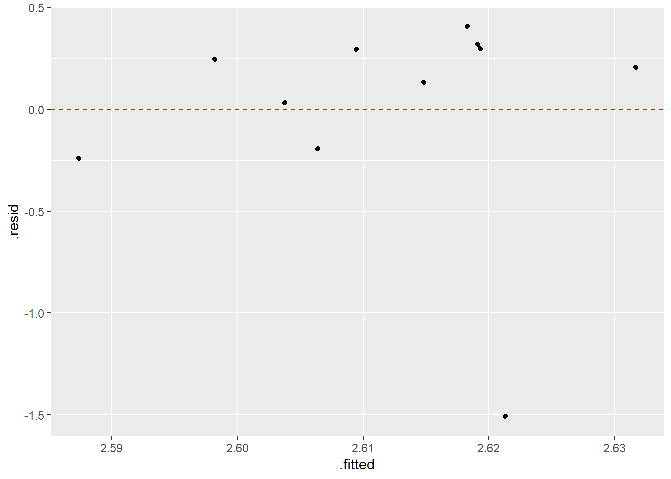
RESULTS: (from the original article) Logarithmically transformed geographical areas and acorn volumes were correlated for oaks of each of the Atlantic and California regions (Fig. 2). A highly significant positive correlation was found for twenty-eight Atlantic species (\(r=0.635, P<0.0005\)). For the eleven California oaks the correlation was not significant (\(r=0.02, P>0.95\)), but the exclusion of Quercus tomentella Engelm, the only non-continental species, resulted in a highly positive correlation (\(r=0.667, n=10, P<0.05\)). The small range of Quercus tomentella is a function of the species being confined to the Channel Islands of southern California and the oceanic island of Guadalupe off the dry coast of Baja California (Little, 1976). The large acorns in this species could, in fact, be related to its condition as an island species (Carlquist, 1974). Oak species with larger trees could bear bigger and more seeds and larger and more exposed amounts of winddispersed pollen grains than species with smaller trees. Morphological evidence (Kaul & Abbe, 1984) and selfpollination experiments (Wright, 1953) indicate that the oak group is composed principally of outcrossing species.
1.6 Simple Linear Regression with the Planets
How many planets are there in our solar system?
When I was a kid, the answer was 9. For those of you educated in the 21st century, the answer is 8 after Pluto got “demoted” to “dwarf planet” status in 2006.
If you lived in ancient times, your answer was 5 (Mercury, Venus, Earth, Mars, Jupiter), the five planets visible with the naked eye.
If you lived in the 17th century, the answer became 6 when Galileo discovered Saturn in 1610. Let’s consider the data below (source: https://www.enchantedlearning.com/subjects/astronomy/planets/), where \(D\) is the distance from the sun, measured in AU (astronomical units, where 1 AU is approx. 93 million miles or 150 million km, the average distance Earth is from the sun) and \(T\) is the period of revolution around the sun (i.e. a year), measured in Earth units. We’ll need to make sure all planets are measured with the same unit for \(T\). I’ll suggest dividing days by 365.25 to convert to years (these are Earth-years, of course).
| Planet | \(D\) | \(T\) |
|---|---|---|
| Mercury | 0.390 | 87.96 days |
| Venus | 0.723 | 224.68 days |
| Earth | 1 | 365.25 days |
| Mars | 1.524 | 686.98 days |
| Jupiter | 5.203 | 11.862 years |
| Saturn | 9.539 | 29.456 years |
I’m going to create a small EXCEL spreadsheet with this data, to illustrate the use of the “Import Dataset” option in the upper right hand window of R Studio. We will save in the .xls or .xlsx format. If you don’t have EXCEL, you can create a spreadsheet with OpenOffice or just a plain text file with Notepad and save in either .txt or .csv format (you can also save in these formats with EXCEL).
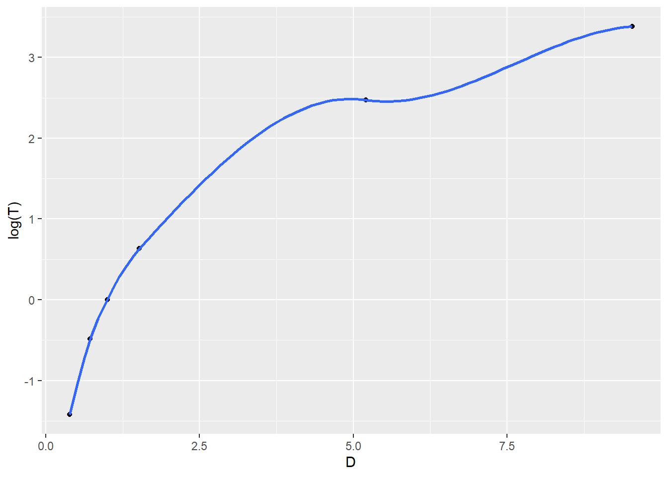
We will plot the following: \[T \sim D\] \[\ln(T) \sim D\] \[T \sim \ln(D)\] \[\ln(T) \sim \ln(D)\]
Which seems to be the best choice of transformations if we know how to fit a least squares linear model?
# here I'm entering data straight into R, will demonstrate using EXCEL in class
D <- c(0.390,0.723,1,1.524,5.203,9.539)
T <- c(87.96/365.25,224.68/365.25,1,686.98/365.25,11.862,29.456)
planets <- tibble(D,T)
ggplot(planets,aes(x=D,y=T)) + geom_point() + geom_smooth()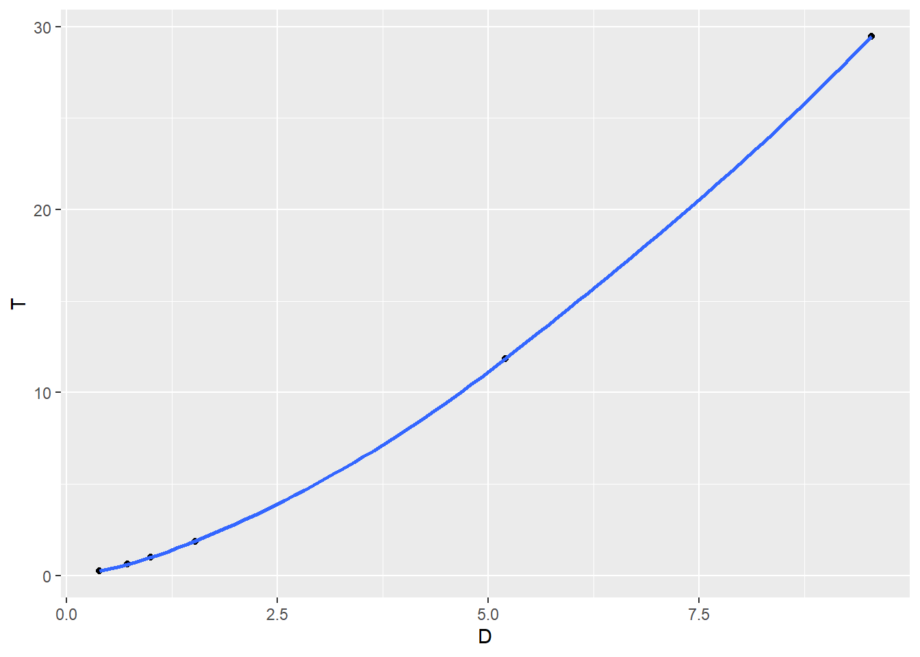

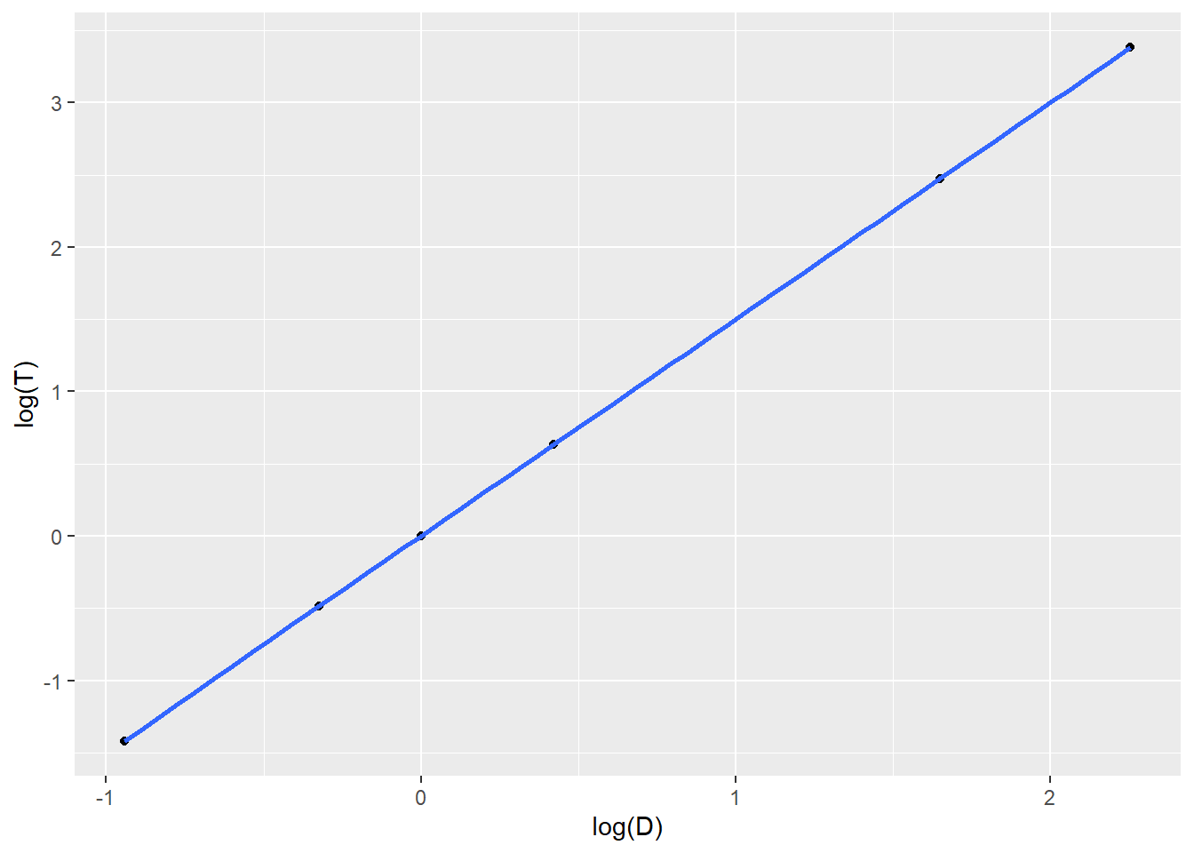
##
## Call:
## lm(formula = log(T) ~ log(D), data = planets)
##
## Residuals:
##          1          2          3          4          5          6
## -0.0064103  0.0042433  0.0029735  0.0018373 -0.0008732 -0.0017707
##
## Coefficients:
##              Estimate Std. Error t value Pr(>|t|)
## (Intercept) -0.002974   0.001948  -1.527    0.202
## log(D)       1.502021   0.001592 943.259 7.58e-12 ***
## ---
## Signif. codes:  0 '***' 0.001 '**' 0.01 '*' 0.05 '.' 0.1 ' ' 1
##
## Residual standard error: 0.004336 on 4 degrees of freedom
## Multiple R-squared:      1,	Adjusted R-squared:      1
## F-statistic: 8.897e+05 on 1 and 4 DF, p-value: 7.579e-12## [1] 1.0228309 0.9987723 1.0000000 1.0005693 1.0010266 1.0003708Once we fit the equation of the least squares model, we will algebraically solve the model for \(T\) and \(D\). Using AUs and Earth-years as units, you’ll end up finding that \[\frac{D^3}{T^2} \approx 1\]
If you know Kepler’s third law of planetary motion, it might be familiar.
https://en.wikipedia.org/wiki/Kepler%27s_laws_of_planetary_motion
Finally, we’ll use our model to make predictions of \(T\) for Uranus (discovered in 1761), Nepture (1846), and Pluto (1930, demoted to dwarf planet in 2006).
| Planet | \(D\) | \(T\) |
|---|---|---|
| Uranus | 19.18 | ??? |
| Neptune | 30.06 | ??? |
| Pluto | 39.53 | ??? |
By the way, here are the actual values of \(T\) for Uranus, Neptune, and Pluto.
| Planet | \(D\) | \(T\) |
|---|---|---|
| Uranus | 19.18 | 84.07 years |
| Neptune | 30.06 | 164.81 years |
| Pluto | 39.53 | 247.7 years |