STA 265 Notes (Methods of Statistics and Data Science)
2020-10-20
Chapter Zero
This chapter includes both material from the textbook and material that I have added to aid you in using R and R Studio for statistical and data science tasks.
0.1 What Is A Statistical Model? (Chapter Zero)

To both illustrate the 4-Step Process of statistical modeling and to review the two-sample \(t\)-test, I will illustrate testing to see if there was a statistically significant differnce between two different sections of a class on their final exam, where one section took a final on Monday morning and the other one on Friday afternoon.
0.1.1 Choose the Model
##    exam class
## 1    74     F
## 2    72     F
## 3    65     F
## 4    96     F
## 5    45     F
## 6    62     F
## 7    82     F
## 8    67     F
## 9    63     F
## 10   93     F
## 11   29     F
## 12   68     F
## 13   47     F
## 14   80     F
## 15   87     F
## 16  100     M
## 17   86     M
## 18   87     M
## 19   89     M
## 20   75     M
## 21   88     M
## 22   81     M
## 23   71     M
## 24   87     M
## 25   97     M
## 26   83     M
## 27   81     M
## 28   49     M
## 29   71     M
## 30   63     M
## 31   53     M
## 32   77     M
## 33   71     M
## 34   86     M
## 35   78     M
## class min Q1 median Q3 max mean sd n missing
## 1 F 29 62.5 68 81 96 68.66667 18.35626 15 0
## 2 M 49 71.0 81 87 100 78.65000 13.05565 20 0
Notice that there is a point that is an outlier in the Friday section (the lowest exam score). Despite the presence of this outlier, we will (for now) ignore it and use the \(t\)-test, despite this making the assumption of (nearly) normal data questionable. The variances are roughly equal. The parameters we will need to estimate are \(\mu_1, \sigma_1, \mu_2, \sigma_2\).
The model can be written as \[Y = \mu_i + \epsilon\] \(\mu_i\) is the mean of group \(i\) and \(\epsilon \sim N(0,\sigma_i)\) is the random error. We have jus two groups. If the null hypothesis \(H_o: \mu_1 = \mu_2\) (where group #1 is Friday, #2 is Monday), then we assume the means and variances of the two groups are equal, where we are primarily interested in the means.
0.1.2 Fit the Model
Our parameter estimates are: \[\bar{y}_1=68.67, \bar{y}_2=78.65, s_1=18.56, s_2=13.06 \]
The fitted model is \[\hat{y} = \bar{y}_i\] We are simply estimated any student in the Monday section to have a predicted exam score of 78.65 and the Friday section 68.67.
The error term isn’t in that fitted model, even though we know these predictions are not perfectly accurate for each student, since we don’t know whether the random error term will be positive or negative for each observation.
If this seems like a simplistic linear regression model, well, it is.
0.1.3 Assess the Model
We can compute the residual, \(e\) for each observation (student) by taking the difference of their actual response \(y\) (the real exam score) from the predicted valeu \(\hat{y}\) (the model prediction).
\[e = y - \hat{y}\]
For example, student #1 got an exam score of \(y_1=74\) and has a predicted score of \(\hat{y}_1=68.67\) (the mean of the Friday group), so \(e_1=74-68.67=5.33\) (this student did 5.33 points better than predicted). Student #30 has \(y_30=63\) and \(\hat{y}_{30}=78.65\) (the mean of the Monday group), hence \(e_{30}=63-78.65=-15.65\) (did 15.65 points worse than predicted).
We really are assuming that these residuals are normally distributed with mean zero and variance equal to \(\sigma^2\) for each group, so a more thorough assessment of the normality assumption would involve an analysis of these residuals, which we’ll do with R on Thursday.
We can now compute the usual test statistic and \(p\)-value for the \(t\)-test. For today, we will assume equal variances between the groups.
\[t= \frac{\bar{y}_1-\bar{y}_2}{\sqrt{s_p^2(1/n_1+1/n_2)}}\]
where \(s_p^2\) is the pooled variance, \[s_p^2=\frac{(n_1-1)s_1^2 + (n_2-1)s_2^2}{n_1+n_2-2}\].
Under the null hypothesis, \(t \sim t(n_1 + n_2 -2)\).
Using the data in this problem, we obtain \(t=-1.8824\) with \(df=33\) and a \(p\)-value of \(p=0.0686\). If we are using a standard level of significance of \(\alpha=0.05\), we fail to reject the null hypothesis.
0.1.4 Use the Model
Since we failed to reject the null hypothesis, we would conclude that the difference in mean exam scores between the Monday and Friday sections is not statistically significant.
There are some caveats to this conclusion:
the sample sizes were not large
the assumption of normality is questionable due to an outlier
were the students assigned to sections randomly?
Other options (such as randomization tests and non-parametrics) exist if we question the use of a \(t\)-test. We might also consider collecting more data and/or improving how the data was collected.
0.2 Introduction to R and R Studio
we are going to get used to using R and R Studio.
First, choose the link Download R for Linux/(Mac) OS X/Windows (choose your operating syster)
If you chose Windows, then click on the install R for the first time link, then Download R 4.0.2 For Windows (4.0.2 is the latest version as of this writing)
If you chose (Mac) OS X, then click on R-4.0.2.pkg link.
Once you’ve downloaded, then click and follow the menu instructions as you would for other downloaded software.
If you chose Linux, I doubt you’ll need my help. I’m not a Linux user.
http://www.rstudio.com (Download R Studio)
Click on Download R Studio then click on Download over R Studio Desktop (the Free version) and pick the link that corresponds to your operating system (Windows/macOS/several Linux distributions).
Some free online textbooks we’ll be using are:
https://r4ds.had.co.nz/ (R For Data Science, by Hadley Wickham & Garrett Grolemund)
Hadley’s probably the most prominent R guru and is largely responsible for the tidyverse, a collection of R packages designed for data science. We’ll discuss the tidyverse more in class, or go to https://www.tidyverse.org/. We’ll use R4DS as our main reference for the tidyverse.
https://moderndive.com/ (Modern Dive: Statistical Inference via Data Science, by Chester Ismay & Albert Kim)
We’ll use this book to supplement our main STAT 2 text, and as a guide for our “Data Story” project (see Section 1.1.1).
But first things first…
First, we can use R as a basic calculator. The stuff after the hashtag/pound sign are comments that the computer ignores but are there for our benefit.
2+2
5+8*2^2
(5+8)*2^2
sqrt(12)
-2^4
(-2)^4
pi
pi/4
exp(1) #e
exp(0) #e^0
log(100) #natural log or ln
log10(100) #base-10 log
log(64,b=2) #base-2 log
0.3 The Tidyverse
There are literally thousands of packages created by R users to add statistical functions and built-in data sets. Let’s install and load the tidyverse and Stat2Data packages. The tidyverse package is a set of several packages, including ggplot2 (Grammar of Graphics), for using R in a modern fashion. Stat2Data is a package with data sets that accompanies our textbook.
In the lower right hand window of R Studio, go to the Packages tab and then Install Packages. (you can also do this in the R console window if you aren’t using the R Studio interface).
A bit more on using the tidyverse package for data manipulation, graphing, and analysis. Key resources are https://r4ds.hadley.co.nz, https://www.rstudio.com/resources/cheatsheets/ and http://www.cookbook-r.com/Graphs/.
require(tidyverse)
require(MASS) #cereal data
require(mosaic)

# R for Data Science text book
# http://r4ds.had.co.nz

#  http://genomicsclass.github.io/book/pages/dplyr_tutorial.html (mammal sleep example)
# and http://dplyr.tidyverse.org/ (Star Wars example)
# and http://r4ds.had.co.nz/transform.html (NYC Flights example)
# look there for some options I left off

# using the 'dplyr' package for the grammar of data manipulation
# using the 'ggplot2' package for the grammar of graphics: data visualization

data(UScereal)
head(UScereal)
str(UScereal)
UScereal$SHELF <- factor(UScereal$shelf,labels=c("bottom","middle","top"),ordered=TRUE)
UScereal$BRAND <- rownames(UScereal)
head(UScereal)
str(UScereal)
View(UScereal)

# note, there is a function named 'select' in both dplyr and MASS
# thus, I'm using package::function notation
# Selecting specific columns using select()

UScereal1 <- dplyr::select(UScereal,BRAND,SHELF,carbo,fibre,sugars)
head(UScereal1)
# to select all columns except one, use - operator
UScereal2 <- dplyr::select(UScereal, -vitamins)
head(UScereal2)
# range of columns with the : operator
UScereal3 <- dplyr::select(UScereal,calories:sodium,SHELF)
head(UScereal3)

# Selecting specific rows using filter()
UScereal11 <- filter(UScereal1, fibre >= 10)
head(UScereal11)
UScereal12 <- filter(UScereal1, sugars>=10, fibre<5)
head(UScereal12)
UScereal13 <- filter(UScereal1, fibre>5, SHELF %in% c("middle","bottom"))
head(UScereal13)

# more with piping

UScereal %>%
  dplyr::select(SHELF, sugars) %>%
  mutate(sugars=round(sugars,1)) %>%
  head

# arrange or re-arrange rows with arrange()
UScereal1 %>%
  arrange(SHELF)
UScereal1 %>%
 arrange(SHELF,fibre)
UScereal1 %>%
  arrange(desc(SHELF),desc(fibre))

# create new columns with mutate()
 UScereal1 %>%
  mutate(total_carbo=carbo+fibre) %>%
  head

UScereal1 %>%
  mutate(sugars_oz = sugars/28.3495) %>%
  head

# Create summaries of a data frame with summarise()
UScereal %>%
  summarise(avg_fibre=mean(fibre))

UScereal %>%
  summarise(total = n(),
            MIN_calories=min(calories),
            Q1_calories=quantile(calories,probs=0.25),
            M_calories=median(calories),
            Q3_calories=quantile(calories,probs=0.75),
            MAX_calories=max(calories),
            SD_calories=sd(calories),
            IQR_calories=Q3_calories-Q1_calories,
            Range_calories=MAX_calories-MIN_calories)

# I like the favstats function from the `mosaic` package better, it is easier
favstats(~calories,data=UScereal)

# Group operations using group_by()
shelf_stats <-
  UScereal %>%
  group_by(SHELF) %>%
  summarise(avg_fibre=mean(fibre),sd_fibre=sd(fibre),n=n(),se_fibre=sd_fibre/sqrt(n))
shelf_stats

favstats(calories~SHELF,data=UScereal)

# https://cran.r-project.org/web/packages/tibble/vignettes/tibble.html
# Tibbles are a modern take on data frames. They keep the features that have
# stood the test of time, and drop the features that used to be convenient but
# are now frustrating (i.e. converting character vectors to factors).

# Let's turn UScereal from the traditional R data frame to the modern R tibble
UScerealT <- as_tibble(UScereal)
UScerealT
str(UScereal)
str(UScerealT)
options(tibble.print_min=15,tibble.width=Inf) #15 rows, all columns
UScerealT


ggplot(shelf_stats,aes(x=SHELF,y=avg_fibre,color=SHELF)) +
  geom_point() +
  geom_errorbar(aes(ymin=avg_fibre-se_fibre,ymax=avg_fibre+se_fibre),width=0.1)

# Two-way interaction graph
UScereal4 <-
  UScereal %>%
  dplyr::select(BRAND,SHELF,sugars,fibre) %>%
  mutate(HighSugar=(sugars>=10))

head(UScereal4)
shelf_hisugar_stats <-
  UScereal4 %>%
  group_by(SHELF,HighSugar) %>%
  summarise(avg_fibre=mean(fibre),sd_fibre=sd(fibre),n=n(),se_fibre=sd_fibre/sqrt(n))

shelf_hisugar_stats

ggplot(shelf_hisugar_stats,aes(x=SHELF,y=avg_fibre,group=HighSugar,color=HighSugar)) +
  geom_point() +
  geom_line()

data(faithful)

# http://www.cookbook-r.com/Graphs/

ggplot(faithful, aes(x=eruptions,y=waiting))+
  geom_point(color="darkblue",pch=22,size=2) +
  # scatterplot, points twice as big, choose color & shape of points
  theme_bw() +
  # uses black & white theme rather than standard gray theme
  labs(title="Predicting Old Faithful",
       x="Length of Previous Eruption",y="Waiting Time") +
  # labels for graph and axes
  theme(title=element_text(size=16,face="bold"),
        axis.title=element_text(size=12,face="italic")) +
  # changes font size and face
  theme(plot.title = element_text(hjust = 0.5)) +
  # centers title, shouldn't be this hard
  geom_smooth(method=lm, se=TRUE,color="green3",fill="goldenrod") +
  #fits linear model (regression line), change to method=loess
  geom_abline(intercept=30,slope=15) +
  #fits a specified line, not the line of best fit
  geom_vline(xintercept=mean(faithful$eruptions),linetype="dashed") +
  #vertical line
  geom_hline(yintercept=mean(faithful$waiting),linetype="dashed")
#horizontal line

data(KidsFeet)
favstats(length~sex,data=KidsFeet)
g1 <- ggplot(KidsFeet,aes(x=sex,y=length,color=sex))
g1 # you haven't picked a "geom" yet
g2 <- ggplot(KidsFeet,aes(x=length))
g2

g1 + geom_boxplot()
g1 + geom_dotplot(binaxis="y",stackdir="center",binwidth=0.1)
g1 + geom_violin()
g2 + geom_histogram(binwidth=0.5,col="blue",fill="lightblue")
g1 + stat_summary(fun.data=mean_se)
#a way to do error bars, mean +/- standard error

# change colors, Hadley Wickham will tell you to usually not do this

g1 + stat_summary(fun.data=mean_se) +
  scale_color_manual(values=c("dodgerblue3","hotpink3")) +
  theme_bw()

g3 <- ggplot(KidsFeet,aes(x=length,y=width,color=sex,shape=sex))
g3 + geom_point(size=2) +
  scale_color_manual(values=c("dodgerblue3","hotpink3")) +
  theme_bw() +
  xlim(20,30) +
  ylim(7,11)

# what if you don't have a color printer
g1 + geom_boxplot() +
  scale_color_grey() +
  theme_bw()


# lots more out there...
# http://environmentalcomputing.net/plotting-with-ggplot-colours-and-symbols/
0.4 Data Wrangling & Visualization
We are going to follow the lead of Chapters 3 & 4 of the Modern Dive online textbook, https://moderndive.com/2-viz.html and https://moderndive.com/3-wrangling.html to work with a couple of data sets. In my opinion, the Modern Dive book, while it doesn’t have as much detail as R4DS, https://r4ds.hadley.co.nz, it is probably a better introduction to using R Studio for basic data analysis.
The first data set will be the flights data set in the nycflights13 data set we talked about on Thursday, with some information about flights leaving from the three New York City area airports: Newark (EWR), LaGuardia (LGA), and Kennedy (JFK) in 2013.
I am going to suppose that I wish to fly from the New York City area to Denver or Salt Lake City for a ski trip in March. I wish to pick an airline with historically (at least in 2013) the least amount of delay because I don’t want to miss any ski time, and I don’t care about price or which of the three airports I fly out of.
The second data set will be the classic_rock_song_list data set from the fivethirtyeight package, with the songs played most frequently on a sample of classic rock radio stations in June 2014 (more info at https://fivethirtyeight.com/features/why-classic-rock-isnt-what-it-used-to-be/) I will look at some visualizations and statistics of the most popular classic rock songs of the 1960s.
require(tidyverse) # gives us access to ggplot2, dplyr, and others
require(mosaic) # I am using mainly for favstats
require(nycflights13) # for the flights data set
require(fivethirtyeight) # you might need to install this package
require(scales) # and this one as well
# I want to fly from the NYC area to DEN in March.
# I will create a data set limited to this.
# & is the logical operator AND, | is the logical operator OR
# airlines # tells us about the carrier codes, what's "B6"?
skitrip <- flights %>%
filter(month==3 & (dest=="DEN" | dest=="SLC")) %>%
mutate(carrier=recode(carrier,"DL"="Delta","F9"="Frontier","B6"="JetBlue",
"WN"="Southwest","UA"="United"))
# those are the only 5 airlines that fly direct from NYC to DEN or SLC
# str(skitrip)
# summary(skitrip)
# table(skitrip$dest)
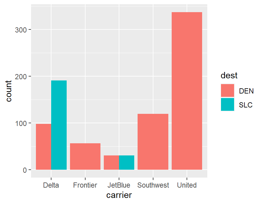
xtabs(~dest+carrier,data=skitrip)## carrier
## dest Delta Frontier JetBlue Southwest United
## DEN 98 57 31 120 337
## SLC 191 0 31 0 0
##
## Call:
## lm(formula = arr_delay ~ dep_delay, data = skitrip)
##
## Coefficients:
## (Intercept)    dep_delay
## -11.028 1.032##
## Call:
## lm(formula = arr_delay ~ dep_delay, data = skitrip)
##
## Residuals:
## Min 1Q Median 3Q Max
## -48.941 -11.845 -1.988 10.147 80.432
##
## Coefficients:
## Estimate Std. Error t value Pr(>|t|)
## (Intercept) -11.02758 0.64579 -17.08 <2e-16 ***
## dep_delay 1.03191 0.01519 67.93 <2e-16 ***
## ---
## Signif. codes: 0 '***' 0.001 '**' 0.01 '*' 0.05 '.' 0.1 ' ' 1
##
## Residual standard error: 18.01 on 848 degrees of freedom
## (15 observations deleted due to missingness)
## Multiple R-squared: 0.8448, Adjusted R-squared: 0.8446
## F-statistic: 4614 on 1 and 848 DF, p-value: < 2.2e-16# scatterplot, departure delay vs arrival delay
ggplot(skitrip,aes(x=dep_delay,y=arr_delay,color=carrier)) +
geom_point(pch=16) +
geom_abline(intercept=-11.028,slope=1.032)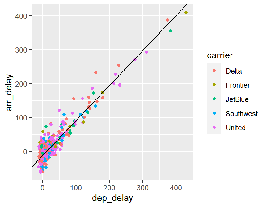
##     carrier min     Q1 median    Q3 max       mean       sd   n missing
## 1     Delta -61 -23.00   -9.5  6.75 387  0.3706294 46.05476 286       3
## 2  Frontier -32 -11.00   -1.0 16.00 410 12.6666667 62.90592  57       0
## 3   JetBlue -27 -16.75   -1.0 14.75 356 14.8870968 57.97600  62       0
## 4 Southwest -56 -24.00  -11.5  6.75 134 -2.8245614 35.09462 114       6
## 5    United -62 -21.50   -9.0  5.50 293  0.2296073 41.92506 331       6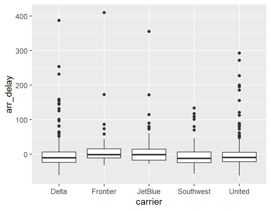
# I suspect the missing data is canceled flights

# create a data set with summary statistics
# remove missing data
skitrip_stats <- skitrip %>%
  filter(!is.na(arr_delay)) %>%
  group_by(carrier) %>%
  summarize(mean_delay=mean(arr_delay),
            sd_delay=sd(arr_delay),
            n=n())

skitrip_stats
## # A tibble: 5 x 4
## carrier mean_delay sd_delay n
## <chr> <dbl> <dbl> <int>
## 1 Delta 0.371 46.1 286
## 2 Frontier 12.7 62.9 57
## 3 JetBlue 14.9 58.0 62
## 4 Southwest -2.82 35.1 114
## 5 United 0.230 41.9 331# error bar plot, not in Modern Dive
ggplot(skitrip_stats,aes(x=carrier)) +
geom_point(aes(y=mean_delay),color="red",size=3) +
geom_errorbar(aes(ymin=mean_delay-sd_delay/sqrt(n),
ymax=mean_delay+sd_delay/sqrt(n)),width=0.1,lwd=1.5) +
geom_hline(yintercept=0,linetype="dashed",color="red") +
xlab("Airline") +
ylab("Mean Arrival Delay (minutes)") +
ggtitle("Error Bars (Mean +/- 1 Standard Error)") +
theme_bw()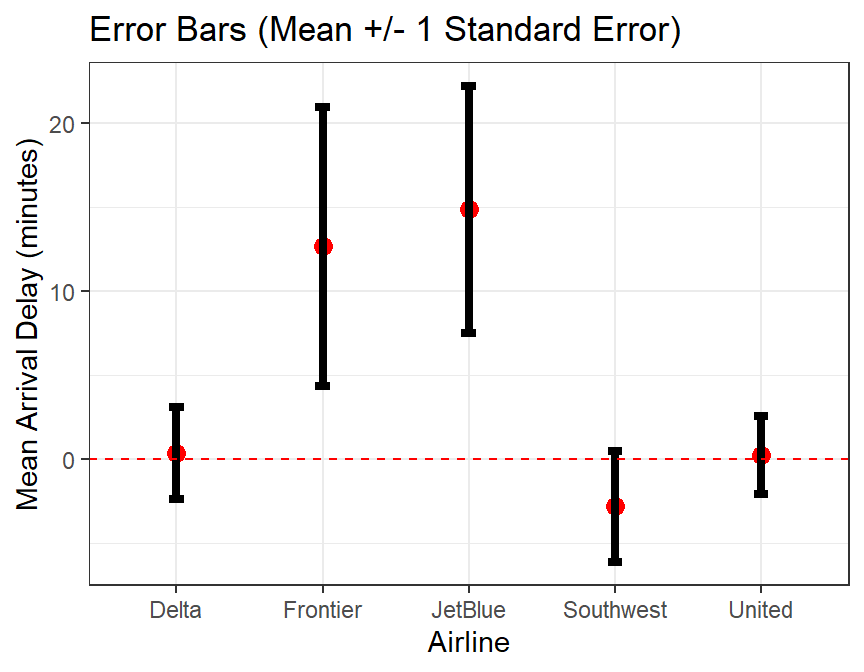
# basic inference, let's compare B6 (Jet Blue) vs DL (Delta)
# the only two airlines that fly into both Denver and Salt Lake from NYC
skitrip2 <- skitrip %>%
  filter(carrier %in% c("Delta","JetBlue"))

t.test(arr_delay~carrier,data=skitrip2)
##
## Welch Two Sample t-test
##
## data: arr_delay by carrier
## t = -1.8491, df = 78.516, p-value = 0.0682
## alternative hypothesis: true difference in means is not equal to 0
## 95 percent confidence interval:
## -30.143873 1.110938
## sample estimates:
## mean in group Delta mean in group JetBlue
## 0.3706294 14.8870968##
## Welch Two Sample t-test
##
## data: arr_delay by dest
## t = 1.143, df = 349.65, p-value = 0.2538
## alternative hypothesis: true difference in means is not equal to 0
## 95 percent confidence interval:
## -3.112329 11.749971
## sample estimates:
## mean in group DEN mean in group SLC
## 2.893482 -1.425339## Classic Rock Songs, 1960s only
classic60s <- classic_rock_song_list %>%
filter(release_year >= 1960 & release_year <= 1969)
# View(classic60s)
# 264 differnt songs from this decade were played
# use the between function for the 1990s
# there are often two or more ways to accomplish the same task
classic90s <- classic_rock_song_list %>%
filter(between(release_year,1990,1999))
View(classic90s)
# histogram
ggplot(classic60s,aes(x=release_year)) +
geom_histogram(binwidth=1,col="white",fill="lightblue") +
scale_x_continuous(breaks=1980:1989)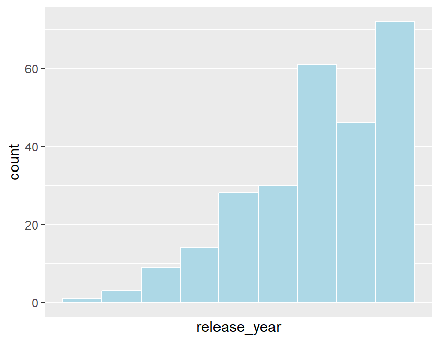
# most popular songs
classic60s %>%
  dplyr::select(song,artist,release_year,playcount) %>%
  arrange(desc(playcount)) %>%
  print(n=20)
## # A tibble: 264 x 4
## song artist release_year playcount
## <chr> <chr> <int> <int>
## 1 All Along the Watchtower Jimi Hendrix 1968 141
## 2 Gimme Shelter Rolling Stones 1969 96
## 3 Ramble On Led Zeppelin 1969 90
## 4 Honky Tonk Women Rolling Stones 1969 87
## 5 Sympathy For The Devil Rolling Stones 1968 81
## 6 Whole Lotta Love Led Zeppelin 1969 72
## 7 Jumpin' Jack Flash Rolling Stones 1968 72
## 8 Come Together The Beatles 1969 69
## 9 White Room Cream 1968 68
## 10 Purple Haze Jimi Hendrix 1967 67
## 11 Magic Carpet Ride Steppenwolf 1968 65
## 12 Fire Jimi Hendrix 1967 63
## 13 You Can't Always Get What You Want Rolling Stones 1969 62
## 14 (I Can't Get No) Satisfaction Rolling Stones 1965 60
## 15 Paint It Black Rolling Stones 1966 58
## 16 Revolution The Beatles 1968 55
## 17 Brown Eyed Girl Van Morrison 1967 55
## 18 Pinball Wizard The Who 1969 54
## 19 Born to Be Wild Steppenwolf 1968 53
## 20 People Are Strange The Doors 1967 53
## # ... with 244 more rows# most popular artists
popular60s <- classic60s %>%
group_by(artist) %>%
summarize(songs=n()) %>%
arrange(desc(songs),artist) %>%
print(n=10)## # A tibble: 57 x 2
## artist songs
## <chr> <int>
## 1 The Beatles 91
## 2 Rolling Stones 22
## 3 Led Zeppelin 18
## 4 Jimi Hendrix 14
## 5 The Doors 13
## 6 The Who 10
## 7 Creedence Clearwater Revival 7
## 8 Cream 6
## 9 Pink Floyd 5
## 10 The Kinks 5
## # ... with 47 more rows# barchart of the most popular artists
popular60s %>%
filter(songs>=5) %>%
ggplot(aes(x=reorder(artist,songs),y=songs)) +
geom_col(fill="purple") +
coord_flip() +
xlab("Number of Songs") +
ylab("Artist") +
ggtitle("Popular 1960s Classic Rock Artists") +
theme(plot.title=element_text(size=10,face="bold",color="purple",
family="serif"))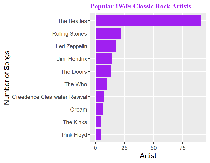
# we aren't going to fuss with reordering alphabeltically or by most songs
# at least today

# what percentage of songs come from various decades?

# View(classic_rock_song_list), sort by release_year
# why I am I using right=FALSE below?

classic_rock_song_list %>%
  filter(release_year>=1960) %>%
  # there is an Elton John song listed as from the year 1071, typo
  # the line below is probably the most complex in this example
  mutate(decade=cut(release_year,breaks=c(1960,1970,1980,1990,2000,2020),
                    right=FALSE,
                    labels=c("60s","70s","80s","90s","2000s"))) ->
  classic_rock_decade

ggplot(classic_rock_decade,aes(x=decade,y=..prop..,group=1)) +
  geom_bar(color="blue",fill="lightblue") +
  scale_y_continuous(labels=scales::percent) +
  ylab("Percent") + xlab("Decade") +
  ggtitle("What Decade's Songs Are Still Played \n on Classic Rock Stations?") +
  theme(plot.title = element_text(hjust = 0.5),
        plot.subtitle=element_text(hjust = 0.5)) # centers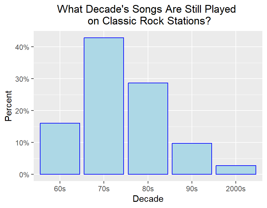
0.5 Data Importing
- Direct Entry
Basically, just manually type in a bunch of vectors and then bind them together into a data frame. This is really only feasible for a small example.
name <- c("Amy","Brad","Carrie","Diego","Emily")
exam <- c(95,72,88,92,65)
grades <- data.frame(name,exam)
str(grades)
## 'data.frame': 5 obs. of 2 variables:
## $ name: chr "Amy" "Brad" "Carrie" "Diego" ...
## $ exam: num 95 72 88 92 65## name exam
## Length:5 Min. :65.0
## Class :character 1st Qu.:72.0
## Mode :character Median :88.0
## Mean :82.4
## 3rd Qu.:92.0
## Max. :95.0- Use built-in datasets
This is very handy for classroom use and if a built-in data set happens to be what you want or need to analyze. Base R comes with many built-in data sets built into the datasets package, including classics such as the Old Faithful data, faithful, Fisher’s flower measurements iris and Anscombe’s famous example anscombe of 4 data sets with the same correlation and regression equation but very different trends. Notice you do not have to “load” the datasets package with a require or library command.
##   eruptions waiting
## 1     3.600      79
## 2     1.800      54
## 3     3.333      74
## 4     2.283      62
## 5     4.533      85
## 6     2.883      55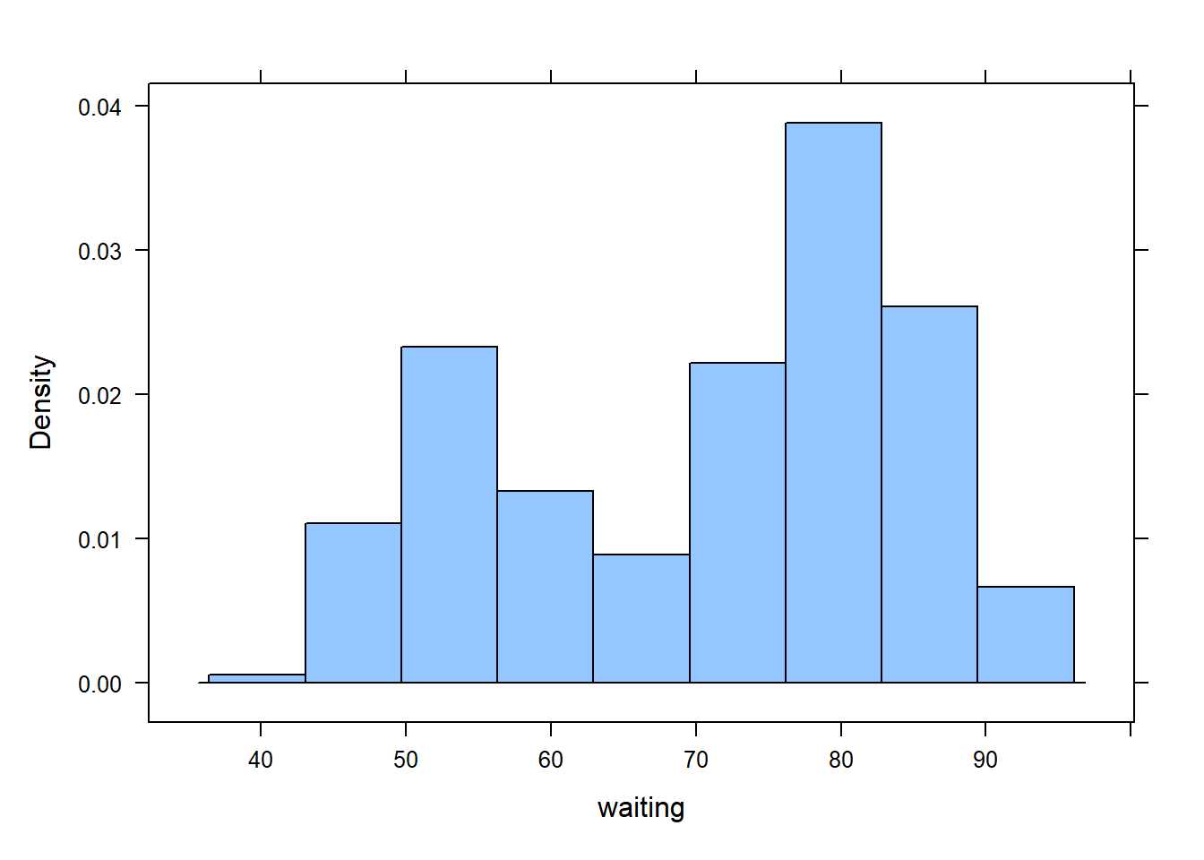
##   Sepal.Length Sepal.Width Petal.Length Petal.Width Species
## 1          5.1         3.5          1.4         0.2  setosa
## 2          4.9         3.0          1.4         0.2  setosa
## 3          4.7         3.2          1.3         0.2  setosa
## 4          4.6         3.1          1.5         0.2  setosa
## 5          5.0         3.6          1.4         0.2  setosa
## 6 5.4 3.9 1.7 0.4 setosa## Sepal.Length Sepal.Width Petal.Length Petal.Width
## Min. :4.300 Min. :2.000 Min. :1.000 Min. :0.100
## 1st Qu.:5.100 1st Qu.:2.800 1st Qu.:1.600 1st Qu.:0.300
## Median :5.800 Median :3.000 Median :4.350 Median :1.300
## Mean :5.843 Mean :3.057 Mean :3.758 Mean :1.199
## 3rd Qu.:6.400 3rd Qu.:3.300 3rd Qu.:5.100 3rd Qu.:1.800
## Max. :7.900 Max. :4.400 Max. :6.900 Max. :2.500
## Species
## setosa :50
## versicolor:50
## virginica :50
##
##
## ## Species min Q1 median Q3 max mean sd n missing
## 1 setosa 1.0 1.4 1.50 1.575 1.9 1.462 0.1736640 50 0
## 2 versicolor 3.0 4.0 4.35 4.600 5.1 4.260 0.4699110 50 0
## 3 virginica 4.5 5.1 5.55 5.875 6.9 5.552 0.5518947 50 0## x1 x2 x3 x4 y1 y2 y3 y4
## 1 10 10 10 8 8.04 9.14 7.46 6.58
## 2 8 8 8 8 6.95 8.14 6.77 5.76
## 3 13 13 13 8 7.58 8.74 12.74 7.71
## 4 9 9 9 8 8.81 8.77 7.11 8.84
## 5 11 11 11 8 8.33 9.26 7.81 8.47
## 6 14 14 14 8 9.96 8.10 8.84 7.04
## 7 6 6 6 8 7.24 6.13 6.08 5.25
## 8 4 4 4 19 4.26 3.10 5.39 12.50
## 9 12 12 12 8 10.84 9.13 8.15 5.56
## 10 7 7 7 8 4.82 7.26 6.42 7.91
## 11 5 5 5 8 5.68 4.74 5.73 6.89## [1] 0.8164205## [1] 0.8162365## [1] 0.8162867## [1] 0.8165214par(mfrow=c(2,2))
plot(y1~x1,data=anscombe)
plot(y2~x2,data=anscombe)
plot(y3~x3,data=anscombe)
plot(y4~x4,data=anscombe)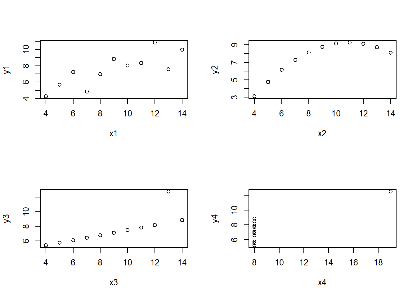
- Use data sets in other R packages
Many of the thousands of R packages come with built-in data sets as well. For example, your textbook has a package called Stat2Data that contains the data sets used in this book. One such data set is Backpack, with the results of the students’ research project looking at factors related to the weight of backpacks and whether that was associated with back problems.
The package MASS contains several data sets that I have used in classroom situations. USCereal has nutritional information on several brands of breakfast cereal and is a favorite of mine. In my biostatistics course for nursing students, I have used a data set called Pima.tr which has data regarding possible predictors of Type II diabetes in women on the Pima reservation in Arizon.
## Loading required package: Stat2Data## BackpackWeight BodyWeight Ratio BackProblems Major Year Sex
## 1 9 125 0.0720000 1 Bio 3 Female
## 2 8 195 0.0410256 0 Philosophy 5 Male
## 3 10 120 0.0833333 1 GRC 4 Female
## 4 6 155 0.0387097 0 CSC 6 Male
## 5 8 180 0.0444444 0 EE 2 Female
## 6 5 240 0.0208333 0 History 0 Male
## Status Units
## 1 U 13
## 2 U 12
## 3 U 14
## 4 G 0
## 5 U 14
## 6 G 0## Loading required package: MASS##
## Attaching package: 'MASS'## The following object is masked from 'package:dplyr':
##
## select## mfr calories protein fat sodium
## G:22 Min. : 50.0 Min. : 0.7519 Min. :0.000 Min. : 0.0
## K:21 1st Qu.:110.0 1st Qu.: 2.0000 1st Qu.:0.000 1st Qu.:180.0
## N: 3 Median :134.3 Median : 3.0000 Median :1.000 Median :232.0
## P: 9 Mean :149.4 Mean : 3.6837 Mean :1.423 Mean :237.8
## Q: 5 3rd Qu.:179.1 3rd Qu.: 4.4776 3rd Qu.:2.000 3rd Qu.:290.0
## R: 5 Max. :440.0 Max. :12.1212 Max. :9.091 Max. :787.9
## fibre carbo sugars shelf
## Min. : 0.000 Min. :10.53 Min. : 0.00 Min. :1.000
## 1st Qu.: 0.000 1st Qu.:15.00 1st Qu.: 4.00 1st Qu.:1.000
## Median : 2.000 Median :18.67 Median :12.00 Median :2.000
## Mean : 3.871 Mean :19.97 Mean :10.05 Mean :2.169
## 3rd Qu.: 4.478 3rd Qu.:22.39 3rd Qu.:14.00 3rd Qu.:3.000
## Max. :30.303 Max. :68.00 Max. :20.90 Max. :3.000
## potassium vitamins
## Min. : 15.00 100% : 5
## 1st Qu.: 45.00 enriched:57
## Median : 96.59 none : 3
## Mean :159.12
## 3rd Qu.:220.00
## Max. :969.70## starting httpd help server ...## done## npreg glu bp skin bmi ped age type
## 1 5 86 68 28 30.2 0.364 24 No
## 2 7 195 70 33 25.1 0.163 55 Yes
## 3 5 77 82 41 35.8 0.156 35 No
## 4 0 165 76 43 47.9 0.259 26 No
## 5 0 107 60 25 26.4 0.133 23 No
## 6 5 97 76 27 35.6 0.378 52 Yes- Internet URL
If someone has uploaded a data set onto a webpage, you can use
read.table(if it is a .txt file) orread.csv(if it is a .csv comma-delimited file) to read in the data. You must be absolutely precise with the URL.
require(mosaic)
URL <- "http://campus.murraystate.edu/academic/faculty/cmecklin/STA135ClassDataFall2017.txt"
class.data <- read.table(file=URL,header=TRUE)
head(class.data)
## Gender Color Texts Chocolate HSAlgebra Pizza Sushi Tacos Temp Height
## 1 F yellow 3 10 8 3 1 2 85 62
## 2 F yellow 5 9 6 1 3 2 87 63
## 3 M orange 21 9 3 3 1 2 88 66
## 4 F yellow 4 9 7 2 3 1 84 61
## 5 M blue 0 7 5 1 3 2 80 74
## 6 F gray 4 10 4 1 2 3 72 65## 'data.frame': 45 obs. of 10 variables:
## $ Gender : chr "F" "F" "M" "F" ...
## $ Color : chr "yellow" "yellow" "orange" "yellow" ...
## $ Texts : int 3 5 21 4 0 4 4 8 5 20 ...
## $ Chocolate: int 10 9 9 9 7 10 2 7 10 4 ...
## $ HSAlgebra: int 8 6 3 7 5 4 8 5 6 6 ...
## $ Pizza : int 3 1 3 2 1 1 3 2 2 2 ...
## $ Sushi : int 1 3 1 3 3 2 1 3 1 3 ...
## $ Tacos : int 2 2 2 1 2 3 2 1 3 1 ...
## $ Temp : int 85 87 88 84 80 72 83 87 93 84 ...
## $ Height : int 62 63 66 61 74 65 71 68 62 70 ...## Gender min Q1 median Q3 max mean sd n missing
## 1 F 0 4 6 16.0 100 15.32 22.04866 25 0
## 2 M 0 0 4 14.5 46 9.00 12.12894 19 1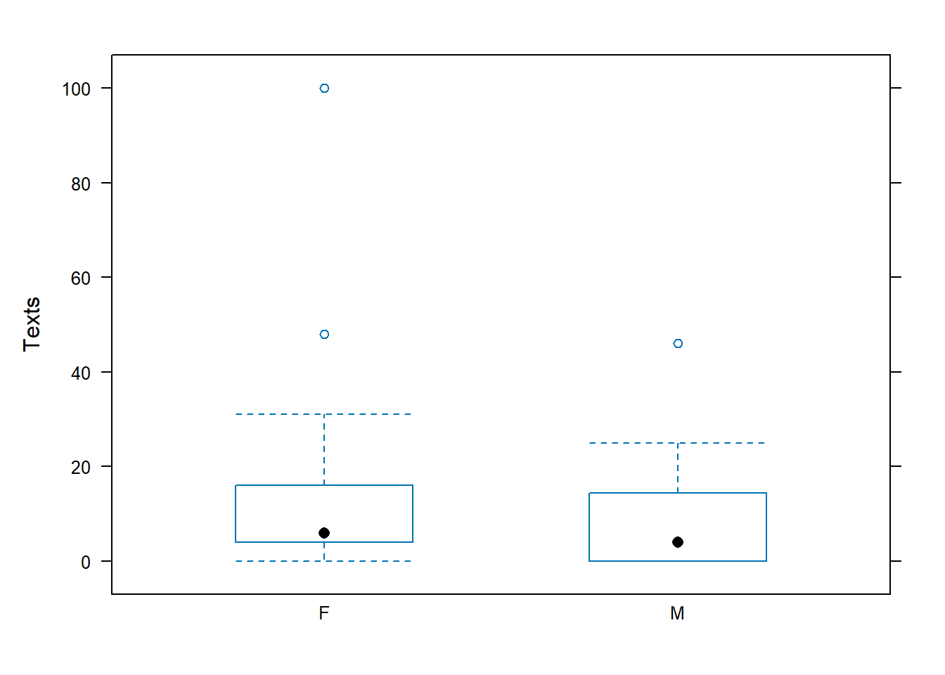
##
## 	Welch Two Sample t-test
##
## data:  Texts by Gender
## t = 1.2121, df = 38.73, p-value = 0.1164
## alternative hypothesis: true difference in means is greater than 0
## 95 percent confidence interval:
##  -2.466853       Inf
## sample estimates:
## mean in group F mean in group M
##           15.32            9.00
grad.school <- read.csv("https://stats.idre.ucla.edu/stat/data/binary.csv")
# note, unlike read.table, header=TRUE is the default for read.csv
head(grad.school)## admit gre gpa rank
## 1 0 380 3.61 3
## 2 1 660 3.67 3
## 3 1 800 4.00 1
## 4 1 640 3.19 4
## 5 0 520 2.93 4
## 6 1 760 3.00 2## 'data.frame': 400 obs. of 4 variables:
## $ admit: int 0 1 1 1 0 1 1 0 1 0 ...
## $ gre : int 380 660 800 640 520 760 560 400 540 700 ...
## $ gpa : num 3.61 3.67 4 3.19 2.93 3 2.98 3.08 3.39 3.92 ...
## $ rank : int 3 3 1 4 4 2 1 2 3 2 ...## admit gre gpa rank
## Min. :0.0000 Min. :220.0 Min. :2.260 Min. :1.000
## 1st Qu.:0.0000 1st Qu.:520.0 1st Qu.:3.130 1st Qu.:2.000
## Median :0.0000 Median :580.0 Median :3.395 Median :2.000
## Mean :0.3175 Mean :587.7 Mean :3.390 Mean :2.485
## 3rd Qu.:1.0000 3rd Qu.:660.0 3rd Qu.:3.670 3rd Qu.:3.000
## Max. :1.0000 Max. :800.0 Max. :4.000 Max. :4.000- EXCEL file
You can save it as .csv rather than .xls or .xlsx, then specify location on your machine when using read.csv. I believe there exist specialized packages for directly importing EXCEL, or go below to see an easier way with the help of R Studio.
# EXCEL file, save in .csv format, stored on machine

class.csv <- read.csv(file="C:/Users/Chris Mecklin/Desktop/MAT135Fall2012/STA135ClassDataFall2017.csv")
head(class.csv)
## Gender Color Texts Chocolate HSAlgebra Pizza Sushi Tacos Temp Height
## 1 F yellow 3 10 8 3 1 2 85 62
## 2 F yellow 5 9 6 1 3 2 87 63
## 3 M orange 21 9 3 3 1 2 88 66
## 4 F yellow 4 9 7 2 3 1 84 61
## 5 M blue 0 7 5 1 3 2 80 74
## 6 F gray 4 10 4 1 2 3 72 65#or, hunt for it locally with file.choose
#uncomment the lines below to do
# class.find <- read.csv(file=file.choose())
# tail(class.find)- Import Data (Enivronment tab in Upper Right hand panel)
In the upper right hand corner in the Environments tab, click on Import Dataset, which will allow you to import in from five different formats: .csv files, EXCEL files, SPSS files, SAS files, and Stata files (the last three are various statistical software packages).
- Google Sheets
Maybe you like to work with a Google Sheet that you have stored on your Google Drive, or you have the link for someone else’s Google Sheet. A package called googlesheets can help.
However, the syntax is very cumbersome and another option would be to save the Google Sheet as a .csv file onto your machine and then import that in as discussed above. (Honestly, this would be my choice)
0.6 Working with Probability Distributions
As always, use the help command to learn about the various distributions available or a specific distribution
In general, functions that begin with d-, such as dbinom and dnorm, evaluate the probability density (or mass) function and are equivalent to such TI functions as binompdf and normalpdf.
For a discrete distribution such as the binomial, this finds the probability that \(X\) is equal to a specific value \(x\). \[f(x)=P(X=x)={n \choose x} p^x (1-p)^{n-x}\] For example, if \(X \sim BIN(n=10,p=0.3)\), find \(P(X=4)\).
## [1] 0.2001209# find and graph the probabilities of all values of X
x <- 0:10
P.x <- dbinom(x=x,size=10,prob=0.3)
plot(P.x~x,type="h",
xlab="Successes",ylab="Probability",main="Binomial, n=10, p=0.3")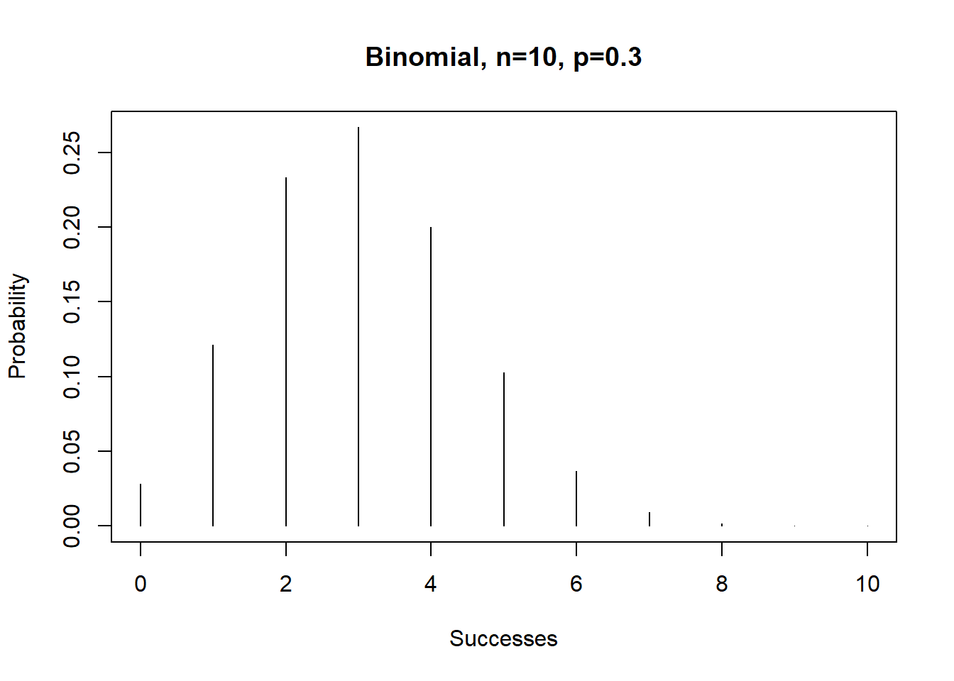
For a continuous distribution such as the normal, this finds the height of the curve \(f(x)\) at a specific value \(x\). \[f(x)=\frac{1}{\sqrt{2\pi\sigma^2}}e^{-(\frac{x-\mu}{\sigma})^2}\] You never needed to know this in a class like STA 135 and is mainly useful for graphing the function.
Suppose we have the normal curve \(X \sim N(\mu=100, \sigma=15)\)
## [1] 0.02129653## Graph the normal curve
x <- seq(50,150,by=0.01)
f.x <- dnorm(x=x,mean=100,sd=15)
plot(f.x~x,type="l",col="blue3",
ylab="f(x)",main="Normal Dist. mu=100,sigma=15")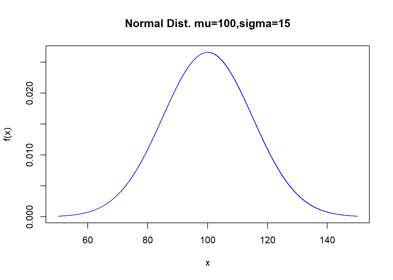
Functions that begin with p-, such as pbinom and pnorm, evaluate the cumulative distribution function, or \(P(X \leq x)\). They are equivalent to such TI functions as binomcdf and normalcdf.
To find the \(P(X \leq 4)\) for the binomial distribution with \(n=10\), \(p=0.3\)
## [1] 0.8497317This avoids us having to repeatedly use the binomial formula and adding the results together.
To find \(P(X \leq 110)\) from the normal curve \(X \sim N(\mu=100,\sigma=15)\)
## [1] 0.7475075This avoids having to either numerically approximate a difficult integral or finding \(z\)-scores and using the standard normal table.
In statistics, we frequently find probabilities involving either the lower tail, upper tail, or both of a distribution, as this will be the \(p\)-value of a hypothesis test.
To find the \(p\)-value of a two-sided \(t\)-test with test statisic \(t=-1.72\) with \(df=15\) (if the alternative was one-sided, don’t multiply by 2)
## [1] 0.1059907To find the \(p\)-value for a chi-square test or a \(F\) test, which unlike the normal and \(t\) distributions only take on positive values and the \(p\)-value will just be the area above the test statistic.
## [1] 0.2738979## [1] 0.03991306Functions that begin with q-, such as qnorm and qt, evaluate the quantile function (i.e. find percentiles) and are equivalent to such TI functions as invNorm and invT. We use these statistics to find critical values that we used to look up in tables, typically as part of a formula for a confidence interval.
##Find the 75th percentile of X~N(100,15)
qnorm(p=0.75,mean=100,sd=15) #same as invNorm(0.75,100,15)
## [1] 110.1173##Find the 2.5th and 97.5th perceniles of X~N(0,1), i.e. critical values for a 95% CI
qnorm(p=0.14) #same as invNorm(0.14)## [1] -1.080319##Find the critical value for a t-test with alpha=0.05, df=20
alpha<-0.05
qt(p=c(alpha/2,1-alpha/2),df=20) #two-sided, divide alpha in half## [1] -2.085963 2.085963## [1] -1.724718## [1] 1.724718##Find the critical value for a F=test with alpha=0.01, df=1,20
alpha<-0.01
qf(p=1-alpha,df1=1,df2=20)## [1] 8.095958Functions that begin with r-, such as rbinom and rnorm, generate random numbers from the appropriate distribution.
require(mosaic)
## Generate 20 random numbers from a normal curve
samp1 <- rnorm(n=20,mean=100,sd=15)
samp1
## [1] 106.87258 94.09079 108.80870 86.18941 96.37385 79.82250 104.22389
## [8] 107.17572 90.06373 104.31413 95.63439 101.61674 92.82288 109.49456
## [15] 103.58920 101.47943 79.61186 96.58949 108.26635 117.37099## min Q1 median Q3 max mean sd n missing
## 79.61186 93.77381 101.5481 106.9484 117.371 99.22056 10.0553 20 0## Repeat an experiment 25 times where you flip a fair coin 100 times
## and count the number of heads
samp2 <- rbinom(n=25,size=100,prob=0.5)
samp2## [1] 53 47 45 50 53 46 50 39 51 53 48 58 45 44 45 53 46 54 50 48 45 36 49 55 52## min Q1 median Q3 max mean sd n missing
## 36 45 49 53 58 48.6 5 25 00.7 Webscraping
This material is to come…