7 Logistic Regression
7.1 Motivation
In the previous chapter, we introduced linear regression techniques, all of which assumed that the response variable, \(Y\), is a numeric, or quantitative, variable. But, what happens if the response variable is a qualitative or categorical variable? In this chapter, we begin to introduce techniques for models that predict a categorical response.
When we make predictions for observations that have a qualitative response, we are said to be classifying those observations. There exists many types of classification techniques. In this chapter, we introduce one of the more basic, but widely used classficiation techniques - the logistic regression.
7.2 Pre-reqs
For this chapter, we will be loading another sample dataset to more easily illustrate the logistic regression concepts.
Imagine you are a healthcare actuary, and you are trying to better understand the factors that lead to heart disease among your insured population. Further, you are trying to use this knowledge to better predict who has heart disease so you can intervene and help improve their health and quality of life. Said another way, you want to be able to predict the likelihood or probability that a person with certain characteristics will have heart disease.
You have been given a sample dataset from the insured population with the following fields and characteristics (note this is just a toy dataset for the purposes of this chapter and not likely to be real data you may use as a health actuary):
- heart_disease - an indicator field corresponding to whether an individual has heart disease (1 = yes, heart disease; 0 = no heart disease)
- coffee_drinker - an indicator field corresponding to whether an individual drinks coffee regularly (1 = yes, coffee drinker; 0 = not a coffee drinker)
- fast_food_spend - a numerical field corresponding to the annual spend of each individual on fast food
- income - a numerical field corresponding to the individual’s annual income
Download this dataset now by clicking the button below and saving to your computer. Then, load this new dataset and call it “heart_data”.
7.3 Logistic Regression
7.3.1 Why not linear regression?
Let’s start to understand heart disease by plotting heart disease, a categorical variable with values of 1 (yes) or 0 (no), against annual fast food spend, a numeric variable.
ggplot(heart_data) +
  geom_point(aes(fast_food_spend, factor(heart_disease)), color = "blue") +
  labs(x = 'Fast Food Spend', y = 'Heart Disease')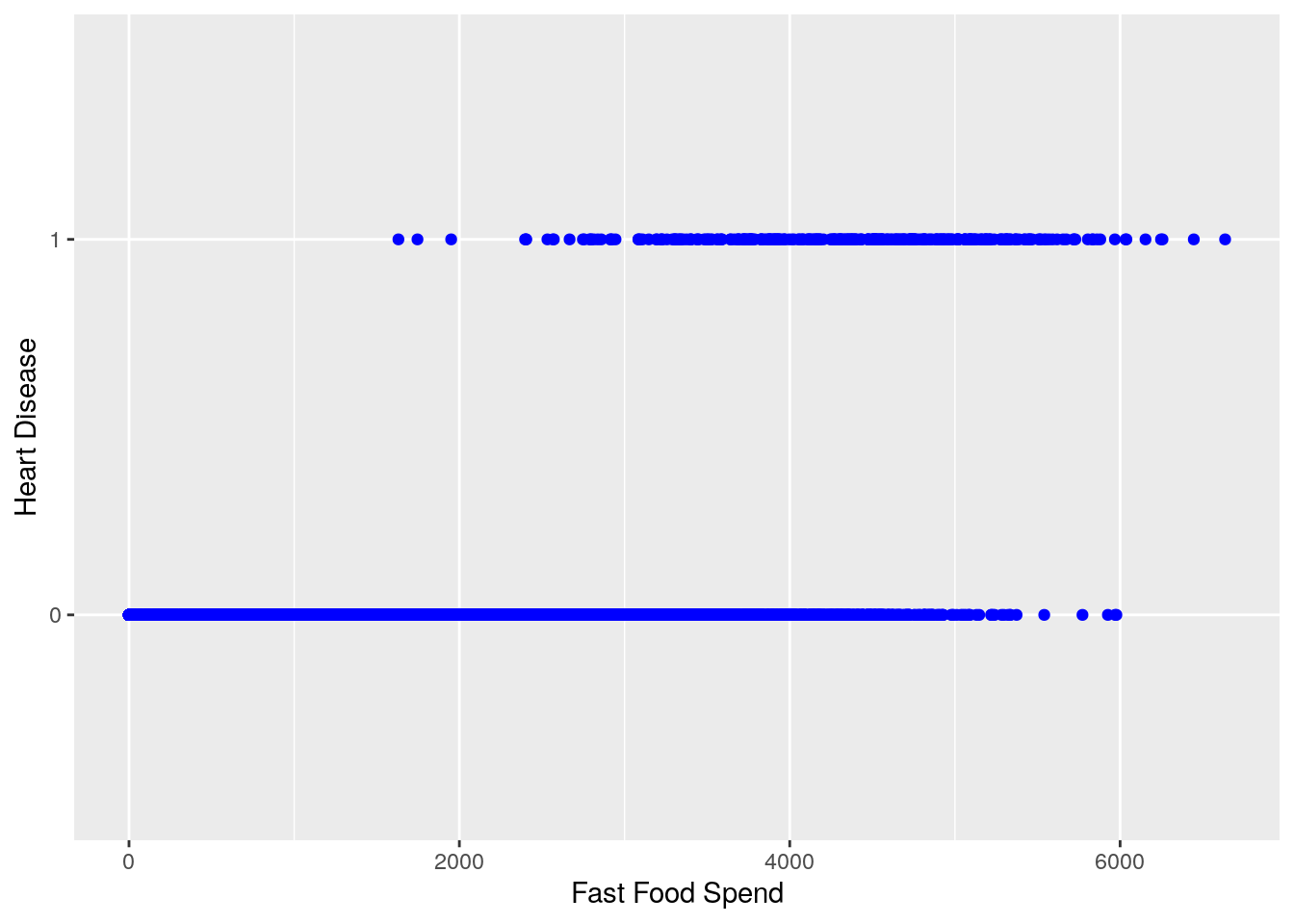
We can see from this chart that generally speaking, it looks as if higher amounts of fast food spending are associated with a higher likelihood of heart disease (heart disease value of ‘1’)
We could technically use linear regression to answer the question, “How much more likely is it that an individual has heart disease as fast food spending increases?”
lin_reg_model <- lm(heart_disease ~ fast_food_spend, data = heart_data)
summary(lin_reg_model)
#>
#> Call:
#> lm(formula = heart_disease ~ fast_food_spend, data = heart_data)
#>
#> Residuals:
#>      Min       1Q   Median       3Q      Max
#> -0.23533 -0.06939 -0.02628  0.02004  0.99046
#>
#> Coefficients:
#>                   Estimate Std. Error t value Pr(>|t|)
#> (Intercept)     -7.519e-02  3.354e-03  -22.42   <2e-16 ***
#> fast_food_spend  5.195e-05  1.390e-06   37.37   <2e-16 ***
#> ---
#> Signif. codes:
#> 0 '***' 0.001 '**' 0.01 '*' 0.05 '.' 0.1 ' ' 1
#>
#> Residual standard error: 0.1681 on 9998 degrees of freedom
#> Multiple R-squared:  0.1226, Adjusted R-squared:  0.1225
#> F-statistic:  1397 on 1 and 9998 DF,  p-value: < 2.2e-16
ggplot(heart_data) +
  geom_point(aes(fast_food_spend, heart_disease), color = "blue") +
  geom_abline(slope = coef(lin_reg_model)[2], intercept = coef(lin_reg_model)[1], color = "red") +
  labs(x = '', y = '')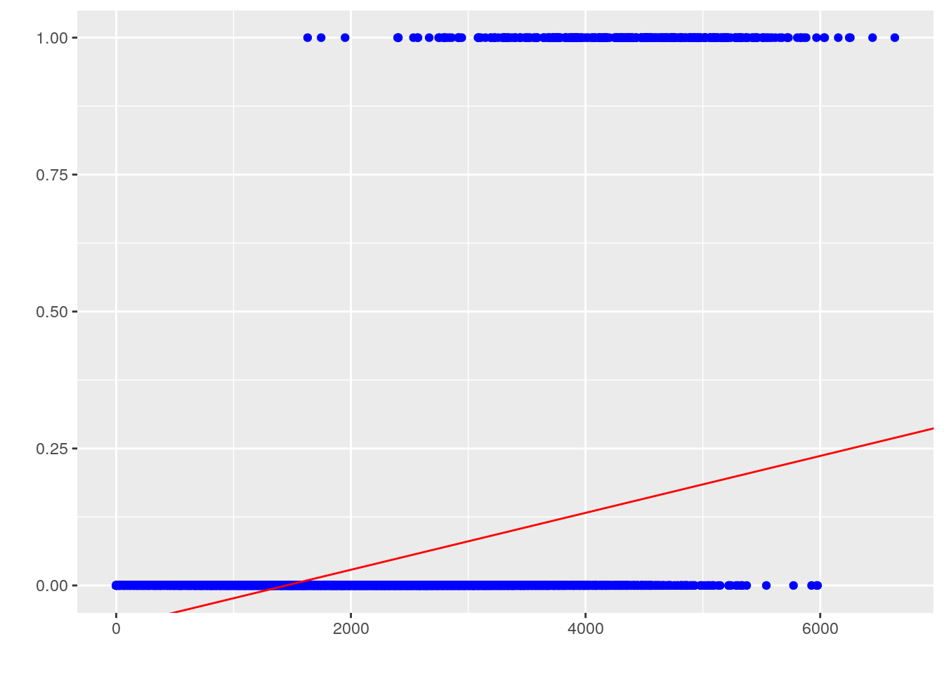
However, this approach is undesirable for a few reasons. First, we know that the response \(y\) is categorical, not numeric, so the interpretation of the regression coefficients is strange to say the least: what does it mean when the prediction is less than 0 or greater than 1? If the predictor is supposed to represent likelihood, or probability of having heart disease for a given observation of fast food spending, it should be constrained on \([0, 1]\). Second, this is not extensible to multi-class problems that have more than 2 possible categorical response values. Finally, our diagnostic plots don’t look good at all:
plot(lin_reg_model, which = 1)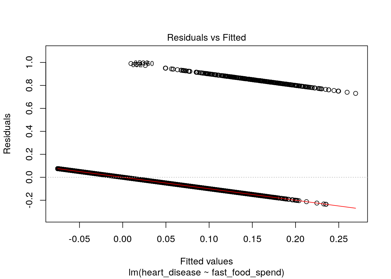
plot(lin_reg_model, which = 2)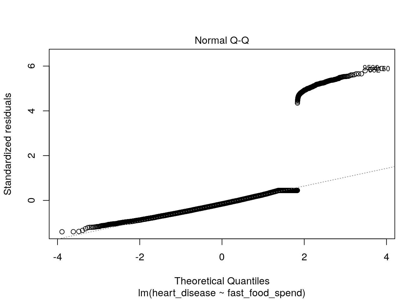
7.3.2 Conceptual framework
Fortunately, there is a model that solves all of these issues above: logistic regression. It is so named because of the trick it uses to convert the linear regression model, relating predictor variables to a numeric variable on \([-\infty, \infty]\), to a model relating predictor variables to probabilities on \([0, 1]\), namely, the logistic function.
The logistic function is given by:
- Formula 1: \(p(X)=\frac{e^{\beta_0 + B_1X_1 + ... + B_pX_p}}{1+e^{\beta_0 + B_1X_1 + ... + B_pX_p}}\)
where \(p(X)\) is short for \(p(Y = 1 | X)\).
In other words, \(p(X)\) is the probability that \(Y\) is equal to 1, given the values of \(p\) predictors. It is easy to see that this function approaches \(0\) as \(X\) approaches \(-\infty\) and \(1\) as \(X\) approaches \(\infty\), which is perfect for modeling probabilities.
With a little manipulation, we get the following two additional results:
- Formula 2: \(\frac{p(X)}{1-p(X)}=e^{\beta_0 + B_1X_1 + ... + B_pX_p}\)
- Formula 3: \(\ln\frac{p(X)}{1-p(X)}=\beta_0 + B_1X_1 + ... + B_pX_p\)
In formula 2, the quantity of \(\frac{p(x)}{1 - p(x)}\) is called the odds and can take on any value between 0 and \(\infty\). Values of the odds close to 0 indicate low probabilities and values closer to \(\infty\) would indicate high probability. For example, an odds of \(\frac{1}{4}\) would be equal to a probability of 0.20 (\(\frac{0.20}{1-0.20}\)).
If we then take the logarithm of both sides, we end up with formula 3, which is known as the log odds or logit. We now see we have a function that is linear in the coefficients that yields a predicted probability, which is exactly what we need for classification problems.
The final piece of the puzzle is an extension of linear models called generalized linear models or GLMs. This is a class of models capable of accommodating response variables in any member of the linear exponential family of probability distributions, which includes the normal and Bernoulli. GLMs add a link function \(g\) to the model form such that:
- \(E(y|X)=g^{-1}(\beta X)\)
In our case of logistic regression, we can see that the link function is the log odds, or \(\ln\frac{p(X)}{1-p(X)}\).
7.3.3 Interpreting Coefficients
In a second, we’ll show an example of how to fit a logistic regression model on our heart disease data. When R fits a logistic regression model, it estimates the regression coefficients (\(B_0, B_1, ..., B_p\)) based on a maximum likelihood approach. For the purposes of this module, we will not go into the details of maximum likelihood estimation - R will do all the hard work for us. However, it is important to understand what the coefficients mean and how to interpret them.
In the prior chapter on linear regression, we discussed that the coefficient \(B_j\) corresponded to the average change in response \(Y\) for a one-unit increase in predictor \(X_j\), holding all other variables fixed.
In the case of logistic regression, increasing \(X_j\) by one unit changes the log odds by \(B_j\) (see formula 3 above). This is equivalent to multiplying the odds by \(e^{B_j}\). It is important to note that you would not interpret \(B_j\) to be equal to the change in the probability of Y equaling 1 given X, \(p(X)\), associated with a one-unit increase in \(X_j\). Rather, it is the odds that directly correspond to the \(B_j\) coefficient. However, if \(B_j\) is positive, that does mean that increasing \(X_j\) will result in an increase in the probability.
7.4 Example
We’ll now go through a comprehensive example of fitting a logistic regression model using our heart disease data. In this example, we’ll use logistic regression to complete two tasks:
- Understand how drinking coffee, eating fast food, and annual income are related to the likelihood of heart disease
- Be able to predict the probability of heart disease, given observations of coffee drinking, fast food spending, and annual income
7.4.1 Examine the data
First, let’s make some plots to get a feel for what we think the association between each predictor and heart disease might be:
heart_data %>%
  dplyr::mutate(heart_disease = ifelse(heart_disease == 1, "Yes", "No")) %>%
  ggplot(aes(x = heart_disease, y = fast_food_spend, fill = heart_disease)) +
  geom_boxplot() +
  xlab("Heart Disease (Y/N)") +
  ylab("Annual Fast Food Spend") +
  ggtitle("Figure 1: Food Spend and Heart Disease")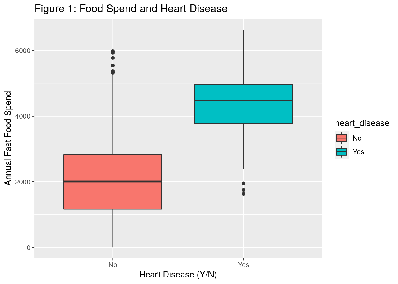
heart_data %>%
  dplyr::mutate(heart_disease = ifelse(heart_disease == 1, "Yes", "No")) %>%
  ggplot(aes(x = heart_disease, y = income, fill = heart_disease)) +
  geom_boxplot() +
  xlab("Heart Disease (Y/N)") +
  ylab("Income") +
  ggtitle("Figure 2: Income and Heart Disease")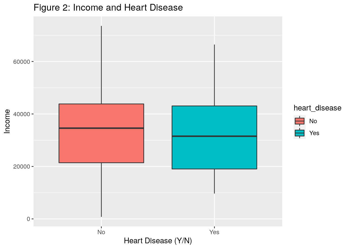
heart_data %>%
  dplyr::mutate(heart_disease = ifelse(heart_disease == 1, "Yes", "No"),
                coffee_drinker = ifelse(coffee_drinker == 1, "Yes", "No")) %>%
  dplyr::group_by(heart_disease, coffee_drinker) %>%
  dplyr::summarise(count = n()) %>%
  ungroup() %>%
  dplyr::group_by(coffee_drinker) %>%
  dplyr::mutate(total_coffee_drinkers = sum(count)) %>%
  ungroup() %>%
  dplyr::mutate(proportion = count / total_coffee_drinkers) %>%
  dplyr::filter(heart_disease == "Yes") %>%
  ggplot(aes(x = coffee_drinker, y = proportion, fill = coffee_drinker)) +
  geom_bar(stat = "identity") +
  theme_minimal() +
  ylab("Percent with Heart Disease") +
  xlab("Coffee Drinker (Y/N)") +
  ggtitle("Figure 3: Percent of Coffee Drinkers with Heart Disease") +
  labs(fill = "Coffee Drinker") +
  scale_y_continuous(labels = scales::percent)
#> `summarise()` has grouped output by 'heart_disease'. You can override using the `.groups` argument.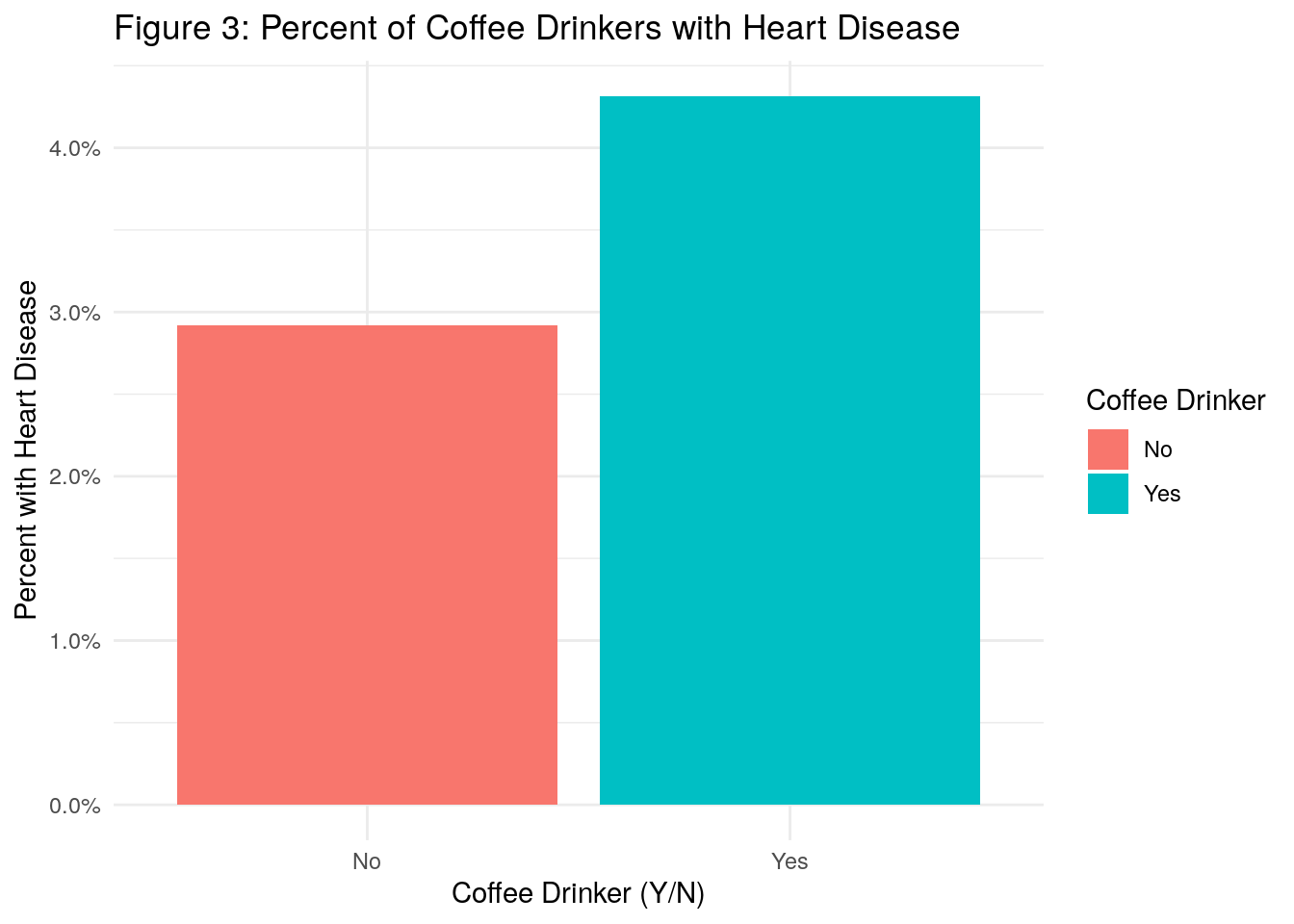
What do we observe?
- In Figure 1, the boxplots appear to indicate that individuals who spend more money annually on fast food tend to have more heart disease
- In Figure 2, it doesn’t appear that income plays much of a role in heart disease
- In Figure 3, we see that there is a higher percentage of coffee drinkers with heart disease as compared to non coffee drinkers
7.4.2 Fit a model
Fitting a logistic regression model is R is very similar to linear regression, but instead of using the lm() function, we use the glm() function for generalized linear models.
In addition to the formula and data arguments, however, the glm() function requires the family argument, which is where we tell it which distribution and link function to use.
Using the family=binomial argument tells R that we want to run a logistic regression, instead of some other type of GLM.
log_reg <- glm(
  formula = factor(heart_disease) ~ factor(coffee_drinker) + fast_food_spend + income,
  data = heart_data,
  family = binomial(link = 'logit')
)
summary(log_reg)
#>
#> Call:
#> glm(formula = factor(heart_disease) ~ factor(coffee_drinker) +
#>     fast_food_spend + income, family = binomial(link = "logit"),
#>     data = heart_data)
#>
#> Deviance Residuals:
#>     Min       1Q   Median       3Q      Max
#> -2.4691  -0.1418  -0.0557  -0.0203   3.7383
#>
#> Coefficients:
#>                           Estimate Std. Error z value
#> (Intercept)             -1.087e+01  4.923e-01 -22.080
#> factor(coffee_drinker)1 -6.468e-01  2.363e-01  -2.738
#> fast_food_spend          2.295e-03  9.276e-05  24.738
#> income                   3.033e-06  8.203e-06   0.370
#>                         Pr(>|z|)
#> (Intercept)              < 2e-16 ***
#> factor(coffee_drinker)1  0.00619 **
#> fast_food_spend          < 2e-16 ***
#> income                   0.71152
#> ---
#> Signif. codes:
#> 0 '***' 0.001 '**' 0.01 '*' 0.05 '.' 0.1 ' ' 1
#>
#> (Dispersion parameter for binomial family taken to be 1)
#>
#>     Null deviance: 2920.6  on 9999  degrees of freedom
#> Residual deviance: 1571.5  on 9996  degrees of freedom
#> AIC: 1579.5
#>
#> Number of Fisher Scoring iterations: 8
This output contains a little less info than the linear model case. The distribution of the deviance residuals is not as important here and there is no R-squared because it is not defined for logistic regression. We still have coefficient estimates and associated p-values. The coefficient estimates, as noted above, correspond to the change in the log odds for a one-unit increase in the predictor. The p-values are interpreted in a similar way to the linear regression setting - essentially small p-values indicate that we reject the null hypothesis that the response variable does not depend on the predictor. Or said another way, we can conclude that there is an association between the predictor and the response variable.
Let’s look further at interpreting the coefficients:
- Intercept: the estimated intercept is typically not of interest
- Coffee Drinker: Coffee drinking has an estimated coefficient of -0.6468 which means that the coffee drinking is associated with a decrease in the odds that a person has heart disease. Specifically, it decreases the odds of heart disease (relative to non-coffee drinkers) by a multiplicative factor of \(e^{-0.6468}\), or 0.52, holding all other predictors fixed. Therefore, coffee drinking is also associated with a decrease in the probability of having heart disease. This association appears to be significant.
- Fast Food Spend: A one-unit increase in fast food spend is associated with a 0.002295 increase in the log odds of having heart disease. This association appears to be heavily significant.
- Income: Based on a p-value of 0.71, we conclude that income is not significantly associated with heart disease.
Let’s return briefly to the coffee drinking coefficient. Our model told us that coffee drinking is associated with a decrease in the likelihood of having heart disease. However, our plot above showed that there was a higher proportion of coffee drinkers with heart disease as compared to non coffee drinkers. How can that be?
It’s because coffee drinking and fast food spend are correlated and so on it’s own, it would appear as if coffee drinking were associated with heart disease, but this is only because coffee drinking is also associated with fast food spend, which our model tells us is the real contributor to heart disease.
7.4.3 Making predictions
Let’s now discuss how to make predictions using our logistic model. First, let’s see what a manual calculation would look like. Let’s say an individual person is a coffee drinker, spends 5,000 per year on fast food, and has an annual income of 60,000. What would you predict as their probabilty of having heart disease based on the model?
If we follow Formula 1 from above, we get the following result:
- \(p(X)=\frac{e^{-10.87-.6468 + .002295*5000 + .000003033*60000}}{1+e^{-10.87-.6468 + .002295*5000 + .000003033*60000}}\) = 0.535
Now, let’s check our result using R’s predict() function.
The type="response" option tells R to output the probabilities in the form \(P(Y = 1|X)\)
test_obs <- data.frame(
  coffee_drinker = 1,
  fast_food_spend = 5000,
  income = 60000
)

predict(log_reg, type = "response", test_obs)
#>        1
#> 0.534743
We can also use the predict() function on our heart_data to come up with predicted probabilities of having heart disease for each of our individuals in the training dataset:
pred_probs <- predict(log_reg, type = "response")
head(round(pred_probs, 3), n = 10) # Print first 10 probabilities
#>     1     2     3     4     5     6     7     8     9    10
#> 0.001 0.001 0.010 0.000 0.002 0.002 0.002 0.001 0.016 0.000
There is one final element we need: we have predicted probabilities, but we need to convert those into classifications. In other words, once you have a predicted probability, how do you decide to bucket that probability as a “1” (heart disease) or a “0” (no heart disease).
You might consider bucketing anyone with a predicted probability greater than 0.50 as a “1”, and anyone with a predicted probability less than 0.50 as a “0”. In this case, we would say that the prediction threshold is equal to 0.50. However, it’s not always this simple as we’ll see in the example below.
7.4.4 Evaluating Models and the Confusion Matrix
7.4.4.1 Accuracy
The accuracy of the model is defined as the total number of correct predictions made, divided by the total number of records. Let’s calculate the accuracy of a model with a couple different prediction threshold values:
thresh_1 <-  0.01
thresh_2 <- 0.25
thresh_3 <- 0.50
thresh_4 <- 1.00

accuracy_1 <- sum(ifelse(pred_probs > thresh_1, 1, 0) == heart_data$heart_disease) / nrow(heart_data)
accuracy_2 <- sum(ifelse(pred_probs > thresh_2, 1, 0) == heart_data$heart_disease) / nrow(heart_data)
accuracy_3 <- sum(ifelse(pred_probs > thresh_3, 1, 0) == heart_data$heart_disease) / nrow(heart_data)
accuracy_4 <- sum(ifelse(pred_probs > thresh_4, 1, 0) == heart_data$heart_disease) / nrow(heart_data)

accuracy_1
#> [1] 0.7484
accuracy_2
#> [1] 0.9661
accuracy_3
#> [1] 0.9732
accuracy_4
#> [1] 0.9667
In general, all else equal you would like your accuracy to be higher than lower, but what do you notice about the above thresholds? In the fourth scenario, we set the threshold equal to 1.00. This means that we will predict a person has heart disease if the predicted probability from the model for that person is greater than 1.00, which is impossible.
In other words, we will never predict someone to have heart disease, yet our accuracy is still 96.7%. So would you call this a good classification model? No!
Because our dataset is imbalanced (meaning only a small percentage of people have heart disease - about 3.3%), then we can get high accuracy by never predicting anyone to have heart disease. Therefore, accuracy in this case would not be a sufficient metric to assess our classification model.
7.4.4.2 Confusion Matrix
The image below depicts what is known as the confusion matrix. This matrix can help us better assess our classification model instead of just looking at prediction accuracy.
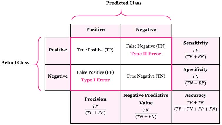
The confusion matrix breaks down our classification model into True Positives, True Negatives, False Positives, and False Negatives.
The sensitivity of a classification model is defined as the proportion of true positives. In other words, it is the number of true positives divided by the number of actual positives. You can think of sensitivity as the ability of a classification model to correctly identify positive cases.
The specificty of a classification model is defined as the proportion of true negatives. It is the probability of a negative prediction, conditioned on the actual result being negative. You can think of specificity as the ability of a classification model to correctly identify negative cases.
Let’s calculate the confusion matrix for two prediction thresholds of 0.01 and 0.25 and compare the results:
# --- 0.01 Threshold ---
data.frame(
  actual = heart_data$heart_disease,
  predicted = ifelse(pred_probs > thresh_1, 1, 0)
) %>% table()
#>       predicted
#> actual    0    1
#>      0 7163 2504
#>      1   12  321

# Sensitivity
321 / (321 + 12)
#> [1] 0.963964

# Specificity
7163 / (7163 + 2504)
#> [1] 0.7409744

# --- 0.25 Threshold ---
data.frame(
  actual = heart_data$heart_disease,
  predicted = ifelse(pred_probs > thresh_2, 1, 0)
) %>% table()
#>       predicted
#> actual    0    1
#>      0 9477  190
#>      1  149  184

# Sensitivity
184 / (184 + 149)
#> [1] 0.5525526

# Specificity
9477 / (9477 + 190)
#> [1] 0.9803455
If we examine the results of the confusion matrices above, and the corresponding sensitivity and specificity statistics, what can we conclude? We can conclude that:
- A threshold value of 0.01 will correctly identify nearly all heart disease cases (sensitivity of 0.96). However, it will often predict someone has heart disease when they actually don’t (high number of false positives).
- A threshold value of 0.25 will often miss when identifying individuals who actually have heart disease, but will rarely incorrectly identify someone as having heart disease who actually doesn’t.
So when we think about our example, what do you think is a better threshold value? Well, it depends. If the goal is to correctly identify individuals with heart disease such that we can intervene to change their lifestyle and health, then you may consider the threshold of 0.01 because you’ll correctly identify more people who actually have heart disease. However, you’d have to balance that against the tradeoff of raising a false alarm and causing unnecessary stress for a lot of individuals, not to mention the financial cost to the insurer of reaching out to and testing all of these individuals who don’t actually have heart disease.
Another way of thinking about it is asking yourself, “what’s the bigger mistake?” Is it worse to tell people they may have heart disease and then they get tested only to find out they don’t actually have heart disease? This causes temporary stress and abrasion for members and costs the insurance company money. Or, is it worse to miss people who actually do have heart disease and so they don’t get tested and treated appropriately? If the latter is the “bigger mistake”, then you would want to opt with the threshold value of 0.01 to be more conservative in your identification.
7.4.4.3 ROC curve and AUC
Finally, we can also visualize and quantify a classification model’s predictive power without specifying a threshold beforehand. Plotting the sensitivity against false positive rate of the model at arbitrarily many thresholds yields the receiver-operating characteristic curve, or ROC curve. The area under this curve, or AUC, is a widely-used metric for comparing classification models.
obj <- roc.curve(pred_probs, weights.class0 = heart_data$heart_disease, curve = T)

plot(obj, color = F)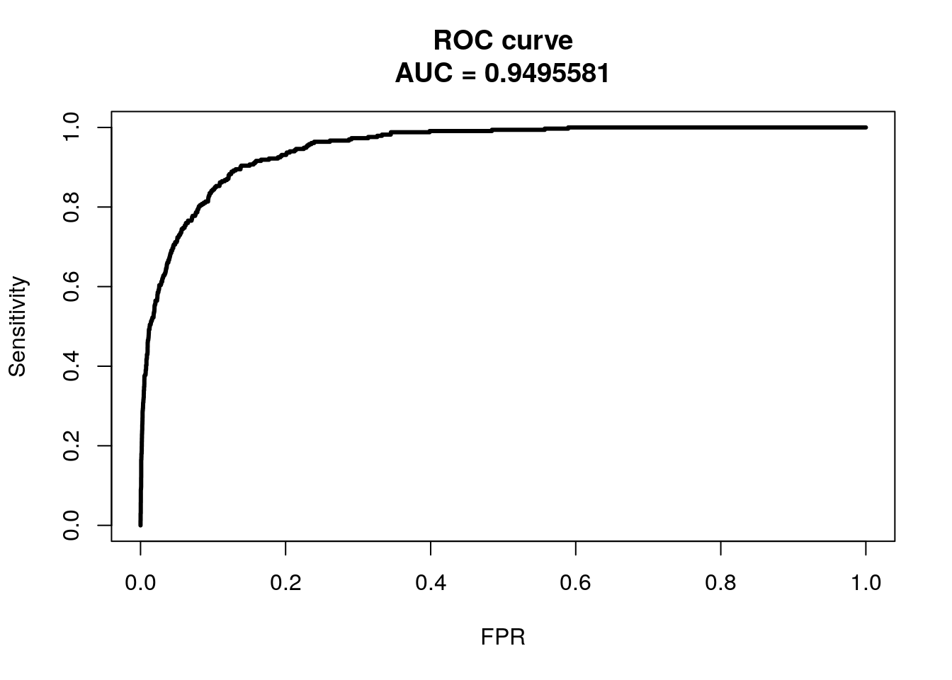
We won’t get into ROC and AUC much, but the ideal ROC curve will hug the top left corner and the AUC will be close to 1. Classifiers that perform no better than random chance would have an AUC of 0.50. If you are interested in learning further about ROC and AUC, see this link.