5 Data Visualization Basics
5.1 Motivation
Now that we have learned the basics of data manipulation and how to summarize data in R, we will continue to learn how to understand and explore our data through visualization. As a future actuary or analytic professional, you will need to be able to understand your data, as well as communicate your data. Data visualization techniques are a great way to accomplish both. Not only can they help you discover patterns in your data that you may not have uncovered looking at tabular data, but they will also allow you to simply and effectively communicate your data, often to non-technical audiences.
R is well known for being capable of producing an amazing variety of visualizations. There are entire books on data visualization in R, ranging from quick one-line-code plots, to extremely complex custom visualizations with many layers. In this chapter, we will introduce you to some of the basics of plotting in R, but remember that there are seemingly infinite ways to visualize your data and customize your charts, so you are only bound by your own creativity and willingness to learn.
At the conclusion of this chapter, you will get the opportunity to apply what you have learned so far in the module through a homework assignment.
5.1.1 Prereqs:
In this chapter, we will cover the very basics of creating plots in R, using another package from the tidyverse called ggplot2.
You will need to also load the MEPS data used in the prior chapters.
Going forward, we will manually change a number of variables in the raw MEPS data when we load it into R, so please be sure to copy the code below exactly and run it yourself each time you load the MEPS data. Do make sure to change the example file path below to the location where you saved the downloaded MEPS file.
library(tidyverse)

meps <- readr::read_csv(file = "C:/Users/my_username/Desktop/Data/MEPS.csv",
                                  col_types = cols(
                                  DUPERSID = col_character(),
                                  PANEL = col_character())) %>%
  dplyr::mutate(
    ADFLST42 = case_when(
      ADFLST42 == 1 ~ "YES",
      ADFLST42 == 2 ~ "NO",
      T ~ "INVALID"
    ),
    SEX = case_when(
      SEX == 1 ~ "MALE",
      SEX == 2 ~ "FEMALE",
      T ~ "INVALID"
    ),
    RACETHX = case_when(
      RACETHX == 1 ~ "HISPANIC",
      RACETHX == 2 ~ "WHITE ONLY",
      RACETHX == 3 ~ "BLACK ONLY",
      RACETHX == 4 ~ "ASIAN ONLY",
      RACETHX == 5 ~ "OTHER OR MULTIPLE",
      T ~ "INVALID"
    ),
    INSCOV18 = case_when(
      INSCOV18 == 1 ~ "ANY PRIVATE",
      INSCOV18 == 2 ~ "PUBLIC ONLY",
      INSCOV18 == 3 ~ "UNINSURED",
      T ~ "INVALID"
    ),
    AFRDCA42 = case_when(
      AFRDCA42 == 1 ~ "YES",
      AFRDCA42 == 2 ~ "NO",
      T ~ "INVALID"
    ),
    MNHLTH42 = case_when(
      MNHLTH42 == 1 ~ "EXCELLENT",
      MNHLTH42 == 2 ~ "VERY GOOD",
      MNHLTH42 == 3 ~ "GOOD",
      MNHLTH42 == 4 ~ "FAIR",
      MNHLTH42 == 5 ~ "POOR",
      T ~ "INVALID"
    ),
    POVCAT18 = case_when(
      POVCAT18 == 1 ~ "POOR/NEGATIVE",
      POVCAT18 == 2 ~ "NEAR POOR",
      POVCAT18 == 3 ~ "LOW INCOME",
      POVCAT18 == 4 ~ "MIDDLE INCOME",
      POVCAT18 == 5 ~ "HIGH INCOME",
      T ~ "INVALID"
    ),
    RTHLTH42 = case_when(
      RTHLTH42 == 1 ~ "EXCELLENT",
      RTHLTH42 == 2 ~ "VERY GOOD",
      RTHLTH42 == 3 ~ "GOOD",
      RTHLTH42 == 4 ~ "FAIR",
      RTHLTH42 == 5 ~ "POOR",
      T ~ "INVALID"
    ),
    HAVEUS42 = case_when(
      HAVEUS42 == 1 ~ "YES",
      HAVEUS42 == 2 ~ "NO",
      T ~ "INVALID"
    ),
    REGION42 = case_when(
      REGION42 == 1 ~ "NORTHEAST",
      REGION42 == 2 ~ "MIDWEST",
      REGION42 == 3 ~ "SOUTH",
      REGION42 == 4 ~ "WEST",
      T ~ "INVALID"
    ),
    HIBPDX = case_when(
      HIBPDX == 1 ~ "YES",
      HIBPDX == 2 ~ "NO",
      T ~ "INVALID"
    ),
    DIABDX_M18 = case_when(
      DIABDX_M18 == 1 ~ "YES",
      DIABDX_M18 == 2 ~ "NO",
      T ~ "INVALID"
    ),
    ADRNK542 = case_when(
      ADRNK542 == 1 ~ "YES",
      ADRNK542 == 2 ~ "NO",
      T ~ "INVALID"
    )
  )
5.2 Example Plots
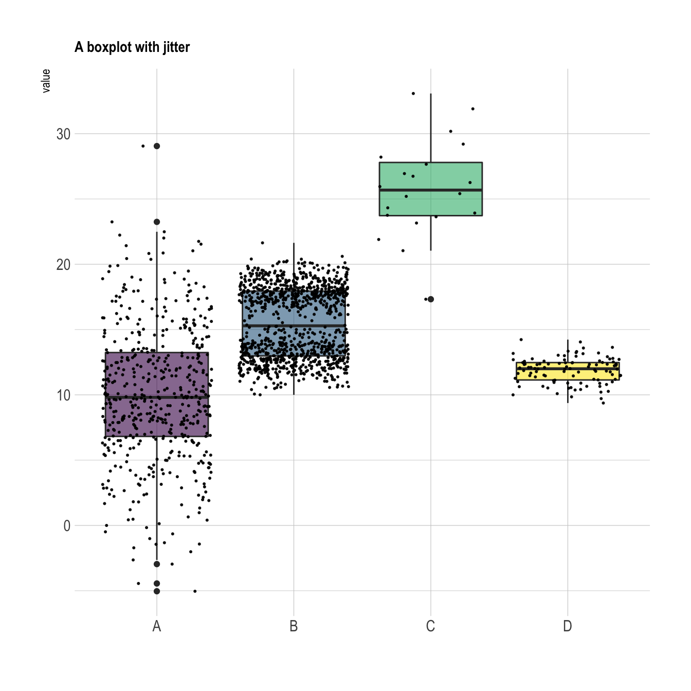
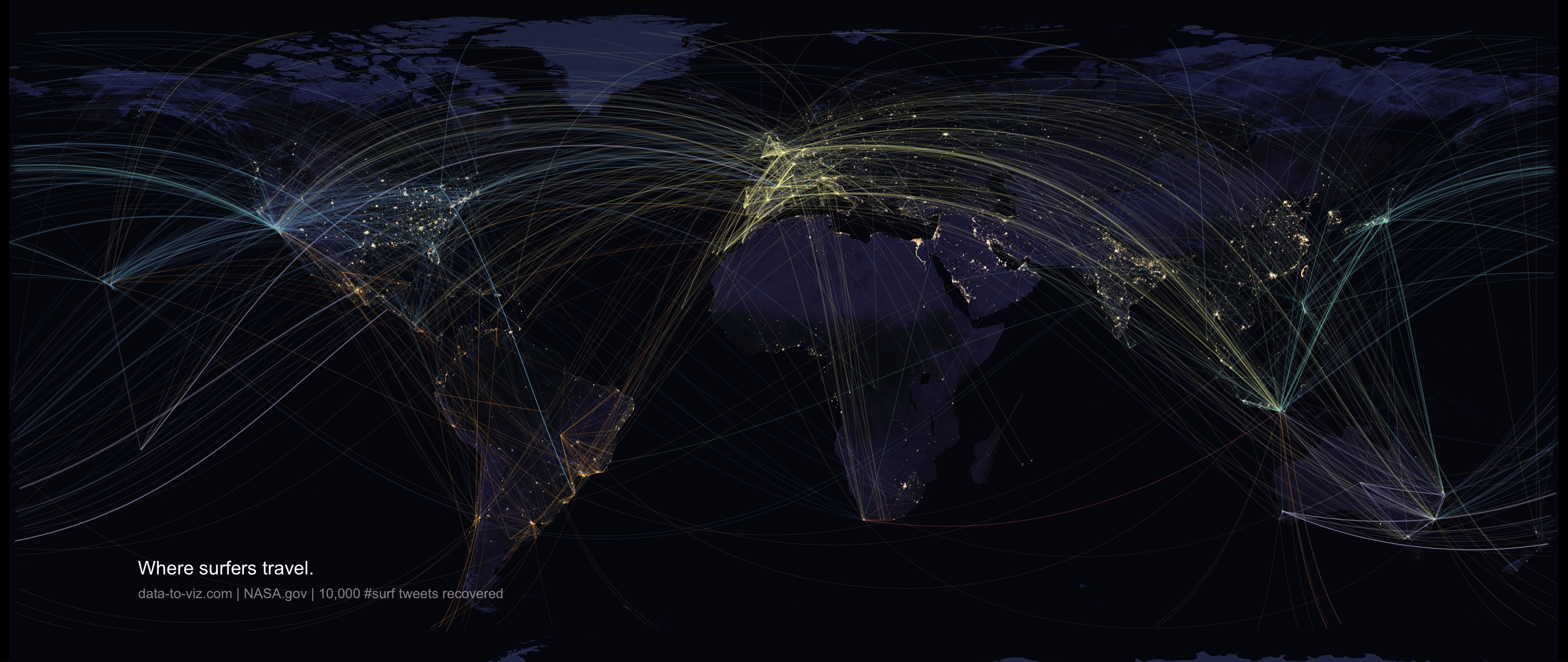
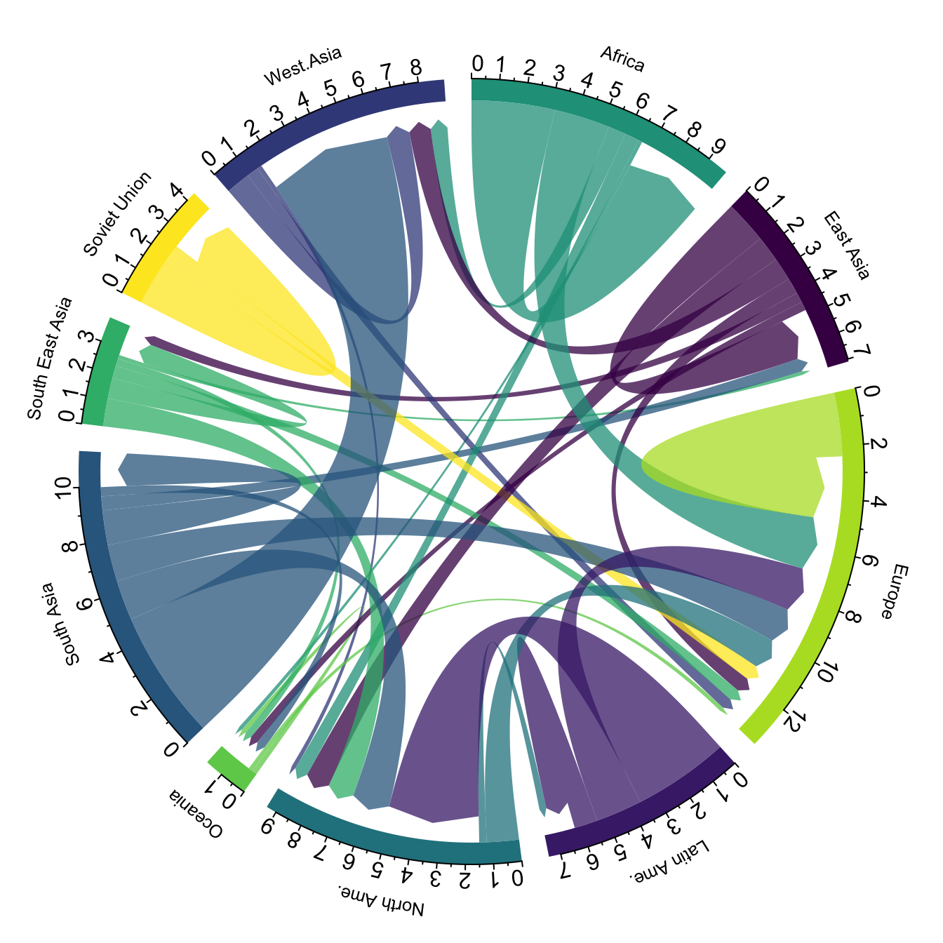
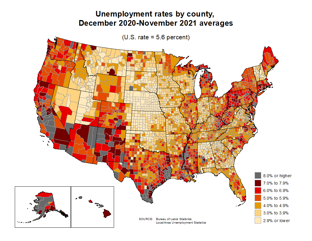
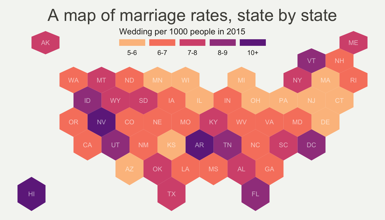
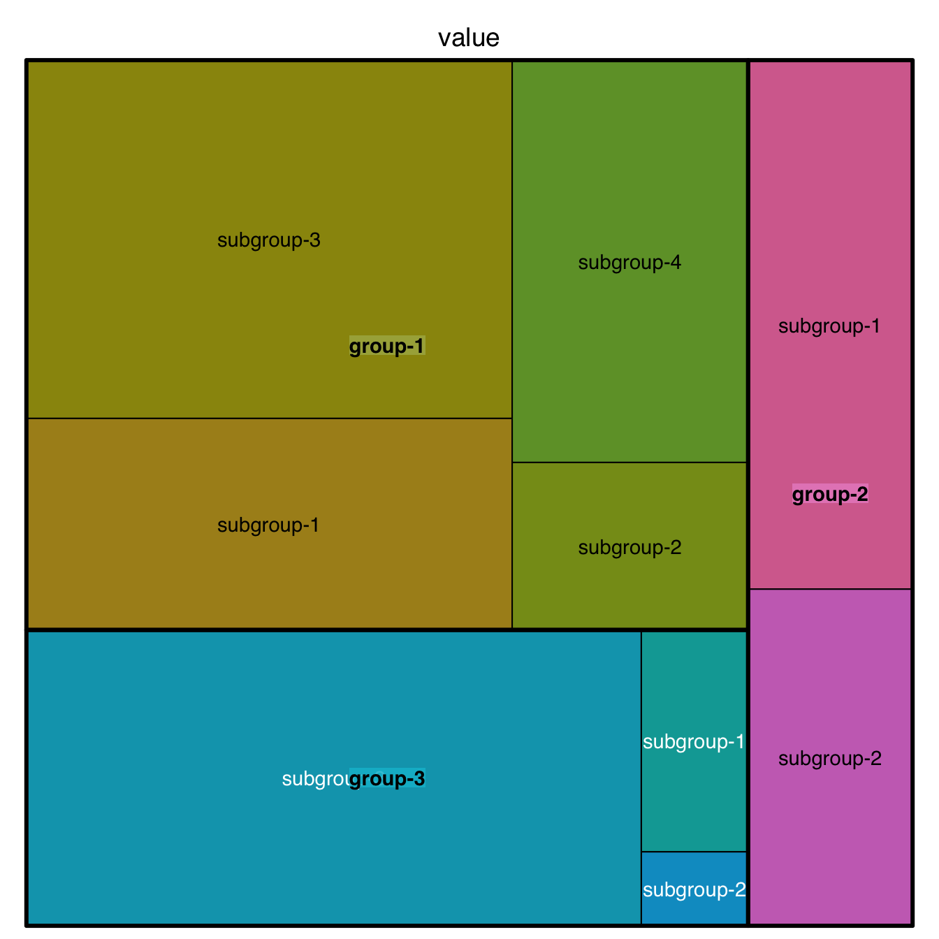
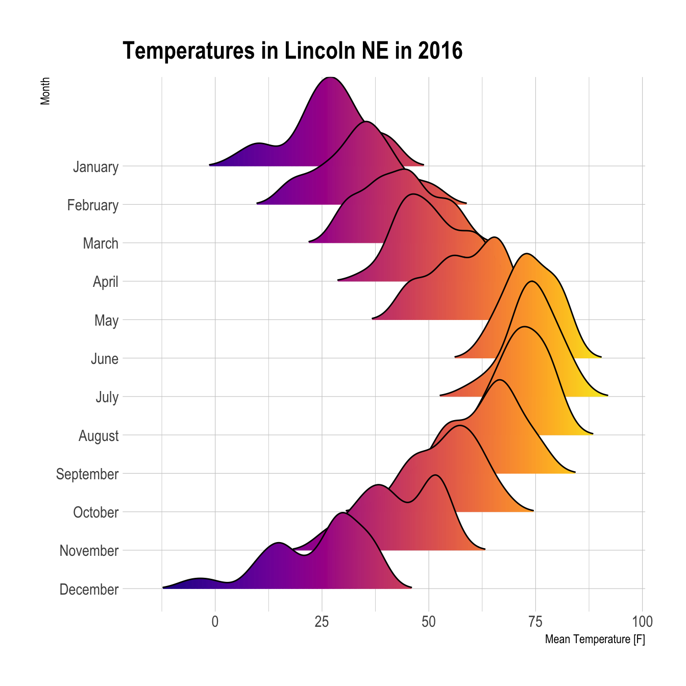
When learning to visualize data in R, it’s important to get a sense of what’s possible. Take a few minutes to scroll through the gallery of example charts below that have all been created using R. While R can certainly produce all of the most widely used charts (bar charts, scatterplots, pie charts, line charts, etc.) the below examples give you an idea of the degree of customization and complexity that is available to you in R. Many of these charts have been taken from example posts on the R Graph Gallery website. Feel free to explore further on their site.

5.3 Learning the Basics
In this section, we will practice plotting three basic types of charts:
- Histogram: is used to visualize the distribution of numerical data
- Scatterplot: is used to visualize how two variables relate in a set of data
- Boxplot: is used to visualize the distribution of numerical data based on their quartiles
5.3.1 A Note on Coding Visualizations
Before we get into learning the code, it is important to understand that the goal is not to memorize any of the code below, but rather to understand the basic constructs of visualizing data in R. Most important is understanding which types of charts are suitable for which situations. In practice, you will not have the code for any of these charts memorized. Instead, you will first devise a plan for how you want to communicate your data graphically, and then will utilize Google or websites like the R Graph Gallery above to figure out how to code it for your use case.
5.3.2 Histogram
Using our MEPS data, let’s try to visualize the distribution of the individual claims cost for each person.
One approach to do so would be using a histogram.
In this example, we’ll use the qplot() function from the ggplot2 package.
The qplot() function is basically a short-hand function used to quickly create simple plots without much customization.
Later in the chapter, we’ll be introduced to more comprehensive ways to use the ggplot2 package.
ggplot2::qplot(x = TOTEXP18,
               data = meps,
               xlab = "Medical Expenditure Distribution",
               ylab = "Person Count",
               main = "Distribution of Individual's 2018 Total Medical Expenditures")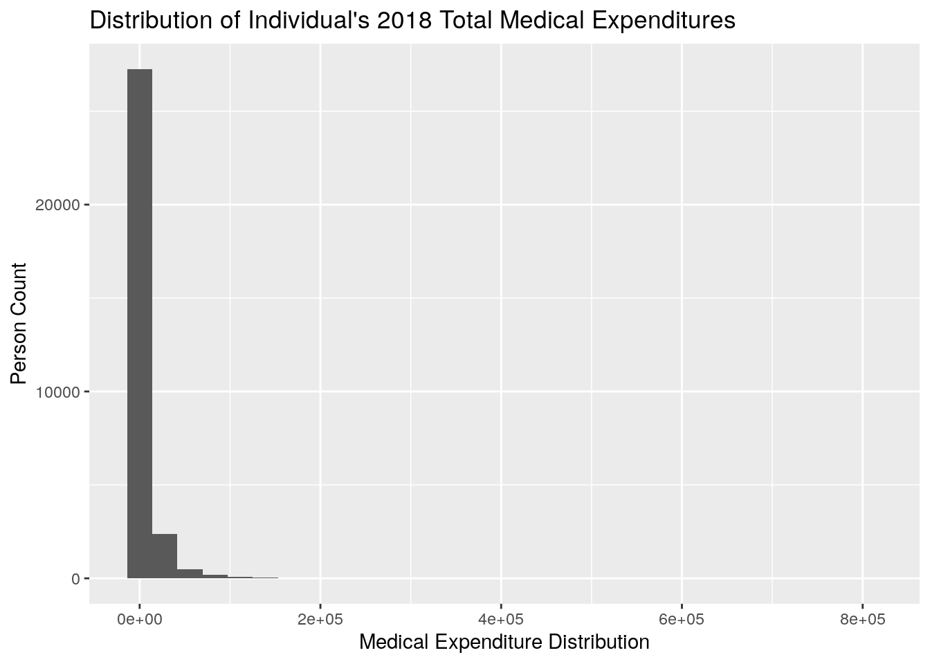
Let’s go over some of the basics of the code:
- We specify that we want to plot
TOTEXPas the x-axis variable by usingx = TOTEXP18 - We specify the dataframe in which this data comes from by using
data = meps - We specify the label for the x-axis, y-axis, and main title by using
xlab,ylab, andmain, respectively
Now, you’ll notice that this histogram looks very unappealing because it is so heavily skewed right, meaning that the majority of the individuals tend to be relatively low-cost, with a few individuals that are very expensive leading to a long tail. This is a phenomenon that is often observed in healthcare, where, in a given year, most individuals will have relatively little spend, and a few individuals will have very high cost.
For example, we can use the summary() function to gather some basic summary statistics of the TOTEXP18 field:
summary(meps$TOTEXP18)
#>    Min. 1st Qu.  Median    Mean 3rd Qu.    Max.
#>       0     213    1179    6094    4903  807611
From this we notice:
- The Mean is much higher than the Median (implies skewed right distribution)
- The 1st quartile is only $213, which tells us that a sizable portion of the population has very little medical spend
- The 3rd quartile is roughly 5,000, so we know that most individuals have less than 5,000 in total spend
Let’s suppose instead that we’re only interested in the distribution of medical expenditures for individuals that have greater than $1 and less than $5000 dollars.
Further, we want to be able to visualize the difference between male and female.
In this plot, we’ll first filter the data using the concepts learned in Chapter 4.
Then, we’ll use the fill argument in the qplot() function to fill in the male vs female values with different colors.
medexp_under_5000 <- meps %>%
  dplyr::filter(TOTEXP18 > 1 & TOTEXP18 < 5000)

ggplot2::qplot(x = TOTEXP18,
               data = medexp_under_5000,
               fill = SEX,
               xlab = "Medical Expenditure Distribution",
               ylab = "Person Count",
               main = "Distribution of Individual's 2018 Total Medical Expenditures by Sex")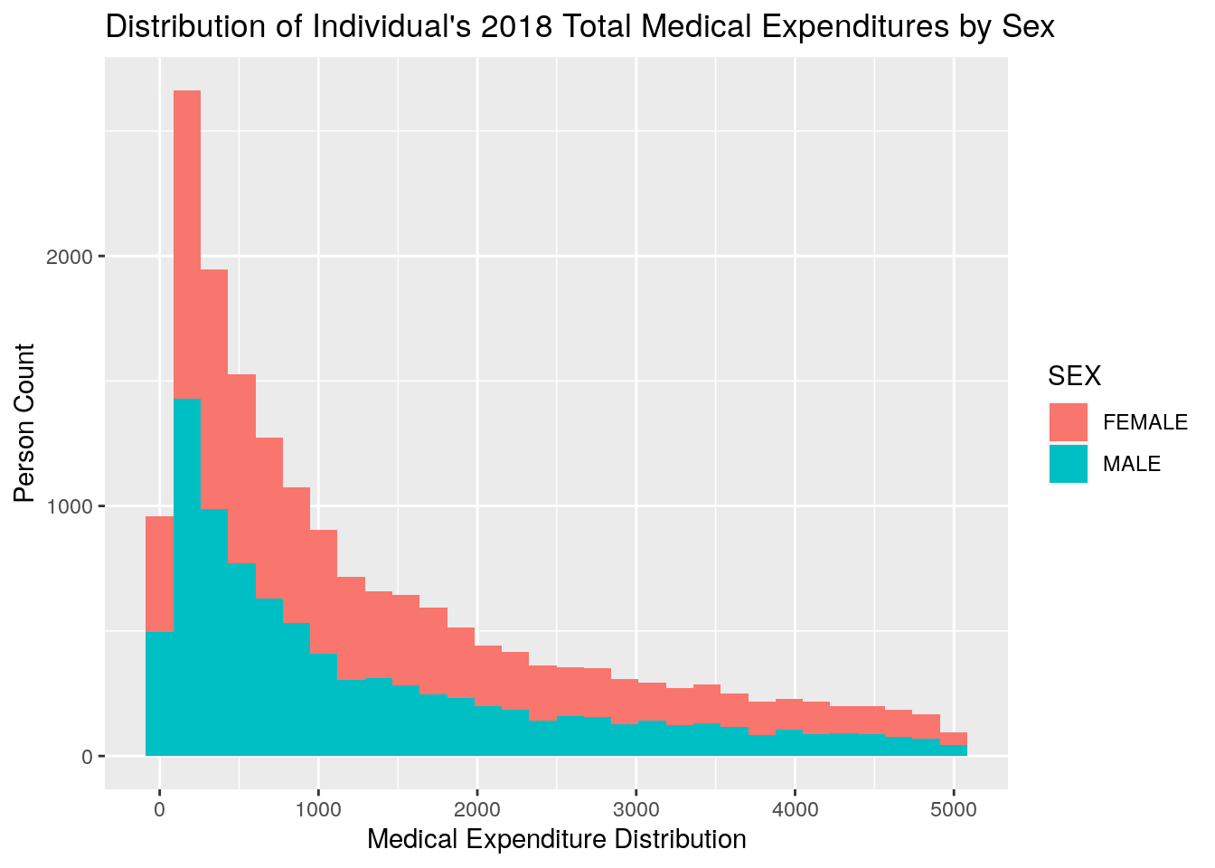
5.3.3 Scatterplot
Next, we’ll create a very basic scatteprlot using our MEPS data.
In this scatterplot, we’re going to be plotting total expenditures by age, breaking out spend amounts by whether or not an individual has diabetes.
To make the graph easier to read, we’ll first compute the average medical expenditure by age and diabetes status, and then plot the result.
To do so, we need to first use the dplyr function from Chapter 4 to calculate the average medical spend by age and diabetes status.
Then we’ll need to specify that we want to create a scatterplot.
In simplest terms, the geom specifies what type of plot you want to create, and so we specify a scatterplot by using the geom = 'point' argument of the qplot() function.
Note that we first will remove any individuals who have an invalid survey response for their diabetes status.
plot_data <- meps %>%
  dplyr::filter(DIABDX_M18 != "INVALID",
                AGE42X >= 0) %>%
  dplyr::group_by(AGE42X, DIABDX_M18) %>%
  dplyr::summarise(med_exp = sum(TOTEXP18),
                   person_count = n()) %>%
  ungroup() %>%
  dplyr::mutate(average_med_exp = med_exp / person_count)

qplot(x = AGE42X,
      y = average_med_exp,
      data = plot_data,
      geom = 'point',
      color = DIABDX_M18,
      xlab = "Age",
      ylab = "Average Medical Expenditures ($)",
      main = "Average Medical Expenditures by Age and Diabetes Status") +
  theme(axis.text.x = element_text(angle = 90))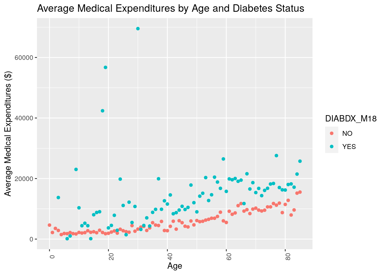
Note that here we used color instead of fill to differentiate the diabetes status by color.
In general, we use color to color points and lines, and fill when we want to fill in shapes or areas.
What do you notice about the resulting plot? Do you think medical expenditures are associated with age? Do you think medical expenditures are associated with diabetes status?
5.3.4 Boxplot
Finally, we’ll look at a basic example of a boxplot before moving on to more complicated code. Now, suppose we wanted to compare what the distribution of medical expenditures looks like for individuals based on their perceived health status (RTHLTH42) and their source of insurance coverage (INSCOV18). The following code produces boxplots to conduct such a comparison:
plot_data_box <- meps %>%
        dplyr::filter(TOTEXP18 <= 15000,
                      RTHLTH42 != "INVALID")

qplot(x = RTHLTH42,
      y = TOTEXP18,
      data = plot_data_box,
      geom = c("boxplot"),
      fill = INSCOV18,
      xlab = "Perceived Health Status",
      ylab = "Medical Expenditures",
      main = "Medical Expenditures by Perceived Health Status and Insurance Coverage")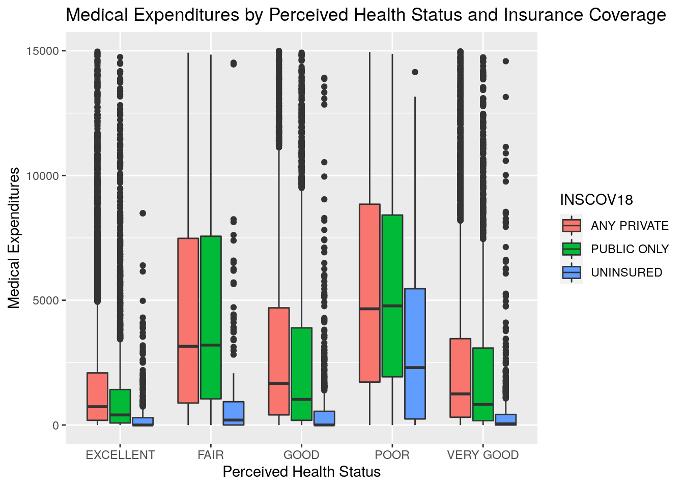
Note a couple things from this example:
- For the purpose of making this chart more readable for this module, we first filtered the MEPS data to remove members with expenditures over $15,000. Otherwise the high-end outliers would make the chart scaling difficult to look at.
- We used the
boxplotgeom here to specify that we wanted a boxplot chart - We used the
filloption here to specify that we wanted to color the boxplots by insurance coverage source
What generalizations can you make from looking at this chart? To us, the most apparent conclusions would be that individuals with excellent perceived health status tend to have lower expenditures, and those with fair or poor perceived health status tend to have higher expenditures. Further, across all groups of perceived health status, those with insurance tended to spend a lot more on healthcare than those without insurance.
5.4 ggplot2
5.4.1 Grammar of Graphics
Now that we’ve walked through some simple approaches to plotting data in R, we’ll start to uncover more of the customization features that the ggplot2 package has to offer.
The ggplot2 package is built on what’s known as the Grammar of Graphics which is, put simply, a construct developed to define how basically any graphical plot can be built.
While the details of the Grammar of Graphics are out of scope for this course, you may reference this free online book if interested in applying the Grammar of Graphics in R using ggplot2
In this section, we’ll move away from using the quick and easy, albeit limited, qplot() function.
Instead, we’ll use ggplot2 in a more direct, customizable fashion to build some plots and apply them to answer questions about our data.
Again, the focus is not on memorizing the code, but rather learning how to apply visualizations in R to understand our data and communicate our data.
5.4.2 Bar Chart
Imagine you’re preparing a presentation for an audience and you want to highlight the difference in average medical expenditures based on age range. One option would be to provide a table of numerical values with the average expenditures by age range. You’re worried that just providing a table of values wouldn’t be the most effective method of communication for a presentation, so you think about providing a visualization instead. What type of visualization would you choose? One simple option would be a bar chart.
Let’s run the code below, analyze the output, and discuss briefly the pieces of the code.
Note that the structure of the code will be slightly different than when we used qplot().
age_breaks <- c(0, 10, 20, 30, 40, 50, 60, 70, 80, Inf)
age_labels <- c("0-9", "10-19", "20-29", "30-39", "40-49", "50-59",
                 "60-69", "70-79", "80+")

medexp_by_age <- meps %>%
  dplyr::filter(AGE42X >= 0) %>%
  dplyr::mutate(age_buckets = cut(AGE42X, breaks = age_breaks, right = F, labels = age_labels)) %>%
  dplyr::group_by(age_buckets) %>%
  dplyr::summarise(Total_Med_Exp = sum(TOTEXP18),
                   person_count = n()) %>%
  ungroup() %>%
  dplyr::mutate(average_med_exp = Total_Med_Exp / person_count)

ggplot(data = medexp_by_age,
        aes(x = age_buckets, y = average_med_exp, fill = age_buckets)) +
  geom_bar(stat = "identity") +
  theme_minimal() +
  ylab("Average Medical Spend") +
  xlab("Age Range") +
  ggtitle("Medical Expenditures by Age Range") +
  theme(axis.text.x = element_blank()) +
  coord_flip() +
  labs(fill = "Age Range")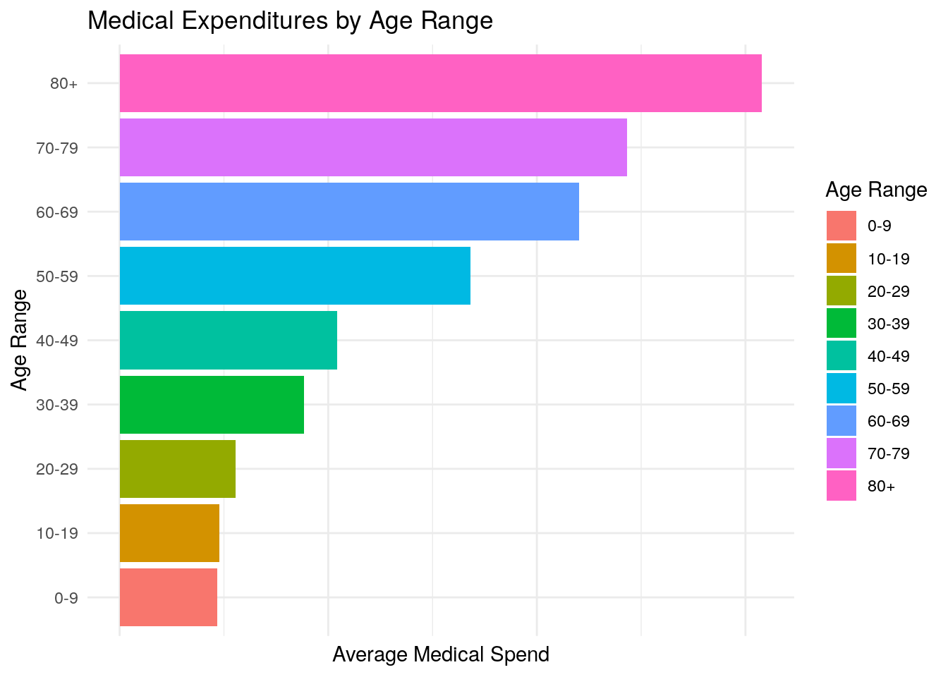
In this code, we:
- First create two new vectors called
age_breaksandage_labelswhich we will use to define our age ranges - Then we create a new dataframe called
medexp_by_agewhich creates a new field calledage_bucketsin order to implement our age range criteria. Note that we used thecut()function here in order to define the age ranges based on theage_breaksandage_labelsvectors. For more information on thecut()function, enter?cut(). - Next, we calculate the average medical expenditures by our
age_bucketsfield - We then specify that we want to create a bar chart by using
geom_bar - We use the plus sign,
+to “chain together” statement inggplot. You can think of this as doing the same thing as the pipe operator,%>%, except using plus signs is customary for ggplot2. - We remove the x-axis text by changing the
theme()of the plot - We flip the coordiantes of the plot by using
coord_flip()to make the bar chart horizontal instead of vertical - Finally, we use the
labsargument to change the name of the Legend Title to “Age Range”
Now, many of these pieces in the code above are purely put in for aesthetic purposes. For example, we didn’t need to flip the coordinates or change the theme of the plot, but the point is to show some of many, many options you have in designing your very own custom plots to create visualizations that you think best convey the data and look the most aesthetically pleasing.
5.4.3 Grouped Bar Chart:
Next, we’ll practice creating grouped bar charts. Grouped bar charts can be particularly effective at plotting two variables at once. For example, let’s say you want to communicate the same information as above about medical expenditures by age, but this time you want to differentiate between perceived mental health status as well.
One example of a grouped bar chart would look like this (note that if this code doesn’t run, you may have to install the scales package by typing install.packages("scales"):
medexp_by_age_mnhlth <- meps %>%
  dplyr::filter(AGE42X >= 0,
                MNHLTH42 != "INVALID") %>%
  dplyr::mutate(age_buckets = cut(AGE42X, breaks = age_breaks, right = F, labels = age_labels)) %>%
  dplyr::group_by(age_buckets, MNHLTH42) %>%
  dplyr::summarise(Total_Med_Exp = sum(TOTEXP18),
                   person_count = n()) %>%
  ungroup() %>%
  dplyr::mutate(average_med_exp = Total_Med_Exp / person_count)

ggplot(data = medexp_by_age_mnhlth,
       aes(x = age_buckets, y = average_med_exp, fill = MNHLTH42)) +
       geom_bar(stat = "identity", position = "dodge") +
       theme_minimal() +
       xlab("Age Range") +
       ylab("Average Medical Expenditures") +
       ggtitle("Medical Expenditures by Age and Mental Health Status") +
       theme(axis.text.x = element_text(angle = 70)) +
       scale_fill_brewer(palette = "Set2") +
       scale_y_continuous(labels = scales::comma) +
       labs(fill = "Mental Health\nStatus")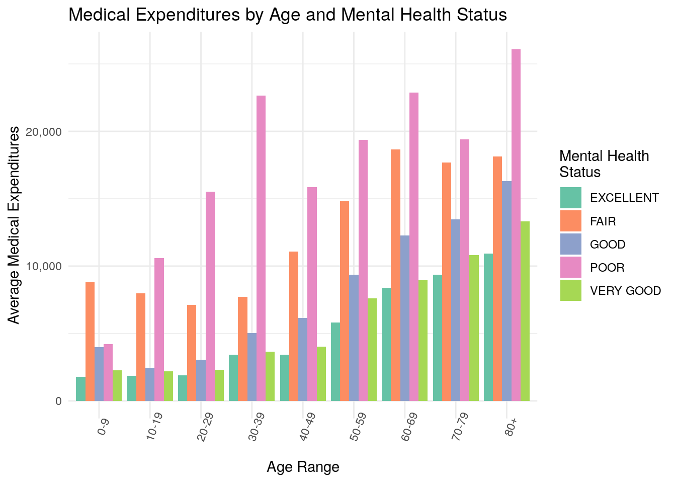
5.4.4 Grouped Bar with Percentages
In this example, we’ll expand on a previous chart we covered above: the Grouped Bar Chart. In the previous example, we used the Grouped Bar Chart to plot Medical Expenditures, which is a continuous variable, but grouped bar charts are also a great way to communicate information about categorical variables.
For example, let’s suppose you’re interested in determining analyzing which fields are associated with higher or lower rates of diabetes. As part of your exploratory work, you want to use a grouped bar chart to plot the percentage of individuals with diabetes, split by race and insurance coverage.
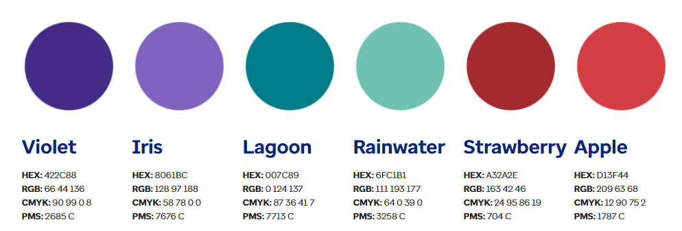
For an additional twist, let’s suppose that you really like a particular color palette, and you want to further customize the colors in your chart based on the palette below:
Let’s see what the code might look like:
diab_by_race_inscov <- meps %>%
  dplyr::filter(DIABDX_M18 != "INVALID") %>%
  dplyr::group_by(DIABDX_M18,
                  RACETHX,
                  INSCOV18) %>%
  dplyr::summarise(person_count = n()) %>%
  ungroup() %>%
  tidyr::pivot_wider(names_from = DIABDX_M18, values_from = person_count) %>%
  dplyr::mutate(total_count = YES + NO,
                percent_diabetic = YES / total_count)

head(diab_by_race_inscov)
#> # A tibble: 6 × 6
#>   RACETHX  INSCOV18    NO   YES total_count percent_diabetic
#>   <chr>    <chr>    <int> <int>       <int>            <dbl>
#> 1 ASIAN O… ANY PRI…  1000    71        1071           0.0663
#> 2 ASIAN O… PUBLIC …   344    56         400           0.14
#> 3 ASIAN O… UNINSUR…    82     5          87           0.0575
#> 4 BLACK O… ANY PRI…  2008   245        2253           0.109
#> 5 BLACK O… PUBLIC …  1624   313        1937           0.162
#> 6 BLACK O… UNINSUR…   310    18         328           0.0549
colorvector <- c("#8061BC", "#6FC1B1", "#D13F44")

ggplot(data = diab_by_race_inscov,
       aes(x = RACETHX, y = percent_diabetic, fill = INSCOV18)) +
       geom_bar(stat = "identity", position = "dodge") +
       theme_minimal() +
       xlab("Race") +
       ylab("Percent Diabetic") +
       ggtitle("Percent Diabetic by Race and Insurance Coverage") +
       scale_x_discrete(labels = function(x) str_wrap(x, width = 10)) +
       scale_fill_manual(values = colorvector) +
       scale_y_continuous(labels = scales::percent) +
       labs(fill = "Insurance\nCoverage")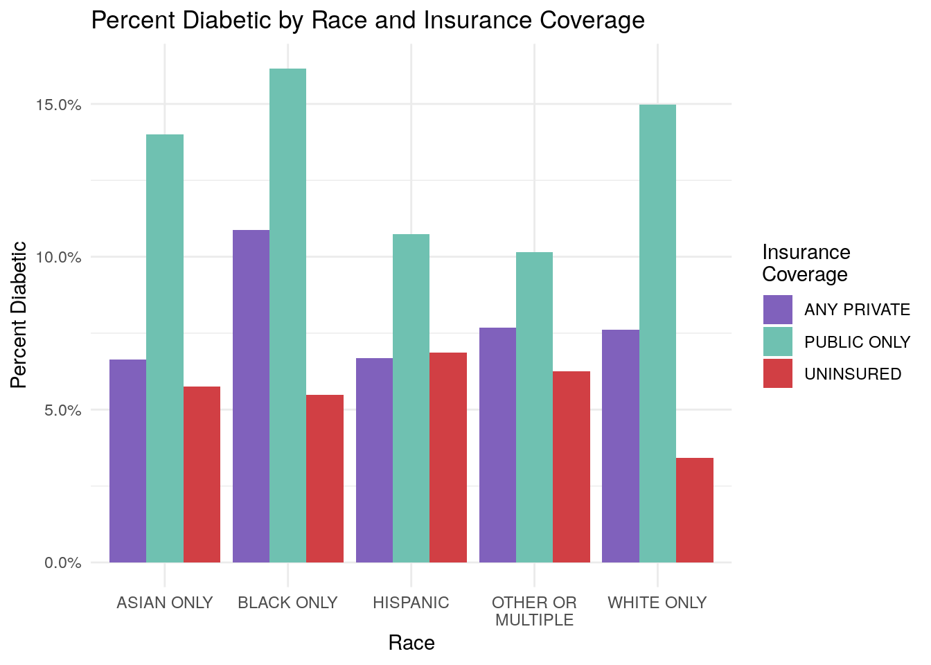
Let’s walk through the steps of this code:
- First, remove invalid values for diabetes status
- Next, group the data by Diabetes Status, Race, and Insurance Coverage, and then count the persons falling into each group combination
- Then, we use the
pivot_wider()function from thetidyrpackage to basically convert the Diabetes Status field (DIAB_M18) into two separate fields based on the diabetes status. Notice now that there are two fields called “YES”, and “NO” that correspond to the person’s diabetic status. In other words, we made the dataframe wider by usingpivot_wider()on the diabetes field. Enter?tidyr::pivot_wider()for more information on thepivot_wider()function. - Next, we create a new field, called
percent_diabeticbased on the new “YES” and “NO” columns - Finally, we create the grouped bar chart plot. Note that we customize our color palette by passing in our custom
colorvectorinto thescale_fill_manual()function. Thecolorvectorconsists of three hex-values that we pulled which correspond to “Iris”, “Rainwater”, and “Apple” from the color palette above. - Also note that we modified the x-axis labels to tell R to “wrap” the labels if they exceed a certain width. You can see this with the “OTHER OR MULTIPLE” race category that gets wrapped onto two lines on the x-axis.
- Last, note that we used the
scales::percentargument to change the y-axis to show percentages
Now, what would be a reasonable conclusions from your chart? We might conclude that it appears the population that receives their insurance coverage from Public Only sources (think Medicare/Medicaid) tends to have higher rates of diabetes than the private or uninsured population.
5.5 Challenge: Proportion Plots
Proportion plots are another way of analyzing a distribution of data. They’re essentially the same concept as a histogram, except you can define your own bin ranges on the x-axis, and then the y-axis is the percent of some value that falls within the range on the x-axis bins.
For example, let’s imagine that your future boss tells you that it is a common phenomenon in healthcare that a small percentage of individuals account for a large percentage of the total spend. You were exposed to this idea briefly in one of the subsections above. He or she wants you to create two charts that display whether this phenomenon is true or not in your MEPS data.
Let’s consider the steps needed to accomplish this task:
- First we’ll categorize each individual’s medical spend into different buckets of spend.
- Next, group the data by each bucket, and create two new variables. The first will be the proportion of individuals whose spend falls into each bucket. The second variable will be the proportion of total spend that falls into each bucket.
- Create two bar charts. One will display the percentage of individuals in each bucket, and the other will display the percentage of spend in each bucket.
5.5.1 Step 1:
This step will categorize each individual’s medical expenditures into different buckets that we define.
We’ll define buckets of $0-$100, $100-$500, $500-$1000, $1000-$5000, $5000-$10,000, and $10,000+, and we’ll use the cut() function again to do this.
When defining buckets, you would normally make sure that each bucket is the same size (for example, each buckets spans $500), but for this application, we’re choosing to define our own cut-points to make the visualizations easier to interpret.
spend_breaks <- c(0, 100, 500, 1000,  5000, 10000, Inf)
spend_labels <- c("$0-$100", "$100-$500", "$500-$1,000", "$1,000-$5,000", "$5,000-$10,000","$10,000+")

meps_w_spend_cats <- meps %>%
  dplyr::mutate(spend_buckets = cut(TOTEXP18, breaks = spend_breaks, right = F, labels = spend_labels)) %>%
  dplyr::select(TOTEXP18, spend_buckets)
Let’s look at the resulting dataset:
head(meps_w_spend_cats)
#> # A tibble: 6 × 2
#>   TOTEXP18 spend_buckets
#>      <dbl> <fct>
#> 1     2368 $1,000-$5,000
#> 2     2040 $1,000-$5,000
#> 3      173 $100-$500
#> 4        0 $0-$100
#> 5      103 $100-$500
#> 6        0 $0-$100
Notice now how the MEPS medical expenditures are now assigned to one of our defined buckets.
5.5.2 Step 2:
Now, let’s group the data by each spend bucket, and summarize the proportion of individuals who fall into each bucket, and the proportion of total medical spend across all individuals that falls into each bucket:
bucket_summary <- meps_w_spend_cats %>%
  dplyr::group_by(spend_buckets) %>%
  dplyr::summarise(person_count = n(),
                   medical_spend = sum(TOTEXP18)) %>%
  ungroup() %>%
  dplyr::mutate(person_proportion = person_count / sum(person_count),
                medical_spend_proportion = medical_spend / sum(medical_spend))
Let’s again look at the resulting dataset:
| spend_buckets | person_count | medical_spend | person_proportion | medical_spend_proportion |
|---|---|---|---|---|
| $0-$100 | 5768 | $67,976 | 0.189 | 0.000 |
| $100-$500 | 5078 | $1,405,372 | 0.167 | 0.008 |
| $500-$1,000 | 3523 | $2,571,140 | 0.116 | 0.014 |
| $1,000-$5,000 | 8573 | $21,112,689 | 0.281 | 0.114 |
| $5,000-$10,000 | 3110 | $21,969,350 | 0.102 | 0.118 |
| $10,000+ | 4409 | $138,499,736 | 0.145 | 0.746 |
We can see that now we have summarized the proportion of individuals falling into each spend bucket, as well as the proportion of medical spend falling into each spend bucket.
5.5.3 Step 3:
Finally, we will create two bar charts to see whether or not a small percentage of individuals makes up a large percentage of total medical spend.
# Percent of Individuals in Each Bucket
ggplot(data = bucket_summary,
       aes(x = spend_buckets, y = person_proportion, label = scales::percent(person_proportion))) +
       geom_bar(fill = "darkblue", stat = "identity") +
       geom_text(position = position_dodge(width = 0.9), size = 3, vjust = -.5)+
       scale_y_continuous(labels = scales::percent) +
       xlab("Spend Bucket") +
       ylab("Percentage of Persons") +
       ggtitle("Percent of Persons by Individual's Spend Buckets")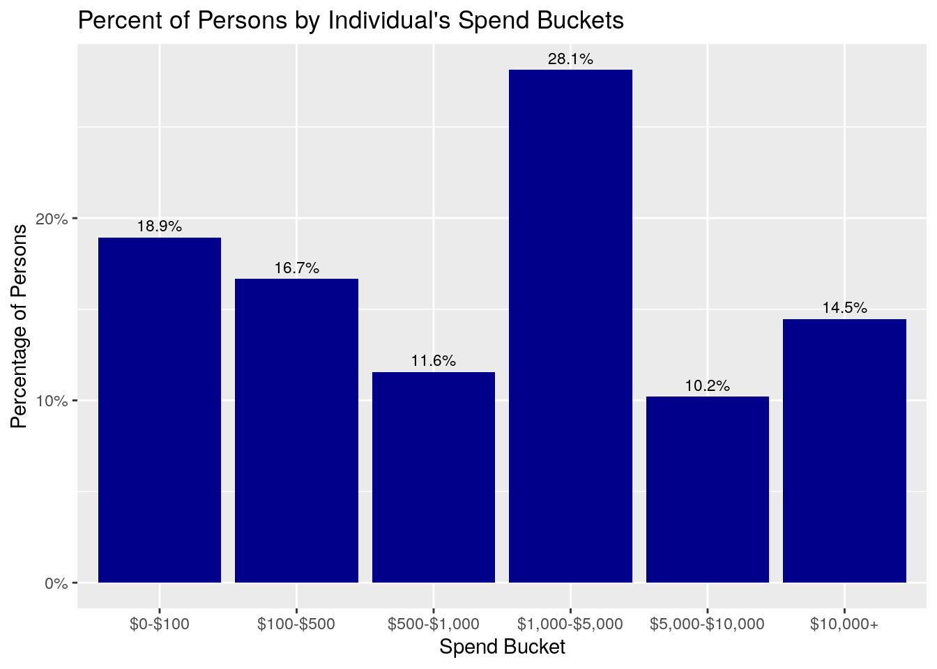
ggplot(data = bucket_summary,
       aes(x = spend_buckets, y = medical_spend_proportion, label = scales::percent(medical_spend_proportion))) +
       geom_bar(fill = "darkgreen", stat = "identity") +
       geom_text(position = position_dodge(width = 0.9), size = 3, vjust = -.5) +
       scale_y_continuous(labels = scales::percent) +
       xlab("Spend Bucket") +
       ylab("Medical Spend Percentage") +
       ggtitle("Medical Spend by Individual's Spend Buckets")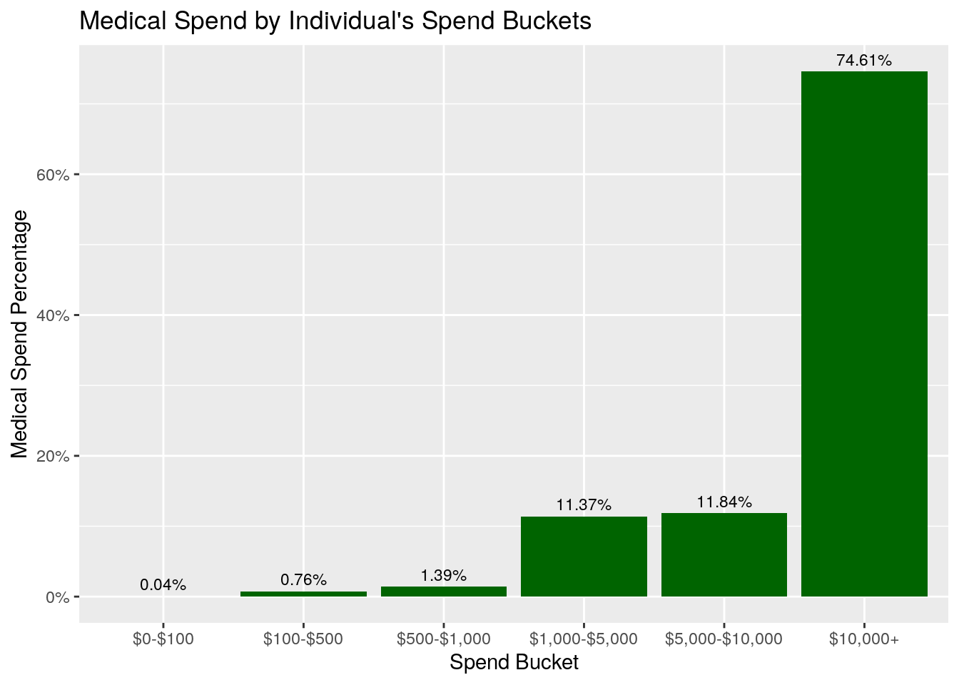
What do you notice about these two plots? First, notice that the Percent of Persons graph shows that about 19% of individuals have between $0-$100 of medical spend, 17% have medical spend of $100-$500, and another 11.6% have medical spend between $500-$1000. So, in total, close to 50% of the individuals have medical spend in 2018 under $1,000.
What about the Percent of Spend graph? In this graph, we see that only about 2% (0.04% + 0.76% + 1.39%) of the total medical expenditures come from individuals who incurred less than $1,000, even though that’s where almost 50% of the individuals fall! In fact, this graph shows that about 75% of the total medical spend comes from members who spent more than $10,000 on healthcare in 2018.
Let’s revisit your boss’s request. Your boss hypothesized that a small percentage of individuals make up a disproportionately large percentage of the total spend. Did this turn out to be true? The answer is yes - these charts do appear to confirm your boss’s hypothesis, and they would be an excellent way to support and communicate the analysis you performed to come to this conclusion.