6 Linear Regression
6.1 Motivation
In this chapter, we begin to address the fourth step of the Data Science framework, model building, by focusing specifically on linear regression. While linear regression is not one of the more fancy types of modeling available to an actuary in today’s world, it is still useful and widely used, and provides a solid basis for understanding more advanced techniques.
Among its many uses, linear regression at its core is often used to study the relationship between two or more variables, and possibly make a prediction based on that relationship. For example, suppose you are an actuary working for a health insurer and you are studying the relationship between annual health expenditures and individuals’ age and sex. Linear regression techniques could be used to answer any of the following questions:
- Does a relationship exist between health expenditures and age and sex?
- If a relationship exists, how strong is that relationship?
- How do age and sex individually influence health expenditures and how large is each’s impact?
- How accurately can we predict future health expenditures based on age and sex?
- Is the relationship between health expenditures and age and sex linear?
Through this chapter, we will touch on each of these questions. We will start by learning simple linear regression with one outcome variable and one predictor. Then, we will extend the linear regression model to multiple predictors. Third, we introduce categorical, or qualitative, variables into the linear model framework. Fourth, we discuss potential issues with the linear model, or how to determine if a linear model is appropriate. Finally, we introduce some broader concepts for prediction and model-building in general.
6.2 How to learn more
Before we dive in, it should be noted that several of the concepts presented over the next two chapters have been modified and adapted from the book An Introduction to Statistical Learning with Applications in R - ISLR. This book is available for free online in a PDF format and it provides an excellent introduction to machine learning and how to apply machine learning using R. The concepts presented in the textbook extend far beyond what will be presented in this module so we highly recommend checking out the ISLR book for anyone interested in learning more complex machine learning algorithms and concepts.
6.3 Pre-reqs:
For this chapter, we will be loading a different sample dataset to more easily illustrate the linear regression concepts.
Imagine your company has pulled you in on a non-traditional actuarial assignment to help the marketing team better understand the effectiveness of their marketing campaigns, and predict how many people will sign up for your health insurance plans based on the company’s marketing efforts. The dataset you’ve been given contains information pertaining to marketing dollars spent on different media and the number of members sign-ups those marketing campaigns have generated.
There are 5 fields in this dataset:
- TV - is the amount of marketing dollars (in thousands) spent on TV advertising
- Internet - is the amount of marketing dollars (in thousands) spent on online advertising
- Mailing - is the amount of marketing dollars (in thousands) spend on advertising via mail
- Members - is the number of people who have signed up (in thousands) for health insurance given the various marketing campaigns
- Region - is the region of the United States that each marketing campaign was focused on
Download this dataset now by clicking the button below and saving to your computer. Then, load this new dataset and call it “marketing”.
6.4 Simple Linear Regression
6.4.1 Intro
Simple linear regression attempts to explain or predict a quantitative response, Y, on the basis of a single predictor, X. The model assumes there is a linear, or approximately linear, relationship between X and Y. The model form for simple linear regression looks like this:
- \(Y_i=\beta_0+\beta_1X_1+\epsilon\)
The parameters in the linear regression model are very easy to interpret. \(B_0\) is the intercept (i.e. the average value for Y if X is zero). \(B_1\) is the slope of the variable X. Said another way, \(B_1\) is the average increase in Y when X is increased by one unit.
For example, in our sample data if we were to model insurance members sign-ups as a function of TV marketing dollars spent, we may use the following linear regression model:
- \(members = B_0 + B_1 * TV\)
\(B_0\) and \(B_1\) together are known as the model coefficients or parameters, and we use our data to produce estimates of these coefficients. Once we have estimates of these coefficients, we can predict future member insurance sign-ups for a particular value of TV marketing:
- \(\hat{y} = \hat{B_0} + \hat{B_1}x\)
Here, \(\hat{y}\) represents the prediction of Y when X = x. It is common that the “hat” symbol, \(\hat{}\), is used to denote estimated values or unknown coefficients, or the predicted value of the response variable, Y.
6.4.2 Estimating Coefficients
While the notation above is important to understand, linear regression is most easily introduced via examples and plots. Taking our example above, let’s plot a scatterplot of insurance member sign-ups against TV marketing dollars spent.
ggplot(marketing, aes(TV, Members)) +
  geom_point() +
  geom_smooth(method = 'lm', se = FALSE, color = "blue")
#> `geom_smooth()` using formula 'y ~ x'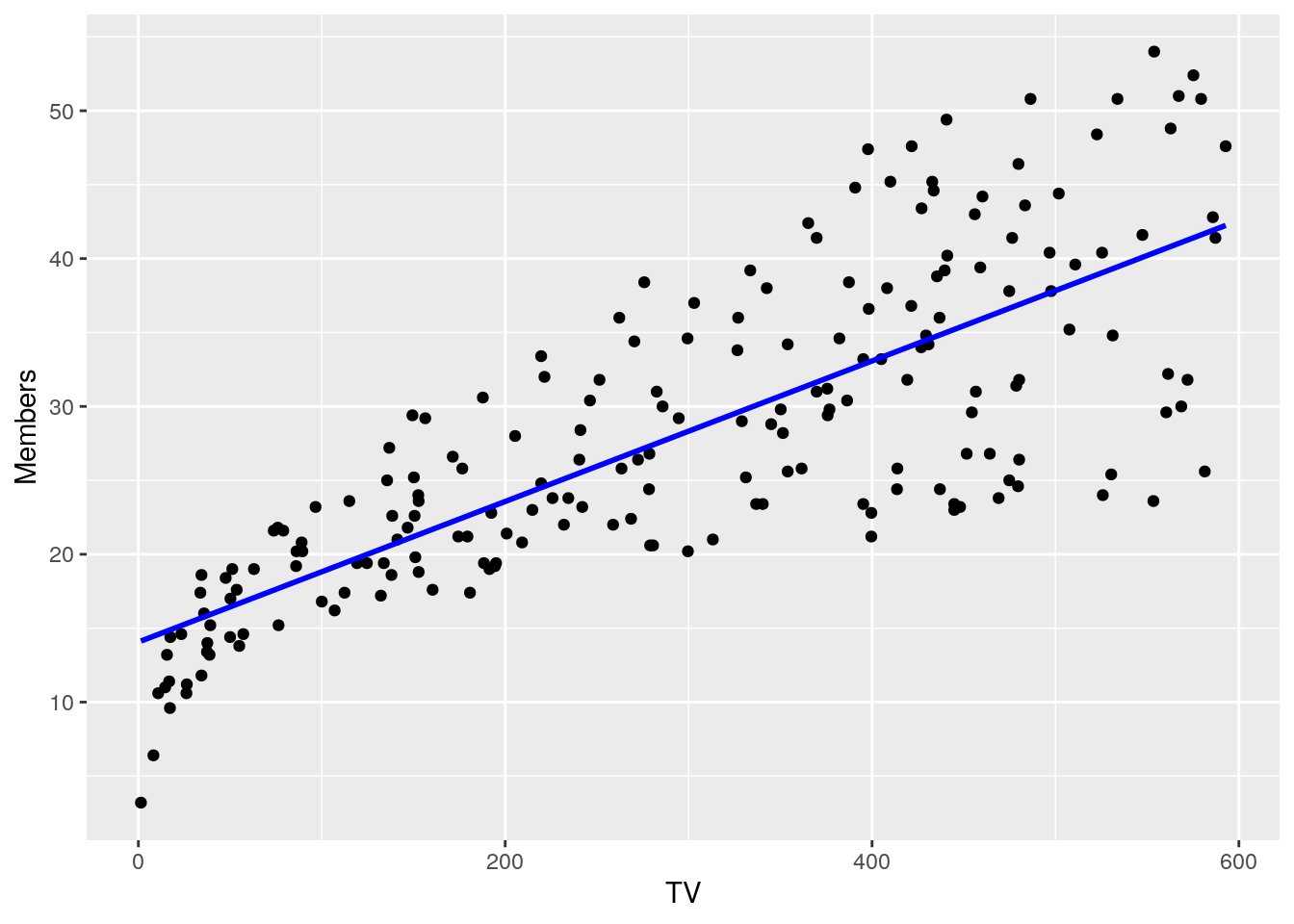
There is a clear relationship between the x-variable (TV marketing dollars) and the Y variable (insurance member sign-ups). Linear regression here can be thought of as solving the problem of drawing the line on this plot that fits these points as well as possible. But how do we know what this “best” or “closest” line is? In other words, how do we estimate what the coefficients of \(B_0\) and \(B_1\) should be from our data?
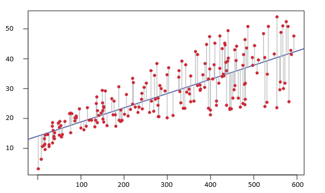
One method of quantifying how well a line fits a set of points is by calculating the distance between the line and each point. Note that this is the same as checking the predicted y-value of a set of points given their x-value; in other words, it is the same as the prediction error of the model. There are many ways to calculate this distance, but the one we will focus on for linear regression is called the \(L^2\) norm in vector calculus, also known as Euclidean distance or, in this context, residual sum of squares because the calculation is the sum of squared distances between actual and expected.
Thus, in order to determine the best-fit line and our model coefficients, \(B_0\) and \(B_1\), we must calculate values of \(B_0\) and \(B_1\) that minimize the Residual Sum of Squares (RSS) formula:
- \(RSS = (y_1 - \hat{B_0} - \hat{B_1}x_1)^2 + (y_2 - \hat{B_0} - \hat{B_1}x_2)^2 + ... + (y_n - \hat{B_0} - \hat{B_1}x_n)^2\)
This is known as the least squares approach.
The following graph depicts the least squares fit for the linear regression of members (Y) onto TV marketing (X). Each gray line represents a residual (or distance between the line and the point) and the least squares approach fits a line that minimizes the sum of squared residuals.
6.5 Multiple Regression
While simple linear regression can be useful if you only have one predictor variable (i.e. TV marketing in the previous example), it is not so useful if you have data in which multiple variables could be used as predictors to strengthen your model. For example, we also have access to marketing dollars spent on Internet advertising and mailing, so how do we build a model that can incorporate those variables, along with TV advertising, to explain and predict increases in member sign-ups?
In the case of multiple linear regression, the model now takes the following form:
- \(Y_i=\beta_0+\beta_1X_1+\beta_2X_2+...+\beta_pX_p+\epsilon\)
Here, \(p\) corresponds to the number of predictors you have, \(X_j\) represents the jth predictor and \(B_j\) is the coefficient between that variable and the response variable, Y.
In the multiple regression setting, we interpret the coefficients, \(B_j\), as the average impact on Y of a one unit increase in \(X_j\), holding all other predictors constant.
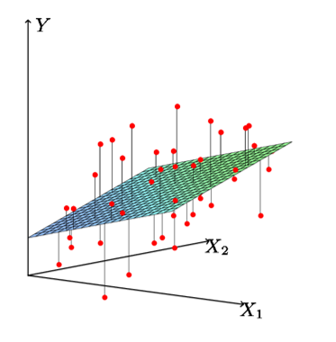
As was the case for simple linear regression, we estimate the regression coefficients, \(B_0, B_1,...,B_p\), by minimizing the residual sum of squares. Graphically, this may look like the following when you have two predictors. In this case, you would be trying to estimate the plane in which the distance from the plane to the points is minimized. Once you have more than 2 predictors, it becomes difficult to graph.
6.6 Including Categorical Variables
So far, we have assumed that all the variables in our linear regression model are quantitative (TV marketing dollars, Internet dollars, mailing dollars).
But as is often the case, some of our predictors in the real world will be qualitative variables, for example the Region field in our sample data.
Region is not a numerical field, but could potentially be a useful predictor for insurance member sign-ups.
In our sample dataset, the Region field can take on four possible values: Central, South, East, and West.
We call this having four different levels and the Region predictor may also be referred to as a factor variable, where there exists four different levels for this factor variable.
In order to incorporate the Region predictor into the regression model, we need to code what’s called dummy variables that can take on two possible values: either 1 or 0.
There will always be one reference or baseline level, to which all the other levels will be compared to.
In general, you will need one fewer dummy variables than the number of levels for a factor variable.
So, since our Region predictor has four levels, we will need three dummy variables.
Let’s assume our reference level is going to the Central region (you may often pick the most common level as the reference level, but here we’re just being arbitrary).
Then here is what your 3 dummy variables will look like:
\(dummy1 = \begin{pmatrix}1 & - & if & the & ith & person & is & from & the & east \\ 0 & - & if & the & ith & person & is & not & from & the & east \end{pmatrix}\)
\(dummy2 = \begin{pmatrix}1 & - & if & the & ith & person & is & from & the & south \\ 0 & - & if & the & ith & person & is & not & from & the & south \end{pmatrix}\)
\(dummy3 = \begin{pmatrix}1 & - & if & the & ith & person & is & from & the & west \\ 0 & - & if & the & ith & person & is & not & from & the & west \end{pmatrix}\)
Then, when you fit your model using these dummy variables, you will be able to interpret the coefficients as the effect of each region on the insurance membership, relative to the reference region (Central region).
This can be confusing at first, but we’ll go through an example below that should help clarify.
6.7 Building a model
In this section, we will go through the steps to build a basic linear regression model using R. Specifically, we will use our sample data to predict health insurance member sign-ups based on TV marketing, internet marketing, mailing advertising, and region. As we go through this section, we’ll discuss how to interpret the model output and coefficients, how to assess the accuracy of the predictors, and how to assess the accuracy of the entire model.
6.7.1 Exploratory Plots
Before we build our model, let’s create some very basic plots of each of our predictor variables against the response variable.
6.7.1.1 Member Sign-Ups vs TV
ggplot(marketing, aes(TV, Members)) +
  geom_point() +
  geom_smooth(method = 'lm', se = FALSE, color = "blue") +
  ggtitle("Member Sign-Ups vs TV Dollars")
#> `geom_smooth()` using formula 'y ~ x'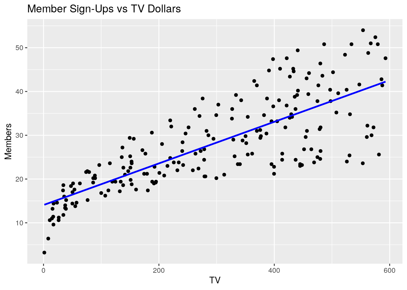
6.7.1.2 Member Sign-Ups vs Internet
ggplot(marketing, aes(Internet, Members)) +
  geom_point() +
  geom_smooth(method = 'lm', se = FALSE, color = "red") +
  ggtitle("Member Sign-Ups vs Internet Dollars")
#> `geom_smooth()` using formula 'y ~ x'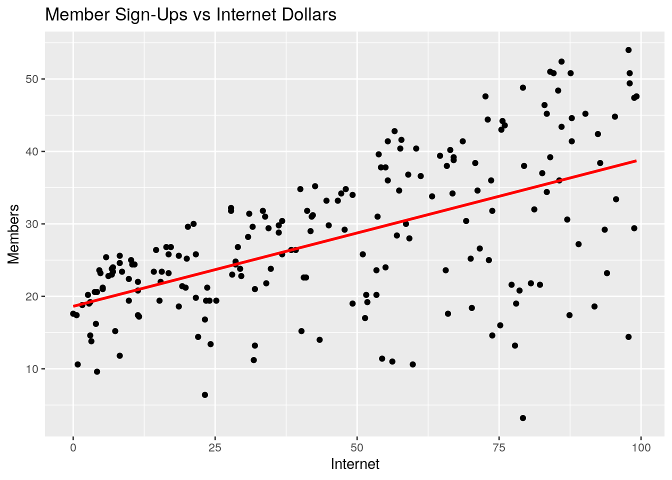
6.7.1.3 Member Sign-Ups vs Mailing
ggplot(marketing, aes(Mailing, Members)) +
  geom_point() +
  geom_smooth(method = 'lm', se = FALSE, color = "green") +
  ggtitle("Member Sign-Ups vs Mailing Dollars")
#> `geom_smooth()` using formula 'y ~ x'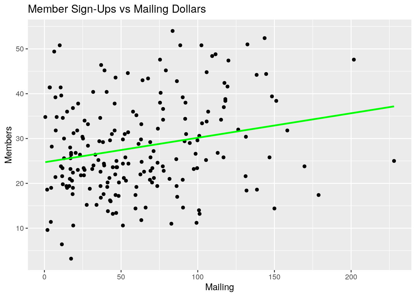
6.7.1.4 Member Sign-Ups vs Region
ggplot(marketing, aes(Region, Members)) +
  geom_point() +
  ggtitle("Member Sign-Ups vs Region")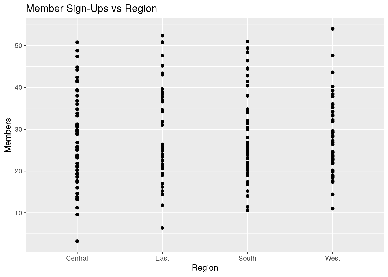
6.7.1.5 Correlation Matrix
Let’s also quickly look at a correlation matrix between the each of the numerical variables in our sample dataset:
round(cor(marketing %>% dplyr::select(TV, Internet, Mailing, Members)),3)
#>             TV Internet Mailing Members
#> TV       1.000    0.055   0.057   0.782
#> Internet 0.055    1.000   0.354   0.576
#> Mailing  0.057    0.354   1.000   0.228
#> Members  0.782    0.576   0.228   1.000
What do you notice about each of these four plots and the correlation matrix? A few observations come to mind:
- Member sign-ups appear to be positively correlated with TV, Internet, and Mailing marketing dollars. On the surface, this would imply that spending money on all types of marketing channels would have a positive impact on member sign-ups
- Member sign-ups appear to be more strongly correlated with TV than Internet, and Internet over Mailing
- Internet and Mailing appear to also be mildly correlated - in other words, it looks as if when Internet marketing is high, mailing marketing has also been high in past campaigns.
- Region does not appear to be very indicative of member sign-ups, by itself.
6.7.2 Fitting a Linear Model
Fitting a linear regression model in R is very simple.
The workhorse function is called lm() and only the following two arguments are generally needed:
-
formula- an R formula object specifying the model form -
data- adata.framein which the data necessary to fit the model is stored
The syntax, in general, then looks like this: lm(y ~ x, data).
To fit our model, m, we then code the following:
m <- lm(Members ~ TV + Internet + Mailing + Region, data = marketing)6.7.3 Interpreting the Coefficients
Calling summary() on your model will print some very useful information.
Let’s do this now and discuss how you would interpret the model’s estimated coefficients.
summary(m)
#>
#> Call:
#> lm(formula = Members ~ TV + Internet + Mailing + Region, data = marketing)
#>
#> Residuals:
#>      Min       1Q   Median       3Q      Max
#> -17.1643  -1.4354   0.5728   2.3103   6.0815
#>
#> Coefficients:
#>              Estimate Std. Error t value Pr(>|t|)
#> (Intercept)  5.415167   0.723235   7.487 2.44e-12 ***
#> TV           0.045750   0.001396  32.767  < 2e-16 ***
#> Internet     0.188204   0.008652  21.753  < 2e-16 ***
#> Mailing     -0.001185   0.005907  -0.201    0.841
#> RegionEast   1.017463   0.674725   1.508    0.133
#> RegionSouth  0.829555   0.646325   1.283    0.201
#> RegionWest   0.242106   0.664486   0.364    0.716
#> ---
#> Signif. codes:
#> 0 '***' 0.001 '**' 0.01 '*' 0.05 '.' 0.1 ' ' 1
#>
#> Residual standard error: 3.37 on 193 degrees of freedom
#> Multiple R-squared:  0.8988, Adjusted R-squared:  0.8957
#> F-statistic: 285.8 on 6 and 193 DF,  p-value: < 2.2e-16
Remember from above that with linear regression, we are attempting to fit a model that will predict insurance member sign-ups based on a linear combination of TV, Internet, Mailing, and Regional data.
When you called lm() to do this, R automatically used the least squares approach above to estimate coefficients for each of the predictor variables.
These coefficients and their estimates are listed (under the “Estimate” column) when you call summary(m).
Also note that R knew that the Region variable is a qualitative predictor, and so it automatically encoded the 3 dummy variables above.
Here’s how we then interpret the model coefficients:
-
y-intercept- This is the expected value of member sign-ups (in thousands), when marketing dollars spent for TV, Internet, and Mailing are all zero, and when the region is the Central region. In other words, if we did zero marketing at all, we could expect to pick up about 5,400 members. It is extremely important to note here that the Central region (our “baseline” or “reference” level) is absorbed into the intercept term, and all other Region predictors will be relative to the central region. -
TV- For every unit of TV marketing spent, we expect member sign-ups to increase by 0.046 units. Since our units are in thousands, we interpret this as: for every $1,000 spent on TV marketing, we expect to sign-up an additional 45 members, all else equal -
Internet- for every $1,000 spent on Internet marketing, we expect to sign-up an additional 19 members -
Mailing- for every $1,000 spent on mailing advertising, we expect to sign-up 0 additional members - ’RegionEast` - The fact that the east region’s coefficient is positive indicates that the east region is associated with more member sign-ups than the central region. In other words, the impact of the east region on member sign-ups is about +1,000 members over the central region.
- ’RegionSouth` - Again, the impact of this coefficient is positive, so the South region is associated with higher member sign-ups than the central region.
- ’RegionWest` - We again see the impact of this coefficient is positive. Thus, the west region is expected to have more member sign-ups than the central region, by about 242 members, all else equal.
Again, note that for the Regional predictor, which is a qualitative predictor, each of the coefficients are interpreted relative to the reference, or baseline, value (Central region).
6.7.4 Assessing Accuracy of Model Coefficients
Now that we know how to interpret the model coefficients, how do we assess their accuracy? Which predictors are useful or important in predicting member sign-ups?
To determine this, we will use the p-values associated with each of the coefficients.
Note that when you called summary(m), R gave you estimates for the coefficients, and associated standard errors, t-statistics, and p-values for each of the coefficients (PR(>|t|)).
The p-values are calculated by R based on a standard hypothesis-test-type approach:
- Null Hypothesis: \(H_0 :\) There is no relationship between predictor \(X_j\) and response, \(Y\)
- Alternative Hypothesis: \(H_a :\) There is some relationship between predictor \(X_j\) and response, \(Y\)
We won’t go into the mathematical details of how to calculate the standard errors for each predictor and resulting p-values in this module. However, you can interpret the p-values as such:
- A small p-value indicates that it is unlikely to observe such a substantial association between a predictor and the response due to chance, in the absence of any real association between the predictor and the response.
In other words, if the p-value is small (generally a value of 0.05 or 0.01 is used as “small”), that is a good indication that a given variable is important in predicting or explaining the response variable.
6.7.4.1 Application to our model
So how do we assess the accuracy or significance of each of the predictors in our specific marketing model?
Recall from our plots and correlation matrix above, we expected TV, Internet, and Mailing to all be associated with member sign-ups, and it didn’t look like region was very well-associated. How did this play out with our multiple regression model?
As it turns out, it seems that both TV and Internet marketing are positively associated with member sign-ups, and that both of these variables are important in predicting member sign-ups (p-values are very small).
Note, however, that Mailing does not appear to be an important variable (p-value of 0.841). This is the power of multiple regression - our model was able to tell us that there is no real association between mailing and member sign-ups. Instead, it only looked like mailing was associated with member sign-ups because it was correlated with Internet marketing. Said differently, when we control for the other variables, mailing as a form of marketing does not have an incremental impact on member sign-ups.
What about region? Our model confirmed to us that region does not appear to be associated with member sign-ups (all p-values are insignificant), and that any impact of region on member sign-ups is likely due to chance or random variation.
Thus, if we were to build a refined model, we would likely drop the mailing and regional variables from our model because there is not enough evidence that these variables have an impact on the response variable.
6.7.5 Assessing the Accuracy of the Model
Now that we have looked at the impact of each of the model coefficients and their significance, how do we assess the accuracy of the model as a whole? In other words, how do we quantify the extent to which the model actually fits the data?
6.7.5.1 R-Squared
The most widely used statistic to measure the quality of fit for linear regression is the \(R^2\) statistic. The \(R^2\) statistic can be interpreted as the proportion of variance in the response variable explained by the model, and always takes a value between 0 and 1, with higher values being better than lower values. Values of \(R^2\) close to 1 indicate that a large proportion of the variability in the response is explained by the regression.
Let’s expand on this. If we define the Total Sum of Squares (\(TSS = \sum (y_i - \overline{y})^2\)) to be a measure of the total amount of variability inherent in the response before any regression is performed, then the Residual Sum of Squares (\(RSS = \sum (y_i - \hat{y})^2\)) measures the amount of variability that is left after running the regression. Therefore, \(R^2 = 1 - \frac{RSS}{TSS}\)
What qualifies as a good \(R^2\) value is hard to define. For example, in disciplines like medical expenditures, psychology, biology, etc. where there are so many factors at play that lead to variation, it could be that an \(R^2\) value of 0.1 is quite acceptable for a model.
6.7.5.2 F-Statistic
The F-statistic is used to indicate whether there is a relationship between the predictors, as a whole, and the response variable. The F-statistic also gives us a p-value, but instead of being a p-value for a single predictor, the F-statistic p-value tells us whether any of the coefficients are associated with the response.. Said differently, it’s an indication of whether the predictor set, as a whole, is associated with the response variable.
Similar to the p-values discussed above for single predictors, if the p-value for the F-statistic is close to zero, then we have strong evidence that at least one of the predictors is associated with the response.
6.7.5.3 Application to Our Model:
Let’s now go back to our model and look at the F-statistic and \(R^2\) values of the model.
We’ll call summary(m) again on our model:
summary(m)
#>
#> Call:
#> lm(formula = Members ~ TV + Internet + Mailing + Region, data = marketing)
#>
#> Residuals:
#>      Min       1Q   Median       3Q      Max
#> -17.1643  -1.4354   0.5728   2.3103   6.0815
#>
#> Coefficients:
#>              Estimate Std. Error t value Pr(>|t|)
#> (Intercept)  5.415167   0.723235   7.487 2.44e-12 ***
#> TV           0.045750   0.001396  32.767  < 2e-16 ***
#> Internet     0.188204   0.008652  21.753  < 2e-16 ***
#> Mailing     -0.001185   0.005907  -0.201    0.841
#> RegionEast   1.017463   0.674725   1.508    0.133
#> RegionSouth  0.829555   0.646325   1.283    0.201
#> RegionWest   0.242106   0.664486   0.364    0.716
#> ---
#> Signif. codes:
#> 0 '***' 0.001 '**' 0.01 '*' 0.05 '.' 0.1 ' ' 1
#>
#> Residual standard error: 3.37 on 193 degrees of freedom
#> Multiple R-squared:  0.8988, Adjusted R-squared:  0.8957
#> F-statistic: 285.8 on 6 and 193 DF,  p-value: < 2.2e-16
If we look at the bottom row, we see that the F-statistic is equal to 285.8 and the corresponding p-value is virtually zero. From this, we can feel very confident that at least one of our predictors is useful in predicting member sign-ups.
The \(R^2\) value is equal to 0.8988 which indicates that about 90% of the variability in the member sign-ups variable is explained by our regression model. This would be considered quite good in most contexts.
6.8 Assumptions
Now that we’ve successfully fitted a linear model and examined the model outputs, we need to talk about potential problems and assumptions that underlay the linear model framework, and how to check for them.
6.8.1 Linearity
The first key assumption underlying the linear regression model is that the true relationship between the response variable and the predictor variables is linear in the coefficients. This does not mean that the relationship is linear; a linear regression can be performed on functions of the predictors such as \(y=\beta_0+\beta_1*x+\beta_2*x^2\). In fact, it is often necessary in practice to transform one or more variables in your data in order to yield the best fit. Rather, “linear in the coefficients” means that the assumed model form contains only terms of the form \(\beta*f(x)\), so you cannot fit models like \(y=\beta^x\) or \(y=x^\beta\).
The lm() object has a plot() method that shows charts that allow us to check many of these assumptions, including this one:
plot(m, which = 1)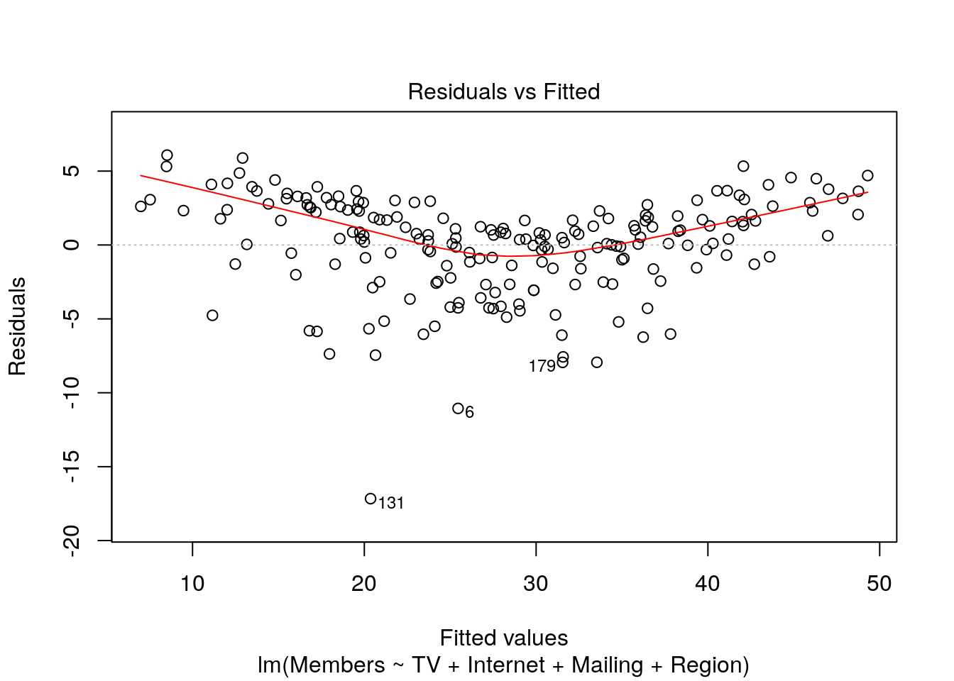
Ideally, a plot of the residuals versus the predicted values will show no discernible pattern. A model that deviates from the linearity assumption will show kinks or curves in this chart. In order to address this situation, you will need to apply transformations to some or all of the variables or add polynomial terms. For example here, we see in our model that there does appear to be a kink in this plot. While out of the scope of this module, we would want to explore performing a transformation or adding polynomial terms to our model.
6.8.2 Residuals
Another key set of assumptions that must be met for a linear regression model to be valid center around the residuals. They must be 1) approximately distributed according to \(N(0, \hat{\sigma^2})\), and 2) uncorrelated. If the sample mean of the residuals is significantly different from 0, this is a sign that there is unexplained variance in the model. Correlation in the residuals means that estimates of standard errors for the model terms will be biased low, which causes hypothesis tests like the p-values for the estimated coefficients to be invalid.
The residuals statistics printed by summary() are sometimes enough to check the first assumption.
Ideally, the median would be very close to zero, and the residuals would show very little sign of skewness (absolute value of Q1 should be close to value of Q3).
In the case of our example model, the median does deviate from zero a bit (0.57), and there does appear to be some level of skewness in our residuals which would lead us to reconsider whether our linearity assumption has been met.
Also, we can view a Q-Q plot of the residuals:
plot(m, which = 2)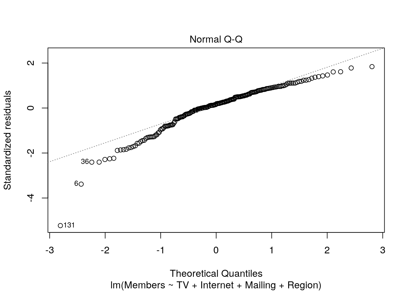
The closer the points are to the diagonal line, the more “normal” they are. Deviations from the diagonal line would indicate non-normality of residuals. In this case, it does appear that the distribution of residuals deviates a bit from normal.
It is also an important assumption that the residuals, or errors, be uncorrelated. Correlation of errors may often occur in time series applications if residuals at adjacent values in time have similar errors.
R comes with the function acf(), which by default plots the autocorrelation of a vector. We can pass it our residuals to check if there is any autocorrelation:
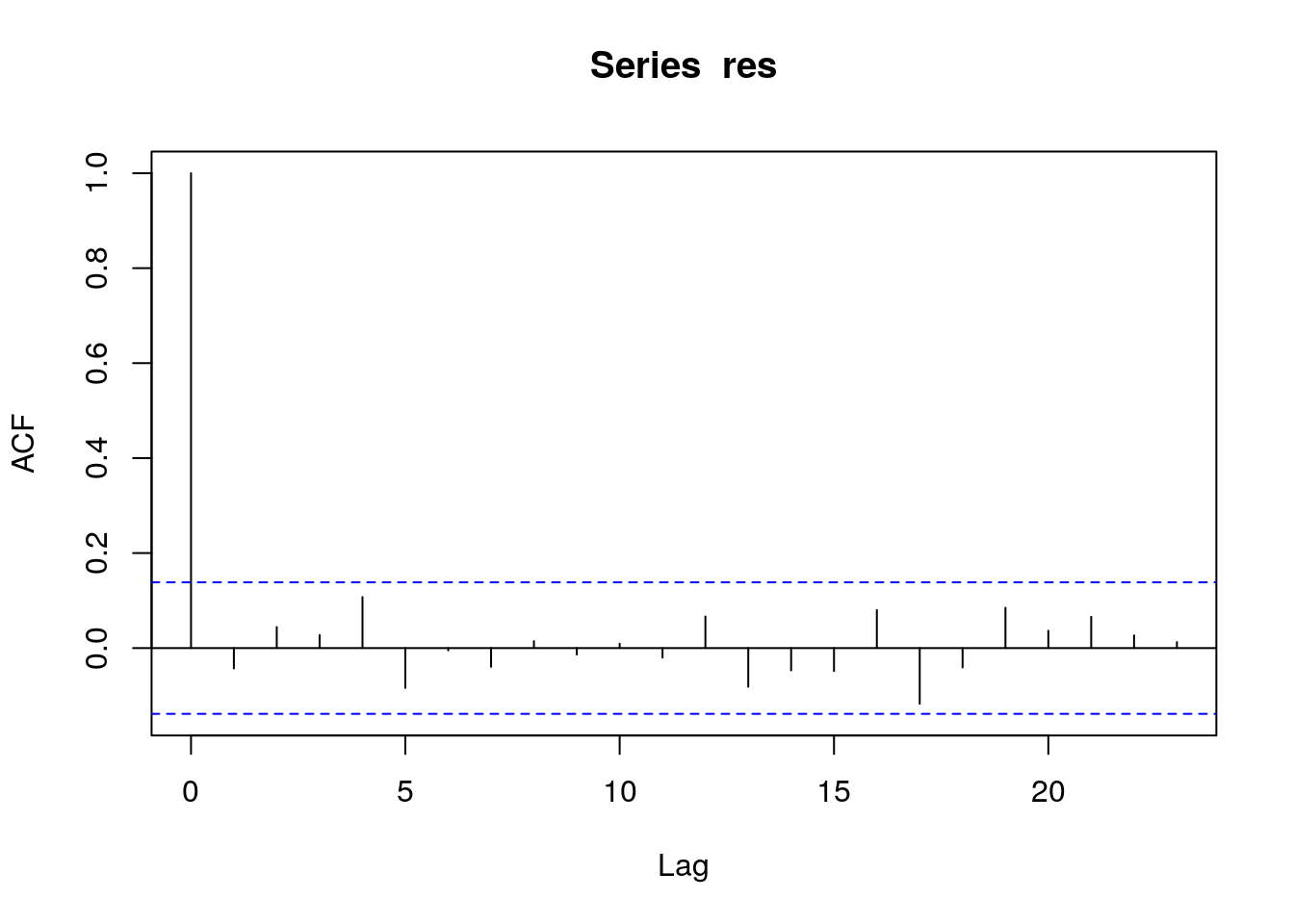
Lines far outside the blue lines are indicative of serial autocorrelation of residuals. If present in a model, this causes the p-values to be biased low, meaning that you will be likely to include terms in a model that are in reality not statistically significant. However, serial autocorrelation does not affect coefficient estimation, so it can be acceptable in some problems. It can be corrected for, but this is outside the scope of this module.
6.8.3 Homoskedasticity
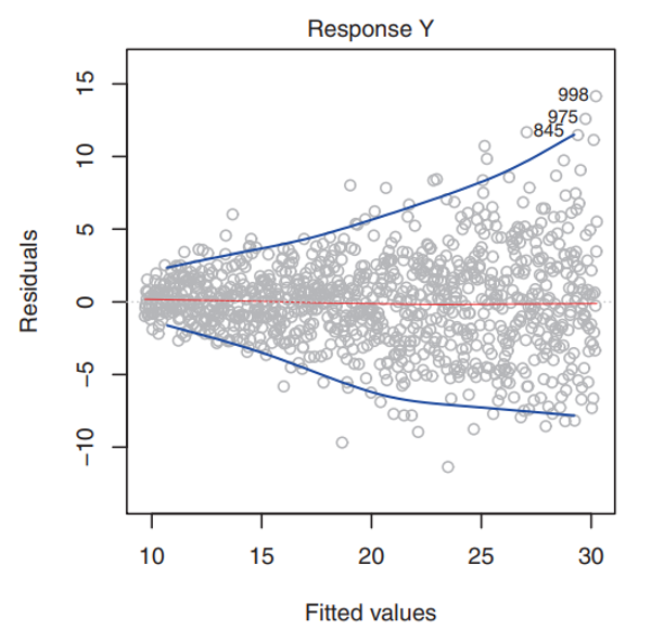
Another important assumption is that there is homoskedasticity in the errors. Homoskedasticity simply means that the variance of the residuals is constant. For example, the variances of the residuals may increase with the value of the response - this would not be desirable. You may be able to detect the presence of non-constant variance (heteroskedasticity) of the error terms by the presence of a funnel shape in the residual vs fitted plot. An example of this “funnel shape” would be if the residual plot looked like the example below (note this example is not from our marketing model).
Note that the \(\hat{\sigma}\) term introduced above is important for the validity of model fit and hypothesis testing; this assumption basically means that there can’t be any “regions” in the residuals where the group variance for that region is significantly different from \(\hat{\sigma}\).
Like serial autocorrelation of errors, this will bias p-values low.
Once again, the plot() method is our friend for testing for it:
plot(m, which = 3)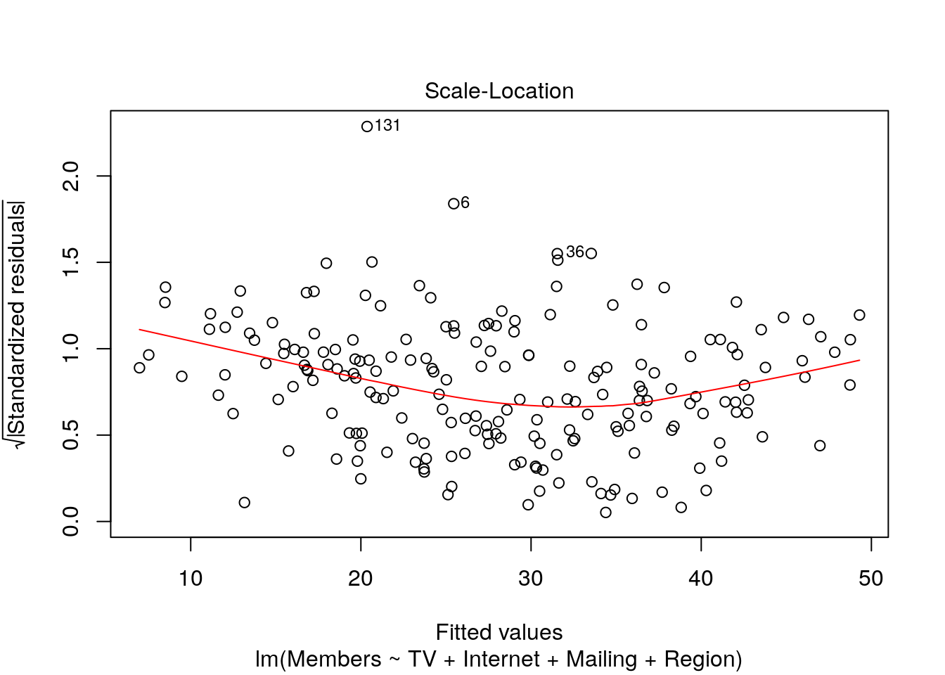
Like the Residuals-Fitted plot above, heteroskedasticity will manifest as large kinks or curves in the red line or narrower/wider range of points in one or more regions. If both charts do not show a straight line, then the problem may simply be that one or more model terms need to be transformed.
6.8.4 Non-collinearity and the dummy variable trap
Model terms are called collinear if they can be accurately predicted from each other.
If this is the case, then the model doesn’t know where to assign variance, as it were.
Think of our regression example with predictors of TV, Internet, Mailing, and Region.
We could have used \(2*TV\) instead as a model term and recovered a coefficient exactly half of the one we currently have.
What would happen, though, if we had both \(TV\) and \(2*TV\) in the formula?
Any effect assigned to one variable could also be assigned to the other.
lm() will generally still converge, but the resulting coefficients and p-values will be invalid.
Note that this is why the reference level of any factors in the model must be absorbed into the intercept: retaining all the levels would add a perfectly collinear term to the model, since the level that is left out can be calculated as the absence of all the other levels.
6.9 Other Modeling Concepts
We have now learned how to fit a linear regression model to a set of data, understand the model outputs and coefficients, and check underlying assumptions of the linear model. In this section, we introduce some extremely important concepts that extend beyond the linear regression framework to more general prediction and modeling problems.
6.9.1 Flexibility in Models
Model flexibility generally refers to the ability of a given model to fit patterns in the data. In general, more flexible methods will require the estimation of more parameters, and the model forms will be more complex (for example, a polynomial or a Support Vector Machine).
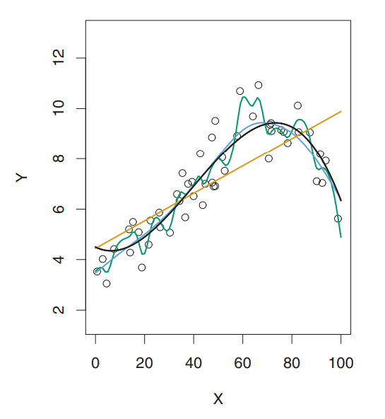
Take, for instance, the image below.
The data points are simulated from a function who’s true shape is the black line.
The orange line represents a linear regression model fit to this data - this would be the least flexible approach shown here.
The green line represents a smoothing spline fit to the data - this would be a more flexible method.
It’s clear here that as the flexibility of the model increases, the curves fit the observed data more closely.
6.9.2 Training Data vs Test Data
Training data refers to the data that you use to train, or fit a particular model.
In our case, up to this point we have used the entire marketing dataset as our training data (i.e. we used the whole dataset to fit our linear model above).
Test data refers to the data that you actually apply to your model to see how well your model predicts unseen data. It is data that the model has not used to estimate its coefficients.
For example, let’s say you are building a model to predict the stock market. You fit your model using historical daily stock price data - this is the training data. However, you’re not really concerned with how well your model predicts historical data, you’re concerned with how your model will predict future data. This future data would be an example of your test data - it is data that has not been seen by the model before.
Our regression techniques use algorithms that are designed to minimize the residual errors of the training dataset, but in reality, a lot of the time we’re mostly concerned with how well they perform on a test dataset, or one that has not been used to fit the model. Thus, when we are evaluating the predictive performance of models, or comparing different models against one another, we want to see how well they minimize the prediction error in an unseen dataset, or test dataset.
6.9.3 Mean Squared Error
In the prediction setting, if we are to evaluate the performance of a model or compare models against one another, we need a way to measure how well the predictions actually match the observed data. In regression, the most common way to measure the quality of fit of a model is the mean squared error (MSE):
- \(MSE = \frac{1}{n}\sum_{i=1}^{n}(y_i - \hat{f}(x_i))^2\)
Here, \(y_i\) is the observed value and \(\hat{f}(x_i)\) is the predicted value for the ith observation.
There are two different types of MSE that you can calculate; you can either decide to calculate the MSE of the model on training data, or calculate the MSE of the model using a test dataset. Which do you think would provide a better measure of quality of fit for prediction purposes? If you guessed test MSE, then you are correct! We want to choose models that give the lowest test MSE, rather than the models that give the lowest training MSE. Take a second to let that sink in - we want the model that produces the smallest amount of prediction error on data that the model has not seen before, because in real life, we will be using our models on things that have not yet happened yet.
As a general rule of thumb, the higher flexibility a model has, the lower the training MSE will be, but not necessarily the test MSE. Take our example above of the linear regression line vs the smoothing spline line. The smoothing spline will have a much lower training MSE because it is a very flexible approach and can pick up lots of nuances in the training data and fit the data points very closely. However, the smoothing spline may or may not have a better test MSE. This is because the model is so good at following the unique patterns of the training data, that when it encounters new, unseen data points, the predictions could be highly variable.
When a given model has a small training MSE but a high test MSE, the model is said to be overfitting the data. In other words, the model is trying too hard to find idiosyncracyies or patterns in training data, and may be picking up patterns that are simply caused by random chance rather than true properties of the unknown, underlying relationship.
Take an extreme example where you again are trying to predict a stock price in the future, and you are able to design a highly flexible model that draws a line perfectly through every single historical daily stock price. This model would technically fit your data extremely well (perfectly), but you would have no idea what to predict next. Thus, this model would have a very small training MSE, but likely a very large test MSE.
This gets at the core modeling concept of the bias-variance tradeoff. In essence, we want models that fit the data closely, but not so closely that, if given a new dataset, the newly predicted values would be highly volatile.
6.9.4 Applications in R
Now that we’ve learned about training vs test MSE to evaluate prediction performance, let’s practice using R. There are many ways to estimate test MSE using various cross-validation approaches, but this is out of scope for this module. Instead, we’ll just randomly split out sample marketing data in half, using one half as a training dataset and the other half as a test dataset. Then we’ll calculate the test MSE of the model.
set.seed(2022)
train <- sample(nrow(marketing), size = nrow(marketing) / 2, replace = F)
new_model <- lm(Members ~ TV + Internet + Mailing + Region, data = marketing, subset = train)
test_data_predictions <- predict(new_model, marketing)[-train]
test_mse <- mean((marketing$Members[-train] - test_data_predictions)^2)
test_mse
#> [1] 11.54857
Let’s walk through this code:
- First we use
set.seed()to initialize a pseudorandom number generator. Setting the seed allows you generate random numbers that are reproducible so that you get the same result each time the code is ran. Think of it as picking a starting point in a table of random numbers. - Then we define our training dataset by picking 100 random numbers between 1 and 200 (the total number of rows in the marketing dataset) which will define the rows of our training dataset
- Then we fit a new linear model, called
new_model, which only uses the 100 rows from the training dataset - Then we use the
predict()function to generate the predicted membership sign-ups using our test data. Note that we had to pass the new linear model into the predict function, as well as the marketing dataset, and then filtered out the training data rows using[-train](don’t worry if this syntax is new to you). - Finally, we calculate the test_mse as the average of the squared prediction errors between the model-predicted-values and the test dataset observations to get a test MSE of 11.55.
Now, let’s compare this test MSE value to a separate model that we fit using a cubic polynomial model.
poly_model <- lm(Members ~ poly(TV, 3), data = marketing, subset = train)
poly_test_mse <- mean((marketing$Members - predict(poly_model, marketing))[-train]^2)
poly_test_mse
#> [1] 45.03734
Notice that the polynomial model test MSE is 45.04, which is worse than the 11.55 from our above model. Thus, we would favor the first model here as a better alternative than the polynomial model. It also has the added bonus of being much more interpretable than the cubic model.