11 Homework: Week 2 Solution
Load MEPS Data:
Subset MEPS data for use in linear regression model:
meps_sub = meps %>%
  dplyr::select(TOTEXP18, AGE42X, ADBMI42, MNHLTH42) %>%
  dplyr::filter(AGE42X >= 18,
                ADBMI42 > 0,
                MNHLTH42 != "INVALID")
11.1 Question 1 (27 Points):
11.1.1 Part 1 (5 points)
For the 3 plots, we want to make plots that depict the relationship of each predictor against the response variable, total medical expenditures. One way of doing this would be some sort of scatterplot (shown in example plots for age and BMI). Another way of doing this would be plotting grouped bar charts as shown in Chapter 5.
Total Expenditures vs Age:
library(scales)
#>
#> Attaching package: 'scales'
#> The following object is masked from 'package:purrr':
#>
#>     discard
#> The following object is masked from 'package:readr':
#>
#>     col_factor

#' Total Medical Expenditures vs Age
plot_age = meps_sub %>%
  dplyr::group_by(AGE42X) %>%
  dplyr::mutate(q1 = quantile(TOTEXP18, probs = 0.25),
                q3 = quantile(TOTEXP18, probs = 0.75),
                mn = mean(TOTEXP18)) %>%
  ggplot(., mapping = aes(AGE42X)) +
    geom_ribbon(aes(ymin = q1, ymax = q3), alpha = .2) +
    geom_line(aes(y = mn), show.legend = F) +
    scale_y_continuous(labels = dollar) +
    labs(
      title = 'Distibution of Total Medical Expenditures by Age',
      x = '',
      y = ''
    )
plot_age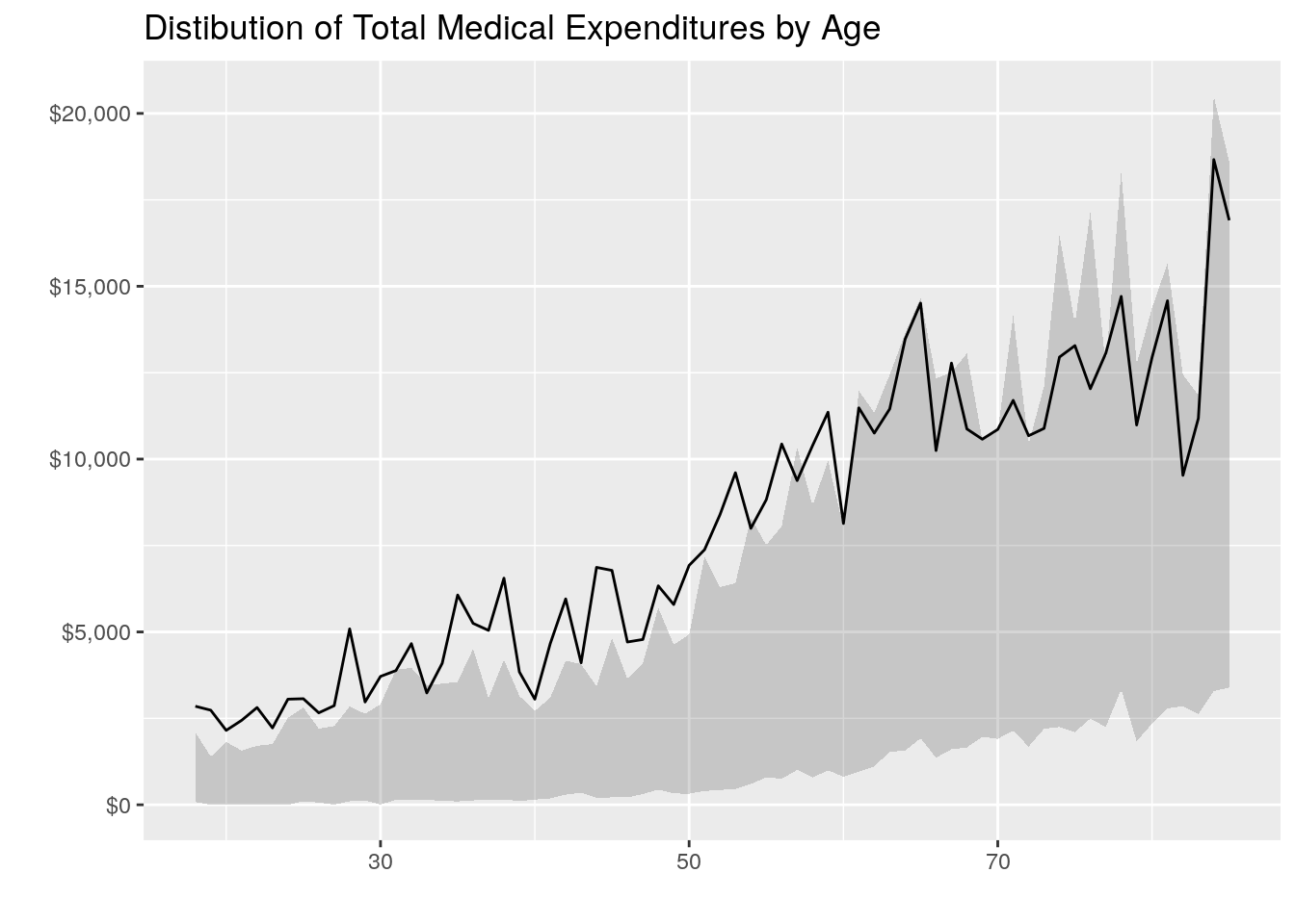
Total Expenditures vs BMI
#' Total Medical Expenditures vs BMI
plot_bmi = meps_sub %>%
  dplyr::mutate(bmi2 = round(ADBMI42, 0)) %>%
  dplyr::group_by(bmi2) %>%
  dplyr::mutate(q1 = quantile(TOTEXP18, probs = 0.25),
                q3 = quantile(TOTEXP18, probs = 0.75),
                mn = mean(TOTEXP18)) %>%
  ggplot(., mapping = aes(bmi2)) +
    geom_ribbon(aes(ymin = q1, ymax = q3), alpha = .2) +
    geom_line(aes(y = mn), show.legend = F) +
    scale_y_continuous(labels = dollar) +
    labs(
      title = 'Distibution of Total Medical Expenditures by BMI',
      x = '',
      y = ''
    )
plot_bmi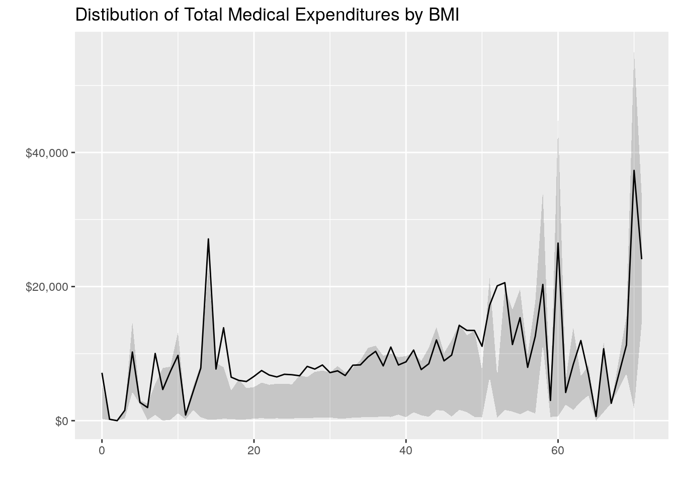
# Alternative Way to Plot Grouped Bar Charts for BMI
bmi_breaks = c(0, 10, 20, 30, 40, 50, Inf)
bmi_labels = c("0-9", "10-19", "20-29", "30-39", "40-49", "50+")

medexp_by_bmi = meps_sub %>%
  dplyr::mutate(bmi_buckets = cut(ADBMI42, breaks = bmi_breaks, right = F, labels = bmi_labels)) %>%
  dplyr::group_by(bmi_buckets) %>%
  dplyr::summarise(Total_Med_Exp = sum(TOTEXP18),
                   person_count = n()) %>%
  ungroup() %>%
  dplyr::mutate(average_med_exp = Total_Med_Exp / person_count)

ggplot(data = medexp_by_bmi,
        aes(x = bmi_buckets, y = average_med_exp, fill = bmi_buckets)) +
  geom_bar(stat = "identity") +
  theme_minimal() +
  ylab("Average Medical Spend") +
  xlab("BMI Range") +
  ggtitle("Medical Expenditures by BMI Range") +
  theme(axis.text.x = element_blank()) +
  coord_flip() +
  labs(fill = "BMI Range")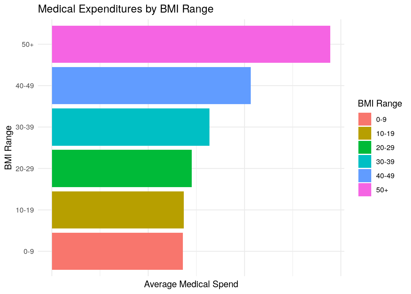
Total Expenditures vs Mental Health Status
#' Total Medical Expenditures vs Mental Health Status
medexp_by_mental_health = meps_sub %>%
  dplyr::group_by(MNHLTH42) %>%
  dplyr::summarise(Total_Med_Exp = sum(TOTEXP18),
                   person_count = n()) %>%
  ungroup() %>%
  dplyr::mutate(average_med_exp = Total_Med_Exp / person_count)

ggplot(data = medexp_by_mental_health,
        aes(x = MNHLTH42, y = average_med_exp, fill = MNHLTH42)) +
  geom_bar(stat = "identity") +
  theme_minimal() +
  ylab("Average Medical Spend") +
  xlab("Perceived Mental Health") +
  ggtitle("Medical Expenditures by Perceived Mental Health") +
  theme(axis.text.x = element_blank()) +
  coord_flip() +
  labs(fill = "Perceived Mental Health")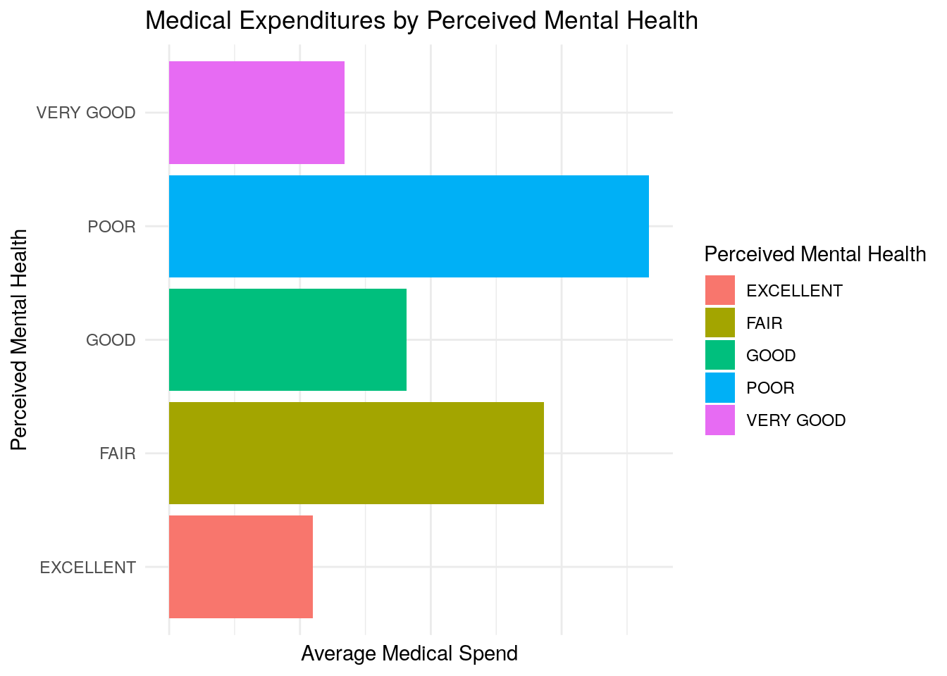
Correlation Matrix:
cor(meps_sub %>%
      dplyr::select(-MNHLTH42))
#>            TOTEXP18        AGE42X       ADBMI42
#> TOTEXP18 1.00000000  0.1921359528  0.0533997166
#> AGE42X   0.19213595  1.0000000000 -0.0001296941
#> ADBMI42  0.05339972 -0.0001296941  1.0000000000
We can gather several things from these plots and the correlation matrix:
- Age appears to be positively correlated with medical expenditures (as age increases, medical expenditures seem to increase, which makes logical sense). This is seen in both the plot and the correlation matrix with a correlation of 0.19 between age and medical expenditures
- BMI appears to be somewhat associated with medical expenditures, but the relationship seems modest based on the plots and correlation of 0.05.
- Average medical expenditures appear to vary significantly based on perceived mental health status, with worse mental health being associated with higher average medical expenditures.
11.1.2 Part 2 (12 points)
model = lm(TOTEXP18 ~ AGE42X + ADBMI42 + MNHLTH42, data = meps_sub)
summary(model)
#>
#> Call:
#> lm(formula = TOTEXP18 ~ AGE42X + ADBMI42 + MNHLTH42, data = meps_sub)
#>
#> Residuals:
#>    Min     1Q Median     3Q    Max
#> -23536  -6772  -3477    142 800417
#>
#> Coefficients:
#>                    Estimate Std. Error t value Pr(>|t|)
#> (Intercept)       -6853.080    661.167 -10.365  < 2e-16 ***
#> AGE42X              191.898      7.658  25.057  < 2e-16 ***
#> ADBMI42             116.826     17.990   6.494 8.57e-11 ***
#> MNHLTH42FAIR       7473.642    559.794  13.351  < 2e-16 ***
#> MNHLTH42GOOD       2753.371    364.908   7.545 4.72e-14 ***
#> MNHLTH42POOR      11909.996   1108.848  10.741  < 2e-16 ***
#> MNHLTH42VERY GOOD   757.270    348.367   2.174   0.0297 *
#> ---
#> Signif. codes:
#> 0 '***' 0.001 '**' 0.01 '*' 0.05 '.' 0.1 ' ' 1
#>
#> Residual standard error: 18750 on 18239 degrees of freedom
#> Multiple R-squared:  0.05518,    Adjusted R-squared:  0.05487
#> F-statistic: 177.5 on 6 and 18239 DF,  p-value: < 2.2e-16
The intercept term represents the expected medical expenditures when each of the numerical predictor variables are equal to zero, and when the qualitative predictors are equal to the reference level. In this case, we have one qualitative predictor (Mental Health Status) and the reference level is Excellent. Thus we interpret the intercept to be the expected medical expenditures when Age and BMI are zero, and Mental Health is excellent. We interpret the predictor coefficients as follows:
- For a one-year increase in age, we expect medical expenditures to increase by about 192 dollars, holding all other variables constant
- For a one-unit increase in BMI, we expect medical expenditures to increase by about 117 dollars, all else equal
- Having a mental health status of Fair is expected to increase medical expenditures by about 7,500 in relation to Excellent mental health, all else equal
- Having a mental health status of Good is expected to increase medical expenditures above those with Excellent mental health by about 2,750 dollars.
- Having a mental health status of Poor is expected to increase medical expenditures by about 11,900 in relation to Excellent mental health, all else equal
- Having a mental health status of Very Good is expected to increase medical expenditures by about 757 in relation to Excellent mental health, all else equal
Age, BMI, and Mental Health Status all appear to be important variables in predicting total medical expenditures. We use the p-value associated with each predictor to determine whether the predictor is important, and all of the p-values are either virtually zero or under typical thresholds for significance (0.05). For example, if we take the Age predictor, the p-value tells us that there is virtually zero probability of observing that level of association between age and health expenditures, in the absence of any real association (your null hypothesis).
Deciding how well the model fits the data can be somewhat subjective depending on the type of data your are modeling. In contexts such as this, where you’re trying to predict medical expenditures which can vary based on countless different variables, our threshold for what is a good predictive model may be different than some other situation. Nonetheless, the statistic that is mostly commonly used in linear regression to measure the quality of fit of the model would be the \(R^2\) statistic. Here, the \(R^2\) statistic is equal to 0.055, which is typically not regarded as very good in most contexts.
The p-value associated with the F-statistic for our model is basically zero. In the case of the F-statistic, the null hypothesis would be that none of the predictor variables are associated with the response. Since the p-value is virtually zero, this tells us that there is almost no chance of observing this level of association between the predictor set and the response, in the absence of any real association. Therefore, we can feel confident that at least one of the predictors is associated with the response and important in predicting medical expenditures.
11.1.3 Part 3 (2 points)
Here, the residual plot is a little difficult to decipher, so we’ll rely on other sources. If we use the
summary()function, we can look at the distribution of the residuals. We notice that the median is significantly different from zero, and the absolute value of the first quartile is nowhere near the value of the 3rd quartile. From this, we can infer that distribution of the residuals appears to be highly skewed which would conflict with our linearity assumption.One option to try to correct for this would be to perform a log transformation on the response variable. Let’s see what a model with a log-transformation would look like and if that helps at all with the linearity assumption:
model_log = lm(log(TOTEXP18) ~ AGE42X + ADBMI42 + MNHLTH42, data = meps_sub %>% dplyr::filter(TOTEXP18 >0))
summary(model_log)
#>
#> Call:
#> lm(formula = log(TOTEXP18) ~ AGE42X + ADBMI42 + MNHLTH42, data = meps_sub %>%
#>     dplyr::filter(TOTEXP18 > 0))
#>
#> Residuals:
#>     Min      1Q  Median      3Q     Max
#> -7.6497 -0.9960  0.0554  1.0259  5.9631
#>
#> Coefficients:
#>                    Estimate Std. Error t value Pr(>|t|)
#> (Intercept)       5.4272786  0.0599017  90.603  < 2e-16 ***
#> AGE42X            0.0321416  0.0006821  47.124  < 2e-16 ***
#> ADBMI42           0.0191794  0.0015770  12.162  < 2e-16 ***
#> MNHLTH42FAIR      0.8663927  0.0480629  18.026  < 2e-16 ***
#> MNHLTH42GOOD      0.3292167  0.0325283  10.121  < 2e-16 ***
#> MNHLTH42POOR      1.3200760  0.0933177  14.146  < 2e-16 ***
#> MNHLTH42VERY GOOD 0.1343319  0.0310608   4.325 1.54e-05 ***
#> ---
#> Signif. codes:
#> 0 '***' 0.001 '**' 0.01 '*' 0.05 '.' 0.1 ' ' 1
#>
#> Residual standard error: 1.551 on 15953 degrees of freedom
#> Multiple R-squared:  0.1607, Adjusted R-squared:  0.1604
#> F-statistic: 509.3 on 6 and 15953 DF,  p-value: < 2.2e-16
plot(model_log, which = 1)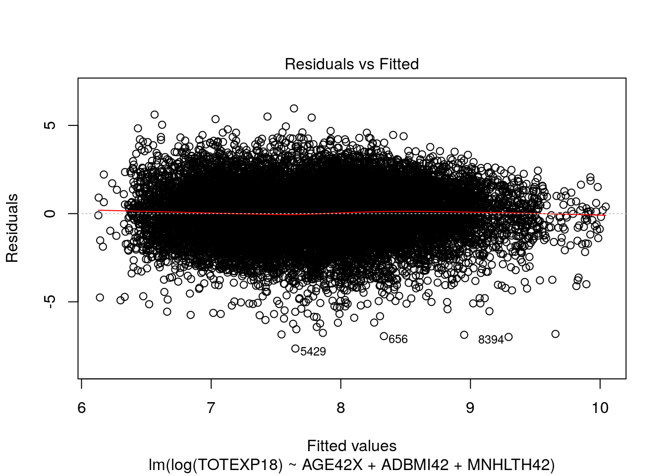
plot(model_log, which = 2)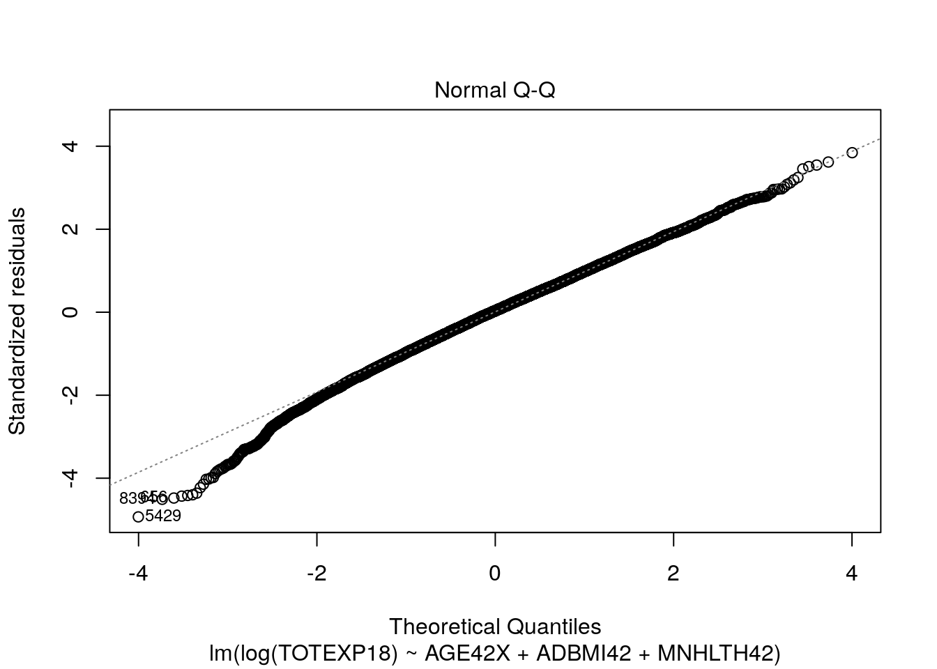
Here, our tests for linearity appear to be much more satisfactory and the residuals appear to be more normally distributed.
11.1.4 Part 4 (8 points)
set.seed(10)
train = sample(nrow(meps_sub), size = nrow(meps_sub) / 2, replace = F)
model_train = lm(TOTEXP18 ~ AGE42X + ADBMI42 + MNHLTH42, data = meps_sub, subset = train)
test_data_predictions = predict(model_train, meps_sub)[-train]
head(test_data_predictions)
#>         1         3         4         5         8        19
#>  2900.804  5184.001  6424.874  4870.366  6790.020 10354.183
test_mse = mean((meps_sub$TOTEXP18[-train] - test_data_predictions)^2)
test_mse
#> [1] 370558472
When comparing the predictive performance of models, we want to compare each model’s performance on unseen data (i.e. using the test MSE). The main reason for this is that when we apply our models in the real world, we won’t care about “predicting” things that have already happened or that we already know about (i.e. our training data), but rather we care how our model performs on new or unseen data (our test data).
Further, we can typically always improve the training MSE of a model by choosing a more complex or flexible learning algorithm. However, doing so does not guarantee that the model will perform well on novel data. Often times, there will be a point where increasing model flexibility results in increases to test MSE, even though the training MSE will be monotonically decreasing. This happens when a model works too hard to try to explain random variation in the training data, and is then not able to produce stable and accurate predictions on the test data. When the test MSE is very large, but the training MSE is small, we are said to be overfitting the data.
11.2 Question 2
11.2.1 Part 1
meps_logistic = meps %>%
  dplyr::select(ADFLST42, AGE42X, SEX, INSCOV18, POVCAT18, RACETHX) %>%
  dplyr::filter(ADFLST42 != "INVALID",
                AGE42X >= 18) %>%
  dplyr::mutate(ADFLST42 = ifelse(ADFLST42 == "YES", 1, 0))
flu_logistic_model = glm(
  ADFLST42 ~ AGE42X + SEX + INSCOV18 + POVCAT18 + RACETHX,
  data = meps_logistic,
  family = binomial(link = 'logit')
)
summary(flu_logistic_model)
#>
#> Call:
#> glm(formula = ADFLST42 ~ AGE42X + SEX + INSCOV18 + POVCAT18 +
#>     RACETHX, family = binomial(link = "logit"), data = meps_logistic)
#>
#> Deviance Residuals:
#>     Min       1Q   Median       3Q      Max
#> -1.7950  -1.0061  -0.6261   1.0752   2.4683
#>
#> Coefficients:
#>                            Estimate Std. Error z value
#> (Intercept)              -1.3174495  0.0835712 -15.764
#> AGE42X                    0.0318920  0.0009356  34.087
#> SEXMALE                  -0.2670878  0.0315908  -8.455
#> INSCOV18PUBLIC ONLY      -0.0050637  0.0410267  -0.123
#> INSCOV18UNINSURED        -1.1693722  0.0780303 -14.986
#> POVCAT18LOW INCOME       -0.3793822  0.0525876  -7.214
#> POVCAT18MIDDLE INCOME    -0.3155024  0.0388891  -8.113
#> POVCAT18NEAR POOR        -0.4421934  0.0824622  -5.362
#> POVCAT18POOR/NEGATIVE    -0.4340699  0.0559807  -7.754
#> RACETHXBLACK ONLY        -0.4073675  0.0805521  -5.057
#> RACETHXHISPANIC          -0.3315924  0.0779426  -4.254
#> RACETHXOTHER OR MULTIPLE -0.1007940  0.1112220  -0.906
#> RACETHXWHITE ONLY        -0.0388867  0.0712942  -0.545
#>                          Pr(>|z|)
#> (Intercept)               < 2e-16 ***
#> AGE42X                    < 2e-16 ***
#> SEXMALE                   < 2e-16 ***
#> INSCOV18PUBLIC ONLY         0.902
#> INSCOV18UNINSURED         < 2e-16 ***
#> POVCAT18LOW INCOME       5.42e-13 ***
#> POVCAT18MIDDLE INCOME    4.94e-16 ***
#> POVCAT18NEAR POOR        8.21e-08 ***
#> POVCAT18POOR/NEGATIVE    8.91e-15 ***
#> RACETHXBLACK ONLY        4.25e-07 ***
#> RACETHXHISPANIC          2.10e-05 ***
#> RACETHXOTHER OR MULTIPLE    0.365
#> RACETHXWHITE ONLY           0.585
#> ---
#> Signif. codes:
#> 0 '***' 0.001 '**' 0.01 '*' 0.05 '.' 0.1 ' ' 1
#>
#> (Dispersion parameter for binomial family taken to be 1)
#>
#>     Null deviance: 26193  on 19170  degrees of freedom
#> Residual deviance: 23647  on 19158  degrees of freedom
#> AIC: 23673
#>
#> Number of Fisher Scoring iterations: 4
The SEXMALE coefficient is -0.267.
This means that males are associated with a 0.267 reduction in the log odds of receiving a flu shot, relative to females.
This can also be interpreted as a decrease in the odds of receiving a flu shot by a multiplicative factor of \(e^{-0.267} = 0.766\).
We can further infer that males are associated with a lower likelihood or probability of receiving a flu shot than females.
Finally, we note that the p-value associated with the sex-male coefficient is extremely small, indicating that the predictor is significant.
The INSCOV18PUBLIC ONLY coefficient is equal to -0.005 and the INSCOV18UNINSURED coefficient is equal to -1.169.
This means that both the ‘public only’ level and the ‘uninsured’ level are associated with a decrease in the log odds of receiving a flu shot, relative to the privately insured population.
However, we note that the p-value for the public-only population is high, so we cannot say that the impact of public-only insurance on the likelihood of receiving a flu shot is different than that of private insurance.
If we calculate \(e^{-1.169}\) for the uninsured coefficient, we get a value of 0.31, so we can say that being uninsured is estimated to reduce a person’s odds of receiving a flu shot by a multiplicative factor of 0.31 (~70% decrease), relative to the privately insured population.
We can also then infer that being uninsured is associated with a reduction in the probability of receiving a flu shot, relative to those with private insurance.
The reference level for the POVCAT18 variable is HIGH INCOME, thus all the other levels’ coefficients will be relative to HIGH INCOME.
Because all of the coefficients for the non-high-income levels are negative (and they appear to get roughly more negative the poorer a person is), we can generally conclude that lower income appears to be associated with a lower likelihood of receiving the flu vaccine, all else equal.
When we look at the RACETHX predictor, we see that the reference level in this model is ASIAN ONLY, thus all coefficients will be relative to ASIAN ONLY.
All of the other levels’ coefficients for race are negative, so we can generally infer that other races have a lower likelihood of receiving a flu shot relative to Asian only.
However, we notice that the ‘other race’ and ‘white only’ coefficients are not significant, so we cannot conclude that they are associated with a lower likelihood of receiving a flu vaccine, relative to Asian only.
11.2.2 Part 2:
preds = predict(flu_logistic_model, type = "response")
head(preds, n = 10)
#>         1         2         3         4         5         6
#> 0.2877112 0.2304972 0.2736886 0.2588942 0.4481313 0.2724622
#>         7         8         9        10
#> 0.3355505 0.2329154 0.1063345 0.2332347

thresh = 0.5

accuracy = sum(ifelse(preds > thresh, 1, 0) == meps_logistic$ADFLST42) / nrow(meps_logistic)
accuracy
#> [1] 0.6591727

data.frame(
  actual = meps_logistic$ADFLST42,
  predicted = ifelse(preds > thresh, 1, 0)
) %>% table()
#>       predicted
#> actual    0    1
#>      0 8141 2798
#>      1 3736 4496

# Sensitivity
4496 / (4496 + 3736)
#> [1] 0.5461613
The sensitivity of our classifier is equal to 0.546 with a threshold of 0.50. This means that our model correctly classifies about 55% of the individuals who actually received a flu shot.
11.2.3 Bonus Question
In this type of scenario, it’s often easiest to ask yourself what the consequences are of your model’s decisions. If your model has high sensitivity, it is more likely that you will correctly identify the killer. However, you are also more likely to identify a person as the killer who actually did not commit the crime. If your model has high specificity, it is more likely that you will correctly identify the individuals who did not commit the crime, (i.e. are innocent).
You may ask “what’s the bigger mistake?”. Is it better to identify the killer but risk also convicting innocent people of murder? Or is it better to feel confident that you are not incorrectly convicting people of murder, but risk the killer not being identified and able to roam free.
Many people would argue it’s a bigger mistake to incorrectly convict innocent people, which would correspond to picking a model with greater specificity.