10 Homework: Week 1 Solution
10.1 Question 1 (2 Points):
The HIDEG field refers to the highest degree that a person achieved at the time they first entered the MEPS survey.
Here is what the codebook lists for all possible values and record counts:
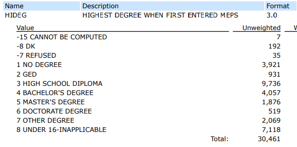
To verify the record count of the “HIDEG” field values, I would use the group_by() function to group by HIDEG, and then I would use the summarize() function along with n() to count the number of records for each value of HIDEG.
It would look like this:
10.2 Question 2 (2 Points):
person_sum_by_race <- meps %>%
  dplyr::group_by(RACETHX) %>%
  dplyr::summarize(person_weight_sum = sum(PERWT18F)) %>%
  ungroup() %>%
  dplyr::mutate(percent = 100 * round(person_weight_sum / sum(person_weight_sum),3))

person_sum_by_race
#> # A tibble: 5 × 3
#>   RACETHX           person_weight_sum percent
#>   <chr>                         <dbl>   <dbl>
#> 1 ASIAN ONLY                19307379.     5.9
#> 2 BLACK ONLY                40104475.    12.3
#> 3 HISPANIC                  60229788.    18.5
#> 4 OTHER OR MULTIPLE         11920040.     3.7
#> 5 WHITE ONLY               194766207.    59.7
Confirming with codebook:
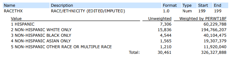
Many solutions could be accepted, but here is one example that would confirm that the MEPS weighted distribution of race is representative of the U.S. population.

10.3 Question 3 (5 Points):
hw_df_1 <- meps %>%
  dplyr::select(DUPERSID, AGE42X, ADBMI42) %>%
  dplyr::filter(AGE42X >= 0) %>%
  dplyr::arrange(desc(ADBMI42)) %>%
  dplyr::slice(1:10) %>%
  dplyr::mutate(BMI_2 = round(ADBMI42, 0))

head(hw_df_1)
#> # A tibble: 6 × 4
#>   DUPERSID   AGE42X ADBMI42 BMI_2
#>   <chr>       <dbl>   <dbl> <dbl>
#> 1 2290648101     56    71.1    71
#> 2 2328264101     31    70.8    71
#> 3 2326867103     32    70.5    70
#> 4 2327052101     24    70.2    70
#> 5 2327273101     53    69.7    70
#> 6 2328953102     22    69.1    69
10.4 Question 4 (6 Points):
hw_df_2 <- meps %>%
  dplyr::filter(POVCAT18 %in% c("POOR/NEGATIVE", "LOW INCOME")) %>%
  dplyr::select(POVCAT18, RTHLTH42, TOTEXP18) %>%
  dplyr::filter(RTHLTH42 != "INVALID") %>%
  dplyr::group_by(POVCAT18, RTHLTH42) %>%
  dplyr::summarize(
    total_med_exp = sum(TOTEXP18),
    person_count = n(),
    average_med_exp = total_med_exp / person_count,
    average_med_exp_alternative = mean(TOTEXP18),
    median_med_exp = median(TOTEXP18),
    median_med_exp_alternative = quantile(TOTEXP18, probs = 0.50),
    percentile_75 = quantile(TOTEXP18, probs = 0.75)
  )

head(hw_df_2)
#> # A tibble: 6 × 9
#> # Groups:   POVCAT18 [2]
#>   POVCAT18      RTHLTH42  total_med_exp person_count
#>   <chr>         <chr>             <dbl>        <int>
#> 1 LOW INCOME    EXCELLENT       2087391         1171
#> 2 LOW INCOME    FAIR            6073514          485
#> 3 LOW INCOME    GOOD            8355011         1338
#> 4 LOW INCOME    POOR            3360914          132
#> 5 LOW INCOME    VERY GOOD       4391685         1320
#> 6 POOR/NEGATIVE EXCELLENT       2581576         1515
#> # … with 5 more variables: average_med_exp <dbl>,
#> #   average_med_exp_alternative <dbl>,
#> #   median_med_exp <dbl>, median_med_exp_alternative <dbl>,
#> # percentile_75 <dbl>- Note the multiple ways to calculate the average and median spend
10.5 Question 5 (10 Points):
# This data manipulation section is worth 4 points:
flushot_by_usc_inscov = meps %>%
  dplyr::filter(ADFLST42 != "INVALID",
                HAVEUS42 != "INVALID") %>%
  dplyr::group_by(ADFLST42,
                  HAVEUS42,
                  INSCOV18) %>%
  dplyr::summarise(person_count = n()) %>%
  ungroup() %>%
  tidyr::pivot_wider(names_from = ADFLST42, values_from = person_count) %>%
  dplyr::mutate(total_count = YES + NO,
                percent_flushot = YES / total_count)

head(flushot_by_usc_inscov)
#> # A tibble: 6 × 6
#>   HAVEUS42 INSCOV18     NO   YES total_count percent_flushot
#>   <chr>    <chr>     <int> <int>       <int>           <dbl>
#> 1 NO       ANY PRIV…  2004   729        2733          0.267
#> 2 NO       PUBLIC O…   781   262        1043          0.251
#> 3 NO       UNINSURED   919    98        1017          0.0964
#> 4 YES      ANY PRIV…  4492  4640        9132          0.508
#> 5 YES      PUBLIC O…  2069  2267        4336          0.523
#> 6 YES      UNINSURED   484   115         599          0.192
# This plotting section is worth 5 points
# Explanation is worth 1 point
gopher_colors = c("#7A0019", "#FCD131", "#515151")

ggplot(data = flushot_by_usc_inscov,
         aes(x = HAVEUS42, y = percent_flushot, fill = INSCOV18)) +
       geom_bar(stat = "identity", position = "dodge") +
       theme_minimal() +
       xlab("Usual Source of Care") +
       ylab("Percent Receiving Flu Shot") +
       ggtitle("Percent Receiving Flu Shot by USC and Insurance Coverage") +
       scale_x_discrete(labels = function(x) str_wrap(x, width = 10)) +
       scale_fill_manual(values = gopher_colors) +
       scale_y_continuous(labels = scales::percent) +
       labs(fill = "Insurance\nCoverage")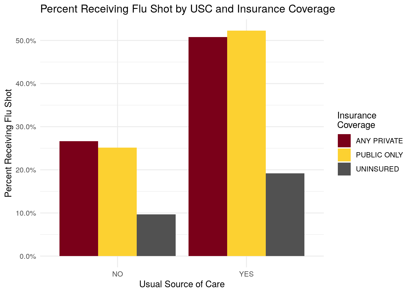
- Individuals with a usual source of care have a higher percentage of members receiving flu shot.
- Individuals with insurance coverage have a higher percentage of members receiving flu shot, as compared to the uninsured.
10.6 Question 6 (11 Points):
10.6.1 Part 1:
# This section using the 'cut' function is worth 5 points
bmi_breaks = c(0, 16, 17, 18.5, 25, 30, 35, 40, Inf)
bmi_labels = c("Underweight - Severe", "Underweight - Moderate", "Underweight - Mild", "Normal", "Overweight", "Obese - I",
                 "Obese II", "Obese III")

medexp_by_bmi_cut = meps %>%
  dplyr::filter(ADBMI42 >= 0) %>%
  dplyr::mutate(bmi_buckets = cut(ADBMI42, breaks = bmi_breaks, right = F, labels = bmi_labels)) %>%
  dplyr::group_by(bmi_buckets) %>%
  dplyr::summarise(Total_Med_Exp = sum(TOTEXP18),
                   person_count = n()) %>%
  ungroup() %>%
  dplyr::mutate(average_med_exp = Total_Med_Exp / person_count)

ggplot(data = medexp_by_bmi_cut,
        aes(x = bmi_buckets, y = average_med_exp, fill = bmi_buckets)) +
  geom_bar(stat = "identity") +
  theme_minimal() +
  ylab("Average Medical Spend") +
  xlab("BMI Range") +
  ggtitle("Medical Expenditures by BMI Range") +
  scale_fill_brewer(palette = "RdPu") +
  scale_x_discrete(labels = function(x) str_wrap(x, width = 10)) +
  scale_y_continuous(labels = scales::comma) +
  coord_flip() +
  labs(fill = "BMI Range")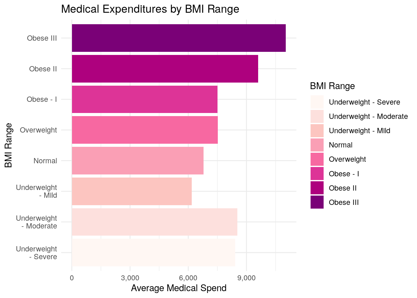
10.6.2 Part 2:
# This section using the 'case_when` function is worth 5 points.
# Explanation below is worth 1 point
medexp_by_bmi_case_when <-  meps %>%
  dplyr::filter(ADBMI42 >= 0) %>%
  dplyr::mutate(
    bmi_buckets = case_when(
      ADBMI42 >= 0 & ADBMI42 < 16 ~ "Underweight - Severe",
      ADBMI42 >= 16 & ADBMI42 < 17 ~ "Underweight - Moderate",
      ADBMI42 >= 17 & ADBMI42 < 18.5 ~ "Underweight - Mild",
      ADBMI42 >= 18.5 & ADBMI42 < 25 ~ "Normal",
      ADBMI42 >= 25 & ADBMI42 < 30 ~ "Overweight",
      ADBMI42 >= 30 & ADBMI42 < 35 ~ "Obese - I",
      ADBMI42 >= 35 & ADBMI42 < 40 ~ "Obese - II",
      ADBMI42 >= 40 ~ "Obese - III"
    )
  ) %>%
  dplyr::group_by(bmi_buckets) %>%
  dplyr::summarise(Total_Med_Exp = sum(TOTEXP18),
                   person_count = n()) %>%
  ungroup() %>%
  dplyr::mutate(average_med_exp = Total_Med_Exp / person_count)

ggplot(data = medexp_by_bmi_case_when,
        aes(x = bmi_buckets, y = average_med_exp, fill = bmi_buckets)) +
  geom_bar(stat = "identity") +
  theme_minimal() +
  ylab("Average Medical Spend") +
  xlab("BMI Range") +
  ggtitle("Average Medical Expenditures by BMI Range") +
  scale_fill_brewer(palette = "YlOrRd") +
  scale_x_discrete(labels = function(x) str_wrap(x, width = 10)) +
  scale_y_continuous(labels = scales::comma) +
  coord_flip() +
  labs(fill = "BMI Range")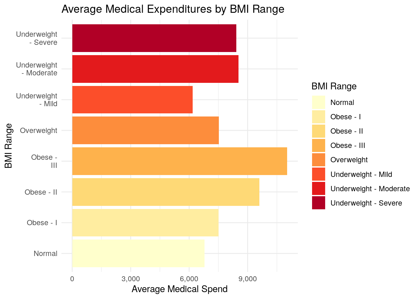
10.6.3 Part 3:
The biggest difference between using the cut() function and the case_when() function is that the cut() function creates a new field that is a “factor” type instead of a “character” type.
Factor variables are special types of fields in R, and when cut() creates the new factor variable, it tells R that there is an inherent order to the BMI classification.
When you use case_when(), R does not know that there is an intended order to the classification schedule.
As a result, when you plot Part 1 using cut(), the bar chart is plotted in the order that you defined the BMI classification, where it progresses from Underweight, to Normal, to Overweight, to Obese - as it should.
When you plot Part 2 using case_when(), R doesn’t know about the inherent order of the BMI classification, so it will plot the bar chart in alphabetical order, which makes the bar chart more difficult to read, especially when you use one of the ‘sequential’ color palettes, as we have.
In other words, using a sequential color palette implies some sort of order to your chart, and so the plot in Part 2 of this question really is not a very good plot.
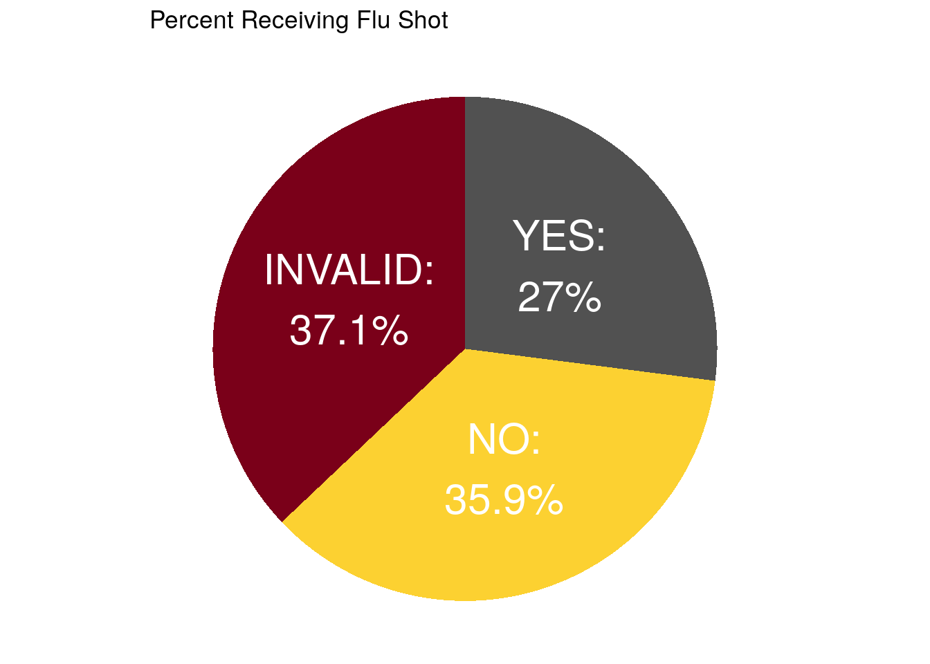
10.7 Question 7 (5 Bonus Points):
10.7.2 Part 2:
ggplot(data = pie_data,
       aes(x = "", y = count, fill = ADFLST42)) +
  geom_bar(stat = "identity", width = 1) +
  coord_polar("y", start = 0) +
  theme_void() +
  theme(legend.position="none") +
  geom_text(aes(label = paste0(ADFLST42, ":\n", percent, "%")),
            position = position_stack(vjust = 0.5),
            color = "white",
            size = 8) +
  # geom_text(aes(y = ypos, label = ADFLST42), color = "white", size=6) +
  scale_fill_manual(values = gopher_colors) +
  ggtitle("Percent Receiving Flu Shot")