Chapter 11 Using R
In a previous chapter we learned some basic R terminology and how to run R, and how to use R to read and view data. In this chapter, we will use this knowledge to do some useful analysis of the Canadian employment data we have already worked with. We will also use ggplot, R’s powerful graphing system.
Chapter goals
In this chapter we will learn how to use R to:
- Use filter, select, arrange, and mutate to transform data tables.
- Calculate univariate statistics in R.
- Produce simple but informative histograms and line graphs using ggplot.
To get started, open R, load the Tidyverse, and read in our employment data.
library(tidyverse)
EmpData <- read_csv("https://bookdown.org/bkrauth/BOOK/sampledata/EmploymentData.csv")
11.1 Cleaning data in R
We will not spend a lot of time on data cleaning in R, as we can always clean data in Excel and export it to R. However, we have a few Tidyverse tools that are useful to learn.
The Tidyverse includes four core functions for modifying data:
mutate()allows us to add or change variables.filter()allows us to select particular observations, much like Excel’s filter tool.arrange()allows us to sort observations, much like Excel’s sort tool.select()allows us to select particular variables.
All four functions follow a common syntax that is designed to work with a convenient Tidyverse tool called the “pipe” operator.
11.1.1 The pipe operator
The pipe operator is part of the Tidyverse and is written %>%. Recall
that an operator is just a symbol like + or * that performs some function
on whatever comes before it and whatever comes after it.
To see how it works, I’ll show you a few examples:
# This is equivalent to names(EmpData)
EmpData %>%
    names()
##  [1] "MonthYr"          "Population"       "Employed"         "Unemployed"
##  [5] "LabourForce"      "NotInLabourForce" "UnempRate"        "LFPRate"
##  [9] "Party"            "PrimeMinister"    "AnnPopGrowth"
# This is equivalent to sqrt(2)
2 %>%
    sqrt()
## [1] 1.414214
# This is equivalent to cat(sqrt(2),' is the square root of 2')
2 %>%
    sqrt() %>%
    cat(" is the square root of 2")
## 1.414214  is the square root of 2
As you can see, R’s rule for interpreting the pipe operator is that the
object before the %>% is taken as the first argument for the function
after the %>%.
The pipe operator does not add any functionality to R; anything you can do with it can also be done without it. But it addresses a common problem: we often want to perform multiple transformations on a data set, but doing so in the usual functional language can lead to code that is quite difficult to read. The pipe operator can be used to create much more readable code, as we will see in the examples below.
11.1.2 Mutate
The most important data transformation function is mutate, which
allows us to change or add variables. We will start by changing
the MonthYr variable from character (text) to date, using the as.Date()
function:
# Change MonthYr to date format
EmpData %>%
    mutate(MonthYr = as.Date(MonthYr, "%m/%d/%Y"))
## # A tibble: 541 x 11
##    MonthYr    Population Employed Unemployed LabourForce NotInLabourForce
##    <date>          <dbl>    <dbl>      <dbl>       <dbl>            <dbl>
##  1 1976-01-01     16852.    9637.       733       10370.            6483.
##  2 1976-02-01     16892     9660.       730       10390.            6502.
##  3 1976-03-01     16931.    9704.       692.      10396.            6535
##  4 1976-04-01     16969.    9738.       713.      10451.            6518.
##  5 1976-05-01     17008.    9726.       720       10446.            6562
##  6 1976-06-01     17047.    9748.       721.      10470.            6577.
##  7 1976-07-01     17086.    9760.       780.      10539.            6546.
##  8 1976-08-01     17124.    9780.       744.      10524.            6600.
##  9 1976-09-01     17154.    9795.       737.      10532.            6622.
## 10 1976-10-01     17183.    9782.       783.      10565.            6618.
## # ... with 531 more rows, and 5 more variables: UnempRate <dbl>, LFPRate <dbl>,
## #   Party <chr>, PrimeMinister <chr>, AnnPopGrowth <dbl>
As you can see, the MonthYr column is now labeled as a date rather than text. Like Excel, R has an internal representation of dates that allows for correct ordering and calculations, but displays dates in a standard human-readable format.
Mutate can be used to add variables as well as changing them. For example, suppose we also want to create versions of UnempRate and LFPRate that are expressed in percentages rather than decimal units:
# Add UnempPct and LFPPct
EmpData %>%
    mutate(UnempPct = 100 * UnempRate) %>%
    mutate(LFPPct = 100 * LFPRate)
## # A tibble: 541 x 13
##    MonthYr   Population Employed Unemployed LabourForce NotInLabourForce UnempRate
##    <chr>          <dbl>    <dbl>      <dbl>       <dbl>            <dbl>     <dbl>
##  1 1/1/1976      16852.    9637.       733       10370.            6483.    0.0707
##  2 2/1/1976      16892     9660.       730       10390.            6502.    0.0703
##  3 3/1/1976      16931.    9704.       692.      10396.            6535     0.0665
##  4 4/1/1976      16969.    9738.       713.      10451.            6518.    0.0682
##  5 5/1/1976      17008.    9726.       720       10446.            6562     0.0689
##  6 6/1/1976      17047.    9748.       721.      10470.            6577.    0.0689
##  7 7/1/1976      17086.    9760.       780.      10539.            6546.    0.0740
##  8 8/1/1976      17124.    9780.       744.      10524.            6600.    0.0707
##  9 9/1/1976      17154.    9795.       737.      10532.            6622.    0.0699
## 10 10/1/1976     17183.    9782.       783.      10565.            6618.    0.0741
## # ... with 531 more rows, and 6 more variables: LFPRate <dbl>, Party <chr>,
## #   PrimeMinister <chr>, AnnPopGrowth <dbl>, UnempPct <dbl>, LFPPct <dbl>
If you look closely, you can see that the UnempPct and LFPPct variables are now included in the data table.
Before we go any further, note that we haven’t yet changed the
EmpData data table:
print(EmpData)
## # A tibble: 541 x 11
##    MonthYr   Population Employed Unemployed LabourForce NotInLabourForce UnempRate
##    <chr>          <dbl>    <dbl>      <dbl>       <dbl>            <dbl>     <dbl>
##  1 1/1/1976      16852.    9637.       733       10370.            6483.    0.0707
##  2 2/1/1976      16892     9660.       730       10390.            6502.    0.0703
##  3 3/1/1976      16931.    9704.       692.      10396.            6535     0.0665
##  4 4/1/1976      16969.    9738.       713.      10451.            6518.    0.0682
##  5 5/1/1976      17008.    9726.       720       10446.            6562     0.0689
##  6 6/1/1976      17047.    9748.       721.      10470.            6577.    0.0689
##  7 7/1/1976      17086.    9760.       780.      10539.            6546.    0.0740
##  8 8/1/1976      17124.    9780.       744.      10524.            6600.    0.0707
##  9 9/1/1976      17154.    9795.       737.      10532.            6622.    0.0699
## 10 10/1/1976     17183.    9782.       783.      10565.            6618.    0.0741
## # ... with 531 more rows, and 4 more variables: LFPRate <dbl>, Party <chr>,
## #   PrimeMinister <chr>, AnnPopGrowth <dbl>
As you can see, the MonthYr variable is still listed as a character variable and the new UnempPct and LFPPct variables do not seem to exist.
What has happened here? Our original commands simply created a new object based
on EmpData that was then displayed on the screen. In order to change EmpData
itself, we need to assign that new object back to EmpData:
# Make permanent changes to EmpData
EmpData <- EmpData %>%
    mutate(MonthYr = as.Date(MonthYr, "%m/%d/%Y")) %>%
    mutate(UnempPct = 100 * UnempRate) %>%
    mutate(LFPPct = 100 * LFPRate)
We can confirm that now we have changed EmpData:
print(EmpData)
## # A tibble: 541 x 13
##    MonthYr    Population Employed Unemployed LabourForce NotInLabourForce
##    <date>          <dbl>    <dbl>      <dbl>       <dbl>            <dbl>
##  1 1976-01-01     16852.    9637.       733       10370.            6483.
##  2 1976-02-01     16892     9660.       730       10390.            6502.
##  3 1976-03-01     16931.    9704.       692.      10396.            6535
##  4 1976-04-01     16969.    9738.       713.      10451.            6518.
##  5 1976-05-01     17008.    9726.       720       10446.            6562
##  6 1976-06-01     17047.    9748.       721.      10470.            6577.
##  7 1976-07-01     17086.    9760.       780.      10539.            6546.
##  8 1976-08-01     17124.    9780.       744.      10524.            6600.
##  9 1976-09-01     17154.    9795.       737.      10532.            6622.
## 10 1976-10-01     17183.    9782.       783.      10565.            6618.
## # ... with 531 more rows, and 7 more variables: UnempRate <dbl>, LFPRate <dbl>,
## #   Party <chr>, PrimeMinister <chr>, AnnPopGrowth <dbl>, UnempPct <dbl>,
## #   LFPPct <dbl>
11.1.3 Filter, arrange, and select
Now let’s suppose we want to know more about the months in our data set
with the highest unemployment rates. We can use filter() for
this purpose:
# This will give all of the observations with unemployment rates over 12.5%
EmpData %>%
    filter(UnempPct > 12.5)
## # A tibble: 8 x 13
##   MonthYr    Population Employed Unemployed LabourForce NotInLabourForce
##   <date>          <dbl>    <dbl>      <dbl>       <dbl>            <dbl>
## 1 1982-10-01     19183.   10787.      1602.      12389.            6794.
## 2 1982-11-01     19203.   10764.      1600.      12364.            6839.
## 3 1982-12-01     19223.   10774.      1624.      12398.            6824.
## 4 1983-01-01     19244.   10801.      1573.      12374             6870.
## 5 1983-02-01     19266.   10818.      1574.      12392.            6875.
## 6 1983-03-01     19285.   10875.      1555.      12430.            6856.
## 7 2020-04-01     30994.   16142.      2444.      18586.           12409.
## 8 2020-05-01     31009.   16444       2610.      19054.           11955.
## # ... with 7 more variables: UnempRate <dbl>, LFPRate <dbl>, Party <chr>,
## #   PrimeMinister <chr>, AnnPopGrowth <dbl>, UnempPct <dbl>, LFPPct <dbl>
As you can see, only 8 of the 541 months in our data have unemployment rates over 12.5% - the worst months of the 1982-83 recession, and April and May of last year.
Now let’s suppose that we only want to see a few pieces of information about those
months. We can use select() to choose variables:
# This will take out all variables except a few
EmpData %>%
    filter(UnempPct > 12.5) %>%
    select(MonthYr, UnempRate, LFPPct, PrimeMinister)
## # A tibble: 8 x 4
##   MonthYr    UnempRate LFPPct PrimeMinister
##   <date>         <dbl>  <dbl> <chr>
## 1 1982-10-01     0.129   64.6 Pierre Trudeau
## 2 1982-11-01     0.129   64.4 Pierre Trudeau
## 3 1982-12-01     0.131   64.5 Pierre Trudeau
## 4 1983-01-01     0.127   64.3 Pierre Trudeau
## 5 1983-02-01     0.127   64.3 Pierre Trudeau
## 6 1983-03-01     0.125   64.5 Pierre Trudeau
## 7 2020-04-01     0.131   60.0 Justin Trudeau
## 8 2020-05-01     0.137   61.4 Justin Trudeau
Finally, suppose that we want to show months in descending order by
unemployment rate (i.e., the highest unemployment rate first). We
can use arrange() to sort rows in this way:
# This will sort the rows by unemployment rate
EmpData %>%
    filter(UnempPct > 12.5) %>%
    select(MonthYr, UnempPct, LFPPct, PrimeMinister) %>%
    arrange(UnempPct)
## # A tibble: 8 x 4
##   MonthYr    UnempPct LFPPct PrimeMinister
##   <date>        <dbl>  <dbl> <chr>
## 1 1983-03-01     12.5   64.5 Pierre Trudeau
## 2 1983-02-01     12.7   64.3 Pierre Trudeau
## 3 1983-01-01     12.7   64.3 Pierre Trudeau
## 4 1982-10-01     12.9   64.6 Pierre Trudeau
## 5 1982-11-01     12.9   64.4 Pierre Trudeau
## 6 1982-12-01     13.1   64.5 Pierre Trudeau
## 7 2020-04-01     13.1   60.0 Justin Trudeau
## 8 2020-05-01     13.7   61.4 Justin Trudeau
Hopefully you can see why the pipe operator is useful in making our code clear and readable:
# This is what the same code looks like without the pipe
arrange(select(filter(EmpData, UnempPct > 12.5), MonthYr, UnempPct, LFPPct, PrimeMinister),
    UnempPct)
## # A tibble: 8 x 4
##   MonthYr    UnempPct LFPPct PrimeMinister
##   <date>        <dbl>  <dbl> <chr>
## 1 1983-03-01     12.5   64.5 Pierre Trudeau
## 2 1983-02-01     12.7   64.3 Pierre Trudeau
## 3 1983-01-01     12.7   64.3 Pierre Trudeau
## 4 1982-10-01     12.9   64.6 Pierre Trudeau
## 5 1982-11-01     12.9   64.4 Pierre Trudeau
## 6 1982-12-01     13.1   64.5 Pierre Trudeau
## 7 2020-04-01     13.1   60.0 Justin Trudeau
## 8 2020-05-01     13.7   61.4 Justin Trudeau
Now I should probably say: these results imply nothing meaningful about the economic policy of either Pierre or Justin Trudeau. The severe worldwide recessions in 1982-83 (caused by US monetary policy) and 2020-2021 (caused by the COVID-19 pandemic) were caused by world events largely outside the control of Canadian policy makers.
11.1.4 Saving code and data
It is possible to save your data set in R’s internal format just like you would save an Excel file. But I’m not going to tell you how to do that, because what you really need to do is save your code.
Because it is command-based, R enables an entirely different and much more reproducible model for data cleaning and analysis. In Excel, the original data, the data cleaning, the data analysis, and the results are all mixed in together in a simple file. This is convenient and simple to use in many applications, but it can be a disaster in complex projects.
In contrast, R allows you to have three separate files or groups of files
- The original data, which you do not change.
- The code to clean and analyze the data, which you maintain carefully
(including version control).
- Your code can be saved in an R script, or as part of an R Markdown document.
- This code can be split into multiple files.
- You can have one script to clean the data and another to analyze it.
- The results of your code, which you treat as temporary files that can be
deleted or replaced at any time.
- This can include the results of your analysis
- It can also include your cleaned data.
The key is to make sure that all of your cleaned data and results can be regenerated from the original data at any time by running your code.
Example 11.1 BC education data
My colleagues and I have a long-term research project that uses student records from the British Columbia elementary school system. It requires linking a student’s records across multiple years, linking student records to school records, calculating school-level averages of some variables, and many other tasks.
The code to clean this data is split into about 10 scripts which must be run in sequence and takes about 30-45 minutes to run. I do not want to do that every time I do something with the data, so the last script saves the cleaned data to a file, and my analysis scripts use that cleaned data file.
But every time I make a major change, or every time I put results into a research paper for others to read, I re-run everything from the beginning.
11.2 Data analysis in R
Having read and cleaned our data set, we can now move on to some summary statistics.
11.2.1 The summary function
The summary() function will give a basic summary of any object. Exactly what
that summary looks like depends on the object. For tibbles, summary() produces
a set of summary statistics for each variable:
summary(EmpData)
##     MonthYr             Population       Employed       Unemployed
##  Min.   :1976-01-01   Min.   :16852   Min.   : 9637   Min.   : 691.5
##  1st Qu.:1987-04-01   1st Qu.:20290   1st Qu.:12230   1st Qu.:1102.5
##  Median :1998-07-01   Median :23529   Median :14064   Median :1265.5
##  Mean   :1998-07-01   Mean   :23795   Mean   :14383   Mean   :1261.0
##  3rd Qu.:2009-10-01   3rd Qu.:27327   3rd Qu.:16926   3rd Qu.:1404.6
##  Max.   :2021-01-01   Max.   :31191   Max.   :19130   Max.   :2609.8
##
##   LabourForce    NotInLabourForce   UnempRate          LFPRate
##  Min.   :10370   Min.   : 6483    Min.   :0.05446   Min.   :0.5996
##  1st Qu.:13467   1st Qu.: 6842    1st Qu.:0.07032   1st Qu.:0.6501
##  Median :15333   Median : 8162    Median :0.07691   Median :0.6573
##  Mean   :15644   Mean   : 8151    Mean   :0.08207   Mean   :0.6564
##  3rd Qu.:18230   3rd Qu.: 9099    3rd Qu.:0.09369   3rd Qu.:0.6674
##  Max.   :20316   Max.   :12409    Max.   :0.13697   Max.   :0.6766
##
##     Party           PrimeMinister       AnnPopGrowth         UnempPct
##  Length:541         Length:541         Min.   :0.007522   Min.   : 5.446
##  Class :character   Class :character   1st Qu.:0.012390   1st Qu.: 7.032
##  Mode  :character   Mode  :character   Median :0.013156   Median : 7.691
##                                        Mean   :0.013703   Mean   : 8.207
##                                        3rd Qu.:0.014286   3rd Qu.: 9.369
##                                        Max.   :0.024815   Max.   :13.697
##                                        NA's   :12
##      LFPPct
##  Min.   :59.96
##  1st Qu.:65.01
##  Median :65.73
##  Mean   :65.64
##  3rd Qu.:66.74
##  Max.   :67.66
##
11.2.2 Univariate statistics
The R function mean() calculates the sample average of any numeric
vector:
# Mean of a single variable
mean(EmpData$UnempPct)
## [1] 8.207112
There are many other functions in R to calculate other univariate summary statistics:
# VAR calculates the sample variance
var(EmpData$UnempPct)
## [1] 2.923088
# SD calculates the standard deviation
sd(EmpData$UnempPct)
## [1] 1.709704
# MEDIAN calculates the sample median
median(EmpData$UnempPct)
## [1] 7.691411
As you can see, they work just like mean().
In real-world data, some variables have missing values for one or more
observations. For example, the AnnPopGrowth variable in our data set is
missing for the first year of data (1976), since calculating the growth rate
for 1976 would require data from 1975. In R, missing values are given the
special value NA which stands for “not available”:
EmpData %>%
    select(MonthYr, Population, AnnPopGrowth)
## # A tibble: 541 x 3
##    MonthYr    Population AnnPopGrowth
##    <date>          <dbl>        <dbl>
##  1 1976-01-01     16852.           NA
##  2 1976-02-01     16892            NA
##  3 1976-03-01     16931.           NA
##  4 1976-04-01     16969.           NA
##  5 1976-05-01     17008.           NA
##  6 1976-06-01     17047.           NA
##  7 1976-07-01     17086.           NA
##  8 1976-08-01     17124.           NA
##  9 1976-09-01     17154.           NA
## 10 1976-10-01     17183.           NA
## # ... with 531 more rows
When we try to take the mean of this variable we also get NA:
mean(EmpData$AnnPopGrowth)
## [1] NA
This is because math in R follows the
IEEE-754
standard for numerical arithmetic, which says that any calculation
involving NA should also result in NA. Some other applications
drop missing data from the calculation.
Whenever you have missing values, you should investigate before proceeding. Sometimes (as in our case here), missing values are for a good reason, other times they are the result of a mistake or problem that needs to be fixed.
Once we have investigated the missing values, we can tell R explicitly
to exclude them from the calculation by adding the na.rm = TRUE option:
mean(EmpData$AnnPopGrowth, na.rm = TRUE)
## [1] 0.01370259
11.2.3 Tables of statistics
Suppose we want to calculate the sample average for each column in our
tibble. We could just call mean() for each of them, but there should
be a quicker way. Here is the code to do that:
# Mean of each column
EmpData %>%
    select(where(is.numeric)) %>%
    lapply(mean, na.rm = TRUE)
## $Population
## [1] 23795.46
##
## $Employed
## [1] 14383.15
##
## $Unemployed
## [1] 1260.953
##
## $LabourForce
## [1] 15644.1
##
## $NotInLabourForce
## [1] 8151.352
##
## $UnempRate
## [1] 0.08207112
##
## $LFPRate
## [1] 0.6563653
##
## $AnnPopGrowth
## [1] 0.01370259
##
## $UnempPct
## [1] 8.207112
##
## $LFPPct
## [1] 65.63653
I would not expect you to come up with this code, but maybe it kind of makes sense.
- The
select(where(is.numeric))step selects only the columns inEmpDatathat are numeric rather than text. - The
lapply(mean,na.rm=TRUE)step calculatesmean(x,na.rm=TRUE)for each (numeric) columnxinEmpData.
We can use this method with any function that calculates a summary statistic:
# Standard deviation of each column
EmpData %>%
    select(where(is.numeric)) %>%
    lapply(sd, na.rm = TRUE)
## $Population
## [1] 4034.558
##
## $Employed
## [1] 2704.267
##
## $Unemployed
## [1] 243.8356
##
## $LabourForce
## [1] 2783.985
##
## $NotInLabourForce
## [1] 1294.117
##
## $UnempRate
## [1] 0.01709704
##
## $LFPRate
## [1] 0.01401074
##
## $AnnPopGrowth
## [1] 0.00269365
##
## $UnempPct
## [1] 1.709704
##
## $LFPPct
## [1] 1.401074
11.2.4 Frequency tables
We can also construct frequency tables for both discrete and continuous variables:
# COUNT creates a frequency table for discrete variables
EmpData %>%
    count(PrimeMinister)
## # A tibble: 10 x 2
##    PrimeMinister      n
##    <chr>          <int>
##  1 Brian Mulroney   104
##  2 Jean Chretien    120
##  3 Joe Clark          8
##  4 John Turner        2
##  5 Justin Trudeau    62
##  6 Kim Campbell       4
##  7 Paul Martin       25
##  8 Pierre Trudeau    91
##  9 Stephen Harper   116
## 10 Transfer           9
# COUNT and CUT_INTERVAL create a binned frequency table
EmpData %>%
    count(cut_interval(UnempPct, 6))
## # A tibble: 6 x 2
##   `cut_interval(UnempPct, 6)`     n
##   <fct>                       <int>
## 1 [5.45,6.82]                    94
## 2 (6.82,8.2]                    240
## 3 (8.2,9.57]                     95
## 4 (9.57,10.9]                    56
## 5 (10.9,12.3]                    43
## 6 (12.3,13.7]                    13
As you might imagine, there are various ways of customizing the intervals just like in Excel.
11.2.5 Probability distributions in R
R has a family built-in functions for each commonly-used probability distribution.
For example:
The
dnorm()function gives the normal PDF:# The N(0,1) PDF, evaluated at 1.96 dnorm(1.96) ## [1] 0.05844094 # The N(1,4) PDF, evaluated at 1.96 dnorm(1.96, mean = 1, sd = 4) ## [1] 0.09690415The
pnorm()function gives the normal CDF:# The N(0,1) CDF, evaluated at 1.96 pnorm(1.97) ## [1] 0.9755808The
qnorm()function gives the inverse normal CDF (or quantile function):# The 97.5 percentile of the N(0,1) CDF qnorm(0.975) ## [1] 1.959964The
rnorm()function produces normal random numbers:# Four random numbers from the N(0,1) distribution rnorm(4) ## [1] 0.4683020 0.1698058 1.2790350 -0.1379395
There is a similar set of functions available for the
uniform distribution (dunif, punif, qunif, runif), the
binomial distribution (dbinom, pbinom, qbinom,rbinom),
and Student’s T distribution (dt, pt, qt, rt), along
with many others.
11.3 Graphs with ggplot
The Tidyverse also contains a powerful graphics package called8 ggplot.
11.3.1 Creating a graph
We can start by making a histogram of the unemployment rate:
ggplot(data = EmpData, mapping = aes(x = UnempPct)) + geom_histogram()
## `stat_bin()` using `bins = 30`. Pick better value with `binwidth`.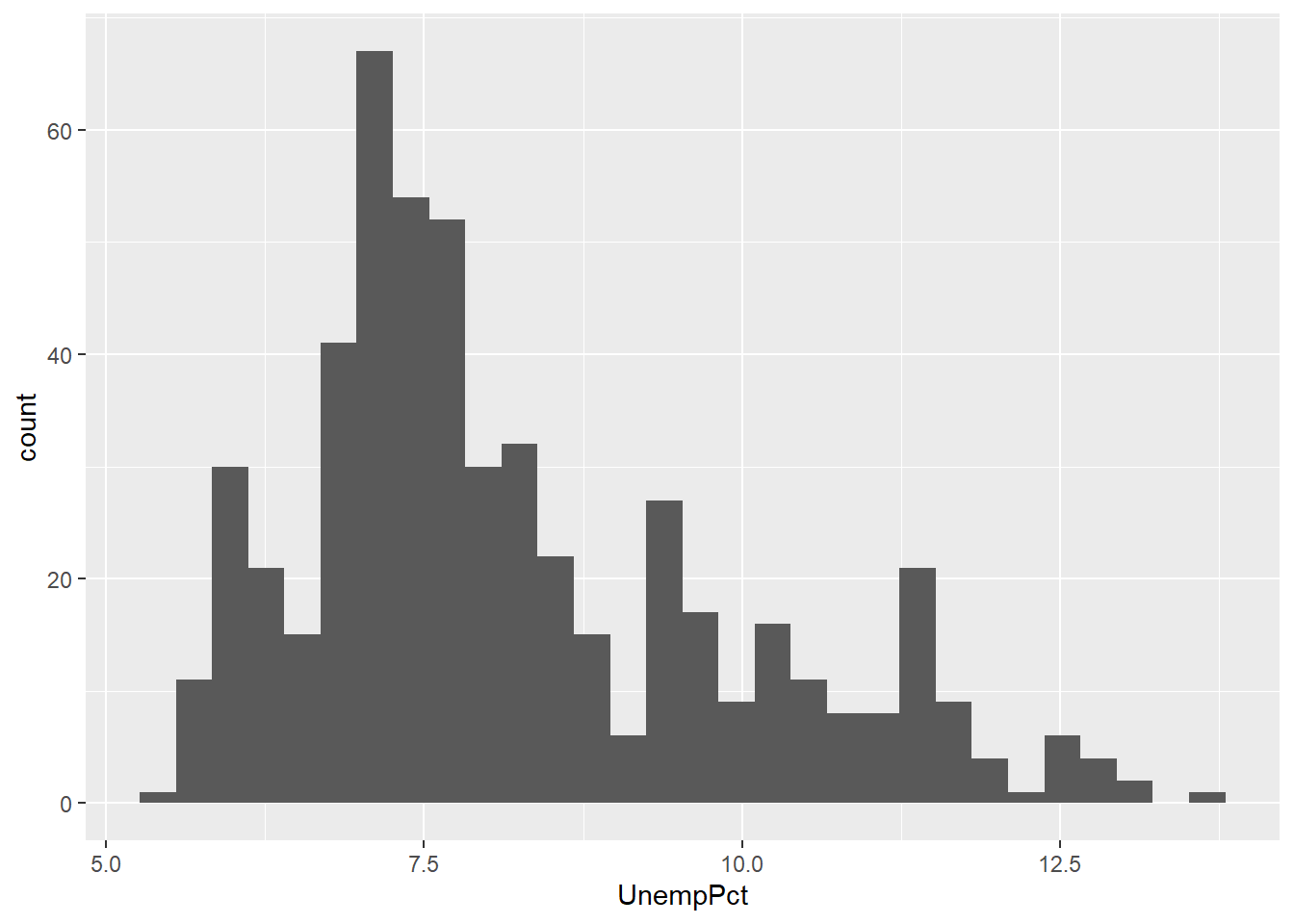
We can also make a time series (line) graph:
ggplot(data = EmpData, mapping = aes(x = MonthYr, y = UnempPct)) + geom_line()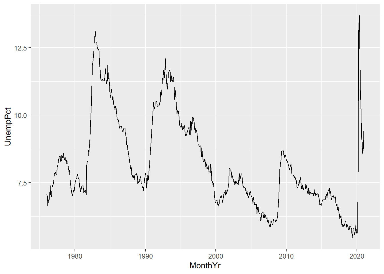
The ggplot() function has a non-standard syntax, so I’d like to go over
it.
- The first line sets up the basic characteristics of the graph:
- The
dataargument tells R which data set (tibble) will be used - the
mappingargument describes the basic aesthetics of the graph, i.e., the relationship in the data we will be graphing.- For the histogram, our aesthetic includes only one variable
- For the line graph, our aesthetic includes two variables
- The
- The rest of the command is one or more statements separated by
a
+sign. These are called geometries and are geometric elements to be included in the plot.- The
geom_histogram()geometry produces a histogram - The
geom_line()geometry produces a line
- The
A graph can include multiple geometries in a given graph, as we will see shortly.
11.3.2 Modifying a graph
As when making graphs in Excel, the basic graph gives us some useful information but we can improve upon it in various ways.
11.3.2.1 Titles and labels
You can add a title and subtitle, and you can change the axis titles:
ggplot(data = EmpData, aes(x = MonthYr, y = UnempPct)) + geom_line() + labs(title = "Unemployment rate",
    subtitle = "January 1976 - January 2021", caption = "Source: Statistics Canada, Labour Force Survey",
    tag = "Canada") + xlab("") + ylab("Unemployment rate, %")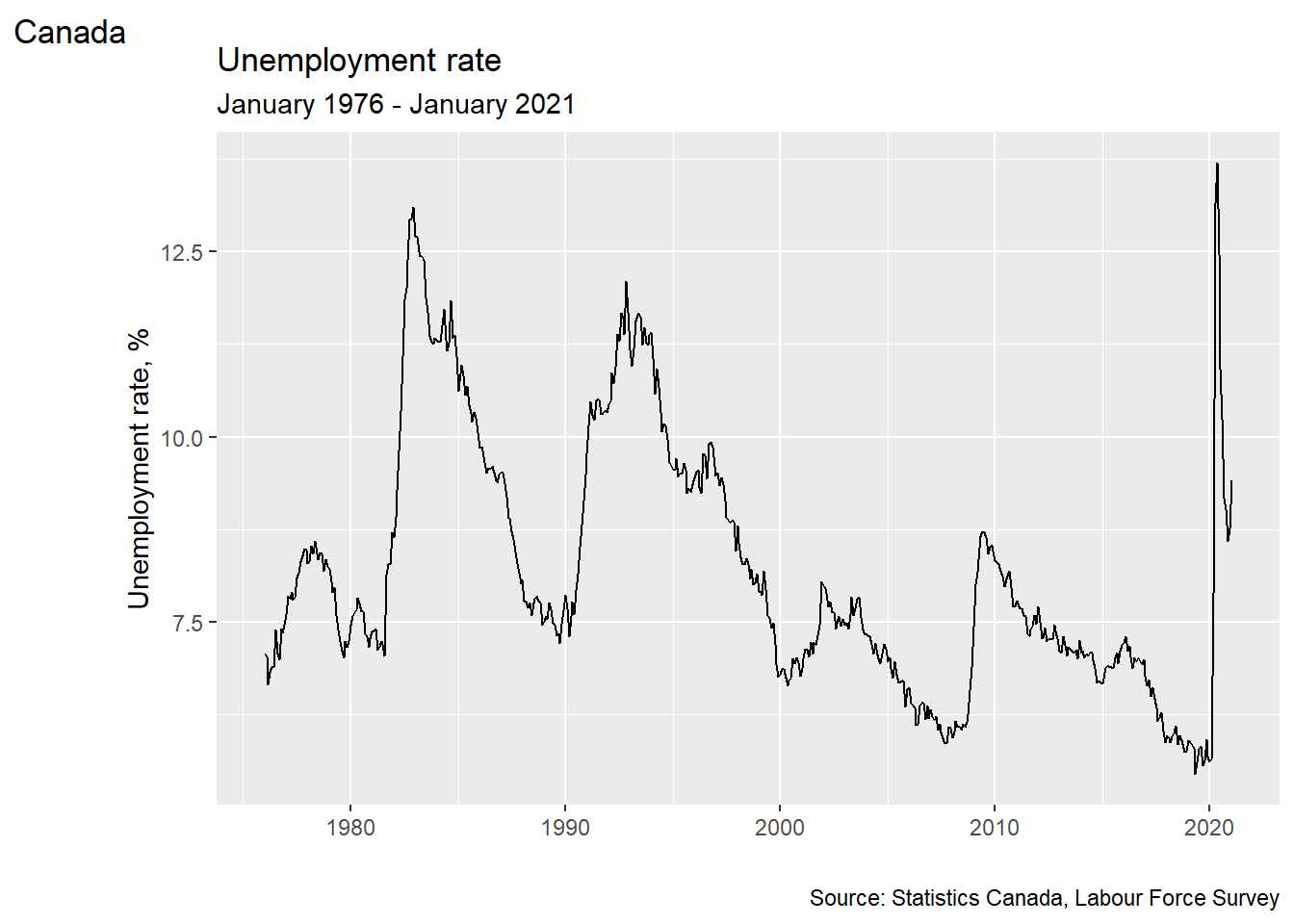
11.3.2.2 Color
You can change the color of any geometric element
using the col= argument:
ggplot(data = EmpData, aes(x = MonthYr, y = UnempPct)) + geom_line(col = "blue")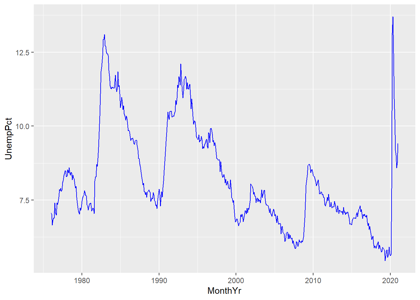
Colors can be given in ordinary English (or local language) words, or with detailed color codes in RGB or CMYK format.
Some geometric elements, such as the bars in a histogram, also have a fill color:
ggplot(data = EmpData, aes(x = UnempPct)) + geom_histogram(col = "red", fill = "blue")
## `stat_bin()` using `bins = 30`. Pick better value with `binwidth`.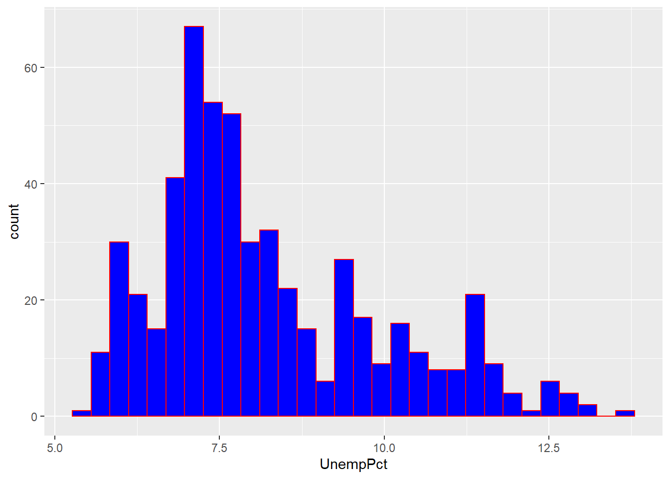
As you can see, the col= argument sets the color for the exterior
of each bar, and the fill= argument sets the color for the interior.
11.3.3 Adding graph elements
We can include multiple geometries in the same graph. For example, we can include lines for both unemployment and labour force participation:
ggplot(data = EmpData, aes(x = MonthYr, y = UnempPct)) + geom_line(col = "blue") +
    geom_line(aes(y = LFPPct), col = "red")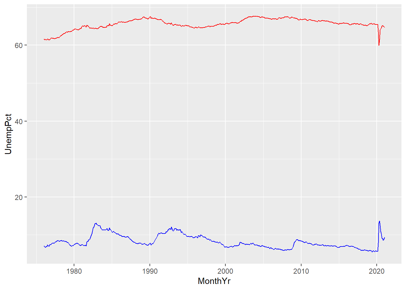
A few things to note here:
- The third line gives
geom_line()an aesthetics argumentaes(y=LFPPct). This overrides the aesthetics in the first line.
- We have used color to differentiate the two lines, but there is no legend to tell the reader which line is which. We will need to fix that.
- The vertical axis is labeled UnempPct. We will need to fix that.
We could add a legend here, but it is better (and friendlier to the color-blind)
to just label the lines. We can use the geom_text geometry to do this:
ggplot(data = EmpData, aes(x = MonthYr)) + geom_line(aes(y = UnempPct), col = "blue") +
    geom_text(x = as.Date("1/1/2000", "%m/%d/%Y"), y = 15, label = "Unemployment",
        col = "blue") + geom_line(aes(y = LFPPct), col = "red") + geom_text(x = as.Date("1/1/2000",
    "%m/%d/%Y"), y = 60, label = "LFP", col = "red")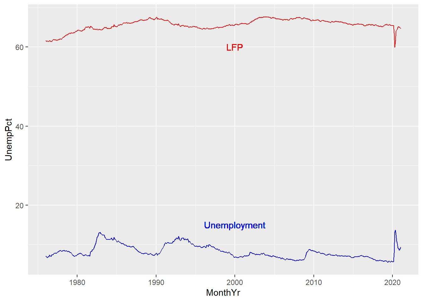
The graphs below combine all of the features described above to yield clean and clear graphs.
ggplot(data = EmpData, aes(x = UnempPct)) + geom_histogram(binwidth = 0.5, fill = "blue") +
    geom_density() + labs(title = "Unemployment rate", subtitle = paste("January 1976 - January 2021 (",
    nrow(EmpData), " months)", sep = "", collapse = ""), caption = "Source: Statistics Canada, Labour Force Survey",
    tag = "Canada") + xlab("Unemployment rate, %") + ylab("Count")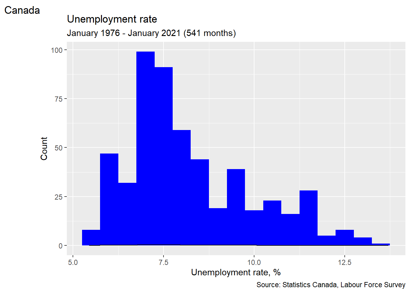
ggplot(data = EmpData, aes(x = MonthYr)) + geom_line(aes(y = UnempPct), col = "blue") +
    geom_text(x = as.Date("1/1/2000", "%m/%d/%Y"), y = 15, label = "Unemployment",
        col = "blue") + geom_line(aes(y = LFPPct), col = "red") + geom_text(x = as.Date("1/1/2000",
    "%m/%d/%Y"), y = 60, label = "LFP", col = "red") + labs(title = "Unemployment and LFP rates",
    subtitle = paste("January 1976 - January 2021 (", nrow(EmpData), " months)",
        sep = "", collapse = ""), caption = "Source: Statistics Canada, Labour Force Survey",
    tag = "Canada") + xlab("") + ylab("Percent")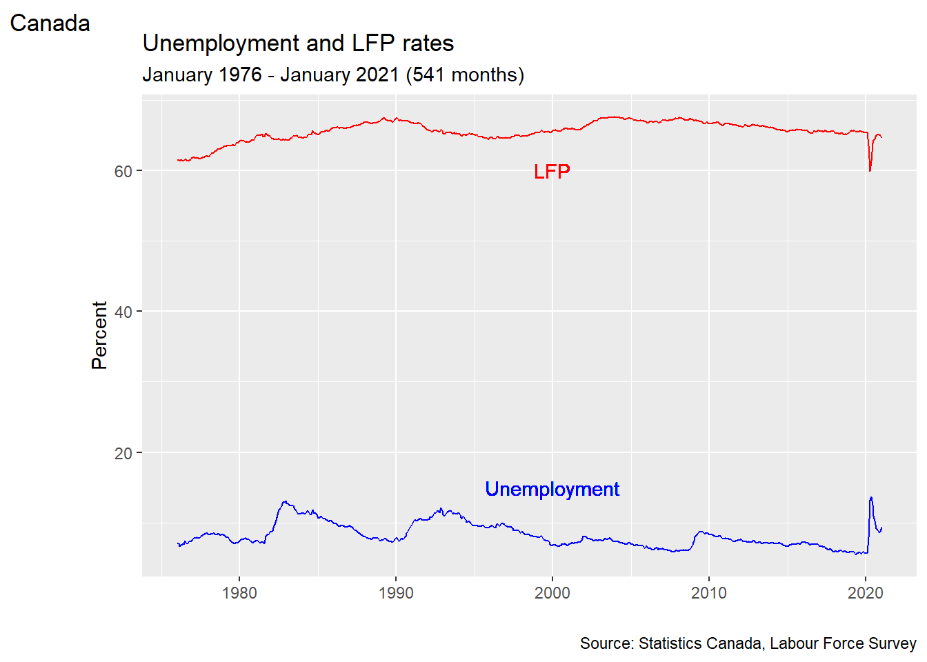
Chapter review
As we have seen, we can do many of the same things in Excel and R. R is typically more difficult to use for simple analysis tasks, and there is nothing wrong with using Excel when it is easier. But the usability gap gets smaller with more complicated tasks, and there are many tasks where Excel doesn’t do everything that R can do. You should think of them as complementary tools, and be comfortable using both.
Practice problems
Answers can be found in the appendix.
SKILL #1: Use mutate to add or change a variable
SKILL #2: Use filter, arrange and select to modify a data table
- Starting with the data table
EmpData:- Add the numeric variable Year based on the existing variable MonthYr. The
formula for Year should be
format(MonthYr, "%Y") - Add the numeric variable EmpRate, which is the proportion of the population (Population) that is employed (Employed), also called the employment rate or employment-to-population ratio.
- Drop all observations from years before 2010.
- Drop all variables except MonthYr, Year, EmpRate, UnempRate, and AnnPopGrowth
- Sort observations by EmpRate.
- Give the resulting data table the name
PPData.
- Add the numeric variable Year based on the existing variable MonthYr. The
formula for Year should be
SKILL #3: Calculate univariate statistics for a single variable
SKILL #4: Construct a table of summary statistics
SKILL #5: Recognize and handle missing data problems
- Starting with the
PPDatadata table you created in question (1) above:- Calculate and report the mean employment rate since 2010.
- Calculate and report a table reporting the median for all variables
in
PPData. - Did any variables in
PPDatahave missing data? If so, how did you decide to address it in your answer to (b), and why?
SKILL #6: Construct a simple or binned frequency table
- Using the
PPDatadata set, construct a frequency table of the employment rate.
SKILL #7: Perform simple probability calculations in R
- Calculate the following quantities in R:
- The 45th percentile of the \(N(4,6)\) distribution.
- The 97.5 percentile of the \(T_8\) distribution.
- The value of the standard uniform CDF, evaluated at 0.75.
- 5 random numbers from the \(Binomial(10,0.5)\) distribution.
SKILL #8: Create a histogram with ggplot
- Using the
PPDatadata set, create a histogram of the employment rate.
SKILL #9: Create a line graph with ggplot
- Using the
PPDatadata set, create a time series graph of the employment rate.
The package is technically called
ggplot2since it is the second version ofggplot. But everyone calls it “ggplot” anyway.↩︎