Chapter 12 Multivariate data analysis
So far, most of our emphasis has been on univariate analysis: understanding the behavior of a single variable at a time. However, we are often interested in the relationship among multiple variables. This will be the primary subject of your next course in statistics (most likely ECON 333), but we will touch on a few of the basics in this chapter, using a combination of theoretical concepts, Excel, and R.
Chapter goals
In this chapter, we will learn how to:
- Calculate and interpret the sample covariance and correlation.
- Interpret frequency tables, cross-tabulations and conditional averages
- Construct Excel Pivot Tables, including frequency tables, cross-tabulations, and conditional averages.
- Interpret scatter plots, binned-mean plots, smoothed-mean plots, and linear regression plots.
- Construct scatter plots, smoothed-mean plots and linear regression plots in R.
For the most part, we will focus on the case of a random sample of size \(n\) on two random variables \(x_i\) and \(y_i\).
Example 12.1 Obtaining the data
The primary application in this chapter will use our Canadian employment data. We will be using both Excel and R in our examples.
For the Excel examples we will start with the file https://bookdown.org/bkrauth/BOOK/sampledata/EmploymentData.xlsx. This file is similar to the employment data file we used in Chapter 6.
For the R examples we will start with the EmploymentData.csv file we used in Chapter 11. Execute the following R code to get started:
library(tidyverse)
EmpData <- read_csv("https://bookdown.org/bkrauth/BOOK/sampledata/EmploymentData.csv")
# Make permanent changes to EmpData
EmpData <- EmpData %>%
    mutate(MonthYr = as.Date(MonthYr, "%m/%d/%Y")) %>%
    mutate(UnempPct = 100 * UnempRate) %>%
    mutate(LFPPct = 100 * LFPRate)
12.1 Covariance and correlation
When both variables are numeric, we can summarize their relationship using the sample covariance: \[s_{x,y} = \frac{1}{n-1} \sum_{i=1}^n (x_i-\bar{x})(y_i-\bar{y})\] and the sample correlation \[\rho_{x,y} = \frac{s_{x,y}}{s_x s_y}\] where \(\bar{x}\) and \(\bar{y}\) are the sample averages and \(s_{x}\) and \(s_{y}\) are the the sample standard deviations. These univariate statistics are defined in Chapter 7.
The sample covariance and sample correlation can be interpreted as estimates of the corresponding population covariance and correlation as defined in Chapter 5.
12.1.1 Covariance and correlation in R
The sample covariance and correlation can be calculated in R using
the cov() and cor() functions.
These functions can be applied to any two columns of data:
# For two specific columns of data
cov(EmpData$UnempPct, EmpData$LFPPct)
## [1] -0.6126071
cor(EmpData$UnempPct, EmpData$LFPPct)
## [1] -0.2557409
As you can see, unemployment and labour force participation are negatively correlated: when unemployment is high, LFP tends to be low. This makes sense given the economics: if it is hard to find a job, people will move into other activities that take one out of the labour force: education, childcare, retirement, etc.
Both cov() and cor() can also be applied to (the numeric variables in)
an entire data set. The result is what is called a
covariance matrix or correlation matrix:
# Correlation matrix for the whole data set (at least the numerical parts)
EmpData %>%
    select(where(is.numeric)) %>%
    cor()
##                  Population   Employed Unemployed LabourForce NotInLabourForce
## Population        1.0000000  0.9905010  0.3759661   0.9950675        0.9769639
## Employed          0.9905010  1.0000000  0.2866686   0.9964734        0.9443252
## Unemployed        0.3759661  0.2866686  1.0000000   0.3660451        0.3846586
## LabourForce       0.9950675  0.9964734  0.3660451   1.0000000        0.9509753
## NotInLabourForce  0.9769639  0.9443252  0.3846586   0.9509753        1.0000000
## UnempRate        -0.4721230 -0.5542043  0.6249095  -0.4836022       -0.4315427
## LFPRate           0.4535956  0.5369032  0.1874114   0.5379437        0.2568786
## AnnPopGrowth             NA         NA         NA          NA               NA
## UnempPct         -0.4721230 -0.5542043  0.6249095  -0.4836022       -0.4315427
## LFPPct            0.4535956  0.5369032  0.1874114   0.5379437        0.2568786
##                   UnempRate    LFPRate AnnPopGrowth   UnempPct     LFPPct
## Population       -0.4721230  0.4535956           NA -0.4721230  0.4535956
## Employed         -0.5542043  0.5369032           NA -0.5542043  0.5369032
## Unemployed        0.6249095  0.1874114           NA  0.6249095  0.1874114
## LabourForce      -0.4836022  0.5379437           NA -0.4836022  0.5379437
## NotInLabourForce -0.4315427  0.2568786           NA -0.4315427  0.2568786
## UnempRate         1.0000000 -0.2557409           NA  1.0000000 -0.2557409
## LFPRate          -0.2557409  1.0000000           NA -0.2557409  1.0000000
## AnnPopGrowth             NA         NA            1         NA         NA
## UnempPct          1.0000000 -0.2557409           NA  1.0000000 -0.2557409
## LFPPct           -0.2557409  1.0000000           NA -0.2557409  1.0000000
Each element in the matrix reports the covariance or correlation of a pair of variables. As you can see, the matrix is symmetric since \(cov(x,y) = cov(y,x)\). In addition, the diagonal elements of the covariance matrix are \(cov(x,x) = var(x)\) and the diagonal elements of the correlation matrix are \(cor(x,x) = 1\).
Every variable’s correlation with AnnPopGrowth is NA, so we will
want to exclude NA values from the calculation. Excluding missing
values is more complicated for covariance and correlation matrices because
there are two different ways to exclude them:
- Pairwise deletion: when calculating the covariance or correlation of two variables, exclude observations with a missing values for either of those two variables.
- Casewise or listwise deletion: when calculating the covariance or correlation of two variables, exclude observations with a missing value for any variable.
The use argument allows you to specify which approach you want to use:
# EmpData has missing data in 1976 for the variable AnnPopGrowth Pairwise will
# only exclude 1976 from calculations involving AnnPopGrowth
EmpData %>%
    select(where(is.numeric)) %>%
    cor(use = "pairwise.complete.obs")
##                  Population   Employed Unemployed LabourForce NotInLabourForce
## Population        1.0000000  0.9905010  0.3759661   0.9950675        0.9769639
## Employed          0.9905010  1.0000000  0.2866686   0.9964734        0.9443252
## Unemployed        0.3759661  0.2866686  1.0000000   0.3660451        0.3846586
## LabourForce       0.9950675  0.9964734  0.3660451   1.0000000        0.9509753
## NotInLabourForce  0.9769639  0.9443252  0.3846586   0.9509753        1.0000000
## UnempRate        -0.4721230 -0.5542043  0.6249095  -0.4836022       -0.4315427
## LFPRate           0.4535956  0.5369032  0.1874114   0.5379437        0.2568786
## AnnPopGrowth     -0.5427605 -0.5239765 -0.5771164  -0.5618814       -0.4851752
## UnempPct         -0.4721230 -0.5542043  0.6249095  -0.4836022       -0.4315427
## LFPPct            0.4535956  0.5369032  0.1874114   0.5379437        0.2568786
##                    UnempRate    LFPRate AnnPopGrowth    UnempPct     LFPPct
## Population       -0.47212303  0.4535956  -0.54276051 -0.47212303  0.4535956
## Employed         -0.55420434  0.5369032  -0.52397653 -0.55420434  0.5369032
## Unemployed        0.62490950  0.1874114  -0.57711636  0.62490950  0.1874114
## LabourForce      -0.48360222  0.5379437  -0.56188142 -0.48360222  0.5379437
## NotInLabourForce -0.43154270  0.2568786  -0.48517519 -0.43154270  0.2568786
## UnempRate         1.00000000 -0.2557409  -0.06513125  1.00000000 -0.2557409
## LFPRate          -0.25574087  1.0000000  -0.48645089 -0.25574087  1.0000000
## AnnPopGrowth     -0.06513125 -0.4864509   1.00000000 -0.06513125 -0.4864509
## UnempPct          1.00000000 -0.2557409  -0.06513125  1.00000000 -0.2557409
## LFPPct           -0.25574087  1.0000000  -0.48645089 -0.25574087  1.0000000
# Casewise will exclude 1976 from all calculations
EmpData %>%
    select(where(is.numeric)) %>%
    cor(use = "complete.obs")
##                  Population   Employed  Unemployed LabourForce NotInLabourForce
## Population        1.0000000  0.9898651  0.32223097   0.9951165        0.9782320
## Employed          0.9898651  1.0000000  0.22300335   0.9964469        0.9443181
## Unemployed        0.3222310  0.2230034  1.00000000   0.3043132        0.3495771
## LabourForce       0.9951165  0.9964469  0.30431322   1.0000000        0.9529715
## NotInLabourForce  0.9782320  0.9443181  0.34957711   0.9529715        1.0000000
## UnempRate        -0.5162732 -0.6032136  0.62908791  -0.5350956       -0.4601639
## LFPRate           0.3943552  0.4879065  0.05409547   0.4814461        0.1986298
## AnnPopGrowth     -0.5427605 -0.5239765 -0.57711636  -0.5618814       -0.4851752
## UnempPct         -0.5162732 -0.6032136  0.62908791  -0.5350956       -0.4601639
## LFPPct            0.3943552  0.4879065  0.05409547   0.4814461        0.1986298
##                    UnempRate     LFPRate AnnPopGrowth    UnempPct      LFPPct
## Population       -0.51627317  0.39435518  -0.54276051 -0.51627317  0.39435518
## Employed         -0.60321359  0.48790649  -0.52397653 -0.60321359  0.48790649
## Unemployed        0.62908791  0.05409547  -0.57711636  0.62908791  0.05409547
## LabourForce      -0.53509557  0.48144610  -0.56188142 -0.53509557  0.48144610
## NotInLabourForce -0.46016393  0.19862976  -0.48517519 -0.46016393  0.19862976
## UnempRate         1.00000000 -0.33577578  -0.06513125  1.00000000 -0.33577578
## LFPRate          -0.33577578  1.00000000  -0.48645089 -0.33577578  1.00000000
## AnnPopGrowth     -0.06513125 -0.48645089   1.00000000 -0.06513125 -0.48645089
## UnempPct          1.00000000 -0.33577578  -0.06513125  1.00000000 -0.33577578
## LFPPct           -0.33577578  1.00000000  -0.48645089 -0.33577578  1.00000000
In most applications, pairwise deletion makes the most sense because it avoids throwing out data. But it is occasionally important to use the same data for all calculations, in which case we would use listwise deletion.
Covariance and correlation in Excel
The sample covariance and correlation between two variables (data ranges)
can be calculated in Excel using the COVARIANCE.S() and CORREL()
functions.
12.2 Pivot tables
Excel’s Pivot Tables are a powerful tool for the analysis of frequencies, conditional averages, and various other aspects of the data. They are somewhat tricky to use, and we will only scratch the surface here. But the more comfortable you can get with them, the better.
The first step is to create a blank Pivot Table that is tied to a particular data table. We can create as many Pivot Tables as we want.
Example 12.2 Creating a blank Pivot Table
To create a blank Pivot Table based on the employment data:
- Open the Data for Analysis worksheet in EmploymentData.xlsx and select any cell in the data table.
- Select
Insert > PivotTablefrom the menu. - Excel will display the
Create PivotTabledialog box:
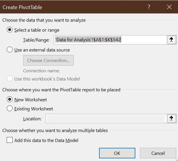
The default settings are fine, so selectOK.
Excel will open a new worksheet that looks like this:
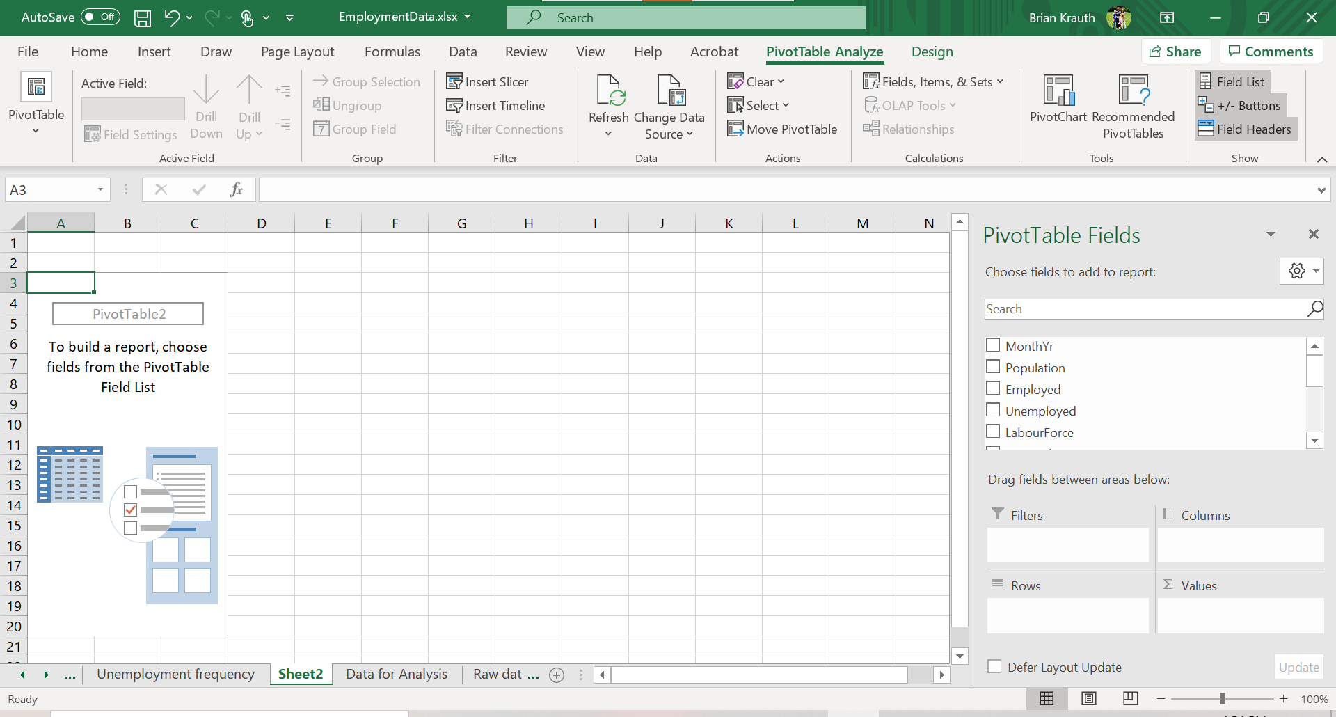
The Pivot Table itself is on the left side of the new worksheet.
The next step is to add elements to the table. There are various tools available to do that:
- the
Pivot Table Fieldsbox on the right side of the screen - the
PivotTable Analyzemenu - the
Designmenu.
These tools only appear in context, so they will disappear if you click a cell outside of the Pivot Table. You can fix this by just clicking any cell in the Pivot Table.
12.2.1 Simple frequencies
The simplest application of a Pivot Table is to construct a table of frequencies. By default, Pivot Tables report absolute frequencies - a count of the number of times we observe a particular value in the data.
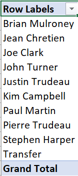
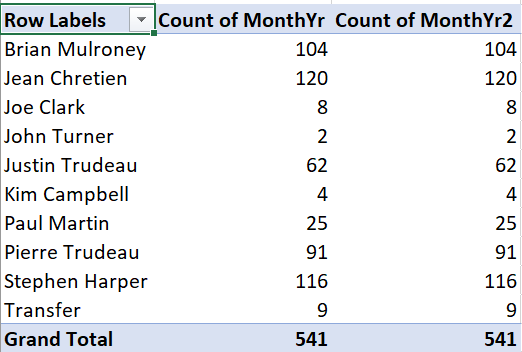
Example 12.3 A simple frequency table
To create a simple frequency table showing the number of months in office for each Canadian prime minister:
- Check the box next to PrimeMinister. The Pivot Table will look
like this:
- Drag MonthYr into the box marked “\(\Sigma\) values.” The Pivot Table
will now look like this:
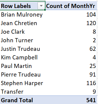
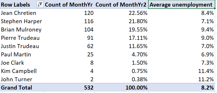
As we can see, the table shows the number of observations for each value of the PrimeMinister variable, which also happens to be the number of months in office for each prime minister. It also shows a grand total.
In many applications, we are also interested in relative frequencies - the fraction or percentage of observations that take on a particular value. As we discussed earlier, a relative frequency can be interpreted as an estimate of the corresponding relative probability.
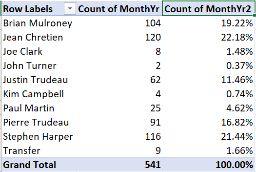
Example 12.4 Reporting relative frequencies
To add a relative frequency column, we first need to add a second absolute frequency column:
- In the PivotTable Fields box, drag MonthYr to the “\(\Sigma\) values” box.
Then we convert it to a relative frequency column:
- Right-click on the “Count of MonthYr2” column, and select
Value Field Settings...
- Click on the
Show Values Astab and select “% of Column Total” from theShow Values Asdrop-down box. - Select
OK.
The third column will now show the number of observations as a percentage of
the total:
12.2.2 Cross tabulations
We can also construct frequency tables for pairs of variables. There are various ways of laying out such a table, but the simplest is to have one variable in rows and the other variable in columns. When the table is set up this way, we often call it a cross tabulation or crosstab. Crosstabs can be expressed in terms of absolute frequency, relative frequency, or both.
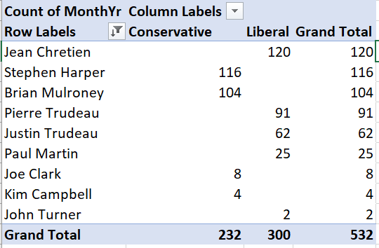
Example 12.5 An absolute frequency table
Starting with a blank Pivot Table:
- Drag PrimeMinister into the Rows box.
- Drag Party into the Columns box.
- Drag MonthYr into the \(\Sigma\) values box.
You will now have this table of absolute frequencies:
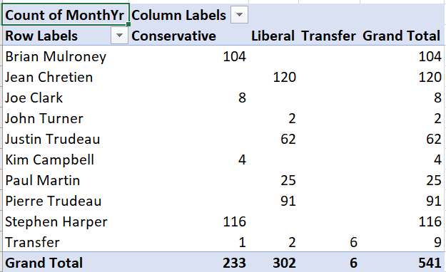
For example, this crosstab tells us Brian Mulroney served 104 months as prime minister, with all of those months as a member of the (Progressive) Conservative party.
We can also construct crosstabs using relative frequencies, but there is more than one kind of relative frequency we can use here. A joint frequency crosstab shows the count in each cell as a percentage of all observations. Joint frequency tables can be interpreted as estimates of joint probabilities.
Example 12.6 A joint frequency crosstab
To convert our absolute frequency crosstab into a joint frequency crosstab:
- Right click on “Count of MonthYr” and select
Value Field Settings... - Select the
Show Values Astab, and select “% of Grand Total” from the Show Values As drop-down box.
Your table will now look like this:
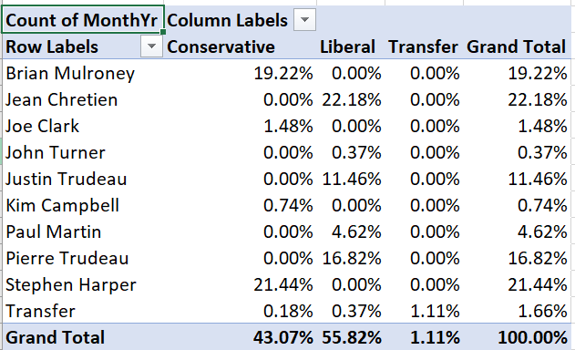
For example, the table tells us that Brian Mulroney’s 104 months as prime minister represent 19.22% of all months in our data.
A conditional frequency crosstab shows the count in each cell as a percentage in that row or column. Conditional frequencies can be interpreted as estimates of conditional probabilities.
Example 12.7 A conditional frequency crosstab
To convert our crosstab into a conditional frequency crosstab:
- Right click on “Count of MonthYr” and select
Value Field Settings - Select the
Show Values Astab, and select “% of column total” from the Show Values As drop-down box.
Your table will now look like this:
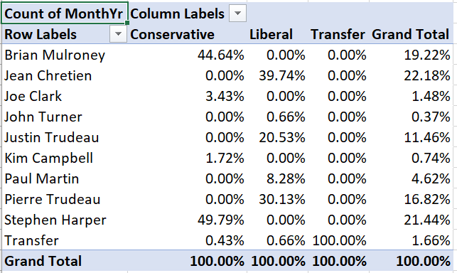
For example, Brian Mulroney’s 104 months as prime minister represent 44.64% of all months served by a Conservative prime minister in our data.
12.2.3 Conditional averages
We can also use Pivot Tables to report conditional averages. A conditional average is just the average of one variable, taken within a sub-population defined by another variable. For example, we might be interested in average earnings for men in Canada versus average earnings for women.
A conditional average can be interpreted as an estimate of the corresponding conditional mean; for example average earnings for men in a random sample of Canadians can be interpreted as an estimate of average earnings among all Canadian men.
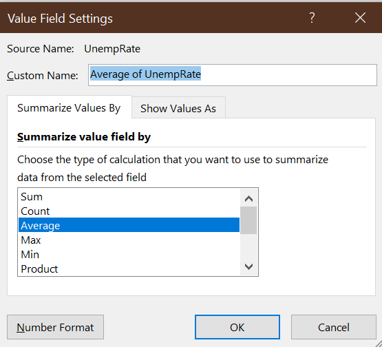
Example 12.8 Adding a conditional average
Suppose we want to add the average unemployment rate during
each prime minister’s time in office to this Pivot Table:
- Drag UnempRate into the box marked “\(\Sigma\) values.” The table will
now look like this:
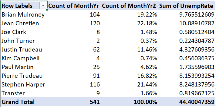
Unfortunately, we wanted to see the average unemployment rate for each prime minister, but instead we see the sum of unemployment rates for each prime minister. To change this:
- Right-click “Sum of UnempRate,” then select
Value Field Settings.... - Select
Average
The table now looks like this:
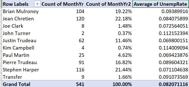
We now have the average unemployment rate for each prime minister. It is not very easy to read, so we will want to change the formatting later.
In addition to conditional averages, we can report other conditional statistics including variances, standard deviations, minimum, and maximum.
12.2.4 Modifying a Pivot Table
As you might expect, we can modify Pivot Tables in various ways to make them clearer, more informative, and more visually appealing.
As with other tables in Excel, we can filter and sort them. Filtering is particularly useful with Pivot Tables since there are often categories we want to exclude.
Example 12.9 Filtering a Pivot Table
There is no Canadian prime minister named “Transfer.” If you recall, we used that value to represent months in the data where the prime minister changed. To exclude those months from our main table:
Click on the
 . The
sort and filter menu will appear:
. The
sort and filter menu will appear:
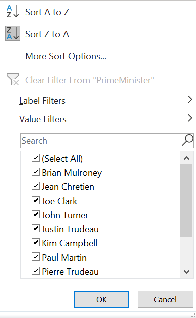
Uncheck the check box next to “Transfer,” and select
OK:
The table no longer includes the Transfer value:
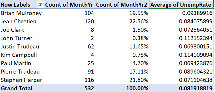
Note that the grand total has also gone down from 541 to 532.
By default, the table is sorted on the row labels, but we can sort on any column.
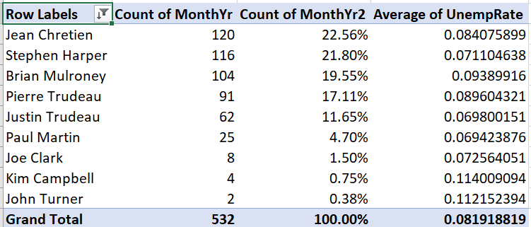
Example 12.10 Sorting a Pivot Table
To sort our table by months in office:
- Click on and the
sort and filter menu will appear.
- Select
More sort options; the Pivot Table sort dialog box will appear:
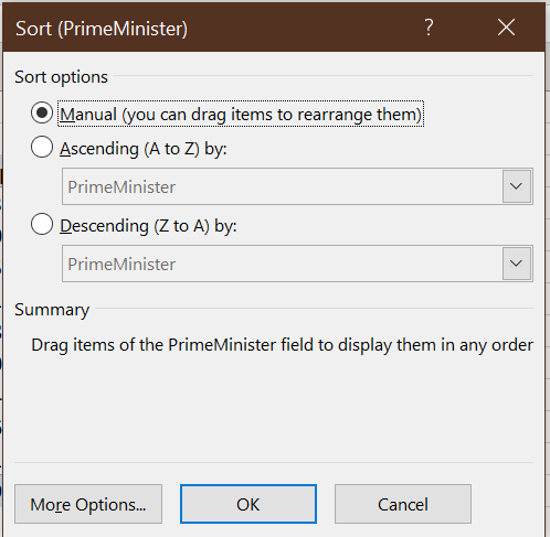
- Select the
Descending (Z to A)radio button and “Count of MonthYr” from the drop-down box.
The table is now sorted by number of months in office:
We can change number formatting, column and row titles, and various other aspects of the table’s appearance.
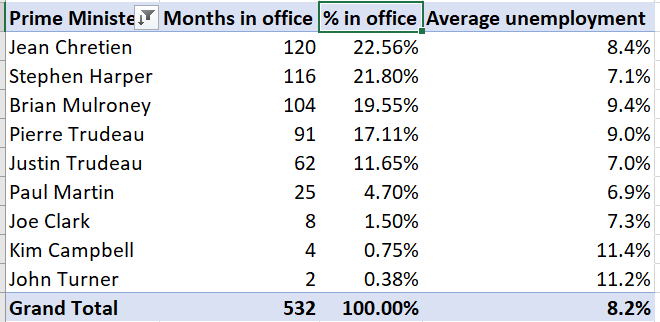
Example 12.11 Cleaning up a table’s appearance
Our table can be improved by making the column headers more informative and reporting the unemployment rate in percentage terms and fewer decimal places:
Right-click on “Average of UnempRate,” and then select
Value Field Settings...Enter “Average Unemployment” in the
Custom Nametext box.Select
Number Format, then change the number format to Percentage with 1 decimal place.Select
OKand thenOKagain. The table will now look like this:
Change the other three headers. You can do this through
Value Field Settings...but you can also just edit the text directly.- Change “Row Labels” to “Prime Minister”
- Change “Count of MonthYr” to “Months in office”
- Change “Count of MonthYr2” to “% in office”
Our final table looks like this:
Finally, we can use Pivot Tables to create graphs.
Example 12.12 A Pivot Table graph
To create a simple bar graph depicting months in office, we start by cleaning up the Pivot Table so that it shows the data we want to represent:
Select any cell in this table:
Use filtering to remove “Transfer” from the list of prime ministers.
Use sorting to sort by (grand total) number of months in office.
The table should now look like this:
Then we can generate the graph:
Select any cell in the table, then select
Insert > Recommended Chartsfrom the menu.Select
Column, and thenStacked Columnfrom the dialog box, and then selectOK.
Your graph will look like this:
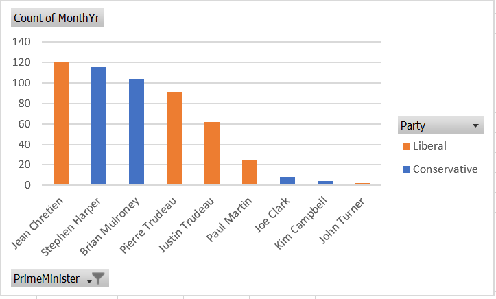
As always, there are various ways we could customize this graph to be more attractive and informative.
You can download the full set of Pivot Tables and associated charts generated in this chapter at https://bookdown.org/bkrauth/BOOK/sampledata/EmploymentDataPT.xlsx
12.3 Graphical methods
Bivariate summary statistics like the covariance and correlation provide a simple way of characterizing the relationship between any two numeric variables. Frequency tables, cross tabulations, and conditional averages allow us to gain a greater understanding of the relationship between two discrete or categorical variables, or between a discrete/categorical variable and a continuous variable.
In order to develop a detailed understanding of the relationship between two continuous variables (or discrete variables with many values), we need to develop some additional methods. The methods that we will explore in this class are primarily graphical. You will learn more about the underlying numerical methods in courses like ECON 333.
12.3.1 Scatter plots
A scatter plot is the simplest way to view the relationship between two variables in data. The horizontal (\(x\)) axis represents one variable, the vertical (\(y\)) axis represents the other variable, and each point represents an observation.
Scatter plots can be created in R using the geom_point() geometry:
ggplot(data = EmpData, aes(x = UnempPct, y = LFPPct)) + geom_point()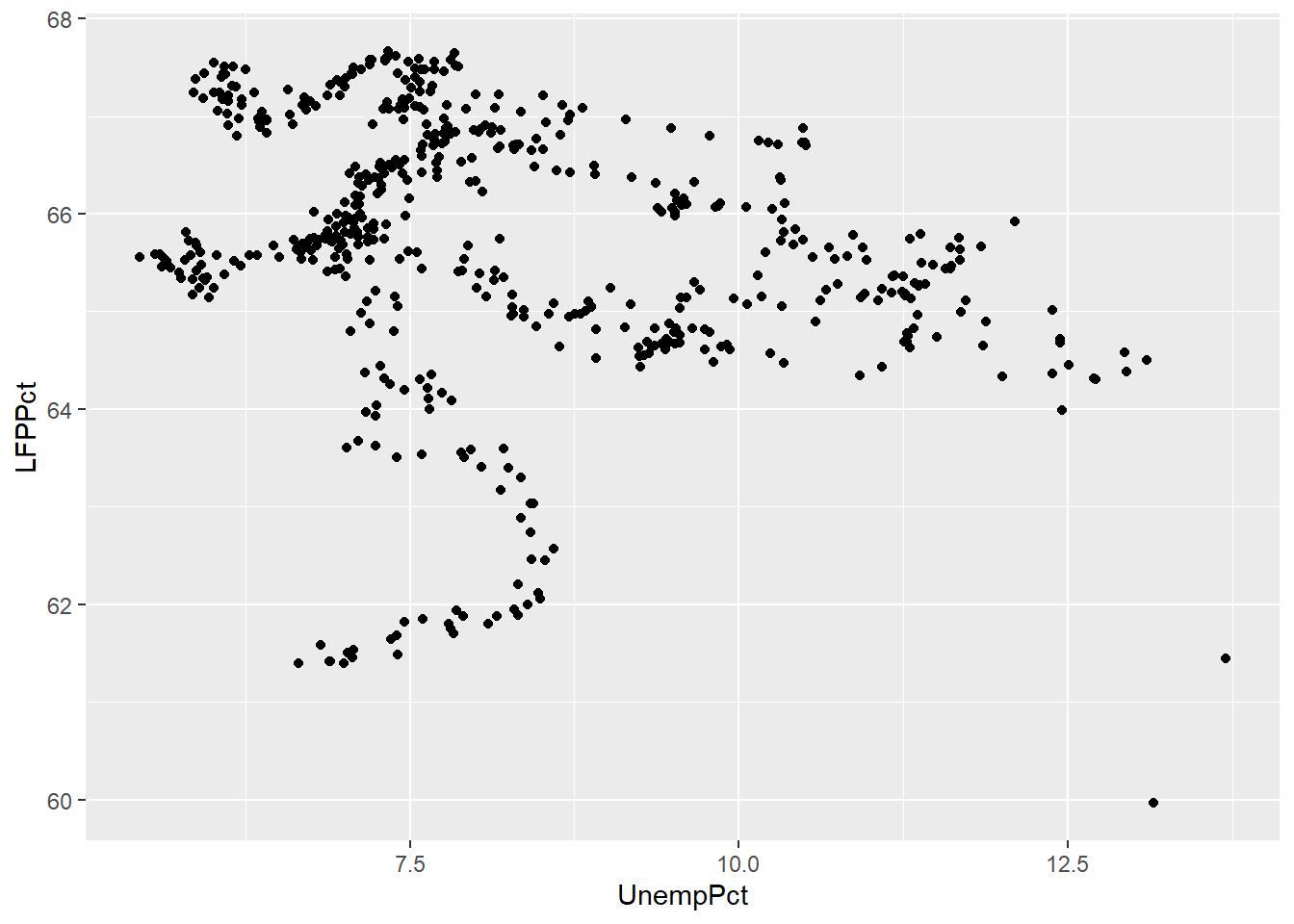
In some sense, the scatter plot shows everything about the relationship between the two variables, since it shows every observation. The negative relationship between the two variables indicated by the correlation we calculated earlier (-0.2557409) is clear, but it is also clear that this relationship is not very strong.
12.3.1.1 Jittering
If both of our variables are truly continuous, each point represents a single observation. But if both variables are actually discrete, points can “stack” on top of each other. In that case, the same point can represent multiple observations, leading to a misleading scatter plot.
For example, suppose we had rounded our unemployment and LFP data to the nearest percent:
# Round UnempPct and LFPPct to nearest integer
RoundedEmpData <- EmpData %>%
    mutate(UnempPct = round(UnempPct)) %>%
    mutate(LFPPct = round(LFPPct))
The scatter plot with the rounded data would look like this:
# Create graph using rounded data
ggplot(data = RoundedEmpData, aes(x = UnempPct, y = LFPPct)) + geom_point(col = "red")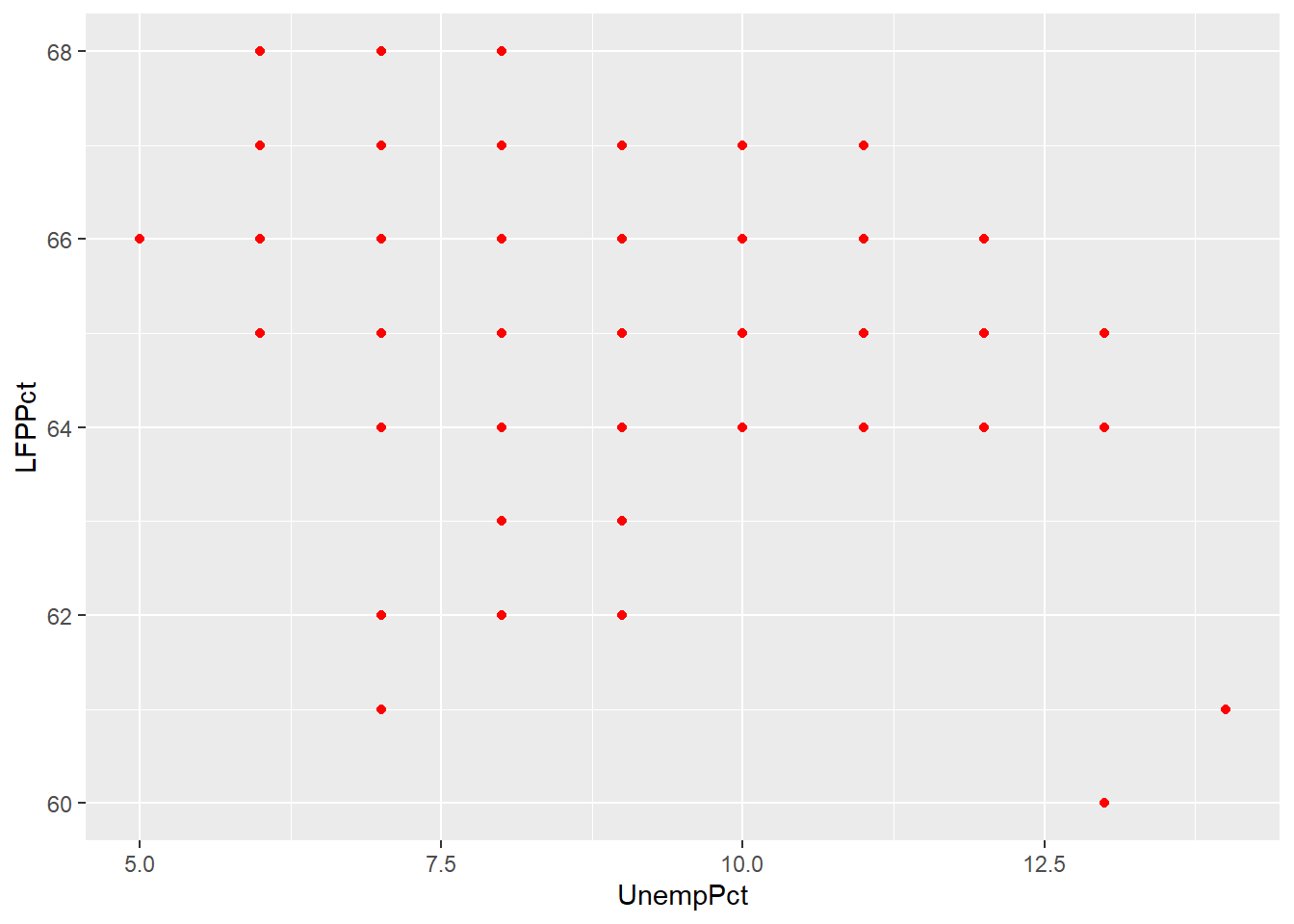
As you can see from the graph, the scatter plot is misleading: there are 541 observations in the data set represented by only 40 points.
A common solution to this problem is to jitter the data by adding a
small amount of random noise so that every observation is at least a little
different and appears as a single point. We can use the geom_jitter()
geometry to do a jittered scatter plot:
ggplot(data = RoundedEmpData, aes(x = UnempPct, y = LFPPct)) + geom_point(col = "red") +
    geom_jitter(size = 0.5, col = "blue")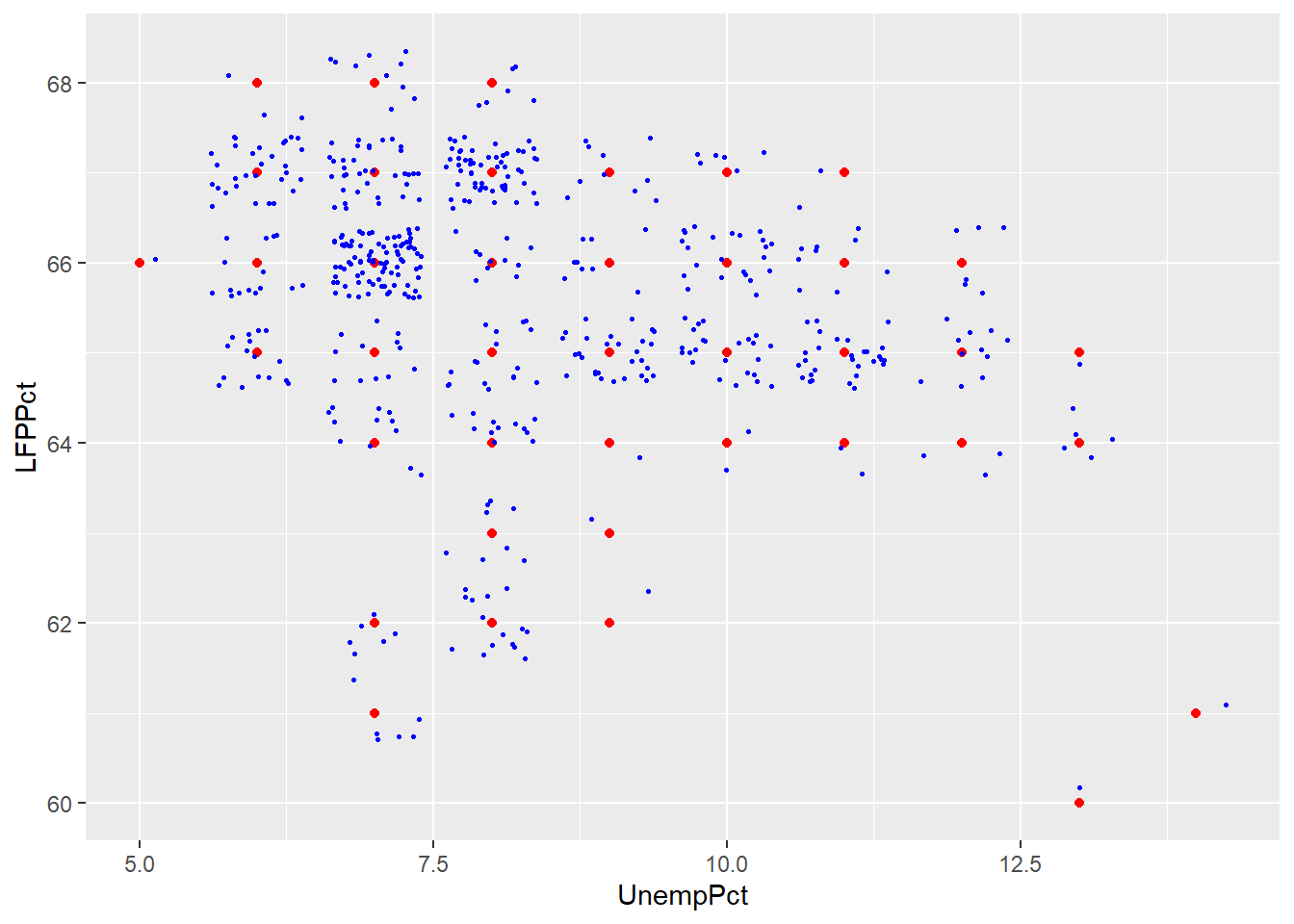
As you can see the jittered rounded data (small blue dots) more accurately reflects the original unrounded data than the rounded data (large red dots).
12.3.1.2 Using color as a third dimension
We can use color to add a third dimension to the data. That is, we can color-code points based on a third variable by including it as part of the aesthetic:
ggplot(data = EmpData, aes(x = UnempPct, y = LFPPct, col = Party)) + geom_point()
ggplot(data = EmpData, aes(x = UnempPct, y = LFPPct, col = MonthYr)) + geom_point()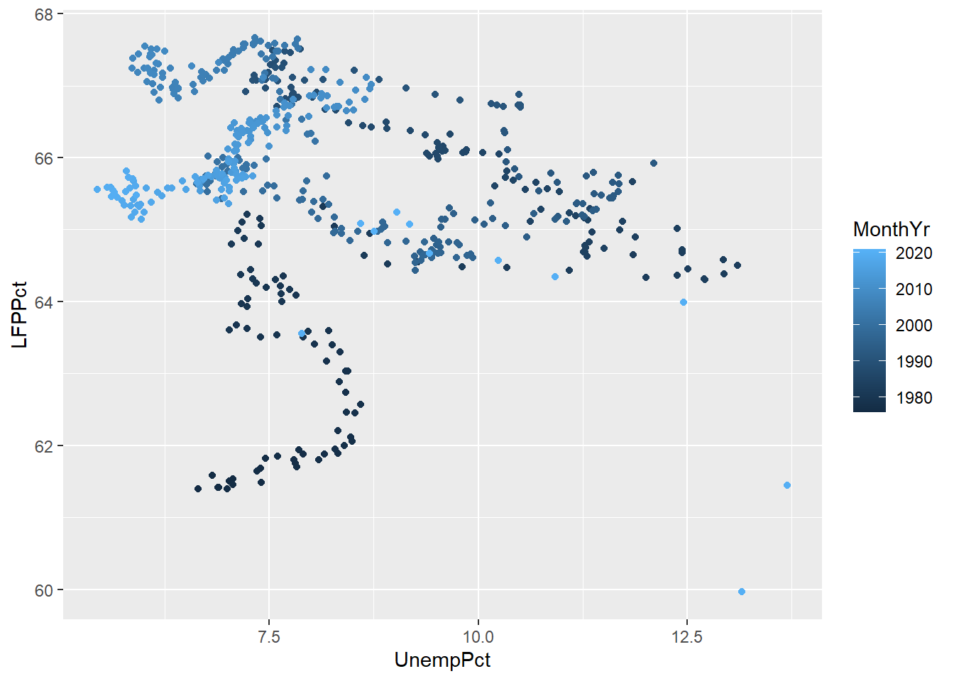
As these graphs show, R will use a discrete or continuous color scheme depending on whether the variable is discrete or continuous.
As we discussed earlier, you want to make sure your graph can be read by a reader who is color blind or is printing in black and white. So we can use shapes in addition to color:
ggplot(data = EmpData, aes(x = UnempPct, y = LFPPct, col = Party)) + geom_point(aes(shape = Party))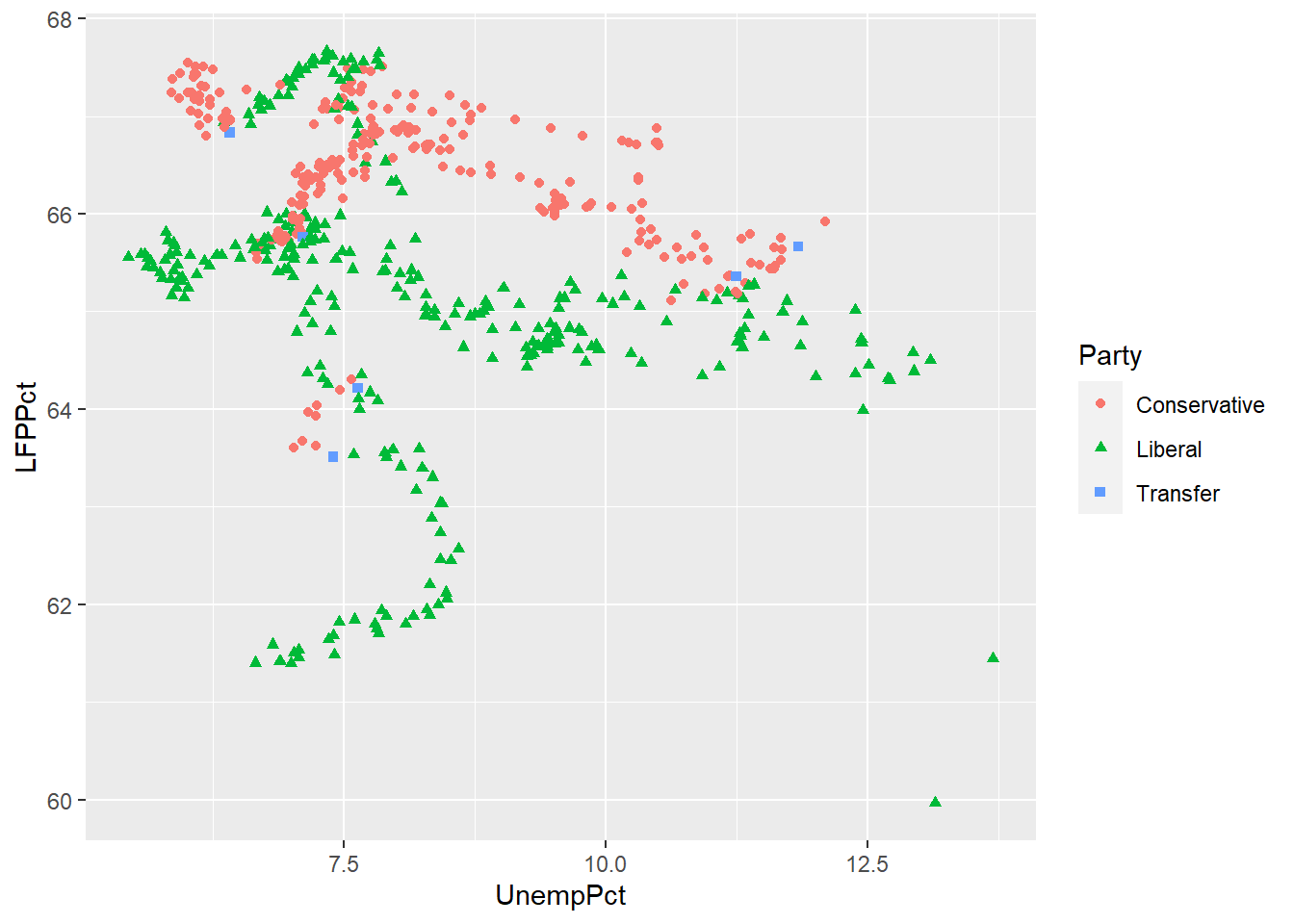
We would also choose a color scheme other than red and green, since that is the most common form of color blindness.
Scatter plots in Excel
Scatter plots can also be created in Excel, though it is more work and produces less satisfactory results.
12.3.2 Binned averages
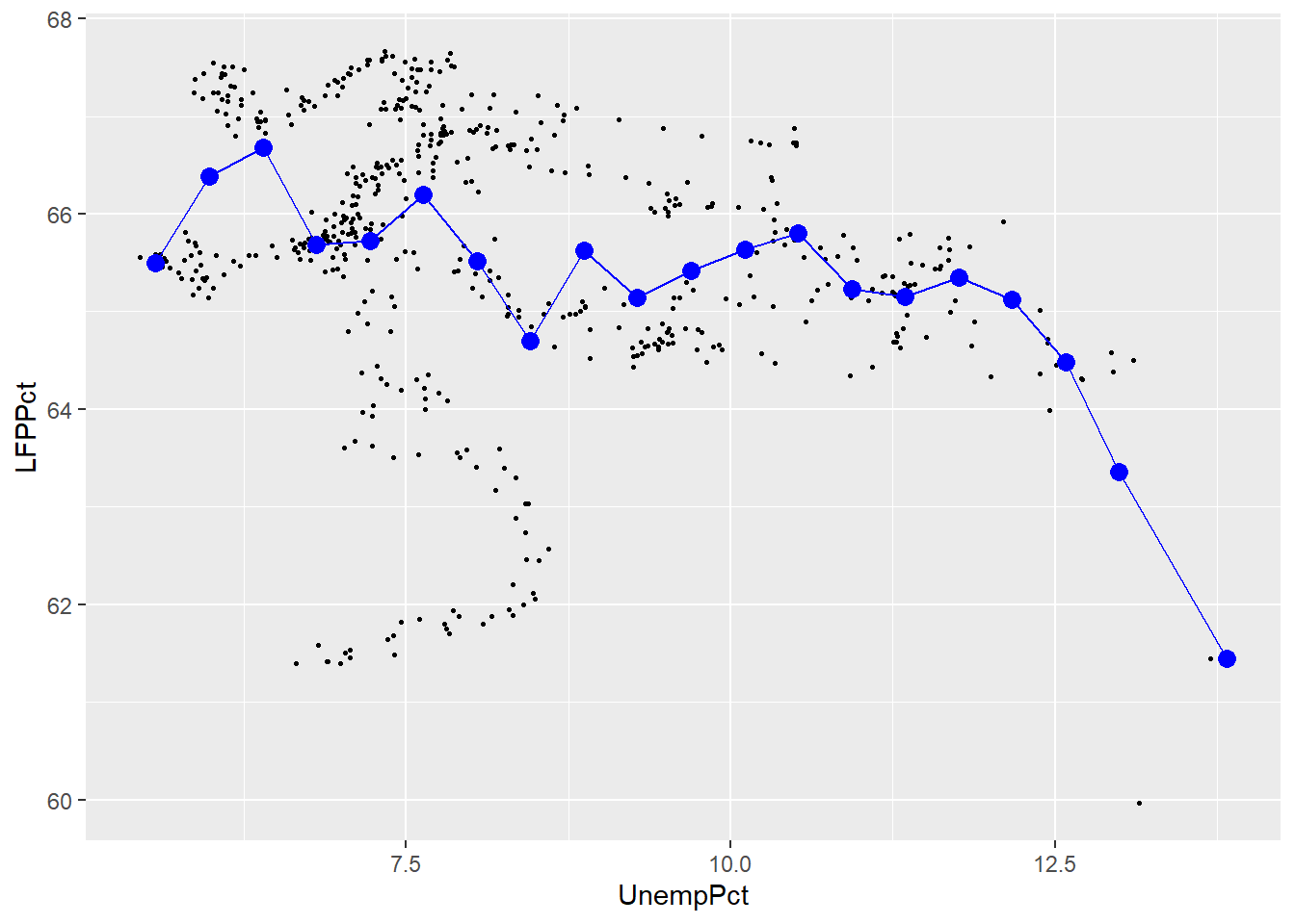
In section 12.2.3 we calculated a conditional average of the (continuous) variable UnempRate for each observed value of the discrete variable PrimeMinister. When both variables are continuous, this isn’t such a good idea: there are as many values of each variable as there are observations, so the “conditional average” ends up just being the original data
When both variables are continuous, one solution is to divide the range for \(x_i\) into a set of bins and then take averages within each bin. We can then plot the average \(y_i\) within each bin against the midpoint of the bin. This kind of plot is called a binned scatterplot.
Binned scatterplots are not difficult to do in R but the code is quite
a bit more complex than you are used to. As a result, I will not ask
you to be able to produce binned scatter plots, I will only ask you
to interpret them. Here is my binned scatter plot with 20 bins:
The number of bins is an important choice. The graph below adds a red line based on 4 bins and a green line based on 100 bins.
ggplot(data = EmpData, aes(x = UnempPct, y = LFPPct)) + geom_point(size = 0.5) +
    stat_summary_bin(fun = "mean", bins = 4, col = "red", size = 1, geom = "point") +
    stat_summary_bin(fun = "mean", bins = 4, col = "red", size = 0.5, geom = "line") +
    stat_summary_bin(fun = "mean", bins = 20, col = "blue", size = 1, geom = "point") +
    stat_summary_bin(fun = "mean", bins = 20, col = "blue", size = 0.5, geom = "line") +
    stat_summary_bin(fun = "mean", bins = 100, col = "green", size = 1, geom = "point") +
    stat_summary_bin(fun = "mean", bins = 100, col = "green", size = 0.5, geom = "line") +
    geom_text(x = 13.8, y = 64.1, label = "4 bins", col = "red") + geom_text(x = 13.8,
    y = 62.5, label = "20 bins", col = "blue") + geom_text(x = 13.8, y = 60, label = "100 bins",
    col = "green")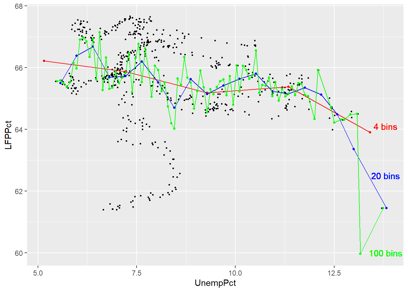
As you can see, the binned scatterplot tends to be smooth when there are only a few bins, and jagged when there are many bins. This reflects a trade-off between bias (too few bins may lead us to miss important patterns in the data) and variance (too many bins may lead us to see patterns in the data that aren’t really part of the DGP).
12.3.3 Smoothing
An alternative to binned averaging is smoothing, which calculates a smooth curve that fits the data as well as possible. There are many different techniques for smoothing, but they are all based on taking a weighted average of \(y_i\) near each point, with high weights on observations with \(x_i\) close to that point and low (or zero) weights on observations with \(x_i\) far from that point. The calculations required for smoothing can be quite complex and well beyond the scope of this course.
Fortunately, smoothing is easy to do in R using the geom_smooth() geometry:
ggplot(data = EmpData, aes(x = UnempRate, y = LFPRate)) + geom_point(size = 0.5) +
    geom_smooth()
## `geom_smooth()` using method = 'loess' and formula 'y ~ x'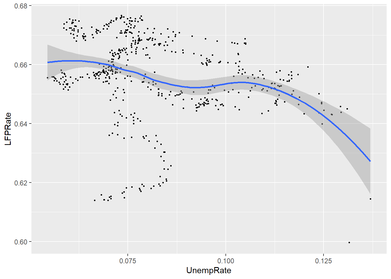
Notice that by default, the graph includes both the fitted line (in blue) and a 95% confidence interval (the shaded area around the line). Also note that the confidence interval is narrow in the middle (where there is a lot of data) and wide in the ends (where there is less data).
12.3.4 Linear regression
Our last approach is to assume that the relationship between the two variables is linear, and estimate it by a technique called linear regression. Linear regression calculates the straight line that fits the data best.
You can include a linear regression line in your plot by adding the
method=lm argument to the geom_smooth() geometry:
ggplot(data = EmpData, aes(x = UnempPct, y = LFPPct)) + geom_point(size = 0.5) +
    geom_smooth(method = "lm")
## `geom_smooth()` using formula 'y ~ x'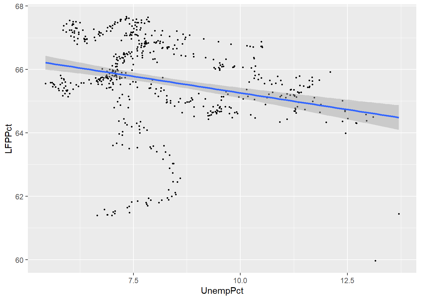
We can compare the linear and smoothed fits to see where they differ:
ggplot(data = EmpData, aes(x = UnempPct, y = LFPPct)) + geom_point(size = 0.5) +
    geom_smooth(col = "red") + geom_smooth(method = "lm", col = "blue")
## `geom_smooth()` using method = 'loess' and formula 'y ~ x'
## `geom_smooth()` using formula 'y ~ x'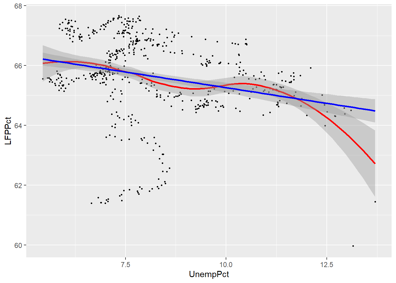
As you can see, the two fits are quite similar for unemployment rates below 12%, but diverge quite a bit above that level. This is inevitable, because the smooth fit becomes steeper, but linear fit can’t do that.
Linear regression is much more restrictive than smoothing, but has several important advantages:
- The relationship is much easier to interpret, as it can be summarized by a single number: the slope of the line.
- The linear relationship is much more precisely estimated
These advantages are not particularly important in this case, with only two variables and a reasonably large data set. The advantages of linear regression become overwhelming when you have more than two variables to work with. As a result, linear regression is the most important tool in applied econometrics, and you will spend much of your time in ECON 333 learning to use it.
Chapter review
Econometrics is mostly about the relationship between variables: price and quantity, consumption and savings, labour and capital, today and tomorrow. So most of what we do is multivariate analysis.
This chapter has provided a brief view of some of the main techniques for multivariate analysis. Our higher-level statistics courses (ECON 333, ECON 334, ECON 335, ECON 433, ECON 435) are all about multivariate analysis, and will develop both the theory behind these tools and the set of applications in much greater detail.
Practice problems
Answers can be found in the appendix.
SKILL #1: Calculate and interpret covariance and correlation
- Using the
EmpDatadata set, calculate the covariance and correlation of UnempPct and AnnPopGrowth. Based on these results, are periods of high population growth typically periods of high unemployment?
SKILL #2: Distinguish between pairwise and casewise deletion of missing values
- In problem (1) above, did you use pairwise or casewise deletion of missing values? Did it matter? Explain why.
SKILL #3: Construct and interpret a pivot table in Excel
- The following tables are based on 2019 data for Canadians aged 25-34. Classify each of these
tables as simple frequency tables, crosstabs, or conditional averages.
Educational attainment Percent Below high school 6 High school 31 Tertiary (e.g. university) 63 Gender Years of schooling Male 14.06 Female 14.74 Educational attainment Male Female Below high school 7 5 High school 38 24 Tertiary 55 71
SKILL #4: Construct and interpret a scatter plot in R
- Using the
EmpDatadata set, construct a scatter plot with annual population growth on the horizontal axis and unemployment rate on the vertical axis.
SKILL #5: Construct and interpret a linear or smoothed average plot in R
- Using the
EmpDatadata set, construct the same scatter plot as in problem (4) above, but add a smooth fit and a linear fit.