Chapter 2 Units
Some of the information described below is covered in this tutorial video. We suggest that you could watch the tutorial video first and then refer to the text description below to clarify what might not be clear in the tutorial video.
2.1 Unit selection in the manual mode
Once you uploaded your data and decided to manually build the model (see Chapter 1), you should land on the main page of the ENA webtool. By defalut, you should be on Model, and on the Units tab (see Figure 2.1). If you hover over the question mark next to the units icon [1], you will find a short explanation of this concept. To select your units, click the plus button under the tab bar.
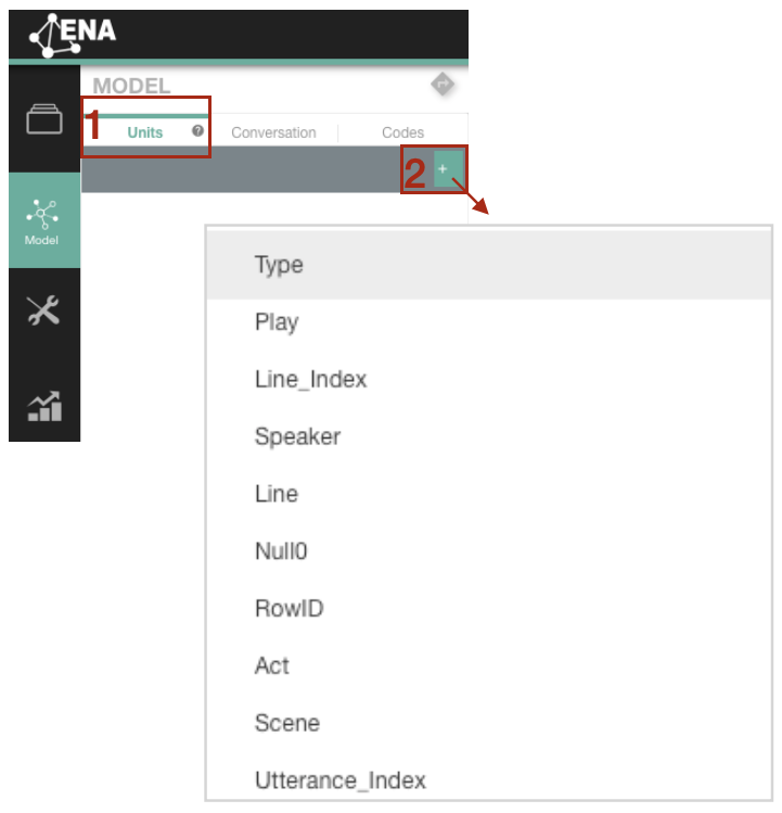
Figure 2.1: Unit selection in the manual mode
2.2 Why might you want to use multiple unit columns?
Take our sample dataset as an example. The units we selected are individual speakers, but instead of selecting Speaker column only in the web tool, we selected a combination of columns: Play, Act, Scene, Speaker. The reason is that doing so would allow us to do group comparison by investigating Speakers’ discourse in each “Act” and “Scene.”
2.3 Does the order in selecting multiple columns matter?
Please note that as long as it is the combination of the four columns (i.e., Play, Act, Scene, Speaker), the order you select columns from the drop-down menu won’t change your ENA model itself. However, it will influence the structure of the nested Units list. For example, in the Figure below, since we selected columns following the order Play > Act > Scene >Speaker, the Units list is arranged in a way that Speaker is nested within Scene, Scene is nested within Act, Act is nested within Play. So, in the following analysis, if we want to find a specific Speaker’s network in certain Scene within certain Act of either Romeo and Juliet or Hamlet, it is more convenient to do so given the current nested structure in our Units list.
Compare the network visualizations for the speaker: Romeo in the play Romeo and Juliet, Act 1, Scene 1 for two different unit selection:
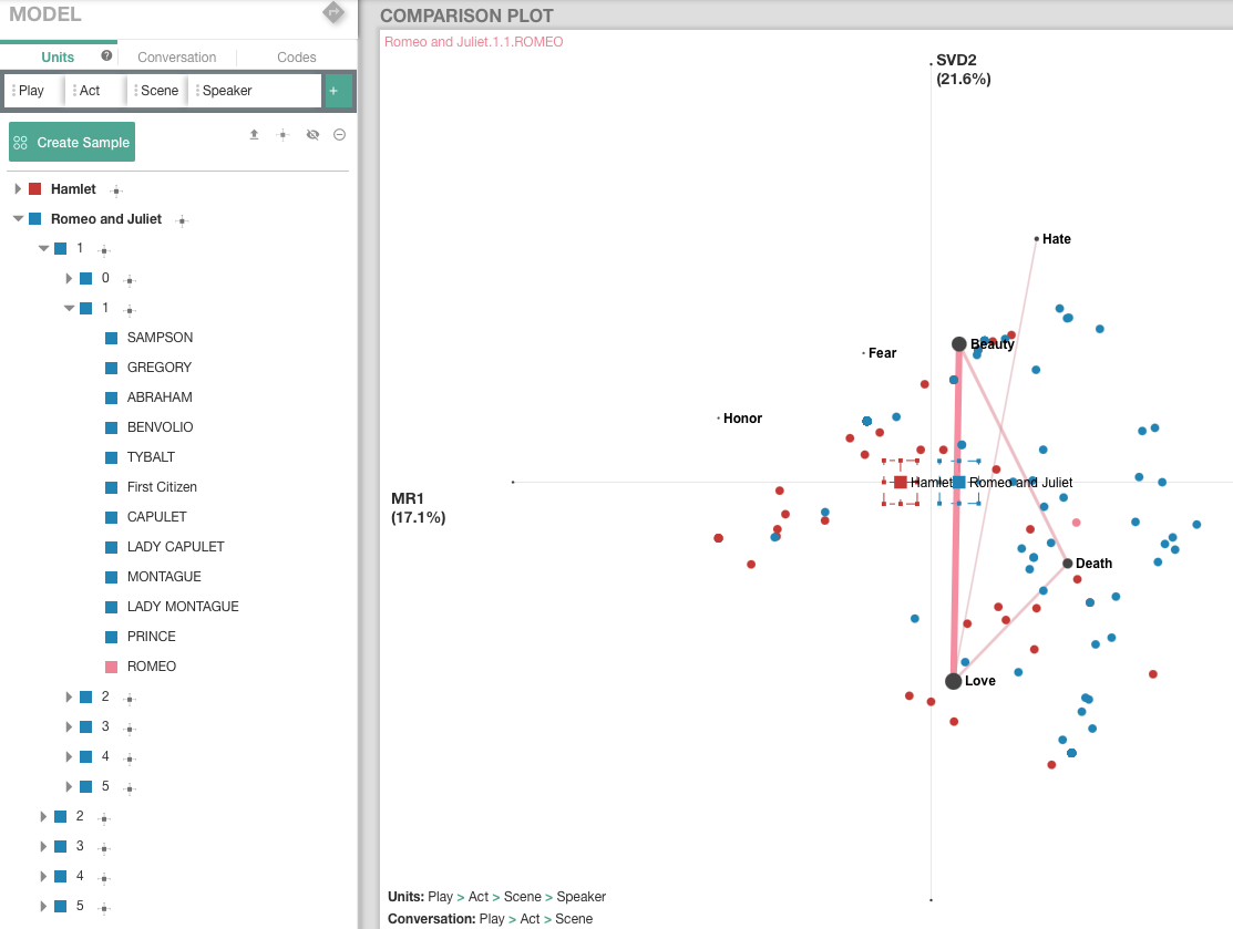
Figure 2.2: Unit selection example: Play > Act > Scene > Speaker
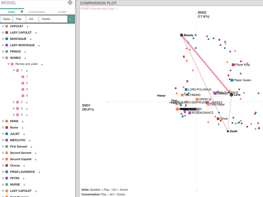
Figure 2.3: Unit selection example: Speaker > Play > Act > Scene
2.4 Means options
If you are grouping units, you can create mean networks for those units. Network means can be visualised by clciking on the means option icon next to your comparison group [1] (see Figure 2.4), and make sure that the option Show Means is selected.
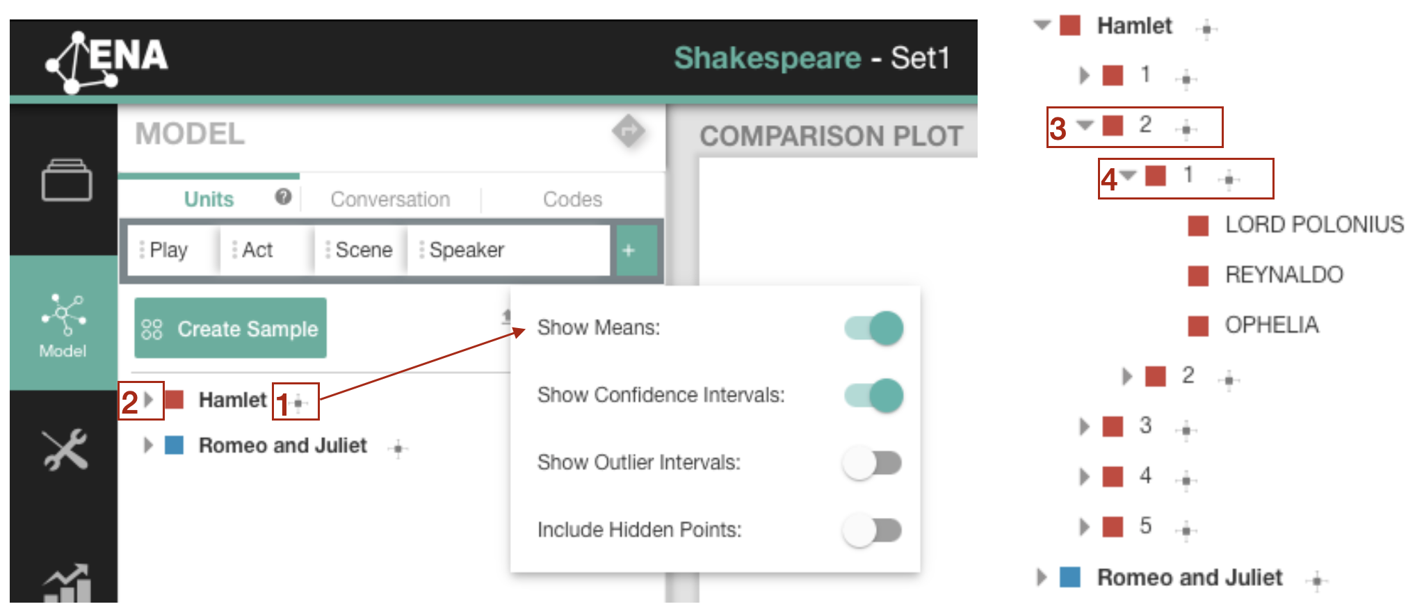
Figure 2.4: Unit means
To visualize means in different grouping of units, click on the open menu arrow [2] (see Figure 2.4). This will expand your unit selection, and you can continue expanding it until your smallest grouping of units [3] [4]. Figure 2.5 shows how different means are represented in an ENA graph. In the comparison plot you can find the means of:
- Romeo and Juliet (Romeo and Juliet)
- First act of Hamlet (HAMLET.1)
- Second act of Hamlet (HAMLET.2)
- The first scene of the third act of Hamlet (HAMLET.3.1)
- The fourth scene of the third act of Hamlet (HAMLET.3.4)
The segmentation of the units is expressed in dots between the levels. Visualisation of means in the lower levels of units might be useful to conduct a temporal analysis.
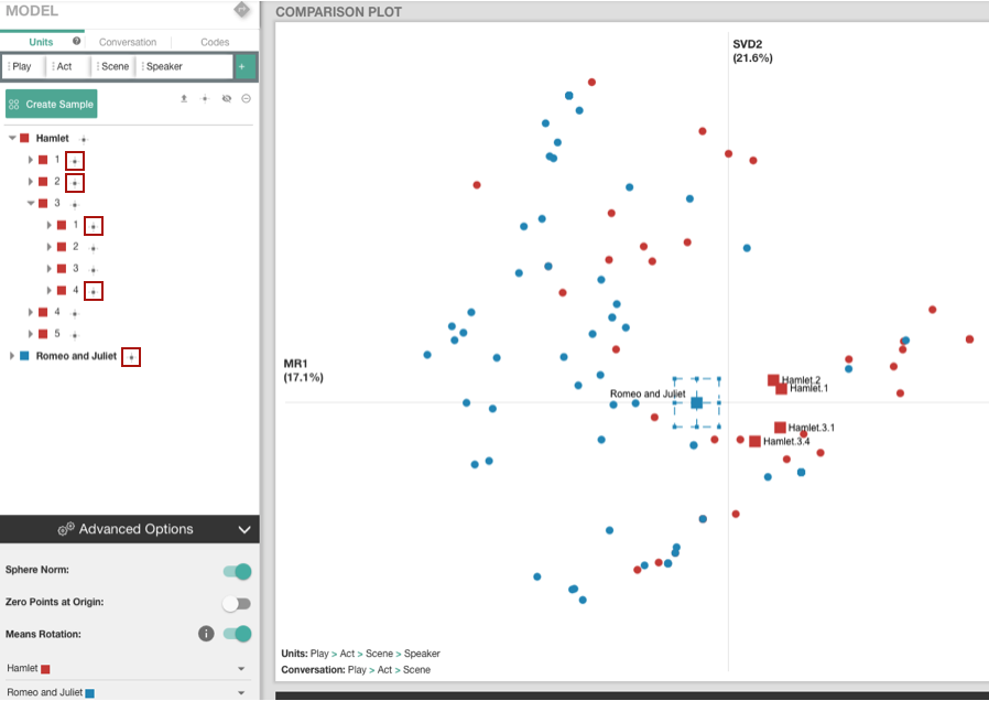
Figure 2.5: Visualization example of unit means
2.5 Hide/unhide units
Hidden units are still part of an ENA model, however, they are not visualized in a graph. You might want to hide particular units for aesthetic reasons to “declutter” your network, or you might want to only focus on the network means.
You can hide all units by clicking on the hide all icon under the tab bar [1] (see Figure 2.6). If you want to hide units on a particular unit level, hover over the unit name, and an hide all icon will appear next to the unit name [2]. Once you click on the hide all icon, the hidden unit names will become grey [3] and will disappear from the visualization. If you want to unhide the units, you can either click on the unhide all icon under the tab bar [4], or on the unhide all icon on a particular unit level that will appear, if you hover over the unit name [5].
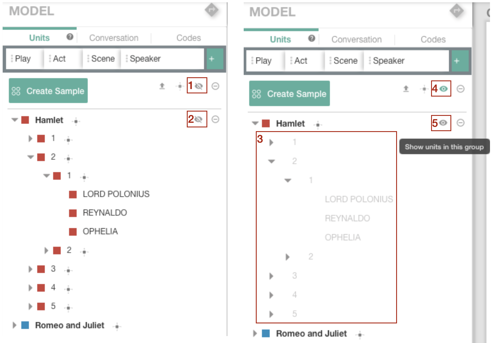
Figure 2.6: Hiding/unhiding units
2.6 Exclude/include units
In comparison to hidden units, excluded units will remove units from the model you just built (you can always add them back).
You can exclude all units by clicking on the exclude all icon under the tab bar [1] (see Figure 2.7). If you want to exclude units on a particular unit level, hover over the unit name, and an exclude all icon will appear next to the unit name [2]. Once you click on the exclude all icon, the excluded unit names will become grey and strikethrough [3], and will disappear from the visualization. If you want to include the units, you can either click on the include all icon under the tab bar [4], or on the include all icon on a particular unit level that will appear, if you hover over the unit name.
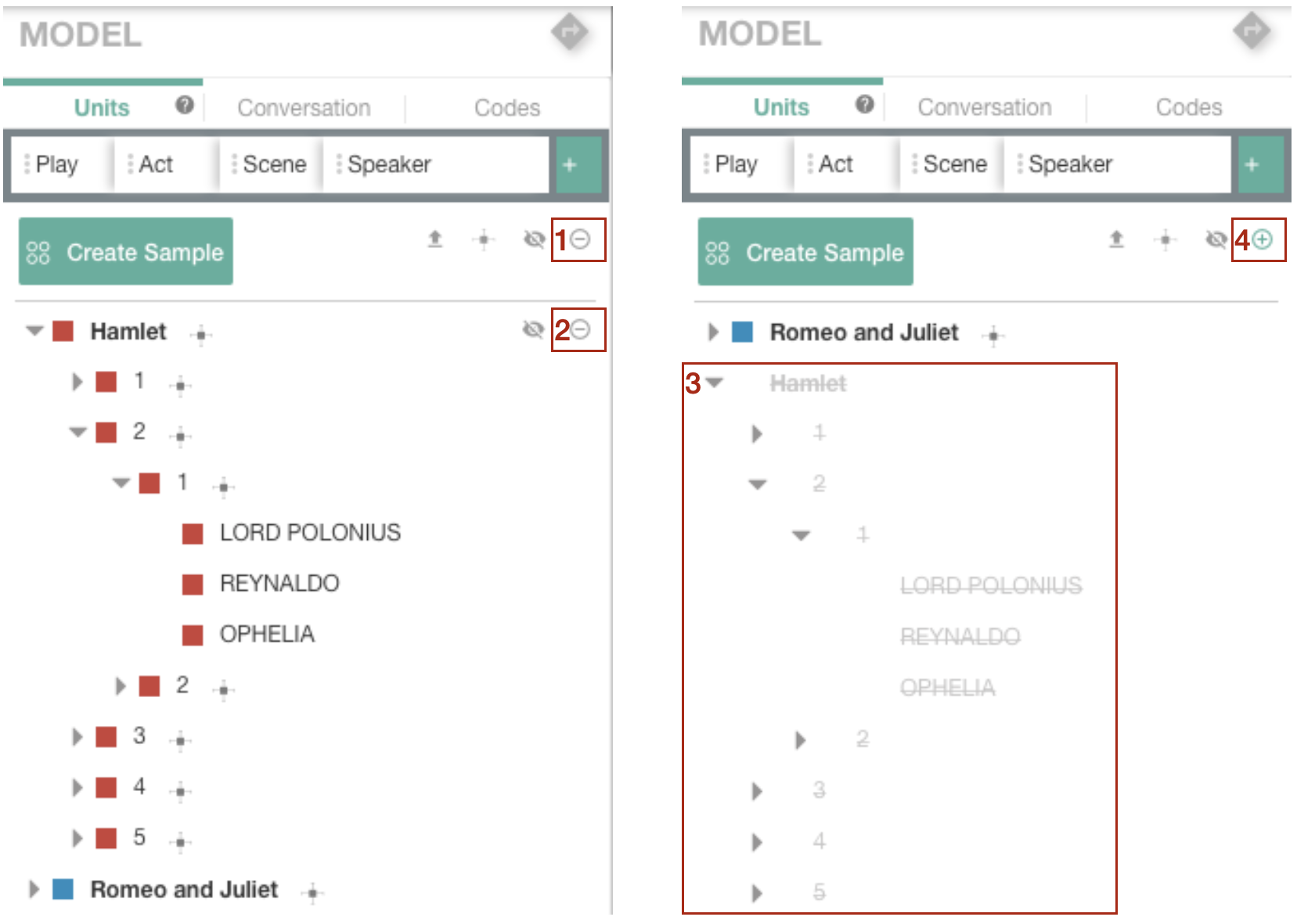
Figure 2.7: Excluding/including units
2.7 Create sample
Tutorial video on creating sample
To create a sample, click on the Create Sample button under the tab bar [1] (see Figure 2.8). This will activate the sample mode [2]. Name your sample and choose the units from your dataset that you would like to include in this sample by clicking on the units names [3]. Finally, save the sample. After you created your sample, it will appear as another comparison group in your list of units [4]. You can perform the typical unit operations, such as units hiding/unhiding or units excluding/including. Additionally, you can delete the sample by clicking on the bin button or edit your sample by clicking on the pen-like button that will appear next to the sample name, once you hover over it [5]. After you have created your sample, it will appear in your comparison plot with its own group mean. It is possible to create multiple samples.
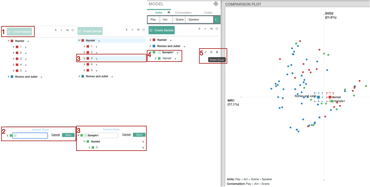
Figure 2.8: Creating a sample
2.8 Change units colour
To change units colour in your visualisation, click on the Pick colour button that looks like a square next to the units name [1] (see Figure 2.9). A pop-up window will appear with different colour options [2]. Notice that your colour choice will affect all the lower level units [3].
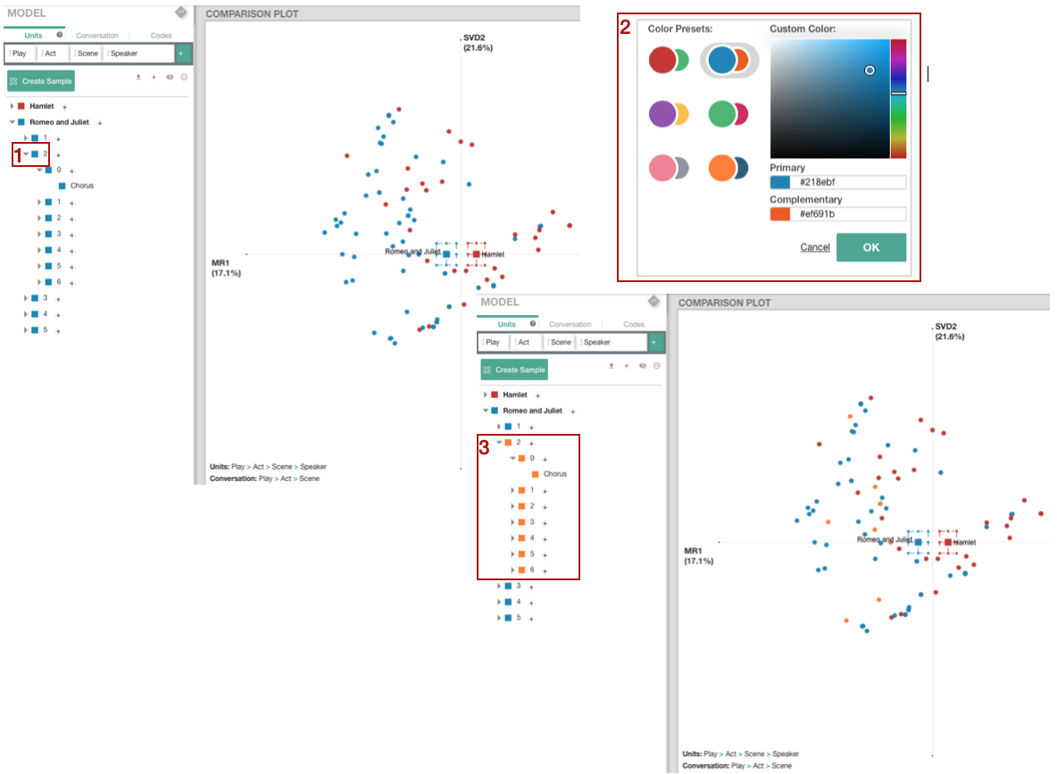
Figure 2.9: Selection of the units colour
2.9 Advanced units options
Advanced units options include: Sphere Norm, Zero Points at Origin, and Means Rotation, as shown in Figure 2.10.
By default, the web tool itself will automatically turn on or off the three settings for users. For example, Means Rotation is automatically turned on when there are two group of units for comparison. Sphere Norm is automatically turned on when there is only one group of units in the model. When Zero Points at Origin is turned on, units that have zero connections in the network will be located at the origin.
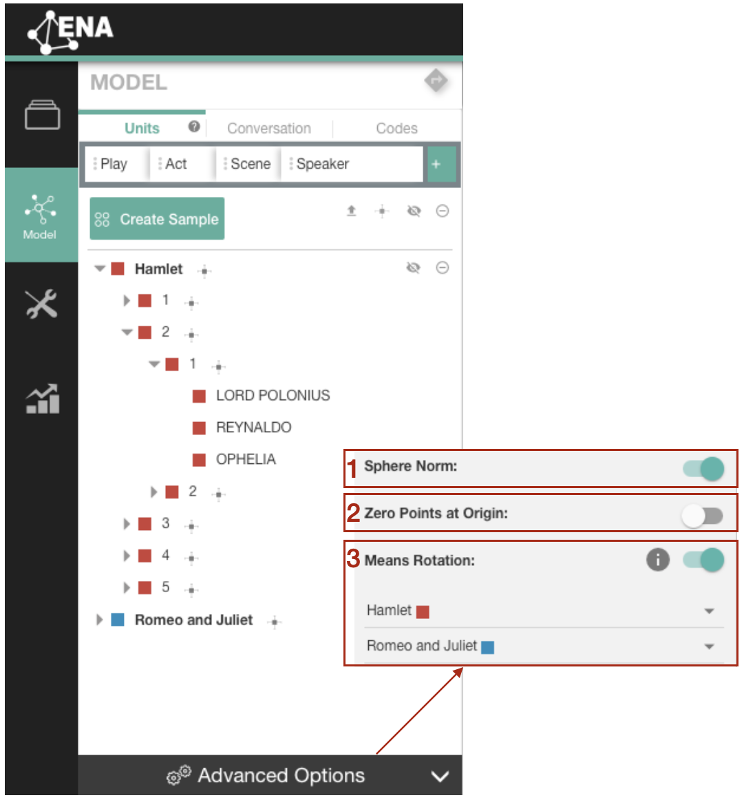
Figure 2.10: Advanced options for units