Chapter 4 Exploratory Data Analysis
Exploratory data analysis (EDA) is a bit like taking the vital signs of your data set in order to tell what you are working with. EDA can be an explicit step you take during (or before) your analysis, or it can be a more organic process that changes in quantity and quality with each data set. EDA can help to familiarize you with the data (especially if it is not yours) or help you gain a deeper understanding of possible features and relationships in the data. EDA is not a new thing, evidenced by John Tukey et al. (1977) in Exploratory Data Analysis, but EDA has grown substantially in the recent past for a number of reasons:
Data is being generated faster and in greater quantities than ever before, so we have a lot to look through.
Computers and software (like R) have expanded opportunities to do EDA.
Recent growth in options for statistical models often require that we look more closely at our data rather than go directly to a conventional model.
EDA is often not statistical in terms of the final analysis of your data, but EDA should be thought of as transitional. What you learn from EDA will guide your modeling and directly inform decisions you make about statistical tools.
4.1 Peng’s 10 Steps
R. Peng (2012) has a great book, aptly titled Exploratory Data Analysis with R. In Chapter 5, he provides 10 steps for conducting EDA. Below I have listed those steps and added some comments (not taken from Peng).
- Formulate your question
- Be knowledgeable about your data
- Read metadata the data is not yours
- Come at an analysis with leading questions
- Hypothesis-driven studies are great, if possible
- Multiple questions are often better (recall Chamberlin 1890)
- Read in your data
- This goes without saying; you can’t explore your data if it is not read in
- Recall some of the tips and tricks in Chapter 2 if you are trying to read in a large dataset
- Check the packaging
- This won’t tell you too much, but is a simple step and can help you get an understanding of the data
- Functions like
ncol(),nrow(),dim(),str(),summary()are all helpful here
- Use
str()
- As a follow up to step 3,
str()is particularly useful
- Look at the top and the bottom of your data
- A lot can be learned by looking at a snapshot of the data
- Run
head()to show the top 5 rows of your data, and runtail()to show the bottom 5 rows
- Check your “n”s
- Getting some basic counts and tabulations can be very imformative (or frustrating when you learn of sample size limitations)
- Functions like
table(),dplyr::filter(), anddplyr::group_by()are excellent places to start splitting and counting your samples
- Validate with at least one external data source
- Checking your data against an external data source is a great idea, and you should do it if you can
- If you cannot do this, ask yourself how can I demonstrate that my measurements align with what others have reported?
- Although not necessarily included in this step, here is a good place for a reminder to undertake some QA/QC by checking each variable for magnitude, direction, units, etc.
- Try the easy solution first
- Based on how you worded your question(s), try the simplest approach first
- The simplest approach will also generally be the simplest code (this is good!)
- You can build from there
- Challenge your solution
- Assuming you saw something promising in your initial approach, consider variability of space and time
- Consider unbalanced data
- Consider other ways of reporting
- Follow up
- Do you have the right data?
- Do you need other data?
- Do you have the right question?
4.2 Visually Exploring Your Data
Plotting or otherwise visualizing your data can be one of the most helpful steps in understanding your data. For instance, imagine I told you that four different data sets had the virtually same means for \(x\) and \(y\), virtually the same sample variance (\(\sigma^2\)), the same correlation, and the same regression line. You would likely have a hard time visualizing four different plots of these data sets. In fact, these 4 data sets are shown below, and are referred to as Anscombe’s Quartet (Anscombe 1973).
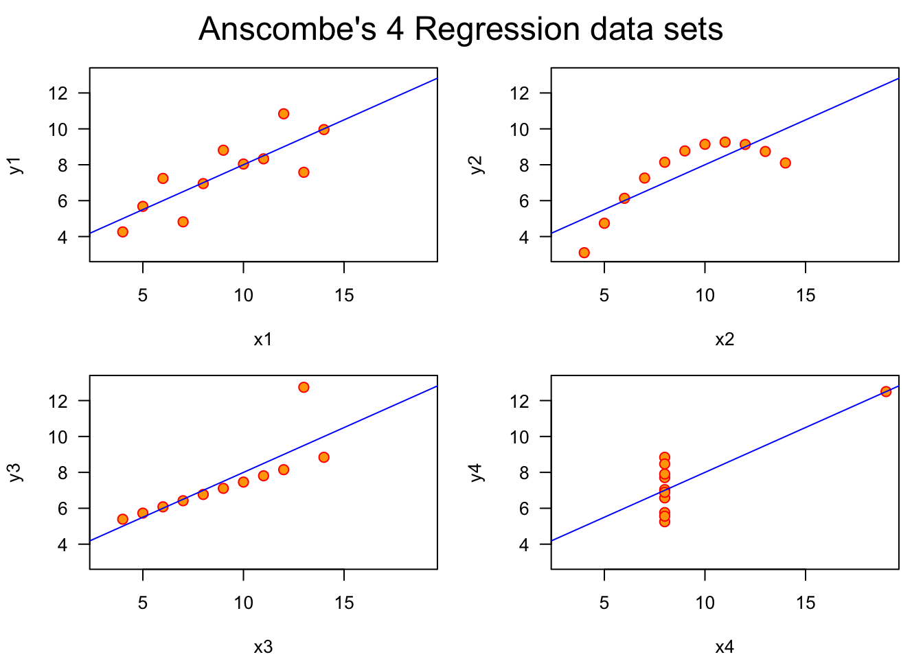
Anscombe’s Quartet is a powerful reminder that there is often no substitute for visualizing data. Let’s cover some different types of plots, not from the perspective of making highly-detailed and aesthetically-effective plots, but from the perspective of making plots that accurately show the data and relationships we want to explore.
4.2.1 Making Comparisons
One of the primary reasons we plot data is to compare one or more variables against itself or other variables. To start, consider the relationship(s) you want to investigate. Are they connected to the question or hypothesis with which you started?
Specificity Be specific in your comparisons. Making vague or general statements only opens the door for latent effects to cause trouble when not accounted for. For example, if you want to explore plots that support your hypothesis that The Mississippi River Plume has high species diversity, consider what is meant by high species diversity? What is the reference for low species diversity? Are you comparing the plume diversity to other plumes? To areas outside of plumes?
Causality Consider underlying causality or mechanism. Simply because two variables have a relationship does not mean they are actually influencing each other. Along this line, manipulation of plot axes and other graphical parameters can trick viewers into interpreting more than might be there. Remember the expression correlation is not causation.
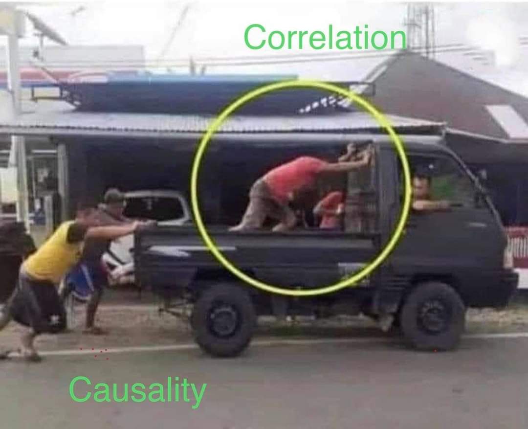
Figure 4.1: Source: Twitter
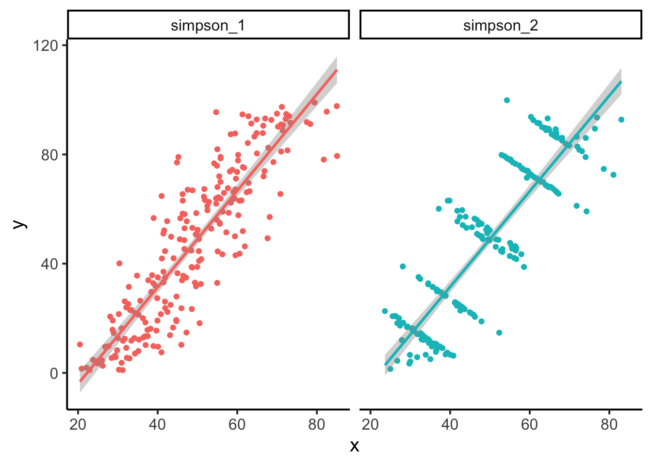
Other Factors If you plot a comparison and see a relationship, ask what other variables may influence it (rarely are two variables solely responsible for an entire story). We certainly hope to see strong and interpretable relationships in the data we plot, but assume there is always more to the story. Here is a good time to consider the effects of groups. Might group membership of your plotted data tell a different story? This was certainly the case for Simpson’s Paradox (Simpson 1951). (The example below was done using data from the package datasauRus, which you are encouraged to check out for more examples on this topic.)
Document and Describe Ultimately you will want to spend more time with the details of your plots and figure when they are showing study results and are being prepared for a poster, manuscript, or some other external product. But that does not mean you should hold back on some plotting features like text, arrows, labels, and anything else that can help highlight the points your plot is making.
4.3 Plot Types
4.3.1 Bar Plot
Bar plots are reserved primarily for count data, or data that shows some accumulation (or proportion). Bar plots are not the proper plot type for distributional data or data that is showing estimates (e.g., means) and uncertainty. Bar plots are commonly used in software like Microsoft Excel, and coupled with the lack of other plot types (e.g., box plots), many of us will default to a bar plot even when the data are not counts. In R, you may often need to tabulate your data first, and then use the barplot() function on your table object. A number of studies (Annesley 2010; Streit and Gehlenborg 2014; Weissgerber et al. 2015) have warned against problems with bar plots, so please be informed about their use and interpretation.
# Tabulate earthquakes by magnitude
magnitude.counts <- table(quakes$mag)
# plot counts of earthquakes by magnitude
barplot(magnitude.counts,
        xlab = "Magnitude",
        ylab = "Frequency",
        las = 1,
        col = "black")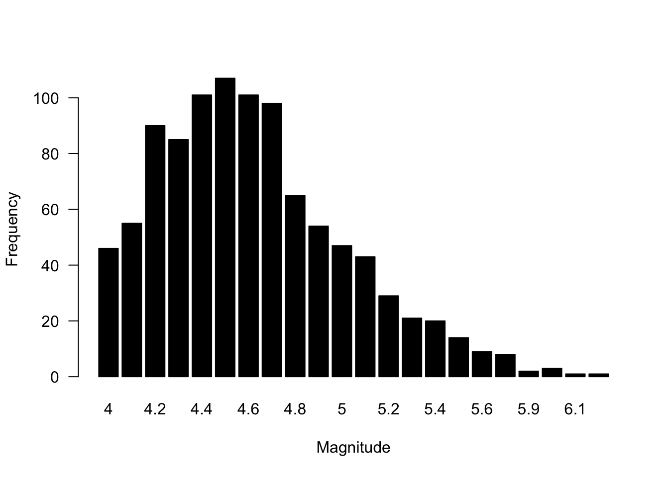
4.3.2 Histogram
Histograms are are the quintessential exploratory plot because they show densities of data and can help provide distributional information. Histograms may end up in a final analysis, but they are much more likely to be found in your exploratory code where you are trying to understand the range and density of different variables. Histograms are used on numerical data that the histogram() function will automatically bin, although you can specify the resolution of the bins by modifying the breaks = argument.
# Histogram of the heights of black cherry trees
hist(trees$Height)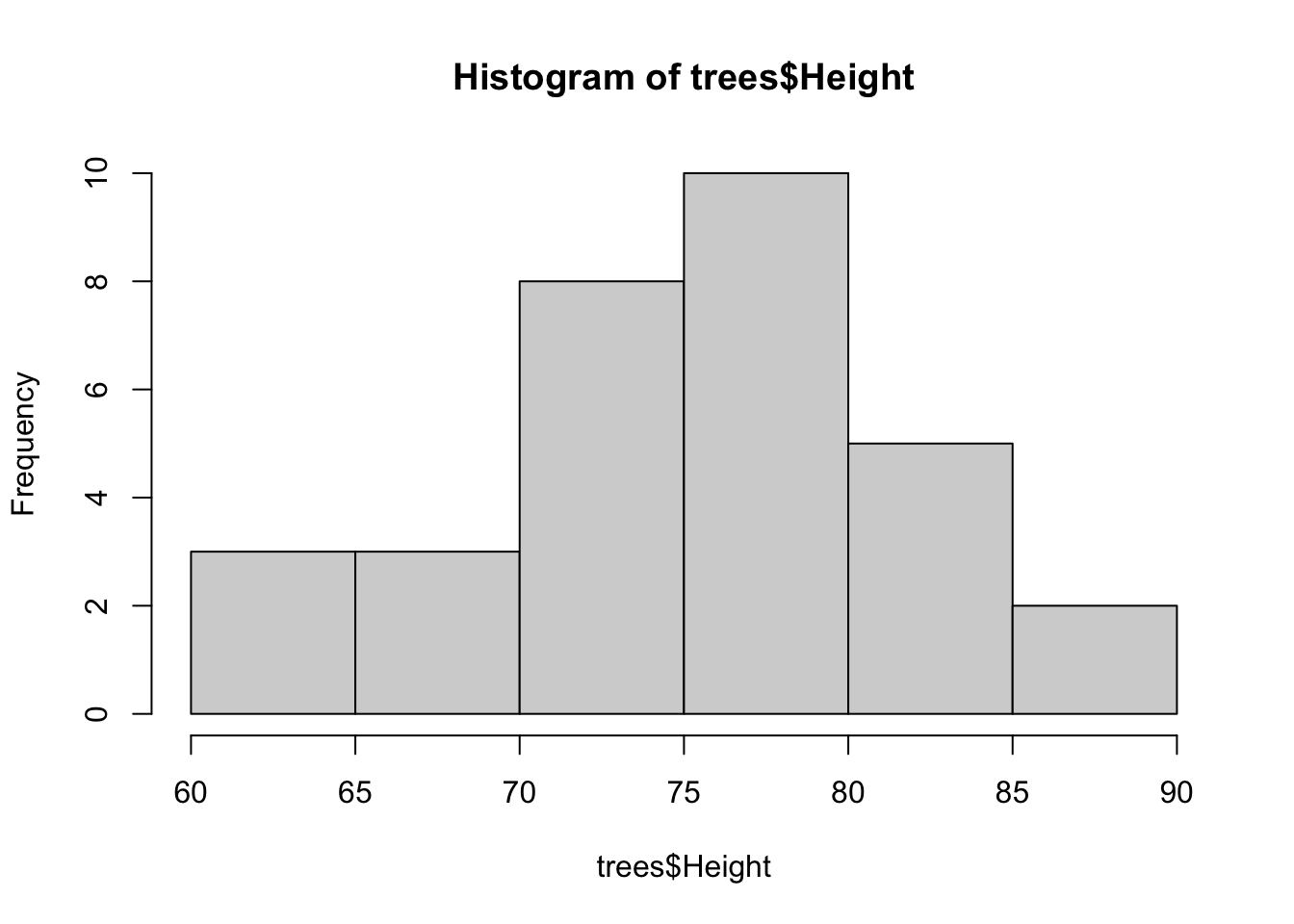
Default histograms are fine, but some low-level plotting often helps with their visualization. Also, it’s not clear whether more bins that the default would be needed, but the modified histogram below illustrates how to add more bins.
# Histogram of the heights of black cherry trees
hist(trees$Height,
     las = 1, # rotate numbers on y-axis
     col = "brown", # black bars
     border = "white", # white border
     main = '', # Leave the title empty (use caption)
     breaks = 10, # 10 bins
     xlim = c(60,90), # Range of x-axis
     xlab = "Black Cherry Tree Height") # y-axis label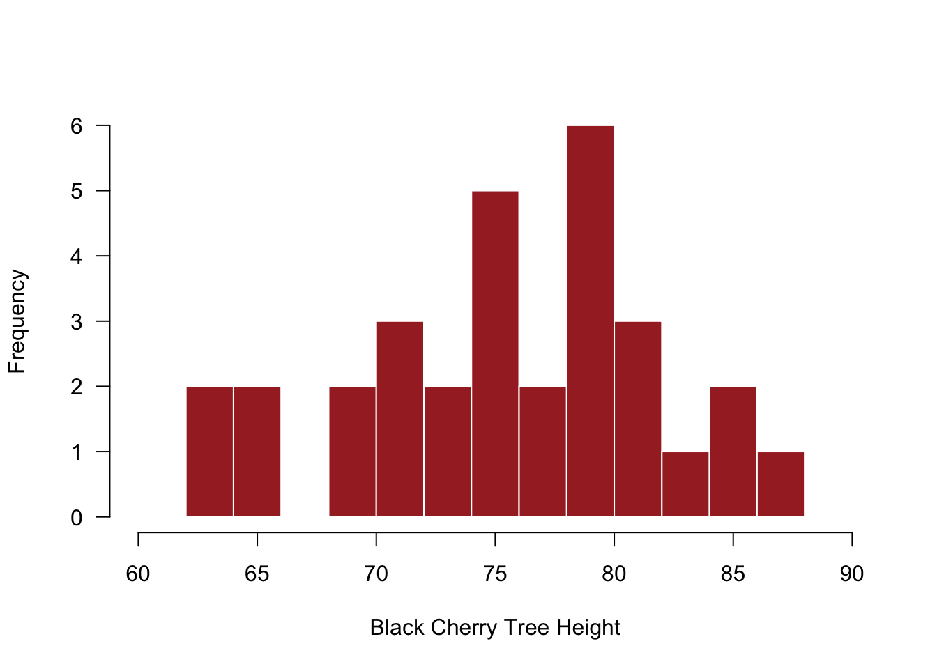
4.3.3 Scatterplot
Another workhorse of the exploratory plot family is the scatterplot. Often you will want to see how to numeric variables relate to each other, and scatterplot (simply plot()) will do the trick. Scatterplots are particularly useful for considering how your variable \(y\) changes across values of \(x\), and your observations here may directly inform a model you want to evaluate with your data.
# Scatterplot of Black Cherry Tree Height and Volume
plot(trees$Volume ~ trees$Height)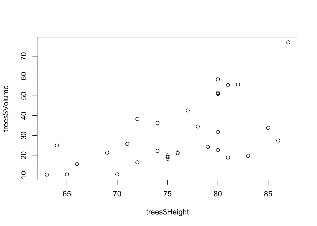
And again, we can do some basic modifications to improve the display of information in this plot.
# Scatterplot of Black Cherry Tree Height and Volume
plot(trees$Volume ~ trees$Height, # The plot in formula syntax; y ~ x
     xlim = c(60,90), # Range of x-axis
     ylim = c(0,100), # Range of y-axis
     pch = 19, # Plotting symbol change to filled-in circle
     xlab = "Height", # x-axis label
     ylab = "Volume", # y-axis label
     las = 1) # Rotate numbers on y-axis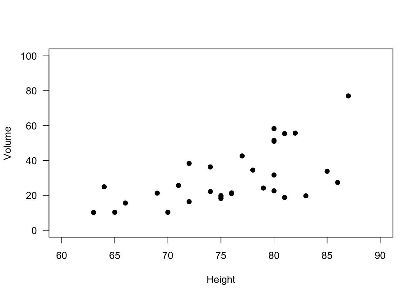
4.3.4 Boxplot
The boxplot is one of the more undervalued plots for data—both for exploratory work and final presentation. So often when bar plots are used incorrectly, it is actually a box plot that is the appropriate plot. Boxplot show distributional information for data. Typically the box represents the IQR (interquartile range), the center line represents the median, and the whiskers represent some extreme of the data. However, one mistake that is often made with boxplots is that the boxplot features are not described in the figure caption. You might not be captioning all your exploratory plots, but for final renderings, be sure to state what the box represents, what the whiskers represent, and so on. It might be obvious to you, but boxplot symbology is not universal!
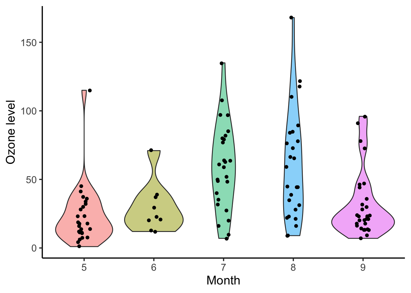
It is also worth noting that boxplots need not only be used on normally-distributed data; however, proceed with caution when using boxplots on data that start to get away from normal or symmetrical distributions. Your data does not need to be perfectly normal, but there are plenty of distributions for which you would not use a boxplot (e.g., Bernoulli). Relatives of box plots, like the violin plot, may be more appropriate for non-normal data because it can capture more of the shape of the data.
# Boxplot of ozone by month for New York
boxplot(airquality$Ozone ~ airquality$Month)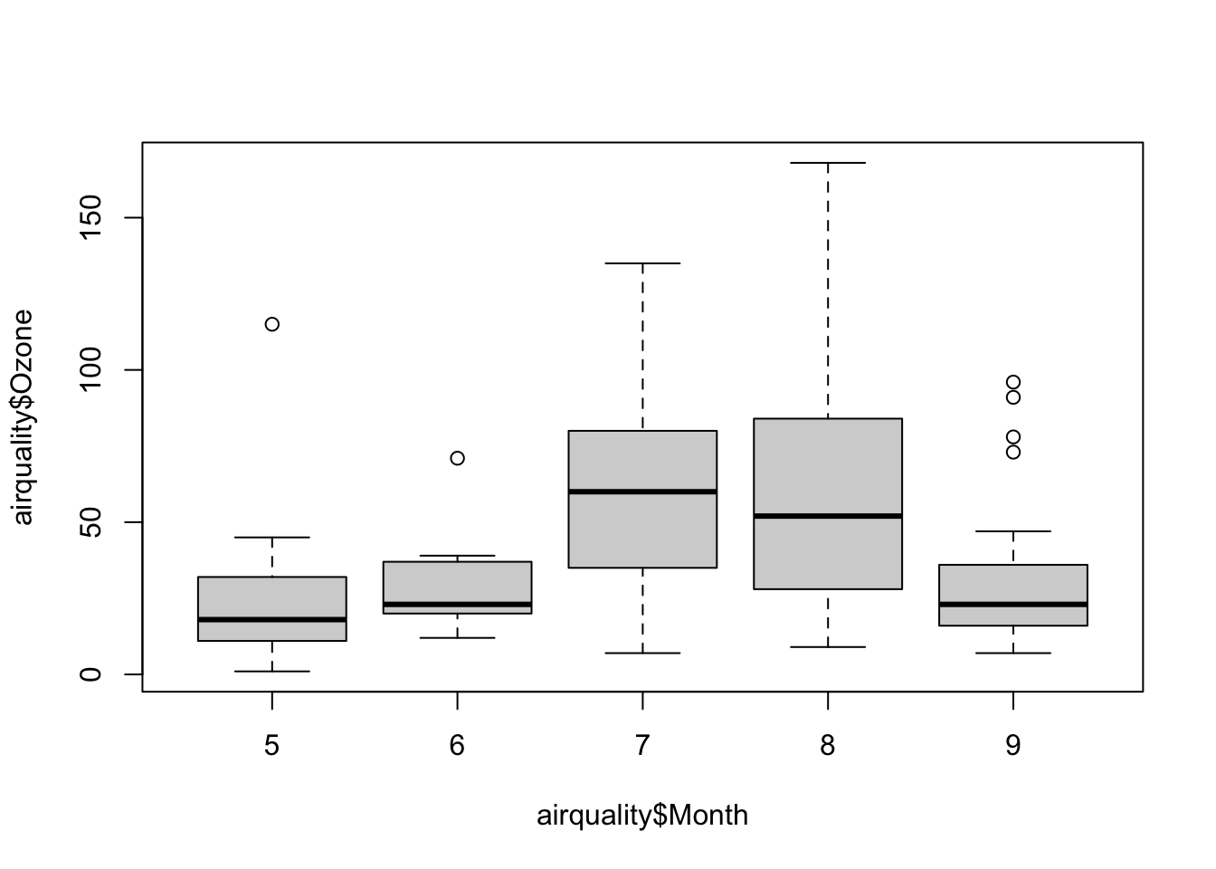
And again, we can make some minor changes to improve the look.
# Boxplot of ozone by month for New York
boxplot(airquality$Ozone ~ airquality$Month,
        xlab = "Month", # x-axis label
        ylab = "Ozone", # y-axis label
        las = 1, # Rotate numbers on y-axis
        ylim = c(0,200), # Range of y-axis
        col = "lightblue", # Boxplot fill color
        border = "darkred", # Boxplot border color
        pch = 19) # Symbol for outliers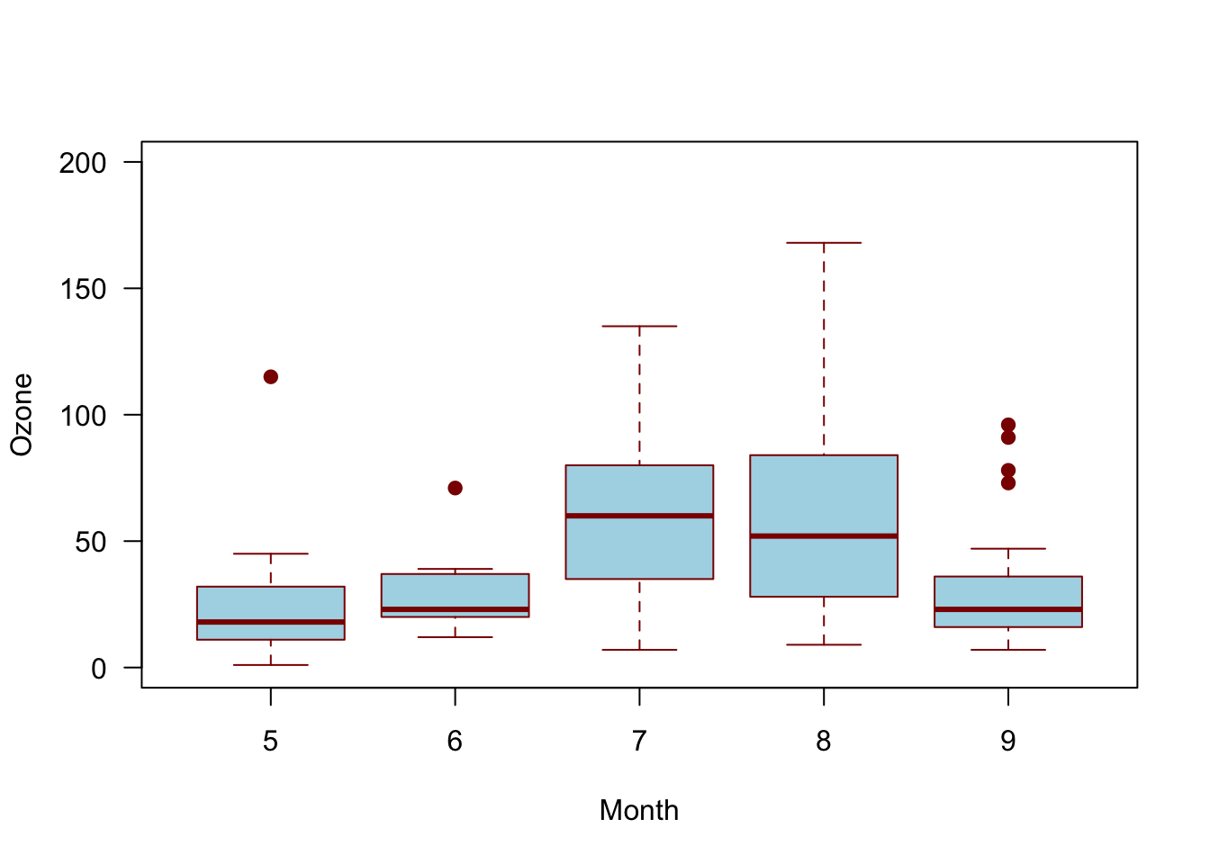
As mentioned above, a violin plot, or a number of other distributional geometries, may be more useful and honest when the distribution of the data is uncertain. Compare the below violin plot to the box plot above.
4.3.5 Line Plot
Be careful with plotting lines in exploratory work. Rarely is data a line—data are almost always points and a line is something we create to infer connections between points. In other words, a line is almost always a model. Models may be exploratory, but they are not data. Lines representing models are interpolating (or extrapolating) your data, and that is a different from simply evaluating the data on its own. Having said this, adding reference lines or other annotations is encouraged, so long as it is clear what is added and why.
4.3.6 Other Considerations
Many other types of plots exist and the ones presented here may not get you where you need to go in data exploration. However, the plots covered here are the vast majority of common plot types, especially for getting to know your data. Furthermore, there is a lot of guidance available for creating effective figures, and although subsequent chapters will delve into this more, simple advice is available (Midway 2020).
4.4 Data Manipulation
Data manipulation is a good and useful term, but it can also be interpreted very broadly to refer to just about anything done with data. Because data manipulation can include so much, it is hard to succinctly cover what exactly is needed. In fact, entire texts have been devoted to this singular topic (Spector 2008; Abedin and Das 2015) and other R-related texts feature chapters or sections on this topic (Wickham and Grolemund 2016). Given the breadth of what can be included in data manipulation, this section will provide only a brief overview of some common data manipulation functions, all of which happen to be included in the excellent dplyr package.
Like so much in the tidyverse, the dplyr package adopts a common syntax for its family of functions. In dplyr functions, the focus is on data frames, which is the object on which the functions are performed. dplyr provides often simplified functions that are typically faster performing, especially as data frame objects increase in size. dplyr refers to their commands as verbs, which you should know, although you will also see them refered to as commands and functions. Finally, dplyr is the successor of the plyr package.
The structure for dplyr verbs is consistent, and the first arguement is always the data frame. The following function describes what to do with the data frame, and you don’t need the $ operator (subset) because specifying the data frame insures that the function is performed on that object. Whatever is done, a new data frame results, and you will need to give that object a name for it to be saved (like all R functions).
dplyr is incredibly powerful and very logical. Please check out an excellent cheat sheet (with diagrams) here.
4.4.1 dplyr Verbs
Let’s use the iris built-in data set to illustrate the dplyr verbs. (Note that in many examples the head() function has been added to save space by preventing an entire data frame from being printed.)
4.4.1.1 select
select subsets columns. The iris data set has 5 columns, but perhaps we only want to keep the Sepal.Width and Petal.Width column.
library(dplyr)
head(iris) # show 5 columns
## Sepal.Length Sepal.Width Petal.Length Petal.Width Species
## 1 5.1 3.5 1.4 0.2 setosa
## 2 4.9 3.0 1.4 0.2 setosa
## 3 4.7 3.2 1.3 0.2 setosa
## 4 4.6 3.1 1.5 0.2 setosa
## 5 5.0 3.6 1.4 0.2 setosa
## 6 5.4 3.9 1.7 0.4 setosa# Select by column order
head(dplyr::select(iris, c(2,4)))## Sepal.Width Petal.Width
## 1 3.5 0.2
## 2 3.0 0.2
## 3 3.2 0.2
## 4 3.1 0.2
## 5 3.6 0.2
## 6 3.9 0.4# Select by column name
head(dplyr::select(iris, c('Sepal.Width','Petal.Width')))## Sepal.Width Petal.Width
## 1 3.5 0.2
## 2 3.0 0.2
## 3 3.2 0.2
## 4 3.1 0.2
## 5 3.6 0.2
## 6 3.9 0.4# Select by column name criteria
head(dplyr::select(iris, ends_with('Width')))## Sepal.Width Petal.Width
## 1 3.5 0.2
## 2 3.0 0.2
## 3 3.2 0.2
## 4 3.1 0.2
## 5 3.6 0.2
## 6 3.9 0.4# To save output as object
# iris_new <- select(iris, ends_with('Width'))4.4.1.2 filter
filter is a verb for subsetting based on criteria, much like subset().
# Filter for only virginica species
head(filter(iris, Species == 'virginica'))
## Sepal.Length Sepal.Width Petal.Length Petal.Width Species
## 1 6.3 3.3 6.0 2.5 virginica
## 2 5.8 2.7 5.1 1.9 virginica
## 3 7.1 3.0 5.9 2.1 virginica
## 4 6.3 2.9 5.6 1.8 virginica
## 5 6.5 3.0 5.8 2.2 virginica
## 6 7.6 3.0 6.6 2.1 virginica# Filter for only Petal.Width greater than 2.0
head(filter(iris, Petal.Width > 2.0))## Sepal.Length Sepal.Width Petal.Length Petal.Width Species
## 1 6.3 3.3 6.0 2.5 virginica
## 2 7.1 3.0 5.9 2.1 virginica
## 3 6.5 3.0 5.8 2.2 virginica
## 4 7.6 3.0 6.6 2.1 virginica
## 5 7.2 3.6 6.1 2.5 virginica
## 6 6.8 3.0 5.5 2.1 virginica# Filter for only Petal.Width greater than 2.3
# and the virginica species
head(filter(iris, Petal.Width > 2.3 & Species == 'virginica'))## Sepal.Length Sepal.Width Petal.Length Petal.Width Species
## 1 6.3 3.3 6.0 2.5 virginica
## 2 7.2 3.6 6.1 2.5 virginica
## 3 5.8 2.8 5.1 2.4 virginica
## 4 6.3 3.4 5.6 2.4 virginica
## 5 6.7 3.1 5.6 2.4 virginica
## 6 6.7 3.3 5.7 2.5 virginica4.4.1.3 arrange
arrange is a verb for reordering row(s).
# Arrange by Sepal.Length
head(arrange(iris, Sepal.Length))
## Sepal.Length Sepal.Width Petal.Length Petal.Width Species
## 1 4.3 3.0 1.1 0.1 setosa
## 2 4.4 2.9 1.4 0.2 setosa
## 3 4.4 3.0 1.3 0.2 setosa
## 4 4.4 3.2 1.3 0.2 setosa
## 5 4.5 2.3 1.3 0.3 setosa
## 6 4.6 3.1 1.5 0.2 setosa# Arrange by Sepal.Length decreasing
head(arrange(iris, desc(Sepal.Length)))## Sepal.Length Sepal.Width Petal.Length Petal.Width Species
## 1 7.9 3.8 6.4 2.0 virginica
## 2 7.7 3.8 6.7 2.2 virginica
## 3 7.7 2.6 6.9 2.3 virginica
## 4 7.7 2.8 6.7 2.0 virginica
## 5 7.7 3.0 6.1 2.3 virginica
## 6 7.6 3.0 6.6 2.1 virginica4.4.1.4 rename
rename is a verb for renaming columns.
# Rename Species column in iris
head(rename(iris, sp = Species))
## Sepal.Length Sepal.Width Petal.Length Petal.Width sp
## 1 5.1 3.5 1.4 0.2 setosa
## 2 4.9 3.0 1.4 0.2 setosa
## 3 4.7 3.2 1.3 0.2 setosa
## 4 4.6 3.1 1.5 0.2 setosa
## 5 5.0 3.6 1.4 0.2 setosa
## 6 5.4 3.9 1.7 0.4 setosa4.4.1.5 mutate
mutate computes and transformation of variables.
# Rename Species column in iris
head(mutate(iris, Petal_condition = Petal.Length/Petal.Width))
## Sepal.Length Sepal.Width Petal.Length Petal.Width Species Petal_condition
## 1 5.1 3.5 1.4 0.2 setosa 7.00
## 2 4.9 3.0 1.4 0.2 setosa 7.00
## 3 4.7 3.2 1.3 0.2 setosa 6.50
## 4 4.6 3.1 1.5 0.2 setosa 7.50
## 5 5.0 3.6 1.4 0.2 setosa 7.00
## 6 5.4 3.9 1.7 0.4 setosa 4.254.4.1.6 group_by
group_by groups for summary statistics; often used with summarize()
# Rename Species column in iris
group_by(iris, Species)
## # A tibble: 150 × 5
## # Groups: Species [3]
## Sepal.Length Sepal.Width Petal.Length Petal.Width Species
## <dbl> <dbl> <dbl> <dbl> <fct>
## 1 5.1 3.5 1.4 0.2 setosa
## 2 4.9 3 1.4 0.2 setosa
## 3 4.7 3.2 1.3 0.2 setosa
## 4 4.6 3.1 1.5 0.2 setosa
## 5 5 3.6 1.4 0.2 setosa
## 6 5.4 3.9 1.7 0.4 setosa
## 7 4.6 3.4 1.4 0.3 setosa
## 8 5 3.4 1.5 0.2 setosa
## 9 4.4 2.9 1.4 0.2 setosa
## 10 4.9 3.1 1.5 0.1 setosa
## # … with 140 more rows4.4.1.7 Pipeine: %>%
%>%is called the pipeline operator, and it strings together verbs so that multiple different (but sequential) manipulation steps can happen in one expression. Data frames do not need to be specified within a pipeline operator once they are introduced.
# Get mean condition for each species
iris %>%
  mutate(Petal_condition = Petal.Length/Petal.Width) %>%
  group_by(Species) %>%
  summarize(
    cond = mean(Petal_condition)
  )
## # A tibble: 3 × 2
## Species cond
## <fct> <dbl>
## 1 setosa 6.91
## 2 versicolor 3.24
## 3 virginica 2.78