14 How did we visualise these results?
The Visualisation and Interactive Solutions for Engagement and Research (VISER) group at QUT led the development of the most effective ways of visualising and communicating the results of the spatial and spatiotemporal models. This process included a series of focus groups with potential end users, and a final stakeholder workshop held several months before the launch.
14.1 Thematic maps
14.1.1 Relative measures
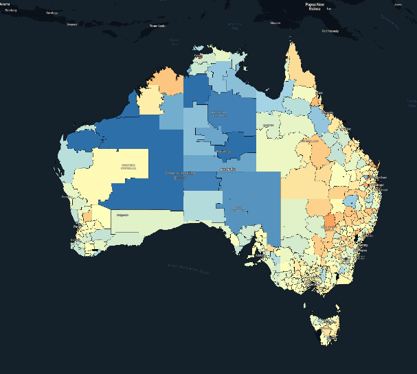
These maps show how the cancer burden varies by small areas across Australia relative to the Australian average by mapping the median values of the SA2-specific relative estimates for each indicator using gradated colours.
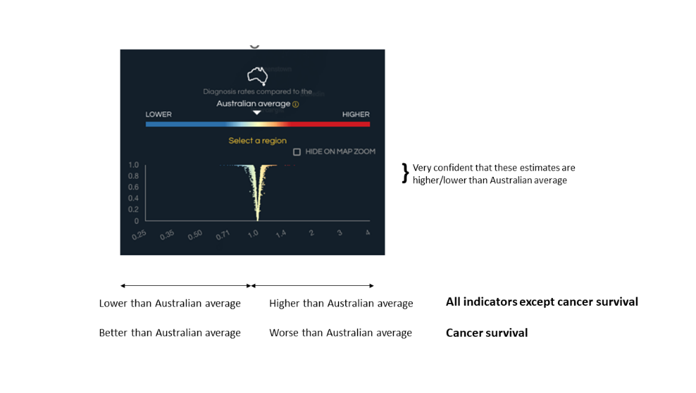
The relative map view shows estimates compared to the Australian average. Areas in orange/red are higher than the Australian average, areas in blue are lower than the Australian average, and yellow represents the Australian average (Figure 14.1). When considering cancer survival, blue means better than the Australian average, and orange/red means worse than the Australian average.
There is a choice of three types of estimates displayed on these relative maps.
Geographical patterns (average) which provides a snapshot of geographical patterns for the latest available time period (up to 10 years).
Geographical patterns (separate time periods) which shows how geographical patterns across Australia have changed over different time periods (typically, but not always, single years). This is when area-specific rates for each time period are compared to the Australian average for that time period.
Changes over time for each geographical area which shows how the rates for each geographical area have changed over a combined time period. This is when area-specific rates for each time period are compared to the Australian average over the combined time period. These changes reflect the national trends over time in many cases.
The available types vary for each health indicator. For instance, for cancer diagnoses, cancer survival and hospital treatment, you can select all three estimate types. However, for cancer risk factors, stage, and cancer screening/testing, only “Geographical patterns (average)“ is accessible. Note there are no survival maps accessible for testicular cancer, in situ cancers (melanoma, female breast), thin melanomas, localised cancers (female breast, melanoma, prostate) and thyroid cancers (See Section 9.2).
The map of Australia can be zoomed in and out, like Google Maps. The Atlas can also switch between male only, female only, or persons (combined male and female). It also allows comparisons between cancer types and indicators within one area and between areas.
14.1.2 Absolute measures
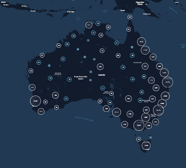
These maps show how the absolute burden of cancer varies by small areas across Australia. The absolute map view shows the modelled counts for each SA2 across Australia as estimated by the spatial models in circles (Figure 14.2) The value in these circles changes as you zoom in and out of the map. Modelled counts of less than five are not shown. The only possible type of estimate is the “Geographical patterns (average)“, which provides a snapshot of geographical patterns for the latest available time period (up to 10 years).
Absolute maps are available for all indicators in Atlas 2.0. However, the definition of the modelled counts shown in the maps are indicator specific. The reported estimates are the modelled number of:
Cancer diagnoses for cancer diagnosis
Survivors living five years after a cancer diagnosis for cancer survival
People with a specific risk factor such as smokers for cancer risk factors
Screened or tested people for cancer screening/testing
Males having each of three prostate cancer treatments for hospital treatment
14.1.3 Both relative and absolute measures combined
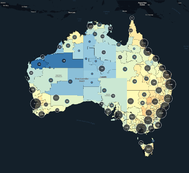
The combined absolute and relative map view (or “both”) shows the relative estimates compared to the Australian average (shown by the colours) and the modelled counts (estimated from the spatial models) shown by the circles (Figure 14.3). The value in these circles changes as you zoom in and out of the map. Modelled counts of less than five are not shown.
Areas in orange/red are higher than the Australian average, areas in blue are lower than the Australian average, and yellow represents the Australian average. When considering cancer survival, blue means better than the Australian average, and orange/red means worse than the Australian average.
The combined map view is available for “Geographical patterns (average)“, only for all indicator types.
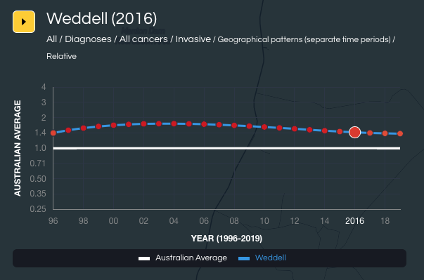
14.2 Changes over time- Temporal graphs
Temporal graphs (Figure 14.4) show the national trend over time (white line) along with the trend for the area selected in the map (blue line). The trend figure is visible for these two estimate types: “Geographical patterns (separate time periods)” and”Changes over time for each geographical area” (See Section Types of estimates).
14.3 Uncertainty
A single number is not enough to understand the cancer burden in an area. As is always the case with statistical estimates, each estimate has a degree of uncertainty, or imprecision, around it. This is because there are many different factors at play that can impact indicators such as cancer diagnosis rates and survival, including random (or chance) variation. We calculated the most precise and accurate estimate possible for each of the indicators included in Atlas 2.0 given the available data, and then provided users with an idea of how certain they can be of these estimates.
The larger the uncertainty associated with an estimate, the less convincing it is that this is the true value. Conversely, the smaller the uncertainty associated with an estimate, and the further away from the Australian average it is, the more likely it is to reflect a real difference. Areas with smaller populations are generally more likely to have wider uncertainty around them.
The Australian Cancer Atlas 2.0 uses three methods to visualise uncertainty around the modelled estimates for relative measures: the wave-plot, the V-plot and transparency. These views are accessible for all available indicators (see Section 14.1.1).
14.3.1 Wave plot
The spatial (and spatiotemporal) effects estimated by the Bayesian models are output as probability distributions. This means that the area-level results can be expressed as a point estimate and the uncertainty. The median value of the distribution for a relative measure (compared to the Australian average) is shown in the maps and the wave plot reflects the distribution. A wave plot for a specific area that is higher and narrower in shape provides high confidence in the estimate, those that are wider and shorter imply a large amount of uncertainty.
As an example, for Cape York (see bottom of Figure 14.5) the small square in the centre shows the reported estimate, while the horizontal line (capped by the two small circles) shows the range in which it is likely the true estimate lies. The height of the shaded curve, or wave, reflects the probability that the true estimate lies in that range.
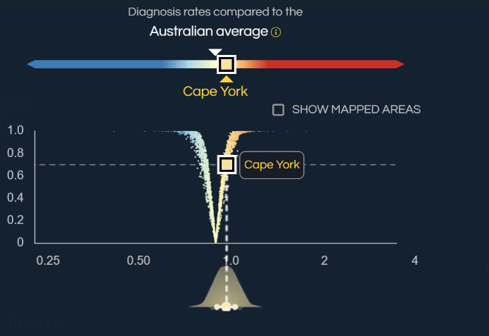
14.3.2 V plots
The V-plot combines two pieces of information (Figure 14.6). The first, displayed on the x-axis, shows how the estimate for an area compares to the Australian average, using the same colour scheme as for the map (Section 14.1.1). The second, displayed on the y-axis, shows the probability (or how likely) the estimate is truly different from the Australian average. The Australian average is shown at one on the bottom axis. Dots to the left of the Australian average are lower, dots to the right of the Australian average are higher. Estimates near the top of the V-plot are likely to reflect a real difference to the Australian average, while estimates near the bottom of the V-plot are unlikely to be different to the average.
For all indicators except for cancer survival, dots to the left of one are lower than the Australian average, dots to the right of one are higher than the Australian average. For cancer survival, dots to the left of one are better than the Australian average, dots to the right of one are worse than the Australian average.
As an example, the square for Cape York (see top of Figure 14.5) for ‘all cancers combined’ is to the right of the Australian average, with a high probability (towards the top of the graph) of being different to the Australian average. This suggests that we can confidently interpret this estimate as the diagnosis rate for this cancer is 7% higher than the Australian average and likely to be a real difference.
This interpretation (Figure 14.7) is shown in the panel that pops up when you select an individual SA2 area on the map. The square for diagnoses of ‘all cancers combined’ is orange (meaning higher than the Australian average), with the text showing “7% above the Australian average, likely to be a real difference” under “All cancers”.

14.3.3 Transparency
Transparency (Figure 14.8) was used in the Atlas to make the areas whose estimates have a large amount of uncertainty appear less noticeable in the map, and more similar to the Australian average. In practice, the visual impact of transparency was subtle, primarily due to the impact of smoothing.
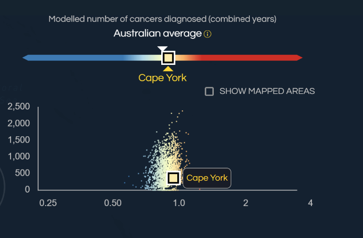
14.4 Scatter plots
When selecting the Absolute view (Section 14.1.2) or the Combined view (Section 14.1.3), the scatter plot (Figure 14.9) is shown which combines two pieces of information.
The first, displayed on the x-axis (or horizontal axis), shows how the estimate for an area compares to the Australian average, using the same colour scheme as the map (Section 14.1.1). The second, displayed on the y-axis, shows the value of the modelled count for an area. The Australian average is shown at one on the x-axis.
For most indicator types (apart from cancer survival), dots to the left of one are lower than what would be expected, dots to the right of one are higher than what would be expected. For cancer survival, dots to the left of one are better than what would be expected, while dots to the right of one are worse than what would be expected.
14.5 Summary plots by broad regions
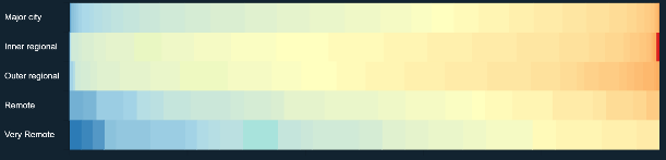
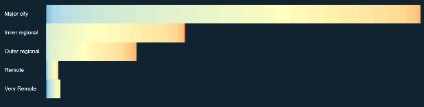
The small areas (SA2s) (Section 4.1) used in the Australian Cancer Atlas can also be grouped into broader regions. The Atlas reports estimates for four broad regions: states and territories (Section 4.2), greater capital city regions (Section 4.3), remoteness (Section 4.4), and area-level socioeconomic status (Section 4.5). Patterns of modelled SA2 estimates for each broad region are visualised through three different viewing modes (Figure 14.10).
| Percentage | Number |
|---|---|
| The percentage of SA2s within each colour shading for each broad region. | The number of SA2s within each colour shading by broad region. |
 |
 |
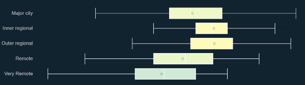
Distribution
This shows the range of SA2 estimates within each broad region, with the circle showing the median value, the rectangle box showing the range of the middle 50% of values, and the lines showing the range of outlying values.
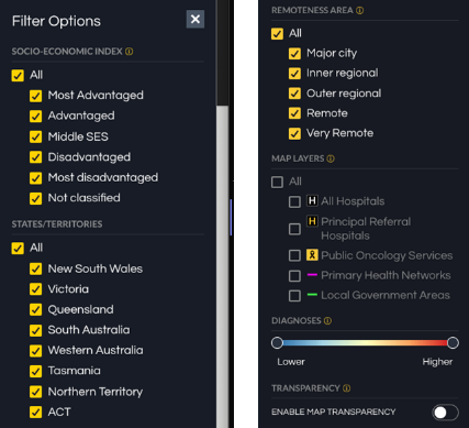
It is possible to select, or filter, specific areas within the map of Australia based on their broad region (Figure 14.11). Selecting or de-selecting the “All” category impacts on all the categories within that broad region.
It is also possible to use the slider to show only those areas with a specific range of values. When the transparency feature is turned on, the colours for areas that have more uncertainty associated with them are made closer to the Australian average.
14.6 Other map layers
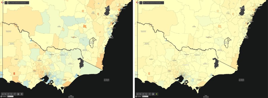
The location of three overlapping categories of hospitals across Australia can be displayed in the maps. These categories are all hospitals (both public and private hospitals), principal referral hospitals, and public oncological services (see Section 13.1). It is also possible to show the boundaries of the Primary Health Networks (PHNs) that were established by the Australian Government in 2015 to enhance patient care and healthcare efficiency (Section 13.2) and Local Government Areas (LGAs) which are regions that manage local services (Section 13.3).
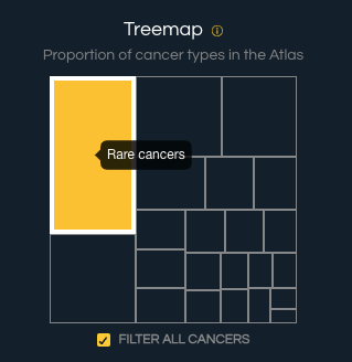
14.7 Tree maps
Within the cancer selection panel, tree maps (Figure 14.12) show the relative burden of each cancer type in terms of numbers of cancers diagnosed or survival. The larger the block, the greater the cancer burden for that cancer. The importance is shown as the proportion of the block shaded green, with the entire area representing ‘all cancers’. Tree maps provide a method to identify the common cancer types and those that are less common.
Note that the categories are not exclusive, which means the size of each rectangle does not match the percentage of all cancers.
You can select the “show all cancers” box to include the rectangle for all cancer types combined.
14.8 Level of evidence for spatial variation
Evidence for spatial variation between small areas across Australia was assessed using Tango’s Maximised Excess Events Test (MEET) global clustering test. (Tango, 2000) This test has been shown to perform well across a variety of datasets. (Kulldorff et al., 2006) The test compares the expected counts with the modelled counts. That is, the test takes the estimated number of diagnoses, screens, treatments, or deaths from the spatial model and compares it with the numbers that would be expected if rates were the same across Australia, after adjusting for age. As the test is expected to consider up to half the total area, our maximum distance of examination was 2000 km. This means that pairs of areas more than 2000 km apart will not contribute to the Tango’s MEET test statistic.
The p-value from Tango’s MEET was divided into four categories. (Duncan et al., 2019a)
Strong (p-value <0.01)
Moderate (p-value 0.01 to <0.05)
Weak (p-value 0.05 to <0.10)
None (p-value 0.10+)
Tango’s MEET uses Monte Carlo methods, so estimates may have slight differences on subsequent runs. To ensure our categorisation was appropriate, we calculated Tango’s MEET three times, with the most conservative category being used. (Duncan et al., 2019a)
This summary provides details of the level of evidence for spatial variation in the estimates across Australia. The evidence is split into four categories, denoting strong evidence for variation, moderate, weak and no evidence for spatial variation. ‘Weak’ or ‘none’ indicates a lack of variation in the overall patterns across the country. Even if there is weak or no evidence of spatial variation, there may still be some individual areas that are likely to be above/below the Australian average, but given the lack of evidence for overall variation, these individual differences should be interpreted with greater caution.
14.9 Evidence of change over time
When “changes over time for each geographical area” is selected, users can see the evidence that the national rates have changed over time. In this feature, the most recent estimates are compared with those of the time period selected by the user. An arrow pointing upwards indicates strong evidence that the national rates have increased. An arrow pointing downwards indicates strong evidence the national rates have decreased. A horizontal line (or hyphen) indicates there was no evidence that rates have changed.
The evidence of change over time was calculated by fitting a temporal trend to the data aggregated to the national level, with the survival model adjusted by age group and risk interval as for the spatiotemporal survival model. From these models, we obtained MCMC estimates of the national standardised incidence ratio the national standardised separation rate ratio, and national survival ratio (\(SIR_{national,t}\), \(SSR_{national,t}\) and \(SR_{national,t}\), respectively) for each time point, \(t.\) The national estimate for each time point was then compared with the corresponding estimate for the most recent time point, similarly to the way the exceedance probability was calculated in Section 7.1.9:
\[{EP}_{t} = \frac{1}{M}\sum_{m = 1}^{M}{\prod_{}^{}\left( A_{t}^{(m)} < A_{final}^{(m)}\ \right)}\]
where \(A_{t}^{(m)}\) is the \(m\)th MCMC estimate for time point \(t\) and \(A_{final}^{(m)}\) is the \(m\)th MCMC estimate for the most recent time point. \(A_{t}^{(m)}\) may represent either \(SIR_{national,t}^{(m)}\), \(SSR_{national,t}^{(m)}\) or \(RSR_{national,t}^{(m)}\).
Based on the work of Richardson and colleagues, (Richardson et al., 2004) an \({EP}_{t}\) less than 0.2 is considered strong evidence that rates decreased between the selected year and the most recent year. An \({EP}_{t}\) between 0.2 and 0.8 indicates a lack of evidence that rates increased or decreased between the selected year and the most recent year. An \({EP}_{t}\) greater than 0.8 is considered strong evidence that rates have increased between the selected year and the most recent year.
We decided not to include evidence of spatial variation for spatiotemporal estimates because the statistical methodology needs development. The Tango’s MEET statistical test cannot determine whether the evidence of spatial variation has changed over time. The total number of diagnoses of cancer has increased over time because of population growth and because the population is ageing. The increase in the number of observed diagnoses means that the statistical techniques are better able to detect differences in more recent years. Hence, if the results of Tango’s MEET change over time, the change may be driven by the increased statistical power rather than changes in the spatial variation.
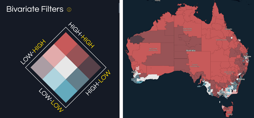
14.10 Comparison (Bivariate)
The comparison feature provides users with the ability to see the geographical patterns across Australia in two measures at the same time. This is only possible for estimates that are relative to the Australian average (that is, not for absolute measures).
Each of the two measures is split into three categories based on the modelled estimates and its level of uncertainty – “high” (meaning likely to be higher than the Australian average), “average” (meaning unlikely to be different to the Australian average) and “low” (meaning likely to be lower than the Australian average). This categorisation is described in more detail in Section 7.1.9. The combination of the two measures means that there are nine possible categories.
The comparison map view enables users to simultaneously map two indicators, using a custom bivariate colour scheme (left of Figure 14.13). Areas that have higher (or in the case of survival, worse) than average rates for both indicators are coloured red, areas with lower (or better) than average rates for both indicators are coloured blue and areas with one outcome higher (or worse) than average and the other lower (or better) than average are coloured grey or brown. The colour shading of the labels (yellow and white) matches the colours of the text describing the indicators.
For example, users may use this feature to see the geographic patterns of cancer diagnosis rates for two cancers with similar causal factors, such as lung cancer and head and neck cancers (right of Figure 14.13).