6 ggplot and descriptive statistics
In this chapter, we show how to use ggplot to create scatterplots, boxplots and histograms. (Note that using geom_line() was discussed in Chapter 5).
6.1 Scatterplots
Following Wickham’s example in Chapter 2 of his book, let’s consider the mpg data set in the library ggplot2. (Why 2? I don’t know.)
ggplot(mpg, aes(x = displ, y = hwy)) + geom_point()
The function ggplot takes as its first argument the data frame that we are working with, and as its second argument the aesthetics mappings between variables and visual properties. In this case, we are telling ggplot that the aesthetic “x-coordinate” is to be associated with the variable displ, and the aesthetic “y-coordinate” is to be associated to the variable hwy. Let’s see what that command does all by itself:
ggplot(mpg, aes(x = displ, y = hwy))
ggplot has set up the x-coordinates and y-coordinates for displ and hwy. Now, we just need to tell it what we want to do with those coordinates. That’s where geom_ point comes in. geom_ point() inherits the x and y coordinates from ggplot, and plots them as points. geom_ line() would plot a line.
ggplot(mpg, aes(x = displ, y = hwy)) + geom_point()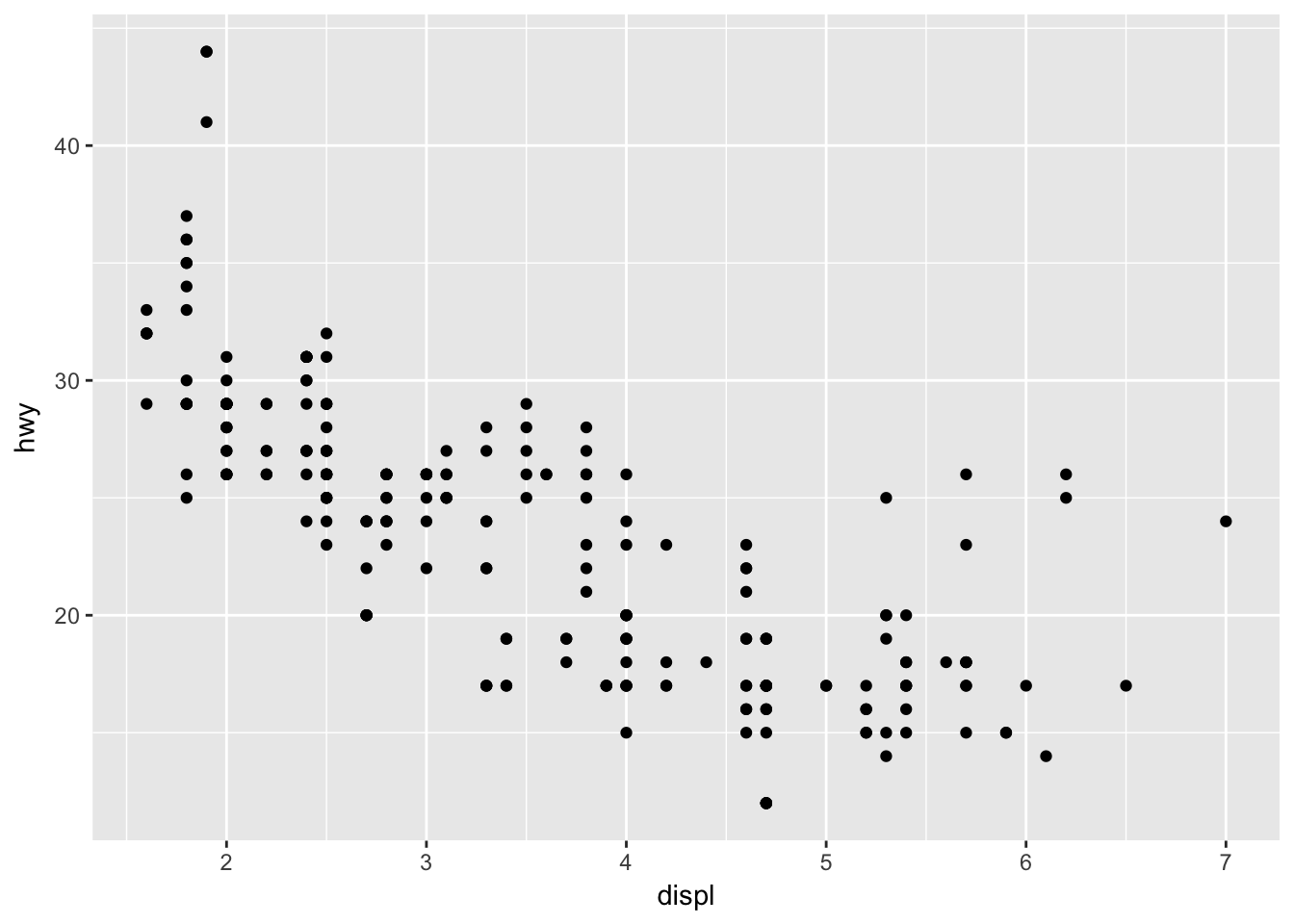
ggplot(mpg, aes(x = displ, y = hwy)) + geom_line() #Not useful for this data set; only as an illustration.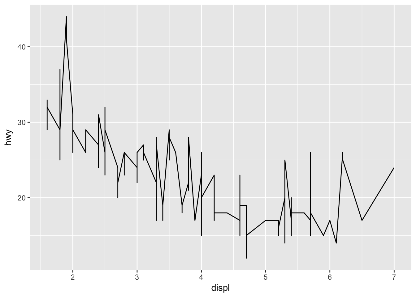
There are tons of other geoms that you can use! For example, how would you create a boxplot of hwy versus drv?
ggplot(mpg, aes(x = drv, y = hwy)) + geom_boxplot() #For this to work, drv must be a factor. Otherwise, you will need to specify the grouping.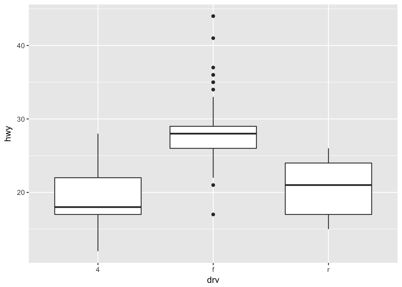
Exercises
- Plot igf1 versus age in the
ISwR::juuldata set. - Plot igf1 versus age in the
ISwR::juuldata set, but color code the points according to tanner puberty level!
You can definitely do the first one. Do that before looking at how to do the second one below.
Solution to exercise 2.
juul <- ISwR::juul
ggplot(juul, aes(x = age,y = igf1, color = tanner)) + geom_point()
## Warning: Removed 326 rows containing missing values (geom_point).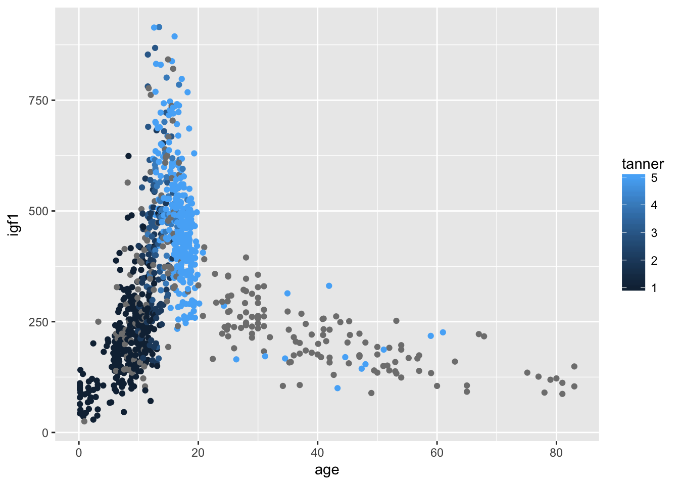
This solution leaves something to be desired, because the points with no tanner level assigned are given values of gray, which makes it a little hard to see what is going on. Let’s redo with the tanner values of NA removed.
ggplot(filter(juul, !is.na(tanner)), aes(x = age,y = igf1, color = tanner)) + geom_point()## Warning: Removed 307 rows containing missing values (geom_point).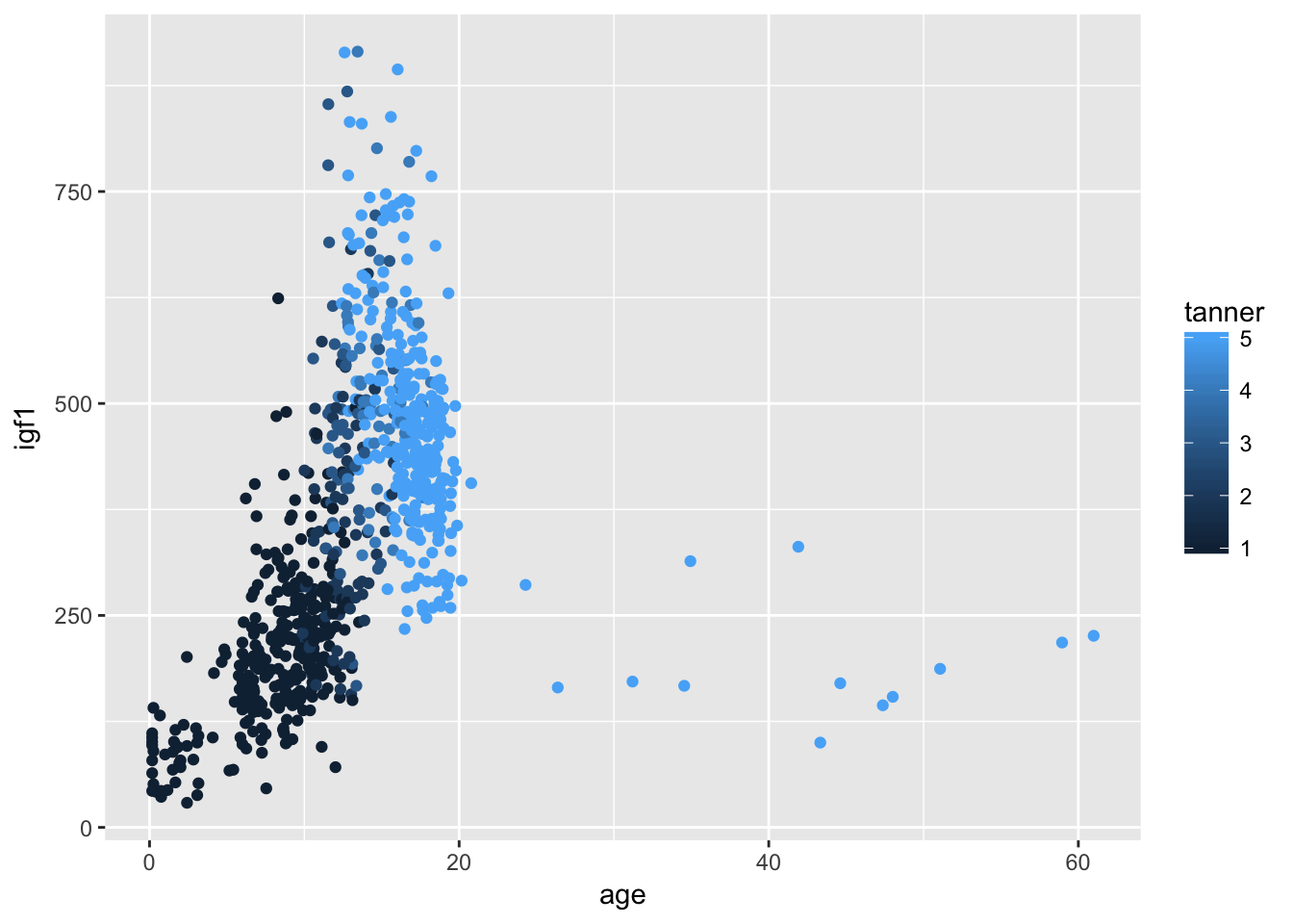
If we only wanted tanner I-IV, we could do
ggplot(filter(juul, tanner %in% 1:4), aes(x = age,y = igf1, color = tanner)) + geom_point()## Warning: Removed 287 rows containing missing values (geom_point).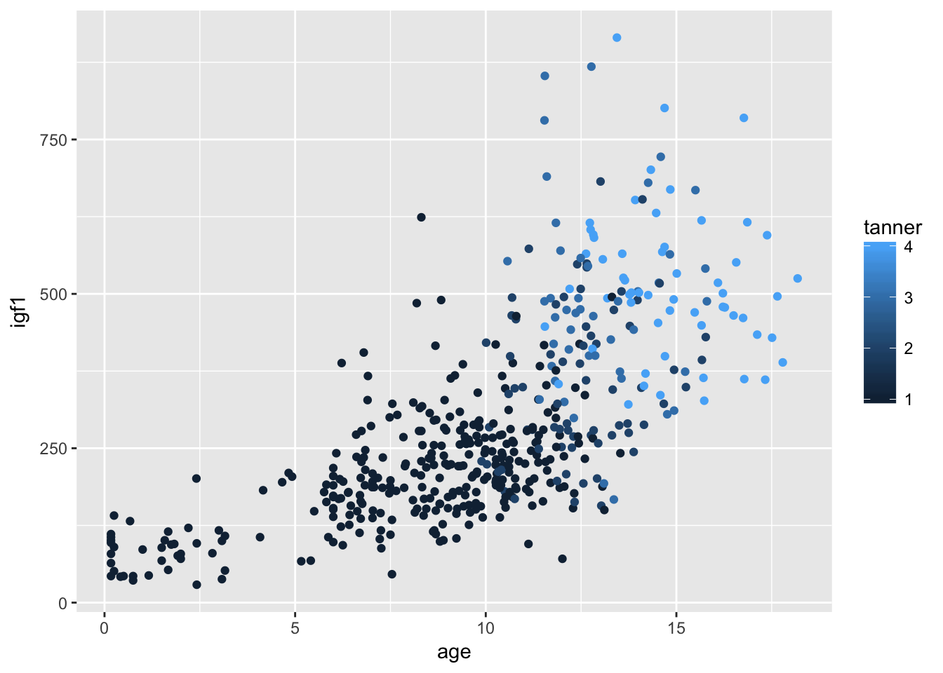
Remember that juul encodes tanner as numeric, when it is probably better thought of as a factor. Let’s switch it to a factor and see what happens to the graph:
juul$tanner <- as.factor(juul$tanner)
juul$sex <- as.factor(juul$sex)
ggplot(filter(juul, !is.na(tanner)), aes(x = age,y = igf1, color = tanner)) + geom_point()
## Warning: Removed 307 rows containing missing values (geom_point).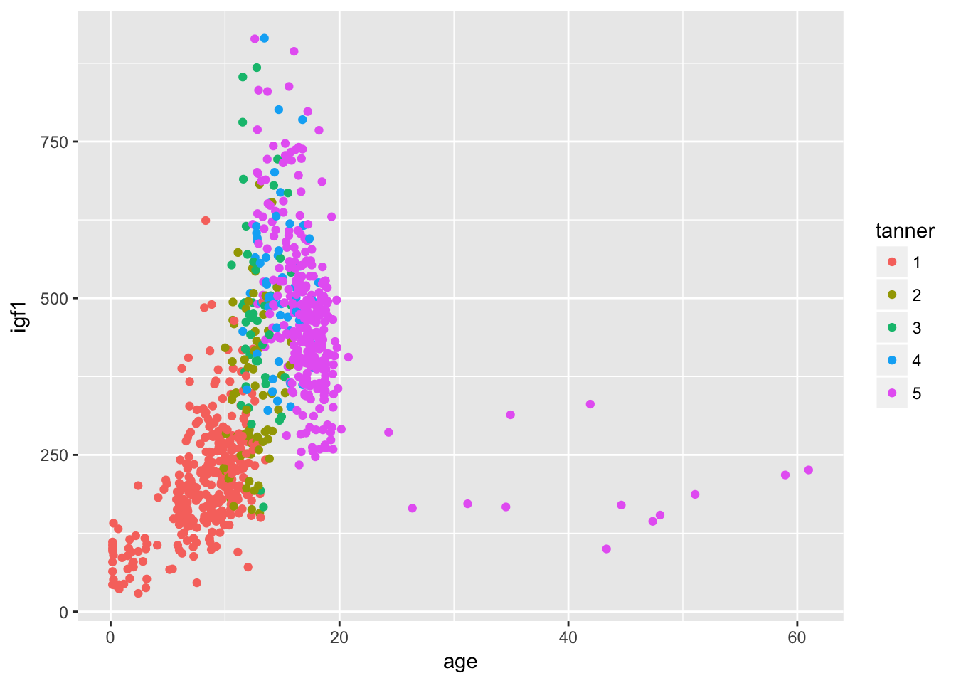
I might not say that this is the definitive graph of this data set, but it is definitely much better than anything we did before learning about ggplot. Note that the default colors change when the color aesthetic is a factor. This makes sense, because when it is a factor you want to be able to distinguish between the factors. If it is an integer or real number, you want to be able to see the continuum of change.
6.2 Boxplots
We aren’t going to say a lot about boxplots. Let’s create a boxplot of igf1 level.
ggplot(juul, aes(x = "x", y = igf1)) + geom_boxplot()## Warning: Removed 321 rows containing non-finite values (stat_boxplot).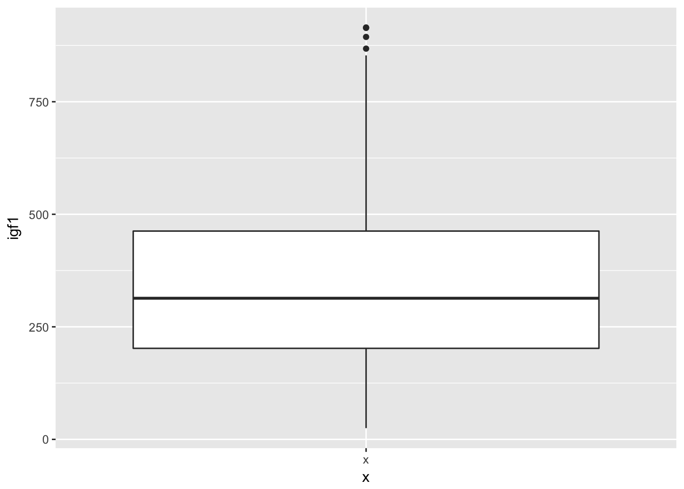
If we want to create multiple boxplots, say one for each gender, we would use
ggplot(juul, aes(x = sex, y = igf1)) + geom_boxplot()## Warning: Removed 321 rows containing non-finite values (stat_boxplot).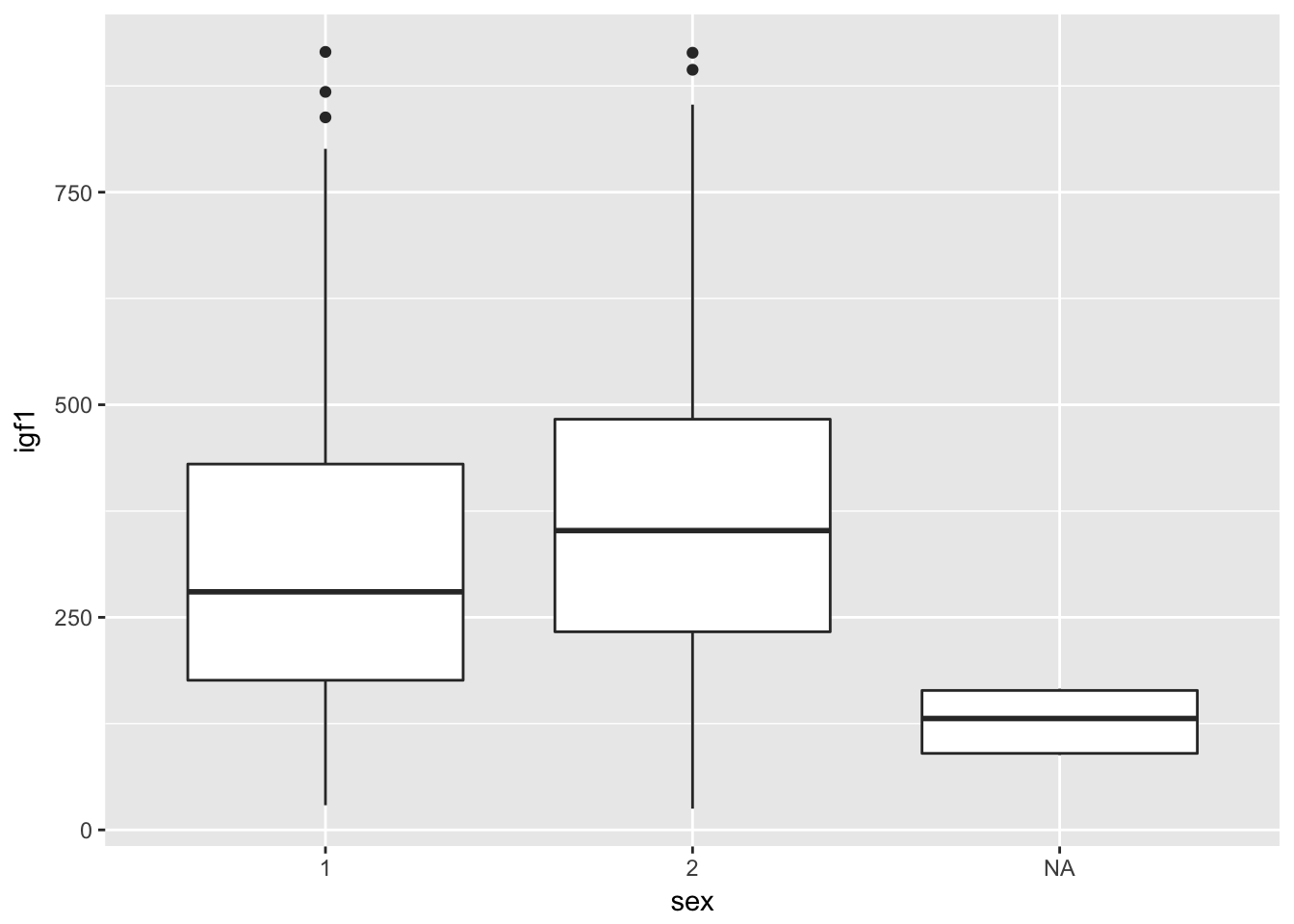
It is useful that the NA shows up here. We see that there seems to be a correlation between whether sex was reported and igf1 levels. We would definitely want to keep that in mind as we progress with analysis.
Let’s do the same for tanner level.
ggplot(juul, aes(x = tanner, y = igf1)) + geom_boxplot()## Warning: Removed 321 rows containing non-finite values (stat_boxplot).
6.3 Histograms
Let’s look at the juul igf1 data again. If we just want a histogram of the igf1 data, we use:
ggplot(juul, aes(x = igf1)) + geom_histogram()## `stat_bin()` using `bins = 30`. Pick better value with `binwidth`.## Warning: Removed 321 rows containing non-finite values (stat_bin).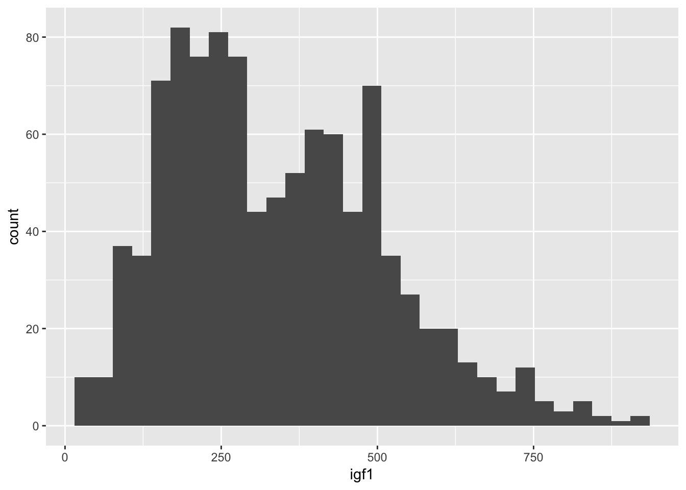
It’s a little bit hard to tell what is going on. Since we have done the scatterplot already, we know that the igf1 levels are very different for the various tanner puberty levels. So, let’s plot igf1 level by tanner puberty level.
ggplot(juul, aes(x = igf1)) + geom_histogram(aes(fill = tanner))## `stat_bin()` using `bins = 30`. Pick better value with `binwidth`.## Warning: Removed 321 rows containing non-finite values (stat_bin).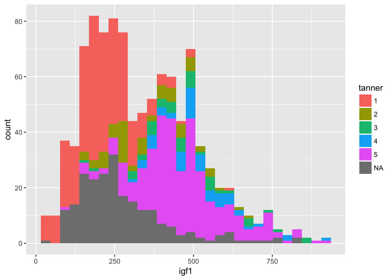
It is hard to see what is going on here. Better would be if we had each histogram plotted on its own axes. In the graphical lexicon, that is called faceting. We will use the ggplot2 function facet_wrap to do this:
ggplot(juul, aes(x = igf1)) +
  geom_histogram(aes(fill = tanner)) +
  facet_wrap(~tanner)
## `stat_bin()` using `bins = 30`. Pick better value with `binwidth`.## Warning: Removed 321 rows containing non-finite values (stat_bin).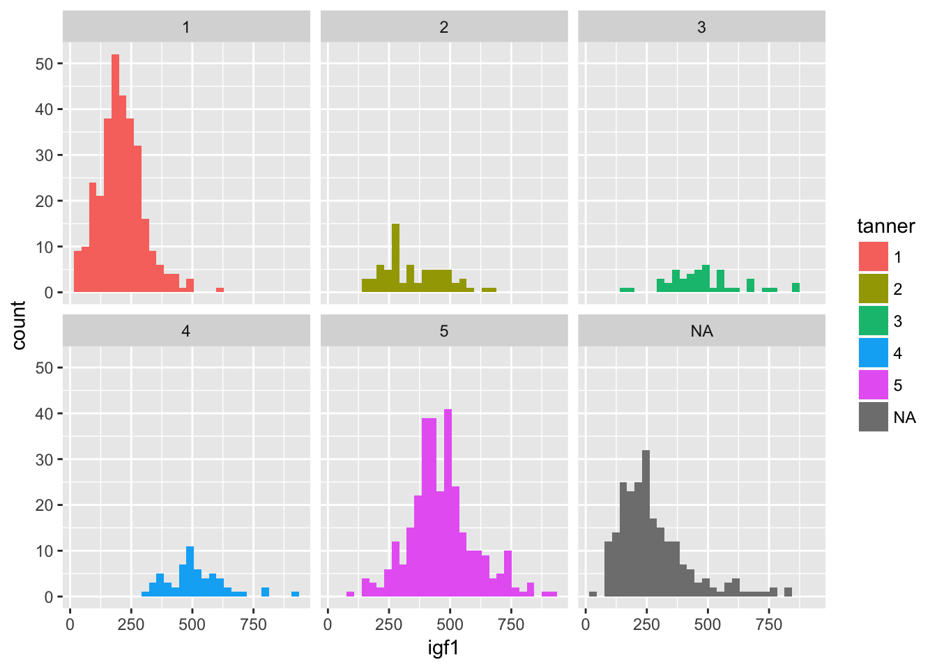
Now, though, the colors don’t mean anything, so we could color by another variable instead of tanner, such as by sex.
ggplot(juul, aes(x = igf1)) +
  geom_histogram(mapping = aes(fill = sex)) +
  facet_wrap(~tanner)
## `stat_bin()` using `bins = 30`. Pick better value with `binwidth`.## Warning: Removed 321 rows containing non-finite values (stat_bin).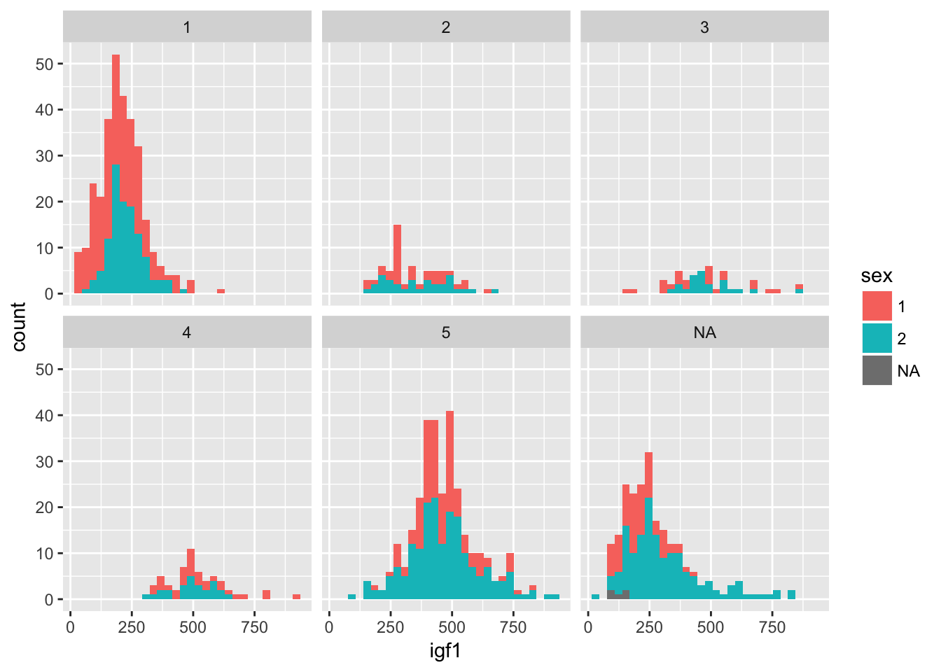
Normally when faceting plots like this, we want the axes the same for all the plots, as is the case above. Occasionally, we prefer to free up the axes so that they are not all on the same scale. We can do that as follows:
ggplot(juul, aes(x = igf1)) +
  geom_histogram(mapping = aes(fill = sex)) +
  facet_wrap(~tanner, scales = "free_y")
## `stat_bin()` using `bins = 30`. Pick better value with `binwidth`.## Warning: Removed 321 rows containing non-finite values (stat_bin).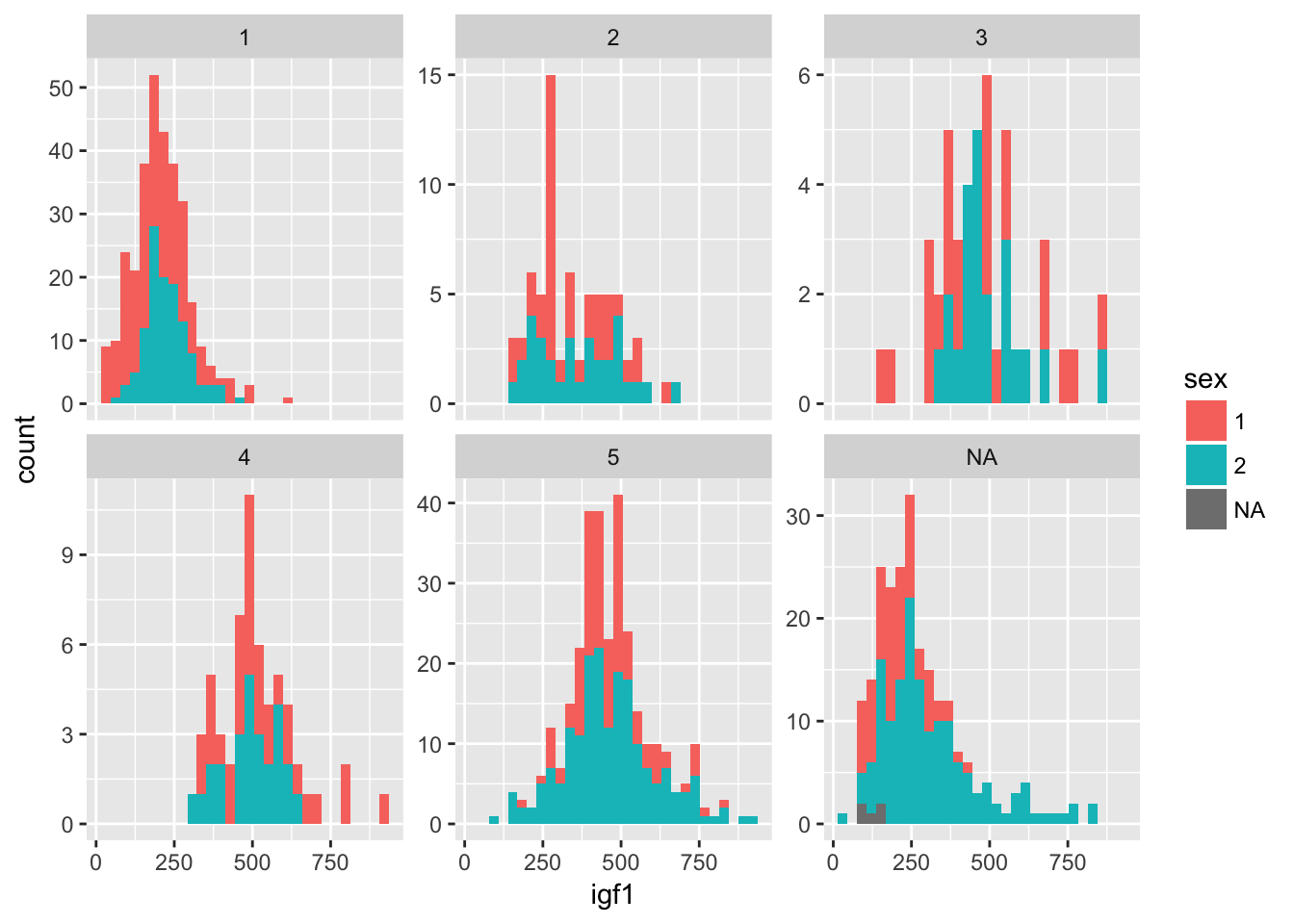
There is still quite a bit of work to do to finalize this plot. It would be nice to have different bin sizes for the different facets, and we need to relabel sex as boy and girl, instead of 1 and 2. We also could change the top label of each plot to indicate that it is tanner level 1, tanner 2, and so on. The interested reader can find information on how to do this in Wickham’s book, ggplot2.
6.4 Plotting pmfs
In this section, we illustrate the use of dplyr tools and geom_bar to plot pmf’s. This was introduced in 4.2. There are two possibilities. In the first, you wish to store the tabulated data in a data frame and plot it. The verb count is the dplyr tool that most closely mimics the base function table. We illustrate its usage here:
poisData <- data.frame(x = rpois(200, 20))
poisTable <- count(poisData, x)
head(poisTable)
## # A tibble: 6 x 2
## x n
## <int> <int>
## 1 11 3
## 2 12 3
## 3 13 6
## 4 14 11
## 5 15 4
## 6 16 16Note that we really would prefer the proportion of values rather than the raw count in poisTable. So, we need to mutate the data frame:
poisTable <- mutate(poisTable, prop = n/200)
head(poisTable)
## # A tibble: 6 x 3
## x n prop
## <int> <int> <dbl>
## 1 11 3 0.015
## 2 12 3 0.015
## 3 13 6 0.030
## 4 14 11 0.055
## 5 15 4 0.020
## 6 16 16 0.080Now, it is a simple matter to call ggplot, using the geom geom_bar:
ggplot(poisTable, aes(x = x, y = prop)) + geom_bar(stat = "identity")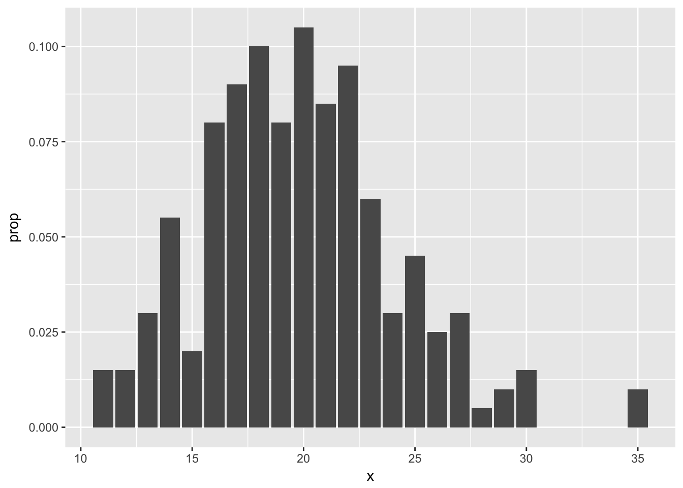
OPTIONAL
The second way is easier, but requires usage of the mystical ..count.. argument. It assumes that you have the un-tabulated data. In this case, you simply use geom_bar with only one aesthetic.
ggplot(poisData, aes(x)) + geom_bar(aes(y = (..count..)/sum(..count..)))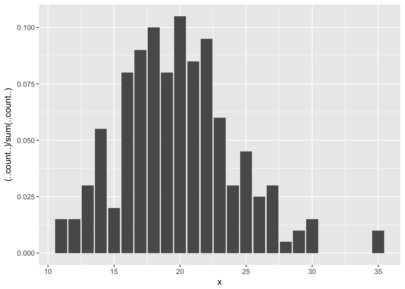 Let’s clean up that \(y\)-axis label:
ggplot(poisData, aes(x)) + geom_bar(aes(y = (..count..)/sum(..count..))) +
  ylab("Proportion")
6.5 Plotting functions
Sometimes, you would like to plot the graph of a function, like \(y = x^2\). While ggplot2 might not be the most convenient tool for doing that, it is easy to do that if you want to plot functions on top of a scatterplot. Let’s look at an example.
Suppose you are given data that more or less lies along the curve \(y = x^2 + x + 1\), and you wish to plot the data and the curve \(y = x^2 + x + 1\) on the same plot. The easiest way to do so is with the stat_function function.
quadData <- data.frame(x = runif(20,0,10))
quadData <- mutate(quadData, y = x^2 + x + 1 + rnorm(20,0,10))
Let’s plot the data:
ggplot(quadData, aes(x, y)) + geom_point()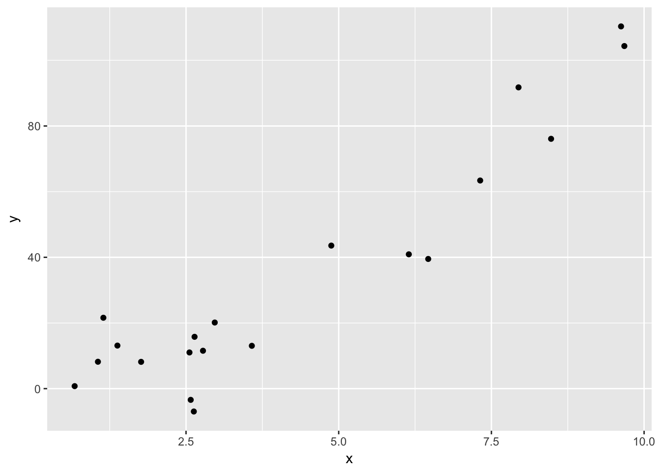
And here is how you use stat_function. Note that stat_function is really nice for plotting functions, but it can sometimes be challenging to get correct colors and labeling. An alternate approach is to define a new dataframe containing \(x\) and \(y\) coordinates for the function you wish to plat, then use geom_line to draw the curve.
f = function(x) x^2 + x + 1
ggplot(quadData, aes(x,y)) + geom_point() + stat_function(fun = f)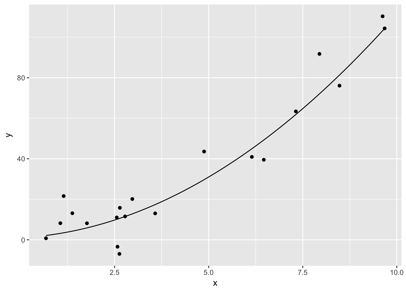
6.6 Piping to ggplot
Combining the ideas from last chapter with the above, we can easily create plots after manipulating a large data set to contain the information that we want to see. Let’s consider the movieLens data set from Chapter 5, and make sure that you have dplyr loaded.
movies <- read.csv("http://stat.slu.edu/~speegle/_book_data/movieLensData", as.is = TRUE)Let’s create a barplot of ratings for movies with the genre Comedy|Romance.
movies %>%
  filter(Genres == "Comedy|Romance") %>%
  ggplot(aes(x = Rating)) +
  geom_bar()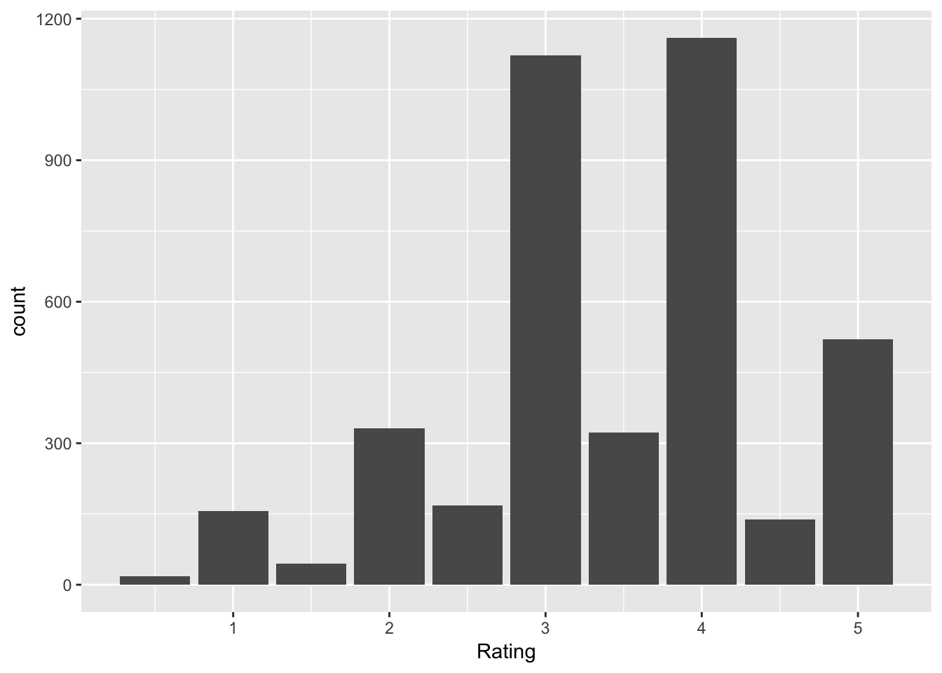
6.7 Two common ggplot issues
There are two issues that commonly arise when using ggplot. First, the data must be stored as a data frame in order to use ggplot. We snuck in this while plotting pmf’s and pdf’s, but we are emphasizing it now.
Example Consider the rivers data set in base R. Create a histogram of the lengths of the rivers.
To do this, we first see what type of data set rivers is:
str(rivers)## num [1:141] 735 320 325 392 524 ...And, we see that it is a numerical vector. We must convert it to a data frame to use ggplot.
dfRivers <- data.frame(length = rivers)
head(dfRivers)
## length
## 1 735
## 2 320
## 3 325
## 4 392
## 5 524
## 6 450Now, we can use ggplot:
ggplot(dfRivers, aes(x = length)) + geom_histogram()## `stat_bin()` using `bins = 30`. Pick better value with `binwidth`.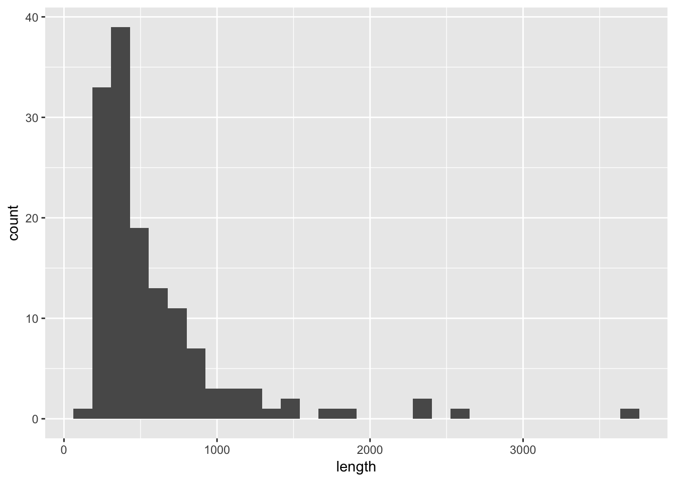
The second issue that comes up is that the data is in wide format rather than long format. Let’s illustrate via an example.
Example Consider the anorexia data in the MASS library. Create a side-by-side boxplot of the Pre- and Post-treatment weights of the patients in the CBT group.
Let’s look at the data.
anorexia <- MASS::anorexiaNote the use of MASS::anorexia to pull out the data set from the library. If you are only using a small piece of a library, I recommend doing it this way. If you load the library MASS, you will need to be careful because it contains a function called select, which will hide the dplyr function.
head(anorexia)## Treat Prewt Postwt
## 1 Cont 80.7 80.2
## 2 Cont 89.4 80.1
## 3 Cont 91.8 86.4
## 4 Cont 74.0 86.3
## 5 Cont 78.1 76.1
## 6 Cont 88.3 78.1Note that the column names actually contain variable values! That is, you could imagine that there is an undefined variable called weightTime that has values Pre and Post. We will change the data so that the values Prewt and Postwt are stored inside of variables, like this.
library(tidyr)
anorexia_long <- gather(data = anorexia,key = WeightTime, value = Weight, -Treat)
Next, we filter out the CBT treatments.
anorexia_long <- filter(anorexia_long, Treat == "CBT")Now, the values Prewt and Postwt are values of a variable, and can be easily passed to ggplot as follows.
ggplot(anorexia_long, aes(x = WeightTime, y = Weight)) + geom_boxplot()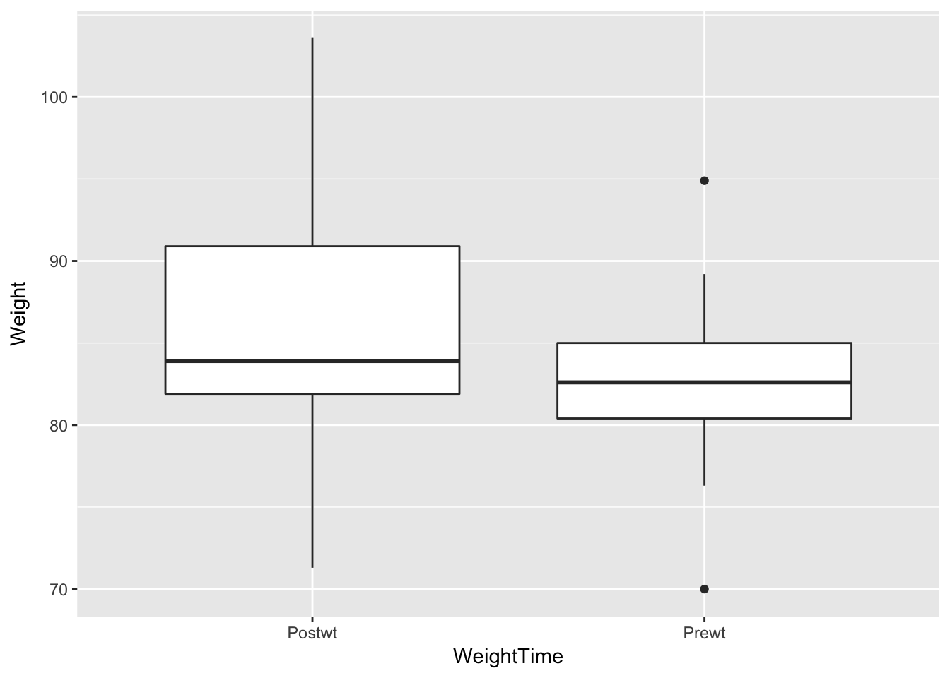
6.8 Exercises
The built-in R data set
quakesgives the locations of earthquakes off of Fiji in the 1960’s. Create a plot of the locations of these earthquakes, showing depth with color and magnitude with size.Create a graphic that displays the differences in mpg between 4,6, and 8 cylinder cars in the built-in data set
mtcars.- Consider the
Battingdata in theLahmandata set.- Create a scatterplot of the number of doubles hit in each year from 1871-2015.
- Create a scatterplot of the number of doubles hit in each year from 1871-2015 in each league. Color the NL blue and the AL red.
- Create boxplots for total runs scored per year in the AL and the NL from 1969-2015.
- Create a histogram of lifetime batting averages (H/AB) for all players who have at least 1000 career AB’s.
- In your histogram from (d), color the NL blue and the AL red. (If a player played in both the AL and NL, count their batting average in each league if they had more than 1000 AB’s in that league.)
- Using the
Masterdata, create a barplot of the birthmonths of all players. (Hint:geom_bar()) - Create a barplot of the birth months of the players born in the USA after 1970.
- The
babynamesdata set is the only thing in thebabynameslibrary, which you probably need to install.- Make a line graph showing the total number of babies of each sex, plotted over time.
- Make a line graph showing the number of different names used for each sex, plotted over time.
- Make a line graph comparing the number of boys named Bryan and the number of boys named Brian from 1920 to the present.
- Make a line graph showing how many babies of your gender have your name, plotted over time.
Data scientist Kieran Healy created this widely circulated figure:
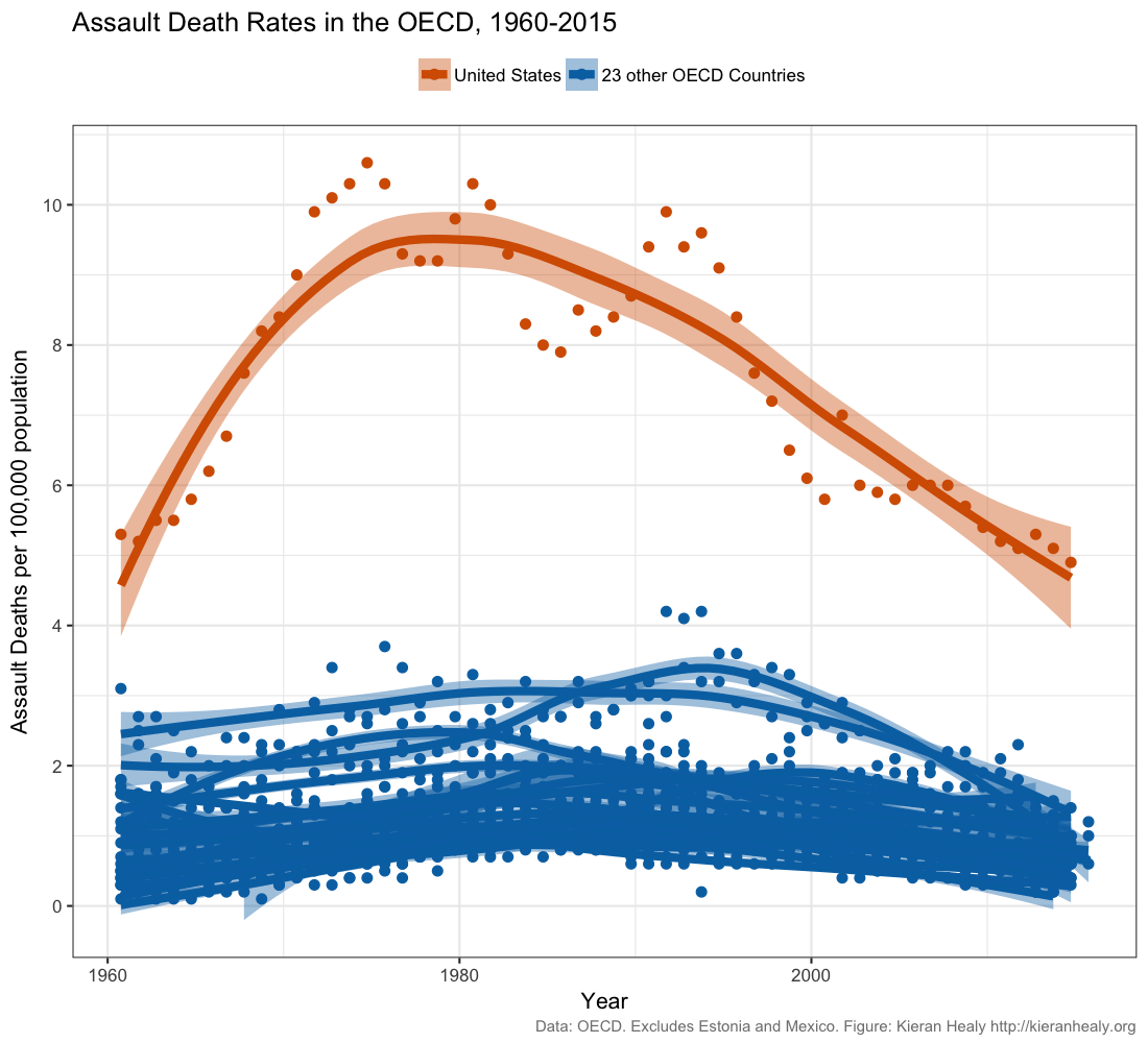 Recreate this plot as well as you can, using Healy’s github data. Read Healy’s blog post and his follow up post. Do you think this figure is a reasonable represenation of gun violence in the United States?
Complete the Introduction of the ggplot2 datacamp tutorial.
Complete the Aesthetics chaper of the ggplot2 datacamp tutorial.
Complete the Geometries chaper of the ggplot2 datacamp tutorial.