10 Simple Linear Regression
Assume you have data that is given in the form of ordered pairs \((x_1, y_1),\ldots, (x_n, y_n)\). In this chapter, we study the model \(y_i = \beta_0 + \beta_1 x_i + \epsilon_i\), where \(\epsilon_i\) are iid normal random variables with mean 0. We develop methods for estimating \(\beta_0\) and \(\beta_1\), we examine whether or model is satisfied, we study prediction and confidence intervals for \(y\), and we perform inference on the slope and intercept.
10.1 Finding the intercept and slope
We imagine that we have data that is in the form of ordered pairs \((x_1, y_1),\ldots,(x_n, y_n)\), and we would like to find values of \(\beta_0\) and \(\beta_1\) such that the line \(y = \beta_0 + \beta_1 x\) “best” fits the data. One way to proceed is to notice that when we fix \(\beta_0\) and \(\beta_1\), we have an estimate for \(y_i\) given by \[ \hat y_i = \beta_0 + \beta_1 x_i. \] The error associated with that is \(y_i - \hat y_i\). We would like to choose \(\beta_0\) and \(\beta_1\) to make the error terms small in some way. One way would be to choose \(\beta_0\) and \(\beta_1\) to minimize \[ \sum_i |y_i - (\beta_0 + \beta_1 x_i)| \] However, we are going to choose \(\beta_0\) and \(\beta_1\) to minimize the SSE, given by \[ SSE(\beta_0,b) = \sum_i |y_i - (\beta_0 + \beta_1 x_i)|^2 \] Note that I can omit the absolute values in the definition of SSE, because I am squaring the values. This means that we have a differentiable function of \(\beta_0\) and \(\beta_1\), and we can use calculus to minimize \(SSE(\beta_0,\beta_1)\) over all choices of \(\beta_0\) and \(\beta_1\). It isn’t too hard to do, but it does require some knowledge of material that is typically taught in Calculus III.
Instead, we show how to do the following, which gives the flavor of what you would do in general, without needing to minimize a function of two variables. Let’s suppose that we know that the intercept is 0. That is, we are modeling \[ y_i = \beta_1x_i + \epsilon_i \] We wish to minimize the sum-squared error, which now takes the form \[ S(\beta_1) = \sum_{i=1}^n (y_i - \beta_1x_i)^2. \] To do so, we take the derivative (with respect to \(\beta_1\)) and set equal to zero. We get \[ \frac d{d\beta_1} S = 2\sum_{i=1}^n (y_i - \beta_1x_i) (-x_i) \] where the last \(-x_i\) is because of the chain rule. Setting equal to zero and solving yields:
\[\begin{align*} 2\sum_{i=1}^n (y_i - \beta_1x_i) (-x_i) & = 0 \qquad \iff \\ -\sum_{i=1}^n x_i y_i + \beta_1 \sum_{i=1}^n x_i^2 & = 0 \qquad \iff\\ \beta_1 & = \frac{\sum_{i=1}^n x_i y_i}{\sum_{i=1}^n x_i^2} \end{align*}\]It is clear that the second derivative of \(S\) is positive everywhere, so this is indeed a minimum. Notationally, we denote the unknown constants in our model by \(\beta_0\) and \(\beta_1\), and we will denote their estimates by \(\hat \beta_0\) and \(\hat \beta_1\). So, when modeling \[ y_i = \beta_1x_i + \epsilon_i \] based on data \((x_1,y_1), \ldots, (x_n, y_n)\), we have the formula \[ \hat \beta_1 = \frac{\sum_{i=1}^n x_i y_i}{\sum_{i=1}^n x_i^2} \]
10.2 Using R and Linear Models
We will be finding out linear models by using the lm command inside of R. Let’s illustrate the procedure through the use of an example.
Consider the data rmr in the ISwR library.
library(ISwR)
head(rmr)
## body.weight metabolic.rate
## 1 49.9 1079
## 2 50.8 1146
## 3 51.8 1115
## 4 52.6 1161
## 5 57.6 1325
## 6 61.4 1351summary(rmr)## body.weight metabolic.rate
## Min. : 43.10 Min. : 870
## 1st Qu.: 57.20 1st Qu.:1160
## Median : 64.90 Median :1334
## Mean : 74.88 Mean :1340
## 3rd Qu.: 88.78 3rd Qu.:1468
## Max. :143.30 Max. :2074length(rmr$body.weight)## [1] 44As you can see, we have 44 measurements of body weight and metabolic rate of individuals. Using ?rmr, we see that the data is the resting metabolic rate (kcal/24hr) and the body weight (kg) of 44 women. A natural question to ask is whether resting metabolic rate and body weight are correlated.
Thinking about the question, it seems plausible that people with higher resting metabolic rates would have a lower body weight, but it also seems plausible that having a higher body weight would encourage the metabolic rate of a patient to increase. So, without any more domain specific knowledge, I cannot say before we start what we expect a relationship between the two variables to look like. If you were working on this data, it might be a good idea to talk to the experts and determine whether there is reason to believe a priori that these variables would be positively (or negatively) correlated. Since I don’t have an expert handy, I am not going to make any assumptions.
Let’s look at a plot of the data:
ggplot(rmr, aes(x = body.weight, y = metabolic.rate)) + geom_point()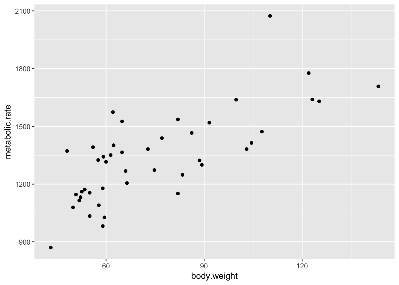
So, we are plotting metabolic rate (dependent variable) described by body weight (independent variable). Of course, we could also have thought that metabolic rate determines body weight, in which case we would be thinking of the metabolic rate as the independent variable.
Looking at the data, it seems there is a relatively strong positive correlation between metabolic rate and body weight. It is a good thing that I didn’t guess which direction the correlation would go, because I would have thought high metabolic rates correspond to low body weights if I had been forced to guess!
There don’t seem to be any outliers, though perhaps the patients with the highest and lowest metabolic rate don’t follow the trend of the rest of the data quite right.
which.max(rmr$metabolic.rate)## [1] 40which.min(rmr$metabolic.rate)## [1] 9We see that patients 40 and 9 are the two that don’t seem to follow the trend quite as well, just by eyeballing it.
Our model for the data is \[ y_i = \beta_0 + \beta_1x_i + \epsilon_i. \]
where \((x_i, y_i)\) are the data points given by body.weight and metabolic.rate, respectively, and \(\epsilon_i\) are iid normal random variables with mean 0 and unknown variance \(\sigma\). Our goal is to estimate \(\beta_0\) and \(\beta_1\), and eventually to evaluate the fit of the model. We do this with the lm (linear model) command in R:
rmr.mod <- lm(metabolic.rate~body.weight, data = rmr)To view the most basic results, we use:
rmr.mod##
## Call:
## lm(formula = metabolic.rate ~ body.weight, data = rmr)
##
## Coefficients:
## (Intercept) body.weight
## 811.23 7.06We can see that the least SSE best fit line that we have come up with is
metabolic.rate ~ 7.06 * body.weight + 811.23
Re-interpreting in terms of \(y_i = \beta_0 + \beta_1x_i + \epsilon_i\), we have \(\hat \beta_0 = 811.23\) and \(\hat \beta_1 = 7.06\).
The intercept is hard to interpret in this case, but the slope has an interpretation: for each kg of weight, the resting metabolic rate of the patients increase by 7 kcal/day. Let’s plot the regression line on the same plot as the data.
ggplot(rmr, aes(x = body.weight, y = metabolic.rate)) +
  geom_point() +
  geom_smooth(method = "lm", se = FALSE) +
  geom_abline(slope = 7.06, intercept = 811.23, linetype = "dashed")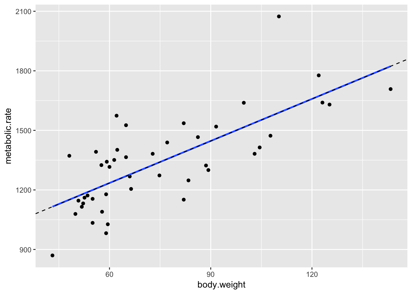
The geom_smooth command is a general command that fits lines and curves to data. Here, we specify that we want the regression line using method = "lm", and we indicate that we don’t want error bars by using se = FALSE. Now that the regression line has been drawn, it doesn’t seem like patient 9 (lowest metabolic rate) is as much of a departure from the overall trend. For kicks, we include a plot of the regression line that we computed above, just to make sure that it is the same as that computed by geom_smooth.
Finally, let’s look at the entire output of lm, and interpret it line by line. The rest of this section explains each line of output in some detail.
summary(rmr.mod)##
## Call:
## lm(formula = metabolic.rate ~ body.weight, data = rmr)
##
## Residuals:
## Min 1Q Median 3Q Max
## -245.74 -113.99 -32.05 104.96 484.81
##
## Coefficients:
## Estimate Std. Error t value Pr(>|t|)
## (Intercept) 811.2267 76.9755 10.539 2.29e-13 ***
## body.weight 7.0595 0.9776 7.221 7.03e-09 ***
## ---
## Signif. codes: 0 '***' 0.001 '**' 0.01 '*' 0.05 '.' 0.1 ' ' 1
##
## Residual standard error: 157.9 on 42 degrees of freedom
## Multiple R-squared: 0.5539, Adjusted R-squared: 0.5433
## F-statistic: 52.15 on 1 and 42 DF, p-value: 7.025e-09Call: lm(formula = metabolic.rate ~ body.weight, data = rmr)
This just echos back the command that was used to generate the linear model. It is not particular useful if we just typed in the model ourselves, but can be useful in other contexts.
Residuals:
  Min       1Q   Median      3Q     Max
-245.74 -113.99  -32.05  104.96  484.81
These values give a preliminary residual analysis. Recall that the residuals are the differences between the actual data points and values predicted by the model. For example, for patient 40, the predicted metabolic rate is
7.06 * rmr$body.weight[40] + 811## [1] 1589.012and the actual metabolic rate is
rmr$metabolic.rate[40]## [1] 2074so the difference (or residual) is 2074 - 1589 = 485. More formally, if we recall that \(\hat \beta_0\) denotes our estimate for the intercept and \(\hat \beta_1\) denotes our estimate for the slope, then the residuals are our estimate for \(\epsilon_i\) is given by \[ \hat \epsilon_i = \bigl(y_i - (\hat \beta_0 + \hat \beta_1 x_i)) \]
We can get a list of all of the residuals by using
rmr.mod$residuals## 1 2 3 4 5 6
## -84.497113 -23.850688 -61.910216 -21.557838 107.144523 106.318317
## 7 8 9 10 11 12
## 150.964742 95.609970 -245.492324 221.210037 -47.734027 -16.911413
## 13 14 15 16 17 18
## -165.500705 -44.500705 185.439767 -129.267383 -245.738816 -49.738816
## 19 20 21 22 23 24
## 112.849278 -204.268580 81.201656 324.376648 256.609970 -9.155511
## 25 26 27 28 29 30
## -74.979322 56.839700 -66.279356 83.483730 145.892044 -239.107956
## 31 32 33 34 35 36
## -151.991295 46.242027 -113.700840 -141.642509 61.120577 123.232449
## 37 38 39 40 41 42
## -156.358040 -134.947332 -98.537821 484.813359 104.510931 -40.254550
## 43 44
## -65.079558 -114.857012and in particular, we can see that patient 40 has the maximum residual of 484.8133593, as we computed. In summary, the residuals are the errors obtained when using our model to estimate the metabolic rate for the body weights of patients in the study.
Why are residuals important? Well, if our model \[ y_i = \beta_0 x_i + \beta_1 + \epsilon_i \] is correct, then \(y_i - (\beta_0 x_i + \beta_1)\) are random samples from the error random variable. Of course, we don’t actually know \(\beta_0\) and \(\beta_1\), so we will use the estimates for them to estimate the error term. The residual is the estimate for the error term. Then, we can look and see whether the residuals really are a random sample from a normal distribution. The information contained in
Residuals:
  Min       1Q   Median      3Q     Max
-245.74 -113.99  -32.05  104.96  484.81
is that we should expect the residuals to be symmetric around 0. In particular, the median should be close to 0, the first and third quartiles should be close to the same in absolute value and the max and min should be close to the same in absolute value. We will talk a lot more about residuals in the future, but for now, we just look at these residuals and see whether they more or less follow what we expect. The max being twice the min in absolute value is possibly an issue, and will mean that we will want to think some more about these residuals at a later date. For now, we move on to the next group of output.
| Coefficients | Estimate | Std. Error | t value | Pr(>|t|) |
|---|---|---|---|---|
| (Intercept) | 811.2267 | 76.9755 | 10.539 | 2.29e-13 *** |
| body.weight | 7.0595 | 0.9776 | 7.221 | 7.03e-09 *** |
This gives the intercept value and the slope of the line, as in the short summary, in the column Estimate. The standard error is a measure of how accurately we can estimate the coefficient. We will not describe how this is computed. The value is always positive, and should be compared to the size of the estimate itself by dividing the estimate by the standard error. This leads us to the t value, which is the test statistic that you obtain when testing
\(H_0\): Coefficient is zero versus
\(H_a\): Coefficient is not zero.
Under the assumption that the errors are iid normal(0, \(\sigma\)), the test statistic has a students t distribution, with \(n-2\) degrees of freedom. Here, \(n\) is the number of samples and 2 is the number of parameters that we have estimated. In particular, to reproduce the \(p\)-values associated with body.weight, we could use
2*( 1 - pt(7.221,42))## [1] 7.032306e-09where we have doubled the value because it is a two-sided test.
The final column is the significance codes, which are not universally loved. Basically, the more stars, the lower the \(p\)-value in the hypothesis test of the coefficients as described above. One problem with these codes are that the (Intercept) coefficient is often highly significant, even though it has a dubious interpretation. In this case, notice that the intercept corresponds to the resting metabolic rate of a person who weighs zero pounds. (OK, kg actually.) First of all, that is not something that I can interpret. Second, even if I could, a value of the independent variable of zero is extremely far outside the range of values that I have data for. That makes the use of the intercept highly dependent on whether the model continues to hold outside of the range of values that we have collected data for. Nonetheless, it has three stars in the output, which bothers some people.
Moving on to the line:
Residual standard error: 157.9 on 42 degrees of freedom
The residual standard error is an estimate of the standard deviation of the error term in our linear model. Recall that we are working with the model \[ y_i = \beta_0 + \beta_1 x_i + \epsilon_i \] where \(\epsilon_i\) are assumed to be iid normal random variables with mean 0 and unknown standard deviation \(\sigma\). The residual standard error is an estimate for the unknown standard deviation of the error term. To better understand this, let’s look at simulated data:
set.seed(994)
x <- runif(30,0,20)
y <- 3*x + 1 + rnorm(30,0,5)
plotData <- data.frame(x = x, y = y)
ggplot(plotData, aes(x,y)) +
  geom_point() +
  geom_smooth(method = "lm", se = FALSE)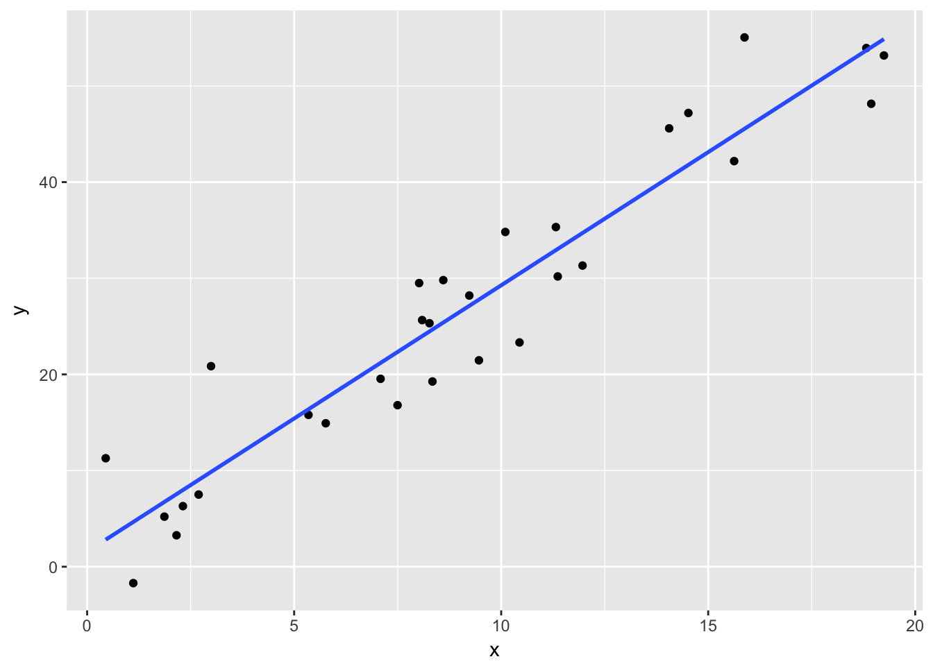
summary(lm(y~x))##
## Call:
## lm(formula = y ~ x)
##
## Residuals:
## Min 1Q Median 3Q Max
## -7.168 -3.256 -1.524 3.911 11.002
##
## Coefficients:
## Estimate Std. Error t value Pr(>|t|)
## (Intercept) 1.5668 1.8211 0.86 0.397
## x 2.7700 0.1732 15.99 1.31e-15 ***
## ---
## Signif. codes: 0 '***' 0.001 '**' 0.01 '*' 0.05 '.' 0.1 ' ' 1
##
## Residual standard error: 5.071 on 28 degrees of freedom
## Multiple R-squared: 0.9013, Adjusted R-squared: 0.8978
## F-statistic: 255.7 on 1 and 28 DF, p-value: 1.307e-15Notice in this case, we have thirty data points that are defined to be \(y_i = 3x_i + 1 + \epsilon_i\), where \(\epsilon_i\) is normal(0, 5). When we run the regression, we estimate the intercept to be \(\hat \beta_0 = 1.57\) and the slope to be \(\hat \beta_1 = 2.77\), which are pretty close to the true values of \(\beta_0 = 1\) and \(\beta_1 = 3\). We also estimate the error term to have standard deviation of \(\hat \sigma = 5.071\), which is very close to the true value of \(\sigma = 5\).
Returning to our model:
summary(rmr.mod)##
## Call:
## lm(formula = metabolic.rate ~ body.weight, data = rmr)
##
## Residuals:
## Min 1Q Median 3Q Max
## -245.74 -113.99 -32.05 104.96 484.81
##
## Coefficients:
## Estimate Std. Error t value Pr(>|t|)
## (Intercept) 811.2267 76.9755 10.539 2.29e-13 ***
## body.weight 7.0595 0.9776 7.221 7.03e-09 ***
## ---
## Signif. codes: 0 '***' 0.001 '**' 0.01 '*' 0.05 '.' 0.1 ' ' 1
##
## Residual standard error: 157.9 on 42 degrees of freedom
## Multiple R-squared: 0.5539, Adjusted R-squared: 0.5433
## F-statistic: 52.15 on 1 and 42 DF, p-value: 7.025e-09The very last line is not interesting for simple linear regression, i.e. only one explanatory variable, but becomes interesting when we have multiple explanatory variables. For now, notice that the \(p\)-value on the last line is exactly the same as the \(p\)-value of the coefficient of body.weight, and the F-statistic is the square of the t value associated with body.weight.
10.3 Prediction and Confidence Intervals
We continue our study of regression by looking at prediction and confidence intervals.
Let’s do this via an example — we continue with the rmr data set in the ISwR library.
library(ISwR)
head(rmr)
## body.weight metabolic.rate
## 1 49.9 1079
## 2 50.8 1146
## 3 51.8 1115
## 4 52.6 1161
## 5 57.6 1325
## 6 61.4 1351We decided that it was appropriate to predict metabolic.rate by body.weight in the following model.
rmr.mod <- lm(metabolic.rate~body.weight, data = rmr)Let’s look at a plot:
ggplot(rmr, aes(x = body.weight, y = metabolic.rate)) +
  geom_point() +
geom_smooth(method = "lm", se = FALSE) 
There are two questions about the fit that one could ask.
How confident are we about our line of best fit? Can we get a 95% confidence band around it, so that we can see where else the line might have gone based on the variability of the data?
If we use the model to predict future values, how confident are we in our prediction of future values? What is the error range?
For either of these to work well via the following technique, we have to know that our data fits the model \[ y_i = \beta_0 + \beta_1 x_i + \epsilon_i, \] where \(\epsilon_i\) are iid normal rv’s with mean 0 and unknown variance \(\sigma^2\). That is why we did the residual tests, which all seemed more or less OK, except that there was one relatively large positive residual that was unexplained.
10.3.1 Confidence Bands
Here, we get a band around the line of best fit that we are 95% confident that the true line of best fit will lie in. This depends on the number of data points and the variability of the data, but as the number of data points goes to infinity, the confidence band should get narrower and narrower and approach a single line. Let’s look at the range of values of body.weight:
max(rmr$body.weight)## [1] 143.3min(rmr$body.weight)## [1] 43.1The range is about from 40 to 145, so let’s create a new data frame consisting of values between 40 and 145.
rmrnew <- data.frame(body.weight = seq(40,145,5))We will use this data frame to predict values of the line of best fit at each point, using the R command predict.
predict(rmr.mod, newdata = rmrnew)## 1 2 3 4 5 6 7 8
## 1093.608 1128.905 1164.203 1199.501 1234.798 1270.096 1305.394 1340.691
## 9 10 11 12 13 14 15 16
## 1375.989 1411.287 1446.584 1481.882 1517.179 1552.477 1587.775 1623.072
## 17 18 19 20 21 22
## 1658.370 1693.668 1728.965 1764.263 1799.561 1834.858Note that this data falls directly on the line of best fit. In order to get a confidence bound around it, we use the option interval = "confidence":7
predict(rmr.mod, newdata = rmrnew, interval = "c")## fit lwr upr
## 1 1093.608 1009.684 1177.531
## 2 1128.905 1052.860 1204.950
## 3 1164.203 1095.521 1232.885
## 4 1199.501 1137.484 1261.518
## 5 1234.798 1178.499 1291.098
## 6 1270.096 1218.252 1321.940
## 7 1305.394 1256.398 1354.389
## 8 1340.691 1292.650 1388.733
## 9 1375.989 1326.898 1425.080
## 10 1411.287 1359.262 1463.311
## 11 1446.584 1390.035 1503.133
## 12 1481.882 1419.563 1544.200
## 13 1517.179 1448.157 1586.202
## 14 1552.477 1476.063 1628.891
## 15 1587.775 1503.461 1672.088
## 16 1623.072 1530.482 1715.663
## 17 1658.370 1557.217 1759.523
## 18 1693.668 1583.734 1803.601
## 19 1728.965 1610.081 1847.850
## 20 1764.263 1636.293 1892.233
## 21 1799.561 1662.398 1936.723
## 22 1834.858 1688.415 1981.301Note that the predict command gives us the 95% confidence band of the line of best fit, based on the data that we have. We have the fit, the lwr bound and the upr bound all in one big matrix. For example, we expect the average metabolic rate for people with body weight of 45 kg to be between 1052 and 1201 with 95% confidence. NOTE this does not mean that we expect any individual sampled to be between those values with 95% confidence! We’ll see how to do that later. But if we averaged over many people with body weight 45 kg, we would expect the average to be between 1052 and 1201. For instance, if you were in charge of ordering food for a large hospital, full of bed-ridden patients who weigh 45 kg, then you could be 95% confident that ordering 1200 calories per patient/ per day would be enough to maintain the patients’ body weight.
In order to visualize this better, let’s plot the data, the line of best fit, and the confidence bands all on one graph. Here we go.
mymat <- as.data.frame(predict(rmr.mod, newdata = rmrnew, interval = "c"))
mymat <- mutate(mymat, xvals = rmrnew$body.weight)
ggplot(rmr, aes(x = body.weight, y = metabolic.rate)) +
  geom_point() +
  geom_smooth(method = "lm", se = TRUE) +
  geom_line(data = mymat, mapping = aes(x = xvals, y = lwr), linetype = "dashed") +
geom_line(data = mymat, mapping = aes(x = xvals, y = upr), linetype = "dashed") 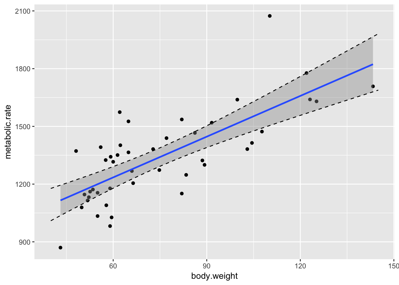
Some things to notice:
- It is definitely not the case that 95% of the data falls in this band. That’s not what we are doing. We are 95% confident that the regression line will fall in this band.
- Note that the band is narrowest near \((\overline{x}, \overline{y})\), and gets wider as we get further away. That is typical.
- We have confirmed the method that
geom_smoothuses to create the confidence band.
10.3.2 Prediction Intervals
Suppose you want to predict the metabolic rate of a new patient, whose body weight is known. You can use the regression coefficients to get an estimate, but how large is your error? That’s where prediction intervals come in. For example, a new patient presents with body weight 80 kg. In order to predict their metabolic rate, we could do one of two things:
rmr.mod #To remind me what the slope and intercept are##
## Call:
## lm(formula = metabolic.rate ~ body.weight, data = rmr)
##
## Coefficients:
## (Intercept) body.weight
## 811.23 7.06(811.2 + 7.06 * 80) #Estimated value of y when x = 80## [1] 1376We see that we would predict a metabolic rate of 1376.
Alternatively, we could use predict:
predict(rmr.mod, newdata = data.frame(body.weight = 80))## 1
## 1375.989What this doesn’t tell us, however, is how confident we are of our prediction. That is where the advantage of using predict becomes clear.
predict(rmr.mod, newdata = data.frame(body.weight = 80), interval = "prediction")## fit lwr upr
## 1 1375.989 1053.564 1698.414This tells us that we are 95% confident that a patient who presents with a body weight of 80 kg will have resting metabolic rate between 1054 and 1698. This is a much larger range than the confidence in the regression line when body.weight = 80, which is given by
predict(rmr.mod, newdata = data.frame(body.weight = 80), interval = "confidence")## fit lwr upr
## 1 1375.989 1326.898 1425.08The reason is that the prediction interval takes into account both our uncertainty in where the regression line is as well as the variability of the data. The confidence interval only takes into account our uncertainty in where the regression line is. If you were observing a patient in a hospital who weighed 80 kg, and they were eating 1580 calories per day, that would be within the 95% prediction band of what they would need. You should probably wonder whether the patient will maintain their weight if they eat more than 1700 calories per day, or less than 1050.
The procedure for plotting the prediction intervals is the same as for confidence intervals, except that geom_smooth doesn’t have a default way of doing the prediction bands!
rmrnew <- data.frame(body.weight = seq(40,145,5)) #Repeated for exposition
mymat <- as.data.frame(predict(rmr.mod, newdata = rmrnew, interval = "p"))
mymat <- mutate(mymat, xvals = rmrnew$body.weight)
ggplot(rmr, aes(x = body.weight, y = metabolic.rate)) +
  geom_point() +
  geom_smooth(method = "lm", se = FALSE) +
  geom_line(data = mymat, mapping = aes(x = xvals, y = lwr), linetype = "dashed") +
geom_line(data = mymat, mapping = aes(x = xvals, y = upr), linetype = "dashed") 
Note that about 95% of the data points do fall within the bands that we have created, though we shouldn’t expect exactly 95% of the data points to be within the bounds.
It is often useful to put the regression line, confidence bands and prediction bands all on one graph.
ggplot(rmr, aes(x = body.weight, y = metabolic.rate)) +
  geom_point() +
  geom_smooth(method = "lm", se = TRUE) +
  geom_line(data = mymat, mapping = aes(x = xvals, y = lwr), linetype = "dashed") +
geom_line(data = mymat, mapping = aes(x = xvals, y = upr), linetype = "dashed") 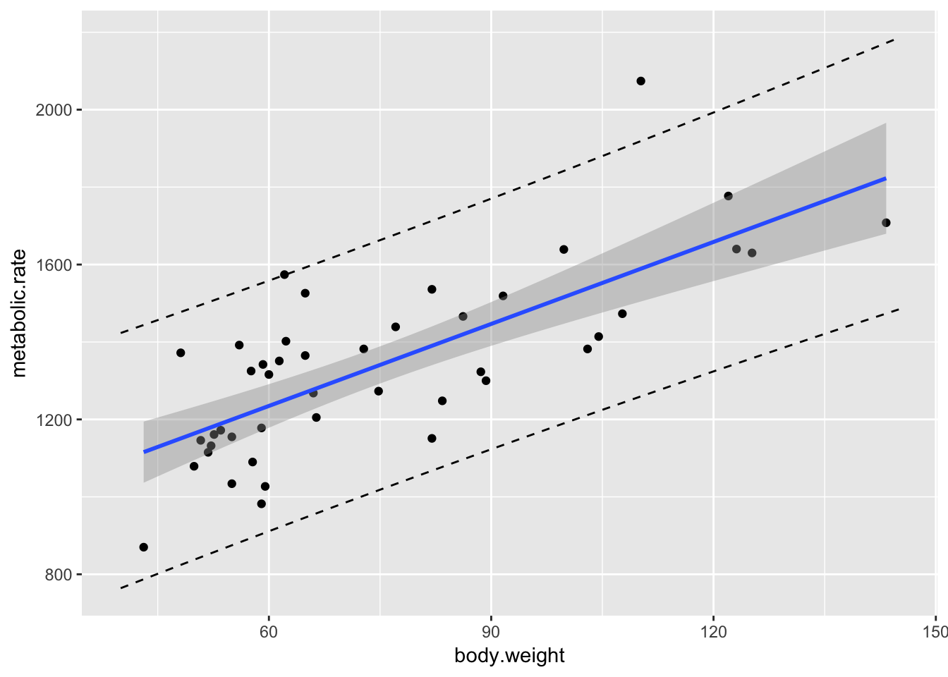
10.4 Inference on the slope
The most likely type of inference on the slope we will make is \(H_0: \beta_1 = 0\) versus \(H_a: \beta_1 \not = 0\). The \(p\)-value for this test is given in the summary of the linear model. However, there are times when we will want a confidence interval for the slope, or to test the slope against a different value. We illustrate with the following example.
Example Consider the data set Davis in the library car. The data consists of 200 observations of the variables sex, weight, height, repwt and repht. Let’s look at a plot of patients weight versus their reported weight.
Davis <- car::Davis
ggplot(Davis, aes(x = repwt, y = weight)) + geom_point()
## Warning: Removed 17 rows containing missing values (geom_point).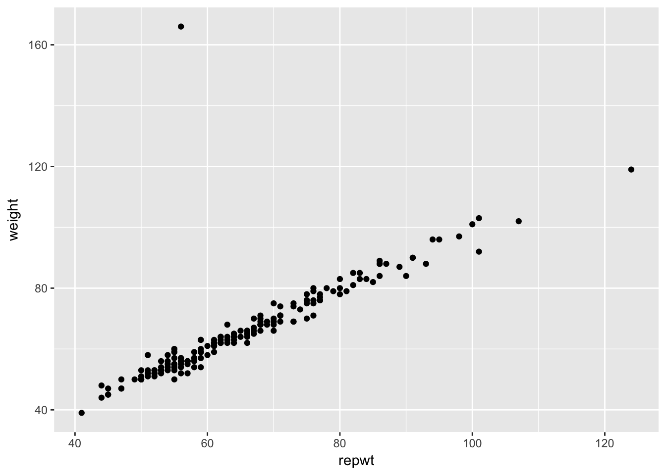
As we can see, there is a very strong linear trend in the data. There is also one outlier, who has reported weight of 56 and observed weight of 166. Let’s remove that data point. We can use
Davis <- filter(Davis, weight != 166)Create a linear model for weight as explained by repwt:
modDavis <- lm(weight~repwt, data = Davis)
summary(modDavis)
##
## Call:
## lm(formula = weight ~ repwt, data = Davis)
##
## Residuals:
## Min 1Q Median 3Q Max
## -7.5296 -1.1010 -0.1322 1.1287 6.3891
##
## Coefficients:
## Estimate Std. Error t value Pr(>|t|)
## (Intercept) 2.73380 0.81479 3.355 0.000967 ***
## repwt 0.95837 0.01214 78.926 < 2e-16 ***
## ---
## Signif. codes: 0 '***' 0.001 '**' 0.01 '*' 0.05 '.' 0.1 ' ' 1
##
## Residual standard error: 2.254 on 180 degrees of freedom
## (17 observations deleted due to missingness)
## Multiple R-squared: 0.9719, Adjusted R-squared: 0.9718
## F-statistic: 6229 on 1 and 180 DF, p-value: < 2.2e-16Notice in this case, we would be wondering whether the slope is 1, or whether there is a different relationship between reported weight and actual weight. Perhaps, for example, as people vary further from what is considered a healthy weight, they round their weights toward the healthy side. So, underweight people would overstate their weight and overweight people would understate their weight. A rough estimate of a 95% confidence interval would be the estimate plus or minus twice the standard error of the estimate. In this, case we can say we are about 95% confident that the true slope is 0.95837 \(\pm\) 2(.01214), or \([.93409, .98265]\). To get more precise information, we can use the R function confint.
confint(modDavis,level = .95)## 2.5 % 97.5 %
## (Intercept) 1.1260247 4.3415792
## repwt 0.9344139 0.9823347Note that the confidence interval for the slope is very close to what we estimated in the preceding paragraph. Via the relationship between confidence intervals and hypothesis testing, we would reject \(H_0: \beta_1 = 1\) in favor of \(H_a: \beta_1\not = 1\) at the \(\alpha - .05\) level, since the 95% confidence interval for the slope does not contain the value 1.
10.5 Residual Analysis
In this section, we show how to interpret the standard residual graphs that R produces. We return to the rmr data set in ISwR. Recall that our model was
rmr.mod <- lm(metabolic.rate~body.weight, data = rmr)
ggplot(rmr, aes(body.weight, metabolic.rate)) +
    geom_point() + geom_smooth(method = "lm")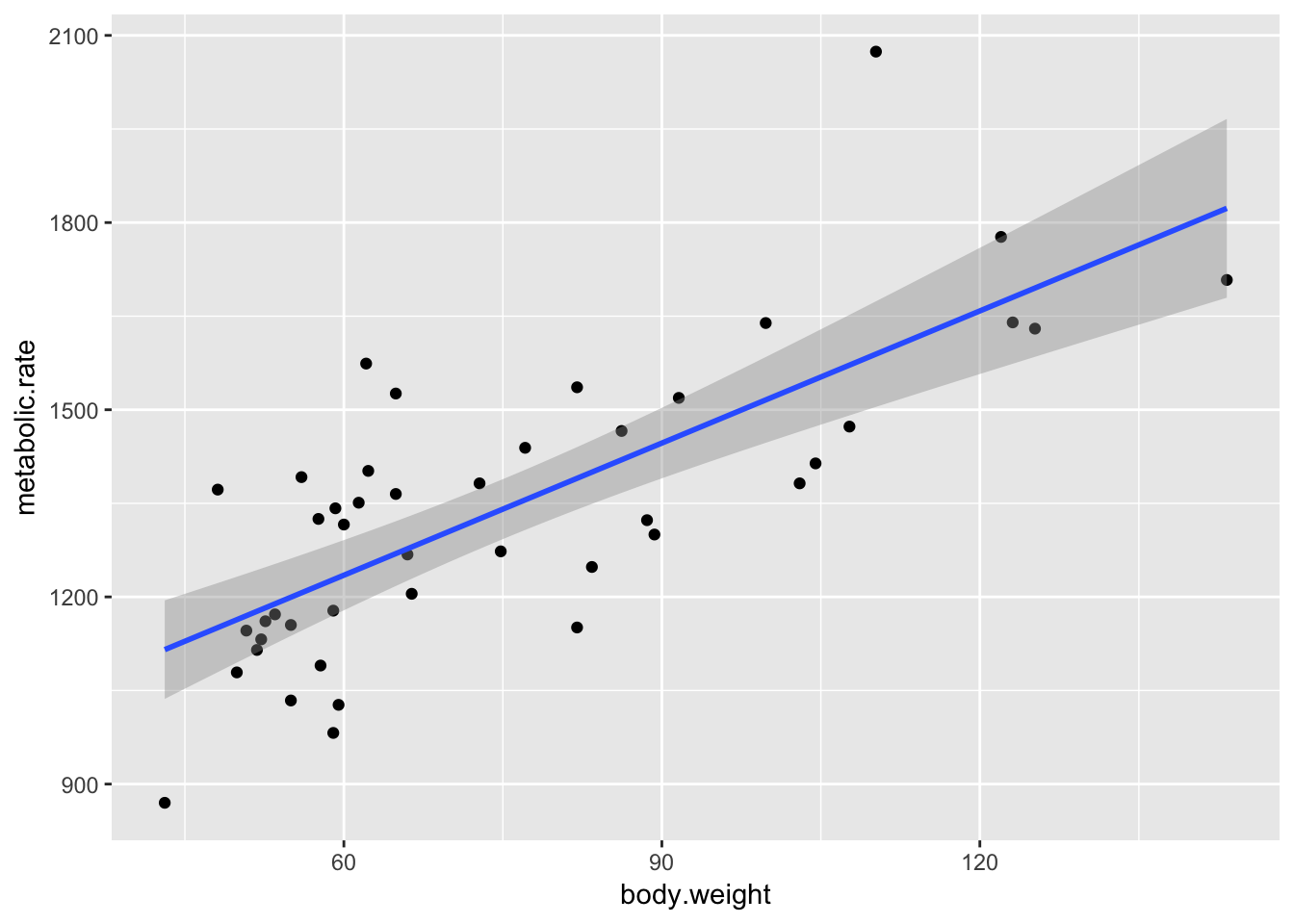
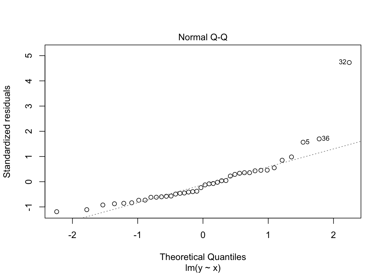
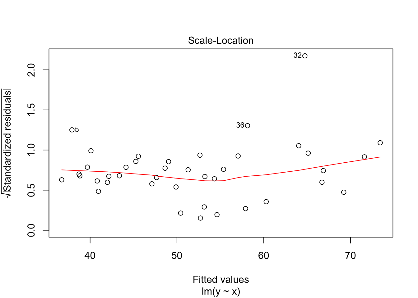
Recall that the residuals are the true values - the predicted values. According to our model, \(y_i = \beta_0 + \beta_1x_i + \epsilon_i\) \(\epsilon_i \sim N(0, \sigma)\), so the residuals should be normal with constant variance.
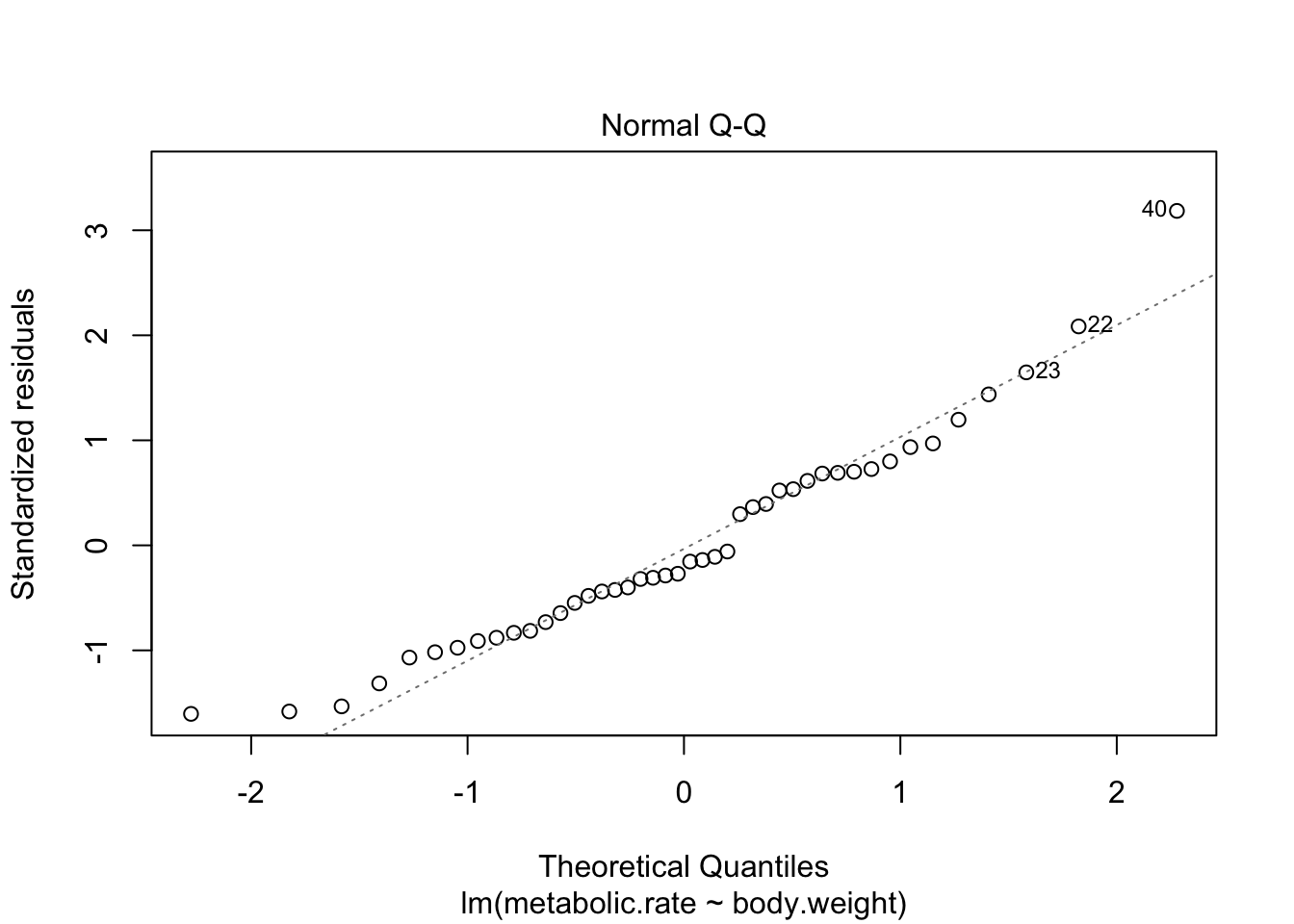
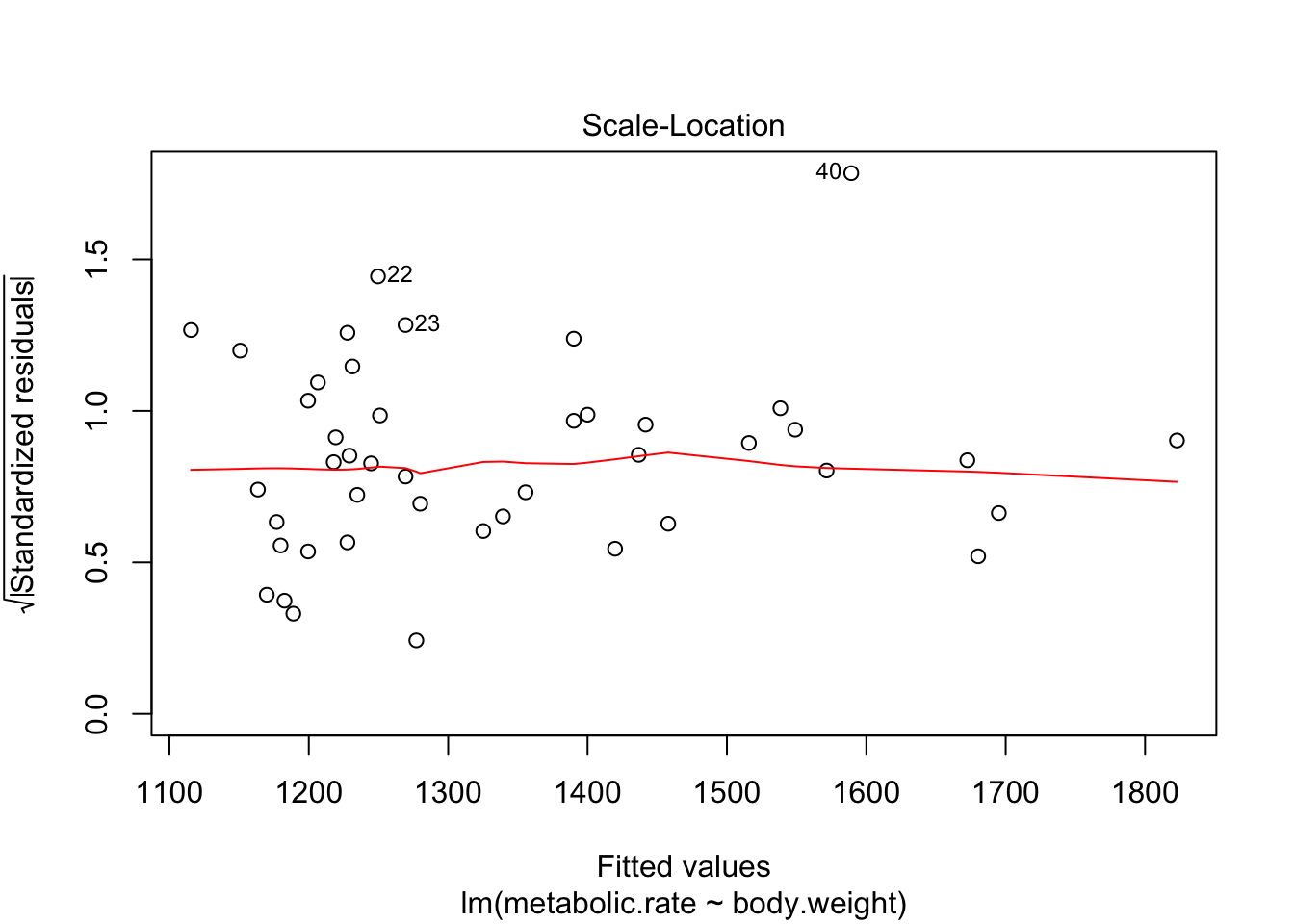
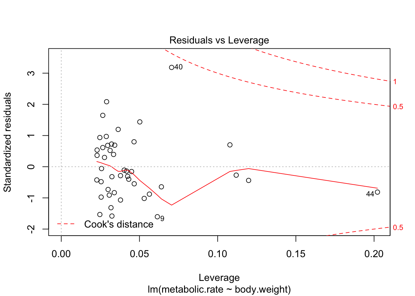
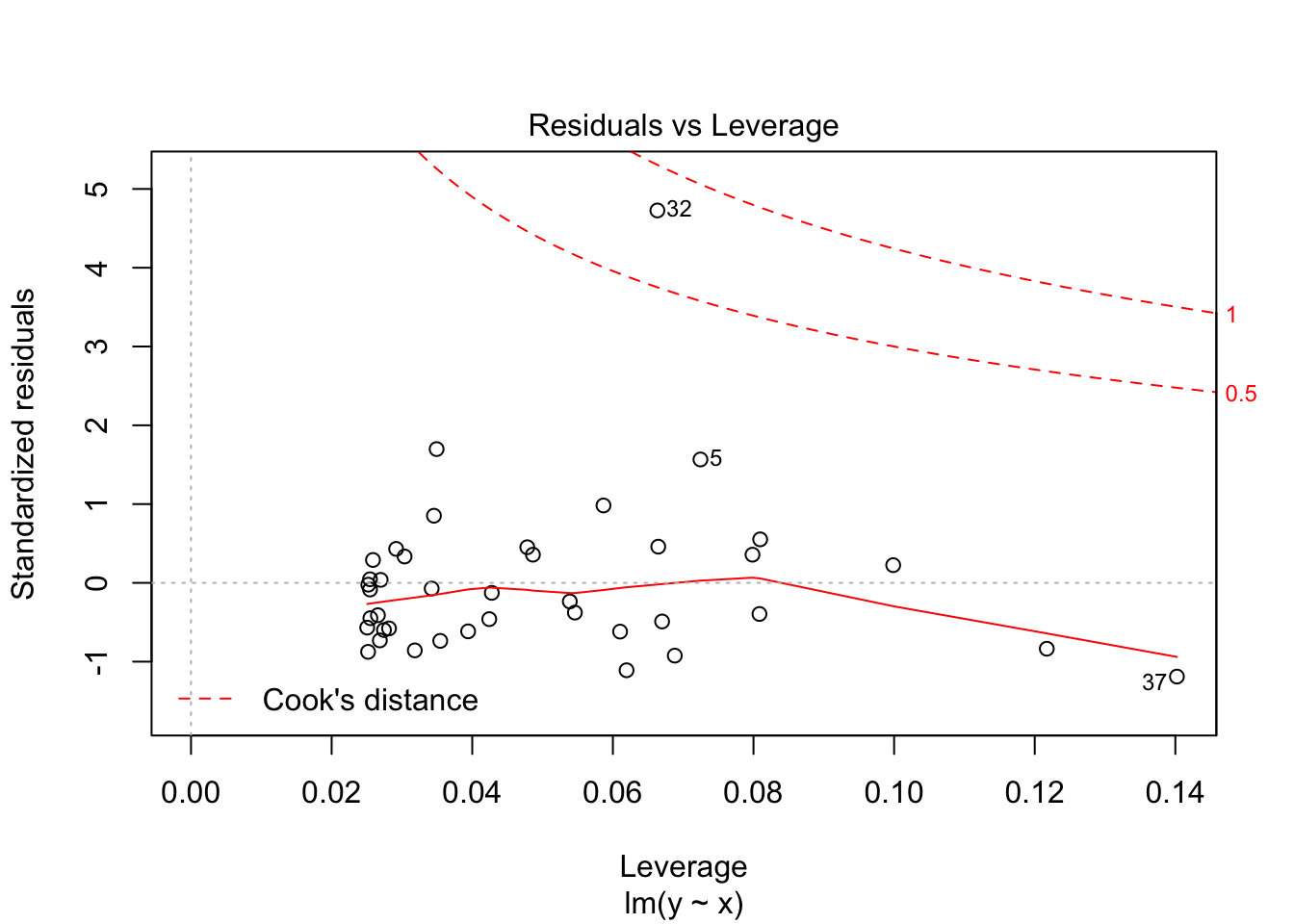
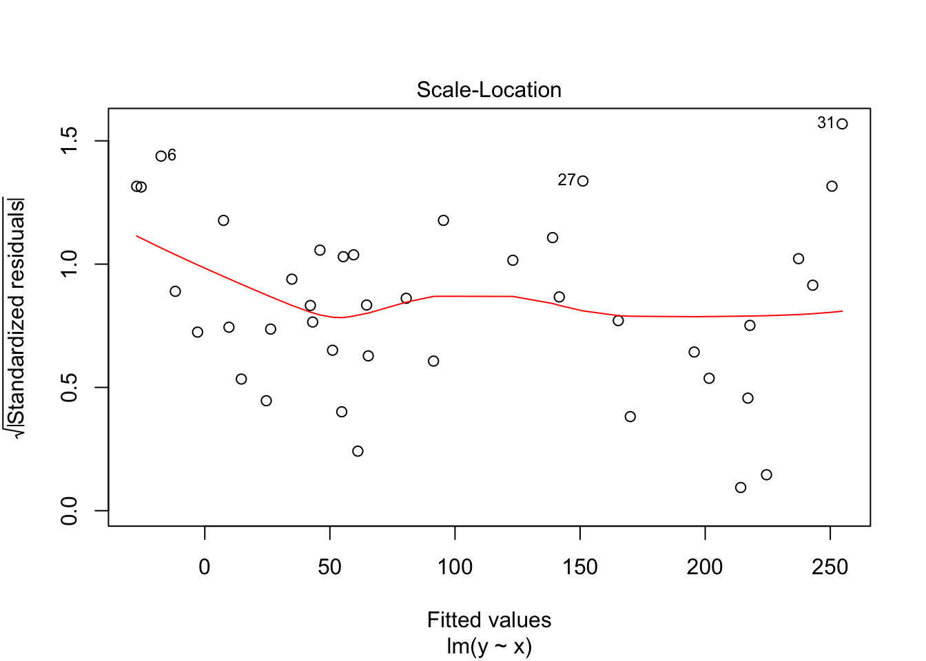
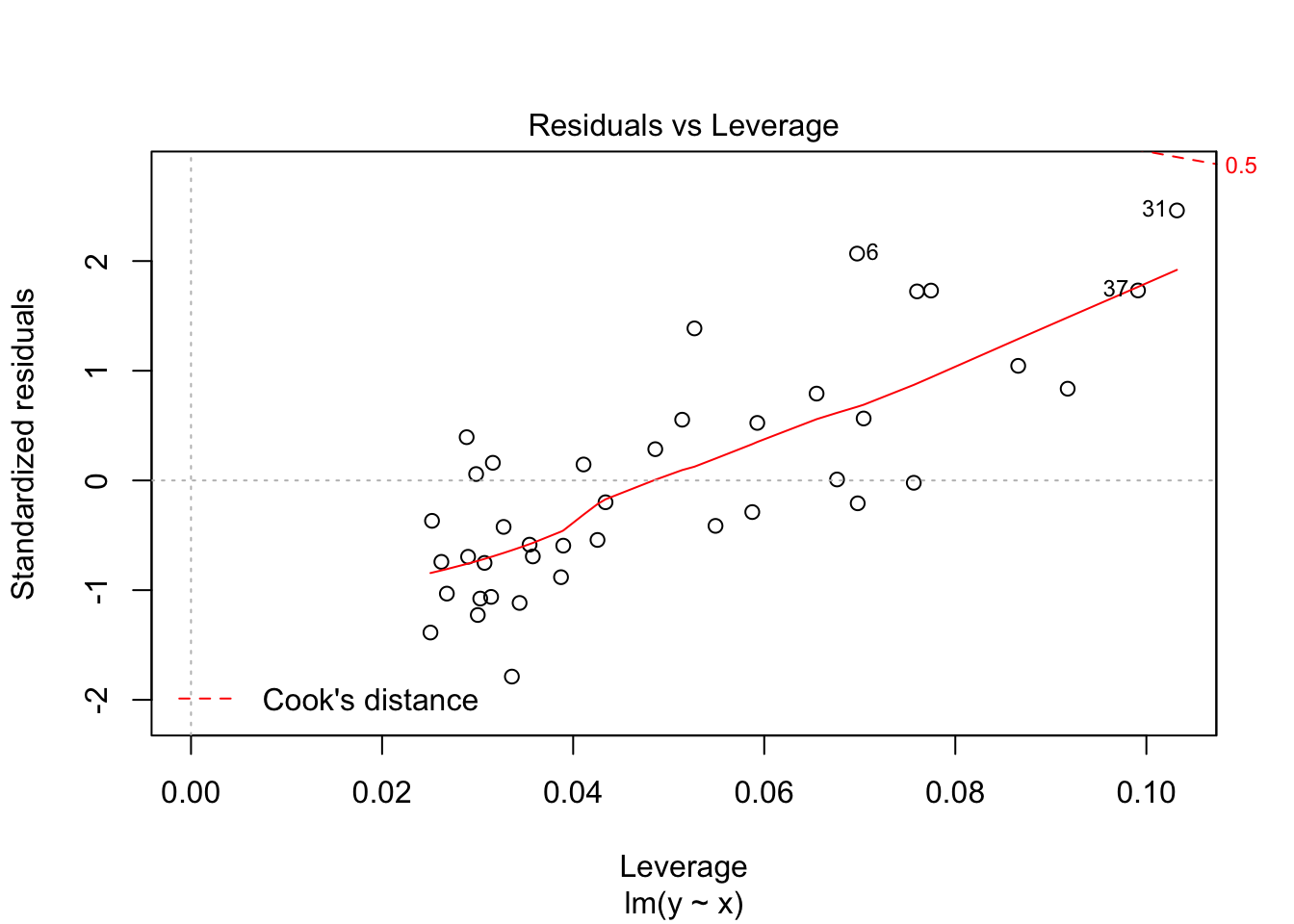
plot(rmr.mod)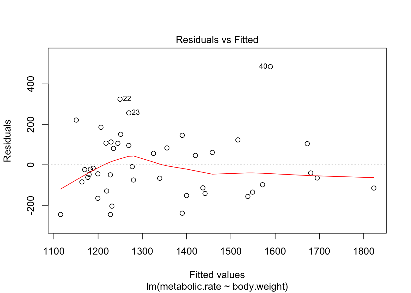
There are 4 residual plots that R does by default. The first plots the residuals versus the fitted values. We are looking to see whether the residuals are spread uniformly across the line \(y = 0\). If there is a U-shape, then that is evidence that there may be a variable “lurking” that we have not taken into account. It could be a variable that is related to the data that we did not collect, or it could be that our model should include a quadratic term.
The second plot is a normal-qq plot of the residuals. Ideally, the points would fall more or less along the line given in the plot. It takes some experience to know what is a reasonable departure from the line and what would indicate a problem. We give some examples in the following section that could help with that.
The third plot is the standardized residuals versus the fitted values. This is a plot that helps us to see whether the variance is constant across the fitted values. Many times, the variance will increase with the fitted value, in which case we would see an upward trend in this plot. We are looking to see that the line is more or less flat.
The last plot is an analysis of outliers and leverage. Outliers are points that fit the model worse than the rest of the data. Outliers with \(x\) coordinates in the middle of the data tend to have less of an impact on the final model than outliers toward the edge of the \(x\)-coordinates. Data that falls outside the red dashed lines are high-leverage outliers, meaning that they (may) have a large effect on the final model. You should consider removing the data and re-running in order to see how big the effect is. Or, you could use robust methods, that are covered in a different course. Care should be made in interpreting your model when you have high leverage outliers.
10.6 Simulations
10.6.1 simulating residuals
It can be tricky to learn what “good” residuals look like. One of the nice things about simulated data is that you can train your eye to spot departures from the hypotheses. Let’s look at three examples. You should think about other examples you could come up with!
Example 1 Consider simulated data that follows the model \(y_i = 2 + 3x_i + \epsilon_i\), where \(\epsilon_i\) is iid normal with mean 0 and standard deviation 5. After simulating the data, use R to estimate the parameters that were chosen.
x <- runif(40,10,20) #40 data points. explanatory values between 10 and 20
y <- 3*x + 2 + rnorm(40,0,5) #follows model
my.mod <- lm(y~x)
plotData <- data.frame(x, y)
ggplot(plotData, aes(x,y)) + geom_point() +
  geom_smooth(method = "lm")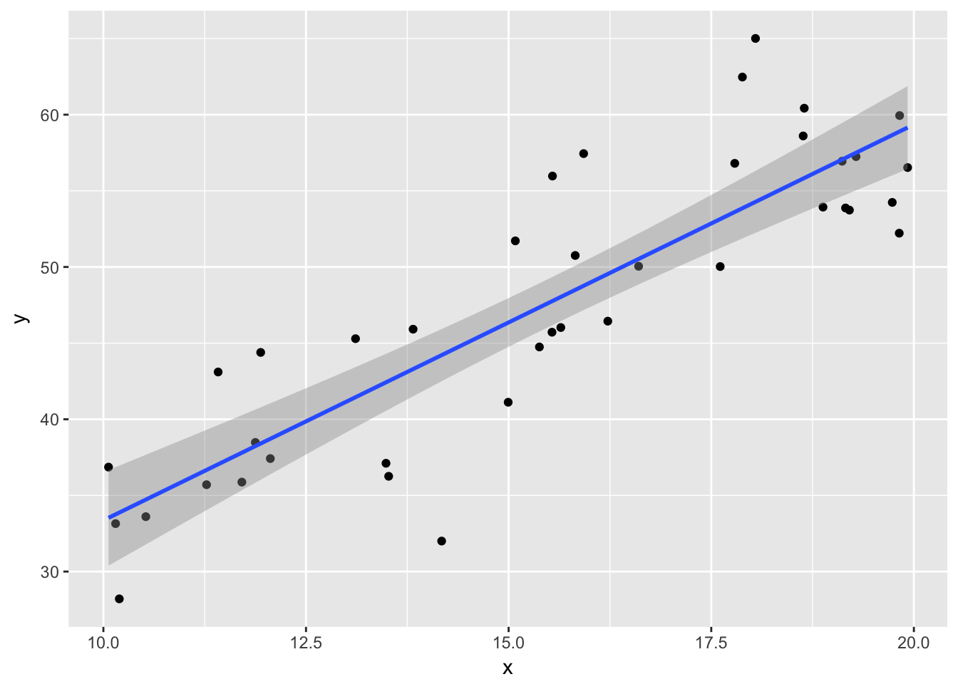
summary(my.mod)##
## Call:
## lm(formula = y ~ x)
##
## Residuals:
## Min 1Q Median 3Q Max
## -12.2081 -3.1018 -0.7863 3.2285 10.7312
##
## Coefficients:
## Estimate Std. Error t value Pr(>|t|)
## (Intercept) 7.3691 3.9033 1.888 0.0667 .
## x 2.5993 0.2469 10.529 8e-13 ***
## ---
## Signif. codes: 0 '***' 0.001 '**' 0.01 '*' 0.05 '.' 0.1 ' ' 1
##
## Residual standard error: 4.942 on 38 degrees of freedom
## Multiple R-squared: 0.7447, Adjusted R-squared: 0.738
## F-statistic: 110.9 on 1 and 38 DF, p-value: 7.996e-13Things to notice:
- the regression line more or less follows the line of the points.
- The residuals listed are more or less symmetric about 0.
- The estimate for the intercept is \({\hat\beta}_0=\) 7.3690569 and for the slope it is \({\hat\beta}_1=\) 2.5992834.
Example 2
Now, let’s see what happens if we have an exponential error. (This is just to illustrate what bad residuals might look like.) We keep the same model, except we change the error to iid exponential with rate 1/10.
set.seed(44)
x <- runif(40,10,20) #40 data points. explanatory values between 10 and 20
y <- 3*x + 2 + rexp(40,1/10) #doesn't follow model
my.mod <- lm(y~x)
plotData <- data.frame(x, y)
ggplot(plotData, aes(x,y)) + geom_point() +
  geom_smooth(method = "lm")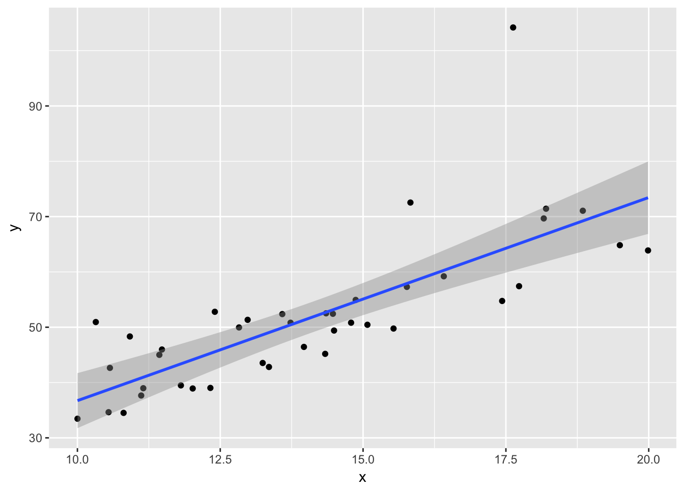
summary(my.mod)##
## Call:
## lm(formula = y ~ x)
##
## Residuals:
## Min 1Q Median 3Q Max
## -9.528 -5.119 -1.529 2.976 39.454
##
## Coefficients:
## Estimate Std. Error t value Pr(>|t|)
## (Intercept) -0.004658 7.153581 -0.001 0.999
## x 3.672905 0.498003 7.375 7.68e-09 ***
## ---
## Signif. codes: 0 '***' 0.001 '**' 0.01 '*' 0.05 '.' 0.1 ' ' 1
##
## Residual standard error: 8.638 on 38 degrees of freedom
## Multiple R-squared: 0.5887, Adjusted R-squared: 0.5779
## F-statistic: 54.39 on 1 and 38 DF, p-value: 7.683e-09plot(my.mod)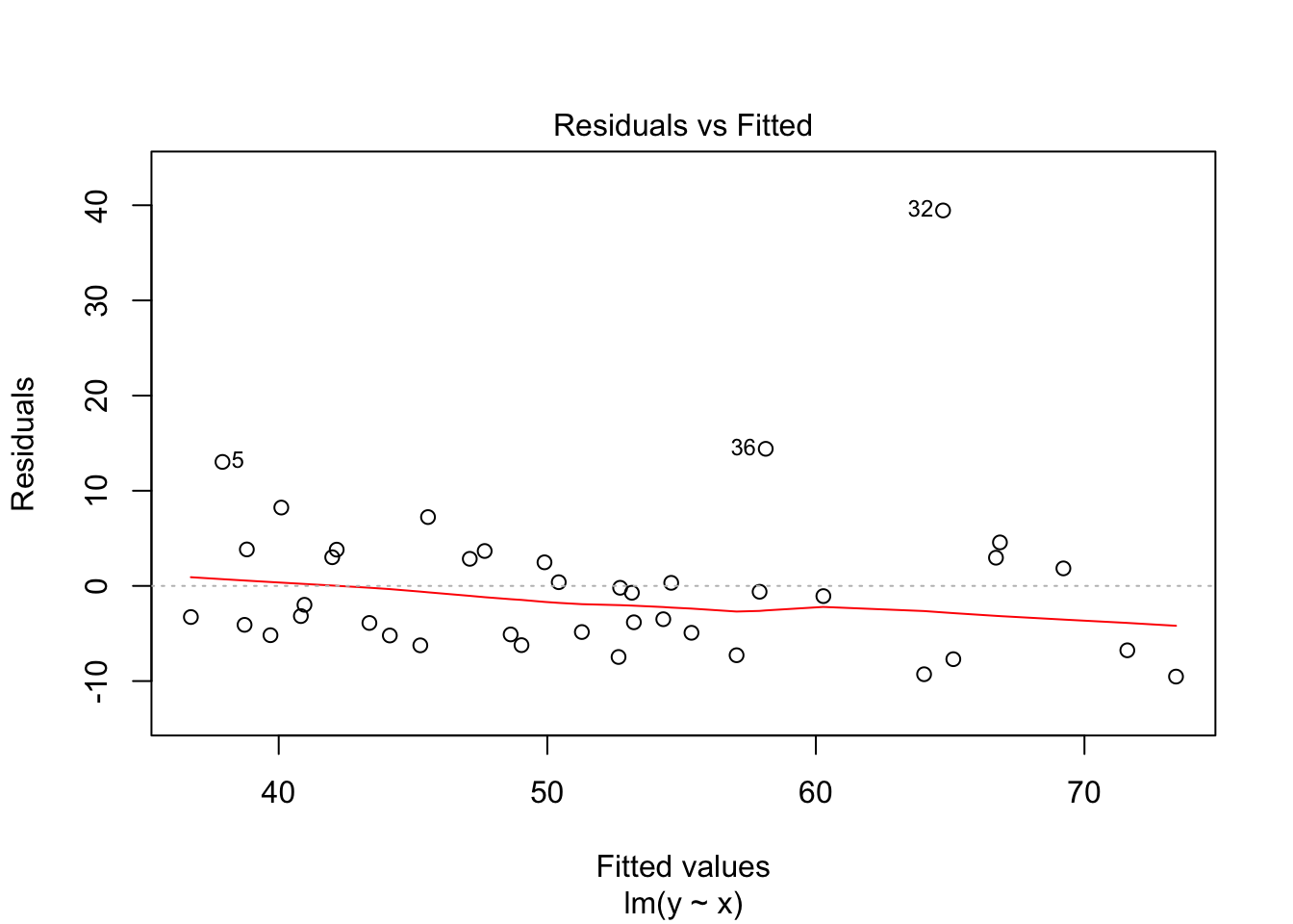
 Note that the line still follows the points more or less, and the estimates of the intercept and slope are not terrible, but the residuals do not look good, as the median is far away from zero relative to the magnitude of the first and third quartiles, and the max is 4 times the min in absolute value. If you run this several times, you will start to get a feel for what bad residuals might look like at this level.
Example 3
Next, we suppose that the true relationship between \(x\) and \(y\) is quadratic. Let’s see what happens to the residuals in that case. Our model remains the (incorrect) \[ y_i = \beta_0 + \beta_1 x_i + \epsilon_i \] It makes sense to increase the error, since the \(y\) values are now between 100 and 400. Let’s increase the error to have standard deviation of 10.
x <- runif(40,1,10) #40 data points. explanatory values between 10 and 20
y <- 3*x^2 + 2 + rnorm(40,0,10) #doesn't follow model
my.mod <- lm(y~x)
plotData <- data.frame(x, y)
ggplot(plotData, aes(x,y)) + geom_point() +
  geom_smooth(method = "lm")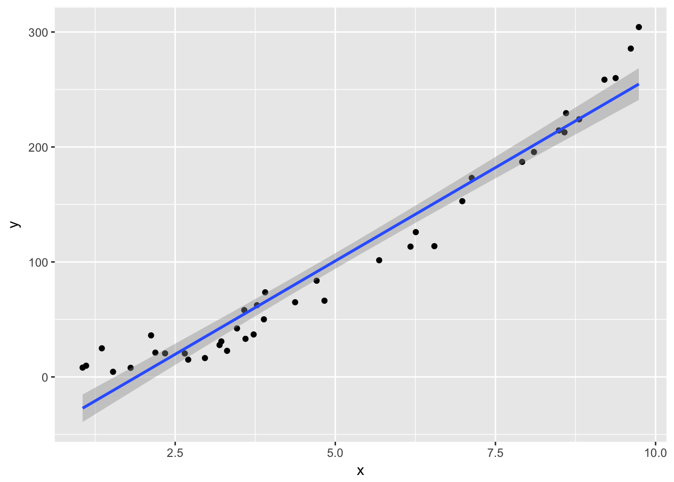
summary(my.mod)##
## Call:
## lm(formula = y ~ x)
##
## Residuals:
## Min 1Q Median 3Q Max
## -37.348 -14.815 -4.202 11.486 49.525
##
## Coefficients:
## Estimate Std. Error t value Pr(>|t|)
## (Intercept) -61.473 7.034 -8.739 1.26e-10 ***
## x 32.471 1.245 26.088 < 2e-16 ***
## ---
## Signif. codes: 0 '***' 0.001 '**' 0.01 '*' 0.05 '.' 0.1 ' ' 1
##
## Residual standard error: 21.25 on 38 degrees of freedom
## Multiple R-squared: 0.9471, Adjusted R-squared: 0.9457
## F-statistic: 680.6 on 1 and 38 DF, p-value: < 2.2e-16plot(my.mod)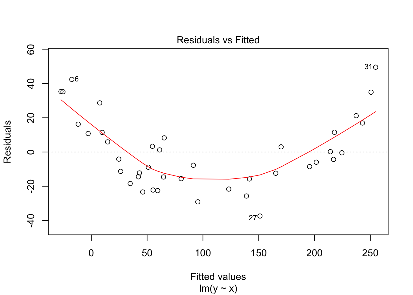
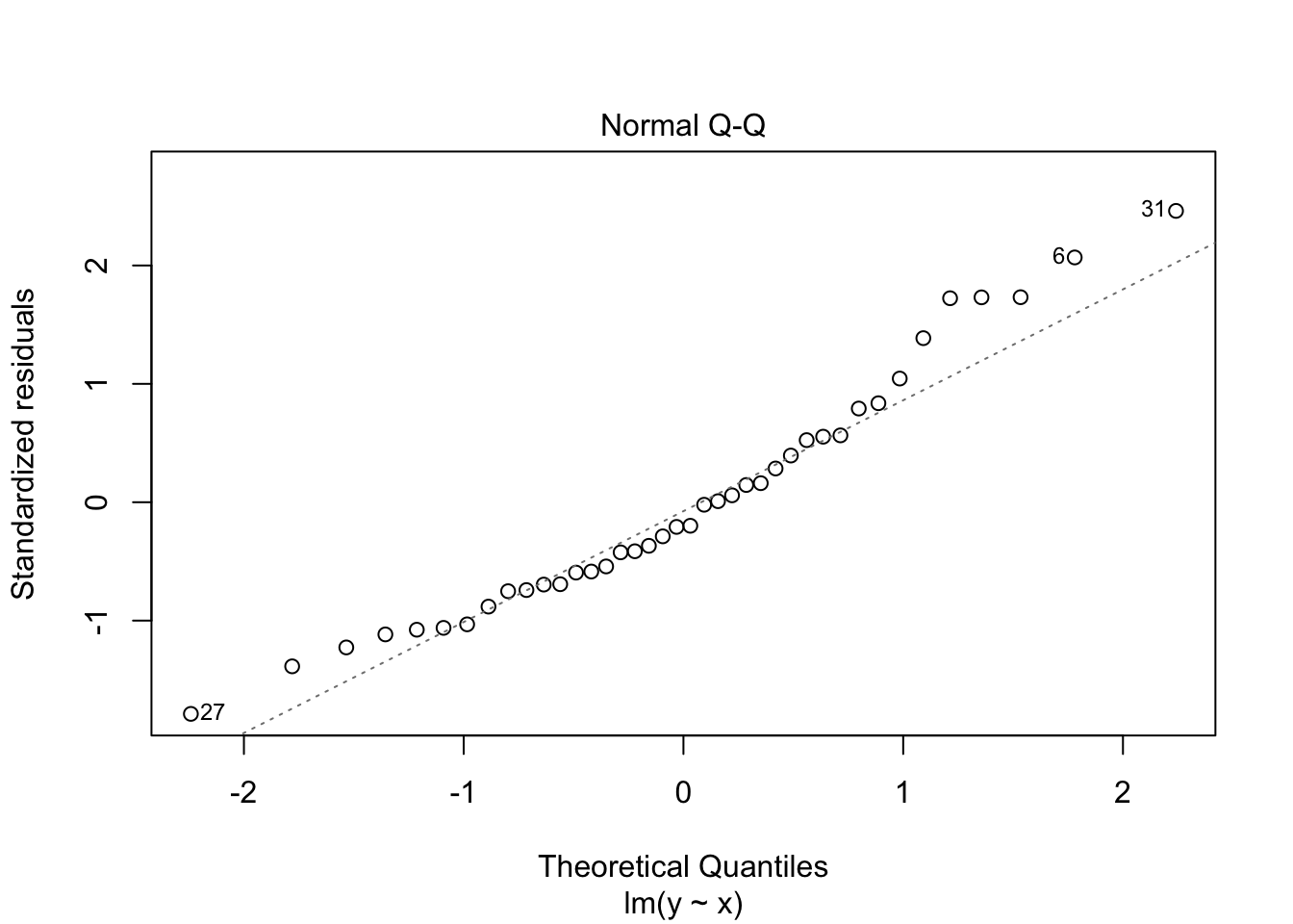
 Notice that the residuals in the summary look fine, but when plotted against the fitted values, a very distinct U shape appears. This is strong evidence that the model we have chosen is insufficient to describe the data.
10.6.2 Simulating Prediction and Confidence Intervals
In this section, we simulate prediction and confidence intervals to see what happens when various assumptions are not met. Several examples are also left to the exercises.
We begin by simulating 95% prediction intervals when the data truly comes from \(y_i = 1 + 2x_i + \epsilon_i\), where \(\epsilon_i \sim N(0,1)\). We will assume the \(x\) values come from the interval \((0,10)\) and are randomly selected.
simdata <- data.frame(x = runif(20,0,10))
simdata <- dplyr::mutate(simdata, y = 1 + 2 * x + rnorm(20)) #Note the use of mutate()
ggplot(simdata, aes(x = x, y = y)) + geom_point()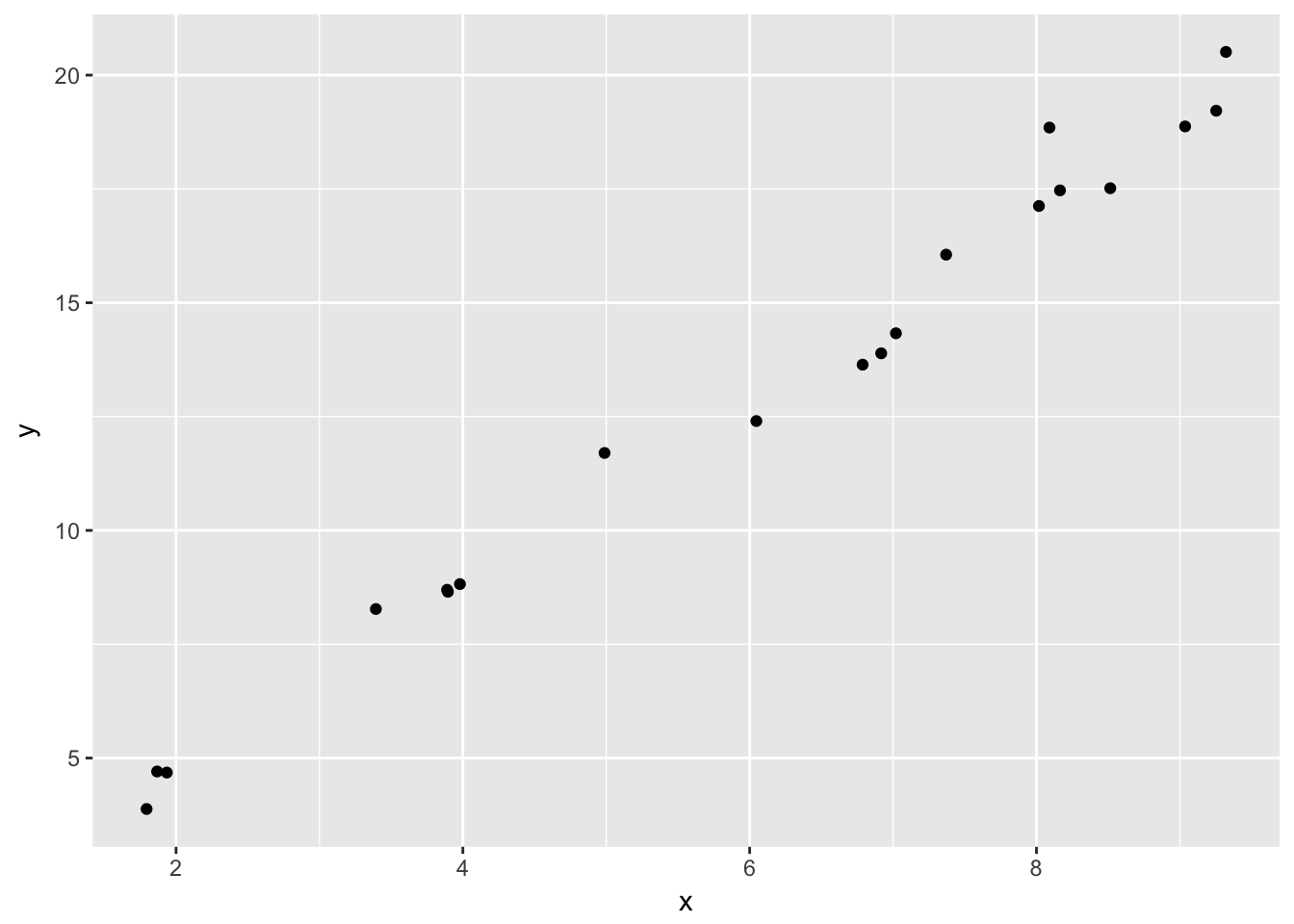
Now, let’s pick \(x = 7.5\) and get a 95% prediction interval for \(x\).
simmod <- lm(y~x, data = simdata)
predict.lm(simmod, newdata = data.frame(x = 7.5), interval = "pre")
## fit lwr upr
## 1 15.99153 14.55528 17.42778Now, let’s suppose that we did have one more sample at \(x = 7.5\). It would be
1 + 2*7.5 + rnorm(1)## [1] 14.9204And we would test to see whether the point falls in the prediction interval. Now, in order to test whether our prediction interval is working correctly, we need to recreate sample data, apply lm and predict.lm, pick a point in \([0,10]\) and see whether a new point in the model falls in the prediction interval.
mean(replicate(10000, {simdata <- data.frame(x = runif(20,0,10));
                simdata <- dplyr::mutate(simdata, y = 1 + 2*x + rnorm(20));
                simmod <- lm(y~x, data = simdata);
                newpoint <- runif(1,0,10);
                newy <- 1 + 2 * newpoint + rnorm(1);
                predictint <- predict.lm(simmod, newdata = data.frame( x= newpoint), interval = "pre");
                newy < predictint[3] && newy > predictint[2]}))
## [1] 0.9514We can also simulate a 95% confidence interval. Basically, everything is the same as above except we use interval = "conf" in predict.lm(), and we don’t add random noise to the newpoint. The details are an exercise for the reader8.
We compare the prediction interval to a case when the model is incorrect. Suppose there is an undiagnosed quadratic term in our data, so that the data follows \(y = 1 + 2x + x^2/20 + \epsilon\), while we are still modeling on \(y = \beta_0 + \beta_1x + \epsilon\). Let’s see what happens to the prediction intervals. But first, let’s look at an example of data that follows that form:
simdata <- data.frame(x = runif(20,0,10))
simdata <- dplyr::mutate(simdata, y = 1 + 2*x + x^2/10 + rnorm(20))
ggplot(simdata, aes(x,y)) + geom_point()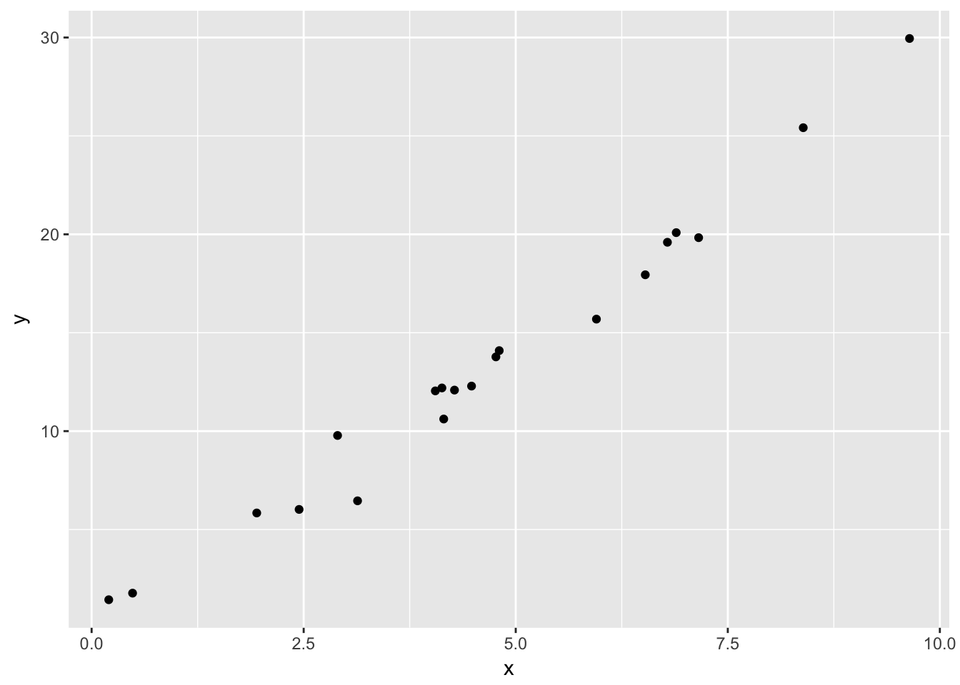
It is not implausible that someone could look at this data and not notice the quadratic term.
mean(replicate(10000, {simdata <- data.frame(x = runif(20,0,10));
                simdata <- dplyr::mutate(simdata, y = 1 + 2*x + x^2/10 + rnorm(20));
                simmod <- lm(y~x, data = simdata);
                newpoint <- runif(1,0,10);
                newy <- 1 + 2 * newpoint + newpoint^2/10 + rnorm(1)
                predictint <- predict.lm(simmod, newdata = data.frame( x= newpoint), interval = "pre");
                newy < predictint[3] && newy > predictint[2]}))
## [1] 0.946Still working more or less as designed on average.
However, let’s examine things more carefully. Let’s see what percentage of the time it correctly would put new data in \(x = 10\) in the prediction interval.
mean(replicate(10000, {simdata <- data.frame(x = runif(20,0,10));
                simdata <- dplyr::mutate(simdata, y = 1 + 2*x + x^2/10 + rnorm(20));
                simmod <- lm(y~x, data = simdata);
                newpoint <- 10;
                newy <- 1 + 2 * newpoint + newpoint^2/10 + rnorm(1)
                predictint <- predict.lm(simmod, newdata = data.frame( x= newpoint), interval = "pre");
                newy < predictint[3] && newy > predictint[2]}))
## [1] 0.8089This isn’t working at all as designed!
Let’s also see what happens at \(x = 5\):
mean(replicate(10000, {simdata <- data.frame(x = runif(20,0,10));
                simdata <- dplyr::mutate(simdata, y = 1 + 2*x + x^2/10 + rnorm(20));
                simmod <- lm(y~x, data = simdata);
                newpoint <- 5;
                newy <- 1 + 2 * newpoint + newpoint^2/10 + rnorm(1)
                predictint <- predict.lm(simmod, newdata = data.frame( x= newpoint), interval = "pre");
                newy < predictint[3] && newy > predictint[2]}))
## [1] 0.952So, we can see that the prediction intervals are behaving more or less as designed near \(x = 5\), but are wrong near \(x = 10\) when there is an undiagnosed quadratic term. This means that when we are making predictions, we should be very careful when we are making predictions near the bounds of the data that we have collected, and we should tread even more carefully when we start to move outside of the range of values for which we have collected data! (Note that in the simulation above, the new data would be just outside the region for which we have data. If you replace newdata <- 10 with the maximum \(x\)-value in the data, you get closer to 90%.)
10.7 Exercises
Consider the model \(y_i = \beta_0 + x_i + \epsilon_i\). That is, assume that the slope is 1. Find the value of \(\beta_0\) that minimizes the sum-squared error when fitting the line \(y = \beta_0 + x\) to data given by \((x_1,y_1),\ldots,(x_n, y_n)\).
- Consider the
Battingdata from theLahmandata set. This problem uses home runs (HR) to explain total runs scored (R) in a baseball season.- Construct a data frame that has the total number of HR hit and the total number of R scored for each year from 1871-2015.
- Create a scatterplot of the data, with HR as the explanatory variable and R as the response. Use color to show the yearID.
- Notice early years follow a different pattern than more modern years. Restrict the data to the years 1970-2015, and create a new scatterplot.
- Fit a linear model to the recent data. How many additional R does the model predict for each additional HR? Is the slope significant?
- Plot the best-fit line and the recent data on the same graph.
- Create a prediction interval for the total number of runs scored in the league if a total of 4000 home runs are hit. Would this be a valid prediction interval if we found new data for 1870 that included HR but not R?
- Consider the data set Anscombe, which is in the car library. (Note: do not use the data set anscombe, which is preloaded in R.) The data contains, among other things, the per capita education expenditures and the number of youth per 1000 people.
- Would you expect number of youth and per capita education expenditures to be correlated? Why or why not?
- What is the correlation coefficient between number of youth and per capita education expenditures?
- Model expenditures as a function of number of youth. Interpret the slope of the regression line. Is it significant?
- Examine your data and residuals carefully. Model the data minus the one outlier, and re-interpret your conclusions in light of this.
- Consider the
juuldata set inISwR.- Fit a linear model to explain igf1 level by age for people under age 20 who are in tanner puberty group 5.
- Fit a linear model to explain the log of igf1 level by age for people under age 20 who are in tanner puberty group 5.
- Examine the residuals to determine which fit seems to better match our assumptions on linear models.
- Consider the
ex0728data set inSleuth2(note: not in Sleuth3!). This gives the year of completion, height and number of stories for 60 randomly selected notable tall buildings in North America.- Create a scatterplot of Height (response) versus Stories (explanatory).
- Which building(s) are unexpectedly tall for their number of stories?
- Is there evidence to suggest that the height per story has changed over time?
- Consider the data in
ex0823inSleuth3. This data set gives the wine consumption (liters per person per year) and heart disease mortality rates (deaths per 1000) in 18 countries.- Create a scatterplot of the data, with Wine as the explanatory variable. Does their appear to be a transformation of the data needed?
- Does the data suggest that wine consumption is associated with heart disease?
- Would this study be evidence that if a person who increases their wine consumption to 75 liters per year, then their odds of dying from heart disease would change?
- Suppose you terribly incorrectly model \(y = x^2 + \epsilon\) based on a linear model \(y = \beta_0 + \beta_1x + \epsilon\). Assume your data comes uniformly from the interval \([0, 10]\). What percentage of time is new data at \(x = 5\) in the prediction interval at \(x = 5\)? At \(x = 10\)?
- What changes in the simulation of prediction intervals need to be made if we choose our original \(x\) values to be \(0, 0.5, 1, 1.5, 2, 2.5, \ldots, 9.5, 10\)? Does a 95% prediction interval still contain new data 95% of the time? Think of what your answer should be, and then write code to verify. (Note that in this case, there will be 21 \(x\)-values.)
- Simulate 95% confidence intervals for data following \(y_i = 1 + 2x_i + \epsilon_i\), where \(\epsilon_i \sim N(0,1)\). You can assume that the \(x\) values you use are randomly selected between \(0\) and \(10\). Your goal should be to estimate the probability that \(1 + 2x_0\) is in the confidence interval associated with \(x = x_0\). (Hint: modify the code that was given for prediction intervals in the text.)
Create a data set of size 20 that follows the model \(y = 2 + 3x + \epsilon\), where \(\epsilon\sim N(0,1)\). Fit a linear model to the data. Estimate the probability that if you chose a point \(x\) in \([0,10]\) and create a new data point
2 + 3*x + rnorm(1), then that new data point will be in the 95% prediction interval given by your model. Is your answer 95%? Why would you not necessarily expect the answer to be 95%?
To find this option with R’s built-in help, use
?predictand then click onpredict.lm, because we are applying predict to an object created by lm.↩mean(replicate(10000, {simdata <- data.frame(x = runif(20,0,10)); simdata <- dplyr::mutate(simdata, y = 1 + 2*x + rnorm(20)); simmod <- lm(y~x, data = simdata); newpoint <- runif(1,0,10); predictint <- predict.lm(simmod, newdata = data.frame( x= newpoint), interval = "conf"); 1 + 2 * newpoint < predictint[3] && 1 + 2*newpoint > predictint[2]}))↩