Chapter 5 Statistical Models
In this chapter we will focus on the introduction of the broom package, part of the tidyverse suite of packages. In general, packages used for working with model information are known as the tidymodels suite of packages.
# Remember all of these packages can be loaded by just loading tidyverse instead!
library(dplyr)
library(ggplot2)
library(broom)
Dr. Sonderegger’s Video Companion: Video Lecture.
5.1 Introduction to Simple Statistical Models
While R is a full programming language, it was first developed by statisticians for statisticians. There are several functions to do common statistical tests but because those functions were developed early in R’s history, there is some inconsistency in how those functions work. There have been some attempts to standardize modeling object interfaces, but there will always be a little weirdness. This chapter introduces you to how to build basic linear models with R and extract and use information through the broom package.
5.1.1 Formula Notation
Most statistical modeling functions rely on a formula based interface. The primary purpose is to provide a consistent way to designate which columns in a data frame are the response variable and which are the explanatory variables. In particular the notation is
\[ \underbrace{y}_{\textrm{LHS response}} \;\;\; \underbrace{\sim}_{\textrm{is a function of}} \;\;\; \underbrace{x}_{\textrm{RHS explanatory}} \]
Mathematicians often refer to these terms as the Left Hand Side (LHS) and Right Hand Side (RHS). The LHS is always the response and the RHS contains the explanatory variables. In R, the LHS is usually just a single variable in the data. However, the RHS can contain multiple variables with the possibility for complex relationships.
| Right Hand Side Terms | Meaning |
x1 + x2 |
Both x1 and x2 are additive explanatory variables.
In this format, we are adding only the main effects
of the x1 and x2 variables. |
x1:x2 |
This is the interaction term between x1 and x2 |
x1 * x2 |
Whenever we add an interaction term to a model,
we want to also have the main effects. So this is a
short cut for adding the main effect of x1 and x2
and also the interaction term x1:x2. |
(x1 + x2 + x3)^2 |
This is the main effects of x1, x2, and x3 and
also all of the second order interactions. |
poly(x, degree=2) |
This fits the degree 2 polynomial. When fit like this, R produces an orthogonal basis for the polynomial, which is more computationally stable, but won’t be appropriate for interpreting the polynomial coefficients. |
poly(x, degree=2, raw=TRUE) |
This fits the degree 2 polynomial using \(\beta_0 + \beta_1 x + \beta_2 x^2\) and the polynomial polynomial coefficients are suitable for interpretation. |
I( x^2 ) |
Ignore the usual rules for interpreting formulas
and do the mathematical calculation. This is not
necessary for things like sqrt(x) or log(x) but
required if there is a conflict between mathematics
and the formula interpretation. This is not commonly
used in modern statistical analysis. |
5.2 Basic Models
The most common statistical models are generally referred to as linear models and the R function for creating a linear model is lm(). This section will introduce how to fit the model using a data frame as well as how to fit very specific t-test models. This book can only introduce you to the concepts of linear modeling, and for further information, students are encouraged to take STA 477, STA 570, and/or STA 571.
5.2.1 t-tests
There are several variants on t-tests depending on the question of interest, but they all require a continuous response and a categorical explanatory variable with two levels. If there is an obvious pairing between an observation in the first level of the explanatory variable with an observation in the second level, then it is a paired t-test, otherwise it is a two-sample t-test. There are other variants of the t-test not described here, which lead way to the more general statistical modeling structure known as ANOVA.
5.2.1.1 Two Sample t-tests
First we’ll import data from the Lock5Data package that gives SAT scores and gender from 343 students in an introductory statistics class. We’ll also recode the CodedSex column to be more descriptive than 0 or 1. We’ll do a t-test to examine if there is evidence that males and females have a different SAT score at the college where these data were collected.
We should be familiar with some of the syntax below after Chapters 1 - 4, and we are starting to see how the statistical programming structure within R builds upon itself. The code chunk below imports the GPAbySex data set from the Lock5Data package, uses some dplyr functionality to mutate in a new easy-to-interpret Gender variable, and then produces a ggplot2 graphic for a visualization of the t-test as side-by-side boxplots.
data('GPAbySex', package='Lock5Data')
GPAbySex <- GPAbySex %>%
  mutate( Gender = ifelse(CodedSex == 1, 'Male', 'Female'))
ggplot(GPAbySex, aes(x=Gender, y=SAT)) +
  geom_boxplot()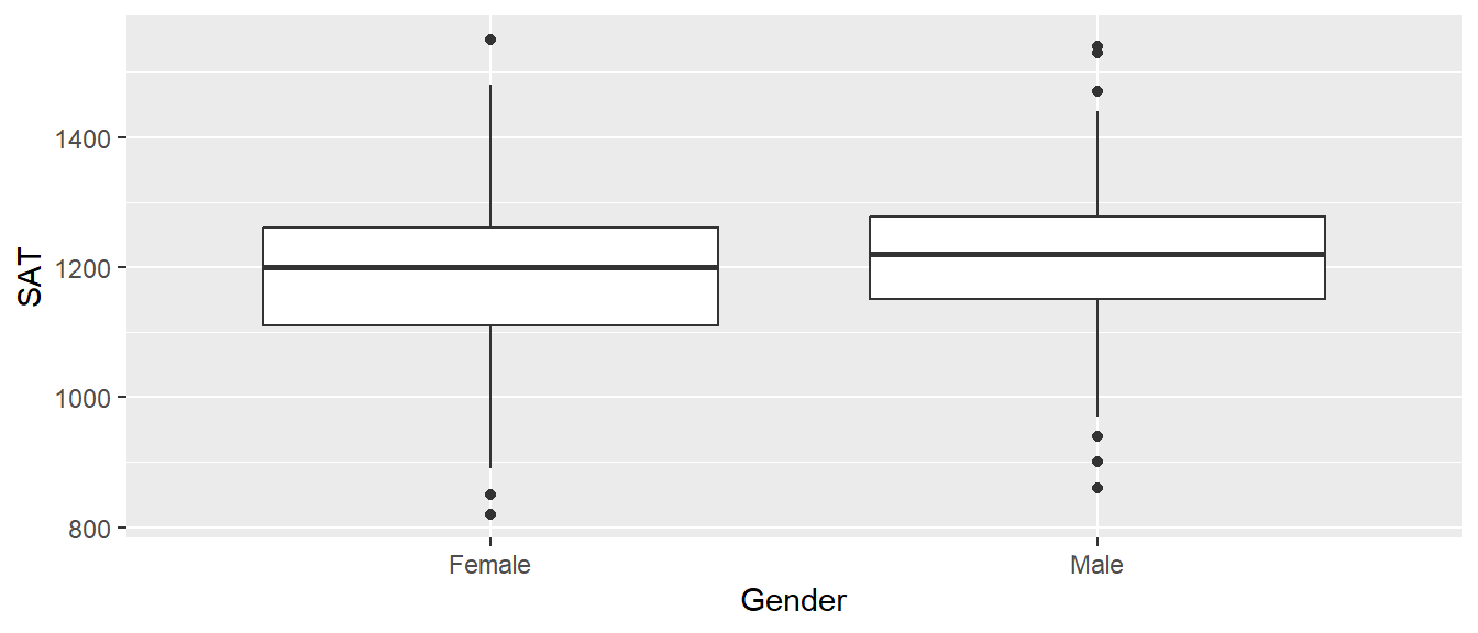
We’ll use the function t.test() using the formula interface for specifying the response and the explanatory variables. The usual practice should be to save the output of the t.test function call (typically as an object named model or model_1 or similar). Once the model has been fit, all of the important quantities have been calculated and saved and we just need to ask for them. Unfortunately, the base functions in R don’t make this particularly easy, but the tidymodels group of packages for building statistical models allows us to wrap all of the important information into a data frame with one row. In this case we will use the broom::tidy() function to extract all the important information from the resulting model object.
model <- t.test(SAT ~ Gender, data=GPAbySex) # Run default two-sample t-test
print(model) # print the summary information to the screen
##
## Welch Two Sample t-test
##
## data: SAT by Gender
## t = -1.4135, df = 323.26, p-value = 0.1585
## alternative hypothesis: true difference in means between group Female and group Male is not equal to 0
## 95 percent confidence interval:
## -44.382840 7.270083
## sample estimates:
## mean in group Female mean in group Male
## 1195.702 1214.258## # A tibble: 1 × 10
## estimate estimate1 estimate2 statistic p.value parameter conf.low conf.high
## <dbl> <dbl> <dbl> <dbl> <dbl> <dbl> <dbl> <dbl>
## 1 -18.6 1196. 1214. -1.41 0.158 323. -44.4 7.27
## method alternative
## <chr> <chr>
## 1 Welch Two Sample t-test two.sidedIn the t.test function, the default behavior is to perform a test with a two-sided alternative and to calculate a 95% confidence interval. Those can be adjusted using the alternative and conf.level arguments. See the help
documentation for t.test() function to see how to adjust those.
The t.test function can also be used without using a formula by inputting a vector of response variables for the first group and a vector of response variables for the second. The following results in the same model as the formula based interface. With our budding knowledge of data frames, doing such steps is often MORE work then necessary. However, it is good to see how work is done outside of a data frame structure, although it is highly encouraged to learn the formula notation introduced above. To do the t-test without formulas and a data frame, we create two vectors that represent the STA scores of Males and SAT scores of females.
male_SATs   <- GPAbySex %>% filter( Gender ==   'Male' ) %>% pull(SAT)
female_SATs <- GPAbySex %>% filter( Gender == 'Female' ) %>% pull(SAT)

model <- t.test( female_SATs, male_SATs ) # provide each vector for the t-test
broom::tidy(model) # all that information as a data frame
## # A tibble: 1 × 10
## estimate estimate1 estimate2 statistic p.value parameter conf.low conf.high
## <dbl> <dbl> <dbl> <dbl> <dbl> <dbl> <dbl> <dbl>
## 1 -18.6 1196. 1214. -1.41 0.158 323. -44.4 7.27
## method alternative
## <chr> <chr>
## 1 Welch Two Sample t-test two.sidedYou can see that using vectors produces the same output as the formula notation. It is important to note that the order in which the vectors are given matters, and switch the order will change the sign of many of the estimates, but not the results/conclusions of the test. The order for using formula notation is inherent to the ordering of the explanatory variable, which by default for characters is set to alphabetical order. This made the formula notation t-test use Female as the reference group, and thus for the above vector-based answer, I placed the Female SAT score first, so that the answers would agree. Vector notation is also important to learn as there are some cases, such as the paired t-tests introduced below, that don’t have a ‘nice’ way to write a simple formula to conduct the test.
To be clear of the results of the testing of GPA by Gender, the resulting t-test from the available Lock5Data suggest there is no evidence for a difference in SAT scores between Male and Female students.
5.2.1.2 Paired t-tests
In a paired t-test, there is some mechanism for pairing observations in the two categories. For example, perhaps we observe the maximum weight lifted by a strongman competitor while wearing a weight belt vs not wearing the belt. Then we look at the difference between the weights lifted for each athlete. In the example we’ll look at here, we have the ages of 100 randomly selected married heterosexual couples from St. Lawrence County, NY. For any given man in the study, the obvious woman to compare his age to is his wife’s. So a paired test makes sense to perform. Below we do our usual steps of loading data and doing a brief exploratory analysis via a scatter graph of the Husband and Wife ages.
## 'data.frame':    105 obs. of  2 variables:
##  $ Husband: int  53 38 46 30 31 26 29 48 65 29 ...
## $ Wife : int 50 34 44 36 23 31 25 51 46 26 ...ggplot(MarriageAges, aes(x=Husband, y=Wife)) +
geom_point() + labs(x="Husband's Age", y="Wife's Age")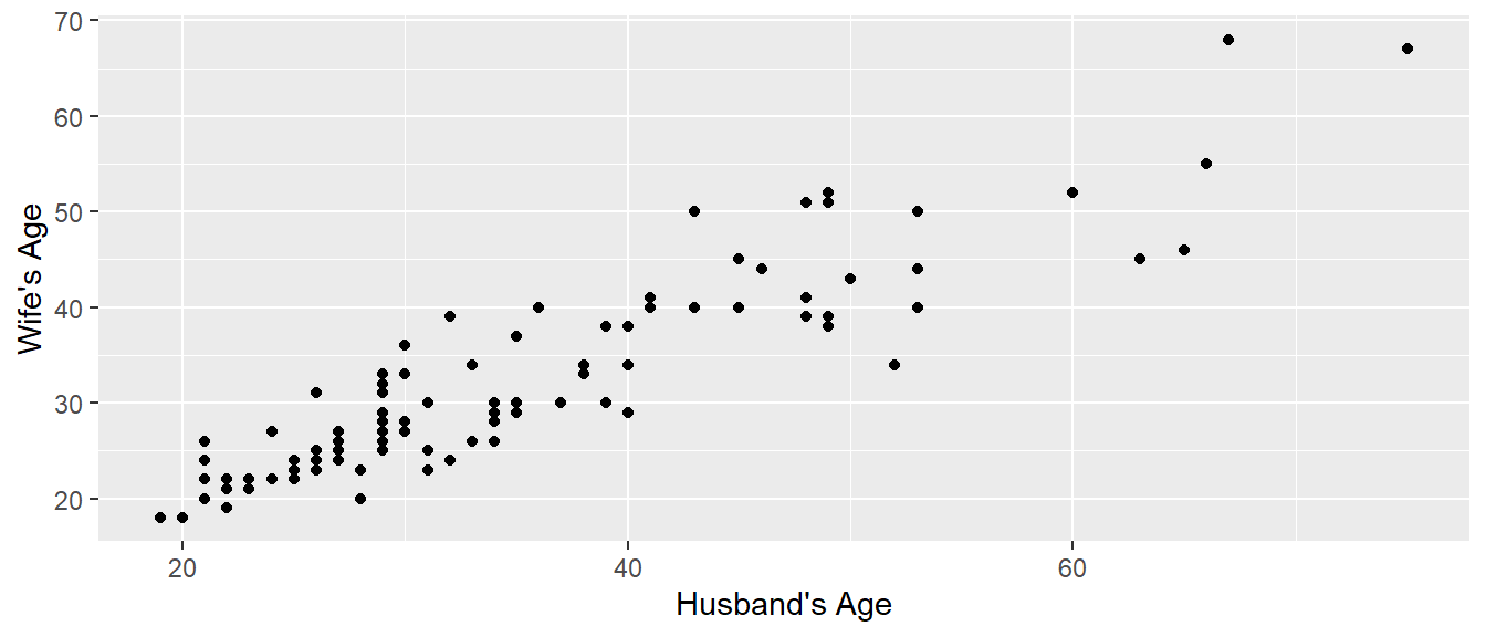
To do a paired t-test, all we need to do is calculate the difference in age for each couple and pass that into the t.test() function. This is a great use for the functionality of dplyr.
##
##  One Sample t-test
##
## data:  MarriageAges$Age_Diff
## t = 5.8025, df = 104, p-value = 7.121e-08
## alternative hypothesis: true mean is not equal to 0
## 95 percent confidence interval:
##  1.861895 3.795248
## sample estimates:
## mean of x
##  2.828571
The above shows the simple t-test output from R, but we could do the typical steps of saving the model to an object and extracting information with broom::tidy(). Alternatively, we could pass the vector of Husband ages and the vector of Wife ages into the t.test() function and tell it that the data is paired so that the first husband is paired with the first wife.
##
##  Paired t-test
##
## data:  MarriageAges$Husband and MarriageAges$Wife
## t = 5.8025, df = 104, p-value = 7.121e-08
## alternative hypothesis: true mean difference is not equal to 0
## 95 percent confidence interval:
##  1.861895 3.795248
## sample estimates:
## mean difference
##        2.828571
Either way that the function is called, the broom::tidy() function could convert the printed output into a nice data frame which can then be used in further analysis. To be clear of the results of the test above, based on the Lock5Data provided, there is significant evidence that the Husband is older than the Wife, and on average the difference in age is 2.8 years.
5.2.2 lm objects
The general linear model function lm is more widely used than t.test because lm can be made to perform a t-test and the general linear model allows for fitting more than one explanatory variable and those variables could be either categorical or continuous. Think of lm as the flexible way to build more complex linear models, but that doesn’t mean it couldn’t be used for even simple testing like a t-test!
The general work-flow will be to:
- Visualize the data
- Call
lm()using a formula to specify the model to fit. - Save the results of the
lm()to an object (model,myModel, etc.) - Use accessor functions to ask for pertinent quantities that have already been calculated.
- Store prediction values and model confidence intervals for each data point in the original data frame.
- Graph the original data along with prediction values and model confidence intervals.
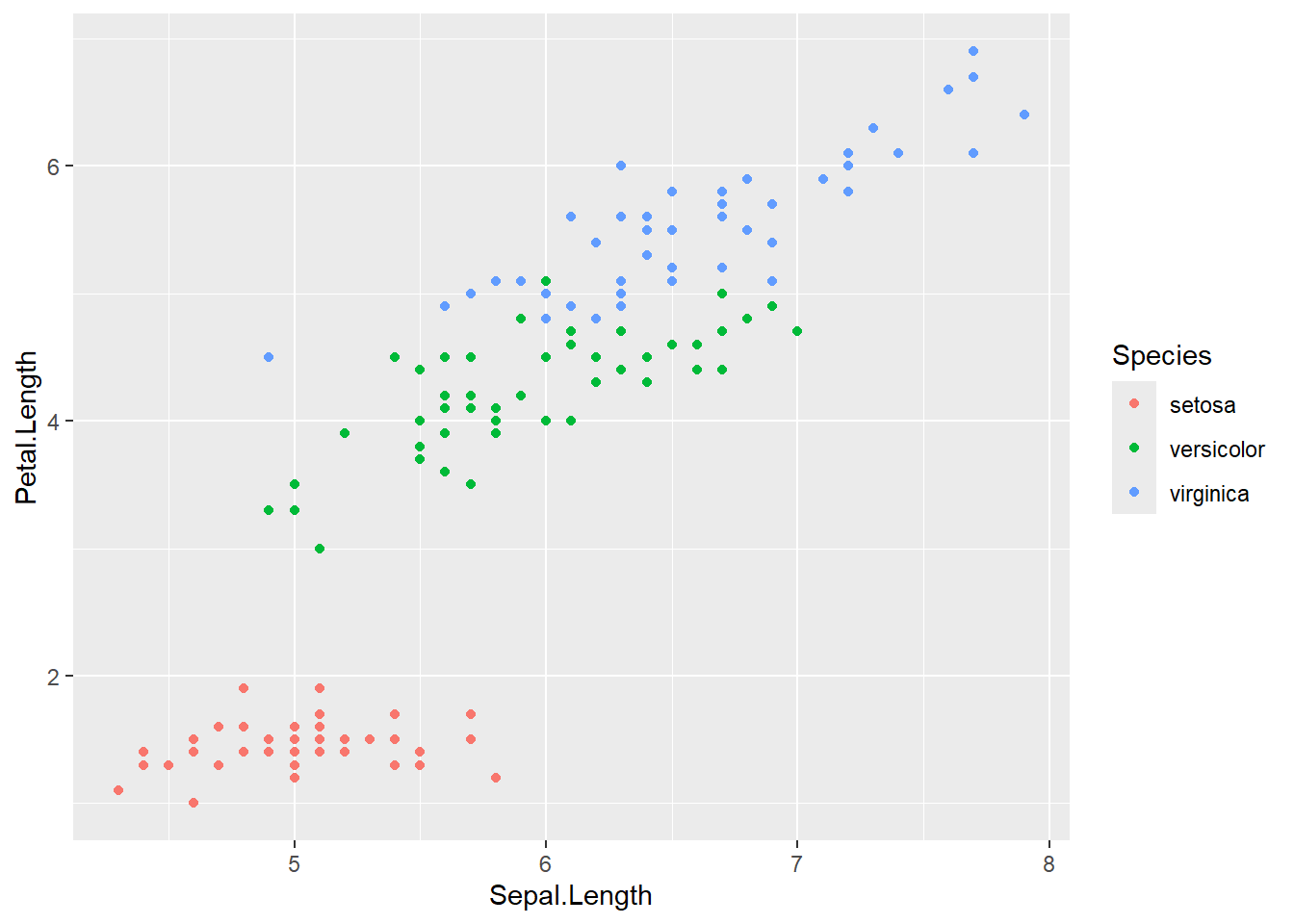
To explore this topic we’ll use the iris data set to fit a regression model to predict petal length using sepal length. The iris set is part of the base R package and doesn’t require prior loading to use. Lets start with a visualization Sepal.Length and Petal.Length colored by species. This graph should look very familiar from Chapter 3!
We will now explore a more complex model, often referred to as an interaction model. In this case, we will attempt to build a predictive model of Petal.Length based on the observed Sepal.Length and species of iris. The formula notation below introduces the interaction term between the categorical variable species and numerical variable Sepal.Length, which in turn will allow each species of iris to have its own slope. We would fit the interaction model as such:
With the model.iris object saved, we can now explore the results of the model further.
5.3 Accessor functions
Once a model has been fit, we want to obtain a variety of information from the model object. The way that we get most all of this information using base R commands is to call the summary() function which returns a list and then grab whatever we want out of that. Typically for a report, we could just print out all of the summary information and let the reader pick out the information.
##
## Call:
## lm(formula = Petal.Length ~ Sepal.Length * Species, data = iris)
##
## Residuals:
##      Min       1Q   Median       3Q      Max
## -0.68611 -0.13442 -0.00856  0.15966  0.79607
##
## Coefficients:
##                                Estimate Std. Error t value Pr(>|t|)
## (Intercept)                      0.8031     0.5310   1.512    0.133
## Sepal.Length                     0.1316     0.1058   1.244    0.216
## Speciesversicolor               -0.6179     0.6837  -0.904    0.368
## Speciesvirginica                -0.1926     0.6578  -0.293    0.770
## Sepal.Length:Speciesversicolor   0.5548     0.1281   4.330 2.78e-05 ***
## Sepal.Length:Speciesvirginica    0.6184     0.1210   5.111 1.00e-06 ***
## ---
## Signif. codes:  0 '***' 0.001 '**' 0.01 '*' 0.05 '.' 0.1 ' ' 1
##
## Residual standard error: 0.2611 on 144 degrees of freedom
## Multiple R-squared:  0.9789, Adjusted R-squared:  0.9781
## F-statistic:  1333 on 5 and 144 DF,  p-value: < 2.2e-16
There is a lot of information above! It is outside of the scope of the book to describe each of the coefficients in the output summary, but know that all of the output above is critical to properly interpreting the model and understanding the limitations/problems with the model. In general, the interaction model looks very promising and has high significant interaction terms - meaning that the different slopes per species is important to the model!
If we want to make a nice graph that includes the model’s \(R^2\) value on it, we need to code some way of grabbing particular bits of information from the model fit and wrestling into a format that we can easily manipulate it. Below is a table of many elements of a model we might want to extract and how to do so with either base R or tidymodels commands. I often find myself using some mixture of the two in real-life work, and thus believe it is important to see how both base R and tidymodels behave at this juncture.
| Goal | Base R command | tidymodels version |
|---|---|---|
| Summary table of Coefficients | summary(model)$coef |
broom::tidy(model) |
| Parameter Confidence Intervals | confint(model) |
broom::tidy(model, conf.int=TRUE) |
| Rsq and Adj-Rsq | summary(model)$r.squared |
broom::glance(model) |
| Model predictions | predict(model) |
broom::augment(model, data) |
| Model residuals | resid(model) |
broom::augment(model, data) |
| Model predictions w/ CI | predict(model, interval='confidence') |
|
| Model predictions w/ PI | predict(model, interval='prediction') |
|
| ANOVA table of model fit | anova(model) |
The package broom provides compact data frame based results and has three ways to interact with a model.
- The
tidycommand gives a nice table of the model coefficients. - The
glancefunction gives information about how well the model fits the data overall. - The
augmentfunction adds the fitted values, residuals, and other diagnostic information to the original data frame used to generate the model. Options for the confidence or prediction intervals can be included using theinterval=option for augment (this makes the table to wide for an htlm page).
As always, see the help documentation using ?augment.lm for more information on using these functions.
With a discussion of these important accessor out of the way, lets look to try and take the resulting output of model.iris and create an informative figure. First, we will want to attach the results of the model to the original iris data set in some fashion. The first method would be to use base R and attach the results of the \(95\%\) confidence interval that data frame. This could be done using either the predict() function from base R or the augment() function from broom. To first visualize what these functions do, lets run them without saving objects below.
First, recall what the first few entries of the iris data set look like.
##   Sepal.Length Sepal.Width Petal.Length Petal.Width Species
## 1          5.1         3.5          1.4         0.2  setosa
## 2          4.9         3.0          1.4         0.2  setosa
## 3          4.7         3.2          1.3         0.2  setosa
## 4          4.6         3.1          1.5         0.2  setosa
## 5          5.0         3.6          1.4         0.2  setosa
## 6          5.4         3.9          1.7         0.4  setosa
What we would like to do here is attach new columns to this data frame that relate to the resulting model. For this example we will want to attach the \(95\%\) confidence interval, which commonly has three parts: 1) fit or fitted., 2) lwr or .lower and 3) upr or .upper. The fit column refers the the best-fit line, or the expected value of the model without noise. You know this best as ‘the line that runs through the center of the data’. The confidence interval is then extracted in two parts: upr referring to the upper point of the interval and lwr referring to the lower point of the interval.
Lets first use the broom package to calculate this information using the augment() function. The augment() function takes the resulting model, along with the original data frame, and outputs a new data frame with the model information attached.
## # A tibble: 6 × 13
##   Sepal.Length Sepal.Width Petal.Length Petal.Width Species .fitted .lower
##          <dbl>       <dbl>        <dbl>       <dbl> <fct>     <dbl>  <dbl>
## 1          5.1         3.5          1.4         0.2 setosa     1.47   1.40
## 2          4.9         3            1.4         0.2 setosa     1.45   1.37
## 3          4.7         3.2          1.3         0.2 setosa     1.42   1.32
## 4          4.6         3.1          1.5         0.2 setosa     1.41   1.30
## 5          5           3.6          1.4         0.2 setosa     1.46   1.39
## 6          5.4         3.9          1.7         0.4 setosa     1.51   1.40
##   .upper  .resid   .hat .sigma  .cooksd .std.resid
##    <dbl>   <dbl>  <dbl>  <dbl>    <dbl>      <dbl>
## 1   1.55 -0.0744 0.0215  0.262 0.000303     -0.288
## 2   1.52 -0.0480 0.0218  0.262 0.000129     -0.186
## 3   1.52 -0.122  0.0354  0.262 0.00138      -0.475
## 4   1.52  0.0914 0.0471  0.262 0.00106       0.359
## 5   1.53 -0.0612 0.0200  0.262 0.000191     -0.237
## 6   1.62  0.186  0.0455  0.262 0.00423       0.730
Notice I am starting to get a bit trickier with my syntax, and as to not explode our screen with data output, I piped to a head() to show only the first 6 rows - remember this does not save the desired result to an object so I cannot use this information for later calculations! Observe that the augment() function includes all the information from the original iris data set, but now also includes columns for the best-fit line and confidence intervals. If augment() has one negative, it might be that it provides too many new columns, each has relevance in a statistical analysis, but for now, we have little use for the .resid, .hat, .sigma, .coodsd, and .std.resid columns. Just know that each of these is important in diagnosing the ‘goodness’ of the model.
We could gather the same information using base R commands through the predict() function. It is important to introduce the predict() function as this shows up in a variety of manners within statistical modeling. We can calculate the information for the confidence interval using the following:
##        fit      lwr      upr
## 1 1.474373 1.398783 1.549964
## 2 1.448047 1.371765 1.524329
## 3 1.421721 1.324643 1.518798
## 4 1.408558 1.296579 1.520536
## 5 1.461210 1.388211 1.534210
## 6 1.513863 1.403776 1.623950
Notice though that predict doesn’t immediately attach the data to the original data frame. To attach the results of the confidence interval and best-fit line to the original iris data, we need to use some dplyr tools. The code below removes any previously attached fit, lwr, and upr columns, then binds on new columns based on the output of predict(). This is two steps to obtain the same information as the augment() command above, but can be done seamlessly in a pipeline.
# Remove any previous model prediction values that I've added,
# and then add the model predictions
iris <- iris %>%
  dplyr::select( -matches('fit'), -matches('lwr'), -matches('upr') ) %>%
  cbind( predict(model.iris, newdata=., interval='confidence') )
head(iris)
## Sepal.Length Sepal.Width Petal.Length Petal.Width Species fit lwr
## 1 5.1 3.5 1.4 0.2 setosa 1.474373 1.398783
## 2 4.9 3.0 1.4 0.2 setosa 1.448047 1.371765
## 3 4.7 3.2 1.3 0.2 setosa 1.421721 1.324643
## 4 4.6 3.1 1.5 0.2 setosa 1.408558 1.296579
## 5 5.0 3.6 1.4 0.2 setosa 1.461210 1.388211
## 6 5.4 3.9 1.7 0.4 setosa 1.513863 1.403776
## upr
## 1 1.549964
## 2 1.524329
## 3 1.518798
## 4 1.520536
## 5 1.534210
## 6 1.623950Now that the fitted values that define the regression lines and the associated confidence interval band information have been added to the iris data set, we can now plot the raw data and the regression model predictions.
ggplot(iris, aes(x=Sepal.Length, color=Species)) +
  geom_point( aes(y=Petal.Length) ) +
  geom_line( aes(y=fit) ) +
  geom_ribbon( aes( ymin=lwr, ymax=upr, fill=Species), alpha=.3 )   # alpha is the ribbon transparency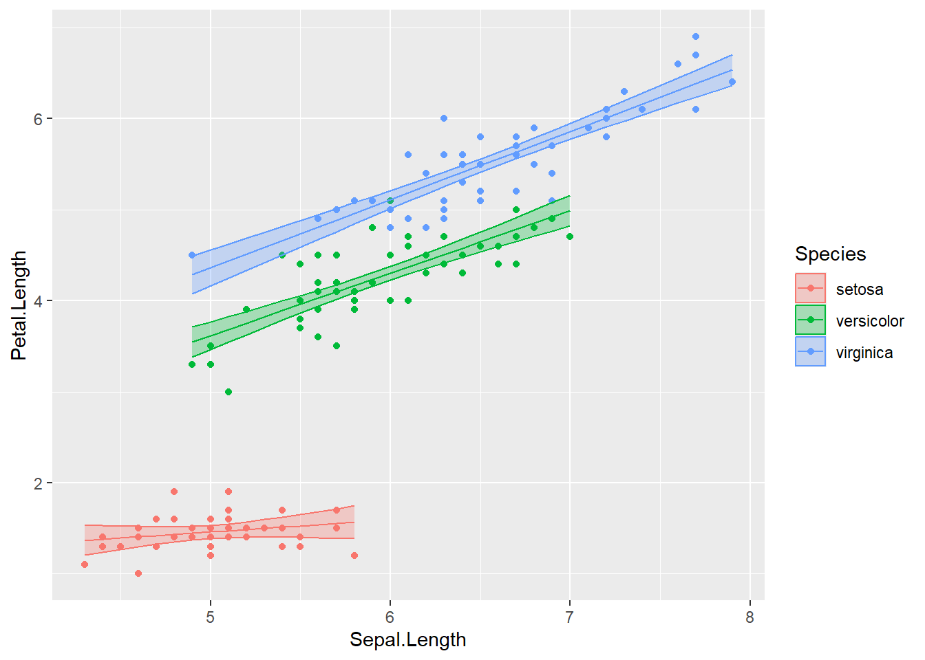
Now to add the R-squared value to the graph, we need to add a simple text layer. To do that, I’ll make a data frame that has the information, and then add the x and y coordinates for where it should go.
Rsq_string <-
  broom::glance(model.iris) %>%
  select(r.squared) %>%
  mutate(r.squared = round(r.squared, digits=3)) %>%   # only 3 digits of precision
  mutate(r.squared = paste('Rsq =', r.squared)) %>%    # append some text before
  pull(r.squared)

ggplot(iris, aes(x=Sepal.Length, y=Petal.Length, color=Species)) +
  geom_point(  ) +
  geom_line( aes(y=fit)  ) +
  geom_ribbon( aes( ymin=lwr, ymax=upr, fill=Species), alpha=.3 ) +   # alpha is the ribbon transparency
  annotate('label', label=Rsq_string, x=7, y=2, size=7)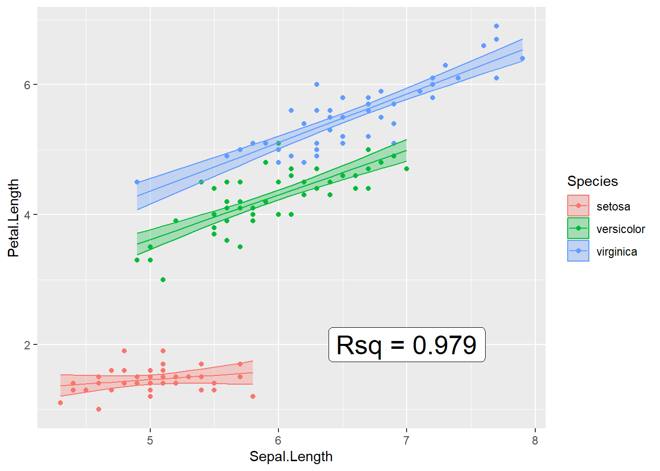
5.4 Exercises
Exercise 1
Using the trees data frame that comes pre-installed in R, we will fit the regression model that uses the tree Height as a predictor to explain the Volume of wood harvested from the tree. We will then plot our model with some of the information of the regression model on the graph.
a) Graph the data
b) Fit a lm model using the command model <- lm(Volume ~ Height, data=trees).
c) Print out the table of coefficients with estimate names, estimated value, standard error, and upper and lower \(95\%\) confidence intervals.
d) Add the model fitted values to the trees data frame along with the confidence interval.
e) Graph the data including now the fitted regression line and confidence interval ribbon.
f) Add the R-squared value as an annotation to the graph.
Exercise 2
The data set phbirths from the faraway package contains information on birth weight, gestational length, and smoking status of mother. We’ll fit a quadratic model to predict infant birth weight using the gestational time.
a) Create two faceted scatter plots of gestational length and birth weight, one for each smoking status.
b) Remove all the observations that are premature (less than 36 weeks).
For the remainder of the problem, only use full-term births (greater than or equal to 36 weeks).
c) Fit the quadratic model
d) Add the model fitted values to the phbirths data frame along with the regression model confidence intervals.
e) Improve your graph from part (a) by adding layers for the model fits and confidence interval ribbon for the model fits.
f) Create a column for the residuals in the phbirths data set using any of the following (you only need one):
phbirths$residuals = resid(model)
phbirths <- phbirths %>% mutate( residuals = resid(model) )
phbirths <- broom::augment(model, phbirths)
g) Create a histogram of the residuals.