Chapter 3 Graphing
In this chapter you will learn more about the ggplot2 package, part of the tidyverse suite of packages.
Dr. Sonderegger’s Video Companion: Video Lecture.
3.1 Introduction to ggplot2 graphics
There are three major “systems” of making graphs in R. The basic plotting commands in R are quite effective but the commands do not have a way of being combined in easy ways, often requiring loops or functions to produce complex multi-layered graphs. Lattice graphics (which the mosaic package uses) makes it possible to create some quite complicated graphs but it is very difficult to make non-standard graphs. The package we will focus on here, ggplot2, tries to not anticipate what the user wants to do, but rather provide the mechanisms for pulling together different graphical concepts and the user gets to decide which elements to combine. This will allow a user to create almost any graphic of interest.
To make the most of ggplot2 it is important to wrap your mind around “The Grammar of Graphics”. Briefly, the act of building a graph can be broken down into three steps.
Define what data set we are using.
What is the major relationship we wish to examine?
In what way should we present that relationship? These relationships can be presented in multiple ways, and the process of creating a good graph relies on building layers upon layers of information.
For example, after preparing a proper data frame for the analysis, we may want to present a linear model result including both the data, best-fit line, and other statistical intervals (confidence, prediction). We might start with printing the raw data as a scatter graphic. We can then add additional layers such as an overlay of the regression line over the top of the scatter. We can then continue this thinking for as many layers as we want, producing a final graphic that conveys important information clearly.
By producing code that outputs these graphics, we can then introduce small changes as needed to improve them as our needs grow. Although the first version of the graph may take some time to prepare, once code is stored in a script, it becomes easy to update and improve the graphic over time. This is an essential part of work that is done in research laboratories or for publications, and being able to easily handle the updates needed to a graphic can not only save time, but help you prepare the exact graphic needed to tell your story!
Next, it should be noted that ggplot2 is designed to act on data frames. It is actually hard to just draw three data points and for simple graphs it might be easier to use the base graphing system in R. However for any real data analysis project, the data will already be in a data frame and this is not an annoyance. Throughout this textbook, you will become very comfortable with formatting data into data frames.
These notes are sufficient for creating simple graphs using ggplot2, but are not intended to be exhaustive. There are many places online to get help with ggplot2. One very nice resource is the website, http://www.cookbook-r.com/Graphs/, which gives much of the information available in the textbook R Graphics Cookbook which I highly recommend. Second is just using Google to solve your problems and see what you can find on websites such as StackExchange. As you become more advanced in your knowledge of preparing figures through ggplot2, generative AI sources such as chatGPT can help produce the syntax outline that you can then manipulate to create the exact graphic of interest.
One way that ggplot2 makes it easy to form very complicated graphs is that it provides a large number of basic building blocks that, when stacked upon each other, can produce extremely complicated graphs. A full list is available at https://ggplot2.tidyverse.org/reference/. The following list gives some idea of different building blocks that are most commonly used. These different geometries offer different ways to display the relationship between variables and can be combined in many interesting ways. We will explore several geometries in this chapter and future graphing chapters.
| Geom | Description | Required Aesthetics |
|---|---|---|
geom_histogram |
A histogram | x |
geom_bar |
A barplot (y is number of rows) | x |
geom_col |
A barplot (y is given by a column) | x, y |
geom_density |
A density plot of data. (smoothed histogram) | x |
geom_boxplot |
Boxplots | x, y |
geom_line |
Draw a line (after sorting x-values) | x, y |
geom_path |
Draw a line (without sorting x-values) | x, y |
geom_point |
Draw points (for a scatterplot) | x, y |
geom_smooth |
Add a ribbon that summarizes a scatterplot | x, y |
geom_ribbon |
Enclose a region, and color the interior | ymin, ymax |
geom_errorbar |
Error bars | ymin, ymax |
geom_text |
Add text to a graph (with box) | x, y, label |
geom_label |
Add text to a graph (without box) | x, y, label |
geom_tile |
Create Heat map | x, y, fill |
A graph can be built up layer by layer, where:
- Each layer corresponds to a geometry (
geom), each of which requires a data set and a mapping between an aesthetic (aes) and a column of the data set.- If you don’t specify the data or aesthetic within a geometry, then the layer inherits everything defined in the primary
ggplot()command. - You can have different data sets for each layer!
- If you don’t specify the data or aesthetic within a geometry, then the layer inherits everything defined in the primary
- Layers can be added with a
+, or you can define two plots and add them together (second one over-writes anything that conflicts).
3.2 Basic Graphs
3.2.1 Scatterplots
To start with, we’ll make a very simple scatterplot using the iris data set. The iris data set contains observations on three species of iris plants where we’ve measured the length and width of both the petals and sepals. We will make a scatterplot of Sepal.Length versus Petal.Length, which are two columns in the data set. First, lets recall how to load a data set into our local environment. We then show the structure (str) of the data set to understand its data types and get a clear listing of the variables present in the data frame
data(iris)  # load the iris data set that comes with R
str(iris)   # what columns do we have to play with...
## 'data.frame': 150 obs. of 5 variables:
## $ Sepal.Length: num 5.1 4.9 4.7 4.6 5 5.4 4.6 5 4.4 4.9 ...
## $ Sepal.Width : num 3.5 3 3.2 3.1 3.6 3.9 3.4 3.4 2.9 3.1 ...
## $ Petal.Length: num 1.4 1.4 1.3 1.5 1.4 1.7 1.4 1.5 1.4 1.5 ...
## $ Petal.Width : num 0.2 0.2 0.2 0.2 0.2 0.4 0.3 0.2 0.2 0.1 ...
## $ Species : Factor w/ 3 levels "setosa","versicolor",..: 1 1 1 1 1 1 1 1 1 1 ...We then make our first graphic using a single line of ggplot2 syntax.
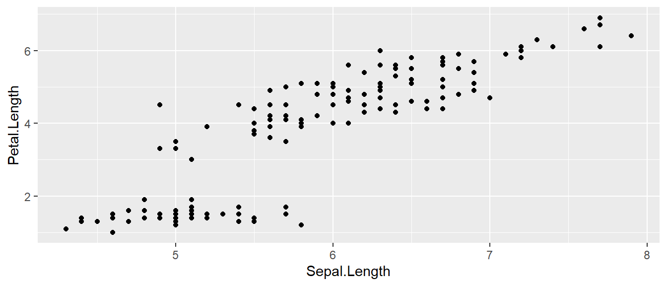
- All ggplot graphics start with the
ggplot()command. - The data set we wish to use is specified using
data=iris. - The relationship we want to explore is
x=Sepal.Lengthandy=Petal.Length. This means the x-axis will be the Sepal Length and the y-axis will be the Petal Length. To use data directly from the initial data frame, we must always include this mapping within theaes()command. - The way we want to display this relationship is through graphing 1 point for every observation (scatter). Thus we map this information into the scatter graph geometry known as
geom_point().
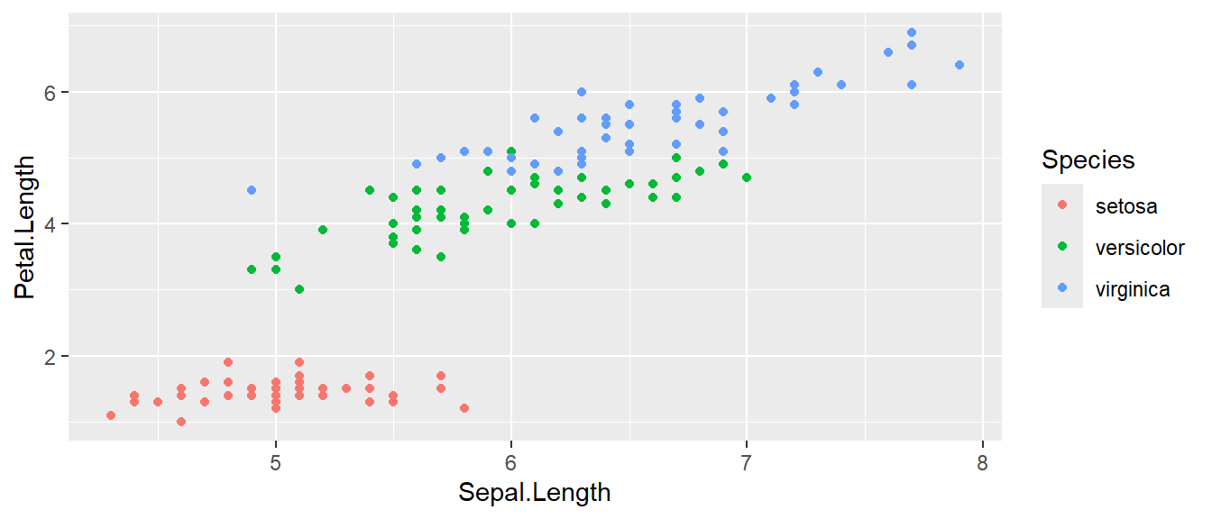
We can define other attributes that might reflect other aspects of the data. For example, we might want for the color of the data point to change dynamically based on the species of iris. We can update our graph by including a second aesthetic (aes()) within the geom_point() specifically. Below we add a color option based on the species of iris. Notice below that by coloring the graph by species, we gain significant new information regarding how differences between the iris species.
Let’s take a moment to think about the aes() command inside the previous section of code, which can be quite mysterious to new users. The way to think about the aes() is that it gives you a way to define relationships that are dependent on the data frame (here data=iris). In the previous graph, the x-value and y-value for each point was defined dynamically by the data, as was the color. If we just wanted all the data points to be colored blue and larger, then the following code would do that
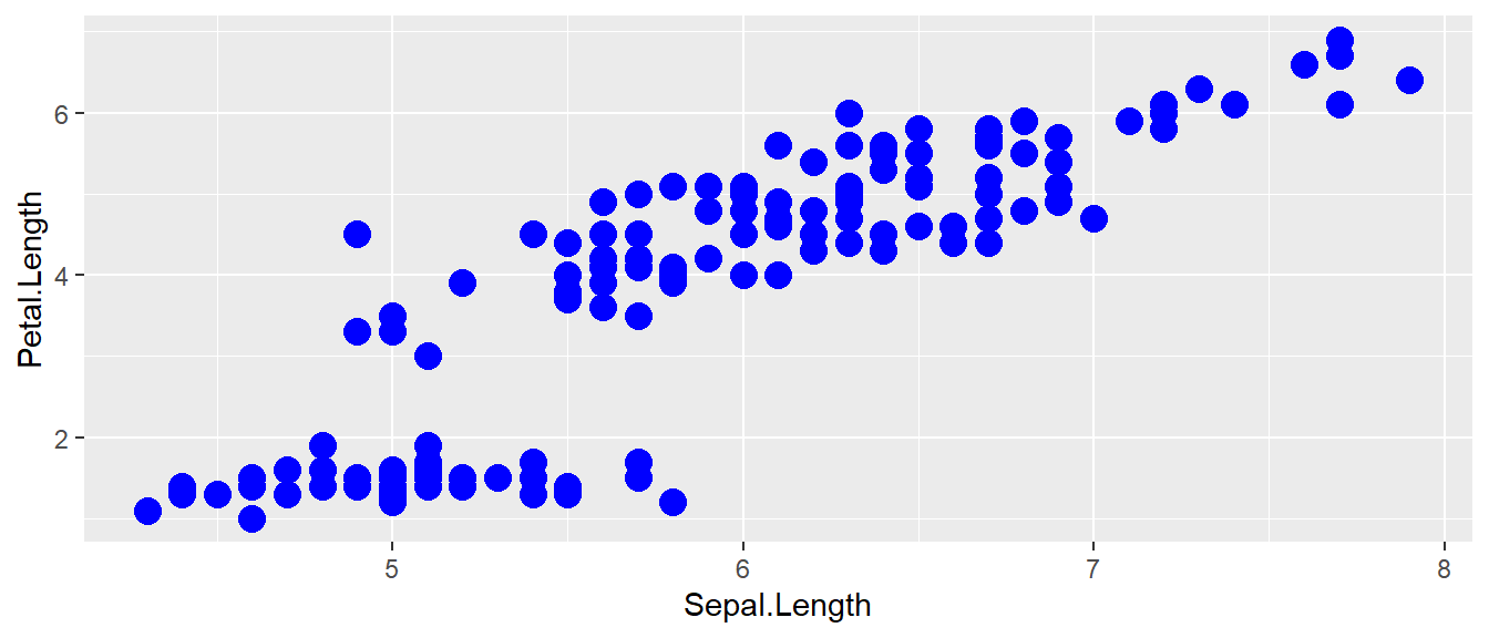
The important part isn’t that color and size were defined in the geom_point() but that they were defined outside of an aes() function! Notice though by removing the dependence to the species, we have lost the ability to see how different each species behaves!
A few quick notes on the use of aesthetics:
- Anything set inside an
aes()command will be of the formattribute=Column_Nameand will change based on the data. We must always use theaes()command to extract information from the data frame. - Anything set outside an
aes()command will be in the formattribute=valueand will be fixed. This is used for static information that doesn’t depend on the data frame.
3.2.2 Box Plots
Boxplots are a common way to show a categorical variable on the x-axis and continuous on the y-axis. Lets evaluate the distribution of Petal.Length versus the Species of iris. The syntax works very similar to above, but now we will map the information into a boxplot geometry.
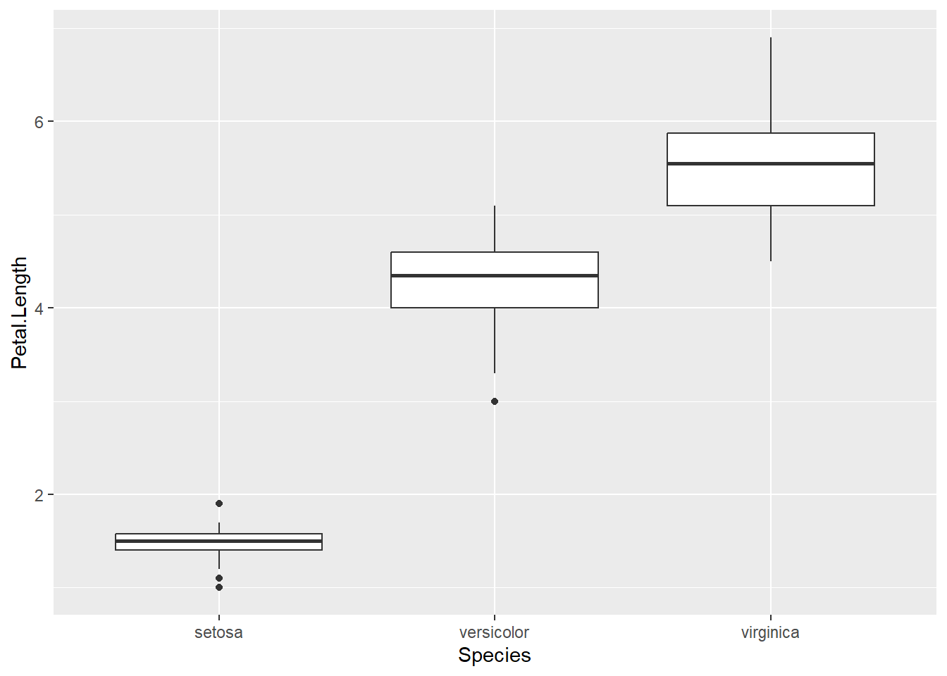
The boxes show the \(25^{th}\), \(50^{th}\), and \(75^{th}\) percentile and the lines coming off the box extend to the smallest and largest non-outlier observation. Boxplots are important for viewing information across different categorical groupings, and are often related to ANOVA-type statistical analyses. We will explore boxplots further in later chapters, as they are very common in all fields!
3.3 Faceting
The goal with faceting is to make many panels of graphics where each panel represents the same relationship between variables, but something changes between each panel. For example using the iris data set we could look at the relationship between Sepal.Length and Petal.Length again, but now instead of placing all information with color on a single graph, we can make one panel per species. Faceting allows for the introduction of even more variables within a single graph!
library(ggplot2)
ggplot(iris, aes(x=Sepal.Length, y=Petal.Length)) +
  geom_point() +
  # facet_grid( cols = vars(Species) ) # using vars() to dictate columns
  # facet_grid( rows = vars(Species) ) #using vars() to dictate rows
  facet_grid( . ~ Species ) # Formula notation y ~ x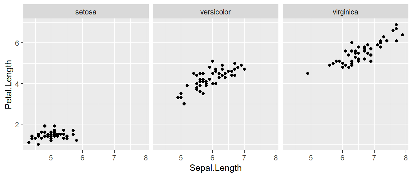
The line facet_grid( formula ) tells ggplot2 to make panels, and the formula tells how to orient the panels. In R, formulas are always interpreted in the order y ~ x. Because I want the species to change as we go across a page (horizontally, commonly called the x-direction on a 2D-graph), but don’t have anything I want to change vertically (y-direction) we use . ~ Species to represent that. If we had wanted three graphs stacked vertically instead, we could use Species ~ .. Additional code is provided that allows the user to more specifically define columns (cols = vars(Species)). This syntax provides more control over the x- and y-direction, but the formula notation should become more familiar with experience in R.
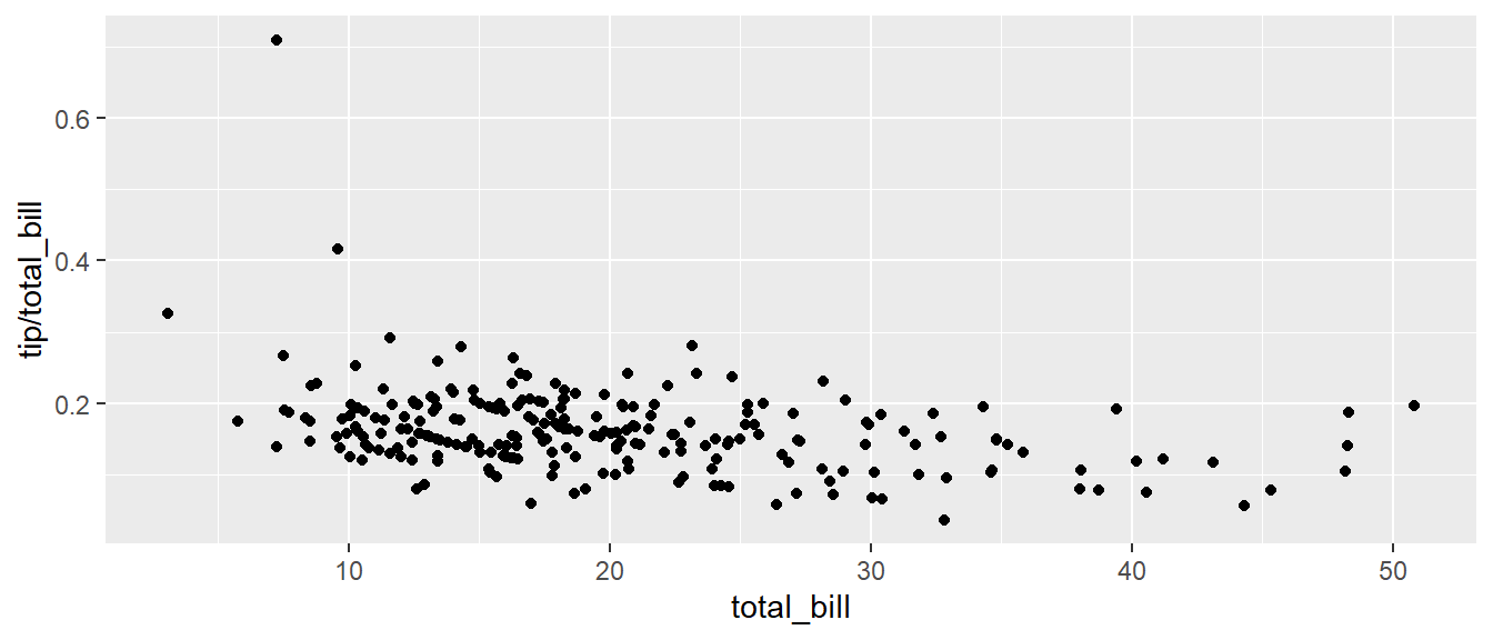
For a second example, we look at a data set that examines the amount a waiter was tipped by 244 different parties. Covariates that were measured include the day of the week, size of the party, total amount of the bill, amount tipped, whether there were smokers in the group and the gender of the person paying the bill. Like always, lets load the data and explore the variables a bit, here we output the first 6 rows using the head() function.
##   total_bill  tip    sex smoker day   time size
## 1      16.99 1.01 Female     No Sun Dinner    2
## 2      10.34 1.66   Male     No Sun Dinner    3
## 3      21.01 3.50   Male     No Sun Dinner    3
## 4      23.68 3.31   Male     No Sun Dinner    2
## 5      24.59 3.61 Female     No Sun Dinner    4
## 6      25.29 4.71   Male     No Sun Dinner    4
It is easy to look at the relationship between the size of the bill and the percent tipped. We use the flexible syntax of R to calculate the percent tip directly within the aes() command. We then plot the total bill against the tip/total_bill ratio (or percent tipped).
Next we investigate if there is a difference in tipping percent based on gender or day of the week by plotting this relationship for each combination of gender and day.
ggplot(tips, aes(x = total_bill, y = tip / total_bill, color=time )) +
geom_point( ) +
# facet_grid( day ~ sex ) # changing orientation emphasizes certain comparisons!
facet_grid( sex ~ day )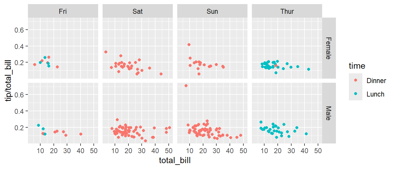
It doesn’t seem there is much difference between the genders, but we would like to investigate the relation to day of week further. Sometimes we want multiple rows and columns of the facets, but there is only one categorical variable with many levels. Rather than making the graph grow very long either horizontally or vertically, we use facet_wrap() which takes a one-sided formula and will wrap in both the x- and y-directions automatically.
ggplot(tips, aes(x = total_bill, y = tip / total_bill )) +
geom_point() +
# facet_grid( . ~ day) # Four graphs in a row, Too Squished left/right!
facet_wrap( ~ day ) # spread graphs out both left/right and up/down.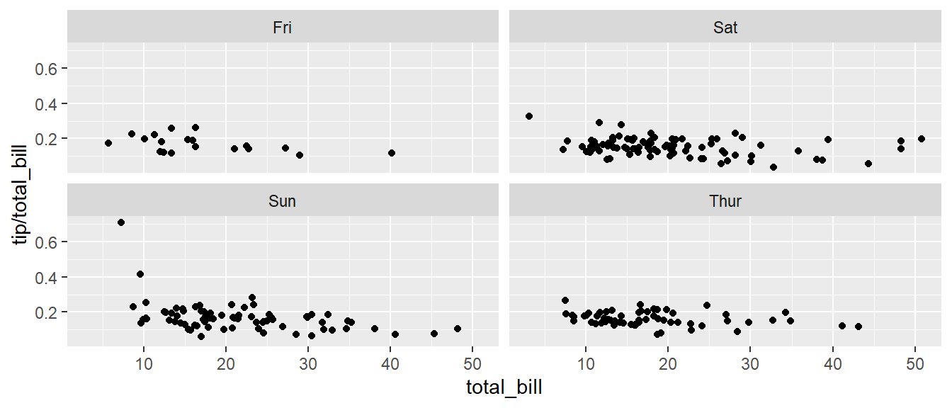
Finally we can allow the x and y scales to vary between the panels by setting “free”, “free_x”, or “free_y”. In the following code, the y-axis scale changes for each day in the data set.
ggplot(tips, aes(x = total_bill, y = tip / total_bill )) +
  geom_point() +
  facet_wrap( . ~ day, scales="free_y" )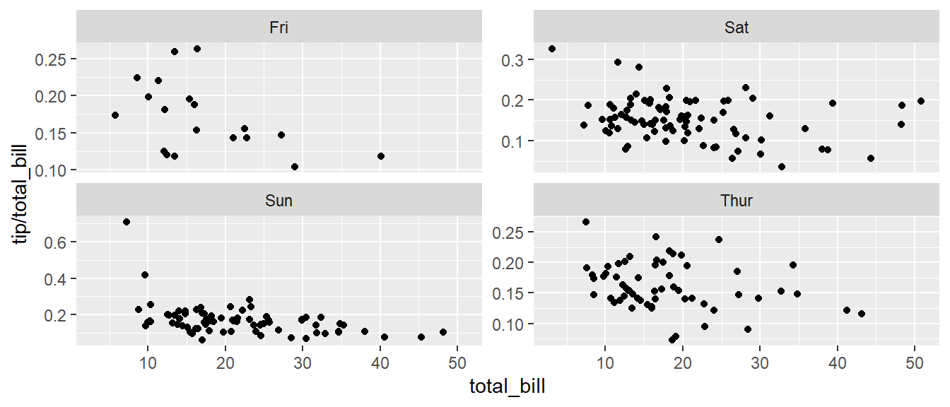
3.4 Annotation
3.4.1 Axis Labels and Titles
To make a graph more understandable, it is necessary to tweak the axis labels and add a main title and such. Lets return to the iris data set example, but improve the quality of our scatter graph. The code below introduces lots of new syntax that changes the written text in many areas of the graph. You could either call the labs() command repeatedly with each label, or you could provide multiple arguments to just one labs() call. For readability, the lines have been separated in the code below.
# Assign the graph to the object 'p' allowing us to add more later.
P <-
  ggplot( data=iris, aes(x=Sepal.Length, y=Petal.Length, color=Species) ) +
  geom_point( ) +
  labs( title='Sepal Length vs Petal Length' ) +
  labs( x="Sepal Length (cm)", y="Petal Length (cm)" ) +
  labs( color="Species Name")  +
  labs( caption = "Iris data from Edgar Anderson (1935)" )

# Print out the plot
P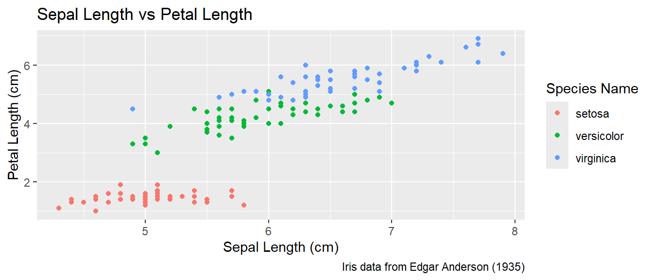
3.4.2 Text Labels
One way to improve the clarity of a graph is to remove the legend and, instead, label the points directly on the graph. For example, we could instead have the species names near the cloud of data points for the species.
Usually our annotations aren’t stored in the data frame that contains our data of interest. So we need to either create a new (usually small) data frame that contains all the information needed to create the annotation or we need to provide all necessary information within the syntax. It is encouraged to make additional, smaller data frames, that store auxiliary information such as annotations as these can be easily changed without interfering with the syntax making the graphs. Either way, we need to specify the x and y coordinates, and the label to be printed, as well as any other attribute that is set in the global aes() command. That means if color has been set globally, the annotation layer also needs to address the color attribute.
3.4.2.1 Using a data frame
To do this in ggplot, we need to make a data frame that has the columns Sepal.Length and Petal.Length so that we can specify where each label should go, as well as the label that we want to print. This is essentially indicating where on the x-y graph the text should be located. Also, because color is matched to the Species column, this small data set should also have a the Species column.
This step always requires a bit of fussing with the graph because the text size and location should be chosen based on the size of the output graphic and if I rescale the image it often looks awkward. Typically I leave this step until the figure is being prepared for final publication.
# create another data frame that has the text labels I want to add to the graph.
annotation.data <- data.frame(
  Sepal.Length = c(4.5,  6.5,  7.0),  # Figured out the label location by eye.
  Petal.Length = c(2.25, 3.75, 6.5),  # If I rescale the graph, I would redo this step.
  Species = c('setosa', 'versicolor', 'virginica'),
  Text = c('SETOSA', 'VERSICOLOR', 'VIRGINICA')
)

# Use the previous plot I created, along with the
# aes() options already defined.
P +
  geom_text( data=annotation.data, aes(label=Text), size=2.5) +   # write the labels
  theme( legend.position = 'none' )                               # remove the legend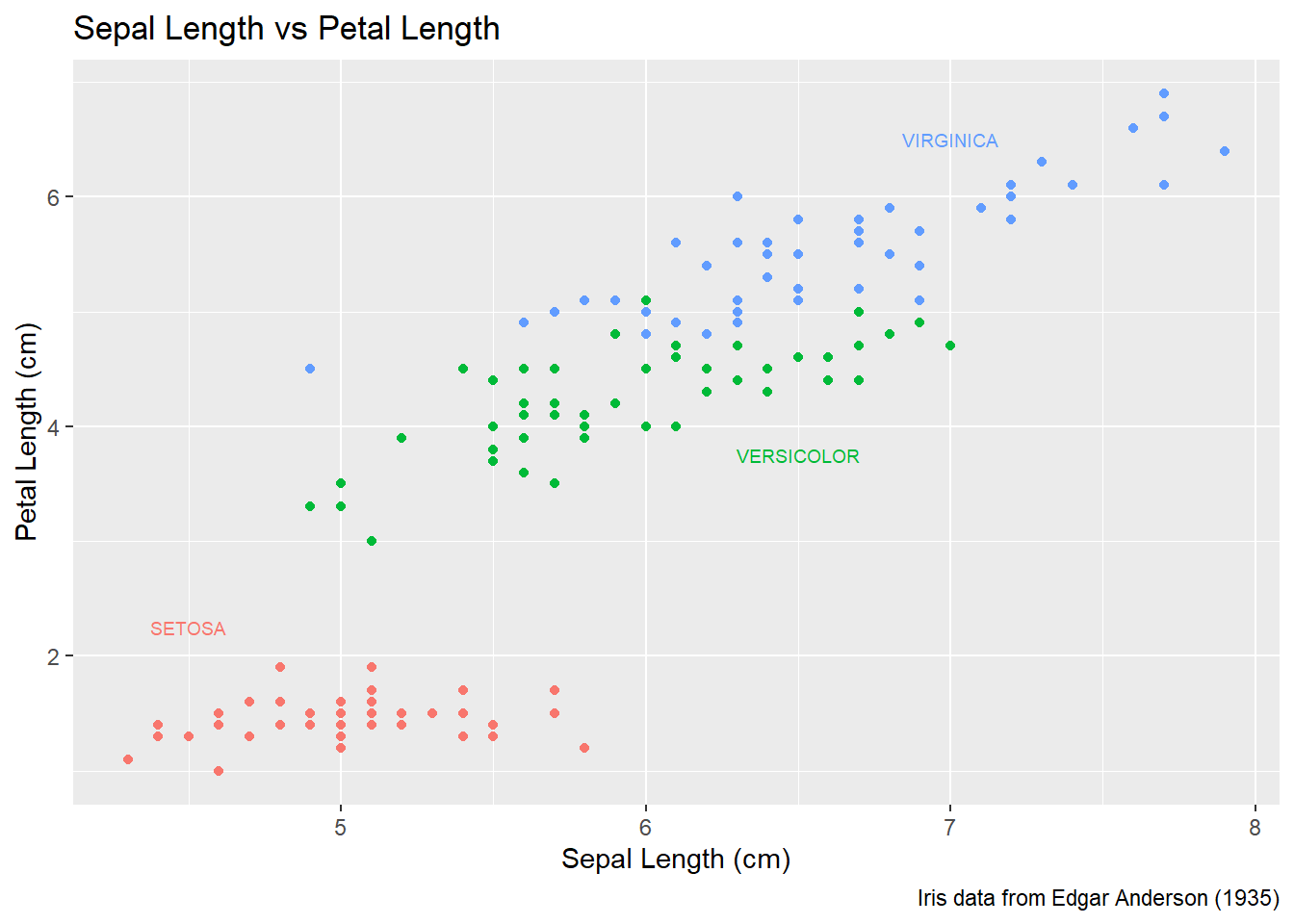
3.4.2.2 Setting attributes in-line
Instead of creating a new data frame, we could just add a new layer and set all of the graph attributes manually. To do this, we have to have one layer for each text we want to add to the graph. The annotate() function takes a geometry layer type, here we use the geom_text layer to place the information on the graph. We must provide all necessary inputs for each line, but by doing this work manual we can avoid the annoyance of building a data frame for the label information.
P +
  annotate('text', x=4.5, y=2.25, size=6, color='#F8766D', label='SETOSA'     ) +
  annotate('text', x=6.5, y=3.75, size=6, color='#00BA38', label='VERSICOLOR' ) +
  annotate('text', x=7.0, y=6.50, size=6, color='#619CFF', label='VIRGINICA'  ) +
  theme(legend.position = 'none')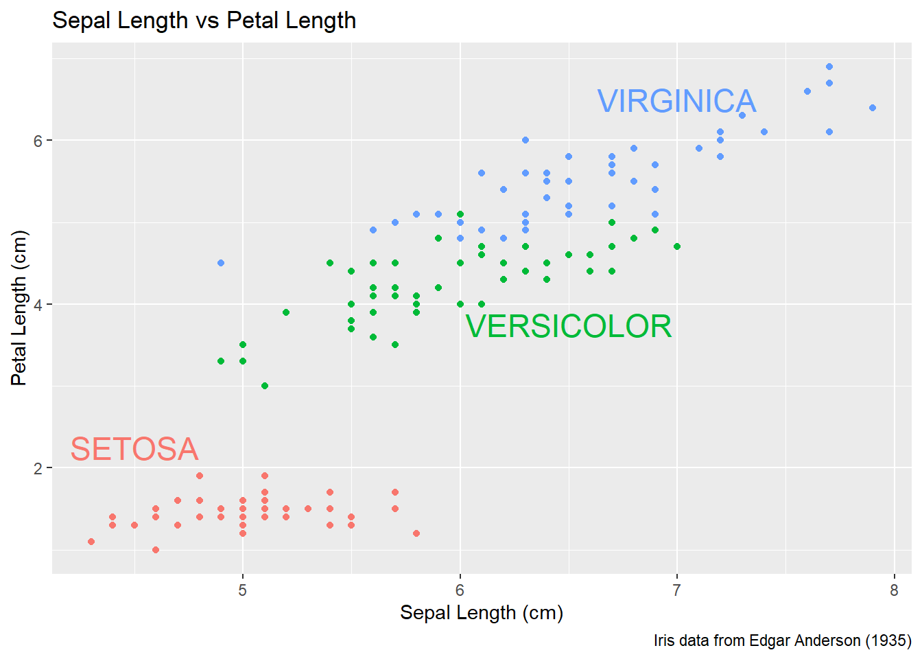
Finally there is a geom_label layer that draws a nice box around what you want to print.
P +
  annotate('label', x=4.5, y=2.25, size=6, color='#F8766D', label='SETOSA'     ) +
  annotate('label', x=6.5, y=3.50, size=6, color='#00BA38', label='VERSICOLOR' ) +
  annotate('label', x=7.0, y=6.75, size=6, color='#619CFF', label='VIRGINICA'  ) +
  theme(legend.position = 'none')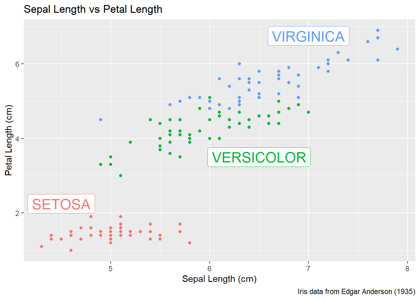
My recommendation is to just set the x, y, and label attributes manually inside an annotate() call if you have one or two annotations to print on the graph. If you have many annotations to print, then create a data frame that contains all of the required information and use data= argument.
3.5 Exercises
Exercise 1
Examine the data set trees, which should already be pre-loaded. Look at the help file using ?trees for more information about this data set. We wish to build a scatter plot that compares the height and girth of these cherry trees to the volume of lumber that was produced.
a) Create a graph using ggplot2 with Height on the x-axis, Volume on the y-axis, and Girth as the either the size of the data point or the color of the data point. Which do you think is a more intuitive representation?
b) Add appropriate labels for the main title and the x and y axes.
c) The R-squared value for a regression through these points is 0.36 and the p-value for the statistical significance of height is 0.00038. Add text labels “R-squared = 0.36” and “p-value = 0.0004” somewhere on the graph.
Exercise 2
Consider the following small data set that represents the number of times per day my wife played “Ring around the Rosy” with my daughter relative to the number of days since she has learned this game. The column yhat represents the best fitting line through the data, and lwr and upr represent a 95% confidence interval for the predicted value on that day. Because these questions ask you to produce several graphs and evaluate which is better and why, please include each graph and response with each sub-question.
Rosy <- data.frame(
  times = c(15, 11, 9, 12, 5, 2, 3),
  day   = 1:7,
  yhat  = c(14.36, 12.29, 10.21, 8.14, 6.07, 4.00,  1.93),
  lwr   = c( 9.54,  8.5,   7.22, 5.47, 3.08, 0.22, -2.89),
  upr   = c(19.18, 16.07, 13.2, 10.82, 9.06, 7.78,  6.75))
a) Using ggplot() and geom_point(), create a scatterplot with day along the x-axis and times along the y-axis.
b) Add a line to the graph where the x-values are the day values but now the y-values are the predicted values which we’ve called yhat. Notice that you have to set the aesthetic y=times for the points and y=yhat for the line. Because each geom_ will accept an aes() command, you can specify the y attribute to be different for different layers of the graph.
c) Add a ribbon that represents the confidence region of the regression line. The geom_ribbon() function requires an x, ymin, and ymax columns to be defined. For examples of using geom_ribbon() see the online documentation: https://ggplot2.tidyverse.org/reference/geom_ribbon.html.
ggplot(Rosy, aes(x=day)) +
  geom_point(aes(y=times)) +
  geom_line( aes(y=yhat)) +
  geom_ribbon( aes(ymin=lwr, ymax=upr), fill='salmon')
d) What happened when you added the ribbon? Did some points get hidden? If so, why?
e) Reorder the statements that created the graph so that the ribbon is on the bottom and the data points are on top and the regression line is visible.
f) The color of the ribbon fill is ugly. Use Google to find a list of named colors available to ggplot2. For example, I googled “ggplot2 named colors” and found the following link: http://sape.inf.usi.ch/quick-reference/ggplot2/colour. Choose a color for the fill that is pleasing to you.
g) Add labels for the x-axis and y-axis that are appropriate along with a main title.
Exercise 3
We’ll next make some density plots that relate several factors towards the birth weight of a child. Because these questions ask you to produce several graphs and evaluate which is better and why, please include each graph and response with each sub-question.
a) The MASS package contains a data set called birthwt which contains information about 189 babies and their mothers. In particular there are columns for the mother’s race and smoking status during the pregnancy. Load the birthwt by either using the data() command or loading the MASS library.
b) Read the help file for the data set using MASS::birthwt. The covariates race and smoke are not stored in a user friendly manner. For example, smoking status is labeled using a 0 or a 1. Because it is not obvious which should represent that the mother smoked, we’ll add better labels to the race and smoke variables. For more information about dealing with factors and their levels, see the Factors chapter in these notes.
library(tidyverse)
data('birthwt', package='MASS')
birthwt <- birthwt %>% mutate(
  race  = factor(race,  labels=c('White','Black','Other')),
  smoke = factor(smoke, labels=c('No Smoke', 'Smoke')))
c) Graph a histogram of the birth weights bwt using ggplot(birthwt, aes(x=bwt)) + geom_histogram().
d) Make separate graphs that denote whether a mother smoked during pregnancy by appending + facet_grid() command to your original graphing command.
e) Perhaps race matters in relation to smoking. Make our grid of graphs vary with smoking status changing vertically, and race changing horizontally (that is the formula in facet_grid() should have smoking be the y variable and race as the x).
f) Remove race from the facet grid, (so go back to the graph you had in part d). I’d like to next add an estimated density line to the graphs, but to do that, I need to first change the y-axis to be density (instead of counts), which we do by using aes(y=..density..) in the ggplot() aesthetics command.
g) Next we can add the estimated smooth density using the geom_density() command.
h) To really make this look nice, lets change the fill color of the histograms to be something less dark, lets use fill='cornsilk' and color='grey60'. To play with different colors that have names, check out the following: https://www.datanovia.com/en/blog/awesome-list-of-657-r-color-names/.
i) Change the order in which the histogram and the density line are added to the plot. Does it matter and which do you prefer?
j) Finally consider if you should have the histograms side-by-side or one on top of the other (i.e. . ~ smoke or smoke ~ .). Which do you think better displays the decrease in mean birth weight and why?
Exercsie 4
Load the data set ChickWeight, which comes pre-loaded in R, and get the background on the data set by reading the manual page ?ChickWeight. Because these questions ask you to produce several graphs and evaluate which is better and why, please include each graph and response with each sub-question.
a) Produce a separate scatter plot of weight vs age for each chick. Use color to distinguish the four different Diet treatments. Note, this question should produce 50 separate graphs! If the graphs are too squished you should consider how to arrange them so that the graphs wrap to a new row of graphs in the resulting output figure. The results are messy!
b) We could examine these data by producing a scatter plot for each diet. Most of the code below is readable, but if we don’t add the group aesthetic the lines would not connect the dots for each Chick but would instead connect the dots across different chicks.
data(ChickWeight)
ggplot(ChickWeight, aes(x=Time, y=weight, group=Chick )) +
  geom_point() + geom_line() +
  facet_grid( ~ Diet)
Notice in the code chunk above, if you copied from the online source code you must remove the eval=FALSE in the chunk header. This option allows the code to be displayed, but it won’t be run and no plot will be produced in your final output document. So when you ask, why don’t I see a plot?, I’ll reminder you of this statement!