11 Maps!
Before we start, install the following packages. These will take a while.
install.packages("sf")
install.packages("ggspatial")
install.packages("ggplot2")
install.packages("rnaturalearth")
install.packages("wbstats")
install.packages("maps")
On some Macs, SF can be a pain to install. If you’re having trouble, try this:
Make sure everything loads correctly before we start.
library(tidyverse)
library(sf)
library(ggspatial)
library(rnaturalearth)
library(wbstats)
library(maps)11.2 Getting country data the easy way
Geodata can be a real pain to deal with, but if you just want some basic country data, you can use the rnaturalearth package.
This package has a few functions that allow you to download geodata from the Natural Earth database, which is often my first choice.
## # A tibble: 55 × 169
##    featurecla      scalerank labelrank sovereignt    sov_a3 adm0_dif level type  tlc   admin adm0_a3 geou_dif geounit gu_a3 su_dif subunit su_a3 brk_diff name  name_long brk_a3 brk_name brk_group abbrev postal formal_en formal_fr name_ciawf note_adm0 note_brk name_sort
##    <chr>               <int>     <int> <chr>         <chr>     <int> <int> <chr> <chr> <chr> <chr>      <int> <chr>   <chr>  <int> <chr>   <chr>    <int> <chr> <chr>     <chr>  <chr>    <chr>     <chr>  <chr>  <chr>     <chr>     <chr>      <chr>     <chr>    <chr>
##  1 Admin-0 country         0         2 Ethiopia      ETH           0     2 Sove… 1     Ethi… ETH            0 Ethiop… ETH        0 Ethiop… ETH          0 Ethi… Ethiopia  ETH    Ethiopia <NA>      Eth.   ET     Federal … <NA>      Ethiopia   <NA>      <NA>     Ethiopia
##  2 Admin-0 country         0         3 South Sudan   SDS           0     2 Sove… 1     Sout… SDS            0 South … SDS        0 South … SDS          0 S. S… South Su… SDS    S. Sudan <NA>      S. Su… SS     Republic… <NA>      South Sud… <NA>      <NA>     South Su…
##  3 Admin-0 country         0         6 Somalia       SOM           0     2 Sove… 1     Soma… SOM            0 Somalia SOM        0 Somalia SOM          0 Soma… Somalia   SOM    Somalia  <NA>      Som.   SO     Federal … <NA>      Somalia    <NA>      <NA>     Somalia
##  4 Admin-0 country         0         2 Kenya         KEN           0     2 Sove… 1     Kenya KEN            0 Kenya   KEN        0 Kenya   KEN          0 Kenya Kenya     KEN    Kenya    <NA>      Ken.   KE     Republic… <NA>      Kenya      <NA>      <NA>     Kenya
##  5 Admin-0 country         0         6 Malawi        MWI           0     2 Sove… 1     Mala… MWI            0 Malawi  MWI        0 Malawi  MWI          0 Mala… Malawi    MWI    Malawi   <NA>      Mal.   MW     Republic… <NA>      Malawi     <NA>      <NA>     Malawi
##  6 Admin-0 country         0         3 United Repub… TZA           0     2 Sove… 1     Unit… TZA            0 Tanzan… TZA        0 Tanzan… TZA          0 Tanz… Tanzania  TZA    Tanzania <NA>      Tanz.  TZ     United R… <NA>      Tanzania   <NA>      <NA>     Tanzania
##  7 Admin-0 country         0         5 Somaliland    SOL           0     2 Sove… 1     Soma… SOL            0 Somali… SOL        0 Somali… SOL          0 Soma… Somalila… SOL    Somalil… <NA>      Solnd. SL     Republic… <NA>      <NA>       Disputed  Self ad… Somalila…
##  8 Admin-0 country         0         3 Morocco       MAR           0     2 Sove… 1     Moro… MAR            0 Morocco MAR        0 Morocco MAR          0 Moro… Morocco   MAR    Morocco  <NA>      Mor.   MA     Kingdom … <NA>      Morocco    <NA>      <NA>     Morocco
##  9 Admin-0 country         0         7 Western Saha… SAH           0     2 Inde… 1     West… SAH            0 Wester… SAH        0 Wester… SAH          1 W. S… Western … B28    W. Saha… <NA>      W. Sa… WS     Sahrawi … <NA>      Western S… <NA>      Self ad… Western …
## 10 Admin-0 country         0         4 Republic of … COG           0     2 Sove… 1     Repu… COG            0 Republ… COG        0 Republ… COG          0 Congo Republic… COG    Republi… <NA>      Rep. … CG     Republic… <NA>      Congo, Re… <NA>      <NA>     Congo, R…
## # ℹ 45 more rows
## # ℹ 138 more variables: name_alt <chr>, mapcolor7 <int>, mapcolor8 <int>, mapcolor9 <int>, mapcolor13 <int>, pop_est <dbl>, pop_rank <int>, pop_year <int>, gdp_md <int>, gdp_year <int>, economy <chr>, income_grp <chr>, fips_10 <chr>, iso_a2 <chr>, iso_a2_eh <chr>,
## #   iso_a3 <chr>, iso_a3_eh <chr>, iso_n3 <chr>, iso_n3_eh <chr>, un_a3 <chr>, wb_a2 <chr>, wb_a3 <chr>, woe_id <int>, woe_id_eh <int>, woe_note <chr>, adm0_iso <chr>, adm0_diff <chr>, adm0_tlc <chr>, adm0_a3_us <chr>, adm0_a3_fr <chr>, adm0_a3_ru <chr>,
## #   adm0_a3_es <chr>, adm0_a3_cn <chr>, adm0_a3_tw <chr>, adm0_a3_in <chr>, adm0_a3_np <chr>, adm0_a3_pk <chr>, adm0_a3_de <chr>, adm0_a3_gb <chr>, adm0_a3_br <chr>, adm0_a3_il <chr>, adm0_a3_ps <chr>, adm0_a3_sa <chr>, adm0_a3_eg <chr>, adm0_a3_ma <chr>,
## #   adm0_a3_pt <chr>, adm0_a3_ar <chr>, adm0_a3_jp <chr>, adm0_a3_ko <chr>, adm0_a3_vn <chr>, adm0_a3_tr <chr>, adm0_a3_id <chr>, adm0_a3_pl <chr>, adm0_a3_gr <chr>, adm0_a3_it <chr>, adm0_a3_nl <chr>, adm0_a3_se <chr>, adm0_a3_bd <chr>, adm0_a3_ua <chr>,
## #   adm0_a3_un <int>, adm0_a3_wb <int>, continent <chr>, region_un <chr>, subregion <chr>, region_wb <chr>, name_len <int>, long_len <int>, abbrev_len <int>, tiny <int>, homepart <int>, min_zoom <dbl>, min_label <dbl>, max_label <dbl>, label_x <dbl>, label_y <dbl>,
## #   ne_id <dbl>, wikidataid <chr>, name_ar <chr>, name_bn <chr>, name_de <chr>, name_en <chr>, name_es <chr>, name_fa <chr>, name_fr <chr>, name_el <chr>, name_he <chr>, name_hi <chr>, name_hu <chr>, name_id <chr>, name_it <chr>, name_ja <chr>, name_ko <chr>, …
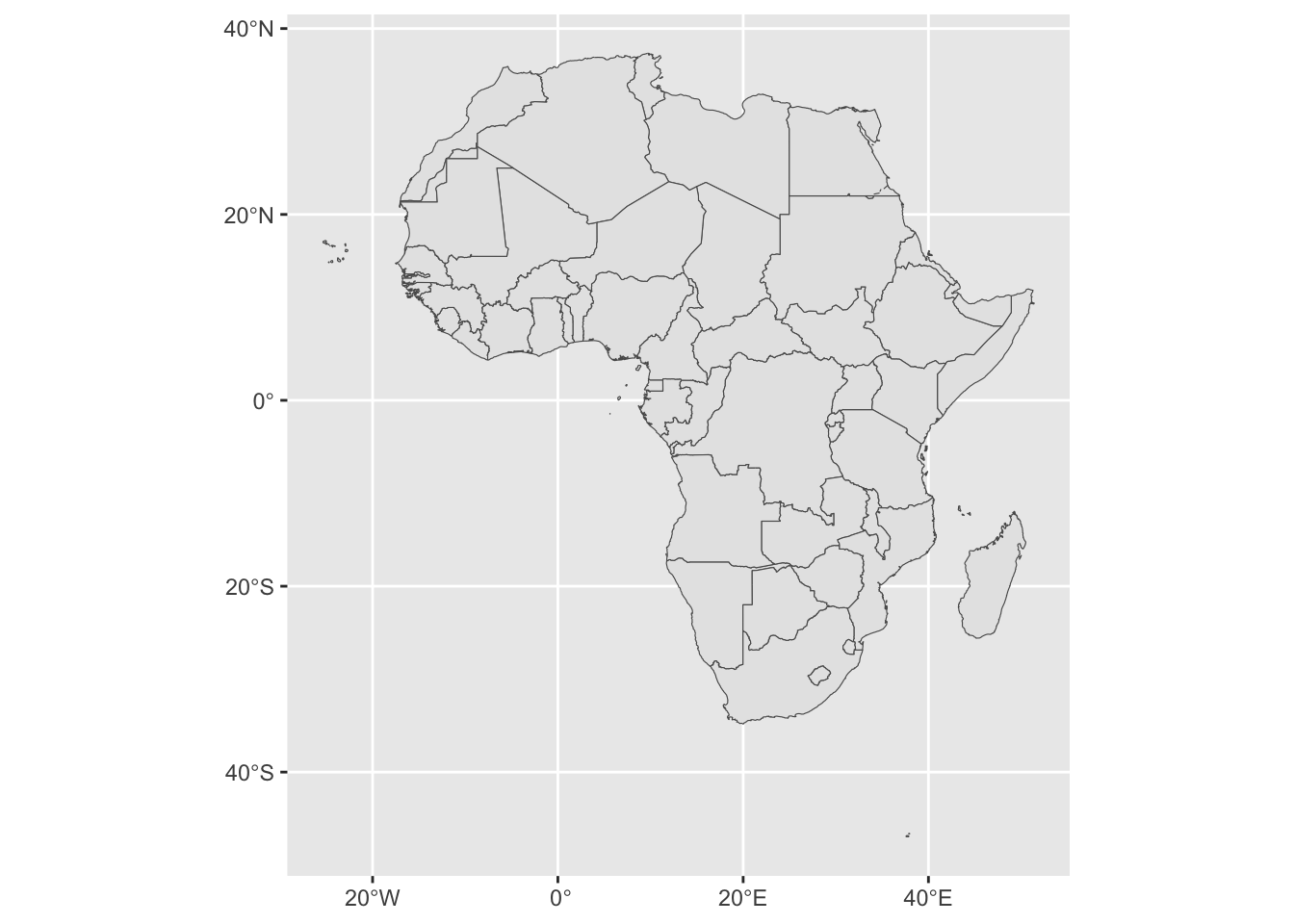
The sf (Simple Features) package includes a lot of functions to make maps, one of which is the geom_sf() function, which allows you to plot geographic data as a simple map.
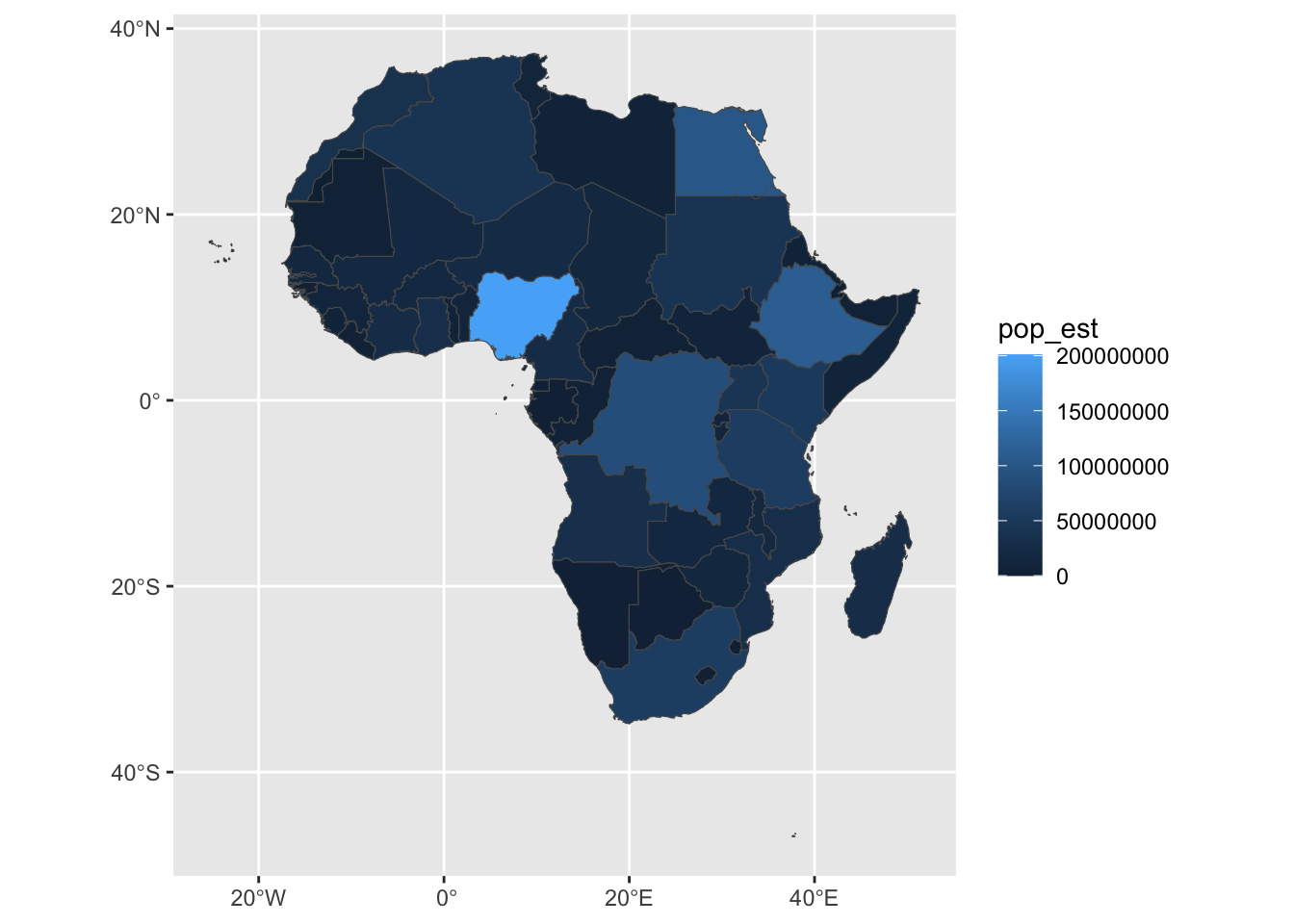
Just like any other kind of data frame, you can use the aes() function to map variables to aesthetics. Here, I’m mapping the pop_est column to the fill color of the map. This is the estimated population of each country, and is a column in the africa data frame.
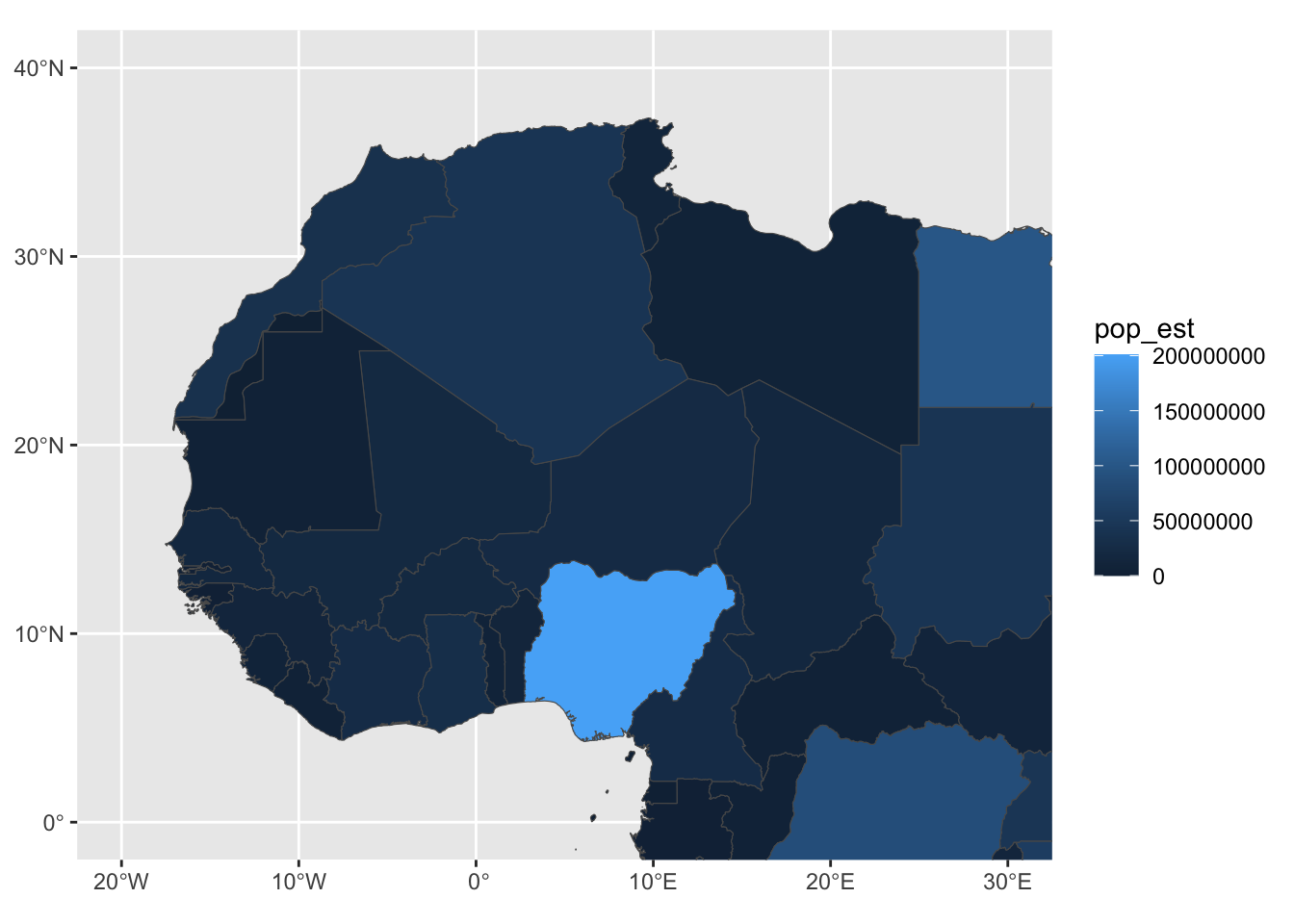
Just like with any other plot, I can use the lims() function to set the limits of the plot. In this case, it’s the longitude and latitude in degrees.
earth.google.com is a good place to find these, the longitude and latitude will show up in the lower right corner.
It’s easy to get mixed up about Longitude and Latitude and X and Y.
Remember that Lats lay Flat
And that Y has 3 lines, lat has 3 letters
And that Long has the long lines
Here, I’ve zoomed in a bit on west Africa.
My African geography could use some work, so I’ll also add some labels to the map.
We do this by adding a geom_sf_label() layer to the plot, as well as a label= aesthetic to the aes() call.
africa |>
  ggplot(aes(fill = pop_est, label = name)) +
  geom_sf() +
  coord_sf(xlim = c(-15, 50), ylim = c(-35, 40)) +
  geom_sf_label()
## Warning in st_point_on_surface.sfc(sf::st_zm(x)): st_point_on_surface may not give correct results for longitude/latitude data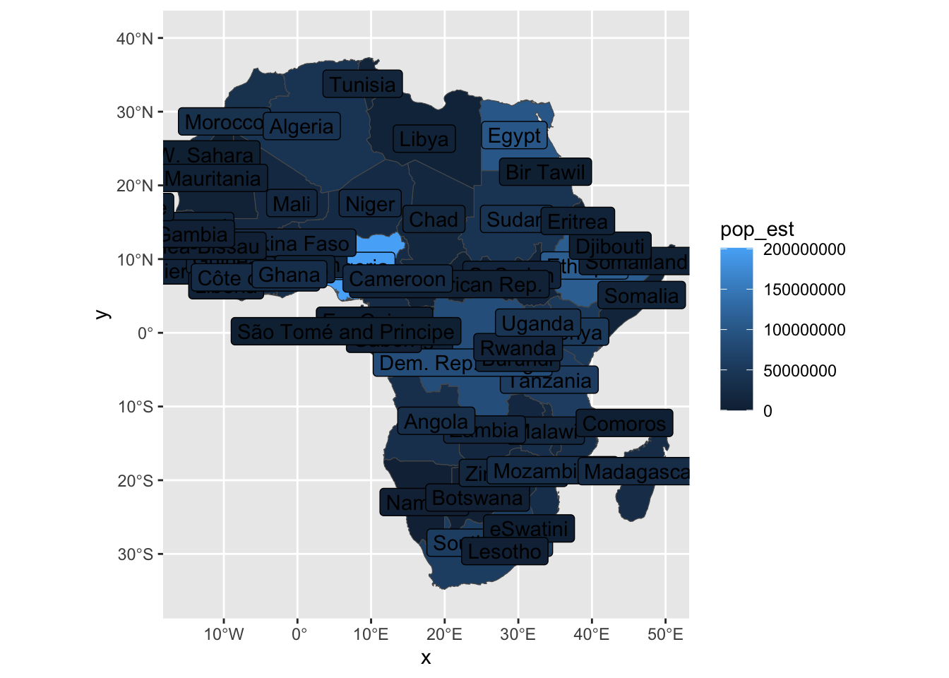
This is, however, a little crowded, so we can first make a new column to only include the most populous countries, those over 30 million (3e7) inhabitants.
We here use case_when() to create a new column, label_name, which is the name of the country if the population is over 30 million, and NA otherwise.
case_when() is a bit like a more powerful version of ifelse(). It takes a list of arguments, the first of which is a logical test, and the second is the value to return if the test is true.
africa |> mutate(
  label_name = case_when(
    pop_est > 3e7 ~ name, # if pop_est > 3e7, make it the same as the name column
    .default = NA  # If none of the conditions are true, use this one
  )
)
## # A tibble: 55 × 3
## name pop_est label_name
## <chr> <dbl> <chr>
## 1 Ethiopia 112078730 Ethiopia
## 2 S. Sudan 11062113 <NA>
## 3 Somalia 10192317. <NA>
## 4 Kenya 52573973 Kenya
## 5 Malawi 18628747 <NA>
## 6 Tanzania 58005463 Tanzania
## 7 Somaliland 5096159 <NA>
## 8 Morocco 36471769 Morocco
## 9 W. Sahara 603253 <NA>
## 10 Congo 5380508 <NA>
## # ℹ 45 more rowsafrica <- africa |> mutate(
label_name = case_when(
pop_est > 3e7 ~ name,
.default = NA
)
)
africa |>
ggplot(aes(fill = pop_est, label = label_name)) +
geom_sf() +
coord_sf(xlim = c(-15, 50), ylim = c(-35, 40)) +
geom_sf_label()## Warning in st_point_on_surface.sfc(sf::st_zm(x)): st_point_on_surface may not give correct results for longitude/latitude data## Warning: Removed 41 rows containing missing values or values outside the scale range (`geom_label()`).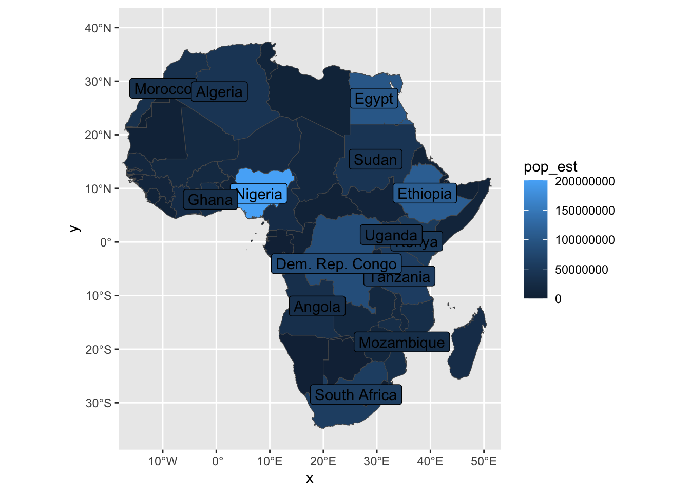
With a little messing around, we can get a decent looking map, without having to leave our little RStudio bubble.
Remember that for scale and stuff, you should look at the final output, not the little map preview in RStudio.
africa |>
  ggplot(aes(fill = pop_est, label = label_name)) +
  geom_sf() +
  coord_sf(xlim = c(-15, 50), ylim = c(-35, 40)) +
  geom_sf_label(fill = "#eeeeee") +
  theme_minimal() +
  theme(
    legend.position = "bottom",
    legend.key.width = unit(3, "cm")
  ) +
  labs(fill="Population") |>
  scale_fill_viridis_c(option = "A")
## Warning in st_point_on_surface.sfc(sf::st_zm(x)): st_point_on_surface may not give correct results for longitude/latitude data## Warning: Removed 41 rows containing missing values or values outside the scale range (`geom_label()`).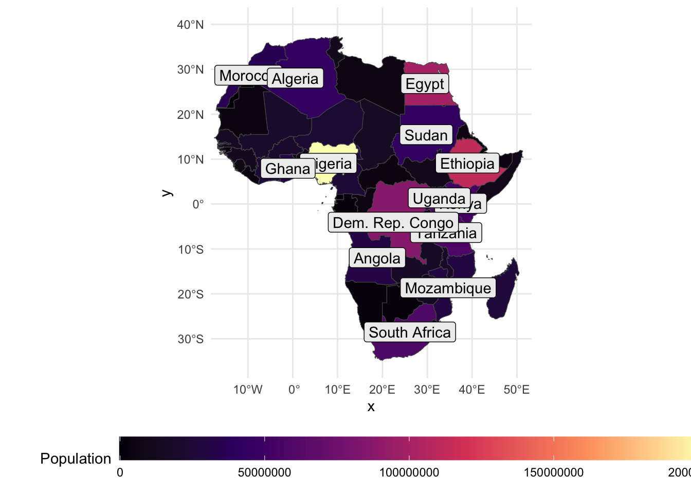
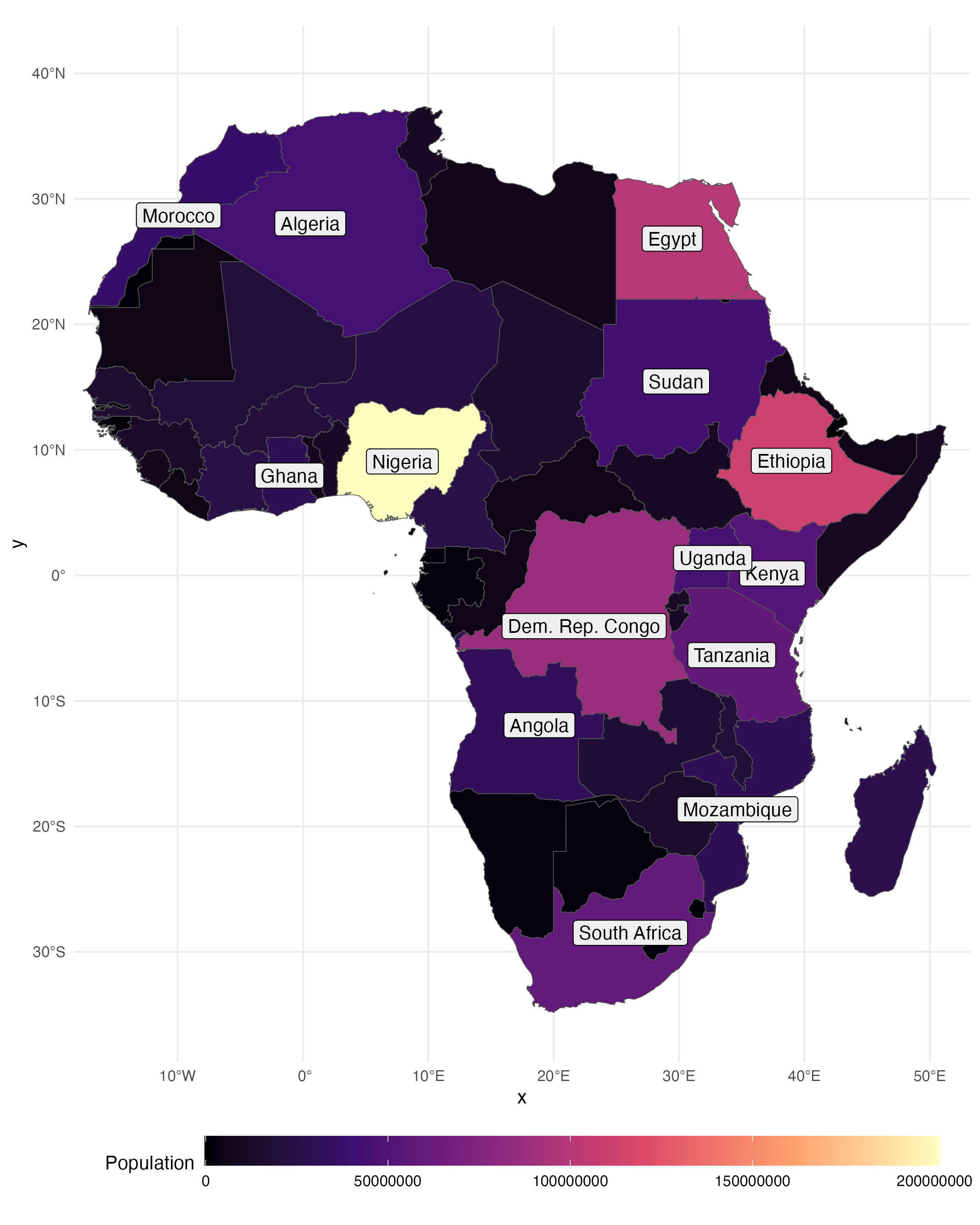
This will save the final output. Be sure to look here when you’re making your maps.
The final output, the one you’ll send to a publisher, looks alright.
11.3 Classwork: Make a map
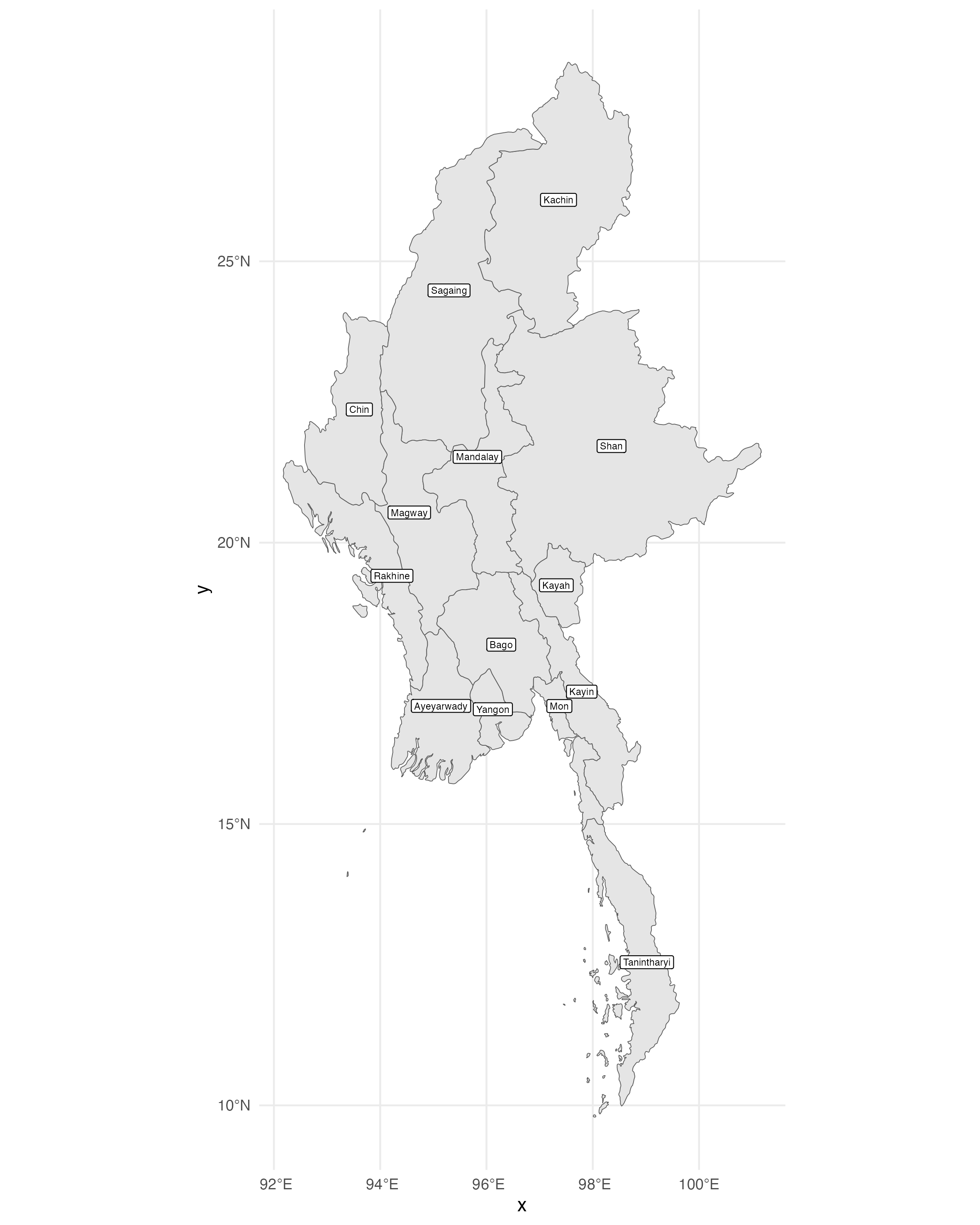
- Choose a country, and load the states / provinces / regions of that country using
ne_states().
- Make map of the country, listing the names of the states. Make it look nice when it’s saved.
11.4 Getting country data the more complicated way
The more complicated way to get geodata is to download it from a website like naturalearthdata.com, and then load it into R.
This is a bit more complicated, but it gives you a bit more data than the R version.
download.file("https://naciscdn.org/naturalearth/10m/cultural/ne_10m_admin_0_countries.zip", "input_data/ne_countries.zip")
unzip("input_data/ne_countries.zip", exdir = "input_data/ne_countries")

world_from_file <- st_read("input_data/ne_countries/ne_10m_admin_0_countries.shp")
## Reading layer `ne_10m_admin_0_countries' from data source `/Users/mwesto/Zurich/data-viz-course/bdown/data_viz_bdown/input_data/ne_countries/ne_10m_admin_0_countries.shp' using driver `ESRI Shapefile'
## Simple feature collection with 258 features and 168 fields
## Geometry type: MULTIPOLYGON
## Dimension: XY
## Bounding box: xmin: -180 ymin: -90 xmax: 180 ymax: 83.6341
## Geodetic CRS: WGS 84Why do this? there’s one incredibly important reason.
11.5 Cartography can get you in a lot of trouble
Wherever you publish your data, you have to be aware that you have to be very careful about the maps you present; many countries are very touchy about this.
This can apply to your own country, too, and can get you in some deep trouble. Wherever you publish, you’ll have to consider:
- The laws of the country you’re in
- The laws of the country you’re publishing in
- The laws of the country you’re from
This can be a real headache, and if you’re from a sensitive country, you might not want to publish maps at all.
If you want to open this can of worms, naturalearthdata.com has geodata from each country’s point of view.
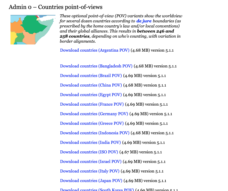
Figure 11.1: An apple 2e, from computinghistory.org.uk
You might have to do some wrangling with some other data, as well. For example, the World Bank and IMF don’t publish data on Taiwan, the UN lists it as either “Taiwan, Province of China” or “Other Asian Area”.
11.6 Map projections
Africa looked alright, but let’s make a map of Europe.
europe <- ne_countries(scale = 10, continent = "europe", returnclass = "sf")

europe |>
  ggplot(aes(fill=economy)) +
  geom_sf() +
  lims(x = c(-10, 40), y = c(35, 70)) +
  theme_minimal()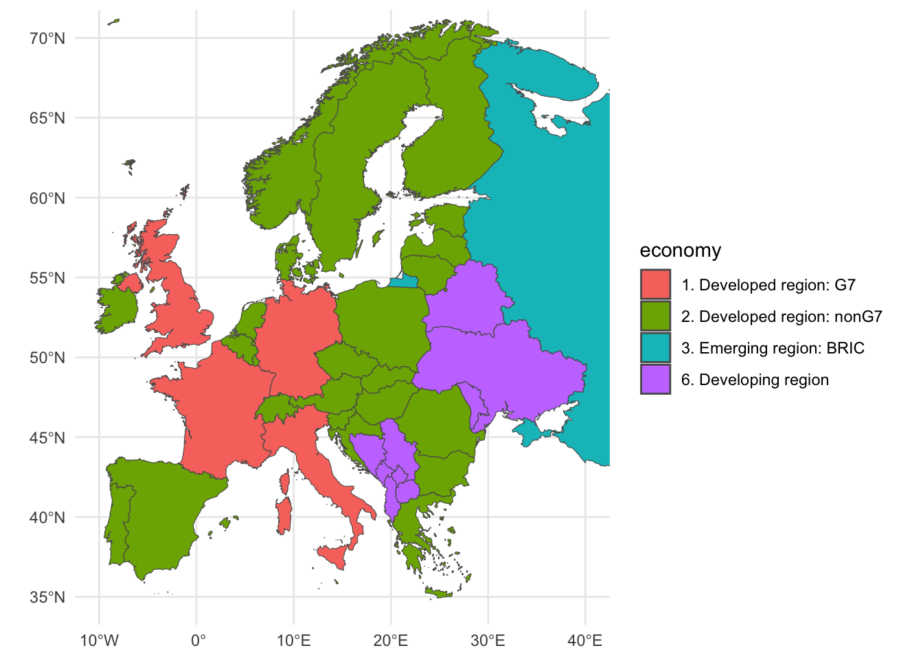
What are some things we notice here? One subtle one that stands out to me is that France is a lot longer and thinner than it should be.
This is because of our map projection. The default projection in ggplot2 is the Mercator projection, which is great for navigation, but not so great for area.
We can change this by using the coord_sf() function, which allows us to change the projection of the map. I’ll do these on a world map so that you can more easily see the difference.
In the coord_sf() function, we can specify the projection we want to use. For example, the Robinson projection is a compromise projection that tries to balance area and shape distortion.
You can find a list of different projections at https://proj.org/en/9.5/operations/projections/index.html.
world <- ne_countries(scale = 10, returnclass = "sf")

world |>
  ggplot(aes(fill=economy)) +
  geom_sf() +
  coord_sf(crs = "+proj=robin") +
  theme_minimal()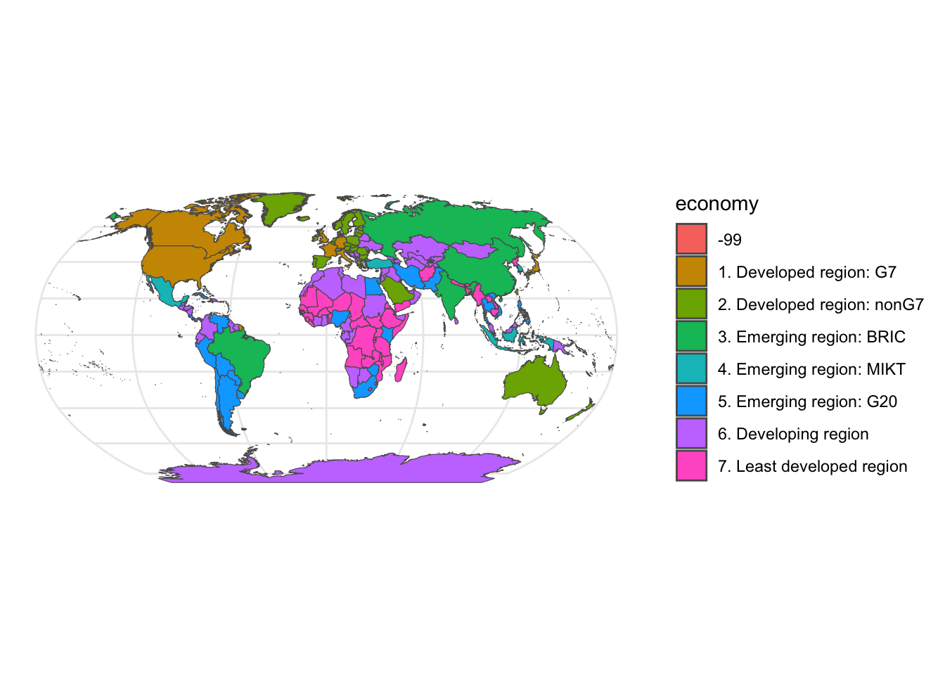
You can get really fancy with this if you want to. Here’s the world centered on Switzerland.
A good tool for this is https://projectionwizard.org, which allows you to play around with different projections in your browser.
world |>
  ggplot() +
  geom_sf() +
  coord_sf(crs = "+proj=laea +y_0=47 +lon_0=8 +lat_0=47") +
  theme_minimal()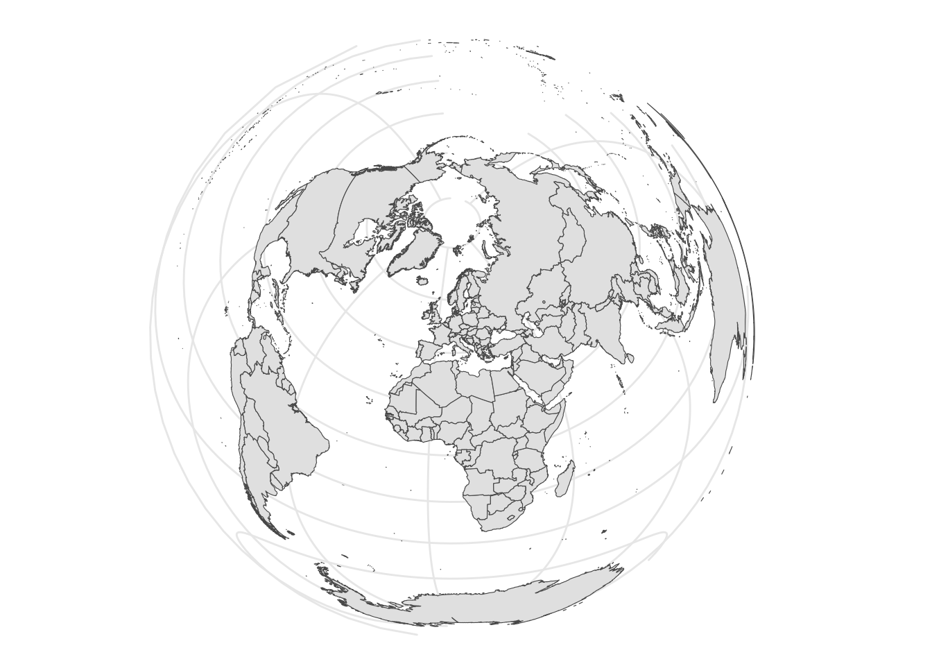
However, when you change the projection, your lims() won’t work anymore. This is because some projections use degrees, some use meters, and some use other units.
There are two ways to get around this. The first is to crop the map using the st_crop() function, which allows you to specify the bounding box of the map. You can then use the map as is, but you’ll have some weird edges.
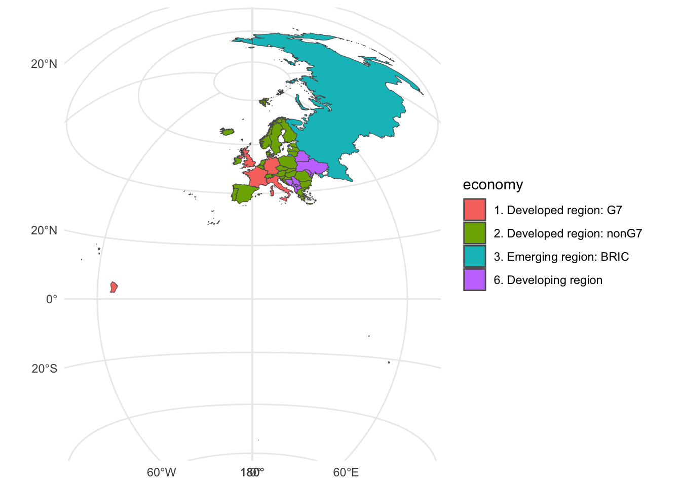
europe |>
  st_crop(xmin = -10, xmax = 50, ymin = 30, ymax = 70) |>
  ggplot(aes(fill=economy)) +
  geom_sf() +
  coord_sf(crs = "+proj=laea") +
  theme_minimal()
## although coordinates are longitude/latitude, st_intersection assumes that they are planar## Warning: attribute variables are assumed to be spatially constant throughout all geometries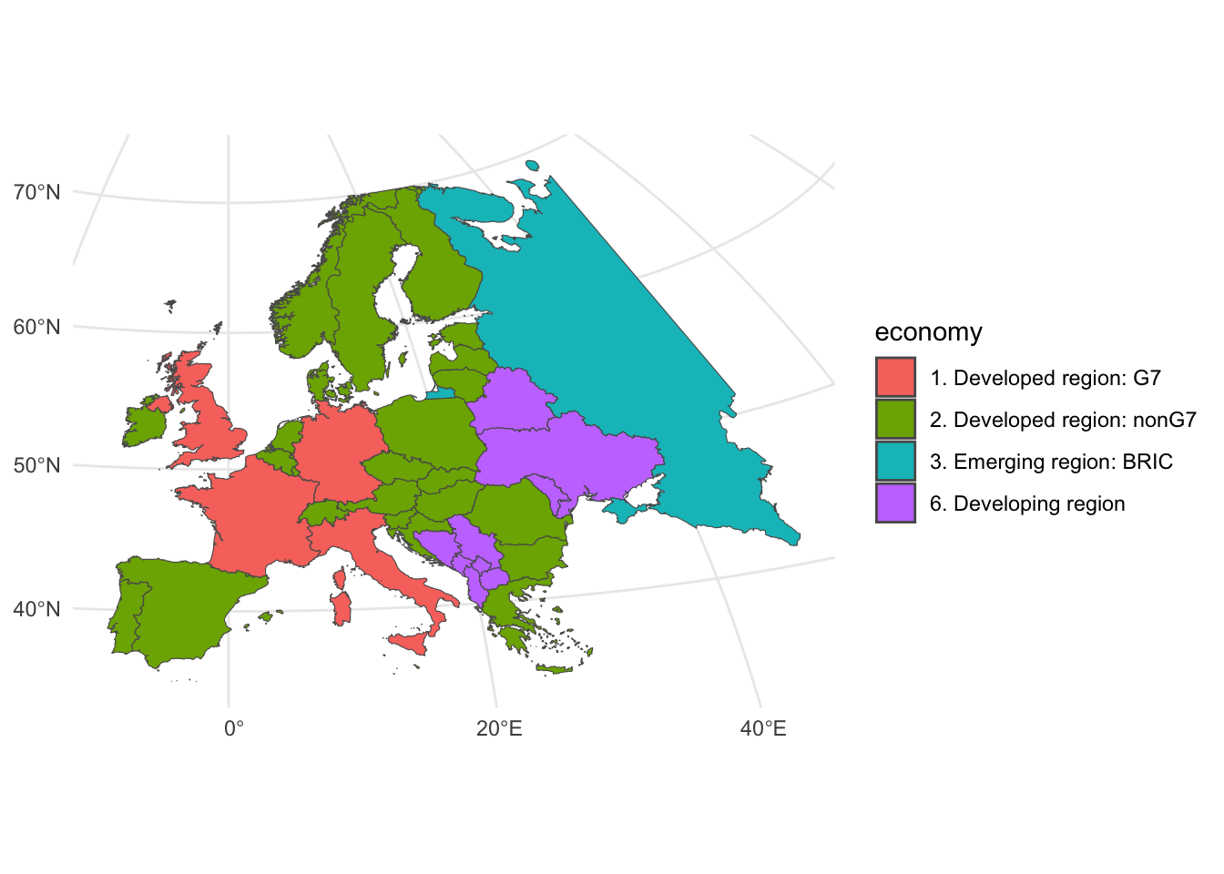
If you get errors with this, you might want to try running this first:
Don’t worry about what it does.
The second option is to use the lims() function, but you’ll have to convert the coordinates to the projection you’re using. This can be a bit of a pain, but it’s the best way to get a clean map.
A good tool for this is https://epsg.io/transform, which allows you to look up the EPSG code for a projection, as well as the proj4 string, and convert coordinates between projections.
europe |>
  ggplot(aes(fill=economy)) +
  geom_sf() +
  coord_sf(crs = "+proj=laea") +
  lims(x = c(-1079349, 3063863), y = c(3829721, 7645704)) +
  theme_minimal()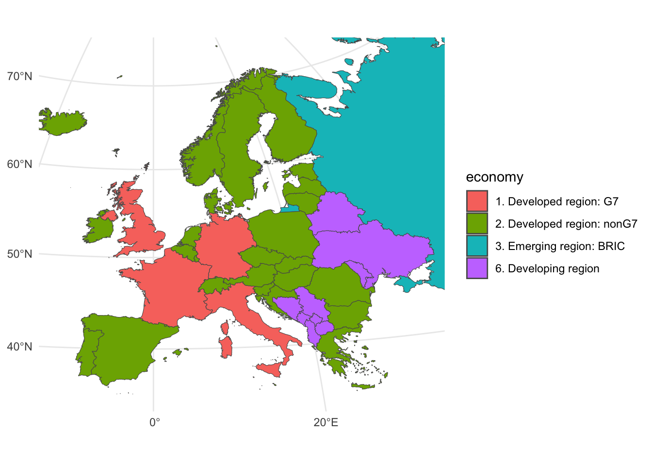
11.7 Classwork: Make a map
- Choose a region of the world. I’ve chosen Switzerland and its surrounding countries.
world |>
  st_crop(xmin = 4, xmax = 13, ymin = 44, ymax = 50) |>
  ggplot() +
  geom_sf() +
  theme_minimal()
## although coordinates are longitude/latitude, st_intersection assumes that they are planar## Warning: attribute variables are assumed to be spatially constant throughout all geometries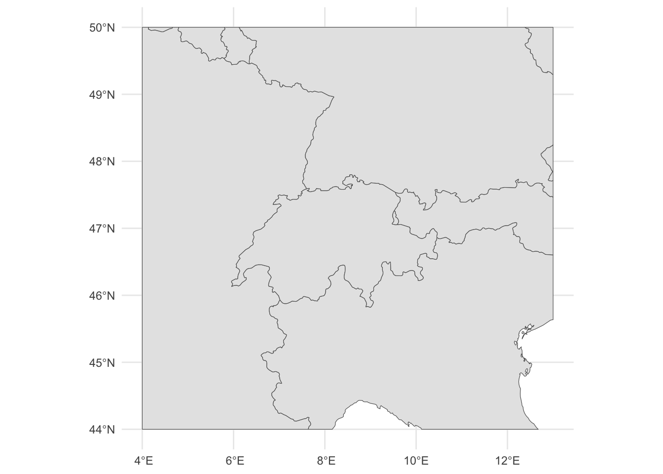
- Convert it to a new projection.
world |>
  st_crop(xmin = 4, xmax = 13, ymin = 44, ymax = 50) |>
  ggplot() +
  geom_sf() +
  coord_sf(crs = "+proj=laea +y_0=47 +lon_0=8 +lat_0=47") +
  theme_minimal()
## although coordinates are longitude/latitude, st_intersection assumes that they are planar## Warning: attribute variables are assumed to be spatially constant throughout all geometries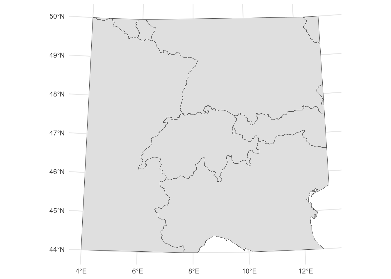
11.8 Adding data to maps
One thing that will trip you up is that every country has a lot of names. I might say I’m from:
- The US
- The United States
- The United States of America
- America
- The States
- The US of A
- The USA
- USA
- Etc. etc. etc.
Naturalearthdata has a lot of different names for each country, and you’ll have to pick the right one to match to your other data. Note that some of these places don’t have names on some fields / points of view.
world |>
  as_tibble() |>
  select(name, name_long, formal_en, name_ciawf, fips_10, iso_a2, iso_a3, wb_a2, wb_a3)
## # A tibble: 258 × 9
## name name_long formal_en name_ciawf fips_10 iso_a2 iso_a3 wb_a2 wb_a3
## <chr> <chr> <chr> <chr> <chr> <chr> <chr> <chr> <chr>
## 1 Indonesia Indonesia Republic of Indonesia Indonesia ID ID IDN ID IDN
## 2 Malaysia Malaysia Malaysia Malaysia MY MY MYS MY MYS
## 3 Chile Chile Republic of Chile Chile CI CL CHL CL CHL
## 4 Bolivia Bolivia Plurinational State of Bolivia Bolivia BL BO BOL BO BOL
## 5 Peru Peru Republic of Peru Peru PE PE PER PE PER
## 6 Argentina Argentina Argentine Republic Argentina AR AR ARG AR ARG
## 7 Dhekelia Dhekelia <NA> <NA> -99 -99 -99 -99 -99
## 8 Cyprus Cyprus Republic of Cyprus Cyprus CY CY CYP CY CYP
## 9 India India Republic of India India IN IN IND IN IND
## 10 China China People's Republic of China China CH CN CHN CN CHN
## # ℹ 248 more rowsIf you’re working with local data, you might want to download the full data *set from naturalearthdata.com, which has a lot more fields.
## # A tibble: 258 × 5
##    NAME_ZHT       NAME_RU                       NAME_JA        NAME_PL                  NAME_AR
##    <chr>          <chr>                         <chr>          <chr>                    <chr>
##  1 印度尼西亞     Индонезия                     インドネシア   Indonezja                إندونيسيا
##  2 馬來西亞       Малайзия                      マレーシア     Malezja                  ماليزيا
##  3 智利           Чили                          チリ           Chile                    تشيلي
##  4 玻利維亞       Боливия                       ボリビア       Boliwia                  بوليفيا
##  5 秘魯           Перу                          ペルー         Peru                     بيرو
##  6 阿根廷         Аргентина                     アルゼンチン   Argentyna                الأرجنتين
##  7 德凱利亞軍營   Декелия                       デケリア       Dhekelia                 ديكيليا كانتونمنت
##  8 賽普勒斯       Кипр                          キプロス       Cypr                     قبرص
##  9 印度           Индия                         インド         Indie                    الهند
## 10 中華人民共和國 Китайская Народная Республика 中華人民共和国 Chińska Republika Ludowa الصين
## # ℹ 248 more rows
For some nice, download.file() -free data, we can search with World Bank database from right in R. You simply enter a search term, and it will give you back a list of file codes.
## # A tibble: 127 × 3
##    indicator_id                   indicator                                                       indicator_desc
##    <chr>                          <chr>                                                           <chr>
##  1 1.1_ACCESS.ELECTRICITY.TOT     Access to electricity (% of total population)                   Access to electricity is the percentage of population with access to electricity.
##  2 1.2_ACCESS.ELECTRICITY.RURAL   Access to electricity (% of rural population)                   Access to electricity is the percentage of rural population with access to electricity.
##  3 1.3_ACCESS.ELECTRICITY.URBAN   Access to electricity (% of urban population)                   Access to electricity is the percentage of total population with access to electricity.
##  4 2.0.cov.Ele                    Coverage: Electricity                                           The coverage rate is the childhood access rate of a given opportunity used in calculating the Human Opportunities Index (HOI). The coverage rate does not take into accoun…
##  5 2.0.hoi.Ele                    HOI: Electricity                                                The Human Opportunities Index (HOI) is an economic indicator that captures the degree of inequality of access to an essential service by different circumstance groups. Th…
##  6 4.1.1_TOTAL.ELECTRICITY.OUTPUT Total electricity output (GWh)                                  Total electricity output (GWh): Total number of GWh generated by all power plants
##  7 4.1.2_REN.ELECTRICITY.OUTPUT   Renewable energy electricity output (GWh)                       Renewable energy electricity output (GWh): Total number of GWh generated by renewable power plants, including wind, solar PV, solar thermal, hydro, marine, geothermal, bi…
##  8 4.1_SHARE.RE.IN.ELECTRICITY    Renewable electricity (% in total electricity output)           Renewable electricity (% in total electricity output): Share of electrity generated by renewable power plants in total electricity generated by all types of plants
##  9 9060000                        9060000:ACTUAL HOUSING, WATER, ELECTRICITY, GAS AND OTHER FUELS <NA>
## 10 BM.GSR.TRAN.ZS                 Transport services (% of service imports, BoP)                  Transport covers all transport services (sea, air, land, internal waterway, pipeline, space and electricity transmission) performed by residents of one economy for those …
## # ℹ 117 more rows
Next, load that data with wb_data() Super simple stuff.
## # A tibble: 5,886 × 9
##    iso2c iso3c country  date `1.1_ACCESS.ELECTRICITY.TOT` unit  obs_status footnote last_updated
##    <chr> <chr> <chr>   <dbl>                        <dbl> <chr> <chr>      <chr>    <date>
##  1 AW    ABW   Aruba    1990                         88.4 <NA>  <NA>       <NA>     2018-06-30
##  2 AW    ABW   Aruba    1991                         88.8 <NA>  <NA>       <NA>     2018-06-30
##  3 AW    ABW   Aruba    1992                         89.1 <NA>  <NA>       <NA>     2018-06-30
##  4 AW    ABW   Aruba    1993                         89.4 <NA>  <NA>       <NA>     2018-06-30
##  5 AW    ABW   Aruba    1994                         89.8 <NA>  <NA>       <NA>     2018-06-30
##  6 AW    ABW   Aruba    1995                         90.1 <NA>  <NA>       <NA>     2018-06-30
##  7 AW    ABW   Aruba    1996                         90.4 <NA>  <NA>       <NA>     2018-06-30
##  8 AW    ABW   Aruba    1997                         90.7 <NA>  <NA>       <NA>     2018-06-30
##  9 AW    ABW   Aruba    1998                         91.0 <NA>  <NA>       <NA>     2018-06-30
## 10 AW    ABW   Aruba    1999                         91.2 <NA>  <NA>       <NA>     2018-06-30
## # ℹ 5,876 more rows
11.9 Classwork: Joining Data review
- Get another statistic from the World Bank dataset.
- Filter, select and rename the data so that it looks something like this
## # A tibble: 218 × 2
##    iso_a3 electricity_access
##    <chr>               <dbl>
##  1 ABW                91.7
##  2 AFG                 0.960
##  3 AGO                22.8
##  4 ALB               100
##  5 AND               100
##  6 ARE               100
##  7 ARG                95.1
##  8 ARM                98.9
##  9 ASM                NA
## 10 ATG                90.1
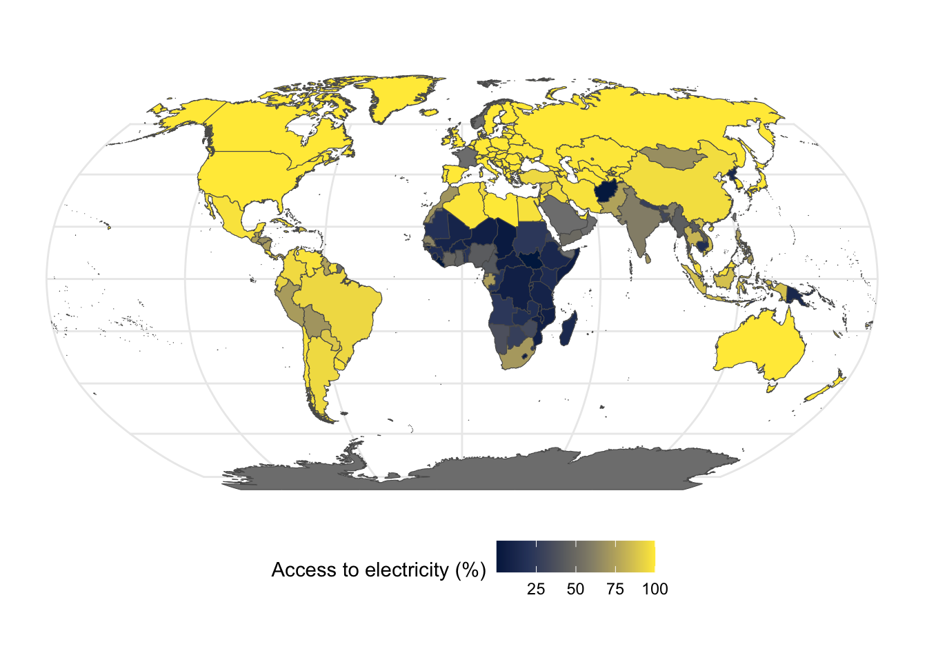
## # ℹ 208 more rows- Join the data to the world map like so:
- Make a map of the data
11.10 Layering data on maps
So far, we’ve basically just been using maps as a coloring book, but we often want to add more layers to our map. We can mix and match other things with our geom_sf() layers, just like any other kind of plot.
Let’s make a map of some cities with greater populations than Switzerland. The maps library will give you a list of cities.
This isn’t the most accurate, but I’m trying to avoid some download.file() nonsense here.
##                 name country.etc   pop   lat  long capital
## 1 'Abasan al-Jadidah   Palestine  5629 31.31 34.34       0
## 2 'Abasan al-Kabirah   Palestine 18999 31.32 34.35       0
## 3       'Abdul Hakim    Pakistan 47788 30.55 72.11       0
## 4 'Abdullah-as-Salam      Kuwait 21817 29.36 47.98       0
## 5              'Abud   Palestine  2456 32.03 35.07       0
## 6            'Abwein   Palestine  3434 32.03 35.20       0
We can filter the only the cities with populations of greater than 9 million.
##           name country.etc      pop    lat   long capital
## 1       Bombay       India 12883645  18.96  72.82       0
## 2 Buenos Aires   Argentina 11595183 -34.61 -58.37       1
## 3        Delhi       India 11215130  28.67  77.21       0
## 4     Istanbul      Turkey 10034830  41.10  29.00       0
## 5      Karachi    Pakistan 11969284  24.86  67.01       0
## 6        Lagos     Nigeria  9020089   6.45   3.47       0
Now, to add these to our map, we need to convert it to something that works on a map. These have the latitude and longitude points, but we need them to be an sf object to be drawn correctly.
We can do this with the st_as_sf() function, which makes a map layer from points columns. We can see that we have a long and a lat column, so we can add these as coordinates.
We also need to set our coordinate reference system (crs), which in this case is the default Mercator projection, (4326). It will almost always be this if you see longitude and latitude as degrees.
## $y
## <ScaleContinuousPosition>
##  Range:
## Limits: -0 -- 10## Simple feature collection with 11 features and 4 fields
## Geometry type: POINT
## Dimension: XY
## Bounding box: xmin: -58.37 ymin: -34.61 xmax: 126.99 ymax: 55.75
## Geodetic CRS: WGS 84
## First 10 features:
## name country.etc pop capital geometry
## 1 Bombay India 12883645 0 POINT (72.82 18.96)
## 2 Buenos Aires Argentina 11595183 1 POINT (-58.37 -34.61)
## 3 Delhi India 11215130 0 POINT (77.21 28.67)
## 4 Istanbul Turkey 10034830 0 POINT (29 41.1)
## 5 Karachi Pakistan 11969284 0 POINT (67.01 24.86)
## 6 Lagos Nigeria 9020089 0 POINT (3.47 6.45)
## 7 Manila Philippines 10546511 1 POINT (120.97 14.62)
## 8 Moscow Russia 10472629 1 POINT (37.62 55.75)
## 9 Sao Paulo Brazil 10059502 0 POINT (-46.63 -23.53)
## 10 Shanghai China 15017783 2 POINT (121.47 31.23)Now, to add these to our map, we just set them as another layer.
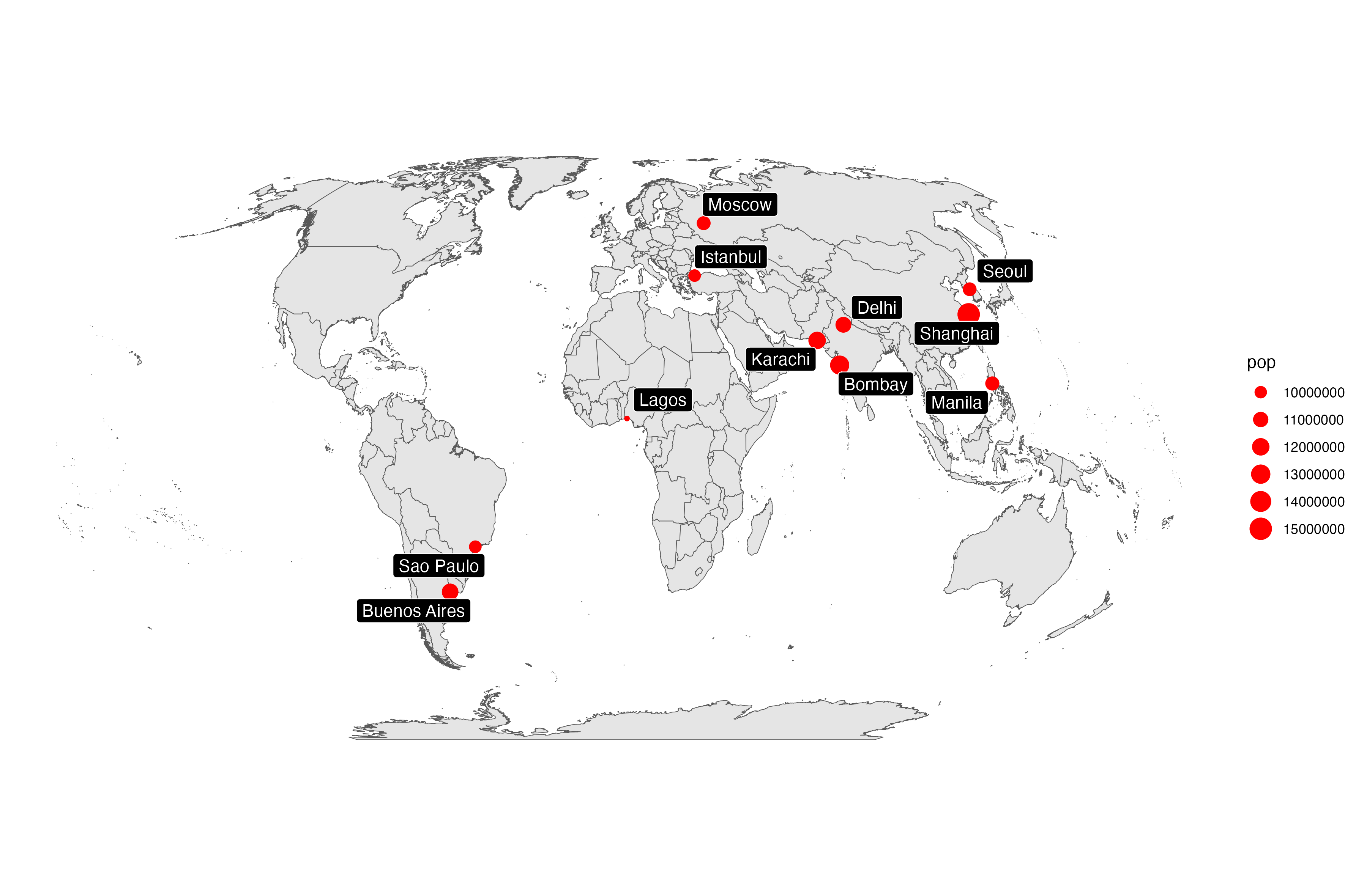
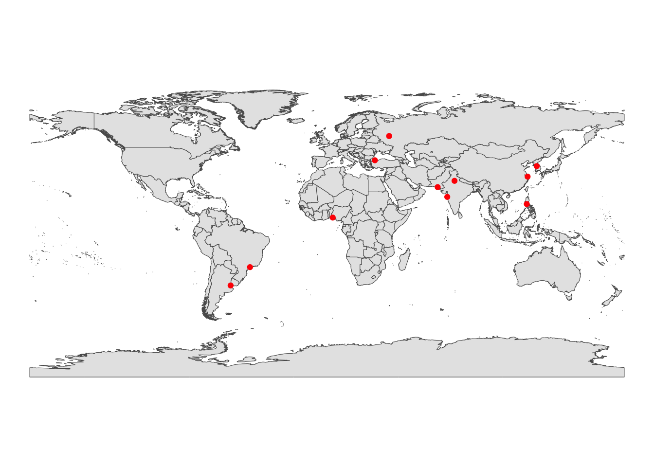 These can take aesthetics just like anything else. Here, I set the size of the dot depending on the size of the city.
ggplot() +
  geom_sf(data = world) +
  geom_sf(data=big_cities_sf, aes(size = pop), color="red") +
  theme_void()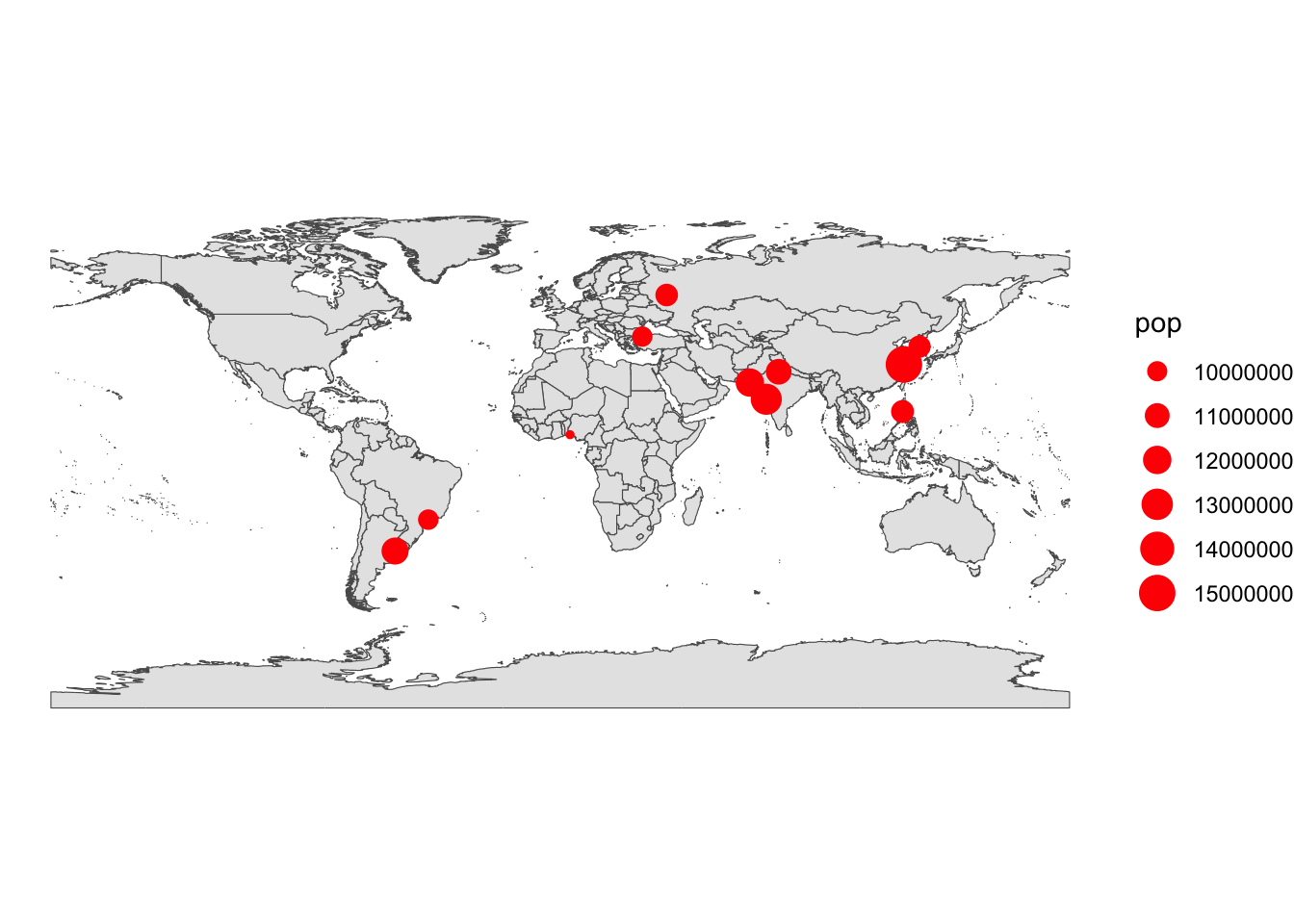
We can also add labels to the cities, using the geom_label_repel().
library(ggrepel)
ggplot() +
geom_sf(data = world) +
geom_sf(data=big_cities_sf, aes(size = pop), color="red") +
geom_label_repel(
data = big_cities_sf, # The data we want
aes(label = name, geometry = geometry), # set the geometry as the 'geometry' column. This is a very new feature!
stat = "sf_coordinates" # Turn it into a sf object
) +
coord_sf(crs = "+proj=wag5") +
theme_void()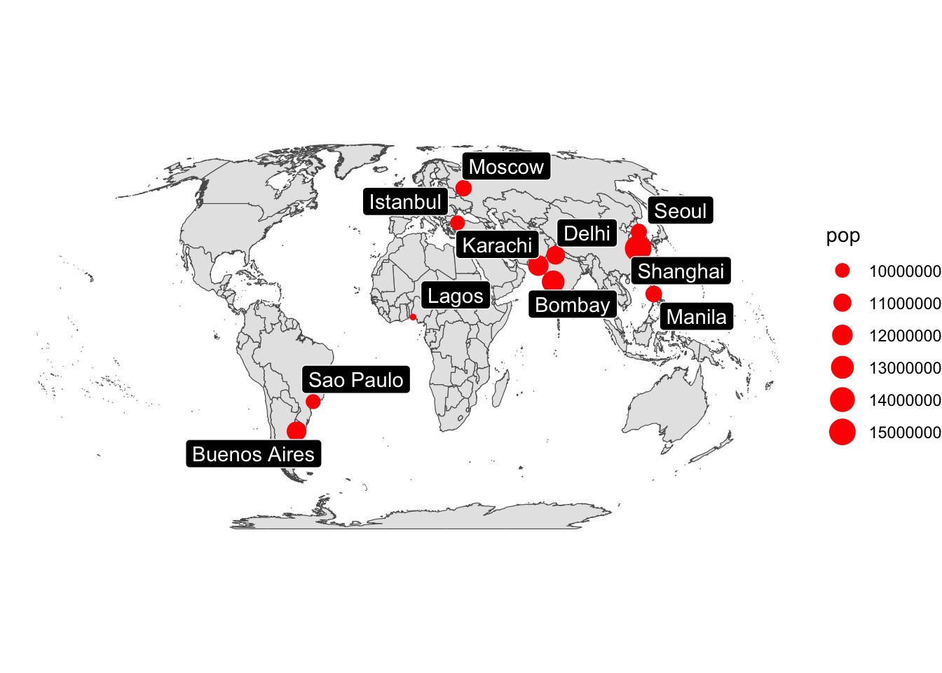 Be sure to check the final output before you make big changes.
11.11 Classwork:
Filter the world.cities data to be just a map of where you’ve lived, or want to live.
Turn this into a map. Make it as fancy as possible.
## although coordinates are longitude/latitude, st_intersection assumes that they are planar## Warning: attribute variables are assumed to be spatially constant throughout all geometries
This is just the beginning, and there’s a lot more you can do with maps in R. Good luck!