12 Interactive Graphics
12.1 Plotly
The first library we’ll look at is Plotly, a powerful library that allows you to create interactive graphics in R. First, you’ll need to install some stuff:
Loading this, we need both the plotly and htmlwidgets libraries. We’ll also load the gapminder library, which contains a data set we’ll use for this example.
library(tidyverse)
library(plotly)
library(gapminder) # Interesting data set about life expectancy, population, gdp, etc.
library(htmlwidgets)
Let’s take a look at the data set. What do you think each of these columns means?
## Rows: 1,704
## Columns: 6
## $ country   <fct> "Afghanistan", "Afghanistan", "Afghanistan", "Afghanistan", "Afghanistan", "Afghanistan", "Afghanistan", "Afghanistan", "Afghanistan", "Afghanistan", "Afghanistan", "Afghanistan", "Albania", "Albania", "Albania", "Albania", "Albania", "Albania", "Al…
## $ continent <fct> Asia, Asia, Asia, Asia, Asia, Asia, Asia, Asia, Asia, Asia, Asia, Asia, Europe, Europe, Europe, Europe, Europe, Europe, Europe, Europe, Europe, Europe, Europe, Europe, Africa, Africa, Africa, Africa, Africa, Africa, Africa, Africa, Africa, Africa, A…
## $ year      <int> 1952, 1957, 1962, 1967, 1972, 1977, 1982, 1987, 1992, 1997, 2002, 2007, 1952, 1957, 1962, 1967, 1972, 1977, 1982, 1987, 1992, 1997, 2002, 2007, 1952, 1957, 1962, 1967, 1972, 1977, 1982, 1987, 1992, 1997, 2002, 2007, 1952, 1957, 1962, 1967, 1972, 197…
## $ lifeExp   <dbl> 28.801, 30.332, 31.997, 34.020, 36.088, 38.438, 39.854, 40.822, 41.674, 41.763, 42.129, 43.828, 55.230, 59.280, 64.820, 66.220, 67.690, 68.930, 70.420, 72.000, 71.581, 72.950, 75.651, 76.423, 43.077, 45.685, 48.303, 51.407, 54.518, 58.014, 61.368, 6…
## $ pop       <int> 8425333, 9240934, 10267083, 11537966, 13079460, 14880372, 12881816, 13867957, 16317921, 22227415, 25268405, 31889923, 1282697, 1476505, 1728137, 1984060, 2263554, 2509048, 2780097, 3075321, 3326498, 3428038, 3508512, 3600523, 9279525, 10270856, 1100…
## $ gdpPercap <dbl> 779.4453, 820.8530, 853.1007, 836.1971, 739.9811, 786.1134, 978.0114, 852.3959, 649.3414, 635.3414, 726.7341, 974.5803, 1601.0561, 1942.2842, 2312.8890, 2760.1969, 3313.4222, 3533.0039, 3630.8807, 3738.9327, 2497.4379, 3193.0546, 4604.2117, 5937.029…
Let’s go back to the basics, and make a simple line plot of the population of each continent over time. First, we need to summarise the population of each continent by year. Because we want to add the data for each country, we’ll use sum().
## # A tibble: 60 × 3
## # Groups:   continent [5]
##    continent  year       pop
##    <fct>     <int>     <dbl>
##  1 Africa     1952 237640501
##  2 Africa     1957 264837738
##  3 Africa     1962 296516865
##  4 Africa     1967 335289489
##  5 Africa     1972 379879541
##  6 Africa     1977 433061021
##  7 Africa     1982 499348587
##  8 Africa     1987 574834110
##  9 Africa     1992 659081517
## 10 Africa     1997 743832984
## # ℹ 50 more rows
12.2 Classwork: Make this plot.
Take a few minutes to recreate the following plot, and save it to a new variable. This will be important for the next step.
population_plt <- gapminder |>
  group_by(continent, year) |>
  summarise(pop = sum(pop)) |>
  ggplot() +
  ...

population_plt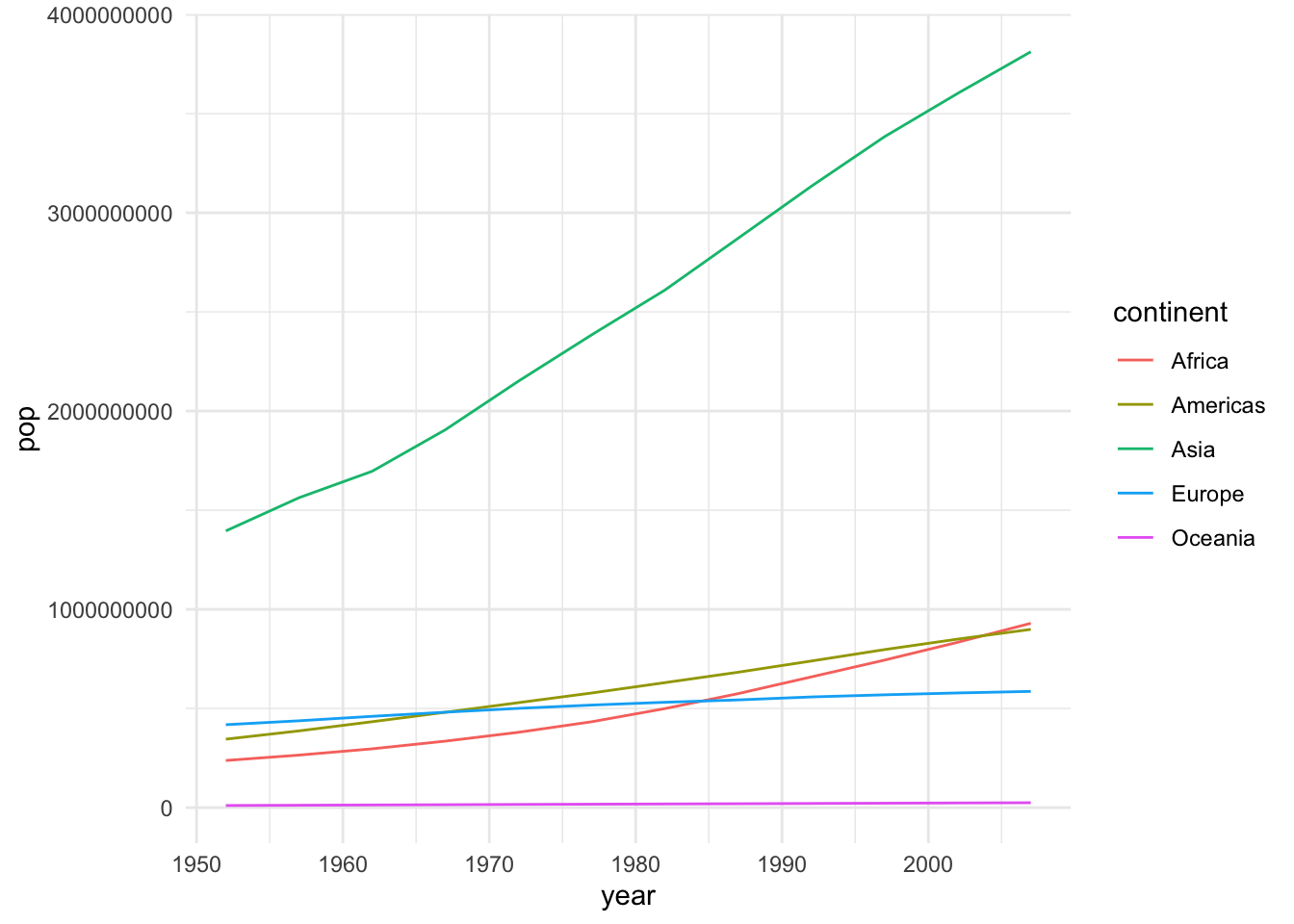
Now, to make it interactive and web-ready is one single step; pass the plot into the ggplotly() function, which converts things from ggplot to plotly. That’s just about the easiest way you can do it.
We can see now that by hovering over a line, we can see the population of each continent at each year. Super simple stuff.
This is great, but how would you share this with someone who doesn’t have R installed? You can save the plot as an HTML file, and send it to them.
Just like with ggsave(), we can do this with the saveWidget() function, which takes the plot and saves it as an HTML file.
Now, you should see the plot in your folder, and can open this file in your web browser and see the interactive plot there.
12.3 Classwork: Immitate this plot
Take a few minutes to recreate the following plot, and convert it to an interactive plot. Save it as an html widget, and open it in your web browser.
12.4 Animation
Suppose we want to look at the relationship between GDP per capita and life expectancy over time. This is maybe a bit too much infromation for a static graph, but with an animation, we can see how these two variables change over time.
Let’s start by making a simple scatter plot of GDP per capita and life expectancy, with the color of the points representing the continent.
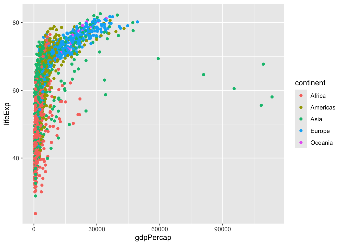 If you’re not a fan of scientific notation, you can turn it off with the following command:
12.4.1 Log scaling
A good tool to know about is log scaling. This is useful when you have a wide range of values, and you want to see the differences in the lower values. This is especially useful for GDP per capita, which can range from a few hundred to tens of thousands. We can do this here with the scale_x_log10() function.
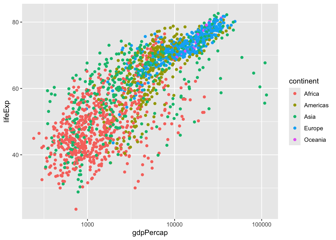
But what is logarithmic scaling? Instead of increasing by a fixed amount, the axis increases by a fixed multiple. We can see on the plot we’ve made that GDP hare is increasing by 1000, 10000, 100000, etc. It’s good to indicate this somewhere on the plot, so as not to mislead the viewer.
ggplot(gapminder, aes(gdpPercap, lifeExp, color = continent)) +
  geom_point(aes(frame = year, id=country))  +
  scale_x_log10() +
  labs(title = "Life expectancy vs GDP per capita", x = "GDP per capita (Log 10 scale)", y = "Life expectancy")
## Warning in geom_point(aes(frame = year, id = country)): Ignoring unknown aesthetics: frame and id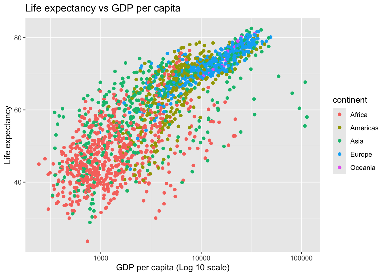 Now, to animate it!
To do this, all we need to do is add two more aesthetics to our geom_point: frame = year and id = country. This tells the plot to animate the points by year, and to identify each point by country.
Just like frames in a movie, each frame in our animation will be a different year.
id is a bit more complicated. It tells the plot to keep track of each point by country, so that it can animate the points correctly. You’ll see in our final plot that the points move around, and transition smoothly from year to year.
R will give us a little warning about this, but it’s nothing to worry about. ggplot doesn’t know how to handle the id and frame aesthetics, but plotly does.
pop_vs_gdp_plot <- ggplot(gapminder, aes(gdpPercap, lifeExp, color = continent)) +
  geom_point(aes(frame = year, id=country))  +
  scale_x_log10() +
  labs(title = "Life expectancy vs GDP per capita", x = "GDP per capita (Log 10 scale)", y = "Life expectancy")
## Warning in geom_point(aes(frame = year, id = country)): Ignoring unknown aesthetics: frame and id12.5 Classwork: An Interactive map
Before we move on, let’s review our cartography lesson a little bit. We can use the rnaturalearth library to get a map of Asia, which we’ll use to make a map of GDP per capita.
library(rnaturalearth)

asia_geodata <- ne_countries(continent = "asia", scale = "medium", returnclass = "sf")- From this data, we have two important columns:
gdp_md_(gdp in millions of dollars) andpop_est(estimated population). Use these to calculate GDP per capita.
- Try to imitate this map.
12.6 Beyond ggplotly
like ggplot(), plotly is its own project, with its own syntax. When we call ggplotly(), we’re converting a ggplot object into a plotly object. But we can also make plotly plots directly, without ggplot.
The code that we used for our little animation:
pop_vs_gdp_plot_ggplotly <- ggplot(
  gapminder,
  aes(gdpPercap,
      lifeExp,
      color = continent)
  ) +
  geom_point(aes(frame = year))  +
  scale_x_log10()

pop_vs_gdp_plot_ggplotly |> ggplotly()
… can be written in plotly like this:
pop_vs_gdp_plot_plotly <- plot_ly(
  gapminder,
  x = ~gdpPercap,
  y = ~lifeExp,
  color = ~continent,
  frame = ~year) |>
  add_markers() |> # The plotly equivalent of geom_point()
  layout(xaxis = list(type = "log")) # Log scaling

pop_vs_gdp_plot_plotly
Plotly has a lot more that you can do with it. Its syntax is essentially the same as GGplot. The following book is a great introduction:
12.7 3D Stuff
One thing that plotly can do that ggplot can’t is 3D plots. This can be useful for visualizing data in three dimensions, or for making a plot that looks cool. I’ve never found a practical use for it, but if you do, fantastic.
Here’s an example of a 3D plot. We’re going to look at the relationship between GDP per capita, life expectancy, and year for a few countries that had wars in the 1990s.
countries_with_wars_in_the_90s <- gapminder |>
  filter(country %in% c("Afghanistan", "Albania", "Rwanda", "Croatia", "Somalia", "Iraq", "Sri Lanka"))


pop_vs_gdp_plot_vs_le_3d <- plot_ly(
  countries_with_wars_in_the_90s,
  x = ~gdpPercap,
  y = ~lifeExp,
  z = ~year, # A third dimension!
  name = ~country
  ) |>
  add_markers() # The plotly equivalent of geom_point()

pop_vs_gdp_plot_vs_le_3d
12.8 Generating a whole web page
These widgets are cool, but sometimes we need to generate a whole report.
Your final project for this class will be to create a web report that uses interactive graphics. The easiest way to do this with R is to export a Quarto document.
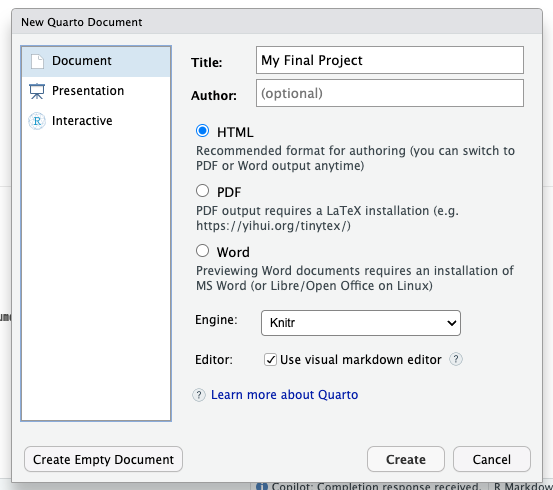
When you first make the project, there will be some options for you at the top. Just set it to these, and you should be good to go.
format:
  html:
    embed-resources: true
editor: visual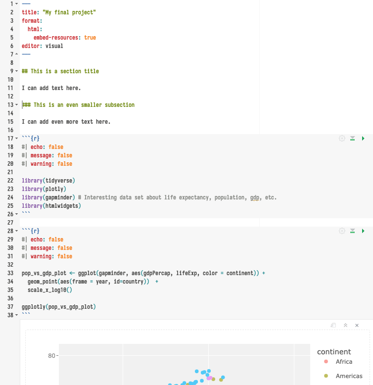
12.8.1 Rendering the document
To preview the document, just hit the “render” button above your document. This will do two things:
- Save the document as an HTML file.
- Open the HTML file in your web browser.
12.8.2 Formatting your page
Quarto uses a form of Markdown, which is a simple way to format text. Here are some tips.
- You can make headers with
#, - subheaders with
##,###, etc. - You can make lists with
-, - You can make links with
[text](url).
You can find more information about Markdown here:
12.8.3 Hiding code
You can add a few useful options to your code blocks to make them look better in the final document, as follows:
This will not show the code in the final document:
#| echo: falseThis will not show any messages (like ‘data loaded’, ‘library whatever’) in the final document:
#| message: falseThis will not show any warnings in the final document. Beware, this can hide important information:
#| warning: false12.9 Classwork: A simple CV
- Create a Quarto notebook, and make 10-line CV using it. If you prefer not to share your personal information, you can make a fictional resume.
- Add at least one interactive graphic to your resume, about something in your life. This could be a map of places you’ve been, a timeline of your life, a graph of the number of pets you’ve had over your life, or whatever else.
Here’s an example of how to manually enter data into a tibble and make a simple line plot:
farm_cats_my_parents_have <- tibble(
  year = c(1990, 2000, 2010, 2011, 2019),
  n = c(2, 3, 2, 3, 3)
)

cats <- farm_cats_my_parents_have |>
  ggplot(aes(x = year, y = n)) +
  geom_line() +
  lims(y = c(0, 5)) +
  labs(title = "Number of cats on the farm", x = "Year", y = "Number of cats") +
  theme_minimal()

cats |> ggplotly()