10 Computer Colors
10.1 Show and tell
10.1.1 Polar coordinate charts
To replicate Martina’s chart, we first need to load some COVID data, and assign the number of COVID cases to the “size” aesthetic, which will create a thicker line where there are more cases. Here, we’re setting Y to 1, which will create a horizontal line, and the size of the line will be determined by the number of cases.
I’ve downloaded the data from here: https://ourworldindata.org/covid-cases
covid <- read_csv("input_data/daily-new-confirmed-covid-19-cases-per-million-people.csv")

covid <- covid |>
  filter(Entity == "Switzerland") |>
  rename(cases = 4) |>
  select(Day, cases)

covid |>
  ggplot(aes(x = Day, y = 1, size = cases)) +
  geom_line()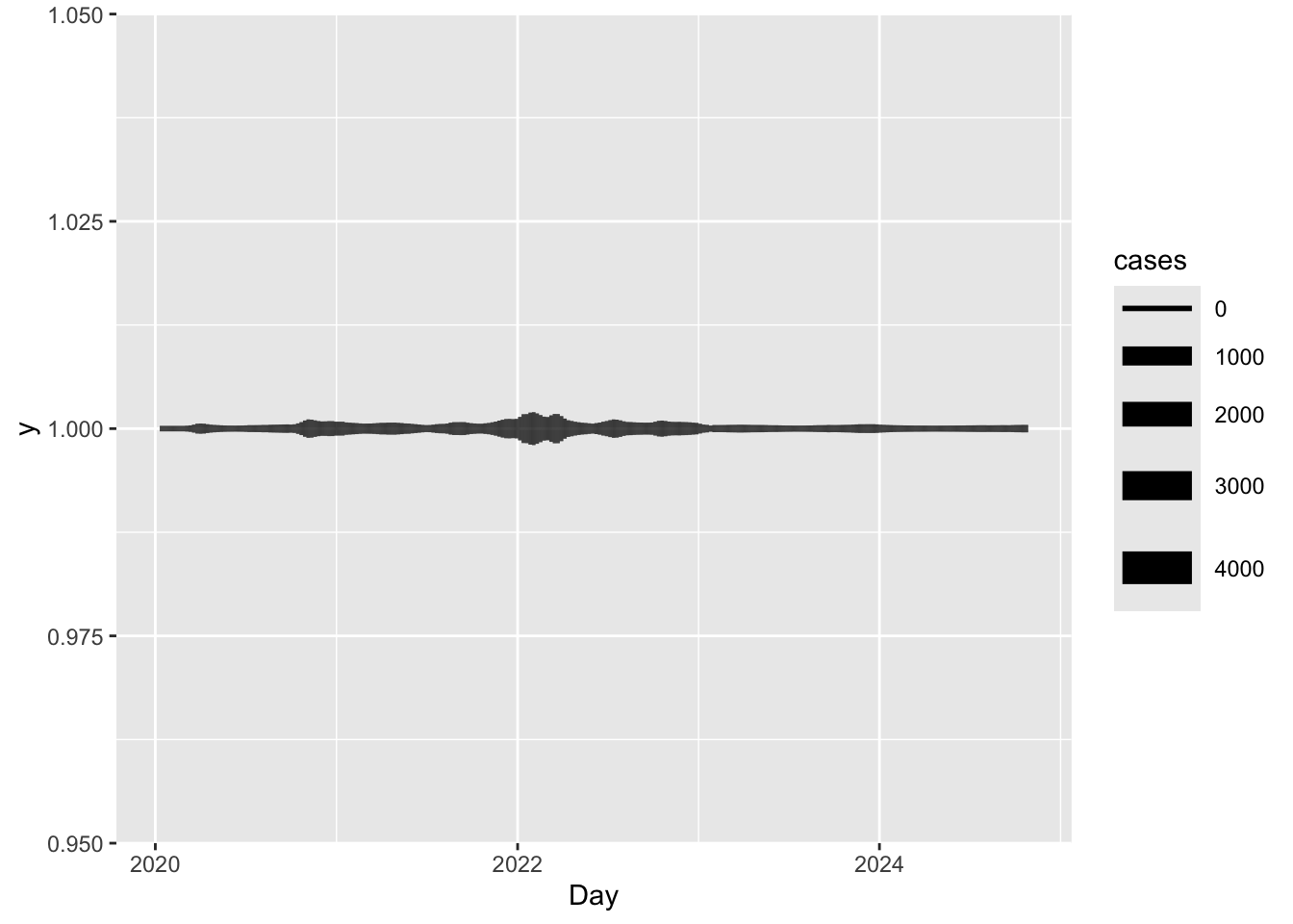
That’s nice, but this is a line, not a spiral.
We need to use something we haven’t talked about before, changing the coordinate system.
Adding coord_polar() to the plot will change the coordinate system to polar coordinates, which will wrap the line around the plot, instead of the usual XY Cartesian coordinates.
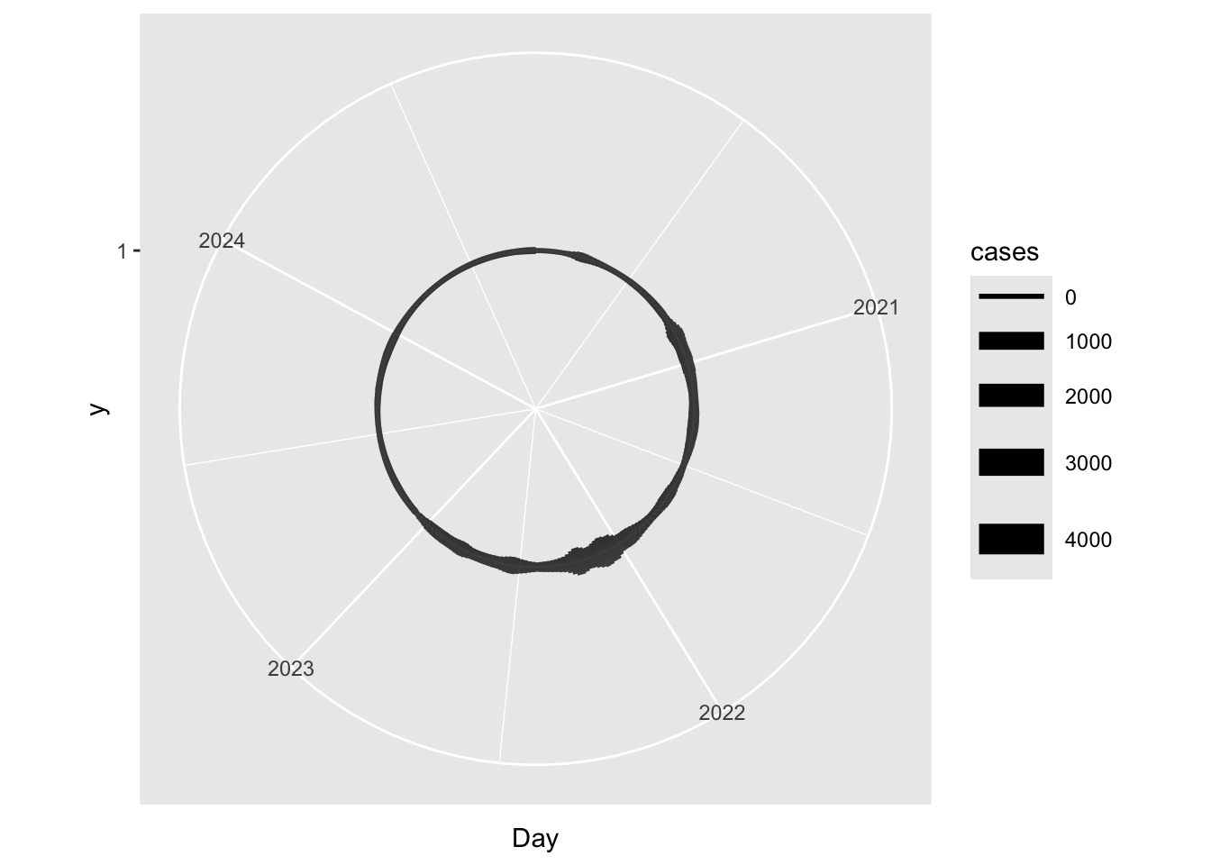
Closer, but we have a circle here, not a spiral as was intended. To do this, we need to add some tilt to the line. Going back to the Cartesian coordinate system, the simplest way to tilt a line is to change the Y value.
We can do this by setting it to a range of values, which will create a line that goes from the bottom left to the top right of the plot. I’ve here used 1:nrow(covid), which will create a line that goes from 1 to the number of rows in the data frame.
covid |>
  ggplot(aes(x = Day, y = 1:nrow(covid), size = cases)) +
  geom_line() +
  labs(title = "Daily new confirmed COVID-19 cases per million people in Switzerland",
       x = "Day",
       y = "Cases per million people")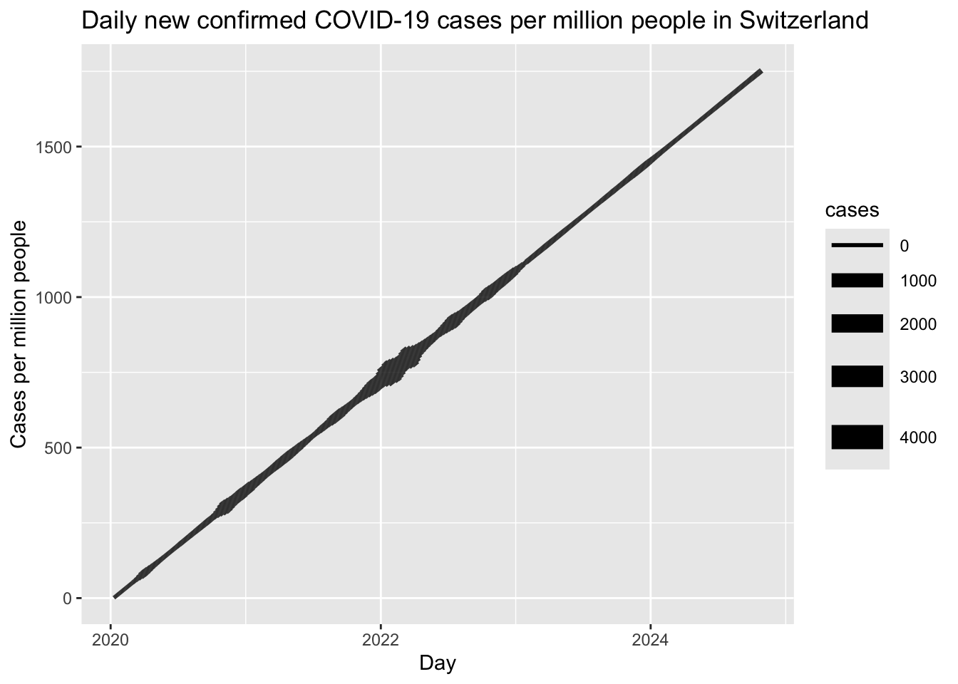
When we plot this with polar coordinates, we get a spiral that shows the number of COVID cases in Switzerland over time.
covid |>
  ggplot(aes(x = Day, y = 1:nrow(covid), size = cases)) +
  geom_line() +
  labs(title = "Daily new confirmed COVID-19 cases per million people in Switzerland",
       x = "Day",
       y = "Cases per million people") +
  coord_polar()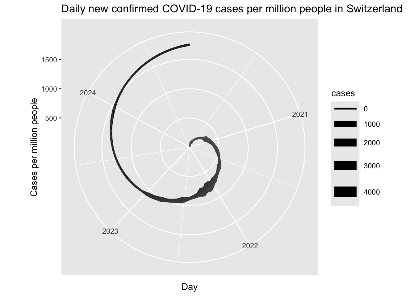
Of course, there’s a lot more that could be done; making the line thicker, labeling some key events, making the spiral go around twice, etc. But this is an easy way to get started.
10.2 Color theory
What colors should you make your charts? Here are some basic guidelines to follow:
10.2.1 Classwork: Color blindness and accessibility.
Everyone should take out the plots they did for their midterms, and paste one of them into this website: https://pilestone.com/pages/color-blindness-simulator-1
This will show you what your plot looks like to someone with color blindness. Did the colors you chose still work? If not, what could you do to make them more accessible?
10.2.2 Printability
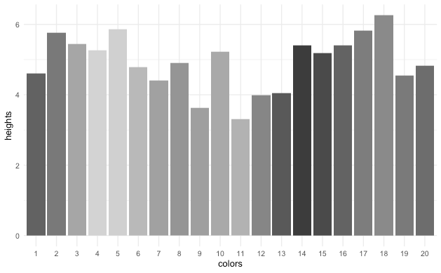
Especially when you’re making plots for an academic article, you need to make sure that they look good in black and white, because many people still print things off to read them on their B&W office printer, and your plot should still look OK. You can use the color blindness simulator to see how your plot looks in black and white under the monochromacy setting, or actually print it off before publishing.
Be careful with gradients, as they can do weird things in black and white. For example, this chart looks pretty festive and easy to interpret in color, but in black and white, it’s a mess.
tibble(
  colors = 1:20,
  heights = rnorm(20) + 5
) |>
  mutate(colors = factor(colors)) |>
ggplot() +
  geom_col(aes(x = colors, y = heights, fill = colors)) +
  theme_minimal() +
  scale_fill_manual(values = rainbow(20)) +
  theme(legend.position = "none")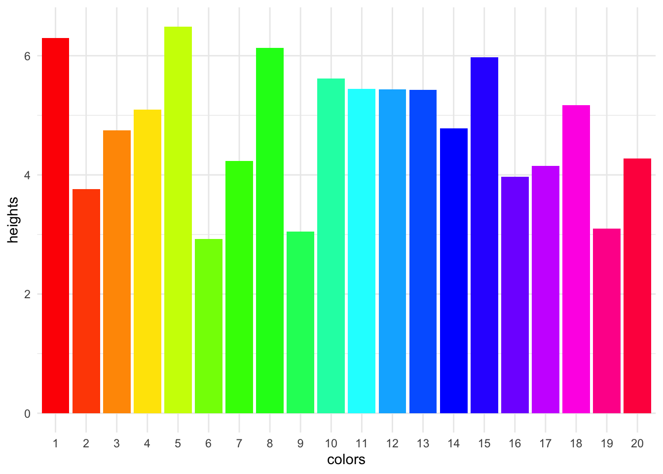
10.2.3 Significance & cultural context
Some colors are associated with certain things, and you should be aware of this when choosing colors for your plots. For example, in most western countries, a stock market chart that goes up is green, and a stock market chart that goes down is red. However, this is the opposite on most East Asian stock markets, where red is lucky.
10.2.4 Personal style
If you want to push something out that looks nice by default, the Viridis color palettes are never a bad choice; they’re built into ggplot2, and they’re colorblind-friendly and look good in black and white.
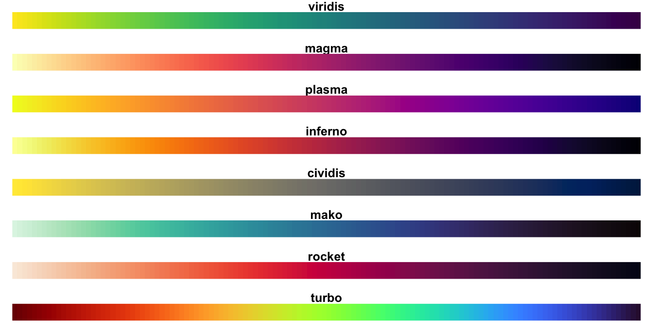
However, once you learn them, you’ll start to see them absolutely everywhere.
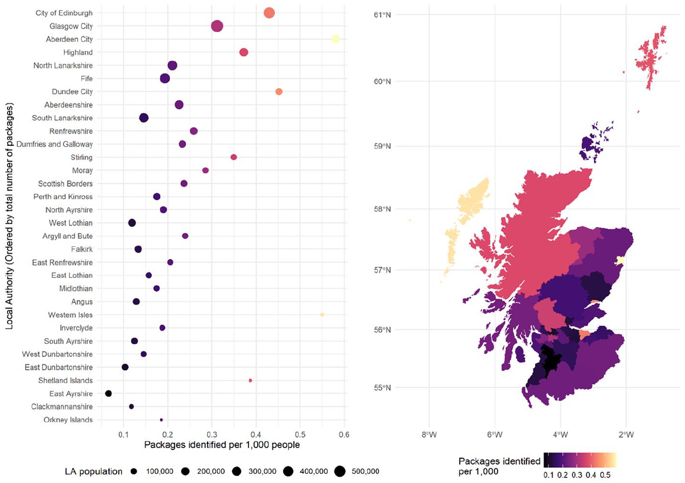
This article about buying drugs online in Scotland? Viridis.
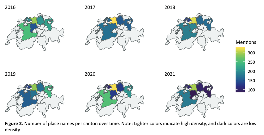
This article about news in rural Switzerland? Viridis.
Because of this, it might be nice to make your own color palettes, so that your plots look like your plots, and not like everyone else’s.
10.3 Classwork: Coloring a chart
Sometimes, when a variable we’re plotting is categorical, we want to assign a different color to each category manually.
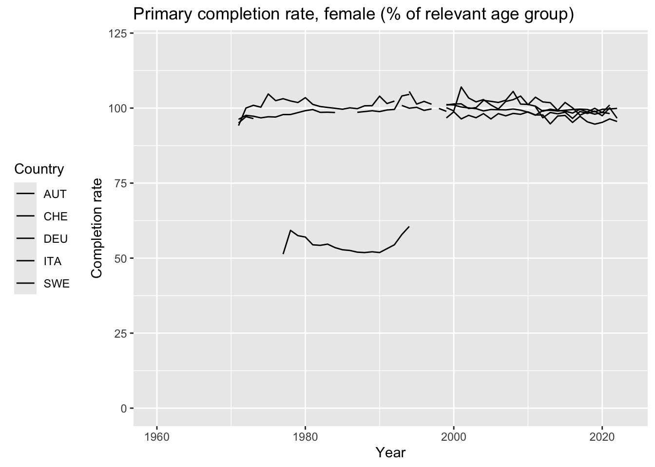
Here is a plot of the primary school completion rate for girls, with the code to add a color to each country.
Data comes from here: https://data.worldbank.org/indicator/SE.PRM.CMPT.FE.ZS I do not know why it goes above 100%. A bonus point to anyone who can tell me.
Take a minute with a color picker, and change the colors to something you like better.
A helpful tool is Adobe’s color wheel, which will help you pick colors that go well together: https://color.adobe.com/create/color-wheel
download.file("https://api.worldbank.org/v2/en/indicator/SE.PRM.CMPT.FE.ZS?downloadformat=csv", "input_data/edu_girls.zip", mode = "wb")
unzip("input_data/edu_girls.zip", exdir = "input_data/edu_girls")
edu_girls <- read_csv("input_data/edu_girls/API_SE.PRM.CMPT.FE.ZS_DS2_en_csv_v2_3431875.csv", skip = 3)edu_girls <- edu_girls |>
pivot_longer(cols = 5:68, names_to = "year", values_to = "percent") |>
select(1:2, year, percent) |>
mutate(year = as.Date(paste0(year, "-01-01"))) |>
rename(country_name = `Country Name`, country_code = `Country Code`)
edu_plot <- edu_girls |>
filter(country_code %in% c("DEU", "AUT", "CHE", "ITA", "SWE")) |> # Only select these countries
ggplot(aes(x = year, y = percent, color=country_code)) +
geom_line() +
labs(title = "Primary completion rate, female (% of relevant age group)",
x = "Year",
y = "Completion rate",
color = "Country"
) +
lims(y=c(0, 120)) +
theme(legend.position = "left")edu_plot +
scale_color_manual(
values = c(
"DEU" = "#000000",
"AUT" = "#000000",
"CHE" = "#000000",
"ITA" = "#000000",
"SWE" = "#000000"
)
)
10.4 A history of computer colors
But what do these codes mean? Let’s go on a little deep dive into how colors are represented on computers.
Everything on a computer is stored as groups of 0s and 1s. This is called the binary number system. Back in the olden days, computers would display colors as only black and white, with a 0 being black and a 1 being white (or green, or whatever color the screen was).
10.4.1 Old-school graphics

Figure 10.3: An apple 2e, from computinghistory.org.uk
tibble(
  g = c(0, 0, 0, 0, 0, 0, 0),
  f = c(0, 0, 1, 0, 1, 0, 0),
  e = c(0, 0, 0, 0, 0, 0, 0),
  d = c(0, 0, 0, 1, 0, 0, 0),
  c = c(0, 1, 0, 0, 0, 1, 0),
  b = c(0, 0, 1, 1, 1, 0, 0),
  a = c(0, 0, 0, 0, 0, 0, 0)
) |>
  mutate(row = row_number()) |>
  pivot_longer(cols = a:g, names_to = "column", values_to = "value")  |>
  ggplot() +
  geom_tile(aes(x = row, y = column, fill = value)) +
  scale_fill_gradient(low = "#112222", high = "#22dd22") +
  theme_void() +
  theme(legend.position = "none")
This was fine in the 1980s, but as computers got more powerful, people wanted to display more colors. To do this, we need to understand how computers store numbers.
When we write a number, we can go from 0 to 9 before we need to add another digit. This is called base 10, because we have 10 digits to work with. Computers, however, only have two digits: 0 and 1. This is called base 2, or binary. When numbers are stored in a computer, you need to add another digit every time you get to 2.
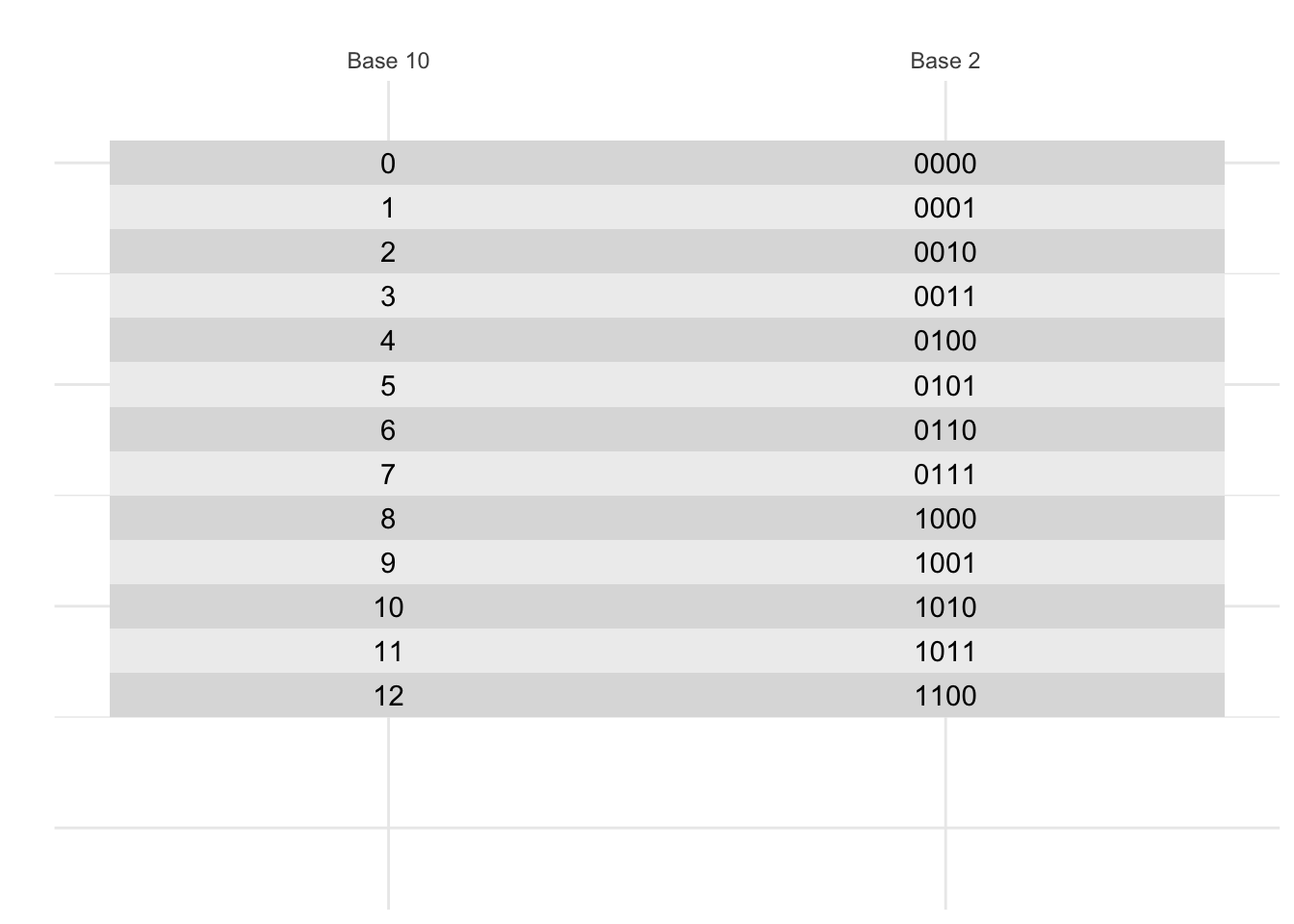
10.5 Classwork: Counting in binary
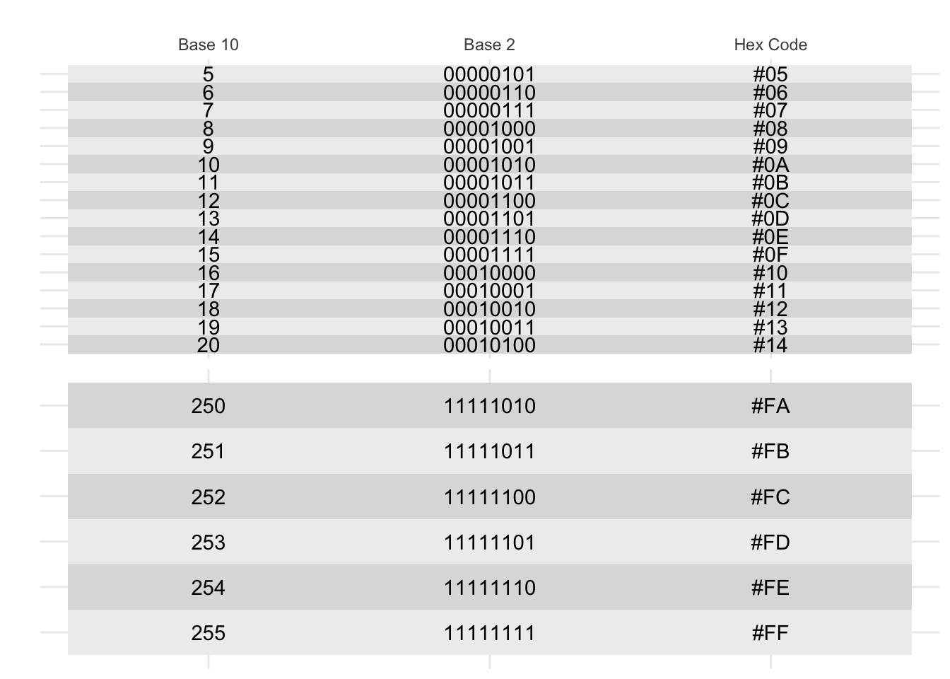
Without peeking, on a piece of paper, write the numbers 1 to 20 in binary.
- How many bits (a 0 or a 1) do you need to write the number 20 in binary?
- What is 1111 in base 10?
- How many different numbers can you write with 4 bits?
10.5.1 Four-bit color
The next innovation was to code each of these numbers to a color. This is called a color palette. Here’s a four-bit color palette:

Figure 10.4: Four-bit color, from https://www.fountainware.com/EXPL/vga_color_palettes.htm
Note that with 4 bits, we get 16 colors. This is because 2^4 = 16. To make it easier to remember, we can write these numbers in hexadecimal, which is base 16. This is why the colors are written as #0, #1, #2, …, #9, #A, #B, #C, #D, #E, #F. Hexidecimal is used all the time in computer programming because it’s a nice way to write numbers in base 16.
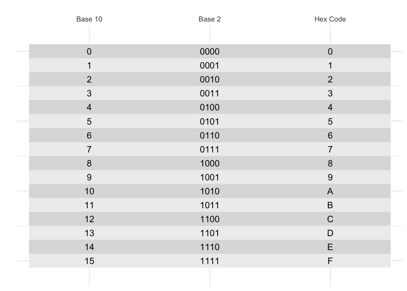 But what if you want more than 16 numbers? You could use 8 bits, which gives you 256 colors. This is called the 8-bit color model. This is often represented with two hexidecimal digits, so you can have colors like #00, #01, …, #FF.
10.6 Color channels
Color palettes were fine for the early 90s, but there were two problems:
- The colors were different on every computer.
- There were only a limited number of colors.
We solved this by using three color channels: red, green, and blue.This is called the RGB color model. This works well, because if you look super closely at most compuuter screens, you’ll see that it’s made up of tiny red, green, and blue dots right next to each other, and your brain mixes them together to make all the colors you see.
Figure 10.5: Four-bit color, from https://en.wikipedia.org/wiki/RGB_color_model#/media/File:RGB_pixels.jpg
10.6.1 Web colors
The current most common color model is the web color model, which uses 8 bits for each color channel; two hexidecimal digits for each color. For this, there are two digits for red, two for green, and two for blue. This means that there are 256 different values for each color channel, which gives us 256 * 256 * 256 = 16,777,216 different colors.
In this system, the color #000000 is black, #FFFFFF is white, #FF0000 is red, #00FF00 is green, and #0000FF is blue. R + G + B.
Here is a color wheel of all the colors in the web color model:
tibble(
  hue = seq(0,1, length.out = 13),
  color = hsv(hue, 1, 1)
) |>
  mutate(color_string = color |> as.character() |> str_to_lower()) |>
  head(-1) |>
  ggplot(aes(x = hue, y = 1)) +
  geom_tile(aes(fill = color)) +
  geom_text(aes(label = color_string), color = "black") +
  scale_fill_identity() +
  lims(y = c(-0.5, 1.5)) +
  theme_void() +
  coord_polar()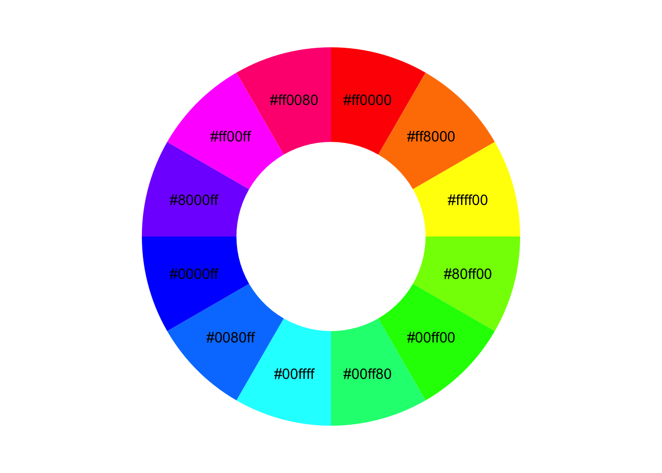
You’ll notice that this color wheel is a little different than the one you learned in school; the complement of blue is yellow, not orange. This is because this is a color wheel of light, not pigment. The primary colors of light are red, green, and blue, not red, yellow, and blue.

10.7 Classwork: Color matching
Let’s get some practice with color matching. I’ve given you an array of tiles, each with a different color. Please type the hex code that matches each color. You don’t have to be exact.

ggplot() +
  geom_tile(aes(x = 1, y = 1), fill = "#ff0000") +
  geom_tile(aes(x = 2, y = 1), fill = "#000000") +
  geom_tile(aes(x = 3, y = 1), fill = "#000000") +
  geom_tile(aes(x = 4, y = 1), fill = "#000000") +
  geom_tile(aes(x = 5, y = 1), fill = "#000000") +
  geom_tile(aes(x = 6, y = 1), fill = "#000000") +
  geom_tile(aes(x = 7, y = 1), fill = "#000000") +
  geom_tile(aes(x = 8, y = 1), fill = "#000000") +
  geom_tile(aes(x = 1, y = 0), fill = "#000000") + # Second row starts here
  geom_tile(aes(x = 2, y = 0), fill = "#000000") +
  geom_tile(aes(x = 3, y = 0), fill = "#000000") +
  geom_tile(aes(x = 4, y = 0), fill = "#000000") +
  geom_tile(aes(x = 5, y = 0), fill = "#000000") +
  geom_tile(aes(x = 6, y = 0), fill = "#000000") +
  geom_tile(aes(x = 7, y = 0), fill = "#000000") +
  geom_tile(aes(x = 8, y = 0), fill = "#000000") +
  theme_void()
This is a skill you now have for the rest of your digital life.
10.8 Homework and practice
- Make some gradients!
With the language chart, we’ve done a discrete color palette, one where each color is assigned to a category. The other type of color palette is a continuous color palette, where the color changes gradually with the value of the variable.
You can test this out by making a gradient with the code below.
Here’s a simple example of a gradient with some nice blues, using the scale_fill_gradientn() function.
Make three gradients of your own, so that you can use them in future plots whenever you wish.
tibble(
  grad = 0:10 / 10,
) |>
  ggplot() +
  geom_tile(aes(x = grad, y = 1, fill = grad)) +
  theme_void() +
  theme(legend.position = "left") +
  labs(fill="My\nGradient") +
  scale_fill_gradientn(colors = c("#222255", "#227788", "#88bbff")) # Change this!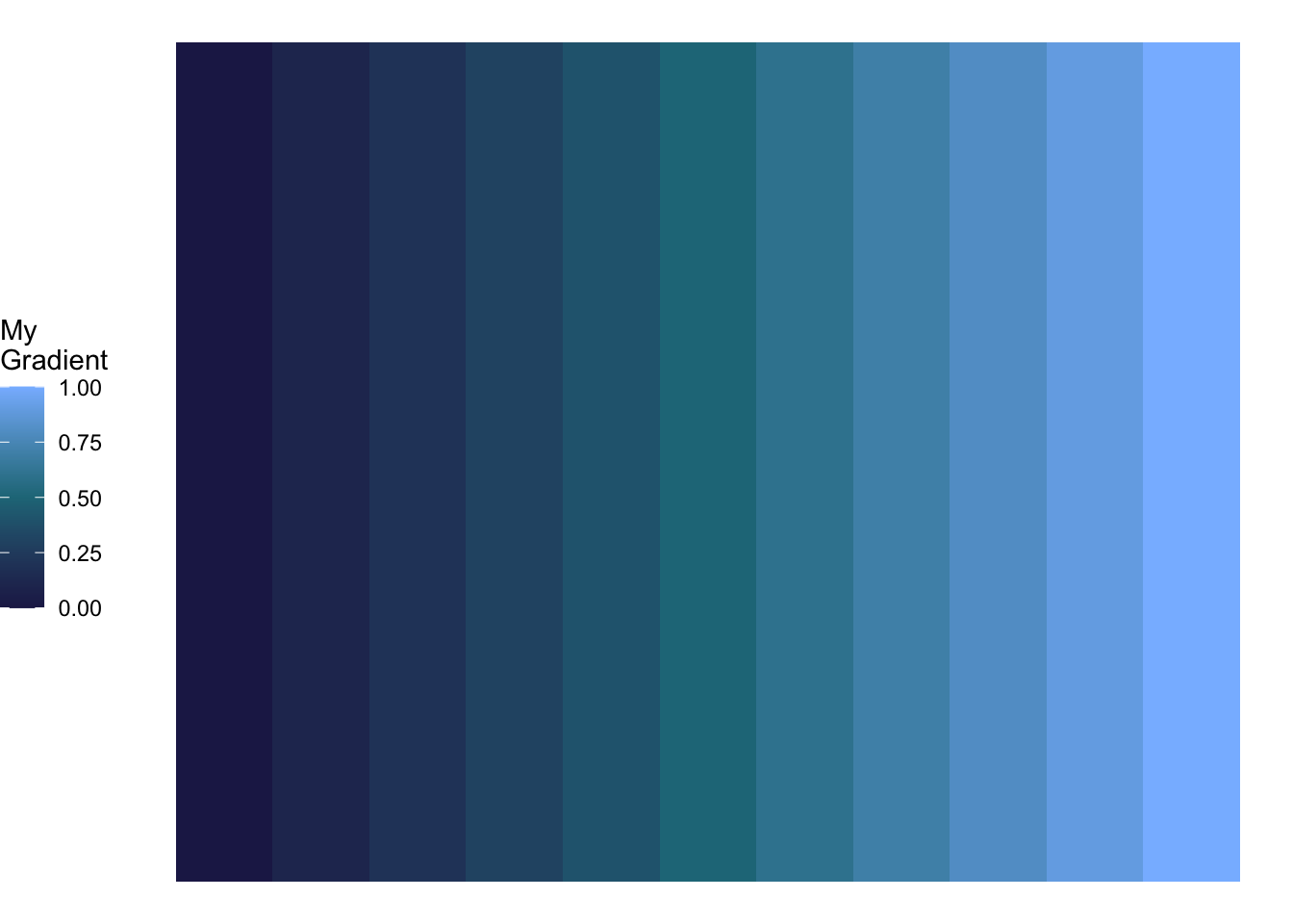
- Download some data of your choice, make a plot, and color it with a discrete or continuous color palette that you think would work well. Test for accessibility and printability, and email it to me before 12:00 on Wednesday.
