5 GGplot 1
We’ve finally done it! We’ve reached the point where we can stop cleaning data over and over, and start making some plots.
But first, we must remember that form follows function, and we’ll first concentrate on making plots that are useful, before we make them beautiful.
Our first task this week is to use data visualization to explore a data set and come to some conclusions about it.
We’ll use the charlatan package to create a fake data set, different for each student, and then use ggplot to gain some insights about it. This will be fake data, but is inspired by a real data set in my own PhD project.
To start, we’ll install the charlatan package, which is just something that helps us create fake data.
install.packages("charlatan)Next, please copy and paste the following code into a new R script. This will make a data frame called news_users.
Be careful! every time you run this code, you’ll get new data with new correlations.
library(tidyverse)
library(charlatan)

survey_questions <- c(
  "q1" = "How often do you read the news?",
  "q2" = "Are you interested in international politics?",
  "q3" = "Do you think the news is biased?",
  "q4" = "Are you satisfied with your life?",
  "q5" = "Do you think the news is too negative?",
  "q6" = "How many children do you have?",
  "q7" = "How many hours per day are you on your phone?",
  "q8" = "Do you use Instagram?",
  "q9" = "Do you use Twitter?",
  "q10" = "Do you use Tiktok?"
)

news_users <- tibble(
  name = ch_name(n = 1000, locale = "fr_FR"),
  gender = sample(c("m", "w"), 1000, replace = TRUE),
  age = sample(18:65, 1000, replace = TRUE)

) |>
  bind_cols(
    tibble(
      job = ch_job(n = 10, locale = "en_US"),
      salary = sample(seq(2e4, 2e5, 1e3), 10, replace = TRUE)
    ) |>
      sample_n(1000, replace = TRUE) |>
      mutate(salary = salary + sample(seq(-1e4, 1e4, 1e3), 20))
  ) |> bind_cols(
    tibble(
      q1 = sample(
        c("Never", "Rarely", "Sometimes", "Often", "Always"),
        1000,
        replace = TRUE
      ),
      q2 = sample(1:7, 1000, replace = TRUE),
      q3 = sample(c("Yes", "No", "I don't know"), 1000, replace = TRUE),
      q4 = sample(1:7, 1000, replace = TRUE),
      q5 = sample(c("Yes", "No", "I don't know"), 1000, replace = TRUE),
      q6 = sample(c(rep(0, 5), 1:5), 1000, replace = TRUE),
      q7 = sample(0:8, 1000, replace = TRUE),
      q8 = sample(c(TRUE, FALSE), 1000, replace = TRUE),
      q9 = sample(c(TRUE, FALSE), 1000, replace = TRUE),
      q10 = sample(c(TRUE, FALSE), 1000, replace = TRUE)
    )
  ) |>
  mutate(minutes_reading_news = (age - 25) / 3) |>
  mutate(minutes_reading_news = if_else(gender == "m", minutes_reading_news + 3, minutes_reading_news -3)) |>
  mutate(
    minutes_reading_news = case_when(
      q1 == "Never" ~ minutes_reading_news - 4,
      q1 == "Rarely" ~ minutes_reading_news - 2,
      q1 == "Sometimes" ~ minutes_reading_news,
      q1 == "Often" ~ minutes_reading_news + 4,
      q1 == "Always" ~ minutes_reading_news + 6
    )
  ) |>
  mutate(minutes_reading_news = minutes_reading_news + q2 * 1.2 - 3) |>
  mutate(minutes_reading_news = if_else(salary > 1e5, minutes_reading_news + 3, minutes_reading_news - 3)) |>
  mutate(minutes_reading_news = if_else(
    q3 == "Yes",
    minutes_reading_news + sample(c(0, 5), 1),
    minutes_reading_news)
    )  |>
  mutate(minutes_reading_news = minutes_reading_news - (q4 * sample(c(0,2), 1))) |>
  mutate(minutes_reading_news = if_else(
    q5 == "Yes",
    minutes_reading_news - sample(c(0, 5), 1),
    minutes_reading_news)
    ) |>
  mutate(minutes_reading_news = minutes_reading_news + (q6 * sample(c(0,2), 1))) |>
  mutate(minutes_reading_news = minutes_reading_news + (q7 * sample(c(0,2), 1))) |>
  mutate(minutes_reading_news = if_else(q8, minutes_reading_news + sample(c(0, 5), 1), minutes_reading_news)) |>
  mutate(minutes_reading_news = if_else(q9, minutes_reading_news + sample(c(0, 5), 1), minutes_reading_news)) |>
  mutate(minutes_reading_news = if_else(q10, minutes_reading_news - 5, minutes_reading_news)) |>
  mutate(minutes_reading_news = minutes_reading_news + rnorm(1000, 0, 1)) |>
  mutate(minutes_reading_news = if_else(minutes_reading_news < 0, 0, minutes_reading_news))
Let’s take a look at this data! We can use glimpse() to get a quick overview of the data.
## Rows: 1,000
## Columns: 16
## $ name                 <chr> "Alice Silva d'Lefort", "Charles Pineau", "Jérôme Oliveira-Loiseau", "Joseph Delattre-Légrand", "Adrien Chauveau", "Constance Dupuy", "Véronique Brun", "Luce Carré L'Brunét", "Nathalie Benard", "Sophie Rénard", "Manon Martin-Lemaitre", "I…
## $ gender               <chr> "m", "w", "w", "m", "m", "m", "w", "w", "m", "m", "w", "w", "m", "m", "w", "m", "w", "m", "m", "m", "w", "m", "w", "m", "w", "w", "m", "w", "w", "w", "w", "w", "m", "m", "m", "m", "w", "w", "w", "w", "m", "w", "w", "w", "w", "m", "w", "m"…
## $ age                  <int> 19, 22, 32, 36, 19, 29, 25, 45, 62, 38, 39, 33, 62, 34, 35, 31, 30, 38, 58, 49, 20, 59, 39, 19, 55, 22, 46, 56, 58, 34, 43, 48, 18, 49, 50, 21, 58, 26, 58, 39, 20, 59, 62, 52, 24, 49, 33, 24, 27, 37, 23, 26, 43, 46, 20, 52, 29, 21, 31, 55…
## $ job                  <chr> "Insurance broker", "Administrator, arts", "Company secretary", "Company secretary", "Production manager", "Psychiatric nurse", "Amenity horticulturist", "Production manager", "Company secretary", "Administrator, arts", "Psychiatric nurse…
## $ salary               <dbl> 168000, 92000, 115000, 117000, 23000, 191000, 188000, 35000, 112000, 85000, 180000, 36000, 193000, 51000, 92000, 99000, 18000, 190000, 32000, 191000, 181000, 173000, 176000, 93000, 119000, 91000, 42000, 46000, 27000, 40000, 161000, 25000,…
## $ q1                   <chr> "Rarely", "Sometimes", "Rarely", "Always", "Sometimes", "Sometimes", "Never", "Never", "Rarely", "Sometimes", "Never", "Sometimes", "Never", "Never", "Sometimes", "Rarely", "Never", "Often", "Rarely", "Sometimes", "Rarely", "Never", "Rare…
## $ q2                   <int> 6, 6, 3, 1, 4, 1, 2, 3, 5, 2, 2, 1, 2, 4, 5, 2, 4, 6, 1, 3, 2, 2, 6, 7, 5, 1, 3, 7, 4, 5, 2, 6, 7, 4, 5, 3, 5, 1, 5, 2, 6, 3, 2, 5, 6, 1, 4, 2, 5, 7, 6, 7, 1, 1, 6, 2, 7, 6, 6, 6, 4, 7, 4, 2, 6, 6, 2, 3, 2, 2, 4, 6, 4, 3, 7, 1, 4, 5, 4, 2…
## $ q3                   <chr> "No", "I don't know", "Yes", "I don't know", "I don't know", "No", "Yes", "I don't know", "I don't know", "No", "No", "Yes", "No", "No", "I don't know", "Yes", "I don't know", "Yes", "I don't know", "I don't know", "I don't know", "No", "…
## $ q4                   <int> 3, 3, 7, 2, 4, 3, 6, 3, 4, 3, 1, 4, 3, 7, 1, 5, 1, 1, 1, 7, 1, 1, 6, 6, 2, 3, 7, 4, 4, 6, 2, 7, 7, 3, 4, 7, 5, 5, 7, 1, 6, 6, 1, 7, 5, 6, 5, 5, 4, 6, 6, 5, 2, 2, 3, 6, 5, 4, 5, 1, 3, 5, 4, 4, 2, 3, 7, 7, 6, 7, 2, 1, 2, 5, 2, 6, 3, 1, 1, 6…
## $ q5                   <chr> "Yes", "No", "I don't know", "No", "I don't know", "Yes", "No", "I don't know", "I don't know", "I don't know", "Yes", "No", "Yes", "I don't know", "No", "No", "No", "No", "Yes", "No", "I don't know", "I don't know", "Yes", "I don't know"…
## $ q6                   <dbl> 5, 5, 0, 0, 1, 3, 0, 3, 5, 4, 3, 3, 0, 2, 0, 0, 0, 1, 3, 4, 0, 5, 0, 0, 0, 0, 0, 0, 3, 2, 1, 0, 0, 0, 0, 0, 1, 5, 0, 0, 0, 4, 0, 1, 5, 5, 0, 3, 0, 5, 0, 0, 0, 0, 1, 4, 0, 4, 0, 0, 1, 0, 0, 3, 4, 0, 3, 3, 1, 1, 0, 0, 0, 2, 0, 3, 0, 0, 5, 0…
## $ q7                   <int> 5, 5, 1, 7, 5, 2, 5, 7, 7, 4, 4, 6, 8, 4, 8, 5, 7, 1, 4, 8, 1, 2, 1, 5, 3, 4, 6, 3, 3, 2, 5, 6, 4, 2, 3, 6, 8, 7, 8, 3, 0, 0, 4, 7, 7, 2, 5, 6, 5, 2, 7, 2, 8, 2, 6, 6, 7, 0, 6, 8, 0, 3, 1, 8, 0, 0, 2, 0, 7, 6, 5, 0, 5, 1, 1, 0, 0, 1, 4, 0…
## $ q8                   <lgl> FALSE, FALSE, FALSE, TRUE, FALSE, TRUE, FALSE, TRUE, TRUE, FALSE, TRUE, FALSE, FALSE, FALSE, FALSE, FALSE, TRUE, TRUE, TRUE, FALSE, TRUE, TRUE, TRUE, FALSE, TRUE, FALSE, TRUE, FALSE, TRUE, TRUE, TRUE, FALSE, TRUE, TRUE, FALSE, FALSE, TRUE…
## $ q9                   <lgl> TRUE, TRUE, TRUE, TRUE, TRUE, TRUE, FALSE, FALSE, TRUE, TRUE, FALSE, FALSE, TRUE, FALSE, FALSE, FALSE, FALSE, TRUE, TRUE, FALSE, FALSE, TRUE, TRUE, TRUE, TRUE, FALSE, FALSE, TRUE, FALSE, FALSE, TRUE, FALSE, FALSE, FALSE, TRUE, TRUE, FALSE…
## $ q10                  <lgl> TRUE, FALSE, TRUE, FALSE, FALSE, TRUE, TRUE, TRUE, FALSE, TRUE, FALSE, TRUE, TRUE, FALSE, TRUE, FALSE, FALSE, FALSE, TRUE, TRUE, TRUE, TRUE, TRUE, TRUE, FALSE, TRUE, TRUE, FALSE, TRUE, FALSE, TRUE, TRUE, TRUE, TRUE, FALSE, FALSE, FALSE, T…
## $ minutes_reading_news <dbl> 11.6711884, 12.0228747, 0.5149378, 24.2893918, 6.4603633, 11.6755662, 0.0000000, 1.2544819, 40.6896135, 11.7016788, 7.2455513, 0.0000000, 11.5374695, 3.6848539, 0.0000000, 0.0000000, 0.6770188, 31.7210563, 15.8404667, 16.8088582, 0.000000…
This is the sort of thing you encounter all the time when you’re doing science. We have one data frame that contains a whole bunch of information of different types, and our goal is to figure out if it’s all related in some way.
In the pretense of this data set, let’s imagine we measured how much time people spent reading the news each day. That is the meaning of the minutes_reading_news variable. We can use summary() to get a quick overview of this variable. (Note that this is different from summarize() which is used in the tidyverse.)
##  minutes_reading_news
##  Min.   : 0.000
##  1st Qu.: 5.373
##  Median :11.672
##  Mean   :12.330
##  3rd Qu.:18.453
##  Max.   :40.690
Next, we also have some information about the people in the data set. We have their gender, age, job, and salary.
## # A tibble: 9 × 1
##   job
##   <chr>
## 1 Insurance broker
## 2 Administrator, arts
## 3 Company secretary
## 4 Production manager
## 5 Psychiatric nurse
## 6 Amenity horticulturist
## 7 Secretary, company
## 8 Landscape architect
## 9 Clinical biochemist
Finally, we have 10 survey questions that we asked people. In real life, these are always a bit of a mess, so I’ve made them a bit messy for you too. You can see the questions in a separate object.
##                                              q1                                              q2                                              q3                                              q4                                              q5
##               "How often do you read the news?" "Are you interested in international politics?"              "Do you think the news is biased?"             "Are you satisfied with your life?"        "Do you think the news is too negative?"
##                                              q6                                              q7                                              q8                                              q9                                             q10
##                "How many children do you have?" "How many hours per day are you on your phone?"                         "Do you use Instagram?"                           "Do you use Twitter?"                            "Do you use Tiktok?"
Note that the survey questions are sometimes different types of variables. For example, q1 is a categorical variable, q2 is a continuous variable, and q8 is a binary variable.
##       q1                  q2             q3                  q4           q5                  q6              q7            q8              q9             q10
##  Length:1000        Min.   :1.000   Length:1000        Min.   :1.0   Length:1000        Min.   :0.000   Min.   :0.000   Mode :logical   Mode :logical   Mode :logical
##  Class :character   1st Qu.:2.000   Class :character   1st Qu.:2.0   Class :character   1st Qu.:0.000   1st Qu.:2.000   FALSE:483       FALSE:511       FALSE:471
##  Mode  :character   Median :4.000   Mode  :character   Median :4.0   Mode  :character   Median :0.000   Median :4.000   TRUE :517       TRUE :489       TRUE :529
##                     Mean   :4.003                      Mean   :3.9                      Mean   :1.467   Mean   :4.134
##                     3rd Qu.:6.000                      3rd Qu.:6.0                      3rd Qu.:3.000   3rd Qu.:6.000
##                     Max.   :7.000                      Max.   :7.0                      Max.   :5.000   Max.   :8.000
So, our goal in this super scientific study is to figure out which variables are related to the amount of time people spend reading the news. Are older people more likely to read news than younger people? Are people with higher salaries more likely to read the news? Are people who think the news is biased more likely to read the news?
We can start by making some plots to explore the data. Let’s start with a super basic method of visualizing data: scatter plots.
A scatterplot is just a plot where each point represents a single observation, usually with one variable on the x-axis and one variable on the y-axis. We can use the geom_point() geometry to make scatter plots, like so:
5.1 Scatterplots
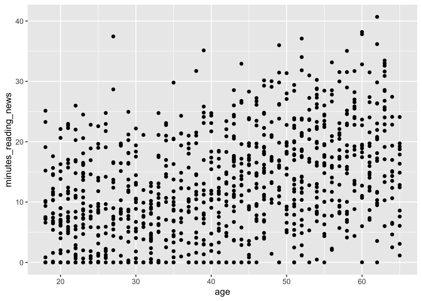 What do you think? Is there a relationship between age and the amount of time people spend reading the news? What else can we learn from this plot?
A second, more advanced type of plot is a boxplot. Boxplots are useful for comparing the distribution of a continuous variable across different categories. We can use the geom_boxplot() geometry to make boxplots, like so:
5.2 Boxplots
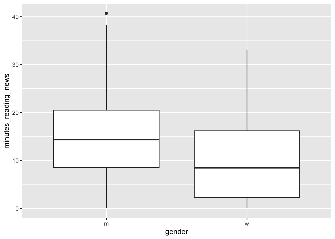
A boxplot shows the median, quartiles, and outliers of a continuous variable. Let’s take a minute to learn how to interpret these plots.
The line in the center is the median; the value that separates the top 50% of the data from the bottom 50%. The box represents the interquartile range, which is the range that contains the middle 50% of the data; from the bottom 25% to the top 25%. The whiskers extend to the most extreme data points that are not considered outliers. Outliers are shown as individual points.
What can we learn from this plot? Is there a difference in the amount of time people spend reading the news? If someone showed you this this plot in a scientific paper, would you find it convincing?
Let’s now look at the first survey question. This is a categorical variable, so we can again use a boxplot to compare the distribution of the continuous variable across the different categories.
5.2.1 Factors vs continuous variables
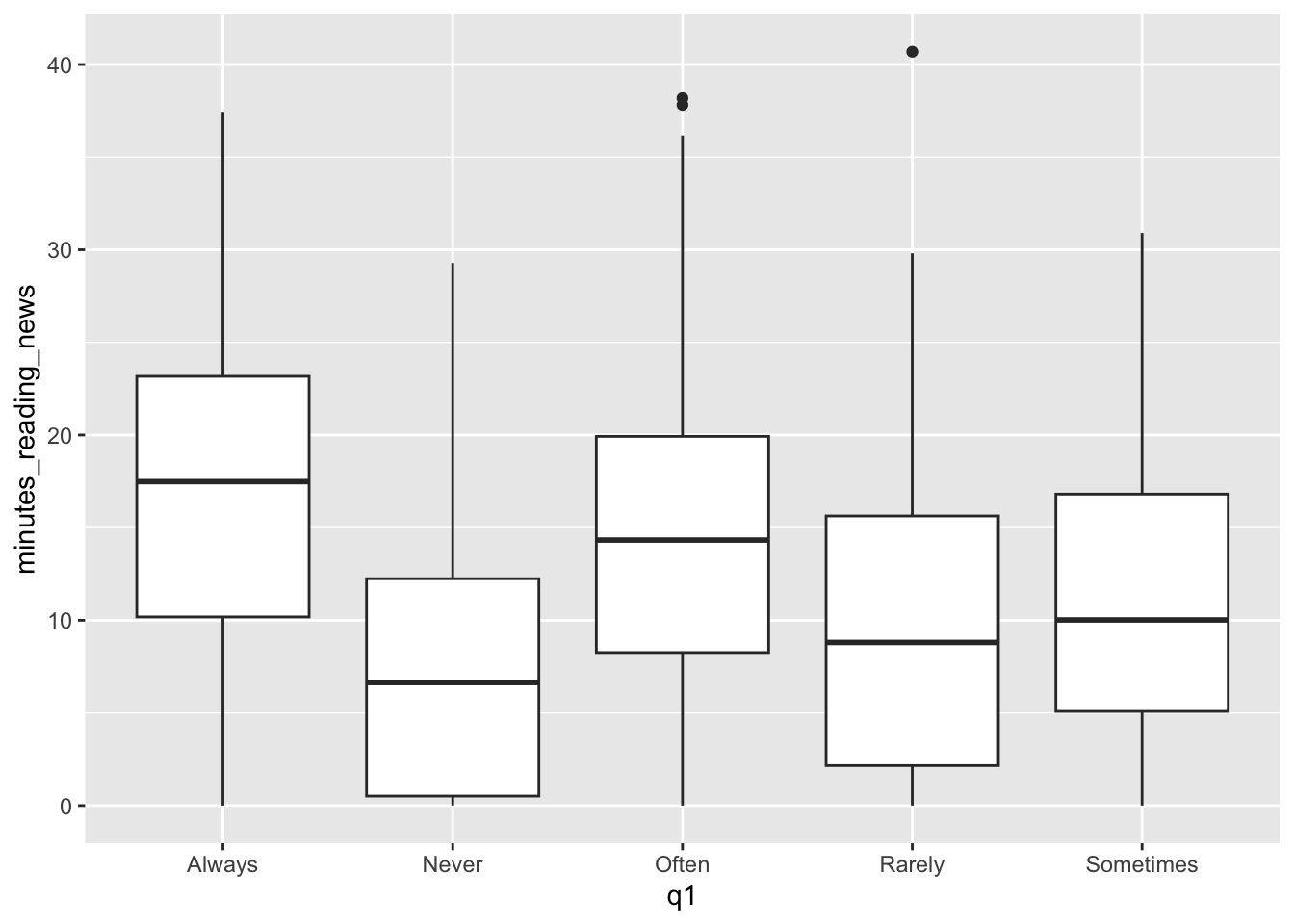 Question 1 was: “How often do you read the news?”
It looks like they were pretty honest on this question, as the boxplot shows a clear trend. However, this plot is kind of a mess: the categories are in alphabetical order, not in the order of the question. We can fix this by changing the type of the variable from a character to a factor.
What is a factor? A factor is a type of variable that has a fixed number of possible values. In this case, the possible values are “Never”, “Rarely”, “Sometimes”, “Often”, and “Always”. We can change the type of a variable using the factor() function. The levels argument specifies the order of the levels.
news_users |>
mutate(q1 = factor(q1, levels = c("Never", "Rarely", "Sometimes", "Often", "Always"))) |>
ggplot() +
geom_boxplot(aes(x=q1, y=minutes_reading_news))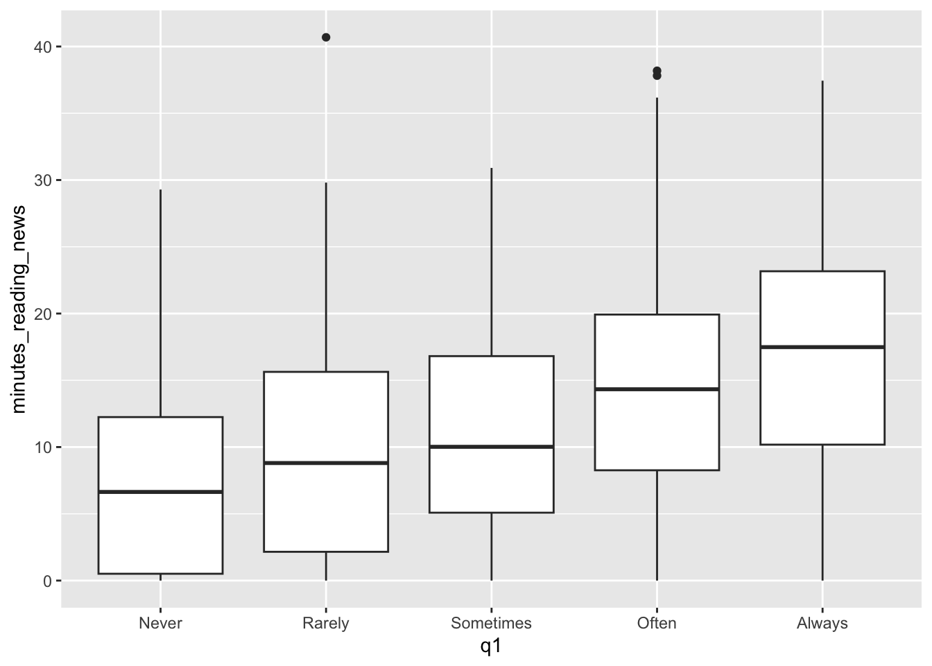 That’s much better! Now we can see them in the order we intended. Looks like a pretty clear trend to me. What more can we see from this plot?
Most of these survey questions should be considered factors. For example, in survey question 2, “Are you interested in international politics?”, we get answers on a scale of 1 to 7. This is a categorical variable, not a continuous variable. We can change it to a factor and make a boxplot to see if there is a relationship between this question and the amount of time people spend reading the news.
We can change q2 to a factor, but we don’t need to specify the levels because they are already in the correct order.
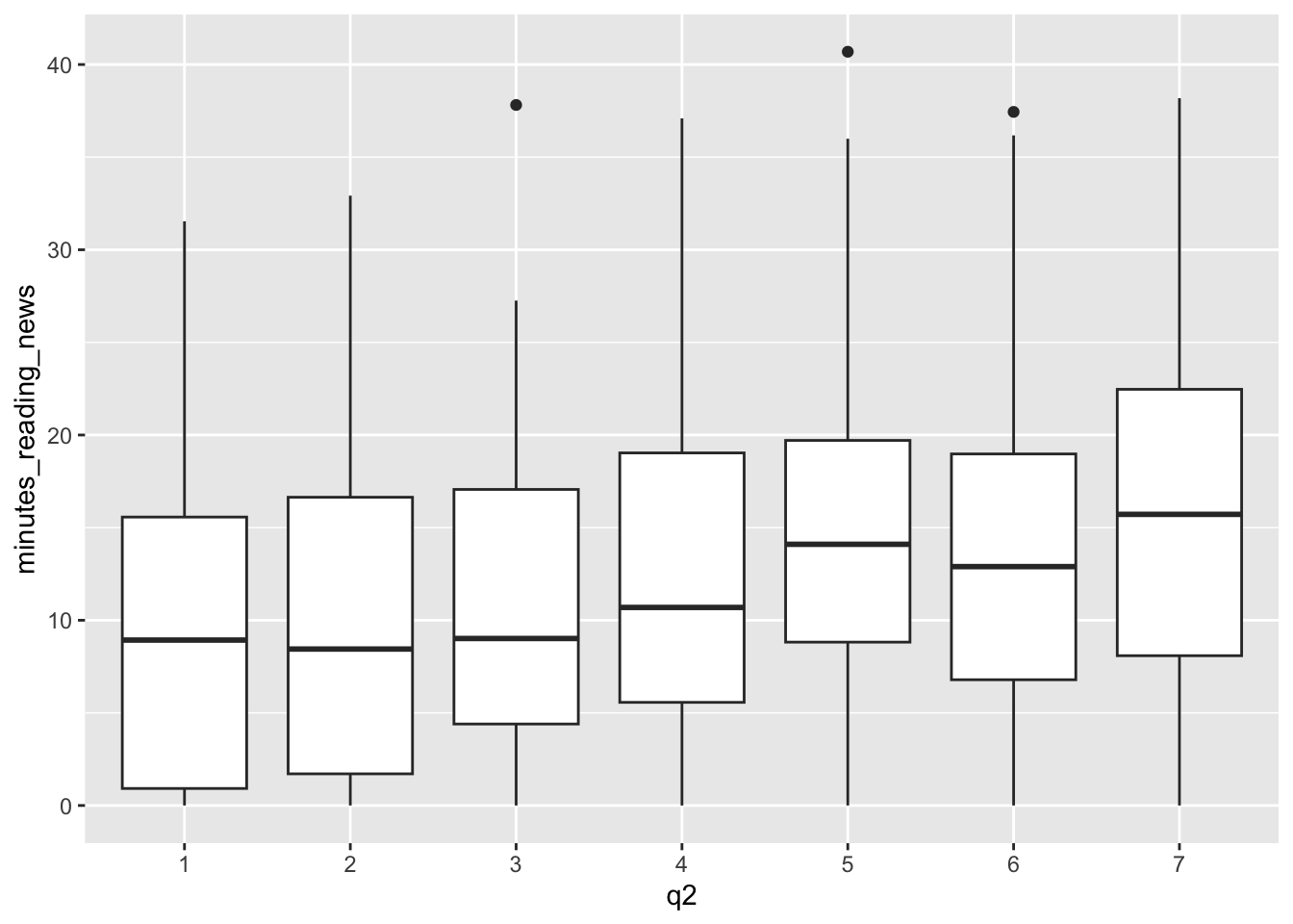
What do you think? Is there a relationship between this question and the amount of time people spend reading the news?
5.3 Density plots
Finally, we can also use density plots to visualize the distribution of a continuous variable. A density plot a kind of histogram, and it shows the distribution of a continuous variable. We can use the geom_density() geometry to make density plots, like so:
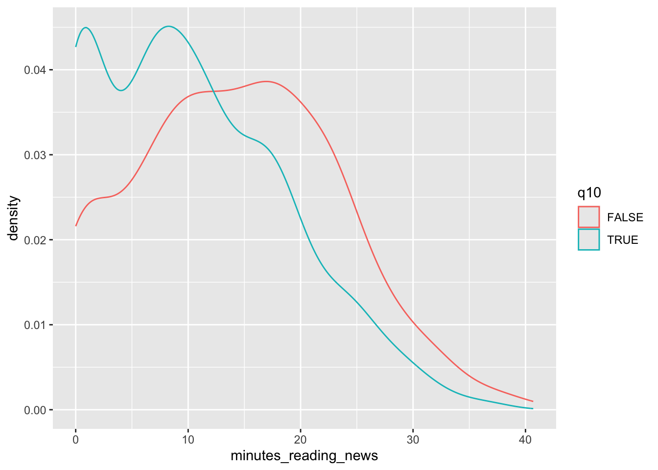 Let’s take a moment to look at this plot. Question 10 was: “Do you use Tiktok?” We can see that a lot of people who use TikTok
don’t read the news at all; there’s a high density of them near 0. What else can we learn from this plot?
Let’s take a moment to look at this plot. Question 10 was: “Do you use Tiktok?” We can see that a lot of people who use TikTok
don’t read the news at all; there’s a high density of them near 0. What else can we learn from this plot?
These are some of the first plots I go to when I get some new data, so let’s get some practice using them with our data set.
5.4 Classwork: Explore your data set
Let’s get some practice using these fundamental tools.
- Create appropriate scatterplots, boxplots, or density plots for survey questions 3-9 as you see appropriate.
- Which variables seem to have an effect on the minutes spent reading the news?
Note that you all have different results in the ramdomly generated data set, so you’ll have similarly different correlations.
5.5 Multiple geometries
One trick that we can use is to combine multiple geometries in the same plot. This can be useful when we want to show multiple aspects of the data at the same time. For example, we can combine a scatterplot with a smooth line to show the relationship between two variables.
Let’s go back to our age plot and add a smooth line to it using geom_smooth().
news_users |>
  ggplot() +
geom_point(aes(x = age, y = minutes_reading_news)) +
geom_smooth(aes(x = age, y = minutes_reading_news))## `geom_smooth()` using method = 'gam' and formula = 'y ~ s(x, bs = "cs")'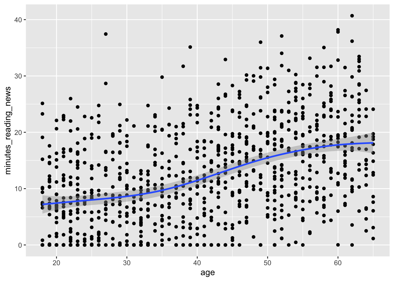 Now we can more clearly see the relationship with a handy little line. Very cool!
5.6 Parametric vs fixed variables
Here’s something that messes people up all the time: whether to put a variable inside the aes() function or not. These do very different things!
If you put a variable inside the aes() function, ggplot will treat it as a variable that changes across the data. For example, if you put color=gender inside aes(), ggplot will make a different color for men and women.
If you put a variable outside the aes() function, ggplot will treat it as a fixed value. For example, if you put color=“red” outside aes(), ggplot will make all the points red. There are other things we can do with fixed values, like setting the size of the points. Let’s see the difference:
Here, the color links to a variable in the data set, so it changes for each point. The size is fixed, so it’s the same for all points.
news_users |>
  ggplot() +
  geom_point(aes(x = age, y = minutes_reading_news, color=gender)) +
  geom_smooth(aes(x = age, y = minutes_reading_news))
## `geom_smooth()` using method = 'gam' and formula = 'y ~ s(x, bs = "cs")'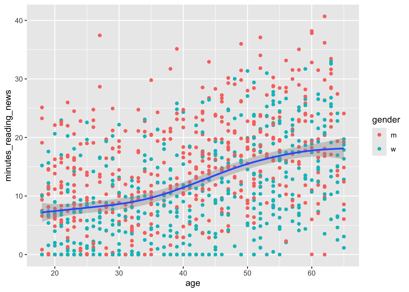
Here, the color is fixed, so it’s the same for all points. The size of the line is also fixed, so it’s the same for all points.
news_users |>
  ggplot() +
  geom_point(aes(x = age, y = minutes_reading_news), color = "red") +
  geom_smooth(aes(x = age, y = minutes_reading_news), size = 5)
## `geom_smooth()` using method = 'gam' and formula = 'y ~ s(x, bs = "cs")'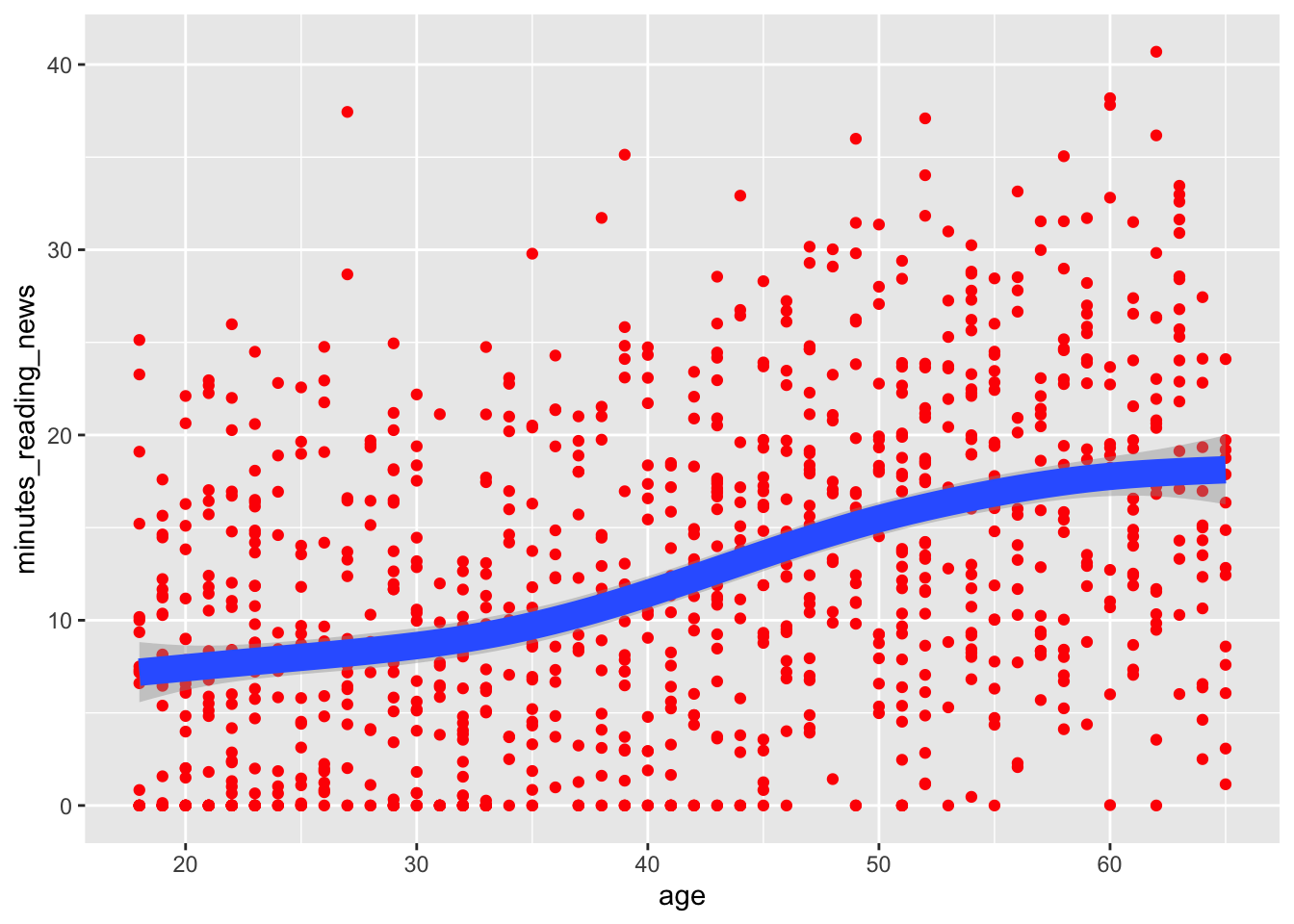
5.7 Labels and titles
So, let’s say we want to finalize a plot. We can add a title, subtitle, and labels to make it more clear. We can use the labs() function to add these to a plot. Adding a title and labels are a hard requirement for any plot you make in a scientific paper.
news_users |>
  ggplot() +
  geom_point(aes(x = age, y = minutes_reading_news), color = "red") +
  geom_smooth(aes(x = age, y = minutes_reading_news), size = 5) +
  labs(
    title = "Minutes spent reading the news by age",
    subtitle = "Data from a survey of 1000 people",
    x = "Age",
    y = "Minutes spent reading the news"
  )
## `geom_smooth()` using method = 'gam' and formula = 'y ~ s(x, bs = "cs")'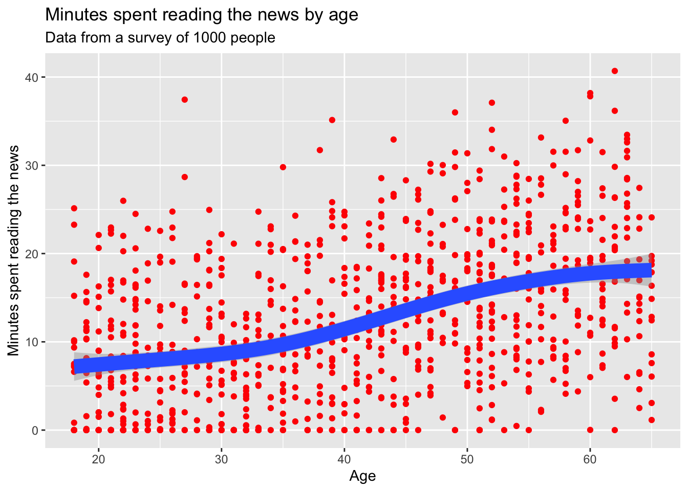 ## Drawing order
One small thing: the order of the geoms matters. If you put the geom_smooth() before the geom_point(), the points will be on top of the line. If you put the geom_point() before the geom_smooth(), the line will be on top of the points. Pretty simple, but it can make a big difference in how your plot looks.
news_users |>
  ggplot() +
  geom_smooth(aes(x = age, y = minutes_reading_news), size = 5) +
  geom_point(aes(x = age, y = minutes_reading_news), color = "red") +
  labs(
    title = "Minutes spent reading the news by age",
    subtitle = "Data from a survey of 1000 people",
    x = "Age",
    y = "Minutes spent reading the news"
  )
## `geom_smooth()` using method = 'gam' and formula = 'y ~ s(x, bs = "cs")'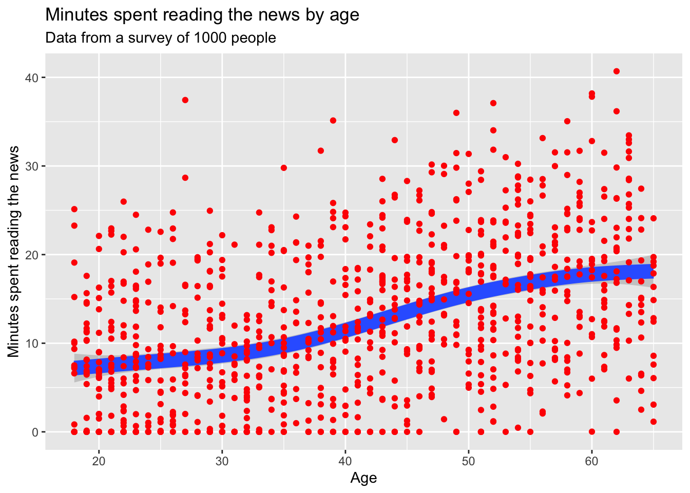
5.8 Saving plots
Now, let’s pretend we’re happy with our plot and want to save it.
We can use the ggsave() function to save a plot; just change the file name to .png, .jpg, .pdf, .svg, or any other number of file formats. We should also specify the width, height, dpi, and units of the plot. R has a bad habit of changing things to inches, so if your plot is 2.54 times too big, check your units argument.
## `geom_smooth()` using method = 'gam' and formula = 'y ~ s(x, bs = "cs")'Note that ggsave() will save the last plot that you made. If you want to save a different plot, you can save it as an object and then use ggsave().
plot_i_want_to_save <- news_users |>
  ggplot() +
  geom_point(aes(x = age, y = minutes_reading_news), color = "red") +
  geom_smooth(aes(x = age, y = minutes_reading_news), size = 5) +
  labs(
    title = "Minutes spent reading the news by age",
    subtitle = "Data from a survey of 1000 people",
    x = "Age",
    y = "Minutes spent reading the news"
  )

ggsave("minutes_reading_news_vs_age.pdf", plot_i_want_to_save, width = 20, height = 15, dpi = 300, units = "cm")
## `geom_smooth()` using method = 'gam' and formula = 'y ~ s(x, bs = "cs")'5.9 Classwork: Finalizing plots
From your earlier classwork, save the plots that you think are the most interesting. Make sure they have titles, subtitles, and labels.
- Make your favorite plots into environmental variables using the <- operator.
- Save each plot as a .png file.
5.10 Processing data into a plot
Just like when we were cleaning data, we can use the pipe operator to process data before we make a plot. This can be useful when we want to summarize data or change the order of the levels of a factor. Here, we’ll use the group_by() and summarize() functions to calculate the mean amount of time people spend reading the news for each level of question 1.
news_users |>
  group_by(q1) |>
  summarize(mean_minutes_reading_news = mean(minutes_reading_news)) |>
  mutate(q1 = factor(q1, levels = c("Never", "Rarely", "Sometimes", "Often", "Always"))) |>
  ggplot() +
  geom_col(aes(x = q1, y = mean_minutes_reading_news))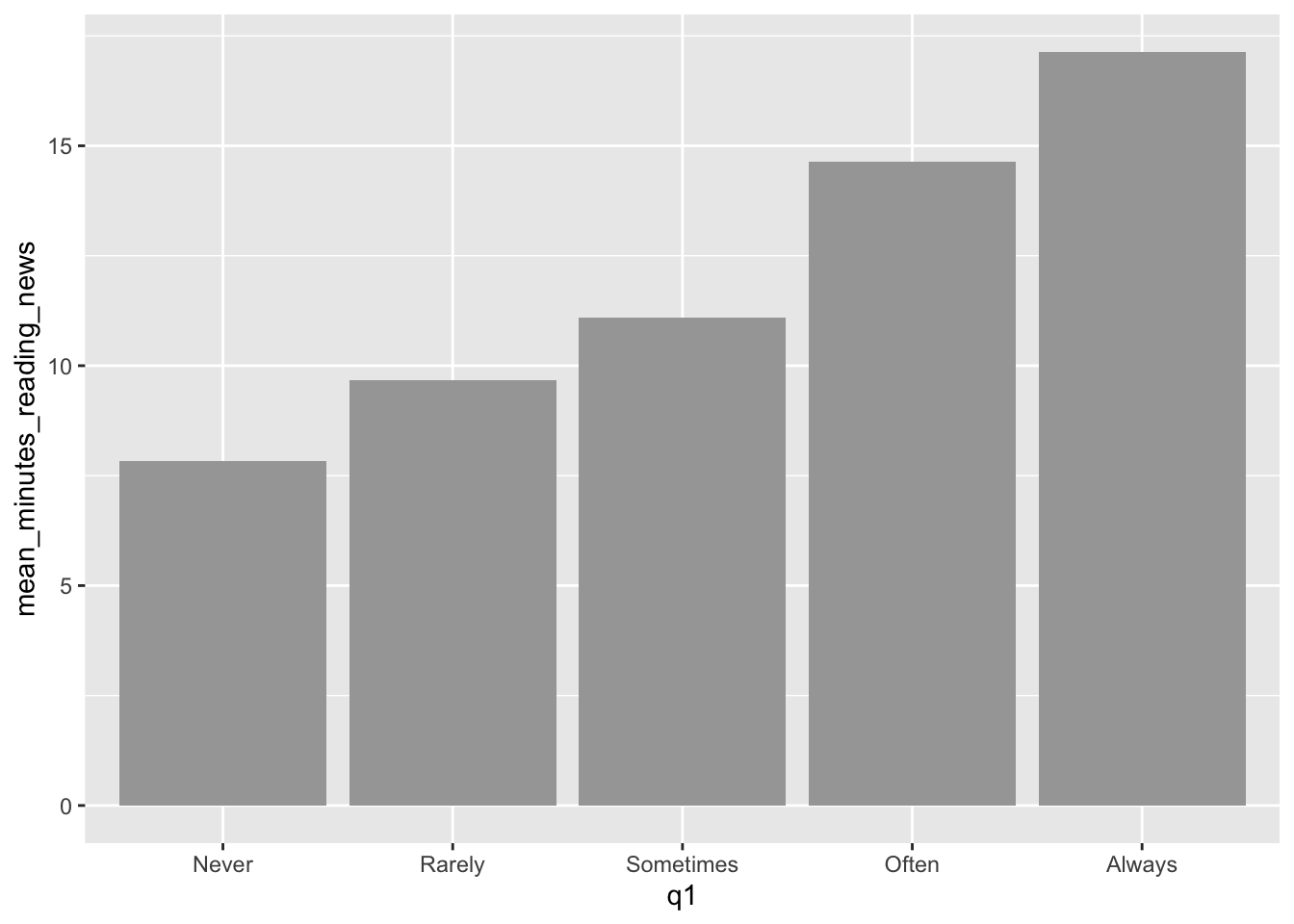
5.11 The best geoms, and some tricks for each.
GGplot has a ton of stuff to learn, and I figure out a new trick every paper I write. For more handy tips and tricks, I recommend you check out the R Graph Gallery. When you need some inspiration, this place can give you some code to copy and play around with.
Here are some of the most useful geoms, and some tricks for each.
5.11.1 geom_line()
Everyone likes a line plot. It’s a great way to show trends over time or across a continuous variable. We can use the geom_line() geometry to make line plots, like so:
news_users |>
  group_by(age) |>
  summarize(mean_minutes_reading_news = mean(minutes_reading_news)) |>
  ggplot() +
  geom_line(aes(x = age, y = mean_minutes_reading_news))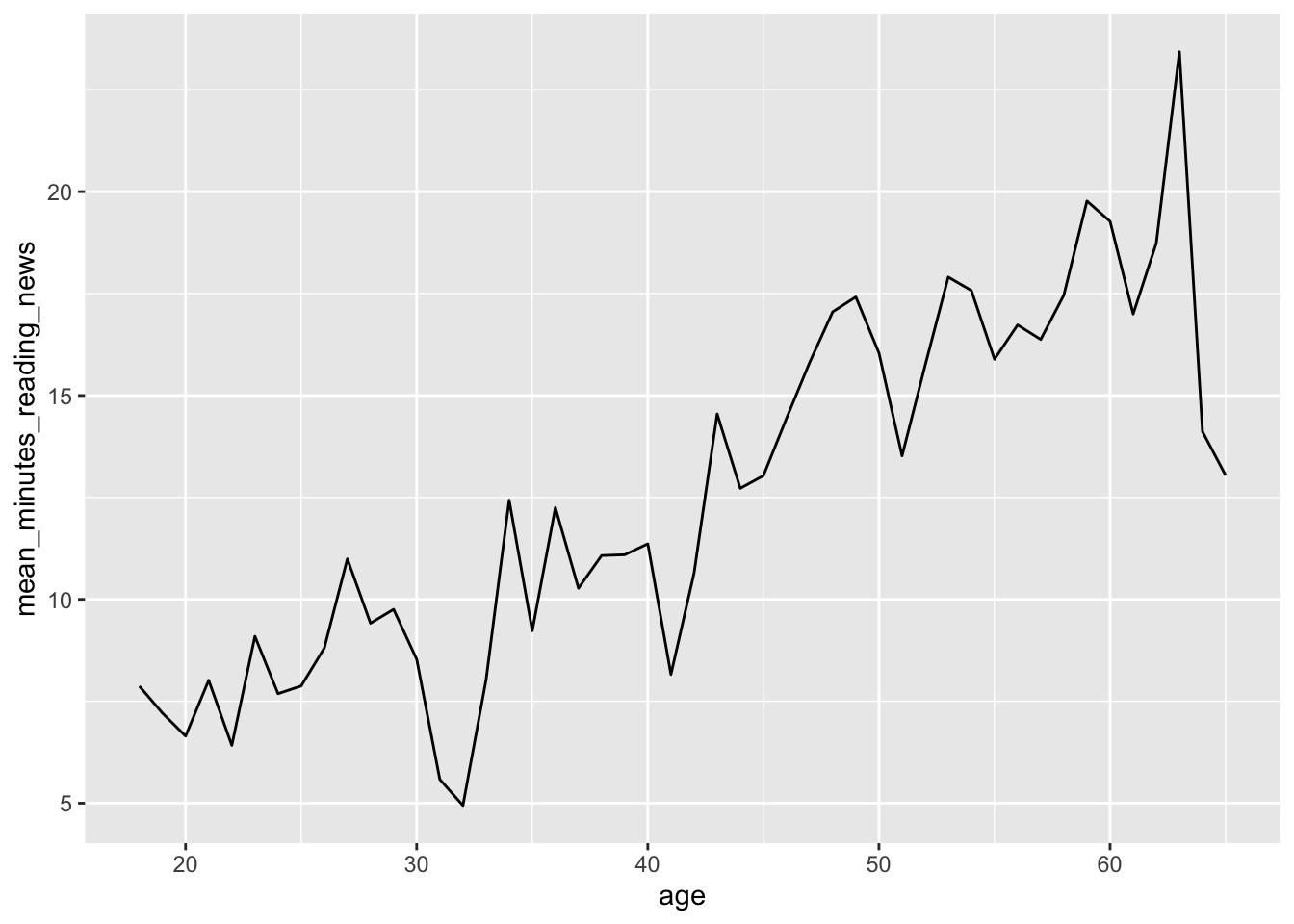
However, we can see that this plot is a bit misleading, because the Y axis doesn’t start at 0. By default, R sets the edges of your chart to wherever your data is. Sometimes, you want to make sure your chart starts and stops at a certain place, which you can do with the lims() function. X and y in lims() takes two values in a vector, the minimum and maximum values of the axis, like so:
news_users |>
  group_by(age) |>
  summarize(mean_minutes_reading_news = mean(minutes_reading_news)) |>
  ggplot() +
  geom_line(aes(x = age, y = mean_minutes_reading_news)) +
  lims(y = c(0, 30))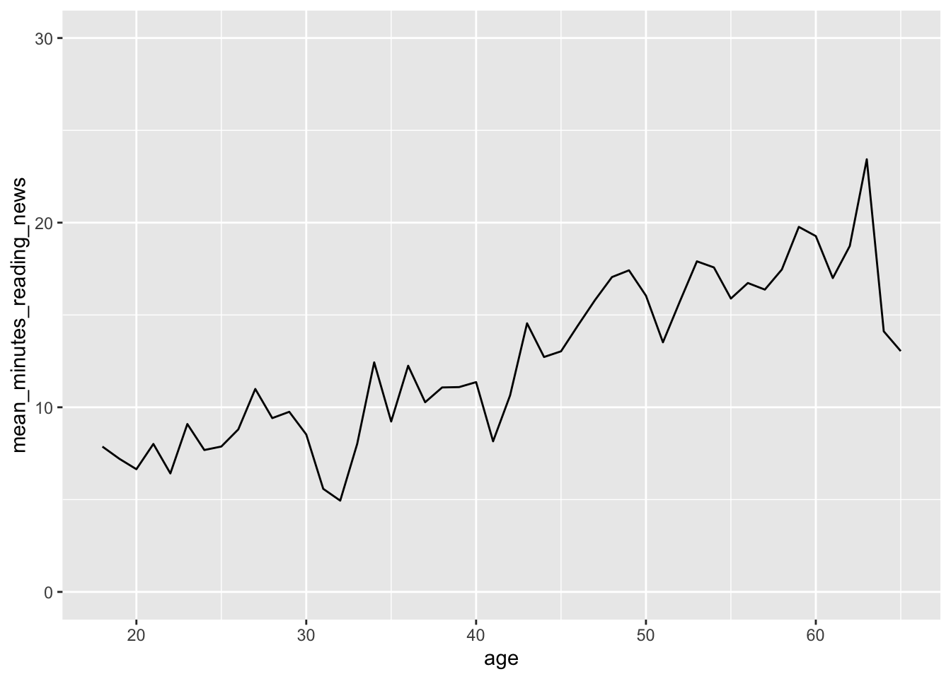
5.11.2 geom_col()
When someone thinks of a chart, they usually think of a bar chart. We can use the geom_col() geometry to make bar charts, like so:
news_users |>
  group_by(job) |>
  summarize(mean_minutes_reading_news = mean(minutes_reading_news)) |>
  ggplot() +
  geom_col(aes(x = job, y = mean_minutes_reading_news))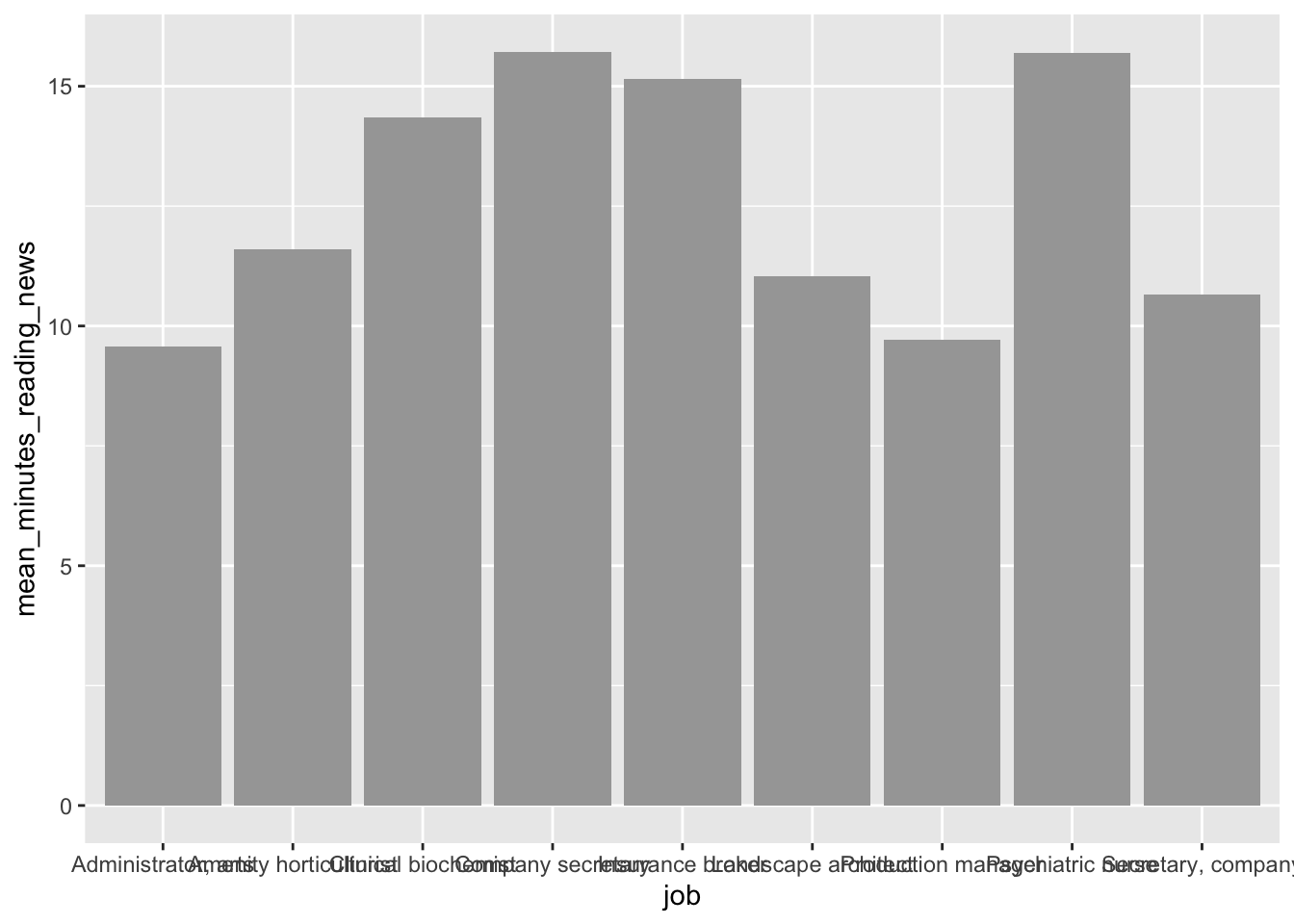
On careful inspection, we’ll see that this looks like garbage. There are a few ways to fix this, but the easiest is to just flip the chart on its side. Feel free to be creative with your charts!
news_users |>
group_by(job) |>
summarize(mean_minutes_reading_news = mean(minutes_reading_news)) |>
ggplot() +
geom_col(aes(y = job, x = mean_minutes_reading_news))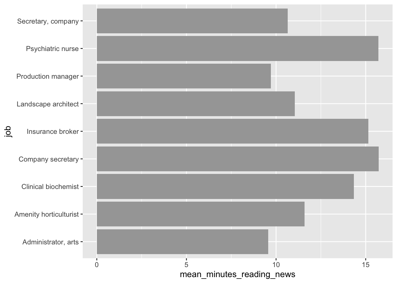 Second tip: Remember back to the factor() function? We can use it to order the bars in a bar chart. This can be useful when you want to show the bars in a specific order, like from smallest to largest.
here, we’ll first arrange the data by the mean amount of time people spend reading the news, and then use factor() to order the bars by this value. This “locks in” the order of the bars, so ggplot won’t change it.
news_users |>
group_by(job) |>
summarize(mean_minutes_reading_news = mean(minutes_reading_news)) |>
arrange(mean_minutes_reading_news) |>
mutate(job = factor(job, levels = job)) |>
ggplot() +
geom_col(aes(y = job, x = mean_minutes_reading_news))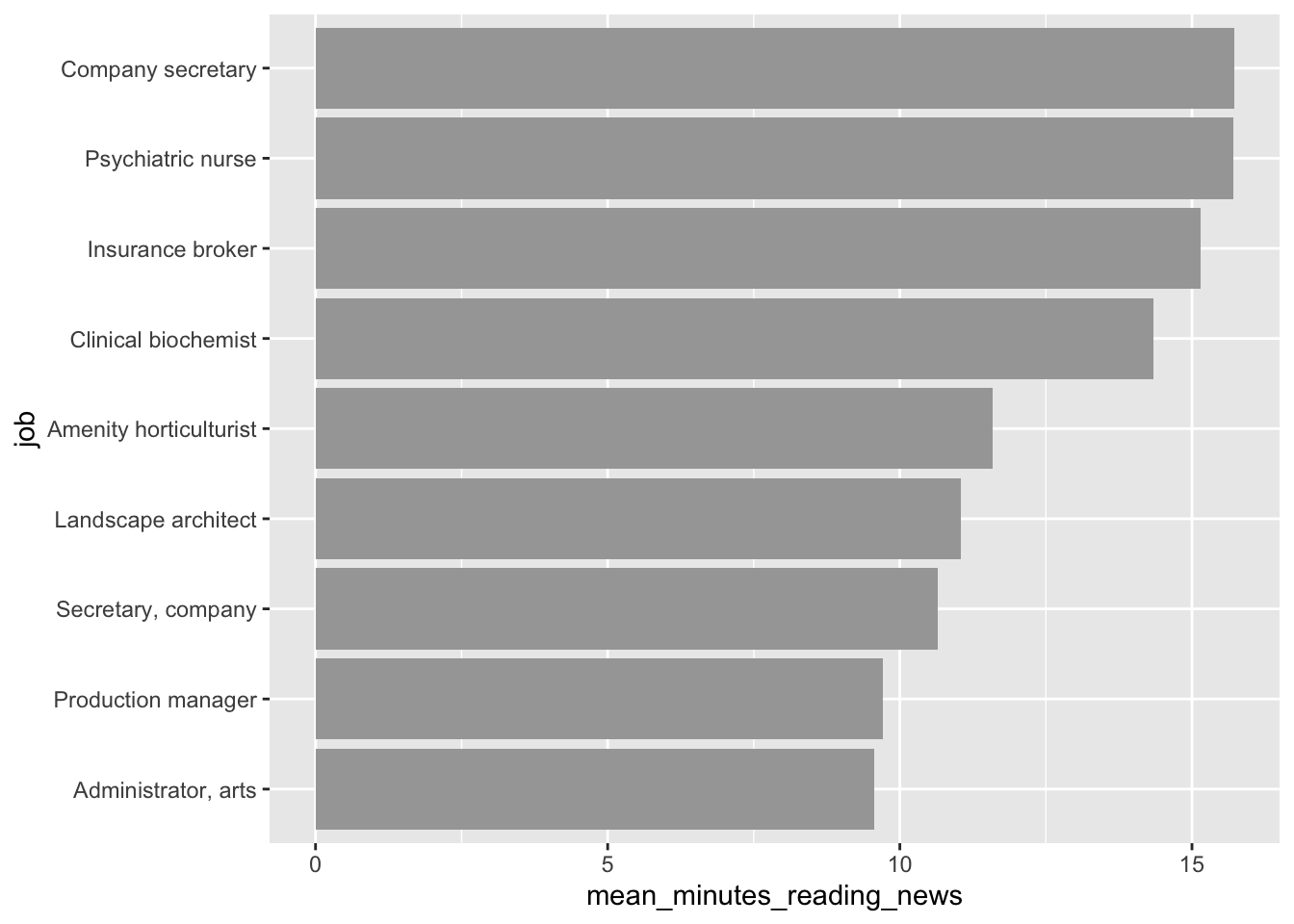 ### geom_jitter(): a more random scatterplot.
I like scatterplots. They hide the least amount of data from the viewer, but they only really work if both variables are continuous. If, for example, I want to make a scatterplot of q7, which is coded on a scale from 1 to 7. A scatterplot will technically work, but isn’t fantastic.
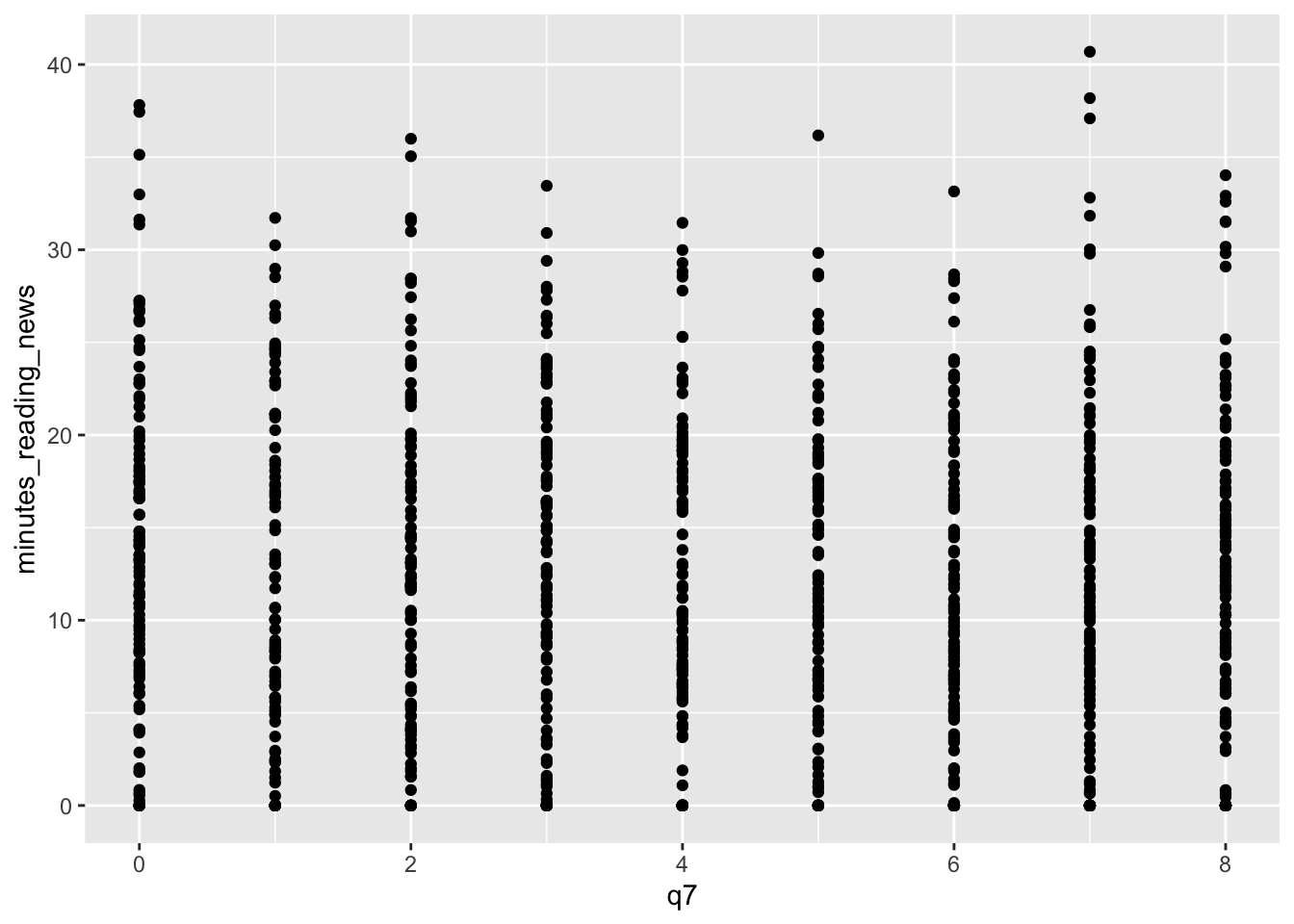 In this case, we can use geom_jitter() to add a bit of randomness to the points. This can be useful when you have a lot of data points that overlap, and you want to see them all.
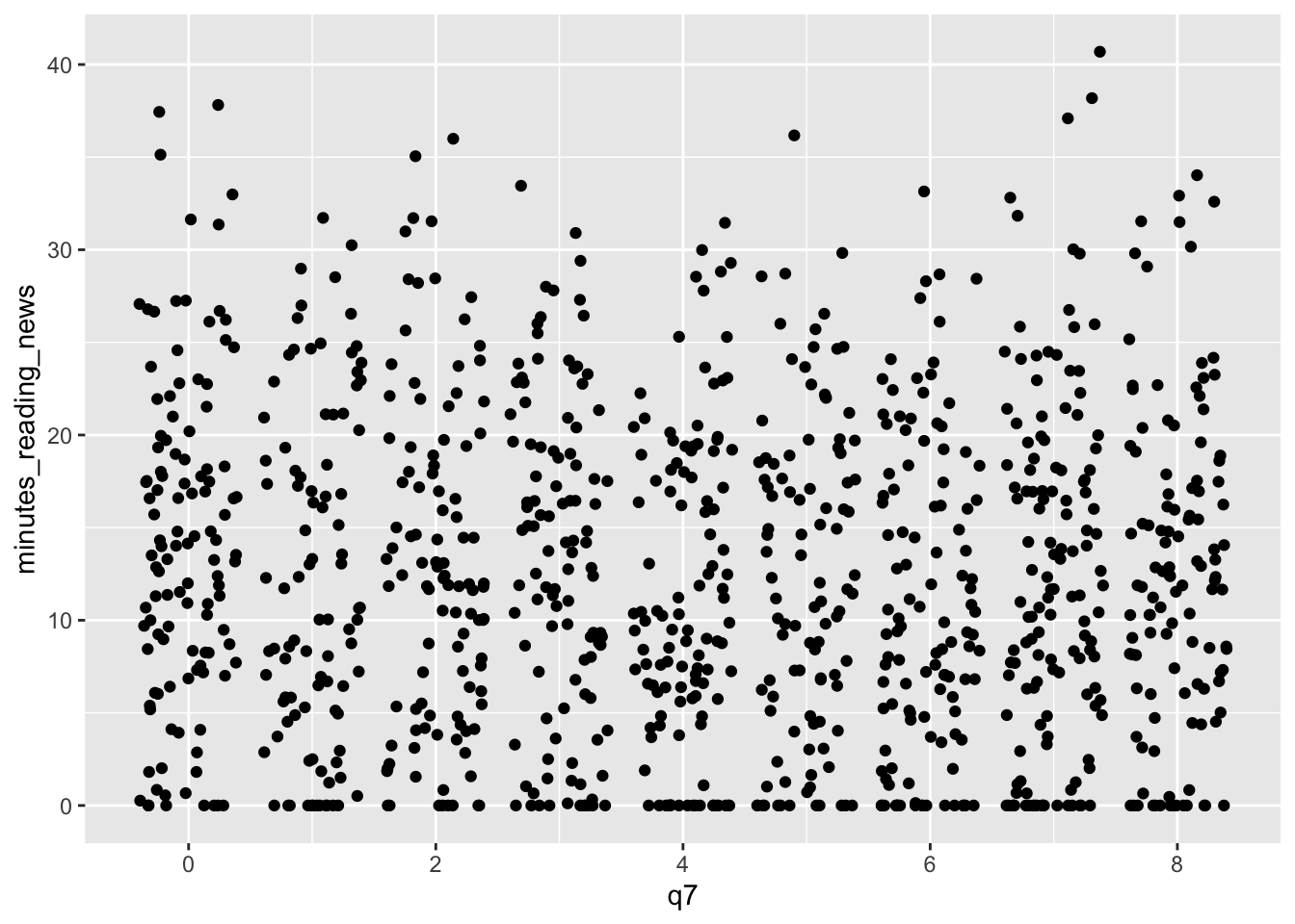 We can tweak the amount of jitter with the width argument, and maybe make the points a bit smaller with the size argument, like so:
news_users |>
  ggplot() +
  geom_jitter(aes(x = q7, y = minutes_reading_news), width = 0.1, size = 0.3)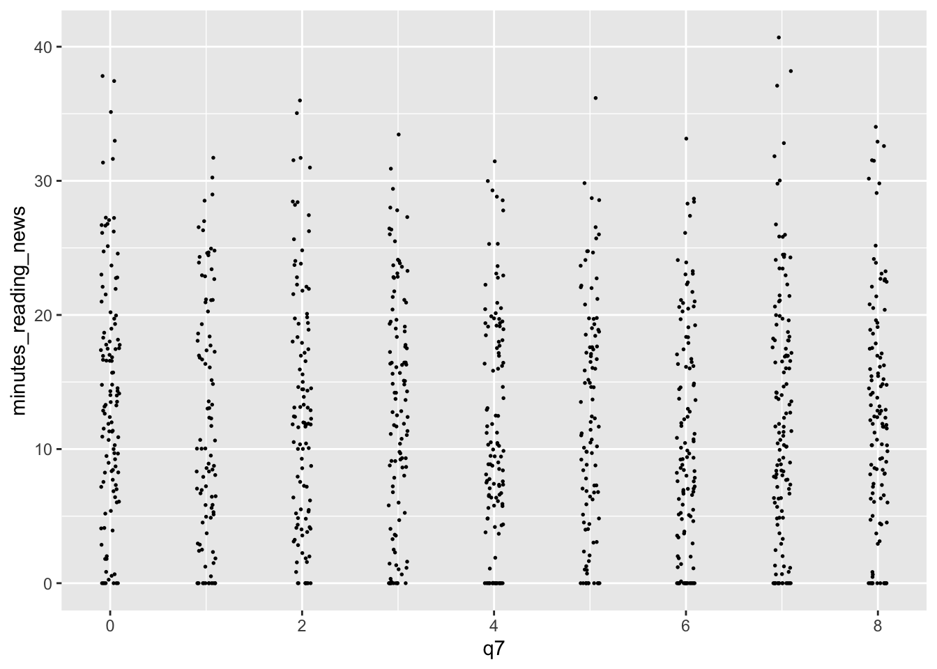
5.11.3 geom_smooth()
We earlier learned about geom_smooth(), a way to add a regression line to a plot. This can be useful when you want to show the relationship between two variables, but don’t want to show all the data points. However, by default, it adds a curvy line. Sometimes, we’re interested in the straight linear relationship between two variables. We can use the method argument to specify the type of regression line we want. For example, we can use method = “lm” to add a linear regression line, like so:
news_users |>
  ggplot() +
  geom_jitter(aes(x = q7, y = minutes_reading_news), width = 0.1, size = 0.3) +
  geom_smooth(aes(x = q7, y = minutes_reading_news), method = "lm")
## `geom_smooth()` using formula = 'y ~ x'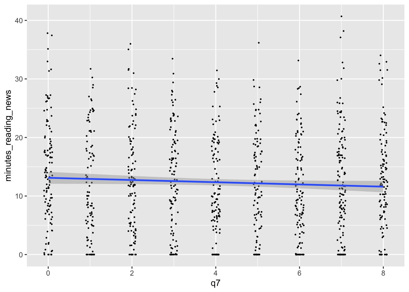 There’s a lot more to learn! Next week, we’ll focus on making them actually look good.
5.12 Homework and Practice
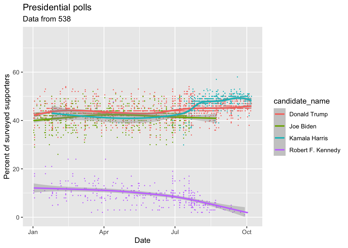
For your homework, let’s get some practice with data from the 2024 US presidential election.
First, I want you to download the presidential polling from 538. You can do this with the following code:
download.file("https://projects.fivethirtyeight.com/polls/data/president_polls.csv", "input_data/presidential_polls.csv", mode = "wb")Next, add this code to clean your data. I want you to focus in plotting the data, so I’ve cleaned it up a little for you.
polls <- read_csv("input_data/presidential_polls.csv")

polls <- polls |>
  filter(candidate_name %in% c("Kamala Harris", "Donald Trump", "Robert F. Kennedy", "Joe Biden")) |>
  select(start_date, candidate_name, pct, state) |>
  mutate(start_date = as.Date(start_date, format = "%m/%d/%y")) |>
  filter(start_date > "2024-01-01")

polls |> glimpse()
Now, I want you to replicate the following plots. I’ve started the code below for you, you just have to finish the ggplot segments. Try to make them look as close as possible, but don’t worry about tiny details.
In this one, I’ve extracted just the polls for Kamala Harris, and I want you to make a bar chart showing the average percentage of supporters by state.
harris_approval_by_state <- polls |>
  filter(candidate_name == "Kamala Harris") |> # Only look at Kamala Harris polls
  filter(!is.na(state)) |> # Only look at state polls
  group_by(state) |> # We want to look at every state separately
  summarize(mean_pct = mean(pct)) |> # Calculate the mean percentage of supporters by state
  arrange(mean_pct) |> # Sort the states by the mean percentage of supporters
  mutate(state = factor(state, levels = state)) # Make sure the states are ordered by the mean percentage of supporters

harris_approval_by_state |>
  ggplot() +
  # Finish me!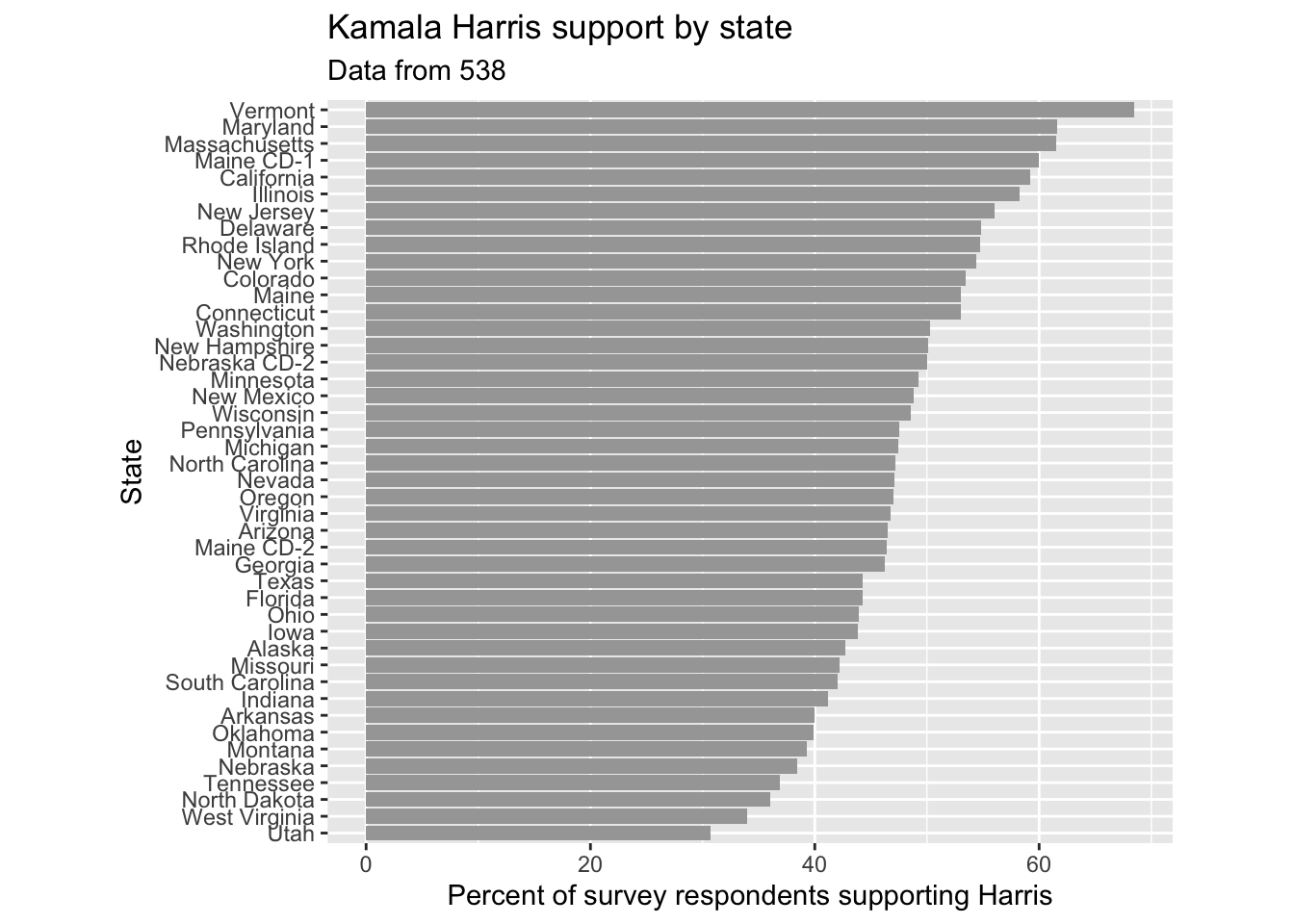
Finally, I want you to make a boxplot showing the percentage of supporters for Kamala Harris and Donald Trump in the most important swing states since October 2024.
polls |>
  filter(candidate_name %in% c("Kamala Harris", "Donald Trump")) |> # Only look at Kamala Harris and Donald Trump polls
  filter(state %in% c("Pennsylvania", "Michigan", "Georgia", "Nevada", "Arizona")) |> # Only look at the most important swing states
  filter(start_date > "2024-08-01") |> # Only look at polls after August 2024
  ggplot() +
  # Finish me!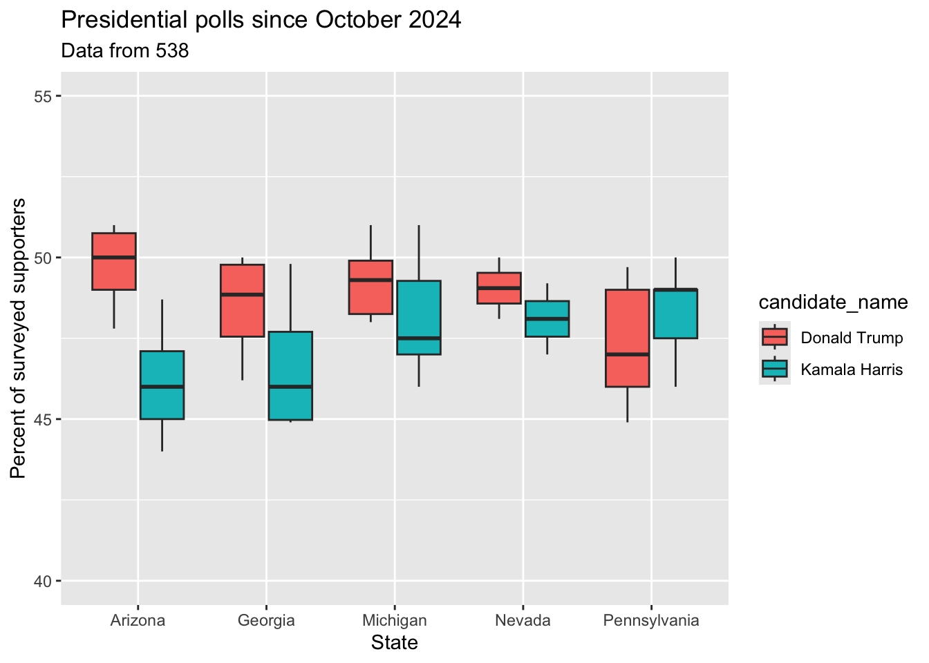
Please send me the code used to create your plots by noon on Wednesday.