Chapter 6 Lab 4 - 27/03/2023
In this lecture we will learn:
- how to import data from a Excel file
- how to plot multiple time series with ggplot moving from a wide to a long dataframe
- how to compute log-returns and study their distribution using boxplots and histograms
For this lab the tidyverse package is required and loaded:
library(tidyverse)6.1 Data import: Excel file
We have some financial data (i.e. prices) available in the Excel file named Adjcloseprices28032023.xlsx. It is possible to use the user-friendly feature provided by RStudio, already used in the previous lab for importing data from a csv file (see Figure 5.2). Now we select Import Dataset - From Excel. It will be necessary to specify to locate the file in your compute and then set the name of the new R object that will be created (prices in our example, as shown in Figure 6.1.
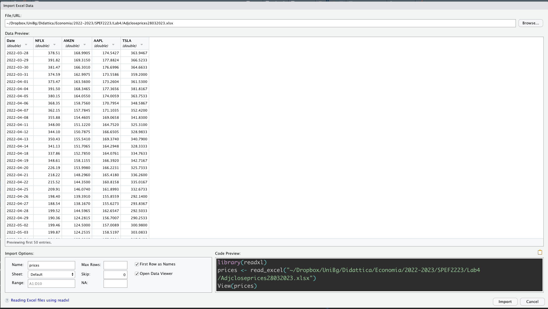
Figure 6.1: Specification of the Excel file characteristics through the Import Dataset feature
After clicking on Import an object named prices will be created (essentially this RStudio feature makes use of the read_excel function from the readxl package):
library(readxl)
prices <- read_excel("./files/Adjcloseprices28032023.xlsx")
By using glimpse (from the tidyverse package) we get information about the type of variables included in the data frame:
glimpse(prices) ## Rows: 250
## Columns: 5
## $ Date <dttm> 2022-03-28, 2022-03-29, 2022-03-30, 2022-03-31, 2022-04-01, 2022…
## $ NFLX <dbl> 378.51, 391.82, 381.47, 374.59, 373.47, 391.50, 380.15, 368.35, 3…
## $ AMZN <dbl> 168.9905, 169.3150, 166.3010, 162.9975, 163.5600, 168.3465, 164.0…
## $ AAPL <dbl> 174.5427, 177.8824, 176.6996, 173.5586, 173.2604, 177.3656, 174.0…
## $ TSLA <dbl> 363.9467, 366.5233, 364.6633, 359.2000, 361.5300, 381.8167, 363.7…In this case the variable Date is interpreted correctly as a vector of dates (dttm) and it is not necessary to use the lubridate package as shown in the previous lab. Note that prices are available for 4 assets.
6.2 Plot multiple time series in the same plot
We want to plot the price time series for the 4 assets in the same plot. We start as follows trying to include 4 geometries geom_line, one for each asset:
prices %>%
  ggplot() +
  geom_line(aes(Date, NFLX)) +
  geom_line(aes(Date, AMZN), col="red") +
  geom_line(aes(Date, AAPL), col="violet") +
geom_line(aes(Date, TSLA), col="blue") 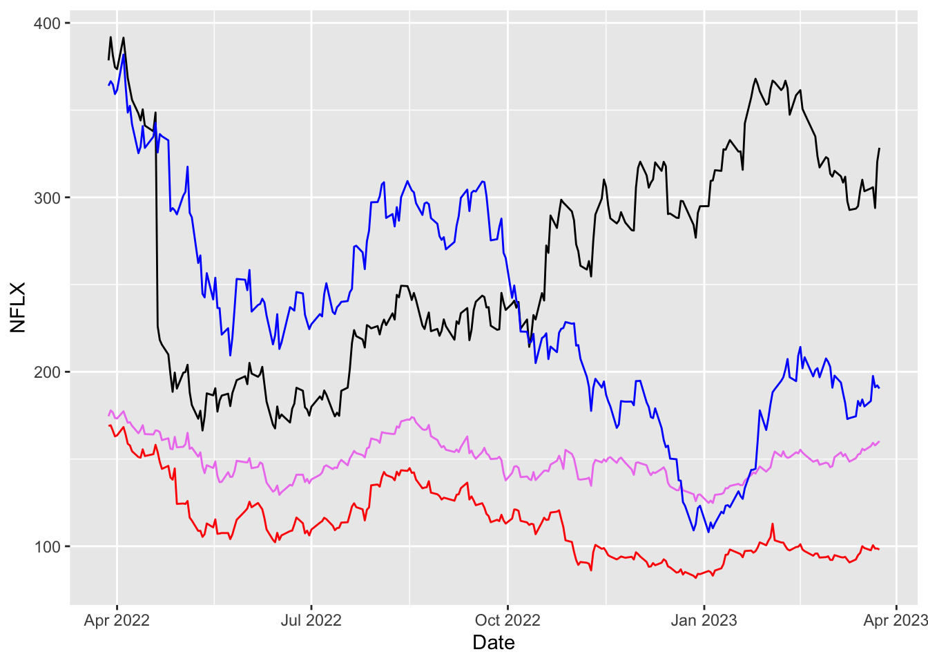
This plot has two problems: - there is no legend, - the label for the y axis is not correct (it should be prices).
6.3 From wide to long format
The data as structured in the prices dataframe are in the so called wide format. Note the same information about prices is contained in 4 different columns according to the asset. In the long format instead, each row corresponds to a specific time point per asset. So each asset will have data in multiple rows (250 to be precise) and the final long dataframe will have 250x4 rows. As a consequence the number of columns will be lower (one for the dates, one for the value of the prices, and one for the name of the assets).
We move from the wide to the long format with the following code:
prices_long = prices %>%
  pivot_longer(NFLX:TSLA) #columns to pivot into longer format
glimpse(prices_long)
## Rows: 1,000
## Columns: 3
## $ Date <dttm> 2022-03-28, 2022-03-28, 2022-03-28, 2022-03-28, 2022-03-29, 202…
## $ name <chr> "NFLX", "AMZN", "AAPL", "TSLA", "NFLX", "AMZN", "AAPL", "TSLA", …
## $ value <dbl> 378.5100, 168.9905, 174.5427, 363.9467, 391.8200, 169.3150, 177.…head(prices_long)## # A tibble: 6 × 3
## Date name value
## <dttm> <chr> <dbl>
## 1 2022-03-28 00:00:00 NFLX 379.
## 2 2022-03-28 00:00:00 AMZN 169.
## 3 2022-03-28 00:00:00 AAPL 175.
## 4 2022-03-28 00:00:00 TSLA 364.
## 5 2022-03-29 00:00:00 NFLX 392.
## 6 2022-03-29 00:00:00 AMZN 169.Now it will be very easy to plot the 4 prices time series. In particular we use the col argument inside aes to speciy that the color of the time series depends on the name (asset); this will automatically create 4 different time series. Note that the legend is created automatically as a consequence of using col:
prices_long %>%
  ggplot() +
  geom_line(aes(Date, value, col=name)) +
  ylab("Prices (in dollars)") #change the y-axis lab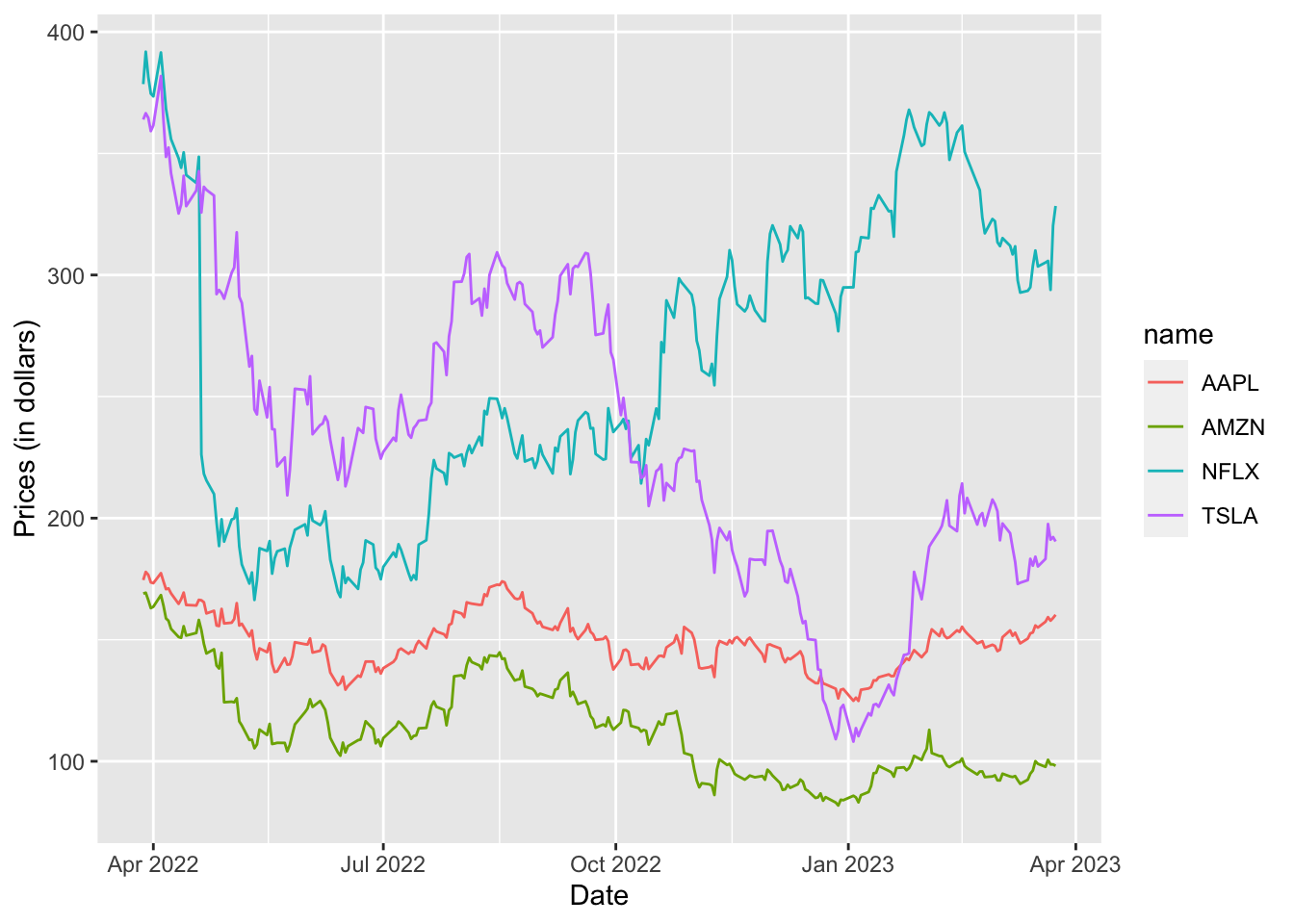
6.4 Compute log-returns with a simple example
We start by computing log-returns using the following definition: \[ r_t = \log\left(\frac{P_t}{P_{t-1}}\right) = log(P_t) - log(P_{t-1}) \] for \(t=2, \ldots, n\).
In particular we will use the fact that log-returns are given by the subsequent differences of log-prices. The latter are compute by using the log functions, while differences are obtained by using the lag function. In order to discover how lag works, let’s consider a simple example (named small) with the first 5 log-prices of NFLX:
small = log(prices$NFLX[1:5])
small
## [1] 5.936243 5.970803 5.944032 5.925832 5.922838The function lag finds the previous (day before) values in a vector. It is useful for comparing values behind of the current values. The output of lag is a vector with the same length of small (but with a NA in the first position):
lag(small) #log-prices of the day before## [1] NA 5.936243 5.970803 5.944032 5.925832Obvioulsy the first element is missing and there are no data before the first day. It is now possible to compute the log-returns by using the difference between small and its lagged values (remember that the vectors’ computations in R are performed element wise):
small - lag(small) #log-returns!!!!## [1] NA 0.034560049 -0.026770355 -0.018200129 -0.0029944016.5 Compute log-prices
Using the approach describe before with small we need to compute the log-prices of all the assets contained in prices. This would require to use the verb mutate 4 separate times. But imagine if instead of 4 columns there were 10 or 20 or 100! To speed up the coding it is possible to combine mutate with across and use mutate only once. In particular, across makes it possible to apply a function (like log) across multiple columns (from NFLX to TSLA coded as NFLX:TSLA):
logprices = prices %>%
  mutate(across(NFLX:TSLA, log))
glimpse(logprices)
## Rows: 250
## Columns: 5
## $ Date <dttm> 2022-03-28, 2022-03-29, 2022-03-30, 2022-03-31, 2022-04-01, 2022…
## $ NFLX <dbl> 5.936243, 5.970803, 5.944032, 5.925832, 5.922838, 5.969986, 5.940…
## $ AMZN <dbl> 5.129842, 5.131761, 5.113799, 5.093735, 5.097180, 5.126024, 5.100…
## $ AAPL <dbl> 5.162169, 5.181123, 5.174451, 5.156516, 5.154796, 5.178213, 5.159…
## $ TSLA <dbl> 5.897007, 5.904062, 5.898975, 5.883879, 5.890345, 5.944941, 5.896…The returned data frame contains the date column and 4 columns containing the the log-prices for the 4 assets.
Note that across has two arguments:
- the first selects the columns you want to operate on (
NFLX:TSLA). - the second is a function (
log) to apply to each column.
6.6 Compute log-returns for a single asset
We can now use the lag function as done previously with small for computing the log-returns of a single asset, for example NFLX. This requires the use of mutate:
logretNFLX = logprices %>%
  mutate(NFLX - lag(NFLX))
glimpse(logretNFLX)
## Rows: 250
## Columns: 6
## $ Date <dttm> 2022-03-28, 2022-03-29, 2022-03-30, 2022-03-31, 20…
## $ NFLX <dbl> 5.936243, 5.970803, 5.944032, 5.925832, 5.922838, 5…
## $ AMZN <dbl> 5.129842, 5.131761, 5.113799, 5.093735, 5.097180, 5…
## $ AAPL <dbl> 5.162169, 5.181123, 5.174451, 5.156516, 5.154796, 5…
## $ TSLA <dbl> 5.897007, 5.904062, 5.898975, 5.883879, 5.890345, 5…
## $ `NFLX - lag(NFLX)` <dbl> NA, 0.034560049, -0.026770355, -0.018200129, -0.002…The output contains a new column with the log-returns for NFLX.
6.7 Compute log-returns for many assets
We obviously want to compute the log-returns for the remaining assets. And we want to do it with just one mutate. Similarly to what has been done before for computing log-prices, we will combine mutate with across. However here the compution is slightly more complex because, differently from using log, it involves the use of the name of each column (remember small - lag(small)?). To solve this we will use the following code:
logret = logprices %>%
  mutate(across(NFLX : TSLA, ~ . - lag(.)))
glimpse(logret)
## Rows: 250
## Columns: 5
## $ Date <dttm> 2022-03-28, 2022-03-29, 2022-03-30, 2022-03-31, 2022-04-01, 2022…
## $ NFLX <dbl> NA, 0.034560049, -0.026770355, -0.018200129, -0.002994401, 0.0471…
## $ AMZN <dbl> NA, 0.001918432, -0.017961528, -0.020064518, 0.003445032, 0.02884…
## $ AAPL <dbl> NA, 0.018953542, -0.006671716, -0.017935591, -0.001719646, 0.0234…
## $ TSLA <dbl> NA, 0.007054914, -0.005087675, -0.015095175, 0.006465653, 0.05459…Here above the symbol . represents the generic column name; moreover we use ~ to indicate that we are supplying a generic function that will have to be applied to all the columns of logprices. The output named logret is a 5-columns data frame containing the dates and the 4 log-prices time-series. As done before, we get ready for plotting the 4 time series by moving from the wide to the long format:
logret_long = logret %>%
  pivot_longer(NFLX : TSLA)
glimpse(logret_long)
## Rows: 1,000
## Columns: 3
## $ Date <dttm> 2022-03-28, 2022-03-28, 2022-03-28, 2022-03-28, 2022-03-29, 202…
## $ name <chr> "NFLX", "AMZN", "AAPL", "TSLA", "NFLX", "AMZN", "AAPL", "TSLA", …
## $ value <dbl> NA, NA, NA, NA, 0.034560049, 0.001918432, 0.018953542, 0.0070549…logret_long %>%
ggplot() +
geom_line(aes(Date, value, col=name)) +
ylab("Log-returns")## Warning: Removed 4 row(s) containing missing values (geom_path).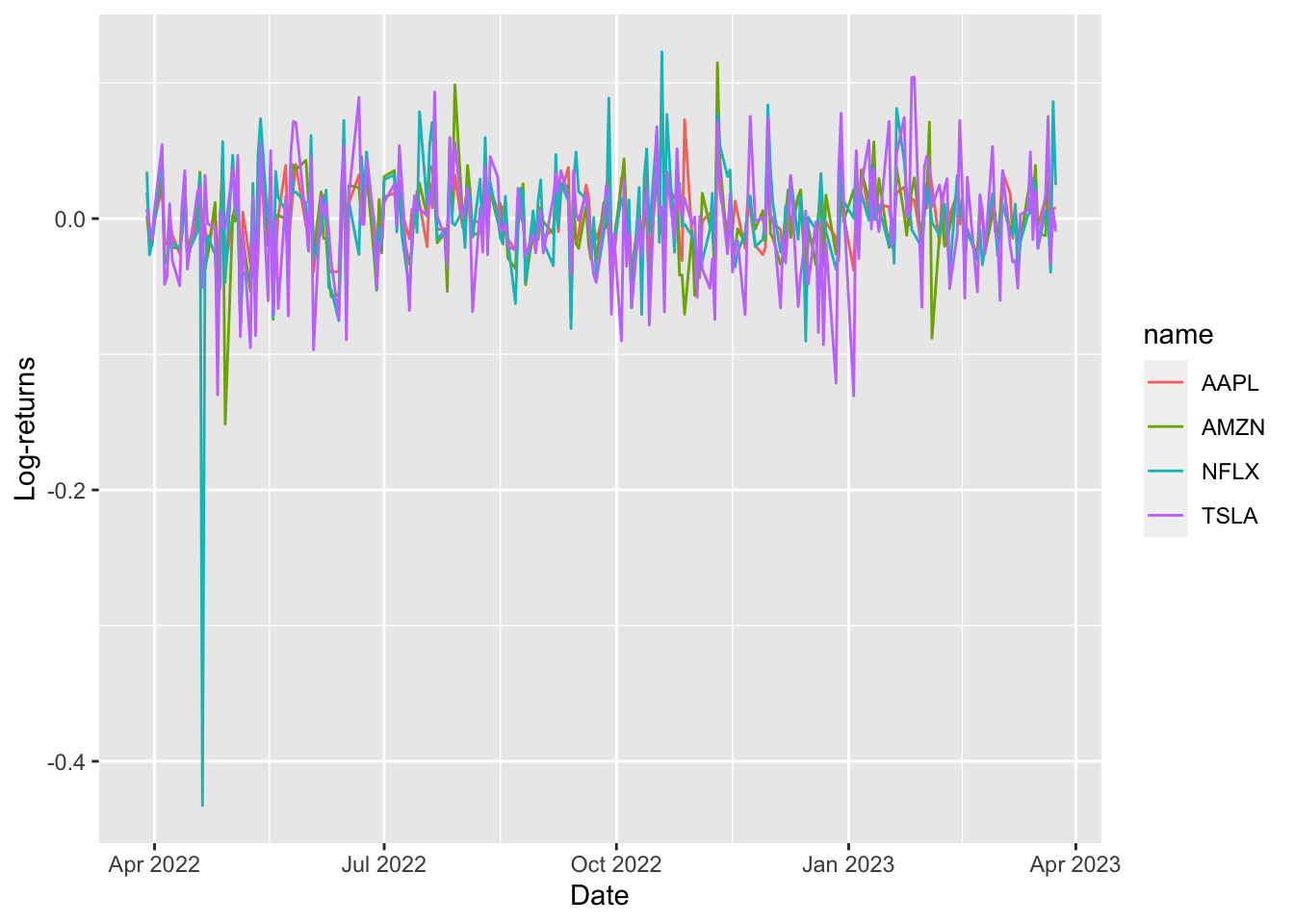 The warning message suggests that 4
 NA values are removed for the plotting. Remember that for the first day the log-return can’t be computed!
6.8 Study the distribution of log-returns with boxplot and histogram
We are interested now in studying the log-returns distributions by using a new geometry named geom_boxplot:
logret_long %>%
  ggplot() +
  geom_boxplot(aes(name, value, fill = name), col = "blue")
## Warning: Removed 4 rows containing non-finite values (stat_boxplot).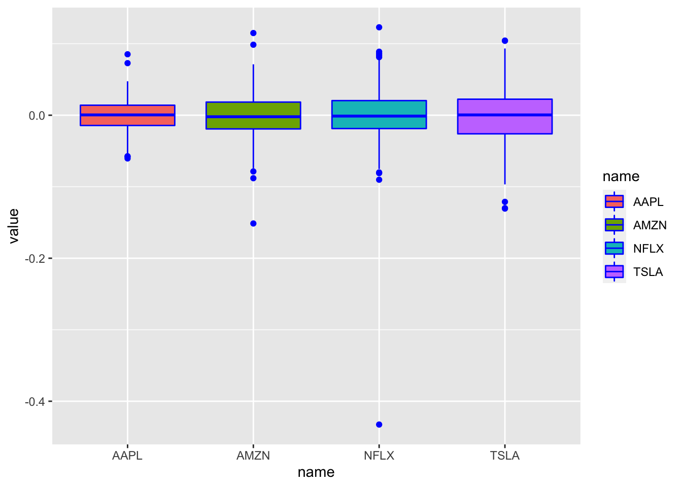 Each boxplot corresponds to an asset (read the x-axis) and represents the distribution of the corresponding log-returns. The central line in the box is the median; the dots are the outliers. Here the
 col = "blue" argument sets the outer color which is equal to blue for all the boxes. For the internal color of the boxplots we need to use fill which is here specified inside aes and is given by the variable name.
Another kind of plot which is useful for studying the distribution of a continuos variable is the histogram (geom_histogram). In this case it is necessary to specify only the x variable, while the y is computed automatically by ggplot and corresponds to the count variable
(i.e. how many observations for each class). This is given by the
fact that every geometry has a default stat specification. For the histogram the default computation is stat_bin which uses 30 bins:
logret_long %>%
  ggplot() +
  geom_histogram(aes(value, fill=name), col="black")
## `stat_bin()` using `bins = 30`. Pick better value with `binwidth`.## Warning: Removed 4 rows containing non-finite values (stat_bin).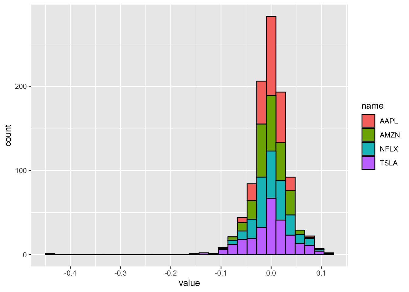 The problem with this plot is that the 4 histograms are overlapping and the 4 distributions are not clearly visible. As an alternative, it is possible to create 4 smaller sub-plots using
 facet_wrap as in the following code:
logret_long %>%
  ggplot() +
  geom_histogram(aes(value, fill=name), col="black") +
  facet_wrap(~name)
## `stat_bin()` using `bins = 30`. Pick better value with `binwidth`.## Warning: Removed 4 rows containing non-finite values (stat_bin).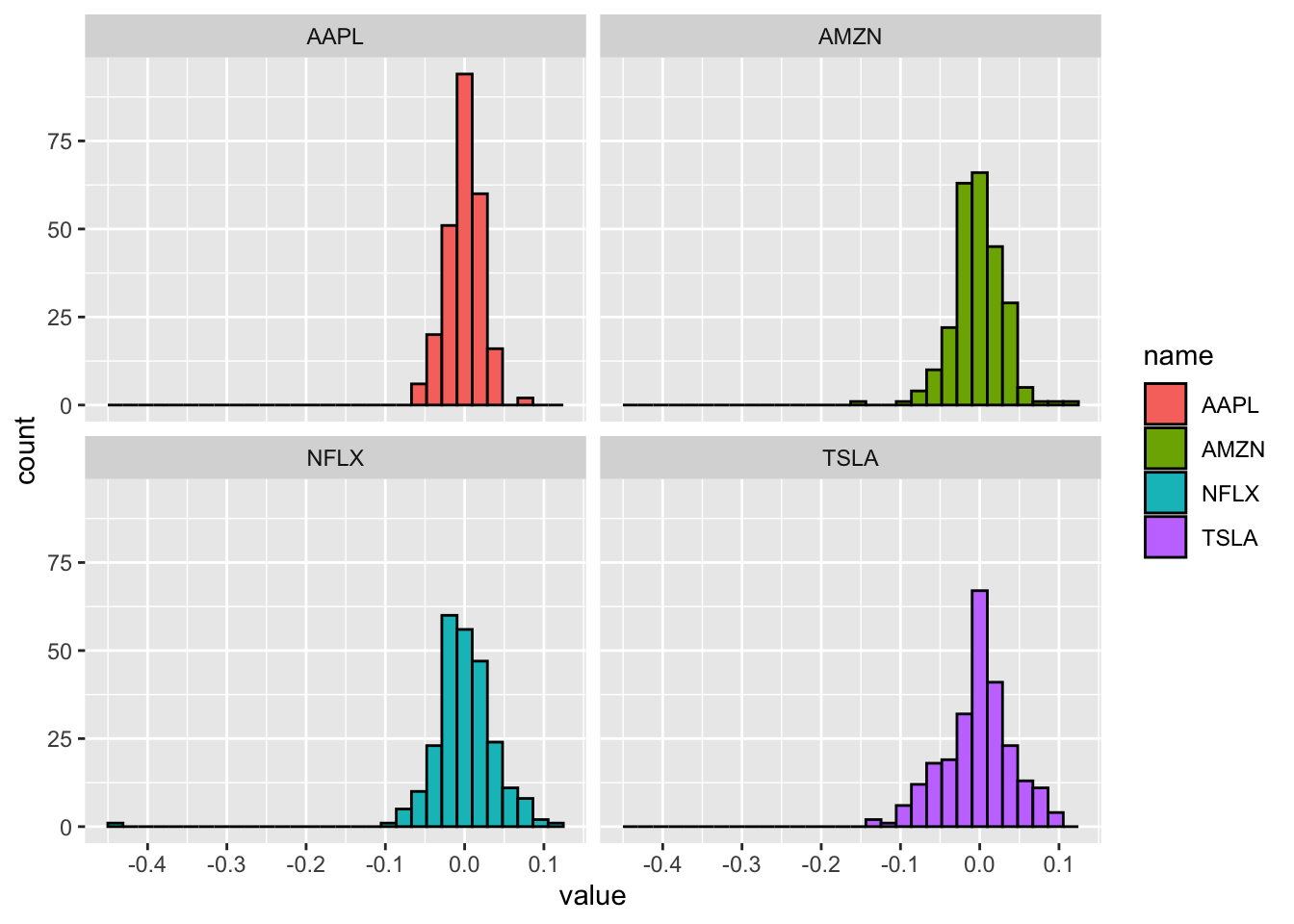 Now it is easier to compare the 4 log-returns distributions.
6.9 Exercises Lab 4
6.9.1 Exercise 1
Consider the file AdjclosepricesLab4Exercises.xlsx. It contains the adjusted close prices for several assets.
- Import the data into R and create a new data frame named
prices. Have a look to the data. Is the data frame in the long or wide format? How many assets and days do we have? - Plot all the prices time-series in a single plot. Try also to use
facet_wrap. - Use the function
pivot_widerand the following code to move from the long to the wide format.
prices_wide = prices %>%
  pivot_wider(names_from = ticker, values_from = price.adjusted)
glimpse(prices_wide)- Using
prices_widecompute the log-returns for all the assets (usemutateonly once): - Plot the log-returns time series only for
APAandXOM. Comment the plot. - Study the log-returns distributions by using conditional boxplots.
- Which are the assets that have a positive mean log-returns? Suggestion: use
group_by. Suggestion 2: use the optionna.rm=Tfor themeanfunction to remove the missing values. - Compute for each asset the number of log-returns < -0.1.
- Use histogram to study the distribution of the log-returns of
APA,DVNandXOM. Comment the plot.