Chapter 8 Lab 6 - 17/04/2023
In this lecture we will learn:
- simulate values from the Log Normal distribution
- obtain and plot the empirical cumulative distribution function (ecdf)
- apply the Box-Cox data transformation
- apply normality tests
For this lab the following packages are used (install them if necessary):
library(tidyverse)
library(car) #for box-cox transformation
##
## Attaching package: 'car'## The following object is masked from 'package:dplyr':
##
## recode## The following object is masked from 'package:purrr':
##
## somelibrary(moments) #for skewness and Jarque-Bera test
library(KScorrect) #for Kolmogorov-Smirnov test8.1 Log Normal distribution
Let \(X\) be a Normal random variable with parameters \(\mu\) (mean) and \(\sigma^2\) (variance). The exponential transformation of \(X\) gives rise to a new random variable \(Y=e^{X}\) which is known as Log Normal. Its probability density function (pdf) is \[ f_Y(y)=\frac{1}{y\sigma\sqrt{2\pi}}e^{-\frac{(\ln(y)-\mu)^2}{2\sigma^2}} \] for \(y>0\) (and it’s 0 elsewhere). Note that the pdf depends on two parameters, \(\mu\) and \(\sigma\) known as log mean and log standard deviation. They are inherited from the Normal distribution \(X\) but have a different meaning.
It is possible to demonstrate empirically the relationship between the Normal and Log Normal distribution by means of the following steps:
- simulate 5 numbers from the normal distribution
with mean \(\mu=4\) and standard deviation \(\sigma= 0.5\) by using the
rnormfunction:
set.seed(66)
x = rnorm(5, mean=4, sd=0.5)
x
## [1] 5.161987 4.108489 4.209096 3.904504 3.842581- Apply the exponential transformation to the values in \(x\):
exp(x)## [1] 174.51092 60.85467 67.29570 49.62544 46.64570- Check that the transformed values are the same that can be obtained by using the
rlnormfunction in R, which is the function for simulating values from the Log Normal distribution with parameters \(\mu\) and \(\sigma\) (denoted bymeanlogandsdlogin therlnormfunction, see?rlnorm):
set.seed(66)
y = rlnorm(5, meanlog=4, sdlog=0.5)
y
## [1] 174.51092 60.85467 67.29570 49.62544 46.64570Note that the values in exp(x) and y coincide.
8.2 Empirical cumulative distribution function
The empirical cumulative distribution function (ECDF) returns the proportion of values in a vector which are lower than or equal to a given real value \(y\). It is defined as \[ F_n(y)=\frac{\sum_{i=1}^n \mathbb I(Y_i\leq y)}{n} \] where \(\mathbb I(\cdot)\) is the indicator function which is equal to one if \(Y_i\leq y\) or 0 otherwise (basically you simply count the number of observations \(\leq y\) over the total number of observations \(n\)).
It can be obtained by saving the output of the ecdf function in an object named for example myecdf obtained by applying the function ecdf to the vector x created above:
myecdf = ecdf(x)The object myecdf belongs to the function class and can be used to compute proportions, such as for example the probability of having a value lower than or equal to -4:
myecdf(-4) ## [1] 0The output returns the proportion of values lower than or equal to -4 (as expected is zero). Similarly, the proportion of values lower than or equal to 10 is exactly one:
myecdf(10)## [1] 1Note that the input of the myecdf function can be any real number. For the considered example the ecdf is equal to 0 for values lower than the lowest observed value (3.84) and equal to 1 for values bigger than the largest observed value (5.16). As expected, if we evaluate the ecdf in the median value we get 50% (for the definition of median):
myecdf(median(x))*100## [1] 60The following computation
myecdf(3.57)## [1] 0returns the proportion of values lower than or equal to 3.57.
The ecdf can be plotted by using
plot(myecdf)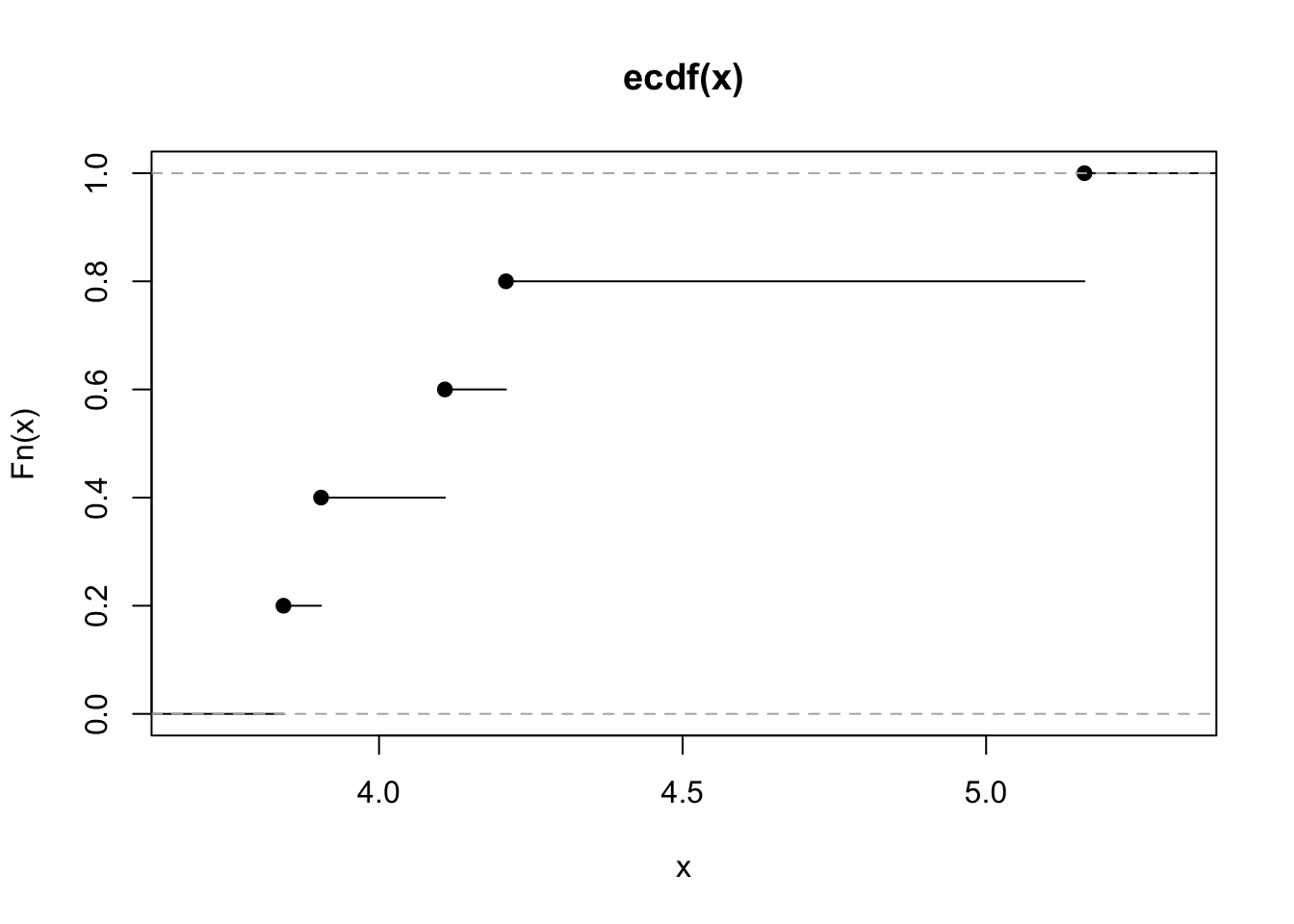 On the x-axis we could have values from \(-\infty\) to \(+\infty\) (but only values between the min and max of the observed values are shown as they are the most interesting). On the y-axis we have the values of the ecdf and so proportions (which are always between 0 and 1).
By looking at the plot it is possible to get, for a particular value on the x-axis, the corresponding ecdf. As shown in the plot, the ecdf is a step function which is continuos from the right.
8.3 Data transformation
Let’s now simulate 1000 values from the Log Normal distribution with parameters \(\mu=0.1\) and \(\sigma=0.5\):
set.seed(66)
y = rlnorm(1000, meanlog=0.1, sdlog=0.5)
head(y)
## [1] 3.5324346 1.2318148 1.3621936 1.0045137 0.9441982 0.7993718We represent graphically the distribution of the simulated values including also some vertical lines in the plot to represent some specific values (as the mean and the median):
data.frame(y) %>%
  ggplot() +
  geom_histogram(aes(y,..density..), col="white", fill="grey") +
  geom_density(aes(y), col="blue", lwd=1.5) + #lwd is for the line width
  geom_vline(xintercept = mean(y), lwd=1.1) +
  geom_vline(xintercept = median(y), col="red", lwd=1.1)
## `stat_bin()` using `bins = 30`. Pick better value with `binwidth`.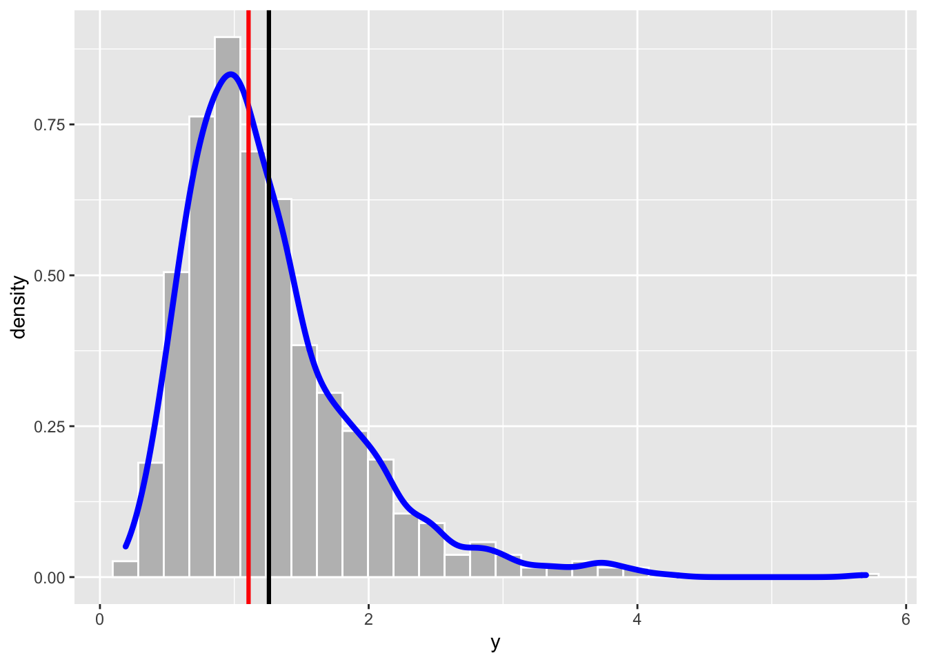
The distribution is characterized by a long right tail. As expected the skewness index is positive:
library(moments)
skewness(y)
## [1] 1.634816We will try to solve the asymmetry problem of the y data by using the Box-Cox power transformation defined by the following formula:
\[
y^{(\lambda)}=\frac{y^\lambda-1}{\lambda} \tag{8.1}
\]
for \(y>0\) and \(\lambda\in\mathbb R\). The particular case of \(\lambda=0\) corresponds to the logarithmic transformation, i.e. \(y^{(0)}=\log(y)\). In R the function for implementing the Box-Cox transformation is called bcPower and it is included in the car package (link).
Once the car package is loaded, we are ready to use the function bcPower contained in the package. This function needs two inputs: the data and the power constant lambda. For example with
y2 = bcPower(y, lambda=-0.8)we define a new vector y2 of the transformed y data by using the Box-Cox equation with \(\lambda=-0.8\). Obviously the lengths of y and y2 coincide. We can plot the distribution of the transformed data by using, for example, the histogram:
data.frame(y=y2) %>%
  ggplot() +
  geom_histogram(aes(y,..density..)) +
  geom_density(aes(y), col="blue", lwd=1.5)
## `stat_bin()` using `bins = 30`. Pick better value with `binwidth`.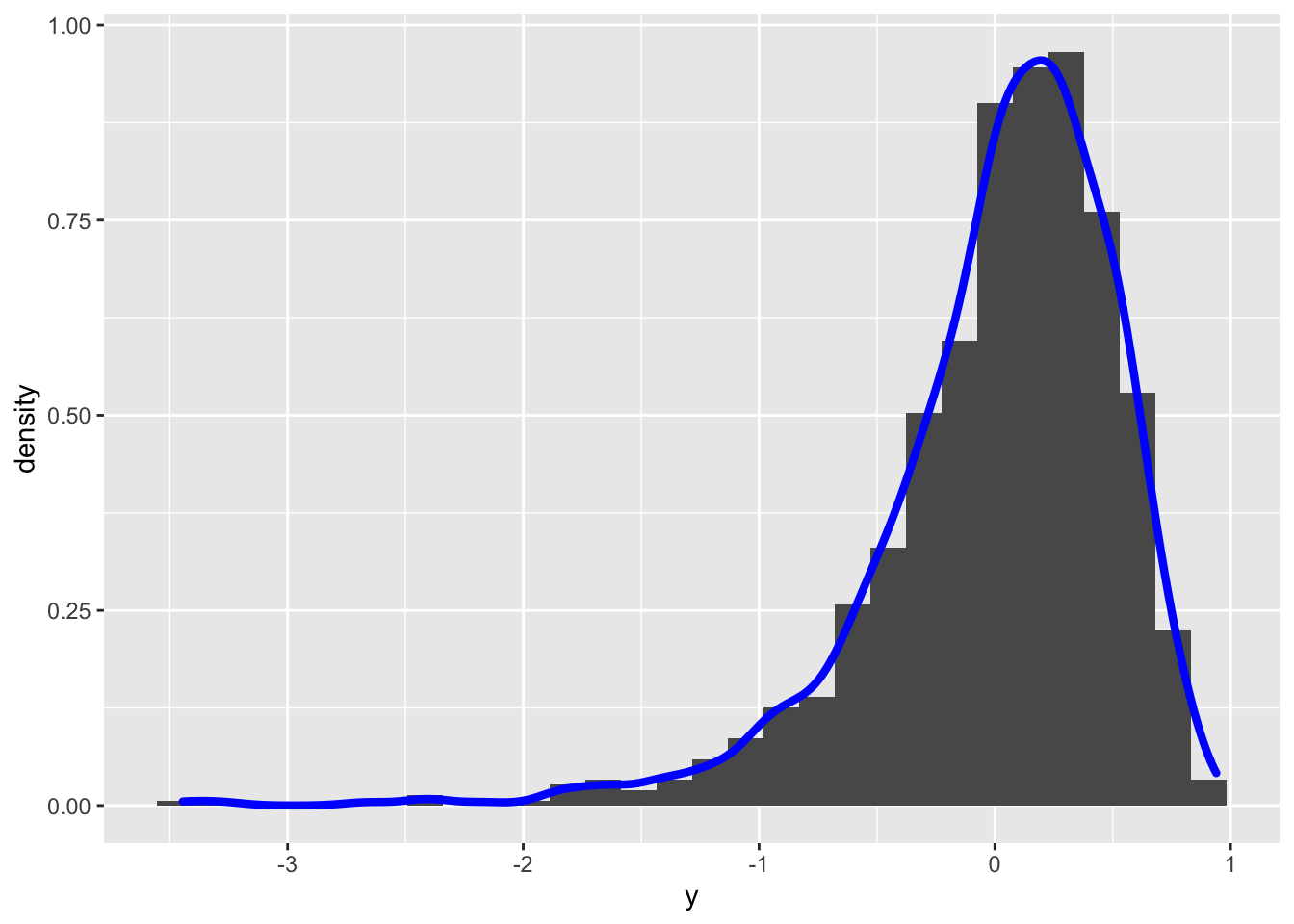 It can be observed that the transformed distribution is now left skewed. Let’s try with another value of \(\alpha\) (remember that \(\alpha\) can be any real number):
y2 = bcPower(y, lambda=0.8)
data.frame(y=y2) %>%
  ggplot() +
  geom_histogram(aes(y,..density..)) +
  geom_density(aes(y), col="blue", lwd=1.5)
## `stat_bin()` using `bins = 30`. Pick better value with `binwidth`.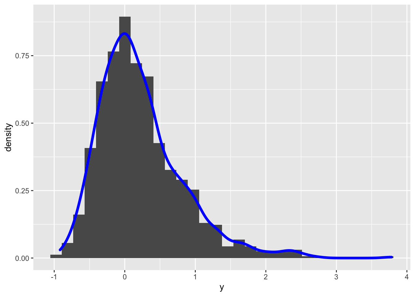 In this case the transformed distribution is still right skewness. To find the best value of \(\alpha\) (in order to get simmetry) it is possible to use the
 powerTransform included in the car package (see ?powerTransform for more details):
powerTransform(y)## Estimated transformation parameter
## y
## 0.04165664The value given as output represents the best value of \(\lambda\) for the Box-Cox transformation formula. In order to use this value directly in the bcPower function, I suggest to proceed as follows: save the output of powerTransform in a new object and then extract from it the required value by using $lambda:
best = powerTransform(y)
best$lambda
## y
## 0.04165664y2 = bcPower(y, lambda = best$lambda)
data.frame(y = y2) %>%
ggplot() +
geom_histogram(aes(y,..density..)) +
geom_density(aes(y), col="blue", lwd=1.5) ## `stat_bin()` using `bins = 30`. Pick better value with `binwidth`.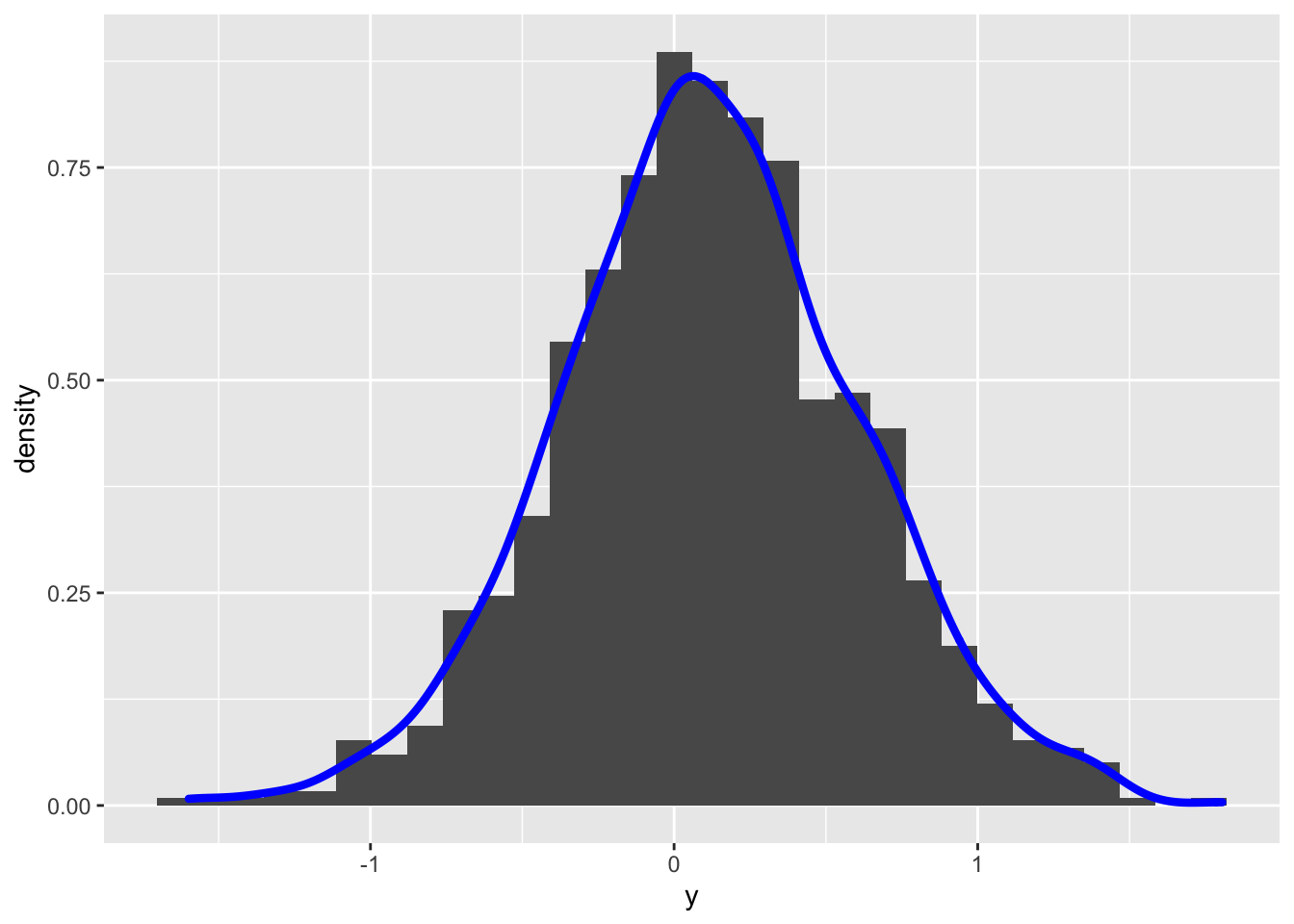
skewness(y2)## [1] 0.00172868From the histogram the distribution looks symmetric and the skewness index is close to zero. Let’s check the normality by using some hypothesis testings. We can start for example from the Jarque-Bera normality test introduced in the previous lecture:
jarque.test(y2)##
## Jarque-Bera Normality Test
##
## data: y2
## JB = 2.6004, p-value = 0.2725
## alternative hypothesis: greaterGiven the high p-value, we do not reject the null hypothesis of normality.
8.3.1 Shapiro-Wilk Normality test
The Shapiro-Wilk is based on the correlation between the empirical quantiles, given by the sample order statistics \(y_{(i)}\), and the theoretical Normal quantiles \(z_{(i)}=E(Z_{(i)})\). Under normality, the correlation should be close to 1; the \(H_0\) hypothesis of normality is rejected for small values of the test statistic.
The shapiro.test function is part of the base R release and provides the values of the test statistic and of the corresponding p-value. It can be computed only if the sample size (\(n\)) is lower than 5000.
shapiro.test(y2)##
## Shapiro-Wilk normality test
##
## data: y2
## W = 0.99832, p-value = 0.4416In this case, as in the previous test, the p-value is quite high and suggest not to reject the normality hypothesis. Note that the Shapiro-Wilk test is known to be a sample-size biased test: for big sample even small differences from the Normal distribution lead to the rejection of the \(H_0\) hypothesis.
8.4 Kolmogorov-Smirnov test
This is a Goodnes of fit test which compares the empirical CDF \(F_n(t)\) (ECDF, see above) and the theoretical CDF \(F(t)\) of a continuous random variable whose (population) parameters are assumed to be known. The test statistics is given by the absolute distance between the two function defined as follows: \[ D_n=\sup_t |F_n(t)-F(t)| \]
Under the null hypothesis, we expect a small value of \(D_n\). In R the ks.test(x,y,...) function can be used to perform this test. The following arguments have to be specified:
xis the vector of datayis a string naming a theoretical CDF, as for instancepnormfor the Normal distribution,plnormfor the logNormal distribution....is used to specify the parameters of the considered distribution (for examplemean=...andsd=...ifpnormis used, ormeanlog=...andsdlog=...ifplnormis used).
However there is an issue with the Kolmogorov-Smirnov test implemented in ks.test. As reported in its help page “the parameters specified in … must be pre-specified and not estimated from the data”.
In other words, it is not possible to specify a “composite” null hypothesis with the ks.test function.
The point is that when the hypothesis is composite, we need to use the sample data to estimate the population parameters. When we plug-in the test the estimated parameters, the Kolmogorov-Smirnov test statistic is closer to the null distribution than it would be when the population parameters are known (and this results in increased Type II error probability, i.e. of the probability of not rejecting \(H_0\) when it is not true). See, for example, the following case where we simulate 200 values from the Uniform(0,1) distribution (see here for the definition of continuos Uniform distribution) by using the runif function:
set.seed(4)
x = runif(200)
hist(x)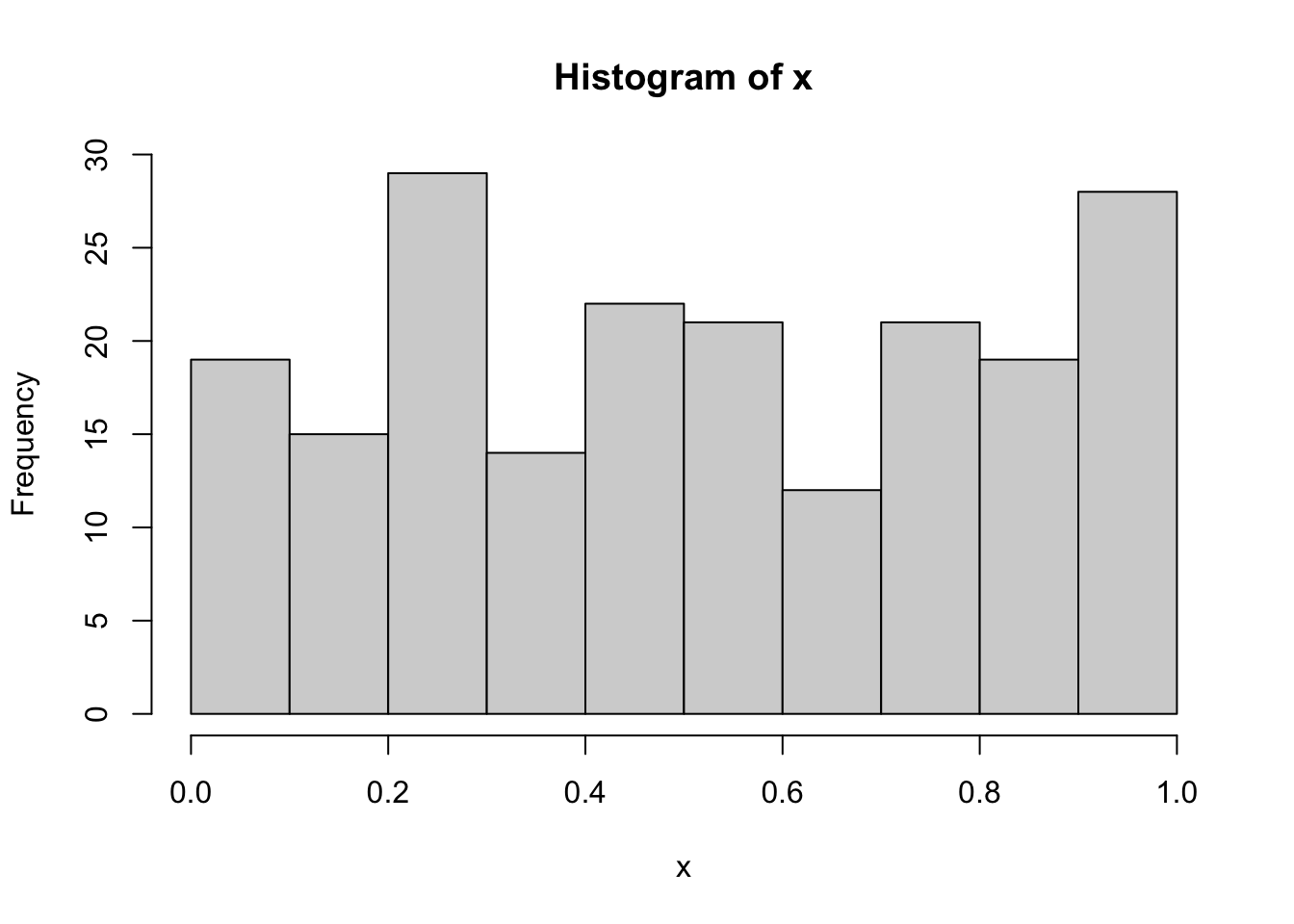
The data aren’t for sure normally distributed because they were simulated from the Uniform distribution. However, if we run the Kolmogorov-Smirnov test with ks.test and by using the sample statistics (mean and sd), we obtain
ks.test(x, "pnorm",
        mean=mean(x),
        sd=sd(x))
##
## Asymptotic one-sample Kolmogorov-Smirnov test
##
## data: x
## D = 0.089686, p-value = 0.08011
## alternative hypothesis: two-sidedThe p-value is 0.0801094: if we consider as threshold 0.05, we conclude the data suggest to not reject the normality hypothesis (and we know this is a wrong decision, i.e. second type error).
To overcome this issue it is possible to use the corrected version of the Kolmogorov-Smirnov test by means of the LcKS function included in the KScorrect library (that has to be installed and then loaded):
library(KScorrect)
ks2 = LcKS(y2,"pnorm")
ks2$p.value
## [1] 0.2242In this case the p-value leads to not rejecting the normality assumption for the transformed data contained in y2.
8.5 Ecdf using ggplot
We conclude this chapter by showing how it is possible to plot the ECDF by using ggplot and not plot as shown previously. In this case we plot together the ECDF of the original data y and of the transformed data y2:
data.frame(y,y2) %>% #wide format
ggplot() +
stat_ecdf(aes(y), col="blue") +
stat_ecdf(aes(y2))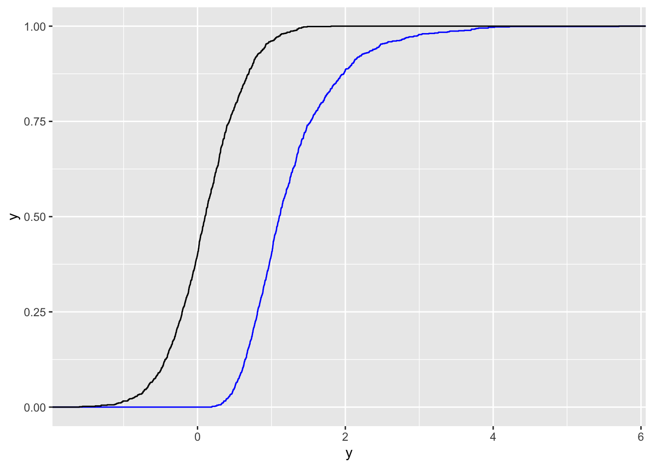 The 2 ECDFs reflect the differences in the two distributions. The limitation of this plot is that it doesn’t have a legend for the two colors. We thus need to transform the data from wide to long format, as the long data format is better with
 ggplot:
data.frame(y,y2) %>%
  pivot_longer(y:y2) %>%  #from wide to long, check the new columns
  ggplot() +
  stat_ecdf(aes(value, col=name), lwd=1.2)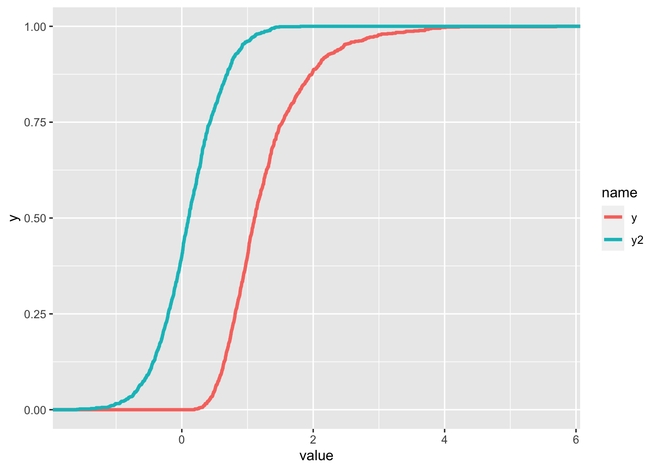
The two functions seem continuous but actually they are step functions (as shown before) with a large number of points.
8.6 Exercises Lab 6
8.6.1 Exercise 1
Suppose that the log-returns \(X\) of a certain title are distributed as a Normal random variable with mean 0.005 and variance 0.1.
Simulate 1000 log-returns from \(X\) (use the value 789 as seed) and represent them through a boxplot. Comment the graph.
Given the vector of log-returns compute – through the proper mathematical transformation – the corresponding vector of gross-returns. Represent through a histogram + KDE the gross-returns distribution. Considering the adopted transformation and the distribution assumed for \(X\), which is the distribution that can be assumed for the gross-returns?
Evaluate the skewness for the gross-returns. What can you conclude about symmetry?
Produce the normal probabilty plot for the gross-returns sample. What can you conclude about normality?
Use the Box-Cox transformation to try to improve your data distribution. Check it graphically and through the skewness index.
Represent the distribution of the transformed data with a normal probability plot. What can be observed?
Implement a normality test (one of your choice) to check the normality assumption.
8.6.2 Exercise 2
Consider the following random variables:
- \(X_1\sim Normal(\mu=10, \sigma=1)\)
- \(X_2\sim Normal(\mu=10, \sigma=2)\)
- \(X_2\sim Normal(\mu=10, \sigma=0.5)\)
Simulate 1000 values from \(X_1\) (seed=1), from \(X_2\) (seed=2) and from \(X_3\) (seed=3). Plot in the same chart the 3 KDEs (showing a proper legend). Comment the plot.
Plot in the same chart the 3 ECDFs. Add to the plot a constant line for the theoretical median and for the probability equal to 0.5. Comment the plot.
Consider the following random variables:
- \(X_4\sim Normal(\mu=-10, \sigma=1)\)
- \(X_5\sim Normal(\mu=0, \sigma=1)\)
- \(X_6\sim Normal(\mu=10, \sigma=1)\)
Simulate 1000 values from \(X_4\) (seed=4), from \(X_5\) (seed=5) and from \(X_6\) (seed=6). Plot in the same chart the 3 KDEs. Comment the plot.
Plot in the same chart the 3 ECDFs. Add to the plot a constant line for the theoretical median and for the probability equal to 0.5. Comment the plot (set properly
xlim).