Chapter 9 Lab 7 - 05/05/2023
In this lecture we will will introduce the simple linear regression model.
We will use the data stored in the datareg_logreturns.csv file regarding the daily log-returns (i.e. relative changes) of:
- the NASDAQ index
- ibm, lenovo, apple, amazon, yahoo
- gold
- the SP500 index
- the CBOE treasury note Interest Rate (10 Year)
We consider as response variable (dependent variable) the log-returns of the NASDAQ index. All the others are independent variables (asa regressors, covariates or features).
We start with data import and its structure check:
library(tidyverse)
datareg = read.csv("files/datareg_logreturns.csv", sep=";")
glimpse(datareg)
## Rows: 1,258
## Columns: 10
## $ Date <chr> "27/10/2011", "28/10/2011", "31/10/2011", "01/11/2011", "02/11/…
## $ ibm <dbl> 0.021259484, 0.008410797, -0.015158278, -0.017924949, 0.0140719…
## $ lenovo <dbl> -0.006983222, -0.022680004, -0.040224791, -0.003738211, 0.07640…
## $ apple <dbl> 0.010157919, 0.000642213, -0.000419862, -0.020642431, 0.0022672…
## $ amazon <dbl> 0.041370257, 0.049715533, -0.017687307, -0.006625757, 0.0164596…
## $ yahoo <dbl> 0.020043187, -0.004218145, -0.057158353, -0.046459124, 0.011322…
## $ nasdaq <dbl> 0.032645344, -0.000540555, -0.019456266, -0.029276155, 0.012586…
## $ gold <dbl> -0.023184473, 0.006458961, 0.030716726, 0.043196913, -0.0006739…
## $ SP <dbl> 0.033716591, 0.000389154, -0.025048617, -0.028340060, 0.0159763…
## $ rate <dbl> 0.083563163, -0.037868809, -0.058485757, -0.083381609, 0.002495…Note that the data are in wide format.
9.1 Covariance and correlation
The linear relationship existing between two quantitative variables can by studied by using the scatterplot or by means of the covariance and correlation index. For example the following code produce the scatterplot between a couple of variables (ibm - independent variable - and nasdaq - dependent variable). The plot includes also a geometry (geom_smooth) displaying the fitted model estimated using the lm method (basically it’s the fitted linear regression model):
datareg %>%
  ggplot() +
  geom_point(aes(ibm, nasdaq)) +
  geom_smooth(aes(ibm, nasdaq), method="lm", col="red")
## `geom_smooth()` using formula 'y ~ x'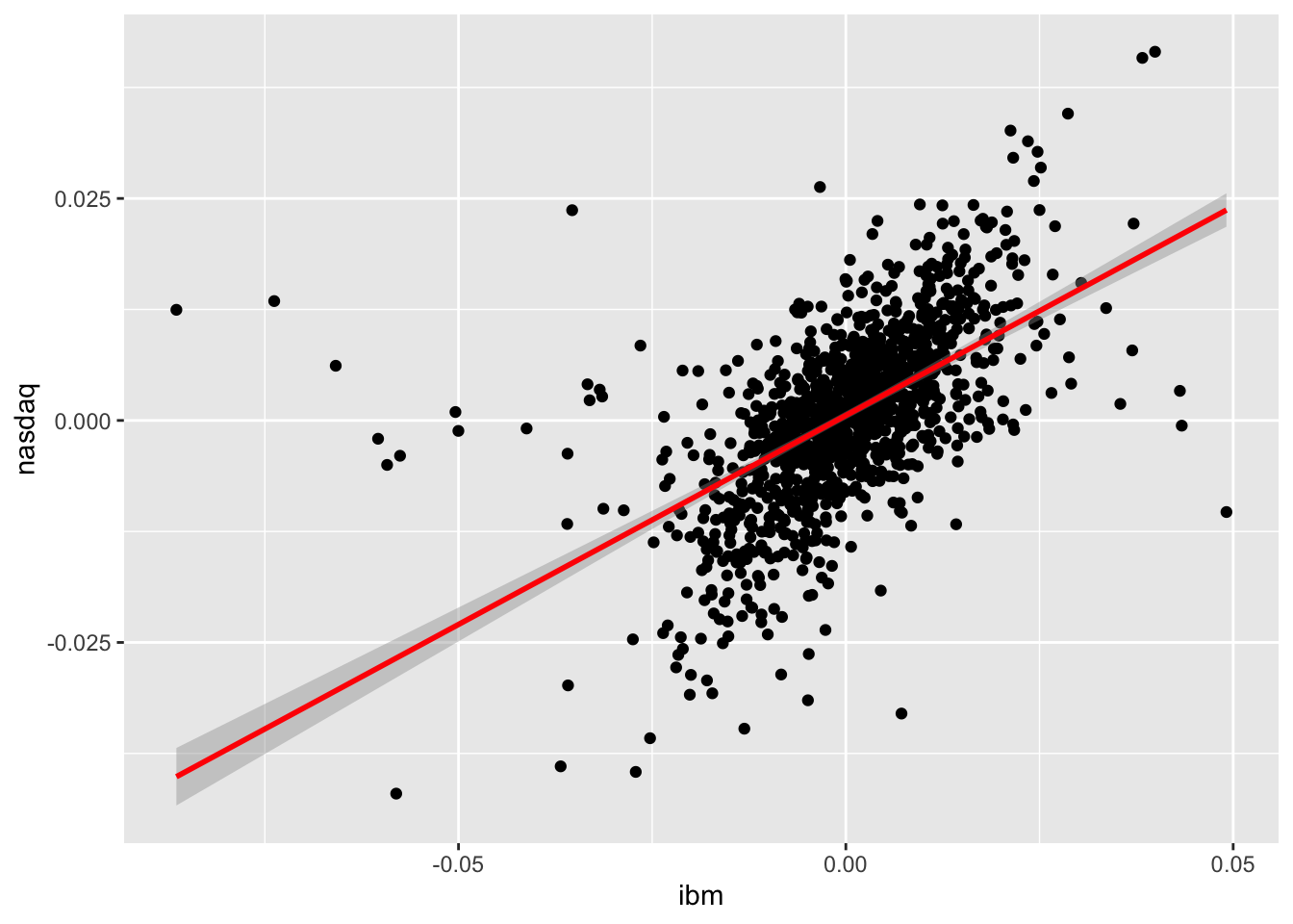
It is clear that a positive relationship exists between the two variables (see the cloud of points with increasing direction). We observe also tail dependence in the plot (high/low values of ibm occur jointly with high/low values of nasdaq). However also some observations connected with tail independence are visible in the plot (see the points corresponding to low negative values of ibm and positive values of nasdaq).
To compute the covariance and correlation index we use the cov and cor functions:
cov(datareg$ibm, datareg$nasdaq) ## [1] 6.783533e-05cor(datareg$ibm, datareg$nasdaq)## [1] 0.5742862We observe that both the indexes are positive, as expected given the shape of the cloud of points. The value 0.57 denotes an average level of linear association.
It is also possible to get the correlation matrix with
cor(x), where x is a data frame or a selection of some columns in it. Before proceeding we have to remove the first column containing the dates (we overwrite datareg with a new data frame created started from datareg and by selecting all the columns except the first one):
datareg = datareg %>% dplyr::select(- Date)
#cov(datareg) #variance-covariance matrix
cor(datareg) #correlation matrix
## ibm lenovo apple amazon yahoo nasdaq
## ibm 1.0000000 0.18256390 0.309141875 0.28410946 0.27040797 0.57428618
## lenovo 0.1825639 1.00000000 0.150725539 0.17169970 0.22717272 0.33962969
## apple 0.3091419 0.15072554 1.000000000 0.24236375 0.24382108 0.58892032
## amazon 0.2841095 0.17169970 0.242363747 1.00000000 0.36127453 0.57097612
## yahoo 0.2704080 0.22717272 0.243821083 0.36127453 1.00000000 0.54915892
## nasdaq 0.5742862 0.33962969 0.588920320 0.57097612 0.54915892 1.00000000
## gold -0.0353601 0.02574602 0.004183599 -0.02683262 0.01754798 -0.01579902
## SP 0.6199620 0.34713968 0.500690167 0.50582255 0.51164856 0.94881773
## rate 0.2798703 0.18969900 0.219320776 0.18581568 0.22813327 0.41351071
## gold SP rate
## ibm -0.0353601041 0.6199619759 0.27987034
## lenovo 0.0257460172 0.3471396840 0.18969900
## apple 0.0041835993 0.5006901672 0.21932078
## amazon -0.0268326183 0.5058225541 0.18581568
## yahoo 0.0175479795 0.5116485609 0.22813327
## nasdaq -0.0157990161 0.9488177268 0.41351071
## gold 1.0000000000 -0.0003491707 -0.04299245
## SP -0.0003491707 1.0000000000 0.43257539
## rate -0.0429924489 0.4325753882 1.00000000We reduce the number of decimals by using round:
cor(datareg) %>% round(3)## ibm lenovo apple amazon yahoo nasdaq gold SP rate
## ibm 1.000 0.183 0.309 0.284 0.270 0.574 -0.035 0.620 0.280
## lenovo 0.183 1.000 0.151 0.172 0.227 0.340 0.026 0.347 0.190
## apple 0.309 0.151 1.000 0.242 0.244 0.589 0.004 0.501 0.219
## amazon 0.284 0.172 0.242 1.000 0.361 0.571 -0.027 0.506 0.186
## yahoo 0.270 0.227 0.244 0.361 1.000 0.549 0.018 0.512 0.228
## nasdaq 0.574 0.340 0.589 0.571 0.549 1.000 -0.016 0.949 0.414
## gold -0.035 0.026 0.004 -0.027 0.018 -0.016 1.000 0.000 -0.043
## SP 0.620 0.347 0.501 0.506 0.512 0.949 0.000 1.000 0.433
## rate 0.280 0.190 0.219 0.186 0.228 0.414 -0.043 0.433 1.000Note that the correlation matrix is a 9x9 symmetric (so that for example Cor(ibm,nasdaq)=Cor(nasdaq,ibm)) matrix; moreover, all the values in the the diagonal are equal to one.
It is possible to consider also all the possible couples of variable in datareg and get a scatterplot matrix by using the function pairs(x), where x is a data frame or a selection of some columns in it.
pairs(datareg)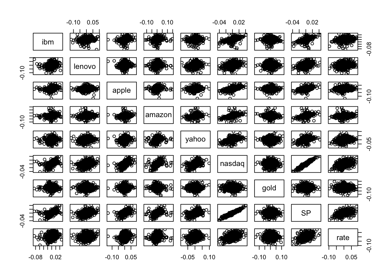 Note that the scatterplot matrix is not symmetric: for example the plot in the second row and first column is not equal to the plot in the first row and second column because the axes are exchanged (in the former lenovo is represented on the y-axis, while in the latter lenovo is on the x-axis).
In the scatterplot matrix just two cases show a thin cloud of points denoting a strong linear relationship: the plots referred to nasdaq and SP. As reported also in the correlation matrix, the correlation between these two variables is very close to one and equal to
cor(datareg$nasdaq,datareg$SP)## [1] 0.9488177Thus, we decide to use SP as regressor in the simple regression model that will be estimated in the following section.
To obtain the scatterplot matrix with a ggplot style we can use the function ggpairs in the GGally library:
library(GGally)## Registered S3 method overwritten by 'GGally':
## method from
## +.gg ggplot2ggpairs(datareg)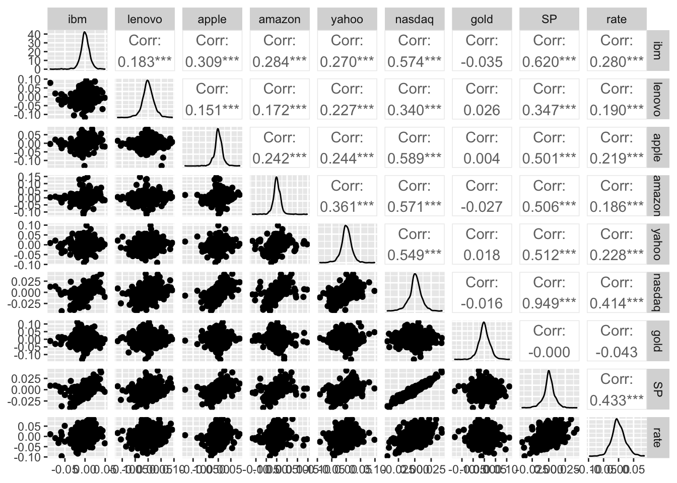
The final plot reports also the marginal distribution of each single variable in the diagonal and also the correlation values (with the corresponding p-value to test if the correlation is significantly different from zero). For discovering all the options of the ggpairs function and have some examples to run see ?ggpairs.
9.1.1 Simple linear regression model
Consider nasdq as dependent (response) variable and SP as independent variable, thus in this case the number of regressor is \(p=1\). The linear model equation is given by
\[
Y = \beta_0+\beta_1 X + \epsilon
\]
where \(\beta_0\) is the intercept and \(\beta_1\) the slope. The term \(\epsilon\) represents the error with mean equal to zero and variance \(\sigma^2_\epsilon\).
The function to be used in R to estimate a linear regression model is lm (linear model):
lm(nameofy ~ nameofx, data=nameofdataframe)The \(\sim\) symbol (tilde) can be obtained by:
- pressing ALT and 5 with Mac
- pressing ALT 1, 2 and 6 with Windows equipped with numeric keypad
- pressing ALT and Fn and 1, 2 and 6 with Windows without numeric keypad
The model we are interested in can be estimated as follows:
modlm = lm(nasdaq ~ SP, data=datareg)The object modlm is a list containing 12 the following 12 elements:
names(modlm)## [1] "coefficients" "residuals" "effects" "rank"
## [5] "fitted.values" "assign" "qr" "df.residual"
## [9] "xlevels" "call" "terms" "model"In particular we are interested in:
- the least squares estimates \(\hat\beta_0\) and \(\hat \beta_1\):
modlm$coefficients## (Intercept) SP
## 7.443203e-05 1.084615e+00The slope estimate (1.085) suggests that when the SP log-return increases by one unit we expect an increase of 1.085 in the nasdaq log-return. The estimated model \(\hat y=\hat\beta_0+\hat\beta_1 x\) is given by the following straight line included in the scatterplot:
datareg %>%
  ggplot(aes(SP, nasdaq)) +
  geom_point() +
  #geom_smooth(method = "lm") +
  geom_abline(slope = modlm$coefficients[2],
              intercept = modlm$coefficients[1],
              col="red")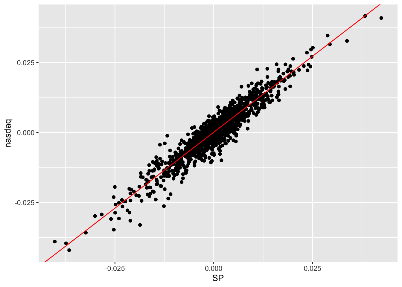
- the fitted values given by \(\hat y_i=\hat\beta_0+\hat\beta_1 x_i\) (\(i=1,\ldots,n\) with $n=$1258).
head(modlm$fitted.values)## 1 2 3 4 5
## 0.0366439651 0.0004965144 -0.0270936832 -0.0306636329 0.0174026410
## 6
## 0.0202565287- the residuals given by the difference between observed and fitted values: \(y_i -\hat y_i\) (\(i=1,\ldots,n\) with $n=$1258).
head(modlm$residuals)## 1 2 3 4 5 6
## -0.003998621 -0.001037069 0.007637417 0.001387478 -0.004816084 0.001471765All the important information related to the estimated model can be obtained by using the summary function:
summary(modlm)##
## Call:
## lm(formula = nasdaq ~ SP, data = datareg)
##
## Residuals:
## Min 1Q Median 3Q Max
## -0.0128494 -0.0018423 0.0002159 0.0020178 0.0115080
##
## Coefficients:
## Estimate Std. Error t value Pr(>|t|)
## (Intercept) 7.443e-05 8.777e-05 0.848 0.397
## SP 1.085e+00 1.019e-02 106.471 <2e-16 ***
## ---
## Signif. codes: 0 '***' 0.001 '**' 0.01 '*' 0.05 '.' 0.1 ' ' 1
##
## Residual standard error: 0.003109 on 1256 degrees of freedom
## Multiple R-squared: 0.9003, Adjusted R-squared: 0.9002
## F-statistic: 1.134e+04 on 1 and 1256 DF, p-value: < 2.2e-16In the central part of the summary table (named Coefficients) the following information are reported:
Estimate(\(\hat \beta_0\) denoted by(Intercept)and \(\hat \beta_1\) denoted bySP);Std.Error: the estimate of the standard deviation of \(\hat\beta_0\) and \(\hat\beta_1\) (this is a measure of the precision of the estimates; the lower the better);t.value: this is t test statistic given by the ratio betweenEstimateandStd.Errorand it’s a realization of a Student t distribution with \(n-p-1\)=nrow(datareg)-2degrees of freedom;Pr(>|t|): this is the corresponding p-value connected with the t test statistic.
In the considered case we reject the hypothesis \(H_0:\beta_1=0\) (thus SP is a significant regressor) and do not reject the hypothesis \(H_0:\beta_0=0\) (but in any case we keep the intercept in the model).
9.1.2 Variance decomposition
In the following we introduce some important quantities connected with the decomposition of the deviance of the dependent variable (\(SST=SSR+SSE\), see Figure 9.1).
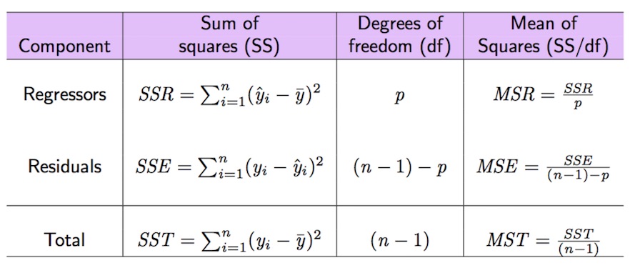
Figure 9.1: Anova table
The total variability of nasdaq is represented by \(SST\) (total sum of squares) which can be computed as follows:
SST = sum((datareg$nasdaq - mean(datareg$nasdaq)) ^2)
SST
## [1] 0.1217202The sum of squares of the errors (SSE) can be obtained by:
SSE = sum(modlm$residuals^2)
SSE
## [1] 0.01214097#SSE = sum((datareg$nasdaq-modlm$fitted.values)^2)Given that \(SST=SSR+SSE\), \(SSR\) can be derived as follows:
SSR = SST-SSE
#SSR=sum((modlm$fitted.values-mean(datareg$nasdaq))^2)
Given these important quantities the goodness of fit index \(R^2\) can be easily derived as the ratio between \(SSR\) and \(SST\):
SSR/SST## [1] 0.90025511-SSE/SST## [1] 0.9002551We obtain that SSR/SST*100 of the total variability of nasdaq is explained by SP. Consider that the range of the \(R^2\) index is the interval \([0,1]\): so, this is a very good performance of the linear model! Note that the \(R^2\) index is also reported in the summary output as Multiple R-squared: 0.9003.
All the important quantities related to the variance decomposition and reported in Figure 9.2 can be obtained also by using the function anova:
anova(modlm)## Analysis of Variance Table
##
## Response: nasdaq
## Df Sum Sq Mean Sq F value Pr(>F)
## SP 1 0.109579 0.10958 11336 < 2.2e-16 ***
## Residuals 1256 0.012141 0.00001
## ---
## Signif. codes: 0 '***' 0.001 '**' 0.01 '*' 0.05 '.' 0.1 ' ' 1
Figure 9.2: Anova table with F-test
9.2 RMarkdown
RMarkdown is the best framework for data science (official website: https://rmarkdown.rstudio.com/). It makes it possible to obtain reproducible reports that include text, R code and the corresponding output. See this video for an introduction to RMarkdown: https://vimeo.com/178485416. To use RMarkdown you have to install the rmarkdown and knitr package.
For the exercise part of the SPEF exam you will receive a RMarkdown document, i.e. a file with .Rmd extension (see for example the file Exam_FacSimile.Rmd available in the SPEF Moodle page). You can open the file (by double clicking) with RStudio.
In the top part of the file, as shown in Figure 9.3, you just have to write your Surname, Name and Student ID. The rest must not be modified. You can compile the RMarkdown file to obtain an html file by using the Knit button, see the yellow circle in Figure 9.3. If the compilation concludes correctly a web page will be opened with your html document. Moreover, the file Exam_FacSimile.html will be saved in the same folder. If you want to see the web page directly in the bottom right panel of RStudio click on the wheel button (see the purple circle in Figure 9.3) and select Preview in Viewer Pane (then compile again your document with Knit, you will see your document in the Viewer pane).
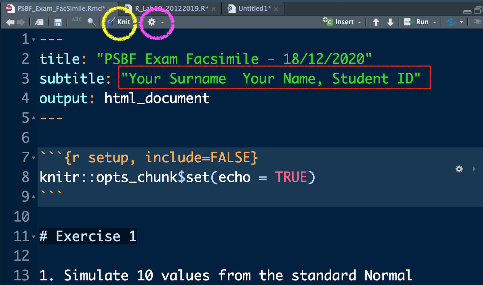
Figure 9.3: Top part of the RMarkdown file
In Figure 9.4 you can view the beginning of Exercise 1 (see the purple rectangle) and the first sub-exercise (1.). This must not be modified. You have instead to write your code and your comments (preceded by #) in the yellow area delimited by the symbols ```{r} and ``` (this area is known as code chunk). To check what your code produces you can:
- run separately each line of code by using Ctrl/Cmd Enter. This is the approach you have used so far, you will find your results in the console and the new objects in your environment (see top right panel).
- Use the arrow located in the right part of the code chunk (see the orange arrow in Figure 9.4 ). This will run all the code lines included in the chunk. You will find your results in the console and the new objects in your environment (see top right panel).
In any case you have to compile your document (using the Knit button) after each sub-exercise. This will make you possible to check the final html file step by step. At the end of your exam you will have to deliver both the .Rmd and .html file (you will upload them to the SPEF Moodle page).
Remember that if a code gives you errors or doesn’t work you can always keep it in your .Rmd file by commenting it out.
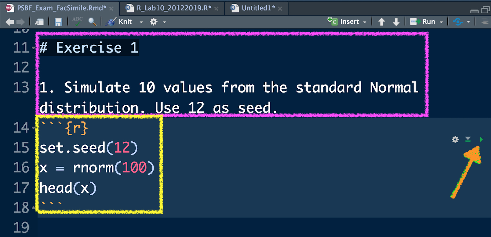
Figure 9.4: Text of an exercise in RMarkdown and code chunk
Another important thing to remember is that RMarkdown runs from scratch everything you knit it and it doesn’t remember which are the objects available in your environment or which are the packages that you have loaded. For this reason at the beginning of the .Rmd file it is compulsory to import the data (with read.csv(...)) and to load all the libraries that are needed.