Chapter 11 Lab 9 - 25/05/2023
In this lecture we will introduce the concepts of influential observations. Finally, we will use the residuals to check the assumptions behind the linear regression model. For the theoretical details of these topics, please refer to lecture slides.
We will use the data contained in the file adsertising.csv which contains for 200 markets the values (in thousands of units) of the Sales and of the TV, Radio, Newspaper budgets.
We start with data import and structure check:
library(tidyverse)
ads = read.csv("./files/Advertising.csv")
glimpse(ads)
## Rows: 200
## Columns: 4
## $ TV <dbl> 230.1, 44.5, 17.2, 151.5, 180.8, 8.7, 57.5, 120.2, 8.6, 199.…
## $ Radio <dbl> 37.8, 39.3, 45.9, 41.3, 10.8, 48.9, 32.8, 19.6, 2.1, 2.6, 5.…
## $ Newspaper <dbl> 69.2, 45.1, 69.3, 58.5, 58.4, 75.0, 23.5, 11.6, 1.0, 21.2, 2…
## $ Sales <dbl> 22.1, 10.4, 9.3, 18.5, 12.9, 7.2, 11.8, 13.2, 4.8, 10.6, 8.6…The response variable is Sales. We plot it and test its normality.
ads %>%
  ggplot() +
  geom_density(aes(Sales)) #also the histogram is fine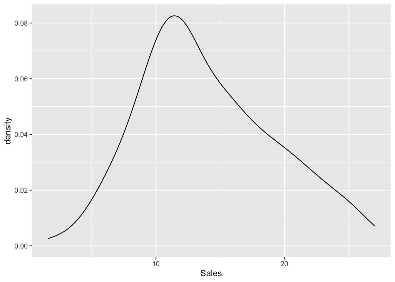
shapiro.test(ads$Sales)##
## Shapiro-Wilk normality test
##
## data: ads$Sales
## W = 0.97603, p-value = 0.001683Given the p-value we reject the normality hypothesis even if there is not a strong evidence against the null hypothesis.
We now produce all the bidimensional scatterplots representing the response variable and each regressor.
ads %>%
  ggplot() +
geom_point(aes(TV, Sales)) 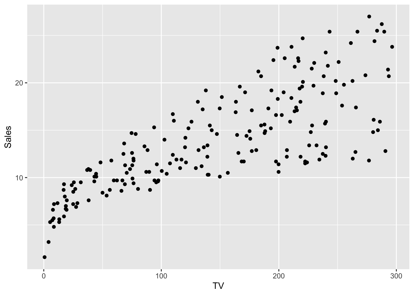
ads %>%
  ggplot() +
geom_point(aes(Radio, Sales)) 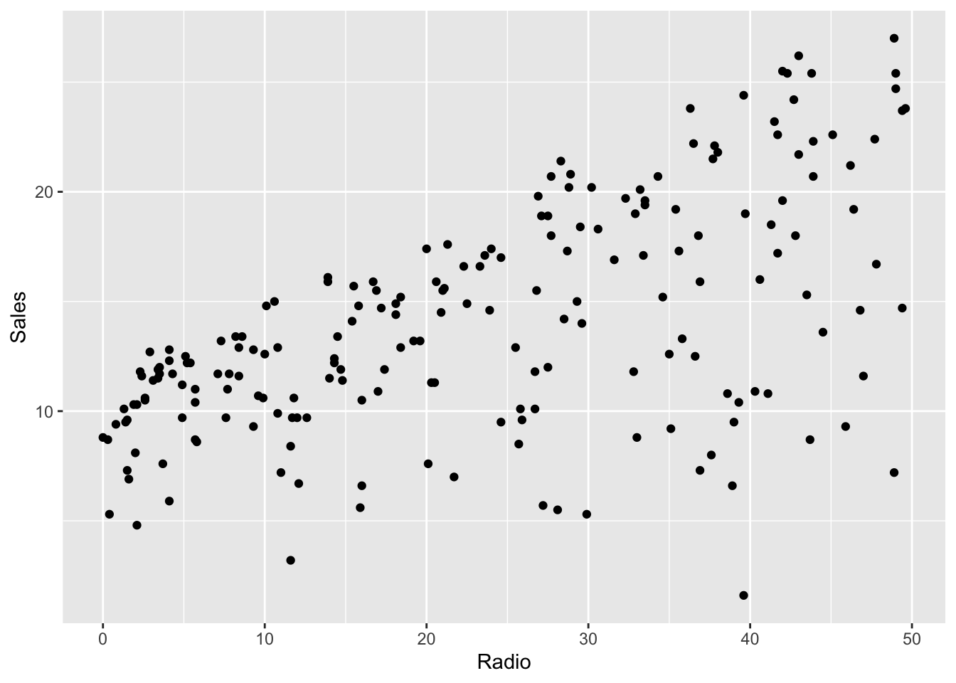
ads %>%
  ggplot() +
geom_point(aes(Newspaper, Sales)) 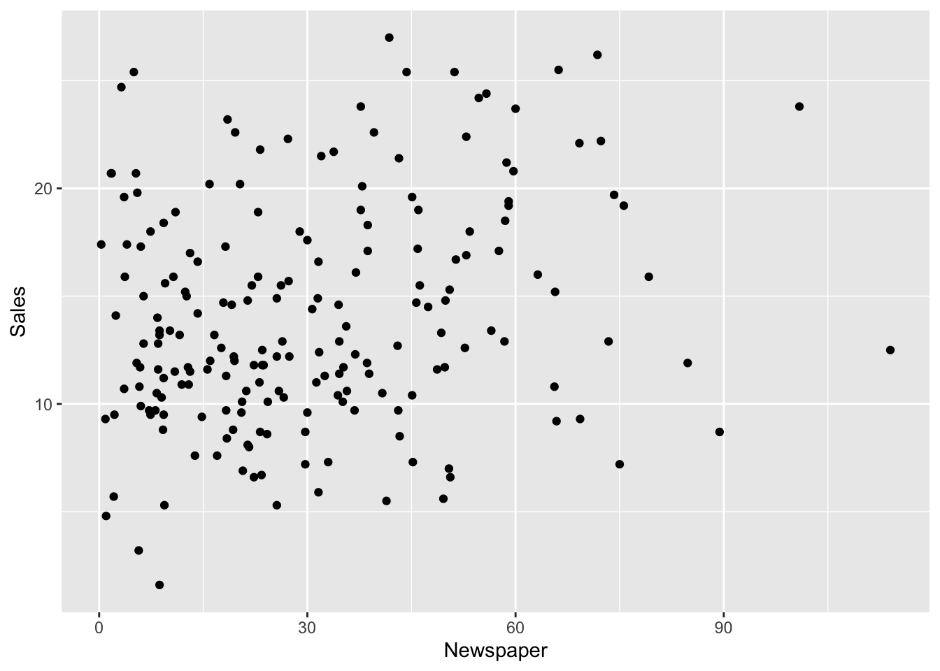
The adopted coding approach (with 3 pieces of code) is fine if we have a reduced number of regressors. But if we have a larger number of regressors it is more convenient to use the following code which requires to transform the data into a long format:
ads %>%
  pivot_longer(TV:Newspaper) %>%  #from wide to long
  ggplot(aes(x = value, y = Sales, colour = name)) +
  geom_point(alpha=0.6) +
  geom_smooth(col="black", method="lm") +
  facet_wrap(~name, scales = "free", ncol = 2) +
  labs(x = "Regressors", y = "Sales")
## `geom_smooth()` using formula 'y ~ x'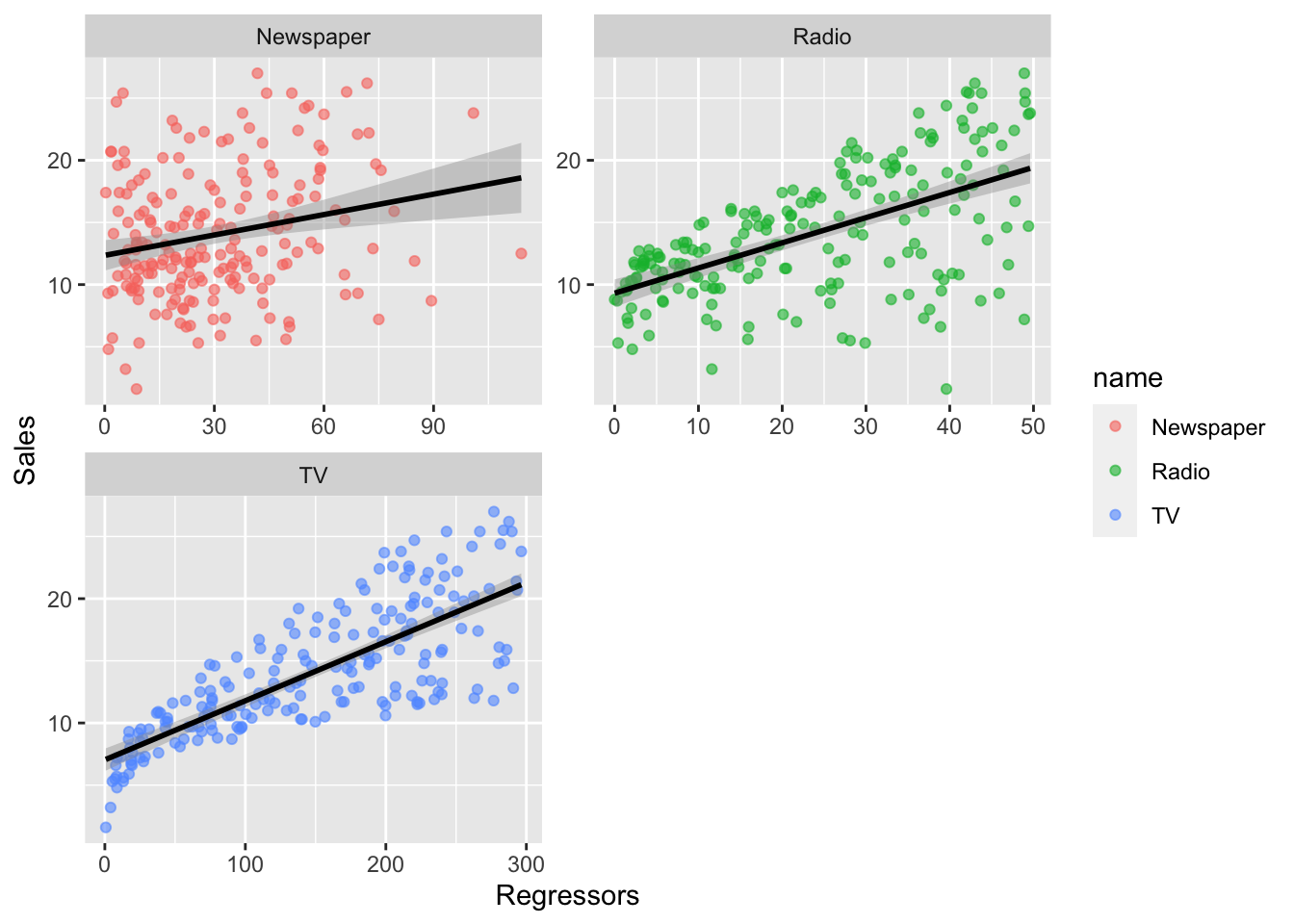
We observe that all the scatterplots show a positive relationship (positive correlative). Moreover, Radio and TV show a stronger linear relationship with Sales than Newspaper.
What we see with the scatterplots can be confirmed with the values of the correlation matrix:
cor(ads) %>% round(2)## TV Radio Newspaper Sales
## TV 1.00 0.05 0.06 0.78
## Radio 0.05 1.00 0.35 0.58
## Newspaper 0.06 0.35 1.00 0.23
## Sales 0.78 0.58 0.23 1.00or the corresponding plot
library(corrplot)## corrplot 0.92 loadedcor(ads) %>% corrplot()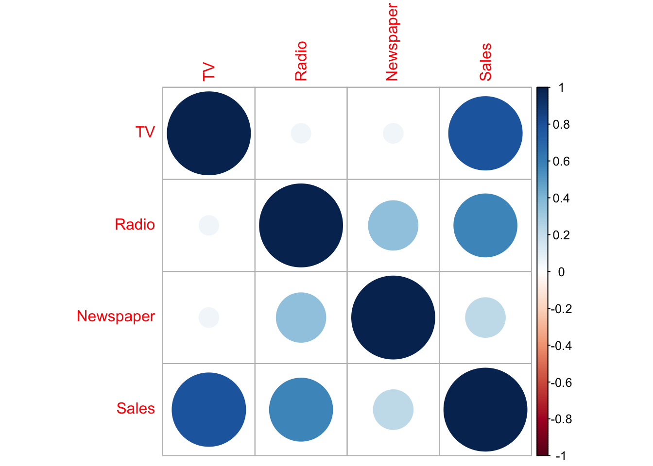 Note that the correlation between Sales and Newspaper is positive but weak (0.23).
We estimate first of all the full regression multiple model with Sales being the dependent variable and the remaining variables as predictors:
lm1 = lm(Sales ~ ., data=ads)
summary(lm1)
##
## Call:
## lm(formula = Sales ~ ., data = ads)
##
## Residuals:
## Min 1Q Median 3Q Max
## -8.8277 -0.8908 0.2418 1.1893 2.8292
##
## Coefficients:
## Estimate Std. Error t value Pr(>|t|)
## (Intercept) 2.938889 0.311908 9.422 <2e-16 ***
## TV 0.045765 0.001395 32.809 <2e-16 ***
## Radio 0.188530 0.008611 21.893 <2e-16 ***
## Newspaper -0.001037 0.005871 -0.177 0.86
## ---
## Signif. codes: 0 '***' 0.001 '**' 0.01 '*' 0.05 '.' 0.1 ' ' 1
##
## Residual standard error: 1.686 on 196 degrees of freedom
## Multiple R-squared: 0.8972, Adjusted R-squared: 0.8956
## F-statistic: 570.3 on 3 and 196 DF, p-value: < 2.2e-16From the summary output we can conclude that the \(\beta\) coefficient for Newspaper is not significantly different from zero and so we remove the regressor from the model:
lm2 = lm(Sales ~ .-Newspaper, data=ads)
summary(lm2)
##
## Call:
## lm(formula = Sales ~ . - Newspaper, data = ads)
##
## Residuals:
## Min 1Q Median 3Q Max
## -8.7977 -0.8752 0.2422 1.1708 2.8328
##
## Coefficients:
## Estimate Std. Error t value Pr(>|t|)
## (Intercept) 2.92110 0.29449 9.919 <2e-16 ***
## TV 0.04575 0.00139 32.909 <2e-16 ***
## Radio 0.18799 0.00804 23.382 <2e-16 ***
## ---
## Signif. codes: 0 '***' 0.001 '**' 0.01 '*' 0.05 '.' 0.1 ' ' 1
##
## Residual standard error: 1.681 on 197 degrees of freedom
## Multiple R-squared: 0.8972, Adjusted R-squared: 0.8962
## F-statistic: 859.6 on 2 and 197 DF, p-value: < 2.2e-16The goodness of fit is still high with just 2 regressors.
This is the plot of the observed and predicted values of Sales:
data.frame(obs=ads$Sales,pred=lm2$fitted.values) %>%
  ggplot() +
  geom_point(aes(obs,pred)) +
  geom_abline(slope=1, intercept=0)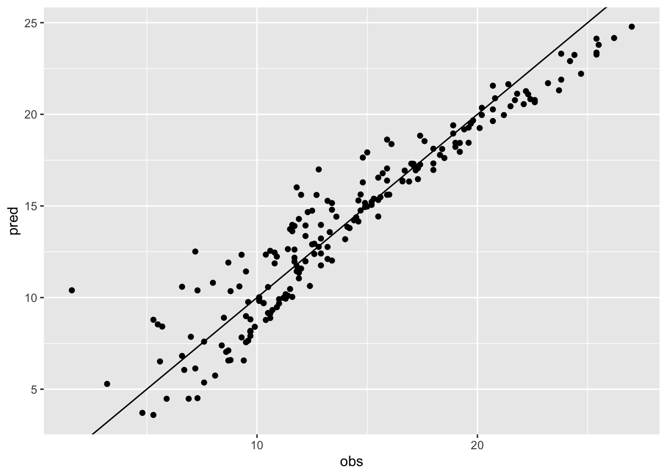
cor(ads$Sales,lm2$fitted.values)## [1] 0.9472034Note that the correlation between predicted and observed values is bigger than 0.9.
11.1 Variance Inflation Factor
The variance inflation factor (VIF) tells how much the variance of \(\hat \beta_j\) for a given regressor \(X_j\) is increased by having other predictors in the model (\(j=1,\ldots,p\)). It is given by \[ VIF_j = \frac{1}{1-R^2_j}\geq 1 \] where \(R^2_j\) is the goodness of fit index for the model which has \(X_j\) has dependent variable and the other remaining regressors as independent variables.
Note that \(VIF_j\) doesn’t provide any information about the relationship between the response and \(X_j\). Rather, it tells us only how correlated \(X_j\) is with the other predictors. We want VIF to be close to one (the latter is the value of VIF when all the regressors are independent).
In R VIF can by computed by using the vif function contained in the faraway library:
library(faraway)
vif(lm2)
## TV Radio
## 1.003013 1.003013All the two values (one for each regressor in the model) are close to one, so we can conclude that there are no problems of collinearity. A standard threshold for identifying problematic collinearity situation is the value of 8 (or 10).
11.2 Problematic observations
Problematic observations are defined according to three concepts: leverage, residual and influence. In the plots of Figure 11.1 we have a bunch of black points and a red point that could be problematic. The black points are used to estimate the black line; the red line instead is estimated by use the black AND the red points. The following 4 situations are represented:
- top-left: the red point has a high residual value, a small leverage value and a low influence (in fact the red and black estimated regression line are pretty close);
- top-right: the red point has a high residual, a high leverage and it’s also highly influential (in fact the red line is quite different from the black line, estimated without the red point);
- bottom-left: the red point has a high leverage but a small residual and a small influence (the black and red line basically coincide);
- bottom-right: the red point has a high residual, a small leverage but a high influence (the two lines differ).
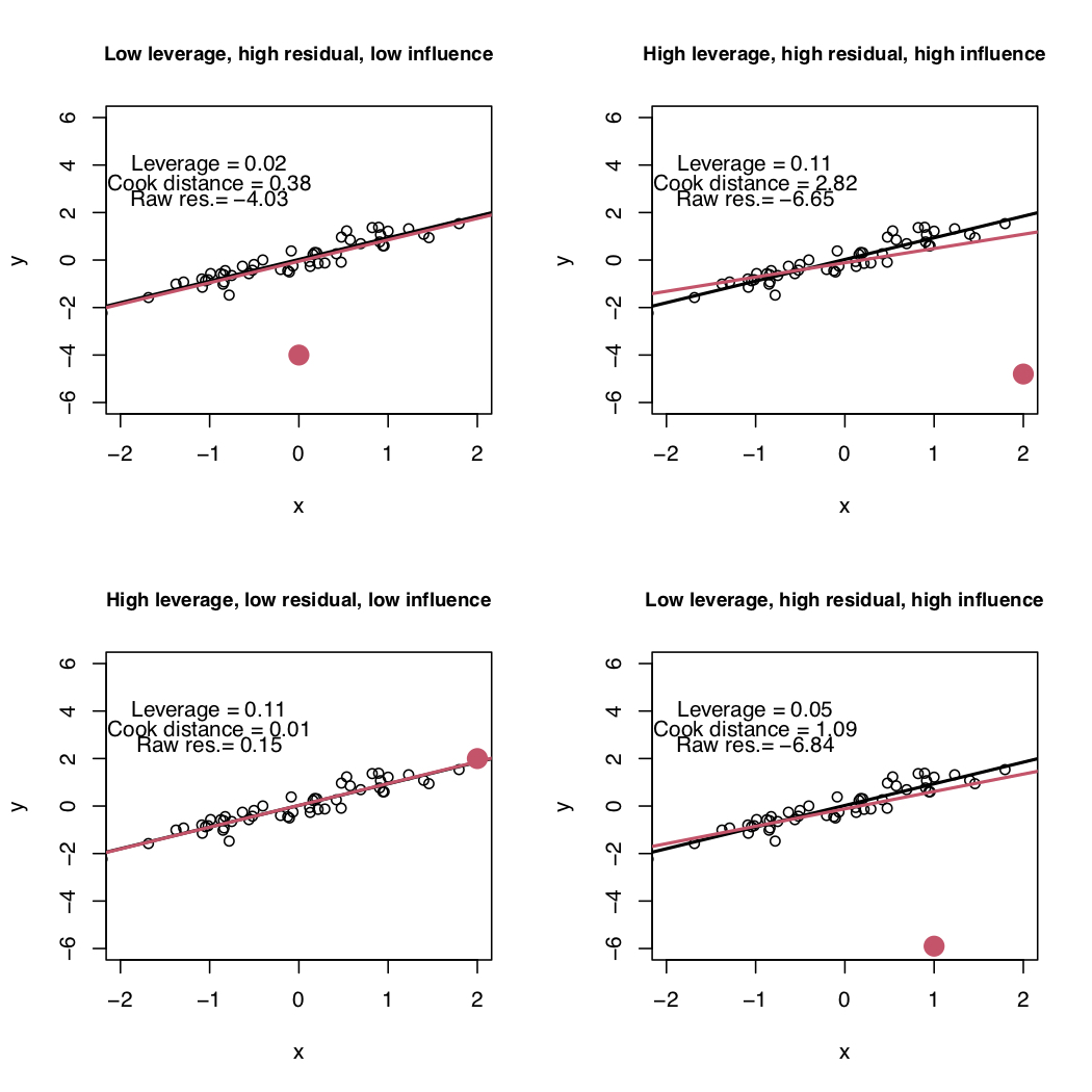
Figure 11.1: Simple linear regression model: four possible situations with respect to leverage, residual and influence.
11.2.1 Cook’s distance
An influential point is an observation which is able to modify the estimates of the regression line. This is given by the Cook’s distance which measures how much the predicted value \(\hat y_i\) changes (due to the change in the slope) when the \(i\)-the observation is removed from the regression model. The Cook’s distance is computed in R by cooks.distance(model=...). The threshold is \(4/n\).
data.frame(
  index = 1:nrow(ads),
  cooks = cooks.distance(lm2)) %>%
  ggplot() +
  geom_point(aes(index,cooks)) +
  geom_text(aes(index,cooks, label=index),nudge_y = 0.005) +
  geom_hline(yintercept=4/nrow(ads),col="red")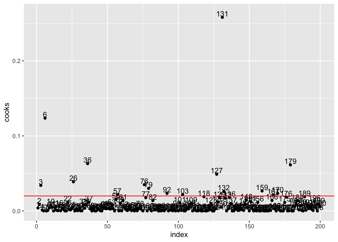
We observe several observations over the threshold. But the most influential observation is the one in position 131. We wonder if this is an error in the data and if it should be removed from the dataset.
ads[131, ]## TV Radio Newspaper Sales
## 131 0.7 39.6 8.7 1.611.3 Residuals and outliers
An outlier is an observation with an extreme value for the dependent variable and thus a high residual value. There are 3 different types of residuals but here we consider raw residuals: \(\hat \epsilon_i=y_i-\hat y_i\), obtained in R with lm2$residuals. The plot of the residuals should not present any clear pattern and they should have mean equal to zero:
data.frame(
  index = 1:nrow(ads),
  res = lm2$residuals) %>%
  ggplot() +
  geom_point(aes(index,res)) +
  geom_hline(yintercept=0, col="red")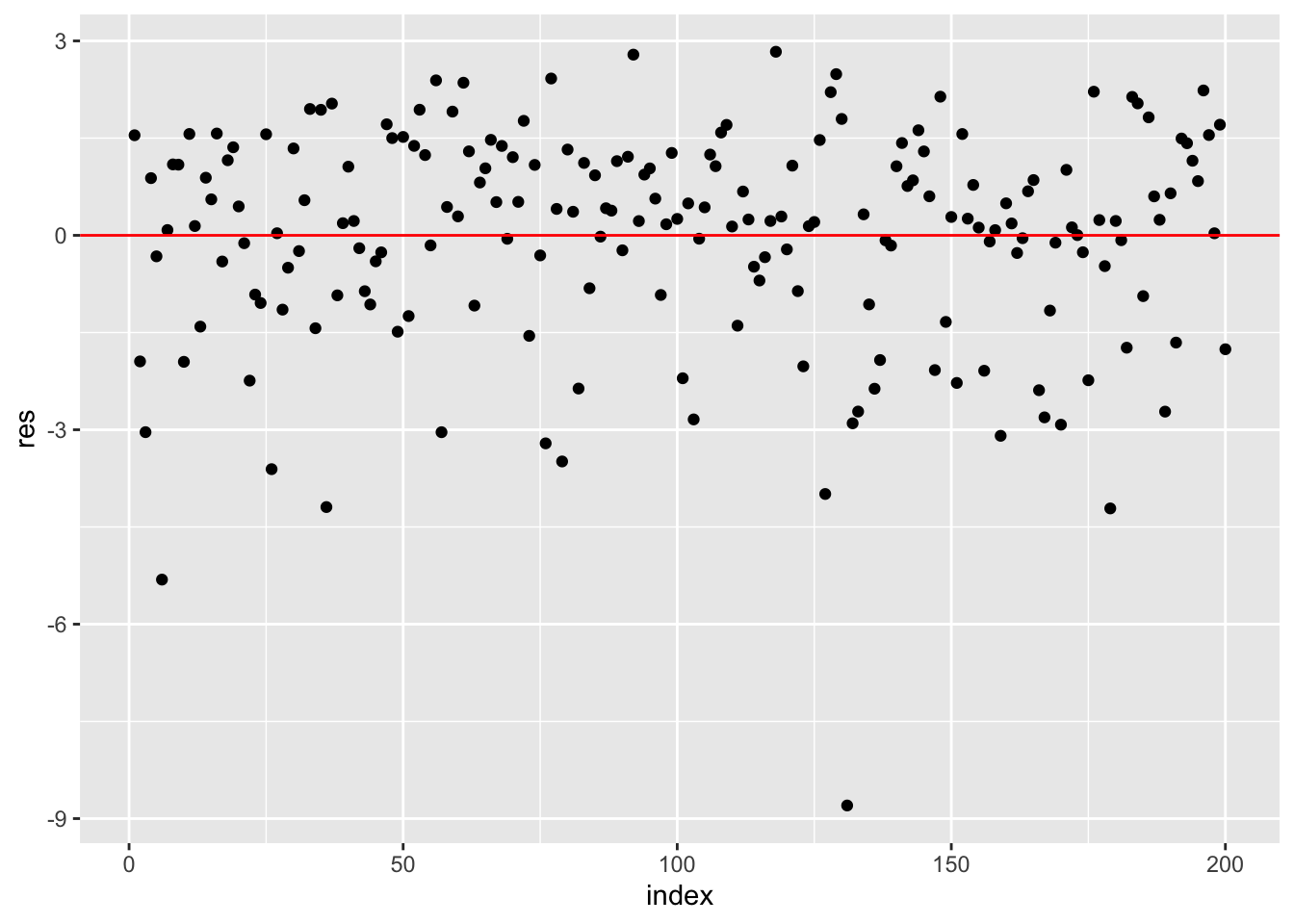
mean(lm2$residuals) ## [1] -1.3726e-18We observe a very negative residual which refers to the influential observation n. 131.
The thresholds for computing the numbers of outliers (i.e. observations with a high residual) are given by -3 and +3. We include these thresholds in the plots:
data.frame(
  index = 1:nrow(ads),
  res = lm2$residuals) %>%
  ggplot() +
  geom_point(aes(index,res)) +
  geom_hline(yintercept=0, col="red") +
  geom_hline(yintercept=-3, col="red", lty=2) +
  geom_hline(yintercept=+3, col="red", lty=2)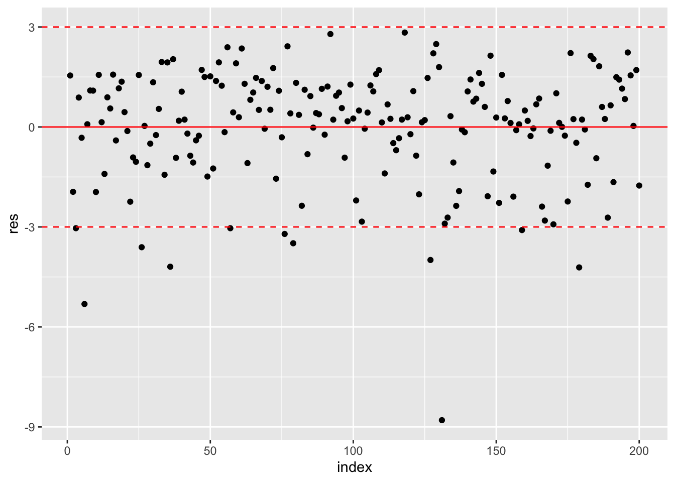
The corresponding computation of the percentage of outliers is given by
mean(lm2$residuals < -3 | lm2$residuals >+3)*100## [1] 5.5The symbol | represents the OR operator. Note that in the previous code it is important to separate < from - with an empty space, otherwise <- will be interpreted as the assignment operator (and it’s not what we want…).
As represented in the top-left panel of Figure 11.1, having a high residual value doesn’t mean that the observation is highly influential.
11.4 Residual diagnostics
After the model has been fit a residual analysis should be carried out in order to detect if there are any problems regarding the assumptions behind regression (see theory lectures). In particular we assume:
- constant variance of the errors, also known as homoschedasticity (\(Var(\epsilon_i)=\sigma^2_\epsilon\));
- linearity of the effects of the predictor variables on the response;
- normality of the errors;
- uncorrelation of the errors, i.e. \(Cov(\epsilon_i,\epsilon_j)=0\) for each \(i,j\).
11.4.1 Normality
To check the normality assumptions we use the tools introduced in the previous labs, such as for example the normal probability plot:
qqnorm(lm2$residuals,datax = T)
qqline(lm2$residuals,datax = T)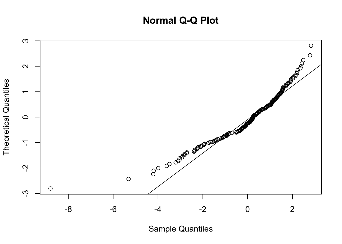
It is characterized by a convex pattern which is typical of distributions with left skewness, as also shown in the histogram:
data.frame(res = lm2$residuals) %>%
  ggplot() +
  geom_histogram(aes(res))
## `stat_bin()` using `bins = 30`. Pick better value with `binwidth`.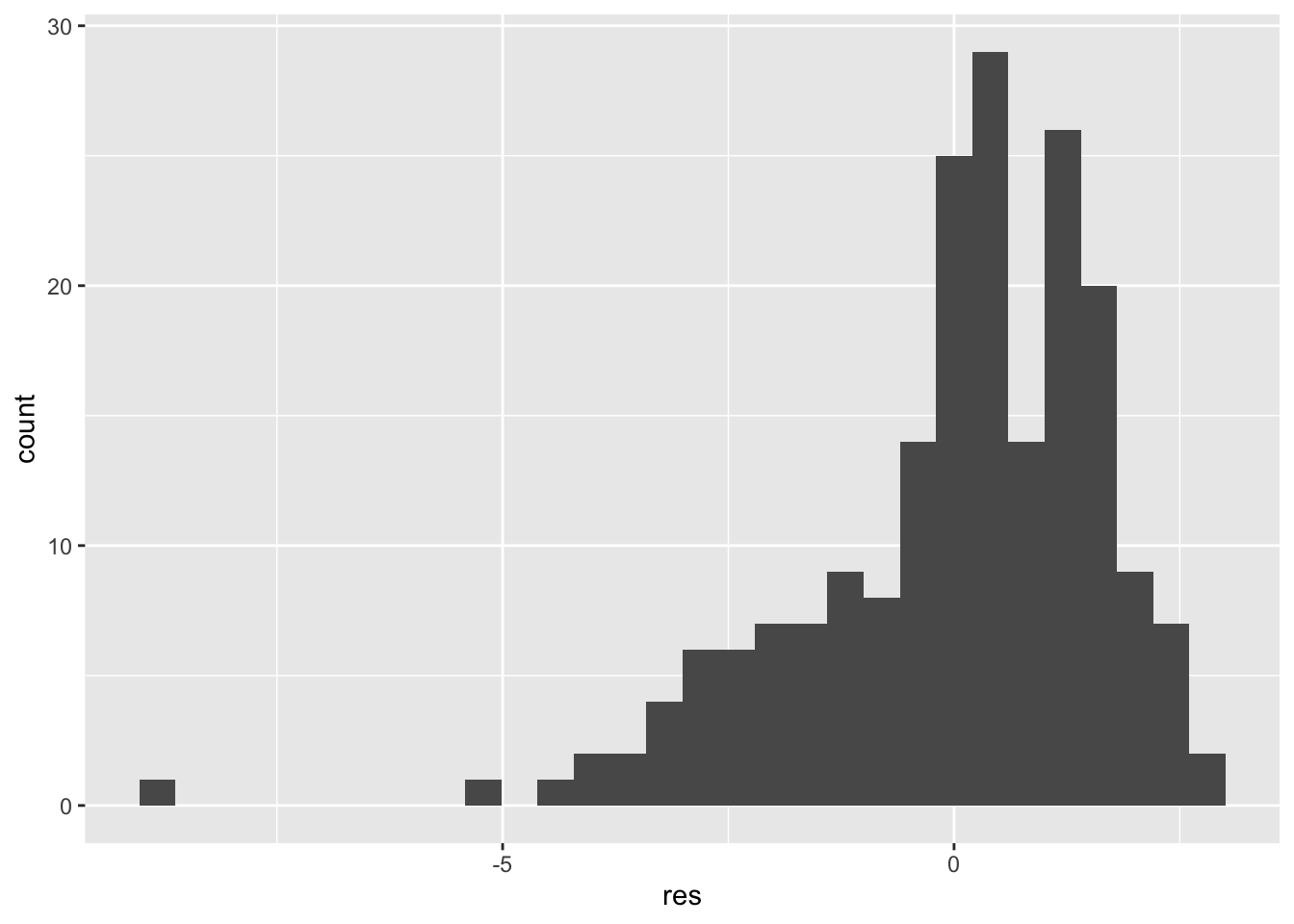 This could be again related to the influential observations detected before. Given these plot we expect to reject the normal assumption:
shapiro.test(lm2$residuals)##
## Shapiro-Wilk normality test
##
## data: lm2$residuals
## W = 0.91804, p-value = 4.19e-09We should try to redo the analysis removing the observation n. 131.
11.4.2 Homoschedasticity
Non constant variance is also called heteroschedasticity. It means that the variability of the errors, and consequently of the response variable, is not constant. In Figure 11.2 we have two scatterplots: in the left plot it is clear that the variability of the dependent variable increases with the values of the regressor \(x\); in this case the cloud of point has a funnel shaper. In the right plot the variability is constant across the range of \(x\) (homoschedasticity).
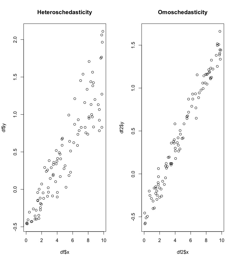
Figure 11.2: Scatterplot in case of non constant and constant variance
Non constant variance can be detected by plotting the absolute (studentized) residuals against the predicted values (\(\hat y\)). A systematic trend, as the one shown in the left plot of Figure 11.3, is an indication of heteroschedasticity.
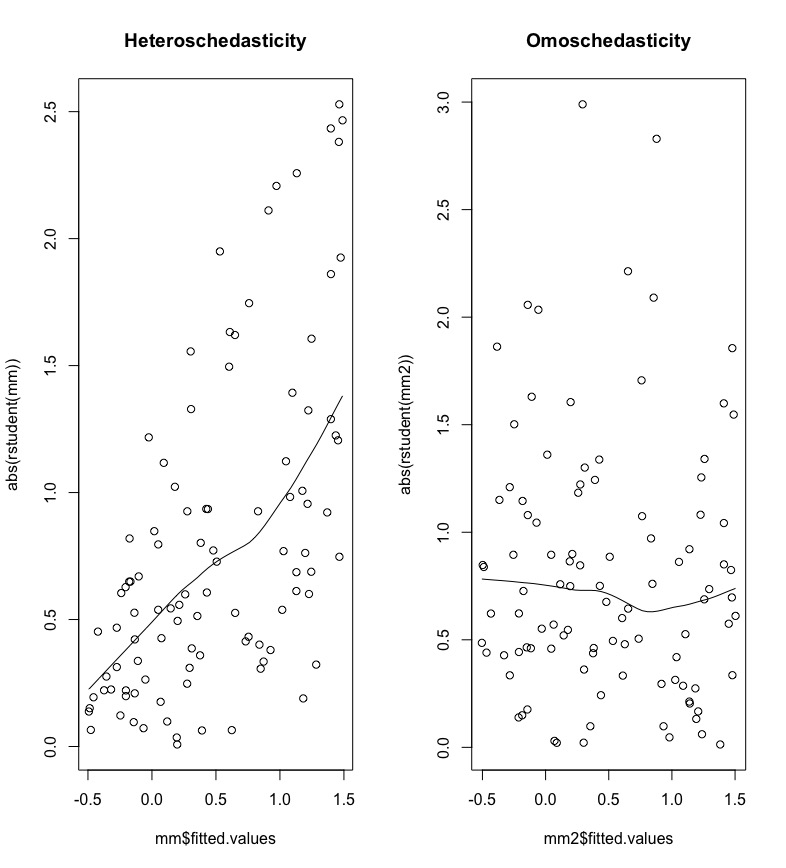
Figure 11.3: Plot of absolute (studentized) residuals against predicted values.
For the data under analysis we obtain the following plot:
data.frame(fitted = lm2$fitted.values,
           res = lm2$residuals) %>%
  ggplot(aes(fitted,abs(res))) +
  geom_point() +
  geom_smooth()
## `geom_smooth()` using method = 'loess' and formula 'y ~ x'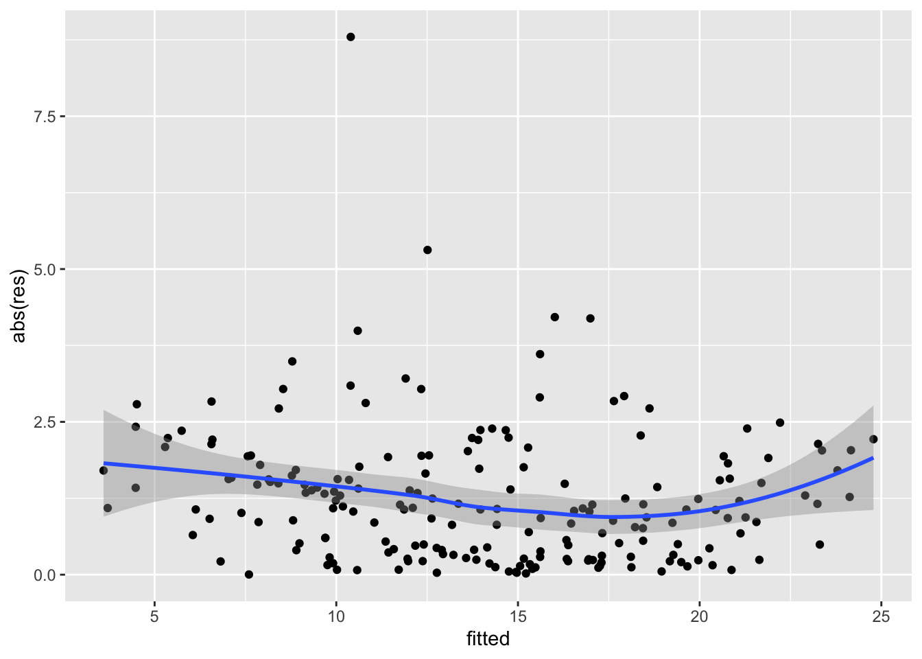
The plot shows no strong trend and we can conclude that the assumption of homoschedasticity can be accepted.
11.4.3 Linearity
The definition of the linear regression model assumes that the predictor variables have a linear effect on the response. In the left plot of Figure 11.4 we observe a non linear relationship between \(x\) and \(y\) (it seems more like a quadratic relationship).
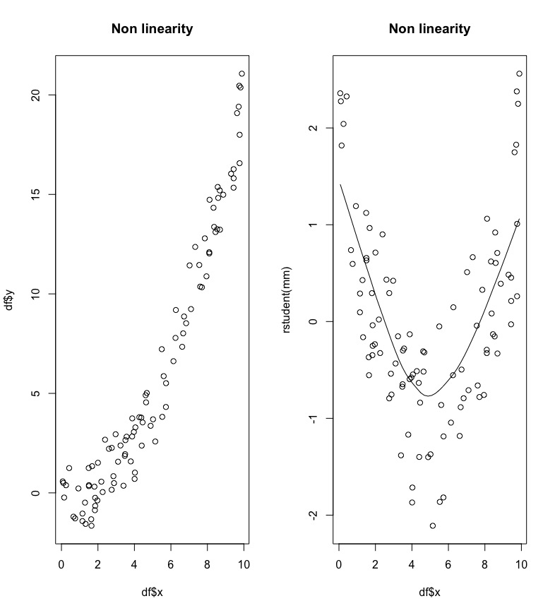
Figure 11.4: A case of non linearity between x and y.
Non linearity can be detected by plotting residuals against the value of each predictor, as shown in the right plot of Figure 11.4; a non linear pattern is an indication of non linearity.
For the considered case we obtain the following 2 plots:
data.frame(TV = ads$TV,
           res = lm2$residuals) %>%
  ggplot(aes(TV,res)) +
  geom_point() +
  geom_smooth()
## `geom_smooth()` using method = 'loess' and formula 'y ~ x'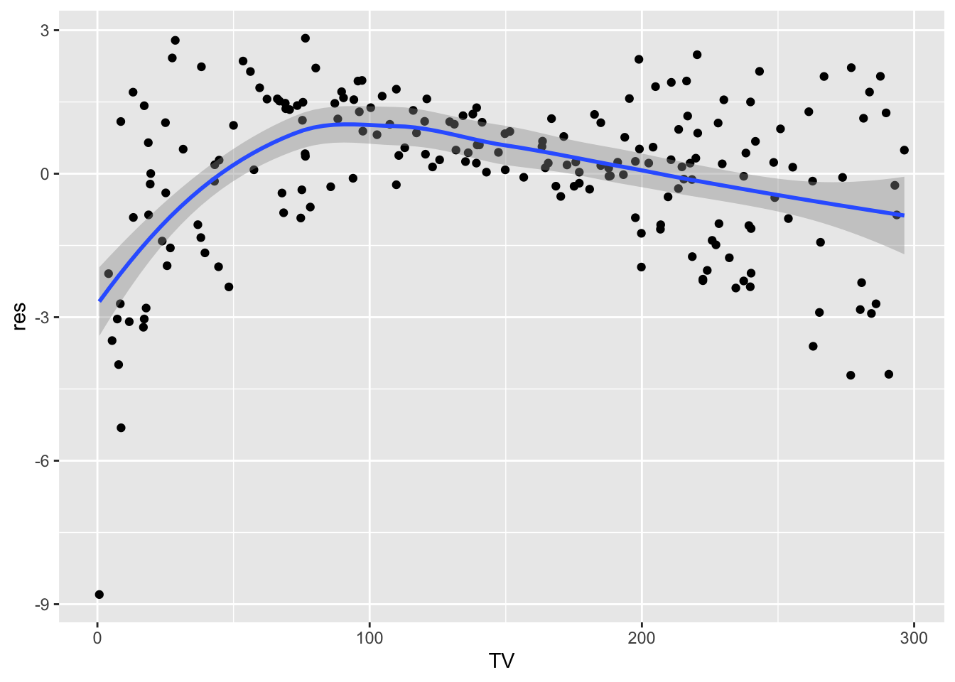
data.frame(Radio = ads$Radio,
           res = lm2$residuals) %>%
  ggplot(aes(Radio,res)) +
  geom_point() +
  geom_smooth()
## `geom_smooth()` using method = 'loess' and formula 'y ~ x'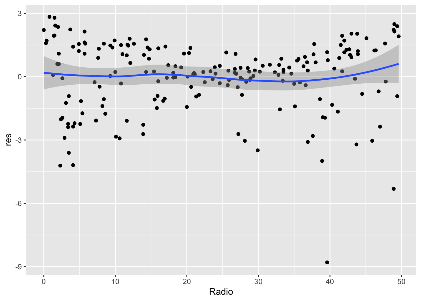
Again it is possible to collapse the code as follows:
ads %>%
  dplyr::select(-Newspaper, -Sales) %>%
  mutate(res=lm2$residuals) %>%
  pivot_longer(TV:Radio) %>%  #from wide to long
  ggplot(aes(x = value, y = res, colour = name)) +
  geom_point(alpha=0.6) +
  geom_smooth(col="black") +
  facet_wrap(~name, scales = "free", ncol = 2) +
  labs(x = "Regressors", y = "Sales")
## `geom_smooth()` using method = 'loess' and formula 'y ~ x'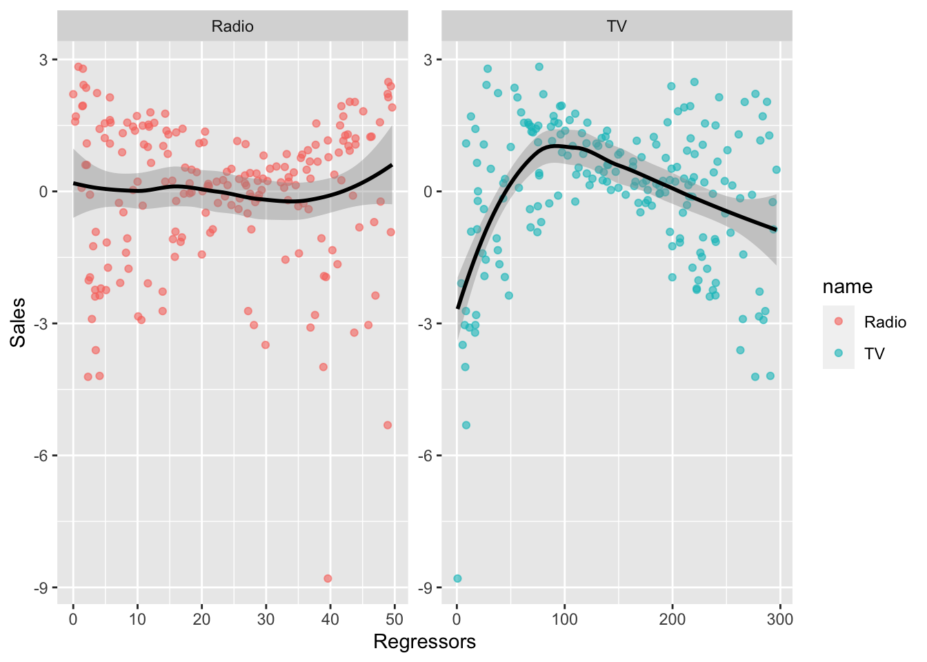
It results that for TV we don’t have a liner relationship. We will try later to find a solution for this, by transforming the regressor.
11.4.4 Uncorrelation
To check if it exists some correlations in the residuals we use the correlogram, a graphical representation that is used extensively for time series analysis. It can be obtained by using the acf (autocorrelation) function.
acf(lm2$residuals)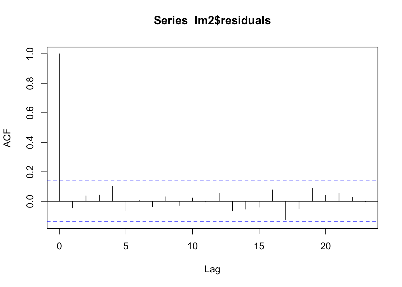 The correlogram has lags (time distance) on the x-axis and the value of the autocorrelation on the y-axis. The first bar is always equal to one because it corresponds to \(Cor(y_t,y_t)\) with \(t=1,\ldots,n\). The second vertical bar for \(h=1\) is negative and significantly different from zero (as it is outside the blue horizontal lines). None of the correlations is significantly different from zero, so the uncorrelation hypothesis can be considered as satisfied.
11.4.5 Fix the problems
We try to fix the linearity problem by transforming TV. We try 3 different transformation: TV^2, log(TV) and sqrt(TV).
lm3 = lm(Sales  ~ Radio + poly(TV,2), data=ads)
data.frame(TV = ads$TV,
           res = lm3$residuals) %>%
  ggplot(aes(TV,res)) +
  geom_point() +
  geom_smooth()
## `geom_smooth()` using method = 'loess' and formula 'y ~ x'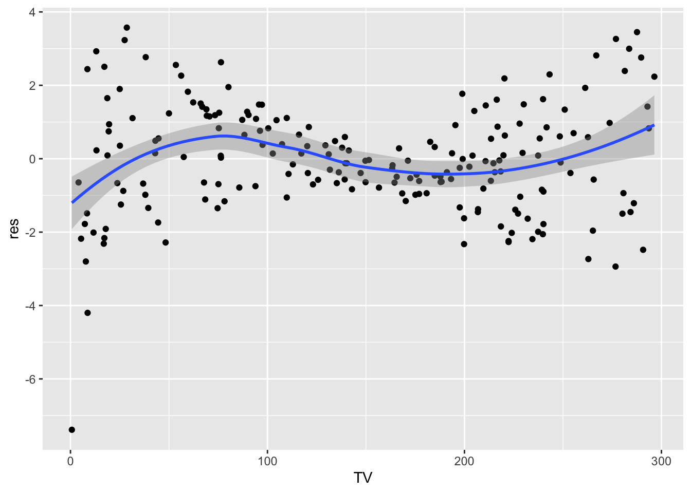
lm4 = lm(Sales  ~ Radio + log(TV), data=ads)
data.frame(TV = ads$TV,
           res = lm4$residuals) %>%
  ggplot(aes(TV,res)) +
  geom_point() +
  geom_smooth()
## `geom_smooth()` using method = 'loess' and formula 'y ~ x'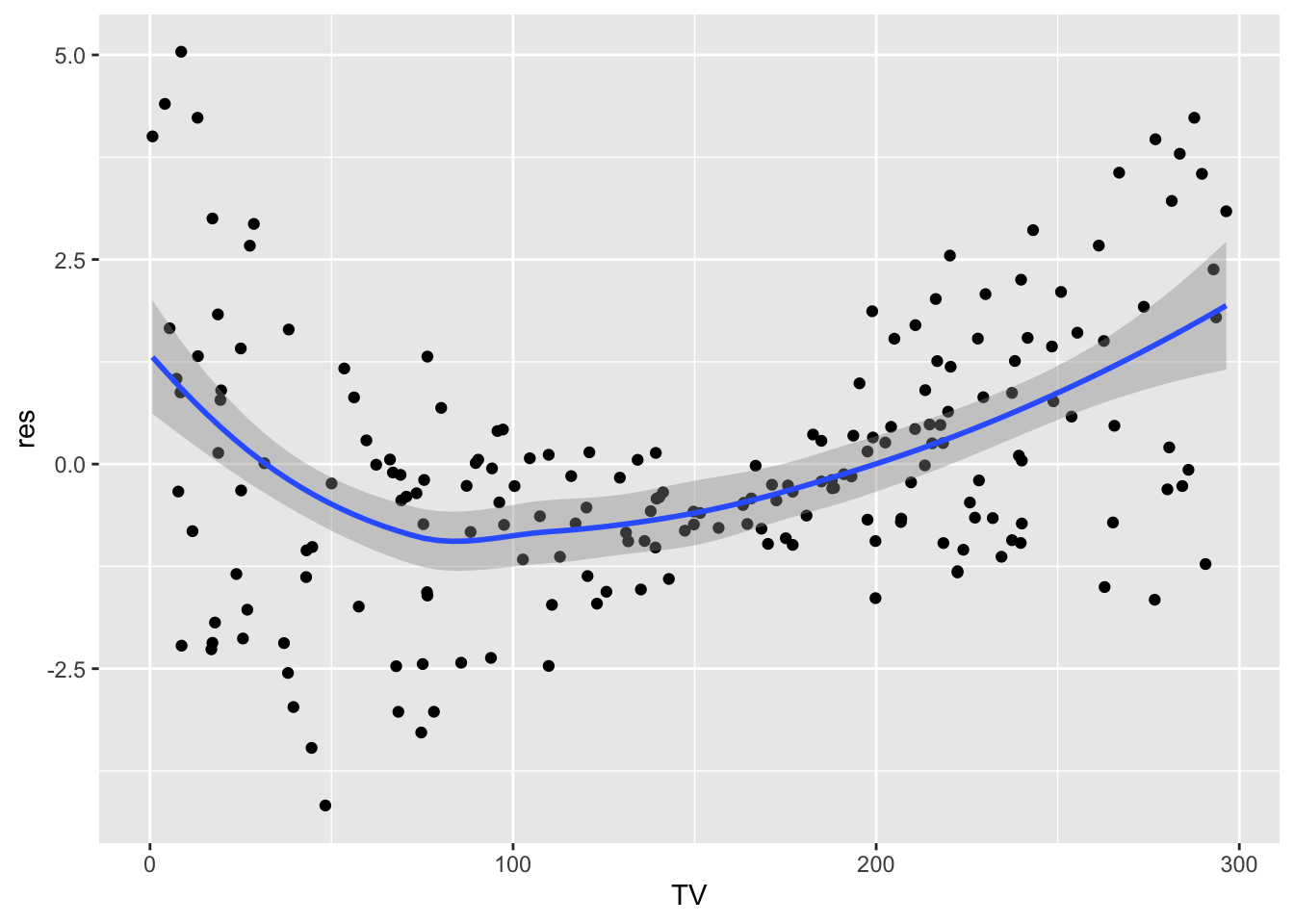
lm5 = lm(Sales  ~ Radio + sqrt(TV), data=ads)
data.frame(TV = ads$TV,
           res = lm5$residuals) %>%
  ggplot(aes(TV,res)) +
  geom_point() +
  geom_smooth()
## `geom_smooth()` using method = 'loess' and formula 'y ~ x'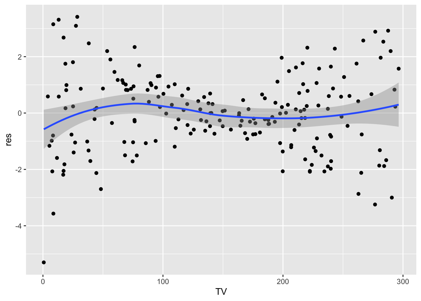
It seems that using the sqrt transform alleviate the linearity problem. At this point we should check again all the assumption for model lm5.
11.5 Exercise Lab 9
11.5.1 Exercise 01
The file “returns_GrA.csv” contains the daily log returns for the following indexes/assets: Dow Jones Industrial Average (DJI), NASDAQ Composite (IXIC), S&P 500 (GSPC) and Visa Inc. (V), from 21-11-2012 to 20-11-2017.
The file “GS.csv” contains the daily prices and volumes for The Goldman Sachs Group, Inc. (GS) asset (from 20-11-2012 to 20-11-2017).
Import the two datasets in R and create two objects named returnslog and GS.
- Compute the series of log returns for the GS asset (use the
Adj.Closeprices) and add it as a new column ofreturnslog.
Provide the plot containing the 5 boxplots (placed side by side).
Comment the plot.
Compute the percentage of days with log returns bigger than 0.05 OR lower than -0.05.
Compute and plot the correlation matrix for the available log returns time series. Comment the values.
Estimate a multiple regression model with the log returns of Visa Inc. (V) as dependent variable and with all the other log returns variables (DJI, IXIC, GSOC and GS) as regressors (full model).
Provide the full model summary.
Discuss the significance of the model coefficients (if needed, use \(\alpha\) = 0.01).
Compute the goodness of fit index by using the formula \(R^2=1-SSE/SST\).
Compute the goodness of fit index by using the formula \(R^2=Cor(y,\hat y)\)^2.
Discuss and compare the goodness of fit index of the full model (obtained at point 3.) and of the reduced model (after removing the non significant regressors). Provide also the reduced model’s summary. What can you conclude, if you have to choose between the full and the reduced model?
For the model chosen at the previous point:
plot the Cook’s distance for detecting high influence points.
Study the raw residuals in order to check if the model assumptions are met.
11.5.2 Exercise 02
Consider the file simdata.csv containing simulated values for a response variable y and 2 covariates (x1 and x2) for \(n=500\) observations. Import the data in R.
Plot the response variable. What can you conclude?
Implement the full regression model.
Provide and comment the summary output.
Consider the studentized residuals and check the assumptions of the regression model. What can you conclude? Which problems do you observe?
- Using the Box-Cox transformation transform the response variable to solve the skewness problem (add the transformed variable to the original dataframe).
Plot the transformed variable.
Implement again the full regression model. Provide and comment the summary output.
Consider the studentized residuals and check the assumption of the regression model.
Consider a non linear effect of \(X_1\) in your model equation: \(Y = \beta_0+\beta_1X_1+\beta_2X_1^2+\beta_3X_2+\epsilon\). You will have to use the following formula in
R:y ~ poly(x1,degree=2)+x2.Provide and comment the summary output.
Consider the raw residuals and check the assumption of the regression model.