Chapter 3 Descriptive Statistics using R
This chapter builds upon the previous, using the tools of R for descriptive statistics. This chapter is written on the assumption that the reader already has a reasonable understanding of basic descriptive statistics, and as such will not go into detail on the “what” or “why” of descriptive statistics, but rather will focus on the how.
Before we get started, a brief note on graphing. We will be using both Base R graphics and ggplot() graphics. In my opinion, ggplot() makes better looking graphics and is more intuitive when you want to customize your graphs than Base R. But sometimes, you just want a quick and dirty graph, and Base R is just fine for that. Also, I won’t be wasting a lot of time making every graph look “good” here. A good looking graph needs to have a title, axis titles, legends, and so forth. For the purposes of chapter, sometimes I will put in the effort to make the graph look proper when it is a ggplot() graph, sometimes I won’t. A deeper dive into data visualization is well beyond the scope of this text.
Finally, before we get going, let’s load in the packages we will be needing and load and attach 2 data sets:
library(AER)
data(CPS1985)
attach(CPS1985)
library(wooldridge)
data(vote1)
attach(vote1)
Additionally, this chapter will make use of the stargazer and tidyverse packages.
3.1 The Grammar of Graphics
The ggplot() function is in the ggplot2 package, which is part of the tidyverse. It is based on a graphing philosophy called the Grammar of Graphics. The Grammar of Graphics is based on the idea that a graphic has a set of indispensable elements:
- Aesthetic - The dimensions and visual attributes of the graph. This can be the x/y dimension, but also you can graph using color, size, and so forth. These are graphical elements used to display data, rather than being purely cosmetic. For example, perhaps I am making a scatterplot of with years of education on the x-axis and income on the y-axis. If I make all of the dots blue because it looks good, this is not an aesthetic. If I make the dots representing men blue and the dots reprenenting women pink, this is an aesthetic, because I am using color to represent the data.
- Layers - Objects are created on the aesthetic in layers. Each layer includes, or is defined by:
- Data - what is being graphed
- Mapping - how the data is put into the layer
- Statistical Transformation - how are you displaying the data? raw data? means? counts?
- Geometry - the physical display of the data (bars, points, lines, area)
- Position - placement of graphic elements for clarity of understanding
These are some higher level data visualization ideas that is beyond the scope of this class. Still, understanding a bit of this is helpful to making good graphics with ggplot().
3.2 Basic Graphing Techniques
3.2.1 Bar and Pie Charts
Let’s start with bar charts and pie charts. For basic bar charts, ggplot() is considerably easier than base R. Here is a bar chart that counts the number of individuals in the CPS data by occupation:
CPS1985 %>% ggplot(aes(x = occupation)) +
geom_bar()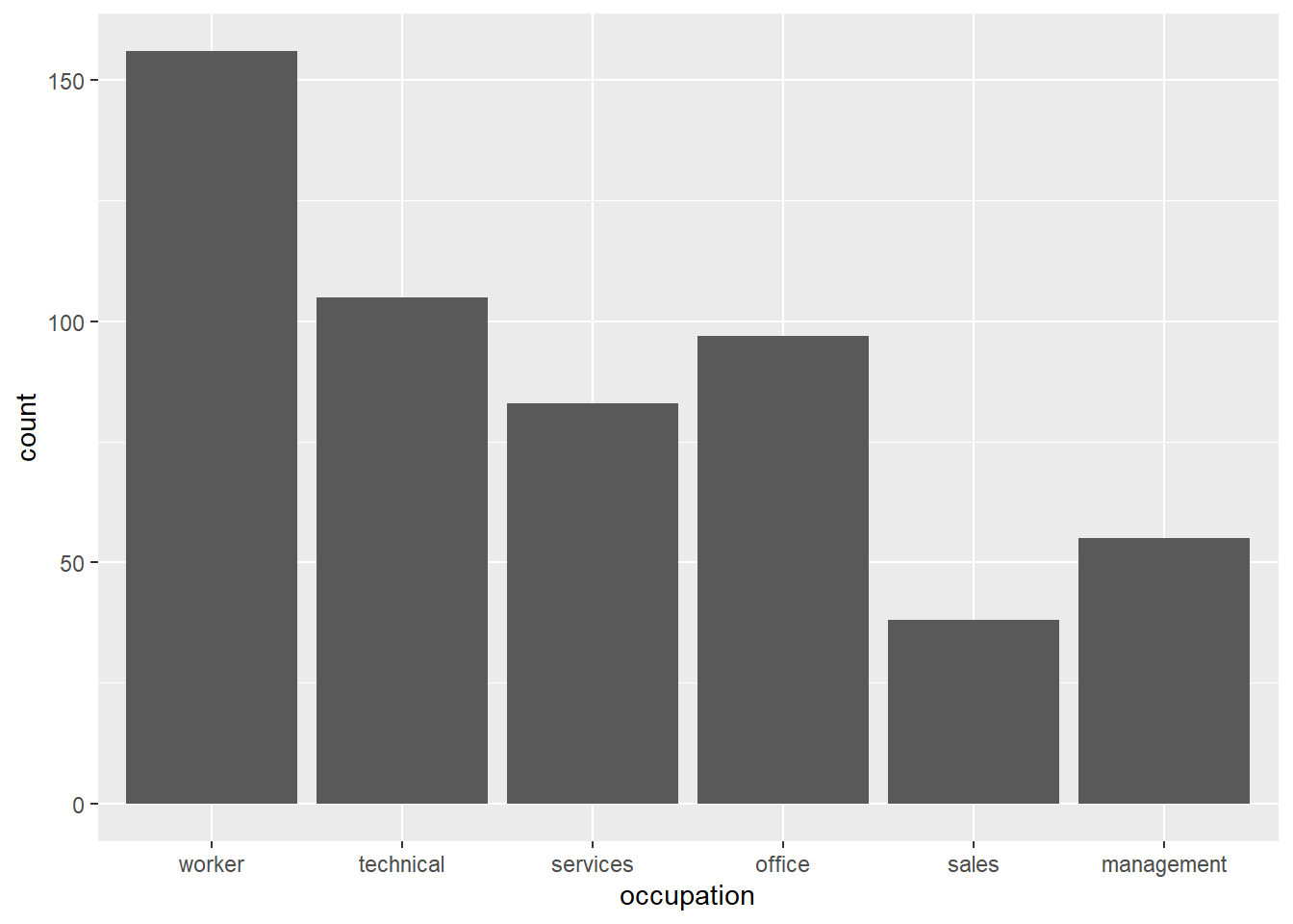 How does this code work?
CPS1985 %>%pipes the CPS data into theggplot()functionaes()is where I set the aesthetic for the graph. I want the x dimension to be the occupation variable, henceaes(x = occupation). I don’t need to define y because I’m making a bar graph- Adding the
+allows me to break up my code over multiple lines. This practice makes for much neater looking R scripts when making fancy graphs. geom_bar()creates a basic bar chart. The geometry is that of a bar chart.
This can be made to look more proper very quickly:
CPS1985 %>% ggplot(aes(x = occupation))+
    geom_bar(fill = "dark green") +
    coord_flip() +
    scale_y_continuous(expand = c(0,0)) +
    theme_classic() +
    labs(title = "Distribution of Occupations", x = "", y = "Number of Observations")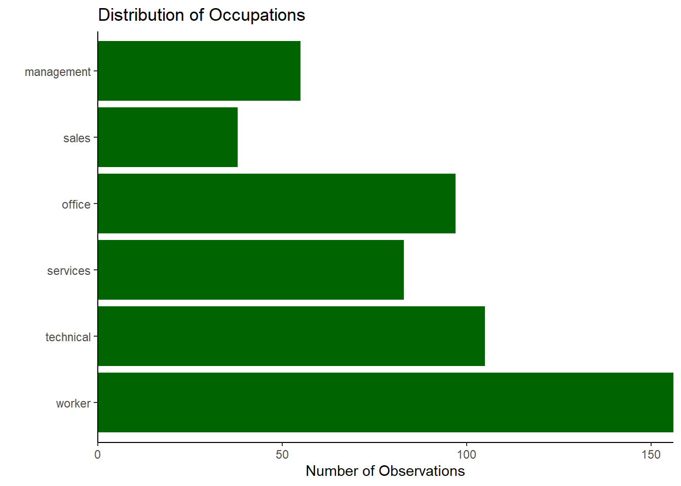
Bar charts in Base R require more work. First, you need to create an object with the relevant counts by utilizing the table() command:
jobtype <- table(occupation)
jobtype
## occupation
## worker technical services office sales management
## 156 105 83 97 38 55This transformed the data into a table of counts. Now, we can graph this object with the barplot() function.
barplot(jobtype)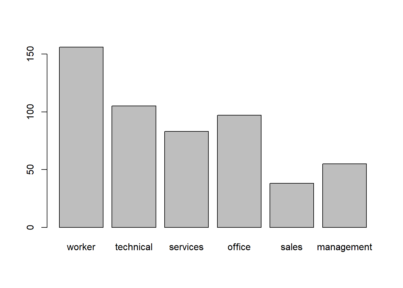
This plot is also customizable in many of the same ways the ggplot() one was if you want to look into it.
We can also display this sort of data in a pie chart. Fun fact: most people who study data visualization believe that a pie chart is a really awful way to graph data. This may be why ggplot2 doesn’t have an easy way of making a pie chart–they know better!
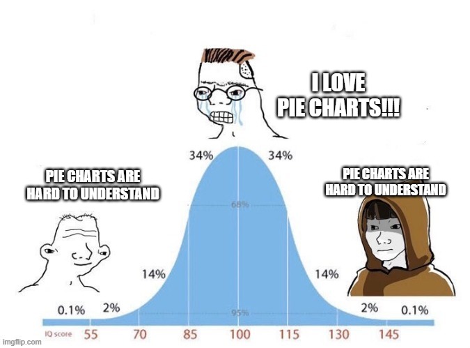
That said, you can make a pie chart in base R very easily with:
pie(jobtype)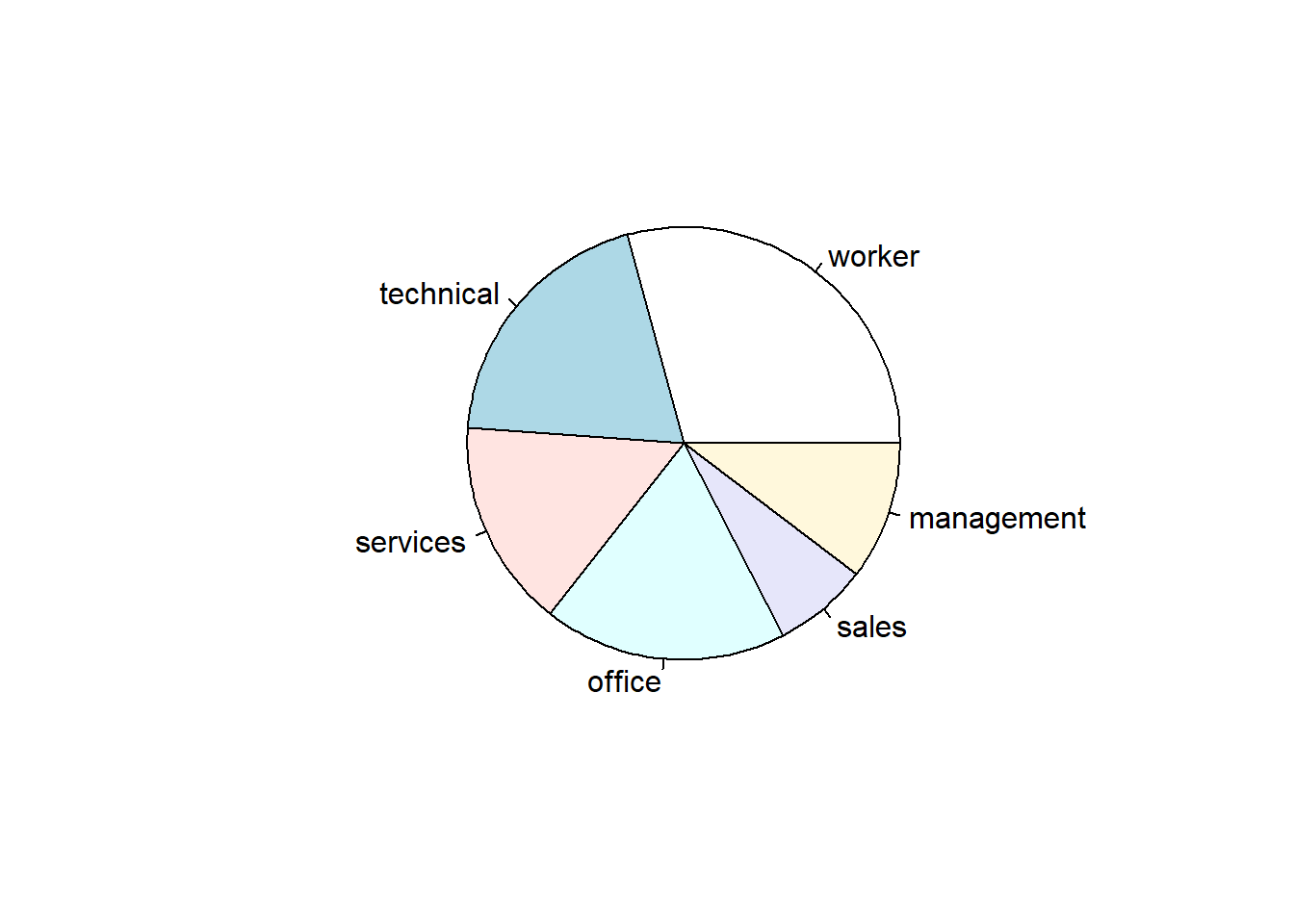
I am on team “Pie Charts are Evil”. Why are they evil? Let’s write some simple code to simulate the rolling of 100 dice so we can create a frequency distribution of the dice rolls.
set.seed(8675309)
a <- sample(1:6, 100, replace = TRUE)
b <- table(a)
b
## a
## 1 2 3 4 5 6
## 18 8 20 16 17 21Now, let’s see whether or not the pie chart or the bar chart makes it more clear which outcome occurred the most often:
First the pie chart:
pie(b)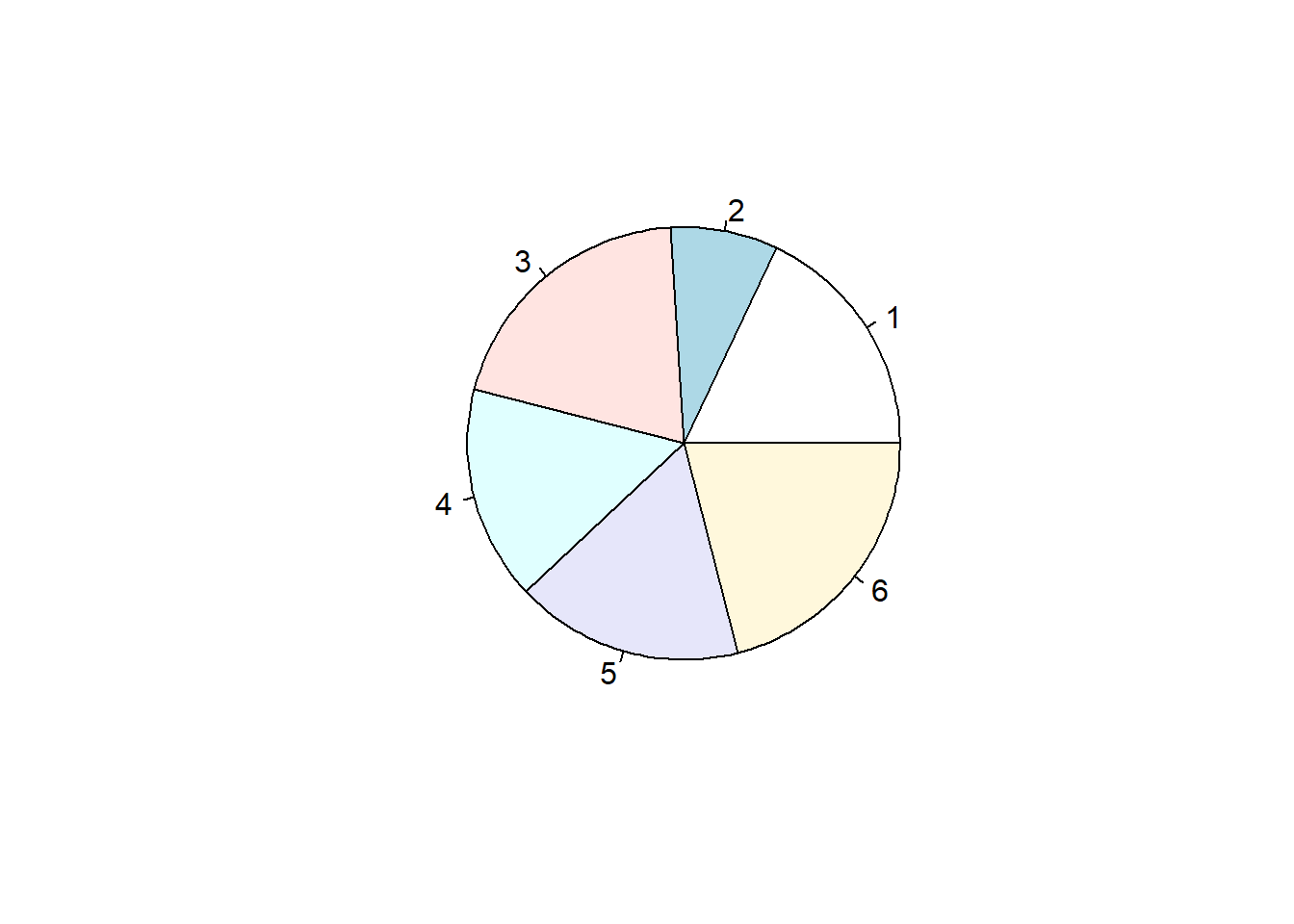
Can you tell the difference between 3 and 6? How about between 1, 4, and 5?
The differences are much plainer to see in a bar chart:
barplot(b)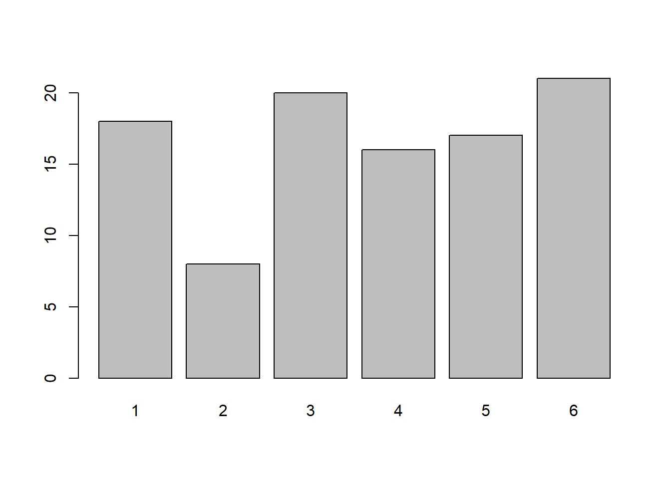
With some work, pie charts can also be made using ggplot(). However, I feel it is my responsibility to discourage you from making poor life decisions, and making pie charts is one of the worst decisions one can make in life. Seriously, if you are making a pie chart, you really ought to be asking yourself what set of awful decisions did you make in your life that led up to a point where you are making a pie chart.
Jokes aside, if you are insistent on using ggplot() to make a pie chart (or other similar “round” style charts), I have included some of the basic instructions in the Appendix to this chapter. I placed it in the appendix, as opposed to here, as some of the concepts are a bit tricky and I’d prefer to not get bogged down in them at this stage. I strongly advise that you continue reading through the end of this chapter before reading the appendix, as pie charts in ggplot() build on the ideas from the stacked bar charts that we will build below.
3.2.2 Boxplots
A boxplot (sometimes called a Box and Whiskers Plot) is a very common way of displaying the distribution of numerical data by showing the 0th, 25th, 50th, 75th, and 100th quartile of data on a graph. I usually skip them when I teach intro to stats because they are stupidly hard to make in Excel. But they are a snap in R. Here is a boxplot() of the wage data in base R:
boxplot(wage)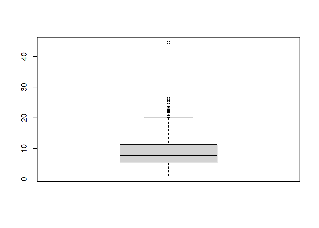
And now for ggplot()
CPS1985 %>% ggplot(aes(y = wage)) +
geom_boxplot() 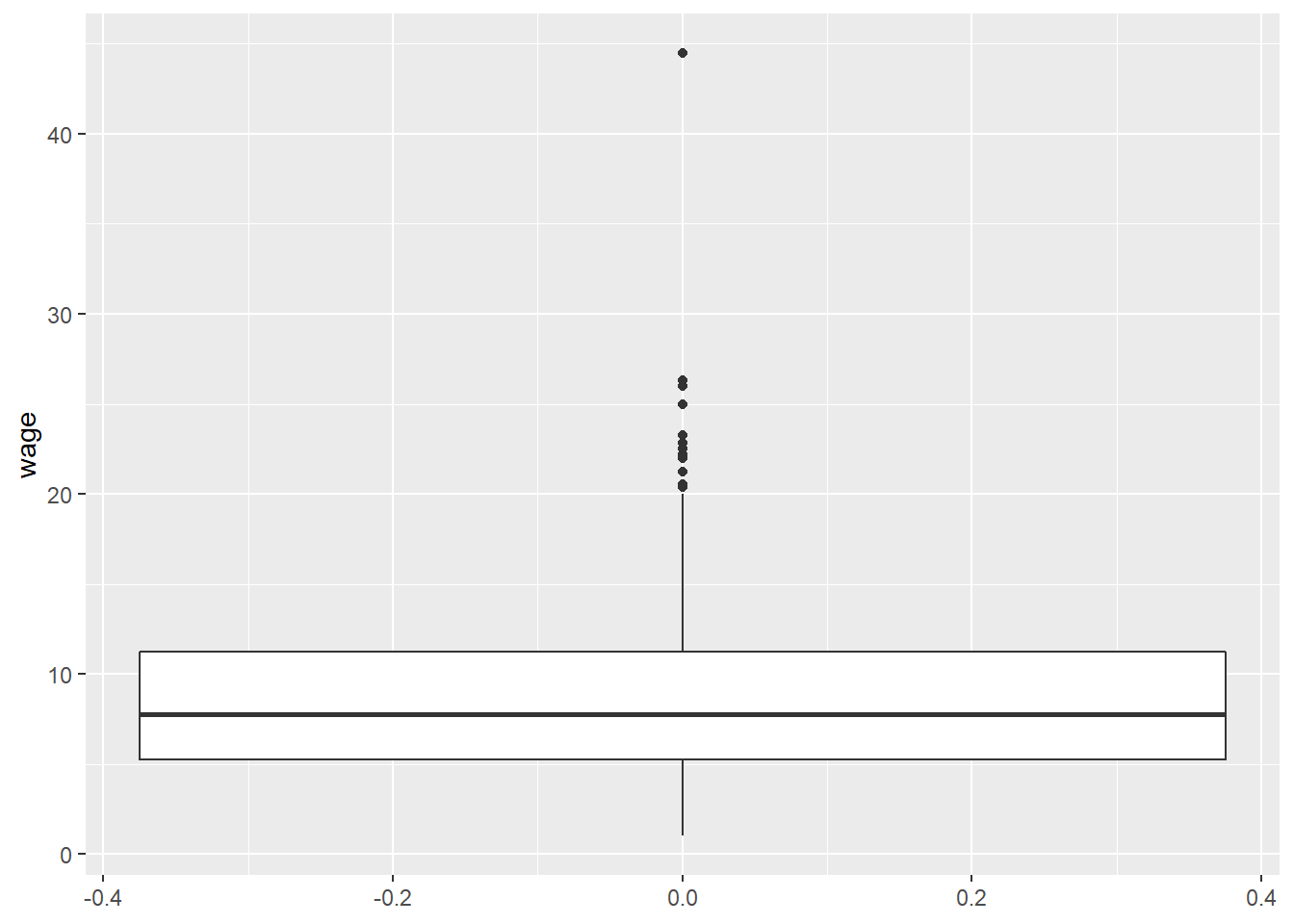
This can be made to look a little more standard with another argument
CPS1985 %>% ggplot(aes(y = wage)) +
    geom_boxplot() +
    stat_boxplot(geom = "errorbar", width = 0.5)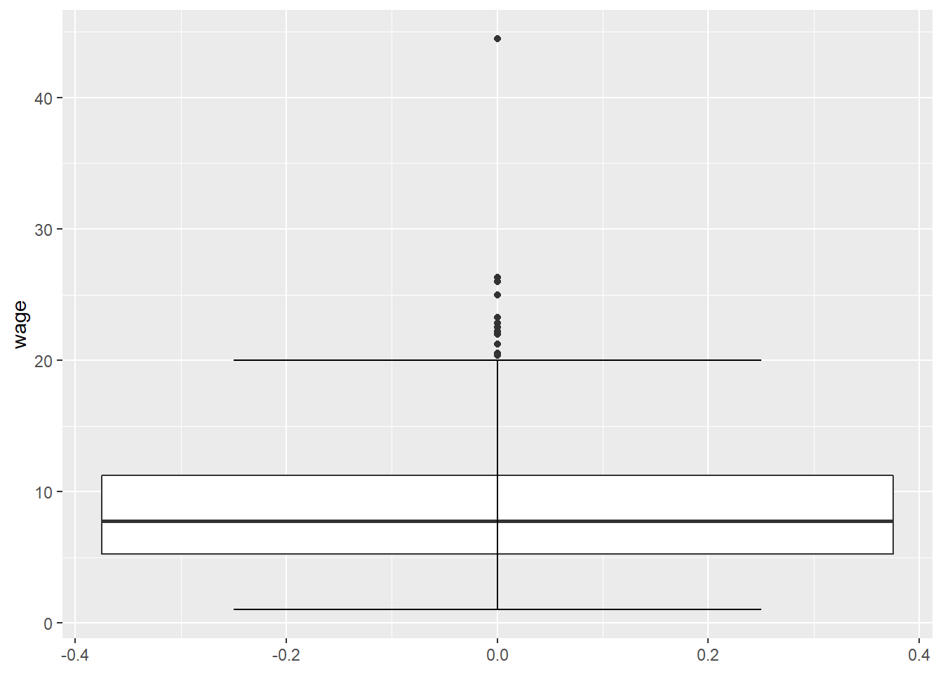
Boxplots are more powerful when looking at distributions across groups. Let’s see what the distribution of income looks like for each of the 6 employment types. First in base R:
boxplot(wage ~ occupation)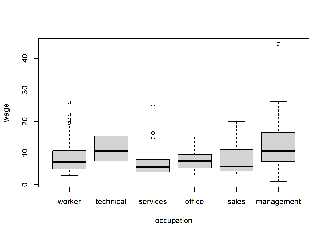
We will use the (~) frequently in r, it basically means “as a function of” so we are making boxplots of wage as a function of occupation.
This seems to be missing the label for management class, and we’d have to do some work to put it in there. But, like most graphs, boxplots look better in ggplot() anyway, so let’s see how to create the same diagram with that function:
CPS1985 %>% ggplot(aes(x = occupation, y = wage)) +
    geom_boxplot() +
    stat_boxplot(geom = "errorbar", width = 0.5)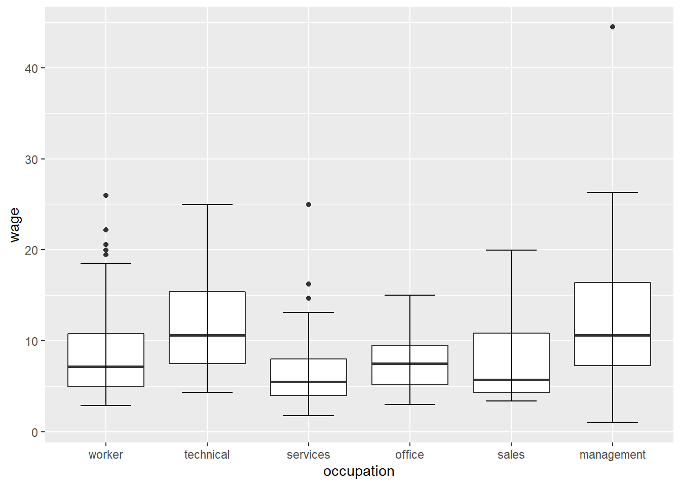
The aesthetic of aes(x = occupation, y = wage) tells the ggplot() that We are plotting wage on the y (vertical) axis and occupation on the x (horizontal) axis.
We can get more complicated with our boxplots. Let’s say we want to look at gender differences in the distribution of wage.
CPS1985 %>% ggplot(aes(x = gender, y = wage)) +
    geom_boxplot() +
    stat_boxplot(geom = "errorbar", width = 0.5)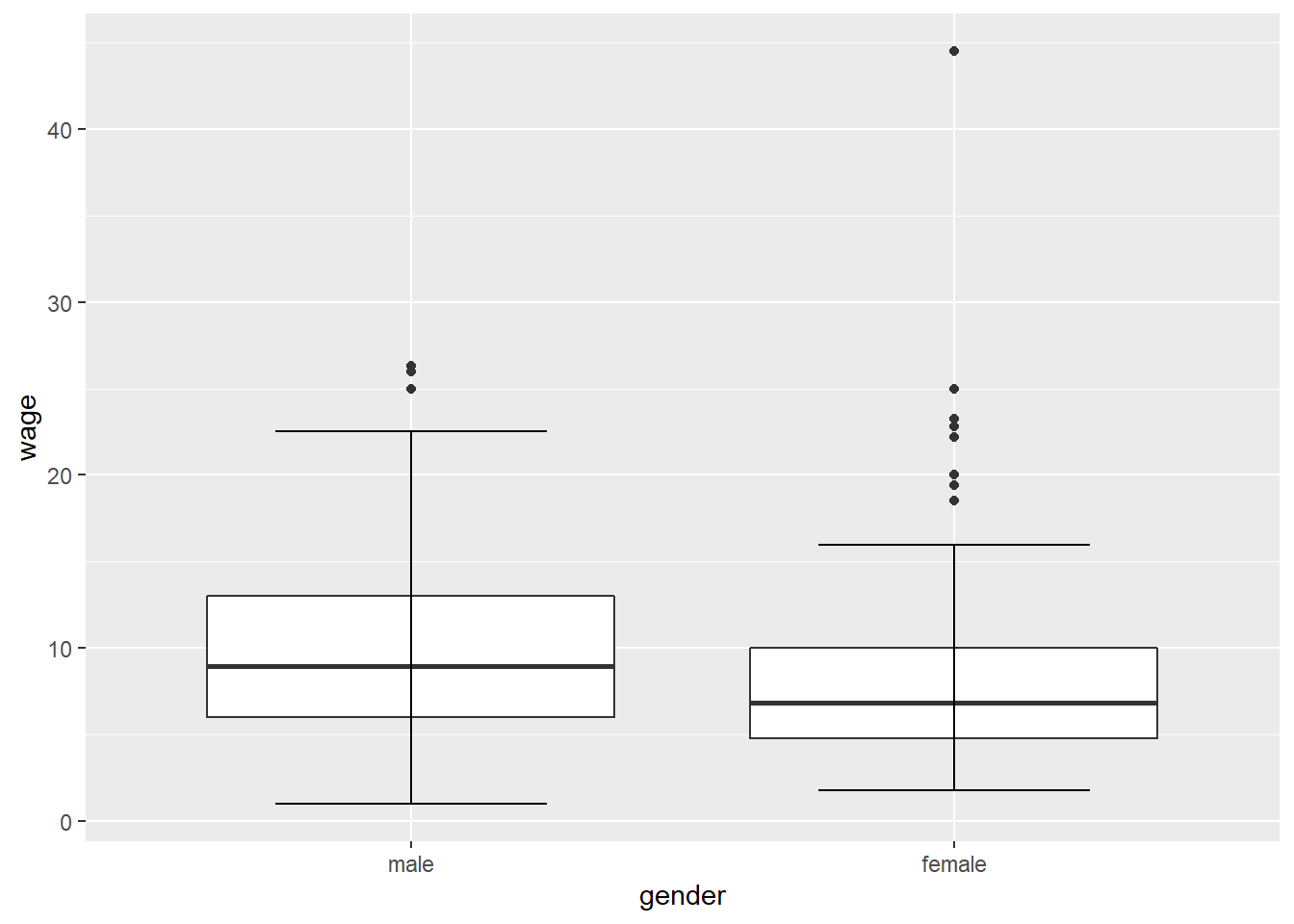
Men seem to make more. Maybe your theory is that this gender wage gap is driven by marital status, so now we have 2 factor variables. We can include one of these factors as a fill aesthetic:
CPS1985 %>% ggplot(aes(x = married, y = wage, fill = gender)) +
geom_boxplot() 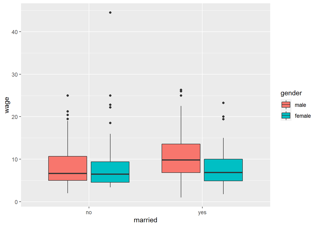
What happens if we put married as our fill variable and gender as our x variable?
CPS1985 %>% ggplot(aes(x = gender, y = wage, fill = married)) +
geom_boxplot() 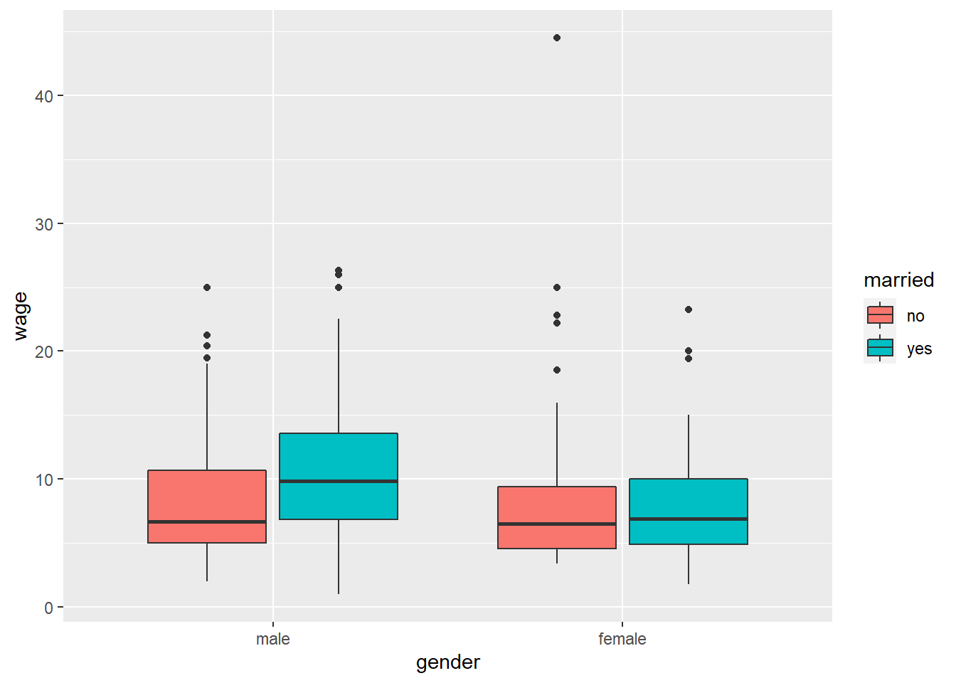
Same data, same boxes, but the arrangement of the boxes tells a different story.
As usual, ggplot2 graphs clean up quite nicely if you invest the time to learn the features. Let’s take the basic graph code from above and add some formatting features to it:
CPS1985 %>% ggplot(aes(x = married, y = wage, fill = gender)) +
    geom_boxplot() +
    theme_classic() +
    labs(title = "Does Marriage Influnce the Gender Wage Gap?",
         subtitle = "1985 CPS data",
         x = "Marital Status",
         y = "Wages",
         fill = "",
         caption = "@mattdobra") +
    scale_fill_manual(values= c("deepskyblue4", "darksalmon")) +
    theme(legend.position = "bottom",
          legend.direction = "horizontal",
          axis.ticks.x = element_blank()) +
    scale_x_discrete(labels = c("no" = "Unmarried", "yes" = "Married"))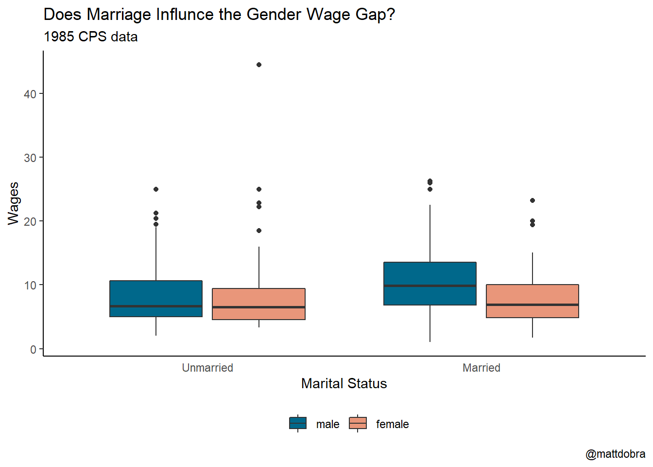
3.2.3 Histograms
Histograms are useful for displaying the distribution of continuous data. Again, these are much easier to do in R than in something like Excel. Here is the distribution of respondent age in the CPS1985 data set using the hist() function.
hist(age)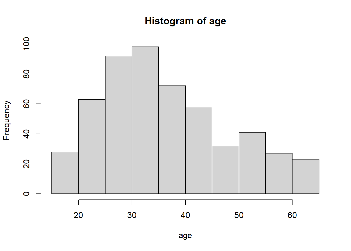
And again with ggplot():
CPS1985 %>%  ggplot(aes(x = age)) +
    geom_histogram()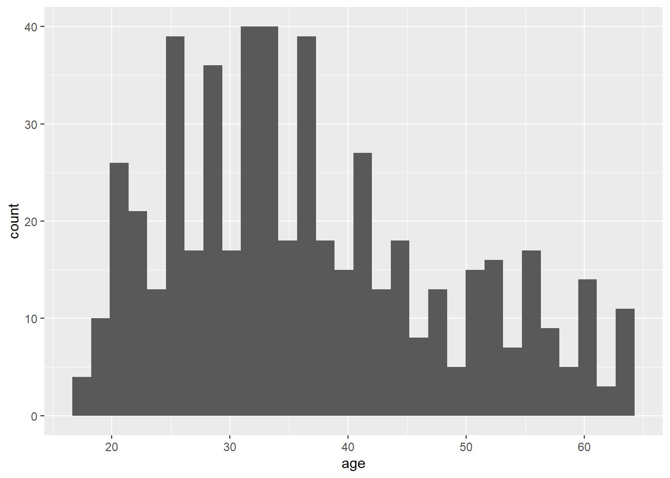
Base R usually does a good job picking the right bin width for histograms, but ggplot() nearly always chooses 30 for some reason. This is easy to sort out in ggplot(). We can also add the outlines for the bars easily.
CPS1985 %>%  ggplot(aes(x = age)) +
    geom_histogram(binwidth = 5, color = "black")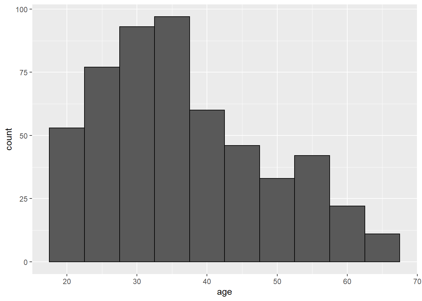
Note that with ggplot(), usually the color option is used for outlines and fill is used to color in spaces. To learn a little more about customizing graphs, let’s remake our graph with the MU official colors, obtained from the 2020 Methodist University Identity Standards Manual:
- MU Green (hex code #00573C)
- Metallic Gold (hex code #B4985A)
- Non-Metallic Gold (hex code #CBB676)
CPS1985 %>%  ggplot(aes(x = age)) +
    geom_histogram(binwidth = 5, fill = "#CBB676", color = "#B4985A") +
    theme(panel.background = element_rect(fill = ("#00573C")))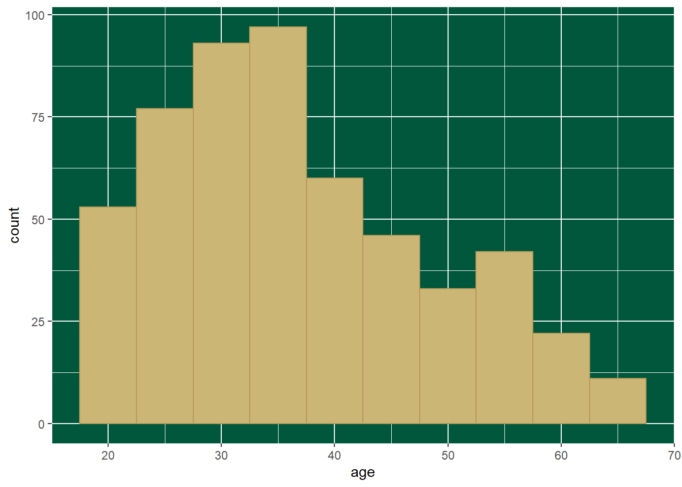
That’s ugly. Maybe this:
CPS1985 %>%  ggplot(aes(x = age)) +
    geom_histogram(binwidth = 5, fill = "#B4985A", color = "#00573C") +
    theme(
        panel.background = element_rect(fill = "#00573C"),
        panel.grid.major = element_line(color = "#CBB676"),
        panel.grid.minor = element_line(color = "#CBB676"))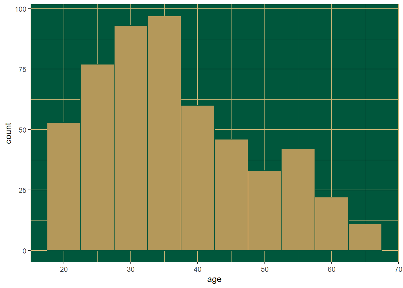
That’s better. That’s enough silliness for now. Again, this is not meant to be a tutorial on ggplot() but rather to provide a taste of what it can do.
3.2.4 Stacked and grouped bar charts
These are used to look at the compositions of groups. This is another place where ggplot() is a bit easier. To make a stacked or grouped bar chart in Base R, we start by making a table. Let’s look at the gender composition of each occupation.
table1 <- table(gender, occupation)
table1
## occupation
## gender worker technical services office sales management
## male 126 53 34 21 21 34
## female 30 52 49 76 17 21Now we can create a stacked barplot()
barplot(table1)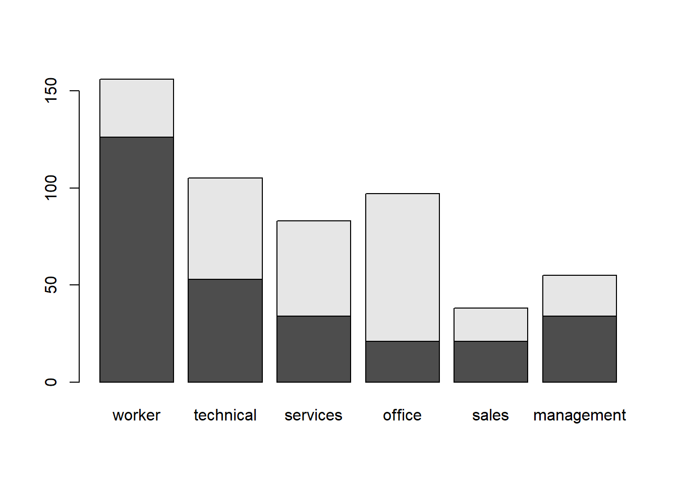
This can be easily transformed into a side-by-side barplot() by specifying beside = TRUE:
barplot(table1, beside = TRUE)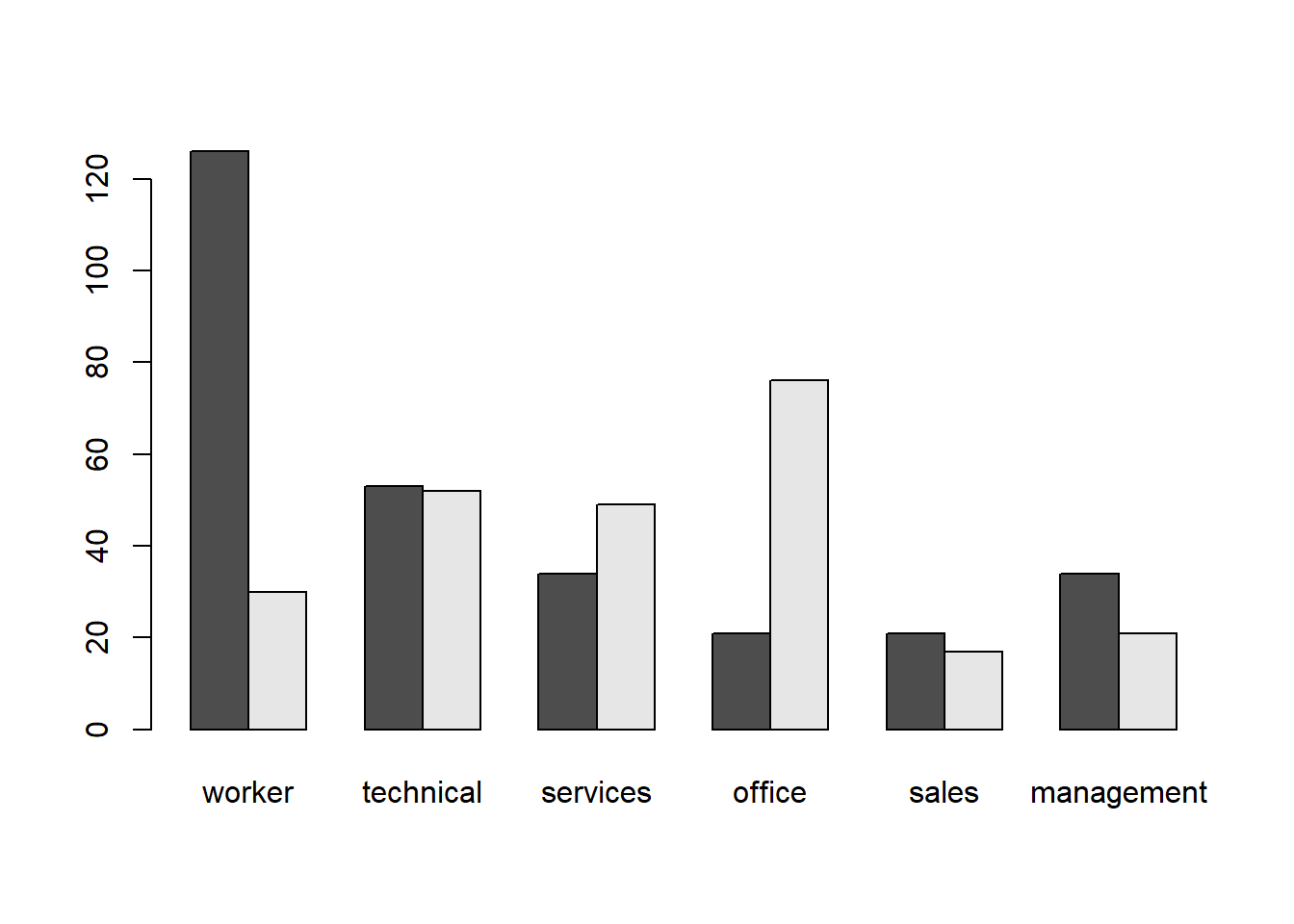
Next, using ggplot():
CPS1985 %>% ggplot(aes(x = occupation, fill = gender)) +
    geom_bar()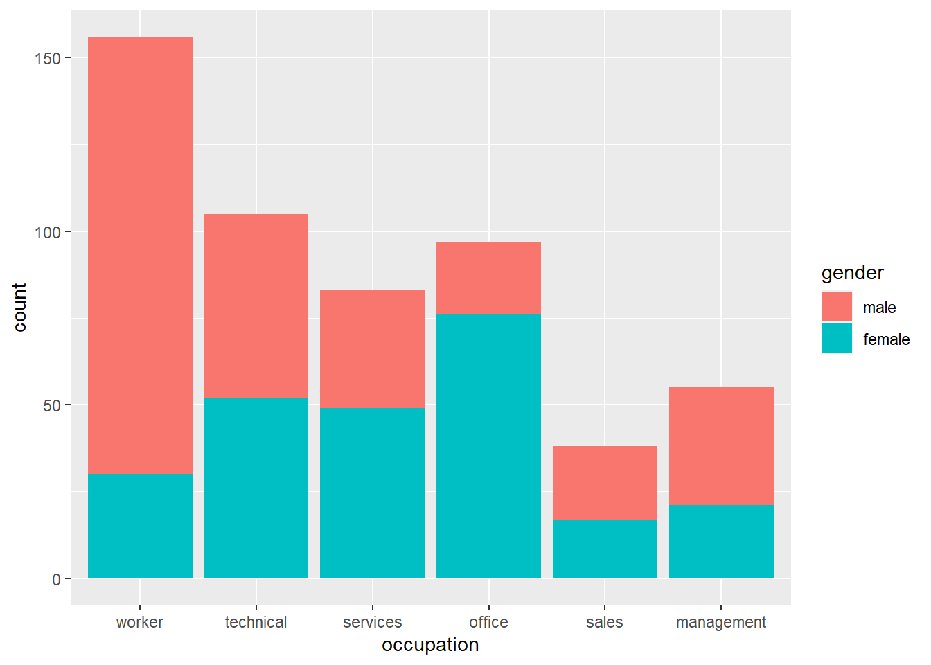
Let’s edit the colors. Gender stereotype colors (i.e. blue for men, pink for women) probably enhance readability to the viewer, but if you want to avoid them, then you probably don’t want to do the exact opposite of what people expect. We can recolor manually if we want:
CPS1985 %>% ggplot(aes(x = occupation, fill = gender)) +
    geom_bar() +
scale_fill_manual(values= c("deepskyblue4", "lightpink2")) 
Alternately, we can choose a different color scheme; the viridis color scheme is often chosen for its high-contrast nature.
CPS1985 %>% ggplot(aes(x = occupation, fill = gender)) +
    geom_bar() +
    scale_fill_viridis_d()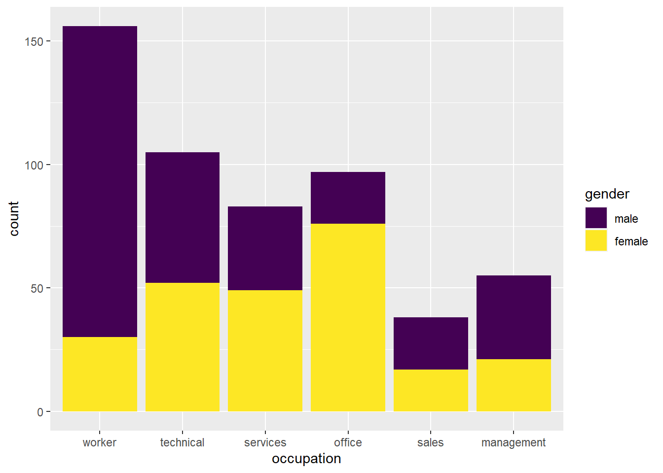
This is easily modified to a side-by-side chart with the option position = "dodge" in the geom_bar() layer
CPS1985 %>% ggplot(aes(x = occupation, fill = gender)) +
    geom_bar(position = "dodge") +
    scale_fill_viridis_d()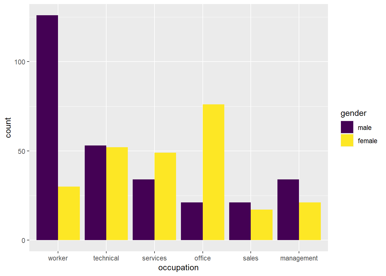
One use of the stacked bar chart is to show proportions. We can accomplish this by using the position = "fill option in our geom_bar() layer.
CPS1985 %>% ggplot(aes(x = occupation, fill = gender)) +
    geom_bar(position = "fill") +
    scale_fill_viridis_d() +
    labs(y = "")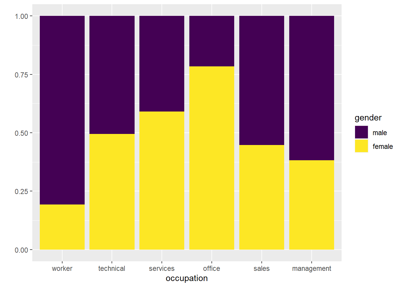
This iteration shows the relative proportions pretty well.
3.2.5 Scatter Plots
Scatter plots are useful for looking at the relationship between 2 numerical (preferably continuous) variables. Because there is only 1 continuous variable in the CPS1985 dataset, let’s switch to using the vote1 dataset. To see what is in this, type ?vote1 in your console. We might also want to get a quick overview of the data with the head(vote1) command:
head(vote1)## state district democA voteA expendA expendB prtystrA lexpendA lexpendB
## 1 AL 7 1 68 328.296 8.737 41 5.793916 2.167567
## 2 AK 1 0 62 626.377 402.477 60 6.439952 5.997638
## 3 AZ 2 1 73 99.607 3.065 55 4.601233 1.120048
## 4 AZ 3 0 69 319.690 26.281 64 5.767352 3.268846
## 5 AR 3 0 75 159.221 60.054 66 5.070293 4.095244
## 6 AR 4 1 69 570.155 21.393 46 6.345908 3.063064
## shareA
## 1 97.40767
## 2 60.88104
## 3 97.01476
## 4 92.40370
## 5 72.61247
## 6 96.38355Let’s look at the relationship between the share of campaign expenditures (shareA) and vote share received (voteA). Base R makes a simple scatter plot with the plot function. The syntax is plot(y ~ x); recall, think of the ~ as saying “as a function of” here.
plot(voteA ~ shareA)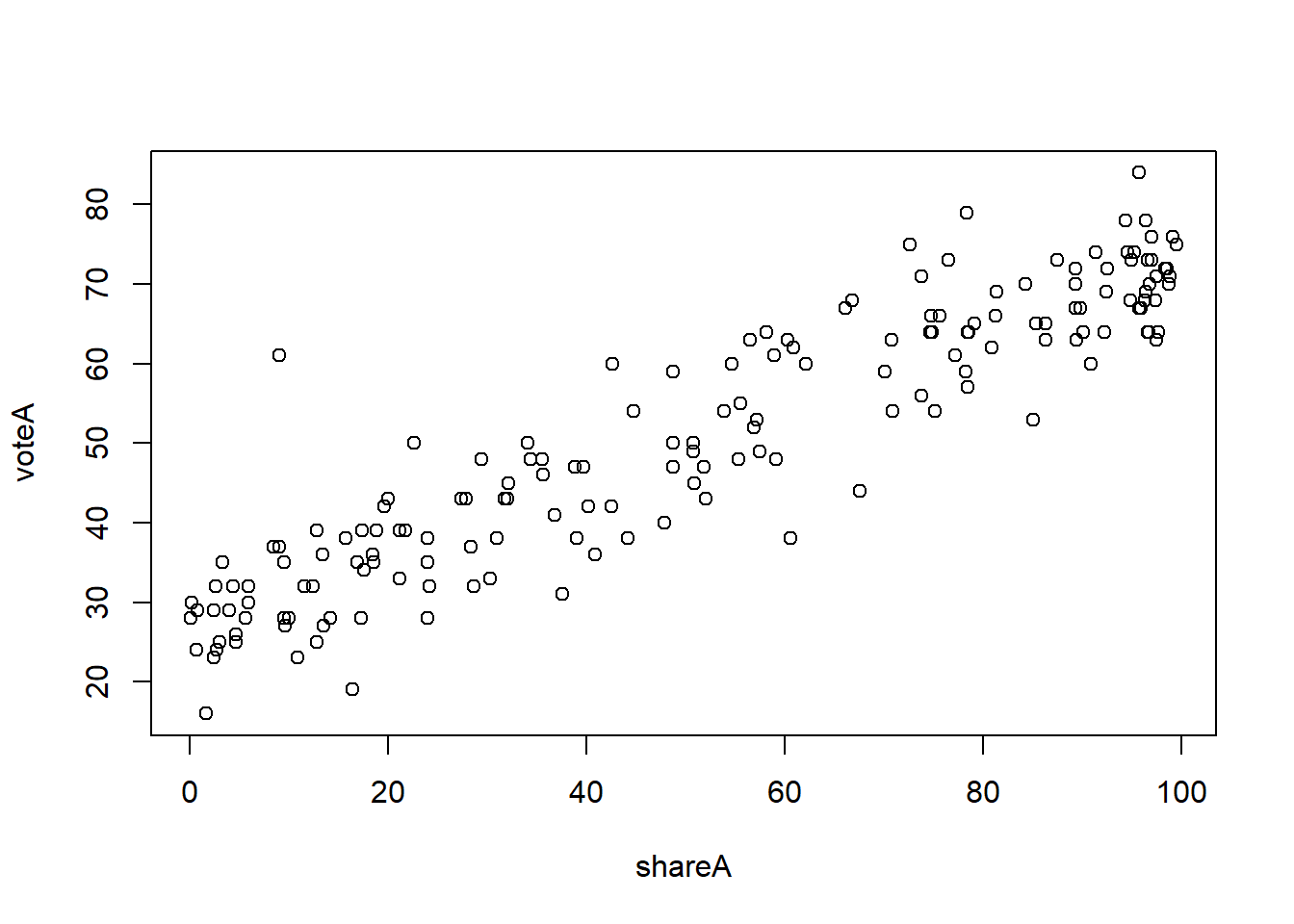
Why plot(voteA ~ shareA) and not plot(shareA ~ voteA)? In this case, theory tells that vote share should be the dependent variable and campaign expenditures should be the independent variable, and when graphing the generally accepted norm is to put the DV (dependent variable) on the Y axis.
In ggplot(), this looks like:
vote1 %>% ggplot(aes(x = shareA, y = voteA)) +
    geom_point()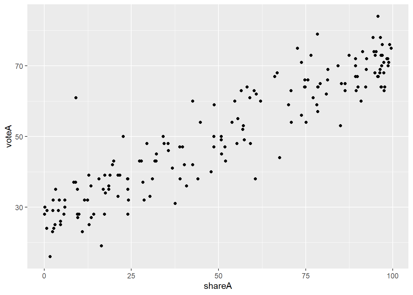
Perhaps you want to see the line of best fit? We can add the geom_smooth(method = lm) argument to our ggplot():
vote1 %>% ggplot(aes(x = shareA, y = voteA)) +
    geom_point() +
    geom_smooth(method = lm)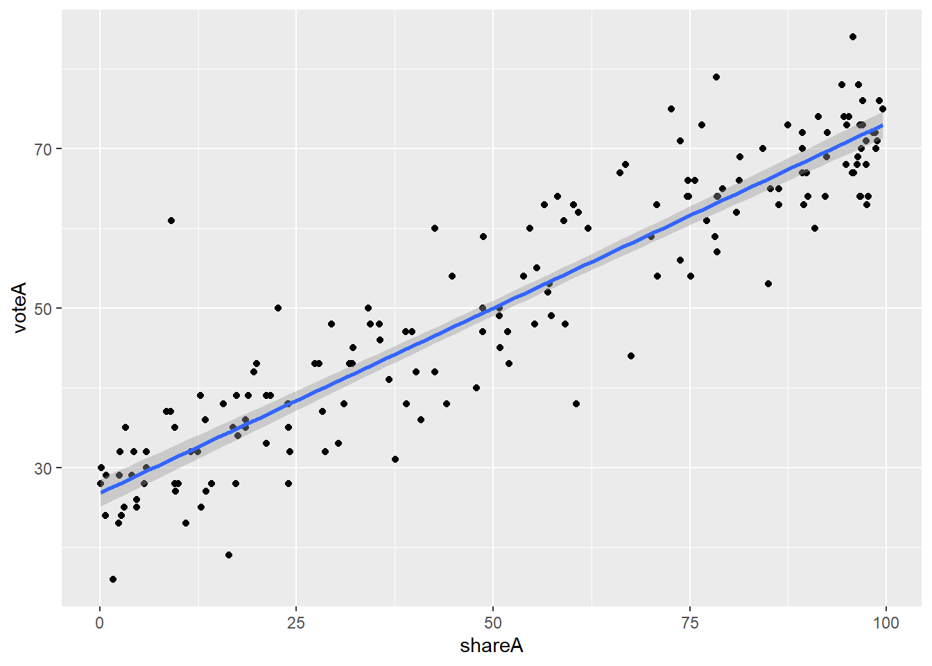
As before, we can add elements if we want here. For example, maybe we want to highlight the parties
vote1 %>% ggplot(aes(x = shareA, y = voteA, color = as.factor(democA))) +
geom_point() 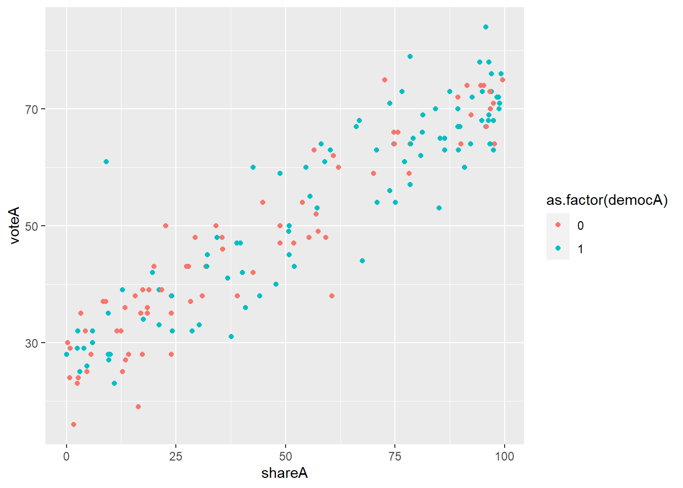
Or perhaps separate graphs for the Democrats and Republicans using facet_wrap(), and going back to MU colors for no good reason:
vote1 %>% ggplot(aes(x = shareA, y = voteA)) +
    geom_point(color = "#00573C", fill = "#B4985A", shape = 21, size = 2.5) +
    facet_wrap(~democA)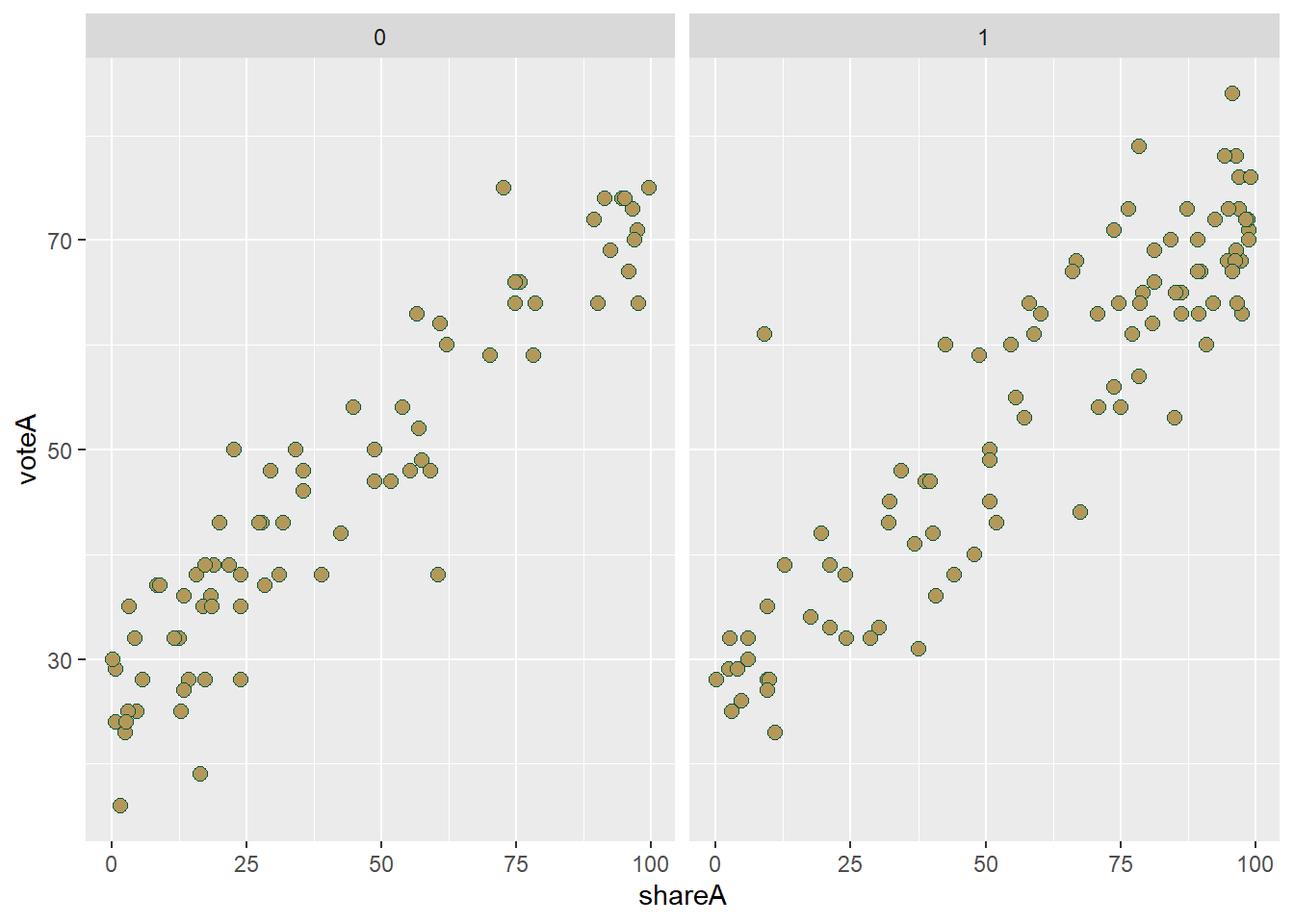
All in all, R has some extremely powerful graphing capabilities that go well beyond what something like Excel is capable of. It’s no surprise that many major news networks use R, and particularly ggplot() to do their graphics. For example, the BBC and the New York Times produce many of their graphics using ggplot(), as does The Economist. In fact, the BBC has even distributed a package you can download called bbplot that you can install (using devtools unfortunately) make your graphs look like BBC graphics!
3.3 Summarizing Data Numerically
Now that we have seen an overview of the graphical capabilities, let’s turn to numerical summaries. We return to the CPS1985 dataset so we can look at both numerical and categorical variables.
3.3.1 Categorical Variables
Let’s start with categorical variables and focus on occupation. Categorical variables are summarized with frequencies or proportions. The table command works to create these.
table(occupation)## occupation
## worker technical services office sales management
## 156 105 83 97 38 55These are counts. The easiest way to convert this to proportions is to divide your totals by the size of the data set. Here are a few ways to get there:
table(occupation)/534## occupation
## worker technical services office sales management
## 0.29213483 0.19662921 0.15543071 0.18164794 0.07116105 0.10299625table(occupation)/nrow(CPS1985)## occupation
## worker technical services office sales management
## 0.29213483 0.19662921 0.15543071 0.18164794 0.07116105 0.10299625table(occupation)/length(occupation)## occupation
## worker technical services office sales management
## 0.29213483 0.19662921 0.15543071 0.18164794 0.07116105 0.10299625table(occupation)/dim(CPS1985)[1]## occupation
## worker technical services office sales management
## 0.29213483 0.19662921 0.15543071 0.18164794 0.07116105 0.10299625You can also produce contingency (two-way) tables that look at the intersection of two categorical variables:
table(occupation, gender)## gender
## occupation male female
## worker 126 30
## technical 53 52
## services 34 49
## office 21 76
## sales 21 17
## management 34 213.3.2 Numerical Variables
While we are limited in how we describe categorical variables, we have lots of options with respect to numerical variables. Let’s analyze the wage variable.
Arithmetic means are calculated with the mean() function.
mean(wage)## [1] 9.024064A trimmed mean drops the outliers from the top and bottom of the data. For example, if we type:
mean(wage, trim = 0.05)## [1] 8.544212We tell R to drop the 5% of the lowest wages and 5% of the highest wages from the data and calculate the mean of the middle 90%. Sometimes this makes sense when you are looking at a data set with a low of skew. Another thing we might do get a measure of central tendency for skewed data is to calculate a median().
median(wage)## [1] 7.78Generally speaking, medians are the preferred measure of central tendency in cases with skewed data because medians are far less sensitive to the presence of outliers in the data…

Variance and Standard Deviation are calculated with var() and sd(), respectively.
var(wage)## [1] 26.41032sd(wage)## [1] 5.139097Don’t forget, the standard deviation is the square root of the variance!
sd(wage)^2## [1] 26.41032sqrt(var(wage))## [1] 5.139097Minima and maxima can be calculated with the min() and max() commands
min(wage)## [1] 1max(wage)## [1] 44.5You can get both easily if you want using range()
range(wage)## [1] 1.0 44.5Measures of position (quartiles, percentiles, etc) can be obtained through the quantile() function. You need to pass through a probs argument to tell it which quantile you want.
If you just one one specific quantile–in this case the first quartile–you type:
quantile(wage, .25)## 25%
## 5.25You can also use the c() language we’ve seen before to get multiple quantiles at once. For example, if we want the 10th, 25th, 50th, 75th, nd 90th percentile, we type:
quantile(wage, probs = c(.1, .25, .5, .75, .9))## 10% 25% 50% 75% 90%
## 4.000 5.250 7.780 11.250 15.275The minimum and maximum of the data can also be obtained using the 0th and 100th quartile:
quantile(wage, probs = c(0,1))## 0% 100%
## 1.0 44.5Correlation coefficients can be calculated using cor(). Here is the correlation between education and wage:
cor(wage, education)## [1] 0.3819221This indicates a moderate positive correlation between the two variables. We can see this correlation in this graph:
CPS1985 %>% ggplot(aes(x = education, y = wage)) +
    geom_point() +
    geom_smooth(method = lm)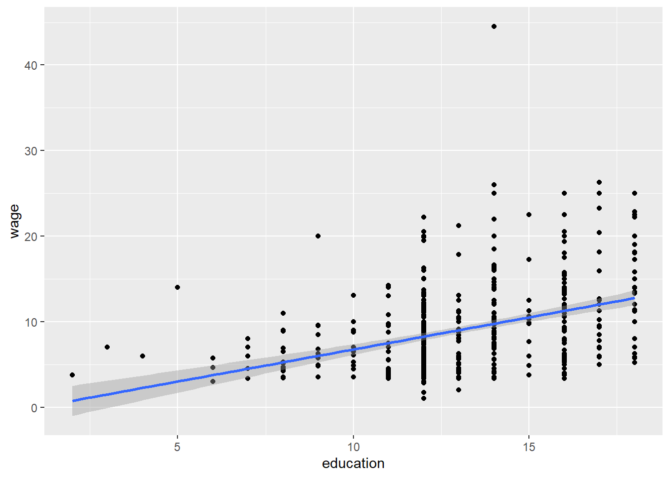
By default, R calculates the Pearson correlation, which is appropriate for interval data, sometimes you have ordinal data where a Spearman correlation makes more sense, for example, when the data is a ranking but not a measure. In this case, the Pearson is quantifing the linear relationship between education and wage, but a Spearman test simply asks whether or not higher levels of education are linked to higher wages.
cor(wage, education, method = "spearman")## [1] 0.3813425In most economic applications, Pearson is more useful.
Don’t forget, the summary() command can be useful here too:
summary(wage)## Min. 1st Qu. Median Mean 3rd Qu. Max.
## 1.000 5.250 7.780 9.024 11.250 44.500The stargazer() package/function makes nicely formatted tables of summary statistics, but you have to put in a whole dataframe:
stargazer(CPS1985, type = "text")##
## ===========================================
## Statistic N Mean St. Dev. Min Max
## -------------------------------------------
## wage 534 9.024 5.139 1.000 44.500
## education 534 13.019 2.615 2 18
## experience 534 17.822 12.380 0 55
## age 534 36.833 11.727 18 64
## -------------------------------------------It is also capable of making more visually attractive, publication ready tables:
stargazer(CPS1985, type = "html")| Statistic | N | Mean | St. Dev. | Min | Max |
| wage | 534 | 9.024 | 5.139 | 1.000 | 44.500 |
| education | 534 | 13.019 | 2.615 | 2 | 18 |
| experience | 534 | 17.822 | 12.380 | 0 | 55 |
| age | 534 | 36.833 | 11.727 | 18 | 64 |
We will make extensive use of stargazer() later in this book!
3.4 Wrapping Up
This chapter notebook reviewed what is essentially the first half of an intro to statistics class and introduced how to use R for these calculations. The next step is to tackle inferential statistics using R, which we turn to in Chapter 4.
3.5 End of Chapter Exercises
Charts and Graphs: Ensure that your charts include axis labels and titles. Use ggplot()!
Datasets are given in the form of package:dataset. To access them, you first load the relevant package, and then load the dataset you wish to use. For example, to use the wooldridge:wine dataset from question 7, you would use the following commands:
library(wooldridge)
data(wine)
Bar Charts:
Look at
fivethirtyeight:hiphop_cand_lyricsand make bar charts of \(sentiment\) for both Donald Trump and Hillary Clinton. What does this tell you?Use the
AER:BankWagesdata to make a bar chart of \(job\). Which job type (\(job\)) is the most common in the data set?Create a bar chart looking at the distribution of student \(ethnicity\) in the
AER:STARdata. What does this tell you about teh student population?
Box Plots and Histograms:
Using the
AER:NMES1988dataset, create a histogram of the number of physician office visits (\(visits\)) and a box plot looking at the number of \(visits\) by \(health\) status.Using the
dplyr:starwarsdataset, create a histogram of the \(height\) of Star Wars characters and a box plot looking at height by the \(sex\) of the characters.
Scatter Plots:
Use
datasets:USArreststo look at the relationship between urbanization (\(UrbanPop\)) and each of the three measures of crime.Look at the relationship between alcohol consumption (\(alcohol\)) and \(deaths\), \(heart\), and \(liver\) in
wooldridge:wine.Using
wooldridge:meap01, look at the relationship between expenditures per student (\(expp\)) and the various test scores (\(math4\) and \(read4\)).
3.6 Appendix:
So, despite all of my admonishments and warnings, you’ve decided to come the dark side of pie charts. This is some evil stuff.

3.6.1 Pie Charts
Most people’s default understanding of a pie chart is as a circle that is used to represent proportions; the circle is divided into wedges of various sizes, where each wedge represents a group, and the size of each wedge indicates the proportion of the whole that group makes up. This is all well and good, but to make a pie chart in ggplot(), we need to develop a different intuition: a pie chart is simply a stacked bar chart that you have forced to be round.
To see what I mean, let’s start with a simple stacked bar chart of the occupation data. The code is fairly straightforward, the only oddity here is the use of the y = "" in the aes() argument. The effect of this is to simply select the entire dataset. Setting the width of the geom_bar() is not necessary, it just aids in my being able to place a visual cue in the next graph.
CPS1985 %>%
  ggplot(aes(y = "", fill = occupation)) +
  geom_bar(width = 0.5) +
scale_fill_viridis_d() 
Behold this horizontal stripe of rainbowy goodness! Next, let’s place a reference dot along the top of the bar, exactly in the middle of the x dimension. I’ve done this below with the geom_point() argument:
CPS1985 %>%
  ggplot(aes(y = "", fill = occupation)) +
  geom_bar(width = 0.5) +
  scale_fill_viridis_d() +
  geom_point(y = 1.25, x = 277, size = 2.2, show.legend = FALSE)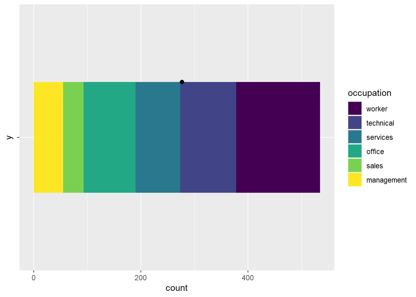
Now, imagine what would happen if you took this shape and started bending the two ends upward, using the black dot as a pivot point. This will cause the top edge to shrink and the bottom edge to stretch. Keep bending this shape around that pivot point until the top edge has shrunk to a single point, the bottom edge has created a circle that completely surrounds the black dot, and the two ends connect, so the far left yellow edge is now flush with the far right purple edge. Now you have a pie chart!
More mathily, we can say that we converted your cartesian coordinate system into a polar coordinate system. so if we wake our stacked bar chart code, and add the coord_polar(theta = "x") line to it, we get a pie chart:
CPS1985 %>%
  ggplot(aes(y = "", fill = occupation)) +
  geom_bar() +
  scale_fill_viridis_d() +
  coord_polar(theta = "x")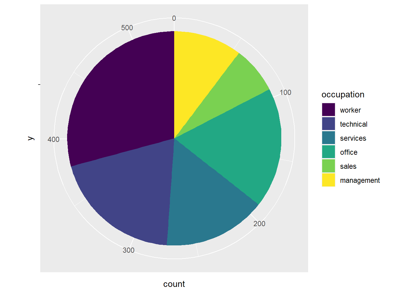
What is going on with the theta = "x" argument? In a polar coordinate system, \(\theta\) (or theta) is the term used to refer to the angle of a line radiating from the center of the coordinate system. In the original stacked bar chart, the x axis was counting how many people were in each group, so the theta = "x" argument is telling ggplot() to use the x variable from the stacked chart to determine the angles of the wedges.
With pie charts, you often want to use the theme_void() argument to get rid of all backgrounds and axes and such, and add the stuff you want in manually:
CPS1985 %>%
  ggplot(aes(y = "", fill = occupation)) +
  geom_bar() +
  theme_void() +
  scale_fill_viridis_d() +
  coord_polar(theta = "x")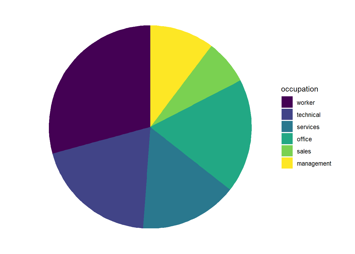
3.6.2 Donut Charts
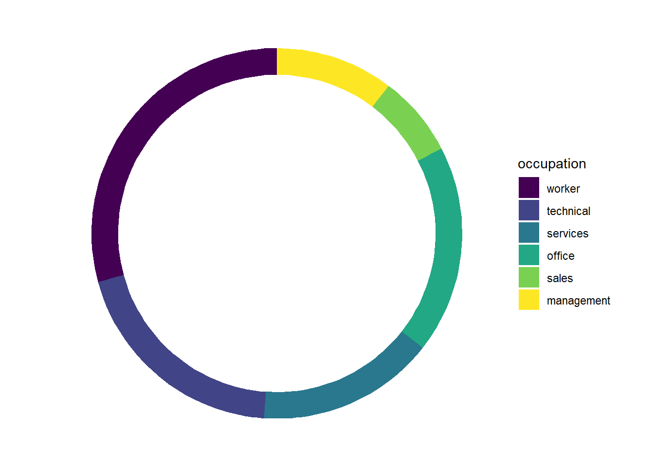
We can use this methodology to make some donut charts too. A donut chart is a pie chart with a hole in it. They are even worse than regular pie charts, but since you’ve come this far, why not?

We start by adjusting our aes() call to have y = 2. The 2 is arbitrary – it can be any number, really, we simply need to have a number there instead of the y = "" from above. Now that y is a number, we can use the ylim() argument to adjust the size of our donut hole. The first number in the ylim() option sets the size of the hole–smaller numbers mean bigger holes, and the value must be less than 2 (the limit here is relative to the y = 2 we set earlier.). The second number set in ylim() must be at least 0.5 bigger than the y = 2 option we set, and controls the overall size of the donut. Smaller numbers mean bigger donuts. The code below sets ylim(0.2, 2.5), and the proportions seem reasonably nice.
CPS1985 %>%
  ggplot(aes(y = 2, fill = occupation)) +
  geom_bar() +
  theme_void() +
  scale_fill_viridis_d() +
  coord_polar(theta = "x") +
  ylim(0.2, 2.5)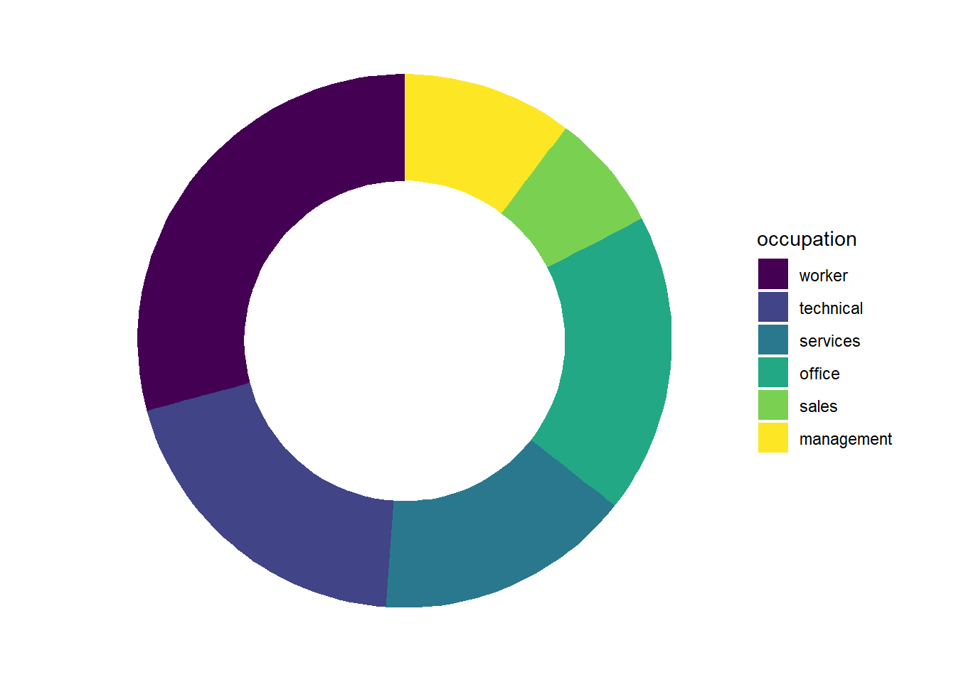
Feel free to play with the y = 2 option and the ylim() parameters to see how you can control the size and shape of the donut. For example, making y (and the corresponding upper limit in ylim()) bigger makes your donut skinnier:
CPS1985 %>%
  ggplot(aes(y = 6, fill = occupation)) +
  geom_bar() +
  theme_void() +
  scale_fill_viridis_d() +
  coord_polar(theta = "x") +
  ylim(.2, 6.5)