Chapter 11 Data visualization
Throughout this book, we have seen a few visualizations such as a box plot and a scatterplot. Within this chapter, we will mainly look at scatterplots, histograms, bar charts, and box plots. Furthermore, in the first part of this chapter, we will mainly work with a package that is already installed by default named the graphics library. In the second part, we will work with the ggplot2 package. The advantages of using ggplot2 are that the visualizations almost always look better, and we can customize the visualizations to our needs.
11.1 Graphics library
We have used the systolic blood pressure data before to make a scatterplot and a boxplot, so we will use this dataset again to explain some things. We start by loading the data:
library(foreign)
sys_bloodpressure <- read.spss("sbp_qas.sav", to.data.frame = TRUE)
## re-encoding from UTF-811.1.1 Scatterplot
To create a scatterplot, we can use the plot() function. To make a scatterplot, we have to give at least two arguments: an x argument for the data we want on the x-axis, and a y argument for the data we want on the y-axis.
To make a simple scatterplot with age on the x-axis and systolic blood pressure on the y-axis, we can type the following (the data you want on the x-axis must always be the first argument):
plot(x = sys_bloodpressure$age, y = sys_bloodpressure$sbp)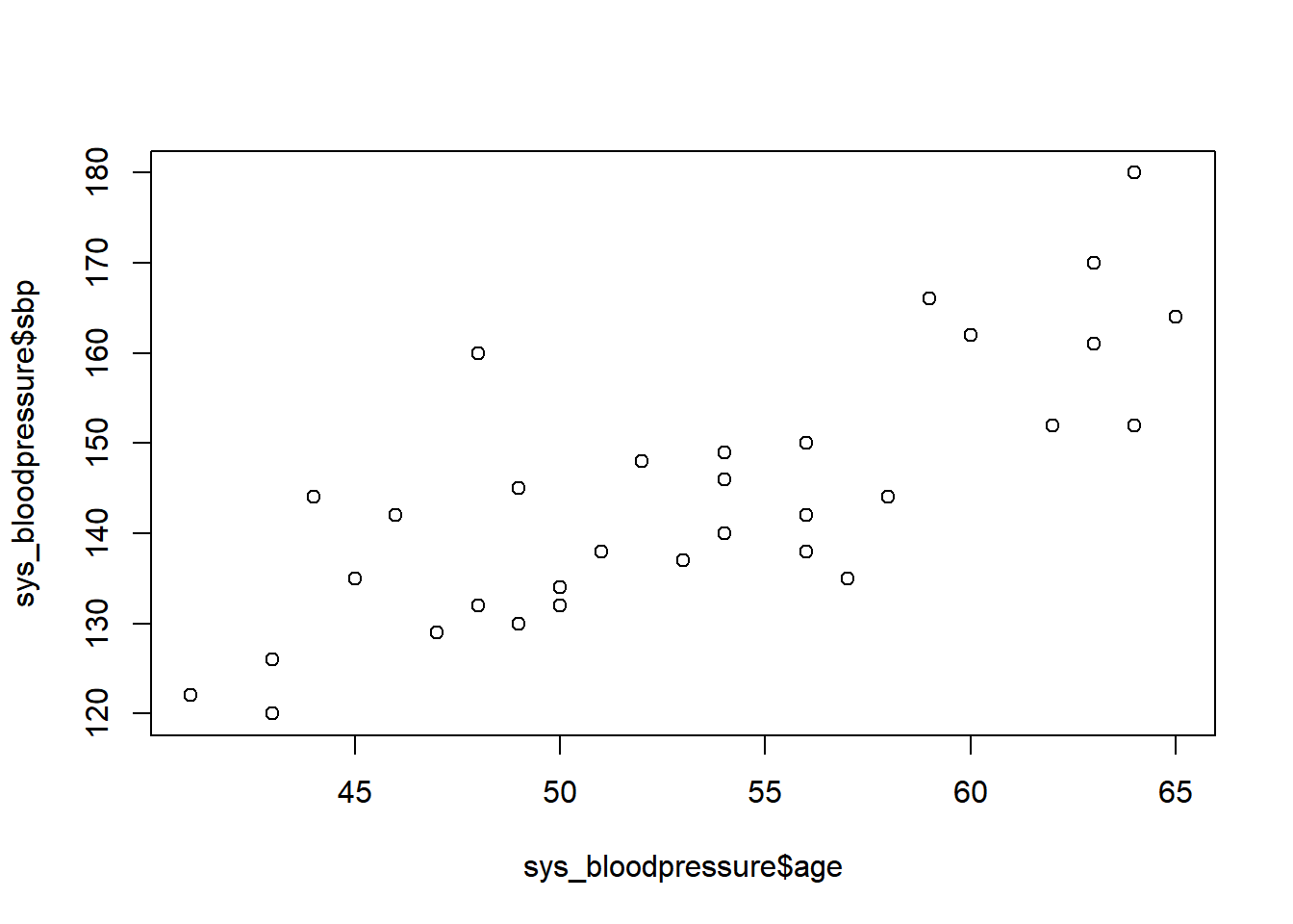
Now we have created a simple scatterplot, and we can see that the names of our variables are on the x and y-axes. Additionally, we can see that the scatterplot is in black and white, and we don’t have a title. Fortunately, we can improve this scatterplot with extra arguments.
Title and labels for the x-axis and y-axis
If we use the graphics library, we can always add the arguments we’re about to explain to add a title and labels for the x- and y-axis. For example, if we want a title for our scatterplot, we can specify a “main” argument.
plot(x = sys_bloodpressure$age, y = sys_bloodpressure$sbp, main = "Systolic blood pressure and Age")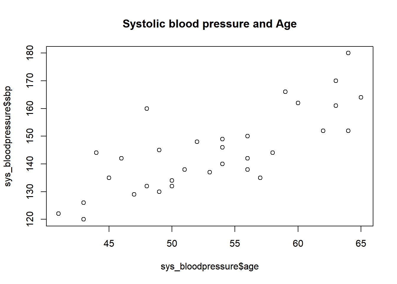
To change the labels of the x-axis and y-axis, we can use the xlab and ylab arguments respectively.
plot(x = sys_bloodpressure$age, y = sys_bloodpressure$sbp,
     main = "Systolic blood pressure and Age",
     xlab = "Age",
     ylab = "Systolic blood pressure")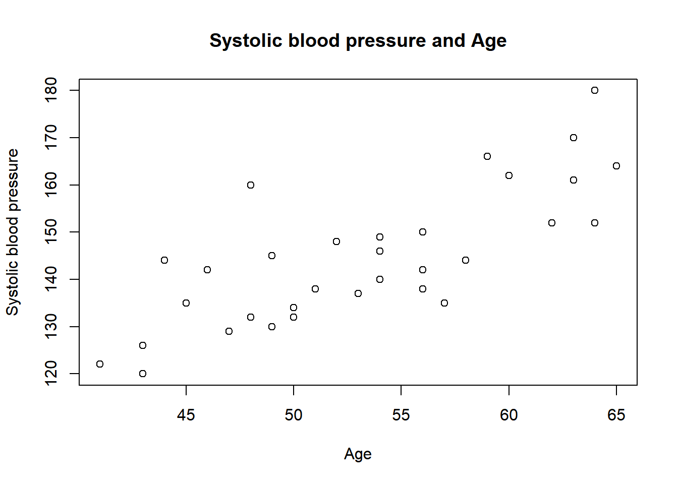
Note the formatting of the code here. If we want to give a lot of arguments, then we can add them all on one line, but sometimes it is better for readability if you separate arguments on new lines. This is allowed as long as the arguments are separated with commas at the end of the line.
We can also change the colors, and we can do that with the “col” argument.
plot(x = sys_bloodpressure$age, y = sys_bloodpressure$sbp,
     main = "Systolic blood pressure and Age",
     xlab = "Age",
     ylab = "Systolic blood pressure", col = "blue")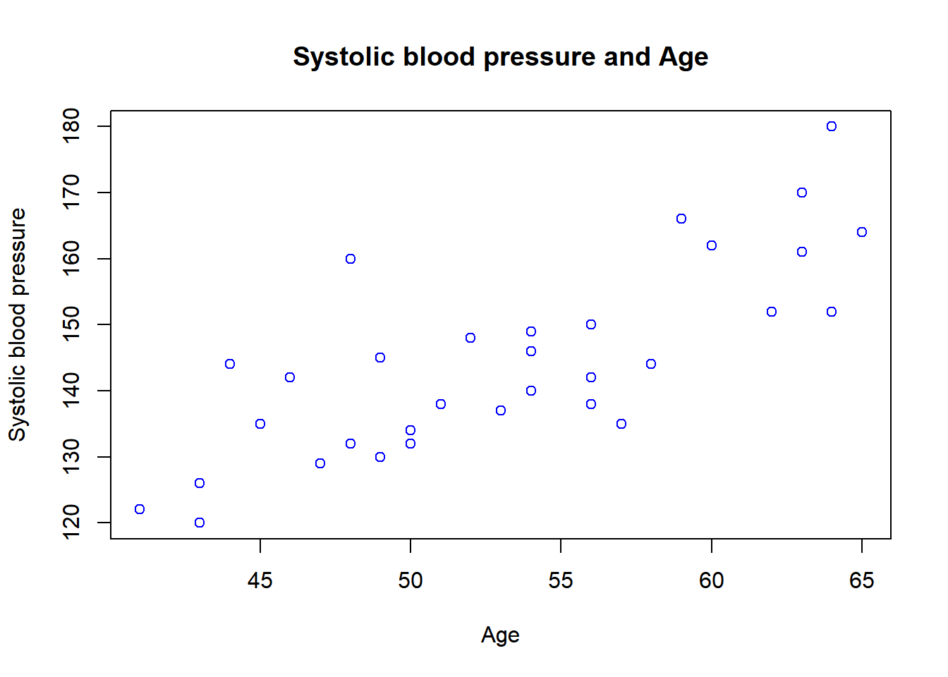
The colors can be changed by specifying a character such as “red”, “dark red”, “blue”, etc. There are currently 657 colors available, and these can be obtained by typing the colors() function. For now, I’ll show the first six colors:
head(colors())## [1] "white" "aliceblue" "antiquewhite" "antiquewhite1"
## [5] "antiquewhite2" "antiquewhite3"That means that there are enough options to choose a color.
Finally, we can also specify a “pch” argument, and this will change the symbols within a scatterplot. By default, this is set to 1 (a circle), but if you want to have a triangle or a square for each observation, we can change that with the pch argument and then specify the number that we want to have.
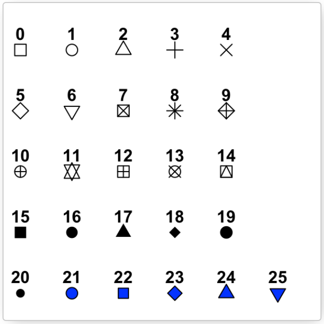
Figure 11.1: Pch symbols
In the following example, we changed the color to green and specified pch = 18.
plot(x = sys_bloodpressure$age, y = sys_bloodpressure$sbp,
     main = "Systolic blood pressure and Age",
     xlab = "Age",
     ylab = "Systolic blood pressure",
     col = "green", pch = 18)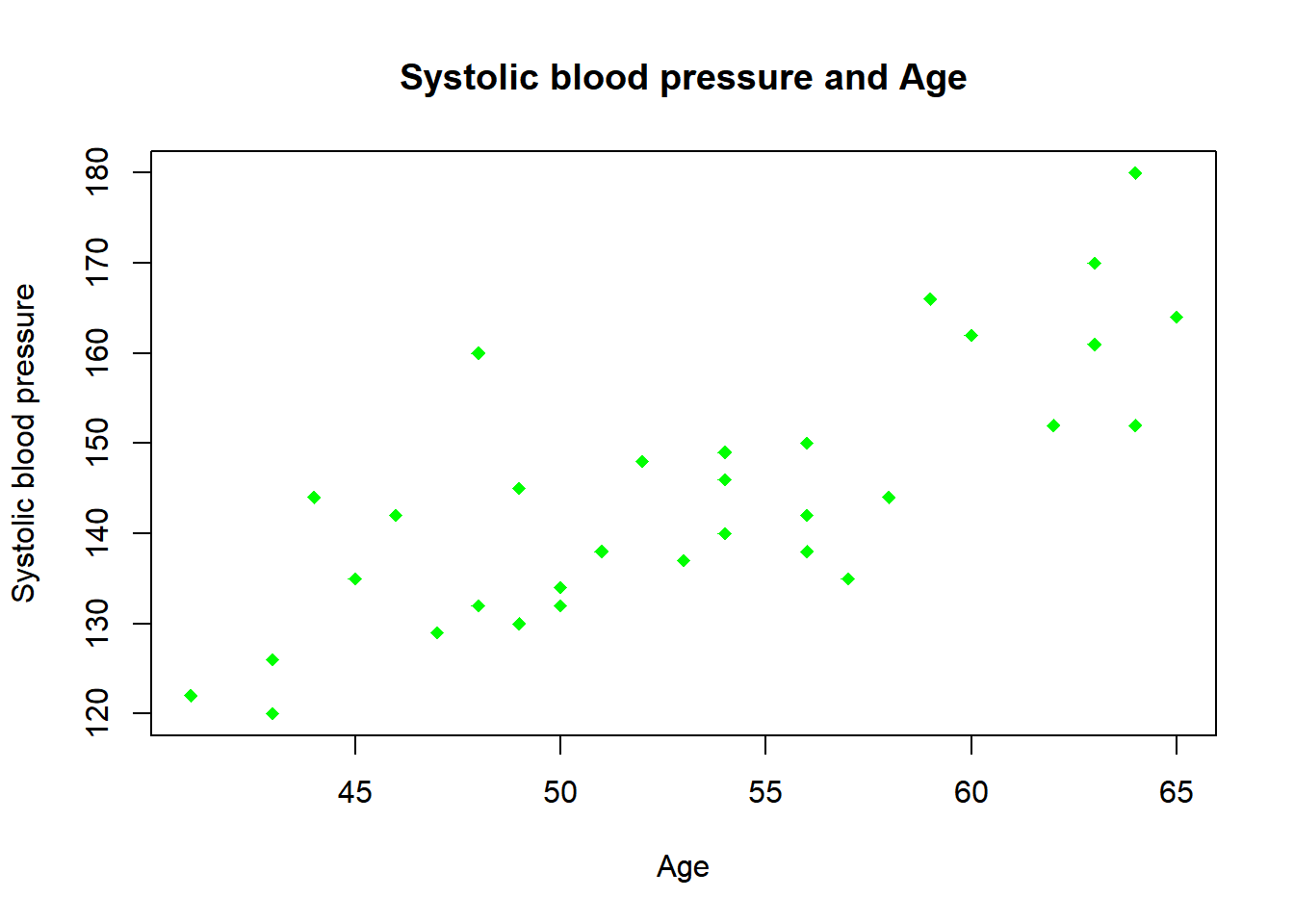
11.1.2 Boxplot
We can create a boxplot with the boxplot() function. This boxplot function is part of the graphics library as well, which means that we can use the same arguments we used for the scatterplot.
We can make a simple boxplot by specifying a formula with the tilde sign (~), and in this case, we want to make a boxplot of the systolic blood pressure on the y-axis for smokers and non-smokers on the x-axis.
boxplot(sys_bloodpressure$sbp ~ sys_bloodpressure$smk)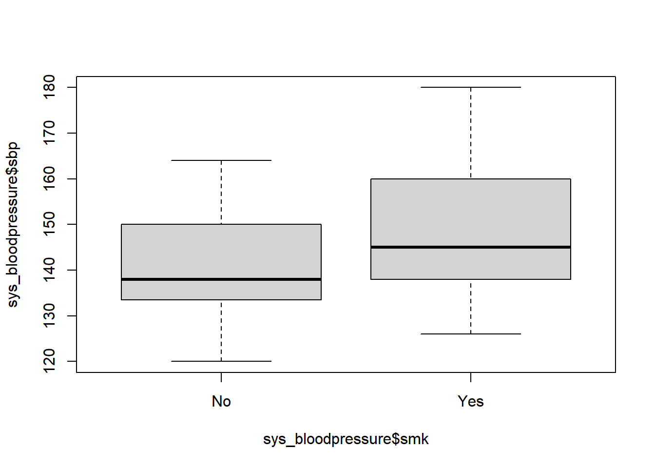
Again, we see that R uses the variable names as labels on the axes and that there is no title. If we want to change that, we can use the main, xlab, ylab, and optionally the col argument to change the color.
boxplot(sys_bloodpressure$sbp ~ sys_bloodpressure$smk,
        main = "Systolic blood pressure smokers and non-smokers",
        xlab = "Smoking (no/yes)",
        ylab = "Systolic blood pressure",
        col = "pink")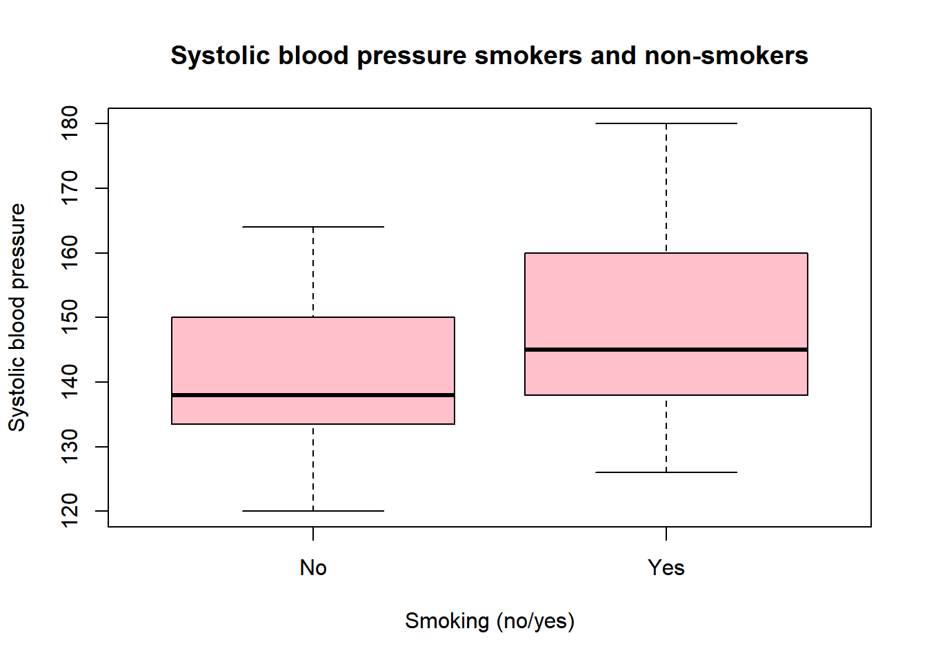
11.1.3 Histogram
To create a histogram, we can use the hist() function. This function only needs one argument: x. In this example, we will look at the age distribution of the systolic blood pressure data.
hist(sys_bloodpressure$age)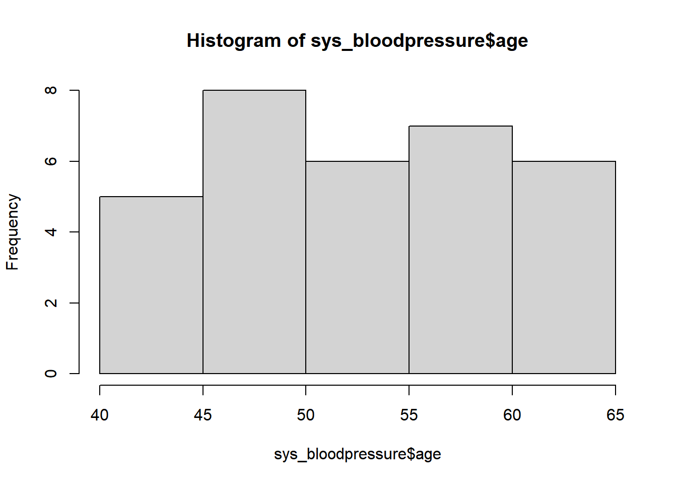
And we can improve this visualization by using the main, xlab, ylab, and col arguments.
hist(sys_bloodpressure$age,
     main = "Age distribution",
     xlab = "Age",
     ylab = "Frequency",
     col = "light blue")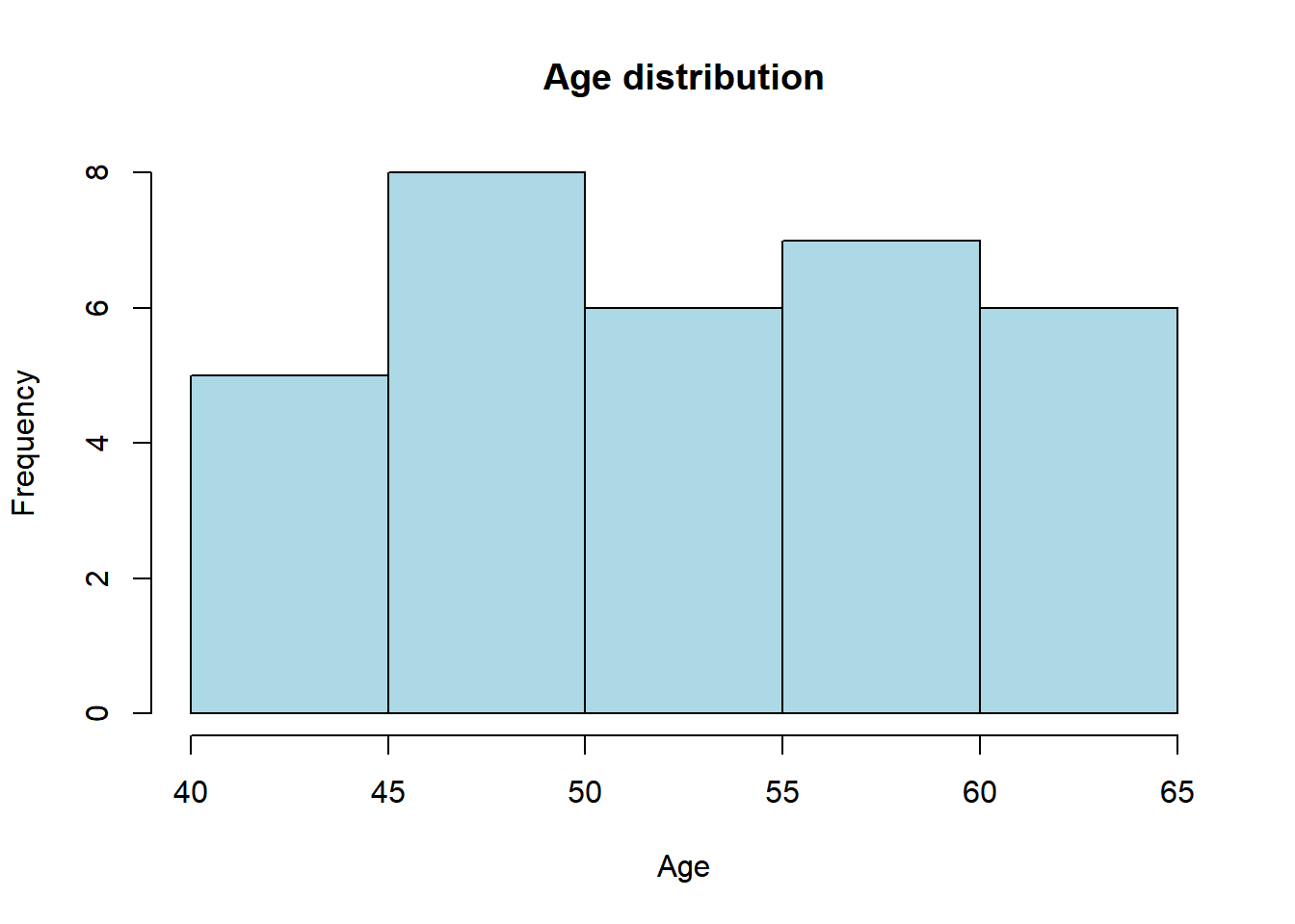
With a histogram, you can see the distribution of a certain variable. For example, if someone had made a typo and there was an age of 4 instead of 40, we would’ve seen that with a histogram.
11.1.4 Bar chart
Now we are going to look at a bar chart. For this example, we use the Dutch population per province (numbers obtained from CBS). First, we will start by looking at the first five regions: Groningen, Friesland, Drenthe, Flevoland, and Gelderland. For now, we make two vectors: one with the names of the provinces and one with the amount of population, and then we combine these two vectors in a data frame.
This is done as follows:
Region5 <- c("Groningen", "Friesland", "Drenthe", "Flevoland", "Gelderland")
Population5 <- c(585866, 649957, 1162406, 423021, 2085952)

Netherlands5 <- data.frame(Region5, Population5)
If we look at the data by typing Netherlands5, we see that the five provinces are in a data frame with the corresponding population.
Netherlands5## Region5 Population5
## 1 Groningen 585866
## 2 Friesland 649957
## 3 Drenthe 1162406
## 4 Flevoland 423021
## 5 Gelderland 2085952If we want to visualize this, we can use the barplot() function. And of course, we can use the arguments we have seen before like col, main, xlab, and ylab.
barplot(Netherlands5$Population5, names =Netherlands5$Region5,
        col = "blue",
        main = "Population per region in the Netherlands 2020",
        ylab = "Population",
        xlab = "Province")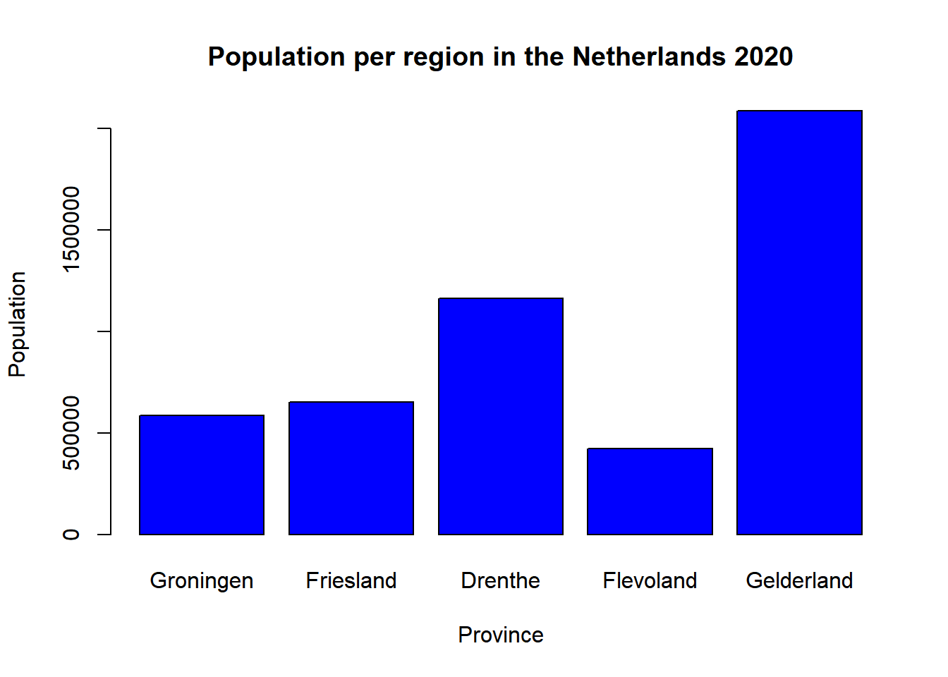
From this visualization, we can conclude that Flevoland has the lowest population and Gelderland has the highest population. For this example, we looked at five provinces. However, the Netherlands has 12 provinces, so let’s see if we can make the visualization for all 12 provinces.
We can add the rest of the information to the vectors and then make a new data frame called Netherlands.
Region <- c("Groningen", "Friesland", "Drenthe", "Flevoland", "Gelderland", "Utrecht",
           "Noord-Holland", "Zuid-Holland", "Zeeland", "Noord-Brabant", "Limburg", "Amsterdam")
Population <- c(585866, 649957, 1162406, 423021, 2085952, 1354834, 2879527, 3708696, 383488, 2562955, 1117201, 872757)

Netherlands <- data.frame(Region, Population)
We can then make another barplot by executing the same code:
barplot(Netherlands$Population, names =Netherlands$Region,
        col = "blue",
        main = "Population per region in the Netherlands 2020",
        ylab = "Population",
        xlab = "Province")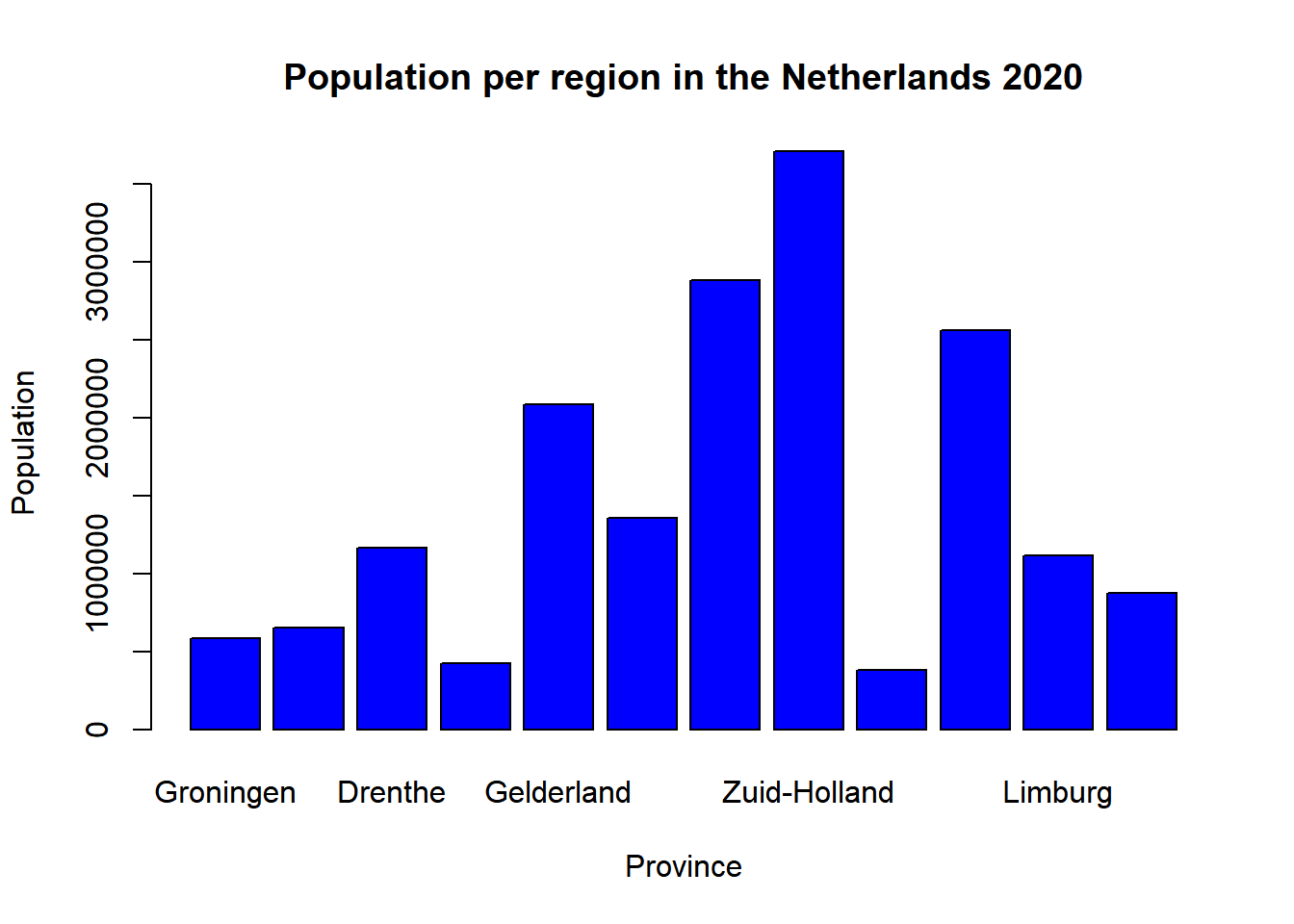
We see that all the data is plotted, but it is no longer possible to see which data belongs to which province. This is because the names of the provinces are too long. The only thing we can do to improve this is to display the text of the provinces differently. We can do this by specifying an las argument and setting this to 2.
barplot(Netherlands$Population, names =Netherlands$Region,
        col = "blue",
        main = "Population per region in the Netherlands 2020",
        ylab = "Population",
        xlab = "Province",
        las = 2)
Now we see that the names of the provinces are displayed under the bar which is already an improvement. However, it is still not ideal since some provinces are not fully displayed, and they are displayed through the x-axis label. In the ggplot chapter, we will use this data again and show some useful functions to visualize this data correctly.
Apart from the scatterplot, boxplot, histogram, and bar charts we just made, we can make many more visualizations. If we type in library(help = “graphics”), we will end up on the documentation for the graphics package.
library(help = "graphics")Here you will find all possibilities for visualization. For example, you can use the stem() function to create a stem-and-leaf plot, and there are also options to create a mosaic-plot, and so on.
11.2 Ggplot2
For this chapter, we will use the ggplot2 package. Make sure you have installed this library, and then we can load this package by typing library(ggplot2).
library(ggplot2)11.2.1 Scatterplot
The code to make ggplot2 visualization differs from the plots we have created earlier. We start with the ggplot() function, then we need to specify a data argument, and an argument called mapping = aes(x = , y =). The mapping argument lets R know which variables should be on which axis.
If we want to do this for the systolic blood pressure data, and we want to have age on the x-axis and systolic blood pressure on the y-axis, we need to type the following code:
ggplot(data = sys_bloodpressure, mapping = aes(x = age, y = sbp)) 
We see that we have a visualization without data, and this is correct because we forgot to specify what kind of visualization we want to make. In ggplot2, we can specify what kind of visualization we want to make with “geom” arguments. Ggplot2 works with components or layers, and that means that we can add things to our visualization by using the “+” sign and adding a layer.
If we want to make a scatterplot, we can do that by using the geom_point() function. If we add that to the previous example, it will look like this:
ggplot(data = sys_bloodpressure, mapping = aes(x = age, y = sbp)) +
  geom_point()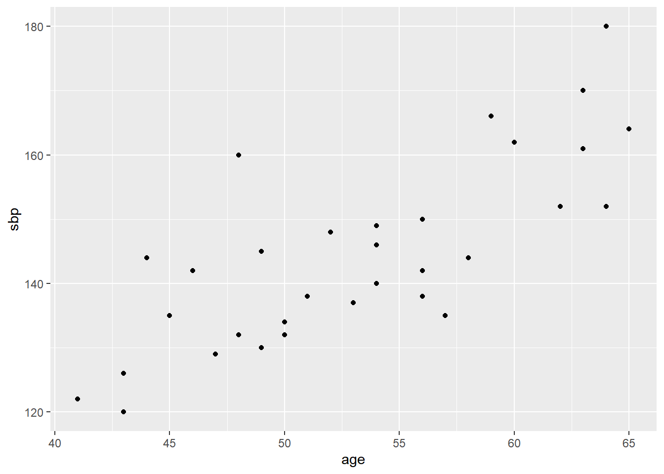
Now we have made a scatterplot, and if we would like to change the names of the x- and y labels, and add a title we can do that again. In ggplot2, we can do that in two ways. The first one is to specify the ggtitle(), xlab(), and ylab() arguments to change the title, x-label, and y-label, and add them as layers with the “+” sign.
ggplot(data = sys_bloodpressure, mapping = aes(x = age, y = sbp)) +
  geom_point() +
  ggtitle("Sytolic blood pressure and Age") +
  xlab("Age") +
  ylab("Systolic blood pressure")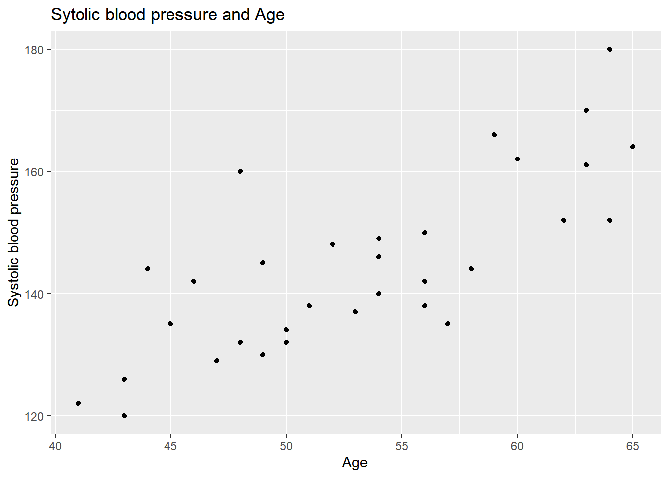
Now we have changed the x- and y-labels, and we have added a title. The second option to change the title and labels is easier because you only need to use one function. With the labs() function, you can change the x-label, y-label, and title all at once.
ggplot(data = sys_bloodpressure, mapping = aes(x = age, y = sbp)) +
  geom_point() +
  labs(title = "Systolic blood pressure and Age", x = "Age", y = "Systolic blood pressure")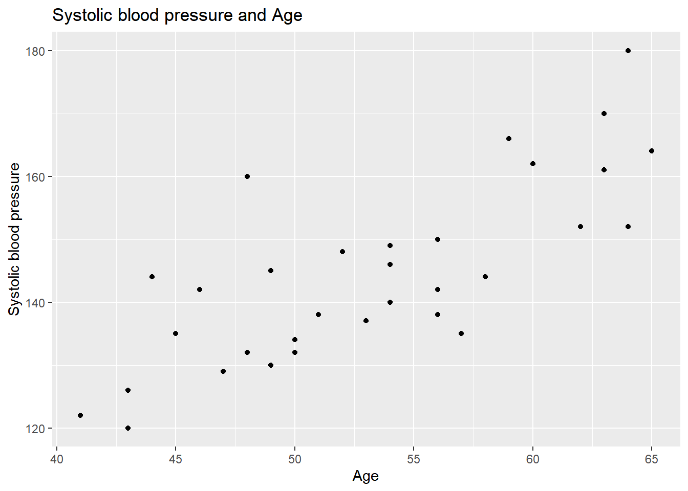
We can see that we have achieved the same thing. The only difference is that we need to specify the title, x, and y arguments instead of ggtitle, xlab, and ylab separately.
Furthermore, we can also change the colors and symbols as we did before. We can do this by specifying the color and shape arguments within the geom_point() function. For example, if we want the color blue and the triangle symbol, we can do that by specifying “blue” for color and shape “6” for shape. The numbers for shape correspond to the pch symbols we have seen earlier.
ggplot(data = sys_bloodpressure, mapping = aes(x = age, y = sbp)) +
  geom_point(color = "blue", shape = 6) +
  labs(title = "Systolic blood pressure and Age", x = "Age", y = "Systolic blood pressure")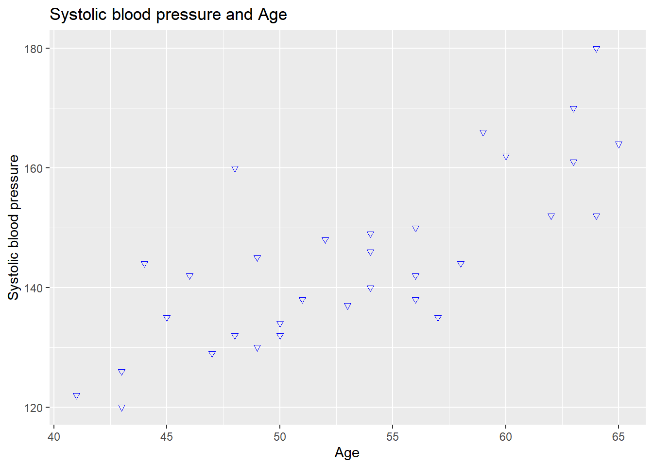
In ggplot2, we can have multiple geom’s in one visualization. For example, if we want to add a regression line to this visualization, we can use the geom_smooth() function. If we want a normal regression line, we have to specify “lm” as the method:
ggplot(data = sys_bloodpressure, mapping = aes(x = age, y = sbp)) +
  geom_point(color = "blue", shape = 6) +
  labs(title = "Systolic blood pressure and Age", x = "Age", y = "Systolic blood pressure") +
  geom_smooth(method = "lm")
## `geom_smooth()` using formula 'y ~ x'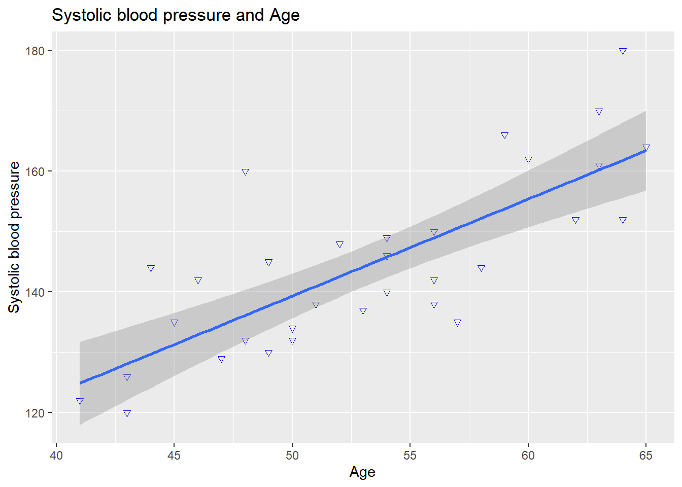
Now we see that a regression line has been added to the visualization with a confidence interval. If you don’t want the confidence interval, then you can specify an extra argument in the geom_smooth() function called se and set it to FALSE:
ggplot(data = sys_bloodpressure, mapping = aes(x = age, y = sbp)) +
  geom_point(color = "blue", shape = 6) +
  labs(title = "Systolic blood pressure and Age", x = "Age", y = "Systolic blood pressure") +
  geom_smooth(method = "lm", se = FALSE)
## `geom_smooth()` using formula 'y ~ x'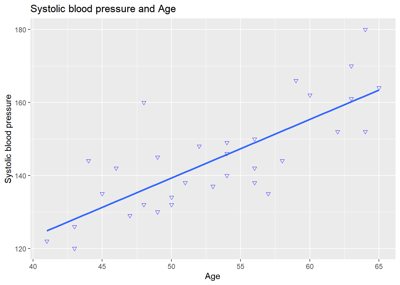
For this example, we only added one regression line, but we can also make multiple regression lines. We can also give the points a different color in the scatterplot based on another variable. Suppose that we have a feeling that the people with high systolic blood pressure are smokers then we can enter an argument called col within aes() and specify a categorical variable here. If we do this with the variable smoking (smk) and then make a scatterplot without a regression line, it will look like this:
ggplot(data = sys_bloodpressure, mapping = aes(x = age, y = sbp, col = smk)) +
  geom_point() +
  labs(title = "Systolic blood pressure and Age", x = "Age", y = "Systolic blood pressure")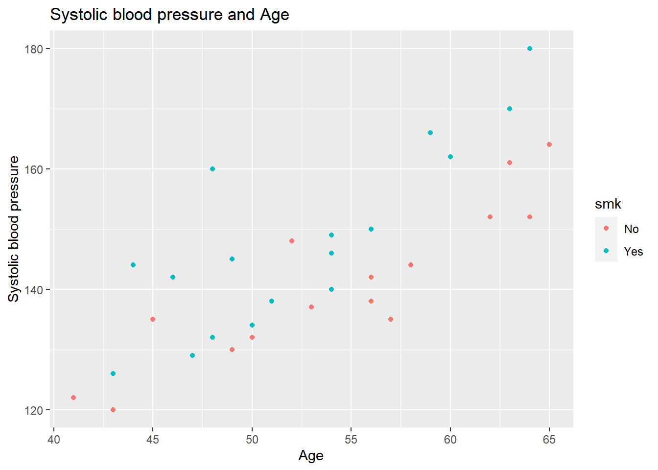
Now we see two colors in the visualization (red for non-smokers and blue for smokers), and we can see that the people who smoke have a higher systolic blood pressure than non-smokers. This also means that the regression line we made earlier is probably not valid for the whole population, and we might want a different regression line for smokers and non-smoker. Since we have already specified the col argument within aes, and we want to add a regression line, it will automatically make two different regression lines for each group.
If we type in the following code:
ggplot(data = sys_bloodpressure, mapping = aes(x = age, y = sbp, col = smk)) +
  geom_point() +
  labs(title = "Systolic blood pressure and Age", x = "Age", y = "Systolic blood pressure") +
  geom_smooth(method = "lm", se = FALSE)
## `geom_smooth()` using formula 'y ~ x'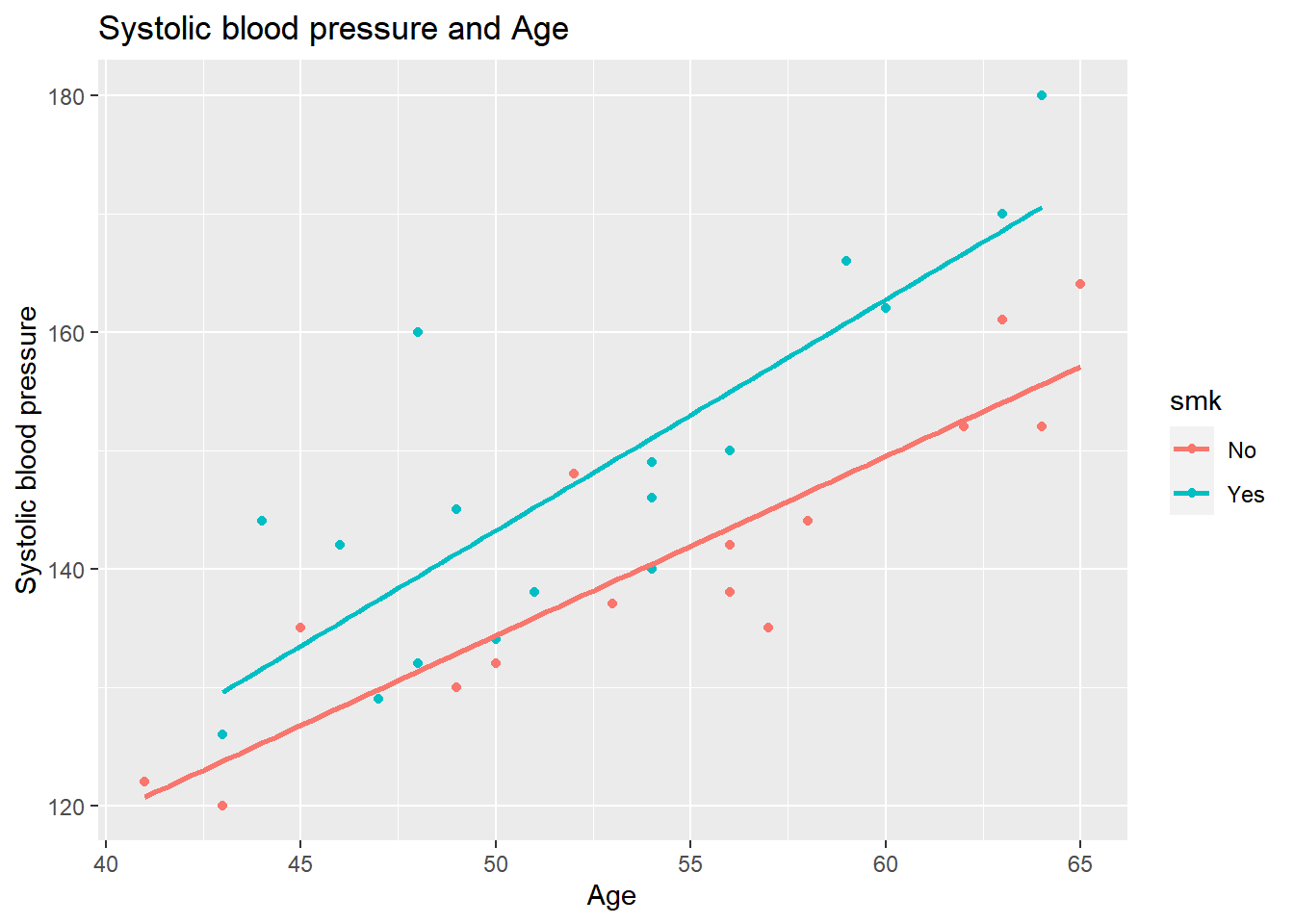
We see that we have separate regression lines for smokers and non-smokers.
Sometimes, you have data points with the same values. This is not the case with this dataset, but suppose there are 30 people with the age of 50 and systolic blood pressure of 140, then there would only be one datapoint visible (because the rest are visualized below it). To deal with this, we can use the geom_jitter() function. To give an example of the geom_jitter() function, we use the original data again, and we will use the geom_jitter() at the same time.
ggplot(data = sys_bloodpressure, mapping = aes(x = age, y = sbp)) +
  labs(title = "Systolic blood pressure and Age", x = "Age", y = "Sytolic blood pressure") +
  geom_point(color = "green") +
  geom_jitter()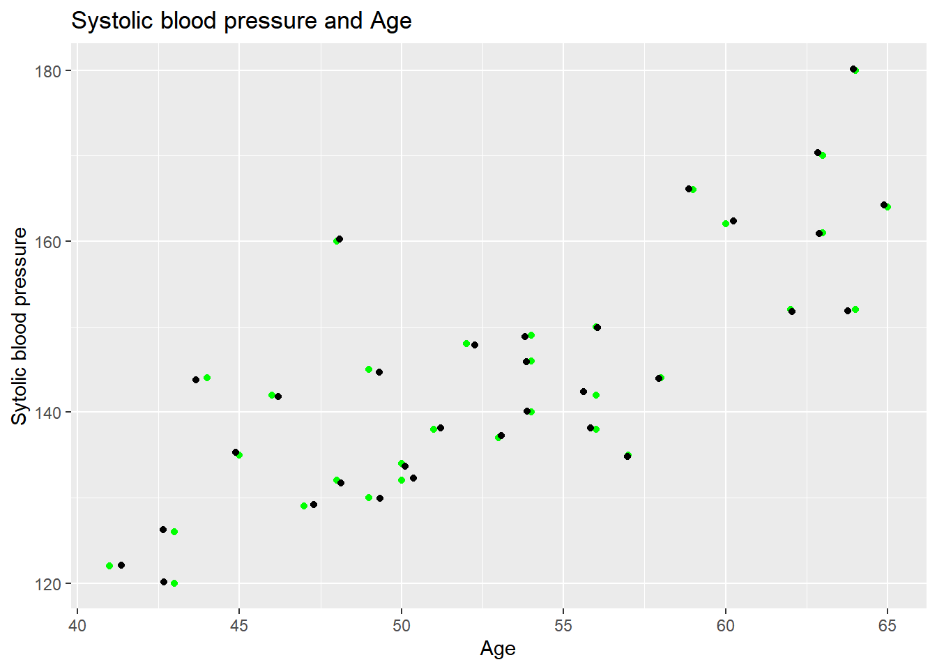
The black points created by the geom_jitter() function differ slightly from the original data, and that is exactly what the geom_jitter() function does. It adds a little bit of random noise to the data points. So if we had 30 people with the same values they would be more visible because the random noise makes the points slightly different.
11.2.2 Boxplot
Now, we are going to look at boxplots with ggplot2, and we will use the same data to look at the difference in systolic blood pressure for smokers and non-smokers. The code is similar to how we made the scatterplot with ggplot. Again, we start with ggplot(data, mapping = aes(x = , y = )) +. For the scatterplot, we used the geom_point() function, and to make a boxplot, we can use the geom_boxplot() function.
If we want to make a with smoking on the x-axis and systolic blood pressure on the y-axis, then we can do it like this:
ggplot(data = sys_bloodpressure, mapping = aes(x = smk, y = sbp)) +
  geom_boxplot()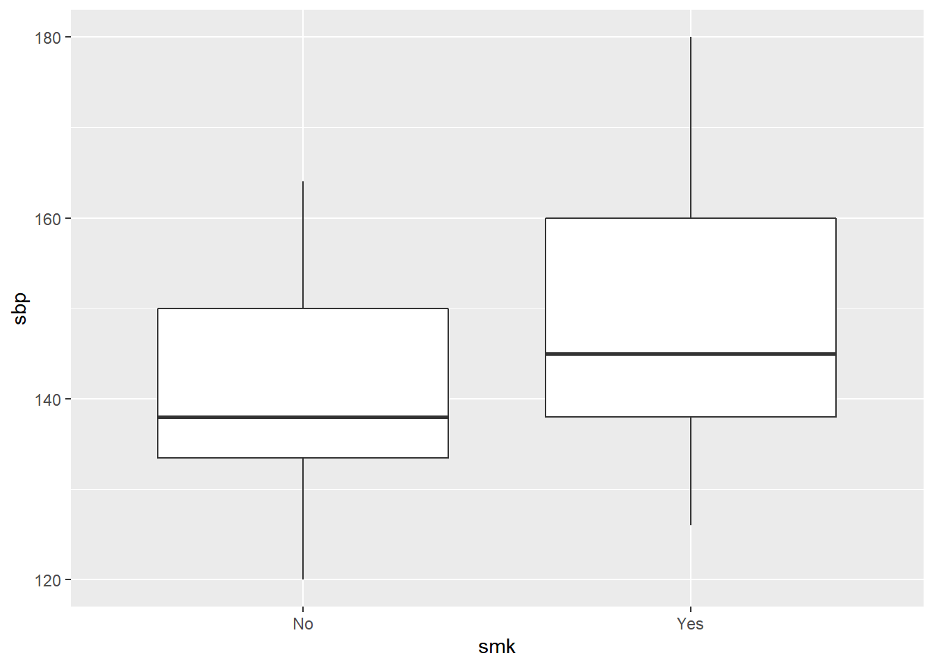
Again, we see that the data is visualized, but it doesn’t have a title or x- and y-labels yet. We can add the title, x- and y-labels by using labs().
ggplot(data = sys_bloodpressure, mapping = aes(x = smk, y = sbp)) +
  labs(title = "Systolic blood pressure smokers and non-smokers", x = "Smoking (No/Yes)", y = "Systolic blood pressure") +
  geom_boxplot()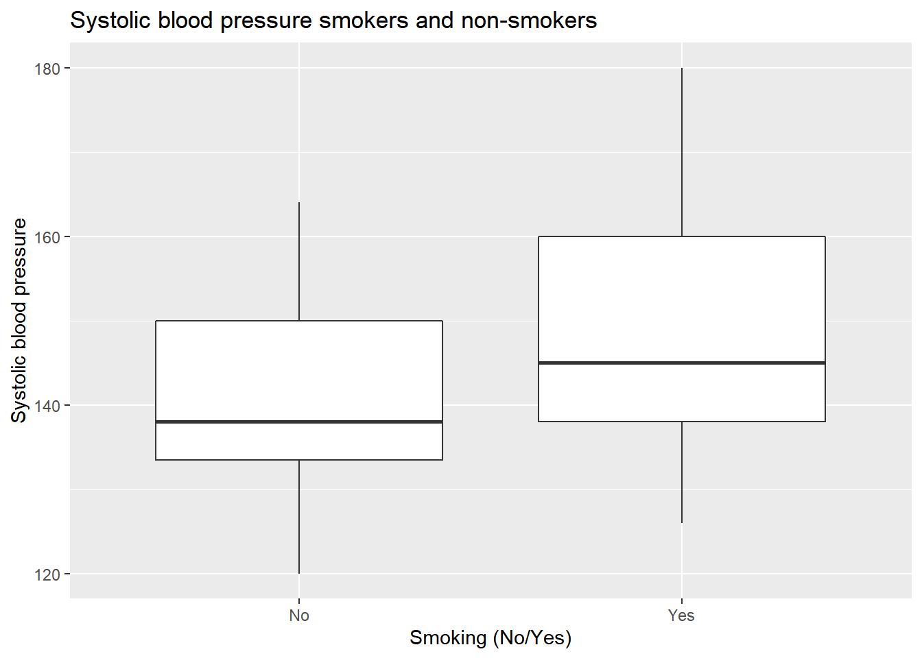
Now, if we want to add color, we can do that in two ways. We can add color by using the fill option. We can use the fill option within aes() and specify a categorical variable such as smoking, and then ggplot2 will automatically use a different color that variable. If we do this for the smoking variable, it will look like this:
ggplot(data = sys_bloodpressure, mapping = aes(x = smk, y = sbp, fill = smk)) +
  labs(title = "Systolic blood pressure smokers and non-smokers", x = "Smoking (No/Yes)", y = "Systolic blood pressure") +
  geom_boxplot()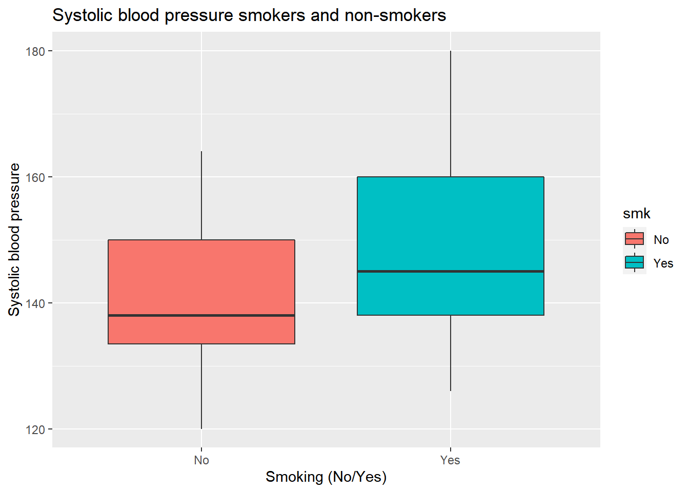
We can also specify the fill argument within the boxplot() function itself, and this will make the two boxes have the same color:
ggplot(data = sys_bloodpressure, mapping = aes(x = smk, y = sbp)) +
  labs(title = "Systolic blood pressure smokers and non-smokers", x = "Smoking (No/Yes)", y = "Systolic blood pressure") +
  geom_boxplot(fill = "pink")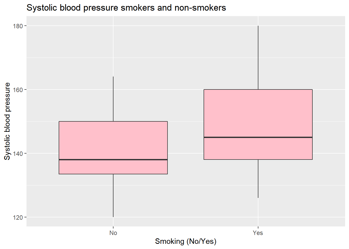
We already know that we can have multiple geom’s in one visualization. For example, if we want to make the previous examples even better, we can add a dot-plot to the boxplot. All we have to do is to add the geom_dotplot() function with binaxis = “y” and stackdir = “center” as default arguments.
ggplot(data = sys_bloodpressure, mapping = aes(x = smk, y = sbp, fill = smk)) +
  labs(title = "Systolic blood pressure smokers and non-smokers", x = "Smoking (No/Yes)", y = "Systolic blood pressure") +
  geom_boxplot() +
  geom_dotplot(binaxis = "y", stackdir = "center")
## `stat_bindot()` using `bins = 30`. Pick better value with `binwidth`.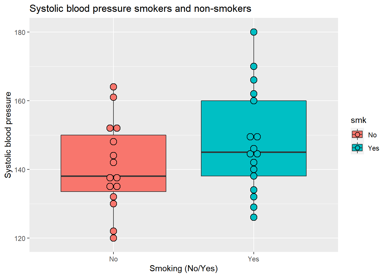
Now we can also see the individual points.
11.2.3 Histogram
To make a histogram, we will recreate the age distribution visualization we made earlier in this chapter. The only difference is that we only need to specify an x argument within aes() and that we need to use geom_histogram() to create a histogram. If we do that, the code looks like this:
ggplot(data = sys_bloodpressure, mapping = aes(x = age)) +
  geom_histogram()
## `stat_bin()` using `bins = 30`. Pick better value with `binwidth`.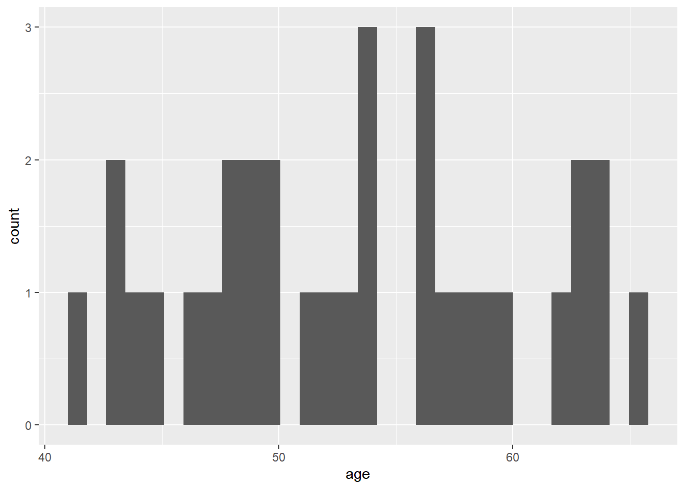
We see that our visualization wasn’t very successful, and there is a warning to choose a better binwidth. Ggplot is trying to get all our data into 30 bins, but that doesn’t work because we only have 32 observations. We can change this by adjusting the bins argument within the geom_histogram() function. We can also change the color by specifying the fill argument in geom_histogram. If we specify bins = 6 and fill = “light blue” our visualization will look like this:
ggplot(data = sys_bloodpressure, mapping = aes(x = age)) +
  geom_histogram(bins = 6, fill = "light blue")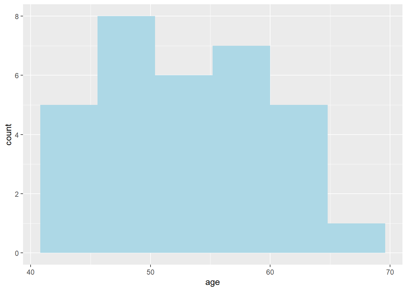
Finally, we can also change the x-axis, y-axis, and title with labs().
ggplot(data = sys_bloodpressure, mapping = aes(x = age)) +
  geom_histogram(bins = 6, fill = "light blue") +
  labs(title = "Age distribution", x = "Age", y = "Frequency")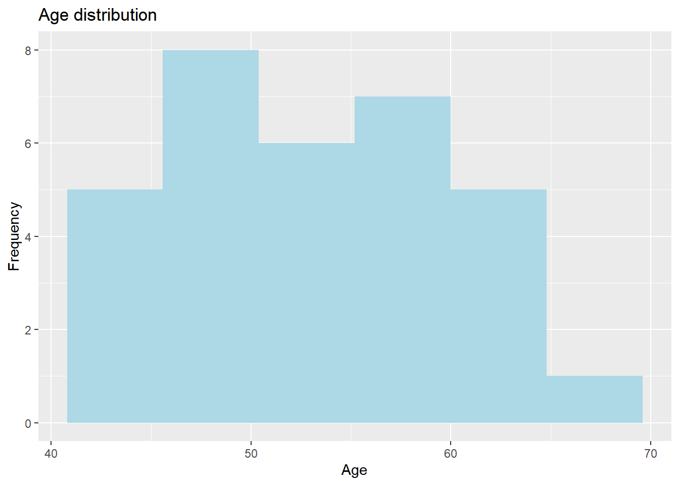
11.2.4 Bar chart
For the bar chart, we will use the same data we used for the bar chart in the graphics library. We want to visualize the population of the Netherlands on the y-axis and the provinces on the x-axis. We can do this by using the geom_bar() function. In this case, it needs an argument called stat, which needs to be set to “identity”. Stat stands for statistical transformations, and “identity” means that the data should stay the same.
ggplot(data = Netherlands, aes(x = Region, y = Population)) +
  geom_bar(stat = "identity")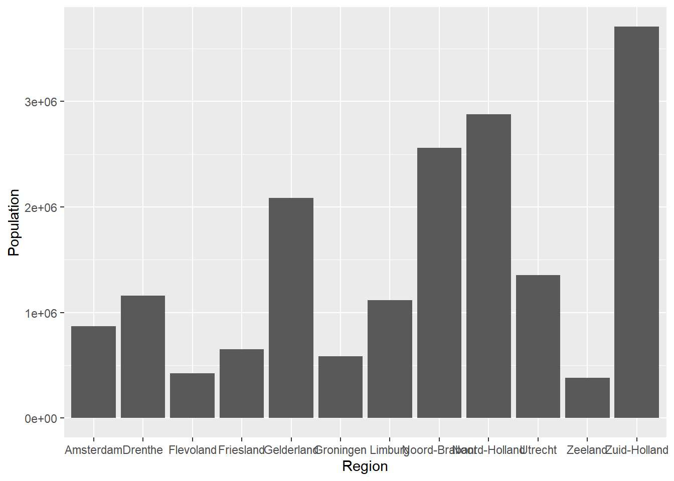
We see that ggplot tries to display all provinces, but they are overlapping. We also see that the numbers for the population are represented scientifically.
One useful trick that we can use with bar charts (or other types of visualizations) is to flip the bar chart so that the names of the provinces are displayed correctly. We can do this by using the coord_flip() function, and we can add this again by using the + sign.
ggplot(data = Netherlands, aes(x = Region, y = Population)) +
  geom_bar(stat = "identity") +
  coord_flip()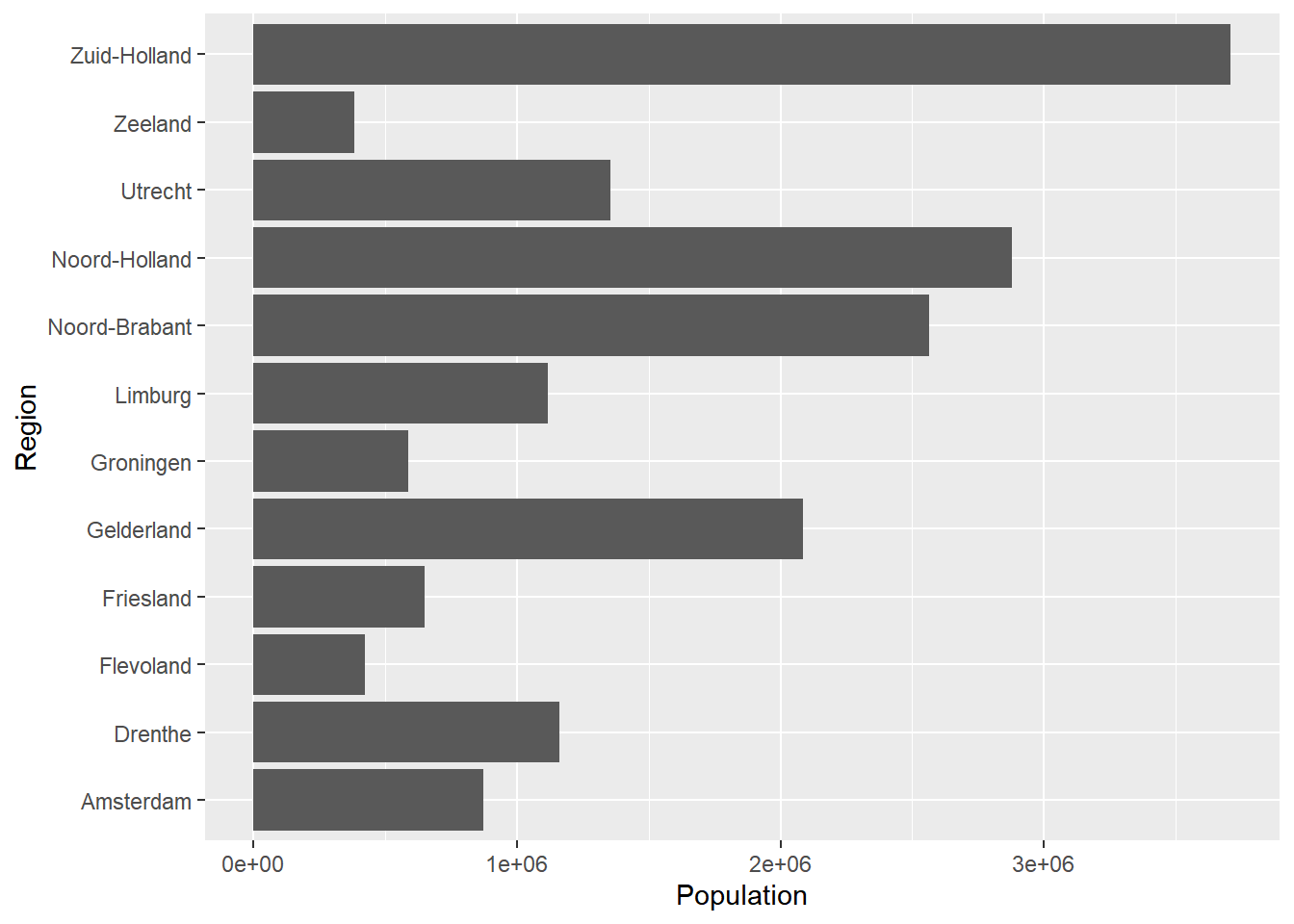
This looks a lot better. Now, we can improve this visualization even more. We can change the numbers for the population from scientific to a normal notation. We can also add color, and we can order the bar chart based on the population variable. Let’s discuss these one-by-one.
To remove the scientific notation, we need the scales package. Make sure this package is installed, and then use library(scales) to load it. Next, we can use the scale_y_continuous() function and set the labels argument to comma to remove the scientific notation.
library(scales)

ggplot(data = Netherlands, aes(x = Region, y = Population)) +
  geom_bar(stat = "identity") +
  coord_flip() +
  scale_y_continuous(labels = comma)
It might be weird that we change the y-axis because the provinces are on the y-axis now, but this is correct since we have flipped the bar, and ggplot still assumes that the population is the y-axis data.
We can change the color by using the fill argument. Again, we can specify this within aes to give every province a different color, or we can specify it in the geom_bar() function to give everything the same color.
If we want to make each province a different color, we do it as follows:
ggplot(data = Netherlands, aes(x = Region, y = Population, fill = Region)) +
  geom_bar(stat = "identity") +
  coord_flip() +
  scale_y_continuous(labels = comma)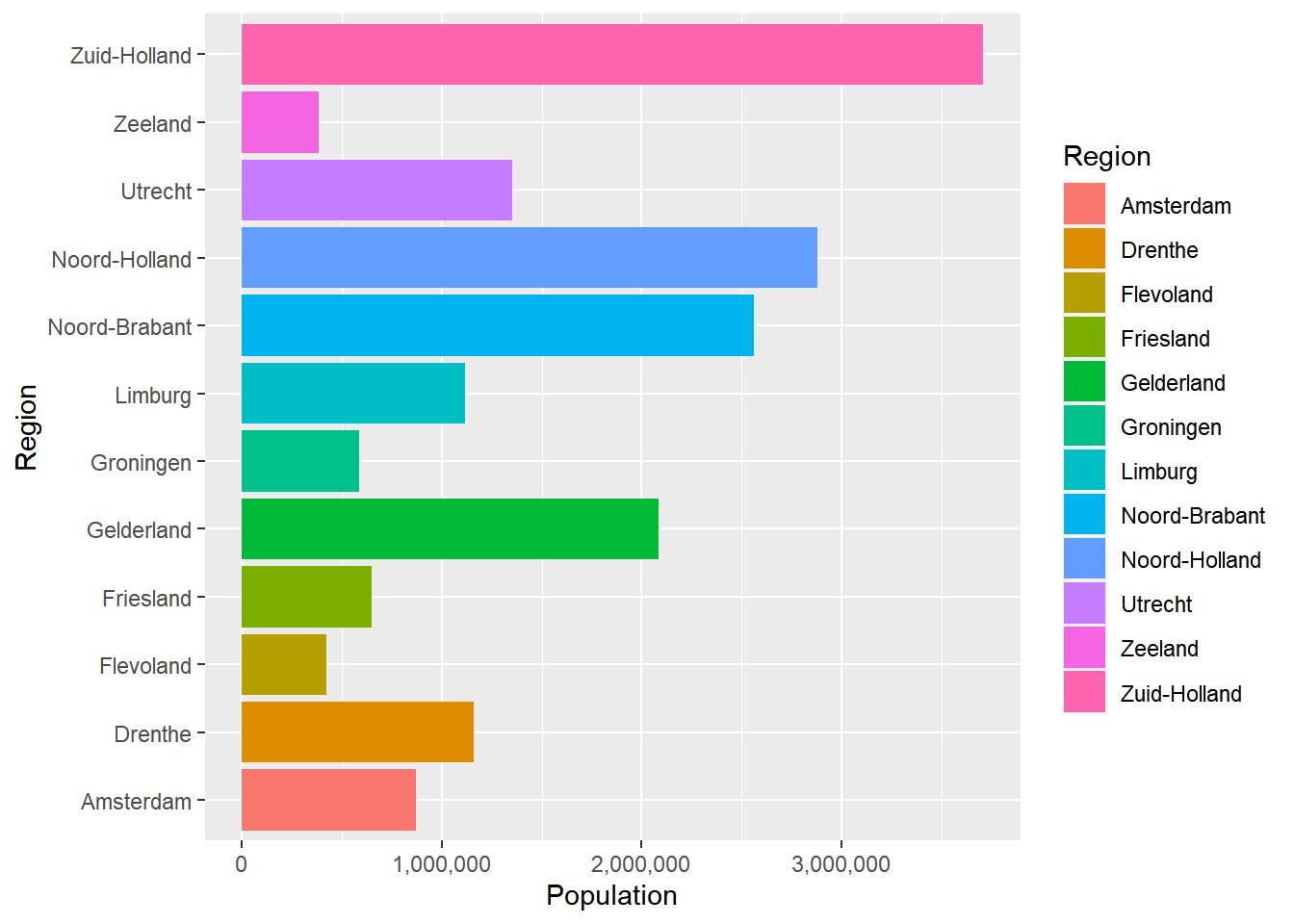
And if we want everything to have the same color, we can do that in the following way:
ggplot(data = Netherlands, aes(x = Region, y = Population)) +
  geom_bar(stat = "identity", fill = "tomato") +
  coord_flip() +
  scale_y_continuous(labels = comma)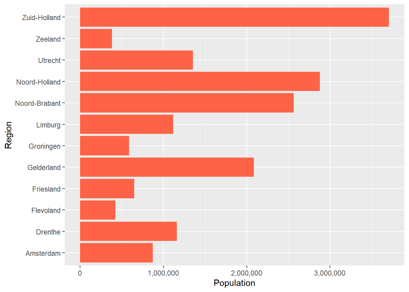
Personally, I prefer that every province has a different color. Finally, we can make the provinces ordered based on the population. To do this, we use reorder within the aes() function.
If we want to order the provinces from high to low, we can do that by giving the x argument: reorder(Region, +Population). This indicates that we want the regions from high to low based on the population variables. The +Population means from high to low, but we could’ve also ordered from low to high by using -Population. If we use reorder(Region, +Population), it will look like this:
ggplot(data = Netherlands, aes(x = reorder(Region, +Population), y = Population, fill = Region)) +
  geom_bar(stat = "identity") +
  coord_flip() +
  scale_y_continuous(labels = comma)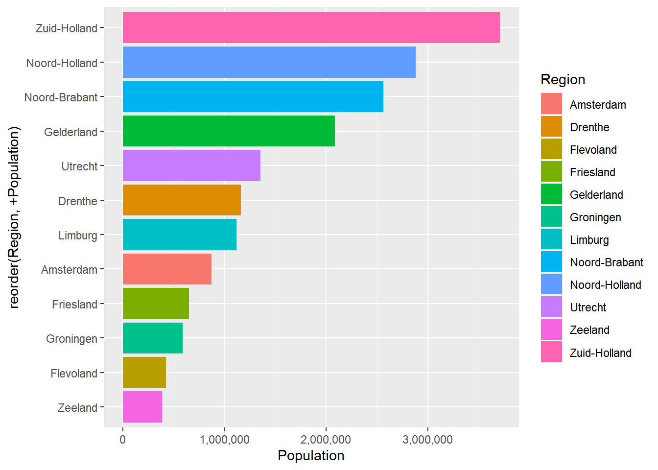
11.2.5 Themes
Within ggplot, we can choose several themes. For example, we can use the default theme with a gray grid background, but we can also choose other options. To add a theme, you can simply add another theme layer with the + sign.
For example, if we don’t want a gray background, we can use theme_classic(). If we use theme_classic() for the previous example, it will look like this:
ggplot(data = Netherlands, aes(x = reorder(Region, +Population), y = Population, fill = Region)) +
  geom_bar(stat = "identity") +
  coord_flip() +
  scale_y_continuous(labels = comma) +
  theme_classic()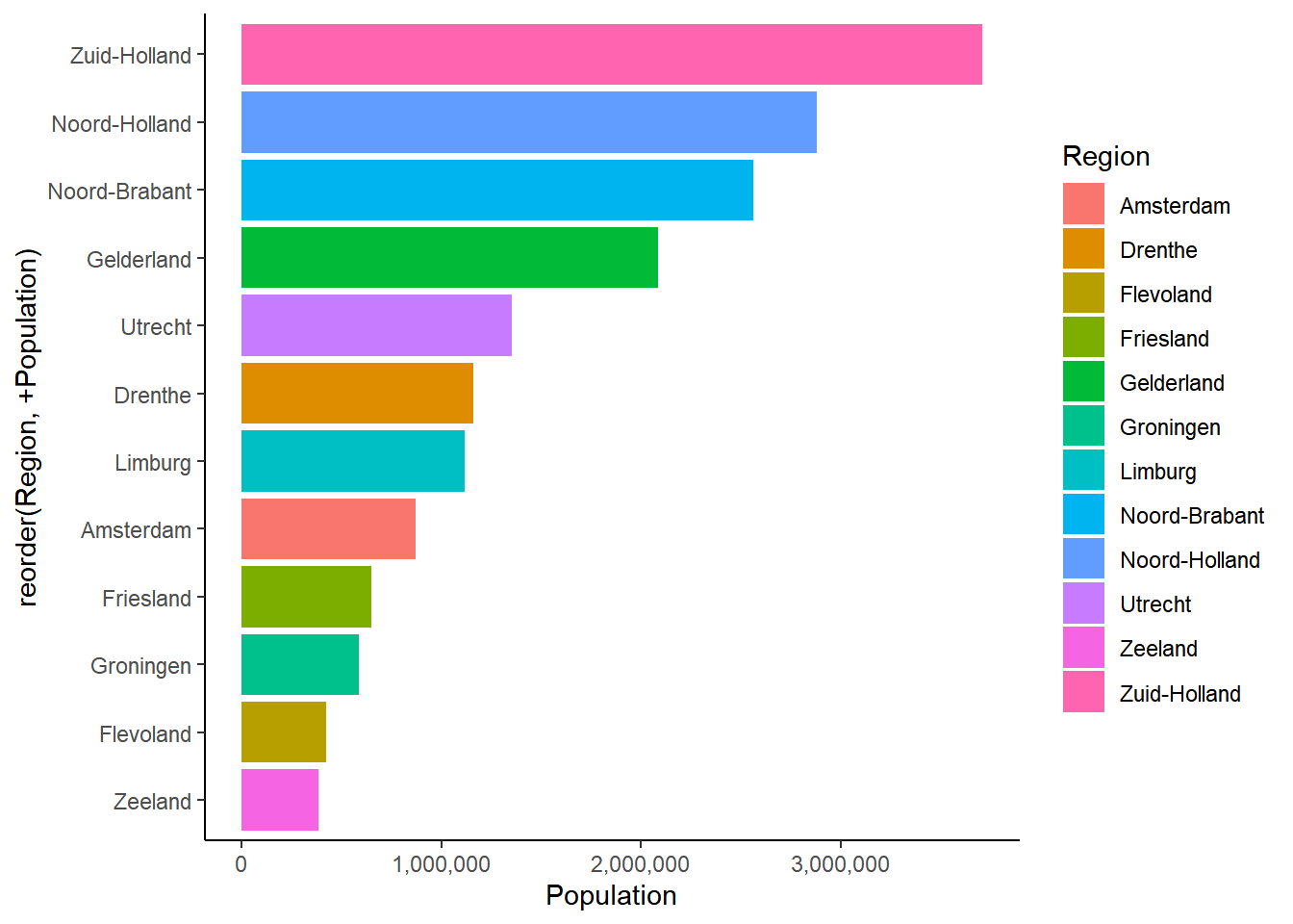
Now we have a white background instead of a gray one.
Besides theme_bw(), there are also other themes we can choose from such as theme_minimal(), theme_classic(), theme_gray() and theme_light(). You should try out different themes and choose the one that fits your style and visualization.