Session 10 Time for Fun
Data visualisation is a lot of work. Most of this work usually takes place ‘behind the scenes’ or ‘out of sight’ and involves importing, tidying and manipulating data. In this session we will look at one package that is not always necessary for data visualisation but is fun to use and makes our plots far more ‘social-media worthy.’
I also highlight the esquisse package which is a nice helper for you to use with your new and improved ggplot2 skills.
10.1 gganimate
Sometimes a static plot just feels so… dull. Humans are a visual species and our brains are wired to recognise and appreciate movement/change. This is where gganimate comes in.
An animated visualisation is not needed in every setting but in the right setting it can be exactly what you need to get a viewer’s attention. It’s also just fun!
We are going to animate two of the plots we made earlier in the course so that you can use the code as a springboard to greater heights of animation prowess.
10.1.1 Why did we stop sampling?
In the first animation, we will look at our reptiles data in an entirely new way. We are going to look at the cumulative numbers of lizards and snakes caught throughout the survey, and highlight the increase in the numbers of captures (evident in the increased slope of the line) in the month before we stopped surveying.
# Load our R environment with the necessary packages
library(tidyverse)
library(gganimate)
library(here)

# Import the data
reptiles <- read_csv(here("data/reptiles_tidy.csv"))

# Prepare the data (using an intricate dplyr chain)
rep_sum <- reptiles %>%
  group_by(date, rep_type) %>%
  count(name = "rep_day") %>%
  arrange(rep_type) %>%
  ungroup() %>%
  group_by(rep_type) %>%
  mutate(sum_time = cumsum(rep_day))

# Prepare the static plot
plot1 <- rep_sum %>%
  ggplot(aes(x = date, y = sum_time)) +
  geom_line(aes(colour = rep_type), size = 1.2) +
  labs(
    title = "Cumulative Number of Reptiles Captured",
    x = NULL,
    y = "Reptiles Captured",
    colour = "Type"
  ) +
  scale_x_date(
    date_breaks = "1 week",
    date_labels = "%d %b %y",
    date_minor_breaks = "2 days"
  ) +
  scale_colour_manual(
    labels = c("Lizard", "Snake"),
    values = c("#1e32c7", "#c7b01e")
  ) +
  theme(
    axis.text.y = element_text(face = "bold"),
    axis.text.x = element_text(vjust = 0.5, angle = 90),
    legend.position = "top"
  )

# View it (and customise if desired)
plot1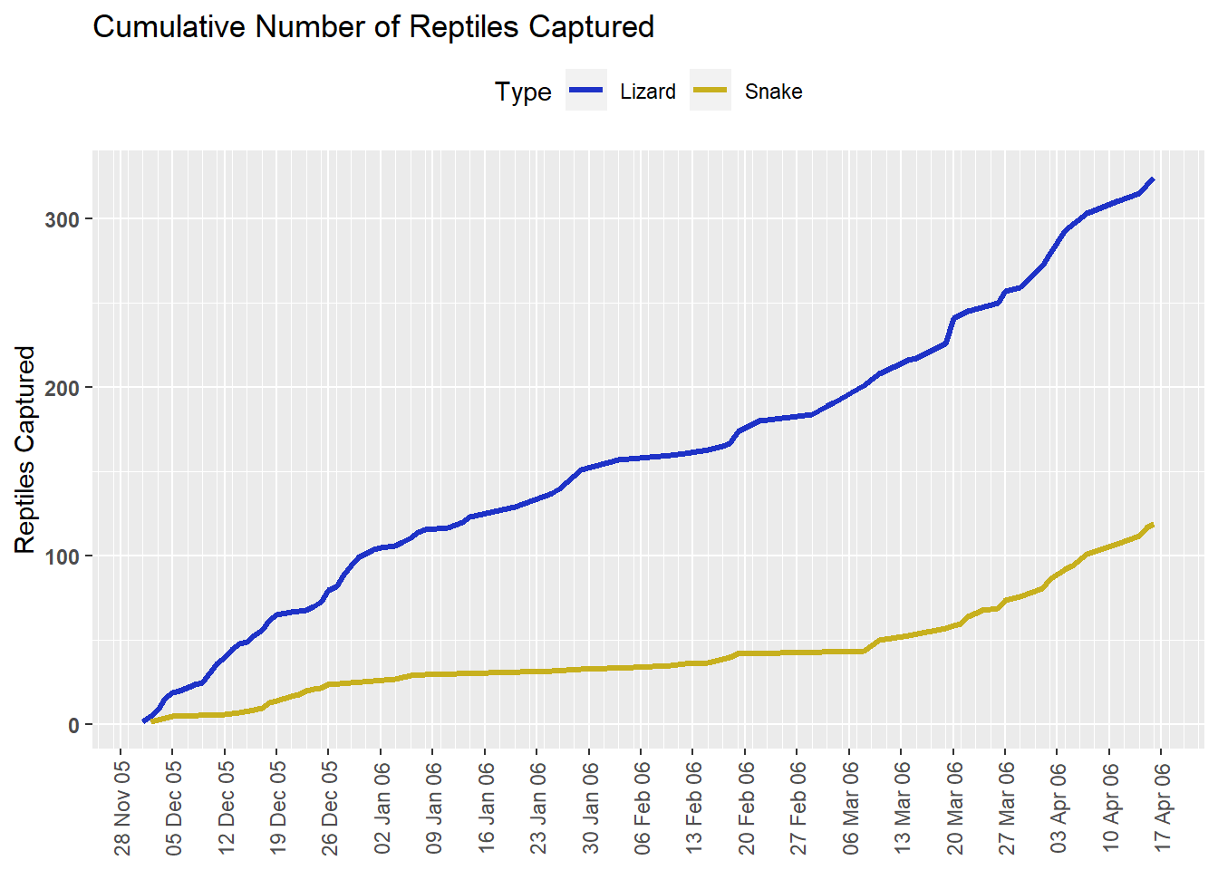
# Now let's animate the plot
rd_anim <- plot1 +
  transition_reveal(date) +
  labs(
    subtitle = "Date: {frame_along}"
  )

animate(rd_anim,
        height = 480,
        width = 600,
        duration = 15,
        end_pause = 25)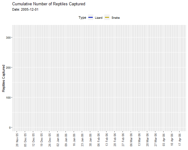
10.1.2 Elephants Galore
In this sescond animation we will be animating our choropleth map of Elephant counts from our earlier session. The plot is exactly like the one we made before, but without the facet-wrap function applied. Instead we will animate the map by year.
# Load the necessary packages
library(tidyverse)
library(here)
library(rnaturalearth)
library(rnaturalearthdata)
library(sf)
library(gganimate)

# Base map: world/Africa
africa <- ne_countries("small",
                       type = "countries",
                       continent = "Africa",
                       returnclass = "sf")

# Elephants data
elephants <- read_csv(here("data/elephants.csv")) %>%
  filter(year > 2005 & year < 2016)


# First we need to aggregate our data
elephants_year <- elephants %>%
  group_by(country, year) %>%
  count(name = "count")

# Then we need to join our counts to our spatial data frame
ele_year_count <- elephants_year %>%
  left_join(africa,
            # Specify the column that is common to both objects
            by = c("country" = "admin")) %>%
  # Convert the grouped_df/tbl to and sf object
  st_as_sf()

plot2 <- ggplot(
  data = africa
  ) +
  geom_sf(fill = "antiquewhite") +
  # We can add an ENTIRELY new data set inside a geom
  geom_sf(data = ele_year_count,
          aes(fill = count)) +
  theme(panel.grid.major = element_line(color = gray(.5),
                                        linetype = "dashed",
                                        size = 0.5),
        panel.background = element_rect(fill = "aliceblue")) +
  labs(
    title = "Recent Elephant Records"
  ) +
  coord_sf(xlim = c(5, 45), ylim = c(-40, 5)) +
  # We also choose two colours across which the scale will vary
  scale_fill_gradient(low = "yellow",
                      high = "red",
                      na.value = NA)

plot2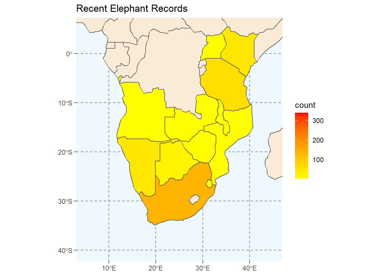
# Add animation
ele_anim <- plot2 +
  transition_manual(year) +
  labs(
    subtitle = "Year: {current_frame}"
  )

ele_anim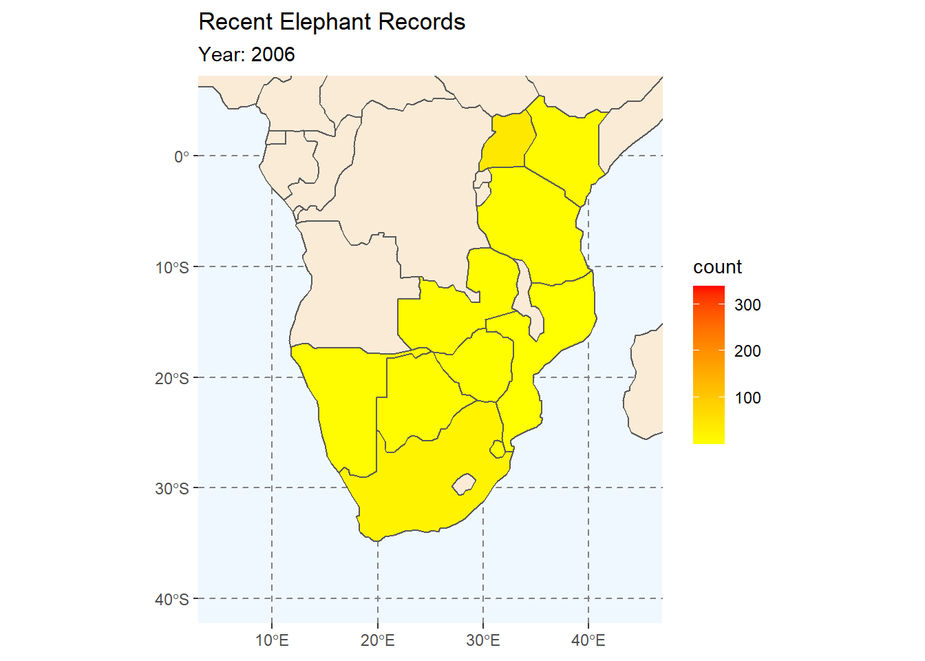
For a deeper appreciation of the options and more code examples using gganimate, read the vignette here: https://gganimate.com/
10.2 esquisse
As demonstrated in Session 9, the esquisse package is a great way to build a ggplot2 visualisation interactively. The package allows you to create a visualisation using a ‘drag-and-drop’ interface in a shiny gadget.
Some of the benefits of using esquisse include:
1. Quickly visualise different components of your data, 2. Customise various plot options with mouse-clicks and a GUI, 3. Extract the auto-generated plot code to R scripts for reproducibility, 4. Learn new code arguments to add to your ggplot2 skills.
To work with the esquisse package:
# Install esquisse
install.packages("esquisse")

# Load the package
library(esquisse)

# Call the interactive window in your web browser using:
esquisser(viewer = "browser")
10.3 Next Steps
ggplot2 is - and will continue to be for the foreseeable future - one of the most valuable packages available to researchers/data analysts in R. There are incredible ggplot2 resources freely-available online, which will make your journey with ggplot2 very smooth.
You may soon be asking: “What steps should I be looking to take to improve my use of ggplot2?”
My advice is:
10.3.1 Keep using ggplot2!
In my experience, using ggplot2 consistently is a sure path to improvement. Learning is practice and experimentation. I enjoy working on my own interests and visualising them, but I will also run other people’s code that I find online and read it for tips and tricks.
10.3.2 Read the documentation
The documentation of code can be scary at first, but it is an incredible resource for quick solutions to issues you may need to deal with. There is the documentation within R, with its minimalist formatting, and there is also documenation of many functions online that may be more appealing to you as you try to understand a function.
For example, you can find the documentation for dplyr::mutate() along with some worked examples online here: https://dplyr.tidyverse.org/reference/mutate.html.
This is true of any of the functions in the Tidyverse.
10.3.3 Don’t be afraid to try something and fail.
There is always something more that can be learned, but don’t let this deter you. Start where you are, but keep trying to improve your understanding of ggplot2 with each visualisation you make. Try and customise one thing that you never have before. Perhaps you even want to try to make your own custom theme to use on a website. I mentioned that ggplot2 is like Lego, which means that the main difference between building a 10-piece house or building a 4000-piece, life-size dog, is ambition (+time).
10.3.4 Lower the stakes!
This may seem counter-intuitive after the previous paragraph, but I added it specifically because I want to remind you that not all data visualisations are good because they are fancy. This is particularly relevant to visualisations that you publish.
Remember to differentiate between the message and ‘packaging’ of the visualisation. In many cases, you could do more customising of the plot, but if you don’t have time - that’s ok. Remember that you won’t always be present to explain your visualisation, so prioritise making it clear rather than fancy.
If you want to get an idea of ‘dataviz in the real world,’ here is a great talk from John Burn-Murdoch (from the Financial Times) in which he discusses the way that he and his team designed their most impactful COVID-19 data visualisation in 2020.
10.3.5 Join in the fun of #tidyTuesday on Twitter
Every week, the tidytuesday package is updated with a new dataset. If you install, and update it, you can play with any of the datasets and create visualisations that you can share online with the #tidyTuesday. The #Rstats community on Twitter is undeniably one of Twitter’s redeeming features because the community is full of encouraging, supporting and helpful people. Join in the fun if you have the time.
There are many other ways to keep learning and if these don’t work for you, please do try out different ideas and use the ones that work for you.
In all of the above, I haven’t even mentioned the benefits of learning the Tidyverse and the impacts this will have on your data management and ‘fluency’ (aka ability to work with it in any setting).
10.4 Farewell
Let me end by saying “Thank you for your participation in the Data Visualisation for Conservation course!” I have thoroughly enjoyed the time spent preparing the course and the interactions that we have had during the times. I hope that you have gained skills that you will use or share in the future. We are all better at this together.
Happy Data Visualising!