Session 7 Space Adventures
This session we are going to be looking at how ggplot2 can be extended to work with spatial data. Spatial data is obviously an entire data topic of its own and so we will cover some general and reproducible methods with which you can create maps and visualisations with your data.
The caveat here is that there are many kinds of ways that errors can arise when working with spatial data. If you are going to attempt to produce visualisations of spatial data, you will need patience.
7.1 Packages We Need
Spatial data is handled by an entire ecosystem of R packages. The Task View: Analysis of Spatial Data (on CRAN) gives you a good idea that we are working with data that comes in many formats and is handled in many ways.
For this session, make sure you have installed the following packages:
# Packages we will need for this session
install.packages("rnaturalearth", "rnaturalearthdata", "rgeos", "sf")
7.2 Data: elephants
If you haven’t already done so, copy the elephants.csv file from the data-files channel in Discord into your data folder.
The data in elephants.csv come from the Global Biodiversity Information Facility (GBIF). The GBIF is an international collaboration between the world’s governments, which aims to make information about all forms of life on earth available to everyone.
Data can be downloaded in various ways, including from inside an R workspace. I used the rgbif package to request the 5000 most-recent, south of the Equator, records of the African Elephant (Loxodonta africana) found in the GBIF database (exported on 14 July 2021). We won’t all be doing this because it involves downloading from the GBIF server, and it supplies the data in a format that is cluttered with database information that we don’t need. I tidied the GBIF data, and exported it to elephants.csv for use in the class today.
# Load our trusty Tidyverse and here packages
library(tidyverse)
library(here)

# Import the elephant data set
elephants <- read_csv(here("data/elephants.csv"))
Have a look at the data in the elephants object using either View, glimpse or the Rstudio Environment pane.
7.3 Spatial Data in R
As already mentioned earlier, there are many R packages for working with spatial data. The ones I have selected here are just the ones that help me produce the maps I need for the session today, they are not in any way the best packages for spatial data workflows. All packages have strengths and weaknesses.
# Load the packages necessary for our maps today
library(rnaturalearth)
library(rnaturalearthdata)
library(sf)

# Create an object with the world data from rnaturalearth
world_map <- ne_countries(scale = "small", returnclass = "sf")
class(world_map)
## [1] "sf" "data.frame"Here we see that the world_map object has a class named "sf". This stands for “simple features,” which is a method for storing spatial data. For our purposes today we will be using data in “simple features” format, but there are many other kinds and there are R packages that work with them. The take home message here is: “Always check the class of your spatial data frames!”. Knowing that your data are in an expected spatial format will save you a lot of trouble/time debugging code.
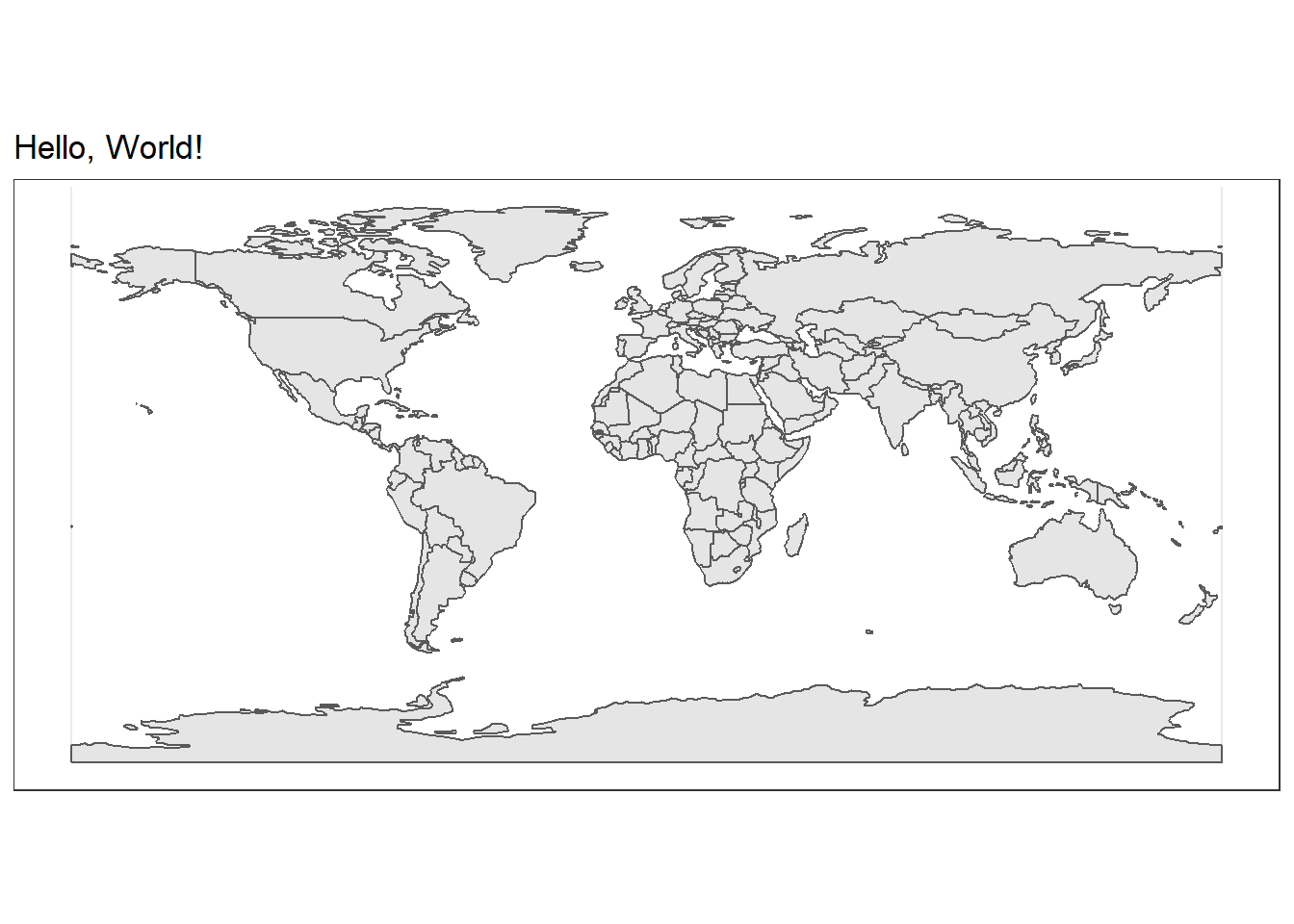
Let’s see what a ggplot of this world_map looks like.
# Set the theme of our ggplot2 objects for this session
theme_set(theme_bw())

# The ggplot call is normal
ggplot(data = world_map) +
  # But we use a new geom provided by the sf package
  geom_sf() +
  labs(
    title = "Hello, World!"
  )
That’s a great start! Now let’s add our elephant data to this map. We will use the familiar geom_point function.
# Plot our map of the world
ggplot(
  data = world_map
  ) +
  geom_sf() +
  # We can add an ENTIRELY new data set inside a geom
  geom_point(data = elephants,
             aes(x = lon,
                 y = lat),
             size = 0.3,
             alpha = 0.1,
             colour = "blue") +
  labs(
    title = "Hello, elephants!"
  )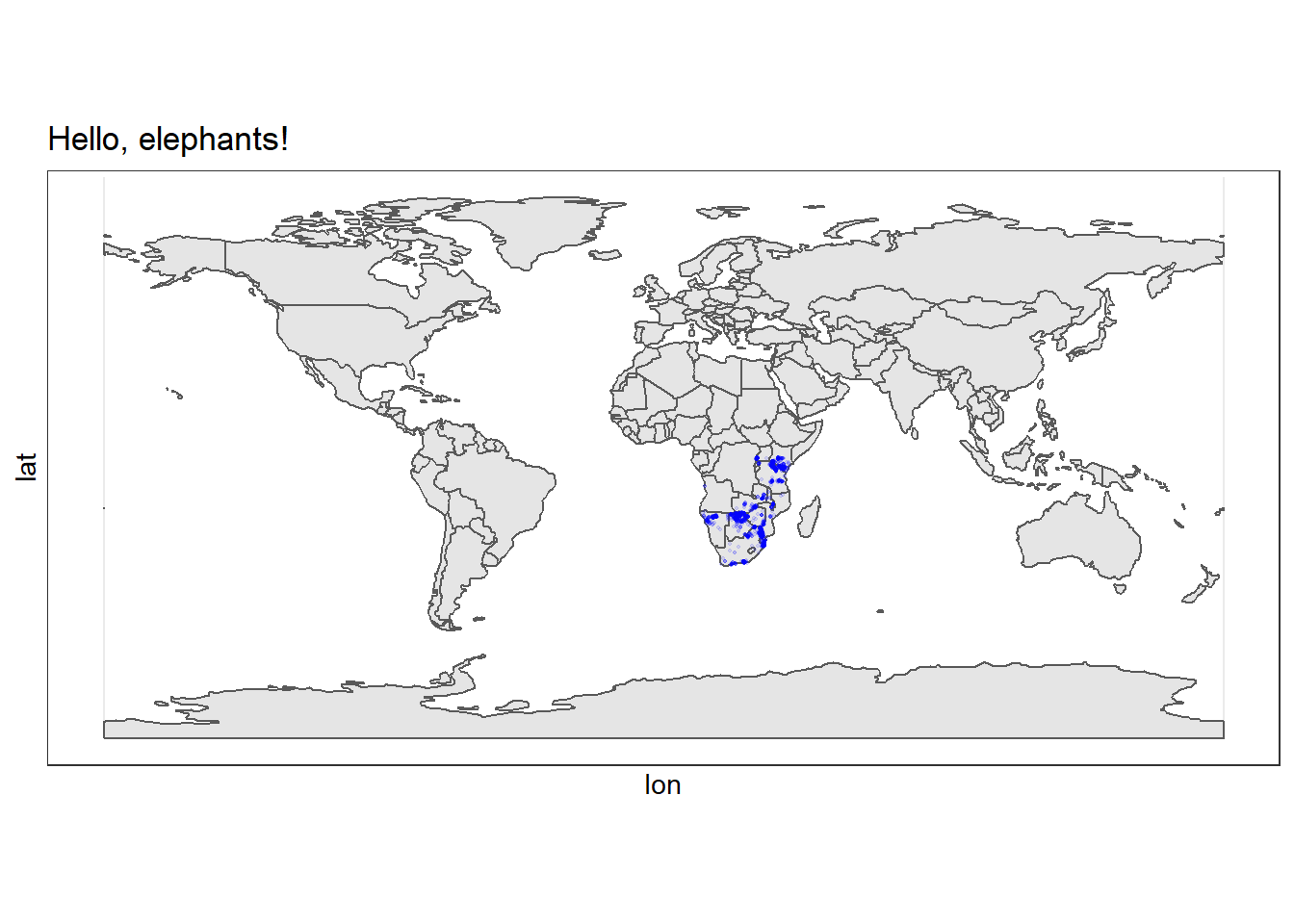
Excellent! We can see that all our records come from the African continent, and mostly from eastern and southern Africa.
The problem is the we have plotted all the countries of the world which makes the data harder to see. Let’s zoom in a little.
There are two ways to do this: 1. Select all African countries from the world_map object. 2. Specify the zoom using the coord_sf function.
7.3.1 Selecting the African Continent
Let’s take the first approach mentioned above and extract only the spatial data for African countries.
# Select just the continent of Africa
africa <- world_map %>%
  filter(continent %in% "Africa")
It is very handy to be able to use our dplyr function on the data!
Now let’s plot the same map as above but we will use data = africa.
# Plot the continent of Africa
ggplot(
  data = africa
  ) +
  geom_sf() +
  # We can add an ENTIRELY new data set inside a geom
  geom_point(data = elephants,
             aes(x = lon,
                 y = lat),
             alpha = 0.1,
             colour = "blue") +
  labs(
    title = "Recent Elephant Records",
    subtitle = "Data from South of the Equator"
  )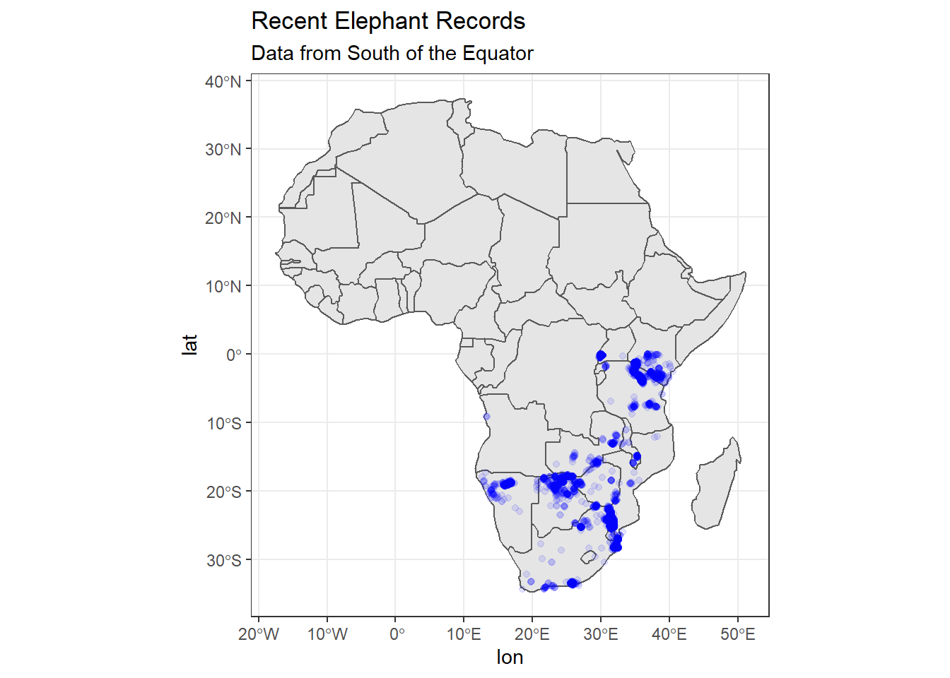
This is better, but we only have data from south of the equator, which means we are ‘wasting’ space in our plot if we don’t zoom in further. Let’s try method 2 mentioned above.
7.3.2 From sf: coord_sf
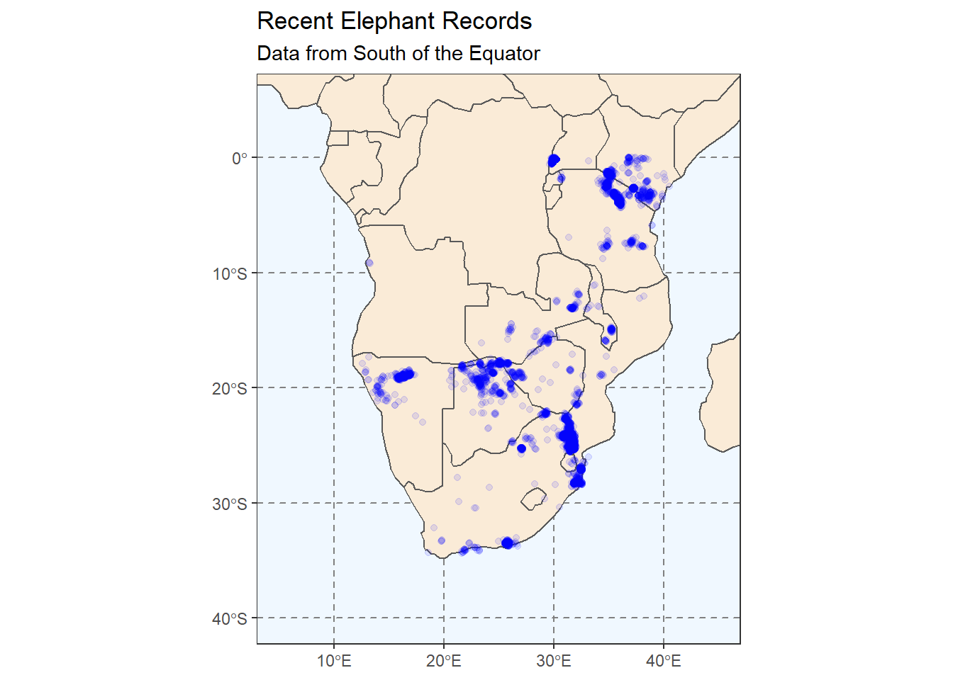
One of the many useful functions in sf is the coord_sf function which allows us to specify a custom ‘lat-long’ range for our plot. This is what we will do below (as well as add some touch-ups to the appearance of the plot). To show that this method is different to modifying your dataframe, we will use the world_map data and then zoom in.
# Change the plot axes (zoom) using the coord_sf function
ggplot(
  # We use world_map not africa here to show it works
  data = world_map
  ) +
  geom_sf(fill = "antiquewhite") +
  # We can add an ENTIRELY new data set inside a geom
  geom_point(data = elephants,
             aes(x = lon,
                 y = lat),
             alpha = 0.1,
             colour = "blue") +
  theme(panel.grid.major = element_line(color = gray(.5),
                                        linetype = "dashed",
                                        size = 0.5),
        panel.background = element_rect(fill = "aliceblue")) +
  labs(
    title = "Recent Elephant Records",
    subtitle = "Data from South of the Equator"
  ) +
  # Zoom in to a specific view
  coord_sf(xlim = c(5, 45),
           ylim = c(-40, 5))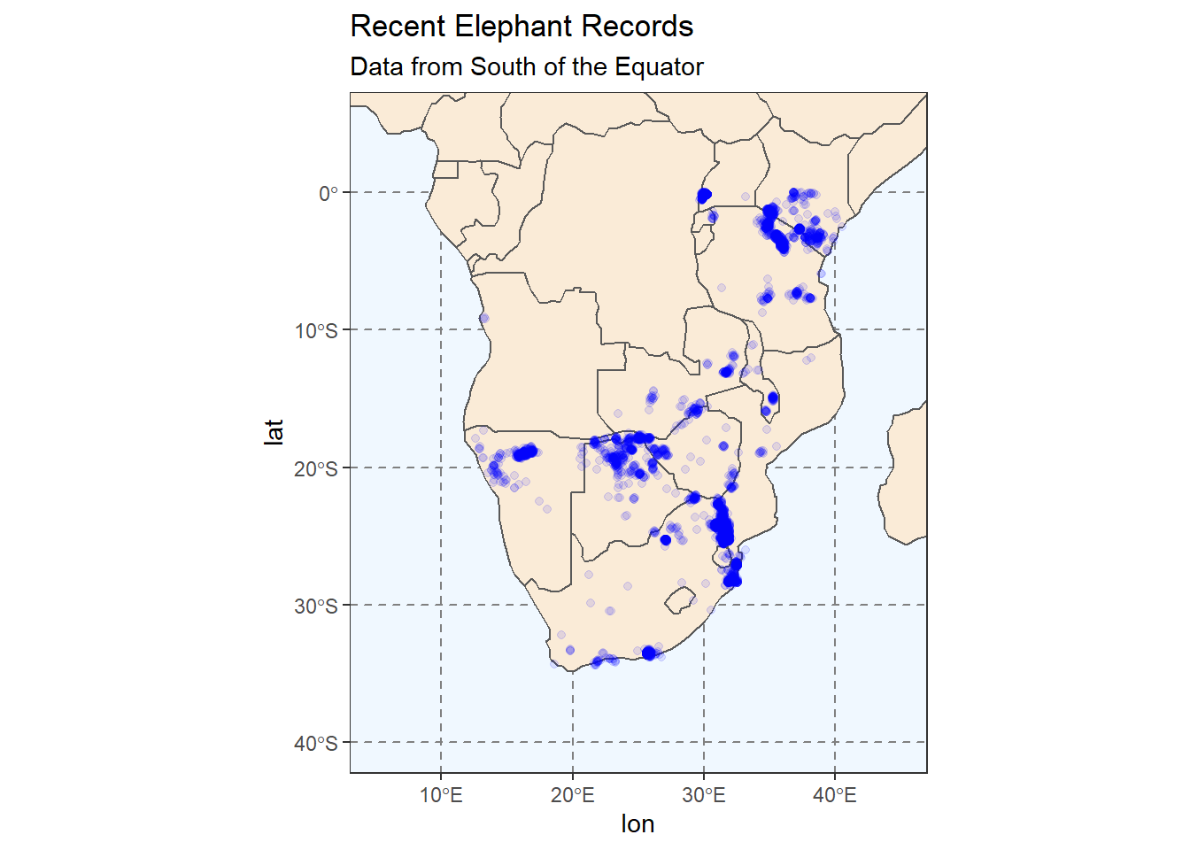
7.4 Choropleth Maps
A choropleth map is one that you will recognise when you see it. A choropleth map is one that has a data aesthetic mapped to an area e.g., country.
Figure 3.4: Image by Wikipedia
In our last section of this session we are going to create a choropleth map of elephant records per country.
# We will do some dplyr work prior our plot
# I find this code is simpler to understand than
# performing all manipulation within ggplot2

# First we need to aggregate our data
elephants_year <- elephants %>%
  group_by(country, year) %>%
  count(name = "count")
So far so familiar. We have counted the number of observations/rows in each country and year. The resulting tibble has three variables and 162 observations. In the count variable we can see the number of elephant records from the relevant country and year.
# Then we need to join our counts to our spatial data frame
ele_year_count <- elephants_year %>%
  left_join(africa,
            # Specify the column that is common to both objects
            by = c("country" = "admin")) %>%
  # Convert the grouped_df/tbl to and sf object
  st_as_sf()
The left_join function used above is one of a group of very useful *_join functions in dplyr. Understanding joins can be challenging so for today, just know that we are merging the data in two objects using a variable found in both of them. In our case, the africa object contains a list of country names in the variable admin so we are joining the two objects using elephants$country and africa$admin.
# Now we can plot the counts of elephant records per country
ggplot(
  data = africa
  ) +
  geom_sf(fill = "antiquewhite") +
  # We can add an ENTIRELY new data set inside a geom
  geom_sf(data = ele_year_count,
          aes(fill = count)) +
  theme(panel.grid.major = element_line(color = gray(.5),
                                        linetype = "dashed",
                                        size = 0.5),
        panel.background = element_rect(fill = "aliceblue")) +
  labs(
    title = "Recent Elephant Records",
    subtitle = "Data from South of the Equator"
  ) +
coord_sf(xlim = c(5, 45), ylim = c(-40, 5)) 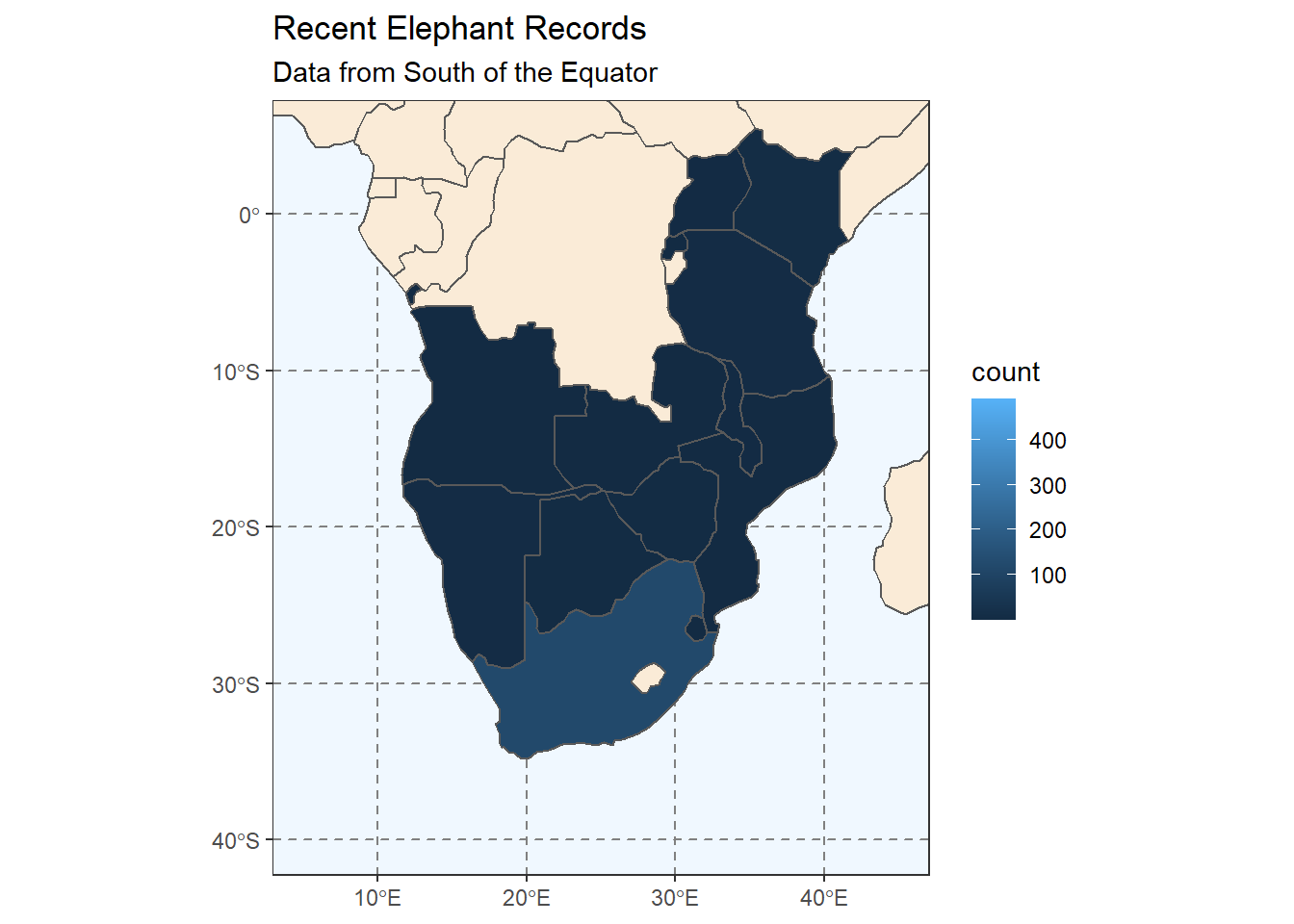
Hmm, that’s not quite what we’re going for. We want to see a plot for each year. Which set of ggplot functions do we need to use?
ggplot(
  data = africa
  ) +
  geom_sf(fill = "antiquewhite") +
  # We can add an ENTIRELY new data set inside a geom
  geom_sf(data = ele_year_count,
          aes(fill = count)) +
  theme(panel.grid.major = element_line(color = gray(.5),
                                        linetype = "dashed",
                                        size = 0.5),
        panel.background = element_rect(fill = "aliceblue")) +
  labs(
    title = "Recent Elephant Records"
  ) +
  coord_sf(xlim = c(5, 45), ylim = c(-40, 5)) +
  # We haven't used facet_wrap before this
  facet_wrap(vars(year)) +
  # We also choose two colours across which the scale will vary
  scale_fill_gradient(low = "yellow",
                      high = "red",
                      na.value = NA)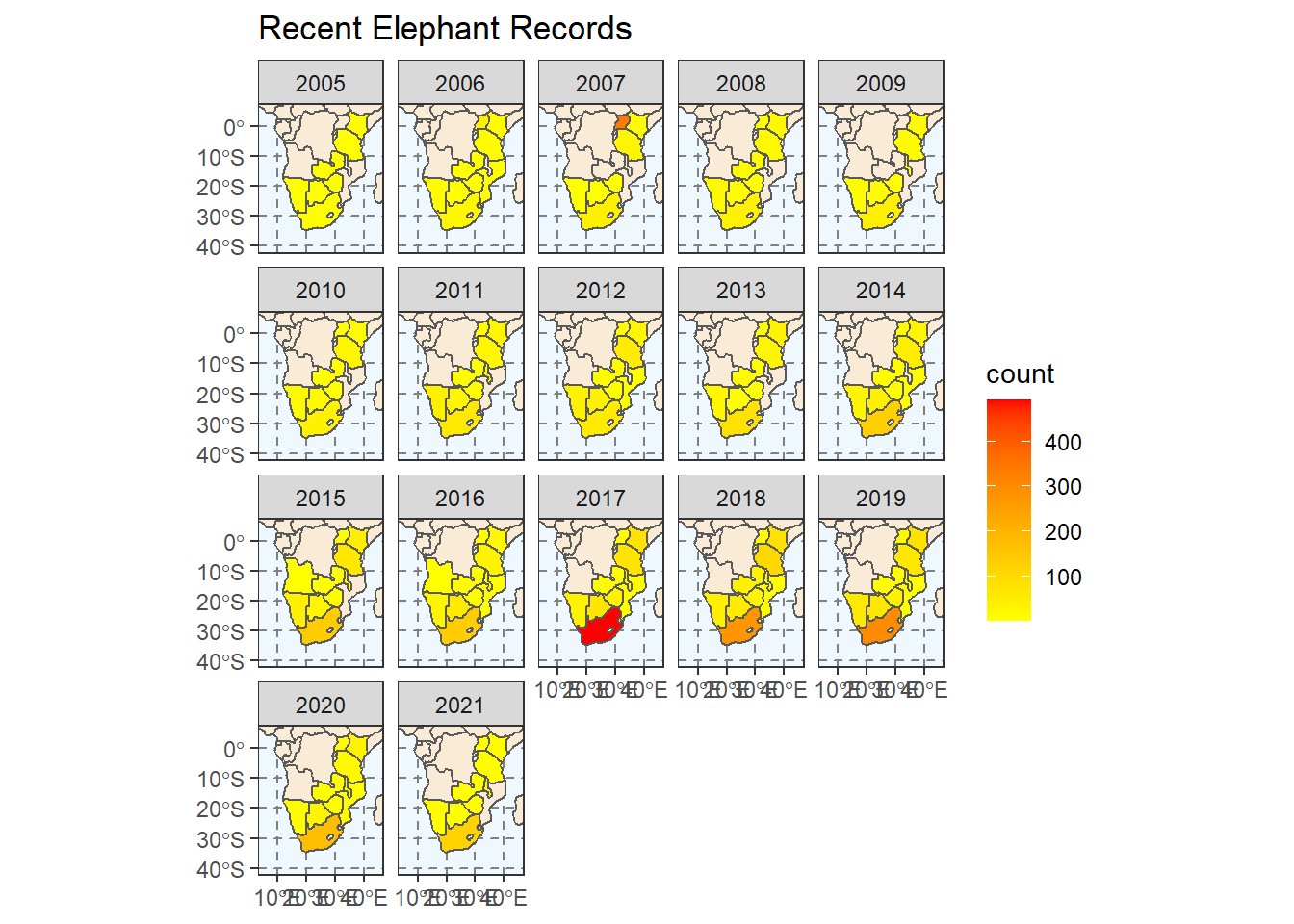
Congratulations! You have made a choropleth map using R.
That is our session on spatial data complete! There are many new things to pay attention to here and I could not cover all of them in detail given the time available.
7.5 Exercises
Add a caption to either of the scatter plots of elephant records. The caption should read: “Data extracted from GBIF (July 2021).” Change the titles of the
xandyaxes.Change the
xlimandylimarguments incoord_sfso that the plot is centered on:Botswana
Around Tanzania and Kenya.
Produce a plot of counts per year (from our
ele_year_countobject) that only shows the following years:- 2016 - 2020
- 2005, 2009, 2012, 2015, 2018
Make a plot showing the mean number of records submitted to GBIF from each country in each month of the year. (Hint: the final visualisation should have one plot for each month)
Spend time changing
themeelements in any of the faceted data visualisations.For example change the font colours, sizes and orientation.
Or change the
strip.backgroundcolour etc.
7.6 Bonus: Converting elephants to an sf object
In our scatter plot above, we mapped the x and y aesthetics manually. In some cases this will be ok, and for the purpose of the session I used this method to make the code more explicit and easier to understand.
The correct way to work with spatial data though, is to understand that you need to have the capacity to change the projection of the data as needed.
The code below shows you how you can change the elephants object into an sf object (in this case with the WGS84 projection system).
# We can also let the sf package do extra work
# by changing elephants into an sf object
elephants_sf <- st_as_sf(elephants, coords = c("lon", "lat"),
                      crs = 4326, agr = "constant")

ggplot(
  # We use world_map not africa here to show it works
  data = world_map
  ) +
  geom_sf(fill = "antiquewhite") +
  # We can add an ENTIRELY new data set inside a geom
  # Because we are using elephants_sf, we use GEOM_SF
  geom_sf(data = elephants_sf,
          alpha = 0.1,
          colour = "blue") +
  theme(panel.grid.major = element_line(color = gray(.5),
                                        linetype = "dashed",
                                        size = 0.5),
        panel.background = element_rect(fill = "aliceblue")) +
  labs(
    title = "Recent Elephant Records",
    subtitle = "Data from South of the Equator"
  ) +
  # Zoom in to a specific view
  coord_sf(xlim = c(5, 45),
           ylim = c(-40, 5))