Session 4 The Basics
In the previous two sessions we covered the theory behind both ggplot2 and tidy data/manipulation using dplyr. The goal for the remainder of this course is for you to ‘learn by doing.’ What this means is that I will not always explain each detail of the code we use so please ask questions if anything is not clear to you.
4.1 Visualisation Stories
For this session we are going to iterate a variety of visualisations using some data my colleagues and I collected in 2005/6. The paper we published on this dataset can be found here: Masterson et al. (2009).
4.1.1 The Data
Between 01 December 2005 and 16 April 2006, my colleagues and I sampled the reptile diversity in the grasslands near Johannesburg, South Africa. The raw data we collected can be found in reptiles.csv, which should be located in your DVC_2021/data folder. Let’s import it and inspect it.
To import the data we will be visualising, we need the readr package. The readr package is part of the ‘Tidyverse’ and so it does not need to be installed - it must only be loaded into memory using the library() function. We also need the here package for the reasons I discussed in the ‘Welcome’ chapter.
# Load the Tidyverse into your R workspace
library(tidyverse)
library(here)

# Import the data using the `here` package
# and `read_csv` from the `readr` package (Tidyverse)
reptiles_raw <- read_csv(here("data/reptiles.csv"))

# Open the data frame to inspect it
View(reptiles_raw)

# You can also use `glimpse` function
# glimpse(reptiles_raw)
When I load any data into R, I inspect it to get a ‘feel’ for its composition.
- Did the import function work?
- How many variables (columns) does it have?
- How many observations (rows) are there?
- Does this match my expectations of the data?
- Is the data in ‘tidy’ format?
- How do I need to tidy/modify it?
In this case, the function has imported correctly, and the data appears to be structured in tidy format - except for one variable. Can you spot which one?
The other issue I can see is that we have two variables with the same names as the size and group aesthetics in ggplot2. Let’s rename these quickly to remove any ambiguity.
# We create a new object in a new name to remind us that it
# is different from the raw data. This is a good habit
# for improving reproducibility of your work.
reptiles <- reptiles_raw %>%
  rename(
    rep_size = size, # Remember: new_name = old_name
    rep_type = group
  )
4.2 Building A Series of Visualisations
My personal data analysis/visualisation workflow looks like this:
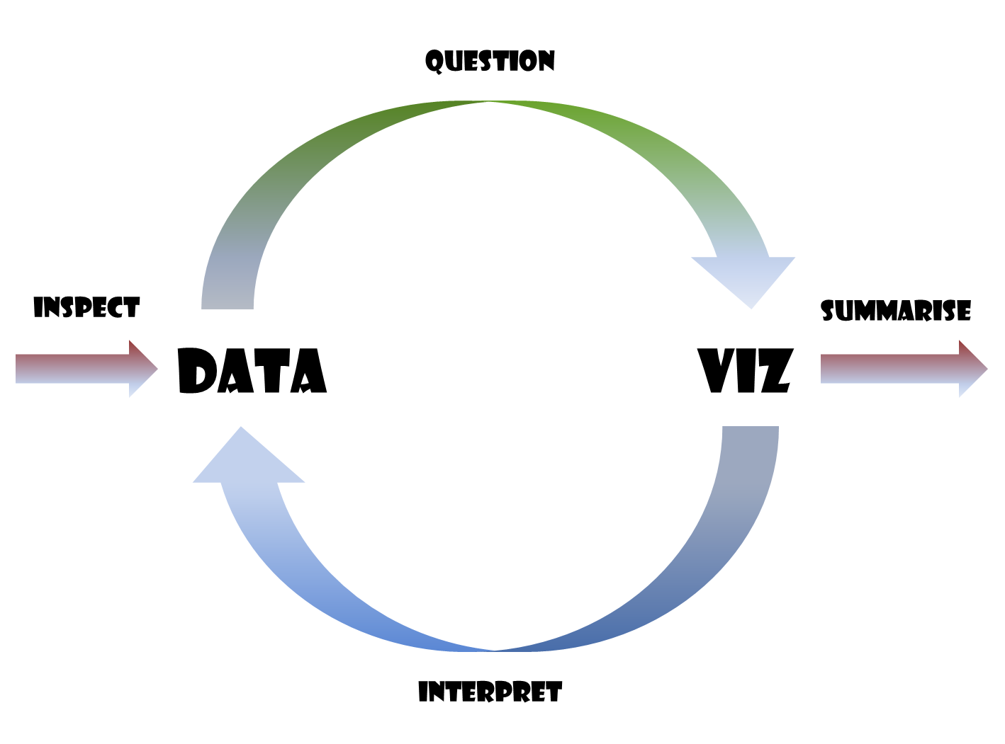
Typically, the first visualisation you will create is simple - like a scatter plot or bar plot etc. - and is based on what we initially want to understand about our data. Once we begin visualising our data, we then find ourselves with more questions than when we started. For example, we often start asking, “What is that outlier value?” or “Does the broad pattern hold for each group in our dataset?” In this way, the visualisation changes the questions we want to ask of our data, and usually leads to a modification of our existing visualisation or a new visualisation entirely. This ‘visualise-question-revisualise’ process can be repeated any number of times depending on the dataset in question.
4.3 Captures Over Time
Surveys of reptiles are difficult because reptiles want to avoid being seen/caught. In our survey, we used trap arrays (groups of traps with drift fences) to sample the locations we were interested in. We checked the traps daily. The first thing I am usually interested in is how successful the survey was. For simplicity’s sake, let’s visualise the number of reptiles captured per day throughout the survey period.
# Create a 'base' object to which we can add layers
cap_date <- reptiles %>%
  ggplot(
    aes(
      x = date
    )
  )

# The default stat for geom_bar is "count" so the function
# will count the number of observations in each group i.e., day
cap_date +
  geom_bar()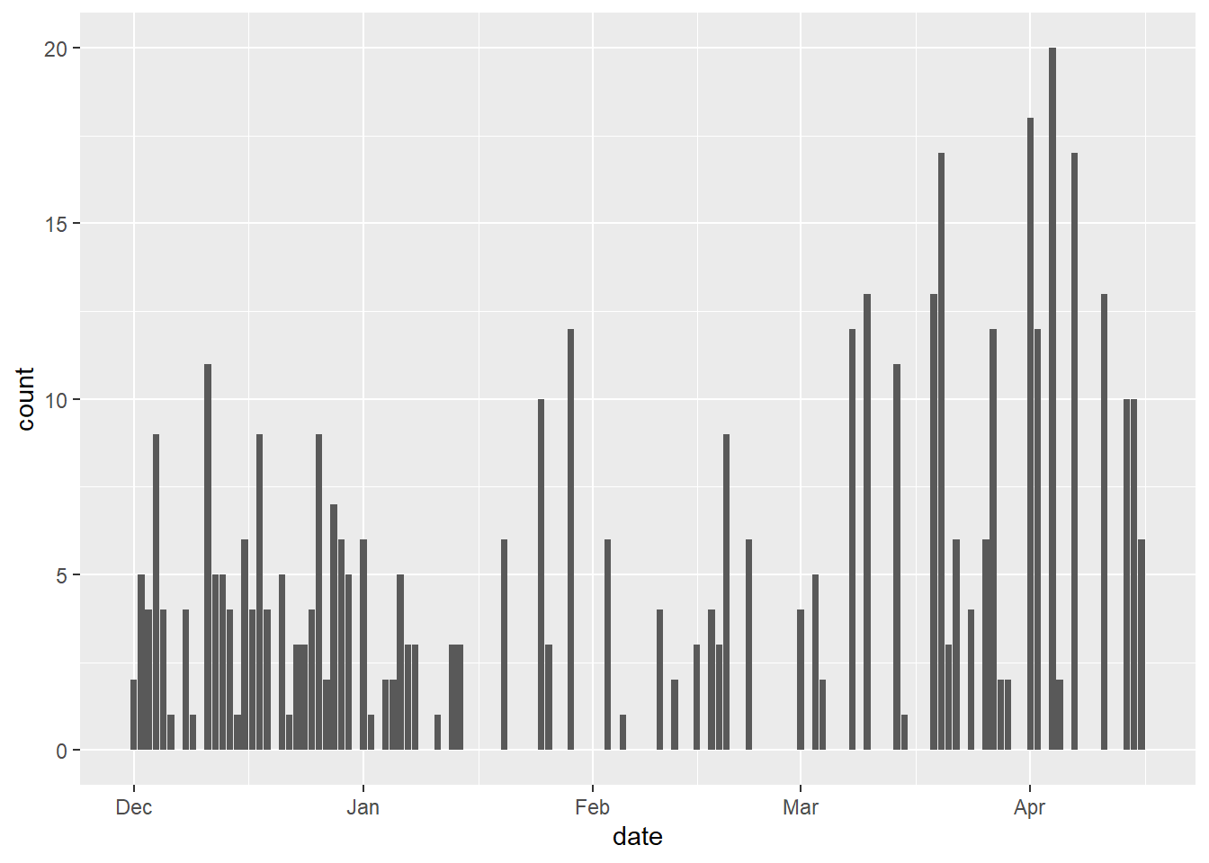
We see that there are many days of no captures and then some days when we captured 8 or more reptiles. The zero days are common because reptiles do not need to be active every day like mammals. The
I wonder if the majority of captures were lizards or snakes? Let’s see what proportion of each bar consists of either “lizard” or “snake” captures.
Below is the plot that we are going for. The code from our previous plot needs one change. Can you figure out how to create it? (Time: 2-3 mins)
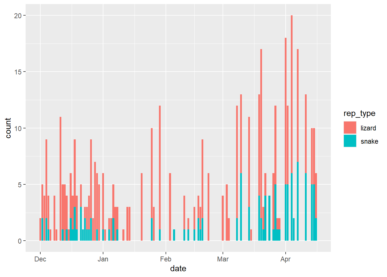
This is a helpful visualisation showing us that lizards typically make up the greater proportion of the reptile captures per day.
Let’s now discuss putting some finishing touches on the plot, such as a title and axis labels.
4.4 Custom Labels in ggplot2
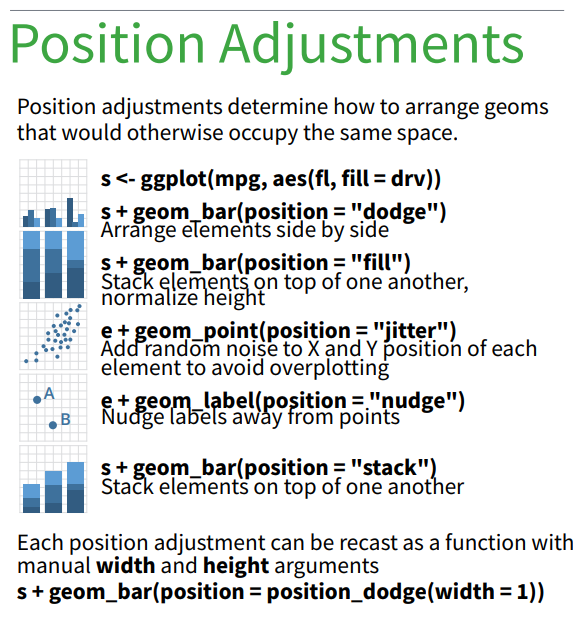
The simplest way to modify the labels in ggplot2 is using the labs function. Let’s revisit the ggplot2 Cheatsheet to learn the common use case of labs.
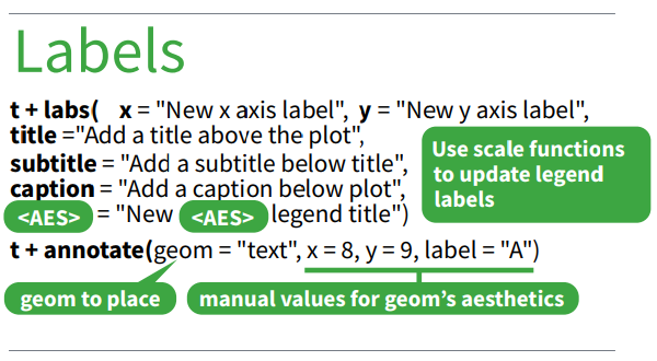
In the image above, t is a ggplot object to which we + labs(...) and specify the labels we want for our plot. We can even specify the title for our aes(...) components. Let’s try this for our bar plot.
# As mentioned previously, we can simply add the `ggplot2` functions
# to the plot object, which makes the sequence of changes/additions clearer
# We will update our plot1 object with the labels we add
plot1 <- plot1 +
  labs(
    title = "Total Reptile Captures per Day",
    subtitle = "Distinguished by the Type of Reptile Captured",
    x = "Date of Sampling",
    y = "Reptiles Captured",
    caption = "Daily sampling from 01 Dec 2005 to 16 Apr 2006",
    fill = "Type"
  )

# And then we view the updated `plot1` object
plot1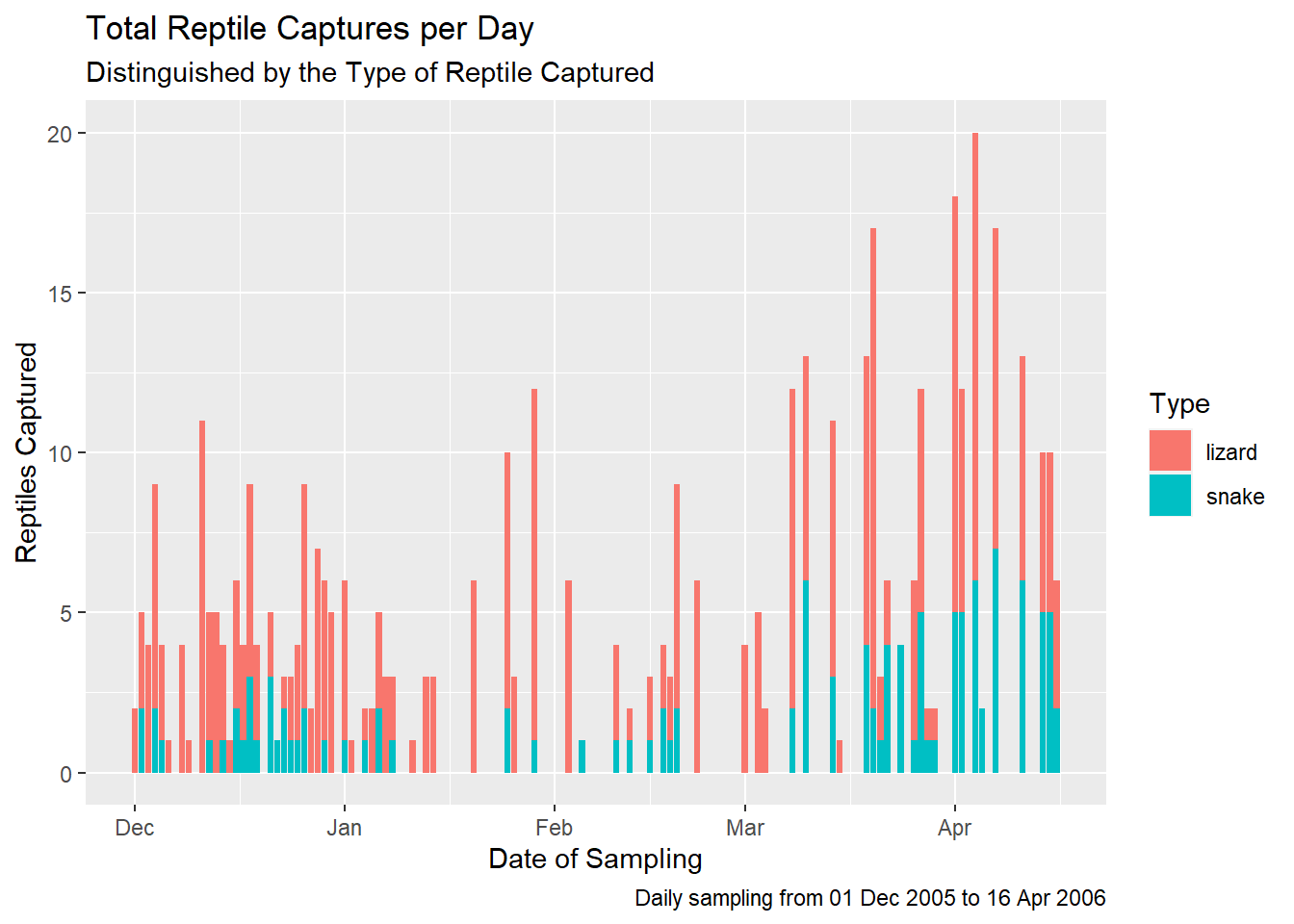
Everything worked as expected and we now have a plot which clearly communicates the data behind the plot and can be used on social media, a blog post or in an academic publication (with some journal-specific formatting).
4.5 Plot Themes
Now that we have added suitable labels to our plot, we can turn our attention to the plot theme. A theme in ggplot2 can be a little confusing at first because it is similar to the plot’s aes (aesthetics). The difference is that the theme elements of your plot are entirely cosmetic, while the aes depend on your data. The simplest example I can give you is the difference between the following code: aes(fill = rep_type) and fill = "red". The code modifies the same component of the plot, but the first code structure is an aesthetic while the second is a theme element.
If you are making simple plots which are just exploratory, the default theme supplied by ggplot2 is probably sufficient. However, when you want/need to give your visualisation some flair, you will want to use a distinctive theme.
There are several complete themes provided in ggplot2, which you can find by typing theme_ in the RStudio Console. A list of options will appear and you can choose the one you like. They are also included in the Cheatsheet.
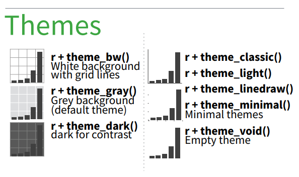
Try the different themes out now:
# Choose different pre-configured themes available in ggplot2
plot1 +
  theme_*()
You can also build an entirely custom ggplot2 theme. You might want/need to do this for academic publications or for a website etc., and you can find the list of modifiable plot components here: https://ggplot2.tidyverse.org/reference/theme.html.
Teaching the theme component of ggplot2 is complicated because there are so many potential element_*s to discuss. We will not be covering theme customisation in this course, but there are helpful online resources if you want/need to learn to make your own themes. There are also ggplot2 extensions such as the ggthemes package. ggthemes contains various theme sets which match the data visualisation styles of some famous publications e.g., The Economist or Wall Street Journal, as well as others.
# Install ggthemes if you do not have it already
# install.packages("ggthemes")

#Load the package
library(ggthemes)
plot1 +
  theme_economist()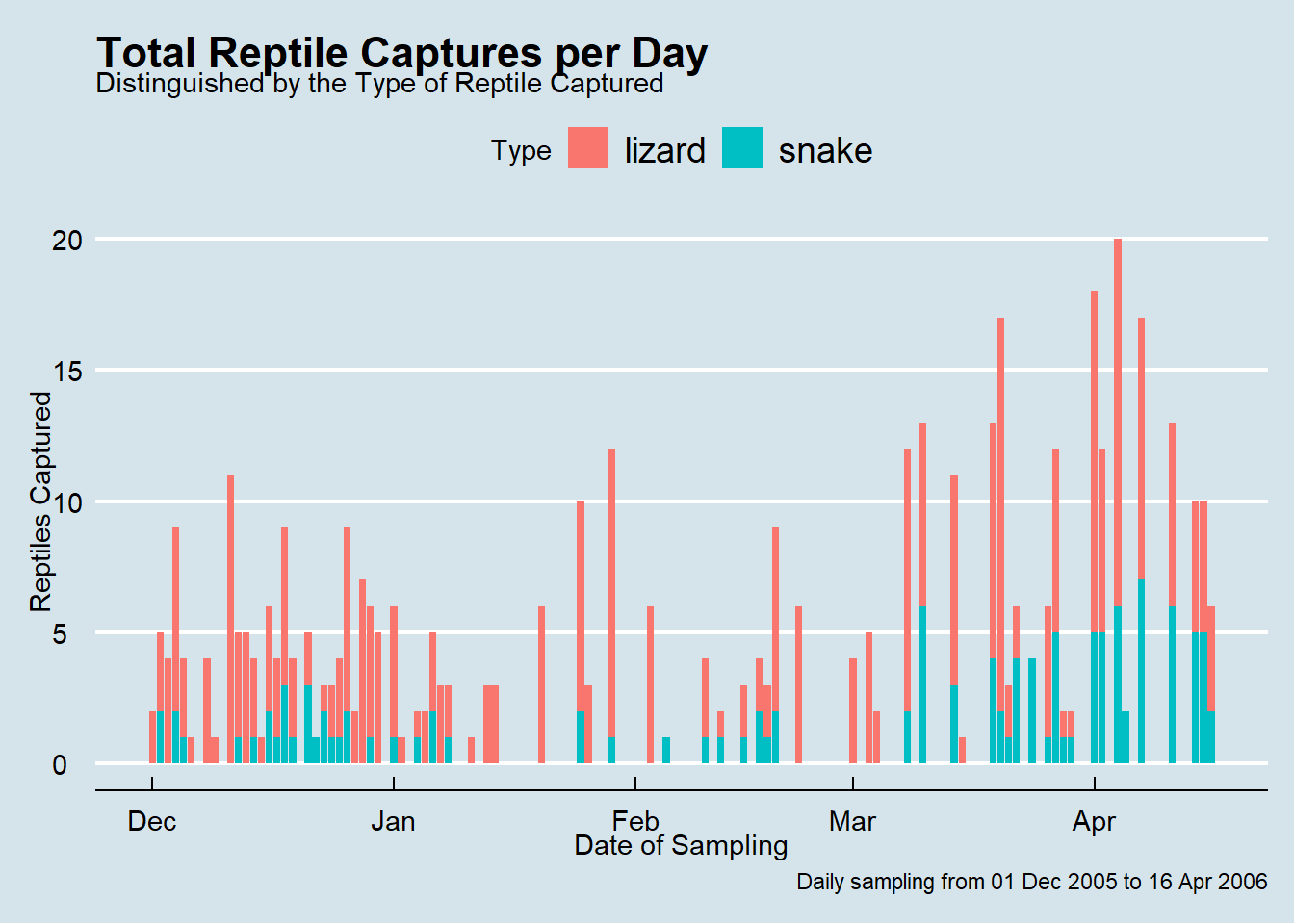
4.6 Lizard Species per Treatment
Let’s look at one of the key motivations of the study: understanding the effect of agriculture on reptile species ‘abundance’.
In the treatment variable we see three categories: modified, rehabilitated, and undisturbed. These categories refer to areas of grassland which were ploughed, ploughed-then-rehabilitated, or never-ploughed respectively.
For each lizard species, do the total numbers of captures vary across treatment type?
# Create a new plot object consisting of just the data for the lizard species
plot2 <- reptiles %>%
  filter(
    rep_type %in% "lizard"
  ) %>%
  ggplot(
    aes(
      x = treatment
    )
  )
plot2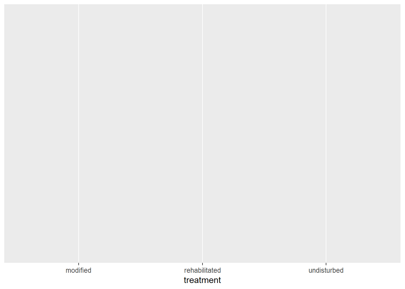
This looks good. Now we need to add our geom. Let’s use geom_bar again.
# We add the geom_bar layer to ggplot and fill the bars/counts
# with a colour for each lizard species
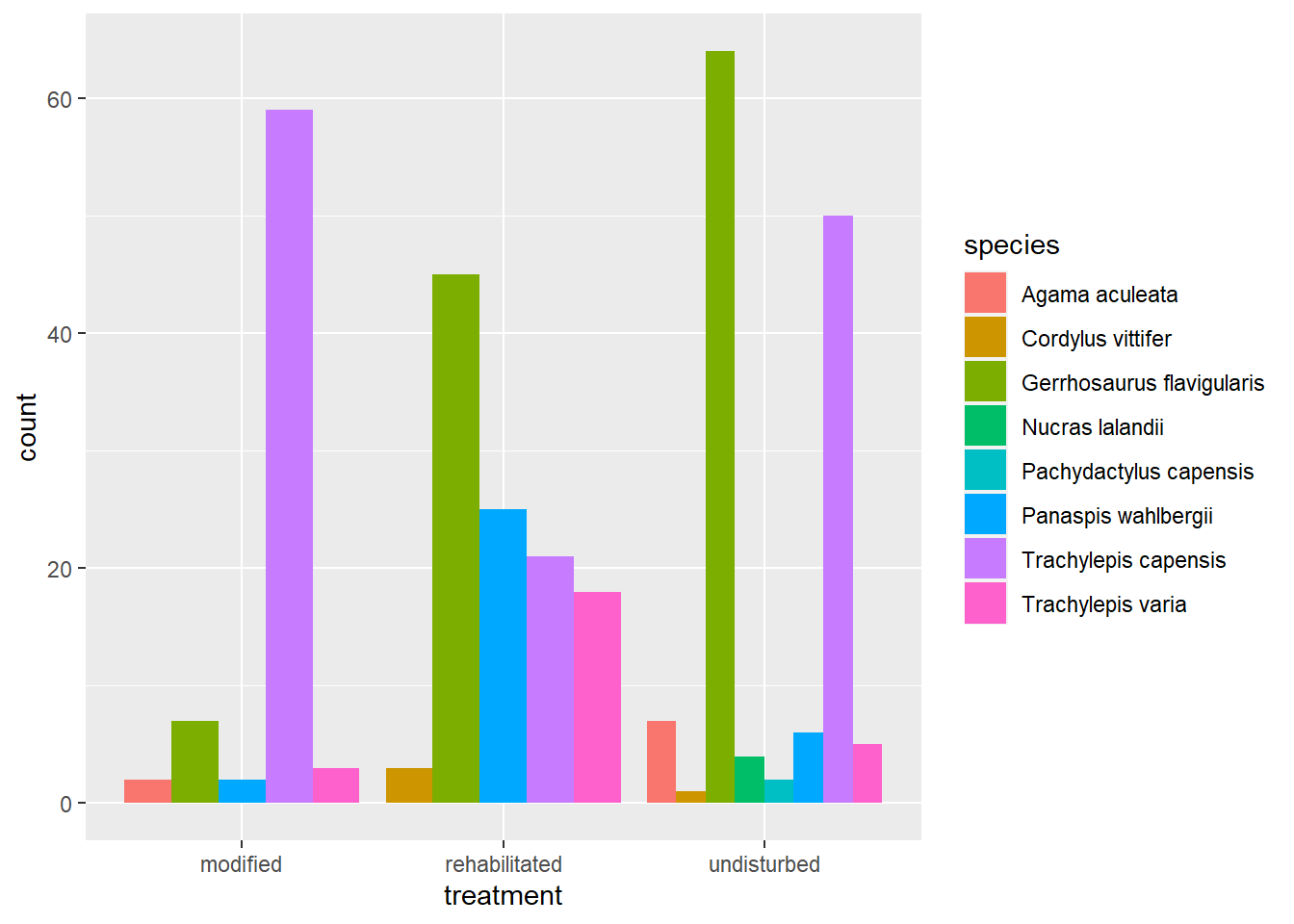
plot2 +
geom_bar(
aes(
fill = species
)
)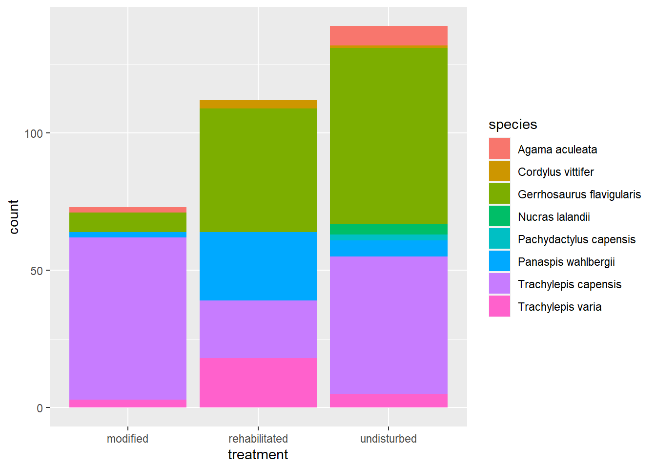
This is a good visualisation if we are primarily interested in which treatment recorded the most lizard captures in total. Unfortunately it’s not that easy to interpret at the species level because the counts for each species are stacked on top of each other. We can see some patterns but the species with smaller counts are lost to the dominant colours of the frequently captured species.
To solve this problem we need to use a new argument: position.
Let’s refer back to our trusty ggplot2 Cheatsheet:
From this infographic we can deduce that our position argument is set to “stack.” Add the correct position argument to create the following plot:
This plot is far easier to interpret for each treatment and each species. From this visualisation we can quickly see that more species were caught in the undisturbed grassland sites, but that evenness (similarity in species numbers) seems to be greatest in the rehabilitated sites.
4.7 Average Captures per Month
The bar plots above are a nice start to our exploration of the data, but we’re still just looking at the raw data.
In our first bar plot of total captures per day, we see that the spikes in reptile captures appear to increase in March and April (late summer in the southern hemisphere). The odd thing is that there seem to be only days of either many captures or no captures as we get later into the survey.
Did the average number of reptiles captured per month increase throughout the study? To compare the number of captures per month of sampling we need a plot that involves a statistical summary of the count data e.g., a box plot.
We now need a way to group the data in reptiles by month. Currently there is no variable in the reptiles tibble that can do this. This is because our date variable is actually not (strictly) tidy. Remember that one of the three rules of tidy data is that each cell is a single measurement. Our date variable contains year, month, and day. To have properly tidy data, we need to split the date variable into it’s three components. If we can do this, we can leverage functions in the Tidyverse to do our analysis.
Here’s how I did it using the dplyr and the lubridate package. As I mentioned in Session 3, the Tidyverse contains several packages that focus on only one class of variable. lubridate is your go-to for manipulating date-time variables.
# Load lubridate into R - it is not loaded by library(tidyverse)
library(lubridate)

# Extract the month of each `date` into a new column
reptiles <- reptiles %>%
  mutate(
    month = month(
      date,
      label = TRUE
    )
  )
You should now see an eleventh variable in our reptiles tibble. This is month variable we created using mutate and the month function in lubridate. month() extracts the month from a vector of date-time values. You can view these functions and their arguments in the Help pane using F1 or ?month
Now that we have a month variable, we can use dplyr to create a new tibble containing the counts of reptiles captured per day.
# Version 1:
# Group the data appropriately and then use `count()`
reptiles %>%
  group_by(
    month,
    date
  ) %>%
  count(name = "cap_per_day") -> month_count
# We can assign the tibble to a new object after piping
# This is just a stylistic preference for some people

# Version 2:
# Use count() to do the grouping for us
reptiles %>%
  count(
    month,
    date,
    name = "cap_per_day") -> month_count
We can now pass the month_count tibble into a ggplot call.
month_count %>%
  ggplot(
    aes(
      x = month,
      y = cap_per_day
    )
  ) +
  geom_boxplot()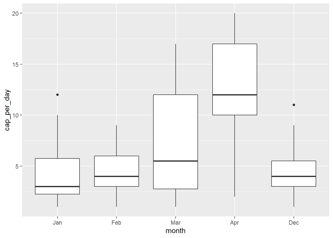
This shows us the data as a box plot, but the months are in the wrong order. When we look at the month_count tibble, we see that the month variable is an Ord.factor w/ 12 levels from Jan - Dec i.e., 1 - 12. In this order, our Dec month will come last as we see in the plot.
We need to specify a custom ordering of the levels, which we can do using mutate.
# Reduce and reorder the levels of the 'month' factor in
# the `month_count` tibble
month_count <- month_count %>%
  mutate(
    month = factor(
      month,
      levels = c("Dec", "Jan", "Feb", "Mar", "Apr")
    )
  )
We now see that the month variable has just five levels and that they match the order that we specified. Let’s see if our box plot looks better now.
month_count %>%
  ggplot(
    aes(
      x = month,
      y = cap_per_day
    )
  ) +
  geom_boxplot()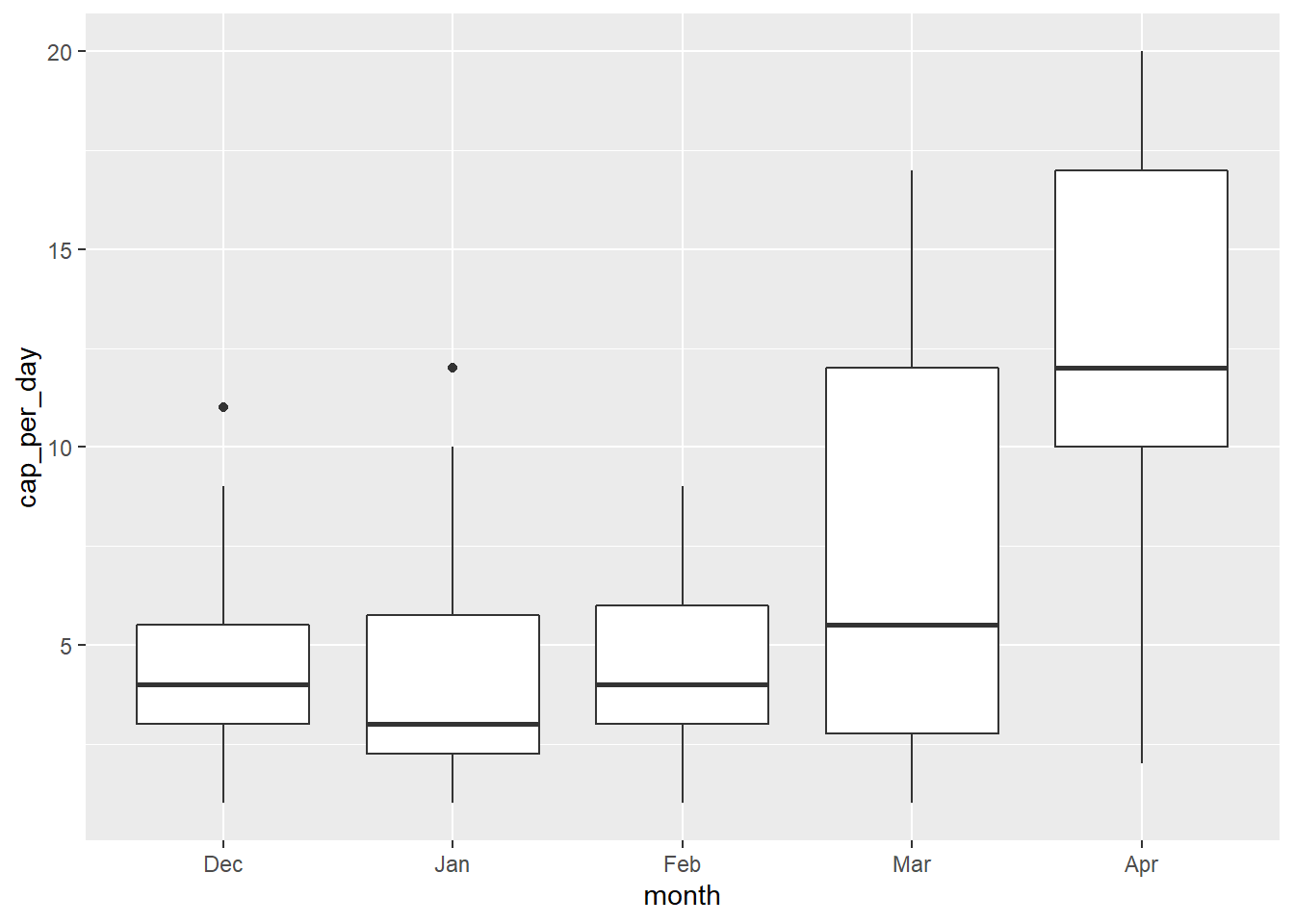
Let’s add one more layer for clarity to see how it affects the interpretation of the box plot above.
Thanks to the layered nature of ggplot2 we can add the raw counts to the box plot as well. If you read discussions on box plots you will find many examples of the ways in which they can distort the interpretation of data.
month_count %>%
  ggplot(
    aes(
      x = month,
      y = cap_per_day
    )
  ) +
  geom_boxplot() +
  geom_jitter(width = 0.25)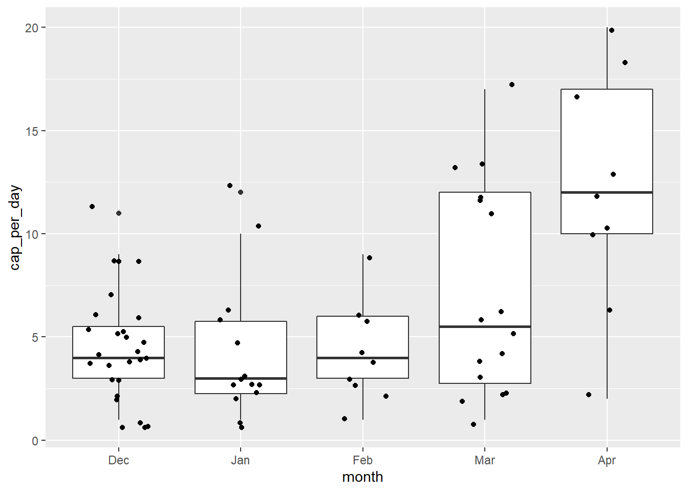
4.8 Exercises
Add suitable labels to the bar plots showing the lizard captures per treatment type. Change the theme too.
Create the exact same bar plot as in Exercise 1 for snake species by modifying just one argument.
Extract the
yearanddayinformation from thedatevariable using theyearanddayfunctions inlubridate. Add them to thereptilestibble.Using the code from the box plot in this session, swap the order of the
geom_jitterandgeom_boxplotfunctions.- What happens to the appearance of the final plot?
- Now change the code so that it reads:
geom_boxplot(alpha=0.3). What do you think thealphaargument does?
Read the help information on
geom_jitter. How would you create the same plot as in Exercise 4 above usinggeom_point?Pick one of the following questions and create a visualisation that a reader could use to quickly understand the answer. (Include all labels necessary to make it possible to understand the visualisation without looking at the data.)
Which block of trap locations saw the most reptile captures during the study?
Which snake species were captured more than once per treatment type?
What proportion of the total captures of each reptile species were adult versus juvenile? (This data is measured in the
rep_sizevariable.)[Insert your own question here] - then create a visual answer.