Session 2 The Grammar of Graphics
2.1 The Path Ahead
In this course, we are going to learn about the grammar of graphics. Don’t worry if the terminology feels overwhelming at first. I promise you that as you begin using the functions to generate plots, this feeling will fade. Remember:

The grammar of graphics is a structured means of describing the characteristics of plots and visualisations. It is incredibly flexible and thus incredibly powerful. The ggplot2 package is an implementation of the grammar of graphics in R, authored by Hadley Wickham. It forms part of a group of related packages called the ‘Tidyverse.’
2.1.1 A Quick Detour
Think of your favourite species (or one of them). Are you picturing it in your mind?
Great!
Now imagine that you need to describe the species to us without drawing a picture? How would you do this? You could simply say the name of the species. The trouble with this approach is that it hopes that your listener has encountered the name in a different setting. If they have - great! If they haven’t - then what? The most effective way would be to use a description of the species’ characteristics.
2.1.1.1 What’s In My Head?
Here’s a simple description of the species I am picturing. The species:
1. is a tetrapod vertebrate,
2. has a large casque on its head,
3. has a prehensile tail,
4. is able to rotate its eyes independently of one another.
Can you guess the type of animal that I’m talking about?
Are there words that you don’t recognise? Did the strange jargon make it harder to paint a mental picture in your head? Does it help if I tell you that “tetrapod” means four legs, a “casque” is a bony extension of the skull - almost like a helmet - and “prehensile” means able to grasp?
When we describe the picture in our head to someone else, the picture in their head:
1. starts to form as a vague outline,
2. grows more detailed as more descriptors are used,
3. may be hampered by jargon or unfamiliar terminology,
4. will form more quickly and clearly based on their experience with similar species.
Here’s the species I was picturing:

Figure 2.1: A sleeping Natal Midlands Dwarf Chameleon (Bradypodion thamnobates). Photo: Gavin Masterson
2.2 The ‘Old’ Approach: Named Plots
To better understand the grammar of graphics, let’s take a look at R code that does not implement it. Let’s start with the plot functions provided with the ‘base R’ installation - specifically graphics. I use the term “base R” here to refer to the set of packages that are installed with every version of R by default. Packages that you have chosen to install on your machine e.g. ggplot2 or tidyverse, are not part of base R because anyone who tries to run your ggplot2 code will have to install the package on their machine first (or see an error).
2.2.1 Toy Data in R
In this section we are going to use one of the datasets that is always available to you when you install R. These datasets are called ‘toy datasets’ because they are no longer used for analysis, but rather for illustrative purposes. To view the data we use the following code:
data(longley)We see that the longley dataset consists of 16 rows and 7 columns of economic data from the years 1947 to 1962. Note that the rows are named for the year that the data come from, but also that the sixth column (or variable) is called Year and contains the same values as the row names.
Let’s create some simple plots using the graphics functions:
# In `graphics`
# XY Scatter plot
# Note:The $ symbol tells R that the GNP column is in the longley object
plot(
x = longley$GNP,
y = longley$Unemployed
)
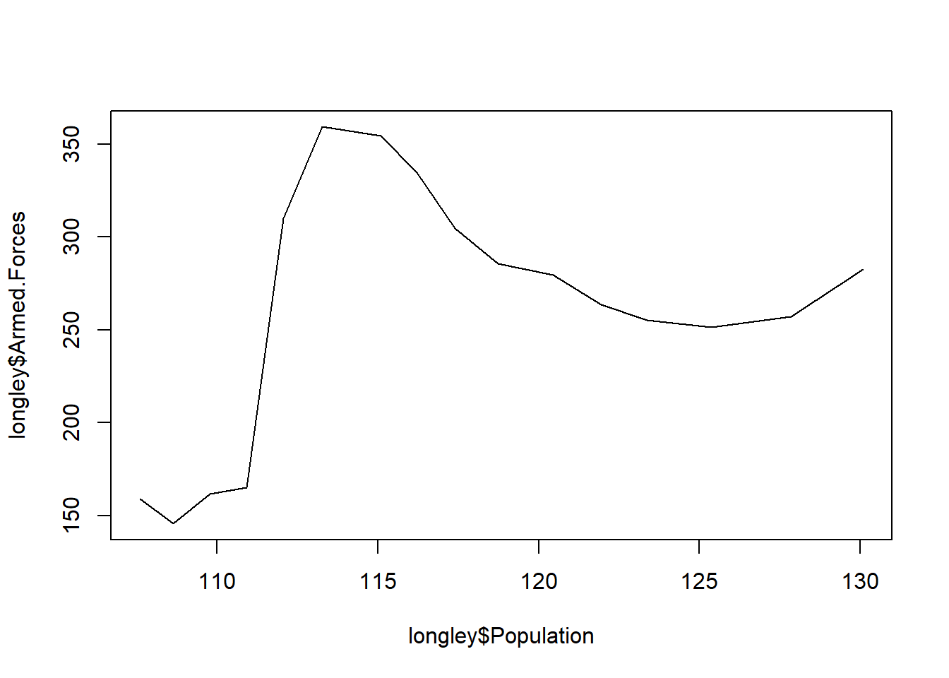
# Line plot
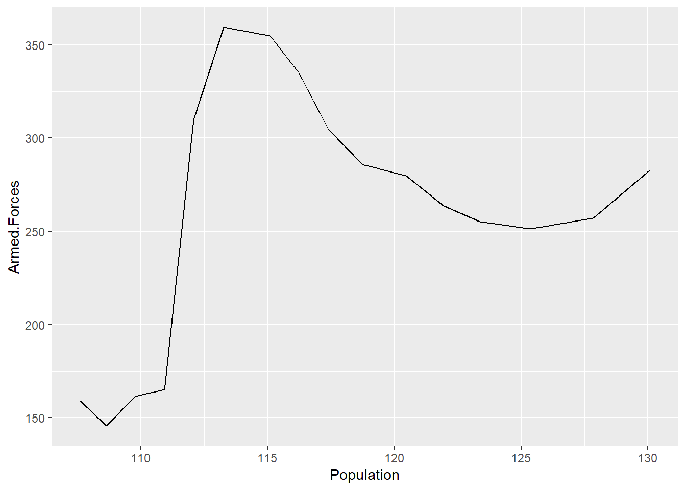
plot(
x = longley$Population,
y = longley$Armed.Forces,
type = "l"
)
# Bar plot
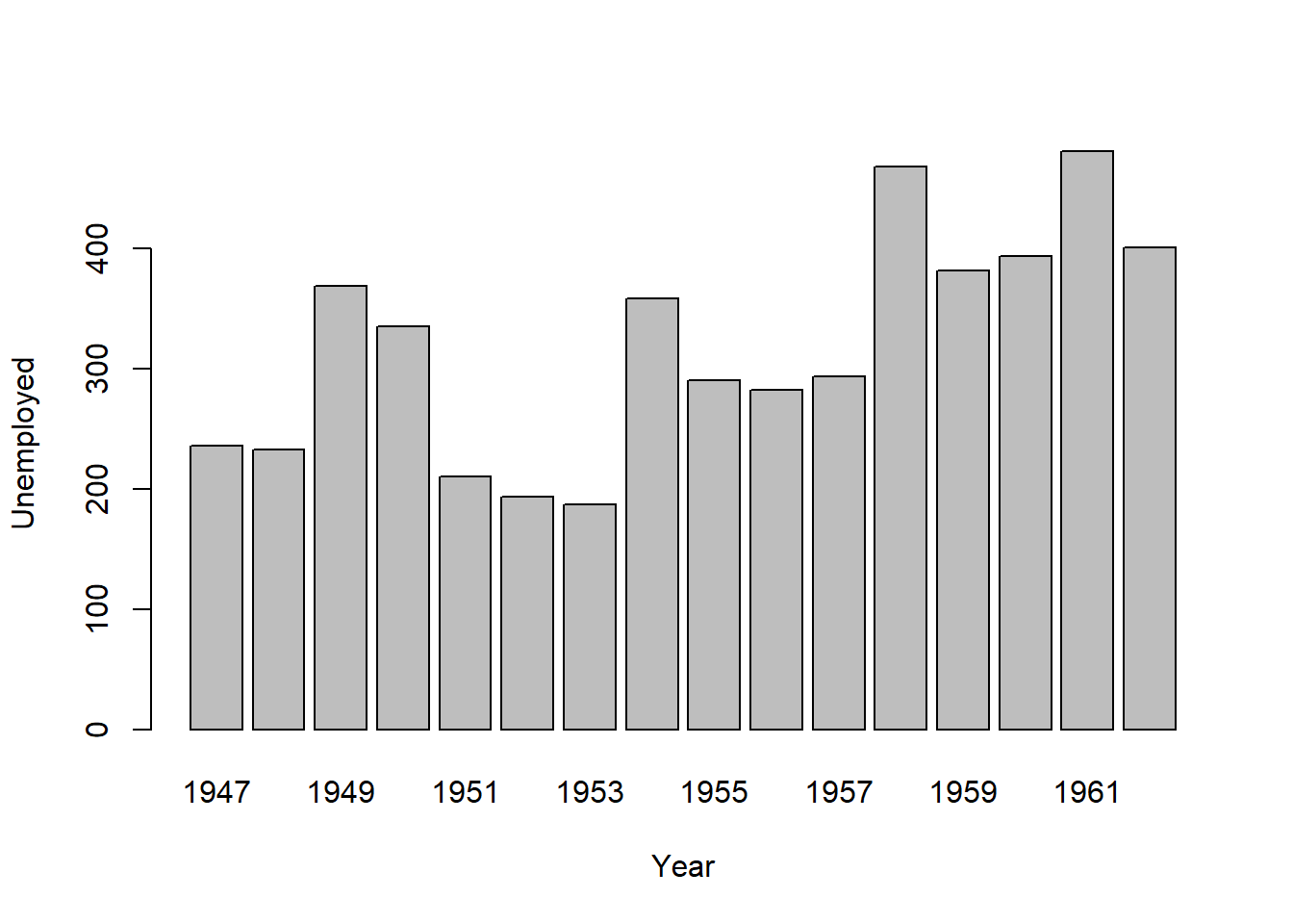
# The ~ symbol is an operator equivalent to = in an equation
# In other words: y ~ x is the same as y = x (Unemployed = Year)
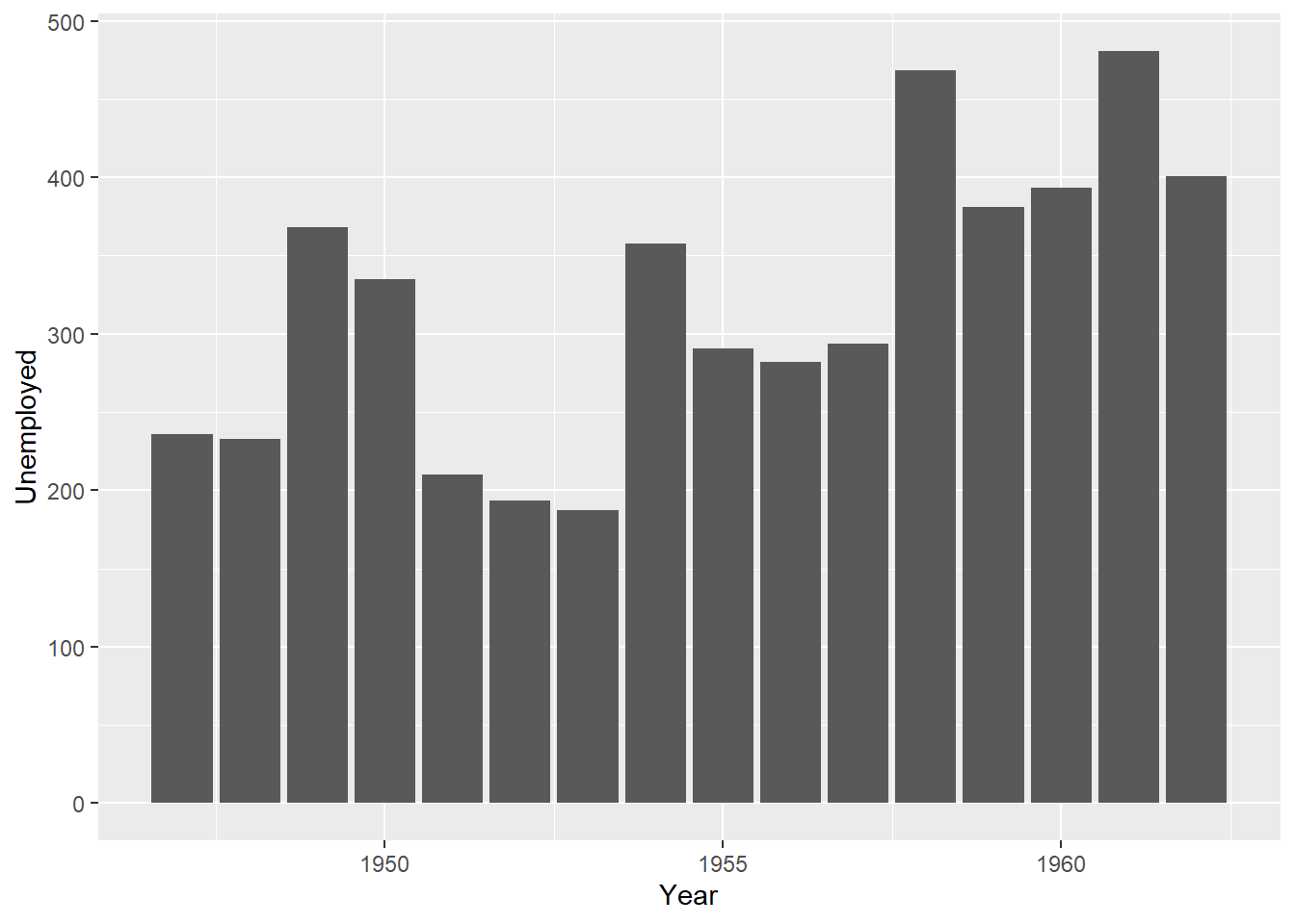
barplot(
data = longley,
Unemployed ~ Year
)
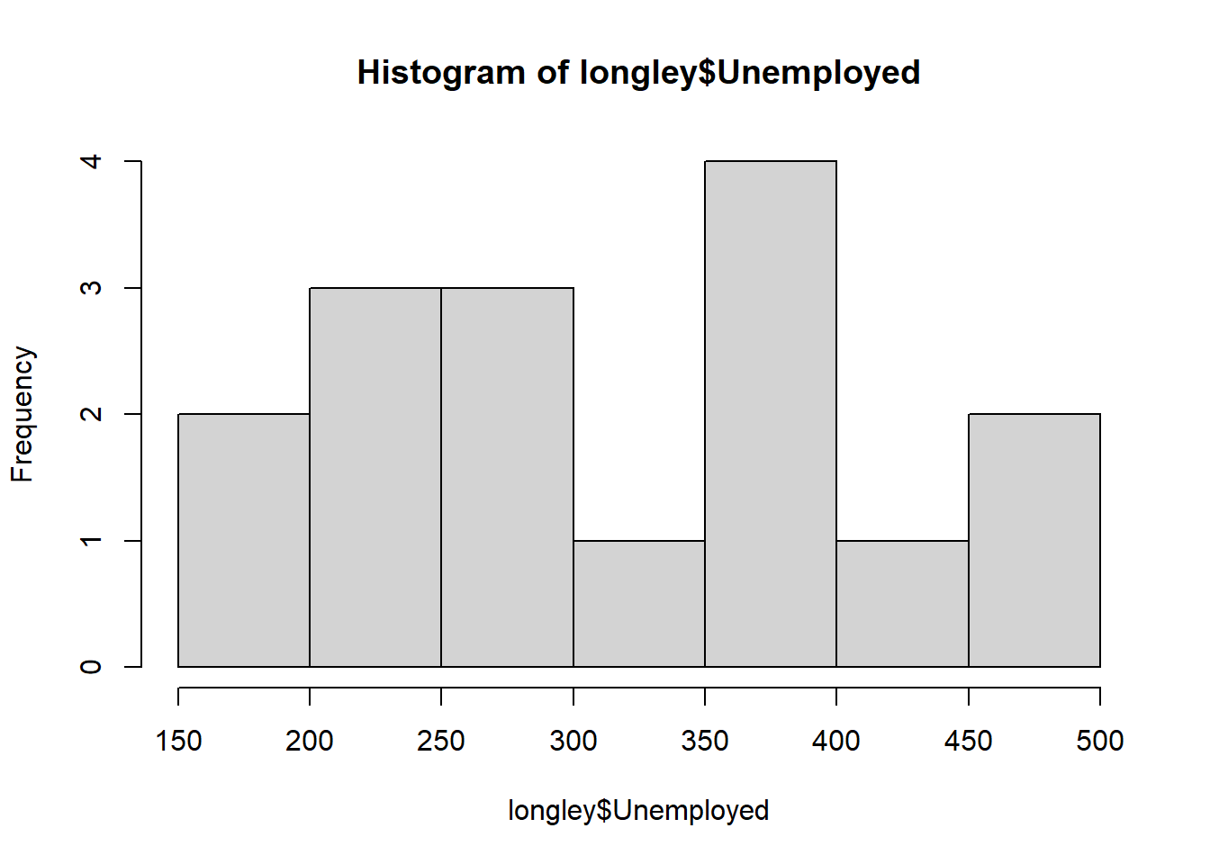
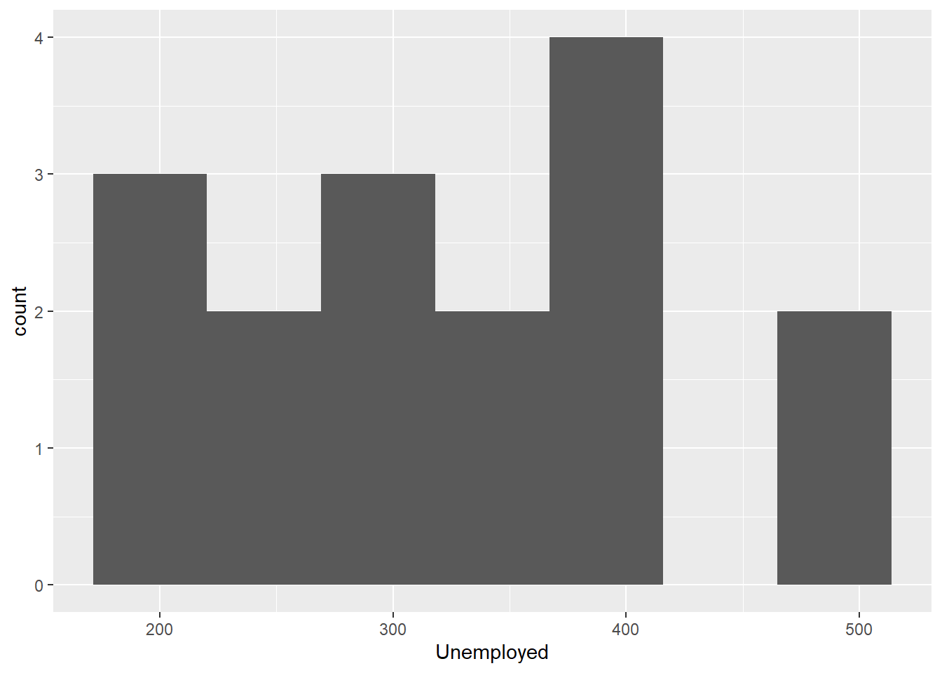
# Histogram
hist(longley$Unemployed)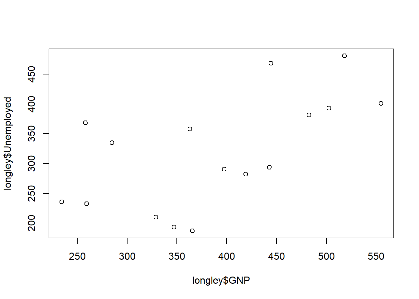
The plots shown above are all plots that you can give a name to - a scatter plot, a line plot, a bar plot, and a histogram. Note that while there are some similarities, each function can have slightly different syntax i.e. code structure depending on its requirements. While this approach is adequate for many situations, the functions are not inherently flexible enough to create unique compositions which combine different plot elements from the named plots. What this means in practice is that coding unique data visualisations can be an extremely time-consuming and frustrating because there is often no guide to work with, nor online help for you if you get stuck. (I say this from personal experience.)
Think of the difference between base R and ggplot2 like the difference between a plastic mould and lego. The mould produces a single shape efficiently, but can not be easily modified. Lego consists of standard pieces that can be arranged into a wide variety of shapes. It is not always as quick a process as a mould, but it is flexible!
The grammar of graphics is like lego.

2.2.2 Comparing ggplot2 and base R
Now let’s using ggplot2 to recreate the named plots we made in base R.
First you’ll have to load the ggplot2 package into your R environment. Recall that all R packages that are not part of the base R must be loaded into memory prior to use. This is so that you have access to the functions contained in the package.
You can load ggplot2 by running the following code:
library(ggplot2)If you attempt to use a function from a package that is not loaded, you will see an error like this one:
## Error in ggplot(data = longley): could not find function "ggplot"With ggplot2 loaded, the code below will reproduce the plots we created above using the graphics functions.
# In `ggplot2`:
# XY Scatter plot
ggplot(
  data = longley,
  mapping = aes(
    x = GNP,
    y = Unemployed
  )
) +
  geom_point()

# Line plot
ggplot(
  data = longley,
  mapping = aes(
    x = Population,
    y = Armed.Forces
  )
) +
  geom_line()

# Bar plot
ggplot(
  data = longley,
  mapping = aes(
    x = Year,
    y = Unemployed
  )
) +
  geom_bar(stat = "identity")

# Histogram
ggplot(
  data = longley,
  mapping = aes(x = Unemployed)
) +
  geom_histogram(bins = 7)
2.2.3 Discussion Questions
Compare the base R plots with the plots made using ggplot2.
- Are you satisfied that the plots are (essentially) the same?
- Do you notice any graphical differences e.g., axis limits, axis labels or anything else?
- What do you notice about the ggplot2 code?
- How is it different from the graphics functions?
2.2.4 The Important Differences
Even in these simple plots, we see differences in the amount of code required to create the same plot using base or ggplot2.
For example, the graphics::barplot function is succinct, and employs formula notation of the form y ~ x to specify that the Unemployed variable is dependent on the Year variable.
By contrast, the ggplot2 code requires us to call two functions: ggplot and geom_bar. Both of the functions have their own arguments and we also see the appearance of the important aes helper function. Within the aes function, Year is explicitly mapped to the x-axis and the Unemployed variable is mapped to the y-axis. We also see that the two functions are joined by a +, which is a unique component of ggplot2 code.
Let’s take a quick look at the + operator in ggplot2 code. When the ggplot2 package is loaded, we can locate the help file for it using this code:
help("+.gg")At this point you may be second-guessing your decision to learn the grammar of graphics. Isn’t it possible to produce suitable data visualisations using the functions provided in the graphics package of R?
The answer is a qualified “Yes, but….” Many types of plots can be created using the functions in the graphics package, and there are also many other graphical packages that have been developed in R over the course of its existence. If you’re interested you can explore the packages contained in the CRAN Task View for Graphics. You can also find demos of base R plots have been collected online (see here. The code has been made available with each plot so that you can customise the plots to your needs.
For the record: I am not saying that you should always use ggplot2. But, what I, and many others, have found is that the utility of base R plotting can only take us so far. For simple, named plots ggplot2 can seem overly complex at first, but the grammar of graphics comes into it’s own as your visualisations move further away from the “stock-standard” or typical types of plots and charts. When you need to make visualisations that give your data that ‘wow-factor,’ the grammar of graphics (and its extensions) is the tool that you will want to have in your toolkit! The bonus of using packages that are well-maintained and widely-used is that you will always be able to find resources to help you with any problems that you encounter in your work.
To illustrate how popular ggplot2 is, let’s visualise the monthly downloads for four randomly-selected R packages on CRAN compared with the monthly downloads for ggplot2.
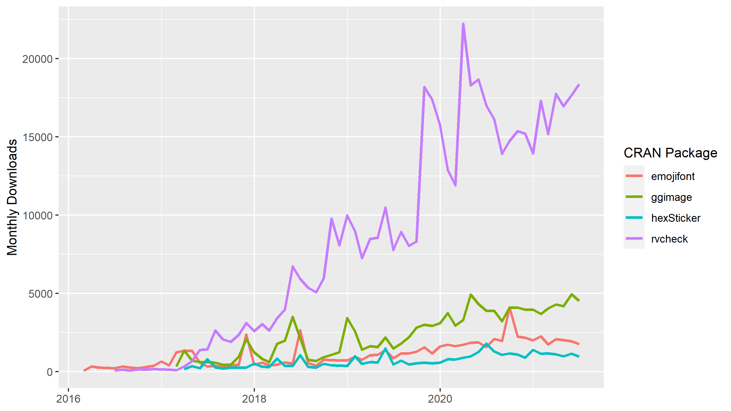
Of these four packages, the most downloaded package is rvcheck which peaked at about 25 000 monthly downloads in early 2020. Now lets add the monthly downloads for ggplot2.
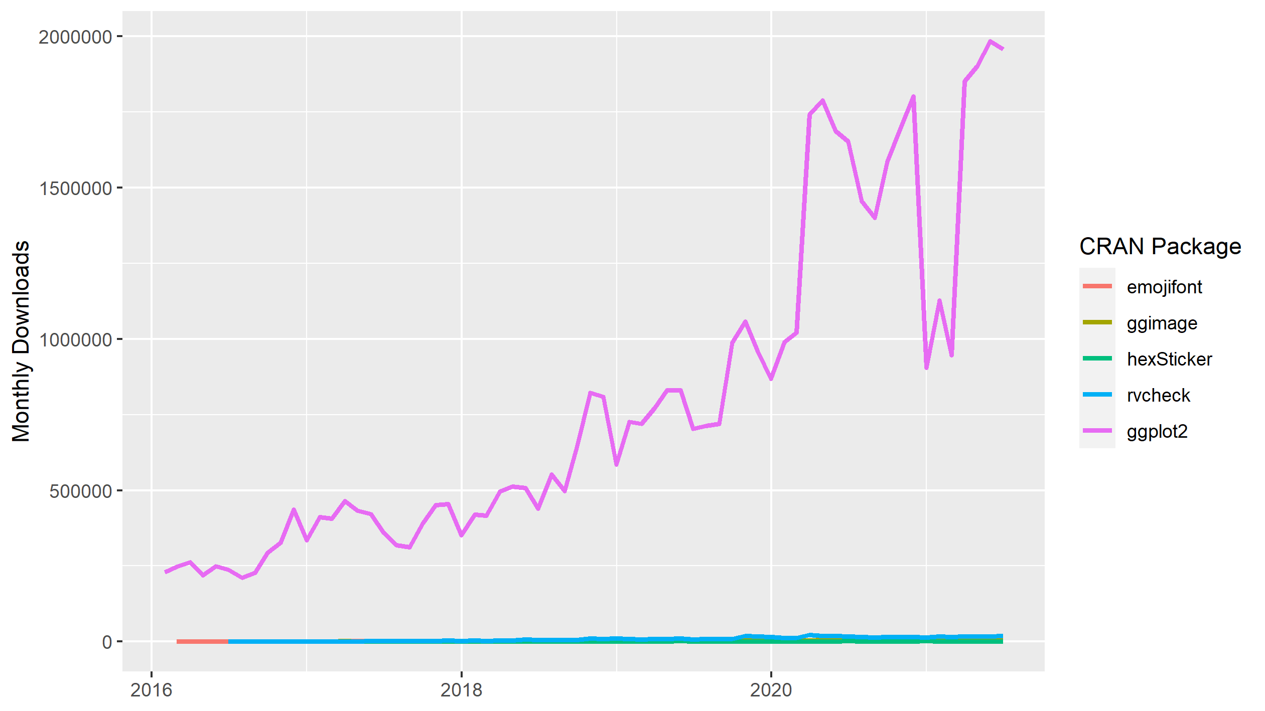
As you can see, the monthly downloads of ggplot2 rapidly climbs to several orders of magnitude larger than our four randomly-selected packages on CRAN. From this data series, we see that monthly downloads of ggplot2 peaked at nearly 2 million in May 2021. The widespread usage translates into a large community that you can ask for help with any ggplot2 questions you have.
One very important (but easy-to-miss) benefit of using ggplot2 is that ggplot2 functions create an R object containing all the data and settings used to render the plot. By contrast, many functions in graphics render the plot from your R code to the graphics device on your machine directly, without creating an R object. This may seem like a minor issue, but it has important implications for how we can work on iterating, tweaking and improving our visualisations, as we’ll see next.
2.3 The ‘New’ Approach: Plot Grammar
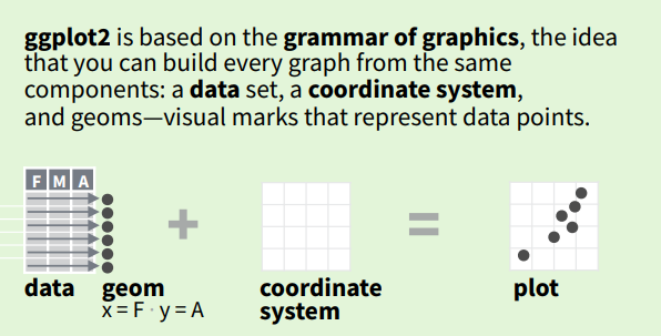
The most basic idea of ggplot2 is that we name the components of plots, rather than the final plot. We then use the components to construct each plot piece by piece.
Well that doesn’t seem so complicated, right?
The terms data and coordinate system are probably familiar to you, but maybe you’ve never heard of geom. In the example above, the data is represented by points, which is to say that the plot geom = "point". A geom - short for “geometry” - is the term we use to describe any point, line, area, or even text that represents the data in our plot.
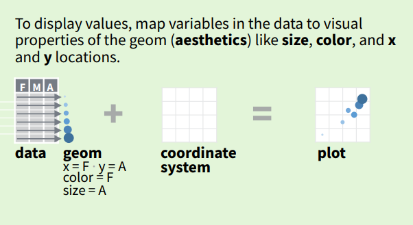
Each geom (point, line, area, text etc.) can have additional attributes, such as colour, size, shape and position e.g., x and y as per the Cartesian coordinate system). An aesthetic (or aes()) is exactly what it implies: an aesthetic feature of our geom e.g., colour, size, shape etc. We use aes when we want the colour of a point to indicate the group that it comes from.
So in practice, it looks like this:
EVERY plot that you will ever make using ggplot2 will start with a call of the ggplot(...) function. The only other requirement in order to visualise your data is one of the geom functions e.g., geom_point, geom_line etc. These two functions are the bare minimum requirement to visualise data with ggplot2. Lastly, the two functions are joined together using +.
ggplot(...) +
  geom_line(...)
Every other function used to build a plot in ggplot2 will use sensible defaults based on the ggplot and geom functions. We will look at how to make use of these additional functions to customise your visualisations in later sessions.
2.3.1 ggplot()
Unlike most functions in R, you don’t actually need to supply any arguments to ggplot() when you call it. This is because the ggplot function initialises a plot object. If no arguments are supplied, then the object does not contain any data,a geom, geom aesthetics or other information.
Here’s what I mean:
View(ggplot())This is important because it illustrates how using using ggplot2 involves editing the plot object by adding (or removing) pieces of information about the plot. Any arguments supplied to ggplot are considered the default settings for the entire plot.
2.3.2 geom_*()
When using any of the geom_* functions (where the * can be replaced by “point” or “line” etc.), you must always supply the data and mapping arguments required for that specific geom. This makes sense because the geom_* functions create the required representation of our data for the plot.
There are two ways that this can be achieved.
- By inheriting the
dataandmappingarguments from theggplotfunction.
ggplot(
  data = longley,
  mapping = aes(
    x = GNP,
    y = Unemployed
  )
) +
  geom_point() # No arguments supplied to geom_point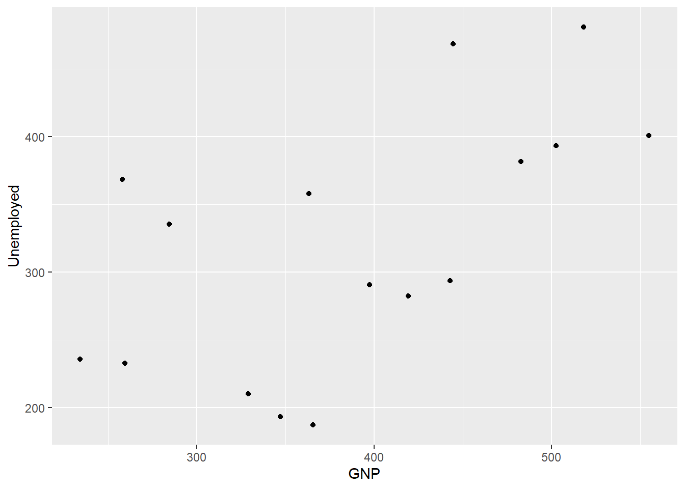
This is the way I produced the plots of the longley economic data above, or
- By adding the arguments to the
geom_*function.
ggplot() + # No arguments supplied to ggplot
  geom_point(
    data = longley,
    mapping = aes(
      x = GNP,
      y = Unemployed
    )
  )
We will come back to this point later, but it is important to know that any arguments supplied to the geom_* function take precedence over those supplied to ggplot.
2.4 Building a Visualisation by Iteration
We’ve spent a lot of time laying the important groundwork for all the chapters to come, so let’s finish this session with the fun of some hands-on, data visualising!

2.4.1 Toy Data
Let’s use another of the toy datasets in R but this time let’s use one with an ecological flavour. This dataset is one of the most famous datasets used to demonstrate coding concepts: iris.
# Import data into working environment
data(iris)

# Inspect it
View(iris)
The iris dataset gives the measurements (in cm) of the variables: sepal length, sepal width, petal length and petal width, respectively, for 50 flowers from each of three species of iris - Iris setosa, I. versicolor, and I. virginica.
2.4.2 A Scatter Plot of Petals
Let’s begin our practice by plotting Petal.Length against Petal.Width.
# We create the plot and then we map Petal.Length to the x-axis position,
# and Petal.Width to the y-axis position using aes()
ggplot(
  data = iris,
  mapping = aes(
    x = Petal.Length,
    y = Petal.Width
  )
)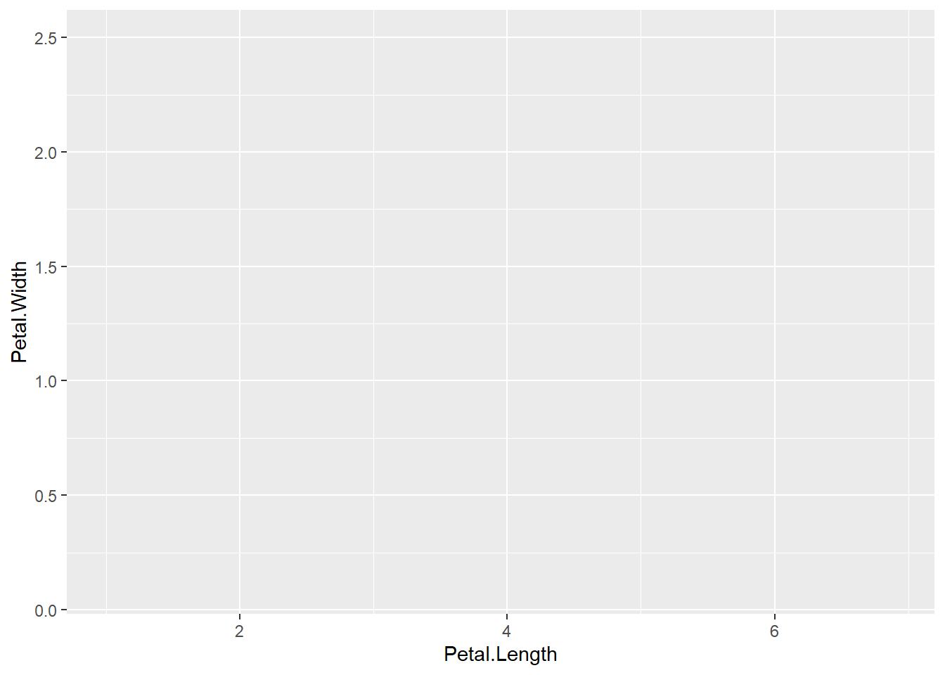
Wait! What happened? Why is there no data represented in the plot?
That’s right! We forgot to specify a geom to represent the data. Your turn: Add geom_point() to the code above to produce the following plot.
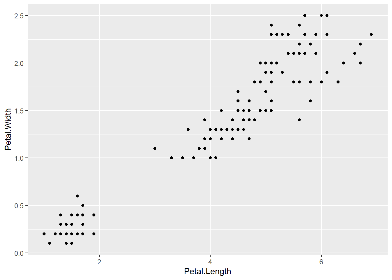
There we go! Now we can see that an iris’ petal width (y-axis) increases linearly as its petal length (x-axis) increases. We can also see that there is a small cluster of points in the bottom left corner. Could petal length and petal width be determined by species?
We can change the shape of each point to match the species it represents by mapping the Species variable to the shape aesthetic.
ggplot(
  data = iris,
  mapping = aes(
    x = Petal.Length,
    y = Petal.Width,
    shape = Species # Map the shape aesthetic of each point to the Species variable
  )
) +
  geom_point()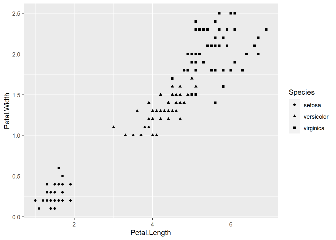
Notice that when we start including aesthetics for our geoms, ggplot2 automatically adds a default legend explaining it to a reader (including you!). We will look at the ways of customising legends in a later session.
The above plot is more informative but it is difficult to make out the different shapes at a glance. Let’s change the colour of each point to match its species instead.
ggplot(
  data = iris,
  mapping = aes(
    x = Petal.Length,
    y = Petal.Width,
    colour = Species  # change the shape aesthetic to colour
  )
) +
  geom_point()
What if we change the shape and the colour of each point to match its species?
ggplot(
  data = iris,
  mapping = aes(
    x = Petal.Length,
    y = Petal.Width,
    colour = Species,  # set the shape and colour aesthetic to Species
    shape = Species
  )
) +
  geom_point()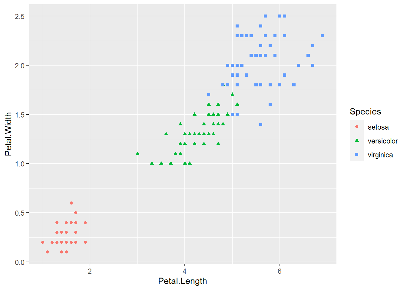
2.5 Exercises
- Type the following code into your R console:
help(package = "graphics"),
and browse through the list of functions.
- What are the advantages of using these functions for plots?
- What are the disadvantages?
- Re-create any of the
plotvisualisations that we made using thelongleydata above, but this time, assign the plot to a variable e.g.p <- plot(...).
- What do see in the Environment pane of Rstudio?
- How is this different to visualisations created using
ggplot2?
- Try exercise 3 again but use the
barplotfunction call from this chapter, e.g.p <- barplot(...).
- Look at the R object by left-clicking on it.
- Now type
plot(p)into the Console pane and view the plot. - Does the plot make sense?
- In the plots of the
irisdata, I coded the plot so that geom_point inherited the aesthetics from theggplotfunction. We could have supplied the aesthetic arguments forcolourandshapeto thegeom_pointfunction directly.
- Try to modify the code in this way but produce the same plot as before.
- Look at each of the plots created using the
irisdata.- Which ones do you like?
- Which plots successfully communicate different aspects of the data?
- Which plots are harder to interpret for a reader?