Session 5 Getting Fancy
5.1 Faceting, Scales and Themes
In this session we are going to work through the remainder of the template for a ggplot2 function: the coord_*, facet_*, scale_* and theme functions.
This session aims to provide you with template-style examples of how to use the various functions to improve and customise your plots.
5.2 Data: reptiles
We turn once again to our trusty reptiles data. Using data and plots that are familiar will allow us to give more attention to the new modifications we are making to our plots.
library(tidyverse)
library(here)

reptiles <- read_csv(here("data/reptiles_tidy.csv"))

# If the date variable is not imported correctly, try this:
# reptiles_tidy <- read_csv(
#   here("data/reptiles.csv")
#   ) %>%
#   mutate(
#     date = mdy(date)
#   )
5.3 Coordinate Functions
The coordinate function in ggplot2 allow you to modify the coordinate system in which the plot geom is depicted. The most common coordinate system, and the ggplot2 default for many plots is the Cartesian coordinate system i.e., X-Y coordinates. Changing the coordinate system of the plot is not something that should be done lightly as there is a high probability that you will confuse the viewers of your data visualisation by distorting the underlying data. The most commonly used function is coord_flip. (For more coord functions - refer to the Cheatsheet.)
reptiles %>%
  ggplot(
    aes(
      x = species
    )
  ) +
  geom_bar() +
  coord_flip()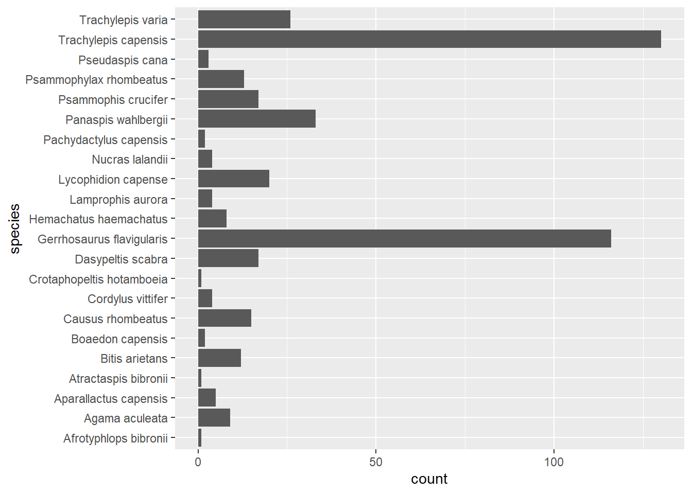
As you can see in the code, we have specified that species should be mapped to the x aesthetic and then flipped the bar plot on its side using coord_flip, which makes the species names easier to read than if they are on the bottom.
5.4 Facets
Compare the following two plots:
# We have seen this plot before in the previous session
reptiles %>%
  filter(rep_type %in% "lizard") %>%
  ggplot() +
  geom_bar(
    aes(
      x = treatment,
      fill = species
    ),
    position = "dodge"
  )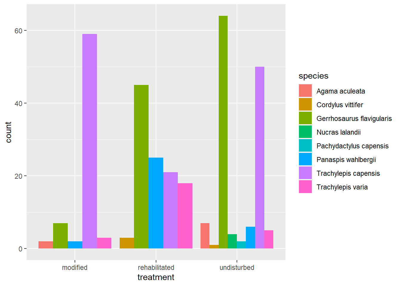
The first plot maps treatment to the x-axis and then counts all captures per lizard species and fills each bar with a unique colour per species. The other way to plot this same information is to use a facet_* function such as in the code below:
# We haven't seen this plot before!
reptiles %>%
  filter(rep_type %in% "lizard") %>%
  ggplot() +
  geom_bar(
    aes(
      x = species, # We now map species to x, NOT treatment
      fill = species
    )
  ) +
  # We split the data into facets and plot each one
  # The data for each treatment is plotted separately
  facet_grid(rows = vars(treatment)) +
  coord_flip() +
  # This code just removes the legend from the plot because it is not needed
  theme(
    legend.position = "none"
  )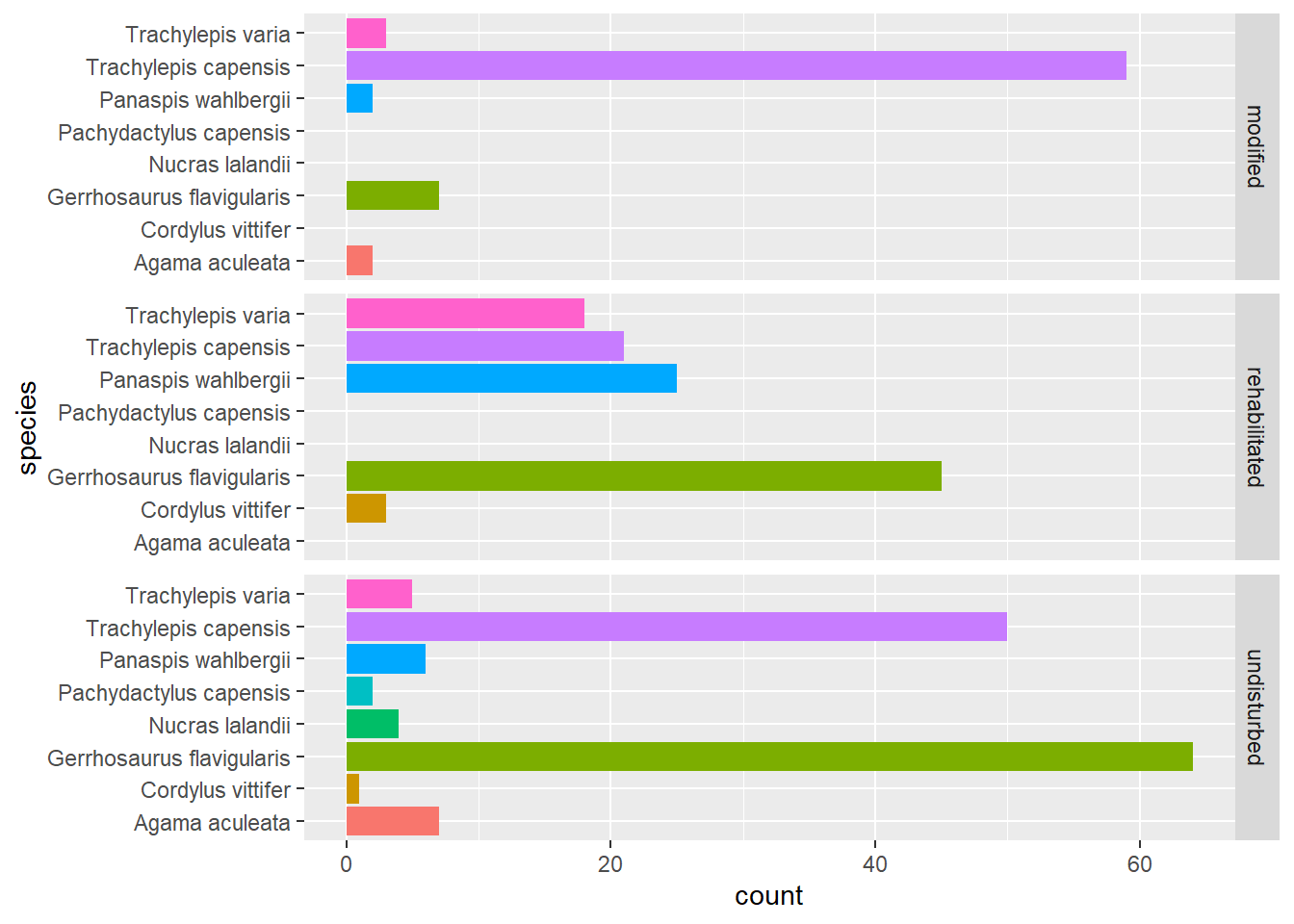
There is a lot to discuss here but let me start by saying that, in my opinion, this is a better data visualisation to use for this particular question. Let’s look at each change.
The code is the same for both plots until we map the x aesthetic. In the first plot x = treatment and in the second x = species. If you render the plot after the geom_bar function in the second code chunk, you will see a bar plot of the total capture count for each lizard species recorded in the survey. This is nowhere near as useful as the first plot.
The fun begins when we add the facet_grid function. It takes our data and groups it according to our chosen variable - we chose treatment - and then renders a plot for each level of the treatment variable on each row of the plot grid. There are three levels of treatment, so we get three distinct plots containing the number of captures of each species in each plot (even if the number was zero). Every species is plotted in each facet, which is different to our first plot where only species that were recorded were plotted for each treatment.
5.5 Scales and Themes
The scale_* functions are all used to modify the elements of our plot which relate to the plot aesthetics. In order to change the default scale supplied to our plot, we need to add a new scale (of the appropriate type). The names of the scale functions tell us exactly which component the function will change.
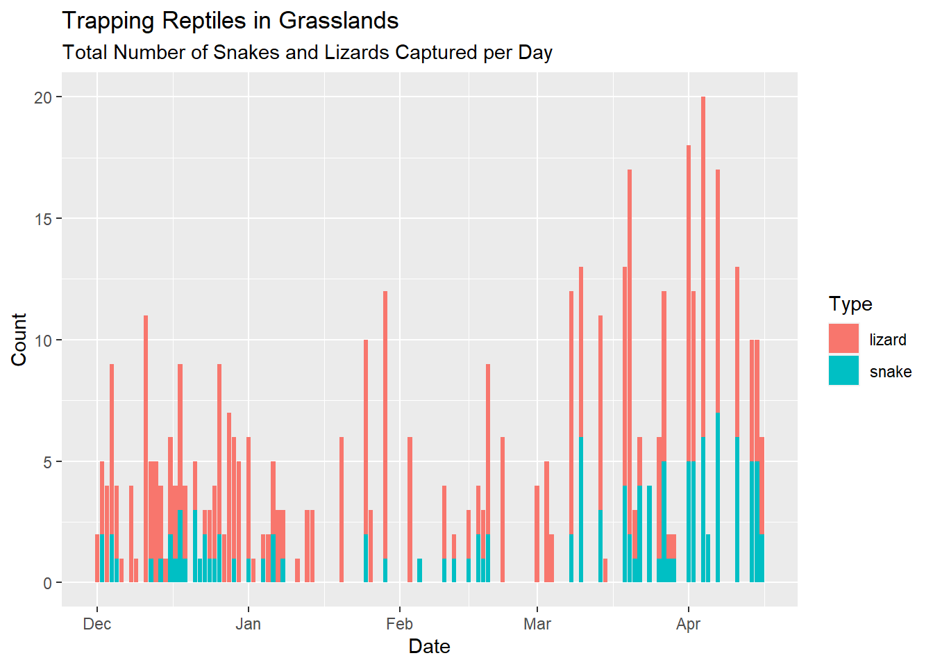
In the familiar plot below, we are looking at the number of reptiles captured per day, designated by the rep_type variable.
# Here is the very first plot we made with the reptiles data
# Plus some labels because we know how to do that now
reptiles %>%
  ggplot() +
  geom_bar(
    aes(
      x = date,
      fill = rep_type
    )
  ) +
  labs(
    title = "Trapping Reptiles in Grasslands",
    subtitle = "Total Number of Snakes and Lizards Captured per Day",
    x = "Date",
    y = "Count",
    fill = "Type"
  )
And here is the same data, plotted in a customised fashion using the scale, theme and facet functions available to us in ggplot2:
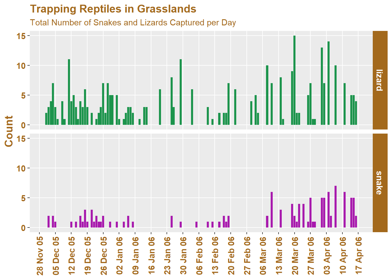
Here is the code used to make this plot (which I’ve separated into sections for discussion):
reptiles %>%
  ggplot(
    aes(x = date)
  ) +
  geom_bar(
    aes(
    fill = rep_type
    )
  ) +
  labs(
    title = "Trapping Reptiles in Grasslands",
    subtitle = "Total Number of Snakes and Lizards Captured per Day",
    x = NULL, # A title can be removed using NULL
    y = "Count",
    fill = "Type"
  ) +
##----------------------------------------------------------------------------
  # This scale function will be a very helpful one to learn!
  scale_x_date(
    date_breaks = "1 week",
    date_labels = "%d %b %y",
    date_minor_breaks = "2 days"
  ) +
  scale_fill_manual(
    values = c("#1c944c", "#a81aad") # These are custom hex colours
  ) +
## ---------------------------------------------------------------------------
  theme(
    plot.title = element_text(colour = "#a3691c", size = 14, face = "bold"),
    plot.subtitle = element_text(colour = "#a3691c"),
    axis.title.x = element_text(face = "bold", size = 11, colour = "#a3691c"),
    axis.text.x = element_text(angle = 90, face = "bold",
                               size = 11, vjust = 0.5, colour = "#a3691c"),
    axis.title.y = element_text(size = 14, face = "bold", colour = "#a3691c"),
    axis.text.y = element_text(face = "bold", size = 11, colour = "#a3691c"),
    legend.text = element_blank(), # Or items can be removed using element_blank()
    legend.position = "none",
    panel.grid.minor.x = element_blank(), # Reduce the clutter on the background panel
    panel.grid.minor.y = element_blank(),
    strip.text = element_text(colour = "white", face = "bold", size = 11),
    strip.background = element_rect(fill = "#a3691c"),
  ) +
## ----------------------------------------------------------------------------
  facet_grid(rows = vars(rep_type))
To understand the symbols I used in the date_labels argument of the scale_x_date function you can read this: https://www.stat.berkeley.edu/~s133/dates.html.
5.6 Exercises
- Work on your visualisation for Session 6. Make use of the code examples from Sessions 4 & 5 to help you iterate and customise your visualisation.
5.7 Bonus: Factors Make Life Interesting
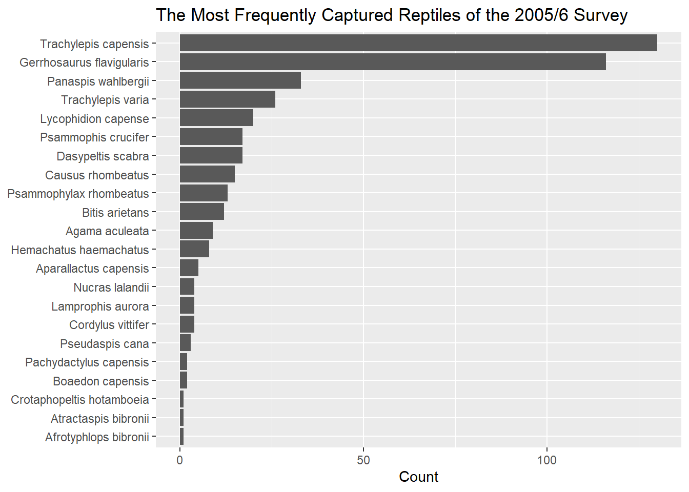
The code below is one way of creating an ordered plot of the most frequently captured reptile species during the survey. It makes use of the forcats package from the Tidyverse.
# We load the forcats package to manipulate factors
library(forcats)

# We extract the species variable and count the number of
# times each species appears i.e. each observation
reptiles %>%
  pull(species) %>%
  fct_count() %>%
  rename(
    species = f,
    count = n
  ) %>%
  ggplot(
    aes(
      # We order the x aesthetic in desc order of count
      x = reorder(species, count),
      y = count
    )
  ) +
  # We already have count data so we set `stat = "identity"`
  geom_bar(stat = "identity") +
  labs(
    title = "The Most Frequently Captured Reptiles of the 2005/6 Survey",
    x = NULL,
    y = "Count"
  ) +
  # We flip the coord system so that the species names are clear
  coord_flip()