Session 8 Extensions of ggplot2
The ggplot2 package is an absolutely amazing place to start learning to visualise data in R. The function structures and their combined flexibility makes ggplot2 a ‘must-know’ for any serious R user.
Of course, ggplot2 doesn’t do everything and nor does it try to. When you find yourself looking for features that are not available in ggplot2 itself, you will generally discover you have two options:
- Install and use a package that extends the functionality of
ggplot2, or - Use a different data visualisation tool entirely.
In terms of option 1, you have already seen how packages such as the sf package can be used to add geom_* functions that can plot/modify specific classes of data object e.g., simple features spatial data. In this session we will look at just a few of the many useful extension packages that you can use with ggplot2.
With regards to option 2, there are many tools and R packages with which you can visualise data, so this session will never be exhaustive in its coverage of them. All I will do is try to point you to useful starting places should your needs be greater than the capabilities of ggplot2.
8.1 Extensions of ggplot2
8.1.1 ggtext
The use of text in visualisations is often of critical importance. The ggplot2 package has somewhat limited functionality for customising any text element of the ggplot object. To help with this Claus Wilke has developed a ggplot2 extension called ggtext.
This extension package aims to give users more control over the specifics of text elements (i.e., objects that get their theme arguments from the element_text helper function).
library(tidyverse)
library(here)

# import reptiles.csv
reptiles <- read_csv(here("data/reptiles.csv")) %>%
  rename(
    rep_type = group
  )

# Our themed/faceted reptile plot from session 5
reptiles %>%
  ggplot(
    aes(x = date)
  ) +
  geom_bar(
    aes(
    fill = rep_type
    )
  ) +
  labs(
    title = "Trapping Reptiles in Grasslands",
    subtitle = "Total Number of Lizards and Snakes Captured per Day",
    x = NULL, # A title can be removed using NULL
    y = "Count",
    fill = "Type"
  ) +
##----------------------------------------------------------------------------
  # This scale function will be a very helpful one to learn!
  scale_x_date(
    date_breaks = "1 week",
    date_labels = "%d %b %y",
    date_minor_breaks = "2 days"
  ) +
  scale_fill_manual(
    values = c("#1c944c", "#a81aad") # These are custom hex colours
  ) +
## ---------------------------------------------------------------------------
  theme(
    plot.title = element_text(colour = "#a3691c", size = 14, face = "bold"),
    plot.subtitle = element_text(colour = "#a3691c"),
    axis.title.x = element_text(face = "bold", size = 11, colour = "#a3691c"),
    axis.text.x = element_text(angle = 90, face = "bold",
                               size = 11, vjust = 0.5, colour = "#a3691c"),
    axis.title.y = element_text(size = 14, face = "bold", colour = "#a3691c"),
    axis.text.y = element_text(face = "bold", size = 11, colour = "#a3691c"),
    legend.text = element_blank(), # Or items can be removed using element_blank()
    legend.position = "none",
    panel.grid.minor.x = element_blank(), # Reduce the clutter on the background panel
    panel.grid.minor.y = element_blank(),
    strip.text = element_text(colour = "white", face = "bold", size = 11),
    strip.background = element_rect(fill = "#a3691c"),
  ) +
## ----------------------------------------------------------------------------
  facet_grid(rows = vars(rep_type))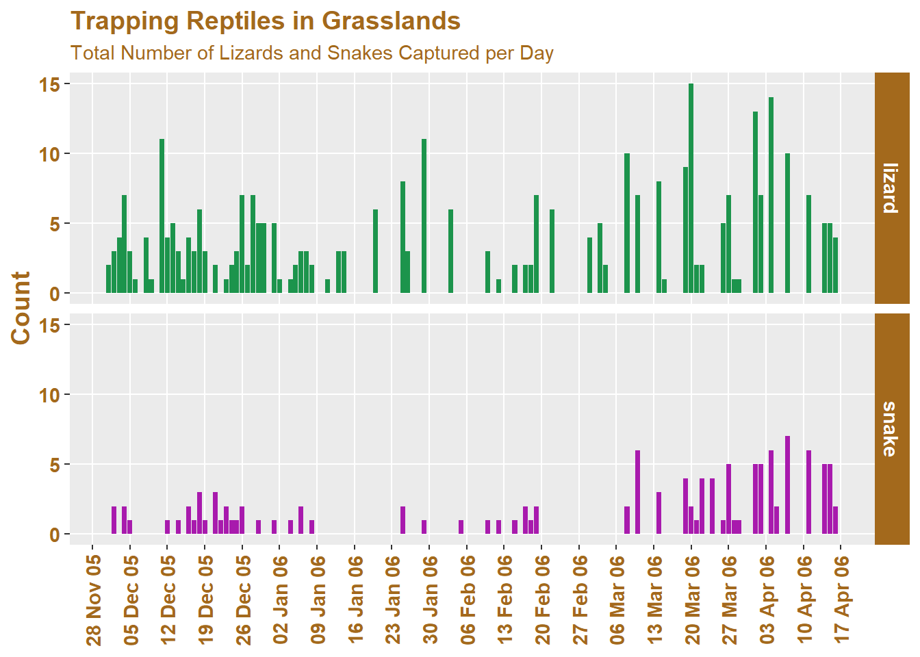
And now we modify it using ggtext:
# import ggtext
library(ggtext)

reptiles %>%
  ggplot(
    aes(x = date)
  ) +
  geom_bar(
    aes(
    fill = rep_type
    )
  ) +
  labs(
    title = "Trapping **Reptiles** in *Grasslands*",
    subtitle = "***Total Number*** of <b style = 'color:#1c944c'>Lizards</b> and <b style = 'color:#a81aad'>Snakes</b> Captured per Day",
    x = NULL, # A title can be removed using NULL
    y = "Count",
    fill = "Type"
  ) +
##----------------------------------------------------------------------------
  # This scale function will be a very helpful one to learn!
  scale_x_date(
    date_breaks = "1 week",
    date_labels = "%d %b %y",
    date_minor_breaks = "2 days"
  ) +
  scale_fill_manual(
    values = c("#1c944c", "#a81aad") # These are custom hex colours
  ) +
## ---------------------------------------------------------------------------
  theme(
    plot.title = element_markdown(colour = "#a3691c", size = 14),
    # We need to change the helper function so that it can understand our html code
    plot.subtitle = element_markdown(colour = "#a3691c"),
    axis.title.x = element_text(face = "bold", size = 11, colour = "#a3691c"),
    axis.text.x = element_text(angle = 90, face = "bold",
                               size = 11, vjust = 0.5, colour = "#a3691c"),
    axis.title.y = element_text(size = 14, face = "bold", colour = "#a3691c"),
    axis.text.y = element_text(face = "bold", size = 11, colour = "#a3691c"),
    legend.text = element_blank(), # Or items can be removed using element_blank()
    legend.position = "none",
    panel.grid.minor.x = element_blank(), # Reduce the clutter on the background panel
    panel.grid.minor.y = element_blank(),
    strip.text = element_text(colour = "white", face = "bold", size = 11),
    strip.background = element_rect(fill = "#a3691c"),
  ) +
## ----------------------------------------------------------------------------
  facet_grid(rows = vars(rep_type))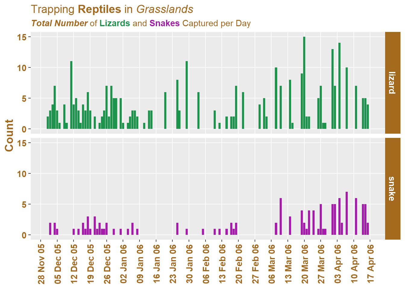
As you can see, we modified the string we supplied to our subtitle as well as changed the helper function from element_text to element_markdown. With these two changes we are able to start changing the with pinpoint specificity. The challenge is that you need to learn about formatting font using markdown, or html, or both.
There are other useful helper functions like geom_textbox, which allow us to place text boxes in our plot and customise them with theme aesthetics.
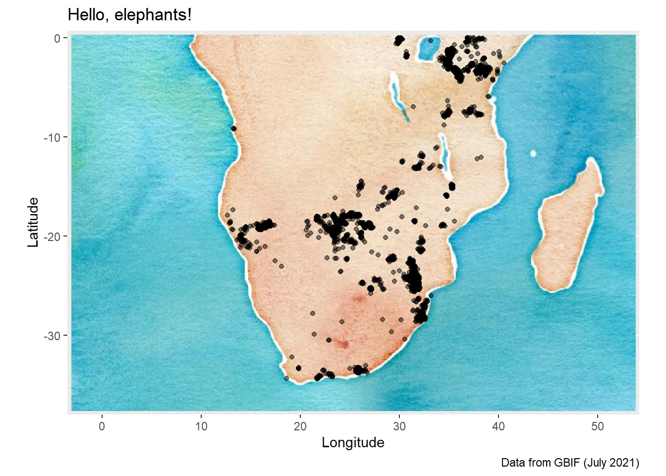
8.1.2 OpenStreetMap
For spatial data, the OpenStreetMap package offers you a way to access map raster images from within R. I have included a small demo of how this can work using our elephants dataset.
We will use the Open Street Map project and the OpenStreetMap R package to create a data visualisation with an historic theme to it.
library(tidyverse)
library(OpenStreetMap)
library(here)

elephants <- read_csv(here("data/elephants.csv"))

# Work interactively to choose map area
# launchMapHelper()

# Set map bounding box and call the OpenStreetMaps API:
# Don't run this `openmap` function repeatedly as you are pinging a server
# which may crash if the load of requests gets too high
ele_map <- openmap(c(0.3076157096439005,-3.076171875),
                   c(-37.579412513438385,53.701171875),
                   # Choose the base map with [X]
                   type = c("osm", "stamen-toner",
                               "stamen-terrain","stamen-watercolor",
                               "esri","esri-topo")[4])

# Project the open street map object into WGS84
ele_map_latlon <- openproj(ele_map, projection = "+proj=longlat +ellps=WGS84 +datum=WGS84 +no_defs")

# Plot the base map
autoplot.OpenStreetMap(ele_map_latlon) +
  # Add the elephant data to the base map
  geom_point(data = elephants,
             aes(x = lon,
                 y = lat),
             size = 1.5,
             alpha = 0.5,
             colour = "black") +
  labs(
    title = "Hello, elephants!",
    caption = "Data from GBIF (July 2021)",
    x = "Longitude",
    y = "Latitude"
) 
If we use the “esri-topo” base map, you will see that we do run into an issue:
ele_map2 <- openmap(c(0.3076157096439005,-3.076171875),
c(-37.579412513438385,53.701171875),
type = "esri-topo")
# Project the open street map object into WGS84
ele_map_latlon <- openproj(ele_map2, projection = "+proj=longlat +ellps=WGS84 +datum=WGS84 +no_defs")
# Plot the base map
autoplot.OpenStreetMap(ele_map_latlon) +
# Add the elephant data to the base map
geom_point(data = elephants,
aes(x = lon,
y = lat),
size = 1.5,
alpha = 0.5,
colour = "black") +
labs(
title = "Hello, elephants!",
caption = "Data from GBIF (July 2021)",
x = "Longitude",
y = "Latitude"
)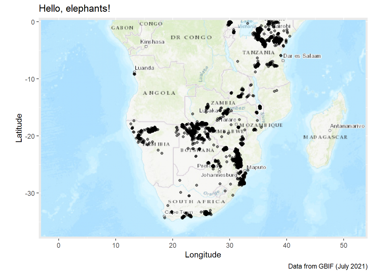 The labels are not rendered with clarity and actually just add clutter to the map. There are solutions to this issue, but they are outside the scope of this course. The simplest solution that I can show you is to try a different visualisation approach entirely.
8.2 Other Visualisation Packages
8.2.1 R Package: plotly
For hardcopy publications of your ggplot2 visualisations, a static object is sufficient. However, the fact that so many data visualisations are published on websites means that we can add interactivity for the viewer.
The plotly package allows us to take any ggplot object that we have made, and turn it into an interactive html widget. This is useful when your data visualisation will be viewed using a browser that supports html.
# Packages needed
library(tidyverse)
library(here)
library(plotly)

# import reptiles.csv
reptiles <- read_csv(here("data/reptiles.csv")) %>%
  rename(
    rep_type = group
  )

# One of our reptile plots from session 4
rep_time <- reptiles %>%
  ggplot() +
  geom_bar(
    aes(
      x = date,
      fill = rep_type
    )
  ) +
  labs(
    title = "Trapping Reptiles in Grasslands",
    subtitle = "Total Number of Snakes and Lizards Captured per Day",
    x = NULL,
    y = "Count",
    fill = "Type"
  ) +
  scale_x_date(
    date_breaks = "1 week",
    date_labels = "%d %b %y",
    date_minor_breaks = "2 days"
  ) +
  theme(
    axis.text.x = element_text(angle = 90, face = "bold",
                               size = 11, vjust = 0.5)
  )

rep_time %>%
  ggplotly()
A great example of a data visualisation that would benefit from interactivity is our map of African Elephant (Loxodonta africana) distribution in sub-equatorial Africa.
# Restart your R Session (if your pc is not too slow)
# Packages needed
library(tidyverse)
library(here)
library(plotly)
library(rnaturalearth)
library(rnaturalearthdata)
library(sf)

# Create an object with the world data from rnaturalearth
world_map <- ne_countries(scale = "small", returnclass = "sf")
class(world_map)
## [1] "sf" "data.frame"elephants <- read_csv(here("data/elephants.csv"))
# Create plot
afr_map <- ggplot(
# We use world_map not africa here to show it works
data = world_map
) +
geom_sf(fill = "antiquewhite") +
# We can add an ENTIRELY new data set inside a geom
geom_point(data = elephants,
aes(x = lon,
y = lat),
alpha = 0.1,
colour = "blue") +
theme(panel.grid.major = element_line(color = gray(.5),
linetype = "dashed",
size = 0.5),
panel.background = element_rect(fill = "aliceblue")) +
labs(
title = "Recent Elephant Records",
subtitle = "Data from South of the Equator"
) +
# Zoom in to a specific view
coord_sf(xlim = c(5, 45),
ylim = c(-40, 5))
afr_map %>% ggplotly()For more information on plotly and customising the plot output options you can read the documentation which is available here: https://plotly.com/r/
8.2.2 R Package: leaflet
The leaflet R package is a ‘wrapper’ for the Leaflet JavaScript library. The ease of use and the excellent documentation available onine, makes leaflet a very useful tool to know about. It will take time and patience to learn the intricacies (because there are many) but if I need to be producing interactive maps in a hurry, then leaflet is what I lean towards using.
In the example below, I will show you how we can take our elephants data and create an interactive map (like the plotly version above), without first creating a ggplot object. The nice thing is that leaflet also uses the pipe (%>%) and has a layer-by-layer structure similar to ggplot2.
# Load the leaflet package
library(leaflet)

elephants %>%
  leaflet() %>%
  addTiles() %>%
  fitBounds(20,0, 30,-35) %>%
  addCircleMarkers(lat = elephants$lat,
                   lng = elephants$lon,
                   radius = 1,
                   fillColor = "blue")
As an example of a way to start customising the map, we can change the underlying base map of the plot using the addProviderTiles() function.
elephants %>%
  leaflet() %>%
  addProviderTiles(providers$Esri.WorldTopoMap) %>%
  fitBounds(20,0, 30,-35) %>%
  addCircleMarkers(lat = elephants$lat,
                   lng = elephants$lon,
                   radius = 1,
                   fillColor = "blue")
If you want to learn more about the leaflet package for R and how to use it, you can find extensive information here: https://rstudio.github.io/leaflet/.
8.3 Summary
The list of ways to visualise data is nearly endless. I can not even list all of them without overwhelming you and so I have decided to highlight a few extensions that can help you with the most immediate benefit for time spent learning them. (Well… perhaps this is not true of OpenStreetMaps but I like to support people who make data available to others at no cost!)
The learning curve for using some of these extensions/alternatives can be quite steep, and it is always helpful to work on understanding R fundamentals so that you can quickly pick up the logic behind different approaches to structuring packages and their functions. The more familiar you are with the core concepts of R, such as objects, classes, functions and their structure, arguments, the easier it will be to perform tasks related to data import, tidying, manipulation and visualisation. If you are still struggling to wrap your head around these, then make a note of the topics covered here, but build a solid foundation first.
8.4 Exercises
- For Session 9, we are doing another codeshare-and-review. With the extra skills and practice from the last two sessions, create a visualisation using any of the
ggplot2skills you have learned. You can use extension packages or even packages likeleafletto create it. The plot can be as simple or as complex as you wish it to be.