Session 9 ggplot2 in Action (part 2)
9.1 Recap & Workshop
Just like the last session, I am going to present each code submission but this time I will include the image of the plot for comparison.
Together, let us try to construct a mental image of the plot from the code we are reading, but because I think they may be more complex, we will use the visualisation to assist us when needed.
9.1.1 Laura
library(tidyverse)
library(here)
library(ggplot2)
library(dplyr)
library(readr)

Panthera_raw <- read_delim("Data/Panthera_correcto.csv",
                                ";", escape_double = FALSE, trim_ws = TRUE)
View(Panthera_raw)

Panthera_onca <- Panthera_raw %>%
  rename(
    lon = decimalLongitude,
    lat = decimalLatitude
  ) %>% select(species, stateProvince, lat, lon, elevation, eventDate, day, month, year, countryCode)

#Load map packages
library(rnaturalearth)
library(rnaturalearthdata)
library(sf)

world_map <- ne_countries(scale = "small", returnclass = "sf")
class(world_map)

theme_set(theme_bw())

america <- world_map %>%
  filter(continent %in% c("South America", "North America"))

ggplot(
  data=america
)+
  geom_sf(fill="#faf4cd")+
  geom_point(data=Panthera_onca,
             aes(
               x = lon,
               y = lat),
             size=1.5,
             alpha=0.1,
             color="#ff9500"
  )+
  labs(
    title="Jaguar records in America",
    subtitle="Records since 1800 till 2021",
    x = "Longitude",
    y = "Latitude"
  )+
  coord_sf(ylim = c(-5, 30),
           xlim = c(-50, -110))

jaguars_year <- Panthera_onca %>%
  #filter(year %in% c("2000", "2001", "2002", "2003", "2004",
  #                   "2005", "2006", "2007", "2008", "2009",
  #                   "2010", "2011", "2012", "2013", "2014",
  #                   "2015", "2016", "2017", "2018", "2019",
  #                   "2020", "2021")) %>%
  group_by(countryCode, year) %>%
  count(name="count")

jaguars_year_count <- jaguars_year %>%
  left_join(america,
            by = c("countryCode" = "postal")) %>%
  st_as_sf()

ggplot(data=america)+
  geom_sf(fill="#faf4cd") +
  geom_sf(data = jaguars_year_count,
          aes(fill=count
          ))+
  coord_sf(ylim = c(-10, 19),
           xlim = c(-45, -100))+
  scale_fill_gradient(low = "#f2e038", high = "#bd1b09",
                      breaks=c(20, 40, 60, 80, 100, 120, 140), limits=c(0, 140),
                      name="Jaguar count")+
  labs(title="**Jaguar** records by *country* in central and northern South America",
       subtitle="Mexico is excluded because it has >140 records",
       x="Longitude",
       y="Latitude",
       caption ="Data from: GBIF.org (17 July 2021)",
  )+
  theme(
    plot.title = element_markdown(size=10),
    plot.subtitle = element_text(size=9),
    legend.title = element_text(size=9),
    panel.grid.major = element_line(
      color = "#a2a8ab",
      linetype = "dashed",
      size = 0.5))+
  geom_point(data=Panthera_onca,
             aes(
               x=lon,
               y=lat),
             size=1,
             color="#1e2224",
             alpha=0.3)

#How to group by ranges of 10 years? and then use facet_wrap(vars(year))
#How to change the middle color of the gradient scale
#How create new names for each row/value in one variable (country codes = country names)

ggplot(
  data=jaguars_year,
  aes(
    x=year,
    y=count,
    color=countryCode
  )
)+
  geom_point()+
  scale_y_continuous(breaks=c(40, 80, 120, 160, 200), limits=c(0, 200))+
  theme_classic()
9.1.2 Gavin
library(tidyverse)## -- Attaching packages --------------------------------------- tidyverse 1.3.1 --## v ggplot2 3.3.3 v purrr 0.3.4
## v tibble 3.1.2 v dplyr 1.0.6
## v tidyr 1.1.3 v stringr 1.4.0
## v readr 1.4.0 v forcats 0.5.1## -- Conflicts ------------------------------------------ tidyverse_conflicts() --
## x dplyr::filter() masks stats::filter()
## x dplyr::lag() masks stats::lag()library(here)## here() starts at C:/Users/gavin/Google Drive/Work/OTS - ggplot course/dvfc_deployed# Import
reptiles <- read_csv("data/reptiles.csv")##
## -- Column specification --------------------------------------------------------
## cols(
## date = col_date(format = ""),
## species = col_character(),
## array = col_character(),
## arm = col_double(),
## trap = col_character(),
## recapture = col_character(),
## size = col_character(),
## group = col_character(),
## block = col_double(),
## treatment = col_character()
## )# p1
reptiles %>%
group_by(
species,
date,
block
) %>%
ggplot(mapping = aes(x = date, fill = group)) +
geom_density(position = "fill")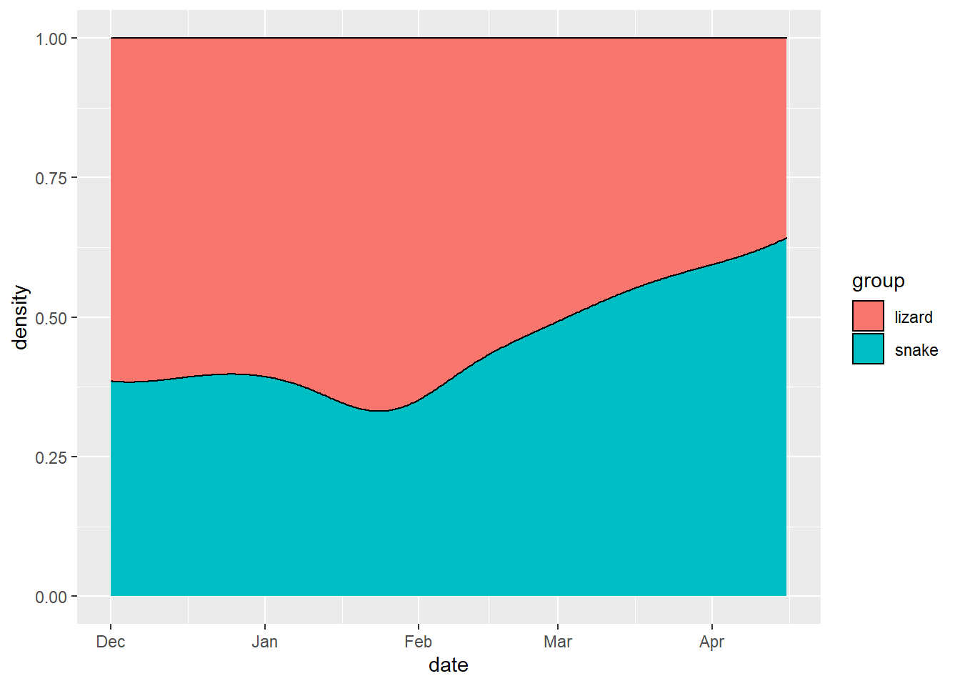
# And the same plot in base R
cdplot(x = reptiles$date, y = as.factor(reptiles$group), col = c("pink", "light blue"))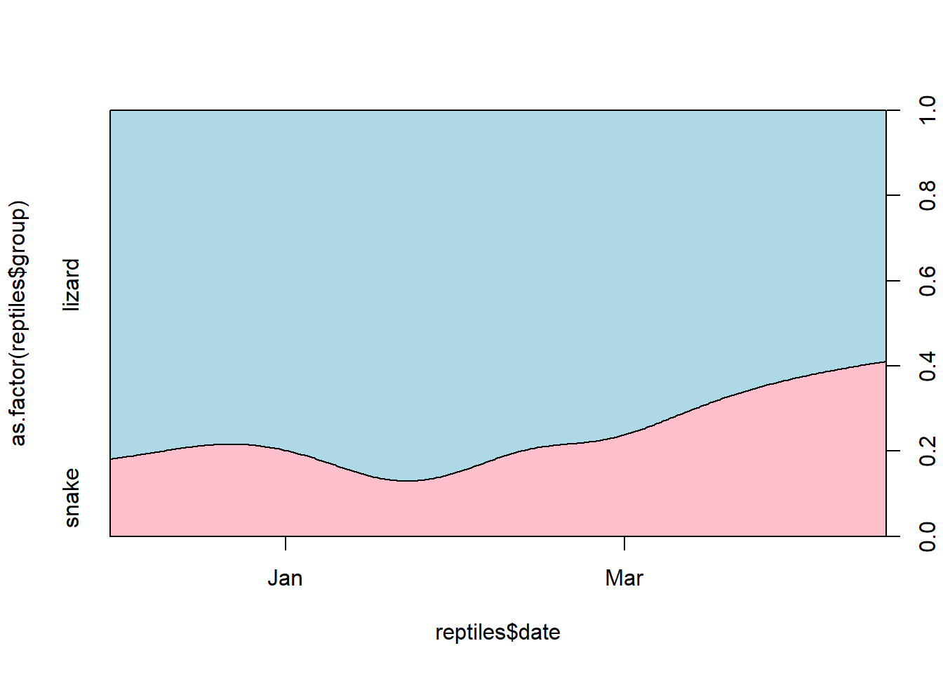
# heatmap of reptile captures through time
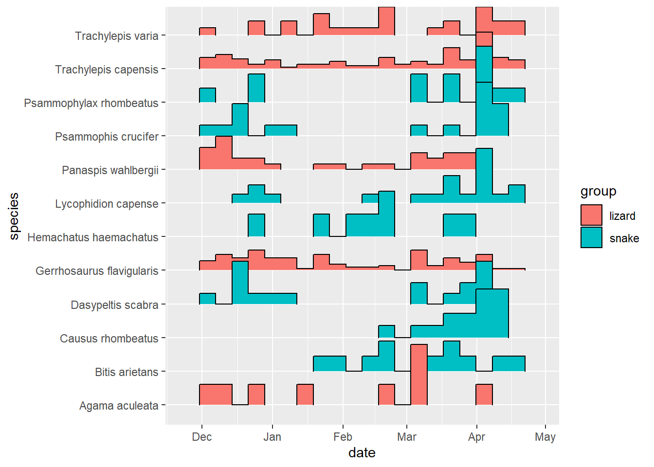
reptiles %>%
ggplot(aes(x = date,
y = species)) +
geom_bin2d()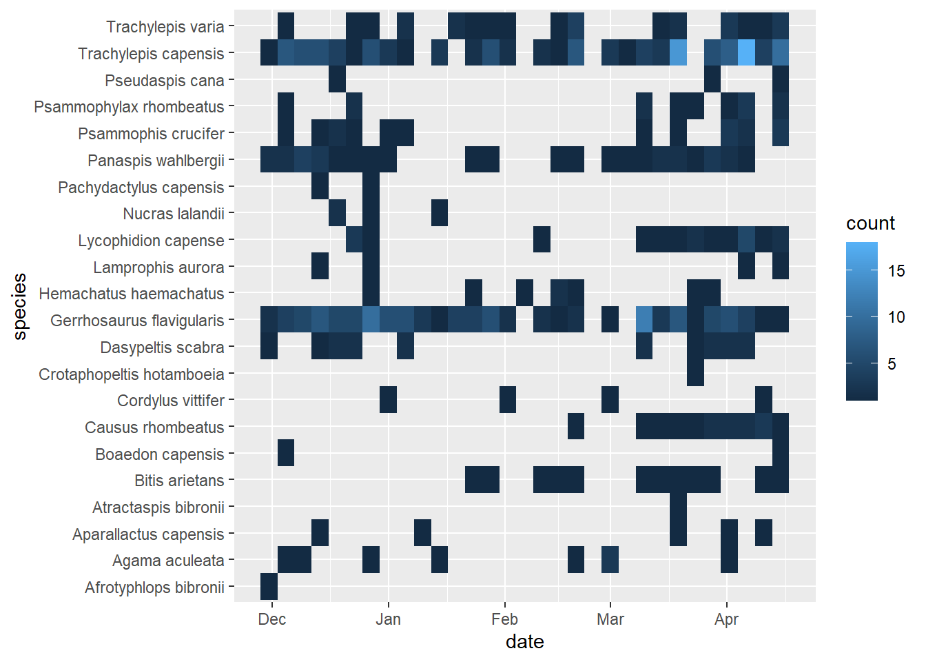
# A different vis - can discuss pros and cons
# e.g no y-axis (distorts numbers of captures across species)
# It was not in fact raining Night Adders (C. rhombeatus) in April compared to other species, 1 in Feb, 6 in March, 8 in April.

reptiles %>%
  group_by(species) %>%
  filter(n() > 5) %>%
  ggplot(aes(x = date, y = species, fill = group)) +
  ggridges::geom_density_ridges()
## Picking joint bandwidth of 16.9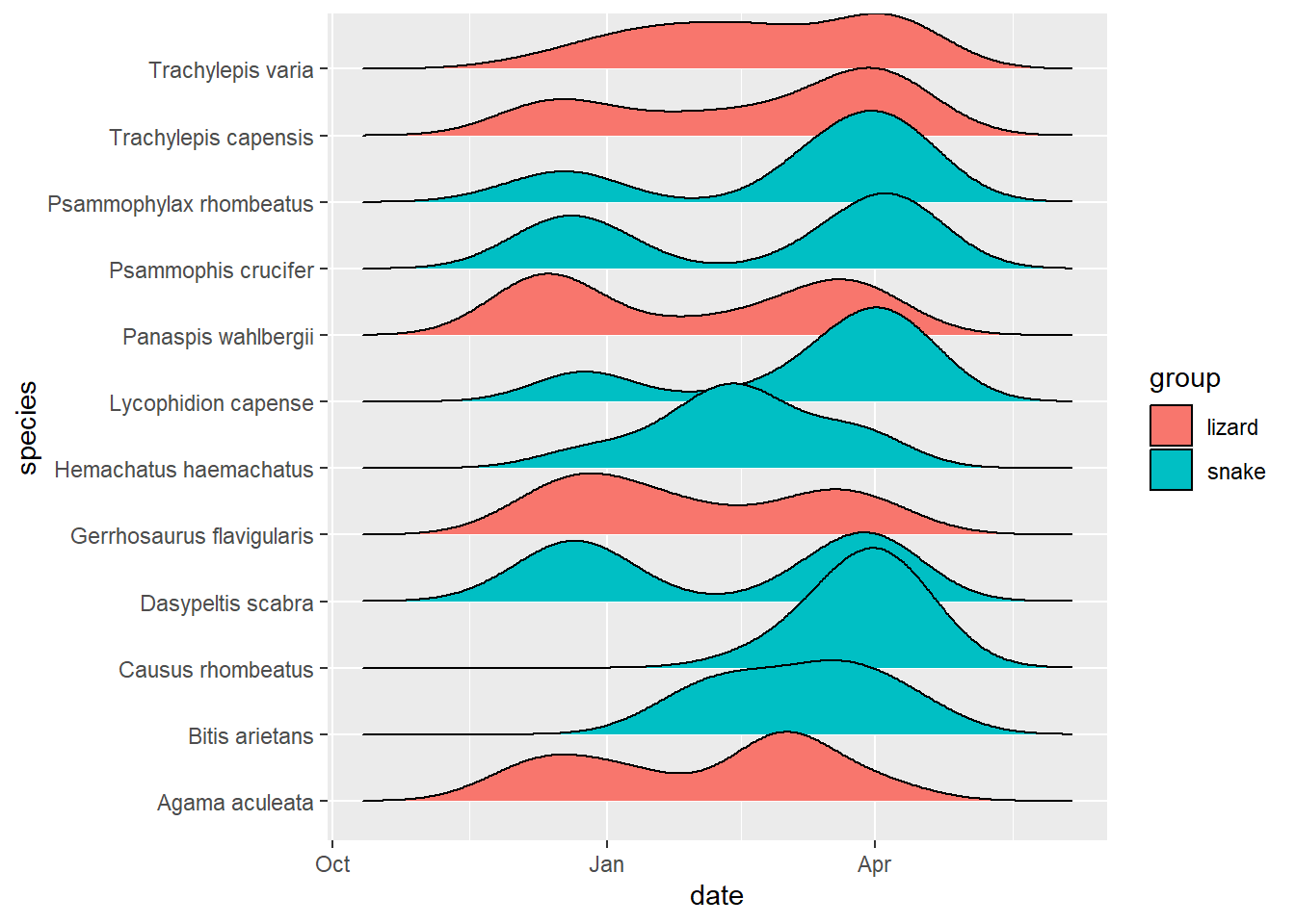
# # hist version
reptiles %>%
  group_by(species) %>%
  filter(n() > 5) %>%
  ggplot(aes(x = date, y = species, fill = group)) +
  ggridges::geom_density_ridges(
    stat = "binline",
    bins = 20, draw_baseline = FALSE
  )